Plot multiple shapefiles
Last updated on 2025-07-02 | Edit this page
Estimated time: 35 minutes
Overview
Questions
- How can I create map compositions with custom legends using ggplot?
Objectives
After completing this episode, participants should be able to…
- Plot multiple vector layers in the same plot.
- Apply custom symbols to spatial objects in a plot.
This episode builds upon the previous episode to work with vector layers in R and explore how to plot multiple vector layers.
Load the data
To work with vector data in R, we use the sf package.
Make sure that it is loaded.
We will continue to work with the three shapefiles that we loaded in the Open and Plot Vector Layers episode.
Plotting Multiple Vector Layers
So far we learned how to plot information from a single shapefile and do some plot customization. What if we want to create a more complex plot with many shapefiles and unique symbols that need to be represented clearly in a legend?
We will create a plot that combines our leisure locations
(point_Delft), municipal boundary
(boundary_Delft) and street (lines_Delft)
objects. We will also build a custom legend.
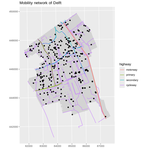
To begin, we create a plot with the site boundary as the first layer.
Then layer the leisure locations and street data on top in consecutive
calls to geom_sf().
R
ggplot() +
  geom_sf(
    data = boundary_Delft,
    fill = "lightgrey",
    color = "lightgrey"
  ) +
  geom_sf(
    data = lines_Delft_selection,
    aes(color = highway),
    size = 1
  ) +
  geom_sf(data = point_Delft) +
  labs(title = "Mobility network of Delft") +
  coord_sf(datum = st_crs(28992))
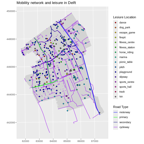
Next, let’s build a custom legend using the functions
scale_color_manual() and scale_fill_manual().
We will use the custom road_colors object created in the
previous episode and we will create a new object called
leisure_colors to store values of all 15 types of leisure
with the rainbow() function.
We also need to customise the shape of the points with the
shape aesthetic if we want to determine the colours inside
the points. shape = 21 will show the points as circles with
a custom fill.
R
point_Delft$leisure <- factor(point_Delft$leisure)
levels(point_Delft$leisure) |> length()
OUTPUT
[1] 15R
leisure_colors <- rainbow(15)

ggplot() +
  geom_sf(
    data = boundary_Delft,
    fill = "lightgrey",
    color = "lightgrey"
  ) +
  geom_sf(
    data = lines_Delft_selection,
    aes(color = highway),
    size = 1
  ) +
  geom_sf(
    data = point_Delft,
    aes(fill = leisure),
    shape = 21
  ) +
  scale_color_manual(
    values = road_colors,
    name = "Road Type"
  ) +
  scale_fill_manual(
    values = leisure_colors,
    name = "Lesiure Location"
  ) +
  labs(title = "Mobility network and leisure in Delft") +
  coord_sf(datum = st_crs(28992))
Challenge: Customizing point shapes
What value of shape will display points as squares with
custom fills?
shape = 22 will display points as squares with custom
fills. Our previous plot would look like this:
R
ggplot() +
  geom_sf(
    data = boundary_Delft,
    fill = "lightgrey",
    color = "lightgrey"
  ) +
  geom_sf(
    data = lines_Delft_selection,
    aes(color = highway),
    size = 1
  ) +
  geom_sf(
    data = point_Delft,
    aes(fill = leisure),
    shape = 22
  ) +
  scale_color_manual(
    values = road_colors,
    name = "Line Type"
  ) +
  scale_fill_manual(
    values = leisure_colors,
    name = "Leisure Location"
  ) +
  labs(title = "Mobility network and leisure in Delft") +
  coord_sf(datum = st_crs(28992))
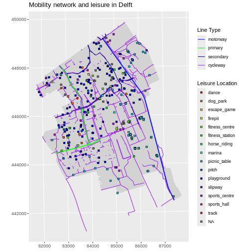
We notice that there are quite some playgrounds in the residential parts of Delft, whereas on campus there is a concentration of picnic tables. So that is what our next challenge is about.
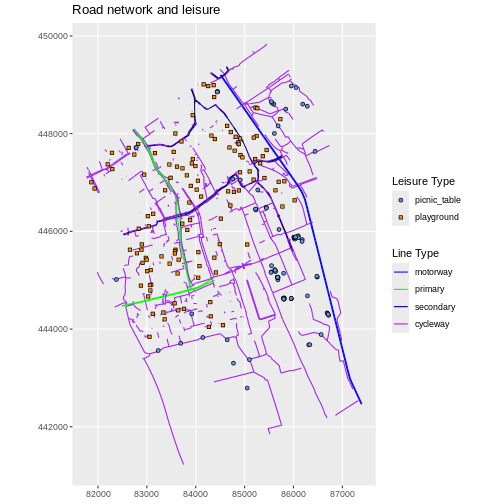
Challenge: Visualising multiple layers with a custom legend
Create a map of leisure locations only including
playground and picnic_table, with each point
coloured by the leisure type. Overlay this layer on top of the
lines_Delft layer (the streets). Tell R to plot playgrounds
and picnic tables with different shape values. Make sure
your plot has a custom legend.
Tip: You can call scale_ functions multiple times for
the same layer, for any of the aesthetics used in
aes().
R
leisure_locations_selection <- st_read("data/delft-leisure.shp") |>
  filter(leisure %in% c("playground", "picnic_table"))
OUTPUT
Reading layer `delft-leisure' from data source
  `/home/runner/work/r-geospatial-urban/r-geospatial-urban/site/built/data/delft-leisure.shp'
  using driver `ESRI Shapefile'
Simple feature collection with 298 features and 2 fields
Geometry type: POINT
Dimension:     XY
Bounding box:  xmin: 81863.21 ymin: 442621.1 xmax: 87370.15 ymax: 449345.1
Projected CRS: Amersfoort / RD New
R
factor(leisure_locations_selection$leisure) |> levels()
OUTPUT
[1] "picnic_table" "playground" R
blue_orange <- c("cornflowerblue", "darkorange")
R
ggplot() +
  geom_sf(
    data = lines_Delft_selection,
    aes(color = highway)
  ) +
  geom_sf(
    data = leisure_locations_selection,
    aes(fill = leisure, shape = leisure)
  ) +
  scale_shape_manual(
    name = "Leisure Type",
    values = c(21, 22)
  ) +
  scale_color_manual(
    name = "Line Type",
    values = road_colors
  ) +
  scale_fill_manual(
    name = "Leisure Type",
    values = blue_orange
  ) +
  labs(title = "Road network and leisure") +
  coord_sf(datum = st_crs(28992))
Key Points
- A plot can be a combination of multiple vector layers, each added
with a separate call to
geom_sf(). - Use the
scale_<aesthetic>_manual()functions to customise aesthetics of vector layers such ascolor,fill, andshape.