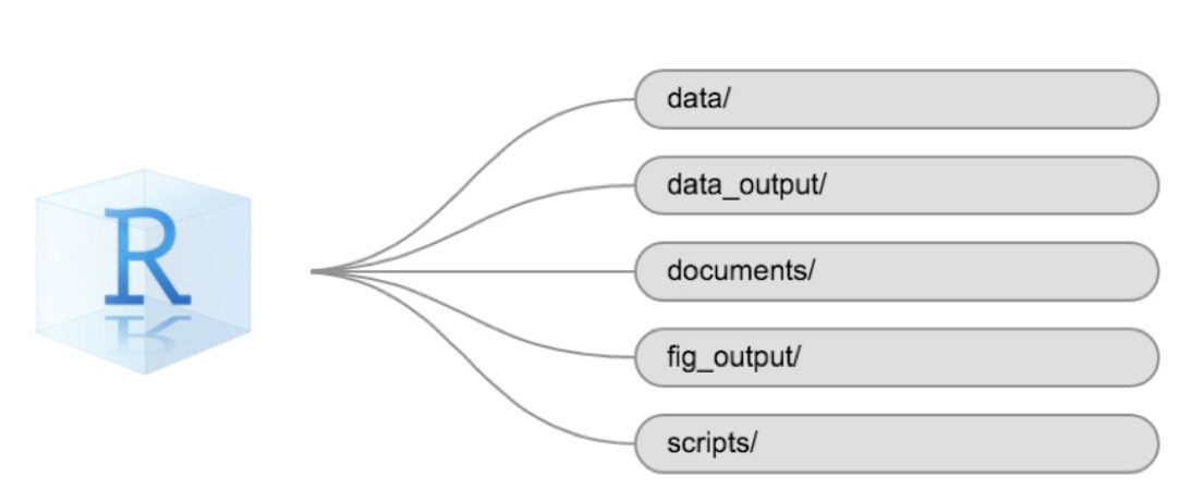
Image 1 of 1: ‘RStudio project logo with five lines, each leading from the logo towards one of the five boxes with texts: 'data/', 'data_output/', 'documents/', 'fig_output/', 'scripts/'’
The plot above uses the default colours inside ggplot2 for
raster objects. We can specify our own colours to make the plot look a
little nicer. R has a built in set of colours for plotting terrain
available through the terrain.colors() function. Since we
have three bins, we want to create a 3-colour palette:
Figure 4
Image 1 of 1: ‘[decorative]’
Figure 5
Image 1 of 1: ‘[decorative]’
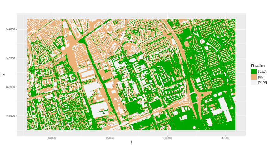
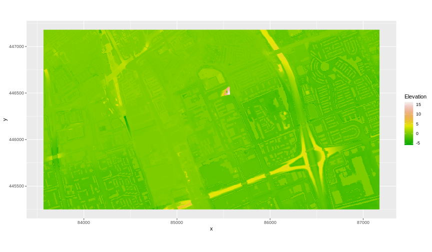
The axis labels x and y are not necessary, so we can turn them off by
passing element_blank() to the axis.title
argument in the theme() function.
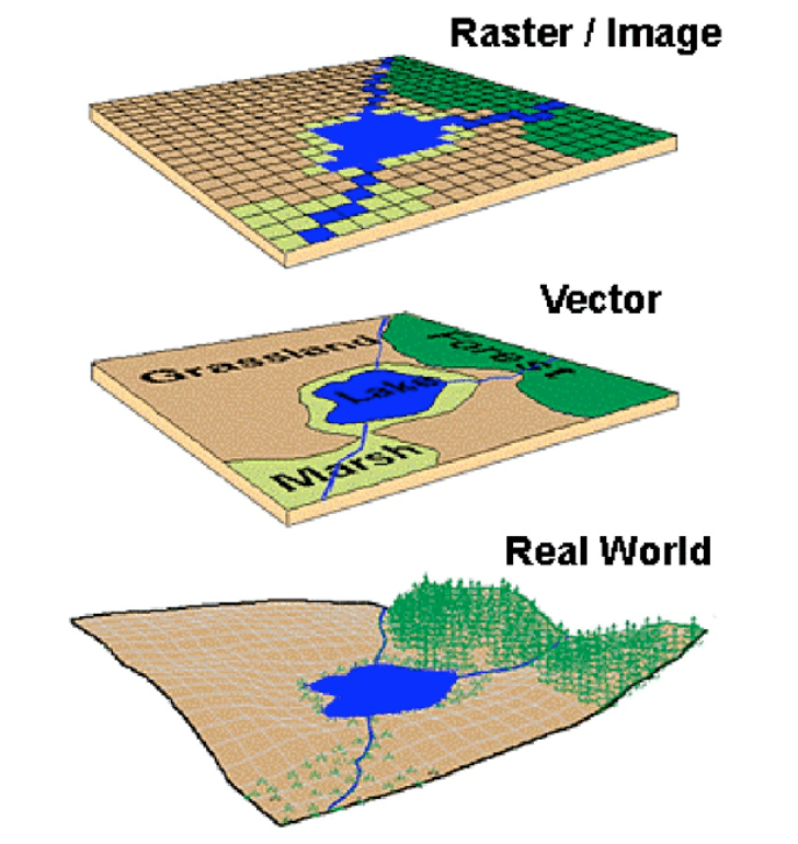
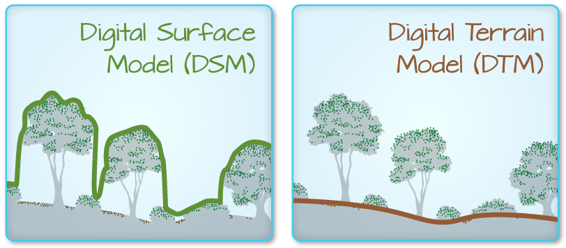
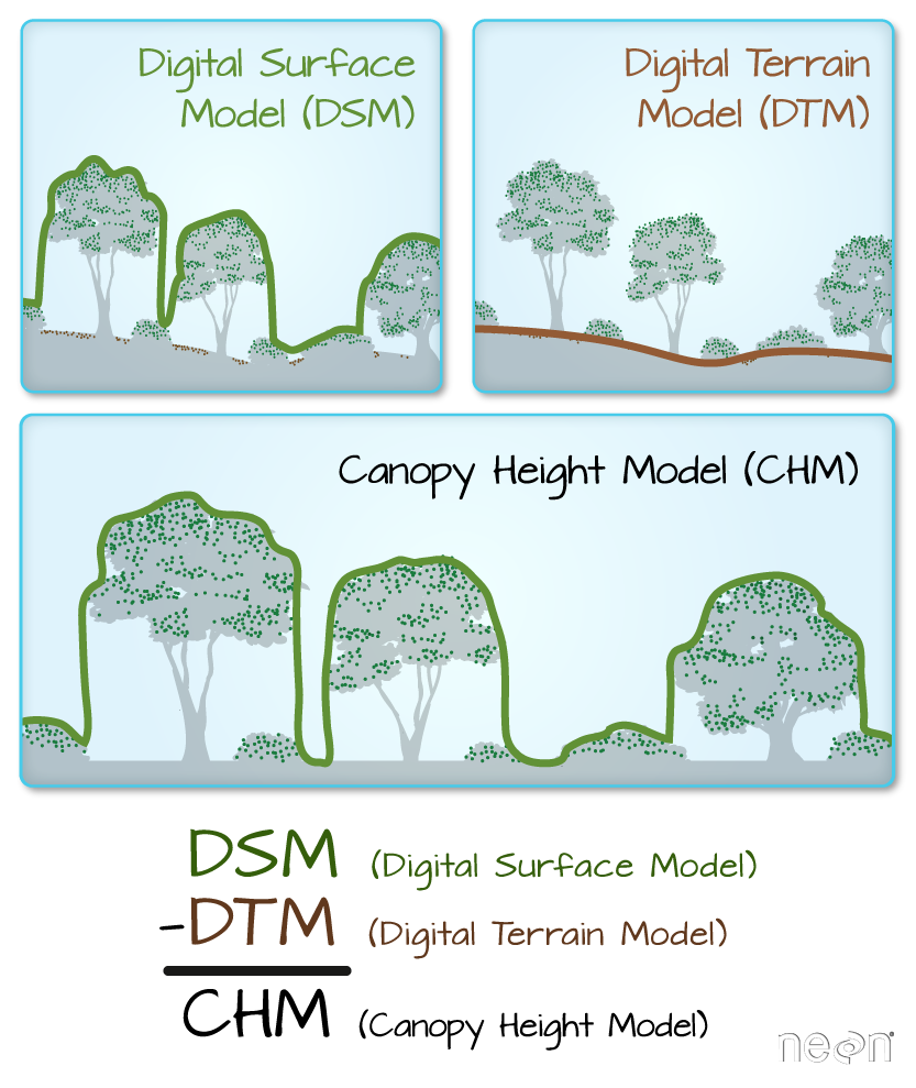
Image 1 of 1: ‘The difference between DSM and DTM. Source: National Ecological Observatory Network (NEON).’
The difference between DSM and DTM. Source: National Ecological
Observatory Network (NEON).
Figure 2
Image 1 of 1: ‘[decorative]’
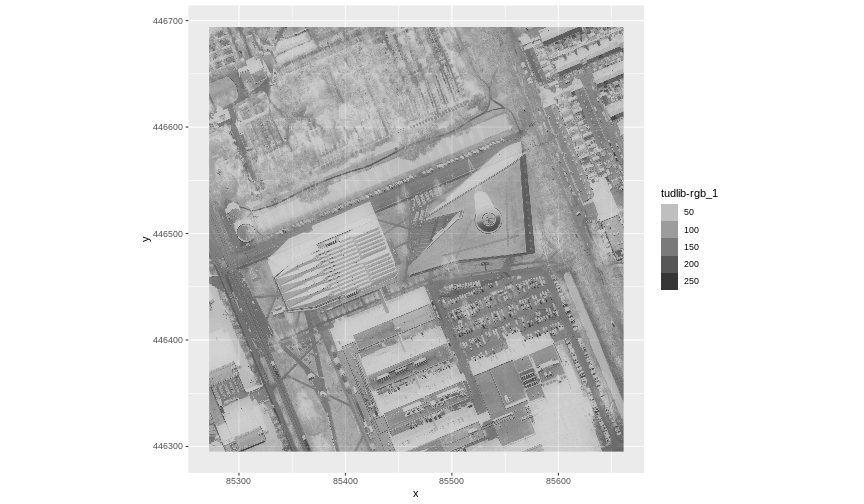
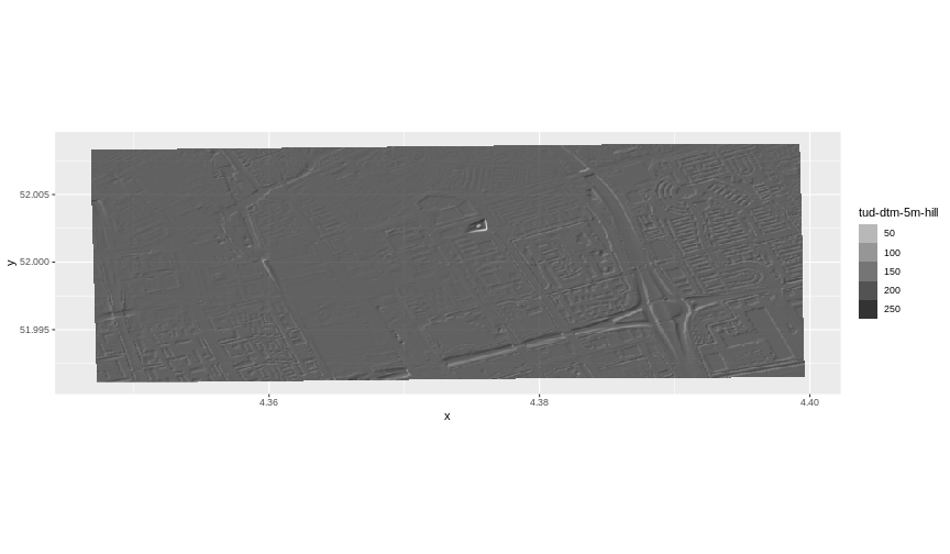
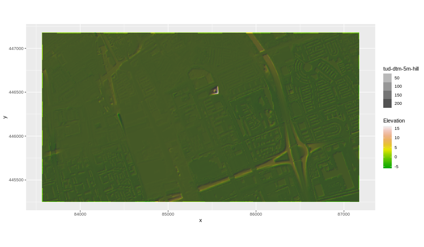
Our results are curious - neither the DTM (DTM_TUD_df) nor
the hillshade (DTM_hill_TUD_df) are plotted. Let’s try to
plot the DTM on its own to make sure the data are there.
Image 1 of 1: ‘Source: National Ecological Observatory Network (NEON).’
Source: National Ecological Observatory Network
(NEON).
Figure 2
Image 1 of 1: ‘[decorative]’
Figure 3
Image 1 of 1: ‘[decorative]’
Figure 4
Image 1 of 1: ‘[decorative]’
Figure 5
Image 1 of 1: ‘[decorative]’
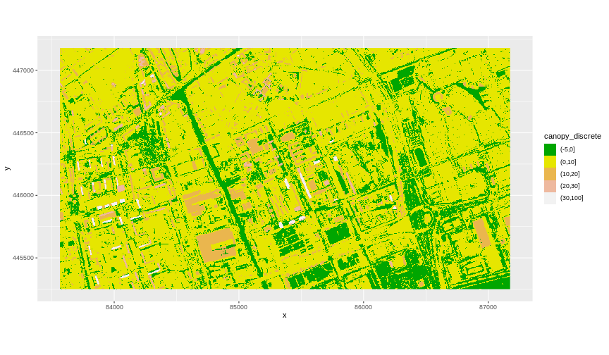
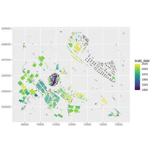
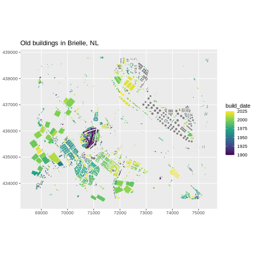
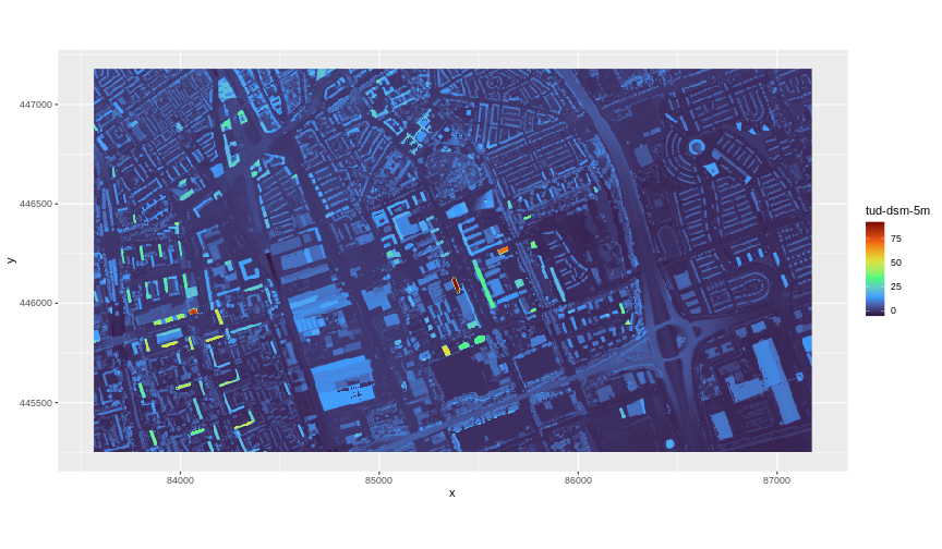
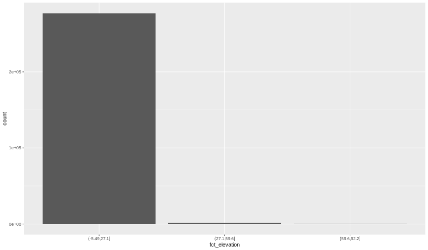
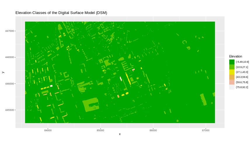
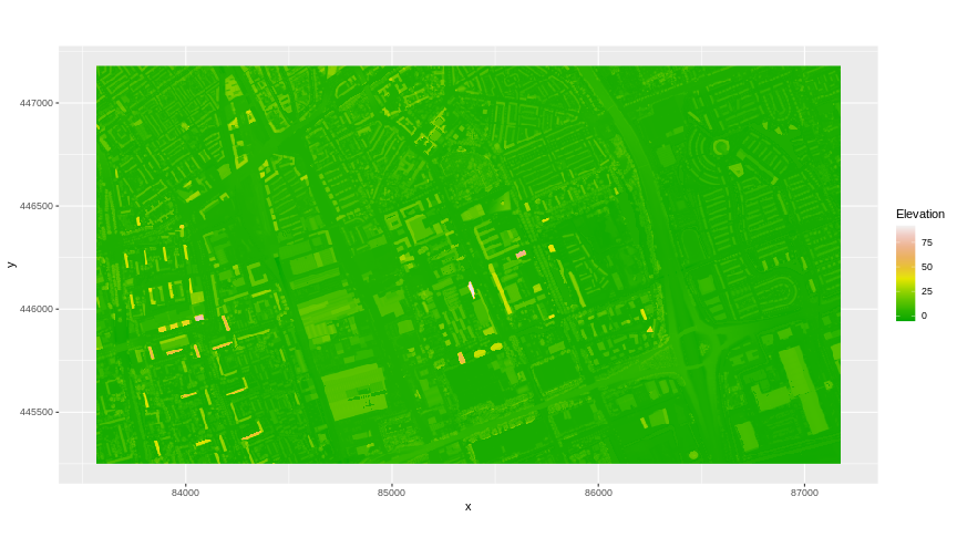
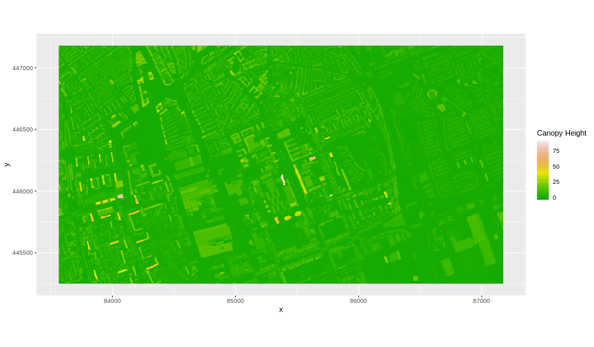
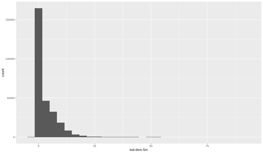
Notice that the range of values for the output CHM starts right below 0
and ranges to almost 100 meters. Does this make sense for buildings and
trees in Delft?


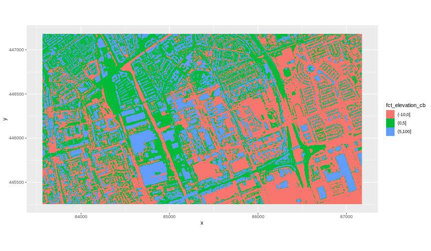 The plot above uses the default colours inside
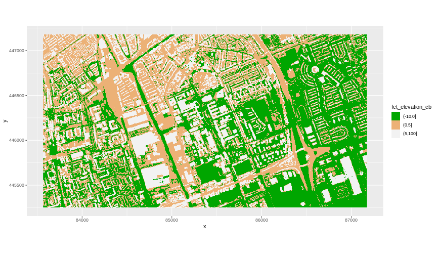
 The axis labels x and y are not necessary, so we can turn them off by
passing
The axis labels x and y are not necessary, so we can turn them off by
passing 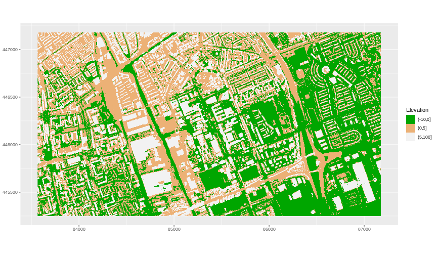
 Our results are curious - neither the DTM (
 Notice that the range of values for the output CHM starts right below 0
and ranges to almost 100 meters. Does this make sense for buildings and
trees in Delft?
Notice that the range of values for the output CHM starts right below 0
and ranges to almost 100 meters. Does this make sense for buildings and
trees in Delft?