All Images
Introduction to R and RStudio
Figure 1
Figure 2
Figure 3
Visualisation with ggplot2Setting valuesGeometrical objects
Figure 1
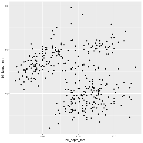
Figure 2
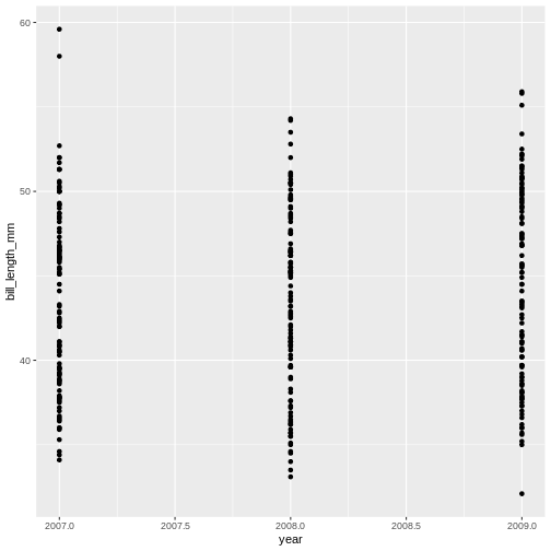
Figure 3
Figure 4
Figure 5
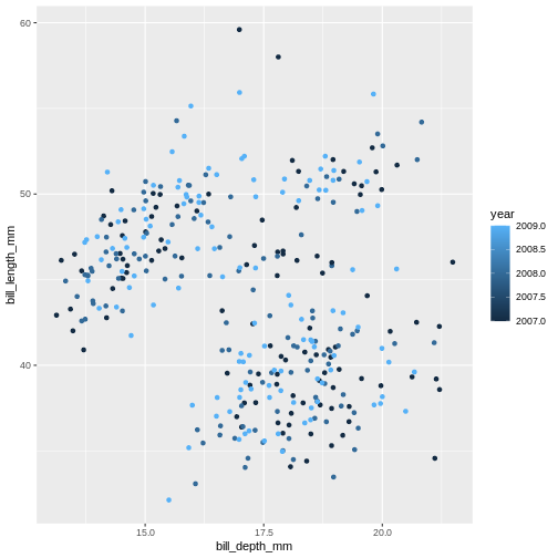
Figure 6
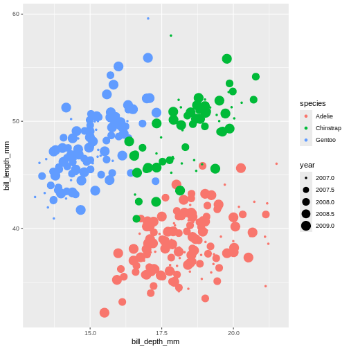
Figure 7
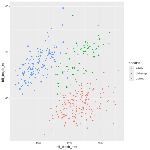
Figure 8
Figure 9
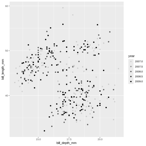
Figure 10
 Controlling the transparency can be a great way to “mute” the visual
effect of certain data, while still keeping it visible. Its a great tool
when you have many data points or if you have several geoms together,
like we will see soon.
Controlling the transparency can be a great way to “mute” the visual
effect of certain data, while still keeping it visible. Its a great tool
when you have many data points or if you have several geoms together,
like we will see soon.
Figure 11
Figure 12
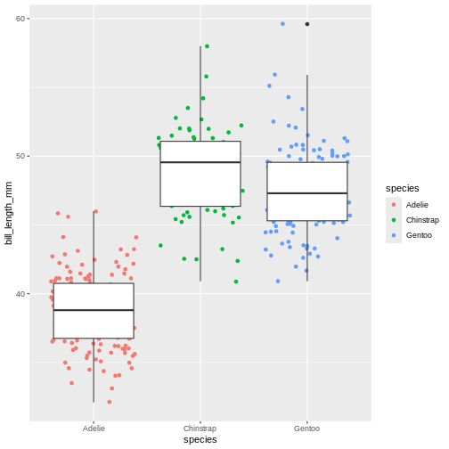
Figure 13
Figure 14
Figure 15
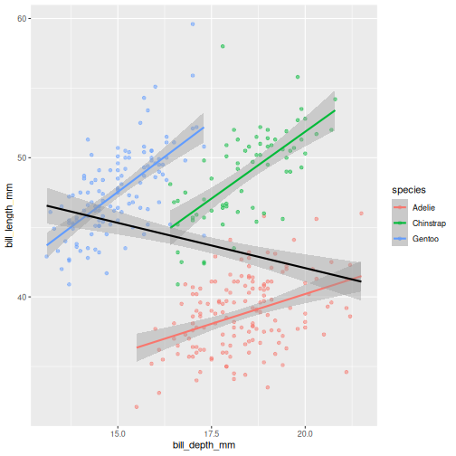
 In the graph above, each geom inherited all three mappings: x, y and
colour. If we want only single linear model to be built, we would need
to limit the effect of
In the graph above, each geom inherited all three mappings: x, y and
colour. If we want only single linear model to be built, we would need
to limit the effect of colour aesthetic to only
geom_point() function, by moving it from the “parent”
function to the layer where we want it to apply. Note, though, that
because we want the colour to be still mapped to the
island variable, it needs to be wrapped into
aes() function and supplied to mapping
argument.
Figure 16
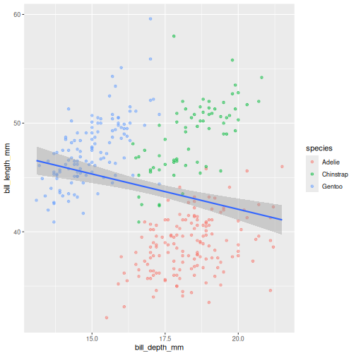
 Look at that! The data actually reveals something called the “simpsons
paradox”. It’s when a relationship looks to go in a specific direction,
but when looking into groups within the data the relationship is the
opposite. Here, the overall relationship between bill length and depths
looks negative, but when we take into account that there are different
species, the relationship is actually positive.
Look at that! The data actually reveals something called the “simpsons
paradox”. It’s when a relationship looks to go in a specific direction,
but when looking into groups within the data the relationship is the
opposite. Here, the overall relationship between bill length and depths
looks negative, but when we take into account that there are different
species, the relationship is actually positive.
Figure 17
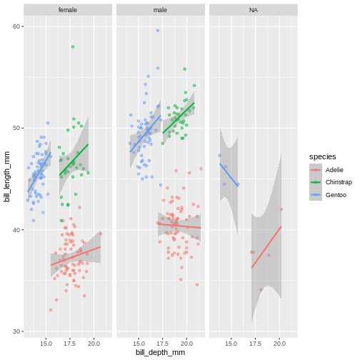
Figure 18
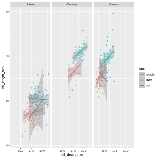
Figure 19
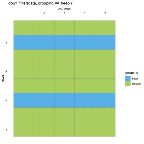
Subsetting data with dplyrWrap-up
Figure 1
Figure 2
Data sorting and pipes dplyrWrap-up
Data visualisation and scalesPiping into ggplotAdding colourChanging colourChanging the overall lookWrap up
Figure 1
Figure 2
Figure 3
Figure 4
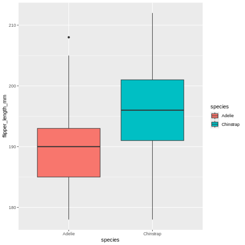
Figure 5
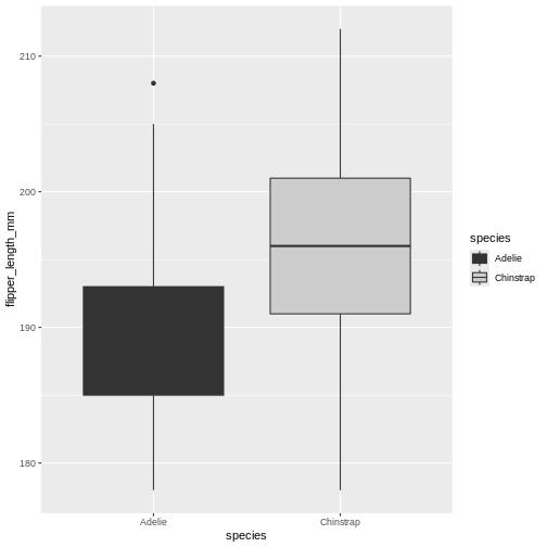
Figure 6
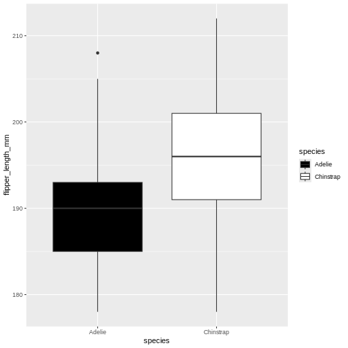
Figure 7
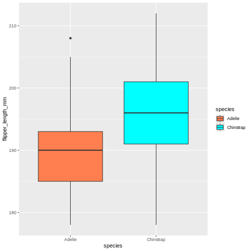
Figure 8
Figure 9
Figure 10
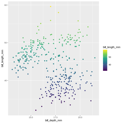
Figure 11
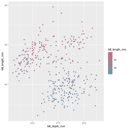
Figure 12
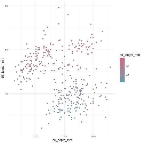
Figure 13
Figure 14
Data manipulation with dplyrAdding new variables,Wrap up
Figure 1
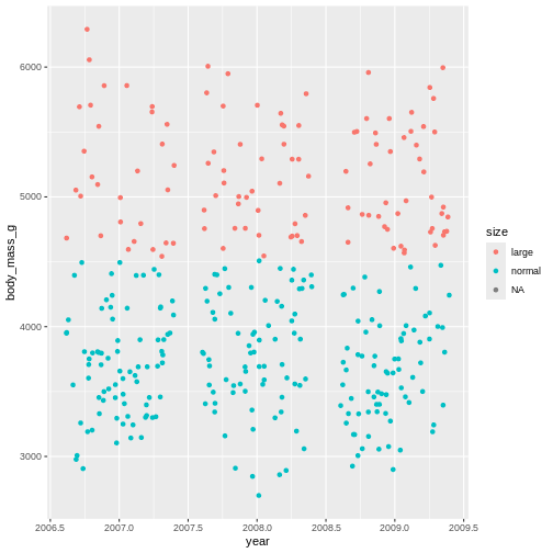
Figure 2
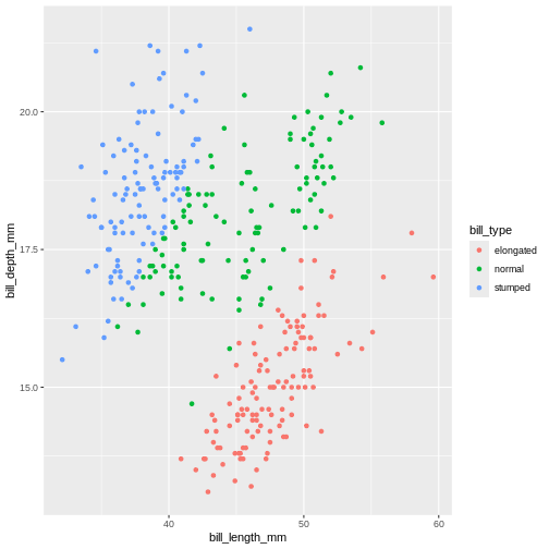
Figure 3
Reshaping data with tidyrCreating longer dataWrap up
Figure 1
Figure 2
Data summaries with dplyrMotivation
Complex data pipelinesMotivation
Figure 1
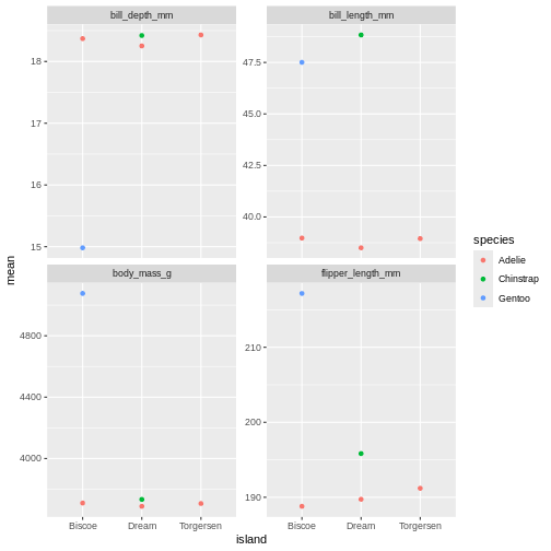
Figure 2
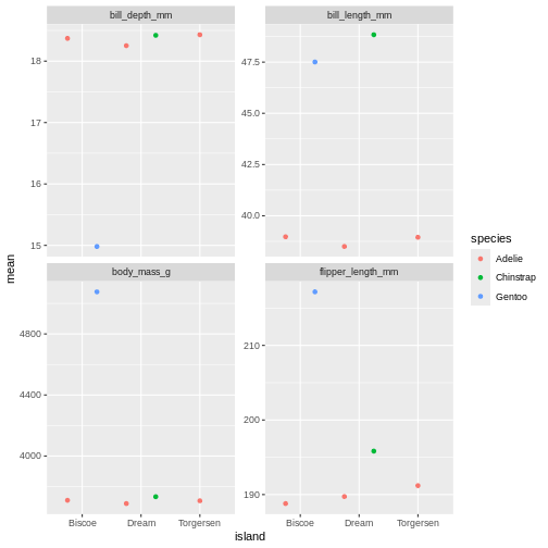
Figure 3
Figure 4
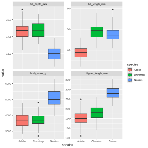
 The last plot is misleading because the data we have summary data by
species and island. Ignoring the island in the plot, means that the
values for the different measurements cannot be distinguished from
eachother.
The last plot is misleading because the data we have summary data by
species and island. Ignoring the island in the plot, means that the
values for the different measurements cannot be distinguished from
eachother.
Figure 5
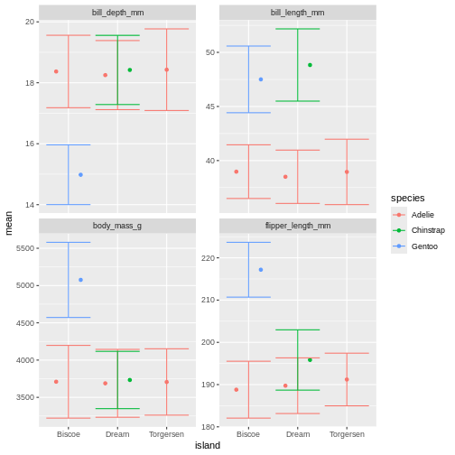
Figure 6
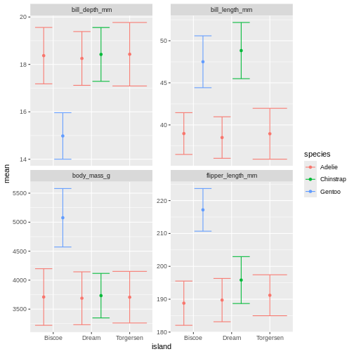
Figure 7
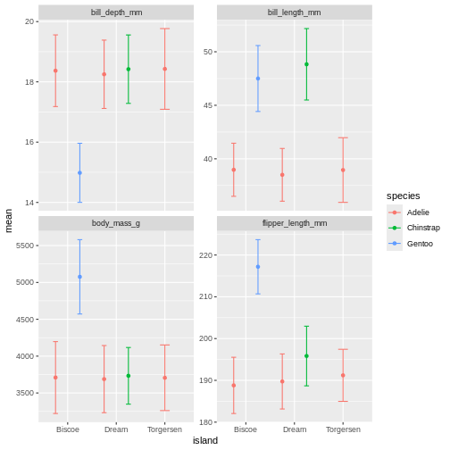
Figure 8
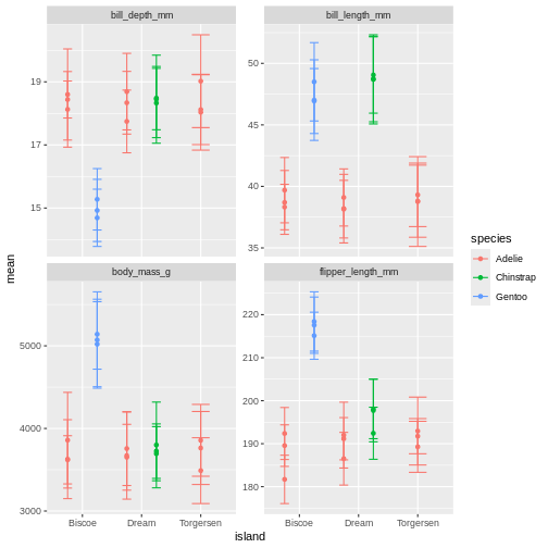
Figure 9
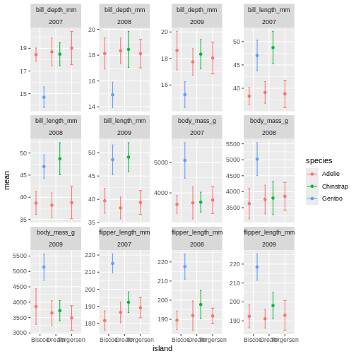
Figure 10
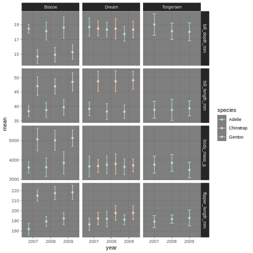
 ok, so we got what we asked, the year part makes more sense, but its a
very “busy” plot. Its really quite hard to compare everything from
Bisoe, or all the Adelie’s, to each other. How can we make it
easier?
ok, so we got what we asked, the year part makes more sense, but its a
very “busy” plot. Its really quite hard to compare everything from
Bisoe, or all the Adelie’s, to each other. How can we make it
easier?
Figure 11
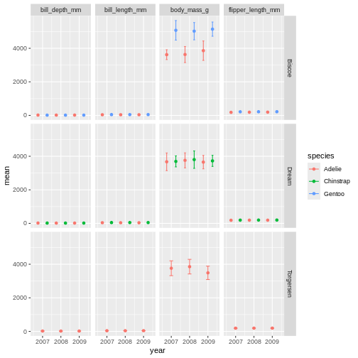
Figure 12
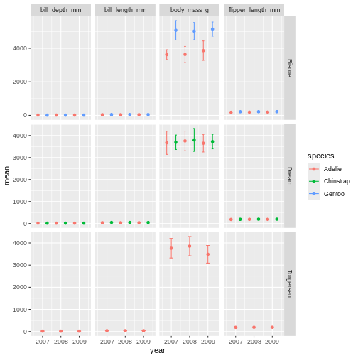
Figure 13

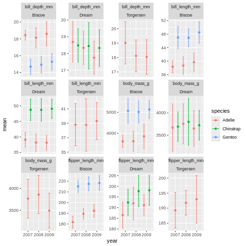
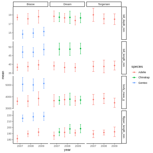
facet_grid is more complex than facet_wrap as
it will always force the y-axis for rows, and x-axis for columns remain
the same. So wile setting scales to free will help a little, it will
only do so within each row and column, not each subplot. When the
results do not look as you like, swapping what are rows and columns in
the grid can often create better results.
Figure 14
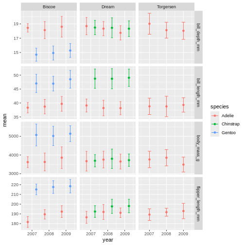
Figure 15
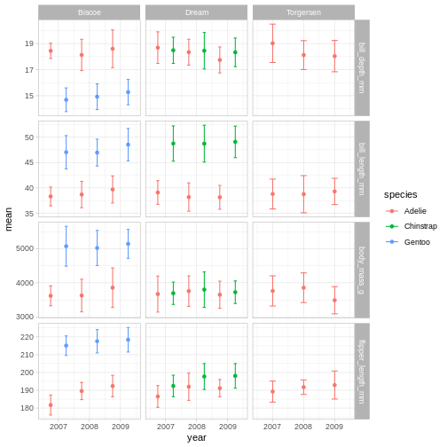
 the classic theme is preferred by many journals, but for facet grid, its
not super nice, since we loose grid information.
the classic theme is preferred by many journals, but for facet grid, its
not super nice, since we loose grid information.
Figure 16
 Theme light could be a nice option, but the white text of light grey
makes the panel text hard to read.
Theme light could be a nice option, but the white text of light grey
makes the panel text hard to read.
Figure 17
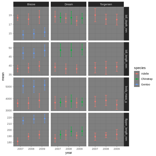
Figure 18
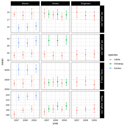
Figure 19
Figure 20
Figure 21
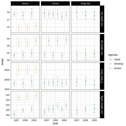
Figure 22