All in One View
Content from Introduction to R and RStudio
Last updated on 2026-05-26 | Edit this page
Estimated time: 49 minutes
Overview
Questions
- How to find your way around RStudio?
- How to interact with R?
- How to organise your project files?
- How to install packages?
Objectives
- Describe the purpose and use of each pane in the RStudio IDE
- Locate buttons and options in the RStudio IDE
- Create and use R-projects
- How to organise and access project files
- Use RStudio to write and run R programs.
- Create and start an R-project
- Use
install.packages()to install packages (libraries). - Use the
herepackage to access project files
Motivation
Working with data can often be challenging. Data are rarely in the shape and format that is most convenient for your end product. Everyone working with data knows that there is a lot of work that goes into altering the data to make sure you can explore and highlight the interesting aspects of it. In this lesson, we will use the dataset from the palmerpenguins R-package, which contains observational data on arctic penguins. Data were collected and made available by Dr. Kristen Gorman and the Palmer Station, Antarctica LTER, a member of the Long Term Ecological Research Network. This lesson focuses on using the tidyverse packages, a opinionated collection of packages that are tailored to the needs of data scientists. Can you organise your project in an orderly fashion and access all the files? Can you navigate a dataset in R? Can you add columns and change column names? Can you efficiently summarise the data? Can you create visualizations to show key aspects of the data? At the end of this lesson, you should be able to do al these things!
Before Starting The Workshop
Please ensure you have the latest version of R and RStudio installed on your machine. This is important, as some packages used in the workshop may not install correctly (or at all) if R is not up to date.
- Download and install the latest version of R here
- Download and install RStudio here
- If you are on a windows computer, also download and install RTools
Introduction to RStudio
Welcome to the R portion of the Software Carpentry workshop.
Throughout this lesson, we’re going to teach you some of the best-practice ways of working with data and projects using the tidyverse framework for R.
We’ll be using RStudio: a free, open source R Integrated Development Environment (IDE). It provides a built in editor, works on all platforms (including on servers) and provides many advantages such as integration with version control and project management.
Basic layout
When you first open RStudio, you will be greeted by three panels:
- The interactive R console/Terminal (entire left)
- Environment/History/Connections (tabbed in upper right)
- Files/Plots/Packages/Help/Viewer (tabbed in lower right)
Once you open files, such as R scripts, an editor panel will also open in the top left.
Work flow within RStudio
There are two main ways one can work within RStudio:
- Test and play within the interactive R console then copy code into a
.R file to run later.
- This works well when doing small tests and initially starting off.
- It quickly becomes laborious
- Start writing in a .R file and use RStudio’s short cut keys for the
Run command to push the current line, selected lines or modified lines
to the interactive R console.
- This is a great way to start; all your code is saved for later
- You will be able to run the file you create from within RStudio or
using R’s
source()function.
Tip: Running segments of your code
RStudio offers you great flexibility in running code from within the
editor window. There are buttons, menu choices, and keyboard shortcuts.
To run the current line, you can:
1. click on the Run button above the editor panel, or
2. select “Run Lines” from the “Code” menu, or
3. hit ctrl+return in Windows or Linux or
cmd+ return on OS X.
(This shortcut can also be seen by hovering the mouse over the button).
To run a block of code, select it and then Run.
Introduction to R
Much of your time in R will be spent in the R interactive console.
This is where you will run all of your code, and can be a useful
environment to try out ideas before adding them to an R script file.
This console in RStudio is the same as the one you would get if you
typed in R in your command-line environment.
The first thing you will see in the R interactive session is a bunch of information, followed by a “>” and a blinking cursor. In many ways this is similar to the shell environment you learned about during the shell lessons: it operates on the same idea of a “Read, evaluate, print loop”: you type in commands, R tries to execute them, and then returns a result.
Using R-projects
Any data analysis process is naturally incremental, and many projects start life as random notes, some code, then a manuscript, and eventually everything is a bit mixed together.
Managing your projects in a reproducible fashion doesn’t just make your science reproducible, it makes your life easier.
— Vince Buffalo (@vsbuffalo) April 15, 2013
Most people tend to organize their projects like this:
There are many reasons why we should ALWAYS avoid this:
- It is really hard to tell which version of your data is the original and which is the modified;
- It gets really messy because it mixes files with various extensions together;
- It probably takes you a lot of time to actually find things, and relate the correct figures to the exact code that has been used to generate it;
A good project layout will ultimately make your life easier:
- It will help ensure the integrity of your data;
- It makes it simpler to share your code with someone else (a lab-mate, collaborator, or supervisor);
- It allows you to easily upload your code with your manuscript submission;
- It makes it easier to pick the project back up after a break.
A possible solution
Fortunately, there are tools and packages which can help you manage your work effectively.
One of the most powerful and useful aspects of RStudio is its project management functionality. We’ll be using this today to create a self-contained, reproducible project.
Challenge 1: Creating a self-contained project
We’re going to create a new project in RStudio:
- Click the “File” menu button, then “New Project”.
- Click “New Directory”.
- Click “New Project”.
- Type in the name of the directory to store your project,
e.g. “my_project”.
- If available, select the checkbox for “Create a git
repository.”
- Click the “Create Project” button.
The simplest way to open an RStudio project once it has been created
is to click through your file system to get to the directory where it
was saved and double click on the .Rproj file. This will
open RStudio and start your R session in the same directory as the
.Rproj file. All your data, plots and scripts will now be
relative to the project directory. RStudio projects have the added
benefit of allowing you to open multiple projects at the same time each
open to its own project directory. This allows you to keep multiple
projects open without them interfering with each other.
Challenge 2: Opening an RStudio project through the file system
- Exit RStudio.
- Navigate to the directory where you created a project in Challenge
1.
- Double click on the
.Rprojfile in that directory.
Best practices for project organization
Although there is no “best” way to lay out a project, there are some general principles to adhere to that will make project management easier:
Treat data as read only
This is probably the most important goal of setting up a project. Data is typically time consuming and/or expensive to collect. Working with them interactively (e.g., in Excel) where they can be modified means you are never sure of where the data came from, or how it has been modified since collection. It is therefore a good idea to treat your data as “read-only”.
Data Cleaning
In many cases your data will be “dirty”: it will need significant preprocessing to get into a format R (or any other programming language) will find useful. This task is sometimes called “data munging”. Storing these scripts in a separate folder, and creating a second “read-only” data folder to hold the “cleaned” data sets can prevent confusion between the two sets.
Treat generated output as disposable
Anything generated by your scripts should be treated as disposable: it should all be able to be regenerated from your scripts.
There are lots of different ways to manage this output. Having an output folder with different sub-directories for each separate analysis makes it easier later. Since many analyses are exploratory and don’t end up being used in the final project, and some of the analyses get shared between projects.
Tip: Good Enough Practices for Scientific Computing
Good Enough Practices for Scientific computing gives the following recommendations for project organization:
- Put each project in its own directory, which is named after the
project.
- Put text documents associated with the project in the
docdirectory.
- Put raw data and metadata in the
datadirectory, and files generated during cleanup and analysis in aresultsdirectory.
- Put source for the project’s scripts and programs in the
srcdirectory, and programs brought in from elsewhere or compiled locally in thebindirectory.
- Name all files to reflect their content or function.
Separate function definition and application
One of the more effective ways to work with R is to start by writing the code you want to run directly in a .R script, and then running the selected lines (either using the keyboard shortcuts in RStudio or clicking the “Run” button) in the interactive R console.
When your project is in its early stages, the initial .R
script file usually contains many lines of directly executed code. Make
sure to comment your code, so you know the intention of each bit, and
once you have a clearer idea of what you want, tidy up your script so it
only contains what is important.
Challenge 3
Set up your project folders. For this workshop we will need folders for data, results and scripts.
- In the bottom right pane of RStudio, click on “Files”.
- Click on “New folder” and create a folder named
data - Repeat to create
resultsandscripts
Challenge 4
Download the palmer penguins data and place it in your
data folder, calling it penguins.csv
- Go to the raw palmer penguins data
- Right click in the browser window
- Choose “save as…”
- Navigate to your project’s data folder
- Save the file to this location
Tip: command line in RStudio
The Terminal tab in the console pane provides a convenient place directly within RStudio to interact directly with the command line.
Version Control
It is important to use version control with projects.
Go here
for a good lesson which describes using Git with RStudio.
Content from Visualisation with ggplot2
Last updated on 2026-05-26 | Edit this page
Estimated time: 68 minutes
Overview
Questions
- How do I access my data in R?
- How do I visualise my data with ggplot2?
Objectives
- Read data into R
- To be able to use
ggplot2to generate publication quality graphics. - To understand the basic grammar of graphics, including the aesthetics and geometry layers, adding statistics, transforming scales, and colouring or panelling by groups.
- Read data into R
- Use ggplot2 to create different types of plots
Motivation
Plotting the data is one of the best ways to quickly explore it and generate hypotheses about various relationships between variables.
There are several plotting systems in R, but today we will focus on
ggplot2 which implements grammar of
graphics - a coherent system for describing components that
constitute visual representation of data. For more information regarding
principles and thinking behind ggplot2 graphic system,
please refer to Layered grammar
of graphics by Hadley Wickham (@hadleywickham).
The advantage of ggplot2 is that it allows R users to
create publication quality graphics with a few lines of code.
ggplot2 has a large user base and is constantly developed
and extended by the community.
Getting data into R
We will start by reading the data into R, from the data
folder you placed them in the last part of the introduction.
R
penguins <- read.csv("data/penguins.csv")
This is our first bit of R code to “assign” data to an object in our “R environment”. The R environment can be seen in the upper right hand corner, and it lists everything R has access to at the moment. You should see an object called “penguins”, which is a Dataset with 344 observations and 8 variables. We created this object with the line of code we just ran. You can “read” the line, right to left as: “read the penguins.csv into R, and assign (<-) it to an object called penguins”. The arrow, or assignment, is R’s way of creating new objects to work on.
Note a key difference from R and programs like SPSS or excel, is that when data is used in R, we do not automatically alter the data in the file we read it from. Everything we do with the penguins data in R from now on, only happens in R, and does not change the originating file. This way we cannot easily accidentally alter our raw data, which is a very good thing.
Tip: We can inspect the data in several ways
- Click the data name in the Environment, and the data opens as a tab
in the scripts pane.
- Click the little arrow next to the data name in the Evironment, and
you’ll see a short preview of the data.
- Type
penguinsin the R console, and a preview will be shown of the data.
The dataset contains the following fields:
- species: penguin species
- island: island of observation
- bill_length_mm: bill length in millimetres
- bill_depth_mm: bill depth in millimetres
- flipper_length_mm: flipper length in millimetres
- body_mass_g: body mass in grams
- sex: penguin sex
- year: year of observation
Introduction to ggplot2
ggplot2 is a core member of tidyverse
family of packages. Installing and loading the package under the same
name will load all of the packages we will need for this workshop. Lets
get started!
R
# install.packages("tidyverse")
library(tidyverse)
── Attaching core tidyverse packages ──────────────────────── tidyverse 2.0.0 ──
✔ dplyr     1.2.1     ✔ readr     2.2.0
✔ forcats   1.0.1     ✔ stringr   1.6.0
✔ ggplot2   4.0.3     ✔ tibble    3.3.1
✔ lubridate 1.9.5     ✔ tidyr     1.3.2
✔ purrr     1.2.2
── Conflicts ────────────────────────────────────────── tidyverse_conflicts() ──
✖ dplyr::filter() masks stats::filter()
✖ dplyr::lag()    masks stats::lag()
ℹ Use the conflicted package (<http://conflicted.r-lib.org/>) to force all conflicts to become errors
Here’s a question that we would like to answer using
penguins data: Do penguins with deep beaks also have
long beaks? This might seem like a silly question, but it gets us
exploring our data.
To plot penguins, run the following code in the R-chunk
or in console. The following code will put bill_depth_mm on
the x-axis and bill_length_mm on the y-axis:
R
ggplot(data = penguins) +
  geom_point(
    mapping = aes(x = bill_depth_mm,
                  y = bill_length_mm)
  )
Warning: Removed 2 rows containing missing values or values outside the scale range
(`geom_point()`).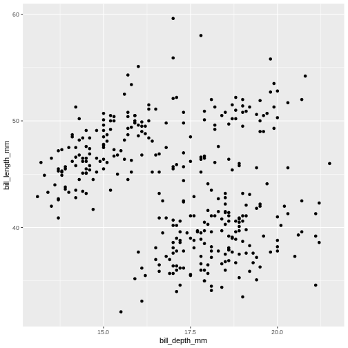
Note that we split the function into several lines. In R, any
function has a name and is followed by parentheses. Inside the
parentheses we place any information the function needs to run. Here, we
are using two main functions, ggplot() and
geom_point(). To save screen space, we have placed each
function on its own line, and also split up arguments into several
lines. How this is done depends on you, there are no real rules for
this. We will use the tidyverse coding style throughout this course, to
be consistent and also save space on the screen. The plus sign indicates
that the ggplot is not over yet and that the next line should be
interpreted as additional layer to the preceding ggplot()
function. In other words, when writing a ggplot() function
spanning several lines, the + sign goes at the end of the
line, not in the beginning.
Note that in order to create a plot using
ggplot2 system, you should start your command with
ggplot() function. It creates an empty coordinate system
and initializes the dataset to be used in the graph (which is supplied
as a first argument into the ggplot() function). In order
to create graphical representation of the data, we can add one or more
layers to our otherwise empty graph. Functions starting with the prefix
geom_ create a visual representation of data. In this case
we added scattered points, using geom_point() function.
There are many geoms in ggplot2, some of which
we will learn in this lesson.
geom_ functions create mapping of variables
from the earlier defined dataset to certain aesthetic elements of the
graph, such as axis, shapes or colours. The first argument of any
geom_ function expects the user to specify these mappings,
wrapped in the aes() (short for aesthetics)
function. In this case, we mapped bill_depth_mm and
bill_length_mm variables from penguins dataset
to x and y-axis, respectively (using x and y
arguments of aes() function).
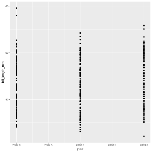
Challenge 1a
How has bill length changed over time? What do you observe?
The* penguins *dataset has a column called
year, which should appear on the x-axis.
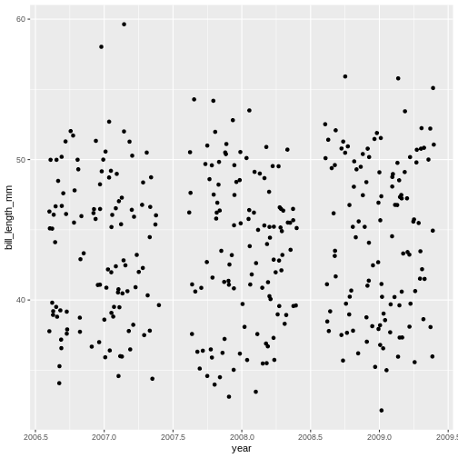
Challenge 1b
Try a different geom_ function called
geom_jitter. How is that different from
geom_point?
Mapping data
What if we want to combine graphs from the previous two challenges and show the relationship between three variables in the same graph? Turns out, we don’t necessarily need to use third geometrical dimension, we can employ colour.
The following graph maps island variable from
penguins dataset to the colour aesthetic of
the plot. Let’s take a look:
R
ggplot(data = penguins) +
  geom_jitter(
    mapping = aes(x = bill_depth_mm,
                  y = bill_length_mm,
                  colour = island)
  )
Warning: Removed 2 rows containing missing values or values outside the scale range
(`geom_point()`).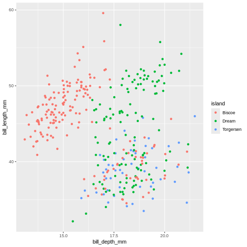
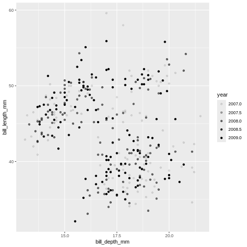
Challenge 2
What will happen if you switch colour to also be by year? Is the graph still useful? Why or why not? What is the difference in the plot between when you colour by island and when you colour by year?
R
ggplot(data = penguins) +
  geom_jitter(
    mapping = aes(x = bill_depth_mm,
                  y = bill_length_mm,
                  colour = year)
  )
Warning: Removed 2 rows containing missing values or values outside the scale range
(`geom_point()`).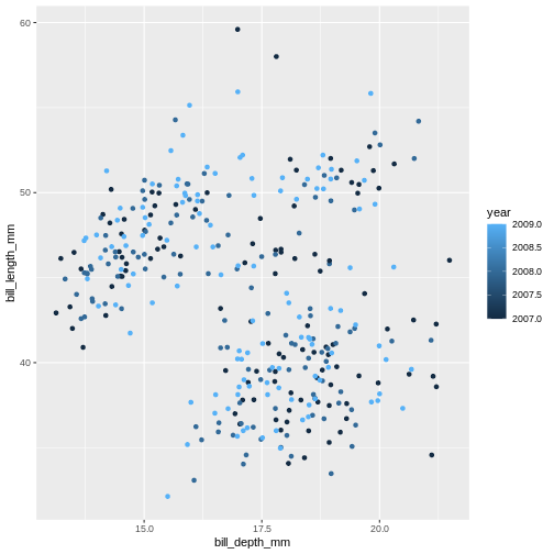
Island is categorical character variable with a discrete range of
possible values. This, like the data type of factor, is represented with
colours by assigning a specific colour to each member of the discrete
set. year is a continuous numeric variable in which any
number of potential values can exist between known values. To represent
this, R uses a colour bar with a continuous gradient.
There are other aesthetics that can come handy. One of them is
size. The idea is that we can vary the size of data points
to illustrate another continuous variable, such as species bill depth.
Lets look at four dimensions at once!
R
ggplot(data = penguins) +
  geom_jitter(
    mapping = aes(x = bill_depth_mm,
                  y = bill_length_mm,
                  colour = species,
                  size = year)
  )
Warning: Removed 2 rows containing missing values or values outside the scale range
(`geom_point()`).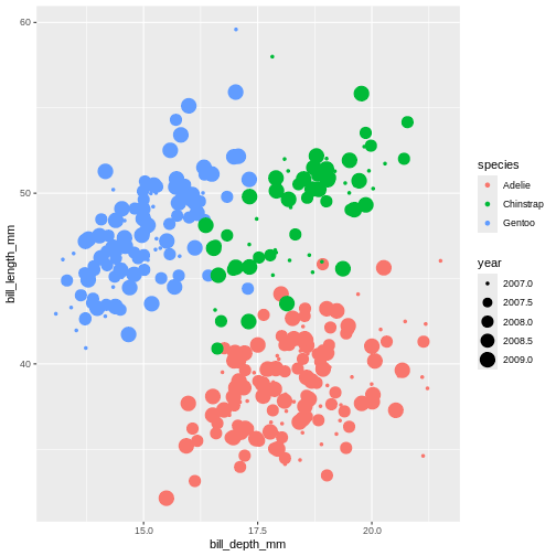
It might be even better to try another type of aesthetic, like shape, for categorical data like species.
R
ggplot(data = penguins) +
  geom_jitter(
    mapping = aes(x = bill_depth_mm,
                  y = bill_length_mm,
                  colour = species,
                  shape = species)
  )
Warning: Removed 2 rows containing missing values or values outside the scale range
(`geom_point()`).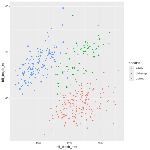
Playing around with different aesthetic mappings until you find something that really makes the data “pop” is a good idea. A plot is rarely made nice on the first try, we all try different configurations until we find the one we like.
Setting values
Until now, we explored different aesthetic properties of a graph
mapped to certain variables. What if you want to recolour or use a
certain shape to plot all data points? Well, that means that such colour
or shape will no longer be mapped to any data, so you need to
supply it to geom_ function as a separate argument (outside
of the mapping). This is called “setting” in the
ggplot2-world. We “map” aesthetics to data columns, or we “set” single
values outside aesthetics to apply to the entire geom or plot. Here’s
our initial graph with all colours coloured in blue.
R
ggplot(data = penguins) +
  geom_point(
    mapping = aes(x = bill_depth_mm,
                  y = bill_length_mm),
    colour = "blue"
  )
Warning: Removed 2 rows containing missing values or values outside the scale range
(`geom_point()`).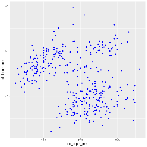
Once more, observe that the colour is now not mapped to any
particular variable from the penguins dataset and applies
equally to all data points, therefore it is outside the
mapping argument and is not wrapped into aes()
function. Note that set colours are supplied as characters (in
quotes).
Challenge 3
Change the transparency (alpha) of the data points by year.
alpha takes a value from 0 (transparent) to 1
(solid).
Challenge 4
Move the transparency outside the aes() and set it to
0.5. What can we benefit of each one of these methods?
R
ggplot(data = penguins) +
geom_point(
mapping = aes(x = bill_depth_mm,
y = bill_length_mm),
alpha = 0.5)
Warning: Removed 2 rows containing missing values or values outside the scale range
(`geom_point()`).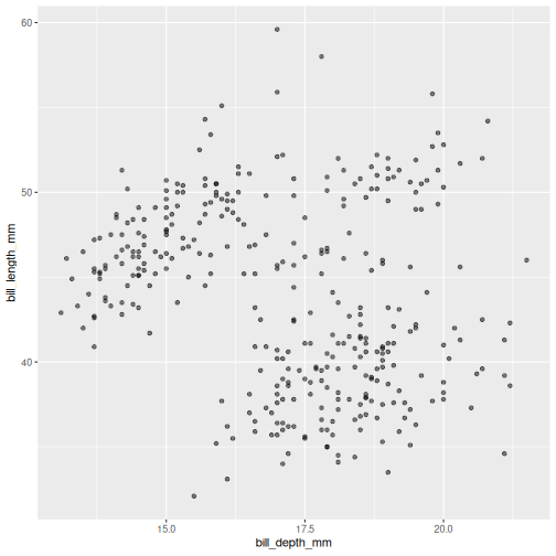 Controlling the transparency can be a great way to “mute” the visual
effect of certain data, while still keeping it visible. Its a great tool
when you have many data points or if you have several geoms together,
like we will see soon.
Controlling the transparency can be a great way to “mute” the visual
effect of certain data, while still keeping it visible. Its a great tool
when you have many data points or if you have several geoms together,
like we will see soon.
Geometrical objects
Next, we will consider different options for geoms.
Using different geom_ functions user can highlight
different aspects of data.
A useful geom function is geom_boxplot(). It adds a
layer with the “box and whiskers” plot illustrating the distribution of
values within categories. The following chart breaks down bill length by
island, where the box represents first and third quartile (the 25th and
75th percentiles), the middle bar signifies the median value and the
whiskers extent to cover 95% confidence interval. Outliers (outside of
the 95% confidence interval range) are shown separately.
R
ggplot(data = penguins) +
  geom_boxplot(
    mapping = aes(x = species,
                  y = bill_length_mm)
  )
Warning: Removed 2 rows containing non-finite outside the scale range
(`stat_boxplot()`).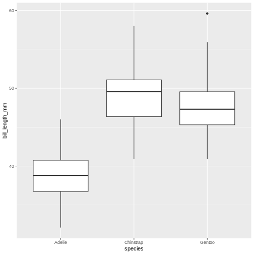
Layers can be added on top of each other. In the following graph we will place the boxplots over jittered points to see the distribution of outliers more clearly. We can map two aesthetic properties to the same variable. Here we will also use different colour for each island.
R
ggplot(data = penguins) +
  geom_jitter(
    mapping = aes(x = species,
                  y = bill_length_mm,
                  colour = species)
  ) +
  geom_boxplot(
    mapping = aes(x = species,
                  y = bill_length_mm)
  )
Warning: Removed 2 rows containing non-finite outside the scale range
(`stat_boxplot()`).
Warning: Removed 2 rows containing missing values or values outside the scale range
(`geom_point()`).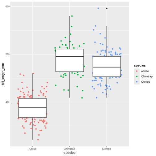
Now, this was slightly inefficient due to duplication of code - we
had to specify the same mappings for two layers. To avoid it, you can
move common arguments of geom_ functions to the main
ggplot() function. In this case every layer will “inherit”
the same arguments, specified in the “parent” function.
R
ggplot(data = penguins,
       mapping = aes(x = island,
                     y = bill_length_mm)
) +
  geom_jitter(aes(colour = island)) +
  geom_boxplot(alpha = .6)
Warning: Removed 2 rows containing non-finite outside the scale range
(`stat_boxplot()`).
Warning: Removed 2 rows containing missing values or values outside the scale range
(`geom_point()`).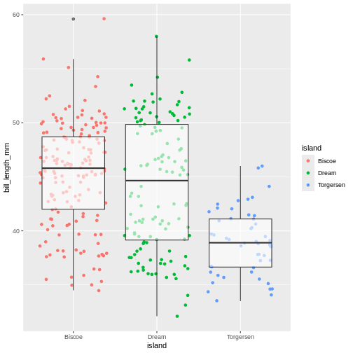
You can still add layer-specific mappings or other arguments by specifying them within individual geoms. Here, we’ve set the transparency of the boxplot to .6, so we can see the points behind it, and also mapped colour to island in the points. We would recommend building each layer separately and then moving common arguments up to the “parent” function.
We can use linear models to highlight differences in dependency
between bill length and body mass by island. Notice that we added a
separate argument to the geom_smooth() function to specify
the type of model we want ggplot2 to built using the data
(linear model). The geom_smooth() function has also
helpfully provided confidence intervals, indicating “goodness of fit”
for each model (shaded gray area). For more information on statistical
models, please refer to help (by typing ?geom_smooth)
R
ggplot(data = penguins,
       mapping = aes(x = bill_depth_mm,
                     y = bill_length_mm)
) +
  geom_point(alpha = 0.5) +
  geom_smooth(method = "lm")
`geom_smooth()` using formula = 'y ~ x'
Warning: Removed 2 rows containing non-finite outside the scale range
(`stat_smooth()`).
Warning: Removed 2 rows containing missing values or values outside the scale range
(`geom_point()`).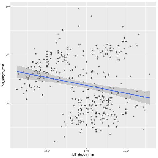
Challenge 5
Modify the plot so the the points are coloured by island, but there is a single regression line.
R
ggplot(data = penguins,
mapping = aes(x = bill_depth_mm,
y = bill_length_mm)) +
geom_point(mapping = aes(colour = species),
alpha = 0.5) +
geom_smooth(method = "lm")
`geom_smooth()` using formula = 'y ~ x'
Warning: Removed 2 rows containing non-finite outside the scale range
(`stat_smooth()`).
Warning: Removed 2 rows containing missing values or values outside the scale range
(`geom_point()`).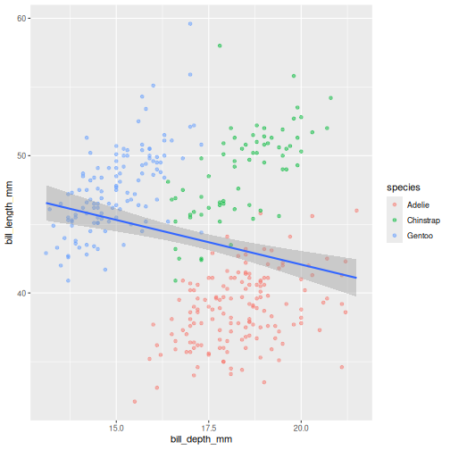 In the graph above, each geom inherited all three mappings: x, y and
colour. If we want only single linear model to be built, we would need
to limit the effect of
In the graph above, each geom inherited all three mappings: x, y and
colour. If we want only single linear model to be built, we would need
to limit the effect of colour aesthetic to only
geom_point() function, by moving it from the “parent”
function to the layer where we want it to apply. Note, though, that
because we want the colour to be still mapped to the
island variable, it needs to be wrapped into
aes() function and supplied to mapping
argument.
Challenge 6
Add a regression line to the plot that plots one line for each species, while also plotting one across all species.
Add another geom!
R
ggplot(penguins,
aes(x = bill_depth_mm,
y = bill_length_mm)) +
geom_point(aes(colour = species),
alpha = 0.5) +
geom_smooth(method = "lm",
aes(colour = species)) +
geom_smooth(method = "lm",
colour = "black")
`geom_smooth()` using formula = 'y ~ x'
Warning: Removed 2 rows containing non-finite outside the scale range
(`stat_smooth()`).
`geom_smooth()` using formula = 'y ~ x'
Warning: Removed 2 rows containing non-finite outside the scale range
(`stat_smooth()`).
Warning: Removed 2 rows containing missing values or values outside the scale range
(`geom_point()`).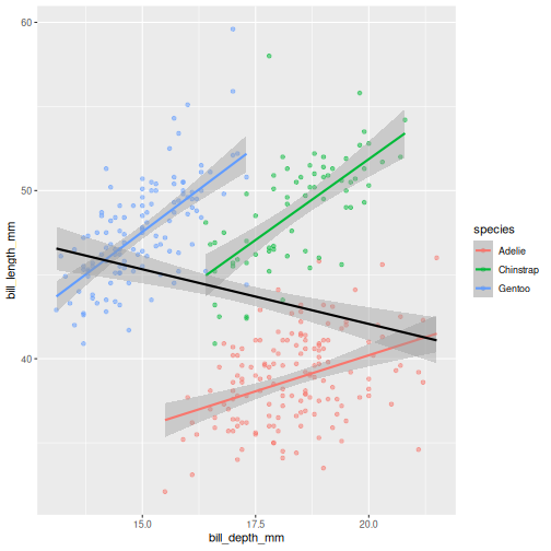 Look at that! The data actually reveals something called the “simpsons
paradox”. It’s when a relationship looks to go in a specific direction,
but when looking into groups within the data the relationship is the
opposite. Here, the overall relationship between bill length and depths
looks negative, but when we take into account that there are different
species, the relationship is actually positive.
Look at that! The data actually reveals something called the “simpsons
paradox”. It’s when a relationship looks to go in a specific direction,
but when looking into groups within the data the relationship is the
opposite. Here, the overall relationship between bill length and depths
looks negative, but when we take into account that there are different
species, the relationship is actually positive.
Sub-plots (plot panels)
The last thing we will cover for plots is creating sub-plots. Often, we’d like to create the same set of plots, but as distinctly different subplots. This way, we dont need to map soo many aesthetics (it can end up being really messy).
Lets say, the last plot we made, we want to understand if there are
also differences between male and female penguins. In ggplot2, this is
called a “facet”, and the function we use is called either
facet_wrap or facet_grid.
R
ggplot(penguins,
      aes(x = bill_depth_mm,
          y = bill_length_mm,
          colour = species)) +
  geom_point(alpha = 0.5) +
  geom_smooth(method = "lm") +
  facet_wrap(~ sex)
`geom_smooth()` using formula = 'y ~ x'
Warning: Removed 2 rows containing non-finite outside the scale range
(`stat_smooth()`).
Warning: Removed 2 rows containing missing values or values outside the scale range
(`geom_point()`).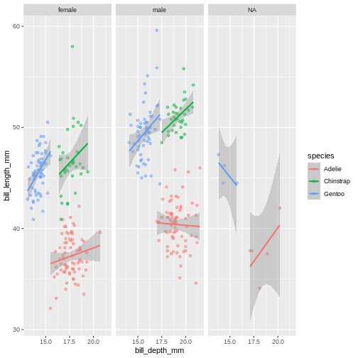
The facet’s take formula arguments, meaning they contain the
tilde (~). The way often we think about it, trying to
“read” the code, is that we facet “over” sex (in this case).
This plot looks a little crazy though, as we have penguins with missing sex information getting their own panel, and really, it makes more sense to compare the sexes within each species rather than the other way around. Let us swap the places of species and sex.
R
ggplot(penguins,
      aes(x = bill_depth_mm,
          y = bill_length_mm,
          colour = sex)) +
  geom_point(alpha = 0.5) +
  geom_smooth(method = "lm") +
  facet_wrap(~ species)
`geom_smooth()` using formula = 'y ~ x'
Warning: Removed 2 rows containing non-finite outside the scale range
(`stat_smooth()`).
Warning: Removed 2 rows containing missing values or values outside the scale range
(`geom_point()`).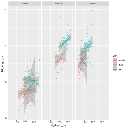
The NA’s still look weird, but its definitely better, I think.
Challenge 7
To the plot we just made before, try adding another variable to facet by. For instance, facet by species and island.
Add another facet variable with the +
R
ggplot(penguins,
      aes(x = bill_depth_mm,
          y = bill_length_mm,
          colour = sex)) +
  geom_point(alpha = 0.5) +
  geom_smooth(method = "lm") +
  facet_wrap(~ species + island)
`geom_smooth()` using formula = 'y ~ x'
Warning: Removed 2 rows containing non-finite outside the scale range
(`stat_smooth()`).
Warning: Removed 2 rows containing missing values or values outside the scale range
(`geom_point()`).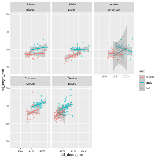
Content from Subsetting data with dplyr
Last updated on 2026-05-26 | Edit this page
Estimated time: 72 minutes
Overview
Questions
- How can I subset the number of columns in my data set?
- How can I reduce the number of rows in my data set?
Objectives
- Use
select()to reduce columns - Use tidyselectors like
starts_with()withinselect()to reduce columns - Use
filter()to reduce rows - Understand common logical operations using
filter()
- Subsetting rows and columns
- Using tidyselectors
- Understanding logical operations
Motivation
In many cases, we are working with data sets that contain more data than we need, or we want to inspect certain parts of the data set before we continue. Subsetting data sets can be challenging in base R, because there is a fair bit of repetition. This can make code difficult to readn and understand.
The {dplyr} package
The {dplyr} package provides a number of very useful functions for manipulating data sets in a way that will reduce the probability of making errors, and even save you some typing time. As an added bonus, you might even find the {dplyr} grammar easier to read.
We’re going to cover 6 of the most commonly used functions as well as
using pipes (|>) to combine them.
-
select()(covered in this session) -
filter()(covered in this session) -
arrange()(covered in this session) -
mutate()(covered in next session) -
group_by()(covered in Day 2 session) -
summarize()(covered in Day 2 session)
Selecting columns
Let us first talk about selecting columns. In {dplyr}, the function
name for selecting columns is select()! Most {tidyverse}
function names for functions are inspired by English grammar, which will
help us when we are writing our code.
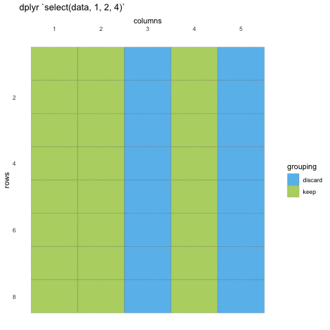
We first need to make sure we have the tidyverse loaded and the penguins data set at hand.
R
library(tidyverse)
penguins <- read_csv("data/penguins.csv")
To select data, we must first tell select which data set we are
selecting from, and then give it our selection. Here, we are asking R to
select() from the penguins data set the
island, species and sex
columns
R
select(penguins, island, species, sex)
OUTPUT
# A tibble: 344 × 3
   island    species sex
   <fct>     <fct>   <fct>
 1 Torgersen Adelie  male
 2 Torgersen Adelie  female
 3 Torgersen Adelie  female
 4 Torgersen Adelie  <NA>
 5 Torgersen Adelie  female
 6 Torgersen Adelie  male
 7 Torgersen Adelie  female
 8 Torgersen Adelie  male
 9 Torgersen Adelie  <NA>
10 Torgersen Adelie  <NA>
# ℹ 334 more rows
When we use select() we don’t need to use quotations, we
write in the names directly. We can also use the numeric indexes for the
column, if we are 100% certain of the order of the columns:
R
select(penguins, 1:3, 6)
OUTPUT
# A tibble: 344 × 4
   species island    bill_length_mm body_mass_g
   <fct>   <fct>              <dbl>       <int>
 1 Adelie  Torgersen           39.1        3750
 2 Adelie  Torgersen           39.5        3800
 3 Adelie  Torgersen           40.3        3250
 4 Adelie  Torgersen           NA            NA
 5 Adelie  Torgersen           36.7        3450
 6 Adelie  Torgersen           39.3        3650
 7 Adelie  Torgersen           38.9        3625
 8 Adelie  Torgersen           39.2        4675
 9 Adelie  Torgersen           34.1        3475
10 Adelie  Torgersen           42          4250
# ℹ 334 more rows
In some cases, we want to remove columns, and not necessarily state
all columns we want to keep. Select also allows for this by adding a
minus (-) sign in front of the column name you don’t
want.
R
select(penguins, -bill_length_mm, -bill_depth_mm)
OUTPUT
# A tibble: 344 × 6
   species island    flipper_length_mm body_mass_g sex     year
   <fct>   <fct>                 <int>       <int> <fct>  <int>
 1 Adelie  Torgersen               181        3750 male    2007
 2 Adelie  Torgersen               186        3800 female  2007
 3 Adelie  Torgersen               195        3250 female  2007
 4 Adelie  Torgersen                NA          NA <NA>    2007
 5 Adelie  Torgersen               193        3450 female  2007
 6 Adelie  Torgersen               190        3650 male    2007
 7 Adelie  Torgersen               181        3625 female  2007
 8 Adelie  Torgersen               195        4675 male    2007
 9 Adelie  Torgersen               193        3475 <NA>    2007
10 Adelie  Torgersen               190        4250 <NA>    2007
# ℹ 334 more rows
Challenge 1
Select the columns sex, year, and species from the penguins dataset.
R
select(penguins, sex, year, species)
OUTPUT
# A tibble: 344 × 3
   sex     year species
   <fct>  <int> <fct>
 1 male    2007 Adelie
 2 female  2007 Adelie
 3 female  2007 Adelie
 4 <NA>    2007 Adelie
 5 female  2007 Adelie
 6 male    2007 Adelie
 7 female  2007 Adelie
 8 male    2007 Adelie
 9 <NA>    2007 Adelie
10 <NA>    2007 Adelie
# ℹ 334 more rows
Challenge 2
Change your selection so that species comes before sex. What is the difference in the output?
R
select(penguins, species, sex, year)
OUTPUT
# A tibble: 344 × 3
   species sex     year
   <fct>   <fct>  <int>
 1 Adelie  male    2007
 2 Adelie  female  2007
 3 Adelie  female  2007
 4 Adelie  <NA>    2007
 5 Adelie  female  2007
 6 Adelie  male    2007
 7 Adelie  female  2007
 8 Adelie  male    2007
 9 Adelie  <NA>    2007
10 Adelie  <NA>    2007
# ℹ 334 more rows
select does not only subset columns, but it can also re-arrange them. The columns appear in the order your selection is specified.
Tidy selections
These selections are quite convenient and fast! But they can be even better.
For instance, what if we want to choose all the columns with millimeter measurements? That could be quite convenient, making sure the variables we are working with have the same measurement scale.
We could of course type them all out, but the penguins data set has names that make it even easier for us, using something called tidy-selectors.
Here, we use a tidy-selector ends_with(), can you guess
what it does? yes, it looks for columns that end with the string you
provide it, here "mm".
R
select(penguins, ends_with("mm"))
OUTPUT
# A tibble: 344 × 3
   bill_length_mm bill_depth_mm flipper_length_mm
            <dbl>         <dbl>             <int>
 1           39.1          18.7               181
 2           39.5          17.4               186
 3           40.3          18                 195
 4           NA            NA                  NA
 5           36.7          19.3               193
 6           39.3          20.6               190
 7           38.9          17.8               181
 8           39.2          19.6               195
 9           34.1          18.1               193
10           42            20.2               190
# ℹ 334 more rows
So convenient! There are several other tidy-selectors you can choose, which you can find here, but often people resort to three specific ones:
-
ends_with()- column names ending with a character string
-
starts_with()- column names starting with a character string
-
contains()- column names containing a character string
If you are working with a well named data set, these functions should make your data selecting much simpler. And if you are making your own data, you can think of such convenient naming for your data, so your work can be easier for you and others.
Lets only pick the measurements of the bill, we are not so interested
in the flipper. Then we might want to change to
starts_with() in stead.
R
select(penguins, starts_with("bill"))
OUTPUT
# A tibble: 344 × 2
   bill_length_mm bill_depth_mm
            <dbl>         <dbl>
 1           39.1          18.7
 2           39.5          17.4
 3           40.3          18
 4           NA            NA
 5           36.7          19.3
 6           39.3          20.6
 7           38.9          17.8
 8           39.2          19.6
 9           34.1          18.1
10           42            20.2
# ℹ 334 more rows
The tidy selector can be combined with each other and other selectors. So you can build exactly the data you want!
R
select(penguins, island, species, year, starts_with("bill"))
OUTPUT
# A tibble: 344 × 5
   island    species  year bill_length_mm bill_depth_mm
   <fct>     <fct>   <int>          <dbl>         <dbl>
 1 Torgersen Adelie   2007           39.1          18.7
 2 Torgersen Adelie   2007           39.5          17.4
 3 Torgersen Adelie   2007           40.3          18
 4 Torgersen Adelie   2007           NA            NA
 5 Torgersen Adelie   2007           36.7          19.3
 6 Torgersen Adelie   2007           39.3          20.6
 7 Torgersen Adelie   2007           38.9          17.8
 8 Torgersen Adelie   2007           39.2          19.6
 9 Torgersen Adelie   2007           34.1          18.1
10 Torgersen Adelie   2007           42            20.2
# ℹ 334 more rows
Challenge 3
Select all columns containing an underscore (“_“).
R
select(penguins, contains("_"))
OUTPUT
# A tibble: 344 × 4
   bill_length_mm bill_depth_mm flipper_length_mm body_mass_g
            <dbl>         <dbl>             <int>       <int>
 1           39.1          18.7               181        3750
 2           39.5          17.4               186        3800
 3           40.3          18                 195        3250
 4           NA            NA                  NA          NA
 5           36.7          19.3               193        3450
 6           39.3          20.6               190        3650
 7           38.9          17.8               181        3625
 8           39.2          19.6               195        4675
 9           34.1          18.1               193        3475
10           42            20.2               190        4250
# ℹ 334 more rows
Challenge 4
Select the species and sex columns, in addition to all columns ending with “mm”
R
select(penguins, species, sex, ends_with("mm"))
OUTPUT
# A tibble: 344 × 5
   species sex    bill_length_mm bill_depth_mm flipper_length_mm
   <fct>   <fct>           <dbl>         <dbl>             <int>
 1 Adelie  male             39.1          18.7               181
 2 Adelie  female           39.5          17.4               186
 3 Adelie  female           40.3          18                 195
 4 Adelie  <NA>             NA            NA                  NA
 5 Adelie  female           36.7          19.3               193
 6 Adelie  male             39.3          20.6               190
 7 Adelie  female           38.9          17.8               181
 8 Adelie  male             39.2          19.6               195
 9 Adelie  <NA>             34.1          18.1               193
10 Adelie  <NA>             42            20.2               190
# ℹ 334 more rows
Challenge 5
De-select all the columns with bill measurements
R
select(penguins, -starts_with("bill"))
OUTPUT
# A tibble: 344 × 6
   species island    flipper_length_mm body_mass_g sex     year
   <fct>   <fct>                 <int>       <int> <fct>  <int>
 1 Adelie  Torgersen               181        3750 male    2007
 2 Adelie  Torgersen               186        3800 female  2007
 3 Adelie  Torgersen               195        3250 female  2007
 4 Adelie  Torgersen                NA          NA <NA>    2007
 5 Adelie  Torgersen               193        3450 female  2007
 6 Adelie  Torgersen               190        3650 male    2007
 7 Adelie  Torgersen               181        3625 female  2007
 8 Adelie  Torgersen               195        4675 male    2007
 9 Adelie  Torgersen               193        3475 <NA>    2007
10 Adelie  Torgersen               190        4250 <NA>    2007
# ℹ 334 more rows
Tidy selections with where
The last tidy-selector we’ll mention is where().
where() is a very special tidy selector, that uses logical
evaluations to select the data. Let’s have a look at it in action, and
see if we can explain it better that way.
Say you are running a correlation analysis. For correlations, you
need all the columns in your data to be numeric, as you cannot correlate
strings or categories. Going through each individual column and seeing
if it is numeric is a bit of a chore. That is where where()
comes in!
R
select(penguins, where(is.numeric))
OUTPUT
# A tibble: 344 × 5
   bill_length_mm bill_depth_mm flipper_length_mm body_mass_g  year
            <dbl>         <dbl>             <int>       <int> <int>
 1           39.1          18.7               181        3750  2007
 2           39.5          17.4               186        3800  2007
 3           40.3          18                 195        3250  2007
 4           NA            NA                  NA          NA  2007
 5           36.7          19.3               193        3450  2007
 6           39.3          20.6               190        3650  2007
 7           38.9          17.8               181        3625  2007
 8           39.2          19.6               195        4675  2007
 9           34.1          18.1               193        3475  2007
10           42            20.2               190        4250  2007
# ℹ 334 more rows
Magic! Let’s break that down. is.numeric() is a function
in R that checks if a vector is numeric. If the vector is numeric, it
returns TRUE if not it returns FALSE.
R
is.numeric(5)
OUTPUT
[1] TRUER
is.numeric("something")
OUTPUT
[1] FALSELet us look at the penguins data set again
R
penguins
OUTPUT
# A tibble: 344 × 8
   species island    bill_length_mm bill_depth_mm flipper_length_mm body_mass_g
   <fct>   <fct>              <dbl>         <dbl>             <int>       <int>
 1 Adelie  Torgersen           39.1          18.7               181        3750
 2 Adelie  Torgersen           39.5          17.4               186        3800
 3 Adelie  Torgersen           40.3          18                 195        3250
 4 Adelie  Torgersen           NA            NA                  NA          NA
 5 Adelie  Torgersen           36.7          19.3               193        3450
 6 Adelie  Torgersen           39.3          20.6               190        3650
 7 Adelie  Torgersen           38.9          17.8               181        3625
 8 Adelie  Torgersen           39.2          19.6               195        4675
 9 Adelie  Torgersen           34.1          18.1               193        3475
10 Adelie  Torgersen           42            20.2               190        4250
# ℹ 334 more rows
# ℹ 2 more variables: sex <fct>, year <int>
The penguins data is stored as a tibble, which is a
special kind of data set in R that gives a nice print out of the data.
Notice, right below the column name, there is some information in
<> marks. This tells us the class of the columns.
Species and island are factors, while bill columns are “double” which is
a decimal numeric class.
where() goes through all the columns and checks if they
are numeric, and returns the ones that are.
R
select(penguins, where(is.numeric))
OUTPUT
# A tibble: 344 × 5
   bill_length_mm bill_depth_mm flipper_length_mm body_mass_g  year
            <dbl>         <dbl>             <int>       <int> <int>
 1           39.1          18.7               181        3750  2007
 2           39.5          17.4               186        3800  2007
 3           40.3          18                 195        3250  2007
 4           NA            NA                  NA          NA  2007
 5           36.7          19.3               193        3450  2007
 6           39.3          20.6               190        3650  2007
 7           38.9          17.8               181        3625  2007
 8           39.2          19.6               195        4675  2007
 9           34.1          18.1               193        3475  2007
10           42            20.2               190        4250  2007
# ℹ 334 more rows
Challenge 6
Select only the columns that are factors from the
penguins data set.
R
select(penguins, where(is.factor))
OUTPUT
# A tibble: 344 × 3
   species island    sex
   <fct>   <fct>     <fct>
 1 Adelie  Torgersen male
 2 Adelie  Torgersen female
 3 Adelie  Torgersen female
 4 Adelie  Torgersen <NA>
 5 Adelie  Torgersen female
 6 Adelie  Torgersen male
 7 Adelie  Torgersen female
 8 Adelie  Torgersen male
 9 Adelie  Torgersen <NA>
10 Adelie  Torgersen <NA>
# ℹ 334 more rows
Challenge 7
Select the columns island, species, as well
as all numeric columns from the penguins data set.
R
select(penguins, island, species, where(is.numeric))
OUTPUT
# A tibble: 344 × 7
   island    species bill_length_mm bill_depth_mm flipper_length_mm body_mass_g
   <fct>     <fct>            <dbl>         <dbl>             <int>       <int>
 1 Torgersen Adelie            39.1          18.7               181        3750
 2 Torgersen Adelie            39.5          17.4               186        3800
 3 Torgersen Adelie            40.3          18                 195        3250
 4 Torgersen Adelie            NA            NA                  NA          NA
 5 Torgersen Adelie            36.7          19.3               193        3450
 6 Torgersen Adelie            39.3          20.6               190        3650
 7 Torgersen Adelie            38.9          17.8               181        3625
 8 Torgersen Adelie            39.2          19.6               195        4675
 9 Torgersen Adelie            34.1          18.1               193        3475
10 Torgersen Adelie            42            20.2               190        4250
# ℹ 334 more rows
# ℹ 1 more variable: year <int>
Filtering rows
Now that we know how to select the columns we want, we should take a
look at how we filter the rows. Row filtering is done with the function
filter(), which takes statements that can be evaluated to
TRUE or FALSE.
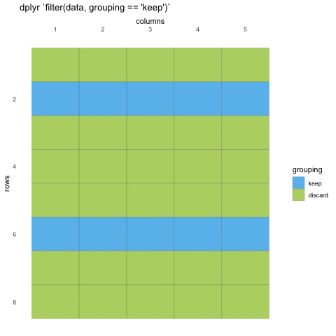
What do we mean with statements that can be evaluated to
TRUE or FALSE? In the example with
where() we used the is.numeric function to
evaluate if the columns where numeric or not. We will be doing the same
for rows!
Now, using is.numeric on a row won’t help, because every
row-value in a column will be of the same type, that is how the data set
works. All values in a column must be of the same type.
So what can we do? Well, we can check if the values meet certain criteria or not. Like values being above 20, or factors being a specific factor.
R
filter(penguins, body_mass_g < 3000)
OUTPUT
# A tibble: 9 × 8
  species   island    bill_length_mm bill_depth_mm flipper_length_mm body_mass_g
  <fct>     <fct>              <dbl>         <dbl>             <int>       <int>
1 Adelie    Dream               37.5          18.9               179        2975
2 Adelie    Biscoe              34.5          18.1               187        2900
3 Adelie    Biscoe              36.5          16.6               181        2850
4 Adelie    Biscoe              36.4          17.1               184        2850
5 Adelie    Dream               33.1          16.1               178        2900
6 Adelie    Biscoe              37.9          18.6               193        2925
7 Adelie    Torgersen           38.6          17                 188        2900
8 Chinstrap Dream               43.2          16.6               187        2900
9 Chinstrap Dream               46.9          16.6               192        2700
# ℹ 2 more variables: sex <fct>, year <int>
Here, we’ve filtered so that we only have observations where the body
mass was less than 3 kilos. We can also filter for specific values, but
beware! you must use double equals (==) for comparisons, as
single equals (=) are for argument names in functions.
R
filter(penguins, body_mass_g == 2900)
OUTPUT
# A tibble: 4 × 8
  species   island    bill_length_mm bill_depth_mm flipper_length_mm body_mass_g
  <fct>     <fct>              <dbl>         <dbl>             <int>       <int>
1 Adelie    Biscoe              34.5          18.1               187        2900
2 Adelie    Dream               33.1          16.1               178        2900
3 Adelie    Torgersen           38.6          17                 188        2900
4 Chinstrap Dream               43.2          16.6               187        2900
# ℹ 2 more variables: sex <fct>, year <int>
What is happening, is that R will check if the values in
body_mass_g are the same as 2900 (TRUE) or not
(FALSE), and will do this for every row in the data set.
Then at the end, it will discard all those that are FALSE,
and keep those that are TRUE.
Challenge 8
Filter the data so you only have observations from the “Dream” island.
R
filter(penguins, island == "Dream")
OUTPUT
# A tibble: 124 × 8
   species island bill_length_mm bill_depth_mm flipper_length_mm body_mass_g
   <fct>   <fct>           <dbl>         <dbl>             <int>       <int>
 1 Adelie  Dream            39.5          16.7               178        3250
 2 Adelie  Dream            37.2          18.1               178        3900
 3 Adelie  Dream            39.5          17.8               188        3300
 4 Adelie  Dream            40.9          18.9               184        3900
 5 Adelie  Dream            36.4          17                 195        3325
 6 Adelie  Dream            39.2          21.1               196        4150
 7 Adelie  Dream            38.8          20                 190        3950
 8 Adelie  Dream            42.2          18.5               180        3550
 9 Adelie  Dream            37.6          19.3               181        3300
10 Adelie  Dream            39.8          19.1               184        4650
# ℹ 114 more rows
# ℹ 2 more variables: sex <fct>, year <int>
Challenge 9
Filter the data so you only have observations after 2008
R
filter(penguins, year >= 2008)
OUTPUT
# A tibble: 234 × 8
   species island bill_length_mm bill_depth_mm flipper_length_mm body_mass_g
   <fct>   <fct>           <dbl>         <dbl>             <int>       <int>
 1 Adelie  Biscoe           39.6          17.7               186        3500
 2 Adelie  Biscoe           40.1          18.9               188        4300
 3 Adelie  Biscoe           35            17.9               190        3450
 4 Adelie  Biscoe           42            19.5               200        4050
 5 Adelie  Biscoe           34.5          18.1               187        2900
 6 Adelie  Biscoe           41.4          18.6               191        3700
 7 Adelie  Biscoe           39            17.5               186        3550
 8 Adelie  Biscoe           40.6          18.8               193        3800
 9 Adelie  Biscoe           36.5          16.6               181        2850
10 Adelie  Biscoe           37.6          19.1               194        3750
# ℹ 224 more rows
# ℹ 2 more variables: sex <fct>, year <int>
Multiple filters
Many times, we will want to have several filters applied at once.
What if you only want Adelie penguins that are below 3 kilos?
filter() can take as many statements as you want! Combine
them by adding commas (,) between each statement, and that will work as
‘and’.
R
filter(penguins,
       species == "Chinstrap",
       body_mass_g < 3000)
OUTPUT
# A tibble: 2 × 8
  species   island bill_length_mm bill_depth_mm flipper_length_mm body_mass_g
  <fct>     <fct>           <dbl>         <dbl>             <int>       <int>
1 Chinstrap Dream            43.2          16.6               187        2900
2 Chinstrap Dream            46.9          16.6               192        2700
# ℹ 2 more variables: sex <fct>, year <int>
You can also use the & sign, which in R is the
comparison character for ‘and’, like == is for
‘equals’.
R
filter(penguins,
       species == "Chinstrap" &
         body_mass_g < 3000)
OUTPUT
# A tibble: 2 × 8
  species   island bill_length_mm bill_depth_mm flipper_length_mm body_mass_g
  <fct>     <fct>           <dbl>         <dbl>             <int>       <int>
1 Chinstrap Dream            43.2          16.6               187        2900
2 Chinstrap Dream            46.9          16.6               192        2700
# ℹ 2 more variables: sex <fct>, year <int>
Here we are filtering the penguins data set keeping only the species “Chinstrap” and those below 3.5 kilos. And we can keep going!
R
filter(penguins,
       species == "Chinstrap",
       body_mass_g < 3000,
       sex == "male")
OUTPUT
# A tibble: 0 × 8
# ℹ 8 variables: species <fct>, island <fct>, bill_length_mm <dbl>,
#   bill_depth_mm <dbl>, flipper_length_mm <int>, body_mass_g <int>, sex <fct>,
#   year <int>
Challenge 10
Filter the data so you only have observations after 2008, and from “Biscoe” island
R
filter(penguins,
       year >= 2008,
       island == "Biscoe")
OUTPUT
# A tibble: 124 × 8
   species island bill_length_mm bill_depth_mm flipper_length_mm body_mass_g
   <fct>   <fct>           <dbl>         <dbl>             <int>       <int>
 1 Adelie  Biscoe           39.6          17.7               186        3500
 2 Adelie  Biscoe           40.1          18.9               188        4300
 3 Adelie  Biscoe           35            17.9               190        3450
 4 Adelie  Biscoe           42            19.5               200        4050
 5 Adelie  Biscoe           34.5          18.1               187        2900
 6 Adelie  Biscoe           41.4          18.6               191        3700
 7 Adelie  Biscoe           39            17.5               186        3550
 8 Adelie  Biscoe           40.6          18.8               193        3800
 9 Adelie  Biscoe           36.5          16.6               181        2850
10 Adelie  Biscoe           37.6          19.1               194        3750
# ℹ 114 more rows
# ℹ 2 more variables: sex <fct>, year <int>
Challenge 11
Filter the data so you only have observations of male penguins of the Chinstrap species
R
filter(penguins,
       sex == "male",
       species == "Chinstrap")
OUTPUT
# A tibble: 34 × 8
   species   island bill_length_mm bill_depth_mm flipper_length_mm body_mass_g
   <fct>     <fct>           <dbl>         <dbl>             <int>       <int>
 1 Chinstrap Dream            50            19.5               196        3900
 2 Chinstrap Dream            51.3          19.2               193        3650
 3 Chinstrap Dream            52.7          19.8               197        3725
 4 Chinstrap Dream            51.3          18.2               197        3750
 5 Chinstrap Dream            51.3          19.9               198        3700
 6 Chinstrap Dream            51.7          20.3               194        3775
 7 Chinstrap Dream            52            18.1               201        4050
 8 Chinstrap Dream            50.5          19.6               201        4050
 9 Chinstrap Dream            50.3          20                 197        3300
10 Chinstrap Dream            49.2          18.2               195        4400
# ℹ 24 more rows
# ℹ 2 more variables: sex <fct>, year <int>
The difference between & (and) and
|(or)
But what if we want all the Chinstrap penguins or if
body mass is below 3 kilos? When we use the comma (or the &), we
make sure that all statements are TRUE. But what if we want
it so that either statement is true? Then we can use the
or character | .
R
filter(penguins,
       species == "Chinstrap" |
         body_mass_g < 3000)
OUTPUT
# A tibble: 75 × 8
   species   island   bill_length_mm bill_depth_mm flipper_length_mm body_mass_g
   <fct>     <fct>             <dbl>         <dbl>             <int>       <int>
 1 Adelie    Dream              37.5          18.9               179        2975
 2 Adelie    Biscoe             34.5          18.1               187        2900
 3 Adelie    Biscoe             36.5          16.6               181        2850
 4 Adelie    Biscoe             36.4          17.1               184        2850
 5 Adelie    Dream              33.1          16.1               178        2900
 6 Adelie    Biscoe             37.9          18.6               193        2925
 7 Adelie    Torgers…           38.6          17                 188        2900
 8 Chinstrap Dream              46.5          17.9               192        3500
 9 Chinstrap Dream              50            19.5               196        3900
10 Chinstrap Dream              51.3          19.2               193        3650
# ℹ 65 more rows
# ℹ 2 more variables: sex <fct>, year <int>
This now gives us both all chinstrap penguins, and the smallest Adelie penguins! By combining AND and OR statements this way, we can slowly create the filtering we are after.
Challenge 12
Filter the data so you only have observations of either male penguins or the Chinstrap species
R
filter(penguins,
       sex == "male" |
       species == "Chinstrap")
OUTPUT
# A tibble: 202 × 8
   species island    bill_length_mm bill_depth_mm flipper_length_mm body_mass_g
   <fct>   <fct>              <dbl>         <dbl>             <int>       <int>
 1 Adelie  Torgersen           39.1          18.7               181        3750
 2 Adelie  Torgersen           39.3          20.6               190        3650
 3 Adelie  Torgersen           39.2          19.6               195        4675
 4 Adelie  Torgersen           38.6          21.2               191        3800
 5 Adelie  Torgersen           34.6          21.1               198        4400
 6 Adelie  Torgersen           42.5          20.7               197        4500
 7 Adelie  Torgersen           46            21.5               194        4200
 8 Adelie  Biscoe              37.7          18.7               180        3600
 9 Adelie  Biscoe              38.2          18.1               185        3950
10 Adelie  Biscoe              38.8          17.2               180        3800
# ℹ 192 more rows
# ℹ 2 more variables: sex <fct>, year <int>Content from Data sorting and pipes dplyr
Last updated on 2026-05-26 | Edit this page
Estimated time: 67 minutes
Overview
Questions
- How can I sort the rows in my data?
- How can I avoid storing intermediate data objects?
Objectives
- Use
arrange()to sort rows - Use the pipe
|>to chain commands together
Motivation
Getting an overview of our data can be challenging. Breaking it up in smaller pieces can help us get a better understanding of its content. Being able to subset data is one part of that, another is to be able to re-arrange rows to get a clearer idea of their content.
Creating subsetted objects
So far, we have kept working on the penguins data set, without actually altering it. So far, all our actions have been executed, then forgotten by R. Like it never happened. This is actually quite smart, since it makes it harder to do mistakes you can have difficulties changing.
To store the changes, we have to “assign” the data to a new object in the R environment. Like the penguins data set, which already is an object in our environment we have called “penguins”.
We will now store a filtered version including only the chinstrap
penguins, in an object we call chinstraps.
R
chinstraps <- filter(penguins, species == "Chinstrap")
You will likely notice that when we execute this command, nothing is output to the console. That is expected. When we assign the output of a function somewhere, and everything works (i.e., no errors or warnings), nothing happens in the console.
But you should be able to see the new chinstraps object in your
environment, and when we type chinstraps in the R console,
it prints our chinstraps data.
R
chinstraps
OUTPUT
# A tibble: 68 × 8
   species   island bill_length_mm bill_depth_mm flipper_length_mm body_mass_g
   <fct>     <fct>           <dbl>         <dbl>             <int>       <int>
 1 Chinstrap Dream            46.5          17.9               192        3500
 2 Chinstrap Dream            50            19.5               196        3900
 3 Chinstrap Dream            51.3          19.2               193        3650
 4 Chinstrap Dream            45.4          18.7               188        3525
 5 Chinstrap Dream            52.7          19.8               197        3725
 6 Chinstrap Dream            45.2          17.8               198        3950
 7 Chinstrap Dream            46.1          18.2               178        3250
 8 Chinstrap Dream            51.3          18.2               197        3750
 9 Chinstrap Dream            46            18.9               195        4150
10 Chinstrap Dream            51.3          19.9               198        3700
# ℹ 58 more rows
# ℹ 2 more variables: sex <fct>, year <int>
Maybe in this chinstrap data we are also not interested in the bill measurements, so we want to remove them.
R
chinstraps <- select(chinstraps, -starts_with("bill"))
chinstraps
OUTPUT
# A tibble: 68 × 6
   species   island flipper_length_mm body_mass_g sex     year
   <fct>     <fct>              <int>       <int> <fct>  <int>
 1 Chinstrap Dream                192        3500 female  2007
 2 Chinstrap Dream                196        3900 male    2007
 3 Chinstrap Dream                193        3650 male    2007
 4 Chinstrap Dream                188        3525 female  2007
 5 Chinstrap Dream                197        3725 male    2007
 6 Chinstrap Dream                198        3950 female  2007
 7 Chinstrap Dream                178        3250 female  2007
 8 Chinstrap Dream                197        3750 male    2007
 9 Chinstrap Dream                195        4150 female  2007
10 Chinstrap Dream                198        3700 male    2007
# ℹ 58 more rows
Now our data has two less columns, and many fewer rows. A simpler data set for us to work with. But assigning the chinstrap data twice like this is a lot of typing, and there is a simpler way, using something we call the “pipe”.
Challenge 1
Create a new data set called “biscoe”, where you only have data from “Biscoe” island, and where you only have the first 4 columns of data.
R
 biscoe <- filter(penguins, island == "Biscoe")
 biscoe <- select(biscoe, 1:4)
The pipe |>
We often want to string together series of functions. This is
achieved using pipe operator |>. This takes the value on
the left, and passes it as the first argument to the function call on
the right.
|> is not limited to {dplyr} functions. It’s an
alternative way of writing any R code.
You can enable the pipe in RStudio by going to Tools -> Global options -> Code -> Use native pipe operator.
The shortcut to insert the pipe operator is
Ctrl+Shift+M for Windows/Linux,
and Cmd+Shift+M for Mac.
In the chinstraps example, we had the following code to
filter the rows and then select our columns.
R
chinstraps <- filter(penguins, species == "Chinstrap")
chinstraps <- select(chinstraps, -starts_with("bill"))
Here we first create the chinstraps data from the filtered penguins data set. Then use that chinstraps data to reduce the columns and write it again back to the same chinstraps object. It’s a little messy. With the pipe, we can make it more streamlined.
When reading this part, read it as follows when typing:
assign to the “chinstraps” object, taking the penguins dataset, and then filtering the species column so we only have Chinstraps, and then selecting away all columns that start with the string “bill”
R
chinstraps <- penguins |>
  filter(species == "Chinstrap") |>
  select(-starts_with("bill"))
The end result is the same, but there is less typing and we can “read” the pipeline of data subsetting more like language, if we know how. You can read the pipe operator as “and then”.
So if we translate the code above to human language we could read it as:
take the penguins data set, and then keep only rows for the chinstrap penguins, and then remove the columns starting with bill and assign the end result to chinstraps.
Learning to read pipes is a great skill, R is not the only programming language that can do this (though the operator is different between languages, the functionality exists in many).
We can do the entire pipe chain step by step to see what is happening.
R
penguins
OUTPUT
# A tibble: 344 × 8
   species island    bill_length_mm bill_depth_mm flipper_length_mm body_mass_g
   <fct>   <fct>              <dbl>         <dbl>             <int>       <int>
 1 Adelie  Torgersen           39.1          18.7               181        3750
 2 Adelie  Torgersen           39.5          17.4               186        3800
 3 Adelie  Torgersen           40.3          18                 195        3250
 4 Adelie  Torgersen           NA            NA                  NA          NA
 5 Adelie  Torgersen           36.7          19.3               193        3450
 6 Adelie  Torgersen           39.3          20.6               190        3650
 7 Adelie  Torgersen           38.9          17.8               181        3625
 8 Adelie  Torgersen           39.2          19.6               195        4675
 9 Adelie  Torgersen           34.1          18.1               193        3475
10 Adelie  Torgersen           42            20.2               190        4250
# ℹ 334 more rows
# ℹ 2 more variables: sex <fct>, year <int>When reading this part, read it as follows when typing:
taking the penguins dataset
R
penguins |>
  filter(species == "Chinstrap")
OUTPUT
# A tibble: 68 × 8
   species   island bill_length_mm bill_depth_mm flipper_length_mm body_mass_g
   <fct>     <fct>           <dbl>         <dbl>             <int>       <int>
 1 Chinstrap Dream            46.5          17.9               192        3500
 2 Chinstrap Dream            50            19.5               196        3900
 3 Chinstrap Dream            51.3          19.2               193        3650
 4 Chinstrap Dream            45.4          18.7               188        3525
 5 Chinstrap Dream            52.7          19.8               197        3725
 6 Chinstrap Dream            45.2          17.8               198        3950
 7 Chinstrap Dream            46.1          18.2               178        3250
 8 Chinstrap Dream            51.3          18.2               197        3750
 9 Chinstrap Dream            46            18.9               195        4150
10 Chinstrap Dream            51.3          19.9               198        3700
# ℹ 58 more rows
# ℹ 2 more variables: sex <fct>, year <int>When reading this part, read it as follows when typing:
taking the penguins dataset, and then filtering the species column so we only have Chinstraps
R
penguins |>
  filter(species == "Chinstrap") |>
  select(-starts_with("bill"))
OUTPUT
# A tibble: 68 × 6
   species   island flipper_length_mm body_mass_g sex     year
   <fct>     <fct>              <int>       <int> <fct>  <int>
 1 Chinstrap Dream                192        3500 female  2007
 2 Chinstrap Dream                196        3900 male    2007
 3 Chinstrap Dream                193        3650 male    2007
 4 Chinstrap Dream                188        3525 female  2007
 5 Chinstrap Dream                197        3725 male    2007
 6 Chinstrap Dream                198        3950 female  2007
 7 Chinstrap Dream                178        3250 female  2007
 8 Chinstrap Dream                197        3750 male    2007
 9 Chinstrap Dream                195        4150 female  2007
10 Chinstrap Dream                198        3700 male    2007
# ℹ 58 more rowsWhen reading this part, read it as follows when typing:
taking the penguins dataset, and then filtering the species column so we only have Chinstraps, and then selecting away all columns that start with the string “bill”
So, for each chain step, the output of the previous step is fed into the next step, and that way the commands build on each other until a final end result is made.
And as before, we still are seeing the output of the command chain in the console, meaning we are not storing it. Let us do that, again using the assignment.
R
chinstraps <- penguins |>
  filter(species == "Chinstrap") |>
  select(-starts_with("bill"))

chinstraps
OUTPUT
# A tibble: 68 × 6
   species   island flipper_length_mm body_mass_g sex     year
   <fct>     <fct>              <int>       <int> <fct>  <int>
 1 Chinstrap Dream                192        3500 female  2007
 2 Chinstrap Dream                196        3900 male    2007
 3 Chinstrap Dream                193        3650 male    2007
 4 Chinstrap Dream                188        3525 female  2007
 5 Chinstrap Dream                197        3725 male    2007
 6 Chinstrap Dream                198        3950 female  2007
 7 Chinstrap Dream                178        3250 female  2007
 8 Chinstrap Dream                197        3750 male    2007
 9 Chinstrap Dream                195        4150 female  2007
10 Chinstrap Dream                198        3700 male    2007
# ℹ 58 more rows
Challenge 2
Create a new data set called “biscoe”, where you only have data from “Biscoe” island, and where you only have the first 4 columns of data. This time use the pipe.
R
penguins |>
  filter(island == "Biscoe") |>
  select(1:4)
OUTPUT
# A tibble: 168 × 4
   species island bill_length_mm bill_depth_mm
   <fct>   <fct>           <dbl>         <dbl>
 1 Adelie  Biscoe           37.8          18.3
 2 Adelie  Biscoe           37.7          18.7
 3 Adelie  Biscoe           35.9          19.2
 4 Adelie  Biscoe           38.2          18.1
 5 Adelie  Biscoe           38.8          17.2
 6 Adelie  Biscoe           35.3          18.9
 7 Adelie  Biscoe           40.6          18.6
 8 Adelie  Biscoe           40.5          17.9
 9 Adelie  Biscoe           37.9          18.6
10 Adelie  Biscoe           40.5          18.9
# ℹ 158 more rows
Sorting rows
So far, we have looked at subsetting the data. But some times, we want to reorganize the data without altering it. In tables, we are used to be able to sort columns in ascending or descending order.
This can also be done with {dplyr}’s arrange() function.
arrange does not alter the data per se, just the order in which
the rows are stored.
When reading this part, read it as follows when typing:
taking the penguins dataset, and then arrainging the rows by the island column
R
penguins |>
  arrange(island)
OUTPUT
# A tibble: 344 × 8
   species island bill_length_mm bill_depth_mm flipper_length_mm body_mass_g
   <fct>   <fct>           <dbl>         <dbl>             <int>       <int>
 1 Adelie  Biscoe           37.8          18.3               174        3400
 2 Adelie  Biscoe           37.7          18.7               180        3600
 3 Adelie  Biscoe           35.9          19.2               189        3800
 4 Adelie  Biscoe           38.2          18.1               185        3950
 5 Adelie  Biscoe           38.8          17.2               180        3800
 6 Adelie  Biscoe           35.3          18.9               187        3800
 7 Adelie  Biscoe           40.6          18.6               183        3550
 8 Adelie  Biscoe           40.5          17.9               187        3200
 9 Adelie  Biscoe           37.9          18.6               172        3150
10 Adelie  Biscoe           40.5          18.9               180        3950
# ℹ 334 more rows
# ℹ 2 more variables: sex <fct>, year <int>
Here we have sorted the data by the island column. Since island is a factor, it will order by the facor levels, which in this case has Biscoe island as the first category. If we sort a numeric column, it will sort by numeric value.
By default, arrange sorts in ascending order. If you want it sorted
by descending order, wrap the column name in desc()
When reading this part, read it as follows when typing:
taking the penguins dataset, and then arrainging the rows by the island column in descending order
R
penguins |>
  arrange(desc(island))
OUTPUT
# A tibble: 344 × 8
   species island    bill_length_mm bill_depth_mm flipper_length_mm body_mass_g
   <fct>   <fct>              <dbl>         <dbl>             <int>       <int>
 1 Adelie  Torgersen           39.1          18.7               181        3750
 2 Adelie  Torgersen           39.5          17.4               186        3800
 3 Adelie  Torgersen           40.3          18                 195        3250
 4 Adelie  Torgersen           NA            NA                  NA          NA
 5 Adelie  Torgersen           36.7          19.3               193        3450
 6 Adelie  Torgersen           39.3          20.6               190        3650
 7 Adelie  Torgersen           38.9          17.8               181        3625
 8 Adelie  Torgersen           39.2          19.6               195        4675
 9 Adelie  Torgersen           34.1          18.1               193        3475
10 Adelie  Torgersen           42            20.2               190        4250
# ℹ 334 more rows
# ℹ 2 more variables: sex <fct>, year <int>
Challenge 3
Arrange the penguins data set by body_mass_g.
R
penguins |>
  arrange(body_mass_g)
OUTPUT
# A tibble: 344 × 8
   species   island   bill_length_mm bill_depth_mm flipper_length_mm body_mass_g
   <fct>     <fct>             <dbl>         <dbl>             <int>       <int>
 1 Chinstrap Dream              46.9          16.6               192        2700
 2 Adelie    Biscoe             36.5          16.6               181        2850
 3 Adelie    Biscoe             36.4          17.1               184        2850
 4 Adelie    Biscoe             34.5          18.1               187        2900
 5 Adelie    Dream              33.1          16.1               178        2900
 6 Adelie    Torgers…           38.6          17                 188        2900
 7 Chinstrap Dream              43.2          16.6               187        2900
 8 Adelie    Biscoe             37.9          18.6               193        2925
 9 Adelie    Dream              37.5          18.9               179        2975
10 Adelie    Dream              37            16.9               185        3000
# ℹ 334 more rows
# ℹ 2 more variables: sex <fct>, year <int>
Challenge 4
Arrange the penguins data set by descending order of
flipper_length_mm.
R
penguins |>
  arrange(desc(flipper_length_mm))
OUTPUT
# A tibble: 344 × 8
   species island bill_length_mm bill_depth_mm flipper_length_mm body_mass_g
   <fct>   <fct>           <dbl>         <dbl>             <int>       <int>
 1 Gentoo  Biscoe           54.3          15.7               231        5650
 2 Gentoo  Biscoe           50            16.3               230        5700
 3 Gentoo  Biscoe           59.6          17                 230        6050
 4 Gentoo  Biscoe           49.8          16.8               230        5700
 5 Gentoo  Biscoe           48.6          16                 230        5800
 6 Gentoo  Biscoe           52.1          17                 230        5550
 7 Gentoo  Biscoe           51.5          16.3               230        5500
 8 Gentoo  Biscoe           55.1          16                 230        5850
 9 Gentoo  Biscoe           49.5          16.2               229        5800
10 Gentoo  Biscoe           49.8          15.9               229        5950
# ℹ 334 more rows
# ℹ 2 more variables: sex <fct>, year <int>
Challenge 5
You can arrange on multiple columns! Try arranging the penguins data
set by ascending island and descending
flipper_length_mm, using a comma between the two
arguments.
R
penguins |>
  arrange(island, desc(flipper_length_mm))
OUTPUT
# A tibble: 344 × 8
   species island bill_length_mm bill_depth_mm flipper_length_mm body_mass_g
   <fct>   <fct>           <dbl>         <dbl>             <int>       <int>
 1 Gentoo  Biscoe           54.3          15.7               231        5650
 2 Gentoo  Biscoe           50            16.3               230        5700
 3 Gentoo  Biscoe           59.6          17                 230        6050
 4 Gentoo  Biscoe           49.8          16.8               230        5700
 5 Gentoo  Biscoe           48.6          16                 230        5800
 6 Gentoo  Biscoe           52.1          17                 230        5550
 7 Gentoo  Biscoe           51.5          16.3               230        5500
 8 Gentoo  Biscoe           55.1          16                 230        5850
 9 Gentoo  Biscoe           49.5          16.2               229        5800
10 Gentoo  Biscoe           49.8          15.9               229        5950
# ℹ 334 more rows
# ℹ 2 more variables: sex <fct>, year <int>
Putting it all together
Now that you have learned about ggplot, filter, select and arrange, we can have a look at how we can combine all these to get a better understanding and control over the data. By piping commands together, we can slowly build a better understanding of the data in our minds.
We can for instance explore the numeric columns arranged by Island
When reading this part, read it as follows when typing:
taking the penguins dataset, and then arrainging the rows by the islan column, and then selecing all columns that are numeric
R
penguins |>
  arrange(island) |>
  select(where(is.numeric))
OUTPUT
# A tibble: 344 × 5
   bill_length_mm bill_depth_mm flipper_length_mm body_mass_g  year
            <dbl>         <dbl>             <int>       <int> <int>
 1           37.8          18.3               174        3400  2007
 2           37.7          18.7               180        3600  2007
 3           35.9          19.2               189        3800  2007
 4           38.2          18.1               185        3950  2007
 5           38.8          17.2               180        3800  2007
 6           35.3          18.9               187        3800  2007
 7           40.6          18.6               183        3550  2007
 8           40.5          17.9               187        3200  2007
 9           37.9          18.6               172        3150  2007
10           40.5          18.9               180        3950  2007
# ℹ 334 more rows
And we can continue that by looking at the data for only male penguins
When reading this part, read it as follows when typing:
taking the penguins dataset, and then arrainging the rows by the islan column, and then selecing the island column and all columns that are numeric, and then filtering toe rows so that sex is equals to male
R
penguins |>
  arrange(island) |>
  select(island, where(is.numeric)) |>
  filter(sex == "male")
ERROR
Error in `filter()`:
ℹ In argument: `sex == "male"`.
Caused by error:
! object 'sex' not found
Whoops! What happened there? Try looking at the error message and see if you can understand it.
Its telling us that there is no sex column. How can that
be? Well, we took it away in our select! Since we’ve only kept numeric
data and the island column, the sex column is missing!
The order in which you chain commands together matters. Since the pipe sends the output of the previous command into the next, we have two ways of being able to filter by sex:
- by adding sex to our selection
- by filtering the data before our selection.
Challenge 6
Fix the previous code bit by applying one of the two solutions suggested.
R
penguins |>
  arrange(island) |>
  select(sex, island, where(is.numeric)) |>
  filter(sex == "male")
OUTPUT
# A tibble: 168 × 7
   sex   island bill_length_mm bill_depth_mm flipper_length_mm body_mass_g  year
   <fct> <fct>           <dbl>         <dbl>             <int>       <int> <int>
 1 male  Biscoe           37.7          18.7               180        3600  2007
 2 male  Biscoe           38.2          18.1               185        3950  2007
 3 male  Biscoe           38.8          17.2               180        3800  2007
 4 male  Biscoe           40.6          18.6               183        3550  2007
 5 male  Biscoe           40.5          18.9               180        3950  2007
 6 male  Biscoe           40.1          18.9               188        4300  2008
 7 male  Biscoe           42            19.5               200        4050  2008
 8 male  Biscoe           41.4          18.6               191        3700  2008
 9 male  Biscoe           40.6          18.8               193        3800  2008
10 male  Biscoe           37.6          19.1               194        3750  2008
# ℹ 158 more rows
R
penguins |>
  filter(sex == "male") |>
  arrange(island) |>
  select(island, where(is.numeric))
OUTPUT
# A tibble: 168 × 6
   island bill_length_mm bill_depth_mm flipper_length_mm body_mass_g  year
   <fct>           <dbl>         <dbl>             <int>       <int> <int>
 1 Biscoe           37.7          18.7               180        3600  2007
 2 Biscoe           38.2          18.1               185        3950  2007
 3 Biscoe           38.8          17.2               180        3800  2007
 4 Biscoe           40.6          18.6               183        3550  2007
 5 Biscoe           40.5          18.9               180        3950  2007
 6 Biscoe           40.1          18.9               188        4300  2008
 7 Biscoe           42            19.5               200        4050  2008
 8 Biscoe           41.4          18.6               191        3700  2008
 9 Biscoe           40.6          18.8               193        3800  2008
10 Biscoe           37.6          19.1               194        3750  2008
# ℹ 158 more rowsContent from Data visualisation and scales
Last updated on 2026-05-26 | Edit this page
Estimated time: 65 minutes
Overview
Questions
- How can I change the colour in my plots?
- How can I change the general look of my plot?
Objectives
- Use
scale_fill_xxx()andscale_colour_xxx()to change colours in your plot. - Use the
theme()functions to change the general look of your plot.
Motivation
Now that we know how to subset and re-arrange our data a little, its time to explore the data again in plots.
Knowing how to apply what we know so far, with plotting, can help us create more exciting and informative plots. Additionally, changing the colour and general look of the plot might be necessary to adapt to journal expectation or company branding.
Piping into ggplot
Since we know about pipes, we should also explore how we can combine the pipes with ggplot, to reduce the data solely for the purpose of a plot, without changing the actual data. Perhaps you only want to plot the bill length of the males, to explore that data more directly.
When reading this part, read it as follows when typing:
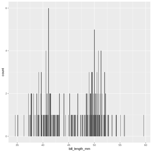
taking the penguins dataset, and then filter the rows so we only have male penguins, and then plot the data with ggplot, with bill length on the x-axis, and add a bar chart
R
penguins |>
  filter(sex == "male") |>
  ggplot(aes(bill_length_mm)) +
  geom_bar()
Now we only plot data from the male penguins, if we are particularly interested in those. This can be quite convenient if you have particularly large data and need to reduce it to get a proper idea of what the variables really look like.
Challenge 1
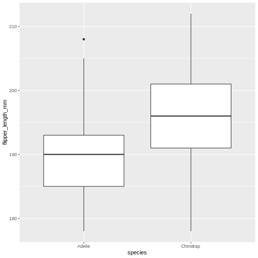
Create a plot of only data from the Dream island, putting flipper length on the y-axis and species on the x-axis. Make it a box-plot.
Try geom_boxplot
R
penguins |>
  filter(island == "Dream") |>
  ggplot(aes(x = species, y = flipper_length_mm)) +
  geom_boxplot()
Adding colour
This plot is a little boring, so let us spruce it up! How about
adding colour to the boxplot? We do this by using the
colour/color argument in ggplot2.
When reading this part, read it as follows when typing:
taking the penguins dataset, and then filter the rows so we penguins from the Dream island, and then plot the data with ggplot, with species on the x-axis and flipper length on the y-axis, and add a box plot
R
penguins |>
  filter(island == "Dream") |>
  ggplot(aes(x = species, y = flipper_length_mm)) +
  geom_boxplot(aes(colour = species))
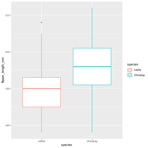
Did that look as you expected? Maybe you expected the rectangles of the boxes to be coloured, rather than the edges?
Challenge 2
Change the previous boxplot argument colour to
fill
Learning the difference between using fill and
colour/color can take a little time, but in
general colour gives colour to edges, while fill floods elements.
R
penguins |>
  filter(island == "Dream") |>
  ggplot(aes(x = species, y = flipper_length_mm)) +
  geom_boxplot(aes(fill = species))
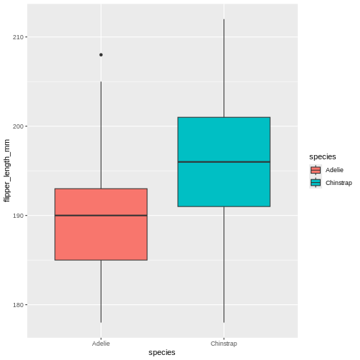
Changing colour
Now, default colours are well and fine for quick plots and exploring
data, but we usually all end up changing the colours when we start
preparing for publication or reports. In ggplot, we change the colours
using the scale_functions. The scale functions actually
cover much more than just colour/fill. They can change the types of
points in point plots, different types of scales for the axes
(logarithmic, percent, currency), and lots more! We will focus on
colour/fill here, but once you start exploring these options, there are
almost no limits to what you can do!
Let’s say you are publishing in a journal with strict policy on black and white only. Its better to prepare you plot in back and white your self, rather than relying on conversion of colour to black and white, you might be surprised at how little distinction there are between colours when the actually colour is stripped.
Let us start with the plot we just made, and test what types of
options we get when starting to add scale_fill_ in the
script. We get lots of preview options, “brewer”, “continuous”,
“gradient”, too many options?
There’s one called scale_fill_grey() let us try that one
for convenience!
R
penguins |>
  filter(island == "Dream") |>
  ggplot(aes(x = species, y = flipper_length_mm)) +
  geom_boxplot(aes(fill = species)) +
  scale_fill_grey()
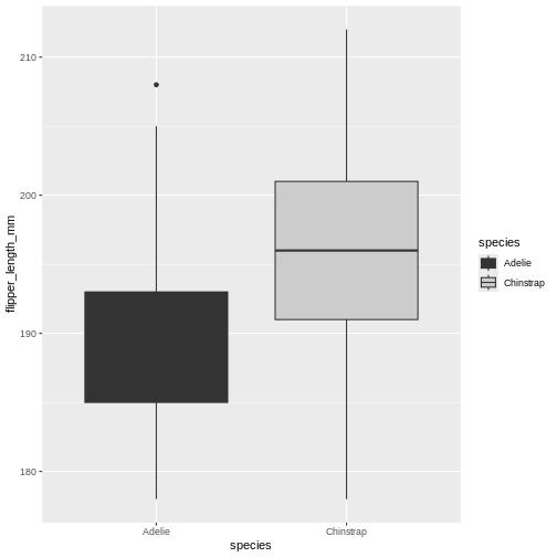
Ok! The colours are now changed, and the legend with it, quite convenient. But, the grey used is the same as for the lines, masking the median line for the Adelie box. That won’t do. Let us try something else.
R
penguins |>
  filter(island == "Dream") |>
  ggplot(aes(x = species, y = flipper_length_mm)) +
  geom_boxplot(aes(fill = species)) +
  scale_fill_manual(values = c("black", "white"))
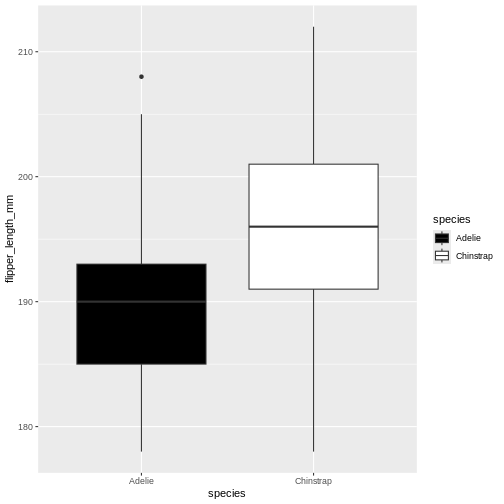
This is maybe a little stark, but the difference is clear between the
two, and that’s what we are after right now. Using the
manual version of scales means you manually add the colours
you want to use. You can specify colours by name and hexidecimal code,
whichever you find better to work with.
Challenge 3
Base you plot on the same as we have used so far. Change the colours to coral and cyan
“coral” and “cyan” are built in colour names, that you can call directly. There are lots of these names, datanovia has a great list of them
R
penguins |>
  filter(island == "Dream") |>
  ggplot(aes(x = species, y = flipper_length_mm)) +
  geom_boxplot(aes(fill = species)) +
  scale_fill_manual(values = c("coral", "cyan"))
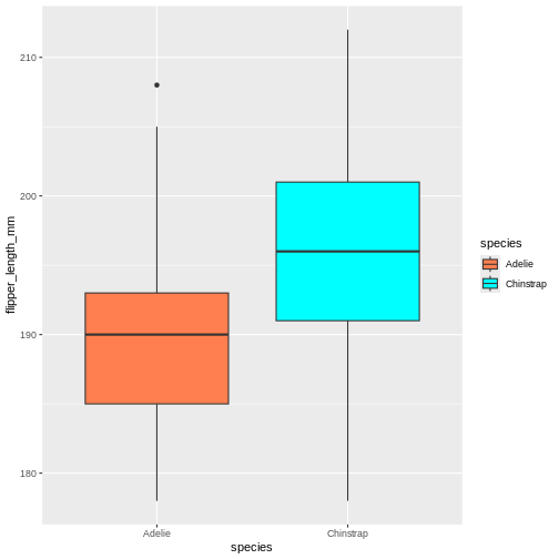
Challenge 4
Base you plot on the same as we have used so far. Change the colours to the hexidecmial colours “#6597aa” and “#cc6882”
hexidecimal colour codes are often use in webdesign, and are a way of coding red, blue and green. To explore colours in hexidecmial, there are lots of we resources like color-hex.com
R
penguins |>
  filter(island == "Dream") |>
  ggplot(aes(x = species, y = flipper_length_mm)) +
  geom_boxplot(aes(fill = species)) +
  scale_fill_manual(values = c("#6597aa", "#cc6882"))
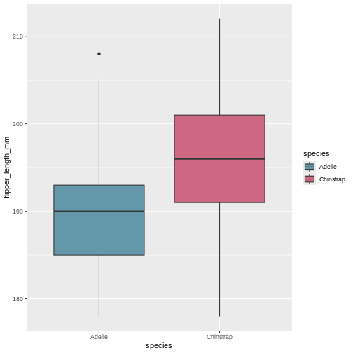
Challenge 5
Base you plot on the same as we have used so far. Change the order for the hexidecimal colours in the previous plot. what did that do?
The order you provide the manual colours dictate which category gets which colour.
R
penguins |>
  filter(island == "Dream") |>
  ggplot(aes(x = species, y = flipper_length_mm)) +
  geom_boxplot(aes(fill = species)) +
  scale_fill_manual(values = c("#cc6882", "#6597aa"))
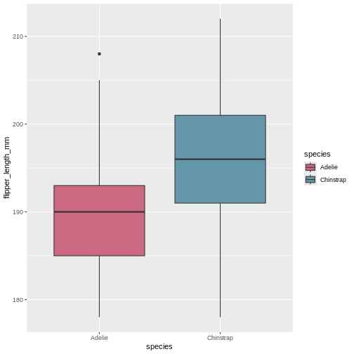
Challenge 6
Now, make an entirely different plot. Take the entire penguins dataset, and plot bill depth on the x-axis and bill length on the y. Create a point plot, with the points coloured by bill length. Try changing the colour of the points. What types of scales can you use?
There is not single answer here, there are many different options. The key difference between what we did before and this, is that the colouring scale is continuous, rather than categorical, so we need slightly different versions.
R
penguins |>
  ggplot(aes(x = bill_depth_mm, y = bill_length_mm)) +
  geom_point(aes(colour = bill_length_mm)) +
  scale_colour_viridis_c()
WARNING
Warning: Removed 2 rows containing missing values or values outside the scale range
(`geom_point()`).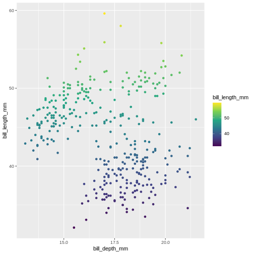
R
penguins |>
  ggplot(aes(x = bill_depth_mm, y = bill_length_mm)) +
  geom_point(aes(colour = bill_length_mm)) +
  scale_colour_gradientn(colours = c("#6597aa", "#cc6882"))
WARNING
Warning: Removed 2 rows containing missing values or values outside the scale range
(`geom_point()`).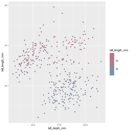
Changing the overall look
Now that we know more about changing the colours, we might want something else than the default look with the grey background etc. Just like with the default colours, it serves its generally quick look purpose, but we likely want to change it.
The theme() functions are there to help you get control
over how a plot looks. There are lots of different themes to choose
from, that form a great basis for all you need.
R
penguins |>
  ggplot(aes(x = bill_depth_mm, y = bill_length_mm)) +
  geom_point(aes(colour = bill_length_mm)) +
  scale_colour_gradientn(colours = c("#6597aa", "#cc6882")) +
  theme_minimal()
WARNING
Warning: Removed 2 rows containing missing values or values outside the scale range
(`geom_point()`).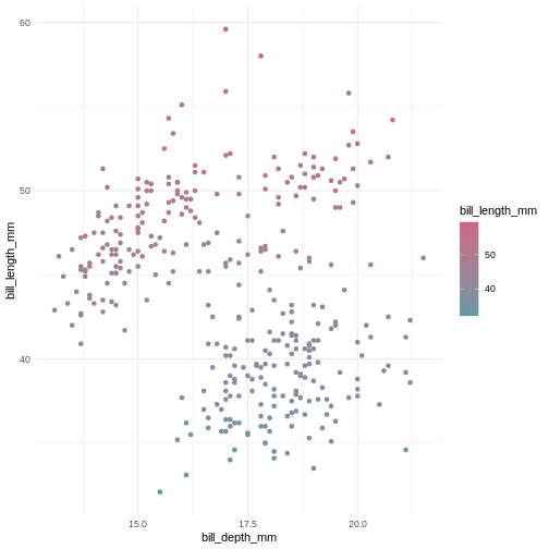
Here we have chosen theme_minimal() which strips axis
lines and the grey background, its more minimal. Explore some different
options by typing theme_ and pressing the tab
key to see what options there are.
Challenge 7
Use the same plot we have been working on, and change the theme to the “classic theme
The classic theme is one often wanted by strict and old-school journals. Its very handy to have a short-cut to it.
R
penguins |>
  ggplot(aes(x = bill_depth_mm, y = bill_length_mm)) +
  geom_point(aes(colour = bill_length_mm)) +
  scale_colour_gradientn(colours = c("#6597aa", "#cc6882")) +
  theme_classic()
WARNING
Warning: Removed 2 rows containing missing values or values outside the scale range
(`geom_point()`).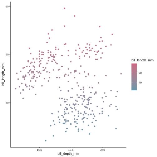
Challenge 8
Now try the void theme. Is this a meaningful theme to use for data plots=
The void theme strips all axis and background, leaving the plot alone. This is generally not a meaningful theme to use for publication, but could be good to use if you ever dwelve into the world of generative art.
R
penguins |>
  ggplot(aes(x = bill_depth_mm, y = bill_length_mm)) +
  geom_point(aes(colour = bill_length_mm)) +
  scale_colour_gradientn(colours = c("#6597aa", "#cc6882")) +
  theme_void()
WARNING
Warning: Removed 2 rows containing missing values or values outside the scale range
(`geom_point()`).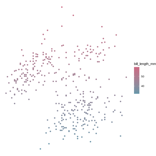
Wrap up
There is a lot more we could teach you about customising your plots to look how you want. There are many web resources you can look at to help you along they way, like on The MockUp. But if you dont want to deal with too many details, you can always isntall and use tne ggthemes package, which can create plots that look like your old favourite tools made them (like SPSS, Stata, excel. etc.).
Content from Data manipulation with dplyr
Last updated on 2026-05-26 | Edit this page
Estimated time: 65 minutes
Overview
Questions
- How can I add variables to my data?
- How can I alter the variables already in my data?
Objectives
- Use
mutate()to add and alter variables - Use
if_else()where appropriate - Use
case_when()where appropriate - Understand basic consents of different data types
Motivation
Often, the data we have do not contain exactly what we need. We might need to change the order of factors, create new variables based on other columns in the data, or even variables conditional on specific values in other columns.
Adding new variables,
In {tidyverse}, when we add new variables, we use the
mutate() function. Just like the other {tidyverse}
functions, mutate work specifically with data sets, and provides a nice
shorthand for working directly with the columns in the data set.
R
penguins |>
  mutate(new_var = 1)
OUTPUT
# A tibble: 344 × 9
   species island    bill_length_mm bill_depth_mm flipper_length_mm body_mass_g
   <fct>   <fct>              <dbl>         <dbl>             <int>       <int>
 1 Adelie  Torgersen           39.1          18.7               181        3750
 2 Adelie  Torgersen           39.5          17.4               186        3800
 3 Adelie  Torgersen           40.3          18                 195        3250
 4 Adelie  Torgersen           NA            NA                  NA          NA
 5 Adelie  Torgersen           36.7          19.3               193        3450
 6 Adelie  Torgersen           39.3          20.6               190        3650
 7 Adelie  Torgersen           38.9          17.8               181        3625
 8 Adelie  Torgersen           39.2          19.6               195        4675
 9 Adelie  Torgersen           34.1          18.1               193        3475
10 Adelie  Torgersen           42            20.2               190        4250
# ℹ 334 more rows
# ℹ 3 more variables: sex <fct>, year <int>, new_var <dbl>
The output of this can be hard to spot, depending on the size of the screen. Let us for convenience create a subsetted data set to work on so we can easily see what we are doing.
R
penguins_s <- penguins |>
  select(1:3, starts_with("bill"))
Lets try our command again on this new data.
R
penguins_s |>
  mutate(new_var = 1)
OUTPUT
# A tibble: 344 × 5
   species island    bill_length_mm bill_depth_mm new_var
   <fct>   <fct>              <dbl>         <dbl>   <dbl>
 1 Adelie  Torgersen           39.1          18.7       1
 2 Adelie  Torgersen           39.5          17.4       1
 3 Adelie  Torgersen           40.3          18         1
 4 Adelie  Torgersen           NA            NA         1
 5 Adelie  Torgersen           36.7          19.3       1
 6 Adelie  Torgersen           39.3          20.6       1
 7 Adelie  Torgersen           38.9          17.8       1
 8 Adelie  Torgersen           39.2          19.6       1
 9 Adelie  Torgersen           34.1          18.1       1
10 Adelie  Torgersen           42            20.2       1
# ℹ 334 more rows
There is now a new column in the data set called “new_var”, and it
has the value 1 for all rows! This is what we told mutate()
to do! We specified a new column by name, and gave it a specific value,
1.
This works because its easy to assigning a single value to all rows. What if we try to give it three values? What would we expect?
R
penguins_s |>
  mutate(var = 1:3)
ERROR
Error in `mutate()`:
ℹ In argument: `var = 1:3`.
Caused by error:
! `var` must be size 344 or 1, not 3.
Here, it’s failing with a mysterious message. The error is telling us that input must be of size 344 or 1. 344 are the number of rows in the data set, so its telling us the input we gave it is not suitable because its neither of length 344 nor of length 1.
So now we know the premises for mutate, it takes inputs that are either of the same length as there are rows in the data set or length 1.
R
penguins_s |>
  mutate(var = 1:344)
OUTPUT
# A tibble: 344 × 5
   species island    bill_length_mm bill_depth_mm   var
   <fct>   <fct>              <dbl>         <dbl> <int>
 1 Adelie  Torgersen           39.1          18.7     1
 2 Adelie  Torgersen           39.5          17.4     2
 3 Adelie  Torgersen           40.3          18       3
 4 Adelie  Torgersen           NA            NA       4
 5 Adelie  Torgersen           36.7          19.3     5
 6 Adelie  Torgersen           39.3          20.6     6
 7 Adelie  Torgersen           38.9          17.8     7
 8 Adelie  Torgersen           39.2          19.6     8
 9 Adelie  Torgersen           34.1          18.1     9
10 Adelie  Torgersen           42            20.2    10
# ℹ 334 more rows
But generally, we create new columns based on other data in the data set. So let’s do a more useful example. For instance, perhaps we want to use the ratio between the bill length and depth as a measurement for a model.
R
penguins_s |>
  mutate(bill_ratio = bill_length_mm / bill_depth_mm)
OUTPUT
# A tibble: 344 × 5
   species island    bill_length_mm bill_depth_mm bill_ratio
   <fct>   <fct>              <dbl>         <dbl>      <dbl>
 1 Adelie  Torgersen           39.1          18.7       2.09
 2 Adelie  Torgersen           39.5          17.4       2.27
 3 Adelie  Torgersen           40.3          18         2.24
 4 Adelie  Torgersen           NA            NA        NA
 5 Adelie  Torgersen           36.7          19.3       1.90
 6 Adelie  Torgersen           39.3          20.6       1.91
 7 Adelie  Torgersen           38.9          17.8       2.19
 8 Adelie  Torgersen           39.2          19.6       2
 9 Adelie  Torgersen           34.1          18.1       1.88
10 Adelie  Torgersen           42            20.2       2.08
# ℹ 334 more rows
So, here we have asked for the ratio between bill length and depth to
be calculated and stored in a column named bill_ratio. Then
we selected just the bill columns to have a peak at the
output more directly.
We can do almost anything within a mutate() to get the
values as we want them, also use functions that exist in R to transform
the data. For instance, perhaps we want to scale the variables of
interest to have a mean of 0 and standard deviation of 1, which is quite
common to improve statistical modelling. We can do that with the
scale() function.
R
penguins_s |>
  mutate(bill_ratio = bill_length_mm / bill_depth_mm,
         bill_length_mm_z = scale(bill_length_mm))
OUTPUT
# A tibble: 344 × 6
   species island   bill_length_mm bill_depth_mm bill_ratio bill_length_mm_z[,1]
   <fct>   <fct>             <dbl>         <dbl>      <dbl>                <dbl>
 1 Adelie  Torgers…           39.1          18.7       2.09               -0.883
 2 Adelie  Torgers…           39.5          17.4       2.27               -0.810
 3 Adelie  Torgers…           40.3          18         2.24               -0.663
 4 Adelie  Torgers…           NA            NA        NA                  NA
 5 Adelie  Torgers…           36.7          19.3       1.90               -1.32
 6 Adelie  Torgers…           39.3          20.6       1.91               -0.847
 7 Adelie  Torgers…           38.9          17.8       2.19               -0.920
 8 Adelie  Torgers…           39.2          19.6       2                  -0.865
 9 Adelie  Torgers…           34.1          18.1       1.88               -1.80
10 Adelie  Torgers…           42            20.2       2.08               -0.352
# ℹ 334 more rows
Challenge 1
Create a column where bill length is transformed to cm. To transform mm to cm, you must divide the mm value by 10. Name the column bill_length_cm.
R
penguins_s |>
  mutate(bill_length_cm = bill_length_mm / 10)
OUTPUT
# A tibble: 344 × 5
   species island    bill_length_mm bill_depth_mm bill_length_cm
   <fct>   <fct>              <dbl>         <dbl>          <dbl>
 1 Adelie  Torgersen           39.1          18.7           3.91
 2 Adelie  Torgersen           39.5          17.4           3.95
 3 Adelie  Torgersen           40.3          18             4.03
 4 Adelie  Torgersen           NA            NA            NA
 5 Adelie  Torgersen           36.7          19.3           3.67
 6 Adelie  Torgersen           39.3          20.6           3.93
 7 Adelie  Torgersen           38.9          17.8           3.89
 8 Adelie  Torgersen           39.2          19.6           3.92
 9 Adelie  Torgersen           34.1          18.1           3.41
10 Adelie  Torgersen           42            20.2           4.2
# ℹ 334 more rows
Challenge 2
Create a column for body mass in kilos, rather than grams, in the main penguins data set. Name the column body_mass_kg. To transform grams to kilograms, divide the grams by 1000.
R
penguins |>
  mutate(body_mass_kg = body_mass_g / 1000)
OUTPUT
# A tibble: 344 × 9
   species island    bill_length_mm bill_depth_mm flipper_length_mm body_mass_g
   <fct>   <fct>              <dbl>         <dbl>             <int>       <int>
 1 Adelie  Torgersen           39.1          18.7               181        3750
 2 Adelie  Torgersen           39.5          17.4               186        3800
 3 Adelie  Torgersen           40.3          18                 195        3250
 4 Adelie  Torgersen           NA            NA                  NA          NA
 5 Adelie  Torgersen           36.7          19.3               193        3450
 6 Adelie  Torgersen           39.3          20.6               190        3650
 7 Adelie  Torgersen           38.9          17.8               181        3625
 8 Adelie  Torgersen           39.2          19.6               195        4675
 9 Adelie  Torgersen           34.1          18.1               193        3475
10 Adelie  Torgersen           42            20.2               190        4250
# ℹ 334 more rows
# ℹ 3 more variables: sex <fct>, year <int>, body_mass_kg <dbl>
Adding conditional variables
Sometimes, we want to assign certain data values based on other variables in the data set. For instance, maybe we want to classify all penguins with body mass above 4.5 kg as “large” while the rest are “normal”?
The if_else() function takes expressions, much like
filter(). The first value after the expression is the value
assigned if the expression is TRUE, while the second is if
the expression is FALSE
R
penguin_weight <- penguins |>
  select(year, body_mass_g)

penguin_weight |>
  mutate(size = if_else(condition = body_mass_g > 4500,
                        true = "large",
                        false = "normal"))
OUTPUT
# A tibble: 344 × 3
    year body_mass_g size
   <int>       <int> <chr>
 1  2007        3750 normal
 2  2007        3800 normal
 3  2007        3250 normal
 4  2007          NA <NA>
 5  2007        3450 normal
 6  2007        3650 normal
 7  2007        3625 normal
 8  2007        4675 large
 9  2007        3475 normal
10  2007        4250 normal
# ℹ 334 more rows
Now we have a column with two values, large and
normal based on whether the penguins are above or below 4.5
kilos.
We can for instance use that in a plot.
R
penguin_weight |>
  mutate(size = if_else(condition = body_mass_g > 4500,
                        true = "large",
                        false = "normal")) |>
  ggplot() +
  geom_jitter(mapping = aes(x = year, y = body_mass_g, colour = size))
WARNING
Warning: Removed 2 rows containing missing values or values outside the scale range
(`geom_point()`).
That shows us clearly that we have grouped the penguins based on
their size. But there is this strange NA in the plot
legend. what is that?
In R, missing values are usually given the value NA
which stands for Not applicable, i.e., missing
data. This is a very special name in R. Like TRUE and
FALSE are capitalized, RStudio immediately recognizes the
combination of capital letters and gives it another colour than all
other values. In this case it means, there are some penguins we do not
have the body mass of.
Now we know how to create new variables, and even how to make them if there are conditions on how to add the data.
But, we often want to add several columns of different types, and maybe even add new variables based on other new columns! Oh, it’s starting to sound complicated, but it does not have to be!
mutate() is so-called lazy-evaluated. This sounds weird,
but it means that each new column you make is made in the sequence you
make them. So as long as you think about the order of your
mutate() creations, you can do that in a single mutate
call.
R
penguins_s |>
  mutate(
    bill_ratio = bill_depth_mm / bill_length_mm,
    bill_type = if_else(condition = bill_ratio < 0.5,
                        true = "elongated",
                        false = "stumped")
  )
OUTPUT
# A tibble: 344 × 6
   species island    bill_length_mm bill_depth_mm bill_ratio bill_type
   <fct>   <fct>              <dbl>         <dbl>      <dbl> <chr>
 1 Adelie  Torgersen           39.1          18.7      0.478 elongated
 2 Adelie  Torgersen           39.5          17.4      0.441 elongated
 3 Adelie  Torgersen           40.3          18        0.447 elongated
 4 Adelie  Torgersen           NA            NA       NA     <NA>
 5 Adelie  Torgersen           36.7          19.3      0.526 stumped
 6 Adelie  Torgersen           39.3          20.6      0.524 stumped
 7 Adelie  Torgersen           38.9          17.8      0.458 elongated
 8 Adelie  Torgersen           39.2          19.6      0.5   stumped
 9 Adelie  Torgersen           34.1          18.1      0.531 stumped
10 Adelie  Torgersen           42            20.2      0.481 elongated
# ℹ 334 more rows
Now you’ve created two variables. One for bill_ratio,
and then another one conditional on the values of the
bill_ratio.
If you switched the order of these two, R would produce an error, because there would be no bill ratio to create the other column.
R
penguins_s |>
  mutate(
    bill_ratio = bill_depth_mm / bill_length_mm,
    bill_type = if_else(condition = bill_ratio < 0.5,
                        true = "elongated",
                        false = "stumped"),
    bill_ratio = bill_depth_mm / bill_length_mm
  )
OUTPUT
# A tibble: 344 × 6
   species island    bill_length_mm bill_depth_mm bill_ratio bill_type
   <fct>   <fct>              <dbl>         <dbl>      <dbl> <chr>
 1 Adelie  Torgersen           39.1          18.7      0.478 elongated
 2 Adelie  Torgersen           39.5          17.4      0.441 elongated
 3 Adelie  Torgersen           40.3          18        0.447 elongated
 4 Adelie  Torgersen           NA            NA       NA     <NA>
 5 Adelie  Torgersen           36.7          19.3      0.526 stumped
 6 Adelie  Torgersen           39.3          20.6      0.524 stumped
 7 Adelie  Torgersen           38.9          17.8      0.458 elongated
 8 Adelie  Torgersen           39.2          19.6      0.5   stumped
 9 Adelie  Torgersen           34.1          18.1      0.531 stumped
10 Adelie  Torgersen           42            20.2      0.481 elongated
# ℹ 334 more rows
But what if we want to categorize based on more than one condition?
Nested if_else()?
R
penguins_s |>
  mutate(
    bill_ratio = bill_depth_mm / bill_length_mm,
    bill_type = if_else(condition = bill_ratio < 0.35,
                        true =  "elongated",
                        false = if_else(condition = bill_ratio < 0.45,
                                        true = "normal",
                                        false = "stumped")))
OUTPUT
# A tibble: 344 × 6
   species island    bill_length_mm bill_depth_mm bill_ratio bill_type
   <fct>   <fct>              <dbl>         <dbl>      <dbl> <chr>
 1 Adelie  Torgersen           39.1          18.7      0.478 stumped
 2 Adelie  Torgersen           39.5          17.4      0.441 normal
 3 Adelie  Torgersen           40.3          18        0.447 normal
 4 Adelie  Torgersen           NA            NA       NA     <NA>
 5 Adelie  Torgersen           36.7          19.3      0.526 stumped
 6 Adelie  Torgersen           39.3          20.6      0.524 stumped
 7 Adelie  Torgersen           38.9          17.8      0.458 stumped
 8 Adelie  Torgersen           39.2          19.6      0.5   stumped
 9 Adelie  Torgersen           34.1          18.1      0.531 stumped
10 Adelie  Torgersen           42            20.2      0.481 stumped
# ℹ 334 more rows
what if you have even more conditionals? It can get pretty messy
pretty fast. Thankfully, {dplyr} has a smarter way of doing this, called
case_when(). This function is similar to
if_else(), but where you specify what each condition should
be assigned. On the left you have the logical expression, and the on the
right of the tilde (~) is the value to be assigned if that
expression is TRUE
R
penguins_s |>
  mutate(
    bill_ratio = bill_depth_mm / bill_length_mm,
    bill_type = case_when(
      bill_ratio < 0.35 ~ "elongated",
      bill_ratio < 0.45 ~ "normal",
      TRUE              ~ "stumped")
  ) |>
  ggplot(mapping = aes(x = bill_length_mm,
                       y = bill_depth_mm,
                       colour = bill_type)) +
  geom_point()
WARNING
Warning: Removed 2 rows containing missing values or values outside the scale range
(`geom_point()`).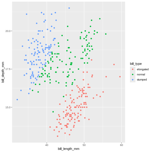
That looks almost the same. The NA’s are gone! That’s
not right. We cannot categorize values that are missing. It’s our last
statement that does this, which just says “make the remainder this
value”. Which is not what we want. We need the NAs to stay
NA’s.
case_when(), like the mutate(), evaluates
the expressions in sequence. Which is why we can have two statements
evaluating the same column with similar expressions (below 0.35 and then
below 0.45). All values that are below 0.45 are also below 0.35. Since
we first assign everything below 0.35, and then below 0.45, they do not
collide. We can do the same for our last statement, saying that all
values that are not NA should be given this category.
R
penguins |>
  mutate(
    bill_ratio = bill_depth_mm / bill_length_mm,
    bill_type = case_when(
      bill_ratio < 0.35  ~ "elongated",
      bill_ratio < 0.45  ~ "normal",
      !is.na(bill_ratio) ~ "stumped")
  ) |>
  ggplot(mapping = aes(x = bill_length_mm,
                       y = bill_depth_mm,
                       colour = bill_type)) +
  geom_point()
WARNING
Warning: Removed 2 rows containing missing values or values outside the scale range
(`geom_point()`).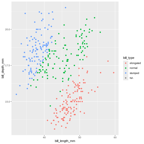
Here, we use the is.na(), which is a special function in
R to detect NA values. But it also has an ! in
front, what does that mean? In R’s logical expressions, the
! is a negation specifier. It means it flips the logical so
the TRUE becomes FALSE, and vice
versa. So here, it means the bill_ratio is
not NA.
Challenge 3
Create a column named bill_ld_ratio_log that is the
natural logarithm (using the log() function) of
bill_length_mm divided by bill_depth_mm
R
penguins |>
  mutate(bill_ld_ratio_log = log(bill_length_mm / bill_depth_mm))
OUTPUT
# A tibble: 344 × 9
   species island    bill_length_mm bill_depth_mm flipper_length_mm body_mass_g
   <fct>   <fct>              <dbl>         <dbl>             <int>       <int>
 1 Adelie  Torgersen           39.1          18.7               181        3750
 2 Adelie  Torgersen           39.5          17.4               186        3800
 3 Adelie  Torgersen           40.3          18                 195        3250
 4 Adelie  Torgersen           NA            NA                  NA          NA
 5 Adelie  Torgersen           36.7          19.3               193        3450
 6 Adelie  Torgersen           39.3          20.6               190        3650
 7 Adelie  Torgersen           38.9          17.8               181        3625
 8 Adelie  Torgersen           39.2          19.6               195        4675
 9 Adelie  Torgersen           34.1          18.1               193        3475
10 Adelie  Torgersen           42            20.2               190        4250
# ℹ 334 more rows
# ℹ 3 more variables: sex <fct>, year <int>, bill_ld_ratio_log <dbl>
Challenge 4
Create a new column called body_type, where animals
below 3 kg are small, animals between 3 and 4.5 kg are
normal, and animals larger than 4.5 kg are
large. In the same command, create a new column named
biscoe and its content should be TRUE if the
island is Biscoe and FALSE for everything
else.
R
penguins |>
  mutate(
    body_type = case_when(
       body_mass_g < 3000 ~ "small",
       body_mass_g >= 3000 & body_mass_g < 4500 ~ "normal",
       body_mass_g >= 4500 ~ "large"),
    biscoe = if_else(island == "Biscoe",
                     true = TRUE,
                     false = FALSE)
  )
OUTPUT
# A tibble: 344 × 10
   species island    bill_length_mm bill_depth_mm flipper_length_mm body_mass_g
   <fct>   <fct>              <dbl>         <dbl>             <int>       <int>
 1 Adelie  Torgersen           39.1          18.7               181        3750
 2 Adelie  Torgersen           39.5          17.4               186        3800
 3 Adelie  Torgersen           40.3          18                 195        3250
 4 Adelie  Torgersen           NA            NA                  NA          NA
 5 Adelie  Torgersen           36.7          19.3               193        3450
 6 Adelie  Torgersen           39.3          20.6               190        3650
 7 Adelie  Torgersen           38.9          17.8               181        3625
 8 Adelie  Torgersen           39.2          19.6               195        4675
 9 Adelie  Torgersen           34.1          18.1               193        3475
10 Adelie  Torgersen           42            20.2               190        4250
# ℹ 334 more rows
# ℹ 4 more variables: sex <fct>, year <int>, body_type <chr>, biscoe <lgl>Content from Reshaping data with tidyr
Last updated on 2026-05-26 | Edit this page
Estimated time: 66 minutes
Overview
Questions
- How can I make my data into a longer format?
- How can I get my data into a wider format?
Objectives
- Use
pivot_longer()to reshape data into a longer format - Use
pivot_wider()to reshape data into a wider format
Motivation
Data come in a myriad of different shapes, and talking about data set can often become confusing as people are used to data being in different formats, and they call these formats different things. In the tidyverse, “tidy” data is a very opinionated term so that we can all talk about data with more common ground.
The goal of the tidyr package is to help you create tidy data.
Tidy data is data where:
- Every column is variable.
- Every row is an observation.
- Every cell is a single value.
Tidy data describes a standard way of storing data that is used
wherever possible throughout the tidyverse. If you ensure that your data
is tidy, you’ll spend less time fighting with the tools and more time
working on your analysis. Learn more about tidy data in
vignette("tidy-data").
Tall/long vs. wide data
Tall (or long) data are considered “tidy”, in that they adhere to the three tidy-data principles
Wide data are not necessarily “messy”, but have a shape less ideal for easy handling in the tidyverse
Example in longitudinal data design:
- wide data: each participant has a single row of data, with all
longitudinal observations in separate columns
- tall data: a participant has as many rows as longitudinal time points, with measures in separate columns
Creating longer data
Let us first talk about creating longer data. In most cases, you will encounter data that is in wide format, this is what is often taught in many disciplines and also necessary to run certain analyses in statistical programs like SPSS. In R, and specifically the tidyverse, working on long data has clear advantages, which we wil be exploring here while we also do the transformations.
As before, we need to start off by making sure we have the tidyverse package loaded, and the penguins dataset ready at hand.
In tidyverse, there is a single function to create longer data sets,
called pivot_longer. Those of you who might have some prior
experience with tidyverse, or you might encounter it when googling for
help, might have seen the gather function. This is an older
function of similar capabilities which we will not cover here, as the
pivot_longer function supersedes it.
R
penguins |>
  pivot_longer(contains("_"))
OUTPUT
# A tibble: 1,376 × 6
   species island    sex     year name               value
   <fct>   <fct>     <fct>  <int> <chr>              <dbl>
 1 Adelie  Torgersen male    2007 bill_length_mm      39.1
 2 Adelie  Torgersen male    2007 bill_depth_mm       18.7
 3 Adelie  Torgersen male    2007 flipper_length_mm  181
 4 Adelie  Torgersen male    2007 body_mass_g       3750
 5 Adelie  Torgersen female  2007 bill_length_mm      39.5
 6 Adelie  Torgersen female  2007 bill_depth_mm       17.4
 7 Adelie  Torgersen female  2007 flipper_length_mm  186
 8 Adelie  Torgersen female  2007 body_mass_g       3800
 9 Adelie  Torgersen female  2007 bill_length_mm      40.3
10 Adelie  Torgersen female  2007 bill_depth_mm       18
# ℹ 1,366 more rows
pivot_longer takes tidy-select column arguments, so it is easy to
grab all the columns you are after. Here, we are pivoting longer all
columns that contain an underscore. And what happens? We now have less
columns, but also two new columns we did not have before! In the
name column, all our previous columns names are, one after
the other. And in the value column, all the cell values for
the observations! So before, the data was wider, in that each of the
columns with _ had their own column, while now, they are
all collected into two columns instead of 4.
Why would we want to do that? Well, perhaps we want to plot all the
variables in a single ggplot call? Now that the measurement types are
collected in these two ways, we can facet over the name
column to create a sub-plot per measurement type!
R
penguins |>
  pivot_longer(contains("_")) |>
  ggplot(aes(y = value,
             x = species,
             fill = species)) +
  geom_boxplot() +
  facet_wrap(~name, scales = "free_y")
WARNING
Warning: Removed 8 rows containing non-finite outside the scale range
(`stat_boxplot()`).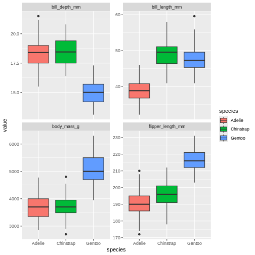
That’s pretty neat. By pivoting the data into this longer shape we are able to create sub-plots for all measurements easily with the same ggplot call and have them consistent, and nicely aligned. This longer format is also great for summaries, which we will be covering tomorrow.
Challenge 1
Pivot longer all columns ending with “mm” .
R
penguins |>
  pivot_longer(ends_with("mm"))
OUTPUT
# A tibble: 1,032 × 7
   species island    body_mass_g sex     year name              value
   <fct>   <fct>           <int> <fct>  <int> <chr>             <dbl>
 1 Adelie  Torgersen        3750 male    2007 bill_length_mm     39.1
 2 Adelie  Torgersen        3750 male    2007 bill_depth_mm      18.7
 3 Adelie  Torgersen        3750 male    2007 flipper_length_mm 181
 4 Adelie  Torgersen        3800 female  2007 bill_length_mm     39.5
 5 Adelie  Torgersen        3800 female  2007 bill_depth_mm      17.4
 6 Adelie  Torgersen        3800 female  2007 flipper_length_mm 186
 7 Adelie  Torgersen        3250 female  2007 bill_length_mm     40.3
 8 Adelie  Torgersen        3250 female  2007 bill_depth_mm      18
 9 Adelie  Torgersen        3250 female  2007 flipper_length_mm 195
10 Adelie  Torgersen          NA <NA>    2007 bill_length_mm     NA
# ℹ 1,022 more rows
Challenge 2
Pivot the penguins data so that all the bill measurements are in the same column.
R
penguins |>
  pivot_longer(starts_with("bill"))
OUTPUT
# A tibble: 688 × 8
   species island    flipper_length_mm body_mass_g sex     year name       value
   <fct>   <fct>                 <int>       <int> <fct>  <int> <chr>      <dbl>
 1 Adelie  Torgersen               181        3750 male    2007 bill_leng…  39.1
 2 Adelie  Torgersen               181        3750 male    2007 bill_dept…  18.7
 3 Adelie  Torgersen               186        3800 female  2007 bill_leng…  39.5
 4 Adelie  Torgersen               186        3800 female  2007 bill_dept…  17.4
 5 Adelie  Torgersen               195        3250 female  2007 bill_leng…  40.3
 6 Adelie  Torgersen               195        3250 female  2007 bill_dept…  18
 7 Adelie  Torgersen                NA          NA <NA>    2007 bill_leng…  NA
 8 Adelie  Torgersen                NA          NA <NA>    2007 bill_dept…  NA
 9 Adelie  Torgersen               193        3450 female  2007 bill_leng…  36.7
10 Adelie  Torgersen               193        3450 female  2007 bill_dept…  19.3
# ℹ 678 more rows
Challenge 3
As mentioned, pivot_longer accepts tidy-selectors. Pivot longer all numerical columns.
R
penguins |>
  pivot_longer(where(is.numeric))
OUTPUT
# A tibble: 1,720 × 5
   species island    sex    name               value
   <fct>   <fct>     <fct>  <chr>              <dbl>
 1 Adelie  Torgersen male   bill_length_mm      39.1
 2 Adelie  Torgersen male   bill_depth_mm       18.7
 3 Adelie  Torgersen male   flipper_length_mm  181
 4 Adelie  Torgersen male   body_mass_g       3750
 5 Adelie  Torgersen male   year              2007
 6 Adelie  Torgersen female bill_length_mm      39.5
 7 Adelie  Torgersen female bill_depth_mm       17.4
 8 Adelie  Torgersen female flipper_length_mm  186
 9 Adelie  Torgersen female body_mass_g       3800
10 Adelie  Torgersen female year              2007
# ℹ 1,710 more rows
Altering names during pivots
While often you can get away with leaving the default naming of the two columns as is, especially if you are just doing something quick like making a plot, most times you will likely want to control the names of your two new columns.
R
penguins |>
  pivot_longer(contains("_"),
               names_to = "columns",
               values_to = "content")
OUTPUT
# A tibble: 1,376 × 6
   species island    sex     year columns           content
   <fct>   <fct>     <fct>  <int> <chr>               <dbl>
 1 Adelie  Torgersen male    2007 bill_length_mm       39.1
 2 Adelie  Torgersen male    2007 bill_depth_mm        18.7
 3 Adelie  Torgersen male    2007 flipper_length_mm   181
 4 Adelie  Torgersen male    2007 body_mass_g        3750
 5 Adelie  Torgersen female  2007 bill_length_mm       39.5
 6 Adelie  Torgersen female  2007 bill_depth_mm        17.4
 7 Adelie  Torgersen female  2007 flipper_length_mm   186
 8 Adelie  Torgersen female  2007 body_mass_g        3800
 9 Adelie  Torgersen female  2007 bill_length_mm       40.3
10 Adelie  Torgersen female  2007 bill_depth_mm        18
# ℹ 1,366 more rows
Here, we change the “names” to “columns” and “values” to “content”. The pivot defaults are usually quite sensible, making it clear what is the column names and what are the cell values. But English might not be your working language or you might find something more obvious for your self.
But we have even more power in the renaming of columns. Pivots actually have quite a lot of options, making it possible for us to create outputs looking just like we want. Notice how the names of the columns we pivoted follow a specific structure. First is the name of the body part, then the type of measurement, then the unit of the measurement. This clear logic we can use to our advantage.
R
penguins |>
  pivot_longer(contains("_"),
               names_to = c("part", "measure" , "unit"),
               names_sep = "_")
OUTPUT
# A tibble: 1,376 × 8
   species island    sex     year part    measure unit   value
   <fct>   <fct>     <fct>  <int> <chr>   <chr>   <chr>  <dbl>
 1 Adelie  Torgersen male    2007 bill    length  mm      39.1
 2 Adelie  Torgersen male    2007 bill    depth   mm      18.7
 3 Adelie  Torgersen male    2007 flipper length  mm     181
 4 Adelie  Torgersen male    2007 body    mass    g     3750
 5 Adelie  Torgersen female  2007 bill    length  mm      39.5
 6 Adelie  Torgersen female  2007 bill    depth   mm      17.4
 7 Adelie  Torgersen female  2007 flipper length  mm     186
 8 Adelie  Torgersen female  2007 body    mass    g     3800
 9 Adelie  Torgersen female  2007 bill    length  mm      40.3
10 Adelie  Torgersen female  2007 bill    depth   mm      18
# ℹ 1,366 more rows
now, the pivot gave us 4 columns in stead of two! We told pivot that the column name could be split into the columns “part”, “measure” and “unit”, and that these were separated by underscore. Again we see how great consistent and logical naming of columns can be such a great help when working with data!
Challenge 4
Pivot longer all the bill measurements, and alter the names in one go, so that there are three columns named “part”, “measure” and “unit” after the pivot.
R
penguins |>
    pivot_longer(starts_with("bill"),
               names_to = c("part", "measure" , "unit"),
               names_sep = "_")
OUTPUT
# A tibble: 688 × 10
   species island  flipper_length_mm body_mass_g sex    year part  measure unit
   <fct>   <fct>               <int>       <int> <fct> <int> <chr> <chr>   <chr>
 1 Adelie  Torger…               181        3750 male   2007 bill  length  mm
 2 Adelie  Torger…               181        3750 male   2007 bill  depth   mm
 3 Adelie  Torger…               186        3800 fema…  2007 bill  length  mm
 4 Adelie  Torger…               186        3800 fema…  2007 bill  depth   mm
 5 Adelie  Torger…               195        3250 fema…  2007 bill  length  mm
 6 Adelie  Torger…               195        3250 fema…  2007 bill  depth   mm
 7 Adelie  Torger…                NA          NA <NA>   2007 bill  length  mm
 8 Adelie  Torger…                NA          NA <NA>   2007 bill  depth   mm
 9 Adelie  Torger…               193        3450 fema…  2007 bill  length  mm
10 Adelie  Torger…               193        3450 fema…  2007 bill  depth   mm
# ℹ 678 more rows
# ℹ 1 more variable: value <dbl>
Challenge 5
Pivot longer all the bill measurements, and use the
names_prefix argument. Give it the string “bill_”. What did
that do?
R
penguins |>
    pivot_longer(starts_with("bill"),
               names_prefix = "bill_")
OUTPUT
# A tibble: 688 × 8
   species island    flipper_length_mm body_mass_g sex     year name      value
   <fct>   <fct>                 <int>       <int> <fct>  <int> <chr>     <dbl>
 1 Adelie  Torgersen               181        3750 male    2007 length_mm  39.1
 2 Adelie  Torgersen               181        3750 male    2007 depth_mm   18.7
 3 Adelie  Torgersen               186        3800 female  2007 length_mm  39.5
 4 Adelie  Torgersen               186        3800 female  2007 depth_mm   17.4
 5 Adelie  Torgersen               195        3250 female  2007 length_mm  40.3
 6 Adelie  Torgersen               195        3250 female  2007 depth_mm   18
 7 Adelie  Torgersen                NA          NA <NA>    2007 length_mm  NA
 8 Adelie  Torgersen                NA          NA <NA>    2007 depth_mm   NA
 9 Adelie  Torgersen               193        3450 female  2007 length_mm  36.7
10 Adelie  Torgersen               193        3450 female  2007 depth_mm   19.3
# ℹ 678 more rows
Challenge 6
Pivot longer all the bill measurements, and use the
names_prefix, names_to and
names_sep arguments. What do you need to change in
names_to from the previous example to make it work now that
we also use names_prefix?
R
penguins |>
    pivot_longer(starts_with("bill"),
              names_prefix = "bill_",
              names_to = c("bill_measure" , "unit"),
              names_sep = "_")
OUTPUT
# A tibble: 688 × 9
   species island   flipper_length_mm body_mass_g sex    year bill_measure unit
   <fct>   <fct>                <int>       <int> <fct> <int> <chr>        <chr>
 1 Adelie  Torgers…               181        3750 male   2007 length       mm
 2 Adelie  Torgers…               181        3750 male   2007 depth        mm
 3 Adelie  Torgers…               186        3800 fema…  2007 length       mm
 4 Adelie  Torgers…               186        3800 fema…  2007 depth        mm
 5 Adelie  Torgers…               195        3250 fema…  2007 length       mm
 6 Adelie  Torgers…               195        3250 fema…  2007 depth        mm
 7 Adelie  Torgers…                NA          NA <NA>   2007 length       mm
 8 Adelie  Torgers…                NA          NA <NA>   2007 depth        mm
 9 Adelie  Torgers…               193        3450 fema…  2007 length       mm
10 Adelie  Torgers…               193        3450 fema…  2007 depth        mm
# ℹ 678 more rows
# ℹ 1 more variable: value <dbl>
Cleaning up values during pivots.
When pivoting, it is common that quite some NA values
appear in the values column. We can remove these immediately by making
the argument values_drop_na be TRUE
R
penguins |>
  pivot_longer(starts_with("bill"),
               values_drop_na = TRUE)
OUTPUT
# A tibble: 684 × 8
   species island    flipper_length_mm body_mass_g sex     year name       value
   <fct>   <fct>                 <int>       <int> <fct>  <int> <chr>      <dbl>
 1 Adelie  Torgersen               181        3750 male    2007 bill_leng…  39.1
 2 Adelie  Torgersen               181        3750 male    2007 bill_dept…  18.7
 3 Adelie  Torgersen               186        3800 female  2007 bill_leng…  39.5
 4 Adelie  Torgersen               186        3800 female  2007 bill_dept…  17.4
 5 Adelie  Torgersen               195        3250 female  2007 bill_leng…  40.3
 6 Adelie  Torgersen               195        3250 female  2007 bill_dept…  18
 7 Adelie  Torgersen               193        3450 female  2007 bill_leng…  36.7
 8 Adelie  Torgersen               193        3450 female  2007 bill_dept…  19.3
 9 Adelie  Torgersen               190        3650 male    2007 bill_leng…  39.3
10 Adelie  Torgersen               190        3650 male    2007 bill_dept…  20.6
# ℹ 674 more rows
This extra argument will ensure that all NA values in
the value column are removed. This is some times convenient
as we might move on to analyses etc of the data, which often are made
more complicated (or impossible) when there is missing data.
We should put everything together and create a new object that is our long formatted penguin data set.
R
penguins_long <- penguins |>
  pivot_longer(contains("_"),
               names_to = c("part", "measure" , "unit"),
               names_sep = "_",
               values_drop_na = TRUE)
penguins_long
OUTPUT
# A tibble: 1,368 × 8
   species island    sex     year part    measure unit   value
   <fct>   <fct>     <fct>  <int> <chr>   <chr>   <chr>  <dbl>
 1 Adelie  Torgersen male    2007 bill    length  mm      39.1
 2 Adelie  Torgersen male    2007 bill    depth   mm      18.7
 3 Adelie  Torgersen male    2007 flipper length  mm     181
 4 Adelie  Torgersen male    2007 body    mass    g     3750
 5 Adelie  Torgersen female  2007 bill    length  mm      39.5
 6 Adelie  Torgersen female  2007 bill    depth   mm      17.4
 7 Adelie  Torgersen female  2007 flipper length  mm     186
 8 Adelie  Torgersen female  2007 body    mass    g     3800
 9 Adelie  Torgersen female  2007 bill    length  mm      40.3
10 Adelie  Torgersen female  2007 bill    depth   mm      18
# ℹ 1,358 more rows
Pivoting data wider
While long data formats are ideal when you are working in the tidyverse, you might encounter packages or pipelines in R that require wide-format data. Knowing how to transform a long data set into wide is just as important a knowing how to go from wide to long. You will also experience that this skill can be convenient when creating data summaries tomorrow.
Before we start using the penguins_longer dataset we made, let us make another simpler longer data set, for the first look a the pivor wider function.
R
penguins_long_simple <- penguins |>
  pivot_longer(contains("_"))
penguins_long_simple
OUTPUT
# A tibble: 1,376 × 6
   species island    sex     year name               value
   <fct>   <fct>     <fct>  <int> <chr>              <dbl>
 1 Adelie  Torgersen male    2007 bill_length_mm      39.1
 2 Adelie  Torgersen male    2007 bill_depth_mm       18.7
 3 Adelie  Torgersen male    2007 flipper_length_mm  181
 4 Adelie  Torgersen male    2007 body_mass_g       3750
 5 Adelie  Torgersen female  2007 bill_length_mm      39.5
 6 Adelie  Torgersen female  2007 bill_depth_mm       17.4
 7 Adelie  Torgersen female  2007 flipper_length_mm  186
 8 Adelie  Torgersen female  2007 body_mass_g       3800
 9 Adelie  Torgersen female  2007 bill_length_mm      40.3
10 Adelie  Torgersen female  2007 bill_depth_mm       18
# ℹ 1,366 more rows
penguins_long_simple now contains the lover penguins
dataset, with column names in the “name” column, and values in the
“value” column.
If we want to make this wider again we can try the following:
R
penguins_long_simple |>
  pivot_wider(names_from = name,
              values_from = value)
WARNING
Warning: Values from `value` are not uniquely identified; output will contain list-cols.
• Use `values_fn = list` to suppress this warning.
• Use `values_fn = {summary_fun}` to summarise duplicates.
• Use the following dplyr code to identify duplicates.
  {data} |>
  dplyr::summarise(n = dplyr::n(), .by = c(species, island, sex, year, name))
  |>
  dplyr::filter(n > 1L)
OUTPUT
# A tibble: 35 × 8
   species island    sex     year bill_length_mm bill_depth_mm flipper_length_mm
   <fct>   <fct>     <fct>  <int> <list>         <list>        <list>
 1 Adelie  Torgersen male    2007 <dbl [7]>      <dbl [7]>     <dbl [7]>
 2 Adelie  Torgersen female  2007 <dbl [8]>      <dbl [8]>     <dbl [8]>
 3 Adelie  Torgersen <NA>    2007 <dbl [5]>      <dbl [5]>     <dbl [5]>
 4 Adelie  Biscoe    female  2007 <dbl [5]>      <dbl [5]>     <dbl [5]>
 5 Adelie  Biscoe    male    2007 <dbl [5]>      <dbl [5]>     <dbl [5]>
 6 Adelie  Dream     female  2007 <dbl [9]>      <dbl [9]>     <dbl [9]>
 7 Adelie  Dream     male    2007 <dbl [10]>     <dbl [10]>    <dbl [10]>
 8 Adelie  Dream     <NA>    2007 <dbl [1]>      <dbl [1]>     <dbl [1]>
 9 Adelie  Biscoe    female  2008 <dbl [9]>      <dbl [9]>     <dbl [9]>
10 Adelie  Biscoe    male    2008 <dbl [9]>      <dbl [9]>     <dbl [9]>
# ℹ 25 more rows
# ℹ 1 more variable: body_mass_g <list>
ok what is happening here? It does not at all look as we expected!
Our columns have something very weird in them, with this strange
<dbl [7]> thing, what does that mean? Lets look at
the warning message our code gave us and see if we can figure it out.
Values are not uniquely identified; output will contain
list-cols. We are being told the pivot wider cannot uniquely
identify the observations, and so cannot place a single value into the
columns. Is returning lists of values.
yikes! That’s super annoying. Let’s go back to our penguins data set and see if we can do something to help.
R
penguins
OUTPUT
# A tibble: 344 × 8
   species island    bill_length_mm bill_depth_mm flipper_length_mm body_mass_g
   <fct>   <fct>              <dbl>         <dbl>             <int>       <int>
 1 Adelie  Torgersen           39.1          18.7               181        3750
 2 Adelie  Torgersen           39.5          17.4               186        3800
 3 Adelie  Torgersen           40.3          18                 195        3250
 4 Adelie  Torgersen           NA            NA                  NA          NA
 5 Adelie  Torgersen           36.7          19.3               193        3450
 6 Adelie  Torgersen           39.3          20.6               190        3650
 7 Adelie  Torgersen           38.9          17.8               181        3625
 8 Adelie  Torgersen           39.2          19.6               195        4675
 9 Adelie  Torgersen           34.1          18.1               193        3475
10 Adelie  Torgersen           42            20.2               190        4250
# ℹ 334 more rows
# ℹ 2 more variables: sex <fct>, year <int>
Have you noticed that there is no column that uniquely identifies an observation? Other than each observation being on its own row, we have nothing to make sure that we can identify which observations belong together once we make the data long. As long as they are in the original format, this is ok, but once we pivoted the data longer, we lost the ability to identify which rows of observations belong together.
We can remedy that by adding row numbers to the original data before
we pivot. The row_number() function is great for this. By
doing a mutate adding the row number to the data set, we should then
have a clear variable identifying each observation.
R
penguins_long_simple <- penguins |>
  mutate(sample = row_number()) |>
  pivot_longer(contains("_"))
penguins_long_simple
OUTPUT
# A tibble: 1,376 × 7
   species island    sex     year sample name               value
   <fct>   <fct>     <fct>  <int>  <int> <chr>              <dbl>
 1 Adelie  Torgersen male    2007      1 bill_length_mm      39.1
 2 Adelie  Torgersen male    2007      1 bill_depth_mm       18.7
 3 Adelie  Torgersen male    2007      1 flipper_length_mm  181
 4 Adelie  Torgersen male    2007      1 body_mass_g       3750
 5 Adelie  Torgersen female  2007      2 bill_length_mm      39.5
 6 Adelie  Torgersen female  2007      2 bill_depth_mm       17.4
 7 Adelie  Torgersen female  2007      2 flipper_length_mm  186
 8 Adelie  Torgersen female  2007      2 body_mass_g       3800
 9 Adelie  Torgersen female  2007      3 bill_length_mm      40.3
10 Adelie  Torgersen female  2007      3 bill_depth_mm       18
# ℹ 1,366 more rows
Notice now that in the sample column, the numbers repeat several rows. Where sample equals 1, all those are observations from the first row of data in the original penguins data set! Let us try to pivot that wider again.
Challenge 6
Turn the penguins_long_simple dataset back to its original state
R
penguins_long_simple |>
  pivot_wider(names_from = name,
              values_from = value)
OUTPUT
# A tibble: 344 × 9
   species island    sex     year sample bill_length_mm bill_depth_mm
   <fct>   <fct>     <fct>  <int>  <int>          <dbl>         <dbl>
 1 Adelie  Torgersen male    2007      1           39.1          18.7
 2 Adelie  Torgersen female  2007      2           39.5          17.4
 3 Adelie  Torgersen female  2007      3           40.3          18
 4 Adelie  Torgersen <NA>    2007      4           NA            NA
 5 Adelie  Torgersen female  2007      5           36.7          19.3
 6 Adelie  Torgersen male    2007      6           39.3          20.6
 7 Adelie  Torgersen female  2007      7           38.9          17.8
 8 Adelie  Torgersen male    2007      8           39.2          19.6
 9 Adelie  Torgersen <NA>    2007      9           34.1          18.1
10 Adelie  Torgersen <NA>    2007     10           42            20.2
# ℹ 334 more rows
# ℹ 2 more variables: flipper_length_mm <dbl>, body_mass_g <dbl>
And now it worked! Now, the remaining columns were able to uniquely identify which observations belonged together. And the data looks just like the original penguins data set now, with the addition of the sample column, and the columns being slightly rearranged.
Pivoting wider with more arguments
We should re-create our penguins long data set, to make sure we don’t have this problem again.
R
penguins_long <- penguins |>
  mutate(sample = row_number()) |>
  pivot_longer(contains("_"),
               names_to = c("part", "measure" , "unit"),
               names_sep = "_",
               values_drop_na = TRUE)
penguins_long
OUTPUT
# A tibble: 1,368 × 9
   species island    sex     year sample part    measure unit   value
   <fct>   <fct>     <fct>  <int>  <int> <chr>   <chr>   <chr>  <dbl>
 1 Adelie  Torgersen male    2007      1 bill    length  mm      39.1
 2 Adelie  Torgersen male    2007      1 bill    depth   mm      18.7
 3 Adelie  Torgersen male    2007      1 flipper length  mm     181
 4 Adelie  Torgersen male    2007      1 body    mass    g     3750
 5 Adelie  Torgersen female  2007      2 bill    length  mm      39.5
 6 Adelie  Torgersen female  2007      2 bill    depth   mm      17.4
 7 Adelie  Torgersen female  2007      2 flipper length  mm     186
 8 Adelie  Torgersen female  2007      2 body    mass    g     3800
 9 Adelie  Torgersen female  2007      3 bill    length  mm      40.3
10 Adelie  Torgersen female  2007      3 bill    depth   mm      18
# ℹ 1,358 more rows
Much as the first example of pivot_longer, pivot_wider in its simplest form is relatively straight forward. But your penguins long data set is much more complex. The column names are split into several columns, how do we fix that? Like pivot_longer, pivot_wider has arguments that will let us get back to the original state, with much of the same syntax as with pivot_longer!
R
penguins_long |>
  pivot_wider(names_from = c("part", "measure", "unit"),
              names_sep = "_",
              values_from = value)
OUTPUT
# A tibble: 342 × 9
   species island    sex     year sample bill_length_mm bill_depth_mm
   <fct>   <fct>     <fct>  <int>  <int>          <dbl>         <dbl>
 1 Adelie  Torgersen male    2007      1           39.1          18.7
 2 Adelie  Torgersen female  2007      2           39.5          17.4
 3 Adelie  Torgersen female  2007      3           40.3          18
 4 Adelie  Torgersen female  2007      5           36.7          19.3
 5 Adelie  Torgersen male    2007      6           39.3          20.6
 6 Adelie  Torgersen female  2007      7           38.9          17.8
 7 Adelie  Torgersen male    2007      8           39.2          19.6
 8 Adelie  Torgersen <NA>    2007      9           34.1          18.1
 9 Adelie  Torgersen <NA>    2007     10           42            20.2
10 Adelie  Torgersen <NA>    2007     11           37.8          17.1
# ℹ 332 more rows
# ℹ 2 more variables: flipper_length_mm <dbl>, body_mass_g <dbl>
Those arguments and inputs should be familiar to the call from pivot_longer. So we are lucky that if you understand one of them, it is easier to understand the other.
Wrap up
We have been exploring how to pivot data into longer and wider shapes. Pivoting is a vital part of the “tidyverse”-way, and very powerful tool once you get used to it. We will see pivots in action more tomorrow as we create summaries and play around with combining all the things we have been exploring.
Content from Data summaries with dplyr
Last updated on 2026-05-26 | Edit this page
Estimated time: 68 minutes
Overview
Questions
- How can I create summary tables of my data?
- How can I create different types of summaries based on groups in my data?
Objectives
- Use
summarise()to create data summaries - Use
group_by()to create summaries of groups - Use
tally()/count()to create a quick frequency table
Motivation
Next to visualizing data, creating summaries of the data in tables is a quick way to get an idea of what type of data you have at hand. It might help you spot incorrect data or extreme values, or whether specific analysis approaches are needed. To summarize data with the {tidyverse} efficiently, we need to utilize the tools we have learned the previous days, like adding new variables, tidy-selections, pivots and grouping data. All these tools combine amazingly when we start making summaries.
Let us start from the beginning with summaries, and work our way up to the more complex variations as we go.
First, we must again prepare our workspace with our packages and data.
R
library(tidyverse)
penguins <- palmerpenguins::penguins
We should start to feel quite familiar with our penguins by now. Let us start by finding the mean of the bill length
R
penguins |>
  summarise(bill_length_mean = mean(bill_length_mm))
OUTPUT
# A tibble: 1 × 1
  bill_length_mean
             <dbl>
1 NANA. as we remember, there are some NA
values in our data. R is very clear about trying to do calculations when
there is an NA. If there is an NA, i.e. a
value we do not know, it cannot create a correct calulcation, so it will
return NA again. This is a nice way of quickly seeing that
you have missing values in your data. Right now, we will ignore those.
We can omit these by adding the na.rm = TRUE argument,
which will remove all NA’s before calculating the mean.
R
penguins |>
  summarise(bill_length_mean = mean(bill_length_mm, na.rm = TRUE))
OUTPUT
# A tibble: 1 × 1
  bill_length_mean
             <dbl>
1             43.9
An alternative way to remove missing values from a column is to pass
the column to {tidyr}’s drop_na() function.
R
penguins |>
  drop_na(bill_length_mm) |>
  summarise(bill_length_mean = mean(bill_length_mm))
OUTPUT
# A tibble: 1 × 1
  bill_length_mean
             <dbl>
1             43.9
R
penguins |>
  drop_na(bill_length_mm) |>
  summarise(bill_length_mean = mean(bill_length_mm),
            bill_length_min = min(bill_length_mm),
            bill_length_max = max(bill_length_mm))
OUTPUT
# A tibble: 1 × 3
  bill_length_mean bill_length_min bill_length_max
             <dbl>           <dbl>           <dbl>
1 43.9 32.1 59.6Challenge 1
First start by trying to summarise a single column,
body_mass_g, by calculating its mean in
kilograms.
:::::::::::::::::::::::::::::::::::::::: solution ## Solution
R
penguins |>
  drop_na(body_mass_g) |>
  summarise(body_mass_kg_mean = mean(body_mass_g / 1000))
OUTPUT
# A tibble: 1 × 1
  body_mass_kg_mean
              <dbl>
1              4.20
:::::::::::::::::::::::::::::::::::::
Challenge 2
Add a column with the standard deviation of body_mass_g
on kilogram scale.
R
penguins |>
    drop_na(body_mass_g) |>
    summarise(
        body_mass_kg_mean = mean(body_mass_g / 1000),
        body_mass_kg_sd = sd(body_mass_g / 1000)
    )
OUTPUT
# A tibble: 1 × 2
  body_mass_kg_mean body_mass_kg_sd
              <dbl>           <dbl>
1              4.20           0.802
Challenge 3
Now add the same two metrics for flipper_length_mm on
centimeter scale and give the columns clear names. Why could
the drop_na() step give us wrong results?
R
penguins |>
    drop_na(body_mass_g, flipper_length_mm) |>
    summarise(
        body_mass_kg_mean      = mean(body_mass_g / 1000),
        body_mass_kg_sd        = sd(body_mass_g / 1000),
        flipper_length_cm_mean = mean(flipper_length_mm / 10),
        flipper_length_cm_sd   = sd(flipper_length_mm / 10)
    )
OUTPUT
# A tibble: 1 × 4
  body_mass_kg_mean body_mass_kg_sd flipper_length_cm_mean flipper_length_cm_sd
              <dbl>           <dbl>                  <dbl>                <dbl>
1              4.20           0.802                   20.1                 1.41
When we use drop_na on multiple columns, it will drop the entire
row of data where there is NA in any of the columns we
specify. This means that we might be dropping valid data from body mass
because flipper length is missing, and vice versa.
Summarising grouped data
All the examples we have gone through so far with summarizing data, we have summarized the entire data set. But most times, we want to have a look at groups in our data, and summarize based on these groups. How can we manage to summarize while preserving grouping information?
We’ve already worked a little with the group_by()
function, and we will use it again! Because, once we know how to
summarize data, summarizing data by groups is as simple as adding one
more line to our code.
Let us start with our first example of getting the mean of a single column.
R
penguins |>
  drop_na(body_mass_g) |>
  summarise(body_mass_g_mean = mean(body_mass_g))
OUTPUT
# A tibble: 1 × 1
  body_mass_g_mean
             <dbl>
1            4202.
Here, we are getting a single mean for the entire data set. In order to get, for instance the means of each of the species, we can group the data set by species before we summarize.
R
penguins |>
  drop_na(body_mass_g) |>
  group_by(species) |>
  summarise(body_mass_kg_mean = mean(body_mass_g / 1000))
OUTPUT
# A tibble: 3 × 2
  species   body_mass_kg_mean
  <fct>                 <dbl>
1 Adelie                 3.70
2 Chinstrap              3.73
3 Gentoo                 5.08
And now we suddenly have three means! And they are tidily collected in each their row. To this we can keep adding as we did before.
R
penguins |>
    drop_na(body_mass_g) |>
    group_by(species) |>
    summarise(
        body_mass_kg_mean = mean(body_mass_g / 1000),
        body_mass_kg_min = min(body_mass_g / 1000),
        body_mass_kg_max = max(body_mass_g / 1000)
    )
OUTPUT
# A tibble: 3 × 4
species body_mass_kg_mean body_mass_kg_min body_mass_kg_max
<fct> <dbl> <dbl> <dbl>
1 Adelie 3.70 2.85 4.78
2 Chinstrap 3.73 2.7 4.8
3 Gentoo 5.08 3.95 6.3 Now we are suddenly able to easily compare groups within our data, since they are so neatly summarized here.
Simple frequency tables
So far, we have created custom summary tables with means and standard deviations etc. But what if you want a really quick count of all the records in different groups, a frequency table.
One way, would be to use the summarise function together with the
n() function, which counts the number of rows in each
group.
R
penguins |>
group_by(species) |>
summarise(n = n())
OUTPUT
# A tibble: 3 × 2
species n
<fct> <int>
1 Adelie 152
2 Chinstrap 68
3 Gentoo 124This is super nice, and n() is a nice function to
remember when you are making your own custom tables. But if all you want
is the frequency table, we would suggest using the functions
count() or tally(). They are synonymous in
what they do, so you can choose the one that feels more appropriate.
R
penguins |>
group_by(species) |>
tally()
OUTPUT
# A tibble: 3 × 2
species n
<fct> <int>
1 Adelie 152
2 Chinstrap 68
3 Gentoo 124R
penguins |>
group_by(species) |>
count()
OUTPUT
# A tibble: 3 × 2
# Groups: species [3]
species n
<fct> <int>
1 Adelie 152
2 Chinstrap 68
3 Gentoo 124These are two really nice convenience functions for getting a quick frequency table of your data.
Challenge 4
Create a table that gives the mean and standard deviation of bill length, grouped by island
R
penguins |>
drop_na(bill_length_mm) |>
group_by(island) |>
summarise(
bill_length_mm_mean = mean(bill_length_mm),
bill_length_mm_sd = sd(bill_length_mm )
)
OUTPUT
# A tibble: 3 × 3
island bill_length_mm_mean bill_length_mm_sd
<fct> <dbl> <dbl>
1 Biscoe 45.3 4.77
2 Dream 44.2 5.95
3 Torgersen 39.0 3.03Challenge 5
Create a table that gives the mean and standard deviation of bill length, grouped by island and sex.
R
penguins |>
drop_na(bill_length_mm) |>
group_by(island, sex) |>
summarise(
bill_length_mm_mean = mean(bill_length_mm),
bill_length_mm_sd = sd(bill_length_mm )
)
OUTPUT
`summarise()` has regrouped the output.
ℹ Summaries were computed grouped by island and sex.
ℹ Output is grouped by island.
ℹ Use `summarise(.groups = "drop_last")` to silence this message.
ℹ Use `summarise(.by = c(island, sex))` for per-operation grouping
(`?dplyr::dplyr_by`) instead.OUTPUT
# A tibble: 9 × 4
# Groups: island [3]
island sex bill_length_mm_mean bill_length_mm_sd
<fct> <fct> <dbl> <dbl>
1 Biscoe female 43.3 4.18
2 Biscoe male 47.1 4.69
3 Biscoe <NA> 45.6 1.37
4 Dream female 42.3 5.53
5 Dream male 46.1 5.77
6 Dream <NA> 37.5 NA
7 Torgersen female 37.6 2.21
8 Torgersen male 40.6 3.03
9 Torgersen <NA> 37.9 3.23Ungrouping for future control
We’ve been grouping a lot and not ungrouping. Which might seem fine now, because we have not really done anything more after the summarize. But in many cases we might continue our merry data handling way and do lots more, and then the preserving of the grouping can give us some unexpected results. Let us explore that a little.
R
penguins |>
group_by(species) |>
count()
OUTPUT
# A tibble: 3 × 2
# Groups: species [3]
species n
<fct> <int>
1 Adelie 152
2 Chinstrap 68
3 Gentoo 124When we group by a single column and summarize, the output data is no
longer grouped. In a way, the summarize() uses up one group
while summarizing, as based on species, the data can not be condensed
any further than this. When we group by two columns, it actually has the
same behavior.
R
penguins |>
group_by(species, island) |>
count()
OUTPUT
# A tibble: 5 × 3
# Groups: species, island [5]
species island n
<fct> <fct> <int>
1 Adelie Biscoe 44
2 Adelie Dream 56
3 Adelie Torgersen 52
4 Chinstrap Dream 68
5 Gentoo Biscoe 124But because we used to have two groups, we now are left with one. In this case “species” is still a grouping variable. Lets say we want a column now, that counts the total number of penguins observations. That would be the sum of the “n” column.
R
penguins |>
group_by(species, island) |>
count() |>
mutate(total = sum(n))
OUTPUT
# A tibble: 5 × 4
# Groups: species, island [5]
species island n total
<fct> <fct> <int> <int>
1 Adelie Biscoe 44 44
2 Adelie Dream 56 56
3 Adelie Torgersen 52 52
4 Chinstrap Dream 68 68
5 Gentoo Biscoe 124 124But that is not what we are expecting! why? Because the data is still
grouped by species, it is now taking the sum within each species, rather
than the whole. To get the whole we need first to
ungroup(), and then try again.
R
penguins |>
group_by(species, island) |>
count() |>
ungroup() |>
mutate(total = sum(n))
OUTPUT
# A tibble: 5 × 4
species island n total
<fct> <fct> <int> <int>
1 Adelie Biscoe 44 344
2 Adelie Dream 56 344
3 Adelie Torgersen 52 344
4 Chinstrap Dream 68 344
5 Gentoo Biscoe 124 344Challenge 6
Create a table that gives the mean and standard deviation of bill length, grouped by island and sex, then add another column that has the mean for all the data
R
penguins |>
drop_na(bill_length_mm) |>
group_by(island, sex) |>
summarise(
bill_length_mm_mean = mean(bill_length_mm),
bill_length_mm_sd = sd(bill_length_mm )
) |>
ungroup() |>
mutate(mean = mean(bill_length_mm_mean))
OUTPUT
`summarise()` has regrouped the output.
ℹ Summaries were computed grouped by island and sex.
ℹ Output is grouped by island.
ℹ Use `summarise(.groups = "drop_last")` to silence this message.
ℹ Use `summarise(.by = c(island, sex))` for per-operation grouping
(`?dplyr::dplyr_by`) instead.OUTPUT
# A tibble: 9 × 5
island sex bill_length_mm_mean bill_length_mm_sd mean
<fct> <fct> <dbl> <dbl> <dbl>
1 Biscoe female 43.3 4.18 42.0
2 Biscoe male 47.1 4.69 42.0
3 Biscoe <NA> 45.6 1.37 42.0
4 Dream female 42.3 5.53 42.0
5 Dream male 46.1 5.77 42.0
6 Dream <NA> 37.5 NA 42.0
7 Torgersen female 37.6 2.21 42.0
8 Torgersen male 40.6 3.03 42.0
9 Torgersen <NA> 37.9 3.23 42.0Grouped data manipulation
You might have noticed that we managed to do some data manipulation
(i.e. mutate) while the data were still grouped, which in
our example before produced unwanted results. But, often, grouping
before data manipulation can unlock great new possibilities for working
with our data.
Let us use the data we made where we summarised the body mass of penguins in kilograms, and let us group by species and sex.
R
penguins |>
drop_na(body_mass_g) |>
group_by(species, sex) |>
summarise(
body_mass_kg_mean = mean(body_mass_g / 1000),
body_mass_kg_min = min(body_mass_g / 1000),
body_mass_kg_max = max(body_mass_g / 1000)
)
OUTPUT
`summarise()` has regrouped the output.
ℹ Summaries were computed grouped by species and sex.
ℹ Output is grouped by species.
ℹ Use `summarise(.groups = "drop_last")` to silence this message.
ℹ Use `summarise(.by = c(species, sex))` for per-operation grouping
(`?dplyr::dplyr_by`) instead.OUTPUT
# A tibble: 8 × 5
# Groups: species [3]
species sex body_mass_kg_mean body_mass_kg_min body_mass_kg_max
<fct> <fct> <dbl> <dbl> <dbl>
1 Adelie female 3.37 2.85 3.9
2 Adelie male 4.04 3.32 4.78
3 Adelie <NA> 3.54 2.98 4.25
4 Chinstrap female 3.53 2.7 4.15
5 Chinstrap male 3.94 3.25 4.8
6 Gentoo female 4.68 3.95 5.2
7 Gentoo male 5.48 4.75 6.3
8 Gentoo <NA> 4.59 4.1 4.88The data we get out after that, is still grouped by species. Let us say that we want to know, the relative size of the penguin sexes body mass to the species mean. We would need the species mean, in addition to the species sex means. We can add this, as the data is already grouped by sex, with a mutate.
R
penguins |>
drop_na(body_mass_g) |>
group_by(species, sex) |>
summarise(
body_mass_kg_mean = mean(body_mass_g / 1000),
body_mass_kg_min = min(body_mass_g / 1000),
body_mass_kg_max = max(body_mass_g / 1000)
) |>
mutate(
species_mean = mean(body_mass_kg_mean)
)
OUTPUT
`summarise()` has regrouped the output.
ℹ Summaries were computed grouped by species and sex.
ℹ Output is grouped by species.
ℹ Use `summarise(.groups = "drop_last")` to silence this message.
ℹ Use `summarise(.by = c(species, sex))` for per-operation grouping
(`?dplyr::dplyr_by`) instead.OUTPUT
# A tibble: 8 × 6
# Groups: species [3]
species sex body_mass_kg_mean body_mass_kg_min body_mass_kg_max species_mean
<fct> <fct> <dbl> <dbl> <dbl> <dbl>
1 Adelie fema… 3.37 2.85 3.9 3.65
2 Adelie male 4.04 3.32 4.78 3.65
3 Adelie <NA> 3.54 2.98 4.25 3.65
4 Chinst… fema… 3.53 2.7 4.15 3.73
5 Chinst… male 3.94 3.25 4.8 3.73
6 Gentoo fema… 4.68 3.95 5.2 4.92
7 Gentoo male 5.48 4.75 6.3 4.92
8 Gentoo <NA> 4.59 4.1 4.88 4.92Notice that now, the same value is in the species_mean column for all the rows of each species. This means our calculation worked! So, in the same data set, we have everything we need to calculate the relative difference between the species mean of body mass and each of the sexes.
R
penguins |>
drop_na(body_mass_g) |>
group_by(species, sex) |>
summarise(
body_mass_kg_mean = mean(body_mass_g / 1000),
body_mass_kg_min = min(body_mass_g / 1000),
body_mass_kg_max = max(body_mass_g / 1000)
) |>
mutate(
species_mean = mean(body_mass_kg_mean),
rel_species = species_mean - body_mass_kg_mean
)
OUTPUT
`summarise()` has regrouped the output.
ℹ Summaries were computed grouped by species and sex.
ℹ Output is grouped by species.
ℹ Use `summarise(.groups = "drop_last")` to silence this message.
ℹ Use `summarise(.by = c(species, sex))` for per-operation grouping
(`?dplyr::dplyr_by`) instead.OUTPUT
# A tibble: 8 × 7
# Groups: species [3]
species sex body_mass_kg_mean body_mass_kg_min body_mass_kg_max species_mean
<fct> <fct> <dbl> <dbl> <dbl> <dbl>
1 Adelie fema… 3.37 2.85 3.9 3.65
2 Adelie male 4.04 3.32 4.78 3.65
3 Adelie <NA> 3.54 2.98 4.25 3.65
4 Chinst… fema… 3.53 2.7 4.15 3.73
5 Chinst… male 3.94 3.25 4.8 3.73
6 Gentoo fema… 4.68 3.95 5.2 4.92
7 Gentoo male 5.48 4.75 6.3 4.92
8 Gentoo <NA> 4.59 4.1 4.88 4.92
# ℹ 1 more variable: rel_species <dbl>Now we can see, with how much the male penguins usually weight compared to the female ones.
Challenge 7
Calculate the difference in flipper length between the different species of penguin
R
penguins |>
drop_na(flipper_length_mm) |>
group_by(species) |>
summarise(
flipper_mean = mean(flipper_length_mm),
) |>
mutate(
species_mean = mean(flipper_mean),
flipper_species_diff = species_mean - flipper_mean
)
OUTPUT
# A tibble: 3 × 4
species flipper_mean species_mean flipper_species_diff
<fct> <dbl> <dbl> <dbl>
1 Adelie 190. 201. 11.0
2 Chinstrap 196. 201. 5.16
3 Gentoo 217. 201. -16.2 Challenge 8
Calculate the difference in flipper length between the different species of penguin, split by the penguins sex.
R
penguins |>
drop_na(flipper_length_mm) |>
group_by(species, sex) |>
summarise(
flipper_mean = mean(flipper_length_mm),
) |>
mutate(
species_mean = mean(flipper_mean),
flipper_species_diff = species_mean - flipper_mean
)
OUTPUT
`summarise()` has regrouped the output.
ℹ Summaries were computed grouped by species and sex.
ℹ Output is grouped by species.
ℹ Use `summarise(.groups = "drop_last")` to silence this message.
ℹ Use `summarise(.by = c(species, sex))` for per-operation grouping
(`?dplyr::dplyr_by`) instead.OUTPUT
# A tibble: 8 × 5
# Groups: species [3]
species sex flipper_mean species_mean flipper_species_diff
<fct> <fct> <dbl> <dbl> <dbl>
1 Adelie female 188. 189. 0.807
2 Adelie male 192. 189. -3.81
3 Adelie <NA> 186. 189. 3.00
4 Chinstrap female 192. 196. 4.09
5 Chinstrap male 200. 196. -4.09
6 Gentoo female 213. 217. 3.96
7 Gentoo male 222. 217. -4.88
8 Gentoo <NA> 216. 217. 0.916Content from Complex data pipelines
Last updated on 2026-05-26 | Edit this page
Estimated time: 67 minutes
Overview
Questions
- How can I combine everything I’ve learned so far?
- How can I get my data into a wider format?
Objectives
- To be able to combine the different functions we have covered in tandem to create seamless chains of data handling
- Creating custom, complex data summaries
- Creating complex plots with grids of subplots
Motivation
This session is going to be a little different than the others. We will be working with more challenges and exploring different way of combining the things we have learned these days.
Before the break, and a little scattered through the sessions, we have been combining the things we have learned. It’s when we start using the tidyverse as a whole, all functions together that they start really becoming powerful. In this last session, we will be working on the things we have learned and applying them together in ways that uncover some of the cool things we can get done.
Lets say we want to summarise all the measurement variables, i.e. all the columns containing “_“. We’ve learned about summaries and grouped summaries. Can you think of a way we can do that using the things we’ve learned?
R
penguins |>
pivot_longer(contains("_"))
OUTPUT
# A tibble: 1,376 × 6
species island sex year name value
<fct> <fct> <fct> <int> <chr> <dbl>
1 Adelie Torgersen male 2007 bill_length_mm 39.1
2 Adelie Torgersen male 2007 bill_depth_mm 18.7
3 Adelie Torgersen male 2007 flipper_length_mm 181
4 Adelie Torgersen male 2007 body_mass_g 3750
5 Adelie Torgersen female 2007 bill_length_mm 39.5
6 Adelie Torgersen female 2007 bill_depth_mm 17.4
7 Adelie Torgersen female 2007 flipper_length_mm 186
8 Adelie Torgersen female 2007 body_mass_g 3800
9 Adelie Torgersen female 2007 bill_length_mm 40.3
10 Adelie Torgersen female 2007 bill_depth_mm 18
# ℹ 1,366 more rowsWe’ve done this before, why is it a clue now? Now that we have learned grouping and summarising, what if we now also group by the new name column to get summaries for each column as a row already here!
R
penguins |>
pivot_longer(contains("_")) |>
group_by(name) |>
summarise(mean = mean(value, na.rm = TRUE))
OUTPUT
# A tibble: 4 × 2
name mean
<chr> <dbl>
1 bill_depth_mm 17.2
2 bill_length_mm 43.9
3 body_mass_g 4202.
4 flipper_length_mm 201. Now we are talking! Now we have the mean of each of our observational columns! Lets add other common summary statistics.
R
penguins |>
pivot_longer(contains("_")) |>
group_by(name) |>
summarise(
mean = mean(value, na.rm = TRUE),
sd = sd(value, na.rm = TRUE),
min = min(value, na.rm = TRUE),
max = max(value, na.rm = TRUE)
)
OUTPUT
# A tibble: 4 × 5
name mean sd min max
<chr> <dbl> <dbl> <dbl> <dbl>
1 bill_depth_mm 17.2 1.97 13.1 21.5
2 bill_length_mm 43.9 5.46 32.1 59.6
3 body_mass_g 4202. 802. 2700 6300
4 flipper_length_mm 201. 14.1 172 231 That’s a pretty neat table! The repetition of
na.rm = TRUE in all is a little tedious, though. Let us use
an extra argument in the pivot longer to remove NAs in the
value column
R
penguins |>
pivot_longer(contains("_")) |>
drop_na(value) |>
group_by(name) |>
summarise(
mean = mean(value),
sd = sd(value),
min = min(value),
max = max(value)
)
OUTPUT
# A tibble: 4 × 5
name mean sd min max
<chr> <dbl> <dbl> <dbl> <dbl>
1 bill_depth_mm 17.2 1.97 13.1 21.5
2 bill_length_mm 43.9 5.46 32.1 59.6
3 body_mass_g 4202. 802. 2700 6300
4 flipper_length_mm 201. 14.1 172 231 Now we have a pretty decent summary table of our data.
Challenge 1
In our code making the summary table. Add another summary column for
the number of records, giving it the name n.
Try the n() function.
R
penguins |>
pivot_longer(contains("_")) |>
drop_na(value) |>
group_by(name) |>
summarise(
mean = mean(value),
sd = sd(value),
min = min(value),
max = max(value),
n = n()
)
OUTPUT
# A tibble: 4 × 6
name mean sd min max n
<chr> <dbl> <dbl> <dbl> <dbl> <int>
1 bill_depth_mm 17.2 1.97 13.1 21.5 342
2 bill_length_mm 43.9 5.46 32.1 59.6 342
3 body_mass_g 4202. 802. 2700 6300 342
4 flipper_length_mm 201. 14.1 172 231 342Challenge 2
Try grouping by more variables, like species and island, is the output what you would expect it to be?
R
penguins |>
pivot_longer(contains("_")) |>
drop_na(value) |>
group_by(name, species, island) |>
summarise(
mean = mean(value),
sd = sd(value),
min = min(value),
max = max(value),
n = n()
)
OUTPUT
`summarise()` has regrouped the output.
ℹ Summaries were computed grouped by name, species, and island.
ℹ Output is grouped by name and species.
ℹ Use `summarise(.groups = "drop_last")` to silence this message.
ℹ Use `summarise(.by = c(name, species, island))` for per-operation grouping
(`?dplyr::dplyr_by`) instead.OUTPUT
# A tibble: 20 × 8
# Groups: name, species [12]
name species island mean sd min max n
<chr> <fct> <fct> <dbl> <dbl> <dbl> <dbl> <int>
1 bill_depth_mm Adelie Biscoe 18.4 1.19 16 21.1 44
2 bill_depth_mm Adelie Dream 18.3 1.13 15.5 21.2 56
3 bill_depth_mm Adelie Torgersen 18.4 1.34 15.9 21.5 51
4 bill_depth_mm Chinstrap Dream 18.4 1.14 16.4 20.8 68
5 bill_depth_mm Gentoo Biscoe 15.0 0.981 13.1 17.3 123
6 bill_length_mm Adelie Biscoe 39.0 2.48 34.5 45.6 44
7 bill_length_mm Adelie Dream 38.5 2.47 32.1 44.1 56
8 bill_length_mm Adelie Torgersen 39.0 3.03 33.5 46 51
9 bill_length_mm Chinstrap Dream 48.8 3.34 40.9 58 68
10 bill_length_mm Gentoo Biscoe 47.5 3.08 40.9 59.6 123
11 body_mass_g Adelie Biscoe 3710. 488. 2850 4775 44
12 body_mass_g Adelie Dream 3688. 455. 2900 4650 56
13 body_mass_g Adelie Torgersen 3706. 445. 2900 4700 51
14 body_mass_g Chinstrap Dream 3733. 384. 2700 4800 68
15 body_mass_g Gentoo Biscoe 5076. 504. 3950 6300 123
16 flipper_length_mm Adelie Biscoe 189. 6.73 172 203 44
17 flipper_length_mm Adelie Dream 190. 6.59 178 208 56
18 flipper_length_mm Adelie Torgersen 191. 6.23 176 210 51
19 flipper_length_mm Chinstrap Dream 196. 7.13 178 212 68
20 flipper_length_mm Gentoo Biscoe 217. 6.48 203 231 123Challenge 3
Create another summary table, with the same descriptive statistics (mean, sd ,min,max and n), but for all numerical variables. Grouped only by the variable names.
R
penguins |>
pivot_longer(where(is.numeric)) |>
drop_na(value) |>
group_by(name) |>
summarise(
mean = mean(value),
sd = sd(value),
min = min(value),
max = max(value),
n = n()
)
OUTPUT
# A tibble: 5 × 6
name mean sd min max n
<chr> <dbl> <dbl> <dbl> <dbl> <int>
1 bill_depth_mm 17.2 1.97 13.1 21.5 342
2 bill_length_mm 43.9 5.46 32.1 59.6 342
3 body_mass_g 4202. 802. 2700 6300 342
4 flipper_length_mm 201. 14.1 172 231 342
5 year 2008. 0.818 2007 2009 344Plotting summaries
Now that we have the summaries, we can use them in plots too! But keep typing or copying the same code over and over is tedious. So let us save the summary in its own object, and keep using that.
R
penguins_sum <- penguins |>
pivot_longer(contains("_")) |>
drop_na(value) |>
group_by(name, species, island) |>
summarise(
mean = mean(value),
sd = sd(value),
min = min(value),
max = max(value),
n = n()
) |>
ungroup()
OUTPUT
`summarise()` has regrouped the output.
ℹ Summaries were computed grouped by name, species, and island.
ℹ Output is grouped by name and species.
ℹ Use `summarise(.groups = "drop_last")` to silence this message.
ℹ Use `summarise(.by = c(name, species, island))` for per-operation grouping
(`?dplyr::dplyr_by`) instead.We can for instance make a bar chart with the values from the summary statistics.
R
penguins_sum |>
ggplot(aes(x = island,
y = mean,
colour = species)) +
geom_point() +
facet_wrap(~ name, scales = "free_y")
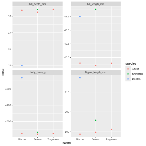
oh, but the points are stacking on top of each other and are hard to see. T
R
penguins_sum |>
ggplot(aes(x = island,
y = mean,
colour = species)) +
geom_point(position = position_dodge(width = 1)) +
facet_wrap(~ name, scales = "free_y")
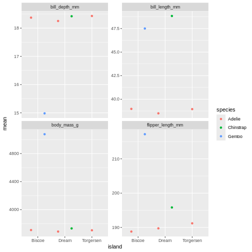
That is starting to look like something nice. What position_dodge is doing, is move the dts to each side a little, so they are not directly on top of each other, but you can still see them and which island they belong to clearly.
Challenge 4
Create a point plot based om the penguins summary data, where the standard deviations are on the y axis and species are on the x axis. Make sure to dodge the bar for easier comparisons. Create subplots on the different observational types
Use facet_wrap()
R
penguins_sum |>
ggplot(aes(x = island,
y = sd,
fill = species)) +
geom_point(position = position_dodge(width = 1)) +
facet_wrap(~ name)
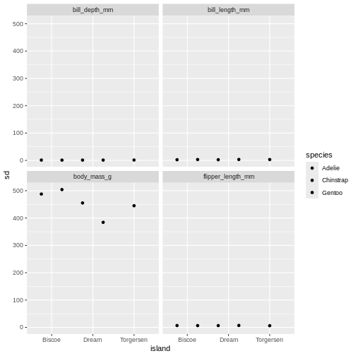
Challenge 5
Change it so that species is both on the x-axis and the colour for
the bar chart, and remove the dodge. What argument do you need to add to
facet_wrap() to make the y-axis scale vary freely between
the subplots? Why is this plot misleading?
R
penguins_sum |>
ggplot(aes(x = species,
y = sd,
fill = species)) +
geom_point(position = position_dodge(width = 1)) +
facet_wrap(~ name, scales = "free")
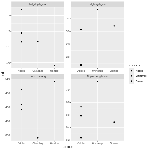 The last plot is misleading because the data we have summary data by
species and island. Ignoring the island in the plot, means that the
values for the different measurements cannot be distinguished from
eachother.
The last plot is misleading because the data we have summary data by
species and island. Ignoring the island in the plot, means that the
values for the different measurements cannot be distinguished from
eachother.
A common thing to add to this type of plot, is the confidence intervals, or the error bars. This is calculated by the standard error, which we dont have, but for the sake of showing how to add error bars, we will use the standard deviation in stead.
To do that, we add the geom_errorbar() function to the
ggplot calls. geom_errorbar is a little different than
other geoms we have seen, it takes very specific arguments, namely the
minimum and maximum value the error bars should span. In our case, it
would be the mean - sd, for minimum, and the mean + sd for the
maximum.
R
penguins_sum |>
ggplot(aes(x = island,
y = mean,
colour = species)) +
geom_point(position = position_dodge(width = 1)) +
geom_errorbar(aes(
ymin = mean - sd,
ymax = mean + sd
)) +
facet_wrap(~ name, scales = "free_y")
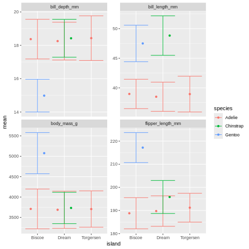
Right, so now we have error bars, but they dont connect to the dots! Perhaps we can dodge those too?
R
penguins_sum |>
ggplot(aes(x = island,
y = mean,
colour = species)) +
geom_point(position = position_dodge(width = 1)) +
geom_errorbar(aes(
ymin = mean - sd,
ymax = mean + sd
),
position = position_dodge(width = 1)) +
facet_wrap(~ name, scales = "free_y")
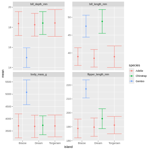
Challenge 6
The width of the top horizontal lines in the error bars are are little too wide. Try adjusting them by setting the width argument to 0.3
R
penguins_sum |>
ggplot(aes(x = island,
y = mean,
colour = species)) +
geom_point(position = position_dodge(width = 1)) +
geom_errorbar(aes(
ymin = mean - sd,
ymax = mean + sd
),
position = position_dodge(width = 1),
width = .2) +
facet_wrap(~ name, scales = "free_y")
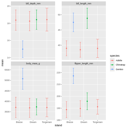
Facetting as a grid
But we can get even more creative! Lets recreate our summary table, and add year as a grouping, so we can get an idea of how the measurements change over time.
R
penguins_sum <- penguins |>
pivot_longer(contains("_")) |>
drop_na(value) |>
group_by(name, species, island, year) |>
summarise(
mean = mean(value),
sd = sd(value),
min = min(value),
max = max(value),
n = n()
) |>
ungroup()
OUTPUT
`summarise()` has regrouped the output.
ℹ Summaries were computed grouped by name, species, island, and year.
ℹ Output is grouped by name, species, and island.
ℹ Use `summarise(.groups = "drop_last")` to silence this message.
ℹ Use `summarise(.by = c(name, species, island, year))` for per-operation
grouping (`?dplyr::dplyr_by`) instead.R
penguins_sum
OUTPUT
# A tibble: 60 × 9
name species island year mean sd min max n
<chr> <fct> <fct> <int> <dbl> <dbl> <dbl> <dbl> <int>
1 bill_depth_mm Adelie Biscoe 2007 18.4 0.585 17.2 19.2 10
2 bill_depth_mm Adelie Biscoe 2008 18.1 1.20 16.2 21.1 18
3 bill_depth_mm Adelie Biscoe 2009 18.6 1.44 16 20.7 16
4 bill_depth_mm Adelie Dream 2007 18.7 1.21 16.7 21.2 20
5 bill_depth_mm Adelie Dream 2008 18.3 0.993 16.1 20.3 16
6 bill_depth_mm Adelie Dream 2009 17.7 0.994 15.5 20.1 20
7 bill_depth_mm Adelie Torgersen 2007 19.0 1.47 17.1 21.5 19
8 bill_depth_mm Adelie Torgersen 2008 18.1 1.11 16.1 19.4 16
9 bill_depth_mm Adelie Torgersen 2009 18.0 1.20 15.9 20.5 16
10 bill_depth_mm Chinstrap Dream 2007 18.5 1.00 16.6 20.3 26
# ℹ 50 more rowsAnd then let us re-create our last plot with this new summary table.
R
penguins_sum |>
ggplot(aes(x = island,
y = mean,
colour = species)) +
geom_point(position = position_dodge(width = 1)) +
geom_errorbar(aes(
ymin = mean - sd,
ymax = mean + sd
),
width = 0.3,
position = position_dodge(width = 1)) +
facet_wrap(~ name, scales = "free_y")
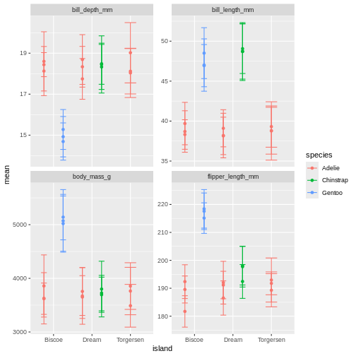
What is happening here? Because we’ve now added year to the groups in the summary, we have multiple means per species and island, for each of the measurement years. So we need to add something to the plot so we can tease those appart. We have added to variables to the facet before. Remember how we did that?
Challenge 7
The width of the top horizontal lines in the error bars are are little too wide. Try adjusting them by setting the width argument to 0.3
R
penguins_sum |>
ggplot(aes(x = island,
y = mean,
colour = species)) +
geom_point(position = position_dodge(width = 1)) +
geom_errorbar(aes(
ymin = mean - sd,
ymax = mean + sd
),
position = position_dodge(width = 1),
width = .2) +
facet_wrap(~ name + year, scales = "free_y")
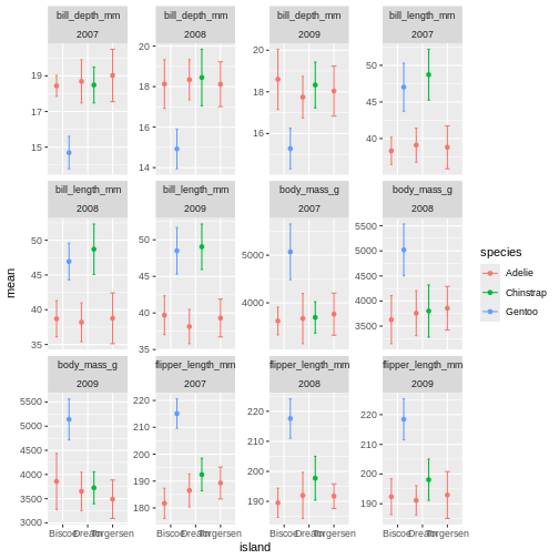
OK, so now we have it all. But its a little messy to compare over time, and what are we really looking at? I find it often makes more sense to plot time variables on the x-axis, and then facets over categories. Lets switch that up.
R
penguins_sum |>
ggplot(aes(x = year,
y = mean,
colour = species)) +
geom_point(position = position_dodge(width = 1)) +
geom_errorbar(aes(
ymin = mean - sd,
ymax = mean + sd
),
position = position_dodge(width = 1),
width = .2) +
facet_wrap(~ name + island, scales = "free_y")
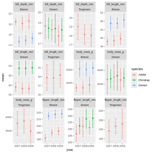 ok, so we got what we asked, the year part makes more sense, but its a
very “busy” plot. Its really quite hard to compare everything from
Bisoe, or all the Adelie’s, to each other. How can we make it
easier?
ok, so we got what we asked, the year part makes more sense, but its a
very “busy” plot. Its really quite hard to compare everything from
Bisoe, or all the Adelie’s, to each other. How can we make it
easier?
We will switch facet_wrap() to facet_grid()
which creates a grid of subplots. The formula for the grid is using both
side of the ~ sign. And you can think of it like
rows ~ columns. So here we are saying we want the
island values as rows, and name values as
columns in the plot grid.
R
penguins_sum |>
ggplot(aes(x = year,
y = mean,
colour = species)) +
geom_point(position = position_dodge(width = 1)) +
geom_errorbar(aes(
ymin = mean - sd,
ymax = mean + sd
),
position = position_dodge(width = 1),
width = .2) +
facet_grid(island ~ name)
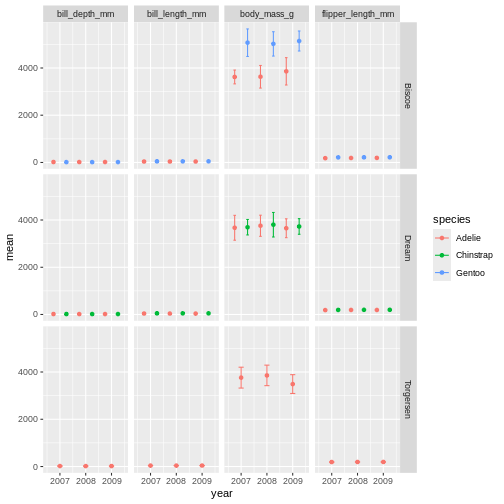
Challenge 8
It is hard to see the different metrics in the subplots, because they are all on such different scales. Try setting the y-axis to be set freely to allow differences betweem the subplots. Was this the effect you expected?
R
penguins_sum |>
ggplot(aes(x = year,
y = mean,
colour = species)) +
geom_point(position = position_dodge(width = 1)) +
geom_errorbar(aes(
ymin = mean - sd,
ymax = mean + sd
),
position = position_dodge(width = 1),
width = .2) +
facet_grid(island ~ name, scales = "free_y")
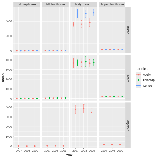
Challenge 9
Try switching up what is plotted as rows and columns in the facet. Does this help the plot?
R
penguins_sum |>
ggplot(aes(x = year,
y = mean,
colour = species)) +
geom_point(position = position_dodge(width = 1)) +
geom_errorbar(aes(
ymin = mean - sd,
ymax = mean + sd
),
position = position_dodge(width = 1),
width = .2) +
facet_grid(name ~ island, scales = "free_y")

facet_grid is more complex than facet_wrap as
it will always force the y-axis for rows, and x-axis for columns remain
the same. So wile setting scales to free will help a little, it will
only do so within each row and column, not each subplot. When the
results do not look as you like, swapping what are rows and columns in
the grid can often create better results.
Altering ggplot colours and theme
We now have a plot that is quite nicely summarising the data we have. But we want to customise it more. While the defaults in ggplot are fine enough, we usually want to improve it from the default look.
Before we do that, lets save the plot as an object, so we dont have to keep track of the part of the code we are not changing. Saving a ggplot object is just like saving a dataset object. We have to assign it a name at the beginning.
R
penguins_plot <- penguins_sum |>
ggplot(aes(x = year,
y = mean,
colour = species)) +
geom_point(position = position_dodge(width = 1)) +
geom_errorbar(aes(
ymin = mean - sd,
ymax = mean + sd
),
position = position_dodge(width = 1),
width = .2) +
facet_grid(name ~ island, scales = "free_y")
Did you notice that it did not make a new plot? Just like when you assign a data set it wont show in the console, when you assign a plot, it wont show in the plot pane.
To re-initiate the plot in the plot pane, write its name in the console and press enter.
R
penguins_plot
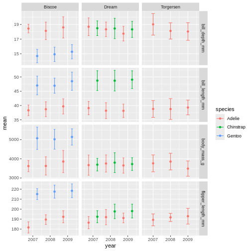
From there, we can keep adding more ggplot geoms or facets etc. In this first version, we will add a “theme”. A theme is a change of the overall “look” of the plot.
R
penguins_plot +
theme_classic()
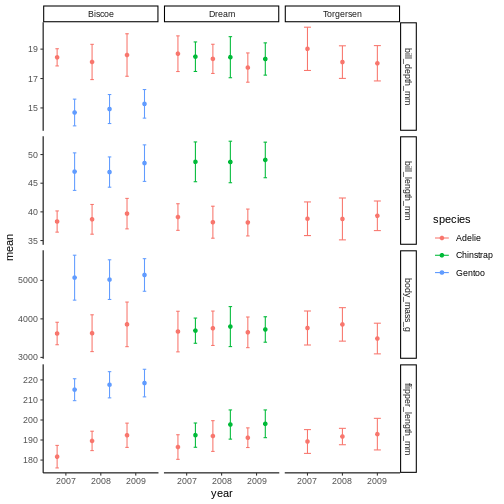 the classic theme is preferred by many journals, but for facet grid, its
not super nice, since we loose grid information.
the classic theme is preferred by many journals, but for facet grid, its
not super nice, since we loose grid information.
R
penguins_plot +
theme_light()
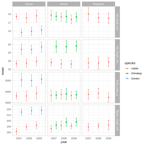 Theme light could be a nice option, but the white text of light grey
makes the panel text hard to read.
Theme light could be a nice option, but the white text of light grey
makes the panel text hard to read.
R
penguins_plot +
theme_dark()
Theme dark could theoretically be really nice, but then we’ll need other colours for the points and error bars!
Challenge 10
Try different themes and find one you like.
You can type “theme” and press the tab button, to look at all the possibilities.
What themes did you find that you liked?
We are going to have a go at theme_linedraw which has a
simple but clear design.
R
penguins_plot +
theme_linedraw()
Now that we have a theme, we can have a look at changing the colours of the points and error bars. We do this through something called “scales”.
R
penguins_plot +
theme_linedraw() +
scale_colour_brewer(palette = "Dark2")
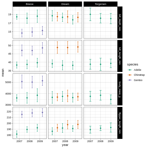
So here, we are changing the colour aesthetic, using a “brewer” palette “Dark2”. What is a brewer palette? THe brewer palettes are a curated library of colour palettes to choose from in ggplot. You can have a peak at all possible brewer palettes by typing
R
RColorBrewer::display.brewer.all()
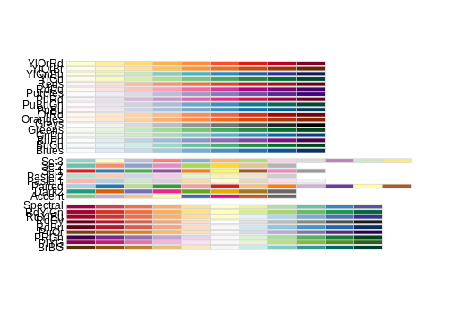
Challenge 11
Try another brewer palette by replacing the palette name with another in the brewer list of palettes.
R
penguins_plot +
theme_linedraw() +
scale_colour_brewer(palette = "Accent")
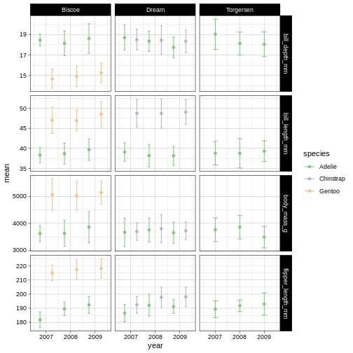
Challenge 12
Apply the dark theme in stead, and a pastel colour palette.
R
penguins_plot +
theme_dark() +
scale_colour_brewer(palette = "Pastel2")
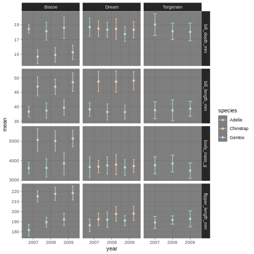
Amazing! We have now adapted our plot to look nicer and more to our liking. There are plenty of packages out there with specialised themes and colour palettes to choose from. Harry Potter colours, Wes Anderson colours, Ghibli move colours. You can find almost anything you like!
Content from Data manipulation across columns
Last updated on 2026-05-26 | Edit this page
Estimated time: 51 minutes
Overview
Questions
- How can I calculate the mean of several columns for every row of data?
- How can I apply the same function across several related columns?
Objectives
Motivation
We have covered many topics so far, and changing (or mutating) variables has been a key concept. The need to create new columns of data, often based on information in other columns of data, is a type of operation that we need very often. But some times, you also need to calculate something per row for several solumns. For instance, you want the sum of all columns in a certain collection, or the mean of them, how can we do that?
One way, is to write it our entirely. Let just pretend there is a good reason to get the sum of bill length and bill depth. Let us also make a subsetted sample with just the bill measurements so we cab easily see what we are doing. We can do that in the following way.
R
penguins_s <- penguins |>
select(species, starts_with("bill"))
penguins_s |>
mutate(
bill_sum = bill_depth_mm + bill_length_mm
)
OUTPUT
# A tibble: 344 × 4
species bill_length_mm bill_depth_mm bill_sum
<fct> <dbl> <dbl> <dbl>
1 Adelie 39.1 18.7 57.8
2 Adelie 39.5 17.4 56.9
3 Adelie 40.3 18 58.3
4 Adelie NA NA NA
5 Adelie 36.7 19.3 56
6 Adelie 39.3 20.6 59.9
7 Adelie 38.9 17.8 56.7
8 Adelie 39.2 19.6 58.8
9 Adelie 34.1 18.1 52.2
10 Adelie 42 20.2 62.2
# ℹ 334 more rowsWe’ve seen similar types of operations before. But what if you want
to sum 20 columns, you would need to type our all 20 column names!
Again, tedious. We have a special type of operations we can do to get
that easily. We will use the function sum to calculate the
sum of several variables when using this pipeline.
R
penguins_s |>
mutate(bill_sum = sum(c_across(starts_with("bill"))))
OUTPUT
# A tibble: 344 × 4
species bill_length_mm bill_depth_mm bill_sum
<fct> <dbl> <dbl> <dbl>
1 Adelie 39.1 18.7 NA
2 Adelie 39.5 17.4 NA
3 Adelie 40.3 18 NA
4 Adelie NA NA NA
5 Adelie 36.7 19.3 NA
6 Adelie 39.3 20.6 NA
7 Adelie 38.9 17.8 NA
8 Adelie 39.2 19.6 NA
9 Adelie 34.1 18.1 NA
10 Adelie 42 20.2 NA
# ℹ 334 more rowshm, that is not what we expected. I know why, but the reason is not
always easy to understand. By default, c_across will
summarise all the rows for all the bill columns, and give a
single value for the entire data set. There are some
NAs the entire data set, so it returns NA. So
how can we force it to work in a row-wise fashion? We can apply a
function called rowwise() which is a special type of
group_by that groups your data by each row, so each row is
its own group. Then, c_across() will calculate the mean of
the columns just for that group (i.e. row in this case).
R
penguins_s |>
rowwise() |>
mutate(bill_sum = sum(c_across(starts_with("bill"))))
OUTPUT
# A tibble: 344 × 4
# Rowwise:
species bill_length_mm bill_depth_mm bill_sum
<fct> <dbl> <dbl> <dbl>
1 Adelie 39.1 18.7 57.8
2 Adelie 39.5 17.4 56.9
3 Adelie 40.3 18 58.3
4 Adelie NA NA NA
5 Adelie 36.7 19.3 56
6 Adelie 39.3 20.6 59.9
7 Adelie 38.9 17.8 56.7
8 Adelie 39.2 19.6 58.8
9 Adelie 34.1 18.1 52.2
10 Adelie 42 20.2 62.2
# ℹ 334 more rowsNow we can see that we get the row sum of all the bill columns for
each row, and the tibble tells us it is “Rowwise”. To stop the data set
being rowwise, we can use the ungroup() function we learned
before.
R
penguins_s |>
rowwise() |>
mutate(bill_sum = sum(c_across(starts_with("bill")))) |>
ungroup()
OUTPUT
# A tibble: 344 × 4
species bill_length_mm bill_depth_mm bill_sum
<fct> <dbl> <dbl> <dbl>
1 Adelie 39.1 18.7 57.8
2 Adelie 39.5 17.4 56.9
3 Adelie 40.3 18 58.3
4 Adelie NA NA NA
5 Adelie 36.7 19.3 56
6 Adelie 39.3 20.6 59.9
7 Adelie 38.9 17.8 56.7
8 Adelie 39.2 19.6 58.8
9 Adelie 34.1 18.1 52.2
10 Adelie 42 20.2 62.2
# ℹ 334 more rowsChallenge 1
Calculate the mean of all the columns with millimeter measurements,
an call it mm_mean, for each row of data.
R
penguins |>
rowwise() |>
mutate(
mm_mean = mean(c_across(ends_with("mm")))
)
OUTPUT
# A tibble: 344 × 9
# Rowwise:
species island bill_length_mm bill_depth_mm flipper_length_mm body_mass_g
<fct> <fct> <dbl> <dbl> <int> <int>
1 Adelie Torgersen 39.1 18.7 181 3750
2 Adelie Torgersen 39.5 17.4 186 3800
3 Adelie Torgersen 40.3 18 195 3250
4 Adelie Torgersen NA NA NA NA
5 Adelie Torgersen 36.7 19.3 193 3450
6 Adelie Torgersen 39.3 20.6 190 3650
7 Adelie Torgersen 38.9 17.8 181 3625
8 Adelie Torgersen 39.2 19.6 195 4675
9 Adelie Torgersen 34.1 18.1 193 3475
10 Adelie Torgersen 42 20.2 190 4250
# ℹ 334 more rows
# ℹ 3 more variables: sex <fct>, year <int>, mm_mean <dbl>Challenge 2
Calculate the mean of all the columns with millimeter measurements,
an call it mm_mean, for each row of data. Then, group the
data by species, and calculate the mean of the mm_mean
within each species and add it as a column named
mm_mean_species. Ignore NAs in the last
calculation
R
penguins |>
rowwise() |>
mutate(
mm_mean = mean(c_across(ends_with("mm"))),
) |>
group_by(species) |>
mutate(mm_mean_species = mean(mm_mean, na.rm = TRUE))
OUTPUT
# A tibble: 344 × 10
# Groups: species [3]
species island bill_length_mm bill_depth_mm flipper_length_mm body_mass_g
<fct> <fct> <dbl> <dbl> <int> <int>
1 Adelie Torgersen 39.1 18.7 181 3750
2 Adelie Torgersen 39.5 17.4 186 3800
3 Adelie Torgersen 40.3 18 195 3250
4 Adelie Torgersen NA NA NA NA
5 Adelie Torgersen 36.7 19.3 193 3450
6 Adelie Torgersen 39.3 20.6 190 3650
7 Adelie Torgersen 38.9 17.8 181 3625
8 Adelie Torgersen 39.2 19.6 195 4675
9 Adelie Torgersen 34.1 18.1 193 3475
10 Adelie Torgersen 42 20.2 190 4250
# ℹ 334 more rows
# ℹ 4 more variables: sex <fct>, year <int>, mm_mean <dbl>,
# mm_mean_species <dbl>Mutating several columns in one go
So far, we’ve been looking at adding or summarising variables one by one, or in a pivoted fashion. This is of course something we do all the time, but some times we need to do the same change to multiple columns at once. Imagine you have a data set with 20 column and you want to scale them all to the same scale. Writing the same command with different columns 20 times is very tedious.
In our case, let us say we want to scale the three columns with
millimeter measurements so that they have a mean of 0 and standard
deviation of 1. We’ve already used the scale() function
once before, so we will do it again.
In this simple example we might have done so:
R
penguins |>
mutate(
bill_depth_sc = scale(bill_depth_mm),
bill_length_sc = scale(bill_length_mm),
flipper_length_sc = scale(flipper_length_mm)
)
OUTPUT
# A tibble: 344 × 11
species island bill_length_mm bill_depth_mm flipper_length_mm body_mass_g
<fct> <fct> <dbl> <dbl> <int> <int>
1 Adelie Torgersen 39.1 18.7 181 3750
2 Adelie Torgersen 39.5 17.4 186 3800
3 Adelie Torgersen 40.3 18 195 3250
4 Adelie Torgersen NA NA NA NA
5 Adelie Torgersen 36.7 19.3 193 3450
6 Adelie Torgersen 39.3 20.6 190 3650
7 Adelie Torgersen 38.9 17.8 181 3625
8 Adelie Torgersen 39.2 19.6 195 4675
9 Adelie Torgersen 34.1 18.1 193 3475
10 Adelie Torgersen 42 20.2 190 4250
# ℹ 334 more rows
# ℹ 5 more variables: sex <fct>, year <int>, bill_depth_sc <dbl[,1]>,
# bill_length_sc <dbl[,1]>, flipper_length_sc <dbl[,1]>Its just three columns, we can do that. But let us imagine we have 20
of these, typing all that out is tedious and error prone. You might
forget to alter the name or keep the same type of naming convention. We
are only human, we easily make mistakes. With {dplyr}’s
across() we can combine our knowledge of tidy-selectors and
mutate to create the entire transformation for these columns at
once.
R
penguins |>
mutate(across(.cols = ends_with("mm"),
.fns = scale))
OUTPUT
# A tibble: 344 × 8
species island bill_length_mm[,1] bill_depth_mm[,1] flipper_length_mm[,1]
<fct> <fct> <dbl> <dbl> <dbl>
1 Adelie Torgersen -0.883 0.784 -1.42
2 Adelie Torgersen -0.810 0.126 -1.06
3 Adelie Torgersen -0.663 0.430 -0.421
4 Adelie Torgersen NA NA NA
5 Adelie Torgersen -1.32 1.09 -0.563
6 Adelie Torgersen -0.847 1.75 -0.776
7 Adelie Torgersen -0.920 0.329 -1.42
8 Adelie Torgersen -0.865 1.24 -0.421
9 Adelie Torgersen -1.80 0.480 -0.563
10 Adelie Torgersen -0.352 1.54 -0.776
# ℹ 334 more rows
# ℹ 3 more variables: body_mass_g <int>, sex <fct>, year <int>Whoa! So fast! Now the three columns are scaled. .col
argument takes a tidy-selection of columns, and .fns it
where you let it know which function to apply.
But oh no! The columns have been overwritten. Rather than creating new ones, we replaced the old ones. This might be your intention in some instances, or maybe you will just create a new data set with the scaled variables.
R
penguins_mm_sc <- penguins |>
mutate(across(.cols = ends_with("mm"),
.fns = scale))
but often, we’d like to keep the original but add the new variants. We can do that to within the across!
R
penguins |>
mutate(across(.cols = ends_with("mm"),
.fns = scale,
.names = "{.col}_sc")) |>
select(contains("mm"))
OUTPUT
# A tibble: 344 × 6
bill_length_mm bill_depth_mm flipper_length_mm bill_length_mm_sc[,1]
<dbl> <dbl> <int> <dbl>
1 39.1 18.7 181 -0.883
2 39.5 17.4 186 -0.810
3 40.3 18 195 -0.663
4 NA NA NA NA
5 36.7 19.3 193 -1.32
6 39.3 20.6 190 -0.847
7 38.9 17.8 181 -0.920
8 39.2 19.6 195 -0.865
9 34.1 18.1 193 -1.80
10 42 20.2 190 -0.352
# ℹ 334 more rows
# ℹ 2 more variables: bill_depth_mm_sc <dbl[,1]>,
# flipper_length_mm_sc <dbl[,1]>Now they are all there! neat! But that .names argument
is a little weird. What does it really mean?
Internally, across() stores the column names in a vector
it calls .col. We can use this knowledge to tell the across
function what to name our new columns. In this case, we want to append
the column name with _sc.
Challenge 3
Transform all the colmns with an underscore in their name so they are
scaled, and add the prefix sc_ to the columns
names.
R
penguins |>
mutate(across(.cols = contains("_"),
.fns = scale,
.names = "sc_{.col}"))
OUTPUT
# A tibble: 344 × 12
species island bill_length_mm bill_depth_mm flipper_length_mm body_mass_g
<fct> <fct> <dbl> <dbl> <int> <int>
1 Adelie Torgersen 39.1 18.7 181 3750
2 Adelie Torgersen 39.5 17.4 186 3800
3 Adelie Torgersen 40.3 18 195 3250
4 Adelie Torgersen NA NA NA NA
5 Adelie Torgersen 36.7 19.3 193 3450
6 Adelie Torgersen 39.3 20.6 190 3650
7 Adelie Torgersen 38.9 17.8 181 3625
8 Adelie Torgersen 39.2 19.6 195 4675
9 Adelie Torgersen 34.1 18.1 193 3475
10 Adelie Torgersen 42 20.2 190 4250
# ℹ 334 more rows
# ℹ 6 more variables: sex <fct>, year <int>, sc_bill_length_mm <dbl[,1]>,
# sc_bill_depth_mm <dbl[,1]>, sc_flipper_length_mm <dbl[,1]>,
# sc_body_mass_g <dbl[,1]>Challenge 4
Transform all the colmns with an underscore in their name so they are
scaled, and add the prefix sc_ to the columns
names. Add another standard change of the body mass column to
kilograms
You can add a standard mutate within the same mutate as across
R
penguins |>
mutate(
across(.cols = contains("_"),
.fns = scale,
.names = "sc_{.col}"),
body_mass_kg = body_mass_g / 1000
)
OUTPUT
# A tibble: 344 × 13
species island bill_length_mm bill_depth_mm flipper_length_mm body_mass_g
<fct> <fct> <dbl> <dbl> <int> <int>
1 Adelie Torgersen 39.1 18.7 181 3750
2 Adelie Torgersen 39.5 17.4 186 3800
3 Adelie Torgersen 40.3 18 195 3250
4 Adelie Torgersen NA NA NA NA
5 Adelie Torgersen 36.7 19.3 193 3450
6 Adelie Torgersen 39.3 20.6 190 3650
7 Adelie Torgersen 38.9 17.8 181 3625
8 Adelie Torgersen 39.2 19.6 195 4675
9 Adelie Torgersen 34.1 18.1 193 3475
10 Adelie Torgersen 42 20.2 190 4250
# ℹ 334 more rows
# ℹ 7 more variables: sex <fct>, year <int>, sc_bill_length_mm <dbl[,1]>,
# sc_bill_depth_mm <dbl[,1]>, sc_flipper_length_mm <dbl[,1]>,
# sc_body_mass_g <dbl[,1]>, body_mass_kg <dbl>Wrap-up
We hope these sessions have given your a leg-up in starting you R and tidyverse journey. Remember that learning to code is like learning a new language, the best way to learn is to keep trying. We promise, your efforts will not be in vain as you uncover the power of R and the tidyverse.
Learning more
As and end to this workshop, we would like to provide you with some learning materials that might aid you in further pursuits of learning R.
The tidyverse webpage offers lots of resources on learning the tidyverse way of working, and information about what great things you can do with this collection of packages. There is an R for Datascience learning community that is an excellent and welcoming community of other learners navigating the tidyverse. We wholeheartedly recommend joining this community! The Rstudio community is also a great place to ask questions or look for solutions for questions you may have, and so is stackoverflow.