Plot Raster Data
Last updated on 2025-07-02 | Edit this page
Overview
Questions
- How can I create categorized maps of raster data?
- How can I customize the colour scheme of a raster image?
Objectives
After completing this episode, participants should be able to…
- Build customized plots for a single band raster using the
ggplot2package.
Things you’ll need to complete this episode
See the setup instructions for detailed information about the software, data, and other prerequisites you will need to work through the examples in this episode.
This lesson uses the terra package in particular. If you
have not installed it yet, do so by running
install.packages("terra") before loading it with
library(terra).
In this part, we will plot our raster object using
ggplot2 with customized colour schemes. We will continue
working with the Digital Surface Model (DSM) raster from the previous episode.
Plotting Data Using Breaks
In the previous plot, our DSM was coloured with a continuous colour
range. For clarity and visibility, we may prefer to view the data
“symbolized” or coloured according to ranges of values. This is
comparable to a “classified” map. For that, we need to tell
ggplot() how many groups to break our data into and where
those breaks should be. To make these decisions, it is useful to first
explore the distribution of the data using a bar plot. To begin with, we
will use dplyr’s mutate() function combined
with cut() to split the data into 3 bins.
R
DSM_TUD_df <- DSM_TUD_df |>
  mutate(fct_elevation = cut(`tud-dsm-5m`, breaks = 3))

ggplot() +
  geom_bar(data = DSM_TUD_df, aes(fct_elevation))
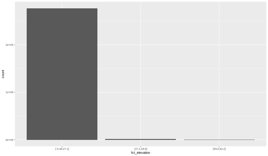
To see the cut-off values for the groups, we can ask for the levels
of fct_elevation:
{rdsm-fct-levels} levels(DSM_TUD_df$fct_elevation)
And we can get the count of values (that is, number of pixels) in
each group using dplyr’s count() function:
R
DSM_TUD_df |>
  count(fct_elevation)
OUTPUT
  fct_elevation      n
1  (-5.49,27.1] 277100
2   (27.1,59.6]   1469
3   (59.6,92.2]    123
We might prefer to customize the cut-off values for these groups.
Lets round the cut-off values so that we have groups for the ranges of
-10-0 m, 0-5 m, and 5-100 m. To implement this we will give
cut() a numeric vector of break points instead of the
number of breaks we want.
R
custom_bins <- c(-10, 0, 5, 100)

DSM_TUD_df <- DSM_TUD_df |>
  mutate(fct_elevation_cb = cut(`tud-dsm-5m`, breaks = custom_bins))

levels(DSM_TUD_df$fct_elevation_cb)
OUTPUT
[1] "(-10,0]" "(0,5]" "(5,100]"Data tip
Note that 4 break values will result in 3 bins of data.
The bin intervals are shown using ( to mean exclusive
and ] to mean inclusive. For example: (0, 5] means “from 0
through 5”.
And now we can plot our bar plot again, using the new groups:
R
ggplot() +
  geom_bar(data = DSM_TUD_df, aes(fct_elevation_cb))
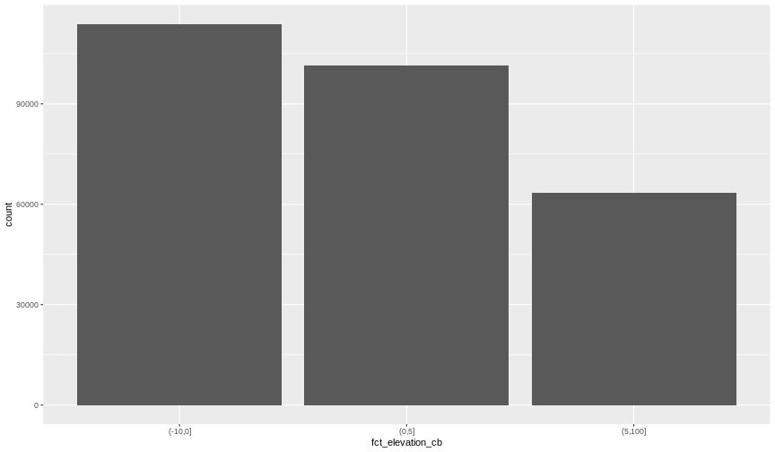
And we can get the count of values in each group in the same way we did before:
R
DSM_TUD_df |>
  count(fct_elevation_cb)
OUTPUT
fct_elevation_cb n
1 (-10,0] 113877
2 (0,5] 101446
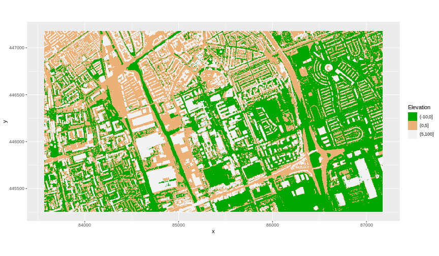
3 (5,100] 63369We can use those groups to plot our raster data, with each group being a different colour:
R
ggplot() +
  geom_raster(data = DSM_TUD_df, aes(x = x, y = y, fill = fct_elevation_cb)) +
  coord_equal()
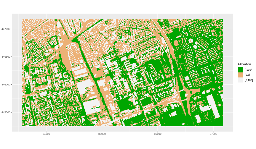
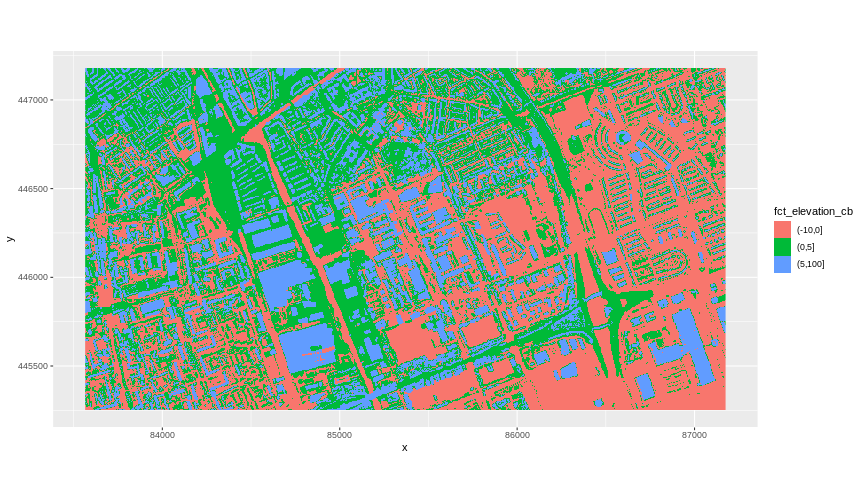 The plot above uses the default colours inside
 ggplot2 for
raster objects. We can specify our own colours to make the plot look a
little nicer. R has a built in set of colours for plotting terrain
available through the terrain.colors() function. Since we
have three bins, we want to create a 3-colour palette:
R
terrain.colors(3)
OUTPUT
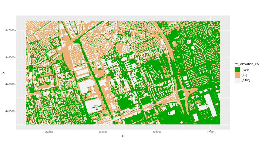
[1] "#00A600" "#ECB176" "#F2F2F2"The terrain.colors() function returns hex colours - each
of these character strings represents a colour. To use these in our map,
we pass them to the values argument in the
scale_fill_manual() function.
R
ggplot() +
  geom_raster(data = DSM_TUD_df, aes(x = x, y = y, fill = fct_elevation_cb)) +
  scale_fill_manual(values = terrain.colors(3)) +
  coord_equal()
More Plot Formatting
If we need to create multiple plots using the same colour palette, we
can create an R object (my_col) for the set of colours that
we want to use. We can then quickly change the palette across all plots
by modifying the my_col object, rather than each individual
plot.
We can give the legend a more meaningful title with the
name argument of the scale_fill_manual()
function.
R
my_col <- terrain.colors(3)

ggplot() +
  geom_raster(data = DSM_TUD_df, aes(
    x = x,
    y = y,
    fill = fct_elevation_cb
  )) +
  scale_fill_manual(values = my_col, name = "Elevation") +
  coord_equal()
 The axis labels x and y are not necessary, so we can turn them off by
passing
The axis labels x and y are not necessary, so we can turn them off by
passing element_blank() to the axis.title
argument in the theme() function.
R
ggplot() +
  geom_raster(data = DSM_TUD_df, aes(
    x = x,
    y = y,
    fill = fct_elevation_cb
  )) +
  scale_fill_manual(values = my_col, name = "Elevation") +
  theme(axis.title = element_blank()) +
  coord_equal()
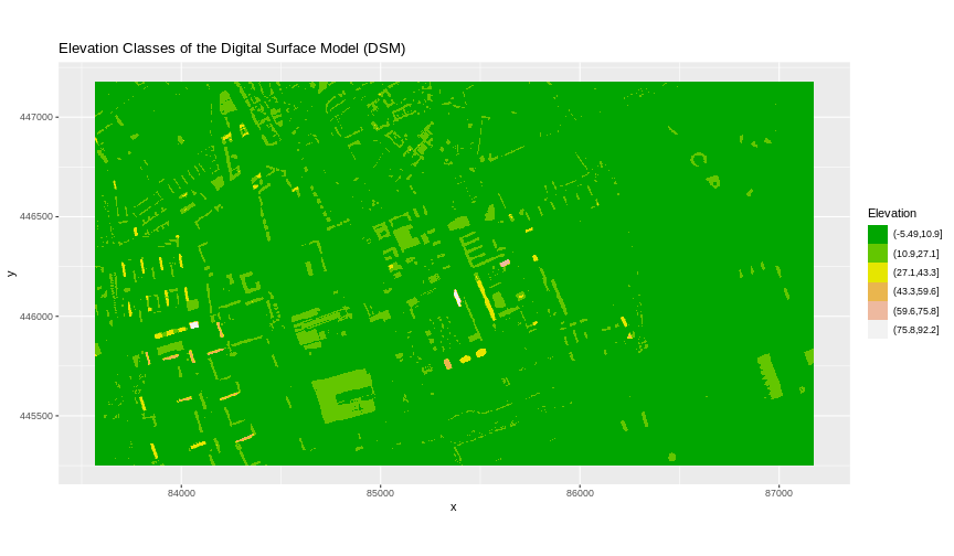
Challenge: Plot Using Custom Breaks
Create a plot of the TU Delft Digital Surface Model
(DSM_TUD) that has:
- Six classified ranges of values (break points) that are evenly divided among the range of pixel values.
- A plot title.
R
DSM_TUD_df <- DSM_TUD_df |>
  mutate(fct_elevation_6 = cut(`tud-dsm-5m`, breaks = 6))

levels(DSM_TUD_df$fct_elevation_6)
OUTPUT
[1] "(-5.49,10.9]" "(10.9,27.1]"  "(27.1,43.3]"  "(43.3,59.6]"  "(59.6,75.8]"
[6] "(75.8,92.2]"
R
my_col <- terrain.colors(6)

ggplot() +
  geom_raster(data = DSM_TUD_df, aes(
    x = x,
    y = y,
    fill = fct_elevation_6
  )) +
  scale_fill_manual(values = my_col, name = "Elevation") +
  coord_equal() +
  labs(title = "Elevation Classes of the Digital Surface Model (DSM)")
Key Points
- Continuous data ranges can be grouped into categories using
mutate()andcut(). - Use the built-in
terrain.colors()or set your preferred colour scheme manually.