Introduction to visualisation
Last updated on 2026-05-19 | Edit this page
Overview
Questions
- How can I create a basic plot in R?
- How can I add features to a plot?
- How can I get basic summary information about my data set?
- How can I include addition information via a colours palette.
- How can I find more information about a function and its arguments?
- How can I reorder columns in a data frame?
Objectives
After completing this episode, participants should be able to…
- Generate plots to visualise data with
ggplot2. - Add plot layers to incrementally build a more complex plot.
- Use the
fillargument for colouring surfaces, and modify colours with the viridis or scale_manual packages. - Explore the help documentation.
- Save and format your plot via the
ggsave()function.
Introduction to Visualisation
The package ggplot2 is a powerful plotting system. We
will start with an introduction of key features of ggplot2.
gg stands for grammar of graphics. The idea behind it is
that the following three components are needed to create a graph:
- data,
- aesthetics - a coordinate system on which we map the data (what is represented on x axis, what on y axis), and
- geometries - visual representation of the data (points, bars, etc.)
A fun part about ggplot2 is that you can add layers to
the plot to provide more information and to make it more beautiful.
While here we still focus on the gapminder dataset, in
later parts of this workshop we will use ggplot2 to
visualize geospatial data. First, make sure that you have the
tidyverse loaded, which includes ggplot2.
R
library(tidyverse)
Now, lets plot the distribution of life expectancy in the
gapminder dataset:
R
ggplot(
  data = gapminder, # data
  aes(x = lifeExp) # aesthetics layer
) +
  geom_histogram() # geometry layer
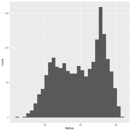
You can see that in ggplot you use + as a
pipe, to add layers. Within the ggplot() call, it is the
only pipe that will work. But, it is possible to chain operations on a
data set with a pipe that we have already learned: |>
and follow them by ggplot syntax.
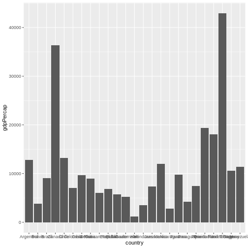
Let’s create another plot, this time only on a subset of observations:
R
gapminder |> # we select a data set
  filter(year == 2007 & continent == "Americas") |> # filter year and continent
  ggplot(aes(x = country, y = gdpPercap)) + # the x and y axes represent columns
  geom_col() # we use a column graph as a geometry
Now, you can iteratively improve how the plot looks like. For example, you might want to flip it, to better display the labels.
R
gapminder |>
  filter(year == 2007 & continent == "Americas") |>
  ggplot(aes(x = country, y = gdpPercap)) +
  geom_col() +
  coord_flip() # flip axes
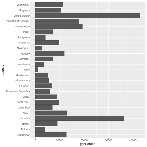
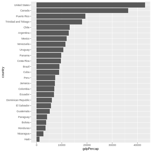
One thing you might want to change here is the order in which countries are displayed. It would be easier to compare GDP per capita, if they were showed in order. To do that, we need to reorder factor levels (you remember, we’ve already done this before).
Now the order of the levels will depend on another variable - GDP per capita.
R
gapminder |>
  filter(year == 2007 & continent == "Americas") |>
  mutate(country = fct_reorder(country, gdpPercap)) |> # reorder factor levels
  ggplot(aes(x = country, y = gdpPercap)) +
  geom_col() +
  coord_flip()
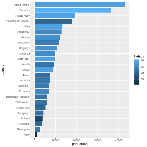
Let’s make things more colourful - let’s represent the average life expectancy of a country by colour
R
gapminder |>
  filter(year == 2007 & continent == "Americas") |>
  mutate(country = fct_reorder(country, gdpPercap)) |>
  ggplot(aes(
    x = country,
    y = gdpPercap,
    fill = lifeExp # use 'fill' for surfaces; 'colour' for points and lines
  )) +
  geom_col() +
  coord_flip()
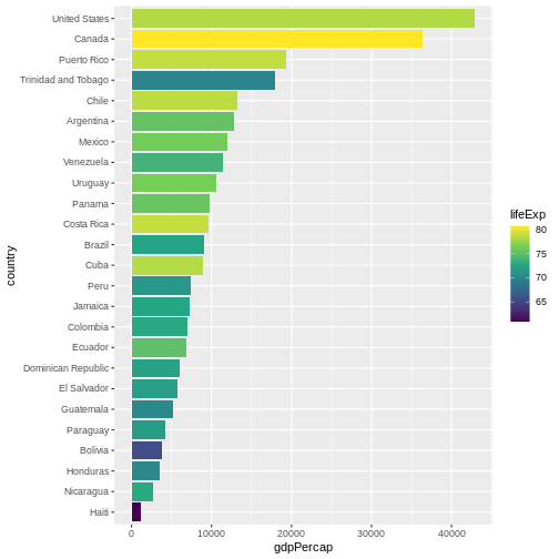
We can also adapt the colour scale. Common choice that is used for
its readability and colorblind-proofness are the palettes available in
the viridis package.
R
gapminder |>
  filter(year == 2007 & continent == "Americas") |>
  mutate(country = fct_reorder(country, gdpPercap)) |>
  ggplot(aes(
    x = country,
    y = gdpPercap,
    fill = lifeExp
  )) +
  geom_col() +
  coord_flip() +
  scale_fill_viridis_c() # _c stands for continuous scale
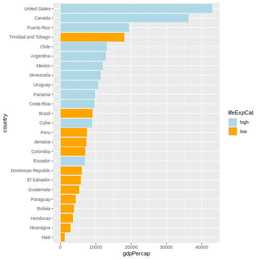
Maybe we don’t need that much information about the life expectancy.
We only want to know if it’s below or above average. We will make use of
the if_else() function inside mutate() to
create a new column lifeExpCat with the value
high if life expectancy is above average and
low otherwise. Note the usage of the if_else()
function:
if_else(<condition>, <value if TRUE>, <value if FALSE>).
R
p <- # this time let's save the plot in an object
  gapminder |>
  filter(year == 2007 & continent == "Americas") |>
  mutate(
    country = fct_reorder(country, gdpPercap),
    lifeExpCat = if_else(
      lifeExp >= mean(lifeExp),
      "high",
      "low"
    )
  ) |>
  ggplot(aes(x = country, y = gdpPercap, fill = lifeExpCat)) +
  geom_col() +
  coord_flip() +
  scale_fill_manual(
    values = c(
      "light blue",
      "orange"
    ) # customize the colors
  )
Since we saved a plot as an object p, nothing has been
printed out. Just like with any other object in R, if you
want to see it, you need to call it.
R
p
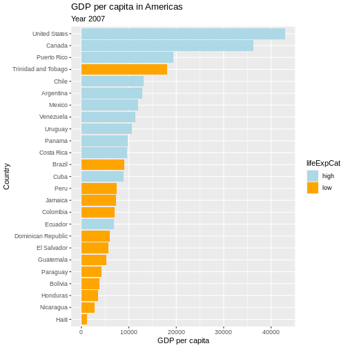
Now we can make use of the saved object and add things to it.
Let’s also give it a title, name the axes and the legend:
R
p <- p +
  labs(
    title = "GDP per capita in Americas",
    subtitle = "Year 2007",
    x = "Country",
    y = "GDP per capita",
    fill = "Life Expectancy categories"
  )

# show plot
p
Writing data
Saving the plot
Once we are happy with our plot we can save it in a format of our choice. Remember to save it in the dedicated folder.
R
ggsave(
  plot = p,
  filename = here("fig_output", "plot_americas_2007.pdf")
)
# By default, ggsave() saves the last displayed plot, but
# you can also explicitly name the plot you want to save
Using help documentation
My saved plot is not very readable. We can see why it happened by exploring the help documentation. We can do that by writing directly in the console:
R
?ggsave
We can read that it uses the “size of the current graphics device”.
That would explain why our saved plots look slightly different. Feel
free to explore the documentation to see how to adapt the size e.g. by
adapting width, height and units
parameter.
Saving the data
Another output of your work you want to save is a cleaned data set. In your analysis, you can then load directly that data set. Let’s say we want to save the data only for Americas:
R
gapminder_amr_2007 <- gapminder |>
  filter(year == 2007 & continent == "Americas") |>
  mutate(
    country_reordered = fct_reorder(country, gdpPercap),
    lifeExpCat = if_else(lifeExp >= mean(lifeExp), "high", "low")
  )

write.csv(gapminder_amr_2007,
  here("data_output", "gapminder_americas_2007.csv"),
  row.names = FALSE
)
- With
ggplot2, we use the+operator to combine plot layers and incrementally build a more complex plot. - In the aesthetics (
aes()), we can assign variables to the x and y axes and use thefillargument for colouring surfaces. - With
scale_fill_viridis_c()andscale_fill_manual()we can assign new colours to our plot. - To open the help documentation for a function, we run the name of
the function preceded by the
?sign.