Working with samples
Last updated on 2023-07-11 | Edit this page
Estimated time 12 minutes
Overview
Questions
- How do you work with posterior samples?
- How can the posterior information be handled?
Objectives
- Learn how to
- work with posterior samples
- compute posterior intervals
- compute probabilities for parameter ranges and sets
In the previous episode, we were introduced to the Bayesian formula and learned how to fit binomial and normal models using the grid approximation. However, the poor scalability of the grid approximation makes it impractical to use on models of even moderate size. To overcome this challenge, the standard solution is to employ Markov chain Monte Carlo (MCMC) methods, which involve drawing random samples from the posterior distribution. While we will delve into MCMC methods in subsequent lessons, we will now learn working with samples.
Example: binomial model
Let’s revisit the binomial model considered in the previous episode. The binomial model with a beta distribution is an example of a model where the analytical shape of the posterior is known.
\[p(\theta | X) = Beta(\alpha + x, \beta + N - x),\] where \(\alpha\) and \(\beta\) are the hyperparameters of the Beta prior and \(x\) the number of successes out of \(N\) trials.
\[\begin{align} p(\theta | X) &\propto p(X | \theta) p(\theta) \\ &= ... \end{align}\]
Let’s generate samples from the prior and posterior distributions, using the handedness data of the previous episode. First redefine the data.
R
# Sample size
N <- 50

# 7/50 are left-handed
x <- 7
Then, we’ll draw 5000 samples from the prior and posterior
distributions. In R, the standard statistical distributions can be
sampled from using readily available functions. For instance, the
binomial, normal and beta distributions can be sampled, respectively,
with rbinom, rnorm and rbeta functions.
R
# Number of samples
n_samples <- 5000

# Prior is Beta(1, 10)
alpha <- 1
beta <- 10

# Draw random values from the prior
prior_samples <- rbeta(n = n_samples,
                       shape1 = alpha,
                       shape2 = beta)

# Draw random values from the posterior
posterior_samples <- rbeta(n = n_samples,
                           shape1 = alpha + x,
                           shape2 = beta + N - x)

samples_df <- data.frame(prior = prior_samples,
                         posterior = posterior_samples)
Let’s plot histograms for these samples along with the analytical densities, the normalized likelihood, and the “true” value (blue) based on a larger population sample.
R
# Wide --> long format
samples_df_w <- samples_df %>% gather(key = "Samples")

# Define analytical distributions
delta <- 0.001
analytical_df <- data.frame(p = seq(0, 1, by = delta)) %>%
  mutate(
    prior = dbeta(x = p , alpha, beta),
    posterior = dbeta(x = p , alpha + x, beta + N - x),
    likelihood = dbinom(size = N, x = x, prob = p)
    ) %>%
  mutate(likelihood = likelihood/(sum(likelihood)*delta)) %>%  # normalize likelihood for better presentation
  gather(key = "Analytical function", value = "value", -p) %>%  # wide --> long
  mutate(`Analytical function` = factor(`Analytical function`, levels = c("posterior", "prior", "likelihood")))


# Frequency in a large population sample (Hardyck, C. et al., 1976)
p_true <- 9.6/100


p <- ggplot(samples_df_w) +
  geom_histogram(aes(x = value, y = after_stat(density),
                     fill = Samples),
                 bins = 50,
                 position = "identity", alpha = 0.75) +
  geom_line(data = analytical_df,
            aes(x = p, y = value, color = `Analytical function`),
            linewidth = 1) +
  geom_vline(xintercept = p_true,
             color = "blue",
             linewidth = 1) +
  scale_color_grafify() +
  scale_fill_grafify() +
  labs(x = "p")

print(p)
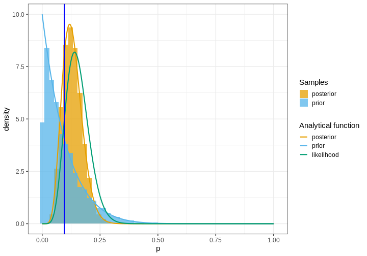
When sampling the prior and posterior, it is important to draw sufficiently many samples to get an accurate representation of the true density. Typically, this means drawing at least some thousands of samples.
Predictive distributions
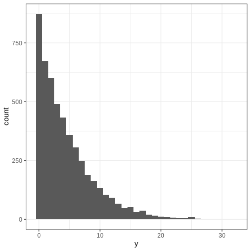
The posterior distribution gives probabilities for the model parameters conditional on the data which is information regarding the data generative process. However, it can also be valuable to analyze what sort of observations might be expected to arise if more data was gathered. On the other hand this might be an interesting question to address based simply on the prior beliefs.
The posterior and prior predictive distributions aim to address this question. They give probabilities for new observations based on the prior, model and currently available data. Prior predictions do not use the data, however.
The prior predictive distribution (also known as marginal distribution of data) is defined as
\[p(y) = \int p(\theta)p(y | \theta) d \theta.\]
In this course, we will not be using the analytical formula or make derivations for any models. The key point here is to be able to simulate from \(p(y)\). This can be done by first drawing a sample from the prior \(p(\theta)\) and then using this sample to generate data based on \(p(y | \theta).\) Let’s generate some data based on the Beta-binomial model of the handedness example and plot a histogram of \(y.\)
R
a <- 1
b <- 10

# Draw from the prior
prior_samples2 <- rbeta(n = n_samples,
                        shape1 = a,
                        shape2 = b)

# Generate data based on the prior samples
y <- rbinom(n_samples, size = 50, prob = prior_samples2)


p_y <- ggplot() +
  geom_histogram(data = data.frame(y),
                 aes(x = y),
                 binwidth = 1)

print(p_y)
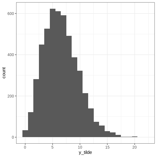
The posterior predictive distribution is defined as
\[p(\tilde{y} | y) = \int p(\tilde{y} | \theta)p(\theta | y) d \theta.\]
The posterior predictive distribution can be samples as follows:
- Draw sample from the posterior \(p(\theta | y)\)
- Generate observations based on \(p(\tilde{y} | \theta)\)
Let’s simulate the posterior predictive distribution.
R
x <- 7
N <- 50

a <- 1
b <- 10

posterior_samples2 <- rbeta(n = n_samples,
                           shape1 = a + x,
                           shape2 = b + N - x)


# Generate data based on the prior samples
y_tilde <- rbinom(n_samples, size = 50, prob = posterior_samples2)


p_y_tilde <- ggplot() +
  geom_histogram(data = data.frame(y_tilde),
                 aes(x = y_tilde),
                 binwidth = 1)

print(p_y_tilde)
Posterior intervals
In Episode 1, we summarized the posterior with the posterior mode (MAP), mean and variance. While these points estimates are informative and often utilized, they and not informative enough for many scenarios.
More specified information about the posterior can be communicated with credible intervals (CI). These intervals refer to areas of the space where a certain amount of posterior mass is located. Usually CIs are computed as quantiles of posterior, so for instance the 90% CI would be located between the 5% and 95% percentiles.
Let us now compute the percentile-based CIs for the handedness example, along with the posterior mode (MAP), and include them in the figure. The x-axis is zoomed so for clarity.
R
# MAP
posterior_density <- density(posterior_samples)
MAP <- posterior_density$x[which.max(posterior_density$y)]

# 90% credible interval
CIs <- quantile(posterior_samples, probs = c(0.05, 0.95))

p <- p +
  geom_vline(xintercept = CIs, linetype = "dashed") +
  geom_vline(xintercept = MAP) +
  geom_vline(xintercept = p_true, color = "blue", size = 1) +
  coord_cartesian(xlim = c(0, 0.5)) +
  labs(title = "Black = MAP and 90% CIs")
WARNING
Warning: Using `size` aesthetic for lines was deprecated in ggplot2 3.4.0.
ℹ Please use `linewidth` instead.
This warning is displayed once every 8 hours.
Call `lifecycle::last_lifecycle_warnings()` to see where this warning was
generated.
R
print(p)
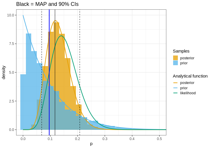
The 90% interval in this example is 0.07, 0.21 which means that, according to the analysis, there is a 90% probability that the proportion of left-handed people is between these values.
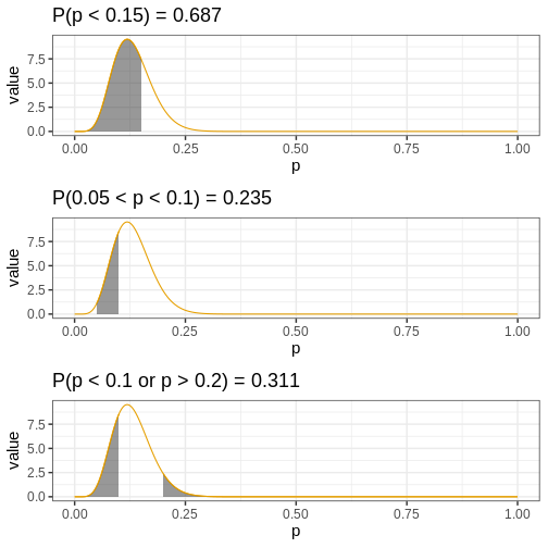
Another approach to reporting posterior information is to find the amount of the posterior mass in a given interval (or some more general set). This approach enables determining probabilities for hypotheses. For instance, we might be interested in knowing the probability that the target parameter is less than 0.2, between 0.05 and 0.10, or less than 0.1 or greater than 0.20. Such probabilities can be recovered based on samples simply by computing the proportion of samples in these sets.
R
p_less_than_0.15 <- mean(posterior_samples < 0.15)
p_between_0.05_0.1 <- mean(posterior_samples > 0.05 & posterior_samples < 0.1)
p_outside_0.1_0.2 <- mean(posterior_samples < 0.1 | posterior_samples > 0.2)
Let’s visualize these probabilities as shaded areas of the analytical posterior:
R
my_df <- analytical_df %>%
                 filter(`Analytical function` == "posterior")

my_p <- ggplot(my_df) +
  geom_line(aes(x = p, y = value,
                     color = `Analytical function`)) +
   scale_color_grafify() +
  guides(color="none")

my_breaks <- seq(0, 1, by = 0.25)

p1 <- my_p +
  geom_area(data = my_df %>%
              filter(p <= 0.15) %>%
              mutate(area = "yes"),
            aes(x = p, y = value,
                     color = `Analytical function`),
            alpha = 0.5) +
  # scale_x_continuous(breaks = c(my_breaks, 0.2)) +
  labs(title = paste0("P(p < 0.15) = ", round(p_less_than_0.15, 3)))

p2 <- my_p +
  geom_area(data = my_df %>%
              filter(p <= 0.1 & p >= 0.05) %>%
              mutate(area = "yes"),
            aes(x = p, y = value,
                     color = `Analytical function`),
            alpha = 0.5) +
  labs(title = paste0("P(0.05 < p < 0.1) = ", round(p_between_0.05_0.1, 3)))

p3 <- my_p +
  geom_area(data = my_df %>%
              filter(p >= 0.2) %>%
              mutate(area = "yes"),
            aes(x = p, y = value,
                     color = `Analytical function`),
            alpha = 0.5) +
  geom_area(data = my_df %>%
              filter(p <= 0.1) %>%
              mutate(area = "yes"),
            aes(x = p, y = value,
                     color = `Analytical function`),
            alpha = 0.5) +
  labs(title = paste0("P(p < 0.1 or p > 0.2) = ", round(p_outside_0.1_0.2, 3)))


p_area <- plot_grid(p1, p2, p3,
               ncol = 1)

print(p_area)
Challenge
Another approach to posterior summarizing to compute the smallest interval that contains p% of the posterior. Such sets are called highest posterior density intervals (HPDI). More generally, this set can be a more general set than an interval.
Write a function that returns the highest posterior density interval
based on a set of posterior samples. Compute the 95% HPDI for the
posterior samples generated (samples_df) and compare it to
the 95% CIs.
If you sort the posterior samples in order, each set of \(n\) consecutive samples contains \(100 \cdot n/N \%\) of the posterior, where \(N\) is the total number of samples.
Let’s write the function for computing the HPDI
R
get_HPDI <- function(samples, prob) {

  # Total samples
  n_samples <- length(samples)

  # How many samples constitute prob of the total number?
  prob_samples <- round(prob*n_samples)

  # Sort samples
  samples_sort <- samples %>% sort


  # Each samples_sort[i:(i + prob_samples - 1)] contains prob of the total distribution mass
  # Find the shortest such interval
  min_i <- lapply(1:(n_samples - prob_samples), function(i) {

    samples_sort[i + prob_samples - 1] - samples_sort[i]

  }) %>% unlist %>% which.min()

  # Get correspongind values
  hpdi <- samples_sort[c(min_i, min_i + prob_samples)]

  return(hpdi)
}
Then we can compute the 95% HPDI and compare it to the corresponding CIs
R
data.frame(HPDI = get_HPDI(samples_df$posterior, 0.95),
           CI = quantile(posterior_samples, probs = c(0.025, 0.975))) %>%
  t %>%
  data.frame() %>%
  mutate(length = X97.5. - X2.5.)
OUTPUT
          X2.5.    X97.5.    length
HPDI 0.05507850 0.2154054 0.1603269
CI   0.06071745 0.2258018 0.1650843
Both intervals contain the same mass but the HPDI is (slightly) shorter.
The code of the solution is based on the HPDI implementation of the
function coda::HPDinterval
Keypoints
- Being able to sample from distributions make working with Bayesian models a lot more straight-forward
- Prior/posterior predictive distributions describe the type of data we’d expect to encounter based on prior/posterior information.
- The posterior distribution can be summarized with point estimates or computing the posterior mass in some set.
- The credible intervals can be computed based on samples using posterior quantiles
- Probability of a parameter being in a set can be computed as the proportion of samples within the particular set.
Reading
- Gelman et al., Bayesian Data Analysis (3rd ed.):
- p. 7: Prediction
- p. 23: Simulation of posterior and …
- McElreath, Statistical Rethinking (2nd ed.): Ch. 3