Introduction to Time-series Forecasting
Baseline Metrics for Timeseries Forecasts
Figure 1
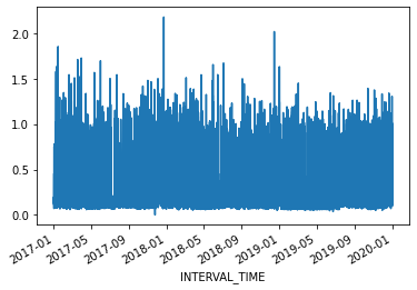
Plot of readings from a single meter,
2017-2019
Figure 2
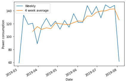
Plot of total weekly readings from a single
meter, January - June, 2019
Figure 3
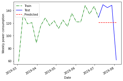
Plot of total weekly readings from a single
meter, January - June, 2019
Figure 4
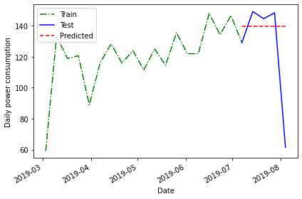
Plot of total weekly readings from a single
meter, January - June, 2019
Figure 5
Plot of total weekly readings from a single
meter, January - June, 2019
Figure 6
Plot of total weekly readings from a single
meter, January - June, 2019
Moving Average Forecasts
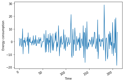
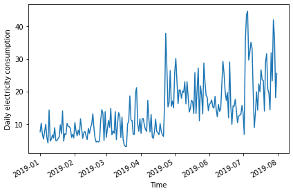
Figure 1
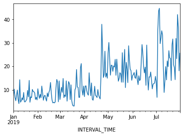
Plot of daily total power consumption from a
single smart meter.
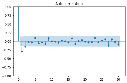
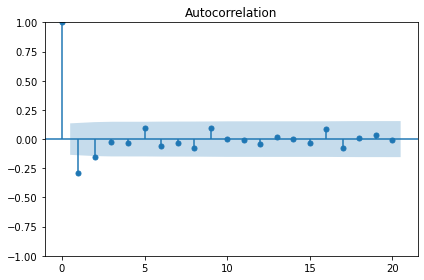
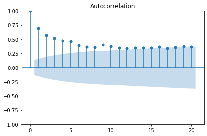
Figure 2
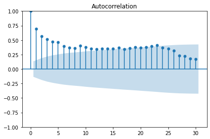
Plot showing autocorrelation of daily total
power consumption.
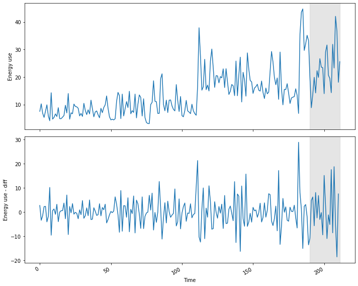
Figure 3
Plot of differenced daily power consumption
data.
Figure 4
Autocorrelation plot of differenced data.
Figure 5
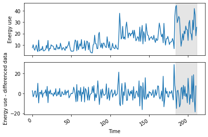
Plot of daily power consumption and differenced
data, with forecast range shaded.
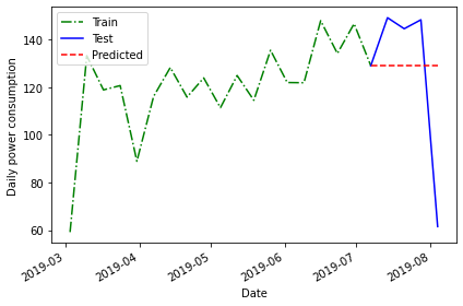
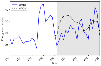
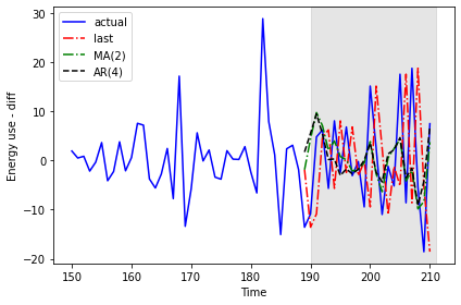
Figure 6
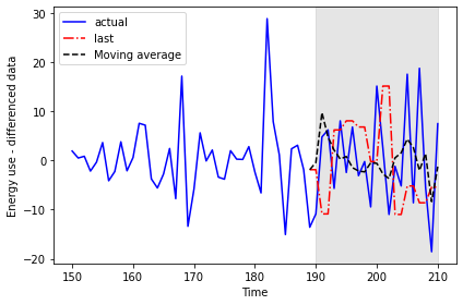
Last known value versus moving average
forecasts.
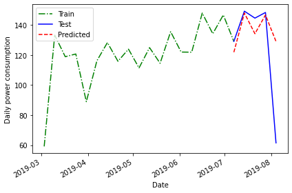
Figure 7
Plot of transformed moving average
forecasts.
Autoregressive Forecasts
Figure 1

Plot of daily power consumption from a single
power meter.
Figure 2
Plot of autocorrelation function of differenced
data.
Figure 3
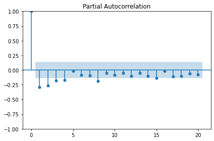
Plot of partial autocorrelation function of
difference data.
Figure 4
Plot of original and differenced data, with
forecast range shaded.
Figure 5
Comparison of forecasted power
consumption.
Figure 6
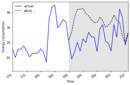
Plot of AR(4) forecast against actual
values.
Autoregressive Moving Average Forecasts
Figure 1
Plot of daily power consumption from a single
smart meter.
Figure 2
Plot of autocorrelation function of
undifferenced data.
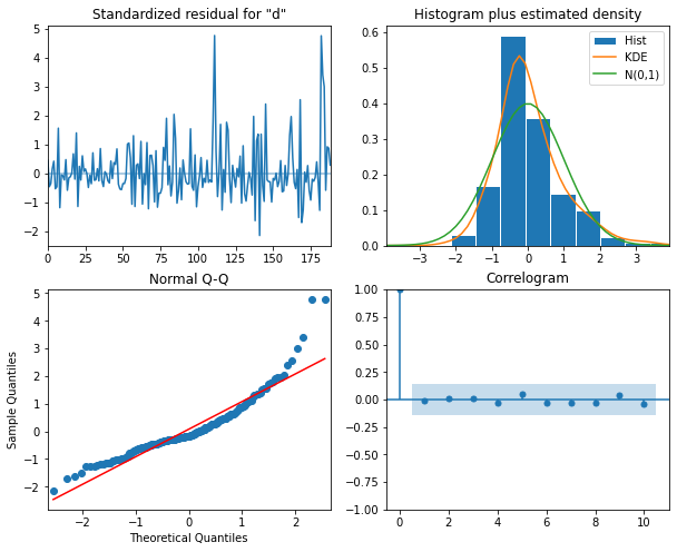
Figure 3
Diagnostic plot of residuals of ARMA(1, 1)
model
Figure 4
Plot of original and differenced data with
forecast region shaded.
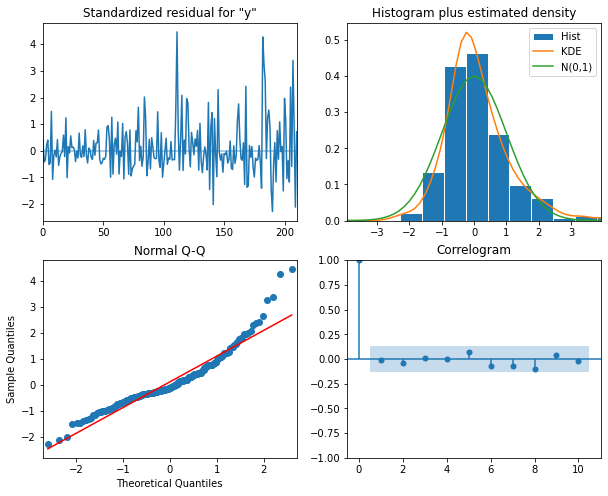
Figure 5
Diagnostic plot of residuals of ARMA(0, 2)
model.
Figure 6
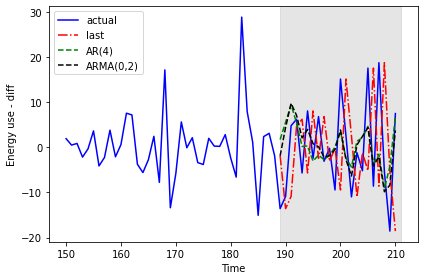
Results of AR(4) and ARMA(0, 2) forecasts
Figure 7
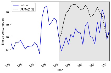
Final plot of ARMA(0, 2) forecast compared to
actual values.
Autoregressive Integrated Moving Average Forecasts
Figure 1
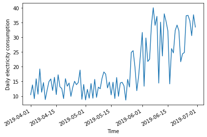
Plot of power consumption from a single smart
meter.
Figure 2
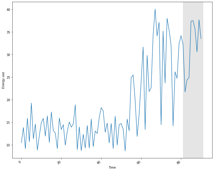
Plot of non-stationary time-series with forecast
range shaded.
Figure 3
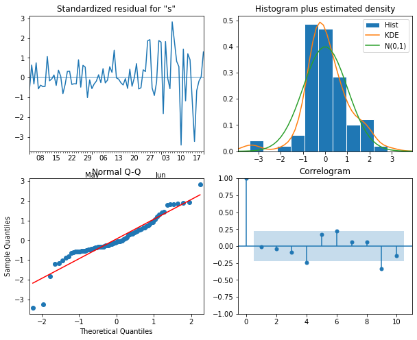
Diagnostic plot of ARIMA(2, 2, 3) process.
Figure 4
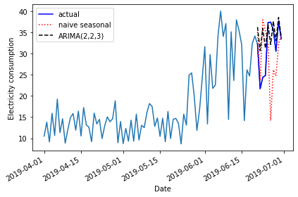
Plot of baseline and ARIMA(2, 2, 3)
forecasts.
Seasonal Autoregressive Integrated Moving Average Forecasts
Figure 1
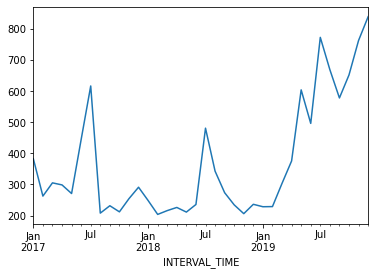
Monthly power consumption over three years from
a single meter.
Figure 2
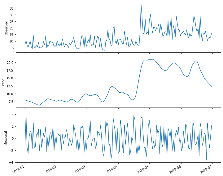
Decomposition plot of the time-series.
Figure 3
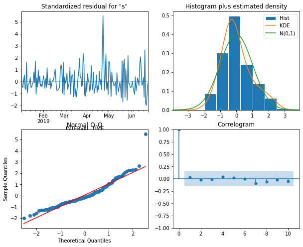
Diagnostic plot of the seasonal ARIMA(3, 1, 4)
model.
Figure 4
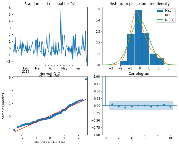
Diagnostic plot of residuals of SARIMA(1, 1,
2)(2, 0, 2)7 model.
Figure 5
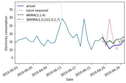
Plot of baseline, ARIMA, and SARIMA
forecasts.