Content from Introduction to Time-series Forecasting
Last updated on 2023-08-29 | Edit this page
Estimated time: 30 minutes
Overview
Questions
- How can we predict future values in a time-series?
Objectives
- Define concepts applicable to forecasting models.
Introduction
This lesson is the second in a series of lessons demonstrating Python libraries and methods for time-series analysis and forecasting.
The first lesson, Time
Series Analysis of Smart Meter Power Consmption Data, introduces
datetime indexing features in the Python Pandas library.
Other topics in the lesson include grouping data, resampling by time
frequency, and plotting rolling averages.
This lesson introduces forecasting time-series. Specifically, this lesson aims to progressively demonstrate the attributes and processes of the SARIMAX model (Seasonal Auto-Regressive Integrated Moving Average witheXogenous factors). Exogenous factors are out of scope of the lesson, which is structured around the process of predicting a single timestep of a variable based on the the historic values of that same variable. Multi-variate forecasts are not addressed. Relevant topics include:
- Stationary and non-stationary time-series
- Auto-regression
- Seasonality
The lesson demonstrates statistical methods for testing for the
presence of stationarity and auto-regression, and for using the
SARIMAX class of the Python statsmodels
library to make forecasts that account for these processes.
As noted throughout the lesson, the code used in this lesson is based on and in some cases is a direct application of code used in the Manning Publications title, Time series forecasting in Python, by Marco Peixeiro.
Peixeiro, Marco. Time Series Forecasting in Python. [First edition]. Manning Publications Co., 2022.
The original code from the book is made available under an Apache 2.0 license. Use and application of the code in these materials is within the license terms, although this lesson itself is licensed under a Creative Commons CC-BY 4.0 license. Any further use or adaptation of these materials should cite the source code developed by Peixeiro:
Peixeiro, Marco. Timeseries Forecasting in Python [Software code]. 2022. Accessed from https://github.com/marcopeix/TimeSeriesForecastingInPython.
The third lesson in the series is Machine Learning for Timeseries Forecasting with Python. It follows from and builds upon concepts from these first two lessons in the series.
All three lessons use the same data. For information about the data and how to set up the environment so the code will work without the need to edit file paths, see the Setup section.
Key Points
- The Python
statsmodelslibrary includes a full featured implementation of the SARIMAX model.
Content from Baseline Metrics for Timeseries Forecasts
Last updated on 2023-08-14 | Edit this page
Estimated time: 50 minutes
Overview
Questions
- What are some common baseline metrics for time-series forecasting?
Objectives
- Identify baseline metrics for time-series forecasting.
- Evaluate performance of forecasting methods using plots and mean absolute percentage error.
Introduction
In order to make reliable forecasts using time-series data, it is necessary to establish baseline forecasts against which to compare the results of models that will be covered in later sections of this lesson.
In many cases, we can only predict one timestamp into the future. From the standpoint of baseline metrics, there are multiple ways we can define a timestep and base predictions using
- the historical mean across the dataset
- the value of the the previous timestep
- the last known value, or
- a naive seasonal baseline based upon a pairwise comparison of a set of previous timesteps.
About the code
The code used in this lesson is based on and, in some cases, a direct application of code used in the Manning Publications title, Time series forecasting in Python, by Marco Peixeiro.
Peixeiro, Marco. Time Series Forecasting in Python. [First edition]. Manning Publications Co., 2022.
The original code from the book is made available under an Apache 2.0 license. Use and application of the code in these materials is within the license terms, although this lesson itself is licensed under a Creative Commons CC-BY 4.0 license. Any further use or adaptation of these materials should cite the source code developed by Peixeiro:
Peixeiro, Marco. Timeseries Forecasting in Python [Software code]. 2022. Accessed from https://github.com/marcopeix/TimeSeriesForecastingInPython.
Create a data subset for basline forecasting
Rather than read a previously edited dataset, for each of the episodes in this lesson we will read in data from one or more of the Los Alamos Department of Public Utilities smart meter datasets downloaded in the Setup section.
Once the dataset has been read into memory, we will create a datetime index, subset, and resample the data for use in the rest of this episode. First, we need to import libraries.
Then we read the data and create the datetime index.
OUTPUT
<class 'pandas.core.frame.DataFrame'>
RangeIndex: 105012 entries, 0 to 105011
Data columns (total 5 columns):
# Column Non-Null Count Dtype
--- ------ -------------- -----
0 INTERVAL_TIME 105012 non-null object
1 METER_FID 105012 non-null int64
2 START_READ 105012 non-null float64
3 END_READ 105012 non-null float64
4 INTERVAL_READ 105012 non-null float64
dtypes: float64(3), int64(1), object(1)
memory usage: 4.0+ MBPYTHON
# Set datetime index
df.set_index(pd.to_datetime(df["INTERVAL_TIME"]), inplace=True)
df.sort_index(inplace=True)
print(df.info())OUTPUT
<class 'pandas.core.frame.DataFrame'>
DatetimeIndex: 105012 entries, 2017-01-01 00:00:00 to 2019-12-31 23:45:00
Data columns (total 5 columns):
# Column Non-Null Count Dtype
--- ------ -------------- -----
0 INTERVAL_TIME 105012 non-null object
1 METER_FID 105012 non-null int64
2 START_READ 105012 non-null float64
3 END_READ 105012 non-null float64
4 INTERVAL_READ 105012 non-null float64
dtypes: float64(3), int64(1), object(1)
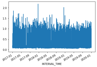
memory usage: 4.8+ MBThe dataset is large, with multiple types of seasonality occurring including
- daily
- seasonal
- yearly
trends. Additionally, the data represent smart meter readings taken from a single meter every fifteen minutes over the course of three years. This gives us a dataset that consists of 105,012 rows of meter readings taken at a frequency which makes baseline forecasts less effective.
For our current purposes, we will subset the data to a period with fewer seasonal trends. Using datetime indexing we can select a subset of the data from the first six months of 2019.
We will also resample the data to a weekly frequency.
PYTHON
weekly_usage = pd.DataFrame(jan_june_2019.resample("W")["INTERVAL_READ"].sum())
print(weekly_usage.info()) # note the index range and freq
print(weekly_usage.head())OUTPUT
<class 'pandas.core.frame.DataFrame'>
DatetimeIndex: 23 entries, 2019-03-03 to 2019-08-04
Freq: W-SUN
Data columns (total 1 columns):
# Column Non-Null Count Dtype
--- ------ -------------- -----
0 INTERVAL_READ 23 non-null float64
dtypes: float64(1)
memory usage: 368.0 bytes
None
INTERVAL_READ
INTERVAL_TIME
2019-03-03 59.1300
2019-03-10 133.3134
2019-03-17 118.9374
2019-03-24 120.7536
2019-03-31 88.9320Plotting the total weekly power consumption with a 4 week rolling mean shows that there is still an overall trend and some apparent weekly seasonal effects in the data. We will see how these different features of the data influence different baseline forecasts.
PYTHON
fig, ax = plt.subplots()
ax.plot(weekly_usage["INTERVAL_READ"], label="Weekly")
ax.plot(weekly_usage["INTERVAL_READ"].rolling(window=4).mean(), label="4 week average")
ax.set_xlabel('Date')
ax.set_ylabel('Power consumption')
ax.legend(loc=2)
fig.autofmt_xdate()
plt.tight_layout()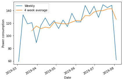
Create subsets for training and testing forecasts
Throughout this lesson, as we develop more robust forecasting models we need to train the models using a large subset of our data to derive the metrics that define each type of forecast. Models are then evaluated by comparing forecast values against actual values in a test dataset.
Using a rough estimate of four weeks in a month, we will test our baseline forecasts using various methods to predict the last four weeks of power consumption based on values in the test dataset. Then we will compare the forecast against the actual values in the test dataset.
PYTHON
train = weekly_usage[:-4].copy()
test = weekly_usage[-5:].copy()
print(train.info())
print(test.info())OUTPUT
<class 'pandas.core.frame.DataFrame'>
DatetimeIndex: 19 entries, 2019-03-03 to 2019-07-07
Freq: W-SUN
Data columns (total 1 columns):
# Column Non-Null Count Dtype
--- ------ -------------- -----
0 INTERVAL_READ 19 non-null float64
dtypes: float64(1)
memory usage: 304.0 bytes
None
<class 'pandas.core.frame.DataFrame'>
DatetimeIndex: 5 entries, 2019-07-07 to 2019-08-04
Freq: W-SUN
Data columns (total 1 columns):
# Column Non-Null Count Dtype
--- ------ -------------- -----
0 INTERVAL_READ 5 non-null float64
dtypes: float64(1)
memory usage: 80.0 bytes
NoneForecast using the historical mean
The first baseline or naive forecast method we will use is the historical mean. Here, we calculate the mean weekly power consumption across the training dataset.
PYTHON
# get the mean of the training set
historical_mean = np.mean(train['INTERVAL_READ'])
print("Historical mean of the training data:", historical_mean)OUTPUT
Historical mean of the training data: 120.7503157894737We then use this value as the value of the weekly forecast for all four weeks of the test dataset.
Plotting the forecast shows that the same value has been applied to each week of the test dataset.
PYTHON
fig, ax = plt.subplots()
ax.plot(train['INTERVAL_READ'], 'g-.', label='Train')
ax.plot(test['INTERVAL_READ'], 'b-', label='Test')
ax.plot(test['pred_mean'], 'r--', label='Predicted')
ax.set_xlabel('Date')
ax.set_ylabel('Weekly power consumption')
ax.legend(loc=2)
fig.autofmt_xdate()
plt.tight_layout()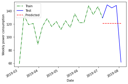
The above plot is a qualitative method of evaluating the accuracy of the historical mean for forecasting our time series. Intuitively, we can see that it is not very accurate.
Quantitatively, we can evaluate the accuracy of the forecasts based on the mean absolute percentage error. We will be using this method to evaluate all of our baseline forecasts, so we will define a function for it.
PYTHON
# Mean absolute percentage error
# measure of prediction accuracy for forecasting methods
def mape(y_true, y_pred):
return np.mean(np.abs((y_true - y_pred)/ y_true)) * 100Now we can calculate the mean average percentage error of the historical mean as a forecasting method.
PYTHON
mape_hist_mean = mape(test['INTERVAL_READ'], test['pred_mean'])
print("MAPE of historical mean", mape_hist_mean)OUTPUT
MAPE of historical mean: 31.44822521573767The high mean average percentage error value suggests that, for these data, the historical mean is not an accurate forecasting method.
Forecast using the mean of the previous timestamp
One source of the error in forecasting with the historical mean can be the amount of data, which over longer timeframes can introduce seasonal trends. As an alternative to the historic mean, we can also forecast using the mean of the previous timestep. Since we are forecasting power consumption over a period of four weeks, this means we can use the mean power consumption within the last four weeks of the training dataset as our forecast.
Since our data have been resampled to a weekly frequency, we will calculate the average power consumption across the last four rows.
PYTHON
# baseline using mean of last four weeks of training set
last_month_mean = np.mean(train['INTERVAL_READ'][-4:])
print("Mean of previous timestep:", last_month_mean)OUTPUT
Mean of previous timestep: 139.55055000000002Apply this to the test dataset. Selecting the data using the
head() command shows that the value calculated above has
been applied to each row.
OUTPUT
INTERVAL_READ pred_mean pred_last_mo_mean
INTERVAL_TIME
2019-07-07 129.1278 120.750316 139.55055
2019-07-14 149.2956 120.750316 139.55055
2019-07-21 144.6612 120.750316 139.55055
2019-07-28 148.4286 120.750316 139.55055
2019-08-04 61.4640 120.750316 139.55055PYTHON
fig, ax = plt.subplots()
ax.plot(train['INTERVAL_READ'], 'g-.', label='Train')
ax.plot(test['INTERVAL_READ'], 'b-', label='Test')
ax.plot(test['pred_last_mo_mean'], 'r--', label='Predicted')
ax.set_xlabel('Date')
ax.set_ylabel('Daily power consumption')
ax.legend(loc=2)
fig.autofmt_xdate()
plt.tight_layout()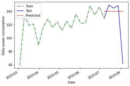
Plotting the data suggests that this forecast may be more accurate than the historical mean, but we will evaluate the forecast using the mean average percentage error as well.
PYTHON
mape_last_month_mean = mape(test['INTERVAL_READ'], test['pred_last_mo_mean'])
print("MAPE of the mean of the previous timestep forecast:", mape_last_month_mean)OUTPUT
MAPE of the mean of the previous timestep forecast: 30.231515216486425The result is a slight improvement over the previous method, but still not very accurate.
Forecasting using the last known value
In addition the mean across the previous timestep, we can also forecast using the last recorded value in the training dataset.
PYTHON
last = train['INTERVAL_READ'].iloc[-1]
print("Last recorded value in the training dataset:", last)OUTPUT
Last recorded value in the training dataset: 129.1278Apply this value to the training dataset.
OUTPUT
INTERVAL_READ pred_mean pred_last_mo_mean pred_last
INTERVAL_TIME
2019-07-07 129.1278 120.750316 139.55055 129.1278
2019-07-14 149.2956 120.750316 139.55055 129.1278
2019-07-21 144.6612 120.750316 139.55055 129.1278
2019-07-28 148.4286 120.750316 139.55055 129.1278
2019-08-04 61.4640 120.750316 139.55055 129.1278Evaluate the forecast by plotting the result and calculating the mean average percentage error.
PYTHON
fig, ax = plt.subplots()
ax.plot(train['INTERVAL_READ'], 'g-.', label='Train')
ax.plot(test['INTERVAL_READ'], 'b-', label='Test')
ax.plot(test['pred_last'], 'r--', label='Predicted')
ax.set_xlabel('Date')
ax.set_ylabel('Daily power consumption')
ax.legend(loc=2)
fig.autofmt_xdate()
plt.tight_layout()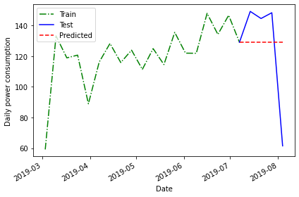
PYTHON
mape_last = mape(test['INTERVAL_READ'], test['pred_last'])
print("MAPE of the mean of the last recorded value forecast:", mape_last)OUTPUT
MAPE of the mean of the last recorded value forecast: 29.46734391639027Here the mean average percentage error indicates another slight improvement in the forecast that may not be apparent in the plot.
Forecasting using the previous timestep
So far we have used the mean of the previous timestep - in the current case the average power consumption across the last four weeks of the training dataset - as well as the last recorded value.
A final method for baseline forecasting uses the actual values of the previous timestep. This is similar to taking the last recorded value, as above, only this time the number of known values is equal to the number of rows in the test dataset. This method accounts somewhat for the seasonal trend we see in the data.
In this case, we can a difference between this and other baseline forecasts in that we are no longer applying a single value to each row of the test dataset.
OUTPUT
INTERVAL_READ pred_mean ... pred_last pred_last_month
INTERVAL_TIME ...
2019-07-07 129.1278 120.750316 ... 129.1278 121.9458
2019-07-14 149.2956 120.750316 ... 129.1278 148.0386
2019-07-21 144.6612 120.750316 ... 129.1278 134.2614
2019-07-28 148.4286 120.750316 ... 129.1278 146.7744
2019-08-04 61.4640 120.750316 ... 129.1278 129.1278
[5 rows x 5 columns]Plotting the forecast and calculating the mean average percentage error once again demonstrate some improvement over previous forecasts.
PYTHON
fig, ax = plt.subplots()
ax.plot(train['INTERVAL_READ'], 'g-.', label='Train')
ax.plot(test['INTERVAL_READ'], 'b-', label='Test')
ax.plot(test['pred_last_month'], 'r--', label='Predicted')
ax.set_xlabel('Date')
ax.set_ylabel('Daily power consumption')
ax.legend(loc=2)
fig.autofmt_xdate()
plt.tight_layout()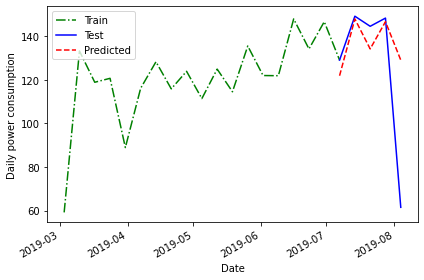
PYTHON
pe_naive_seasonal = mape(test['INTERVAL_READ'], test['pred_last_month'])
print("MAPE of forecast using previous timestep values:", mape_naive_seasonal)OUTPUT
MAPE of forecast using previous timestep values: 24.95886287091312A mean average percentage error of 25, while an improvement in this case over other baseline forecasts, is still not very good. However, these baselines have value in themselves because they also serve as measurements we can use to evaluate other forecasting methods going forward.
Key Points
- Use test and train datasets to evaluate the performance of different models.
- Use mean average percentage error to measure a model’s performance.
Content from Moving Average Forecasts
Last updated on 2023-08-16 | Edit this page
Estimated time: 50 minutes
Overview
Questions
- How can we analyze time-series data with trends?
Objectives
- Create a stationary time-series.
- Test for autocorrelation of time series values.
Introduction
In the previous section, we used baseline metrics to forecast one or more timesteps of a time-series dataset. These forecasts help demonstrate some of the characteristic features of time-series, but as we saw when we evaluated the results they may not make very accurate forecasts. There are some types of random time-series data for which using a baseline metric to forecast a single timestamp ahead is the only option. Since that doesn’t apply to the smart meter data - that is, power consumption values are not random - we will pass over that topic for now.
Instead, the smart meter data have characteristics that make them good candidates for methods that account for trends, autoregression, and one or more types of seasonality. We will develop these concepts over the next several lessons, beginning here with autocorrelation and the use of moving averages to make forecasts using autocorrelated data.
About the code
The code used in this lesson is based on and, in some cases, a direct application of code used in the Manning Publications title, Time series forecasting in Python, by Marco Peixeiro.
Peixeiro, Marco. Time Series Forecasting in Python. [First edition]. Manning Publications Co., 2022.
The original code from the book is made available under an Apache 2.0 license. Use and application of the code in these materials is within the license terms, although this lesson itself is licensed under a Creative Commons CC-BY 4.0 license. Any further use or adaptation of these materials should cite the source code developed by Peixeiro:
Peixeiro, Marco. Timeseries Forecasting in Python [Software code]. 2022. Accessed from https://github.com/marcopeix/TimeSeriesForecastingInPython.
Create a subset to demonstrate autocorrelation
As we did in the previous episode, rather than read a dataset that is ready for analysis we are going to read one of the smart meter datasets and create a subset that demonstrates the characteristics of interest for this section of the lesson.
First we will import the necessary libraries. Note that in additional
to Pandas, Numpy, and Matplotlib we are also importing modules from
statsmodels and sklearn. These are Python
libraries that come with many methods for modeling and machine
learning.
PYTHON
import pandas as pd
import numpy as np
import matplotlib.pyplot as plt
from statsmodels.tsa.stattools import adfuller
from statsmodels.graphics.tsaplots import plot_acf
from statsmodels.tsa.statespace.sarimax import SARIMAX
from sklearn.metrics import mean_squared_error
from sklearn.metrics import mean_absolute_errorRead the data. In this case we are using just a single smart meter.
OUTPUT
<class 'pandas.core.frame.DataFrame'>
RangeIndex: 105012 entries, 0 to 105011
Data columns (total 5 columns):
 #   Column         Non-Null Count   Dtype
---  ------         --------------   -----
 0   INTERVAL_TIME  105012 non-null  object
 1   METER_FID      105012 non-null  int64
 2   START_READ     105012 non-null  float64
 3   END_READ       105012 non-null  float64
 4   INTERVAL_READ  105012 non-null  float64
dtypes: float64(3), int64(1), object(1)
memory usage: 4.0+ MB
NoneSet the datetime index and resample to a daily frequency.
PYTHON
df.set_index(pd.to_datetime(df["INTERVAL_TIME"]), inplace=True)
df.sort_index(inplace=True)
print(df.info())OUTPUT
<class 'pandas.core.frame.DataFrame'>
DatetimeIndex: 105012 entries, 2017-01-01 00:00:00 to 2019-12-31 23:45:00
Data columns (total 5 columns):
 #   Column         Non-Null Count   Dtype
---  ------         --------------   -----
 0   INTERVAL_TIME  105012 non-null  object
 1   METER_FID      105012 non-null  int64
 2   START_READ     105012 non-null  float64
 3   END_READ       105012 non-null  float64
 4   INTERVAL_READ  105012 non-null  float64
dtypes: float64(3), int64(1), object(1)
memory usage: 4.8+ MB
NoneOUTPUT
               INTERVAL_READ
INTERVAL_TIME
2017-01-01           11.7546
2017-01-02           15.0690
2017-01-03           11.6406
2017-01-04           22.0788
2017-01-05           12.8070
Subset to January - July, 2019 and plot the data.
PYTHON
jan_july_2019 = daily_data.loc["2019-01": "2019-07"].copy()
jan_july_2019["INTERVAL_READ"].plot()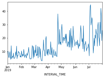
The above plot demonstrates a gradual trend towards increased power consumption through late spring and into summer. This is expected - power consumption in US households tends to increase as the weather becomes warmer and people begin to use air conditioners or evaporative coolers.
Differencing and autocorrelation
In order to make a forecast using the moving average model, however,
the data need to be stationary. That is, we need to remove trends from
the data. We can test for stationarity using the adfuller
function from statsmodels.
PYTHON
adfuller_test = adfuller(jan_july_2019["INTERVAL_READ"])
print(f'ADFuller result: {adfuller_test[0]}')
print(f'p-value: {adfuller_test[1]}')
OUTPUT
ADFuller result: -2.533089941397639
p-value: 0.10762933815081588
The p-value above is greater than 0.05, which in this case indicates that the data are not stationary. That is, there is a trend in the data.
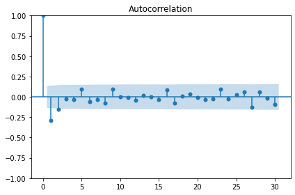
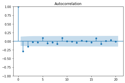
We also want to test for autocorrelation.
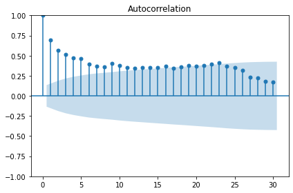
The plot above shows significant autocorrelation up to the 16th lag. Before we can make forecasts on the data, we need to make the data stationary by removing the trend using a technique called differencing. Differencing also reduces the amount of autocorrelation in the data.
Differencing data this way creates a Numpy array of values that represent the difference between one INTERVAL_READ value and the next. We can see this by comparing the head of the jan_july_2019 dataframe with the first five differenced values.
PYTHON
jan_july_2019_differenced = np.diff(jan_july_2019["INTERVAL_READ"], n=1)
print("Head of dataframe:", jan_july_2019.head())
print("\nDifferenced values:", jan_july_2019_differenced[:5])
OUTPUT
Head of dataframe:                INTERVAL_READ
INTERVAL_TIME
2019-01-01            7.5324
2019-01-02           10.2534
2019-01-03            6.8544
2019-01-04            5.3250
2019-01-05            7.5480

Differenced values: [ 2.721  -3.399  -1.5294  2.223   2.3466]
Plotting the result shows that there are no obvious trends in the differenced data.
PYTHON
fig, ax = plt.subplots()

ax.plot(jan_july_2019_differenced)
ax.set_xlabel('Time')
ax.set_ylabel('Energy consumption')

fig.autofmt_xdate()
plt.tight_layout()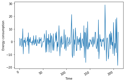
Evaluating the AD Fuller test on the difference data indicates that the data are stationary.
PYTHON
adfuller_test = adfuller(jan_july_2019_differenced)
print(f'ADFuller result: {adfuller_test[0]}')
print(f'p-value: {adfuller_test[1]}')
OUTPUT
ADFuller result: -7.966077912452976
p-value: 2.8626643210939594e-12
The autocorrelation plot still shows some significant autocorrelation up to lag 2. We will use this information to supply the order parameter for the moving average model, below.
Moving average forecast
For our training data, we will use the 90% of the dataset. The remaining 10% of the data will be used to evaluate the performance of the moving average forecast in comparison with a baseline forecast.
Since the differenced data is a numpy array, we also need to convert it to a dataframe.
PYTHON
jan_july_2019_differenced = pd.DataFrame(jan_july_2019_differenced,
                                         columns=["INTERVAL_READ"])

train = jan_july_2019_differenced[:int(round(len(jan_july_2019_differenced) * .9, 0))] # ~90% of data
test = jan_july_2019_differenced[int(round(len(jan_july_2019_differenced) * .9, 0)):] # ~10% of data
print("Training data length:", len(train))
print("Test data length:", len(test))
OUTPUT
Training data length: 190
Test data length: 21
We can plot the original and differenced data together. The shaded area is the date range for which we will be making and evaluating forecasts.
PYTHON
fig, (ax1, ax2) = plt.subplots(nrows=2, ncols=1, sharex=True)

ax1.plot(jan_july_2019["INTERVAL_READ"].values)
ax1.set_xlabel('Time')
ax1.set_ylabel('Energy use')
ax1.axvspan(184, 211, color='#808080', alpha=0.2)

ax2.plot(jan_july_2019_differenced["INTERVAL_READ"])
ax2.set_xlabel('Time')
ax2.set_ylabel('Energy use - differenced data')
ax2.axvspan(184, 211, color='#808080', alpha=0.2)

fig.autofmt_xdate()
plt.tight_layout()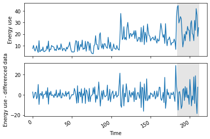
We are going to evaluate the performance of the moving average forecast against a baseline forecast based on the last known value. Since we will be using and building on these methods throughout this lesson, we will create functions for each forecast.
The last_known() function is a more flexible version of
the process used in the previous episode to calculate a baseline
forecast. In that case we used single value - the last known meter
reading from the training dataset - and applied it as a forecast to the
entire test set. In our updated function, we are passing
horizon and window arguments that allow us to pull
values from a moving frame of reference within the differenced data.
The moving_average() function is an implementation of
the seasonal auto-regressive moving average model that is
included in the statsmodels library.
PYTHON
def last_known(data, training_len, horizon, window):
    total_len = training_len + horizon
    pred_last_known = []

    for i in range(training_len, total_len, window):
        subset = data[:i]
        last_known = subset.iloc[-1].values[0]
        pred_last_known.extend(last_known for v in range(window))

    return pred_last_known

def moving_average(data, training_len, horizon, ma_order, window):
    total_len = training_len + horizon
    pred_MA = []

    for i in range(training_len, total_len, window):
        model = SARIMAX(data[:i], order=(0,0, ma_order))
        res = model.fit(disp=False)
        predictions = res.get_prediction(0, i + window - 1)
        oos_pred = predictions.predicted_mean.iloc[-window:]
        pred_MA.extend(oos_pred)

    return pred_MA
Both functions take the differenced dataframe as input and return a list of predicted values that is equal to the length of the test dataset.
PYTHON
pred_df = test.copy()

TRAIN_LEN = len(train)
HORIZON = len(test)
ORDER = 2
WINDOW = 2

pred_last_value = last_known(jan_july_2019_differenced, TRAIN_LEN, HORIZON, WINDOW)
pred_MA = moving_average(jan_july_2019_differenced, TRAIN_LEN, HORIZON, ORDER, WINDOW)

pred_df['pred_last_value'] = pred_last_value
pred_df['pred_MA'] = pred_MA

print(pred_df.head())
OUTPUT
     INTERVAL_READ  pred_last_value   pred_MA
189       -13.5792           -1.863 -1.870535
190       -10.8660           -1.863 -0.379950
191         4.8054          -10.866  9.760944
192         6.2280          -10.866  4.751856
193        -5.6718            6.228  2.106354
Plotting the data allows for a visual comparison of the forecasts.
PYTHON
fig, ax = plt.subplots()

ax.plot(jan_july_2019_differenced[150:]['INTERVAL_READ'], 'b-', label='actual')
ax.plot(pred_df['pred_last_value'], 'r-.', label='last')
ax.plot(pred_df['pred_MA'], 'k--', label='Moving average')

ax.axvspan(190, 210, color='#808080', alpha=0.2)
ax.legend(loc=2)

ax.set_xlabel('Time')
ax.set_ylabel('Energy use - differenced data')

plt.tight_layout()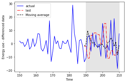
This time we will use the mean_squared_error function
from the sklearn library to evaluate the results.
PYTHON
mse_last = mean_squared_error(pred_df['INTERVAL_READ'], pred_df['pred_last_value'])
mse_MA = mean_squared_error(pred_df['INTERVAL_READ'], pred_df['pred_MA'])

print("Last known forecast, mean squared error:", mse_last)
print("Moving average forecast, mean squared error:", mse_MA)
OUTPUT
Last known forecast, mean squared error: 185.5349359527273
Moving average forecast, mean squared error: 86.16289030738947
We can see that the moving average forecast performs much better than the last known value baseline forecast.
Transform the forecast to original scale
Because we differenced our data above in order to apply a moving
average forecast, we now need to transform the data back to its original
scale. To do this, we apply the numpy cumsum() method to
calculate the cumulative sums of the values in the differenced dataset.
We then map these sums to their corresponding rows of the original
data.
The transformed data are only being applied to the rows of the source
data that were used for the test dataset, so we can use the
tail() function to inspect the result.
PYTHON
jan_july_2019['pred_usage'] = pd.Series()
jan_july_2019['pred_usage'][190:] = jan_july_2019['INTERVAL_READ'].iloc[190] + pred_df['pred_MA'].cumsum()
print(jan_july_2019.tail())
OUTPUT
               INTERVAL_READ  pred_usage
INTERVAL_TIME
2019-07-27           23.2752   31.008305
2019-07-28           42.0504   28.974839
2019-07-29           36.6444   30.387655
2019-07-30           18.0828   22.025803
2019-07-31           25.5774   20.781842
We can plot the result to compare the transformed forecasts against the actual daily power consumption.
PYTHON
fig, ax = plt.subplots()

ax.plot(jan_july_2019['INTERVAL_READ'].values, 'b-', label='actual')
ax.plot(jan_july_2019['pred_usage'].values, 'k--', label='MA(2)')

ax.legend(loc=2)

ax.set_xlabel('Time')
ax.set_ylabel('Energy consumption')
ax.axvspan(191, 210, color='#808080', alpha=0.2)
ax.set_xlim(170, 210)

fig.autofmt_xdate()
plt.tight_layout()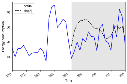
Finally, to evaluate the performance of the moving average forecast
against the actual values in the undifferenced data, we use the
mean_absolute_error from the sklearn
library.
PYTHON
mae_MA_undiff = mean_absolute_error(jan_july_2019['INTERVAL_READ'].iloc[191:],
                                    jan_july_2019['pred_usage'].iloc[191:])

print("Mean absolute error of moving average forecast", mae_MA_undiff)
OUTPUT
Mean absolute error of moving average forecast 8.457690692889582Key Points
- Use differencing to make time-series stationary.
-
statsmodelsis a Python library with time-series methods built in.
Content from Autoregressive Forecasts
Last updated on 2023-08-20 | Edit this page
Estimated time: 50 minutes
Overview
Questions
- How can we enhance our models to account for autoregression?
Objectives
- Explain the parameters of order argument of the
statsmodelsSARIMAX model. - Refine forecasts to account for autoregressive processes.
Introduction
In this section we will continue to use the same subset of data to refine our time-series forecasts. We have seen how we can improve forecasts by differencing data so that time-series are stationary.
However, as noted in our earlier results our forecasts are still not as accurate as we’d like them to be. This is because in addition to not being stationary, our data include autoregressive processes. That is, values for power consumption can be affected by previous values of the same variable.
About the code
The code used in this lesson is based on and, in some cases, a direct application of code used in the Manning Publications title, Time series forecasting in Python, by Marco Peixeiro.
Peixeiro, Marco. Time Series Forecasting in Python. [First edition]. Manning Publications Co., 2022.
The original code from the book is made available under an Apache 2.0 license. Use and application of the code in these materials is within the license terms, although this lesson itself is licensed under a Creative Commons CC-BY 4.0 license. Any further use or adaptation of these materials should cite the source code developed by Peixeiro:
Peixeiro, Marco. Timeseries Forecasting in Python [Software code]. 2022. Accessed from https://github.com/marcopeix/TimeSeriesForecastingInPython.
Create data subset
Since we have been using the same process to read and subset a single data file, this time we will write a function that includes the necessary commands. This will make our process more flexible in case we want to change the date range or the resampling frequency and test our models on different subsets.
First we need to import the same libraries as before.
PYTHON
import pandas as pd
import numpy as np
import matplotlib.pyplot as plt
from statsmodels.tsa.stattools import adfuller
from statsmodels.graphics.tsaplots import plot_acf
from statsmodels.graphics.tsaplots import plot_pacf
from statsmodels.tsa.statespace.sarimax import SARIMAX
from sklearn.metrics import mean_squared_error
from sklearn.metrics import mean_absolute_error
Now, define a function that takes the name of a data file, a start and end date for a date range, and a resampling frequency as arguments.
PYTHON
def subset_resample(fpath, sample_freq, start_date, end_date=None):
    df = pd.read_csv(fpath)
    df.set_index(pd.to_datetime(df["INTERVAL_TIME"]), inplace=True)
    df.sort_index(inplace=True)
    if end_date:
        date_subset = df.loc[start_date: end_date].copy()
    else:
        date_subset = df.loc[start_date].copy()
    resampled_data = date_subset.resample(sample_freq)
    return resampled_data
Note that the returned object is not a data frame - it’s a DatetimeIndexResampler, which is a kind of group in Pandas.
PYTHON
fp = "../../data/ladpu_smart_meter_data_01.csv"
data_subset_resampled = subset_resample(fp, "D", "2019-01", end_date="2019-07")
print("Data type of returned object:", type(data_subset_resampled))
We can create a dataframe for forecasting by aggregating the data using a specific metric. In this case, we will use the sum of the daily “INTERVAL_READ” values.
PYTHON
daily_usage = data_subset_resampled['INTERVAL_READ'].agg([np.sum])
print(daily_usage.info())
print(daily_usage.head())
OUTPUT
<class 'pandas.core.frame.DataFrame'>
DatetimeIndex: 212 entries, 2019-01-01 to 2019-07-31
Freq: D
Data columns (total 1 columns):
 #   Column  Non-Null Count  Dtype
---  ------  --------------  -----
 0   sum     212 non-null    float64
dtypes: float64(1)
memory usage: 3.3 KB
None
                   sum
INTERVAL_TIME
2019-01-01      7.5324
2019-01-02     10.2534
2019-01-03      6.8544
2019-01-04      5.3250
2019-01-05      7.5480
We can further inspect the data by plotting.
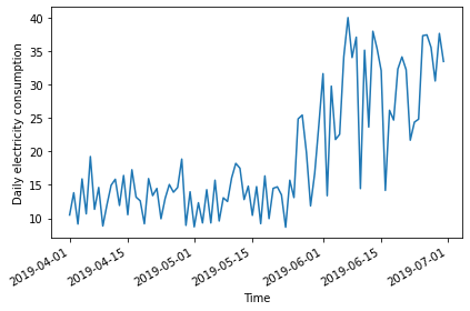
PYTHON
fig, ax = plt.subplots()

ax.plot(daily_usage['sum'])
ax.set_xlabel('Time')
ax.set_ylabel('Daily electricity consumption')

fig.autofmt_xdate()
plt.tight_layout()
Determine order of autoregressive process
As before, we will also calculate the AD Fuller statistic on the data.
PYTHON
adfuller_test = adfuller(daily_usage)
print(f'ADFuller result: {adfuller_test[0]}')
print(f'p-value: {adfuller_test[1]}')
OUTPUT
ADFuller result: -2.533089941397639
p-value: 0.10762933815081588
The result indicates that the data are not stationary, so we will difference the data and recalculate the AD Fuller statistic.
PYTHON
daily_usage_diff = np.diff(daily_usage['sum'], n = 1)
adfuller_test = adfuller(daily_usage_diff)
print(f'ADFuller result: {adfuller_test[0]}')
print(f'p-value: {adfuller_test[1]}')
OUTPUT
ADFuller result: -7.966077912452976
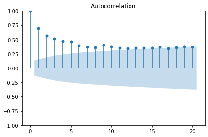
p-value: 2.8626643210939594e-12Plotting the autocorrelation function suggests an autoregressive process occurring within the data.
The order argument of the SARIMAX model that we are using for our forecasts includes a parameter for specifying the order of the autoregressive process. We can plot the partial autocorrelation function to determine this.
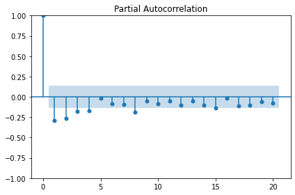
The plot indicates significant autoregression up to the fourth lag, so we have an autoregressive process of order 4, or AR(4).
Forecast an autoregressive process
With the order of the autoregressive process known, we can revise our
forecasting function to pass this new parameter to the SARIMAX model
from sklearn.
First, we will create training and test datasets and plot to show the range of values we will forecast.
PYTHON
df_diff = pd.DataFrame({'daily_usage': daily_usage_diff})

train = df_diff[:int(len(df_diff) * .9)] # ~90% of data
test = df_diff[int(len(df_diff) * .9):] # ~10% of data
print("Training data length:", len(train))
print("Test data length:", len(test))
OUTPUT
Training data length: 189
Test data length: 22
And the plot:
PYTHON
fig, (ax1, ax2) = plt.subplots(nrows=2, ncols=1, sharex=True,
                               figsize=(10, 8))

ax1.plot(daily_usage['sum'].values)
ax1.set_xlabel('Time')
ax1.set_ylabel('Energy use')
ax1.axvspan(190, 211, color='#808080', alpha=0.2)

ax2.plot(df_diff['daily_usage'])
ax2.set_xlabel('Time')
ax2.set_ylabel('Energy use - diff')
ax2.axvspan(190, 211, color='#808080', alpha=0.2)

fig.autofmt_xdate()
plt.tight_layout()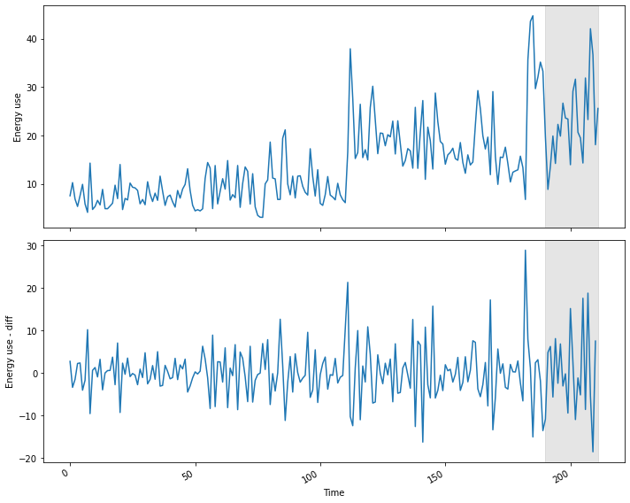
We are also going to update our function from the previous section,
in which we hard-coded a value for the order of the autoregressive
process in the order argument of the SARIMAX model. Here we
generalize the function name to model_forecast() and we are
now using arguments, ar_order and ma_order, to pass
two of the three parameters required by the order argument of
the model.
As before, we will use the last known value as our baseline metric for evaluating the performance of the updated model.
PYTHON
def last_known(data, training_len, horizon, window):
    total_len = training_len + horizon
    pred_last_known = []

    for i in range(training_len, total_len, window):
        subset = data[:i]
        last_known = subset.iloc[-1].values[0]
        pred_last_known.extend(last_known for v in range(window))

    return pred_last_known

def model_forecast(data, training_len, horizon, ar_order, ma_order, window):
    total_len = training_len + horizon
    model_predictions = []

    for i in range(training_len, total_len, window):
        model = SARIMAX(data[:i], order=(ar_order, 0, ma_order))
        res = model.fit(disp=False)
        predictions = res.get_prediction(0, i + window - 1)
        oos_pred = predictions.predicted_mean.iloc[-window:]
        model_predictions.extend(oos_pred)

    return model_predictions
Now we can call our functions to forecast power consumption. For comparison sake we will also make a prediction using the moving average forecast from the last section. Recall that the order of the moving average process was 2, and the order of the autoregressive process is 4.
PYTHON
TRAIN_LEN = len(train)
HORIZON = len(test)
WINDOW = 1

pred_last_value = last_known(df_diff, TRAIN_LEN, HORIZON, WINDOW)
pred_MA = model_forecast(df_diff, TRAIN_LEN, HORIZON, 0, 2, WINDOW)
pred_AR = model_forecast(df_diff, TRAIN_LEN, HORIZON, 4, 0, WINDOW)

test['pred_last_value'] = pred_last_value
test['pred_MA'] = pred_MA
test['pred_AR'] = pred_AR

print(test.head())
OUTPUT
     daily_usage  pred_last_value   pred_MA   pred_AR
189     -13.5792          -1.8630 -1.870535  1.735114
190     -10.8660         -13.5792  4.425102  5.553305
191       4.8054         -10.8660  9.760944  9.475778
192       6.2280           4.8054  7.080340  5.395541
193      -5.6718           6.2280  2.106354  0.205880
Plotting the result shows that the results of the moving average and autoregressive forecasts are very similar.
PYTHON
fig, ax = plt.subplots()

ax.plot(df_diff[150:]['daily_usage'], 'b-', label='actual')
ax.plot(test['pred_last_value'], 'r-.', label='last')
ax.plot(test['pred_MA'], 'g-.', label='MA(2)')
ax.plot(test['pred_AR'], 'k--', label='AR(4)')

ax.axvspan(190, 211, color='#808080', alpha=0.2)
ax.legend(loc=2)

ax.set_xlabel('Time')
ax.set_ylabel('Energy use - diff')

plt.tight_layout()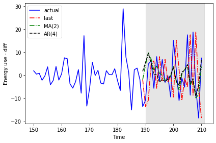
Calculating the mean squared error for each forecast indicates that of the three forecasting methods, the moving average performs the best.
PYTHON
mse_last = mean_squared_error(test['daily_usage'], test['pred_last_value'])
mse_MA = mean_squared_error(test['daily_usage'], test['pred_MA'])
mse_AR = mean_squared_error(test['daily_usage'], test['pred_AR'])

print("MSE of last known value forecast:", mse_last)
print("MSE of MA(2) forecast:",mse_MA)
print("MSE of AR(4) forecast:",mse_AR)
OUTPUT
MSE of last known value forecast: 252.6110739163637
MSE of MA(2) forecast: 73.404918547051
MSE of AR(4) forecast: 85.29189129936279
Given the choice between these three results, we would apply the moving average forecast to our data. For the purposes of demonstration, however, we will reverse transform our differenced data with the autoregressive forecast results.
PYTHON
daily_usage['pred_usage'] = pd.Series()
daily_usage['pred_usage'][190:] = daily_usage['sum'].iloc[190] + test['pred_AR'].cumsum()
print(daily_usage.tail())
OUTPUT
                   sum  pred_usage
INTERVAL_TIME
2019-07-27     23.2752   34.683237
2019-07-28     42.0504   33.145726
2019-07-29     36.6444   24.039123
2019-07-30     18.0828   19.823836
2019-07-31     25.5774   26.623576
Finally we can plot the transformed forecasts with the actual power consumption values for comparison, and perform a final evaluation using the mean absolute error. As expected from the results of the mean squared error calculated above, the mean absolute error for the autoregressive forecast will be higher than that reported for the moving average forecast in the previous section.
PYTHON
mae_MA_undiff = mean_absolute_error(daily_usage['sum'].iloc[191:],
                                    daily_usage['pred_usage'].iloc[191:])

print("Mean absolute error, AR(4):", mae_MA_undiff)
OUTPUT
Mean absolute error, AR(4): 13.074409772576958Plot code:
PYTHON
fig, ax = plt.subplots()

ax.plot(daily_usage['sum'].values, 'b-', label='actual')
ax.plot(daily_usage['pred_usage'].values, 'k--', label='AR(4)')

ax.legend(loc=2)

ax.set_xlabel('Time')
ax.set_ylabel('Energy consumption')
ax.axvspan(190, 211, color='#808080', alpha=0.2)
ax.set_xlim(170, 211)

fig.autofmt_xdate()
plt.tight_layout()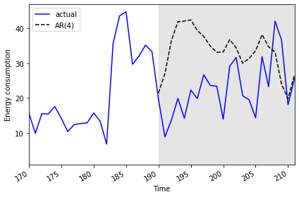
Key Points
- The order argument of the SARIMAX model includes parameters for the order of autoregressive and moving average processes.
Content from Autoregressive Moving Average Forecasts
Last updated on 2023-08-18 | Edit this page
Estimated time: 50 minutes
Overview
Questions
- How can we forecast time-series with both moving average and autoregressive processes?
Objectives
- Apply a generalized workflow to fit different models.
Introduction
Further refining process to combine parameters of order of processes.
About the code
The code used in this lesson is based on and, in some cases, a direct application of code used in the Manning Publications title, Time series forecasting in Python, by Marco Peixeiro.
Peixeiro, Marco. Time Series Forecasting in Python. [First edition]. Manning Publications Co., 2022.
The original code from the book is made available under an Apache 2.0 license. Use and application of the code in these materials is within the license terms, although this lesson itself is licensed under a Creative Commons CC-BY 4.0 license. Any further use or adaptation of these materials should cite the source code developed by Peixeiro:
Peixeiro, Marco. Timeseries Forecasting in Python [Software code]. 2022. Accessed from https://github.com/marcopeix/TimeSeriesForecastingInPython.
Read and subset data
Import libraries.
PYTHON
import pandas as pd
import numpy as np
import matplotlib.pyplot as plt
from statsmodels.tsa.stattools import adfuller
from statsmodels.graphics.tsaplots import plot_acf
from statsmodels.graphics.tsaplots import plot_pacf
from statsmodels.tsa.statespace.sarimax import SARIMAX
from sklearn.metrics import mean_squared_error
from sklearn.metrics import mean_absolute_error
Reuse our function to read, subset, and resample data.
PYTHON
def subset_resample(fpath, sample_freq, start_date, end_date=None):
    df = pd.read_csv(fpath)
    df.set_index(pd.to_datetime(df["INTERVAL_TIME"]), inplace=True)
    df.sort_index(inplace=True)
    if end_date:
        date_subset = df.loc[start_date: end_date].copy()
    else:
        date_subset = df.loc[start_date].copy()
    resampled_data = date_subset.resample(sample_freq)
    return resampled_data
Call the function.
PYTHON
fp = "../../data/ladpu_smart_meter_data_01.csv"
data_subset_resampled = subset_resample(fp, "D", "2019-01", end_date="2019-07")
print("Data type of returned object:", type(data_subset_resampled))
OUTPUT
Data type of returned object: <class 'pandas.core.resample.DatetimeIndexResampler'>Create a dataframe and inspect.
PYTHON
daily_usage = data_subset_resampled['INTERVAL_READ'].agg([np.sum])
print(daily_usage.info())
print(daily_usage.head())
OUTPUT
<class 'pandas.core.frame.DataFrame'>
DatetimeIndex: 212 entries, 2019-01-01 to 2019-07-31
Freq: D
Data columns (total 1 columns):
 #   Column  Non-Null Count  Dtype
---  ------  --------------  -----
 0   sum     212 non-null    float64
dtypes: float64(1)
memory usage: 3.3 KB
None
                   sum
INTERVAL_TIME
2019-01-01      7.5324
2019-01-02     10.2534
2019-01-03      6.8544
2019-01-04      5.3250
2019-01-05      7.5480
Plot.
PYTHON
fig, ax = plt.subplots()

ax.plot(daily_usage['sum'])
ax.set_xlabel('Time')
ax.set_ylabel('Daily electricity consumption')

fig.autofmt_xdate()
plt.tight_layout()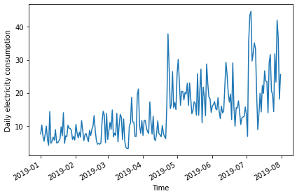
AD Fuller test.
PYTHON
adfuller_test = adfuller(daily_usage)
print(f'ADFuller result: {adfuller_test[0]}')
print(f'p-value: {adfuller_test[1]}')
OUTPUT
ADFuller result: -2.533089941397639
p-value: 0.10762933815081588
Difference data.
PYTHON
daily_usage_diff = np.diff(daily_usage['sum'], n = 1)
adfuller_test = adfuller(daily_usage_diff)
print(f'ADFuller result: {adfuller_test[0]}')
print(f'p-value: {adfuller_test[1]}')
OUTPUT
ADFuller result: -7.966077912452976
p-value: 2.8626643210939594e-12
Plot ACF
Determine the orders of the ARMA(p, q) processes
Plot indicates an autoregressive process.
The order of an autoregressive moving average, or ARMA, process, may not be intelligible from a PACF plot. For the remainder of this lesson, rather than determine order by visually inspecting plots we will statistically determine order of AR and MA processes using a generalized procedure.
We will fit multiple models with different values for the order of
the AR and MA processes and evaluate each one by the resulting Akaike
information criterion (AIC) value. The AIC is an attribute of a SARIMAX
model, so we will continue to refine our function for interacting with
the SARIMAX model of the statsmodel library.
First we create a list of possible values of the orders of the AR and MA processes. In the code below and in general use, the order of the AR process is given as p, while the order of the MA process is given as q.
PYTHON
from itertools import product

p_vals = range(0, 4, 1)
q_vals = range(0, 4, 1)

order_list = list(product(p_vals, q_vals))

for o in order_list:
    print(o)
OUTPUT
(0, 0)
(0, 1)
(0, 2)
(0, 3)
(1, 0)
(1, 1)
(1, 2)
(1, 3)
(2, 0)
(2, 1)
(2, 2)
(2, 3)
(3, 0)
(3, 1)
(3, 2)
(3, 3)
The output above demonstrates the combinations of AR(p) and MA(q) values we will be using to fit, in this case, 16 different ARMA(p, q) models. We will compare the AIC of the results and select the best performing model.
Since we’re not forecasting yet, we will write a new function to fit and evaluate our 16 models.
PYTHON
def fit_eval_AIC(data, order_list):
    aic_results = []
    for o in order_list:
        model = SARIMAX(data, order=(o[0], 0, o[1]),
                        simple_differencing=False)
        res = model.fit(disp=False)
        aic = res.aic
        aic_results.append([o, aic])

    result_df = pd.DataFrame(aic_results, columns=(['(p, q)', 'AIC']))
    result_df.sort_values(by='AIC', ascending=True, inplace=True)
    result_df.reset_index(drop=True, inplace=True)

    return result_df
The function will return a dataframe of ARMA(p, q) combinations and their corresponding AIC values. Results have been sorted by ascending AIC values since a lower AIC value is better. Generally, the top performing model will be listed first.
OUTPUT
    (p, q)          AIC
0   (1, 1)  1338.285936
1   (1, 2)  1340.280751
2   (2, 1)  1340.281961
3   (2, 2)  1341.021637
4   (0, 2)  1341.239402
5   (0, 3)  1341.295724
6   (3, 1)  1341.845466
7   (2, 3)  1342.689150
8   (3, 2)  1342.699834
9   (3, 3)  1342.905525
10  (1, 3)  1344.861937
11  (0, 1)  1356.044366
12  (3, 0)  1358.323315
13  (2, 0)  1363.368153
14  (1, 0)  1375.855521
15  (0, 0)  1391.965311
The result indicates that the best performing model among the 16 is
the ARMA(1, 1) model. But in a worst case this could simply mean that
the ARMA(1, 1) model is the least bad out of the models we fitted. We
also want to assess its overall quality. Before using the model to
forecast, it’s also perform diagnostics to make sure the model doesn’t
violate any of its underlying assumptions. We can use
plot_diagnostics() to evaluate the distribution of
residuals of the ARMA(1, 1) model.
PYTHON
model = SARIMAX(daily_usage_diff, order=(1,0,1), simple_differencing=False)
model_fit = model.fit(disp=False)
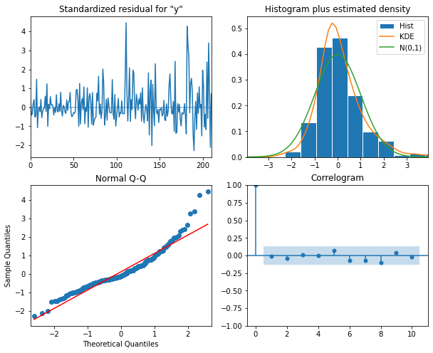
model_fit.plot_diagnostics(figsize=(10, 8));The plots indicate that there is some room for improvement. We will see this improvement in a later section of this lesson when we finally account for the seasonal trends evident in the data. But for now we will proceed and show that the ARMA(p, q) process nonetheless represent a significant improvement over forecasting with either the AR(p) or MA(q) processes by themselves.
Forecast using an ARMA(p, q) model
In the previous section we already updated our forecasting function to initialize a SARIMAX model using variables for the AR(p) and MA(q) orders in the order argument. We can reuse the same function here.
PYTHON
def last_known(data, training_len, horizon, window):
    total_len = training_len + horizon
    pred_last_known = []

    for i in range(training_len, total_len, window):
        subset = data[:i]
        last_known = subset.iloc[-1].values[0]
        pred_last_known.extend(last_known for v in range(window))

    return pred_last_known

def model_forecast(data, training_len, horizon, ar_order, ma_order, window):
    total_len = training_len + horizon
    model_predictions = []

    for i in range(training_len, total_len, window):
        model = SARIMAX(data[:i], order=(ar_order, 0, ma_order))
        res = model.fit(disp=False)
        predictions = res.get_prediction(0, i + window - 1)
        oos_pred = predictions.predicted_mean.iloc[-window:]
        model_predictions.extend(oos_pred)

    return model_predictions
Next we create our training and test datasets and plot the differenced data with the original data. As before, the forecast range is shaded.
PYTHON
df_diff = pd.DataFrame({'daily_usage': daily_usage_diff})

train = df_diff[:int(len(df_diff) * .9)] # ~90% of data
test = df_diff[int(len(df_diff) * .9):] # ~10% of data
print("Training data length:", len(train))
print("Test data length:", len(test))
OUTPUT
Training data length: 189
Test data length: 22
Plot code:
PYTHON
fig, (ax1, ax2) = plt.subplots(nrows=2, ncols=1, sharex=True,
                               figsize=(10, 8))

ax1.plot(daily_usage['sum'].values)
ax1.set_xlabel('Time')
ax1.set_ylabel('Energy use')
ax1.axvspan(190, 211, color='#808080', alpha=0.2)

ax2.plot(df_diff['daily_usage'])
ax2.set_xlabel('Time')
ax2.set_ylabel('Energy use - diff')
ax2.axvspan(190, 211, color='#808080', alpha=0.2)

fig.autofmt_xdate()
plt.tight_layout()Before proceeding, we want to re-evaluate our list of ARMA(p, q)
combinations against the training dataset. We will re-use the
order_list from above.
It’s a good thing we did so - note that the best performing model in this case is an ARMA(0, 2).
OUTPUT
    (p, q)          AIC
0   (0, 2)  1174.311541
1   (1, 1)  1174.622990
2   (1, 2)  1176.276602
3   (0, 3)  1176.293394
4   (2, 1)  1176.474520
5   (2, 2)  1176.928701
6   (3, 1)  1177.165924
7   (1, 3)  1177.484128
8   (2, 3)  1178.444434
9   (3, 2)  1178.809561
10  (3, 3)  1179.559015
11  (0, 1)  1182.375097
12  (3, 0)  1185.092321
13  (2, 0)  1188.277358
14  (1, 0)  1201.973433
15  (0, 0)  1215.699746
Before forecasting, we also want to check that no assumptions of the model are violated by plotting diagnostics of the residuals.
PYTHON
model = SARIMAX(train['daily_usage'], order=(0,0,2), simple_differencing=False)
model_fit = model.fit(disp=False)
model_fit.plot_diagnostics(figsize=(10, 8));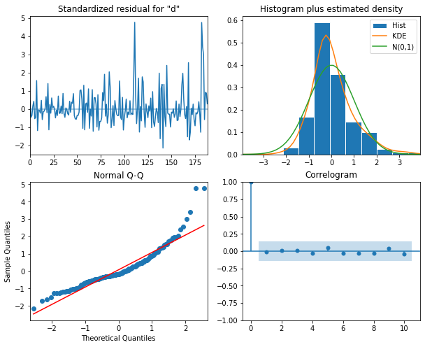
Finally, we will forecast and evaluate the results against our previously used baseline of the last known forecast. We will also compare the ARMA(0, 2) forecast with results from our previous AR(4) and MA(2) forecasts.
As we can see by the function call, an ARMA(0, 2) is equivalent to an MA(2) process. We expect the results from these models to be the same.
PYTHON
TRAIN_LEN = len(train)
HORIZON = len(test)
WINDOW = 1

pred_last_value = last_known(df_diff, TRAIN_LEN, HORIZON, WINDOW)
pred_MA = model_forecast(df_diff, TRAIN_LEN, HORIZON, 0, 2, WINDOW)
pred_AR = model_forecast(df_diff, TRAIN_LEN, HORIZON, 4, 0, WINDOW)
pred_ARMA = model_forecast(df_diff, TRAIN_LEN, HORIZON, 0, 2, WINDOW)

test['pred_last_value'] = pred_last_value
test['pred_MA'] = pred_MA
test['pred_AR'] = pred_AR
test['pred_ARMA'] = pred_ARMA

print(test.head())
OUTPUT
     daily_usage  pred_last_value   pred_MA   pred_AR  pred_ARMA
189     -13.5792          -1.8630 -1.870535  1.735114  -1.870535
190     -10.8660         -13.5792  4.425102  5.553305   4.425102
191       4.8054         -10.8660  9.760944  9.475778   9.760944
192       6.2280           4.8054  7.080340  5.395541   7.080340
193      -5.6718           6.2280  2.106354  0.205880   2.106354
Indeed, we can see the results for the “pred_MA” and “pred_ARMA” forecasts are the same. While that may seem underwhelming, it’s important to note that in this case our model was determined using a statistical approach to fitting multiple models, whereas previously we manually counted significant lags in an ACF plot. This approach is much more scalable.
Since the results are the same, we will only refer to the “pred_ARMA” results from here on when comparing against the baseline and the “pred_AR” results.
The plot indicates that the forecasts of the AR(4) model and the ARMA(0,2) model are very similar.
PYTHON
fig, ax = plt.subplots()

ax.plot(df_diff[150:]['daily_usage'], 'b-', label='actual')
ax.plot(test['pred_last_value'], 'r-.', label='last')
ax.plot(test['pred_AR'], 'g--', label='AR(4)')
ax.plot(test['pred_ARMA'], 'k--', label='ARMA(0,2)')

ax.axvspan(189, 211, color='#808080', alpha=0.2)
ax.legend(loc=2)

ax.set_xlabel('Time')
ax.set_ylabel('Energy use - diff')

plt.tight_layout()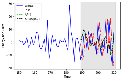
The mean squared error shows a meaningful improvement from the results of the AR(4) model in the previous section.
PYTHON
mse_last = mean_squared_error(test['daily_usage'], test['pred_last_value'])
mse_AR = mean_squared_error(test['daily_usage'], test['pred_AR'])
mse_ARMA = mean_squared_error(test['daily_usage'], test['pred_ARMA'])

print("MSE of last known value forecast:", mse_last)
print("MSE of AR(4) forecast:",mse_AR)
print("MSE of ARMA(0, 2) forecast:",mse_ARMA)
OUTPUT
MSE of last known value forecast: 252.6110739163637
MSE of AR(4) forecast: 85.29189129936279
MSE of ARMA(0, 2) forecast: 73.404918547051
We perform the reverse transformation on the forecasts from the differenced data to apply them to the source data.
PYTHON
daily_usage['pred_usage'] = pd.Series()
daily_usage['pred_usage'][190:] = daily_usage['sum'].iloc[190] + test['pred_ARMA'].cumsum()
print(daily_usage.tail())
OUTPUT
                   sum  pred_usage
INTERVAL_TIME
2019-07-27     23.2752   39.668821
2019-07-28     42.0504   37.635355
2019-07-29     36.6444   27.803183
2019-07-30     18.0828   19.441330
2019-07-31     25.5774   23.182106
We evaluate the transformed forecasts using the mean absolute error.
PYTHON
mae_MA_undiff = mean_absolute_error(daily_usage['sum'].iloc[190:],
                                    daily_usage['pred_usage'].iloc[190:])

print("Mean absolute error, ARMA(0, 2):", mae_MA_undiff)
OUTPUT
Mean absolute error, ARMA(0, 2): 15.766473755136264Finally, we can visualize the forecasts in comparison with the actual values.
PYTHON
fig, ax = plt.subplots()

ax.plot(daily_usage['sum'].values, 'b-', label='actual')
ax.plot(daily_usage['pred_usage'].values, 'k--', label='ARMA(0,2)')

ax.legend(loc=2)

ax.set_xlabel('Time')
ax.set_ylabel('Energy consumption')
ax.axvspan(161, 180, color='#808080', alpha=0.2)

fig.autofmt_xdate()
plt.tight_layout()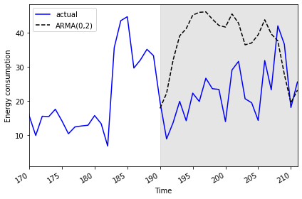
Key Points
- The Akaike information criterion (AIC) is an attribute of a SARIMAX model that can be used to compare model results using different ARMA(p, q) parameters.
Content from Autoregressive Integrated Moving Average Forecasts
Last updated on 2023-08-18 | Edit this page
Estimated time: 50 minutes
Overview
Questions
- How can we forecast non-stationary time-series?
Objectives
- Explain the d parameter of the SARIMAX model’s order(p, d, q) argument.
Introduction
The smart meter data with which we have been modeling forecasts throughout this lesson are non-stationary. That is, there are trends in the data. An assumption of the moving average and autoregressive models that we’ve looked at is that the data are stationary.
So far, we have been manually differencing the data and making forecasts with the differenced data, then transforming the forecasts back to the scale of the source dataset. In this section, we look at the autoregressive integrated moving average or ARIMA(p,d, q) model. In this model, as before, the p is the order of the AR(p) process and the q is the order of the MA(q) process. Now we will further specify the d parameter, which is the integration order.
About the code
The code used in this lesson is based on and, in some cases, a direct application of code used in the Manning Publications title, Time series forecasting in Python, by Marco Peixeiro.
Peixeiro, Marco. Time Series Forecasting in Python. [First edition]. Manning Publications Co., 2022.
The original code from the book is made available under an Apache 2.0 license. Use and application of the code in these materials is within the license terms, although this lesson itself is licensed under a Creative Commons CC-BY 4.0 license. Any further use or adaptation of these materials should cite the source code developed by Peixeiro:
Peixeiro, Marco. Timeseries Forecasting in Python [Software code]. 2022. Accessed from https://github.com/marcopeix/TimeSeriesForecastingInPython.
Create the data subset
In order to more fully demonstrate the integration order of the process, we are going to generate a different subset that needs to be differenced twice before it is stationary. That is, whereas all of our time-series so far have only required first order differencing to become stationary, this subset will require second order differencing.
First, import the required libraries.
PYTHON
import pandas as pd
import numpy as np
import matplotlib.pyplot as plt
from statsmodels.tsa.stattools import adfuller
from statsmodels.graphics.tsaplots import plot_acf
from statsmodels.graphics.tsaplots import plot_pacf
from statsmodels.tsa.statespace.sarimax import SARIMAX
from sklearn.metrics import mean_squared_error
from sklearn.metrics import mean_absolute_error
We will reuse our function for reading, subsetting, and resampling the data.
PYTHON
def subset_resample(fpath, sample_freq, start_date, end_date=None):
    df = pd.read_csv(fpath)
    df.set_index(pd.to_datetime(df["INTERVAL_TIME"]), inplace=True)
    df.sort_index(inplace=True)
    if end_date:
        date_subset = df.loc[start_date: end_date].copy()
    else:
        date_subset = df.loc[start_date].copy()
    resampled_data = date_subset.resample(sample_freq)
    return resampled_data
This time we call our function with different arguments for the file path and the date range of the subset.
PYTHON
fp = "../../data/ladpu_smart_meter_data_02.csv"
data_subset_resampled = subset_resample(fp, "D", "2019-04", end_date="2019-06")
print("Data type of returned object:", type(data_subset_resampled))
OUTPUT
Data type of returned object: <class 'pandas.core.resample.DatetimeIndexResampler'>The object returned by the subset_resample function is a
datetime group, so as before we create a dataframe from an aggregation
of the grouped statistics.
PYTHON
daily_usage = data_subset_resampled['INTERVAL_READ'].agg([np.sum])
print(daily_usage.info())
print(daily_usage.head())
OUTPUT
<class 'pandas.core.frame.DataFrame'>
DatetimeIndex: 91 entries, 2019-04-01 to 2019-06-30
Freq: D
Data columns (total 1 columns):
 #   Column  Non-Null Count  Dtype
---  ------  --------------  -----
 0   sum     91 non-null     float64
dtypes: float64(1)
memory usage: 1.4 KB
None
                   sum
INTERVAL_TIME
2019-04-01     10.4928
2019-04-02     13.8258
2019-04-03      9.1350
2019-04-04     15.8994
2019-04-05     10.6644
Plot the data - the date range is smaller than previous examples, and there is a notable trend in increased power consumption toward the end of the date range.
Determine the integration order of the process
Not surprisingly, the AD Fuller statistic indicates that the time-series is not stationary.
PYTHON
ADF_result = adfuller(daily_usage['sum'])
print(f'ADF Statistic: {ADF_result[0]}')
print(f'p-value: {ADF_result[1]}')
OUTPUT
ADF Statistic: 0.043745771110572505
p-value: 0.9620037401385906
However, after differencing the data the AD Fuller statistic is lower but still indicates that the data are not stationary.
PYTHON
daily_usage_diff = np.diff(daily_usage['sum'], n = 1)

ADF_result = adfuller(daily_usage_diff)
print(f'ADF Statistic: {ADF_result[0]}')
print(f'p-value: {ADF_result[1]}')
OUTPUT
ADF Statistic: -2.552170893387957
p-value: 0.10329088087274496
If we difference the differenced data, the AD Fuller statistic and p-value now indicate that our time-series is stationary.
PYTHON
daily_usage_diff2 = np.diff(daily_usage_diff, n=1)

ad_fuller_result = adfuller(daily_usage_diff2)

print(f'ADF Statistic: {ad_fuller_result[0]}')
print(f'p-value: {ad_fuller_result[1]}')
OUTPUT
ADF Statistic: -11.308460105521412
p-value: 1.2561555209524703e-20
As noted, up until now we have been forecasting and fitting models with training data subset from the differenced time-series. Because we are now integration order to our model, we will be fitting models and making forecasts using the non-stationary source data.
Since we needed to use second order differencing to make our time-series stationary, the value d of the ARIMA(p, d, q) integration order is 2.
First, create training and test data sets.
PYTHON
train = daily_usage[:int(len(daily_usage) * .9)].copy() # ~90% of data
test = daily_usage[int(len(daily_usage) * .9):].copy() # ~10% of data
print("Training data length:", len(train))
print("Test data length:", len(test))
OUTPUT
Training data length: 81
Test data length: 10
Plot the time-series, with the forecast range shaded.
PYTHON
fig, (ax1) = plt.subplots(nrows=1, ncols=1, sharex=True, figsize=(10, 8))

ax1.plot(daily_usage['sum'].values)
ax1.set_xlabel('Time')
ax1.set_ylabel('Energy use')
ax1.axvspan(81, 91, color='#808080', alpha=0.2)

fig.autofmt_xdate()
plt.tight_layout()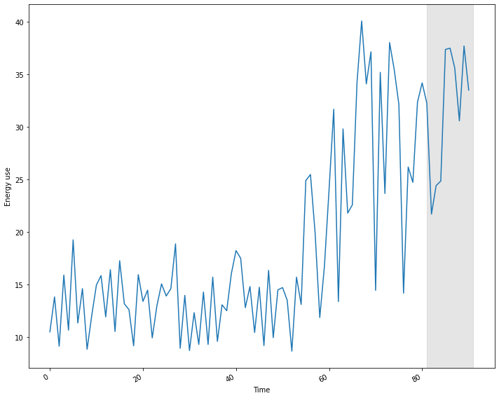
Determine the ARMA(p, q) orders of the process
In addition to the integration order, we also need to know the orders of the AR(p) and MA(q) processes. We can determine these using the Akaike information criterion, as before. The process is the same. First, we create a list of possible p and q values.
PYTHON
from itertools import product

p_vals = range(0, 4, 1)
q_vals = range(0, 4, 1)

order_list = list(product(p_vals, q_vals))

for o in order_list:
    print(o)
OUTPUT
(0, 0)
(0, 1)
(0, 2)
(0, 3)
(1, 0)
(1, 1)
(1, 2)
(1, 3)
(2, 0)
(2, 1)
(2, 2)
(2, 3)
(3, 0)
(3, 1)
(3, 2)
(3, 3)
Next, we reuse our function to fit models using each combination of ARMA(p, q) orders. Note that we have made a change to the function to include the integration order as an argument that is passed to the order argument of the SARIMAX model.
PYTHON
def fit_eval_AIC(data, order_list, i_order):
    aic_results = []
    for o in order_list:
        model = SARIMAX(data, order=(o[0], i_order, o[1]),
                        simple_differencing=False)
        res = model.fit(disp=False)
        aic = res.aic
        aic_results.append([o, aic])

    result_df = pd.DataFrame(aic_results, columns=(['(p, q)', 'AIC']))
    result_df.sort_values(by='AIC', ascending=True, inplace=True)
    result_df.reset_index(drop=True, inplace=True)

    return result_df
Passing our training data to a function call of our AIC evaluation function, the result indicates that the model with the best comparative performance has an ARMA(2, 3) process. Including the integration order gives us an optimized ARIMA(2, 2, 3) process.
OUTPUT
    (p, q)         AIC
0   (2, 3)  497.916050
1   (1, 3)  499.220250
2   (3, 3)  499.620967
3   (3, 2)  503.250113
4   (2, 2)  509.066593
5   (0, 2)  510.498182
6   (3, 1)  511.524737
7   (0, 3)  512.309653
8   (1, 2)  514.444378
9   (1, 1)  515.938985
10  (2, 1)  517.934902
11  (3, 0)  544.559757
12  (0, 1)  547.563212
13  (2, 0)  551.625374
14  (1, 0)  555.131203
15  (0, 0)  632.868700
Before forecasting, we still need to perform diagnostics to make sure
the model doesn’t violate any of its underlying assumptions. We can do
this using plot_diagnostics().
PYTHON
model = SARIMAX(train, order=(2,2,3), simple_differencing=False)
model_fit = model.fit(disp=False)
model_fit.plot_diagnostics(figsize=(10,8));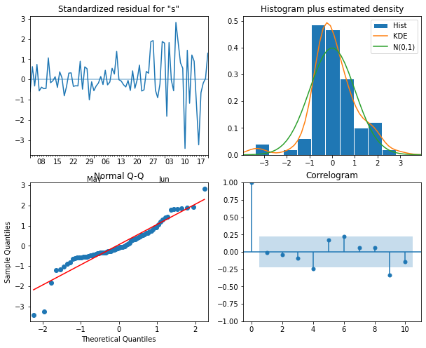
Forecast using an ARIMA(2, 2, 3) process
One advantage to using the non-stationary time-series to diagnose the optimized ARIMA(2, 2, 3) model is that predictions are an attribute of the corresponding SARIMAX model. That is, we don’t have to define a separate function to make forecasts.
First, in order to evaluate the forecasts from our ARIMA(2, 2, 3) model, we need to define a baseline. In this case since we are forecasting power consumption across the last ten days of the time-series, we will use a naive seasonal forecast, which is a pairwise forecast the uses the last ten values of the training set as the forecast for the ten values of the test set.
OUTPUT
                   sum  naive_seasonal
INTERVAL_TIME
2019-06-21     32.2602         35.1876
2019-06-22     21.7008         23.6634
2019-06-23     24.4098         38.0220
2019-06-24     24.8472         35.4414
2019-06-25     37.3656         32.1318
2019-06-26     37.4856         14.1774
2019-06-27     35.6100         26.1804
2019-06-28     30.5742         24.7188
2019-06-29     37.6950         32.3622
2019-06-30     33.4986         34.1838
Now we can use the get_prediction() method of the
SARIMAX model to retrieve the predicted power consumption over the ten
days of the test set.
PYTHON
pred_ARIMA = model_fit.get_prediction(81, 91).predicted_mean

# add these to a new column in test set
test['pred_ARIMA'] = pred_ARIMA
print(test)
OUTPUT
                   sum  naive_seasonal  pred_ARIMA
INTERVAL_TIME
2019-06-21     32.2602         35.1876   36.311936
2019-06-22     21.7008         23.6634   30.731745
2019-06-23     24.4098         38.0220   35.999676
2019-06-24     24.8472         35.4414   31.301976
2019-06-25     37.3656         32.1318   36.802939
2019-06-26     37.4856         14.1774   32.181567
2019-06-27     35.6100         26.1804   37.692010
2019-06-28     30.5742         24.7188   33.084946
2019-06-29     37.6950         32.3622   38.587688
2019-06-30     33.4986         34.1838   33.990146
Finally, we can evaluate the performance of the baseline and the model using the mean absolute error.
PYTHON
mae_naive_seasonal = mean_absolute_error(test['sum'], test['naive_seasonal'])
mae_ARIMA = mean_absolute_error(test['sum'], test['pred_ARIMA'])

print("Mean absolute error, baseline:", mae_naive_seasonal)
print("Mean absolute error, ARMA(2, 2, 3):", mae_ARIMA)
OUTPUT
Mean absolute error, baseline: 7.89414
Mean absolute error, ARMA(2, 2, 3): 4.297101587602739
We can visually compare the results using a plot.
PYTHON
fig, ax = plt.subplots()

ax.plot(daily_usage['sum'])
ax.plot(test['sum'], 'b-', label='actual')
ax.plot(test['naive_seasonal'], 'r:', label='naive seasonal')
ax.plot(test['pred_ARIMA'], 'k--', label='ARIMA(2,2,3)')

ax.set_xlabel('Date')
ax.set_ylabel('Electricity consumption')

ax.legend(loc=2)

fig.autofmt_xdate()
plt.tight_layout()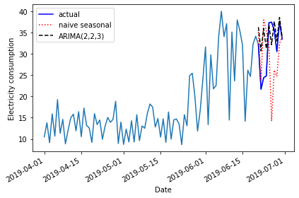
Key Points
- The d parameter of the order argument of the SARIMAX model can be used to forecast non-stationary time-series.
Content from Seasonal Autoregressive Integrated Moving Average Forecasts
Last updated on 2023-08-20 | Edit this page
Estimated time: 50 minutes
Overview
Questions
- How do we account for seasonal processes in time-series forecasting?
Objectives
- Explain the SARIMA(p,d, q)(P, D, Q)m model.
Introduction
The data we have been using so far have apparent seasonal trends. That is, in addition to trends across the entire dataset, there are periodic trends. We can see this most clearly if we look at a plot of monthly power consumption from a single meter over three years, 2017-2019.
PYTHON
d = pd.read_csv("../../data/ladpu_smart_meter_data_01.csv")
d.set_index(pd.to_datetime(d["INTERVAL_TIME"]), inplace=True)
d.sort_index(inplace=True)
d.resample("M")["INTERVAL_READ"].sum().plot()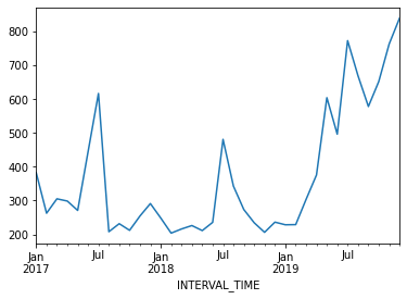
The above plot shows an overall trend of decreased power usage between 2017 and 2018, with a significant increase in power usage in 2019. What may stand out more prominently, however, are the seasonal trends in the data. In particular, there are annual peaks in power consumption in the summer, with smaller peaks in the winter. Power consumption in spring and fall is comparatively low.
Though our example here is explicitly seasonal, seasonal trends can be any periodic trend, including monthly, weekly, or daily trends. In fact, it is possible for a time-series to exhibit multiple trends. This is true of our data. Consider your own power consumption at home, where periodic trends can include
- Daily trends where power consumption may be greater in the morning and evening, before and after work and before sleep.
- Weekly trends where power consumption may be greater over the weekend, or outside of whatever your normal work hours may be.
In this episode, we will expand our model to account for periodic or seasonal trends in the time-series.
About the code
The code used in this lesson is based on and, in some cases, a direct application of code used in the Manning Publications title, Time series forecasting in Python, by Marco Peixeiro.
Peixeiro, Marco. Time Series Forecasting in Python. [First edition]. Manning Publications Co., 2022.
The original code from the book is made available under an Apache 2.0 license. Use and application of the code in these materials is within the license terms, although this lesson itself is licensed under a Creative Commons CC-BY 4.0 license. Any further use or adaptation of these materials should cite the source code developed by Peixeiro:
Peixeiro, Marco. Timeseries Forecasting in Python [Software code]. 2022. Accessed from https://github.com/marcopeix/TimeSeriesForecastingInPython.
Create the data subset
For this episode, we return to the data subset we’ve used for all but the last episode, with the difference that we will limit the date range of the subset to January - June, 2019.
First, load the necessary libaries and define the function to read, subset, and resample the data.
PYTHON
from sklearn.metrics import mean_squared_error, mean_absolute_error
from statsmodels.tsa.seasonal import STL
from statsmodels.stats.diagnostic import acorr_ljungbox
from statsmodels.tsa.statespace.sarimax import SARIMAX
from statsmodels.tsa.stattools import adfuller
from tqdm import tqdm_notebook
from itertools import product
from typing import Union

import matplotlib.pyplot as plt
import numpy as np
import pandas as pd
PYTHON
def subset_resample(fpath, sample_freq, start_date, end_date=None):
    df = pd.read_csv(fpath)
    df.set_index(pd.to_datetime(df["INTERVAL_TIME"]), inplace=True)
    df.sort_index(inplace=True)
    if end_date:
        date_subset = df.loc[start_date: end_date].copy()
    else:
        date_subset = df.loc[start_date].copy()
    resampled_data = date_subset.resample(sample_freq)
    return resampled_data
Call our function to read and subset the data.
PYTHON
fp = "../../data/ladpu_smart_meter_data_01.csv"
data_subset_resampled = subset_resample(fp, "D", "2019-01", end_date="2019-06")
print("Data type of returned object:", type(data_subset_resampled))
OUTPUT
Data type of returned object: <class 'pandas.core.resample.DatetimeIndexResampler'>As before, we will aggregate the data to daily total power consumption. We will use these daily totals to explore and make predictions based on weekly trends.
PYTHON
daily_usage = data_subset_resampled['INTERVAL_READ'].agg([np.sum])
print(daily_usage.info())
print(daily_usage.head())
OUTPUT
<class 'pandas.core.frame.DataFrame'>
DatetimeIndex: 181 entries, 2019-01-01 to 2019-06-30
Freq: D
Data columns (total 1 columns):
 #   Column  Non-Null Count  Dtype
---  ------  --------------  -----
 0   sum     181 non-null    float64
dtypes: float64(1)
memory usage: 2.8 KB
None
                   sum
INTERVAL_TIME
2019-01-01      7.5324
2019-01-02     10.2534
2019-01-03      6.8544
2019-01-04      5.3250
2019-01-05      7.5480
This time, instead of plotting the daily total power consumption we
will use the statsmodels STL method to create
a decomposition plot of the time-series. The decomposition plot is
actually a figure that includes three subplots, one for the observed
values, which is essentially the plot we have been rendering in the
other sections of this lesson when we first inspect the data.
The other two plots include the overall trend and the seasonal trends. Because we set the period argument to 7 when we created the figure, the returned Seasonal subplot is represented as a series of 7 day intervals. A weekly trends is evident.
PYTHON
decomposition = STL(daily_usage['sum'], period=7).fit()

fig, (ax1, ax2, ax3) = plt.subplots(nrows=3, ncols=1,
                                    sharex=True, figsize=(10,8))

ax1.plot(decomposition.observed)
ax1.set_ylabel('Observed')

ax2.plot(decomposition.trend)
ax2.set_ylabel('Trend')

ax3.plot(decomposition.seasonal)
ax3.set_ylabel('Seasonal')

fig.autofmt_xdate()
plt.tight_layout()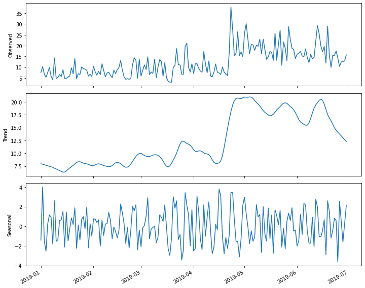
Determine orders of SARIMA(p, d, q)(P, D, Q)m processes
The parameters of the seasonal autoregressive integrated moving average model are similar to those of the ARIMA(p, d, q) model covered in the previous section. The difference is that in addition to specifying the orders of the ARIMA(p, d, q) processes, we are additionally specifying the same parameters, here represented as (P, D, Q) over a given period, m.
We can use differencing to determine the integration order, d, and the seasonal integration order, D.
As we have seen, our time-series is non-stationary.
PYTHON
ADF_result = adfuller(daily_usage['sum'])
print(f'ADF Statistic: {ADF_result[0]}')
print(f'p-value: {ADF_result[1]}')
OUTPUT
ADF Statistic: -2.4711247025051346
p-value: 0.1226589853651796
First order differencing results in a stationary time-series.
PYTHON
daily_usage_diff = np.diff(daily_usage['sum'], n = 1)
ADF_result = adfuller(daily_usage_diff)
print(f'ADF Statistic: {ADF_result[0]}')
print(f'p-value: {ADF_result[1]}')
OUTPUT
ADF Statistic: -7.608254715996063
p-value: 2.291404555919546e-11
From this we know that the value of the integration order is 1. Since we are interested in a weekly period, we will use a value of 7 for m in the SARIMA(p, d, q)(P, D, Q)m model. In the SARIMAX model, this value is given as s, which is the fourth parameter of the seasonal_order argument.
We will update our AIC function to incorporate these additional arguments. Note that we have not yet determined the seasonal integration order, D.
PYTHON
def fit_eval_AIC(data, order_list, d, D, s):
    aic_results = []
    for o in order_list:
        model = SARIMAX(data, order=(o[0], d, o[1]),
                        seasonal_order = (o[2], D, o[3], s),
                        simple_differencing=False)
        res = model.fit(disp=False)
        aic = res.aic
        aic_results.append([o, aic])

    result_df = pd.DataFrame(aic_results, columns=(['(p, q, P, Q)', 'AIC']))
    result_df.sort_values(by='AIC', ascending=True, inplace=True)
    result_df.reset_index(drop=True, inplace=True)

    return result_df
Using the definition of a SARIMA(p, d, q)(P, D, Q)m model, we note that when the seasonal (P, D, Q) orders are zero, that is equivalent to an ARIMA(p, d, q) model, with the addition of a specified period m. Recall that the period parameter in the SARIMAX model is given as s. With this in mind we can use the function to fit and evaluate a range of possible ARMA(p, q) orders as before.
PYTHON
ps = range(0, 8, 1)
qs = range(0, 8, 1)
Ps = [0]
Qs = [0]

d = 1
D = 0
s = 7

ARIMA_order_list = list(product(ps, qs, Ps, Qs))
print(ARIMA_order_list)

```output
[(0, 0, 0, 0), (0, 1, 0, 0), (0, 2, 0, 0), (0, 3, 0, 0), (0, 4, 0, 0), (0, 5, 0, 0), (0, 6, 0, 0), (0, 7, 0, 0), (1, 0, 0, 0), (1, 1, 0, 0), (1, 2, 0, 0), (1, 3, 0, 0), (1, 4, 0, 0), (1, 5, 0, 0), (1, 6, 0, 0), (1, 7, 0, 0), (2, 0, 0, 0), (2, 1, 0, 0), (2, 2, 0, 0), (2, 3, 0, 0), (2, 4, 0, 0), (2, 5, 0, 0), (2, 6, 0, 0), (2, 7, 0, 0), (3, 0, 0, 0), (3, 1, 0, 0), (3, 2, 0, 0), (3, 3, 0, 0), (3, 4, 0, 0), (3, 5, 0, 0), (3, 6, 0, 0), (3, 7, 0, 0), (4, 0, 0, 0), (4, 1, 0, 0), (4, 2, 0, 0), (4, 3, 0, 0), (4, 4, 0, 0), (4, 5, 0, 0), (4, 6, 0, 0), (4, 7, 0, 0), (5, 0, 0, 0), (5, 1, 0, 0), (5, 2, 0, 0), (5, 3, 0, 0), (5, 4, 0, 0), (5, 5, 0, 0), (5, 6, 0, 0), (5, 7, 0, 0), (6, 0, 0, 0), (6, 1, 0, 0), (6, 2, 0, 0), (6, 3, 0, 0), (6, 4, 0, 0), (6, 5, 0, 0), (6, 6, 0, 0), (6, 7, 0, 0), (7, 0, 0, 0), (7, 1, 0, 0), (7, 2, 0, 0), (7, 3, 0, 0), (7, 4, 0, 0), (7, 5, 0, 0), (7, 6, 0, 0), (7, 7, 0, 0)]
Note that we are generating a much longer order_list to account for the combinations of multiple orders. The following step may take a few minutes to complete.
Create a training dataset that includes all but the last seven days of the time-series, then fit the different models on the training data.
PYTHON
train = daily_usage['sum'][:-7]

ARIMA_result_df = fit_eval_AIC(train, ARIMA_order_list, d, D, s)
print(ARIMA_result_df)
OUTPUT
    (p, q, P, Q)          AIC
0   (3, 4, 0, 0)  1031.133360
1   (2, 2, 0, 0)  1031.647489
2   (1, 3, 0, 0)  1031.786064
3   (1, 2, 0, 0)  1032.481145
4   (3, 5, 0, 0)  1032.898114
..           ...          ...
59  (4, 0, 0, 0)  1046.805280
60  (3, 0, 0, 0)  1053.364985
61  (2, 0, 0, 0)  1055.571767
62  (1, 0, 0, 0)  1073.574512
63  (0, 0, 0, 0)  1093.603695
With the comparatively best orders of the p and q parameters, we can run the SARMIAX model and render a diagnostic plot before forecasting.
PYTHON
ARIMA_model = SARIMAX(train, order=(3,1,4), simple_differencing=False)
ARIMA_model_fit = ARIMA_model.fit(disp=False)

ARIMA_model_fit.plot_diagnostics(figsize=(10,8));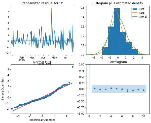
The plot indicates that none of the assumptions of the model have been violated. We now retrieve seven day’s worth of predictions from the model and add them to a test dataset for later evaluation.
PYTHON
test = daily_usage.iloc[-7:]
# Append ARIMA predictions to test set for comparison
ARIMA_pred = ARIMA_model_fit.get_prediction(174, 181).predicted_mean
test['ARIMA_pred'] = ARIMA_pred
print(test)
OUTPUT
                   sum  ARIMA_pred
INTERVAL_TIME
2019-06-24     17.5740   17.617429
2019-06-25     14.1876   14.289460
2019-06-26     10.3902   15.595329
2019-06-27     12.3936   14.154636
2019-06-28     12.6720   16.503719
2019-06-29     12.8916   16.395582
2019-06-30     15.7194   18.233482
We can also add a naive seasonal baseline, similar to the baseline metric used in the last section
OUTPUT
                   sum  ARIMA_pred  naive_seasonal
INTERVAL_TIME
2019-06-24     17.5740   17.617429         19.6512
2019-06-25     14.1876   14.289460         11.8926
2019-06-26     10.3902   15.595329         29.0688
2019-06-27     12.3936   14.154636         15.6822
2019-06-28     12.6720   16.503719          9.8856
2019-06-29     12.8916   16.395582         15.5208
2019-06-30     15.7194   18.233482         15.4338
With the basline forecast and an ARIMA(3, 1, 4) forecast in place, we now need to determine the orders of the seasonal (P, D, Q) processes for the SARIMA model.
For the most part, this is similar to the process we have been using to fit and evaluate different models using their AIC values. In this case we only need to add combinations of the (P, Q) orders to our order_list. But first we need to determine the seasonal integration order, D. We can use differencing to do this. Here we set the n argument for the distance between difference values to 7, since we are differencing values across seven day periods.
PYTHON
daily_usage_diff_seasonal = np.diff(daily_usage['sum'], n = 7)
ADF_result = adfuller(daily_usage_diff_seasonal)
print(f'ADF Statistic: {ADF_result[0]}')
print(f'p-value: {ADF_result[1]}')
OUTPUT
ADF Statistic: -11.91407313712363
p-value: 5.2143503070551235e-22
The result indicates that the source time-series over 7 day intervals is stationary, so since no further differencing is needed we will set the seasonal integration order, D, to zero.
Now, create an order_list that includes a range of values for (P, Q). In this case we will not print the full list because it is long.
PYTHON
ps = range(0, 4, 1)
qs = range(0, 4, 1)
Ps = range(0, 4, 1)
Qs = range(0, 4, 1)

SARIMA_order_list = list(product(ps, qs, Ps, Qs))
With the addition of the integration and seasonal integration orders, as well as the seasonal period, we can now fit the models. This may also take a some time to run.
PYTHON
d = 1
D = 0
s = 7

SARIMA_result_df = fit_eval_AIC(train, SARIMA_order_list, d, D, s)
print(SARIMA_result_df)
OUTPUT
     (p, q, P, Q)          AIC
0    (1, 2, 2, 2)  1028.342573
1    (2, 2, 2, 2)  1029.074015
2    (1, 3, 2, 2)  1029.319536
3    (1, 2, 2, 3)  1029.588997
4    (1, 2, 3, 2)  1029.609838
..            ...          ...
251  (0, 0, 1, 3)  1094.831557
252  (0, 0, 1, 1)  1095.425574
253  (0, 0, 0, 1)  1095.599186
254  (0, 0, 1, 0)  1095.600553
255  (0, 0, 3, 3)  1095.666939

[256 rows x 2 columns]
Among all the models fitted, the comparative best is a SARIMA(1, 1,
2)(2, 0, 2)7 model. We pass this to the SARIMAX model in the
statsmodels library and generate a diagnostic plot before
retrieving forecasts.
PYTHON
SARIMA_model = SARIMAX(train, order=(1,1,2), seasonal_order=(2,0,2,7), simple_differencing=False)
SARIMA_model_fit = SARIMA_model.fit(disp=False)

SARIMA_model_fit.plot_diagnostics(figsize=(10,8));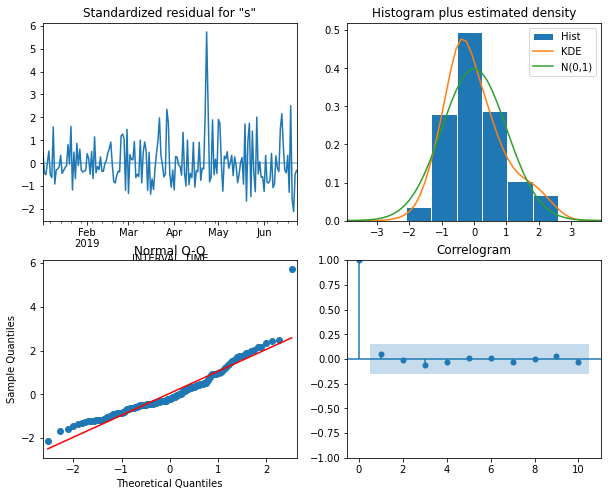
Forecast and evaluate the performance of the SARIMA model
The plot indicates that none of the assumptions of the model are violated, so we retrieve seven days’ worth of predictions from the model and add them as a new column to our test dataset for evaluation.
PYTHON
SARIMA_pred = SARIMA_model_fit.get_prediction(174, 181).predicted_mean
test['SARIMA_pred'] = SARIMA_pred
print(test)
OUTPUT
                   sum  ARIMA_pred  naive_seasonal  SARIMA_pred
INTERVAL_TIME
2019-06-24     17.5740   17.617429         19.6512    15.595992
2019-06-25     14.1876   14.289460         11.8926    13.144431
2019-06-26     10.3902   15.595329         29.0688    15.472899
2019-06-27     12.3936   14.154636         15.6822    13.574806
2019-06-28     12.6720   16.503719          9.8856    16.512553
2019-06-29     12.8916   16.395582         15.5208    13.932104
2019-06-30     15.7194   18.233482         15.4338    17.803156
Plotting the last month of the time-series, including the forecast, suggests that the ARIMA and SARIMA models performed comparably.
PYTHON
fig, ax = plt.subplots()

ax.plot(daily_usage['sum'])
ax.plot(test['sum'], 'b-', label='actual')
ax.plot(test['naive_seasonal'], 'r:', label='naive seasonal')
ax.plot(test['ARIMA_pred'], 'k--', label='ARIMA(11,1,0)')
ax.plot(test['SARIMA_pred'], 'g-.', label='SARIMA(0,1,1)(0,1,1,12)')

ax.set_xlabel('Date')
ax.set_ylabel('Electricity consumption')

ax.legend(loc=2)
ax.set_xlim(18047, 18077)

fig.autofmt_xdate()
plt.tight_layout()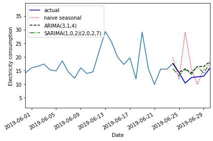
Evaluatinf the mean absolute error shows that the SARIMA model performed slightly better.
PYTHON
mae_naive_seasonal = mean_absolute_error(test['sum'], test['naive_seasonal'])
mae_ARIMA = mean_absolute_error(test['sum'], test['ARIMA_pred'])
mae_SARIMA = mean_absolute_error(test['sum'], test['SARIMA_pred'])

print("Mean absolute error, baseline:", mae_naive_seasonal)
print("Mean absolute error, ARIMA(3, 1, 4):", mae_ARIMA)
print("Mean absolute error, SARIMA(2, 0, 2, 7):", mae_SARIMA)
OUTPUT
Mean absolute error, baseline: 4.577228571428571
Mean absolute error, ARIMA(3, 1, 4): 2.423033958158726
Mean absolute error, SARIMA(2, 0, 2, 7): 2.321413443652824
Key Points
- Use the seasonal_order(P, D, Q, m) argument of the SARIMAX model to specify the order of seasonal processes.