Moving Average Forecasts
Last updated on 2023-08-16 | Edit this page
Estimated time: 50 minutes
Overview
Questions
- How can we analyze time-series data with trends?
Objectives
- Create a stationary time-series.
- Test for autocorrelation of time series values.
Introduction
In the previous section, we used baseline metrics to forecast one or more timesteps of a time-series dataset. These forecasts help demonstrate some of the characteristic features of time-series, but as we saw when we evaluated the results they may not make very accurate forecasts. There are some types of random time-series data for which using a baseline metric to forecast a single timestamp ahead is the only option. Since that doesn’t apply to the smart meter data - that is, power consumption values are not random - we will pass over that topic for now.
Instead, the smart meter data have characteristics that make them good candidates for methods that account for trends, autoregression, and one or more types of seasonality. We will develop these concepts over the next several lessons, beginning here with autocorrelation and the use of moving averages to make forecasts using autocorrelated data.
About the code
The code used in this lesson is based on and, in some cases, a direct application of code used in the Manning Publications title, Time series forecasting in Python, by Marco Peixeiro.
Peixeiro, Marco. Time Series Forecasting in Python. [First edition]. Manning Publications Co., 2022.
The original code from the book is made available under an Apache 2.0 license. Use and application of the code in these materials is within the license terms, although this lesson itself is licensed under a Creative Commons CC-BY 4.0 license. Any further use or adaptation of these materials should cite the source code developed by Peixeiro:
Peixeiro, Marco. Timeseries Forecasting in Python [Software code]. 2022. Accessed from https://github.com/marcopeix/TimeSeriesForecastingInPython.
Create a subset to demonstrate autocorrelation
As we did in the previous episode, rather than read a dataset that is ready for analysis we are going to read one of the smart meter datasets and create a subset that demonstrates the characteristics of interest for this section of the lesson.
First we will import the necessary libraries. Note that in additional
to Pandas, Numpy, and Matplotlib we are also importing modules from
statsmodels and sklearn. These are Python
libraries that come with many methods for modeling and machine
learning.
PYTHON
import pandas as pd
import numpy as np
import matplotlib.pyplot as plt
from statsmodels.tsa.stattools import adfuller
from statsmodels.graphics.tsaplots import plot_acf
from statsmodels.tsa.statespace.sarimax import SARIMAX
from sklearn.metrics import mean_squared_error
from sklearn.metrics import mean_absolute_error
Read the data. In this case we are using just a single smart meter.
OUTPUT
<class 'pandas.core.frame.DataFrame'>
RangeIndex: 105012 entries, 0 to 105011
Data columns (total 5 columns):
 #   Column         Non-Null Count   Dtype
---  ------         --------------   -----
 0   INTERVAL_TIME  105012 non-null  object
 1   METER_FID      105012 non-null  int64
 2   START_READ     105012 non-null  float64
 3   END_READ       105012 non-null  float64
 4   INTERVAL_READ  105012 non-null  float64
dtypes: float64(3), int64(1), object(1)
memory usage: 4.0+ MB
None
Set the datetime index and resample to a daily frequency.
PYTHON
df.set_index(pd.to_datetime(df["INTERVAL_TIME"]), inplace=True)
df.sort_index(inplace=True)
print(df.info())
OUTPUT
<class 'pandas.core.frame.DataFrame'>
DatetimeIndex: 105012 entries, 2017-01-01 00:00:00 to 2019-12-31 23:45:00
Data columns (total 5 columns):
 #   Column         Non-Null Count   Dtype
---  ------         --------------   -----
 0   INTERVAL_TIME  105012 non-null  object
 1   METER_FID      105012 non-null  int64
 2   START_READ     105012 non-null  float64
 3   END_READ       105012 non-null  float64
 4   INTERVAL_READ  105012 non-null  float64
dtypes: float64(3), int64(1), object(1)
memory usage: 4.8+ MB
NoneOUTPUT
               INTERVAL_READ
INTERVAL_TIME
2017-01-01           11.7546
2017-01-02           15.0690
2017-01-03           11.6406
2017-01-04           22.0788
2017-01-05           12.8070
Subset to January - July, 2019 and plot the data.
PYTHON
jan_july_2019 = daily_data.loc["2019-01": "2019-07"].copy()
jan_july_2019["INTERVAL_READ"].plot()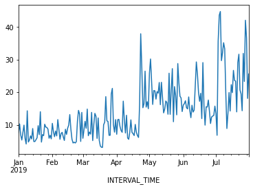
The above plot demonstrates a gradual trend towards increased power consumption through late spring and into summer. This is expected - power consumption in US households tends to increase as the weather becomes warmer and people begin to use air conditioners or evaporative coolers.
Differencing and autocorrelation
In order to make a forecast using the moving average model, however,
the data need to be stationary. That is, we need to remove trends from
the data. We can test for stationarity using the adfuller
function from statsmodels.
PYTHON
adfuller_test = adfuller(jan_july_2019["INTERVAL_READ"])
print(f'ADFuller result: {adfuller_test[0]}')
print(f'p-value: {adfuller_test[1]}')
OUTPUT
ADFuller result: -2.533089941397639
p-value: 0.10762933815081588
The p-value above is greater than 0.05, which in this case indicates that the data are not stationary. That is, there is a trend in the data.
We also want to test for autocorrelation.
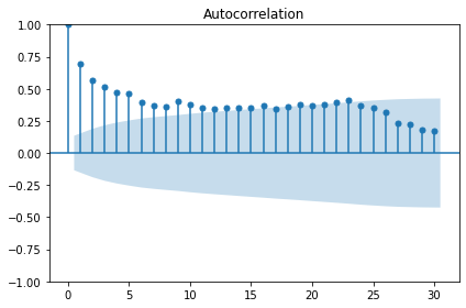
The plot above shows significant autocorrelation up to the 16th lag. Before we can make forecasts on the data, we need to make the data stationary by removing the trend using a technique called differencing. Differencing also reduces the amount of autocorrelation in the data.
Differencing data this way creates a Numpy array of values that represent the difference between one INTERVAL_READ value and the next. We can see this by comparing the head of the jan_july_2019 dataframe with the first five differenced values.
PYTHON
jan_july_2019_differenced = np.diff(jan_july_2019["INTERVAL_READ"], n=1)
print("Head of dataframe:", jan_july_2019.head())
print("\nDifferenced values:", jan_july_2019_differenced[:5])
OUTPUT
Head of dataframe:                INTERVAL_READ
INTERVAL_TIME
2019-01-01            7.5324
2019-01-02           10.2534
2019-01-03            6.8544
2019-01-04            5.3250
2019-01-05            7.5480

Differenced values: [ 2.721  -3.399  -1.5294  2.223   2.3466]
Plotting the result shows that there are no obvious trends in the differenced data.
PYTHON
fig, ax = plt.subplots()

ax.plot(jan_july_2019_differenced)
ax.set_xlabel('Time')
ax.set_ylabel('Energy consumption')

fig.autofmt_xdate()
plt.tight_layout()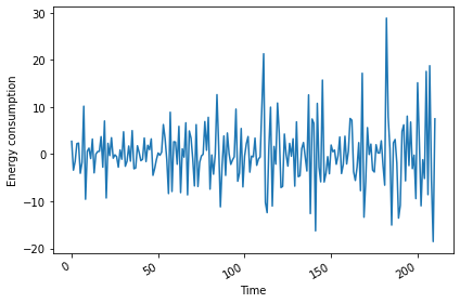
Evaluating the AD Fuller test on the difference data indicates that the data are stationary.
PYTHON
adfuller_test = adfuller(jan_july_2019_differenced)
print(f'ADFuller result: {adfuller_test[0]}')
print(f'p-value: {adfuller_test[1]}')
OUTPUT
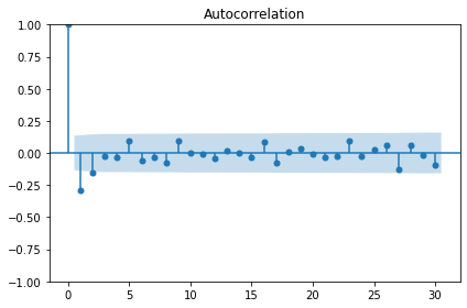
ADFuller result: -7.966077912452976
p-value: 2.8626643210939594e-12
The autocorrelation plot still shows some significant autocorrelation up to lag 2. We will use this information to supply the order parameter for the moving average model, below.
Moving average forecast
For our training data, we will use the 90% of the dataset. The remaining 10% of the data will be used to evaluate the performance of the moving average forecast in comparison with a baseline forecast.
Since the differenced data is a numpy array, we also need to convert it to a dataframe.
PYTHON
jan_july_2019_differenced = pd.DataFrame(jan_july_2019_differenced,
                                         columns=["INTERVAL_READ"])

train = jan_july_2019_differenced[:int(round(len(jan_july_2019_differenced) * .9, 0))] # ~90% of data
test = jan_july_2019_differenced[int(round(len(jan_july_2019_differenced) * .9, 0)):] # ~10% of data
print("Training data length:", len(train))
print("Test data length:", len(test))
OUTPUT
Training data length: 190
Test data length: 21
We can plot the original and differenced data together. The shaded area is the date range for which we will be making and evaluating forecasts.
PYTHON
fig, (ax1, ax2) = plt.subplots(nrows=2, ncols=1, sharex=True)

ax1.plot(jan_july_2019["INTERVAL_READ"].values)
ax1.set_xlabel('Time')
ax1.set_ylabel('Energy use')
ax1.axvspan(184, 211, color='#808080', alpha=0.2)

ax2.plot(jan_july_2019_differenced["INTERVAL_READ"])
ax2.set_xlabel('Time')
ax2.set_ylabel('Energy use - differenced data')
ax2.axvspan(184, 211, color='#808080', alpha=0.2)

fig.autofmt_xdate()
plt.tight_layout()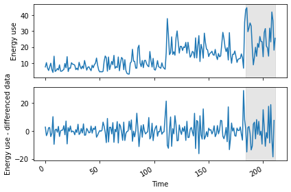
We are going to evaluate the performance of the moving average forecast against a baseline forecast based on the last known value. Since we will be using and building on these methods throughout this lesson, we will create functions for each forecast.
The last_known() function is a more flexible version of
the process used in the previous episode to calculate a baseline
forecast. In that case we used single value - the last known meter
reading from the training dataset - and applied it as a forecast to the
entire test set. In our updated function, we are passing
horizon and window arguments that allow us to pull
values from a moving frame of reference within the differenced data.
The moving_average() function is an implementation of
the seasonal auto-regressive moving average model that is
included in the statsmodels library.
PYTHON
def last_known(data, training_len, horizon, window):
    total_len = training_len + horizon
    pred_last_known = []

    for i in range(training_len, total_len, window):
        subset = data[:i]
        last_known = subset.iloc[-1].values[0]
        pred_last_known.extend(last_known for v in range(window))

    return pred_last_known

def moving_average(data, training_len, horizon, ma_order, window):
    total_len = training_len + horizon
    pred_MA = []

    for i in range(training_len, total_len, window):
        model = SARIMAX(data[:i], order=(0,0, ma_order))
        res = model.fit(disp=False)
        predictions = res.get_prediction(0, i + window - 1)
        oos_pred = predictions.predicted_mean.iloc[-window:]
        pred_MA.extend(oos_pred)

    return pred_MA
Both functions take the differenced dataframe as input and return a list of predicted values that is equal to the length of the test dataset.
PYTHON
pred_df = test.copy()

TRAIN_LEN = len(train)
HORIZON = len(test)
ORDER = 2
WINDOW = 2

pred_last_value = last_known(jan_july_2019_differenced, TRAIN_LEN, HORIZON, WINDOW)
pred_MA = moving_average(jan_july_2019_differenced, TRAIN_LEN, HORIZON, ORDER, WINDOW)

pred_df['pred_last_value'] = pred_last_value
pred_df['pred_MA'] = pred_MA

print(pred_df.head())
OUTPUT
     INTERVAL_READ  pred_last_value   pred_MA
189       -13.5792           -1.863 -1.870535
190       -10.8660           -1.863 -0.379950
191         4.8054          -10.866  9.760944
192         6.2280          -10.866  4.751856
193        -5.6718            6.228  2.106354
Plotting the data allows for a visual comparison of the forecasts.
PYTHON
fig, ax = plt.subplots()

ax.plot(jan_july_2019_differenced[150:]['INTERVAL_READ'], 'b-', label='actual')
ax.plot(pred_df['pred_last_value'], 'r-.', label='last')
ax.plot(pred_df['pred_MA'], 'k--', label='Moving average')

ax.axvspan(190, 210, color='#808080', alpha=0.2)
ax.legend(loc=2)

ax.set_xlabel('Time')
ax.set_ylabel('Energy use - differenced data')

plt.tight_layout()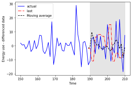
This time we will use the mean_squared_error function
from the sklearn library to evaluate the results.
PYTHON
mse_last = mean_squared_error(pred_df['INTERVAL_READ'], pred_df['pred_last_value'])
mse_MA = mean_squared_error(pred_df['INTERVAL_READ'], pred_df['pred_MA'])

print("Last known forecast, mean squared error:", mse_last)
print("Moving average forecast, mean squared error:", mse_MA)
OUTPUT
Last known forecast, mean squared error: 185.5349359527273
Moving average forecast, mean squared error: 86.16289030738947
We can see that the moving average forecast performs much better than the last known value baseline forecast.
Transform the forecast to original scale
Because we differenced our data above in order to apply a moving
average forecast, we now need to transform the data back to its original
scale. To do this, we apply the numpy cumsum() method to
calculate the cumulative sums of the values in the differenced dataset.
We then map these sums to their corresponding rows of the original
data.
The transformed data are only being applied to the rows of the source
data that were used for the test dataset, so we can use the
tail() function to inspect the result.
PYTHON
jan_july_2019['pred_usage'] = pd.Series()
jan_july_2019['pred_usage'][190:] = jan_july_2019['INTERVAL_READ'].iloc[190] + pred_df['pred_MA'].cumsum()
print(jan_july_2019.tail())
OUTPUT
               INTERVAL_READ  pred_usage
INTERVAL_TIME
2019-07-27           23.2752   31.008305
2019-07-28           42.0504   28.974839
2019-07-29           36.6444   30.387655
2019-07-30           18.0828   22.025803
2019-07-31           25.5774   20.781842
We can plot the result to compare the transformed forecasts against the actual daily power consumption.
PYTHON
fig, ax = plt.subplots()

ax.plot(jan_july_2019['INTERVAL_READ'].values, 'b-', label='actual')
ax.plot(jan_july_2019['pred_usage'].values, 'k--', label='MA(2)')

ax.legend(loc=2)

ax.set_xlabel('Time')
ax.set_ylabel('Energy consumption')
ax.axvspan(191, 210, color='#808080', alpha=0.2)
ax.set_xlim(170, 210)

fig.autofmt_xdate()
plt.tight_layout()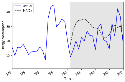
Finally, to evaluate the performance of the moving average forecast
against the actual values in the undifferenced data, we use the
mean_absolute_error from the sklearn
library.
PYTHON
mae_MA_undiff = mean_absolute_error(jan_july_2019['INTERVAL_READ'].iloc[191:],
                                    jan_july_2019['pred_usage'].iloc[191:])

print("Mean absolute error of moving average forecast", mae_MA_undiff)
OUTPUT
Mean absolute error of moving average forecast 8.457690692889582Key Points
- Use differencing to make time-series stationary.
-
statsmodelsis a Python library with time-series methods built in.