Data Management: Introduction
Overview
Teaching: 10 min
Exercises: 5 minQuestions
How do most people organise their data and associated files?
What are some common issues with not having a clear plan for the naming and storage of files?
Why is this important? (reproducible research)
Objectives
Appreciate the potential hazards of poor data management
Data Chaos
Today, many people organise the files associated with some sort of data project in the same manner as they’ve always done it. Namely, to save files in a sporadic fashion with generic filenames, often differing from project to project. The result is waste. Wasted time, wasted money and wasted effort, plus the obvious risks of mistakes, with files being lost, shared with the wrong people, or incorrect files being used for subsequent analysis.
Have you ever experienced a conversation such as the following?
- Hey, have you got that data file that so-and-so did a while back?
- Erm, that stuff to do with those blood-marker measurements?
- Yeah, that’s the one
- wait 20 minutes
- Found it. It was in an email. I’ll forward it to you
- receive a file called data_final_17.xls
If you have, you’re not alone, and it might not seem that big of a deal. But consider the problems that surround this example.
First, the exact file can’t be identified. It’s unclear exactly which file is needed, what it relates to, who created it, when, how, and which project it’s associated with.
Next, its location is a mystery, with the file having to be searched for. Eventually, its location is found to be inside an email, which means its access is limited whilst at the same time its distribution is potentially open to anyone, for better or worse.
Finally, the filename is completely ambiguous. How can you be so sure it’s the correct file? Your only chance to is glean some information from the email that is was attached to, or to explore the content of the file itself. And what does the ‘17’ refer to? The 17th version? The 17th year? Some sort of ID number?
This lesson will explain some key elements of project organisation and data management. These are file-naming and folders, the use of meta-data and the concept of raw data.
Without these core ideas, the most sophisticated data analysis in the world will rest upon shaky foundations, and at an extreme, could lead to the failure of the entire project.
Example 1 - ‘Westpac jumps the gun on profit’ (The Sydney Morning Herald)
“Westpac was forced to halt trading on its shares and deliver its annual profit briefing a day early after it accidentally sent its results by email to research analysts” (link)
Example 2 - ‘Hypertension retracts paper over data glitch’ (retractionwatch.com)
“Hypertension, a journal published by the American Heart Association, has retracted a 2011 paper looking at the implications of blood pressure management guidelines after the authors discovered they had bungled the merging of their data files” (link)
Example 3 - ‘Data questions prompt retraction of PLOS ONE cardiovascular paper’ (retractionwatch.com)
“PLoS One has retracted a 2013 article on atherosclerosis in mice over concerns about the integrity of the data” (link)
These are big, headline-making examples, but similar problems are almost certainly widespread.
However, the good news is that huge strides can be taken away from such potential errors by a handful of basic data management principles.
Reproducible Research
This isn’t just about preventing mistakes or taking a while to find a file. There is a larger issue here, all to do with the concept of reproducible research. This is the idea that when you’re working on a project that involves data analysis, that analysis can be redone precisely at some future point, allowing all results to be checked and verified.
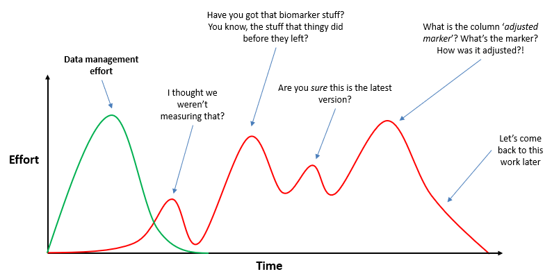
There is also an efficiency aspect, and simply not being constantly frustrated when working on a project. Below is an attempt to illustrate the point, showing that data management, when done well, can save time and confusion.
Exercise: Data problems
Think about issues you’ve encountered over the years relating to data. What were they? Issues around finding data? Knowing what the data is when you do find it? Knowing what’s been done to data and by whom? Etc.
Key Points
Good data organization is the foundation of any research project
Data Management: File-naming and folder structures
Overview
Teaching: 20 min
Exercises: 5 minQuestions
How should files be named?
How should folders be organised?
Objectives
Understand the importance of good file-naming and folder structures
Poor file-naming can make your life and the lives of your collaborators unnecessarily stressful. Data will be lost or at best hard to find. Incorrect files will be used and shared. Important files will be overwritten. For the sake of a few extra seconds when saving your files, all of these issues can be remedied.
The result will be a general increase in efficiency, clear folder structures, filenames that are recognisable and searchable, and improved project cohesion with everyone involved working from clear, trustworthy data sources.
The Principles of Good File-naming
- What to include: Common elements that a filename should include (where relevant) are: Version number, date of creation, name of creator, description of content, name of team/department, and project number
- Longevity: Naming policies should outlive the creator and be universal. Avoid generic names that might clash with other files, and consider scalability. For the version number, ensure it has enough digits for the future (e.g. v001 instead of v1)
- Changes: Always record changes to your data, even when small
- Revisions: A useful convention is to use ordinal numbers for major revisions and decimals for minor revisions (e.g. v001 to v002 for a major revision, and v001 to v001.1 for a minor revision)
- Characters: Don’t use special characters (including #.<>$%!&*?”{}/:\@), use underscores instead of spaces, and format dates correctly
- Consistency: Be consistent between projects
- Dates: A good format for date designations is YYYYMMDD (the ISO 8601 standard). This format ensures that files stay in chronological order, even over the span of many years
- Multiple files: On occasion, data are autogenerated with base file names (e.g. f00001, f00002, …). In this case, consider using a batch renaming tool
- What not to use: Avoid words such as ‘final’, ‘revision’, etc, as they aren’t specific
An example of a poor filename would be: results final 7.xls. An example of a good filename would be: ELISA_ID123_RH_170719_v002.xls.
Thinking about and typing a good filename may take an extra 30 seconds, but it may cost you a lot more time in the future if you don’t.
One issue you may encounter when following the above guidelines is a large number of previous versions. For example, you may edit and resave a file every day for several months. What should you do with the old versions? One approach would be to create an ‘archive’ folder, and put older files in there. These could be compressed by storing them in an archive file format in order to save space (e.g. a zip or tar.gz file). If your older files are too large to store in a local archive, even after compression, there are a few options. One would be to only save those files that contain major revisions, deleting any that contained minor changes. Another would be to store the files on cloud storage, where tens of gigabytes of space can now be purchased very cheaply.
The Principles of Good Folder Organisation
- Most importantly: Use folders! Do not create a desktop of doom, with 200 random files littering your screen
- How many: Use a sensible number of folders. Too few may mean too many files in a single folder. Too many may mean they’re difficult to navigate
- Names: Use sensible names. Don’t worry about the level of detail for files, but do consider project names and the types of files in each folder, such as ‘raw data’, ‘reports’, ‘code’, etc
- Consistency: Be consistent between projects
- Structure: Structure hierarchically. Start broad and drill-down into specific areas or projects
- Reviews: Review folder content periodically, and consider moving older files that are no longer needed into an ‘archive’ folder
Exercise: Folder example
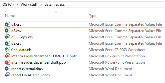
How could you improve the following set-up?
Solution
* Rename the folders
* Rename the files (name, dates, remove words like 'final' and 'complete')
* Create new folders, including an archive
Key Points
Basic data management ideas can improve efficiency and reduce risk
Data Management: Meta-data
Overview
Teaching: 20 min
Exercises: 3 minQuestions
What is meta-data?
Why is it useful?
Objectives
Understand the concept and importance of meta-data
What is Meta-data?
Meta-data is data about data. It is structured information that describes, explains, locates, or otherwise represents something else. Its purpose is to maximise data interpretation and understanding, both by humans and by computers. In other words, its aim is to avoid the details of what the data is from being lost, to prevent rendering the data useless as time passes (sometimes referred to as data entropy or data rot).
The simplest approach to meta-data is to create a simple text file (named, for example, ‘README.txt’) that resides in the same directory as the data. Don’t worry about the file-name of this file in terms of the formal file-naming rules, as crucially, this file will never be distributed on its own. Think of it more as an informal collection of notes.
This file is particularly important for projects that involve multiple files, and it should cover various aspects, such as,
- Project level: What is the study? Name, instruments, methodologies, etc
- File or database level: What are all the files? How do they relate to one another?
- Variable level: Fully explain each variable in the spreadsheets, etc
- Processing: What, in general terms, has been done with the data?
Think of this README.txt file as an email to your future self. What will you need to know about these files in, say, 18 months?
In all but the most complex of datasets, this file should take <10 minutes to create. It does not have to be formal and detailed, although of course it can be if that is deemed necessary. An example of a relatively simple README.txt file,
README.txt file created by Rob Harrand on 2020-04-29
========

Principle researcher: Joe Bloggs
Email: joe.bloggs@research.institute.com

Secondary researcher: Jim Smith
Email: joe.bloggs@research.institute.com

Files in this folder related to project PROJ_00123
See report proj_00123_plan_20190315_JB_v01.docx for general project details
All data collected week commencing 2nd Dec 2019 by Jim Smith (lab B, building 631)
For protocols and instrument detail see corresponding ELISA details in experimental_protocols_20180319_TR_v03.docx

Raw data is in Data/Raw/
Analysed data is in Data/Analysed/
Analysis scripts are in Code/R scripts/

Both the raw and analysed data are commercially sensitive. See NDA-000113
Adjusted biomarker levels in all .xls files are adjusted by subtracking the mean and dividing by the standard deviation
Missing data are indicated using NA throughout all analysed files
Data dictionaries
A more formal version of the simple README.txt is something called a data dictionary. These are repositories of meta-data, containing detailed aspects of the associated data, such as the following,
- Explanations of all files or tables (in a database)
- Field/column definitions and explanations
- Example values, default values, allowed value ranges, and units
- Information on the sources of the datasets
- Information of data types, such as numeric or text
- Any relationships between different fields/columns
- The chosen placeholder for missing values, such as ‘NA’
Data dictionaries are particularly useful when sharing data with others.
Exercise: Data dictionary
Take a look at the data dictionary at the Zika Data Repository
Internal file annotation
In some cases, file types may offer the ability to include meta-data within the main data file. In these cases, a separate meta-data file may be unnecessary, especially if the file is standalone and not part of a group of project files. The simplest example are Word and Excel files. When creating such files, any extra information that will aid in the data’s future use should be included.
Such aspects to keep in mind include,
- With Word files, include the author’s name, date of creation, and project description in the header
- With Excel files, ensure columns and tables are labeled. If the file contains plots, label the axes and give the plot a title. If the file contains multiple tabs, label them appropriately.
Also, consider a separate, initial tab containing a data dictionary and meta-data explaining the rest of the file (e.g. where the data is from, who collected it, units, what each tab is for, etc.).
There are no strict rules on any of the above, and attempting to create such rules for everyone to adhere to may do more harm than good (for example, if the process ends up overly complex and bureaucratic). Instead, guiding principles should be used, with the key aspect being kept in mind, namely, that your aim is to ensure the long-term usefulness of the data.
Key Points
Files and folders with meta-data are far more useable than without
Data Management: Raw Data
Overview
Teaching: 5 min
Exercises: 0 minQuestions
What is raw data?
Why is it important?
Objectives
Understand what raw data is (and what it isn’t)
The concept of raw data
The term raw data is common and often heard in many different contents. However, when there is no agreed definition of what this actually means, problems can arise.
Raw data means unedited and unprocessed. It is the file that the instrument exports, or the file that you download from a cloud-based sensor, or the base file that you’ve created by manually entering some figures. The simpler the file format, the more useful the data. For example, raw data in the form of open file formats such as CSV or TXT can be opened by a wide range of programs. Raw data may well be messy and require considerable processing before it becomes useful. Other names for raw data are source data or primary data.
Sometimes, raw data will not be in a simple, open file format. For example, if the data comes from a piece of lab equipment in a proprietary file format. In cases such as these, the files should still be kept exactly as they are and referred to as the raw data. Conversion to an open file format may be possible, and may form the basis of all consequent analysis. However, this is then not the raw data.
The importance of raw data
One key aspect to modern data analysis is the idea of reproducibility. In other words, being able to understand what has been done to data, and to possibly recreate the workflow. The only way to ensure this is to start with the raw data and turn it into the final output (whether this is a table, a plot, or simply a clearer dataset for some other, future use) via a series of steps.
First, if you begin this process with data that has already been edited, processed and cleaned in a number of unknown ways, you may never be able to fully reproduce the workflow.
Second, the processing may mean that the data is then harder to work with in certain situations (for example, converting a CSV file into an XLS file, containing formatting, makes it more difficult to deal with in code-based analysis environments such as R or Python).
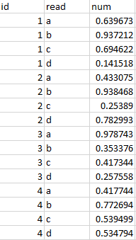
Raw data,
Not raw data,
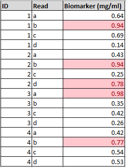
Be aware that programs like Excel will try to guess the datatype that you’re working with. For example, let’s say you had a sample ID number of ‘11-11-01’. Entering this into Excel will result in an automatic change to the cell from ‘General’ to ‘Date’. This can cause issues when analysing the data. We’ll revisit this later when looking at spreadsheets.
Protecting Raw Data
Your raw data files are the foundations of your research project and should be protected. One simple approach is to make the files read-only, to prevent accidental changes being made to them. To do this in Windows, simply right-click on the file, go to ‘Properties’, and then click ‘Read-only’. Finish by clicking ‘OK’.
Key Points
The term ‘raw data’ means something specific in the world of data analysis. Without it, you can’t go back to the start of an analysis
Data Management: Data Management Planning
Overview
Teaching: 10 min
Exercises: 5 minQuestions
What is a data management plan and do I need one?
Objectives
Understand the idea of a data management plan
Know when to create one
Data Management Planning
Often with projects that generate data, the datasets produced are relatively small and straight-forwards. For example, a single experiment with a single datafile which contains ELISA plate data is very easy to handle. However, what if you’ve planned a project that is expected to generate 10,000 small files? Or 10 huge files? What if the data is known to be in an uncommon file-format (from, say, an old piece of equipment), or what if you’re expecting outside help to process the data? In cases such as these, planning the data aspects of an upcoming project can be beneficial.
Data management plans are typically short documents that outline the plans for the use of the data throughout the project’s life-cycle. Also note that data management plans are becoming a requirement for many funding organisations. This document should briefly answer the following questions,
- What data will you collect or create?
- How will the data be collected or created?
- What documentation and metadata will accompany the data?
- What statistical methods and tests will you employ? Do you need to calculate samples sizes a-priori?
- How will you manage any ethical issues?
- How will you manage copyright and intellectual property rights issues?
- How will the data be stored and backed up during research?
- How will you manage access and security?
- Which data should be retained, shared, and/or preserved?
- What is the long-term preservation plan for the dataset?
- How will you share the data?
- Are any restrictions on data sharing required?
- Who will be responsible for data management?
- What resources will you require to implement your plan?
The Data Management Planning Tool is a free, online platform that allows data management plans to be created quickly from a range of templates.
Data management plans should be reviewed as a project progressed, and modified accordingly.
As part of a data management plan, it may be useful to create a flow-diagram of the planned data-flow through the expected analysis pipeline, i.e. a visual overview starting with the raw data, through all analysis steps (and associate files used), to the final output.
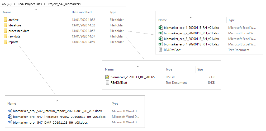
Example of a good project setup
Now that we’ve covered all the main topics for setting up the files and folders of a project, let’s take a look at an example of a good project setup,
Exercise: Data problems and solutions
Think of a past project where you encountered some sort of data issue. Which of these ideas (file-naming, folder organisation, meta-data, data dictionaries, data management plans) would be useful and why?
Key Points
Projects that are expected to generate a large amount of data, and/or complex data, may benefit from such a plan
Spreadsheets: Introduction
Overview
Teaching: 10 min
Exercises: 10 minQuestions
When should you use a spreadsheet?
Objectives
Start to understand when spreadsheets are and aren’t appropriate
Professor Daniel Lemire from the University of Quebec, in a popular blog post titled ‘You shouldn’t use a spreadsheet for important work (I mean it)’, states that “spreadsheets are good for quick and dirty work, but they are not designed for serious and reliable work”.
In his post he cites the example of Professor Thomas Piketty and his book ‘Capital in the 21st Century’. Piketty, aiming for transparency in his work, opening shared the underlying datafiles containing his analysis.
Unfortunately, he has used Excel to perform tasks such as merging different datasets and interpolating missing data, and errors were soon found. When corrected, the central thesis of the book was undermined.
Many more examples exist,
Example 1 - ‘Emerson’s Missed Cell Formula Mix-up’ (caspio.com)
“Emerson incorrectly estimated the total cost of one contract bid. They came up short by $3.7 million all because of a single spreadsheet cell. The cell that contained the cost of electrical was not included in the formula that calculated total expenses. One cell missed, millions of dollars lost”
Example 2 - ‘The $24 Million “Clerical Error” at TransAlta’ (The Register)
“The mistake led to TransAlta, a big Canadian power generator, buying more US power transmission hedging contracts in May at higher prices than it should have. In a conference call, chief executive Steve Snyder said the snafu was ‘literally a cut-and-paste error in an Excel spreadsheet that we did not detect when we did our final sorting and ranking bids prior to submission’”
Example 3 - ‘University of Toledo Loses $2.4 Million in Projected Revenue’ (The Toledo Blade)
“UT officials have discovered an internal budgeting error that means they will have $2.4 million less to work with than anticipated. The mistake - typo in a formula that led officials to overestimate projected revenue - was found Tuesday”
There is even an online list of spreadsheet horror stories by the The European Spreadsheet Risks Interest Group (EuSpRIG), along with a growing body of literature around the details of such errors (e.g. Rajalingham, K., Chadwick, D. R., & Knight, B. (2008). Classification of spreadsheet errors. arXiv preprint arXiv:0805.4224.).
So, when are spreadsheets the answer? And in those situations, how best should they be used?
Spreadsheets are excellent tools for data entry and this is perhaps the most common reason for using them.
Beyond that, spreadsheets are excellent at giving you a quick visual picture of your data. Further, they give the ability to change figures and then see the immediate effects (so called ‘What-if’ analysis). They’re also simple to use and ubiquitous, used for scientific experiments in schools from an early age.
The issues created when using spreadsheets for large, complex datasets are obvious. Intuition on what you’re looking at breaks down. Connections between different parts of the data, especially across different tabs, become increasingly difficult to track. Formulae, hidden from view, can slowly accumulate errors.
But that doesn’t mean that smaller, easier to handle datasets can’t cause problems, or that data under a certain size can be analysed without any consideration of potential spreadsheets dangers. And the issues range beyond pure analysis. Spreadsheets are often used as a replacement for lab books, with multiple tabs containing data from different experiments gathered on different days, text annotations used for ad hoc notes, and entire spreadsheets emailed, opening up all manner of privacy and security issues.
The first step is to consider when using a spreadsheet is and is not appropriate.
Exercise - Which of the following scenarios are appropriate for spreadsheets?
- A dataset of 100 rows of blood markers for 5 people. The aim is to create a simple plot
- A dataset of 100 rows of blood markers for 5 people. The aim is to fit advanced statistical models and interpolate new values from those models
- A dataset of 1000 rows of blood markers for 20 people. Aim is to create simple plots and create summary statistics (mean, standard deviations, etc)
- A dataset of 10k rows of genetic sequencing data. Aim is to pattern-match and extract key sequences
- The dataset in example 1, but instead of a single file, you have 100 similar files, i.e. you wish to create 100 plots
Solution
1. Yes
2. Probably not (but maybe with plug-ins)
3. Yes
4. Probably not
5. Probably not
Key Points
Spreadsheets can be extremely useful, but they can also cause chaos
Spreadsheets: Guiding Principles
Overview
Teaching: 20 min
Exercises: 20 minQuestions
How should spreadsheets be used to maximise efficiency and reproducibility?
Objectives
Understand the concepts of raw data and data dictionaries
Choose sensible and consistent variable names
Appreciate the problems associated with dates, blank cells, merged cells, non-rectangular data and the use of colour in spreadsheets
Know how to apply data validation
Know what format to save data in
In this section we’ll look at how to use spreadsheets in an efficient, clear and reproducible way.
Note that the focus of this section is on those situations where data analysis is confined to a spreadsheet. It is not guidance on how to prepare data for code-based analysis.
Using spreadsheets in accordance with established best-practice may at times seem burdensome and quite different. But it doesn’t have to be an overnight switch. The key aim is to ensure that either a human or a computer can understand the data at a later date. Spreadsheets are rarely a one-time creation, and avoiding clutter, noise and ambiguity is key to future use.
Raw means raw
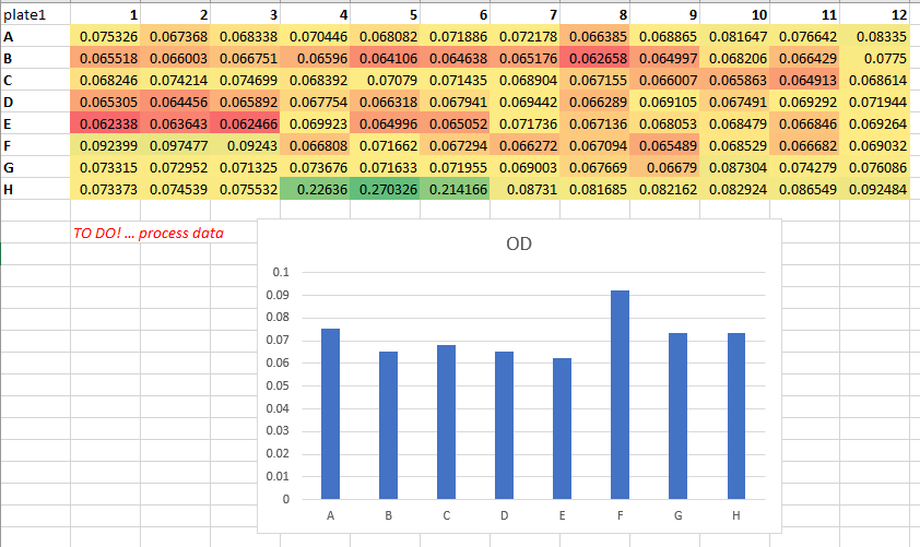
Raw data is that which is untouched. It is the file that comes from the instrument, or the file that is created once the initial figures have been entered. It does not contain formatting, italics, bold titles, calculations or plots. This is the point at which you start, and to which you should always be able to return. Make backups, protect it at all costs, and as soon as you start to work on it, save your consequent work as a new ‘analysis’ file.
If you ever ask someone for their raw data and receive a file that looks like the following, you now know better!
Create a data dictionary
Meta-data, or ‘data about data’, is an essential piece of any project that wishes to be reproducible. Spreadsheet files should be handled within projects using basic project organisation principles, such as having a README.txt file explaining details of the file.
One way of improving the reproducibility of a spreadsheet file is to have a tab or separate spreadsheet file that contains variable names and associated details. For example, it may list all variable names, their units, maximum and minimum values, internet references to find out more, etc.
An example data dictionary,

Consistency and sensible names
Consistency within and between files is essential for the long-term, efficient use of data, where the chances of introducing errors is minimised. For example, if you were to use ‘sample 1’ in one file, ‘s1’ in second and ‘1’ in a third, it’s going to take you and others time to figure things out later on.
Similarly, if you chose to use a blank cell to represent missing values one day, but ‘missing’, ‘unmeasured’, and ‘na’ on others, you’re introducing unnecessary ambiguity.
Having sensible names is also important. ‘Sample 1’ is a meaningful header, but ‘s1’ isn’t. Think also about the ideas of meta-data. Including certain pieces of information like variable units could reside in a data dictionary, but for small pieces of work, having such information in the column headers is fine. For example, ‘CRP (mg/ml)’ is more useful than just ‘CRP’. In this example, even better for later use in certain programs would be ‘CRP_mg.ml’, avoiding characters like brackets and slashes.
Never underestimate the importance of everyone being on the same page with units. In 1999, NASA and Lockheed Martin used different units on the same aspect of a particular project, leading to the destruction of the $125 million Mars Climate Orbiter.
Below is an example of some poor variable/column names,

Dates
Spreadsheet programs love to guess what you’re doing, and at the top of their guess-list are dates.
In the paper (Gene name errors are widespread in the scientific literature)[https://genomebiology.biomedcentral.com/articles/10.1186/s13059-016-1044-7] by Ziemann M, et al, they state that “The spreadsheet software Microsoft Excel, when used with default settings, is known to convert gene names to dates and floating-point numbers. A programmatic scan of leading genomics journals reveals that approximately one-fifth of papers with supplementary Excel gene lists contain erroneous gene name conversions.”. They go on to state that “gene symbols such as SEPT2 (Septin 2) and MARCH1 [Membrane-Associated Ring Finger (C3HC4) 1, E3 Ubiquitin Protein Ligase] are converted by default to ‘2-Sep’ and ‘1-Mar’, respectively”.
To avoid this and similar issues, it’s a good idea to set the format of the relevant column to ‘text’ instead of ‘general’ first. It’s essential that this is done before data are entered, otherwise programs such as Excel will convert what it thinks are dates into a numeric representation.
If you do mean to use dates, again, consistency and meta-data are the key. For example, does a cell in a column called ‘Date’ that reads ‘2020-10-01’ mean the 1st of October or the 10th of January? This ambiguity could be easily removed if the header was ‘Date_yyyymmdd’.
There are also ways to prevent Excel from converting dates into a date format. For example, entering a date as, say, 20201005, will keep the data as a number.
Empty cells
What does a blank cell indicate? Is it genuinely missing data? Or, has some piece of data not been entered yet? Worse still, could it be mistake? Perhaps someone hit the delete key by accident? In general, a blank cell is not only ambiguous, but it can also hinder ordering and searching functions.
For example, if you were to leave several blank cells to mean ‘the same as above’, ordering by that column will not work.
In general, pick a way of indicating missing data, such as ‘na’, and stick to it. Also, never use a zero to represent missing data! Any consequent analysis may inadvertently use it as a real value.
One cell, one datum
Analysing data when cells contain multiple pieces of information is a headache that no-one needs.
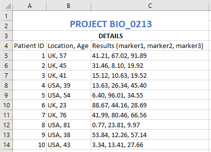
For example, imagine you had a spreadsheet with a column detailing a patient name and postcode, e.g. ‘J. Kirby, YO22’, ‘J. Batey, YO10’, and ‘S. Masca, LS14’. If you wanted to process this information in anyway, from counting the number of different postcodes, picking out the most common surname or simply ordering by postcode, you’d first have to split the column. It’s far easier to use two different columns from the start.
Merging cells is a similar issue. Merging multiple cells into a single cell may look good, but it does nothing for subsequent processing. For example, as soon as you save your file as a CSV, the merging is lost and you end up with an empty cell.
Below is an example of a poor use of columns,
Rectangular data
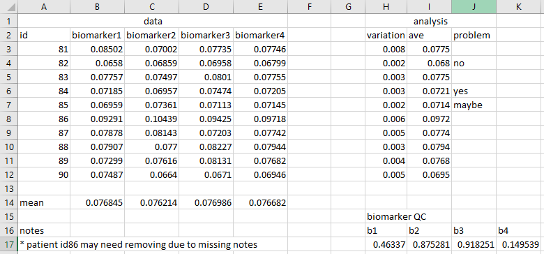
Spreadsheets work best from an analysis point-of-view when data is rectangular, where each row is some sort of observation and each column is a variable. This is not only easy to understand by eye, it’s also easy for other programs to load (and extremely useful for any subsequent code-based analysis).
If your data contains multiple parts, each of which is or can be structured in the form of a rectangle, consider putting each into its own tab, or even into a separate file. The latter may seem overly complicated, and may not always be necessary, but recall that CSV files cannot save multiple tabs. Also, consider keeping plots in their own tab.
Below is an example of non-rectangular data,
An exception to the above may be if you are using a tab in a spreadsheet for interactive analysis, changing values and wanting to see the real-time changes to summary statistics and plots. In that case, the other ideas in this section are extremely important, to prevent the tab from becoming busy and confusing. Notes can be useful, but keep them at a minimum. Any substantial documentation is best kept in a README.txt file or similar.
That said, if you’re analysing your data in an interactive fashion, perhaps changing the contents of cells repeatedly and tinkering with values, you may be on a slippery slope of non-reproducible research. Be careful! Macros can very be useful here, with calculations done automatically, reducing the amount of manual intervention.
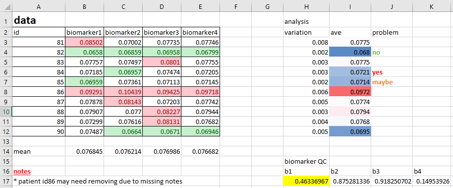
Avoid colour
Adding colour to spreadsheets is extremely common, and the reason is obvious; it generally enhances the visual usability of the data. Where before you may have had a dull collection of numbers, you now have high numbers in red, low in green, healthy patients in purple, diseased patients in yellow, etc.
The problem with this is that colour is completely useless when it comes to analysis. You cannot search by colour, and sorting by colour doesn’t convey as much information as a clear label. Nor can you export the colour details via CSV to some other program.
It’s far more useful to create new columns that contain the details of whatever information you are conveying with colour. For example, rather than using colours to highlight ‘high’ and ‘low’ values of some numeric column, instead create a column called, say, ‘Category’ or ‘Range’, with the values of ‘high’, ‘low’ and ‘normal’ in the cells. Do this using something such as ‘=IF(CELL>0.2, “Yes”, “No”)’, where the cell reference is the value of interest that you are currently highlighting with colour.
You may be very attached to using colour in your files. If you are, at least add a new column as well!
Below is an example of poor colour-use,
Validation techniques
Excel possesses a simple but effective data validation function, that places rules on the data that gets entered. This can take a few minutes to setup, but if you’re manually entering data, that time could save you from costly mistakes.
Exercise: Validation
Modern spreadsheet programs often have data validation tools. For example, in Excel, select a column, then click the ‘data validation’ option from the ‘data’ tab. Click ‘Allow’ and select ‘Whole number’. For ‘Minimum’ and ‘Maximum’, enter 0 and 10, respectively. Click OK. Now, try to enter anything that isn’t a whole number between those ranges.
How to save
Files such as those in an Excel format can be opened in other pieces of software, but in reality, they really want to be opened in Excel. If, for example, you do manage to load an Excel spreadsheet into a coding environment such as R or Python, any formatting, plots or equations are going to cause havoc. Even loading an Excel spreadsheet into an Excel-like program, such as LibreOffice, can lead to problems with how certain elements are displayed.
If you are going to perform analysis within your spreadsheet files, save in program’s default format, such as XLSX for Excel (remembering to adhere to file-naming best practice).
If the intention is then to share your analysis at this point, be aware of data safety and privacy issues. If you’ve been asked for a table or plot, perhaps just share the table or plot as an image? Sharing the raw data plus several tabs of analysis just to get to that table or plot should be avoided.
If your file is a data file, i.e. it does not contain formatting, formulae and plots, the best format is a CSV. This is non-proprietary and can be opened easily with a range of different programs.
In some situations you may start with raw data and process it via a spreadsheet software into some improved, more useable form. In this case, save the file that performed these changes as an Excel file (for example), but save the consequent, improved data file as a CSV. This can then be used for clear, straight-forward analysis later, whilst the details of the changes are retained.
Exercise - Spreadsheet example
Load the file ‘manual-data-example-01.xlsx’. Pick out as many aspects of this file that may hinder reproducibility. How would you change them? There is no single right answer to this. The aim is to improve the file, not necessarily make it perfect.
Note: It’s always useful when looking at a new spreadsheet for the first time to ask the question; What is the aim of this file? Is it ultimately to produce a plot? A neater, more useable version of the data? To explore the data? In this case, assume the point of this file is to find the out-of-range samples Note that the solution below are the changes that I made when looking at this problem. This list of changes does not necessary represent the ‘right’ answer.
Solution
1. Deleted the 'raw' tab as it should be in its own file, saved as a CSV. Also, the 'max' row should be removed to make it 'raw'
2. I would create a README.txt file, explaining what the Excel file, raw data file and analysed data file are. Could then include the info from the 'misc' tab
3. Deleted the 'data', 'stuff' and 'misc' tabs
4. Created tabs for plate 1 and plate 2
5. Created tabs for plate 1 and plate 2 analysis
6. Created a data dictionary
7. Delete the 'PLATE 1' and 'PLATE 2' rows at the top of each tab
8. Created a 'Standards' tab
9. Created a 'Standards plot' tab and tidied up the plot
10. Deleted the '405' column next to the plate data
11. Removed the merged title cells ('Absorbance, 405 nm (uncorrected)'). Less info, but covered in the data dictionary
12. Removed the conditional formatting for the 'CV' column and create a new one called 'High value', with 'yes' and 'no' accordingly. Used =IF(CELL>0.072, "Yes", "No")
13. Used the same header info ('rep1' etc rather than 'a' etc)
14. Corrected 'd' to 'Mean' (look at the formula)
15. Set both sets to 5 decimal places
16. Added 'note' column. Added a useful note and removed colour
17. Added 'na' to blank columns in plate 1 data
18. Added a 'plate definition' tab
19. Unified font and removed horizontal lines
20. Copied the data into a new 'Results' tab, values only (no references), created a new 'plate' column, unified formatting. Sample column changed to numbers only. Ordered by plate value then sample number

Note: Could arguably keep the heatmap. It's fine as it's not aiming to classify the data, it's purely a visual tool. That said, does it help the aim
of finding out-of-range values? Not when that's defined as a CV above a certain value. If the heatmap is to spot, say, some other out-of-range value
that may indicate an experimental issue, is a visual aid a good method for reproducibility? Does that lead down the road of the subjective "Hmmm, that
looks a bit high". Better with a new column

Note: This cleaned 'Results' tab data could be saved as a CSV file for consequent work. If so, ensure the file is described accordingly in the README.txt file
Remember, the aim isn’t to make a spreadsheet look better. You might even conclude that it looks worse! The real question is “when I come back to this in 18 months time, when someone has asked me why and how I did what I did, will I understand it?”. Or, “if someone else looks at this, will they understand it?”. Or, perhaps, “If I do a similar experiment next month, how do I ensure I’m handling the data in the same way?”, i.e. minimising subjective decisions or errors.
Further reading
- Broman, Karl W., and Kara H. Woo. “Data organization in spreadsheets.” The American Statistician 72.1 (2018): 2-10. - A similar overview as presented in this lesson
- Good enough practices in scientific computing - A paper by the folks at Data Carpentry, setting out the reasons behind it all
- (Video) The Importance of Reproducible Research in High-Throughput Biology - A superb motivator for learning R!
Key Points
A number of simple concepts can increase the future usability of data
R introduction: Introduction
Overview
Teaching: 15 min
Exercises: 0 minQuestions
Why bother to code?
Objectives
Understand the reasons why data analysis by code is extremely useful
Why Code?
Coding can be difficult and frustrating. The learning curve is steep. At fist, doing the simplest tasks in a spreadsheet can take several minutes via code. So why on Earth would anyone bother? Without knowing the answer to this question, it can be difficult to stay motivated whilst learning how to perform data analysis via code. In no particular order, here are the main reasons,
1) Reproducibililty. When you go from your raw data to final output (whether that’s a table of results, a plot, a curve-fit, etc) in a spreadsheet, the mouse-clicks that you perform to get there are immediately lost. There is no-way at some future point to know exactly what you or someone else did. The consequence of this is that you have to try and guess the details of what was done, which is both time consuming and prone to error. With code, the precise chain of events can be followed, line-by-line, with no ambiguity. This not only saves time, but it makes it much easier to spot mistakes. This is all absolutely essential for modern scientific research
2) Efficiency. True, I just claimed that the simplest tasks will take you much longer via code, initially. But as your skills develop, you will get quicker with your analysis, and you’ll find that the coding approach may be even quicker in some circumstances. Where the coding approach wins hands-down, however, is with repeat analysis. If you need to analyse 1 file and produce 1 plot, a spreadsheet might be quicker. If you need to analyse 1000 files and produce 1000 plots, using a spreadsheet will take you many painstaking, laborious, non-reproducible hours
3) Automation. This is an extension of the point above. Because analysis can be repeated precisely, it can also be automated. Analysis or the production of reports that currently require manual processing can be set to kick-in at, say, 6am each morning, providing you with a complete analysis of the latest data for you as you arrive at work. And yes, R can automatically produce entire reports
4) Power and flexibility. Coding environments such as R and Python can read just about any data-type and have countless tools for data manipulation such as merging different datasets. They’re also a lot better at handling huge amounts of data, and have advanced statistical and data visualisation capabilities. The base functionality can also be extended via thousands of additional community-developed packages
5) Cost. R and Python are open-source and free to use
6) Community. The R community is huge. Someone, somewhere, has probably already solved whatever coding problem you encounter
What about macros?
Programs such as Excel are not completely limited to being used manually via the mouse and keyboard. Often, the ability to create macros is available, in order to allow automation and improve the reproducibility of data analysis processes.
There are two ways to create macros in Excel. The first is to record a sequence of mouse clicks, the second is to code the macro in Visual Basic (via Excel’s Visual Basic editor). In general, these are both good ways to make your analysis more reproducible and to reduce risk. However, analysis via R offers a wider range of analytical methods and greater collaborative potential due to being open-source.
Key Points
Coding isn’t always the answer, but it’s hard to justify not using it for anything large-scale and/or important
R introduction: Tidy data
Overview
Teaching: 15 min
Exercises: 20 minQuestions
What is tidy data?
Objectives
Understand why tidy data is useful
When analysing data using code, the ideal scenario is to go from the raw data to the finished outcome, whether that’s a plot, a table, an interactive app or machine-learning model, completely via code. Depending on the complexity of the data and the analysis, this may be made up of a series of different coding scripts, creating a data analysis ‘pipeline’.
Very often, the data that you start with is not optimsed for analysis via code. In fact, it’s not unusual for the bulk of a data analysis project to be dedicated to data cleaning, with the actual analysis part only occurring at the end.
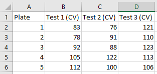
Often, you will deal with ‘wide’ data. That is, data with lots of columns and fewer numbers of rows. Specifically, each variable has its own column.
An alternative format is ‘long’ data, also know as ‘tidy’ data, which is where one column contains all of the values with the remaining columns giving those columns context. Below is an example of data in a wide format,
Here is the same data restructured in a long (or tidy) format,
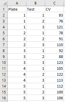
Notice that in this format, each row corresponds to a single data point or observation. This data format not only provides a universal structure for all projects, but is also the preferred format in R, as it allows R to fully exploit certain aspects of how it works ‘under the hood’. It also enables you to encode multiple aspects of an observation. That may not look like a great advantage with 2 aspects (in this case ‘Plate’ and ‘Test’), but imagine if there were others, such as ‘lab’, ‘analyst’ or ‘day of the week’. The goal at the start of any data analysis should be to get your data into this format when possible.
The context for this course is 4PL plate data, which may at first not appear to fit this mold. After-all, the data is simply a 2D representation of the ELISA plate. It doesn’t look ‘untidy’ as that word is commonly used, but what you’ve actually got is a grid of measurements, often containing multiple measurements for a given sample. Once you add these definitions to each plate file, the ‘tidy’ version becomes apparent (see exercises below).
There are also points during analysis where you’ll have intermediate datasets, where again, tidy datasets will be beneficial.
Exercise: Tidy Data example 1
Take a look at the file ‘untidy-to-tidy-eg1.xlsx’. Have a look at the 3 tabs and see the different ways that the same data is laid out. In this example, the plate data (the tab called ‘untidy’) contains 3 repeat measurements for a number of different samples.
Exercise: Tidy Data example 2
Take a look at the file ‘untidy-to-tidy-eg2.xlsx’. This time we have results versus concentration values. Again, see how the untidy data is transformed to the tidy format.
Key Points
Tidy data makes future analysis very straightforward, especially in coding environments
R introduction: R and RStudio
Overview
Teaching: 15 min
Exercises: 5 minQuestions
How do we use R?
Objectives
Understand what R and RStudio are
R
R is a programming language designed specifically for statistics and data analysis. It’s used worldwide in all industries, including science, finance, healthcare and government, by companies such as Facebook, Twitter, Microsoft and Google. Below is an image of what it looks like,
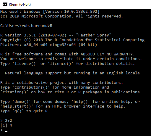
As you can see, it doesn’t look particularly easy to use. After all the text information at the top that loads each time, you can see the actual command prompt (where code is entered) at the bottom. Here, ‘2+2’ has been entered, giving the result of 4.
RStudio
To allow R to be used for real-world data projects, a program called RStudio is used, which effectively sits on top of R. This allows the R functionality to be used, but in a modern programming environment. RStudio allows you to not only write lines of code, but to create projects (where all relevant files and data are bundled together), notebooks (documents with text and code integrated together), presentation slides, websites and interactive apps.
Below us an image of what it looks like,
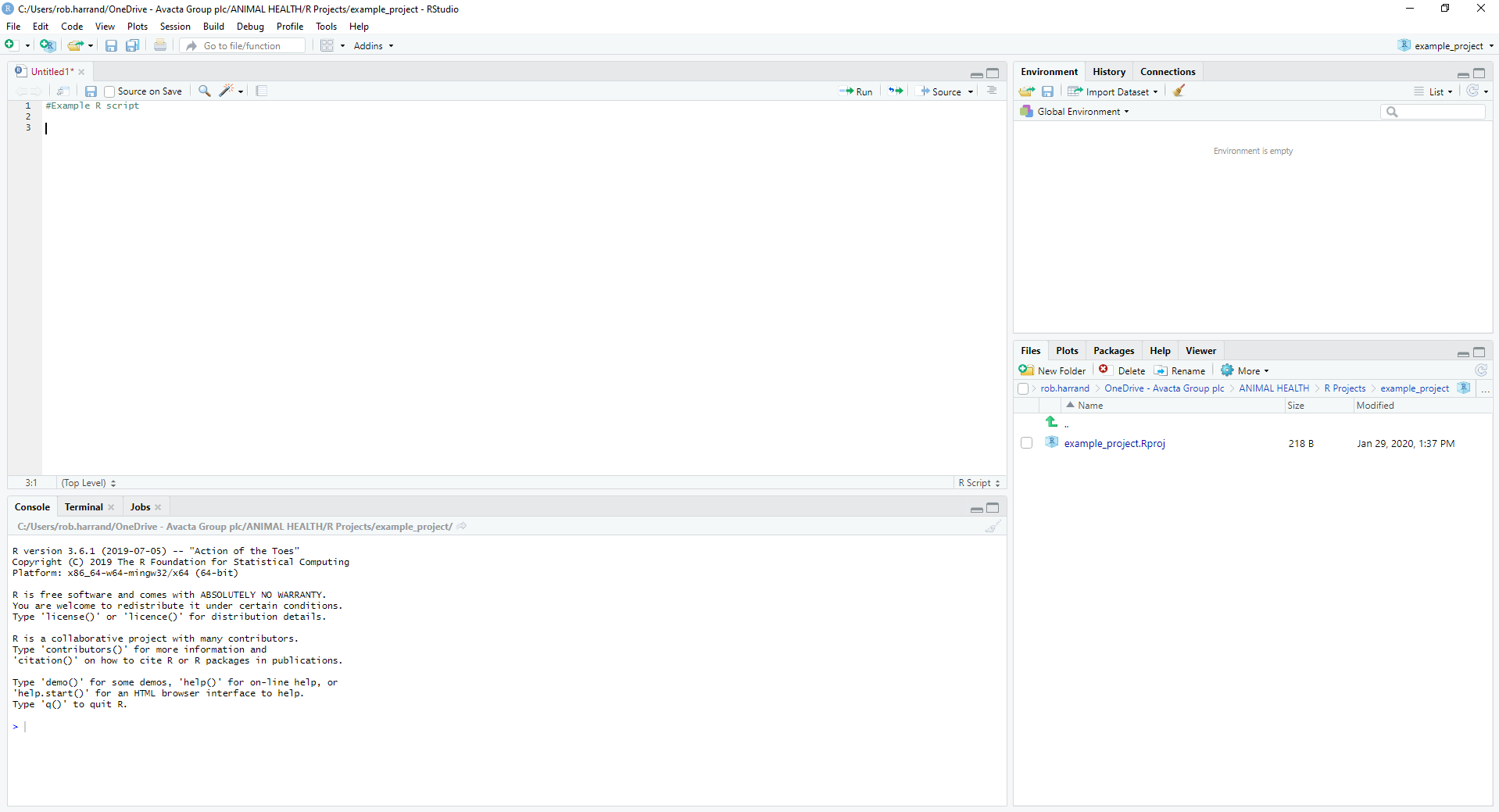
The 4 main areas (which may be positioned differently on your screen) are,
- The source. This is the part where you enter your code
- The console. This is R working under-the-hood. When you run your script in the window above, it will be executed here
- Environment. This is where any variables that are being used can be seen. More on these later
- Everything else. Here you can see details of files, packages, help information, and any plots that have been created
To run code, you can either click on a line and press CTRL-ENTER, or click the ‘Run’ button the top-right corner of the source panel.
Exercise: Your first R command
Load RStudio and in the source section, type and then run the following code. What happens?
(10+10)*2Solution
[1] 40
Key Points
RStudio is the software used for coding in R
R introduction: R fundamentals
Overview
Teaching: min
Exercises: minQuestions
What are the basic features of R?
Objectives
Understand basic R commands relating to simple arithmatic
Be able to create and manipulate data structures in R, such as vectors
Use built-in functions and access their corresponding help file
Use R functions to generate data
Understand the basic R data types
Be able to sub-set data
Simple arithmetic
R is basically a very fancy calculator. You can use arithmetic operators as you would expect, such as,
addition
3+4
[1] 7
Exponentiation
2^3
[1] 8
Use of brackets
(5+5) / 5
[1] 2
Comparisons
Use greater than/less than symbols such as,
3 > 4
[1] FALSE
and,
5 == (2.5 * 2)
[1] TRUE
Where == means ‘equal to’. So, the above command is says 5 is equal to 5, which then evaluates to true.
Assigning variables
We can give variables names and then consequently use them,
sample1 = 6
sample2 = 4
sample1 + sample2
[1] 10
Here we’ve added 6 and 4 via the assigned variables.
Note that R is case sensitive. For example, ‘sample’ is not the sample as ‘Sample’. Also keep in mind that variables should be named in a sensible and clear way in order to enhance reproducibility. For example, if you return to your code after a long break, and see a variable called ‘b’, you’ll have some work to do to figure out what you meant. Life will be easier if you call it, for example, ‘biomarker_CRP_mgml’.
You can also add comments to your R code using the hash symbol #. Any text after this symbol will be ignored.
We can also assign words to variables,
patient_name = "Jim"
If we then call that variable, the data we’ve stored will be printed to the screen,
patient_name
[1] "Jim"
If we try to mix types, we’ll get an error,
patient_name + sample1
Error in patient_name + sample1: non-numeric argument to binary operator
Why? Because we’re trying to add a number to a word!
Vectors
Vector is just a fancy word for a collection of items. For example,
patients_ages = c(12,5,6,3,7,13)
patients_names = c('Jim', 'John', 'Brian', 'Susan', 'Keith', 'Geoff')
Note that we string them together the the letter c, which stands for combine.
Once we have a vector, we can pick out certain elements. For example,
patients_names[3]
[1] "Brian"
Use a colon to indicate items between two indices,
patients_names[3:5]
[1] "Brian" "Susan" "Keith"
Remember using == above? Let’s try it here,
patients_names == 'Jim'
[1] TRUE FALSE FALSE FALSE FALSE FALSE
We’ve just said, ‘do the elements of our vector, patient_names, equal Jim?’
We can do something similar to the numeric vector,
patients_ages >= 10
[1] TRUE FALSE FALSE FALSE FALSE TRUE
We’ve just said ‘are the elements of our vector, patients_ages, greater than or equal to 10?’
Built-in Functions
R comes with a huge number of functions, covering every possible data analysis and statistical requirement.
Exercise: Built-in functions
Create the following vector and then investigate the following functions: and investigate the following functions; round(), sqrt(), median(), max(), sort()
numbers = c(2.34, 4.53, 1.42, 1.42, 9.41, 8.54)Solution
round(): Rounds the numbers, sqrt(): Takes the square root, median(): Returns the median, max(): Returns the max, sort(): Sorts into size order
Getting help
The easiest way to get help is to write the name of the function you’re interested in, preceded by a question mark. For example,
#?plot
This brings up the help file for the function (a function is a package of code that performs a particular task). Beyond this, there are many websites with guides and user forums with guidance. Often, just searching on Google for the problem you’re trying to solve (e.g. ‘How do I plot a histogram in R?’) or searching for the error message (e.g. ‘non-numeric argument to binary operator’) will lead you to the answer.
There are also a number of websites that may be of use, including,
The Comprehensive R Archive Network
Exercise: Getting help
Type and run the following. What happens?
mean(numbers)Solution
[1] 4.61
We see the mean values from the 'numbers' vector
Exercise: Built-in functions
Now type and run the following. What happens this time?
numbers = c(1,2,3,4,NA)
mean(numbers)
Solution
[1] NA
We get an 'NA' instead of a mean value. R will default to NA when NA values are present in the corresponding vector
Exercise: Built-in functions
Type the following and see if you can figure out how to amend the code in the above exercise to give you a sensible answer. Note, you may notice RStudio’s auto-complete feature when typing the answer.
?meanSolution
mean(numbers, na.rm = TRUE)
We're telling the mean function to remove the NA values in the calculation using the 'na.rm' paramater
The above functions are useful for applying to existing numerical data. There are also functions that are useful for being applied to non-numerical data.
Exercise: Built-in functions
Create the following vector, and then investigate the following functions: sort(), order(), table()
terms = c('Serum', 'Blood', 'Plasma', 'Blood', 'Blood', 'Plasma')Solution
sort(): Sorts into alphabetical order, order(): Returns the alphabetical order as a numerical vector, table(): Gives a table containing how many of each item are in the vector
There are also plenty of functions for creating data. For example, rnorm() will give you random numbers from the normal distribution.
Exercise: rnorm()
Investigate rnorm() from the help files and create 100 data-points with a mean of 10 and standard deviation of 2. Run your code several times. What do you notice?
?rnorm()Solution
rnorm(n = 100, mean = 10, sd = 2)
The numbers change each time you run the code. This is because R is generating a new set of random data-points each time
Exercise: Setting the seed
Type and run the following above your code. Now, run both lines together several times. What do you notice?
set.seed(123)Solution
The output from rnorm() is the same each time. This 'set seed' function forces R to choose the same 'random' data-points each time. This is essential if you want to ensure your outputs are the same each time
Other useful functions are seq() and rep(), which general a sequence of numbers and repeated numbers (or words), respectively.
Exercise: seq()
Create a vector of numbers from 1 to 10 using the seq() function
Solution
numbers = seq(from = 1, to = 10, by = 1) or numbers = seq(1:10)
Exercise: sqrt()
Create a second vector of the square root of the first vector
Solution
numbers_sqrt = sqrt(numbers)
Exercise: sample()
Pick 4 random values from the second vector using the ‘sample()’ function
Solution
sample(numbers_sqrt, size = 4)
Data types and structures
Data types in R mainly consist of the following,
- numeric
- integer
- character
- logical
The type of data you’re dealing with will limit the sort of things that you can do with them, so it’s important to know what you have. There are several ways to check, one of which is ‘typeof()’. We’ve already encountered each of these data types to some extent. The ‘logical’ data type is extremely important when dealing with missing values, and a very useful function when checking for missing values is is.na(). For example,
na_example = c(2, 5, 7, 7, NA, 3, 10, NA, 9, 2)
is.na(na_example)
[1] FALSE FALSE FALSE FALSE TRUE FALSE FALSE TRUE FALSE FALSE
This tells you where the missing values are, which you can then use with your code (which we’ll see later)
Exercise: Counting missing values
Using one of the above functions, how could you check how many missing values you have?
Solution
table(na_example, useNA = 'always')
Data structures are collections of the above, and we’ve already seen one of these, too (vectors). The other main ones that you’re likely to encounter are,
- list
- matrix
- data-frame
Lists are like vectors, but they can contain a mixture of data types. Matrices are 2-dimensional structures used in various areas of science and statistics. The data-type that most resembles a spreadsheet is the data-frame, which we’ll see in the next section on loading data.
Sub-setting
Whatever your data type, often you’ll want to subset the data in order to use certain parts. For example, you may want the first element of a vector, or the last 3 elements, or the first column from a matrix. You may even wish to subset a character vector and pick out, say, the first letter.
Subsetting typically works by indicting the position or index of the data that you want.
Exercise: Subsetting vectors
Preceded by set.seed(123), create the following vector and type ‘numbers[3]’. What do you get? Now try ‘numbers[3:5]’. Now what do you get?
numbers = rnorm(n=5)Solution
[1] 1.558708, [1] 1.55870831 0.07050839 0.12928774
You have picked out the 3rd value, and then the 3rd - 5th values, respectively
Exercise: Subsetting matrices by column
Run the two following lines of code. What happens?
matrix_example = matrix(rnorm(n=50), nrow = 10, ncol = 5)
matrix_example[,c(1:2)]
Solution
            [,1]       [,2]
 [1,]  1.7150650  1.7869131
 [2,]  0.4609162  0.4978505
 [3,] -1.2650612 -1.9666172
 [4,] -0.6868529  0.7013559
 [5,] -0.4456620 -0.4727914
 [6,]  1.2240818 -1.0678237
 [7,]  0.3598138 -0.2179749
 [8,]  0.4007715 -1.0260044
 [9,]  0.1106827 -0.7288912
 [10,] -0.5558411 -0.6250393
Exercise: Subsetting matrices by row
Now type the following. What happens?
matrix_example[c(1:2),]Solution
          [,1]      [,2]      [,3]      [,4]       [,5]
[1,] 1.7150650 1.7869131 -1.686693 0.6886403 -1.1231086
[2,] 0.4609162 0.4978505  0.837787 0.5539177 -0.4028848
Exercise: Subsetting strings
Run the two following lines of code. What happens?
patient = 'Mrs. C. Ode'
substr(patient, 1,3)
Solution
[1] "Mrs"
Subsetting not only works by specifying index values, but it can also be done based upon logical (or Boolean) values. Effectively, picking out rows, columns or cells that are TRUE or FALSE. Earlier we created a vector called na_example. Let’s see how you could impute the missing values using this subsetting idea,
imputed = mean(na_example, na.rm = TRUE) #Determine the imputed value based upon the mean values
na_boolean = is.na(na_example) #Find the positions where 'na' occurs
na_example[na_boolean] = imputed #Set the na values to the imputed mean value
Key Points
Base R features and techniques
R introduction: Data Manipulation and Plotting
Overview
Teaching: 50 min
Exercises: 45 minQuestions
How do we get going with real data?
Objectives
Be able to load data into R from a CSV file
Understand the concept of dataframes in R, and their most common corresponding functions
Be able to create basic plots, and appreciate the importance of exploring data through visualisations
Be able to load R’s build-in datasets
Loading Data
R can handle a wide variety of data-types. For this lesson we’ll keep things simple and load a CSV file. First, set your working directory (the path to the files for this workshop on your PC) with the following, adding the path in between the brackets and single quotation marks. Note, you must use forward brackets for the path /
setwd('') #Set working directory
Next, type the following,
df = read.csv('../data/data_carpentry_test_data.csv')
You should see ‘df’ appear in your ‘Environment’ tab, showing 8 observations and 13 variables (rows and columns). This is a data-frame. Click it for a preview.
We can also investigate the dataframe using code,
Exercise: Subsetting dataframes
Type the following, one line at a time, and see what happens
head(df)
tail(df)
df[1,]
df[,1]
Solution
head(df): The first 6 rows are displayed
tail(df): The bottom 6 rows are displayed
df[1,]: The first row is displayed
df[,1]: The first column is displayed
With this last command you may notice that underneath the output, it says ‘Levels’. If you expand the ‘df’ object in your environment panel (by clicking the down-arrow next to it), you’ll see that the column X1 is a ‘factor’. Factors are another important data type in R, and they’re used to represent categorical data. These categories can be unordered, such as ‘Male and ‘Female’, or ordered, such as ‘High’, ‘Medium’ and ‘Low’. As you can see, the categories (or level) here are A, B, C, D, E, F, G and H.
A code based way of checking the data types within a data-frame is to use the ‘str()’ command. Try it out.
Data-frames
Data-frames are the work-horses of a lot of data analysis in R. As you saw above, they can be subsetted to pick out certain rows or columns. This allows parts of a data-frame to be extracted, processed and analysed without effecting the original data.
Exercise: Creating new subsets
Type the following code. What have you just created?
df_2 = df[,c(1:3)]Solution
A new dataframe, made up of the first 3 columns of the original dataframe
There are lots of useful tools in R for working with data-frames,
Exercise: Dataframe functions
Investigate the following functions, dim(), colnames(), summary()
Solution
dim(): Returns the dimensions of the dataframe, colnames(): Returns the column names of the dataframe, summary(): Returns a summary of the dataframe
Note, when an R function gives you multiple values, you can just get individual values by indexing with square brackets. For example,
dim(df)[2]
[1] 13
What have we just returned?
The colnames function can not only be used to see what the existing column names are, but also change them. For example, we could write the following,
colnames(df) = c('Col_1', 'Col_2', 'Col_3', 'Col_4', 'Col_5', 'Col_6', 'Col_7', 'Col_8', 'Col_9', 'Col_10', 'Col_11', 'Col_12', 'Col_13')
However, that’s time-consuming. There is a much better way by using an extremely useful function called paste(). Paste allows text and variables to be combined. For example,
num = 5
paste('The number is', num)
[1] "The number is 5"
With this in mind, we can now use ‘paste()’ and ‘seq()’ together to make the renaming of columns much easier,
df = read.csv('../data/data_carpentry_test_data.csv') #Reload to reset the column names
colnames(df) = paste0('Col_', seq(1:13))
This is much better, but there is still an issue. The number of columns, 13, is hard-coded. In other words, I have had to look to see how many columns there are and then type it. If you were running this code on many files and the dimensions changed, this would break.
Exercise: Dataframe functions
How could we make the code above more robust? What could we replace the number ‘13’ with? We’ve already seen the code somewhere else above.
Solution
colnames(df) = paste0('Col_', seq(1:dim(df)[2]))
Data-frames can be combined and merged in a number of ways, arguably the most useful functions being rbind(), cbind() and merge().
First, let’s create two example data-frames to test the functions,
df_1 = df[c(1:4),]
df_2 = df[c(5:8),]
Take a look at them. Now, let’s try rbind(),
df_rbind = rbind(df_1, df_2)
This stacks the data-frames back by row. cbind() does the same by column. Not that these functions need the two data-frames to have the same number of rows or columns, respectively.
Next, let’s look at how to use merge(). First, create the following data-frames,
samples = data.frame('SampleID' = c(1:10),
                     'Measurement' = rnorm(10,10,5))

patients = data.frame('Name' = c(rep('Bob',3), rep('Bill',2), rep('Bernard',5)),
                      'Treatment' = c(rep('Drug A', 5), rep('Drug B', 5)),
                      'SampleID' = c(1:10))
Have a look at the these data-frames. They’re what you might typically see in the tables of a relational database, where different aspects are stored in different tables, with a key being available to connect them. In this case, the key is the ‘SampleID’ column. Let’s merge them using this key,
df_merged = merge(patients, samples, by = 'SampleID')
Note that the two merging columns can have different names.
What just happened? We’ve merged according to the values in ‘SampleID’, so the data-frames have been merged where these values match. In many situations, you might have missing values in one or both of the data-frames. For example,
patients$SampleID[4] = NA
Take a look at the patients data. Bill is now missing a value for ‘drug A’. Re-run the merging code above and see what happens. You’ll see that the line corresponding to the missing data is completely ignored. In situations like this, it’s possible to force R to include whatever data it does have available. For example, run the following,
df_merged = merge(samples, patients, by = 'SampleID', all.y = TRUE)
Now it has included the data that it could not originally merge. This may be useful if, say, you wanted to maintain the original number of rows.
Finally on data-frames, save your data with write.csv(),
write.csv(df_merged, 'my_new_file.csv')
Base Plots
Now that you can load data and subset data-frames, we can start to plot different parts of the data. For example, try the following,
plot(df$Col_2)
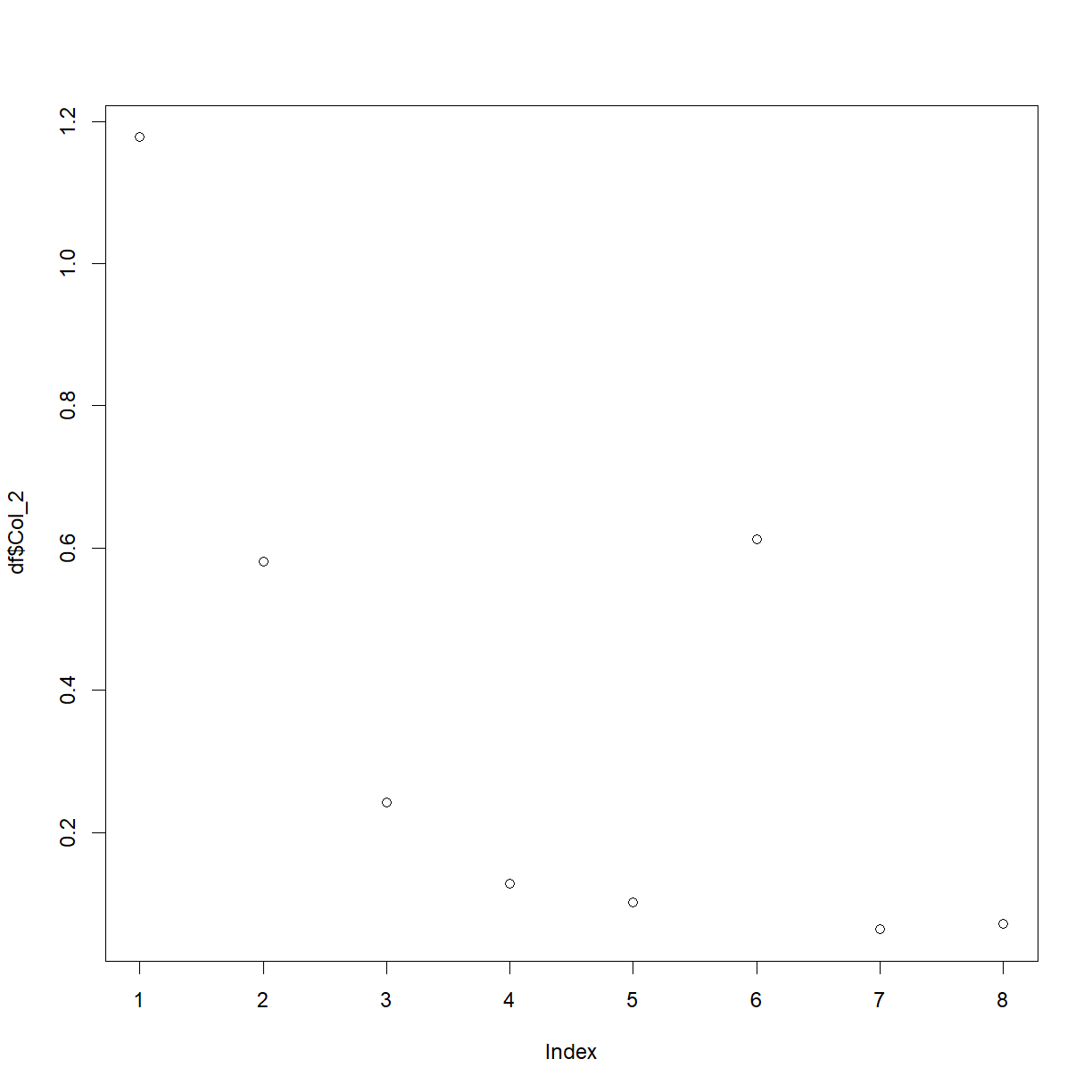
We’ve used a couple of new things here. First, we’ve used the plot() function, and second, we’ve picked out a column from the data-frame with the $ symbol. This is a shortcut in R, and the auto-fill should help you whenever you type the name of a data-frame, followed by this symbol.
You should now have a basic plot of the values in column 2. As R is infinitely customisable, we can of course improve this plot. For example,
plot(df$Col_2,
     ylab = 'Optical Density',
     main = 'Plot of Index vs Optical Density',
     type = 'l',
     col = 'red')
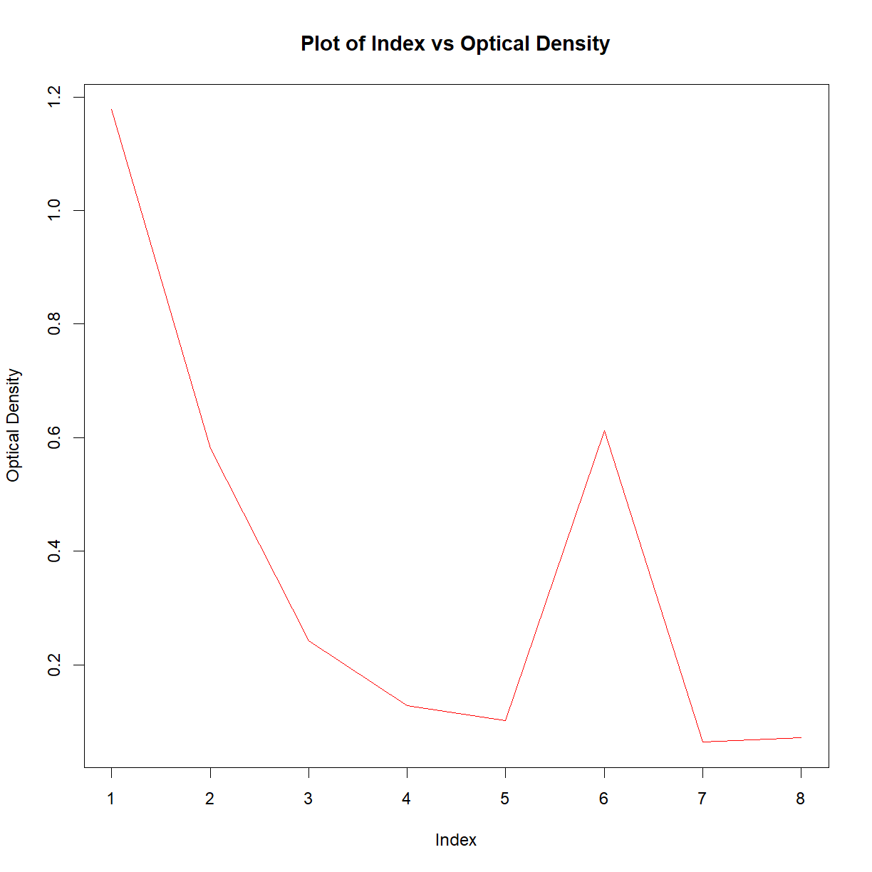
This may look like a lot of effort for one plot, but remember that this is now completely transparent, reproducible, and the code could be reused over and over. For more details on the plot function, have a look at the help files.
Base R can create various other plots. For example, try out this box-and-whisker plot,
df$Sample = 'Sample 1'
df$Sample[c(5:8)] = 'Sample 2'

boxplot(df$Col_2 ~ df$Sample)
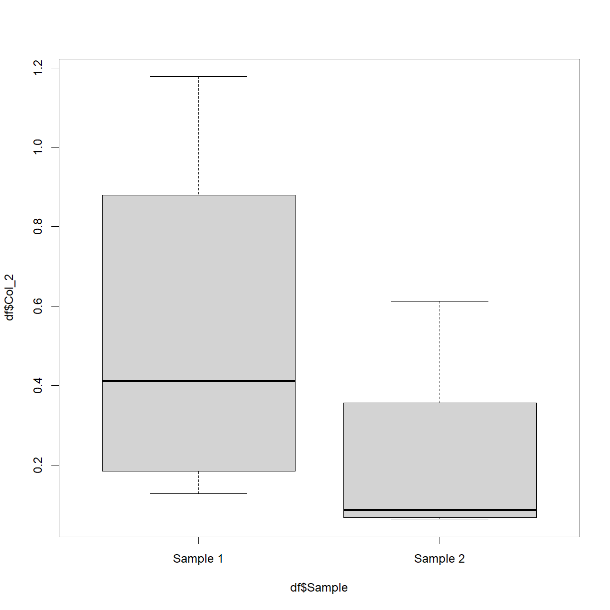
Don’t worry too much about the first two lines. What they’re doing is creating a new (made-up) column called ‘Sample’ and setting every value to be ‘Sample 1’. It then sets the 5th through to the 8th values to be equal to ‘Sample 2’. The boxplot is then plotting the numerical values in column 2 split by this new variable. This is of course easier when your data already has such categories.
How about a histogram?
hist(df$Col_2)
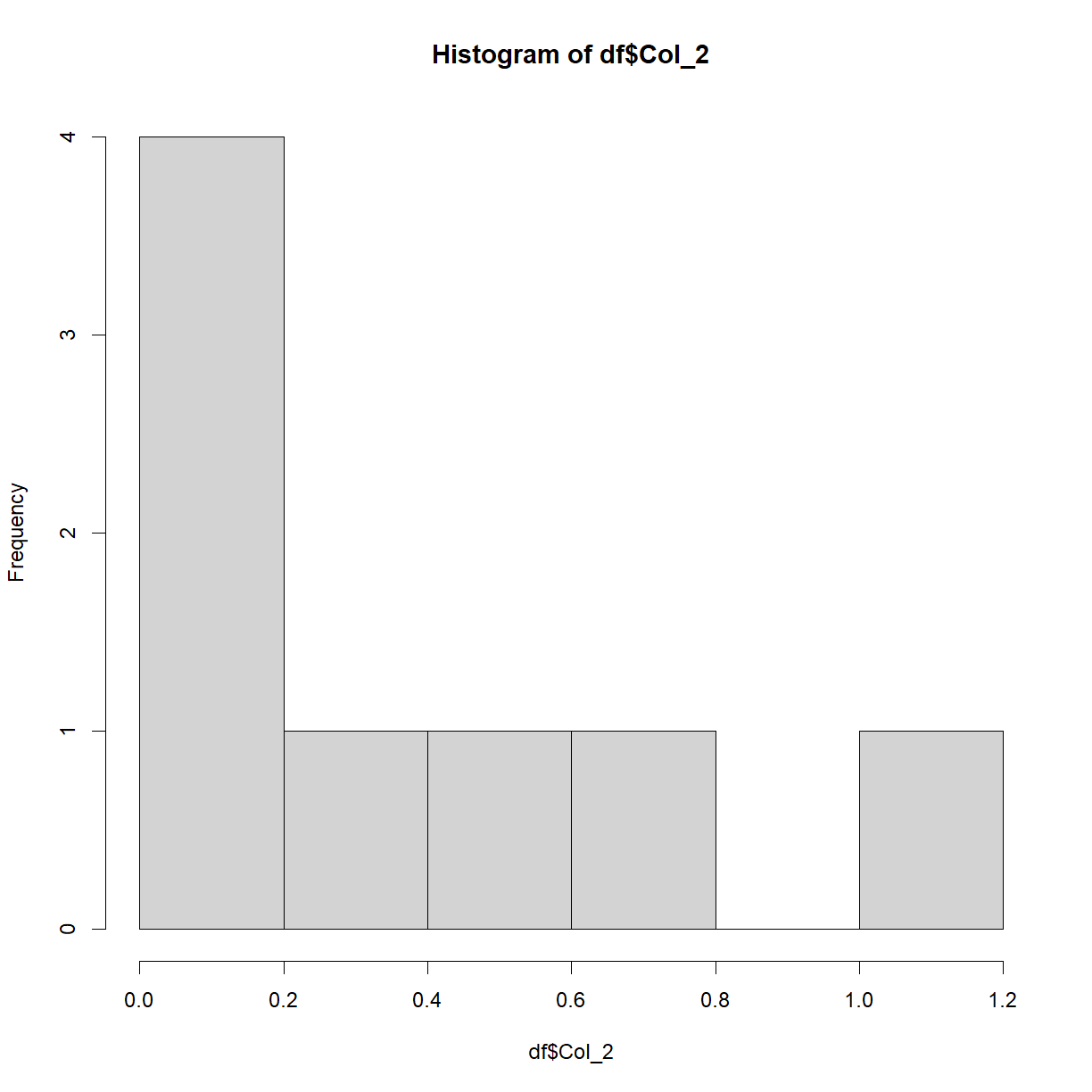
This plot isn’t particularly interesting with this particular dataset. Recall earlier when we saw the rnorm() function? Let’s now plot that data to see what we get,
hist(rnorm(n = 1000))
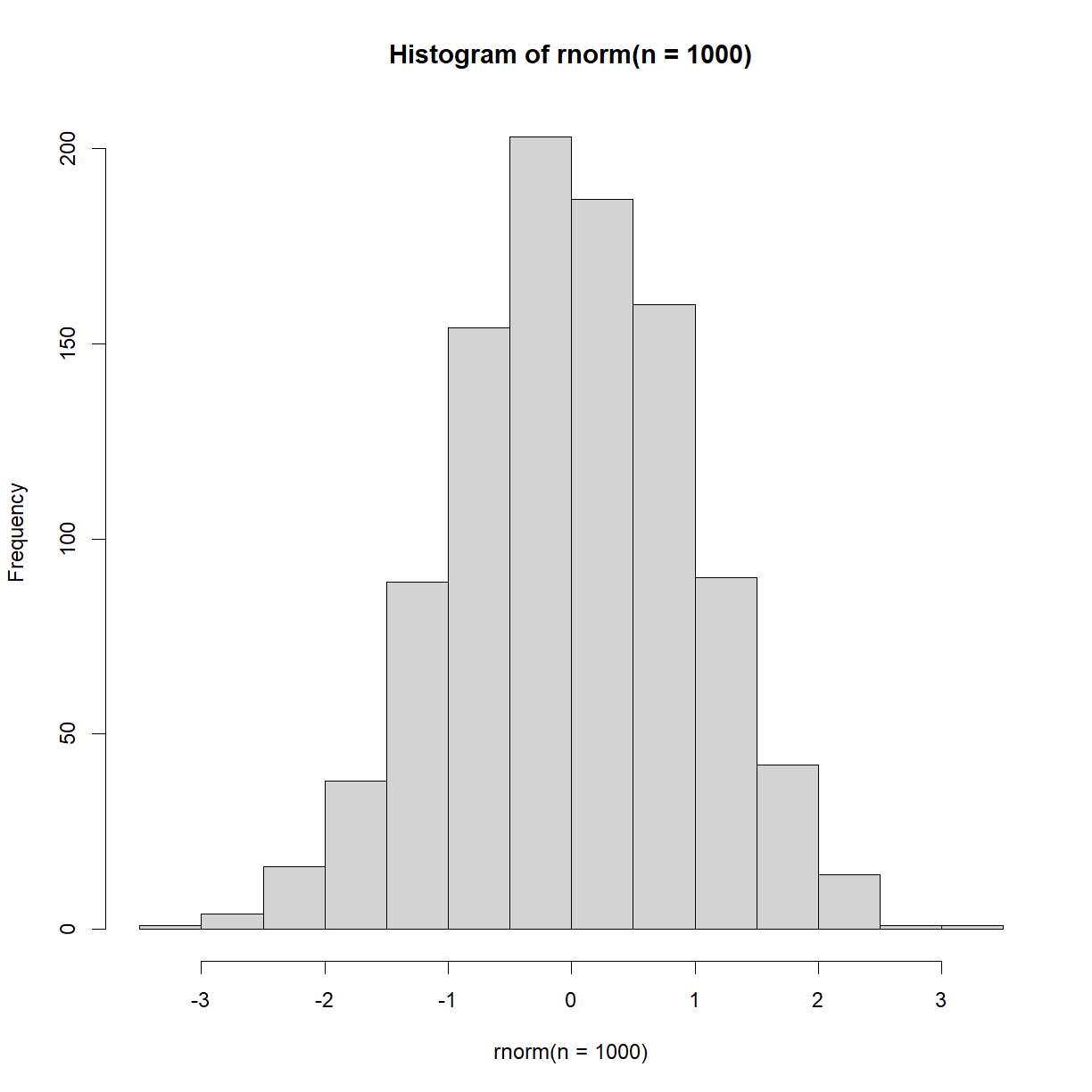
As expected, we see a normal distribution, centered on 0.
Notice on the plot panel you have an Export option. This allows you to save your image either to a file, or to the clip-board.
Something to keep in mind with plots in R is that they tend to be made for 2 different reasons. One is to create slick, professional plots for reports, presentations and publications. These take time to craft and are typically done using libraries beyond base R (the main one of which we’ll see later).
The second reason for plotting in R is to explore the data. These plots are usually done in base R and produced quickly, in order to get a feel for the data. This idea of exploring data visually is an important concept, because it’s very difficult to understand your data from glancing at the raw numbers or even summary statistics.
As a concrete example, consider the following 4 separate datasets (note that most of the code is commented-out here for display purposes on this webpage, but you can run them),
anscombe = anscombe

#mean(anscombe$x1)
#mean(anscombe$x2)
#mean(anscombe$x3)
#mean(anscombe$x4)

#sd(anscombe$x1)
#sd(anscombe$x2)
#sd(anscombe$x3)
#sd(anscombe$x4)
All 4 have the exact same mean and standard deviation. It may seem like they’re similar, if not identical. However, when we plot them,
par(mfrow=c(2,2)) #Setting up the 2x2 grid of images
par(mar=c(2,2,2,2)) #Setting up the plot margins
plot(anscombe$x1, anscombe$y1, pch = 16)
abline(lm(anscombe$y1 ~ anscombe$x1), col = 'red')
plot(anscombe$x2, anscombe$y2, pch = 16)
abline(lm(anscombe$y2 ~ anscombe$x2), col = 'red')
plot(anscombe$x3, anscombe$y3, pch = 16)
abline(lm(anscombe$y3 ~ anscombe$x3), col = 'red')
plot(anscombe$x4, anscombe$y4, pch = 16)
abline(lm(anscombe$y4 ~ anscombe$x4), col = 'red')
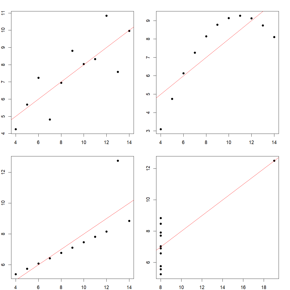
We see that they’re very different. This is a famous example called Anscombe’s quartet, and highlights the perils of trying to use summary statistics to understand your data.
One more point to raise. You may have noticed that we magically created this Anscombe’s quartet data from no-where. R actually comes with many datasets pre-installed, to be used for learning how to code. To see the fill list, type,
data()
Exercise: Built-in datasets
Load the pre-installed dataset ‘ChickWeight’ or ‘ToothGrowth’ and explore it via any of the functions we’ve covered so far, including plots
Key Points
Analysis code is built line-by-line
R introduction: Beyond Base R
Overview
Teaching: 35 min
Exercises: 20 minQuestions
How do we go beyond R’s base functionality?
Objectives
Be able to load extra libraries to extend R’s possibilities
Be able to create plots using ggplot2
Understand how to perform a 4PL curve fit on example data
See how to code a basic loop function in R
Loading packages
We’ve seen how R comes with a variety of built-in functions, and we’ve used many of them to perform various tasks. R can also be extended using any of thousands of additional libraries, each of which comes with several new functions. For a list of all of these libraries (also known as packages), see the Comprehensive R Archive Network (CRAN) website here.
This list can be overwhelming. Go to ‘find’ on your browser and type in ‘drc’. Go through the matched items until you see the package called ‘drc’. Click on it and you’ll see that it’s described as “Analysis of dose-response data is made available through a suite of flexible and versatile model fitting and after-fitting functions.”
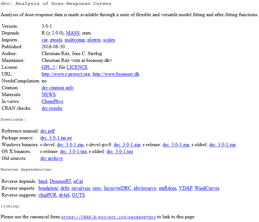
There is a lot of information here. The part that’s possibly of the most use is the reference manual in the form of a PDF. Every package in R comes with a reference manual like this, and outlines all of the additional functions and how to use them. We’ll return to this package later.
ggplot2
The first package we’ll use is called ggplot2, where ‘gg’ stands for ‘grammar of graphics’. This is the main plotting tool used in R for producing professional plots.
First, you’ll need to install the package with the following code,
install.packages('ggplot2')
And then load it with,
library('ggplot2')
Let’s take a look at how to use this new package,
elisa = read.csv('../data/data_carpentry_test_data.csv') #Load the data
colnames(elisa) = paste0('Col_', seq(1:13)) #Change the column names

ggplot(data = elisa, aes(x=Col_1, y=Col_2)) +
  geom_point()
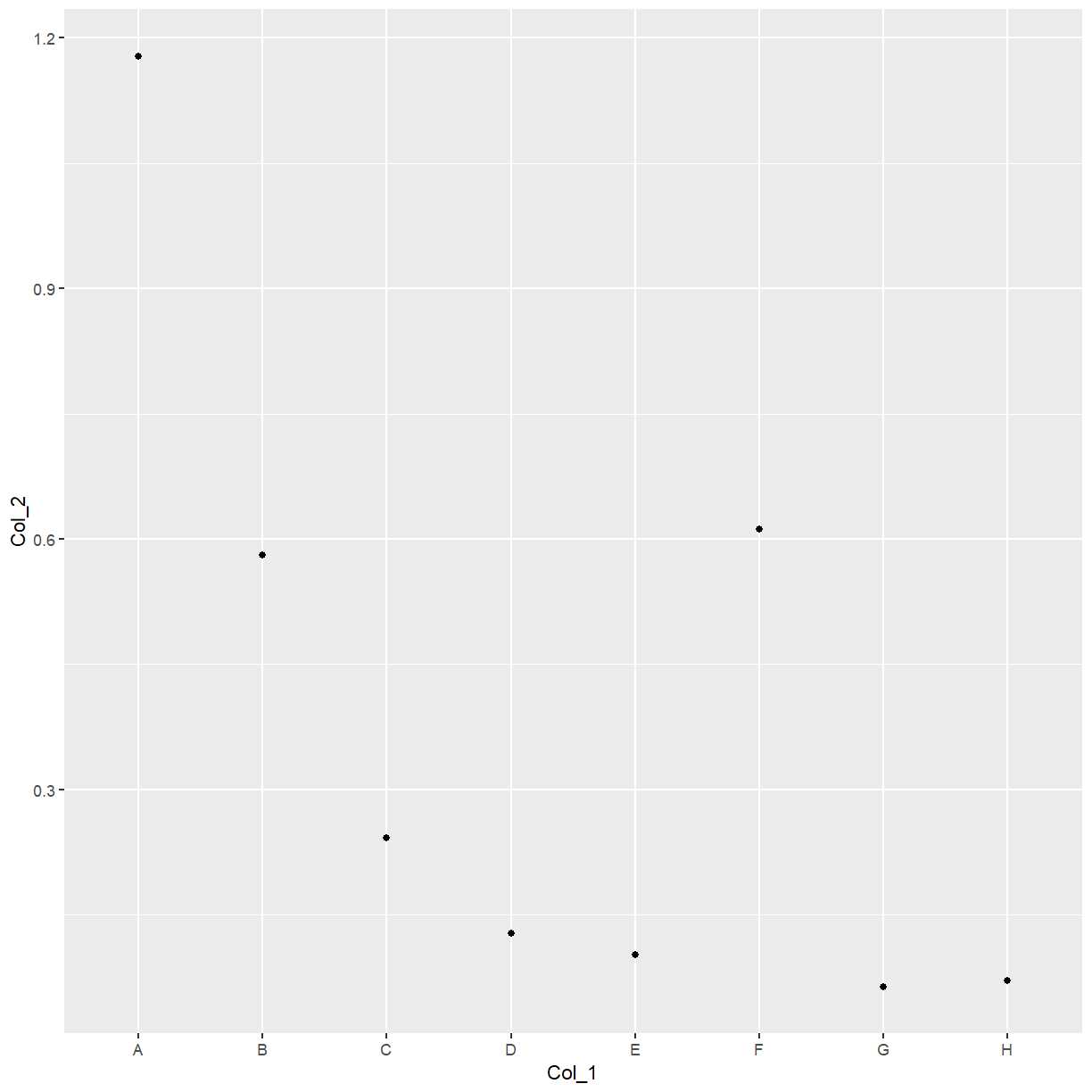
With ggplot, you build up the plot line-by-line.
ggplot(data = elisa, aes(x=Col_1, y=Col_2, size = Col_4)) + #Create the basic plot, of column 1 vs column 2 vs column 3
  geom_point(col = 'blue') + #Create the blue points
  xlab("Index") + #Add an x-label
  ylab("Column 2 OD (log)") + #Add a y-label
  ggtitle("Plot of Index vs Column 2 OD (log)") + #Add a title
  coord_trans(y="log") +
  theme_minimal() #Set to the minimal theme
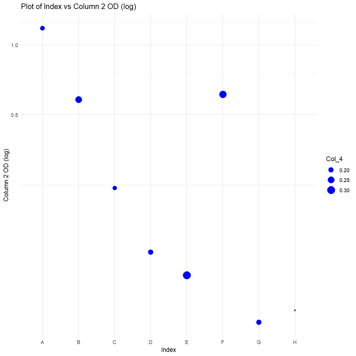
Exercise: CRAN
Take a look at the CRAN page and manual for ggplot2. Can you apply the function ‘coord_flip()’ to the above code? Have a look in the manual for guidance
Solution
Add '+ coord_flip()' as a new line to the code above
4PL fitting with drc
This section installs and loads the drc package designed for the fitting of standard curves.
Note that this section is aimed at demonstrating the use of external libraries. Don’t worry at this stage if you don’t understand everything that’s going on.
library(drc) #Load the package

elisa_stds = elisa[c(1:5),c(1:3)] #based upon the plate definitions
elisa_stds$standards = c(1000, 500, 250, 125, 62.5) #Add a column of standard values
elisa_stds$log_conc = log10(elisa_stds$standards) #Log the standard values
elisa_stds$OD=rowMeans(elisa_stds[,c(2, 3)], na.rm=TRUE) #Calculate row means for the OD column
Fit the curve and plot the results,
curve_4pl = drm(OD ~ standards,
            fct=LL.4(),
            data=elisa_stds)

plot(curve_4pl)
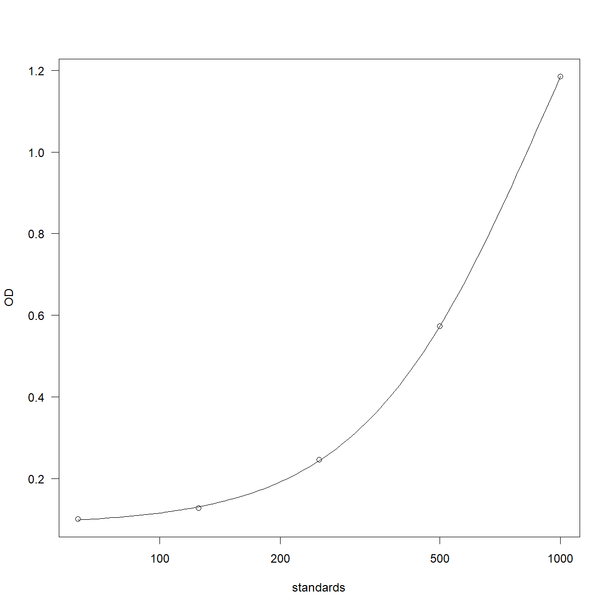
Work out the curve backfit and recovery,
elisa_stds$backfit <- ED(curve_4pl, elisa_stds$OD, type="absolute", display=F)
elisa_stds$recovery = (elisa_stds$backfit/elisa_stds$standards)*100
Work out the sample backfits,
Sample_backfits = ED(curve_4pl, c(elisa$Col_4, elisa$Col_5, elisa$Col_6, elisa$Col_7, elisa$Col_8[1:4]), type="absolute", display=T)
Estimated effective doses

          Estimate Std. Error
e:1:0.189 196.4573     3.9012
e:1:0.255 259.6468     6.5999
e:1:0.18  186.7528     3.6861
e:1:0.202 209.8981     4.2991
e:1:0.307 303.4195     9.3673
e:1:0.275 276.9297     7.6276
e:1:0.207 214.9094     4.4755
e:1:0.151 152.4787     3.3986
e:1:0.105  77.8801     3.7311
e:1:0.112  92.5181     3.7271
e:1:0.085       NA         NA
e:1:0.231 237.9525     5.4588
e:1:0.099  63.0539     3.6323
e:1:0.384 363.1657    13.8547
e:1:0.08        NA         NA
e:1:0.229 236.0891     5.3698
e:1:0.116 100.0398     3.6971
e:1:0.074       NA         NA
e:1:0.251 256.1097     6.4017
e:1:0.068       NA         NA
e:1:0.203 210.9069     4.3334
e:1:0.088  18.4156     2.1509
e:1:0.339 328.8090    11.1895
e:1:0.131 124.7666     3.5324
e:1:0.599 517.7610    27.9397
e:1:0.391 368.4000    14.2786
e:1:0.301 298.5464     9.0339
e:1:0.65  554.0446    31.6358
e:1:0.886 730.1957    51.1850
e:1:0.747 624.2809    39.1322
e:1:0.84  694.2439    47.0005
e:1:0.681 576.2718    33.9613
e:1:0.303 300.1752     9.1447
e:1:0.558 488.7158    25.0762
e:1:0.192 199.6157     3.9844
e:1:0.675 571.9565    33.5063
Sample_results = data.frame(Sample_backfits)
Sample_results$Std..Error = NULL
rownames(Sample_results) = seq(1,36)
Sample_results$Marker = paste0('Marker ', seq(1,36))
The coding punchline
We’ve seen a lot of features and functions in R, many of which may seem like they take a significant amount of thought and effort to use. Recall at the start of today the benefits of using code were reproducibililty, efficiency and automation.
The code above, although fairly involved, is completely reproducible. If you were to return to your analysis 18 months from now, you’d be able to see precisely what had been done, starting with the raw data all the way through to the final results.
Next, we’ll see how code like this makes your analysis more efficient, and highlight the automation potential of such code.
First we need to make our own function, to then use like we’ve been using other functions. This is arguably outside the scope of this introduction to R, but the idea is simple to grasp. A function is a chunk of code that takes data in one end, does something to that data, and then returns the processed data. Or, it’s something that does a task such as create a particular plot. The idea behind functions is to limit the amount of repetition in your code. Below is a very simple example,
times_ten = function(number_in) {

  number_out = number_in * 10
  return(number_out)

}
This function, called ‘times_ten’, takes in a number, multiplies it by 10, and then returns the result. Let’s run it,
times_ten(2)
[1] 20
Exercise: Custom functions
Alter the code to instead return the factorial of the entered number (e.g. if the entered number was 4, the result would be 24, as the factorial of 4 is 4 x 3 x 2 x 1). Hint, there is a function for this. Run your code with the number 6. What do you get? Note, call your function ‘factorial_out’. Never give a custom function the same name as a built-in one!
Solution
factorial_out = function(number_in) {

  number_out = factorial(number_in)
  return(number_out)

}

factorial_out(6)

output: [1] 720
One more concept to understand for this lesson are loops. These are for when you want R to repeat a certain section of code, perhaps changing one or more aspects each time. The main loops in R are while loops and for loops. Let’s take a look at a very simple for-loop,
for(i in seq(1:10)) {

  print(paste0('The number is: ', i))

}
[1] "The number is: 1"
[1] "The number is: 2"
[1] "The number is: 3"
[1] "The number is: 4"
[1] "The number is: 5"
[1] "The number is: 6"
[1] "The number is: 7"
[1] "The number is: 8"
[1] "The number is: 9"
[1] "The number is: 10"
Here, we’re asking R to loop through the sequence of numbers, 1 to 10, and for each one, print out the pasted sentence ‘The number is:’ along with ‘i’. In this loop, ‘i’ is the number in the sequence, which increases by 1 each time the loop finishes.
Let’s put this all together. Below is a much larger function that is going to do something very interesting. First, it grabs a list of all the files with a certain keyword in the filename (using the ‘list.files’ function). Then, it goes through each file (using a for-loop), one at a time, performs the 4PL fit, creates a plot, and saves the plot as a png file.
Let’s take a look over the code and the associated comments,
bulk_plots = function(keyword) {

  files = list.files(path = "../data/",
                     pattern = keyword,
                     full.names = T)

  n=1 #for the file number

  #iterate over the files in the directory,
  for (f in files) {

    #read the data,
    elisa = read.csv(f)

    elisa_stds = elisa[c(1:5),c(1:3)] #based upon the plate definitions
    elisa_stds$standards = c(1000, 500, 250, 125, 62.5) #Add a column of standard values
    elisa_stds$log_conc = log10(elisa_stds$standards) #Log the standard values
    elisa_stds$OD=rowMeans(elisa_stds[,c(2, 3)], na.rm=TRUE) #Calculate row means for the OD column

    #fir the curve,
    curve_4pl = drm(OD ~ standards,
                fct=LL.4(),
                data=elisa_stds)

    #save the plot to a png file,
    png(filename = paste0("../data/", 'plot_', n, '_', Sys.Date(), '.png'))

      plot(curve_4pl, col = 'red', main = paste('Plot ', n)) #create the plot

    dev.off() #close the png file
    n=n+1

  }

}
Let’s run it,
bulk_plots('elisa')
Take a look in the folder where the files reside. You should see 10 png files!
Where to go next?
We’ve just seen how to load x10 files, perform x10 curve-fits and produce x10 plots in less than a second. This script could be set to run at a set time each day, if, for example, you had a piece of equipment that was generating raw data files on a regular basis.
Of course, mistakes can still be made when using code instead of mouse-clicks, but crucially, these mistakes are much easier to spot. For very important work, consider getting a colleague to review your code.
R can generate not only images, but processed data-files, mathematical models, full reports in Word or PDF formats, slides, websites and even interactive apps. The level of sophistication is unlimited and can make any routine data processes much quicker, transparent and less prone to human copy-and-paste errors. Any process that you have in your department or company that’s done on a regular basis could and should be performed by code.
Good luck on your R journey!
Key Points
R can be extended in thousands of different ways
Statistics in R
Overview
Teaching: 2.5 hours min
Exercises: 1 hour minQuestions
What are some basic, core concepts in statistics?
How do you apply them in R?
How should you analyse ‘before and after’ results?
Objectives
To become familiar with some relevant statistical techniques, and their application in R
Techniques and concepts include; Frequentist vs Bayesian statistics, descriptive statistics, inferrential statistics, hypothesis testing, probability distributions, p-values, multiple comparisons, confidence intervals, the central limit theorem, effect size, sample sizes, power
To be able to create an R notebook
The aim of this lesson is to take a look at some key statistical ideas in the context of R, with a focus on the sorts of areas typically employed in life sciences research. Given time constraints, this is not a fully-fledged statistics course, but it will demonstrate how to explore and use the basic principles within R, and hopefully provide ideas for where to go next when learning about statistics. The topics touched upon include,
- Frequentist vs Bayesian statistics
- Probability distributions
- Hypothesis testing
- p-values
- Multiple comparisons
- Type i and type ii errors, alpha, beta and power
- Effect sizes
- Confidence intervals
- Sample sizes
- Preregistration and R notebooks
Frequentist vs Bayesian statistics
The prevailing type of statistics and that used in many applications is known as frequentist statistics. This approach assigns probabilities based upon the frequency of events that occur in a sample. In contrast, in the Bayesian mindset, probabilities are related to our current level of knowledge about an event. This latter approach allows the introduction of something called a prior probability, which is a probability assigned before data is collected on an event. This prior probability is combined with new evidence to give a posterior or post-test probability.
Frequentist statistics can in turn be divided into two main branches; inferential and descriptive. With inferential statistics, the aim is to, as the name suggests, infer something about a population from a sample. The aim of descriptive statistics is much simpler, and involves describing data with things such as the mean, median and standard deviation. In this lesson we’ll take a look at both types of frequentist statistics.
Descriptive Statistics in R
Let’s start by grabbing some in-built R data (specifically, the ‘chick weights’ dataset, which is the weight of chicks on different diets) and creating a summary,
dt = chickwts

summary(dt)
     weight             feed
 Min.   :108.0   casein   :12
 1st Qu.:204.5   horsebean:10
 Median :258.0   linseed  :12
 Mean   :261.3   meatmeal :11
 3rd Qu.:323.5   soybean  :14
 Max.   :423.0   sunflower:12
We can see that we have a ‘weight’ variable, which is numeric, plus a ‘feed’ variable, which is a category/factor.
Let’s take a look at some basic R functions,
mean(dt$weight)
[1] 261.3099
median(dt$weight)
[1] 258
sd(dt$weight)
[1] 78.0737
min(dt$weight)
[1] 108
max(dt$weight)
[1] 423
range(dt$weight)
[1] 108 423
There are several R packages that extend the sorts of descriptive statistics that you can do, but the above functions will typically be some of the most useful. We can also use plots to describe the data. Below is a histogram of the weight, where the feed type is linseed,
hist(dt$weight[dt$feed == 'linseed'])
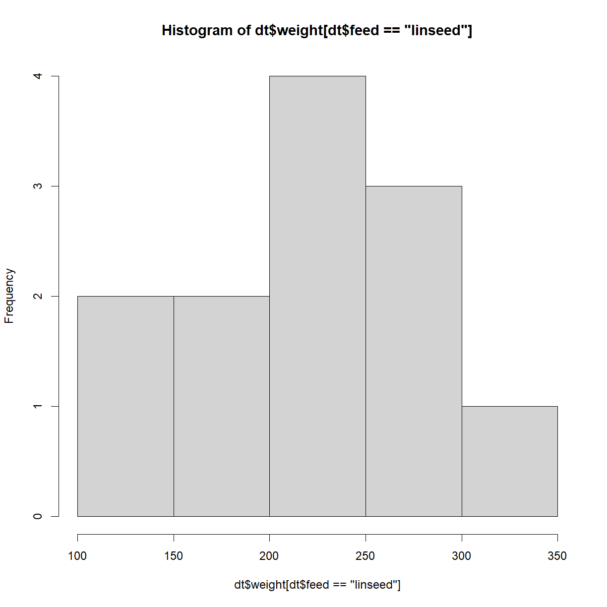
More useful with multiple factors is a box-and-whisker plot,
boxplot(dt$weight ~ dt$feed)
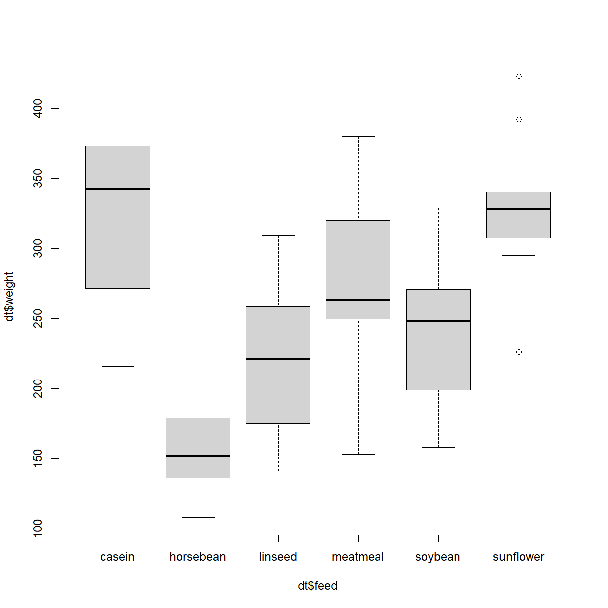
This plot shows us the median (thicker black horizontal lines) plus the interquartile range, min and max, plus outliers.
Let’s now start to move towards inferential statistics.
Inferrential Statistics in R
Imagine you have an orchard containing 100,000 apples and you want to know their mean diameter. How do you it? It’s obviously impractical to measure each and every apple, so instead, you take a sample. The questions that then arise are; How many apples should you measure? Once you have your data, what do you do with it? And once you’ve calculated the mean diameter of your sample, what does that tell you about the mean diameter of all the apples?
Underpinning this area of statistics are probabilities distributions, so let’s take a look at those next.
Probability distributions
Probability distributions, i.e. some measure or quantity plotted again the probability of occurrence underpins huge parts of statistics. Many such types of distribution exist in nature, but for our purposes we’ll stick to the most common - the normal (or Gaussian) distribution.
Let’s create a single normal distribution and plot it,
#Create an example, random, normal distribution
set.seed(123) #ensure reproducible output
eg_dist = rnorm(n = 10000, mean = 10, sd = 2)

#Plot the distribution,
hist(eg_dist)
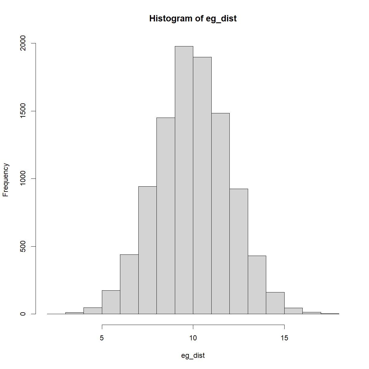
Take a look at the code. We’re using the rnorm() function to create 10,000 random data-points, with a mean of 10 and standard deviation of 2. Note the set.seed() function is also used, to ensure code reproducibility.
We’ll be using this and other normal distributions for many of the topics below. One additional concept to look at here is that of the area under the curve and what it represents. The area under the curve above equals 1, i.e. the probability of everything occurring in this particular scenario. When you take a slice of the curve between two values, the area of that slice is the probability of occurrences in that range. By definition, the highest areas are around the mean.
A common way of communicating how likely something is, is to state how many standard deviations away from the mean it is. For example, a standard deviation of 1 covers (approximately) the central 68% of the above curve. In other words, there is a 68% chance of an occurrence or observation within 1 standard deviation (plus/minus). 2 standard deviations covers (approximately) the central 95% of the curve. Keep this 95% figure in mind, as we’ll revisit it later. For now, here is the same plot as above with the standard deviations plotted,
#Plot the distribution,
hist(eg_dist)

mean_eg = mean(eg_dist) #calcualte the mean
sd_eg = sd(eg_dist) #calculate the standard deviation

#Plot vertical lines at plus/minus 1 and 2 standard deviations,
abline(v=mean_eg+sd_eg, col = 'red', lwd = 2, lty = 'dashed')
abline(v=mean_eg+2*sd_eg, col = 'red', lwd = 2, lty = 'dashed')
abline(v=mean_eg-sd_eg, col = 'red', lwd = 2, lty = 'dashed')
abline(v=mean_eg-2*sd_eg, col = 'red', lwd = 2, lty = 'dashed')
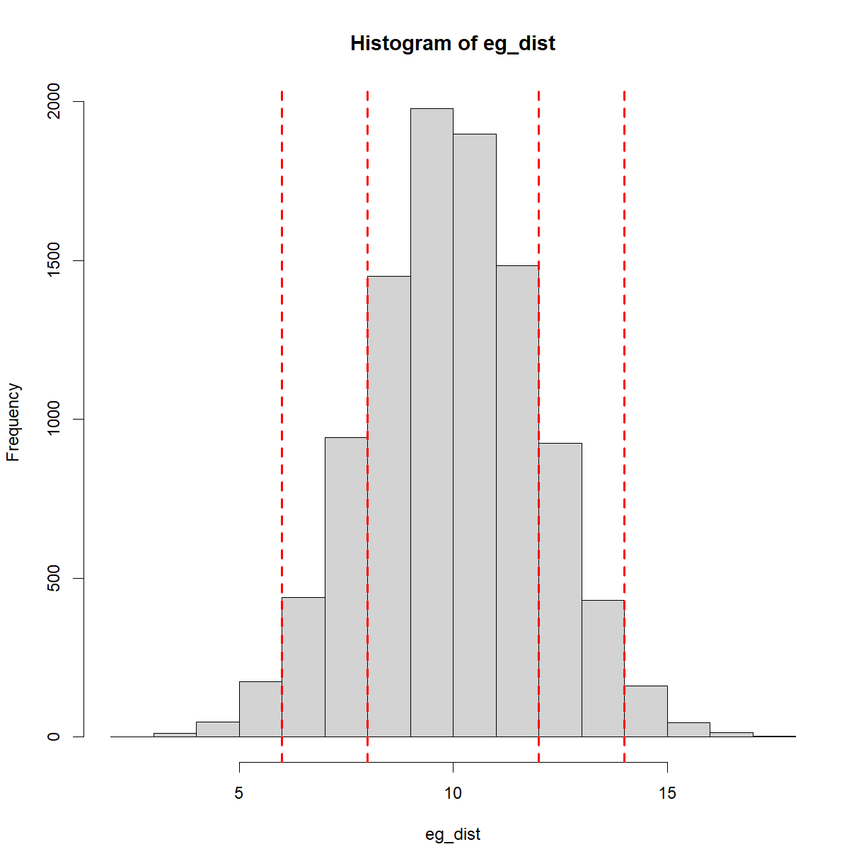
Hypothesis testing
This is a huge area of statistics, so for our purposes, let’s focus on a typical life sciences example, namely, taking measurements before and after some change. For example, you may have created an assay, used a 4PL fit to create a standard curve, and then tested two batches of samples using this assay.
Scenarios could include the following,
- A batch of samples from healthy patients and a batch of samples from patients with a particular disease
- A batch of samples from a treatment group and a batch of samples from a control group (both with some condition or disease)
- A single batch of samples, tested before and after a reagent change
- A single batch of samples, tested before and after adding a new component to the testing procedure
- A single batch of samples, tested at the start and end of a stability trial
- A single batch of samples, tested before and after a freeze-thaw process
Many more examples exist. The key question is; how do you make the judgment that things are the same or things have changed?
To reiterate, in inferential statistics, typical applications include trying to estimate aspects of a population from a sample, or trying to tell if a sample is likely, based upon a theoretical population. Note the terms here - ‘Population’ doesn’t (necessarily) refer to people, but instead to the complete collection of everything that you’re interested in. In most situations, this is impossible to measure, and so a sample is taken instead. From this sample, the population parameters (such as the mean and standard deviation) are inferred (hence the name of this branch of statistics).
One more note on terminology; by ‘sample’, here I’m talking about a number of observations or measurements from a population, e.g. measuring the diameters of 100 apples in an orchard of 100,000 apples. In other places ‘sample’ will mean an actual, individual biologic sample in the lab. Hopefully the context will make is clear which is which.
Another application, and the focus for the examples below, is to try and tell if there are statistically significant differences between groups, in other words, are my two samples likely to be from the same population? In such cases, you’ll encounter something known as hypothesis testing. This works by first coming up with something called the null hypothesis, which is actually just the statement that there is no difference between the groups.
For example, let’s say you have two groups of optical density (OD) measurements, and you’re trying to tell if the mean values for each group are statistically different. In this case, you might perform a t-test (a type of hypothesis test that lets you compare means), which tells you if the means of two samples are significantly different from each other. The null hypothesis in this case would be ‘there is no difference’, and the alternative hypothesis would be ‘there is a difference’.
Intuition helps here. Imagine the groups are both made up of 6 samples and the mean levels of some substance are 616ug/ml and 625ug/ml, respectively. You can already tell that, with such a low number of samples and such similar results, the test is unlikely to conclude anything significant is going on. On the other hand, if 100 samples in each group were used and the levels were 100ug/ml and 900ug/ml, respectively, it now feels very different. This also highlights the two main aspects that underpin such a question; the sample size and magnitude of the difference.
Let’s take two samples from our population,
#Take 2 random samples from the distribution,
set.seed(100)
sample1 = sample(eg_dist, size = 1000, replace = F)
set.seed(200)
sample2 = sample(eg_dist, size = 1000, replace = F)

#Plot the samples,
plot(density(sample1), main = '', xlab = '')
lines(density(sample2), col = 'red')
abline(v=mean(sample1), lty = 'dashed')
abline(v=mean(sample2), lty = 'dashed', col = 'red')
text(15, 0.14, paste0('Mean of sample 1 = ', round(mean(sample1),2)))
text(15, 0.12, paste0('Mean of sample 2 = ', round(mean(sample2),2)), col = 'red')
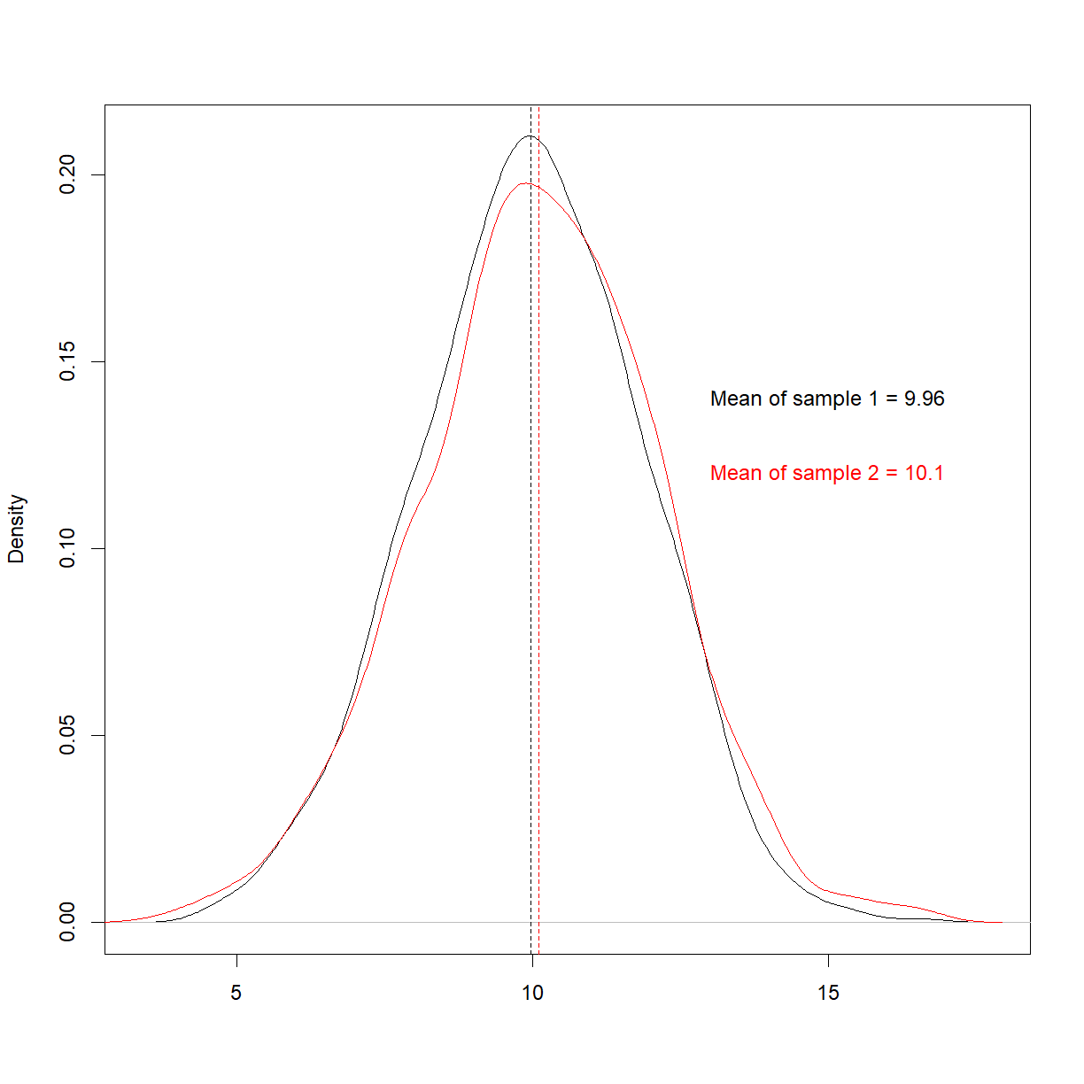
We know in advance that these are from the same population, and it looks like they are, too. To try and quantify this similarity, let’s move on to p-values.
p-values
The ‘p’ is p-values stands for ‘probability’, and what a p-value is telling you in the context of a hypothesis test like the one above is; this is the probability that you’d get these numbers by chance if there is no difference between the groups. Typically, a ‘significant’ result constitutes anything with a p-value less than the (completely arbitrary) level of 0.05.
Let’s run a t-test,
t.test(sample1, sample2)
	Welch Two Sample t-test

data:  sample1 and sample2
t = -1.6452, df = 1987.2, p-value = 0.1001
alternative hypothesis: true difference in means is not equal to 0
95 percent confidence interval:
 -0.31472211  0.02756999
sample estimates:
mean of x mean of y
 9.961241 10.104817
We can see a p-value of 0.1, which is non-significant. (The reason for this value being quite low, despite being from the same population, is that we used quite a large number of samples). Note that our null hypothesis here is that the mean difference is zero.
It’s at this point that p-values can be misinterpreted. What such a result means is ‘the probability of observing the data we have, if the mean levels between the two groups is zero, due to chance, is 0.1’, but what some translate this into is ‘we have therefore disproved biological differences between the two groups’. This latter claim is a huge overreach. p-values are simply an estimate of what to expect over time, with multiple experiments (remember, this is frequentist statistics). In other words, if you performed 10 sampling experiments where the null hypothesis was true, you’d expect a mean difference of this magnitude in 1 of those experiments. In 100 experiments, you’d expect to see it 10 times, etc.
How would this look if we actually had 2 different populations?
#Take 2 random samples from the distribution,
set.seed(123)
eg_dist1 = rnorm(n = 10000, mean = 10, sd = 2)
set.seed(123)
eg_dist2 = rnorm(n = 10000, mean = 15, sd = 2)

set.seed(100)
sample1 = sample(eg_dist1, size = 1000, replace = F)
set.seed(200)
sample2 = sample(eg_dist2, size = 1000, replace = F)

#Plot the samples,
plot(density(sample1), main = '', xlab = '')
lines(density(sample2), col = 'red')
abline(v=mean(sample1), lty = 'dashed')
abline(v=mean(sample2), lty = 'dashed', col = 'red')
text(6, 0.18, paste0('Mean of sample 1 = ', round(mean(sample1),2)))
text(6, 0.16, paste0('Mean of sample 2 = ', round(mean(sample2),2)), col = 'red')
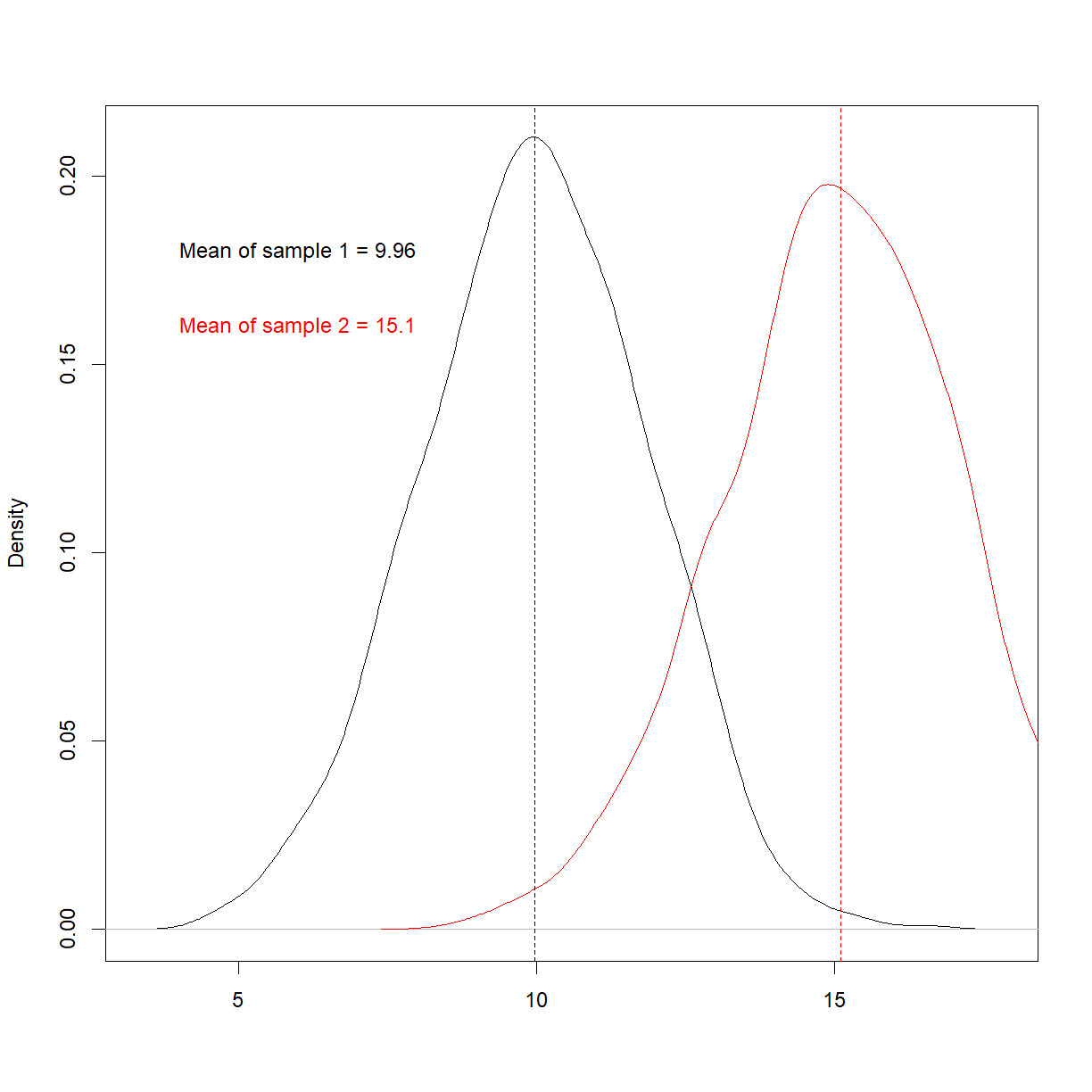
Things now look very different. Re-run the t-test,
t.test(sample1, sample2)
	Welch Two Sample t-test

data:  sample1 and sample2
t = -58.94, df = 1987.2, p-value < 2.2e-16
alternative hypothesis: true difference in means is not equal to 0
95 percent confidence interval:
 -5.314722 -4.972430
sample estimates:
mean of x mean of y
 9.961241 15.104817
We now, as expected, see an extremely small p-value. This is saying it’s virtually impossible that we’ve get these two samples means if these sample were from the same underlying population.
Multiple comparisons
Now that’s we’ve touched upon p-values, let’s take a look at a common mistake made when employing hypothesis testing.
If you have two samples and compare them in a t-test, you’re conducting a single comparison. But what if you have, say, 21 samples and you compare one samples against the rest? Now you’re conducting 20 tests. The problem is, if you set your threshold for significance at 5%, you should expect to see a ‘significant’ result in these 20 comparison just by chance. This can lead people to discard the 19 that were non-significant, and claim a breakthrough with the 20th!
To demonstrate this, let’s takes 10,000 lots of two samples (n=100), run 10,000 t-tests, and plot the corresponding p-values,
p_values = vector()
i=1

#Create a while loop,
while(i<=10000) {

  sample1_temp = sample(eg_dist, size = 100, replace = F)
  sample2_temp = sample(eg_dist, size = 100, replace = F)
  t_test_result = t.test(sample1_temp, sample2_temp)
  p_value = t_test_result$p.value
  p_values = c(p_values, p_value)
  i=i+1

}

plot(p_values, pch = 16, cex = 0.5)
lines(p_values, col = 'grey')
abline(h=0.05, col = 'red', lty = 'dashed', lwd = 2)
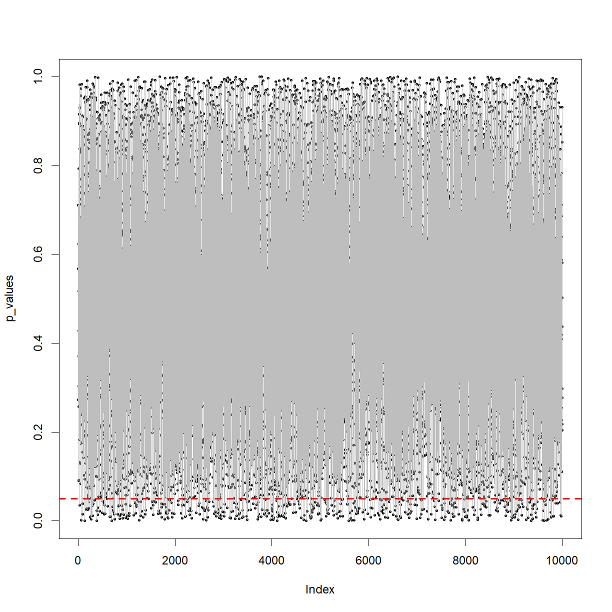
You can see the p-value from the t-tests bouncing around between 0 and 1. Note the dashed red line at p=0.05.
What proportion is below that line?
p_value_table = table(p_values < 0.05)
p_value_table
FALSE  TRUE
 9518   482
p_value_table[2] / p_value_table[1]
      TRUE
0.05064089
Should be around 5%, as expected.
The above plot is terrifying. It shows that when you take two samples from the same population and perform a t-test, when the null hypothesis is true, you could get any p-value from (almost) zero to 1. With a cut-off of 0.05, you’ll be wrong in terms of concluding whether it’s from the same population 5% of the time! Again, we’re dealing with the probability of things occurring over time in terms of frequency. Imagine you replace a key reagent on a production line once a week and perform 52 t-tests a year. If the reagent change never makes a difference, you can still expect a ‘significant’ p-value in around 2 or 3 tests.
What about when there is a real difference? i.e. the alternative hypothesis is true? Now the probability you’ll detect this different is related to the sample size. Let’s take a look,
#Take 2 random samples from the distribution,
set.seed(123)
eg_dist1 = rnorm(n = 10000, mean = 10, sd = 2)
set.seed(123)
eg_dist2 = rnorm(n = 10000, mean = 10.5, sd = 2)

p_values = vector()
i=10

#Create a while loop,
while(i<=1000) {

  sample1_temp = sample(eg_dist1, size = i, replace = F)
  sample2_temp = sample(eg_dist2, size = i, replace = F)
  t_test_result = t.test(sample1_temp, sample2_temp)
  p_value = t_test_result$p.value
  p_values = c(p_values, p_value)
  i=i+1

}

plot(p_values, pch = 16, cex = 0.5, xlab = 'Sample size')
lines(p_values, col = 'grey')
abline(h=0.05, col = 'red', lty = 'dashed')
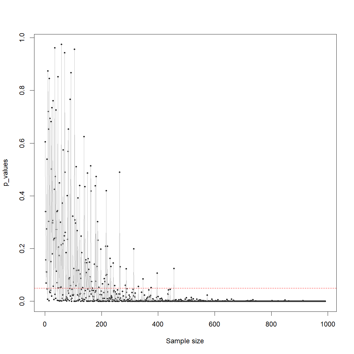
This plot shows that when you are genuinely sampling from two different populations (which have different means), your ability to detect this difference with a t-test (in this case) is directly related to the sample size. You can see that with a sample size of below around 250, the p-value is often jumping above 0.05, were as beyond around 500 samples you’re basically guaranteed to detect it.
The other factor is the size of the effect. This all intuitively makes sense. A real but small difference with a small sample size is likely to be lost in the noise. A large effect size with a large sample size will be stark and obvious.
We started by discussing multiple comparisons. The solution to getting caught out by chance p-values of < 0.05, the simplest solution is to divide 0.05 by the number of p-values, to get your new threshold of significance. For example, in we were talking about 20 comparisons, so the p-value used should actually be 0.05/20 = 0.0025 (know as the Bonferroni correction).
Type i and type ii errors, alpha, beta and power
Next, let’s quickly cover a few terms that you’re likely to come across in the life sciences literature. These terms may sound technical, but we’ve actually basically covered them.
- H0 is the null hypothesis, H1 is the alternative hypothesis
- If the null is correct and you accept it, you’re right. That’s a true negative.
- If the null is correct and you reject it, you’re wrong. That’s a false positive or a type i error.
- If the alternative is correct and you accept it, you’re right. That’s a true positive.
- If the alternative is connect and you reject it, you’re wrong. That’s a false negative or a type ii error.
- alpha is the probability of a significant result when H0 is true (Type 1 error rate). This is usually set to 0.05, but can be set much lower in areas like astronomy and manufacturing
- beta is the probability of a non-significant result when H1 is true (Type 2 error rate)
- 1 - beta is the probability of a significant result when H1 is true, which is also the statistical power
This last one is important and we’ll revisit it later.
Confidence intervals
There’s one more major idea to have a handle on when performing statistics; the confidence interval. This is a concept that can take a while to get your head around, can easily be ignored or misinterpreted, but which offers a very useful tool in the evaluation of evidence.
Underpinning the concept of confidence intervals is something called the central limit theorem. This states that the distribution of an infinite number of sample means from a population is normal, with a mean centered on the population mean.
That may not mean a lot out of context, so let’s take a look at it in action via R,
means = vector()
i=1

#Create a while loop,
while(i<=1000) {

  sample_temp = sample(eg_dist, size = 1000, replace = F)
  mean_temp = mean(sample_temp)
  means = c(means, mean_temp)
  i=i+1

}

hist(means)
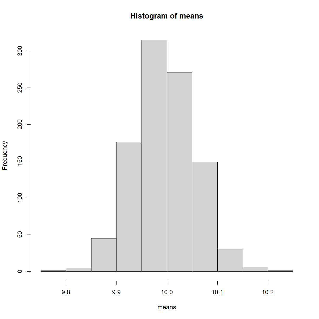
As expected, we see a normal distribution. But to reiterate, we’re now looking at 1000 sample means. That’s quite difference to the population distribution from before. This result and concept might seem a bit esoteric, but it’s an idea that underpins a lot of hypothesis testing, and even works when the sample itself isn’t normally distributed.
Exercise: Binomial Distribution
Create and plot a binomial distribution using the ‘rnbinom()’ function, with n = 1e5, a size of 10 and a probability of 0.9 What do you notice?
Solution
x <- rbinom(n = 10000, size = 10, prob = 0.9)
hist(x)
Exercise: Central Limit Theorem
Run your code in the above loop, to create 1000 sample means from non-normally distributed data. What do you notice?
Solution
means = vector()
i=1

#Create a while loop,
while(i<=1000) {

 sample_temp = rnbinom(n = 10000, size = 10, prob = 0.8)
 mean_temp = mean(sample_temp)
 means = c(means, mean_temp)
 i=i+1

}

hist(means)
You should see that, despite the population distribution being non-normal (‘skewed’), the resulting sampling distribution is normal, as per the central limit theorem.
So far, we’ve looked at samples from populations and whether or not such samples are likely to be selected, given a particular null hypothesis.
However, any population you’re evaluating your sample against is theoretical and unknown. That’s the whole reason a sample has been taken. Measuring the population is too difficult, time-consuming or expensive.
Imagine the authors of a paper have measured the CRP levels of 10 healthy people in the UK, with the aim of estimating such levels in all healthy people in the UK (the population mean). They obtain a mean value of 4.2mg/l. How close is that to the actual population value? We have no idea! For all we know, the population value could be 4.3mg/l and this paper could be extremely close with its value of 4.2mg/l. On the other hand, it’s possible that the population mean is actually 9.7mg/l and this random sample of 10 people just so happened to result in a mean of 4.2mg/l.
Let’s create a plot that shows the underlying population in gray, the population mean in red (5mg/l), and the position of 10 random samples in blue,
set.seed(15)
x = rnorm(10e6, mean = 5, sd = 2) #Create a population with a mean of 5 and standard deviation of 2

hist(x,
     main = 'C-Reactive Protein levels in healthy UK adults',
     col = 'grey',
     xlab = 'CRP (mg/l)',
     border = 'black')

abline(v=mean(x), lwd = 3, col = 'red')

set.seed(10)
samples = sample(x, 10)

abline(v=samples, col = 'blue', lwd = 1, lty = 'dashed')
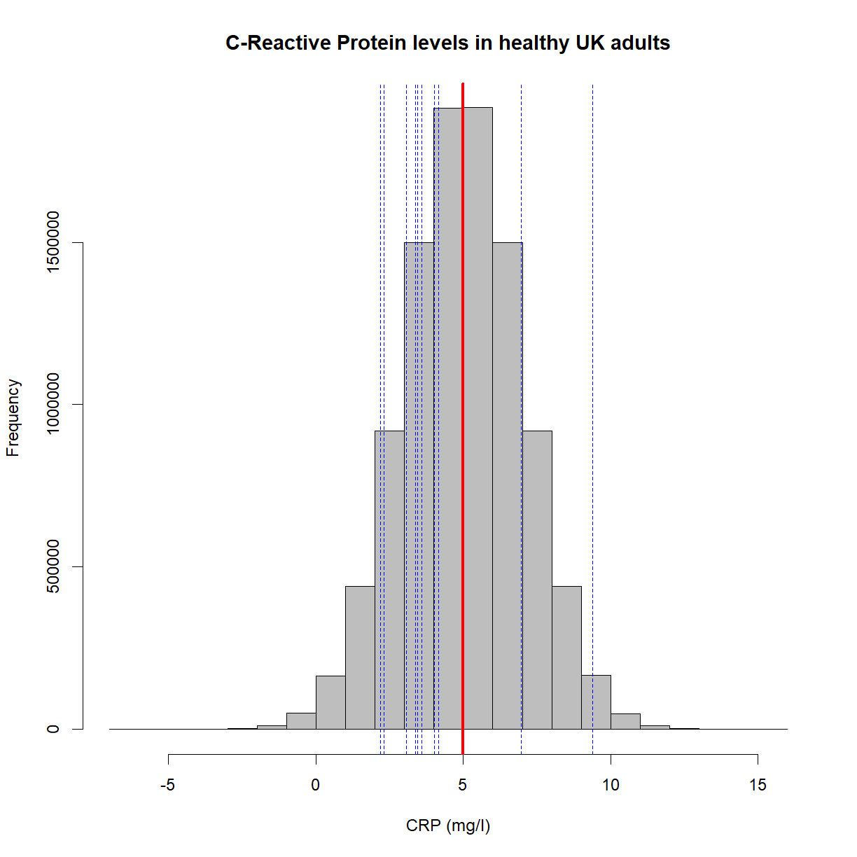
Let’s collapse the samples into a single mean value (in blue),
hist(x,
     main = 'C-Reactive Protein levels in healthy UK adults',
     col = 'grey',
     xlab = 'CRP (mg/l)',
     border = 'black')

abline(v=mean(x), lwd = 3, col = 'red')
abline(v=mean(samples), col = 'blue', lwd = 2)
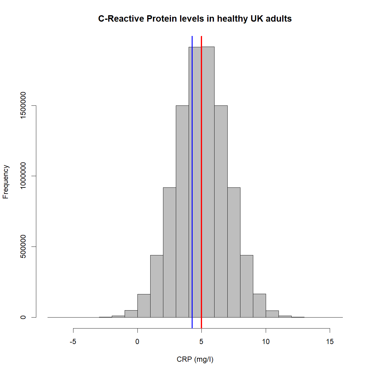
This looks good, but as we’ve already stated, we unfortunately (and crucially), can’t see the gray plot. We have no knowledge of the population distribution or the red line. What we have, in fact, is this,
hist(x,
     main = 'C-Reactive Protein levels in healthy UK adults',
     col = 'white',
     xlab = 'CRP (mg/l)',
     border = 'white')

abline(v=mean(samples), col = 'blue', lwd = 2)
That’s not a lot of use. We don’t know that we’re actually pretty close to the population mean of 5mg/l. For all we know it could be 3mg/l, 6mg/l or 10mg/l; we have no idea. Imagine, for example, that we had a sample mean of 2mg/l. That’s statistically unlikely, but it could happen. Or what can often happen is that you may inadvertently make it more likely by choosing a poor sample. Recall that we’re wanting to know the mean CRP levels of all healthy UK adults. What if your sample included only young adults? Or only men? It’s crucial that a sample is representative of the population.
To get a feel for where our sample mean might sit in relation to the population mean, we use confidence intervals, which are a concept that come straight from the central limit theorem (as seen above).
To reiterate, the central limit theorem states that the distribution of an infinite number of sample means from a population is normal, with a mean centered on the population mean.
Below, I’m going to grab some samples (n=50) from the above population distribution, work out the mean, repeat the process 1000 times, and then plot the resulting distribution. Here it is,
i=1
means = vector()
sds = vector()

while (i<1e3) {

  s_temp = sample(x, 50)
  m_temp = mean(s_temp)
  sd_temp = sd(s_temp)
  means = c(means, m_temp)
  sds = c(sds, sd_temp)
  i=i+1

}

hist(means, main = '1e3 Sample Means (n=50)',
     xlab = "CRP Sample Means",
     col = 'yellow')

abline(v = mean(means),
       lwd = 3,
       col = 'red')
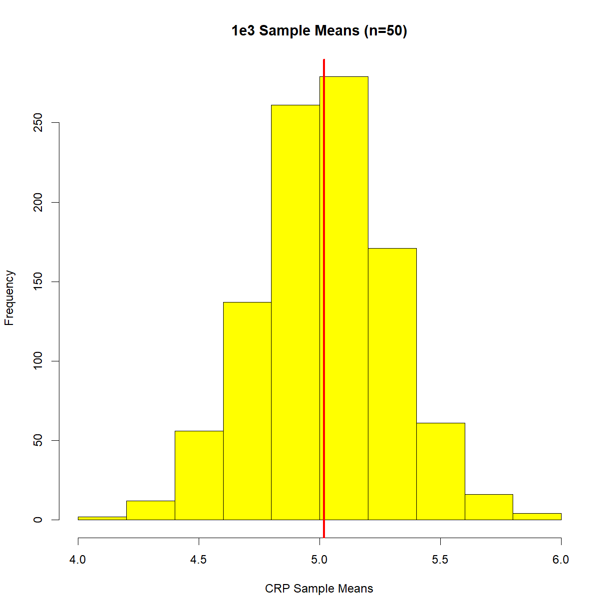
Re-read the definition of the central limit theorem, and then look at this plot. We’re no longer concerned about what individual samples are doing. Now we care when sample means are doing. Specifically, where our sample mean might sit in relation to the population mean. We can now see that our sample mean will sit in the above sample mean distribution.
Confidence intervals, in essence, try to ‘capture’ the population mean in the long run (remember, this is frequentist statistics). They do this by reaching out in both directions from the sample mean, based upon the standard deviation of the sample and the sample size. The equation is,
ci = 1.96 * (sd(samples)/sqrt(sample_size))
Note the value of 1.96. That value scales a standard deviation and gives a value that covers 95% of a normal distribution (for more, look up ‘z-scores’). This is where the ‘95%’ comes from when confidence intervals are often quoted (you may be other percentages, too, such as 90% CI).
Finally, can summarise everything by restating what we know from our single sample mean’s perspective, and get to the heart of what confidence intervals are; There is a range of values around our sample mean that, if we repeated the sampling process an infinite number of times (with a different sample mean each time), would contain the population mean 95% of the time. We can say that because the central limit theorem tells us that our sample means will be from a normal distribution, so it’s simple to now move up a few standard deviations and move down a few standard deviations, to try and capture a certain proportion of the curve.
Note that that’s not the same as saying there is a 95% chance our range contains the population mean (the number one confidence interval misinterpretation). You’ve done your sampling, you have your numbers. You’ve either captured the population range or you haven’t.
Below is a plot showing our single sample mean along with the 95% confidence intervals (shown as blue, dashed lines). The population distribution is also included,
hist(x,
     main = 'C-Reactive Protein levels in healthy UK adults',
     col = 'grey',
     xlab = 'CRP (mg/dl)',
     border = 'black')

abline(v=mean(x), lwd = 3, col = 'red')
abline(v=mean(samples), col = 'blue', lwd = 2)

ci = 1.96 * (sd(samples)/sqrt(length(samples)))

abline(v=mean(samples)+ci, lwd = 3, col = 'blue', lty = 'dashed')
abline(v=mean(samples)-ci, lwd = 3, col = 'blue', lty = 'dashed')
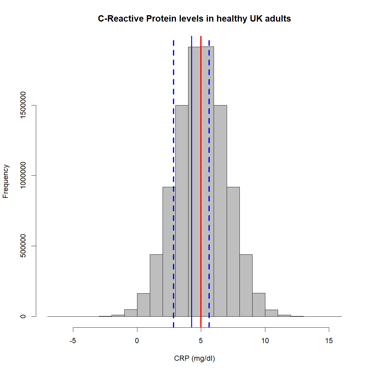
As you can see, this time we’ve captured the population mean. To reiterate, the solid blue line could have been at, say, 10mg/ml, which then would not have captured the population mean. In the real-world, you’ll never know!
Effect sizes
An effect size is the magnitude of the difference you expect to see, or the magnitude of the difference you need to see, beyond which you would make some decision. In this latter case, in other words, it’s the size of the effect that is practically relevant.
For example, you might want to test the ODs of a sample of biological samples, before and after a reagent change, to see if they’re different.
What’s the size of the difference that’s of practical interest? This is largely subjective, but you might decide that, say, a difference of 5 is practically significant.
Effect size can be calculated by dividing the difference by the standard deviation, giving a statistic known as Cohen’s D. A rule of thumb for the consequent values is as follows,
- 0.2, a small effect
- 0.5, a medium effect
- 0.8+, a large effect
Let’s say we have an expected (from previous experiments, or the literature) standard deviation of 6,
cohens_d = 5/6
cohens_d
[1] 0.8333333
That’s a large effect (just).
Sample sizes
The reason for calculating Cohen’s D, is that it allows you to work out a minimum sample size.
It’s well-known that statistical power is an often ignored aspect of experimental design, and consequently, many studies are under-powered. In other words, experiments are carried out that have little or no chance of detecting a real effect, leading to a type ii error (false negative). This has been known for decades, but things are only just changing.
Recall that power is the probability of rejecting the null hypothesis when the alternative hypothesis is true.
A common value for power is 0.8. Think about what this means; in the long run, you’ll fail to reject the null 20% of the time when the alternative hypothesis is true.
library(pwr)
Warning: package 'pwr' was built under R version 4.0.2
pwr.t.test(d=cohens_d,
           power=0.8,
           sig.level=0.05,
           type="paired",
           alternative="two.sided")
     Paired t test power calculation

              n = 13.34954
              d = 0.8333333
      sig.level = 0.05
          power = 0.8
    alternative = two.sided

NOTE: n is number of *pairs*
So, with this expected effect size, with this power and alpha level, you should be aiming for around 13 samples (at least).
Exercise: Power
What would the power be with 50 samples? (hint, read the help file for ‘pwr.t.test’)
Solution
pwr.t.test(n=50,
           d=cohens_d,
           sig.level=0.05,
           type="paired",
           alternative="two.sided")
Preregistration and R notebooks
It has been known for a while now that the scientific literature is riddled with papers that use poor statistical approaches. From p-hacking (continually analysing the data in different ways until a p-value < 0.05 is found) to HARKing (or Hypothesising After the Results are Known, which is where a study is re-written to match the observed rather than expected results), mistakes and deliberate misuse of statistics is everywhere.
One solution that’s emerged in the past decade is pre-registration, which is where the study details, the starting hypothesis, the statistical power, etc. are all published before any data is collected. The second solution is the open sharing of statistical code, via something like an R notebook, to be completely transparent and reproducible with the data analysis.
Exercise - R Notebook
Imagine that you’re in charge of some routine production element of a lab. The lab regularly produces 1000+ measurements each day, and you’re coming to the end of a particular batch of reagents. When this happens, you measure 100 samples with both the old and a new batch of the reagent, to check that the measurements are effectively the same. You have an informal cut-off of 10% as the difference between the two mean values (before vs after the reagent change).
Exercise: R notebook
- Go to File -> New File -> R notebook
- Take a look at the example file, to see how it works
- Give it a title and delete the text and code in the body of the file
- Using a code-chunk, load the files ‘stats_example_batch1.csv’ and ‘stats_example_batch2.csv’. You may have to change your working directory
- Plot a histogram of the data
- Calculate the % change in the means (m1-m2/m1). Is it within the arbitrary 10% limit? Describe the outcome in a sentence
- Check with a paired t-test. Describe the outcome in a sentence
- Repeat with files ‘stats_example_batch3.csv’ and ‘stats_example_batch4.csv’
- Knit the file as an HTML file
- Look at the numbers. What’s going on here?
Solution
See files/stats-notebook-exercise.Rmd
The possible uses of R notebooks is broad, including,
- Capturing the history of analysis for later use/other people using/auditors
- Communicating results and analysis to a 3rd party
- Journal submissions
- Regular internal reporting (as done by the UK government)
This concludes this introduction to statistics in R.
Further reading
- Central limit theorem: the cornerstone of modern statistics
- Multiple comparisons
- Prevalence of comorbidities and its effects in patients infected with SARS-CoV-2: a systematic review and meta-analysis (an example of confidence intervals in a study)
- Cohen’s D visualiser
- Replication power and regression to the mean
- Centre for Open Science (pre-registration)
Key Points
You can do anything, statistics-wise, in R
