Statistics in R
Overview
Teaching: 2.5 hours min
Exercises: 1 hour minQuestions
What are some basic, core concepts in statistics?
How do you apply them in R?
How should you analyse ‘before and after’ results?
Objectives
To become familiar with some relevant statistical techniques, and their application in R
Techniques and concepts include; Frequentist vs Bayesian statistics, descriptive statistics, inferrential statistics, hypothesis testing, probability distributions, p-values, multiple comparisons, confidence intervals, the central limit theorem, effect size, sample sizes, power
To be able to create an R notebook
The aim of this lesson is to take a look at some key statistical ideas in the context of R, with a focus on the sorts of areas typically employed in life sciences research. Given time constraints, this is not a fully-fledged statistics course, but it will demonstrate how to explore and use the basic principles within R, and hopefully provide ideas for where to go next when learning about statistics. The topics touched upon include,
- Frequentist vs Bayesian statistics
- Probability distributions
- Hypothesis testing
- p-values
- Multiple comparisons
- Type i and type ii errors, alpha, beta and power
- Effect sizes
- Confidence intervals
- Sample sizes
- Preregistration and R notebooks
Frequentist vs Bayesian statistics
The prevailing type of statistics and that used in many applications is known as frequentist statistics. This approach assigns probabilities based upon the frequency of events that occur in a sample. In contrast, in the Bayesian mindset, probabilities are related to our current level of knowledge about an event. This latter approach allows the introduction of something called a prior probability, which is a probability assigned before data is collected on an event. This prior probability is combined with new evidence to give a posterior or post-test probability.
Frequentist statistics can in turn be divided into two main branches; inferential and descriptive. With inferential statistics, the aim is to, as the name suggests, infer something about a population from a sample. The aim of descriptive statistics is much simpler, and involves describing data with things such as the mean, median and standard deviation. In this lesson we’ll take a look at both types of frequentist statistics.
Descriptive Statistics in R
Let’s start by grabbing some in-built R data (specifically, the ‘chick weights’ dataset, which is the weight of chicks on different diets) and creating a summary,
dt = chickwts

summary(dt)
     weight             feed
 Min.   :108.0   casein   :12
 1st Qu.:204.5   horsebean:10
 Median :258.0   linseed  :12
 Mean   :261.3   meatmeal :11
 3rd Qu.:323.5   soybean  :14
 Max.   :423.0   sunflower:12
We can see that we have a ‘weight’ variable, which is numeric, plus a ‘feed’ variable, which is a category/factor.
Let’s take a look at some basic R functions,
mean(dt$weight)
[1] 261.3099
median(dt$weight)
[1] 258
sd(dt$weight)
[1] 78.0737
min(dt$weight)
[1] 108
max(dt$weight)
[1] 423
range(dt$weight)
[1] 108 423
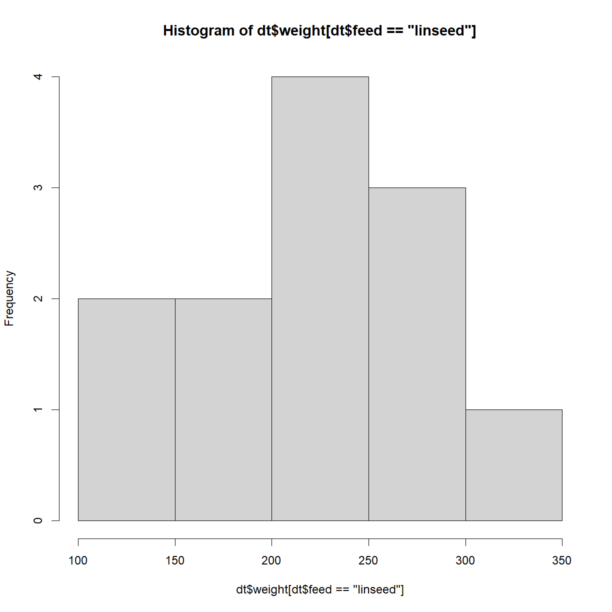
There are several R packages that extend the sorts of descriptive statistics that you can do, but the above functions will typically be some of the most useful. We can also use plots to describe the data. Below is a histogram of the weight, where the feed type is linseed,
hist(dt$weight[dt$feed == 'linseed'])
More useful with multiple factors is a box-and-whisker plot,
boxplot(dt$weight ~ dt$feed)
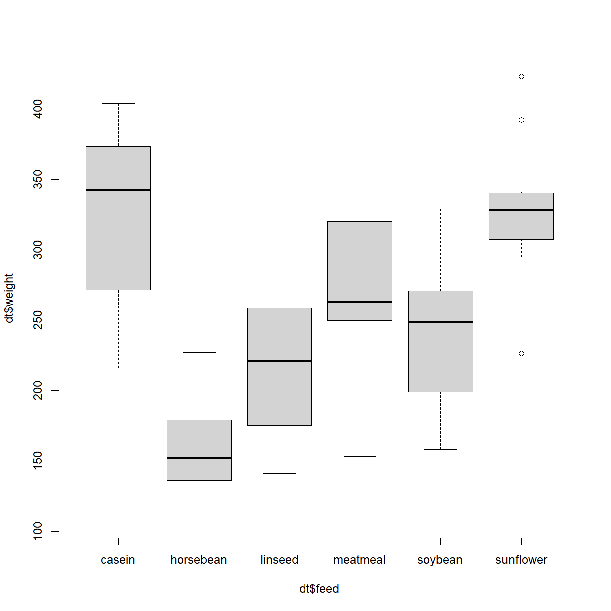
This plot shows us the median (thicker black horizontal lines) plus the interquartile range, min and max, plus outliers.
Let’s now start to move towards inferential statistics.
Inferrential Statistics in R
Imagine you have an orchard containing 100,000 apples and you want to know their mean diameter. How do you it? It’s obviously impractical to measure each and every apple, so instead, you take a sample. The questions that then arise are; How many apples should you measure? Once you have your data, what do you do with it? And once you’ve calculated the mean diameter of your sample, what does that tell you about the mean diameter of all the apples?
Underpinning this area of statistics are probabilities distributions, so let’s take a look at those next.
Probability distributions
Probability distributions, i.e. some measure or quantity plotted again the probability of occurrence underpins huge parts of statistics. Many such types of distribution exist in nature, but for our purposes we’ll stick to the most common - the normal (or Gaussian) distribution.
Let’s create a single normal distribution and plot it,
#Create an example, random, normal distribution
set.seed(123) #ensure reproducible output
eg_dist = rnorm(n = 10000, mean = 10, sd = 2)

#Plot the distribution,
hist(eg_dist)
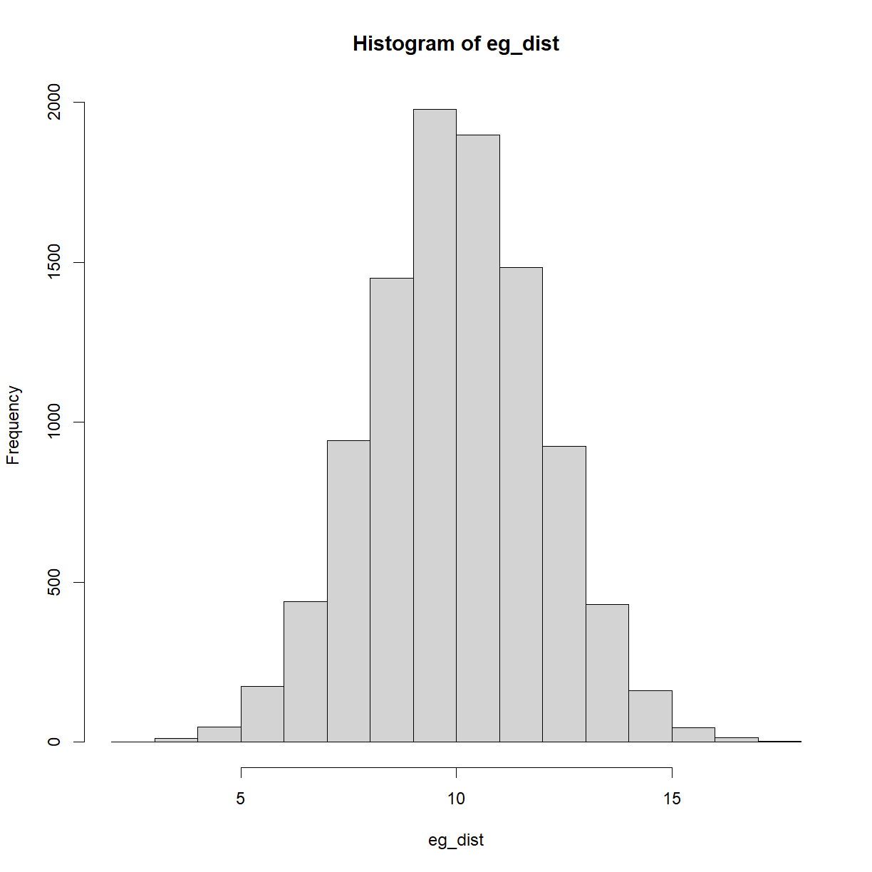
Take a look at the code. We’re using the rnorm() function to create 10,000 random data-points, with a mean of 10 and standard deviation of 2. Note the set.seed() function is also used, to ensure code reproducibility.
We’ll be using this and other normal distributions for many of the topics below. One additional concept to look at here is that of the area under the curve and what it represents. The area under the curve above equals 1, i.e. the probability of everything occurring in this particular scenario. When you take a slice of the curve between two values, the area of that slice is the probability of occurrences in that range. By definition, the highest areas are around the mean.
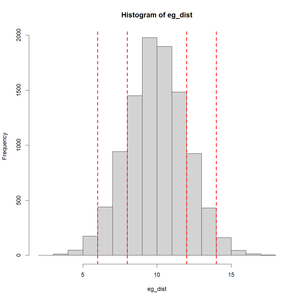
A common way of communicating how likely something is, is to state how many standard deviations away from the mean it is. For example, a standard deviation of 1 covers (approximately) the central 68% of the above curve. In other words, there is a 68% chance of an occurrence or observation within 1 standard deviation (plus/minus). 2 standard deviations covers (approximately) the central 95% of the curve. Keep this 95% figure in mind, as we’ll revisit it later. For now, here is the same plot as above with the standard deviations plotted,
#Plot the distribution,
hist(eg_dist)

mean_eg = mean(eg_dist) #calcualte the mean
sd_eg = sd(eg_dist) #calculate the standard deviation

#Plot vertical lines at plus/minus 1 and 2 standard deviations,
abline(v=mean_eg+sd_eg, col = 'red', lwd = 2, lty = 'dashed')
abline(v=mean_eg+2*sd_eg, col = 'red', lwd = 2, lty = 'dashed')
abline(v=mean_eg-sd_eg, col = 'red', lwd = 2, lty = 'dashed')
abline(v=mean_eg-2*sd_eg, col = 'red', lwd = 2, lty = 'dashed')
Hypothesis testing
This is a huge area of statistics, so for our purposes, let’s focus on a typical life sciences example, namely, taking measurements before and after some change. For example, you may have created an assay, used a 4PL fit to create a standard curve, and then tested two batches of samples using this assay.
Scenarios could include the following,
- A batch of samples from healthy patients and a batch of samples from patients with a particular disease
- A batch of samples from a treatment group and a batch of samples from a control group (both with some condition or disease)
- A single batch of samples, tested before and after a reagent change
- A single batch of samples, tested before and after adding a new component to the testing procedure
- A single batch of samples, tested at the start and end of a stability trial
- A single batch of samples, tested before and after a freeze-thaw process
Many more examples exist. The key question is; how do you make the judgment that things are the same or things have changed?
To reiterate, in inferential statistics, typical applications include trying to estimate aspects of a population from a sample, or trying to tell if a sample is likely, based upon a theoretical population. Note the terms here - ‘Population’ doesn’t (necessarily) refer to people, but instead to the complete collection of everything that you’re interested in. In most situations, this is impossible to measure, and so a sample is taken instead. From this sample, the population parameters (such as the mean and standard deviation) are inferred (hence the name of this branch of statistics).
One more note on terminology; by ‘sample’, here I’m talking about a number of observations or measurements from a population, e.g. measuring the diameters of 100 apples in an orchard of 100,000 apples. In other places ‘sample’ will mean an actual, individual biologic sample in the lab. Hopefully the context will make is clear which is which.
Another application, and the focus for the examples below, is to try and tell if there are statistically significant differences between groups, in other words, are my two samples likely to be from the same population? In such cases, you’ll encounter something known as hypothesis testing. This works by first coming up with something called the null hypothesis, which is actually just the statement that there is no difference between the groups.
For example, let’s say you have two groups of optical density (OD) measurements, and you’re trying to tell if the mean values for each group are statistically different. In this case, you might perform a t-test (a type of hypothesis test that lets you compare means), which tells you if the means of two samples are significantly different from each other. The null hypothesis in this case would be ‘there is no difference’, and the alternative hypothesis would be ‘there is a difference’.
Intuition helps here. Imagine the groups are both made up of 6 samples and the mean levels of some substance are 616ug/ml and 625ug/ml, respectively. You can already tell that, with such a low number of samples and such similar results, the test is unlikely to conclude anything significant is going on. On the other hand, if 100 samples in each group were used and the levels were 100ug/ml and 900ug/ml, respectively, it now feels very different. This also highlights the two main aspects that underpin such a question; the sample size and magnitude of the difference.
Let’s take two samples from our population,
#Take 2 random samples from the distribution,
set.seed(100)
sample1 = sample(eg_dist, size = 1000, replace = F)
set.seed(200)
sample2 = sample(eg_dist, size = 1000, replace = F)

#Plot the samples,
plot(density(sample1), main = '', xlab = '')
lines(density(sample2), col = 'red')
abline(v=mean(sample1), lty = 'dashed')
abline(v=mean(sample2), lty = 'dashed', col = 'red')
text(15, 0.14, paste0('Mean of sample 1 = ', round(mean(sample1),2)))
text(15, 0.12, paste0('Mean of sample 2 = ', round(mean(sample2),2)), col = 'red')
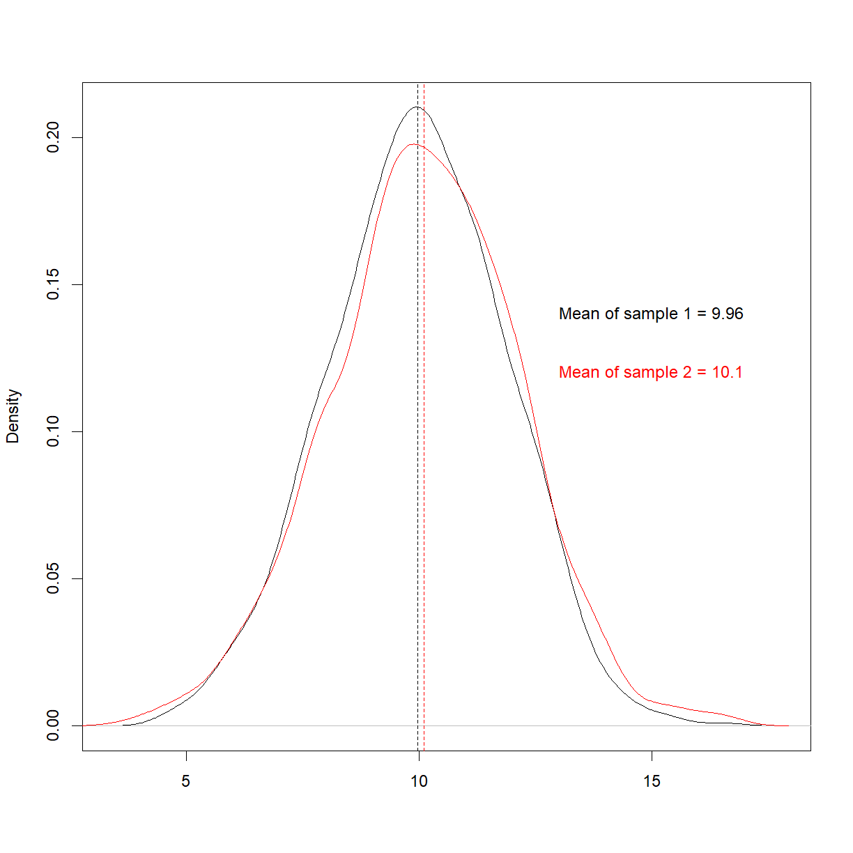
We know in advance that these are from the same population, and it looks like they are, too. To try and quantify this similarity, let’s move on to p-values.
p-values
The ‘p’ is p-values stands for ‘probability’, and what a p-value is telling you in the context of a hypothesis test like the one above is; this is the probability that you’d get these numbers by chance if there is no difference between the groups. Typically, a ‘significant’ result constitutes anything with a p-value less than the (completely arbitrary) level of 0.05.
Let’s run a t-test,
t.test(sample1, sample2)
	Welch Two Sample t-test

data:  sample1 and sample2
t = -1.6452, df = 1987.2, p-value = 0.1001
alternative hypothesis: true difference in means is not equal to 0
95 percent confidence interval:
 -0.31472211  0.02756999
sample estimates:
mean of x mean of y
 9.961241 10.104817
We can see a p-value of 0.1, which is non-significant. (The reason for this value being quite low, despite being from the same population, is that we used quite a large number of samples). Note that our null hypothesis here is that the mean difference is zero.
It’s at this point that p-values can be misinterpreted. What such a result means is ‘the probability of observing the data we have, if the mean levels between the two groups is zero, due to chance, is 0.1’, but what some translate this into is ‘we have therefore disproved biological differences between the two groups’. This latter claim is a huge overreach. p-values are simply an estimate of what to expect over time, with multiple experiments (remember, this is frequentist statistics). In other words, if you performed 10 sampling experiments where the null hypothesis was true, you’d expect a mean difference of this magnitude in 1 of those experiments. In 100 experiments, you’d expect to see it 10 times, etc.
How would this look if we actually had 2 different populations?
#Take 2 random samples from the distribution,
set.seed(123)
eg_dist1 = rnorm(n = 10000, mean = 10, sd = 2)
set.seed(123)
eg_dist2 = rnorm(n = 10000, mean = 15, sd = 2)

set.seed(100)
sample1 = sample(eg_dist1, size = 1000, replace = F)
set.seed(200)
sample2 = sample(eg_dist2, size = 1000, replace = F)

#Plot the samples,
plot(density(sample1), main = '', xlab = '')
lines(density(sample2), col = 'red')
abline(v=mean(sample1), lty = 'dashed')
abline(v=mean(sample2), lty = 'dashed', col = 'red')
text(6, 0.18, paste0('Mean of sample 1 = ', round(mean(sample1),2)))
text(6, 0.16, paste0('Mean of sample 2 = ', round(mean(sample2),2)), col = 'red')
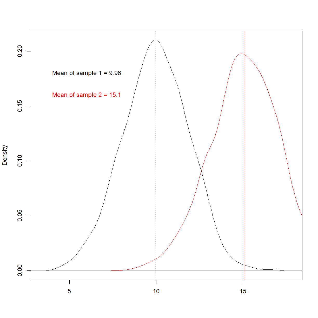
Things now look very different. Re-run the t-test,
t.test(sample1, sample2)
	Welch Two Sample t-test

data:  sample1 and sample2
t = -58.94, df = 1987.2, p-value < 2.2e-16
alternative hypothesis: true difference in means is not equal to 0
95 percent confidence interval:
 -5.314722 -4.972430
sample estimates:
mean of x mean of y
 9.961241 15.104817
We now, as expected, see an extremely small p-value. This is saying it’s virtually impossible that we’ve get these two samples means if these sample were from the same underlying population.
Multiple comparisons
Now that’s we’ve touched upon p-values, let’s take a look at a common mistake made when employing hypothesis testing.
If you have two samples and compare them in a t-test, you’re conducting a single comparison. But what if you have, say, 21 samples and you compare one samples against the rest? Now you’re conducting 20 tests. The problem is, if you set your threshold for significance at 5%, you should expect to see a ‘significant’ result in these 20 comparison just by chance. This can lead people to discard the 19 that were non-significant, and claim a breakthrough with the 20th!
To demonstrate this, let’s takes 10,000 lots of two samples (n=100), run 10,000 t-tests, and plot the corresponding p-values,
p_values = vector()
i=1

#Create a while loop,
while(i<=10000) {

  sample1_temp = sample(eg_dist, size = 100, replace = F)
  sample2_temp = sample(eg_dist, size = 100, replace = F)
  t_test_result = t.test(sample1_temp, sample2_temp)
  p_value = t_test_result$p.value
  p_values = c(p_values, p_value)
  i=i+1

}

plot(p_values, pch = 16, cex = 0.5)
lines(p_values, col = 'grey')
abline(h=0.05, col = 'red', lty = 'dashed', lwd = 2)
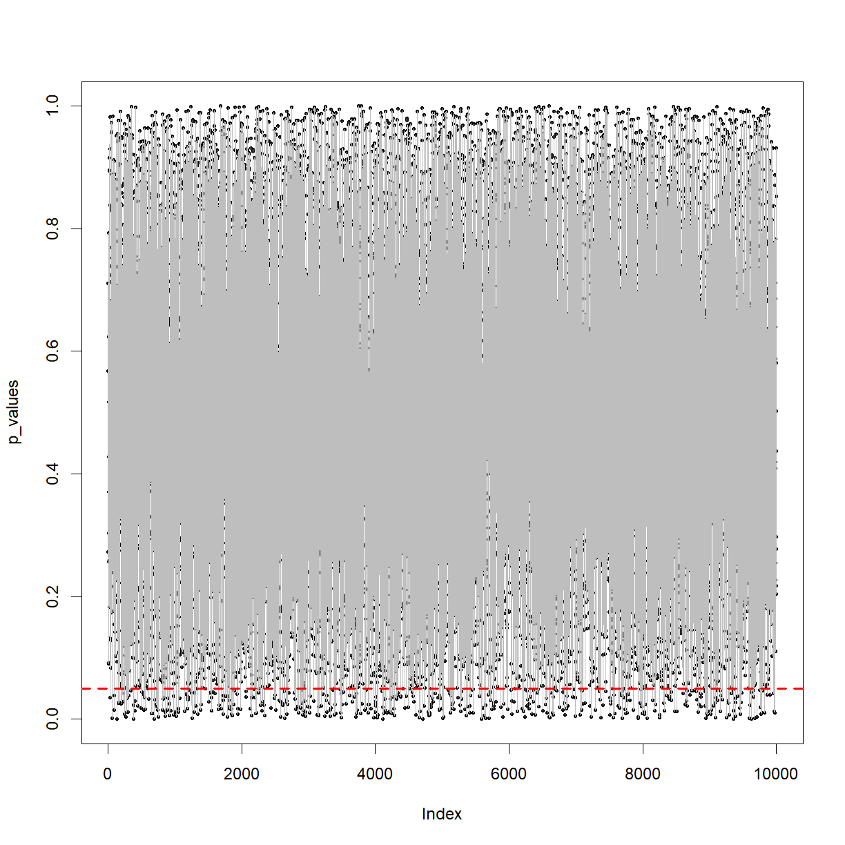
You can see the p-value from the t-tests bouncing around between 0 and 1. Note the dashed red line at p=0.05.
What proportion is below that line?
p_value_table = table(p_values < 0.05)
p_value_table
FALSE  TRUE
 9518   482
p_value_table[2] / p_value_table[1]
      TRUE
0.05064089
Should be around 5%, as expected.
The above plot is terrifying. It shows that when you take two samples from the same population and perform a t-test, when the null hypothesis is true, you could get any p-value from (almost) zero to 1. With a cut-off of 0.05, you’ll be wrong in terms of concluding whether it’s from the same population 5% of the time! Again, we’re dealing with the probability of things occurring over time in terms of frequency. Imagine you replace a key reagent on a production line once a week and perform 52 t-tests a year. If the reagent change never makes a difference, you can still expect a ‘significant’ p-value in around 2 or 3 tests.
What about when there is a real difference? i.e. the alternative hypothesis is true? Now the probability you’ll detect this different is related to the sample size. Let’s take a look,
#Take 2 random samples from the distribution,
set.seed(123)
eg_dist1 = rnorm(n = 10000, mean = 10, sd = 2)
set.seed(123)
eg_dist2 = rnorm(n = 10000, mean = 10.5, sd = 2)

p_values = vector()
i=10

#Create a while loop,
while(i<=1000) {

  sample1_temp = sample(eg_dist1, size = i, replace = F)
  sample2_temp = sample(eg_dist2, size = i, replace = F)
  t_test_result = t.test(sample1_temp, sample2_temp)
  p_value = t_test_result$p.value
  p_values = c(p_values, p_value)
  i=i+1

}

plot(p_values, pch = 16, cex = 0.5, xlab = 'Sample size')
lines(p_values, col = 'grey')
abline(h=0.05, col = 'red', lty = 'dashed')
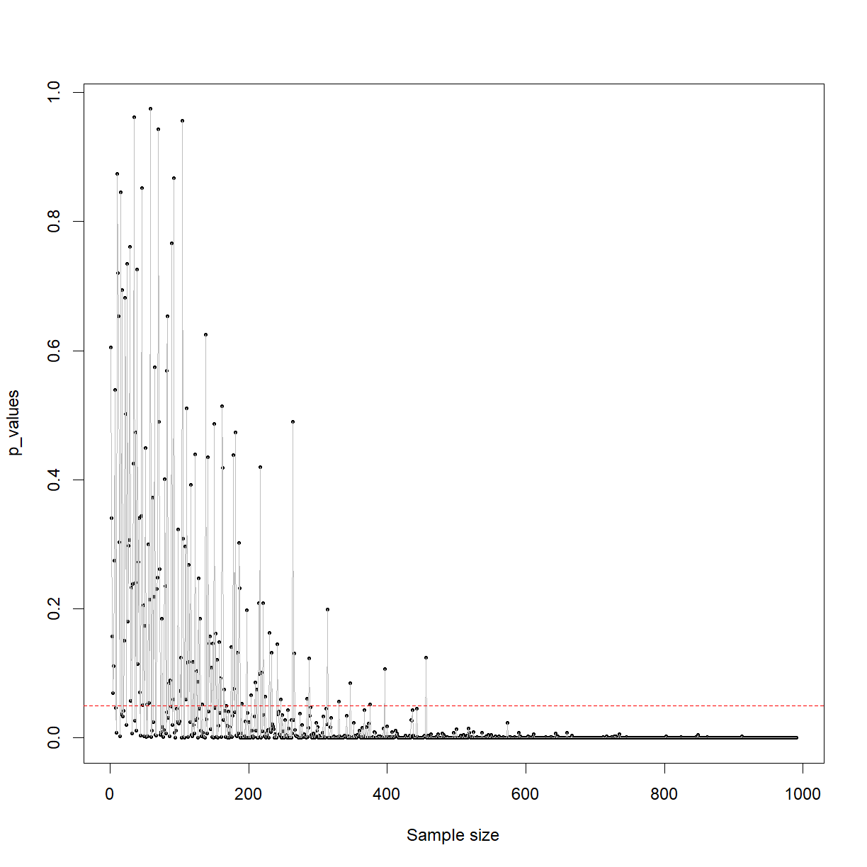
This plot shows that when you are genuinely sampling from two different populations (which have different means), your ability to detect this difference with a t-test (in this case) is directly related to the sample size. You can see that with a sample size of below around 250, the p-value is often jumping above 0.05, were as beyond around 500 samples you’re basically guaranteed to detect it.
The other factor is the size of the effect. This all intuitively makes sense. A real but small difference with a small sample size is likely to be lost in the noise. A large effect size with a large sample size will be stark and obvious.
We started by discussing multiple comparisons. The solution to getting caught out by chance p-values of < 0.05, the simplest solution is to divide 0.05 by the number of p-values, to get your new threshold of significance. For example, in we were talking about 20 comparisons, so the p-value used should actually be 0.05/20 = 0.0025 (know as the Bonferroni correction).
Type i and type ii errors, alpha, beta and power
Next, let’s quickly cover a few terms that you’re likely to come across in the life sciences literature. These terms may sound technical, but we’ve actually basically covered them.
- H0 is the null hypothesis, H1 is the alternative hypothesis
- If the null is correct and you accept it, you’re right. That’s a true negative.
- If the null is correct and you reject it, you’re wrong. That’s a false positive or a type i error.
- If the alternative is correct and you accept it, you’re right. That’s a true positive.
- If the alternative is connect and you reject it, you’re wrong. That’s a false negative or a type ii error.
- alpha is the probability of a significant result when H0 is true (Type 1 error rate). This is usually set to 0.05, but can be set much lower in areas like astronomy and manufacturing
- beta is the probability of a non-significant result when H1 is true (Type 2 error rate)
- 1 - beta is the probability of a significant result when H1 is true, which is also the statistical power
This last one is important and we’ll revisit it later.
Confidence intervals
There’s one more major idea to have a handle on when performing statistics; the confidence interval. This is a concept that can take a while to get your head around, can easily be ignored or misinterpreted, but which offers a very useful tool in the evaluation of evidence.
Underpinning the concept of confidence intervals is something called the central limit theorem. This states that the distribution of an infinite number of sample means from a population is normal, with a mean centered on the population mean.
That may not mean a lot out of context, so let’s take a look at it in action via R,
means = vector()
i=1

#Create a while loop,
while(i<=1000) {

  sample_temp = sample(eg_dist, size = 1000, replace = F)
  mean_temp = mean(sample_temp)
  means = c(means, mean_temp)
  i=i+1

}

hist(means)
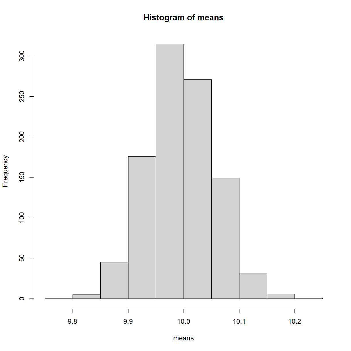
As expected, we see a normal distribution. But to reiterate, we’re now looking at 1000 sample means. That’s quite difference to the population distribution from before. This result and concept might seem a bit esoteric, but it’s an idea that underpins a lot of hypothesis testing, and even works when the sample itself isn’t normally distributed.
Exercise: Binomial Distribution
Create and plot a binomial distribution using the ‘rnbinom()’ function, with n = 1e5, a size of 10 and a probability of 0.9 What do you notice?
Solution
x <- rbinom(n = 10000, size = 10, prob = 0.9)
hist(x)
Exercise: Central Limit Theorem
Run your code in the above loop, to create 1000 sample means from non-normally distributed data. What do you notice?
Solution
means = vector()
i=1

#Create a while loop,
while(i<=1000) {

 sample_temp = rnbinom(n = 10000, size = 10, prob = 0.8)
 mean_temp = mean(sample_temp)
 means = c(means, mean_temp)
 i=i+1

}

hist(means)
You should see that, despite the population distribution being non-normal (‘skewed’), the resulting sampling distribution is normal, as per the central limit theorem.
So far, we’ve looked at samples from populations and whether or not such samples are likely to be selected, given a particular null hypothesis.
However, any population you’re evaluating your sample against is theoretical and unknown. That’s the whole reason a sample has been taken. Measuring the population is too difficult, time-consuming or expensive.
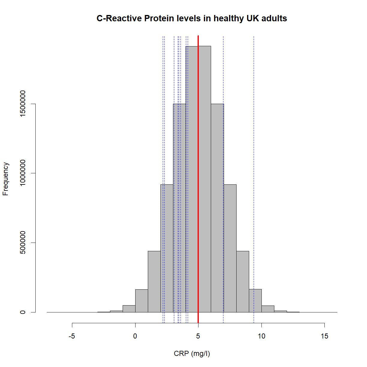
Imagine the authors of a paper have measured the CRP levels of 10 healthy people in the UK, with the aim of estimating such levels in all healthy people in the UK (the population mean). They obtain a mean value of 4.2mg/l. How close is that to the actual population value? We have no idea! For all we know, the population value could be 4.3mg/l and this paper could be extremely close with its value of 4.2mg/l. On the other hand, it’s possible that the population mean is actually 9.7mg/l and this random sample of 10 people just so happened to result in a mean of 4.2mg/l.
Let’s create a plot that shows the underlying population in gray, the population mean in red (5mg/l), and the position of 10 random samples in blue,
set.seed(15)
x = rnorm(10e6, mean = 5, sd = 2) #Create a population with a mean of 5 and standard deviation of 2

hist(x,
     main = 'C-Reactive Protein levels in healthy UK adults',
     col = 'grey',
     xlab = 'CRP (mg/l)',
     border = 'black')

abline(v=mean(x), lwd = 3, col = 'red')

set.seed(10)
samples = sample(x, 10)

abline(v=samples, col = 'blue', lwd = 1, lty = 'dashed')
Let’s collapse the samples into a single mean value (in blue),
hist(x,
     main = 'C-Reactive Protein levels in healthy UK adults',
     col = 'grey',
     xlab = 'CRP (mg/l)',
     border = 'black')

abline(v=mean(x), lwd = 3, col = 'red')
abline(v=mean(samples), col = 'blue', lwd = 2)
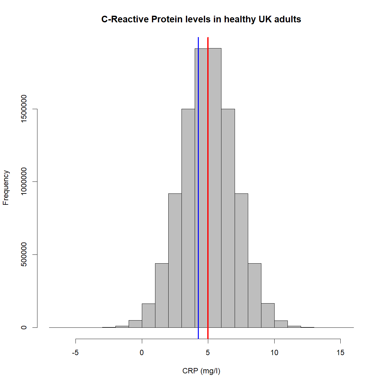
This looks good, but as we’ve already stated, we unfortunately (and crucially), can’t see the gray plot. We have no knowledge of the population distribution or the red line. What we have, in fact, is this,
hist(x,
     main = 'C-Reactive Protein levels in healthy UK adults',
     col = 'white',
     xlab = 'CRP (mg/l)',
     border = 'white')

abline(v=mean(samples), col = 'blue', lwd = 2)
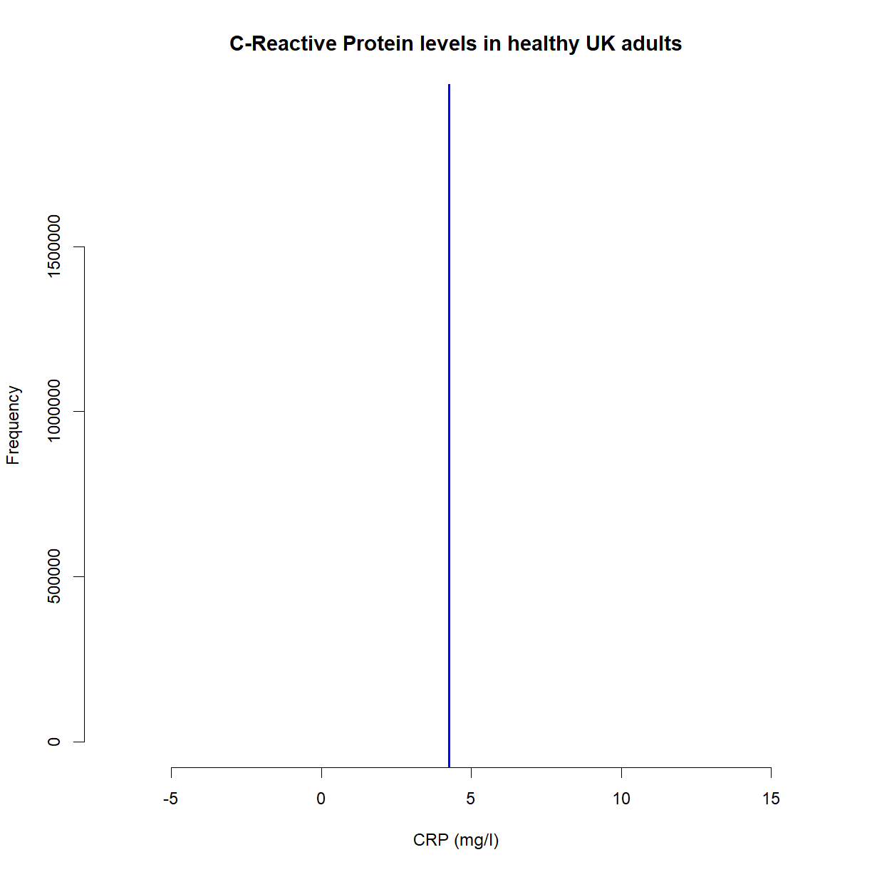
That’s not a lot of use. We don’t know that we’re actually pretty close to the population mean of 5mg/l. For all we know it could be 3mg/l, 6mg/l or 10mg/l; we have no idea. Imagine, for example, that we had a sample mean of 2mg/l. That’s statistically unlikely, but it could happen. Or what can often happen is that you may inadvertently make it more likely by choosing a poor sample. Recall that we’re wanting to know the mean CRP levels of all healthy UK adults. What if your sample included only young adults? Or only men? It’s crucial that a sample is representative of the population.
To get a feel for where our sample mean might sit in relation to the population mean, we use confidence intervals, which are a concept that come straight from the central limit theorem (as seen above).
To reiterate, the central limit theorem states that the distribution of an infinite number of sample means from a population is normal, with a mean centered on the population mean.
Below, I’m going to grab some samples (n=50) from the above population distribution, work out the mean, repeat the process 1000 times, and then plot the resulting distribution. Here it is,
i=1
means = vector()
sds = vector()

while (i<1e3) {

  s_temp = sample(x, 50)
  m_temp = mean(s_temp)
  sd_temp = sd(s_temp)
  means = c(means, m_temp)
  sds = c(sds, sd_temp)
  i=i+1

}

hist(means, main = '1e3 Sample Means (n=50)',
     xlab = "CRP Sample Means",
     col = 'yellow')

abline(v = mean(means),
       lwd = 3,
       col = 'red')
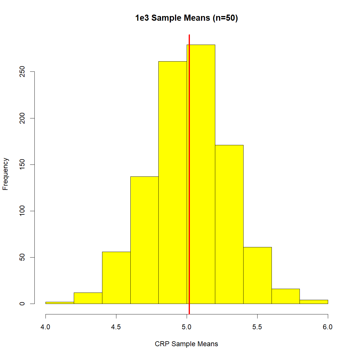
Re-read the definition of the central limit theorem, and then look at this plot. We’re no longer concerned about what individual samples are doing. Now we care when sample means are doing. Specifically, where our sample mean might sit in relation to the population mean. We can now see that our sample mean will sit in the above sample mean distribution.
Confidence intervals, in essence, try to ‘capture’ the population mean in the long run (remember, this is frequentist statistics). They do this by reaching out in both directions from the sample mean, based upon the standard deviation of the sample and the sample size. The equation is,
ci = 1.96 * (sd(samples)/sqrt(sample_size))
Note the value of 1.96. That value scales a standard deviation and gives a value that covers 95% of a normal distribution (for more, look up ‘z-scores’). This is where the ‘95%’ comes from when confidence intervals are often quoted (you may be other percentages, too, such as 90% CI).
Finally, can summarise everything by restating what we know from our single sample mean’s perspective, and get to the heart of what confidence intervals are; There is a range of values around our sample mean that, if we repeated the sampling process an infinite number of times (with a different sample mean each time), would contain the population mean 95% of the time. We can say that because the central limit theorem tells us that our sample means will be from a normal distribution, so it’s simple to now move up a few standard deviations and move down a few standard deviations, to try and capture a certain proportion of the curve.
Note that that’s not the same as saying there is a 95% chance our range contains the population mean (the number one confidence interval misinterpretation). You’ve done your sampling, you have your numbers. You’ve either captured the population range or you haven’t.
Below is a plot showing our single sample mean along with the 95% confidence intervals (shown as blue, dashed lines). The population distribution is also included,
hist(x,
     main = 'C-Reactive Protein levels in healthy UK adults',
     col = 'grey',
     xlab = 'CRP (mg/dl)',
     border = 'black')

abline(v=mean(x), lwd = 3, col = 'red')
abline(v=mean(samples), col = 'blue', lwd = 2)

ci = 1.96 * (sd(samples)/sqrt(length(samples)))

abline(v=mean(samples)+ci, lwd = 3, col = 'blue', lty = 'dashed')
abline(v=mean(samples)-ci, lwd = 3, col = 'blue', lty = 'dashed')
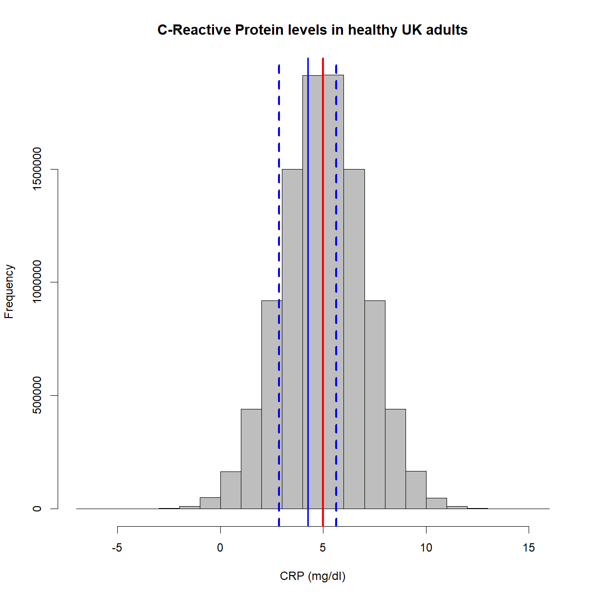
As you can see, this time we’ve captured the population mean. To reiterate, the solid blue line could have been at, say, 10mg/ml, which then would not have captured the population mean. In the real-world, you’ll never know!
Effect sizes
An effect size is the magnitude of the difference you expect to see, or the magnitude of the difference you need to see, beyond which you would make some decision. In this latter case, in other words, it’s the size of the effect that is practically relevant.
For example, you might want to test the ODs of a sample of biological samples, before and after a reagent change, to see if they’re different.
What’s the size of the difference that’s of practical interest? This is largely subjective, but you might decide that, say, a difference of 5 is practically significant.
Effect size can be calculated by dividing the difference by the standard deviation, giving a statistic known as Cohen’s D. A rule of thumb for the consequent values is as follows,
- 0.2, a small effect
- 0.5, a medium effect
- 0.8+, a large effect
Let’s say we have an expected (from previous experiments, or the literature) standard deviation of 6,
cohens_d = 5/6
cohens_d
[1] 0.8333333
That’s a large effect (just).
Sample sizes
The reason for calculating Cohen’s D, is that it allows you to work out a minimum sample size.
It’s well-known that statistical power is an often ignored aspect of experimental design, and consequently, many studies are under-powered. In other words, experiments are carried out that have little or no chance of detecting a real effect, leading to a type ii error (false negative). This has been known for decades, but things are only just changing.
Recall that power is the probability of rejecting the null hypothesis when the alternative hypothesis is true.
A common value for power is 0.8. Think about what this means; in the long run, you’ll fail to reject the null 20% of the time when the alternative hypothesis is true.
library(pwr)
Warning: package 'pwr' was built under R version 4.0.2
pwr.t.test(d=cohens_d,
           power=0.8,
           sig.level=0.05,
           type="paired",
           alternative="two.sided")
     Paired t test power calculation

              n = 13.34954
              d = 0.8333333
      sig.level = 0.05
          power = 0.8
    alternative = two.sided

NOTE: n is number of *pairs*
So, with this expected effect size, with this power and alpha level, you should be aiming for around 13 samples (at least).
Exercise: Power
What would the power be with 50 samples? (hint, read the help file for ‘pwr.t.test’)
Solution
pwr.t.test(n=50,
           d=cohens_d,
           sig.level=0.05,
           type="paired",
           alternative="two.sided")
Preregistration and R notebooks
It has been known for a while now that the scientific literature is riddled with papers that use poor statistical approaches. From p-hacking (continually analysing the data in different ways until a p-value < 0.05 is found) to HARKing (or Hypothesising After the Results are Known, which is where a study is re-written to match the observed rather than expected results), mistakes and deliberate misuse of statistics is everywhere.
One solution that’s emerged in the past decade is pre-registration, which is where the study details, the starting hypothesis, the statistical power, etc. are all published before any data is collected. The second solution is the open sharing of statistical code, via something like an R notebook, to be completely transparent and reproducible with the data analysis.
Exercise - R Notebook
Imagine that you’re in charge of some routine production element of a lab. The lab regularly produces 1000+ measurements each day, and you’re coming to the end of a particular batch of reagents. When this happens, you measure 100 samples with both the old and a new batch of the reagent, to check that the measurements are effectively the same. You have an informal cut-off of 10% as the difference between the two mean values (before vs after the reagent change).
Exercise: R notebook
- Go to File -> New File -> R notebook
- Take a look at the example file, to see how it works
- Give it a title and delete the text and code in the body of the file
- Using a code-chunk, load the files ‘stats_example_batch1.csv’ and ‘stats_example_batch2.csv’. You may have to change your working directory
- Plot a histogram of the data
- Calculate the % change in the means (m1-m2/m1). Is it within the arbitrary 10% limit? Describe the outcome in a sentence
- Check with a paired t-test. Describe the outcome in a sentence
- Repeat with files ‘stats_example_batch3.csv’ and ‘stats_example_batch4.csv’
- Knit the file as an HTML file
- Look at the numbers. What’s going on here?
Solution
See files/stats-notebook-exercise.Rmd
The possible uses of R notebooks is broad, including,
- Capturing the history of analysis for later use/other people using/auditors
- Communicating results and analysis to a 3rd party
- Journal submissions
- Regular internal reporting (as done by the UK government)
This concludes this introduction to statistics in R.
Further reading
- Central limit theorem: the cornerstone of modern statistics
- Multiple comparisons
- Prevalence of comorbidities and its effects in patients infected with SARS-CoV-2: a systematic review and meta-analysis (an example of confidence intervals in a study)
- Cohen’s D visualiser
- Replication power and regression to the mean
- Centre for Open Science (pre-registration)
Key Points
You can do anything, statistics-wise, in R