R introduction: Data Manipulation and Plotting
Overview
Teaching: 50 min
Exercises: 45 minQuestions
How do we get going with real data?
Objectives
Be able to load data into R from a CSV file
Understand the concept of dataframes in R, and their most common corresponding functions
Be able to create basic plots, and appreciate the importance of exploring data through visualisations
Be able to load R’s build-in datasets
Loading Data
R can handle a wide variety of data-types. For this lesson we’ll keep things simple and load a CSV file. First, set your working directory (the path to the files for this workshop on your PC) with the following, adding the path in between the brackets and single quotation marks. Note, you must use forward brackets for the path /
setwd('') #Set working directory
Next, type the following,
df = read.csv('../data/data_carpentry_test_data.csv')
You should see ‘df’ appear in your ‘Environment’ tab, showing 8 observations and 13 variables (rows and columns). This is a data-frame. Click it for a preview.
We can also investigate the dataframe using code,
Exercise: Subsetting dataframes
Type the following, one line at a time, and see what happens
head(df)
tail(df)
df[1,]
df[,1]
Solution
head(df): The first 6 rows are displayed
tail(df): The bottom 6 rows are displayed
df[1,]: The first row is displayed
df[,1]: The first column is displayed
With this last command you may notice that underneath the output, it says ‘Levels’. If you expand the ‘df’ object in your environment panel (by clicking the down-arrow next to it), you’ll see that the column X1 is a ‘factor’. Factors are another important data type in R, and they’re used to represent categorical data. These categories can be unordered, such as ‘Male and ‘Female’, or ordered, such as ‘High’, ‘Medium’ and ‘Low’. As you can see, the categories (or level) here are A, B, C, D, E, F, G and H.
A code based way of checking the data types within a data-frame is to use the ‘str()’ command. Try it out.
Data-frames
Data-frames are the work-horses of a lot of data analysis in R. As you saw above, they can be subsetted to pick out certain rows or columns. This allows parts of a data-frame to be extracted, processed and analysed without effecting the original data.
Exercise: Creating new subsets
Type the following code. What have you just created?
df_2 = df[,c(1:3)]Solution
A new dataframe, made up of the first 3 columns of the original dataframe
There are lots of useful tools in R for working with data-frames,
Exercise: Dataframe functions
Investigate the following functions, dim(), colnames(), summary()
Solution
dim(): Returns the dimensions of the dataframe, colnames(): Returns the column names of the dataframe, summary(): Returns a summary of the dataframe
Note, when an R function gives you multiple values, you can just get individual values by indexing with square brackets. For example,
dim(df)[2]
[1] 13
What have we just returned?
The colnames function can not only be used to see what the existing column names are, but also change them. For example, we could write the following,
colnames(df) = c('Col_1', 'Col_2', 'Col_3', 'Col_4', 'Col_5', 'Col_6', 'Col_7', 'Col_8', 'Col_9', 'Col_10', 'Col_11', 'Col_12', 'Col_13')
However, that’s time-consuming. There is a much better way by using an extremely useful function called paste(). Paste allows text and variables to be combined. For example,
num = 5
paste('The number is', num)
[1] "The number is 5"
With this in mind, we can now use ‘paste()’ and ‘seq()’ together to make the renaming of columns much easier,
df = read.csv('../data/data_carpentry_test_data.csv') #Reload to reset the column names
colnames(df) = paste0('Col_', seq(1:13))
This is much better, but there is still an issue. The number of columns, 13, is hard-coded. In other words, I have had to look to see how many columns there are and then type it. If you were running this code on many files and the dimensions changed, this would break.
Exercise: Dataframe functions
How could we make the code above more robust? What could we replace the number ‘13’ with? We’ve already seen the code somewhere else above.
Solution
colnames(df) = paste0('Col_', seq(1:dim(df)[2]))
Data-frames can be combined and merged in a number of ways, arguably the most useful functions being rbind(), cbind() and merge().
First, let’s create two example data-frames to test the functions,
df_1 = df[c(1:4),]
df_2 = df[c(5:8),]
Take a look at them. Now, let’s try rbind(),
df_rbind = rbind(df_1, df_2)
This stacks the data-frames back by row. cbind() does the same by column. Not that these functions need the two data-frames to have the same number of rows or columns, respectively.
Next, let’s look at how to use merge(). First, create the following data-frames,
samples = data.frame('SampleID' = c(1:10),
                     'Measurement' = rnorm(10,10,5))

patients = data.frame('Name' = c(rep('Bob',3), rep('Bill',2), rep('Bernard',5)),
                      'Treatment' = c(rep('Drug A', 5), rep('Drug B', 5)),
                      'SampleID' = c(1:10))
Have a look at the these data-frames. They’re what you might typically see in the tables of a relational database, where different aspects are stored in different tables, with a key being available to connect them. In this case, the key is the ‘SampleID’ column. Let’s merge them using this key,
df_merged = merge(patients, samples, by = 'SampleID')
Note that the two merging columns can have different names.
What just happened? We’ve merged according to the values in ‘SampleID’, so the data-frames have been merged where these values match. In many situations, you might have missing values in one or both of the data-frames. For example,
patients$SampleID[4] = NA
Take a look at the patients data. Bill is now missing a value for ‘drug A’. Re-run the merging code above and see what happens. You’ll see that the line corresponding to the missing data is completely ignored. In situations like this, it’s possible to force R to include whatever data it does have available. For example, run the following,
df_merged = merge(samples, patients, by = 'SampleID', all.y = TRUE)
Now it has included the data that it could not originally merge. This may be useful if, say, you wanted to maintain the original number of rows.
Finally on data-frames, save your data with write.csv(),
write.csv(df_merged, 'my_new_file.csv')
Base Plots
Now that you can load data and subset data-frames, we can start to plot different parts of the data. For example, try the following,
plot(df$Col_2)
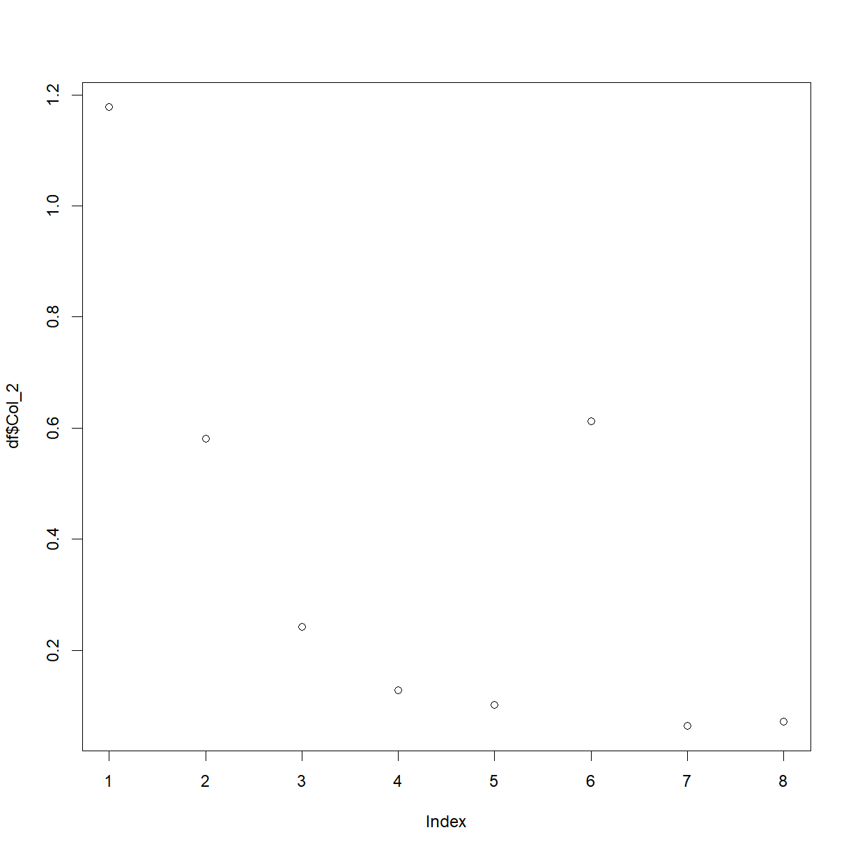
We’ve used a couple of new things here. First, we’ve used the plot() function, and second, we’ve picked out a column from the data-frame with the $ symbol. This is a shortcut in R, and the auto-fill should help you whenever you type the name of a data-frame, followed by this symbol.
You should now have a basic plot of the values in column 2. As R is infinitely customisable, we can of course improve this plot. For example,
plot(df$Col_2,
     ylab = 'Optical Density',
     main = 'Plot of Index vs Optical Density',
     type = 'l',
     col = 'red')
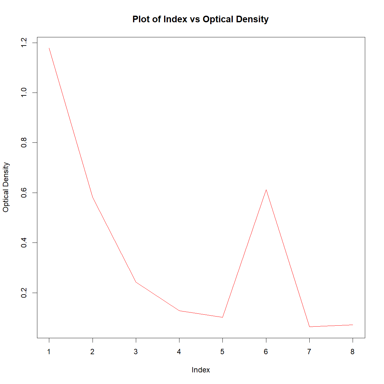
This may look like a lot of effort for one plot, but remember that this is now completely transparent, reproducible, and the code could be reused over and over. For more details on the plot function, have a look at the help files.
Base R can create various other plots. For example, try out this box-and-whisker plot,
df$Sample = 'Sample 1'
df$Sample[c(5:8)] = 'Sample 2'

boxplot(df$Col_2 ~ df$Sample)
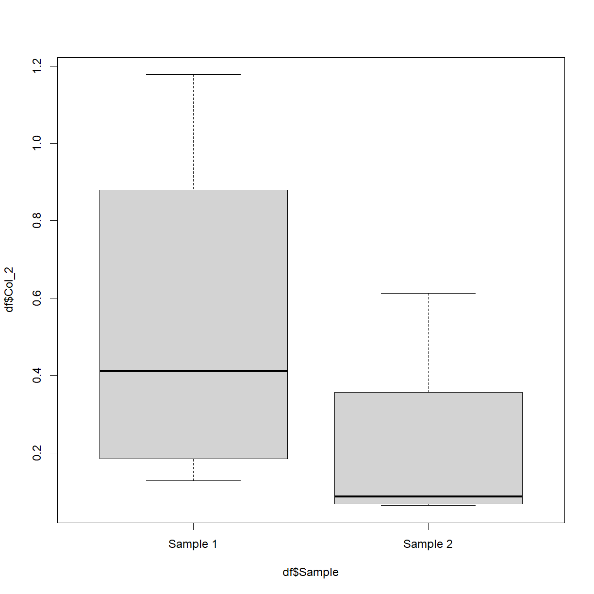
Don’t worry too much about the first two lines. What they’re doing is creating a new (made-up) column called ‘Sample’ and setting every value to be ‘Sample 1’. It then sets the 5th through to the 8th values to be equal to ‘Sample 2’. The boxplot is then plotting the numerical values in column 2 split by this new variable. This is of course easier when your data already has such categories.
How about a histogram?
hist(df$Col_2)
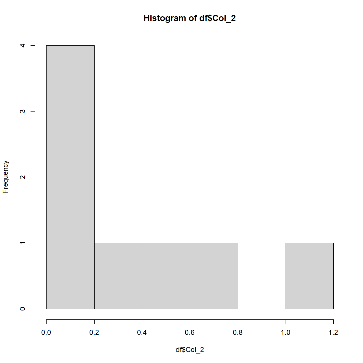
This plot isn’t particularly interesting with this particular dataset. Recall earlier when we saw the rnorm() function? Let’s now plot that data to see what we get,
hist(rnorm(n = 1000))
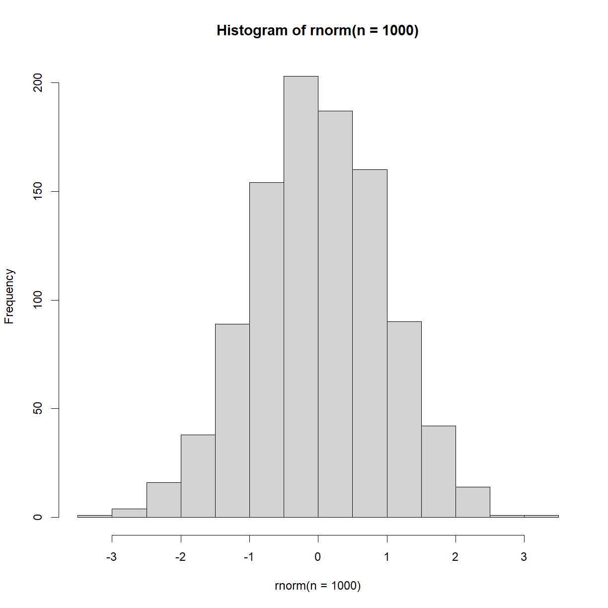
As expected, we see a normal distribution, centered on 0.
Notice on the plot panel you have an Export option. This allows you to save your image either to a file, or to the clip-board.
Something to keep in mind with plots in R is that they tend to be made for 2 different reasons. One is to create slick, professional plots for reports, presentations and publications. These take time to craft and are typically done using libraries beyond base R (the main one of which we’ll see later).
The second reason for plotting in R is to explore the data. These plots are usually done in base R and produced quickly, in order to get a feel for the data. This idea of exploring data visually is an important concept, because it’s very difficult to understand your data from glancing at the raw numbers or even summary statistics.
As a concrete example, consider the following 4 separate datasets (note that most of the code is commented-out here for display purposes on this webpage, but you can run them),
anscombe = anscombe

#mean(anscombe$x1)
#mean(anscombe$x2)
#mean(anscombe$x3)
#mean(anscombe$x4)

#sd(anscombe$x1)
#sd(anscombe$x2)
#sd(anscombe$x3)
#sd(anscombe$x4)
All 4 have the exact same mean and standard deviation. It may seem like they’re similar, if not identical. However, when we plot them,
par(mfrow=c(2,2)) #Setting up the 2x2 grid of images
par(mar=c(2,2,2,2)) #Setting up the plot margins
plot(anscombe$x1, anscombe$y1, pch = 16)
abline(lm(anscombe$y1 ~ anscombe$x1), col = 'red')
plot(anscombe$x2, anscombe$y2, pch = 16)
abline(lm(anscombe$y2 ~ anscombe$x2), col = 'red')
plot(anscombe$x3, anscombe$y3, pch = 16)
abline(lm(anscombe$y3 ~ anscombe$x3), col = 'red')
plot(anscombe$x4, anscombe$y4, pch = 16)
abline(lm(anscombe$y4 ~ anscombe$x4), col = 'red')
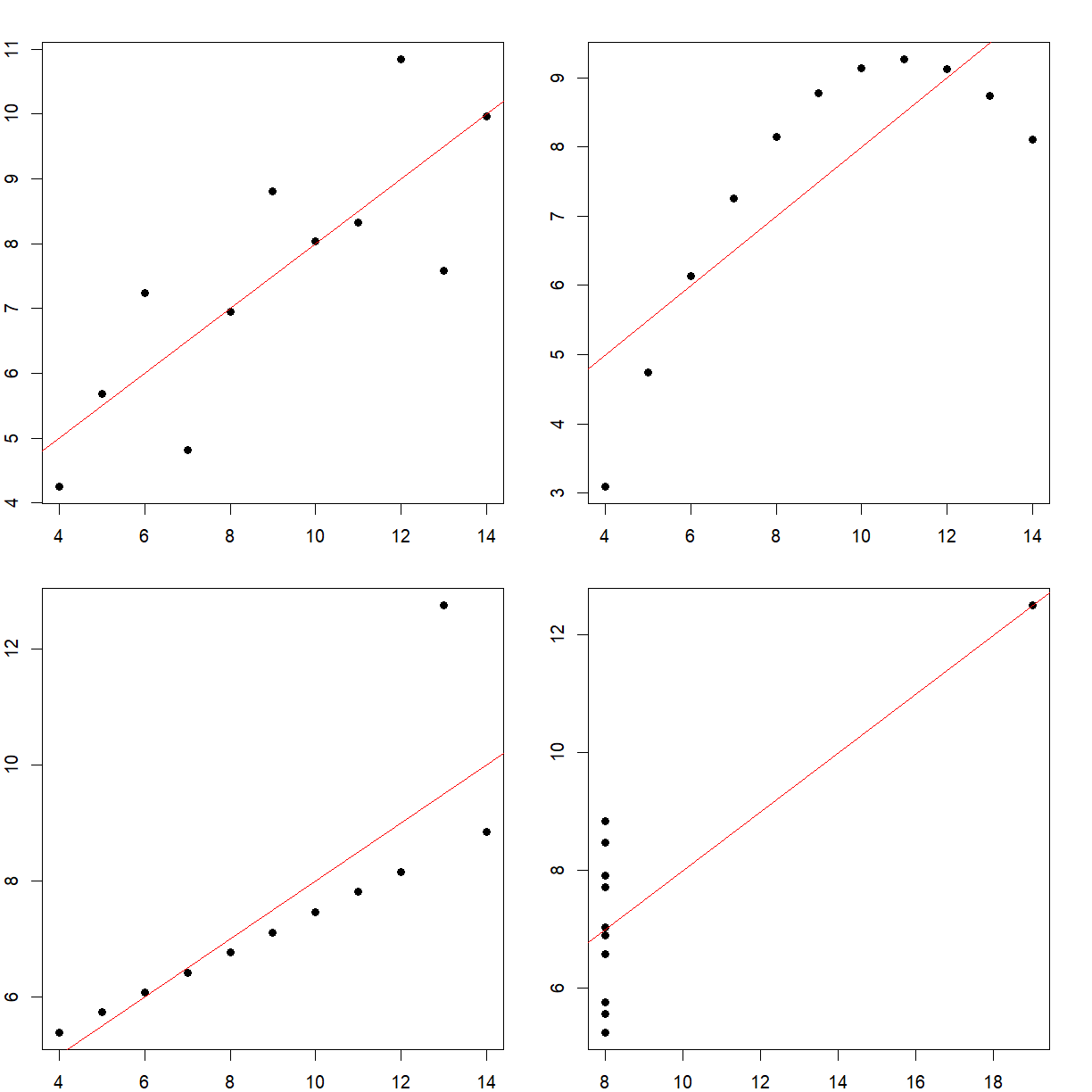
We see that they’re very different. This is a famous example called Anscombe’s quartet, and highlights the perils of trying to use summary statistics to understand your data.
One more point to raise. You may have noticed that we magically created this Anscombe’s quartet data from no-where. R actually comes with many datasets pre-installed, to be used for learning how to code. To see the fill list, type,
data()
Exercise: Built-in datasets
Load the pre-installed dataset ‘ChickWeight’ or ‘ToothGrowth’ and explore it via any of the functions we’ve covered so far, including plots
Key Points
Analysis code is built line-by-line