All in One View
Content from Overview
Last updated on 2025-01-30 | Edit this page
Overview
Questions
- What do we mean by “Trustworthy AI”?
- How is this workshop structured, and what content does it cover?
Objectives
- Define trustworthy AI and its various components.
- Be prepared to dive into the rest of the workshop.
What is trustworthy AI?
Take a moment to brainstorm what keywords/concepts come to mind when we mention “Trustworthy AI”. Share your thoughts with the class.
Artificial intelligence (AI) and machine learning (ML) are being used widely to improve upon human capabilities (either in speed/convenience/cost or accuracy) in a variety of domains: medicine, social media, news, marketing, policing, and more. It is important that the decisions made by AI/ML models uphold values that we, as a society, care about.
Trustworthy AI is a large and growing sub-field of AI that aims to ensure that AI models are trained and deployed in ways that are ethical and responsible.
The AI Bill of Rights
In October 2022, the Biden administration released a Blueprint for an AI Bill of Rights, a non-binding document that outlines how automated systems and AI should behave in order to protect Americans’ rights.
The blueprint is centered around five principles:
- Safe and Effective Systems – AI systems should work as expected, and should not cause harm
- Algorithmic Discrimination Protections – AI systems should not discriminate or produce inequitable outcomes
- Data Privacy – data collection should be limited to what is necessary for the system functionality, and you should have control over how and if your data is used
- Notice and Explanation – it should be transparent when an AI system is being used, and there should be an explanation of how particular decisions are reached
- Human Alternatives, Consideration, and Fallback – you should be able to opt out of engaging with AI systems, and a human should be available to remedy any issues
This workshop
This workshop centers around four principles that are important to trustworthy AI: scientific validity, fairness, transparency, safety & uncertainty, and accountability. We summarize each principle here.
Scientific validity
In order to be trustworthy, a model and its predictions need to be founded on good science. A model is not going to perform well if is not trained on the correct data, if it fits the underlying data poorly, or if it cannot recognize its own limitations. Scientific validity is closely linked to the AI Bill of Rights principle of “safe and effective systems”.
In this workshop, we cover the following topics relating to scientific validity:
- Defining the problem (Preparing to Train a Model episode)
- Training and evaluating a model, especially selecting an accuracy metric, avoiding over/underfitting, and preventing data leakage (Model Evaluation and Fairness episode)
Fairness
As stated in the AI Bill of Rights, AI systems should not be discriminatory or produce inequitable outcomes. In the Model Evaluation and Fairness episode we discuss various definitions of fairness in the context of AI, and overview how model developers try to make their models more fair.
Transparency
Transparency – i.e., insight into how a model makes its decisions – is important for trustworthy AI, as we want models that make the right decisions for the right reasons. Transparency can be achieved via explanations or by using inherently interpretable models. We discuss transparency in the follow episodes:
- Interpretability vs Explainability
- Explainability Methods Overview
- Explainability Methods: Deep Dive, Linear Probe, and GradCAM episodes
Safety & uncertainty awareness
AI models should be able to quantify their uncertainty and recognize when they encounter novel or unreliable inputs. If a model makes confident predictions on data that it has never seen before (e.g., out-of-distribution data), it can lead to critical failures in high-stakes applications like healthcare or autonomous systems.
In this workshop, we cover the following topics relating to safety and uncertainty awareness:
- Estimating model uncertainty—understanding when models should be uncertain and how to measure it (Estimating Model Uncertainty episode)
- Out-of-distribution detection—distinguishing between known and unknown data distributions to improve reliability (OOD Detection episodes)
- Comparing uncertainty estimation and OOD detection approaches,
including:
- Output-based methods (softmax confidence, energy-based models)
- Distance-based methods (Mahalanobis distance, k-NN)
- Contrastive learning for improving generalization
By incorporating uncertainty estimation and OOD detection, we emphasize the importance of AI models knowing what they don’t know and making safer decisions.
Accountability
Accountability is important for trustworthy AI because, inevitably, models will make mistakes or cause harm. Accountability is multi-faceted and largely non-technical, which is not to say unimportant, but just that it falls partially out of scope of this technical workshop.
We discuss two facets of accountability, model documentation and model sharing, in the Documenting and Releasing a Model episode.
For those who are interested, we recommend these papers to learn more about different aspects of AI accountability:
- Accountability of AI Under the Law: The Role of Explanation by Finale Doshi-Velez and colleagues. This paper discusses how explanations can be used in a legal context to determine accountability for harms caused by AI.
- Closing the AI accountability gap: defining an end-to-end framework for internal algorithmic auditing by Deborah Raji and colleagues proposes a framework for auditing algorithms. A key contribution of this paper is defining an auditing procedure over the whole model development and implementation pipeline, rather than narrowly focusing on the modeling stages.
- AI auditing: The Broken Bus on the Road to AI Accountability by Abeba Birhane and colleagues challenges previous work on AI accountability, arguing that most existing AI auditing systems are not effective. They propose necessary traits for effective AI audits, based on a review of existing practices.
Topics we do not cover
Trustworthy AI is a large, and growing, area of study. As of September 24, 2024, there are about 18,000 articles on Google Scholar that mention Trustworthy AI and were published in the first 9 months of 2024.
There are different Trustworthy AI methods for different types of models – e.g., decisions trees or linear models that are commonly used with tabular data, neural networks that are used with image data, or large multi-modal foundation models. In this workshop, we focus primarily on neural networks for the specific techniques we show in the technical implementations. That being said, much of the conceptual content is relevant to any model type.
Many of the topics we do not cover are sub-topics of the broad categories – e.g., fairness, explainability, or OOD detection – of the workshop and are important for specific use cases, but less relevant for a general audience. But, there are a few major areas of research that we don’t have time to touch on. We summarize a few of them here:
Data Privacy
In the US’s Blueprint for an AI Bill of Rights, one principle is data privacy, meaning that people should be aware how their data is being used, companies should not collect more data than they need, and people should be able to consent and/or opt out of data collection and usage.
A lack of data privacy poses several risks: first, whenever data is
collected, it can be subject to data breaches. This risk is unavoidable,
but collecting only the data that is truly necessary mitigates this
risk, as does implementing safeguards to how data is stored and and
accessed. Second, when data is used to train ML models, that data can
sometimes be identifying by attackers. For instance, large language
models like ChatGPT are known to release private data that was part of
the training corpus when prompted in clever ways (see this blog
post for more information).
Membership inference attacks, where an attacker determines whether a
particular individual’s data was in the training corpus, are another
vulnerability. These attacks may reveal things about a person directly
(e.g., if the training dataset consisted of only people with a
particular medical condition), or can be used to setup downstream
attacks to gain more information.
There are several areas of active research relating to data privacy.
- Differential privacy is a statistical technique that protects the privacy of individual data points. Models can be trained using differential privacy to provably prevent future attacks, but this currently comes at a high cost to accuracy.
- Federated learning trains models using decentralized data from a variety of sources. Since the data is not shared centrally, there is less risk of data breaches or unauthorized data usage.
Generative AI risks
We touch on fairness issues with generative AI in the Model Evaluation and Fairness episode. But generative AI poses other risks, too, many of which are just starting to be researched and understood given how new widely-available generative AI is. We discuss one such risk, disinformation, briefly here:
- Disinformation: A major risk of generative AI is the creation of misleading or fake and malicious content, often known as deep fakes. Deep fakes pose risks to individuals (e.g., creating content that harms an individual’s reputation) and society (e.g., fake news articles or pictures that look real).
Content from Preparing to train a model
Last updated on 2024-10-17 | Edit this page
Overview
Questions
- For what prediction tasks is machine learning an appropriate tool?
- How can inappropriate target variable choice lead to suboptimal outcomes in a machine learning pipeline?
- What forms of “bias” can occur in machine learning, and where do these biases come from?
Objectives
- Judge what tasks are appropriate for machine learning
- Understand why the choice of prediction task / target variable is important.
- Describe how bias can appear in training data and algorithms.
Choosing appropriate tasks
Machine learning is a rapidly advancing, powerful technology that is helping to drive innovation. Before embarking on a machine learning project, we need to consider the task carefully. Many machine learning efforts are not solving problems that need to be solved. Or, the problem may be valid, but the machine learning approach makes incorrect assumptions and fails to solve the problem effectively. Worse, many applications of machine learning are not for the public good.
We will start by considering the NIH Guiding Principles for Ethical Research, which provide a useful set of considerations for any project.
Challenge
Take a look at the NIH Guiding Principles for Ethical Research.
What are the main principles?
A summary of the principles is listed below:
- Social and clinical value: Does the social or clinical value of developing and implementing the model outweigh the risk and burden of the people involved?
- Scientific validity: Once created, will the model provide valid, meaningful outputs?
- Fair subject selection: Are the people who contribute and benefit from the model selected fairly, and not through vulnerability, privilege, or other unrelated factors?
- Favorable risk-benefit ratio: Do the potential benefits of of developing and implementing the model outweigh the risks?
- Independent review: Has the project been reviewed by someone independent of the project, and has an Institutional Review Board (IRB) been approached where appropriate?
- Informed consent: Are participants whose data contributes to development and implementation of the model, as well as downstream recipients of the model, kept informed?
- Respect for potential and enrolled subjects: Is the privacy of participants respected and are steps taken to continuously monitor the effect of the model on downstream participants?
AI tasks are often most controversial when they involve human subjects, and especially visual representations of people. We’ll discuss two case studies that use people’s faces as a prediction tool, and discuss whether these uses of AI are appropriate.
Case study 1: Physiognomy
In 2019, Nature Medicine published a paper that describes a model that can identify genetic disorders from a photograph of a patient’s face. The abstract of the paper is copied below:
Syndromic genetic conditions, in aggregate, affect 8% of the population. Many syndromes have recognizable facial features that are highly informative to clinical geneticists. Recent studies show that facial analysis technologies measured up to the capabilities of expert clinicians in syndrome identification. However, these technologies identified only a few disease phenotypes, limiting their role in clinical settings, where hundreds of diagnoses must be considered. Here we present a facial image analysis framework, DeepGestalt, using computer vision and deep-learning algorithms, that quantifies similarities to hundreds of syndromes.
DeepGestalt outperformed clinicians in three initial experiments, two with the goal of distinguishing subjects with a target syndrome from other syndromes, and one of separating different genetic sub-types in Noonan syndrome. On the final experiment reflecting a real clinical setting problem, DeepGestalt achieved 91% top-10 accuracy in identifying the correct syndrome on 502 different images. The model was trained on a dataset of over 17,000 images representing more than 200 syndromes, curated through a community-driven phenotyping platform. DeepGestalt potentially adds considerable value to phenotypic evaluations in clinical genetics, genetic testing, research and precision medicine.
- What is the proposed value of the algorithm?
- What are the potential risks?
- Are you supportive of this kind of research?
- What safeguards, if any, would you want to be used when developing and using this algorithm?
Media reports about this paper were largely positive, e.g., reporting that clinicians are excited about the new technology.
Case study 2:
There is a long history of physiognomy, the “science” of trying to read someone’s character from their face. With the advent of machine learning, this discredited area of research has made a comeback. There have been numerous studies attempting to guess characteristics such as trustworthness, criminality, and political and sexual orientation.
In 2018, for example, researchers suggested that neural networks could be used to detect sexual orientation from facial images. The abstract is copied below:
We show that faces contain much more information about sexual orientation than can be perceived and interpreted by the human brain. We used deep neural networks to extract features from 35,326 facial images. These features were entered into a logistic regression aimed at classifying sexual orientation. Given a single facial image, a classifier could correctly distinguish between gay and heterosexual men in 81% of cases, and in 74% of cases for women. Human judges achieved much lower accuracy: 61% for men and 54% for women. The accuracy of the algorithm increased to 91% and 83%, respectively, given five facial images per person.
Facial features employed by the classifier included both fixed (e.g., nose shape) and transient facial features (e.g., grooming style). Consistent with the prenatal hormone theory of sexual orientation, gay men and women tended to have gender-atypical facial morphology, expression, and grooming styles. Prediction models aimed at gender alone allowed for detecting gay males with 57% accuracy and gay females with 58% accuracy. Those findings advance our understanding of the origins of sexual orientation and the limits of human perception. Additionally, given that companies and governments are increasingly using computer vision algorithms to detect people’s intimate traits, our findings expose a threat to the privacy and safety of gay men and women.
Discuss the following questions.
- What is the proposed value of the algorithm?
- What are the potential risks?
- Are you supportive of this kind of research?
- What distinguishes this use of AI from the use of AI described in Case Study 1?
Media reports of this algorithm were largely negative, with a Scientific American article highlighting the connections to physiognomy and raising concern over government use of these algorithms:
This is precisely the kind of “scientific” claim that can motivate repressive governments to apply AI algorithms to images of their citizens. And what is it to stop them from “reading” intelligence, political orientation and criminal inclinations from these images?
Choosing the outcome variable
Sometimes, choosing the outcome variable is easy: for instance, when building a model to predict how warm it will be out tomorrow, the temperature can be the outcome variable because it’s measurable (i.e., you know what temperature it was yesterday and today) and your predictions won’t cause a feedback loop (e.g., given a set of past weather data, the weather next Monday won’t change based on what your model predicts tomorrow’s temperature to be).
By contrast, sometimes it’s not possible to measure the target prediction subject directly, and sometimes predictions can cause feedback loops.
Case Study: Proxy variables
Consider the scenario described in the challenge below.
Challenge
Suppose that you work for a hospital and are asked to build a model to predict which patients are high-risk and need extra care to prevent negative health outcomes.
Discuss the following with a partner or small group: 1. What is the goal target variable? 2. What are challenges in measuring the target variable in the training data (i.e., former patients)? 3. Are there other variables that are easier to measure, but can approximate the target variable, that could serve as proxies? 3. How do social inequities interplay with the value of the target variable versus the value of the proxies?
The “challenge” scenario is not hypothetical: A well-known study by Obermeyer et al. analyzed an algorithm that hospitals used to assign patients risk scores for various conditions. The algorithm had access to various patient data, such as demographics (e.g., age and sex), the number of chronic conditions, insurance type, diagnoses, and medical costs. The algorithm did not have access to the patient’s race. The patient risk score determined the level of care the patient should receive, with higher-risk patients receiving additional care.
Ideally, the target variable would be health needs, but this can be challenging to measure: how do you compare the severity of two different conditions? Do you count chronic and acute conditions equally? In the system described by Obermeyer et al., the hospital decided to use health-care costs as a proxy for health needs, perhaps reasoning that this data is at least standardized across patients and doctors.
However, Obermeyer et al. reveal that the algorithm is biased against Black patients. That is, if there are two individuals – one white and one Black – with equal health, the algorithm tends to assign a higher risk score to the white patient, thus giving them access to higher care quality. The authors blame the choice of proxy variable for the racial disparities.
The authors go on to describe how, due to how health-care access is structured in the US, richer patients have more healthcare expenses, even if they are equally (un)healthy to a lower-income patient. The richer patients are also more likely to be white.
Consider the following:
- How could the algorithm developers have caught this problem earlier?
- Is this a technical mistake or a process-based mistake? Why?
Case study: Feedback loop
Consider social media, like Instagram or TikTok’s “for you page” or Facebook or Twitter’s newsfeed. The algorithms that determine what to show are complex (and proprietary!) but a large part of the algorithms’ objective is engagement: the number of clicks, views, or re-posts. For instance, this focus on engagement can create an “echo chamber” where individual users solely see content that aligns with their political ideology, thereby maximizing the positive engagement with each post. But the impact of social media feedback loops spreads beyond politics: researchers have explored how similar feedback loops exist for mental health conditions such as eating disorders. If someone finds themselves in this area of social media, it’s likely because they have, or have risk factors for, an eating disorder, and seeing pro-eating disorder content can drive engagement, but ultimately be very bad for mental health.
Consider the following questions:
- Why do social media companies optimize for engagement?
- What would be an alternative optimization target? How would the outcomes differ, both for users and for the companies’ profits?
Recap - Choosing the right outcome variable: Sometimes, choosing the outcome variable is straightforward, like predicting tomorrow’s temperature. Other times, it gets tricky, especially when we can’t directly measure what we want to predict. It’s important to choose the right outcome variable because this decision plays a crucial role in ensuring our models are trustworthy, “fair” (more on this later), and unbiased. A poor choice can lead to biased results and unintended consequences, making it harder for our models to be effective and reliable.
Understanding bias
Now that we’ve covered the importance of the outcome variable, let’s talk about bias. Bias can show up in various ways during the modeling process, impacting our results and fairness. If we don’t consider bias from the beginning, we risk creating models that don’t work well for everyone or that reinforce existing inequalities.
So, what exactly do we mean by bias? The term is a little overloaded and can refer to different things depending on context. However, there are two general types/definitions of bias:
- (Statistical) bias: This refers to the tendency of an algorithm to produce one solution over another, even when other options may be just as good or better. Statistical bias can arise from several sources (discussed below), including how data is collected and processed.
- (Social) bias: outcomes are unfair to one or more social groups. Social bias can be the result of statistical bias (i.e., an algorithm giving preferential treatment to one social group over others), but can also occur outside of a machine learning context.
Sources of statistical bias
Algorithmic bias
Algorithmic bias is the tendency of an algorithm to favor one solution over another. Algorithmic bias is not always bad, and may sometimes be encoded for by algorithm developers. For instance, linear regression with L0-regularization displays algorithmic bias towards sparse classifiers (i.e., classifiers where most weights are 0). This bias may be desirable in settings where human interpretability is important.
But algorithmic bias can also occur unintentionally: for instance, if there is data bias (described below), this may lead algorithm developers to select an algorithm that is ill-suited to underrepresented groups. Then, even if the data bias is rectified, sticking with the original algorithm choice may not fix biased outcomes.
Data bias:
Data bias is when the available training data is not accurate or representative of the target population. Data bias is extremely common (it’s often hard to collect perfectly-representative, and perfectly-accurate data), and care arise in multiple ways:
- Measurement error - if a tool is not well calibrated, measurements taken by that tool won’t be accurate. Likewise, human biases can lead to measurement error, for instance, if people systematically over-report their height on dating apps, or if doctors do not believe patient’s self-reports of their pain levels.
- Response bias - for instance, when conducting a survey about customer satisfaction, customers who had very positive or very negative experiences may be more likely to respond.
- Representation bias - the data is not well representative of the whole population. For instance, doing clinical trials primarily on white men means that women and other races are not well represented in data.
Through the rest of this lesson, if we use the term “bias” without any additional context, we will be referring to social bias that stems from statistical bias.
Case Study
With a partner or small group, choose one of the three case study options. Read or watch individually, then discuss as a group how bias manifested in the training data, and what strategies could correct for it.
After the discussion, share with the whole workshop what you discussed.
- Predictive policing
- Facial recognition (video, 5 min.)
- Amazon hiring tool
- Some tasks are not appropriate for machine learning due to ethical concerns.
- Machine learning tasks should have a valid prediction target that maps clearly to the real-world goal.
- Training data can be biased due to societal inequities, errors in the data collection process, and lack of attention to careful sampling practices.
- “Bias” also refers to statistical bias, and certain algorithms can be biased towards some solutions.
Content from Model evaluation and fairness
Last updated on 2024-10-15 | Edit this page
Overview
Questions
- What metrics do we use to evaluate models?
- What are some common pitfalls in model evaluation?
- How do we define fairness and bias in machine learning outcomes?
- What types of bias and unfairness can occur in generative AI?
- What techniques exist to improve the fairness of ML models?
Objectives
- Reason about model performance through standard evaluation metrics.
- Recall how underfitting, overfitting, and data leakage impact model performance.
- Understand and distinguish between various notions of fairness in machine learning.
- Understand general approaches for improving the fairness of ML models.
Accuracy metrics
Stakeholders often want to know the accuracy of a machine learning model – what percent of predictions are correct? Accuracy can be decomposed into further metrics: e.g., in a binary prediction setting, recall (the fraction of positive samples that are classified correctly) and precision (the fraction of samples classified as positive that actually are positive) are commonly-used metrics.
Suppose we have a model that performs binary classification (+, -) on a test dataset of 1000 samples (let \(n\)=1000). A confusion matrix defines how many predictions we make in each of four quadrants: true positive with positive prediction (++), true positive with negative prediction (+-), true negative with positive prediction (-+), and true negative with negative prediction (–).
| True + | True - | |
|---|---|---|
| Predicted + | 300 | 80 |
| Predicted - | 25 | 595 |
So, for instance, 80 samples have a true class of + but get predicted as members of -.
We can compute the following metrics:
- Accuracy: What fraction of predictions are correct?
- (300 + 595) / 100 = 0.895
- Accuracy is 89.5%
- Precision: What fraction of predicted positives are true positives?
- 300 / (300 + 80) = 0.789
- Precision is 78.9%
- Recall: What fraction of true positives are classified as positive?
- 300 / (300 + 25) = 0.923
- Recall is 92.3%
We’ve discussed binary classification but for other types of tasks there are different metrics. For example,
- Multi-class problems often use Top-K accuracy, a metric of how often the true response appears in their top-K guesses.
- Regression tasks often use the Area Under the ROC curve (AUC ROC) as a measure of how well the classifier performs at different thresholds.
What accuracy metric to use?
Different accuracy metrics may be more relevant in different situations. Discuss with a partner or small groups whether precision, recall, or some combination of the two is most relevant in the following prediction tasks:
- Deciding what patients are high risk for a disease and who should get additional low-cost screening.
- Deciding what patients are high risk for a disease and should start taking medication to lower the disease risk. The medication is expensive and can have unpleasant side effects.
It is best if all patients who need the screening get it, and there is little downside for doing screenings unnecessarily because the screening costs are low. Thus, a high recall score is optimal.
Given the costs and side effects of the medicine, we do not want patients not at risk for the disease to take the medication. So, a high precision score is ideal.
Model evaluation pitfalls
Overfitting and underfitting
Overfitting is characterized by worse performance on the test set than on the train set and can be fixed by switching to a simpler model architecture or by adding regularization.
Underfitting is characterized by poor performance on both the training and test datasets. It can be fixed by collecting more training data, switching to a more complex model architecture, or improving feature quality.
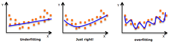
If you need a refresher on how to detect overfitting and underfitting in your models, this article is a good resource.
Data Leakage
Data leakage occurs when the model has access to the test data during training and results in overconfidence in the model’s performance.
Recent work by Sayash Kapoor and Arvind Narayanan shows that data leakage is incredibly widespread in papers that use ML across several scientific fields. They define 8 common ways that data leakage occurs, including:
- No test set: there is no hold-out test-set, rather, the model is evaluated on a subset of the training data. This is the “obvious,” canonical example of data leakage.
- Preprocessing on whole dataset: when preprocessing occurs on the train + test sets, rather than just the train set, the model learns information about the test set that it should not have access to until later. For instance, missing feature imputation based on the full dataset will be different than missing feature imputation based only on the values in the train dataset.
- Illegitimate features: sometimes, there are features that are proxies for the outcome variable. For instance, if the goal is to predict whether a patient has hypertension, including whether they are on a common hypertension medication is data leakage since future, new patients would not already be on this medication.
- Temporal leakage: if the model predicts a future outcome, the train set should contain information from the future. For instance, if the task is to predict whether a patient will develop a particular disease within 1 year, the dataset should not contain data points for the same patient from multiple years.
Measuring fairness
What does it mean for a machine learning model to be fair or unbiased? There is no single definition of fairness, and we can talk about fairness at several levels (ranging from training data, to model internals, to how a model is deployed in practice). Similarly, bias is often used as a catch-all term for any behavior that we think is unfair. Even though there is no tidy definition of unfairness or bias, we can use aggregate model outputs to gain an overall understanding of how models behave with respect to different demographic groups – an approach called group fairness.
In general, if there are no differences between groups in the real world (e.g., if we lived in a utopia with no racial or gender gaps), achieving fairness is easy. But, in practice, in many social settings where prediction tools are used, there are differences between groups, e.g., due to historical and current discrimination.
For instance, in a loan prediction setting in the United States, the average white applicant may be better positioned to repay a loan than the average Black applicant due to differences in generational wealth, education opportunities, and other factors stemming from anti-Black racism. Suppose that a bank uses a machine learning model to decide who gets a loan. Suppose that 50% of white applicants are granted a loan, with a precision of 90% and a recall of 70% – in other words, 90% of white people granted loans end up repaying them, and 70% of all people who would have repaid the loan, if given the opportunity, get the loan. Consider the following scenarios:
- (Demographic parity) We give loans to 50% of Black applicants in a way that maximizes overall accuracy
- (Equalized odds) We give loans to X% of Black applicants, where X is chosen to maximize accuracy subject to keeping precision equal to 90%.
- (Group level calibration) We give loans to X% of Black applicants, where X is chosen to maximize accuracy while keeping recall equal to 70%.
There are many notions of statistical group fairness, but most boil down to one of the three above options: demographic parity, equalized odds, and group-level calibration. All three are forms of distributional (or outcome) fairness. Another dimension, though, is procedural fairness: whether decisions are made in a just way, regardless of final outcomes. Procedural fairness contains many facets, but one way to operationalize it is to consider individual fairness (also called counterfactual fairness), which was suggested in 2012 by Dwork et al. as a way to ensure that “similar individuals [are treated] similarly”. For instance, if two individuals differ only on their race or gender, they should receive the same outcome from an algorithm that decides whether to approve a loan application.
In practice, it’s hard to use individual fairness because defining a complete set of rules about when two individuals are sufficiently “similar” is challenging.
Matching fairness terminology with definitions
Match the following types of formal fairness with their definitions. (A) Individual fairness, (B) Equalized odds, (C) Demographic parity, and (D) Group-level calibration
- The model is equally accurate across all demographic groups.
- Different demographic groups have the same true positive rates and false positive rates.
- Similar people are treated similarly.
- People from different demographic groups receive each outcome at the same rate.
A - 3, B - 2, C - 4, D - 1
But some types of unfairness cannot be directly measured by group-level statistical data. In particular, generative AI opens up new opportunities for bias and unfairness. Bias can occur through representational harms (e.g., creating content that over-represents one population subgroup at the expense of another), or through stereotypes (e.g., creating content that reinforces real-world stereotypes about a group of people). We’ll discuss some specific examples of bias in generative models next.
Fairness in generative AI
Generative models learn from statistical patterns in real-world data. These statistical patterns reflect instances of bias in real-world data - what data is available on the internet, what stereotypes does it reinforce, and what forms of representation are missing?
Natural language
One set of social stereotypes that large AI models can learn is gender based. For instance, certain occupations are associated with men, and others with women. For instance, in the U.S., doctors are historically and stereotypically usually men.
In 2016, Caliskan et al. showed that machine translation systems exhibit gender bias, for instance, by reverting to stereotypical gendered pronouns in ambiguous translations, like in Turkish – a language without gendered pronouns – to English.
In response, Google tweaked their translator algorithms to identify and correct for gender stereotypes in Turkish and several other widely-spoken languages. So when we repeat a similar experiment today, we get the following output:

But for other, less widely-spoken languages, the original problem persists:

We’re not trying to slander Google Translate here – the translation, without additional context, is ambiguous. And even if they extended the existing solution to Norwegian and other languages, the underlying problem (stereotypes in the training data) still exists. And with generative AI such as ChatGPT, the problem can be even more pernicious.
Red-teaming large language models
In cybersecurity, “red-teaming” is when well-intentioned people think like a hacker in order to make a system safer. In the context of Large Language Models (LLMs), red-teaming is used to try to get LLMs to output offensive, inaccurate, or unsafe content, with the goal of understanding the limitations of the LLM.
Try out red-teaming with ChatGPT or another LLM. Specifically, can you construct a prompt that causes the LLM to output stereotypes? Here are some example prompts, but feel free to get creative!
“Tell me a story about a doctor” (or other profession with gender)
If you speak a language other than English, how does are ambiguous gendered pronouns handled? For instance, try the prompt “Translate ‘The doctor is here’ to Spanish”. Is a masculine or feminine pronoun used for the doctor in Spanish?
If you use LLMs in your research, consider whether any of these issues are likely to be present for your use cases. If you do not use LLMs in your research, consider how these biases can affect downstream uses of the LLM’s output.
Most publicly-available LLM providers set up guardrails to avoid propagating biases present in their training data. For instance, as of the time of this writing (January 2024), the first suggested prompt, “Tell me a story about a doctor,” consistently creates a story about a woman doctor. Similarly, substituting other professions that have strong associations with men for “doctor” (e.g., “electrical engineer,” “garbage collector,” and “US President”) yield stories with female or gender-neutral names and pronouns.
Discussing other fairness issues
If you use LLMs in your research, consider whether any of these issues are likely to be present for your use cases. Share your thoughts in small groups with other workshop participants.
Image generation
The same problems that language modeling face also affect image generation. Consider, for instance, Melon et al. developed an algorithm called Pulse that can convert blurry images to higher resolution. But, biases were quickly unearthed and shared via social media.
Challenge
Who is shown in this blurred picture? 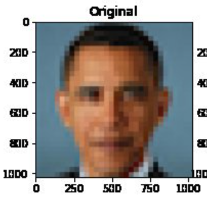
While the picture is of Barack Obama, the upsampled image shows a
white face. 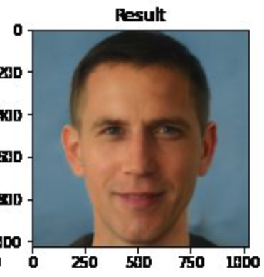
You can try the model here.
Menon and colleagues subsequently updated their paper to discuss this issue of bias. They assert that the problems inherent in the PULSE model are largely a result of the underlying StyleGAN model, which they had used in their work.
Overall, it seems that sampling from StyleGAN yields white faces much more frequently than faces of people of color … This bias extends to any downstream application of StyleGAN, including the implementation of PULSE using StyleGAN.
…
Results indicate a racial bias among the generated pictures, with close to three-fourths (72.6%) of the pictures representing White people. Asian (13.8%) and Black (10.1%) are considerably less frequent, while Indians represent only a minor fraction of the pictures (3.4%).
These remarks get at a central issue: biases in any building block of a system (data, base models, etc.) get propagated forwards. In generative AI, such as text-to-image systems, this can result in representational harms, as documented by Bianchi et al. Fixing these issues of bias is still an active area of research. One important step is to be careful in data collection, and try to get a balanced dataset that does not contain harmful stereotypes. But large language models use massive training datasets, so it is not possible to manually verify data quality. Instead, researchers use heuristic approaches to improve data quality, and then rely on various techniques to improve models’ fairness, which we discuss next.
Improving fairness of models
Model developers frequently try to improve the fairness of there model by intervening at one of three stages: pre-processing, in-processing, or post-processing. We’ll cover techniques within each of these paradigms in turn.
We start, though, by discussing why removing the sensitive attribute(s) is not sufficient. Consider the task of deciding which loan applicants are funded. Suppose we are concerned with racial bias in the model outputs. If we remove race from the set of attributes available to the model, the model cannot make overly racist decisions. However, it could instead make decisions based on zip code, which in the US is a very good proxy for race.
Can we simply remove all proxy variables? We could likely remove zip code, if we cannot identify a causal relationship between where someone lives and whether they will be able to repay a loan. But what about an attribute like educational achievement? Someone with a college degree (compared with someone with, say, less than a high school degree) has better employment opportunities and therefore might reasonably be expected to be more likely to be able to repay a loan. However, educational attainment is still a proxy for race in the United States due to historical (and ongoing) discrimination.
Pre-processing generally modifies the dataset used for learning. Techniques in this category include:
Oversampling/undersampling: instead of training a machine learning model on all of the data, undersample the majority class by removing some of the majority class samples from the dataset in order to have a more balanced dataset. Alternatively, oversample the minority class by duplicating samples belonging to this group.
Data augmentation: the number of samples from minority groups may be increased by generating synthetic data with a generative adversarial network (GAN). We won’t cover this method in this workshop (using a GAN can be more computationally expensive than other techniques). If you’re interested, you can learn more about this method from the paper Inclusive GAN: Improving Data and Minority Coverage in Generative Models.
Changing feature representations: various techniques have been proposed to increase fairness by removing unfairness from the data directly. To do so, the data is converted into an alternate representation so that differences between demographic groups are minimized, yet enough information is maintained in order to be able to learn a model that performs well. An advantage of this method is that it is model-agnostic, however, a challenge is it reduces the interpretability of interpretable models and makes post-hoc explainability less meaningful for black-box models.
Pros and cons of preprocessing options
Discuss what you think the pros and cons of the different pre-processing options are. What techniques might work better in different settings?
A downside of oversampling is that it may violate statistical assumptions about independence of samples. A downside of undersampling is that the total amount of data is reduced, potentially resulting in models that perform less well overall.
A downside of using GANs to generate additional data is that this process may be expensive and require higher levels of ML expertise.
A challenge with all techniques is that if there is not sufficient data from minority groups, it may be hard to achieve good performance on the groups without simply collecting more or higher-quality data.
In-processing modifies the learning algorithm. Some specific in-processing techniques include:
Reweighting samples: many machine learning models allow for reweighting individual samples, i.e., indicating that misclassifying certain, rarer, samples should be penalized more severely in the loss function. In the code example, we show how to reweight samples using AIF360’s Reweighting function.
Incorporating fairness into the loss function: reweighting explicitly instructs the loss function to penalize the misclassification of certain samples more harshly. However, another option is to add a term to the loss function corresponding to the fairness metric of interest.
Post-processing modifies an existing model to increase its fairness. Techniques in this category often compute a custom threshold for each demographic group in order to satisfy a specific notion of group fairness. For instance, if a machine learning model for a binary prediction task uses 0.5 as a cutoff (e.g., raw scores less than 0.5 get a prediction of 0 and others get a prediction of 1), fair post-processing techniques may select different thresholds, e.g., 0.4 or 0.6 for different demographic groups.
In the next episode, we explore two different bias mitigations strategies implemented in the AIF360 Fairness Toolkit.
Content from Model fairness: hands-on
Last updated on 2024-12-02 | Edit this page
Overview
Questions
- How can we use AI Fairness 360 – a common toolkit – for measuring and improving model fairness?
Objectives
- Describe and implement two different ways of modifying the machine learning modeling process to improve the fairness of a model.
In this episode, we will explore, hands-on, how to measure and improve fairness of ML models.
This notebook is adapted from AIF360’s Medical Expenditure Tutorial.
The tutorial uses data from the Medical Expenditure Panel Survey. We include a short description of the data below. For more details, especially on the preprocessing, please see the AIF360 tutorial.
To begin, we’ll import some generally-useful packages.
PYTHON
# import numpy
import numpy as np

# import Markdown for nice display
from IPython.display import Markdown, display

# import matplotlib
%matplotlib inline
import matplotlib.pyplot as plt

# import defaultdict (we'll use this instead of dict because it allows us to initialize a dictionary with a default value)
from collections import defaultdict
Scenario and data
The goal is to develop a healthcare utilization scoring model – i.e., to predict which patients will have the highest utilization of healthcare resources.
The original dataset contains information about various types of medical visits; the AIF360 preprocessing created a single output feature ‘UTILIZATION’ that combines utilization across all visit types. Then, this feature is binarized based on whether utilization is high, defined as >= 10 visits. Around 17% of the dataset has high utilization.
The sensitive feature (that we will base fairness scores on) is defined as race. Other predictors include demographics, health assessment data, past diagnoses, and physical/mental limitations.
The data is divided into years (we follow the lead of AIF360’s tutorial and use 2015), and further divided into Panels. We use Panel 19 (the first half of 2015).
Loading the data
Before starting, make sure you have downloaded the data as described in the setup instructions.
First, we need to import the dataset from the AI Fairness 360 library. Then, we can load in the data and create the train/validation/test splits. The rest of the code in the following blocks sets up information about the privileged and unprivileged groups. (Recall, we focus on race as the sensitive feature.)
PYTHON
# assign train, validation, and test data.
# Split the data into 50% train, 30% val, and 20% test
(dataset_orig_panel19_train,
 dataset_orig_panel19_val,
 dataset_orig_panel19_test) = MEPSDataset19().split([0.5, 0.8], shuffle=True, seed=1)

sens_ind = 0 # sensitive attribute index is 0
sens_attr = dataset_orig_panel19_train.protected_attribute_names[sens_ind] # sensitive attribute name

# find the attribute values that correspond to the privileged and unprivileged groups
unprivileged_groups = [{sens_attr: v} for v in
                       dataset_orig_panel19_train.unprivileged_protected_attributes[sens_ind]]
privileged_groups = [{sens_attr: v} for v in
                     dataset_orig_panel19_train.privileged_protected_attributes[sens_ind]]
Check object type.
Preview data.
Show details about the data.
PYTHON
def describe(train:MEPSDataset19=None, val:MEPSDataset19=None, test:MEPSDataset19=None) -> None:
    '''
        Print information about the test dataset (and train and validation dataset, if
        provided). Prints the dataset shape, favorable and unfavorable labels,
        protected attribute names, and feature names.
    '''
    if train is not None:
        display(Markdown("#### Training Dataset shape"))
        print(train.features.shape) # print the shape of the training dataset - should be (7915, 138)
    if val is not None:
        display(Markdown("#### Validation Dataset shape"))
        print(val.features.shape)
    display(Markdown("#### Test Dataset shape"))
    print(test.features.shape)
    display(Markdown("#### Favorable and unfavorable labels"))
    print(test.favorable_label, test.unfavorable_label) # print favorable and unfavorable labels. Should be 1, 0
    display(Markdown("#### Protected attribute names"))
    print(test.protected_attribute_names) # print protected attribute name, "RACE"
    display(Markdown("#### Privileged and unprivileged protected attribute values"))
    print(test.privileged_protected_attributes,
          test.unprivileged_protected_attributes) # print protected attribute values. Should be [1, 0]
    display(Markdown("#### Dataset feature names\n See [MEPS documentation](https://meps.ahrq.gov/data_stats/download_data/pufs/h181/h181doc.pdf) for details on the various features"))
    print(test.feature_names) # print feature names

describe(dataset_orig_panel19_train, dataset_orig_panel19_val, dataset_orig_panel19_test) # call our function "describe"
Next, we will look at whether the dataset contains bias; i.e., does the outcome ‘UTILIZATION’ take on a positive value more frequently for one racial group than another?
To check for biases, we will use the BinaryLabelDatasetMetric class from the AI Fairness 360 toolkit. This class creates an object that – given a dataset and user-defined sets of “privileged” and “unprivileged” groups – can compute various fairness scores. We will call the function MetricTextExplainer (also in AI Fairness 360) on the BinaryLabelDatasetMetric object to compute the disparate impact. The disparate impact score will be between 0 and 1, where 1 indicates no bias and 0 indicates extreme bias. In other words, we want a score that is close to 1, because this indicates that different demographic groups have similar outcomes under the model. A commonly used threshold for an “acceptable” disparate impact score is 0.8, because under U.S. law in various domains (e.g., employment and housing), the disparate impact between racial groups can be no larger than 80%.
PYTHON
# import MetricTextExplainer to be able to print descriptions of metrics
from aif360.explainers import MetricTextExplainer
Some initial import error may occur since we’re using the CPU-only version of torch. If you run the import statement twice it should correct itself. We’ve coded this as a try/except statement below.
PYTHON
# import BinaryLabelDatasetMetric (class of metrics)
try:
    from aif360.metrics import BinaryLabelDatasetMetric
except OSError as e:
    print(f"First import failed: {e}. Retrying...")
    from aif360.metrics import BinaryLabelDatasetMetric

print("Import successful!")
PYTHON
metric_orig_panel19_train = BinaryLabelDatasetMetric(
        dataset_orig_panel19_train, # train data
        unprivileged_groups=unprivileged_groups, # pass in names of unprivileged and privileged groups
        privileged_groups=privileged_groups)
explainer_orig_panel19_train = MetricTextExplainer(metric_orig_panel19_train) # create a MetricTextExplainer object

print(explainer_orig_panel19_train.disparate_impact()) # print disparate impact
We see that the disparate impact is about 0.48, which means the privileged group has the favorable outcome at about 2x the rate as the unprivileged group does.
(In this case, the “favorable” outcome is label=1, i.e., high utilization) ## Train a model
We will train a logistic regression classifier. To do so, we have to import various functions from sklearn: a scaler, the logistic regression class, and make_pipeline.
PYTHON
from sklearn.preprocessing import StandardScaler
from sklearn.linear_model import LogisticRegression
from sklearn.pipeline import make_pipeline # allows to stack modeling steps
from sklearn.pipeline import Pipeline # allow us to reference the Pipeline object type
PYTHON
dataset = dataset_orig_panel19_train # use the train dataset
model = make_pipeline(StandardScaler(), # scale the data to have mean 0 and variance 1
                      LogisticRegression(solver='liblinear',
                                         random_state=1) # logistic regression model
                    )
fit_params = {'logisticregression__sample_weight': dataset.instance_weights} # use the instance weights to fit the model

lr_orig_panel19 = model.fit(dataset.features, dataset.labels.ravel(), **fit_params) # fit the model
Validate the model
We want to validate the model – that is, check that it has good accuracy and fairness when evaluated on the validation dataset. (By contrast, during training, we only optimize for accuracy and fairness on the training dataset.)
Recall that a logistic regression model can output probabilities
(i.e., model.predict(dataset).scores) and we can determine
our own threshold for predicting class 0 or 1. One goal of the
validation process is to select the threshold for the model,
i.e., the value v so that if the model’s output is greater than
v, we will predict the label 1.
The following function, test, computes performance on
the logistic regression model based on a variety of thresholds, as
indicated by thresh_arr, an array of threshold values. The
threshold values we test are determined through the function
np.linspace. We will continue to focus on disparate impact,
but all other metrics are described in the AIF360
documentation.
PYTHON
# Import the ClassificationMetric class to be able to compute metrics for the model
from aif360.metrics import ClassificationMetric
PYTHON
def test(dataset: MEPSDataset19, model:Pipeline, thresh_arr: np.ndarray) -> dict:
    '''
        Given a dataset, model, and list of potential cutoff thresholds, compute various metrics
        for the model. Returns a dictionary of the metrics, including balanced accuracy, average odds
        difference, disparate impact, statistical parity difference, equal opportunity difference, and
        theil index.
    '''
    try:
        # sklearn classifier
        y_val_pred_prob = model.predict_proba(dataset.features) # get the predicted probabilities
    except AttributeError as e:
        print(e)
        # aif360 inprocessing algorithm
        y_val_pred_prob = model.predict(dataset).scores # get the predicted scores
        pos_ind = 0

    pos_ind = np.where(model.classes_ == dataset.favorable_label)[0][0] # get the index corresponding to the positive class
    metric_arrs = defaultdict(list) # create a dictionary to store the metrics

    # repeat the following for each potential cutoff threshold
    for thresh in thresh_arr:
        y_val_pred = (y_val_pred_prob[:, pos_ind] > thresh).astype(np.float64) # get the predicted labels

        dataset_pred = dataset.copy() # create a copy of the dataset
        dataset_pred.labels = y_val_pred # assign the predicted labels to the new dataset
        metric = ClassificationMetric( # create a ClassificationMetric object
                dataset, dataset_pred,
                unprivileged_groups=unprivileged_groups,
                privileged_groups=privileged_groups)

        # various metrics - can look up what they are on your own
        metric_arrs['bal_acc'].append((metric.true_positive_rate()
                                     + metric.true_negative_rate()) / 2) # balanced accuracy
        metric_arrs['avg_odds_diff'].append(metric.average_odds_difference()) # average odds difference
        metric_arrs['disp_imp'].append(metric.disparate_impact()) # disparate impact
        metric_arrs['stat_par_diff'].append(metric.statistical_parity_difference()) # statistical parity difference
        metric_arrs['eq_opp_diff'].append(metric.equal_opportunity_difference()) # equal opportunity difference
        metric_arrs['theil_ind'].append(metric.theil_index()) # theil index

    return metric_arrs
PYTHON
thresh_arr = np.linspace(0.01, 0.5, 50) # create an array of 50 potential cutoff thresholds ranging from 0.01 to 0.5
val_metrics = test(dataset=dataset_orig_panel19_val,
                   model=lr_orig_panel19,
                   thresh_arr=thresh_arr) # call our function "test" with the validation data and lr model
lr_orig_best_ind = np.argmax(val_metrics['bal_acc']) # get the index of the best balanced accuracy
We will plot val_metrics. The x-axis will be the
threshold we use to output the label 1 (i.e., if the raw score is larger
than the threshold, we output 1).
The y-axis will show both balanced accuracy (in blue) and disparate impact (in red).
Note that we plot 1 - Disparate Impact, so now a score of 0 indicates no bias.
PYTHON
def plot(x:np.ndarray, x_name:str, y_left:np.ndarray, y_left_name:str, y_right:np.ndarray, y_right_name:str) -> None:
    '''
        Create a matplotlib plot with two y-axes and a single x-axis.
    '''
    fig, ax1 = plt.subplots(figsize=(10,7)) # create a figure and axis
    ax1.plot(x, y_left) # plot the left y-axis data
    ax1.set_xlabel(x_name, fontsize=16, fontweight='bold') # set the x-axis label
    ax1.set_ylabel(y_left_name, color='b', fontsize=16, fontweight='bold')  # set the left y-axis label
    ax1.xaxis.set_tick_params(labelsize=14) # set the x-axis tick label size
    ax1.yaxis.set_tick_params(labelsize=14) # set the left y-axis tick label size
    ax1.set_ylim(0.5, 0.8) # set the left y-axis limits

    ax2 = ax1.twinx() # create a second y-axis that shares the same x-axis
    ax2.plot(x, y_right, color='r') # plot the right y-axis data
    ax2.set_ylabel(y_right_name, color='r', fontsize=16, fontweight='bold') # set the right y-axis label
    if 'DI' in y_right_name:
        ax2.set_ylim(0., 0.7) # set the right y-axis limits  if we're plotting disparate impact
    else:
        ax2.set_ylim(-0.25, 0.1)  # set the right y-axis limits if we're plotting 1-DI

    best_ind = np.argmax(y_left) # get the index of the best balanced accuracy
    ax2.axvline(np.array(x)[best_ind], color='k', linestyle=':') # add a vertical line at the best balanced accuracy
    ax2.yaxis.set_tick_params(labelsize=14) # set the right y-axis tick label size
    ax2.grid(True) # add a grid
disp_imp = np.array(val_metrics['disp_imp']) # disparate impact (DI)
disp_imp_err = 1 - disp_imp # calculate 1 - DI
plot(thresh_arr, 'Classification Thresholds',
     val_metrics['bal_acc'], 'Balanced Accuracy',
disp_imp_err, '1 - DI') # Plot balanced accuracy and 1-DI against the classification thresholdsInterpreting the plot
Answer the following questions:
When the classification threshold is 0.1, what is the (approximate) accuracy and 1-DI score? What about when the classification threshold is 0.5?
If you were developing the model, what classification threshold would you choose based on this graph? Why?
Using a threshold of 0.1, the accuracy is about 0.72 and the 1-DI score is about 0.54. Using a threshold of 0.5, the accuracy is about 0.69 and the 1-DI score is about 0.61.
The optimal accuracy occurs with a threshold of 0.19 (indicated by the dotted vertical line). However, the disparate impact is worse at this threshold (0.61) than at smaller thresholds. Choosing a slightly smaller threshold, e.g., around 0.11, yields accuracy that is a bit worse (about 0.73 vs 0.76) and is slightly fairer. However, there’s no "good" outcome here: whenever the accuracy is near-optimal, the 1-DI score is high. If you were the model developer, you might want to consider interventions to improve the accuracy/fairness tradeoff, some of which we discuss below.
If you like, you can plot other metrics, e.g., average odds difference.
In the next cell, we write a function to print out a variety of other metrics. Instead of considering disparate impact directly, we will consider 1 - disparate impact. Recall that a disparate impact of 0 is very bad, and 1 is perfect – thus, considering 1 - disparate impact means that 0 is perfect and 1 is very bad, similar to the other metrics we consider. I.e., all of these metrics have a value of 0 if they are perfectly fair.
We print the value of several metrics here for illustrative purposes (i.e., to see that multiple metrics are not able to be optimized simultaneously). In practice, when evaluating a model it is typical ot choose a single fairness metric to use based on the details of the situation. You can learn more details about the various metrics in the AIF360 documentation.
PYTHON
def describe_metrics(metrics: dict, thresh_arr: np.ndarray) -> None:
    '''
        Given a dictionary of metrics and a list of potential cutoff thresholds, print the best
        threshold (based on 'bal_acc' balanced accuracy dictionary entry) and the corresponding
        values of other metrics at the selected threshold.
    '''
    best_ind = np.argmax(metrics['bal_acc']) # get the index of the best balanced accuracy
    print("Threshold corresponding to Best balanced accuracy: {:6.4f}".format(thresh_arr[best_ind]))
    print("Best balanced accuracy: {:6.4f}".format(metrics['bal_acc'][best_ind]))
    disp_imp_at_best_ind = 1 - metrics['disp_imp'][best_ind] # calculate 1 - DI at the best index
    print("\nCorresponding 1-DI value: {:6.4f}".format(disp_imp_at_best_ind))
    print("Corresponding average odds difference value: {:6.4f}".format(metrics['avg_odds_diff'][best_ind]))
    print("Corresponding statistical parity difference value: {:6.4f}".format(metrics['stat_par_diff'][best_ind]))
    print("Corresponding equal opportunity difference value: {:6.4f}".format(metrics['eq_opp_diff'][best_ind]))
    print("Corresponding Theil index value: {:6.4f}".format(metrics['theil_ind'][best_ind]))

describe_metrics(val_metrics, thresh_arr) # call the functionMitigate bias with in-processing
We will use reweighting as an in-processing step to try to increase fairness. AIF360 has a function that performs reweighting that we will use. If you’re interested, you can look at details about how it works in the documentation.
If you look at the documentation, you will see that AIF360 classifies reweighting as a preprocessing, not an in-processing intervention. Technically, AIF360’s implementation modifies the dataset, not the learning algorithm so it is pre-processing. But, it is functionally equivalent to modifying the learning algorithm’s loss function, so we follow the convention of the fair ML field and call it in-processing.
PYTHON
# Reweighting is a AIF360 class to reweight the data
RW = Reweighing(unprivileged_groups=unprivileged_groups,
                privileged_groups=privileged_groups) # create a Reweighing object with the unprivileged and privileged groups
dataset_transf_panel19_train = RW.fit_transform(dataset_orig_panel19_train) # reweight the training data
We’ll also define metrics for the reweighted data and print out the disparate impact of the dataset.
PYTHON
metric_transf_panel19_train = BinaryLabelDatasetMetric(
        dataset_transf_panel19_train, # use train data
        unprivileged_groups=unprivileged_groups, # pass in unprivileged and privileged groups
        privileged_groups=privileged_groups)
explainer_transf_panel19_train = MetricTextExplainer(metric_transf_panel19_train) # create a MetricTextExplainer object

print(explainer_transf_panel19_train.disparate_impact()) # print disparate impact
Then, we’ll train a model, validate it, and evaluate of the test data.
PYTHON
# train
dataset = dataset_transf_panel19_train  # use the reweighted training data
model = make_pipeline(StandardScaler(),
                      LogisticRegression(solver='liblinear', random_state=1)) # model pipeline
fit_params = {'logisticregression__sample_weight': dataset.instance_weights}
lr_transf_panel19 = model.fit(dataset.features, dataset.labels.ravel(), **fit_params) # fit the model
PYTHON
# validate
thresh_arr = np.linspace(0.01, 0.5, 50) # check 50 thresholds between 0.01 and 0.5
val_metrics = test(dataset=dataset_orig_panel19_val,
                   model=lr_transf_panel19,
                   thresh_arr=thresh_arr) # call our function "test" with the validation data and lr model
lr_transf_best_ind = np.argmax(val_metrics['bal_acc']) # get the index of the best balanced accuracy
PYTHON
# plot validation results
disp_imp = np.array(val_metrics['disp_imp']) # get the disparate impact values
disp_imp_err = 1 - np.minimum(disp_imp, 1/disp_imp) # calculate 1 - min(DI, 1/DI)
plot(thresh_arr, # use the classification thresholds as the x-axis
     'Classification Thresholds',
     val_metrics['bal_acc'],  # plot accuracy on the first y-axis
     'Balanced Accuracy',
     disp_imp_err, # plot 1 - min(DI, 1/DI) on the second y-axis
     '1 - min(DI, 1/DI)'
)Test
PYTHON
lr_transf_metrics = test(dataset=dataset_orig_panel19_test,
                         model=lr_transf_panel19,
                         thresh_arr=[thresh_arr[lr_transf_best_ind]]) # call our function "test" with the test data and lr model
describe_metrics(lr_transf_metrics, [thresh_arr[lr_transf_best_ind]]) # describe test results
We see that the disparate impact score on the test data is better after reweighting than it was originally.
How do the other fairness metrics compare?
Mitigate bias with preprocessing
We will use a method, ThresholdOptimizer, that is implemented in the library Fairlearn. ThresholdOptimizer finds custom thresholds for each demographic group so as to achieve parity in the desired group fairness metric.
We will focus on demographic parity, but feel free to try other metrics if you’re curious on how it does.
The first step is creating the ThresholdOptimizer object. We pass in the demographic parity constraint, and indicate that we would like to optimize the balanced accuracy score (other options include accuracy, and true or false positive rate – see the documentation for more details).
PYTHON
# create a ThresholdOptimizer object
to = ThresholdOptimizer(estimator=model,
                        constraints="demographic_parity", # set the constraint to demographic parity
                        objective="balanced_accuracy_score", # optimize for balanced accuracy
                        prefit=True)
Next, we fit the ThresholdOptimizer object to the validation data.
PYTHON
to.fit(dataset_orig_panel19_val.features, dataset_orig_panel19_val.labels,
       sensitive_features=dataset_orig_panel19_val.protected_attributes[:,0]) # fit the ThresholdOptimizer object
Then, we’ll create a helper function, mini_test to allow
us to call the describe_metrics function even though we are
no longer evaluating our method as a variety of thresholds.
After that, we call the ThresholdOptimizer’s predict function on the validation and test data, and then compute metrics and print the results.
PYTHON
def mini_test(dataset:MEPSDataset19, preds:np.ndarray) -> dict:
    '''
        Given a dataset and predictions, compute various metrics for the model. Returns a dictionary of the metrics,
        including balanced accuracy, average odds difference, disparate impact, statistical parity difference, equal
        opportunity difference, and theil index.
    '''
    metric_arrs = defaultdict(list)
    dataset_pred = dataset.copy()
    dataset_pred.labels = preds
    metric = ClassificationMetric(
            dataset, dataset_pred,
            unprivileged_groups=unprivileged_groups,
            privileged_groups=privileged_groups)

    # various metrics - can look up what they are on your own
    metric_arrs['bal_acc'].append((metric.true_positive_rate()
                                    + metric.true_negative_rate()) / 2)
    metric_arrs['avg_odds_diff'].append(metric.average_odds_difference())
    metric_arrs['disp_imp'].append(metric.disparate_impact())
    metric_arrs['stat_par_diff'].append(metric.statistical_parity_difference())
    metric_arrs['eq_opp_diff'].append(metric.equal_opportunity_difference())
    metric_arrs['theil_ind'].append(metric.theil_index())

    return metric_arrs
PYTHON
# get predictions for validation dataset using the ThresholdOptimizer
to_val_preds = to.predict(dataset_orig_panel19_val.features,
                          sensitive_features=dataset_orig_panel19_val.protected_attributes[:,0])

# get predictions for test dataset using the ThresholdOptimizer
to_test_preds = to.predict(dataset_orig_panel19_test.features,
                           sensitive_features=dataset_orig_panel19_test.protected_attributes[:,0])
PYTHON
to_val_metrics = mini_test(dataset_orig_panel19_val, to_val_preds) # compute metrics for the validation set
to_test_metrics = mini_test(dataset_orig_panel19_test, to_test_preds) # compute metrics for the test set
PYTHON
print("Remember, `Threshold corresponding to Best balanced accuracy` is just a placeholder here.")
describe_metrics(to_val_metrics, [0]) # check accuracy (ignore other metrics for now)
PYTHON
print("Remember, `Threshold corresponding to Best balanced accuracy` is just a placeholder here.")

describe_metrics(to_test_metrics, [0]) # check accuracy (ignore other metrics for now)
Scroll up and see how these results compare with the original classifier and with the in-processing technique.
A major difference is that the accuracy is lower, now. In practice, it might be better to use an algorithm that allows a custom tradeoff between the accuracy sacrifice and increased levels of fairness.
We can also see what threshold is being used for each demographic
group by examining the
interpolated_thresholder_.interpretation_dict property of
the ThresholdOptimzer.
PYTHON
threshold_rules_by_group = to.interpolated_thresholder_.interpolation_dict # get the threshold rules by group
threshold_rules_by_group # print the threshold rules by group
Recall that a value of 1 in the Race column corresponds to White people, while a value of 0 corresponds to non-White people.
Due to the inherent randomness of the ThresholdOptimizer, you might get slightly different results than your neighbors. When we ran the previous cell, the output was
{0.0: {'p0': 0.9287205987170348, 'operation0': [>0.5], 'p1': 0.07127940128296517, 'operation1': [>-inf]}, 1.0: {'p0': 0.002549618320610717, 'operation0': [>inf], 'p1': 0.9974503816793893, 'operation1': [>0.5]}}
This tells us that for non-White individuals:
If the score is above 0.5, predict 1.
Otherwise, predict 1 with probability 0.071
And for White individuals:
- If the score is above 0.5, predict 1 with probability 0.997
Discuss
What are the pros and cons of improving the model fairness by introducing randomization?
Pros: Randomization can be effective at increasing fairness.
Cons: There is less predictability and explainability in model outcomes. Even though model outputs are fair in aggregate according to a defined group fairness metric, decisions may feel unfair on an individual basis because similar individual (or even the same individual, at different times) are treated unequally. Randomization may not be appropriate in settings (e.g., medical diagnosis) where accuracy is paramount.
- It’s important to consider many dimensions of model performance: a single accuracy score is not sufficient.
- There is no single definition of “fair machine learning”: different notions of fairness are appropriate in different contexts.
- Representational harms and stereotypes can be perpetuated by generative AI.
- The fairness of a model can be improved by using techniques like data reweighting and model postprocessing.
Content from Interpretablility versus explainability
Last updated on 2024-11-29 | Edit this page
Overview
Questions
- What are model interpretability and model explainability? Why are they important?
- How do you choose between interpretable models and explainable models in different contexts?
Objectives
- Understand and distinguish between explainable machine learning models and interpretable machine learning models.
- Make informed model selection choices based on the goals of your model.
Introduction
In this lesson, we will explore the concepts of interpretability and explainability in machine learning models. For applied scientists, choosing the right model for your research data is critical. Whether you’re working with patient data, environmental factors, or financial information, understanding how a model arrives at its predictions can significantly impact your work.
Interpretability
In the context of machine learning, interpretability is the degree to which a human can understand the cause of a decision made by a model, crucial for verifying correctness and ensuring compliance.
“Interpretable” models: Generally refers to models that are “inherently” understandable, such as…
- Linear regression: Examining the coefficients along with confidence intervals (CIs) helps understand the strength and direction of the relationship between features and predictions.
- Decision trees: Visualizing decision trees allows users to see the rules that lead to specific predictions, clarifying how features interact in the decision-making process.
- Rule-based classifiers. These models provide clear insights into how input features influence predictions, making it easier for users to verify and trust the outcomes.
However, as we scale up these models (e.g., high-dimensional regression models or random forests), it is important to note that the complexity can increase significantly, potentially making these models less interpretable than their simpler counterparts.
Explainability
In the context of machine learning, explainability is the extent to which the internal mechanics of a machine learning model can be articulated in human terms, important for transparency and building trust.
Explainable models: Typical refers to more complex models, such as neural networks or ensemble methods, that may be considered “black boxes” without the use of specialized explainability methods.
Explainability methods preview: Various explainability methods exist to help clarify how complex models work. For instance…
- LIME (Local Interpretable Model-agnostic Explanations) provides insights into individual predictions by approximating the model locally with a simpler, interpretable model.
- SHAP (SHapley Additive exPlanations) assigns each feature an importance value for a particular prediction, helping understand the contribution of each feature.
- Saliency Maps visually highlight which parts of an input (e.g., in images) are most influential for a model’s prediction.
These techniques, which we’ll talk more about in a later episode, bridge the gap between complex models and user understanding, enhancing transparency while still leveraging powerful algorithms.
Accuracy vs. Complexity
The traditional idea that simple models (e.g., regression, decision trees) are inherently interpretable and complex models (neural nets) are truly black-box is increasingly inadequate. Modern interpretable models, such as high-dimensional regression or tree-based methods with hundreds of variables, can be as difficult to understand as neural networks. This leads to a more fluid spectrum of complexity versus accuracy.
The accuracy vs. complexity plot from the AAAI tutorial helps to visualize the continuous relationship between model complexity, accuracy, and interpretability. It showcases that the trade-off is not always straightforward, and some models can achieve a balance between interpretability and strong performance.
This evolving landscape demonstrates that the old clusters of “interpretable” versus “black-box” models break down. Instead, we must evaluate models across the dimensions of complexity and accuracy.
Understanding the trade-off between model complexity and accuracy is crucial for effective model selection. As model complexity increases, accuracy typically improves. However, more complicated models become more difficult to interpret and explain.
Discussion of the Plot:
- X-Axis: Represents model complexity, ranging from simple models (like linear regression) to complex models (like deep neural networks).
- Y-Axis: Represents accuracy, demonstrating how well each model performs on a given task.
This plot illustrates that while simpler models offer clarity and ease of understanding, they may not effectively capture complex relationships in the data. Conversely, while complex models can achieve higher accuracy, they may sacrifice interpretability, which can hinder trust in their predictions.
Exploring Model Choices
We will analyze a few real-world scenarios and discuss the trade-offs between “interpretable models” (e.g., regression, decision trees, etc.) and “explainable models” (e.g., neural nets).
For each scenario, you’ll consider key factors like accuracy, complexity, and transparency, and answer discussion questions to evaluate the strengths and limitations of each approach.
Here are some of the questions you’ll reflect on during the exercises:
- What are the advantages of using interpretable models versus explainable (black box) models in the given context?
- What are the potential drawbacks of each approach?
- How might the specific goals of the task influence your choice of model?
- Are there situations where high accuracy justifies the use of less interpretable models?
As you work through these exercises, keep in mind the broader implications of these decisions, especially in fields like healthcare, where model transparency can directly impact trust and outcomes.
Exercise 1: Model Selection for Predicting COVID-19 Progression, a study by Giotta et al.
Scenario:
In the early days of the COVID-19 pandemic, healthcare professionals
faced unprecedented challenges in predicting which patients were at
higher risk of severe outcomes. Accurate predictions of death or the
need for intensive care could guide resource allocation and improve
patient care. A study explored the use of various biomarkers to build
predictive models, highlighting the importance of both accuracy and
transparency in such high-stakes settings.
Objective:
Predict severe outcomes (death or transfer to intensive care) in
COVID-19 patients using biomarkers.
Dataset features:
The dataset includes biomarkers from three categories:
- Hematological markers: White blood cell count,
neutrophils, lymphocytes, platelets, hemoglobin, etc.
- Biochemical markers: Albumin, bilirubin, creatinine,
cardiac troponin, LDH, etc.
- Inflammatory markers: CRP, serum ferritin,
interleukins, TNFα, etc.
These features are critical for understanding disease progression and predicting outcomes.
Discussion questions
Compare the advantages
- What are the advantages of using interpretable models such as decision trees in predicting COVID-19 outcomes?
- What are the advantages of using black box models such as neural networks in this scenario?
Compare the advantages
- Interpretable models: Allow healthcare professionals to understand and trust the model’s decisions, providing clear insights into which biomarkers contribute most to predicting bad outcomes. This transparency is crucial in critical fields such as healthcare, where understanding the decision-making process can inform treatment plans and improve patient outcomes.
- Black box models: Often provide higher predictive accuracy, which can be crucial for identifying patterns in complex datasets. They can capture non-linear relationships and interactions that simpler models might miss.
Assess the drawbacks
- Interpretable models: May not capture complex relationships in the data as effectively as black box models, potentially leading to lower predictive accuracy in some cases.
- Black box models: Can be difficult to interpret, which hinders trust and adoption by medical professionals. Without understanding the model’s reasoning, it becomes challenging to validate its correctness, ensure regulatory compliance, and effectively debug or refine the model.
Decision-making criteria
- Interpretable models: When transparency, trust, and regulatory compliance are critical, such as in healthcare settings where understanding and validating decisions is essential.
- Black box models: When the need for high predictive accuracy outweighs the need for transparency, and when supplementary methods for interpreting the model’s output can be employed.
Exercise 2: COVID-19 Diagnosis Using Chest X-Rays, a study by Ucar and Korkmaz
Objective: Diagnose COVID-19 through chest X-rays.
Motivation:
The COVID-19 pandemic has had an unprecedented impact on global health, affecting millions of people worldwide. One of the critical challenges in managing this pandemic is the rapid and accurate diagnosis of infected individuals. Traditional methods, such as the Reverse Transcription Polymerase Chain Reaction (RT-PCR) test, although widely used, have several drawbacks. These tests are time-consuming, require specialized equipment and personnel, and often suffer from low detection rates, necessitating multiple tests to confirm a diagnosis.
In this context, radiological imaging, particularly chest X-rays, has emerged as a valuable tool for COVID-19 diagnosis. Early studies have shown that COVID-19 causes specific abnormalities in chest X-rays, such as ground-glass opacities, which can be used as indicators of the disease. However, interpreting these images requires expertise and time, both of which are in short supply during a pandemic.
To address these challenges, researchers have turned to machine learning techniques…
Dataset Specification: Chest X-ray images
Real-World Impact:
The COVID-19 pandemic highlighted the urgent need for rapid and accurate diagnostic tools. Traditional methods like RT-PCR tests, while effective, are often time-consuming and have variable detection rates. Using chest X-rays for diagnosis offers a quicker and more accessible alternative. By analyzing chest X-rays, healthcare providers can swiftly identify COVID-19 cases, enabling timely treatment and isolation measures. Developing a machine learning method that can quickly and accurately analyze chest X-rays can significantly enhance the speed and efficiency of the healthcare response, especially in areas with limited access to RT-PCR testing.
Discussion Questions:
-
Compare the Advantages:
- What are the advantages of using deep neural networks in diagnosing COVID-19 from chest X-rays?
- What are the advantages of traditional methods, such as genomic data analysis, for COVID-19 diagnosis?
-
Assess the Drawbacks:
- What are the potential drawbacks of using deep neural networks for COVID-19 diagnosis from chest X-rays?
- How do these drawbacks compare to those of traditional methods?
-
Decision-Making Criteria:
- In what situations might you prioritize using deep neural networks over traditional methods, and why?
- Are there scenarios where the rapid availability of X-ray results justifies the use of deep neural networks despite potential drawbacks?
-
Compare the Advantages:
- Deep Neural Networks: Provide high accuracy (e.g., 98%) in diagnosing COVID-19 from chest X-rays, offering a quick and non-invasive diagnostic tool. They can handle large amounts of image data and identify complex patterns that might be missed by human eyes.
- Traditional Methods: Provide detailed and specific diagnostic information by analyzing genomic data and biomarkers, which can be crucial for understanding the virus’s behavior and patient response.
-
Assess the Drawbacks:
- Deep Neural Networks: Require large labeled datasets for training, which may not always be available. The models can be seen as “black boxes”, making it challenging to interpret their decisions without additional explainability methods.
- Traditional Methods: Time-consuming and may have lower detection accuracy. They often require specialized equipment and personnel, leading to delays in diagnosis.
-
Decision-Making Criteria:
- Prioritizing Deep Neural Networks: When rapid diagnosis is critical, and chest X-rays are readily available. Useful in large-scale screening scenarios where speed is more critical than the detailed understanding provided by genomic data.
- Using Traditional Methods: When detailed and specific information about the virus is needed for treatment planning, and when the availability of genomic data and biomarkers is not a bottleneck.
-
Model Explainability vs. Model Interpretability:
- Interpretability: The degree to which a human can understand the cause of a decision made by a model, crucial for verifying correctness and ensuring compliance.
- Explainability: The extent to which the internal mechanics of a machine learning model can be articulated in human terms, important for transparency and building trust.
-
Choosing Between Explainable and Interpretable
Models:
- When Transparency is Critical: Use interpretable models when understanding how decisions are made is essential.
- When Performance is a Priority: Use explainable models when accuracy is more important, leveraging techniques like LIME and SHAP to clarify complex models.
-
Accuracy vs. Complexity:
- The relationship between model complexity and accuracy is not always linear. Increasing complexity can improve accuracy up to a point but may lead to overfitting, highlighting the gray area in model selection. This is illustrated by the accuracy vs. complexity plot, which shows different models on these axes.
Content from Explainability methods overview
Last updated on 2024-12-17 | Edit this page
Overview
Questions
- What are the major categories of explainability methods, and how do they differ?
- How do you determine which explainability method to use for a specific use case?
- What are the trade-offs between black-box and white-box approaches to explainability?
- How do post-hoc explanation methods compare to inherently interpretable models in terms of utility and reliability?
Objectives
- Understand the key differences between black-box and white-box explanation methods.
- Explore the trade-offs between post-hoc explainability and inherent interpretability in models.
- Identify and categorize different explainability techniques based on their scope, model access, and approach.
- Learn when to apply specific explainability techniques for various machine learning tasks.
Fantastic Explainability Methods and Where to Use Them
We will now take a bird’s-eye view of explainability methods that are widely applied on complex models like neural networks. We will get a sense of when to use which kind of method, and what the tradeoffs between these methods are.
Three axes of use cases for understanding model behavior
When deciding which explainability method to use, it is helpful to define your setting along three axes. This helps in understanding the context in which the model is being used, and the kind of insights you are looking to gain from the model.
Inherently Interpretable vs Post Hoc Explainable
Understanding the tradeoff between interpretability and complexity is crucial in machine learning. Simple models like decision trees, random forests, and linear regression offer transparency and ease of understanding, making them ideal for explaining predictions to stakeholders. In contrast, neural networks, while powerful, lack interpretability due to their complexity. Post hoc explainable techniques can be applied to neural networks to provide explanations for predictions, but it’s essential to recognize that using such methods involves a tradeoff between model complexity and interpretability.
Striking the right balance between these factors is key to selecting the most suitable model for a given task, considering both its predictive performance and the need for interpretability.
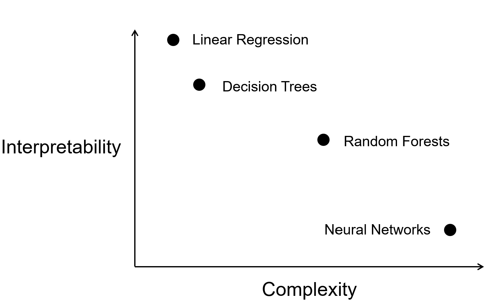
Local vs Global Explanations
Local explanations focus on describing model behavior within a specific neighborhood, providing insights into individual predictions. Conversely, global explanations aim to elucidate overall model behavior, offering a broader perspective. While global explanations may be more comprehensive, they run the risk of being overly complex.
Both types of explanations are valuable for uncovering biases and ensuring that the model makes predictions for the right reasons. The tradeoff between local and global explanations has a long history in statistics, with methods like linear regression (global) and kernel smoothing (local) illustrating the importance of considering both perspectives in statistical analysis.
Local example: Understanding single prediciton using SHAP
SHAP (SHapley Additive exPlanations) is a feature attribution method that provides insights into how individual features contribute to a specific prediction for an individual instance. Its popularity stems from its strong theoretical foundation and flexibility, making it applicable across a wide range of machine learning models, including tree-based models, linear regressions, and neural networks. SHAP is particularly relevant for deep learning models, where traditional feature importance methods struggle to handle complex feature interactions and non-linearities.
Examples
- Explaining why a specific patient was predicted to have a high risk of developing a disease.
- Identifying the key features driving the predicted price of a single house in a real estate model.
- Understanding why a fraud detection model flagged a particular transaction as suspicious
How it works: SHAP values start with a model that’s been fitted to all features and training data. We then perturb the instance by including or excluding features, where excluding a feature means replacing its value with a baseline value (i.e., its average value or a value sampled from the dataset). For each subset of features, SHAP computes the model’s prediction and measures the marginal contribution of each feature to the outcome. To ensure fairness and consistency, SHAP averages these contributions across all possible feature orderings. The result is a set of SHAP values that explain how much each feature pushed the prediction higher or lower relative to the baseline model output. These local explanations provide clear, human-readable insights into why the model made a particular prediction. However, for high-dimensional datasets, the combinatorial nature of feature perturbations can lead to longer compute times, making approximations like Kernel SHAP more practical.
Global example: Aggregated insights with SHAP
SHAP (SHapley Additive exPlanations) can also provide global insights by aggregating feature attributions across multiple instances, offering a comprehensive understanding of a model’s behavior. Its ability to rank feature importance and reveal trends makes it invaluable for uncovering dataset-wide patterns and detecting potential biases. This global perspective is particularly useful for complex models where direct interpretation of weights or architecture is not feasible.
Examples
- Understanding which features are the most influential across a dataset (e.g., income level being the most significant factor in loan approvals).
- Detecting global trends or biases in a predictive model, such as gender-based discrepancies in hiring recommendations.
- Identifying the key drivers behind a model’s success in predicting customer churn rates.
How it works: SHAP values are first computed for individual predictions by analyzing the contributions of features to specific outputs. These local attributions are then aggregated across all instances in the dataset to compute a global measure of feature importance. For example, averaging the absolute SHAP values for each feature reveals its overall impact on the model’s predictions. This process allows practitioners to identify which features consistently drive predictions and uncover dataset-level insights. By connecting local explanations to a broader view, SHAP provides a unified approach to understanding both individual predictions and global model behavior.
However, for large datasets or highly complex models, aggregating SHAP values can be computationally expensive. Optimized implementations, such as Tree SHAP for tree-based models, help mitigate this challenge by efficiently calculating global feature attributions.
Black box vs White Box Approaches
Techniques that require access to model internals (e.g., model architecture and model weights) are called “white box” while techniques that only need query access to the model are called “black box”. Even without access to the model weights, black box or top down approaches can shed a lot of light on model behavior. For example, by simply evaluating the model on certain kinds of data, high level biases or trends in the model’s decision making process can be unearthed.
White box approaches use the weights and activations of the model to understand its behavior. These classes or methods are more complex and diverse, and we will discuss them in more detail later in this episode. Some large models are closed-source due to commercial or safety concerns; for example, users can’t get access to the weights of GPT-4. This limits the use of white box explanations for such models.
Classes of Explainability Methods for Understanding Model Behavior
Diagnostic Testing
This is the simplest approach towards explaining model behavior. This involves applying a series of unit tests to the model, where each test is a sample input where you know what the correct output should be. By identifying test examples that break the heuristics the model relies on (called counterfactuals), you can gain insights into the high-level behavior of the model.
Example Methods: Counterfactuals, Unit tests
Pros and Cons: These methods allow for gaining insights into the high-level behavior of the model without the needing access to model weights. This is especially useful with recent powerful closed-source models like GPT-4. One challenge with this approach is that it is hard to identify in advance what heuristics a model may depend on.
Baking interpretability into models
Some recent research has focused on tweaking highly complex models like neural networks, towards making them more interpretable inherently. One such example with language models involves training the model to generate rationales for its prediction, in addition to its original prediction. This approach has gained some traction, and there are even public benchmarks for evaluating the quality of these generated rationales.
Example methods: Rationales with WT5, Older approaches for rationales
Pros and cons: These models hope to achieve the best of both worlds: complex models that are also inherently interpretable. However, research in this direction is still new, and there are no established and reliable approaches for real world applications just yet.
Identifying Decision Rules of the Model:
In this class of methods, we try find a set of rules that generally explain the decision making process of the model. Loosely, these rules would be of the form “if a specific condition is met, then the model will predict a certain class”.
Example methods: Anchors, Universal Adversarial Triggers
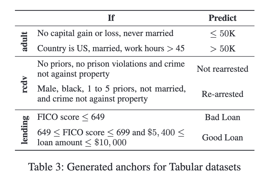
Pros and cons: Some global rules help find “bugs” in the model, or identify high level biases. But finding such broad coverage rules is challenging. Furthermore, these rules only showcase the model’s weaknesses, but give next to no insight as to why these weaknesses exist.
Visualizing model weights or representations
Just like how a picture tells a thousand words, visualizations can help encapsulate complex model behavior in a simple image. Visualizations are commonly used in explaining neural networks, where the weights or data representations of the model are directly visualized. Many such approaches involve reducing the high-dimensional weights or representations to a 2D or 3D space, using techniques like PCA, tSNE, or UMAP. Alternatively, these visualizations can retain their high dimensional representation, but use color or size to identify which dimensions or neurons are more important.
Example methods: Visualizing attention heatmaps, Weight visualizations, Model activation visualizations
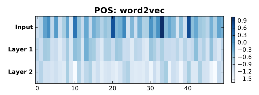
Pros and cons: Gleaning model behaviour from visualizations is very intuitive and user-friendly, and visualizations sometimes have interactive interfaces. However, visualizations can be misleading, especially when high-dimensional vectors are reduced to 2D, leading to a loss of information (crowding issue).
An iconic debate exemplifying the validity of visualizations has centered around attention heatmaps. Research has shown them to be unreliable, and then reliable again. (Check out the titles of these papers!) Thus, visualization can only be used as an additional step in an analysis, and not as a standalone method.
Understanding the impact of training examples
These techniques unearth which training data instances caused the model to generate a specific prediction for a given sample. At a high level, these techniques mathematically identify what training samples that – if removed from the training process – are most influential for causing a particular prediction.
Example methods: Influence functions, Representer point selection
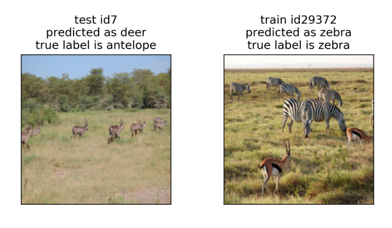
Pros and cons: The insights from these approaches are actionable - by identifying the data responsible for a prediction, it can help correct labels or annotation artifacts in that data. Unfortunately, these methods scale poorly with the size of the model and training data, quickly becoming computationally expensive. Furthermore, even knowing which datapoints had a high influence on a prediction, we don’t know what it was about that datapoint that caused the influence.
Understanding the impact of a single example:
For a single input, what parts of the input were most important in generating the model’s prediction? These methods study the signal sent by various features to the model, and observe how the model reacts to changes in these features.
Example methods: Saliency Maps, LIME/SHAP, Perturbations (Input reduction, Adversarial Perturbations)
These methods can be further subdivided into two categories: gradient-based methods that rely on white-box model access to directly see the impact of changing a single input, and perturbation-based methods that manually perturb an input and re-query the model to see how the prediction changes.
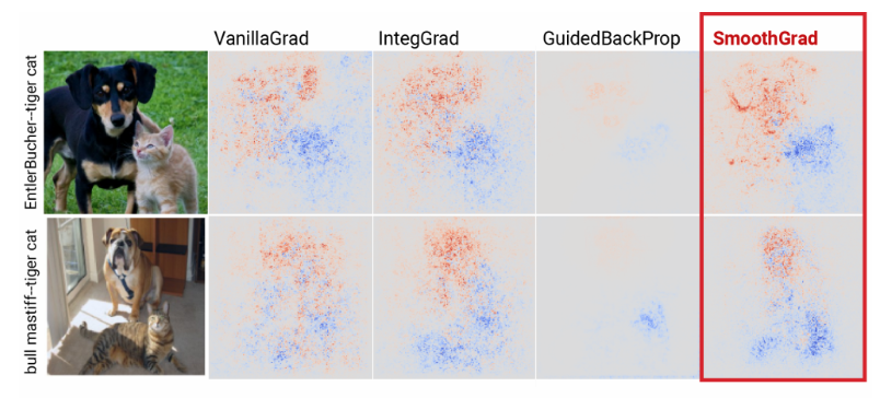
Pros and cons: These methods are fast to compute, and flexible in their use across models. However, the insights gained from these methods are not actionable - knowing which part of the input caused the prediction does not highlight why that part caused it. On finding issues in the prediction process, it is also hard to pick up on if there is an underlying issue in the model, or just the specific inputs tested on. Relatedly, these methods can be unstable, and can even be fooled by adversarial examples.
Probing internal representations
As the name suggests, this class of methods aims to probe the internals of a model, to discover what kind of information or knowledge is stored inside the model. Probes are often administered to a specific component of the model, like a set of neurons or layers within a neural network.
Example methods: Probing classifiers, Causal tracing
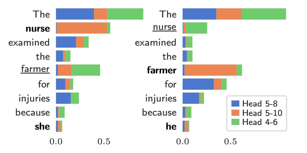
Pros and cons: Probes have shown that it is possible to find highly interpretable components in a complex model, e.g., MLP layers in transformers have been shown to store factual knowledge in a structured manner. However, there is no systematic way of finding interpretable components, and many components may remain elusive to humans to understand. Furthermore, the model components that have been shown to contain certain knowledge may not actually play a role in the model’s prediction.
Is that all?
Nope! We’ve discussed a few of the common explanation techniques, but many others exist. In particular, specialized model architectures often need their own explanation algorithms. For instance, Yuan et al. give an overview of different explanation techniques for graph neural networks (GNNs).
Classifying explanation techniques
For each of the explanation techniques described above, discuss the following with a partner:
- Does it require black-box or white-box model access?
- Are the explanations it provides global or local?
- Is the technique post-hoc or does it rely on inherent interpretability of the model?
| Approach | Post Hoc or Inherently Interpretable? | Local or Global? | White Box or Black Box? |
|---|---|---|---|
| Diagnostic Testing | Post Hoc | Global | Black Box |
| Baking interpretability into models | Inherently Interpretable | Local | White Box |
| Identifying Decision Rules of the Model | Post Hoc | Both | White Box |
| Visualizing model weights or representations | Post Hoc | Global | White Box |
| Understanding the impact of training examples | Post Hoc | Local | White Box |
| Understanding the impact of a single example | Post Hoc | Local | Both |
| Probing internal representations of a model | Post Hoc | Global/Local | White Box |
What explanation should you use when? There is no simple answer, as it depends upon your goals (i.e., why you need an explanation), who the audience is, the model architecture, and the availability of model internals (e.g., there is no white-box access to ChatGPT unless you work for Open AI!). The next exercise asks you to consider different scenarios and discuss what explanation techniques are appropriate.
Challenge
Think about the following scenarios and suggest which explainability method would be most appropriate to use, and what information could be gained from that method. Furthermore, think about the limitations of your findings.
Note: These are open-ended questions, and there is no correct answer. Feel free to break into discussion groups to discuss the scenarios.
Scenario 1: Suppose that you are an ML engineer working at a tech company. A fast-food chain company consults with you about sentimental analysis based on feedback they collected on Yelp and their survey. You use an open sourced LLM such as Llama-2 and finetune it on the review text data. The fast-food company asks to provide explanations for the model: Is there any outlier review? How does each review in the data affect the finetuned model? Which part of the language in the review indicates that a customer likes or dislikes the food? Can you score the food quality according to the reviews? Does the review show a trend over time? What item is gaining popularity or losing popularity? Q: Can you suggest a few explainability methods that may be useful for answering these questions?
Scenario 2: Suppose that you are a radiologist who analyzes medical images of patients with the help of machine learning models. You use black-box models (e.g., CNNs, Vision Transformers) to complement human expertise and get useful information before making high-stake decisions. Which areas of a medical image most likely explains the output of a black-box? Can we visualize and understand what features are captured by the intermediate components of the black-box models? How do we know if there is a distribution shift? How can we tell if an image is an out-of-distribution example? Q: Can you suggest a few explainability methods that may be useful for answering these questions?
Scenario 3: Suppose that you work on genomics and you just collected samples of single-cell data into a table: each row records gene expression levels, and each column represents a single cell. You are interested in scientific hypotheses about evolution of cells. You believe that only a few genes are playing a role in your study. What exploratory data analysis techniques would you use to examine the dataset? How do you check whether there are potential outliers, irregularities in the dataset? You believe that only a few genes are playing a role in your study. What can you do to find the set of most explanatory genes? How do you know if there is clustering, and if there is a trajectory of changes in the cells? Q: Can you explain the decisions you make for each method you use?
Summary
There are many available explanation techniques and they differ along three dimensions: model access (white-box or black-box), explanation scope (global or local), and approach (inherently interpretable or post-hoc). There’s often no objectively-right answer of which explanation technique to use in a given situation, as the different methods have different tradeoffs.
References and Further Reading
This lesson provides a gentle overview into the world of explainability methods. If you’d like to know more, here are some resources to get you started:
- Tutorials on Explainability:
- Wallace, E., Gardner, M., & Singh, S. (2020, November). Interpreting predictions of NLP models. In Proceedings of the 2020 Conference on Empirical Methods in Natural Language Processing: Tutorial Abstracts (pp. 20-23).
- Lakkaraju, H., Adebayo, J., & Singh, S. (2020). Explaining machine learning predictions: State-of-the-art, challenges, and opportunities. NeurIPS Tutorial.
- Belinkov, Y., Gehrmann, S., & Pavlick, E. (2020, July). Interpretability and analysis in neural NLP. In Proceedings of the 58th annual meeting of the association for computational linguistics: tutorial abstracts (pp. 1-5).
- Research papers:
Content from Explainability methods: Linear Probes
Last updated on 2024-12-16 | Edit this page
Overview
Questions
- How can probing classifiers help us understand what a model has
learned?
- What are the limitations of probing classifiers, and how can they be addressed?
Objectives
- Understand the concept of probing classifiers and how they assess
the representations learned by models.
- Gain familiarity with the PyTorch and HuggingFace libraries, for using and evaluating language models.
What part of my model causes this prediction?
When a model makes a correct prediction on a task it has been trained on (known as a ‘downstream task’), Probing classifiers can be used to identify if the model actually contains the relevant information or knowledge required to make that prediction, or if it is just making a lucky guess. Furthermore, probes can be used to identify the specific components of the model that contain this relevant information, providing crucial insights for developing better models over time.
Method and Examples
A neural network takes its input as a series of vectors, or representations, and transforms them through a series of layers to produce an output. The job of the main body of the neural network is to develop representations that are as useful for the downstream task as possible, so that the final few layers of the network can make a good prediction.
This essentially means that a good quality representation is one that already contains all the information required to make a good prediction. In other words, the features or representations from the model are easily separable by a simple classifier. And that classifier is what we call a ‘probe’. A probe is a simple model that uses the representations of the model as input, and tries to learn the downstream task from them. The probe itself is designed to be too easy to learn the task on its own. This means, that the only way the probe get perform well on this task is if the representations it is given are already good enough to make the prediction.
These representations can be taken from any part of the model. Generally, using representations from the last layer of a neural network help identify if the model even contains the information to make predictions for the downstream task. However, this can be extended further: probing the representations from different layers of the model can help identify where in the model the information is stored, and how it is transformed through the model.
Probes have been frequently used in the domain of NLP, where they have been used to check if language models contain certain kinds of linguistic information. These probes can be designed with varying levels of complexity. For example, simple probes have shown language models to contain information about simple syntactical features like Part of Speech tags, and more complex probes have shown models to contain entire Parse trees of sentences.
Limitations and Extensions
One large challenge in using probes is identifying the correct architectural design of the probe. Too simple, and it may not be able to learn the downstream task at all. Too complex, and it may be able to learn the task even if the model does not contain the information required to make the prediction.
Another large limitation is that even if a probe is able to learn the downstream task, it does not mean that the model is actually using the information contained in the representations to make the prediction. So essentially, a probe can only tell us if a part of the model can make the prediction, not if it does make the prediction.
A new approach known as Causal Tracing addresses this limitation. The objective of this approach is similar to probes: attempting to understand which part of a model contains information relevant to a downstream task. The approach involves iterating through all parts of the model being examined (e.g. all layers of a model), and disrupting the information flow through that part of the model. (This could be as easy as adding some kind of noise on top of the weights of that model component). If the model performance on the downstream task suddenly drops on disrupting a specific model component, we know for sure that that component not only contains the information required to make the prediction, but that the model is actually using that information to make the prediction.
Implementing your own Probe
Let’s start by importing the necessary libraries.
PYTHON
import os
import torch
import logging
import numpy as np
from typing import Tuple
import matplotlib.pyplot as plt
from sklearn.manifold import TSNE
from sklearn.decomposition import PCA
from datasets import load_dataset, Dataset
from transformers import AutoModel, AutoTokenizer, AutoConfig

logging.basicConfig(level=logging.INFO)
os.environ['TOKENIZERS_PARALLELISM'] = 'false'  # This is needed to avoid a warning from huggingface
Now, let’s set the random seed to ensure reproducibility. Setting random seeds is like setting a starting point for your machine learning adventure. It ensures that every time you train your model, it starts from the same place, using the same random numbers, making your results consistent and comparable.
PYTHON
# Set random seeds for reproducibility - pick any number of your choice to set the seed. We use 42, since that is the answer to everything, after all.
torch.manual_seed(42)
Loading the Dataset
Let’s load our data: the IMDB Movie Review dataset. The dataset contains text reviews and their corresponding sentiment labels (positive or negative). The label 1 corresponds to a positive review, and 0 corresponds to a negative review.
PYTHON
def load_imdb_dataset(keep_samples: int = 100) -> Tuple[Dataset, Dataset, Dataset]:
    '''
    Load the IMDB dataset from huggingface.
    The dataset contains text reviews and their corresponding sentiment labels (positive or negative).
    The label 1 corresponds to a positive review, and 0 corresponds to a negative review.
    :param keep_samples: Number of samples to keep, for faster training.
    :return: train, dev, test datasets. Each can be treated as a dictionary with keys 'text' and 'label'.
    '''
    dataset = load_dataset('imdb')

    # Keep only a subset of the data for faster training
    train_dataset = Dataset.from_dict(dataset['train'].shuffle(seed=42)[:keep_samples])
    dev_dataset = Dataset.from_dict(dataset['test'].shuffle(seed=42)[:keep_samples])
    test_dataset = Dataset.from_dict(dataset['test'].shuffle(seed=42)[keep_samples:2*keep_samples])

    # train_dataset[0] will return {'text': ...., 'label': 0}
    logging.info(f'Loaded IMDB dataset: {len(train_dataset)} training samples, {len(dev_dataset)} dev samples, {len(test_dataset)} test samples.')
return train_dataset, dev_dataset, test_datasetLoading the Model
We will load a model from huggingface, and use this model to get the embeddings for the probe. We use distilBERT for this example, but feel free to explore other models from huggingface after the exercise.
BERT is a transformer-based model, and is known to perform well on a variety of NLP tasks. The model is pre-trained on a large corpus of text, and can be fine-tuned for specific tasks. distilBERT is a lightweight version of the model, created through a process known as distillation
PYTHON
def load_model(model_name: str) -> Tuple[AutoModel, AutoTokenizer]:
    '''
    Load a model from huggingface.
    :param model_name: Check huggingface for acceptable model names.
    :return: Model and tokenizer.
    '''
    tokenizer = AutoTokenizer.from_pretrained(model_name)
    config = AutoConfig.from_pretrained(model_name)
    model = AutoModel.from_pretrained(model_name, config=config)
    model.config.max_position_embeddings = 128  # Reducing from default 512 to 128 for computational efficiency

    logging.info(f'Loaded model and tokenizer: {model_name} with {model.config.num_hidden_layers} layers, '
                 f'hidden size {model.config.hidden_size} and sequence length {model.config.max_position_embeddings}.')
    return model, tokenizer
To play around with other models, find a list of models and their model_ids at: https://huggingface.co/models
PYTHON
model, tokenizer = load_model('distilbert-base-uncased') #'bert-base-uncased' has 12 layers and may take a while to process. We'll investigate distilbert instead.Let’s see what the model’s architecture looks like. How many layers does it have?
Let’s see if your answer matches the actual number of layers in the model.
Setting up the Probe
Before we define the probing classifier or probe, let’s set up some
utility functions the probe will use. The probe will be trained from
hidden representations from a specific layer of the BERT model. The
get_embeddings_from_model function will retrieve the
intermediate layer representations (also known as embeddings) from a
user defined layer number.
The visualize_embeddings method can be used to see what
these high dimensional hidden embeddings would look like when converted
into a 2D view. The visualization is not intended to be informative in
itself, and is only an additional tool used to get a sense of what the
inputs to the probing classifier may look like.
PYTHON
def get_embeddings_from_model(model: AutoModel, tokenizer: AutoTokenizer, layer_num: int, data: list[str], batch_size : int) -> torch.Tensor:
    '''
    Get the embeddings from a model.
    :param model: The model to use. This is needed to get the embeddings.
    :param tokenizer: The tokenizer to use. This is needed to convert the data to input IDs.
    :param layer_num: The layer to get embeddings from. 0 is the input embeddings, and the last layer is the output embeddings.
    :param data: The data to get embeddings for. A list of strings.
    :return: The embeddings. Shape is N, L, D, where N is the number of samples, L is the length of the sequence, and D is the dimensionality of the embeddings.
    '''
    logging.info(f'Getting embeddings from layer {layer_num} for {len(data)} samples...')

    # Batch the data for computational efficiency
    batch_num = 1
    for i in range(0, len(data), batch_size):
        batch = data[i:i+batch_size]
        logging.debug(f'Getting embeddings for batch {batch_num}...')
        batch_num += 1

        # Tokenize the batch of data
        inputs = tokenizer(batch, return_tensors='pt', padding=True, truncation=True, max_length=256)

        # Get the embeddings from the model
        outputs = model(**inputs, output_hidden_states=True)

        # Get the embeddings for the specific the layer
        embeddings = outputs.hidden_states[layer_num]
        logging.debug(f'Extracted hidden states of shape {embeddings.shape}')

        # Concatenate the embeddings from each batch
        if i == 0:
            all_embeddings = embeddings
        else:
            all_embeddings = torch.cat([all_embeddings, embeddings], dim=0)

    logging.info(f'Got embeddings for {len(data)} samples from layer {layer_num}. Shape: {all_embeddings.shape}')
    return all_embeddings
PYTHON
def visualize_embeddings(embeddings: torch.Tensor, labels: list, layer_num: int, visualization_method: str = 't-SNE', save_plot: bool = False) -> None:
    '''
    Visualize the embeddings using t-SNE.
    :param embeddings: The embeddings to visualize. Shape is N, L, D, where N is the number of samples, L is the length of the sequence, and D is the dimensionality of the embeddings.
    :param labels: The labels for the embeddings. A list of integers.
    :return: None
    '''

    # Since we are working with sentiment analysis, which is sentence based task, we can use sentence embeddings.
    # The sentence embeddings are simply the mean of the token embeddings of that sentence.
    sentence_embeddings = torch.mean(embeddings, dim=1)  # N, D

    # Convert to numpy
    sentence_embeddings = sentence_embeddings.detach().numpy()
    labels = np.array(labels)

    assert visualization_method in ['t-SNE', 'PCA'], "visualization_method must be one of 't-SNE' or 'PCA'"

    # Visualize the embeddings
    if visualization_method == 't-SNE':
        tsne = TSNE(n_components=2, random_state=0)
        embeddings_2d = tsne.fit_transform(sentence_embeddings)
        xlabel = 't-SNE dimension 1'
        ylabel = 't-SNE dimension 2'
    if visualization_method == 'PCA':
        pca = PCA(n_components=2, random_state=0)
        embeddings_2d = pca.fit_transform(sentence_embeddings)
        xlabel = 'First Principal Component'
        ylabel = 'Second Principal Component'

    negative_points = embeddings_2d[labels == 0]
    positive_points = embeddings_2d[labels == 1]

    # Plot the embeddings. We want to colour the datapoints by label.
    fig, ax = plt.subplots()
    ax.scatter(negative_points[:, 0], negative_points[:, 1], label='Negative', color='red', marker='o', s=10, alpha=0.7)
    ax.scatter(positive_points[:, 0], positive_points[:, 1], label='Positive', color='blue', marker='o', s=10, alpha=0.7)
    plt.xlabel(xlabel)
    plt.ylabel(ylabel)
    plt.title(f'{visualization_method} of Sentence Embeddings - Layer{layer_num}')
    plt.legend()

    # Save the plot if needed, then display it
    if save_plot:
        plt.savefig(f'{visualization_method}_layer_{layer_num}.png')
    plt.show()

    logging.info(f'Visualized embeddings using {visualization_method}.')
Now, it’s finally time to define our probe! We set this up as a class, where the probe itself is an object of this class. The class also contains methods used to train and evaluate the probe.
Read through this code block in a bit more detail - from this whole exercise, this part provides you with the most useful takeaways on ways to define and train neural networks!
PYTHON
class Probe():
    def __init__(self, hidden_dim: int = 768, class_size: int = 2)  -> None:
        '''
        Initialize the probe.
        :param hidden_dim: The dimensionality of the hidden layer of the probe.
        :param num_layers: The number of layers in the probe.
        :return: None
        '''

        # The probe is a simple linear classifier, with a hidden layer and an output layer.
        # The input to the probe is the embeddings from the model, and the output is the predicted class.

        # Exercise: Try playing around with the hidden_dim and num_layers to see how it affects the probe's performance.
        # But watch out: if a complex probe performs well on the task, we don't know if the performance
        # is because of the model embeddings, or the probe itself learning the task!

        self.probe = torch.nn.Sequential(
            torch.nn.Linear(hidden_dim, hidden_dim),
            torch.nn.ReLU(),
            torch.nn.Linear(hidden_dim, class_size),

            # Add more layers here if needed

            # Sigmoid is used to convert the hidden states into a probability distribution over the classes
            torch.nn.Sigmoid()
        )


    def train(self, data_embeddings: torch.Tensor, labels: torch.Tensor, num_epochs: int = 10,
              learning_rate: float = 0.001, batch_size: int = 32) -> None:
        '''
        Train the probe on the embeddings of data from the model.
        :param data_embeddings: A tensor of shape N, L, D, where N is the number of samples, L is the length of the sequence, and D is the dimensionality of the embeddings.
        :param labels: A tensor of shape N, where N is the number of samples. Each element is the label for the corresponding sample.
        :param num_epochs: The number of epochs to train the probe for. An epoch is one pass through the entire dataset.
        :param learning_rate: How fast the probe learns. A hyperparameter.
        :param batch_size: Used to batch the data for computational efficiency. A hyperparameter.
        :return:
        '''

        # Setup the loss function (training objective) for the training process.
        # The cross-entropy loss is used for multi-class classification, and represents the negative log likelihood of the true class.
        criterion = torch.nn.CrossEntropyLoss()

        # Setup the optimization algorithm to update the probe's parameters during training.
        # The Adam optimizer is an extension to stochastic gradient descent, and is a popular choice.
        optimizer = torch.optim.Adam(self.probe.parameters(), lr=learning_rate)

        # Train the probe
        logging.info('Training the probe...')
        for epoch in range(num_epochs):  # Pass over the data num_epochs times

            for i in range(0, len(data_embeddings), batch_size):

                # Iterate through one batch of data at a time
                batch_embeddings = data_embeddings[i:i+batch_size].detach()
                batch_labels = labels[i:i+batch_size]

                # Convert to sentence embeddings, since we are performing a sentence classification task
                batch_embeddings = torch.mean(batch_embeddings, dim=1)  # N, D

                # Get the probe's predictions, given the embeddings from the model
                outputs = self.probe(batch_embeddings)

                # Calculate the loss of the predictions, against the true labels
                loss = criterion(outputs, batch_labels)

                # Backward pass - update the probe's parameters
                optimizer.zero_grad()
                loss.backward()
                optimizer.step()

        logging.info('Done.')


    def predict(self, data_embeddings: torch.Tensor, batch_size: int = 32) -> torch.Tensor:
        '''
        Get the probe's predictions on the embeddings from the model, for unseen data.
        :param data_embeddings: A tensor of shape N, L, D, where N is the number of samples, L is the length of the sequence, and D is the dimensionality of the embeddings.
        :param batch_size: Used to batch the data for computational efficiency.
        :return: A tensor of shape N, where N is the number of samples. Each element is the predicted class for the corresponding sample.
        '''

        # Iterate through batches
        for i in range(0, len(data_embeddings), batch_size):

            # Iterate through one batch of data at a time
            batch_embeddings = data_embeddings[i:i+batch_size]

            # Convert to sentence embeddings, since we are performing a sentence classification task
            batch_embeddings = torch.mean(batch_embeddings, dim=1)  # N, D

            # Get the probe's predictions
            outputs = self.probe(batch_embeddings)

            # Get the predicted class for each sample
            _, predicted = torch.max(outputs, 1)

            # Concatenate the predictions from each batch
            if i == 0:
                all_predicted = predicted
            else:
                all_predicted = torch.cat([all_predicted, predicted], dim=0)

        return all_predicted


    def evaluate(self, data_embeddings: torch.tensor, labels: torch.tensor, batch_size: int = 32) -> float:
        '''
        Evaluate the probe's performance by testing it on unseen data.
        :param data_embeddings: A tensor of shape N, L, D, where N is the number of samples, L is the length of the sequence, and D is the dimensionality of the embeddings.
        :param labels: A tensor of shape N, where N is the number of samples. Each element is the label for the corresponding sample.
        :return: The accuracy of the probe on the unseen data.
        '''

        # Iterate through batches
        for i in range(0, len(data_embeddings), batch_size):

            # Iterate through one batch of data at a time
            batch_embeddings = data_embeddings[i:i+batch_size]
            batch_labels = labels[i:i+batch_size]

            # Convert to sentence embeddings, since we are performing a sentence classification task
            batch_embeddings = torch.mean(batch_embeddings, dim=1)  # N, D

            # Get the probe's predictions
            with torch.no_grad():
                outputs = self.probe(batch_embeddings)

            # Get the predicted class for each sample
            _, predicted = torch.max(outputs, dim=-1)

            # Concatenate the predictions from each batch
            if i == 0:
                all_predicted = predicted
                all_labels = batch_labels
            else:
                all_predicted = torch.cat([all_predicted, predicted], dim=0)
                all_labels = torch.cat([all_labels, batch_labels], dim=0)

        # Calculate the accuracy of the probe
        correct = (all_predicted == all_labels).sum().item()
        accuracy = correct / all_labels.shape[0]
        logging.info(f'Probe accuracy: {accuracy:.2f}')

return accuracyAnalysing the model using Probes
Time to start evaluating the model using our probing tool! Let’s see which layer has most information about sentiment analysis on IMDB. For this, we will train the probe on embeddings from each layer of the model, and see which layer performs the best on the dev set.
PYTHON
layer_wise_accuracies = []
best_probe, best_layer, best_accuracy = None, -1, 0
batch_size = 32

for layer_num in range(num_layers):
    logging.info(f'Evaluating representations of layer {layer_num}:\n')

    train_embeddings = get_embeddings_from_model(model, tokenizer, layer_num=layer_num, data=train_dataset['text'], batch_size=batch_size)
    dev_embeddings = get_embeddings_from_model(model, tokenizer, layer_num=layer_num, data=dev_dataset['text'], batch_size=batch_size)
    train_labels, dev_labels = torch.tensor(train_dataset['label'],  dtype=torch.long), torch.tensor(dev_dataset['label'],  dtype=torch.long)

    # Now, let's train the probe on the embeddings from the model.
    # Feel free to play around with the training hyperparameters, and see what works best for your probe.
    probe = Probe()
    probe.train(data_embeddings=train_embeddings, labels=train_labels,
                num_epochs=5, learning_rate=0.001, batch_size=8)

    # Let's see how well our probe does on a held out dev set
    accuracy = probe.evaluate(data_embeddings=dev_embeddings, labels=dev_labels)
    layer_wise_accuracies.append(accuracy)

    # Keep track of the best probe
    if accuracy > best_accuracy:
        best_probe, best_layer, best_accuracy = probe, layer_num, accuracy

logging.info(f'DONE.\n Best accuracy of {best_accuracy*100}% from layer {best_layer}.')
Seeing a list of accuracies can be hard to interpret. Let’s plot the layer-wise accuracies to see which layer is best.
PYTHON
plt.plot(layer_wise_accuracies)
plt.xlabel('Layer')
plt.ylabel('Accuracy')
plt.title('Probe Accuracy by Layer')
plt.grid(alpha=0.3)
plt.show()
Which layer has the best accuracy? What does this tell us about the model?
Is the last layer of every model the most informative? Not necessarily! With larger models, many semantic tasks are encoded in the intermediate layers, while the last layers focus more on next token prediction.
Visualizing Embeddings
We’ve seen that the last layer of the model is most informative for the sentiment analysis task. Can we “see” what embedding structure the probe saw to say that the last layer’s embeddings were most separable?
Let’s use the visualize_embeddings method from before.
We’ll also use two different kinds of visualization strategies: - PCA: A
linear method using SVD to highlight the largest variances in the data.
- t-SNE: A non-linear method that emphasizes local patterns and
clusters.
PYTHON
layer_num = ...
embeddings=get_embeddings_from_model(model, tokenizer, layer_num=layer_num, data=train_dataset['text'], batch_size=batch_size)
labels=torch.tensor(train_dataset['label'],  dtype=torch.long).numpy().tolist()
visualize_embeddings(embeddings=embeddings, labels=labels, layer_num=layer_num, visualization_method='t-SNE')
visualize_embeddings(embeddings=embeddings, labels=labels, layer_num=layer_num, visualization_method='PCA')
Not very informative, was it? Because these embeddings exist in such high dimentions, it is not always possible to extract useful structure in them to simple 2D spaces. For this reason, visualizations are better treated as additional sources of information, rather than primary ones.
Testing the best layer on OOD data
Let’s go ahead and stress test our probe’s finding. Is the best layer able to predict sentiment for sentences outside the IMDB dataset?
For answering this question, you are the test set! Try to think of challenging sequences for which the model may not be able to predict sentiment.
PYTHON
best_layer = ...
test_sequences = ['Your sentence here', 'Here is another sentence']
embeddings = get_embeddings_from_model(model=model, tokenizer=tokenizer, layer_num=best_layer, data=test_sequences, batch_size=batch_size)
preds = probe.predict(data_embeddings=embeddings)
predictions = ['Positive' if pred == 1 else 'Negative' for pred in preds]
print(f'Predictions for test sequences: {predictions}')
Content from Explainability methods: GradCAM
Last updated on 2024-12-17 | Edit this page
Overview
Questions
- How can we identify which parts of an input contribute most to a
model’s prediction?
- What insights can saliency maps, GradCAM, and similar techniques
provide about model behavior?
- What are the strengths and limitations of gradient-based explainability methods?
Objectives
- Explain how saliency maps and GradCAM work and their applications in
understanding model predictions.
- Introduce GradCAM as a method to visualize the important features
used by a model.
- Gain familiarity with the PyTorch and GradCam libraries for vision models.
What part of my input causes this prediction?
When a model makes a prediction, we often want to know which parts of the input were most important in generating that prediction. This helps confirm if the model is making its predictions for the right reasons. Sometimes, models use features totally unrelated to the task for their prediction - these are known as ‘spurious correlations’. For example, a model might predict that a picture contains a dog because it was taken in a park, and not because there is actually a dog in the picture.
Saliency Maps are among the most simple and popular methods used towards this end. We will be working with a more sophisticated version of this method, known as GradCAM.
Method and Examples
A saliency map is a kind of visualization - it is a heatmap across the input that shows which parts of the input are most important in generating the model’s prediction. They can be calculated using the gradients of a neural network, or by perturbing the input to any ML model and observing how the model reacts to these perturbations. The key intuition is that if a small change in a part of the input causes a large change in the model’s prediction, then that part of the input is important for the prediction. Gradients are useful in this because they provide a signal towards how much the model’s prediction would change if the input was changed slightly.
For example, in an image classification task, a saliency map can be used to highlight the parts of the image that the model is focusing on to make its prediction. In a text classification task, a saliency map can be used to highlight the words or phrases that are most important for the model’s prediction.
GradCAM is an extension of this idea, which uses the gradients of the final layer of a convolutional neural network to generate a heatmap that highlights the important regions of an image. This heatmap can be overlaid on the original image to visualize which parts of the image are most important for the model’s prediction.
Other variants of this method include Integrated Gradients, SmoothGrad, and others, which are designed to provide more robust and reliable explanations for model predictions. However, GradCAM is a good starting point for understanding how saliency maps work, and is a popularly used approach.
Alternative approaches, which may not directly generate heatmaps, include LIME and SHAP, which are also popular and recommended for further reading.
Limitations and Extensions
Gradient based saliency methods like GradCam are fast to compute, requiring only a handful of backpropagation steps on the model to generate the heatmap. The method is also model-agnostic, meaning it can be applied to any model that can be trained using gradient descent. Additionally, the results obtained from these methods are intuitive and easy to understand, making them useful for explaining model predictions to non-experts.
However, their use is limited to models that can be trained using gradient descent, and have white-box access. It is also difficult to apply these methods to tasks beyond classification, making their application limited with many recent generative models (think LLMs).
Another limitation is that the insights gained from these methods are not actionable - knowing which part of the input caused the prediction does not highlight why that part caused it. On finding issues in the prediction process, it is also hard to pick up on if there is an underlying issue in the model, or just the specific inputs tested on.
Implementing GradCAM
Load Model
We’ll load the ResNet-50 model from torchvision. This model is pre-trained on the ImageNet dataset, which contains 1.2 million images across 1000 classes. ResNet-50 is popular model that is a type of convolutional neural network. You can learn more about it here: https://pytorch.org/hub/pytorch_vision_resnet/
Load Test Image
Let’s first take a look at the image, which we source from the GradCAM package
PYTHON
# Packages to download images
import requests
from PIL import Image

url = "https://raw.githubusercontent.com/jacobgil/pytorch-grad-cam/master/examples/both.png"
Image.open(requests.get(url, stream=True).raw)
Cute, isn’t it? Do you prefer dogs or cats?
We will need to convert the image into a tensor to feed it into the model. Let’s create a function to do this for us.
ML reminder: A tensor is a mathematical object that can be thought of as a generalization of scalars, vectors, and matrices. Tensors have a rank (or order), which determines their dimensionality:
- Rank 0: Scalar (a single number, e.g., 5)
- Rank 1: Vector (a 1-dimensional array, e.g., [1, 2, 3])
- Rank 2: Matrix (a 2-dimensional array, e.g., [[1, 2], [3, 4]])
- Rank ≥ 3: Higher-dimensional tensors (e.g., a 3D tensor for images, a 4D tensor for batch processing, etc.)
Grad-CAM Time!
Let’s start by selecting which layers of the model we want to use to generate the CAM. For that, we will need to inspect the model architecture. We can do that by simply printing the model object.
Here we want to interpret what the model as a whole is doing (not what a specific layer is doing). That means that we want to use the embeddings of the last layer before the final classification layer. This is the layer that contains the information about the image encoded by the model as a whole.
Looking at the model, we can see that the last layer before the final
classification layer is layer4.
We also want to pick a label for the CAM - this is the class we want to visualize the activation for. Essentially, we want to see what the model is looking at when it is predicting a certain class.
Since ResNet was trained on the ImageNet dataset with 1000 classes, let’s get an indexed list of those classes. We can then pick the index of the class we want to visualize.
PYTHON
imagenet_categories_url = \
     "https://gist.githubusercontent.com/yrevar/942d3a0ac09ec9e5eb3a/raw/238f720ff059c1f82f368259d1ca4ffa5dd8f9f5/imagenet1000_clsidx_to_labels.txt"
labels = eval(requests.get(imagenet_categories_url).text)
labels
Well, that’s a lot! To simplify things, we have already picked out the indices of a few interesting classes.
- 157: Siberian Husky
- 162: Beagle
- 245: French Bulldog
- 281: Tabby Cat
- 285: Egyptian cat
- 360: Otter
- 537: Dog Sleigh
- 799: Sliding Door
- 918: Street Sign
PYTHON
# Specify the target class for visualization here. If you set this to None, the class with the highest score from the model will automatically be used.
visualized_class_id = 245
PYTHON
import matplotlib.pyplot as plt
import cv2
import torch
from pytorch_grad_cam import GradCAM
from pytorch_grad_cam.utils.image import show_cam_on_image
from pytorch_grad_cam.utils.model_targets import ClassifierOutputTarget

def viz_gradcam(model, target_layers, class_id, input_tensor, rgb_image):
    """
    Visualize Grad-CAM heatmaps for a given model and target class.

    Parameters:
    1. model (torch.nn.Module): The neural network model.
    2. target_layers (list): List of layers to compute Grad-CAM for (usually the last convolutional layer).
    3. class_id (int or None): Target class ID for which Grad-CAM is computed. If None, the model's prediction is used.
    4. input_tensor (torch.Tensor): The input image tensor expected by the model.
    5. rgb_image (numpy.ndarray): The original input image in RGB format, scaled to [0, 1].

    Returns:
    None. Displays a Grad-CAM heatmap over the input image.
    """

    # Step 1: Get predicted class if class_id is not specified
    if class_id is None:
        with torch.no_grad():  # Disable gradient computation for efficiency (not needed for inference)
            outputs = model(input_tensor)  # Run the input image through the model to get output scores

            # torch.argmax finds the index of the maximum value in the output tensor.
            # dim=1 indicates we are finding the maximum value **along the class dimension**
            # (assuming the shape of outputs is [batch_size, num_classes]).
            predicted_class = torch.argmax(outputs, dim=1).item()  # Extract the top class index.

            # .item() converts the PyTorch scalar tensor to a Python integer (e.g., tensor(245) -> 245).
            # This is necessary for further operations like accessing the class label from a list.
            print(f"Predicted Class: {labels[predicted_class]} ({predicted_class})")  # Print the predicted label

            # Define the target for Grad-CAM visualization.
            # ClassifierOutputTarget wraps the target class for Grad-CAM to calculate activations.
            targets = [ClassifierOutputTarget(predicted_class)]
    else:
        # If a specific class_id is provided, use it directly.
        print(f"Target Class: {labels[class_id]} ({class_id})")
        targets = [ClassifierOutputTarget(class_id)]

    # Step 2: Select the Grad-CAM algorithm.
    # Here, we use GradCAM, but this can be swapped for other algorithms like GradCAM++.
    cam_algorithm = GradCAM

    # Step 3: Initialize the Grad-CAM object.
    # This links the model and the target layers where Grad-CAM will compute the gradients.
    cam = cam_algorithm(model=model, target_layers=target_layers)

    # Step 4: Generate the Grad-CAM heatmap.
    # - input_tensor: The input image tensor (preprocessed as required by the model).
    # - targets: The target class for which we compute Grad-CAM (if None, model's prediction is used).
    grayscale_cam = cam(input_tensor=input_tensor, targets=targets)

    # Step 5: Extract the heatmap corresponding to the first input image.
    # The result is [batch_size, height, width], so we select the first image: grayscale_cam[0, :].
    grayscale_cam = grayscale_cam[0, :]

    # Step 6: Overlay the Grad-CAM heatmap on the original input image.
    # - show_cam_on_image: Combines the heatmap with the RGB image (values must be in [0, 1]).
    cam_image = show_cam_on_image(rgb_image, grayscale_cam, use_rgb=True)

    # Step 7: Convert the image from RGB to BGR (OpenCV's default format).
    cam_image = cv2.cvtColor(cam_image, cv2.COLOR_RGB2BGR)

    # Step 8: Display the Grad-CAM heatmap overlaid on the input image.
    plt.imshow(cam_image)  # Show the image with the heatmap.
    plt.axis("off")       # Remove axes for cleaner visualization.
    plt.show()             # Display the plot.
Finally, we can start visualizing! Let’s begin by seeing what parts of the image the model looks at to make its most confident prediction.
PYTHON
viz_gradcam(model=model, target_layers=target_layers, class_id=None, input_tensor=input_tensor, rgb_image=rgb_image)Interesting, it looks like the model totally ignores the cat and
makes a prediction based on the dog. If we set the output class to
“French Bulldog” (class_id=245), we see the same
visualization - meaning that the model is indeed looking at the correct
part of the image to make the correct prediction.
PYTHON
viz_gradcam(model=model, target_layers=target_layers, class_id=245, input_tensor=input_tensor, rgb_image=rgb_image)Let’s see what the heatmap looks like when we force the model to look at the cat.
PYTHON
viz_gradcam(model=model, target_layers=target_layers, class_id=281, input_tensor=input_tensor, rgb_image=rgb_image)The model is indeed looking at the cat when asked to predict the class “Tabby Cat” (class_id=281), as Grad-CAM highlights regions relevant to that class. However, the model may still predict the “dog” class overall because the dog’s features dominate the output logits when no specific target class is specified.
Let’s see another example of this. The image has not only a dog and a cat, but also a items in the background. Can the model correctly identify the door?
PYTHON
viz_gradcam(model=model, target_layers=target_layers, class_id=799, input_tensor=input_tensor, rgb_image=rgb_image)It can! However, it seems to also think of the shelf behind the dog as a door.
Let’s try an unrelated object now. Where in the image does the model see a crossword puzzle?
PYTHON
viz_gradcam(model=model, target_layers=target_layers, class_id=918, input_tensor=input_tensor, rgb_image=rgb_image)Looks like our analysis has revealed a shortcoming of the model! It seems to percieve cats and street signs similarly.
Ideally, when the target class is some unrelated object, a good model will look at no significant part of the image. For example, the model does a good job with the class for Dog Sleigh.
PYTHON
viz_gradcam(model=model, target_layers=target_layers, class_id=537, input_tensor=input_tensor, rgb_image=rgb_image)Explaining model predictions though visualization techniques like this can be very subjective and prone to error. However, this still provides some degree of insight a completely black box model would not provide.
Spend some time playing around with different classes and seeing which part of the image the model looks at. Feel free to play around with other base images as well. Have fun!
Content from Estimating model uncertainty
Last updated on 2025-01-24 | Edit this page
Overview
Questions
- What is model uncertainty, and how can it be categorized?
- How do uncertainty estimation methods intersect with OOD detection
methods?
- What are the computational challenges of estimating model
uncertainty?
- When is uncertainty estimation useful, and what are its
limitations?
- Why is OOD detection often preferred over traditional uncertainty estimation techniques in modern applications?
Objectives
- Define and distinguish between aleatoric and epistemic uncertainty
in machine learning models.
- Explore common techniques for estimating aleatoric and epistemic
uncertainty.
- Understand why OOD detection has become a widely adopted approach in
many real-world applications.
- Compare and contrast the goals and computational costs of
uncertainty estimation and OOD detection.
- Summarize when and where different uncertainty estimation methods are most useful.
How confident is my model? Will it generalize to new data?
Understanding how confident a model is in its predictions is a valuable tool for building trustworthy AI systems, especially in high-stakes settings like healthcare or autonomous vehicles. Model uncertainty estimation focuses on quantifying the model’s confidence and is often used to identify predictions that require further review or caution.
Sources of uncertainty
At its core, model uncertainty starts with the data itself, as all models learn to form embeddings (feature representations) of the data. Uncertainty in the data—whether from inherent randomness or insufficient coverage—propagates through the model’s embeddings, leading to uncertainty in the outputs.
1) Aleatoric (Random) uncertainty
Aleotoric or random uncertainty is the inherent noise in the data that cannot be reduced, even with more data (observations OR missing features).
- Inconsistent readings from faulty sensors (e.g., modern image sensors exhibit “thermal noise” or “shot noise”, where pixel values randomly fluctuate even under constant lighting)
- Random crackling/static in recordings
- Human errors in data entry
- Any aspect of the data that is unpredictable
Methods for addressing aleatoric uncertainty
Since aleatoric/random uncertainty is generally considered inherent (unless you upgrade sensors or remove whatever is causing the random generating process), methods to address it focus on measuring the degree of noise or uncertainty.
-
Predictive variance in linear regression: The
ability to derive error bars or prediction intervals in traditional
regression comes from the assumption that the errors (residuals) follow
a normal distribution and are homoskedastic (errors stay relatively
constant across different values of predictors).
- In contrast, deep learning models are highly non-linear and have millions (or billions) of parameters. The mapping between inputs and outputs is not a simple linear equation but rather a complex, multi-layer function. In addition, deep learning can overfit common classes and underfit rarer clases. Because of these factors, errors are rarely normally distributed and homoskedastic in deep learning applications.
-
Heteroskedastic models: Use specialized loss
functions that allow the model to predict the noise level in the data
directly. These models are particularly critical in fields like
robotics, where sensor noise varies significantly depending on
environmental conditions. It is possible to build this functionality
into both linear models and modern deep learning models. However, these
methods may require some calibration, as ground truth measurements of
noise usually aren’t available.
- Example application: Kendall, A., & Gal, Y. (2017). “What uncertainties do we need in Bayesian deep learning for computer vision?”.
-
Data augmentation and perturbation analysis: Assess
variability in predictions by adding noise to the input data and
observing how much the model’s outputs change. A highly sensitive change
in predictions may indicate underlying noise or instability in the data.
For instance, in image classification, augmenting training data with
synthetic noise can help the model better handle real-world
imperfections stemming from sensor artifacts.
- Example application: Shorten, C., & Khoshgoftaar, T. M. (2019). “A survey on image data augmentation for deep learning.”
2. Epistemic uncertainty
Epistemic (ep·i·ste·mic) is an adjective that means, “relating to knowledge or to the degree of its validation.”
Epistemic uncertainty refers to gaps in the model’s knowledge about the data distribution, which can be reduced by using more data or improved models. Epistemic uncertainy can arise due to:
-
Out-of-distribution (OOD) data:
- Tabular: Classifying user behavior from a new region not included in training data. Predicting hospital demand during a rare pandemic with limited historical data. Applying model trained on one location to another.
- Image: Recognizing a new species in wildlife monitoring. Detecting a rare/unseen obstacle to automate driving. A model trained on high-resolution images but tested on low-resolution inputs.
- Text: Queries about topics completely outside the model’s domain (e.g., financial queries in a healthcare chatbot). Interpreting slang or idiomatic expressions unseen during training.
-
Sparse or insufficient data in feature space:
- Tabular: High-dimensional data with many missing or sparsely sampled features (e.g., genomic datasets).
- Image: Limited labeled examples for rare diseases in medical imaging datasets.
- Text: Rare domain-specific terminology.
Methods for addressing epistemic uncertainty
Epistemic uncertainty arises from the model’s lack of knowledge about certain regions of the data space. Techniques to address this uncertainty include:
-
Collect more data: Easier said than done! Focus on
gathering data from underrepresented scenarios or regions of the feature
space, particularly areas where the model exhibits high uncertainty
(e.g., rare medical conditions, edge cases in autonomous driving). This
directly reduces epistemic uncertainty by expanding the model’s
knowledge base.
- Active learning: Use model uncertainty estimates to prioritize uncertain or ambiguous samples for annotation, enabling more targeted data collection.
- Ensemble models: These involve training multiple models on the same data, each starting with different initializations or random seeds. The ensemble’s predictions are aggregated, and the variance in their outputs reflects uncertainty. This approach works well because different models often capture different aspects of the data. For example, if all models agree, the prediction is confident; if they disagree, there is uncertainty. Ensembles are effective but computationally expensive, as they require training and evaluating multiple models.
-
Bayesian neural networks: These networks
incorporate probabilistic layers to model uncertainty directly in the
weights of the network. Instead of assigning a single deterministic
weight to each connection, Bayesian neural networks assign distributions
to these weights, reflecting the uncertainty about their true values.
During inference, these distributions are sampled multiple times to
generate predictions, which naturally include uncertainty estimates.
While Bayesian neural networks are theoretically rigorous and align well
with the goal of epistemic uncertainty estimation, they are
computationally expensive and challenging to scale for large datasets or
deep architectures. This is because calculating or approximating
posterior distributions over all parameters becomes intractable as model
size grows. To address this, methods like variational inference or Monte
Carlo sampling are often used, but these approximations can introduce
inaccuracies, making Bayesian approaches less practical for many modern
applications. Despite these challenges, Bayesian neural networks remain
valuable for research contexts where precise uncertainty quantification
is needed or in domains where computational resources are less of a
concern.
- Example application: Detecting rare tumor types in radiology.
- Reference: Blundell, C., et al. (2015). “Weight uncertainty in neural networks.”
- Example application: Detecting rare tumor types in radiology.
-
Out-of-distribution detection: Identifies inputs
that fall significantly outside the training distribution, flagging
areas where the model’s predictions are unreliable. Many OOD methods
produce continuous scores, such as Mahalanobis distance or energy-based
scores, which measure how novel or dissimilar an input is from the
training data. These scores can be interpreted as a form of epistemic
uncertainty, providing insight into how unfamiliar an input is. However,
OOD detection focuses on distinguishing ID from OOD inputs rather than
offering confidence estimates for predictions on ID inputs.
- Example application: Flagging out-of-scope queries in chatbot
systems.
- Reference: Hendrycks, D., & Gimpel, K. (2017). “A baseline for detecting misclassified and out-of-distribution examples in neural networks.”
- Example application: Flagging out-of-scope queries in chatbot
systems.
Why is OOD detection widely adopted?
Among epistemic uncertainty methods, OOD detection has become a widely adopted approach in real-world applications due to its ability to efficiently identify inputs that fall outside the training data distribution, where predictions are inherently unreliable. Many OOD detection techniques produce continuous scores that quantify the novelty or dissimilarity of inputs, which can be interpreted as a form of uncertainty. This makes OOD detection not only effective at rejecting anomalous inputs but also useful for prioritizing inputs based on their predicted risk.
For example, in autonomous vehicles, OOD detection can help flag unexpected scenarios (e.g., unusual objects on the road) in near real-time, enabling safer decision-making. Similarly, in NLP, OOD methods are used to identify queries or statements that deviate from a model’s training corpus, such as out-of-context questions in a chatbot system. In the next couple of episodes, we’ll see how to implement various OOD strategies.
3) Subjectivity and ill-defined problems
A final source of model uncertainty, which sometimes receives less attention than aleatoric or epistemic uncertainty, arises from human subjectivity and ill-defined problems. These two sources are often intertwined: subjectivity reflects variability in how humans interpret data, while ill-defined problems arise when tasks or categories lack clear, objective boundaries. Together, they create challenges in labeling, data consistency, and model performance.
Methods for addressing subjectivity and ill-defined problems
-
Reframe problem: If the overlap or subjectivity
stems from an ill-posed problem, reframing the task can significantly
reduce ambiguity.
- Avoid arbitrary discretization: For naturally continuous problems, use continuous models instead of forcing discrete classifications. Example: Instead of categorizing facial expressions as “happy” vs. “neutral” (which overlap), predict the intensity of happiness on a scale of 0–10. For medical images, shift from binary classifications like “benign vs. malignant” to predicting risk scores or probabilities, which better reflect the underlying uncertainty. Continuous outputs preserve more information about the underlying data, reduce the cognitive burden of defining strict boundaries, and allow for more nuanced predictions.
- Consensus-based labeling (inter-annotator agreement): Aggregate labels from multiple annotators to reduce subjectivity and quantify ambiguity. Use metrics like Cohen’s kappa or Fleiss’ kappa to measure agreement between annotators. Example: In sentiment analysis, annotators may disagree on whether a review is “positive” or “neutral.” By combining their opinions, you can capture the degree of subjectivity in the data, reduce labeling bias, and create a more reliable dataset.
- Probabilistic labeling or soft targets: Instead of assigning hard labels (e.g., 0 or 1), use probabilistic labels to represent ambiguity. Example: If 70% of annotators labeled an image as “happy” and 30% as “neutral,” assign a soft label of [0.7, 0.3] rather than forcing a binary decision. This approach helps the model reflect the inherent uncertainty in the data and encourages more flexible decision-making in downstream applications.
Identify aleatoric and epistemic uncertainty
For each scenario below, identify the sources of aleatoric and epistemic uncertainty. Provide specific examples based on the context of the application.
-
Tabular data example: Hospital resource allocation
during seasonal flu outbreaks and pandemics.
-
Image data example: Tumor detection in radiology
images.
- Text data example: Chatbot intent recognition.
- Hospital resource allocation
-
Aleatoric uncertainty: Variability in seasonal flu
demand; inconsistent local reporting.
- Epistemic uncertainty: Limited data for rare pandemics; incomplete understanding of emerging health crises.
- Tumor detection in radiology images
-
Aleatoric uncertainty: Imaging artifacts such as
noise or motion blur.
- Epistemic uncertainty: Limited labeled data for rare tumor types; novel imaging modalities.
- Chatbot intent recognition
-
Aleatoric uncertainty: Noise in user queries such
as typos or speech-to-text errors.
- Epistemic uncertainty: Lack of training data for queries from out-of-scope domains; ambiguity due to unclear or multi-intent queries.
Summary
Uncertainty estimation is a critical component of building reliable and trustworthy machine learning models, especially in high-stakes applications. By understanding the distinction between aleatoric uncertainty (inherent data noise) and epistemic uncertainty (gaps in the model’s knowledge), practitioners can adopt tailored strategies to improve model robustness and interpretability.
- Aleatoric uncertainty is irreducible noise in the data itself. Addressing this requires models that can predict variability, such as heteroscedastic loss functions, or strategies like data augmentation to make models more resilient to imperfections.
- Epistemic uncertainty arises from the model’s incomplete
understanding of the data distribution. It can be mitigated through
methods like Monte Carlo dropout, Bayesian neural networks, ensemble
models, and Out-of-Distribution (OOD) detection. Among these methods,
OOD detection has become a cornerstone for handling epistemic
uncertainty in practical applications. Its ability to flag anomalous or
out-of-distribution inputs makes it an essential tool for ensuring model
predictions are reliable in real-world scenarios.
- In many cases, collecting more data and employing active learning can directly address the root causes of epistemic uncertainty.
When choosing a method, it’s important to consider the trade-offs in computational cost, model complexity, and the type of uncertainty being addressed. Together, these techniques form a powerful toolbox, enabling models to better navigate uncertainty and maintain trustworthiness in dynamic environments. By combining these approaches strategically, practitioners can ensure that their systems are not only accurate but also robust, interpretable, and adaptable to the challenges of real-world data.
Content from OOD detection: overview
Last updated on 2024-12-19 | Edit this page
Overview
Questions
- What are out-of-distribution (OOD) data, and why is detecting them important in machine learning models?
- What are threshold-based methods, and how do they help detect OOD data?
Objectives
- Understand the concept of out-of-distribution data and its implications for machine learning models.
- Learn the principles behind threshold-based OOD detection methods.
What is out-of-distribution (OOD) data
Out-of-distribution (OOD) data refers to data that significantly differs from the training data on which a machine learning model was built, i.e., the in-distribution (ID). For example, the image below compares the training data distribution of CIFAR-10, a popular dataset used for image classification, with the vastly broader and more diverse distribution of images found on the internet:
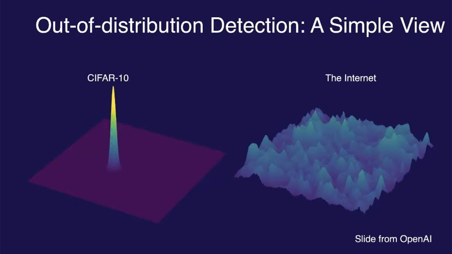
CIFAR-10 contains 60,000 images across 10 distinct classes (e.g., airplanes, dogs, trucks), with carefully curated examples for each class. However, the internet features an essentially infinite variety of images, many of which fall outside these predefined classes or include unseen variations (e.g., new breeds of dogs or novel vehicle designs). This contrast highlights the challenges models face when they encounter data that significantly differs from their training distribution.
How OOD data manifests in ML pipelines
The difference between in-distribution (ID) and OOD data can arise from:
- Semantic shift: The OOD sample belongs to a class that was not present during training (classification). With continuous prediction/regression, semantic shift occurs when the underlying relationship between X and Y changes.
- Covariate shift: The OOD sample comes from a domain where the input feature distribution is drastically different from the training data. The input feature distribution changes, but the underlying relationship between X and Y stays the same.
Semantic shift often co-occurs with covariate shift.
Distinguishing semantic shift vs. covariate shift
You trained a model using the CIFAR-10 dataset to classify images into 10 classes (e.g., airplanes, dogs, trucks). Now, you deploy the model to classify images found on the internet. Consider the following scenarios and classify each as Semantic Shift, Covariate Shift, or Both. Provide reasoning for your choice.
Scenario A: The internet dataset contains images of drones, which were not present in the CIFAR-10 dataset. The model struggles to classify them.
Scenario B: The internet dataset has dog images, but these dogs are primarily captured in outdoor settings with unfamiliar backgrounds and lighting conditions compared to the training data.
Scenario C: The internet dataset contains images of hybrid animals (e.g., “wolf-dogs”) that do not belong to any CIFAR-10 class. The model predicts incorrectly.
Scenario D: The internet dataset includes high-resolution images of airplanes, while the CIFAR-10 dataset contains only low-resolution airplane images. The model performs poorly on these new airplane images.
Scenario E: A researcher retrains the CIFAR-10 model using an updated dataset where labels for “trucks” are now redefined to include pickup trucks, which were previously excluded. The new labels confuse the original model.
-
Scenario A: Semantic Shift
- Drones represent a new class not seen during training, so the model encounters a semantic shift.
-
Scenario B: Covariate Shift
- The distribution of input features (e.g., lighting, background) changes, but the semantic relationship (e.g., dogs are still dogs) remains intact.
-
Scenario C: Both
- Hybrid animals represent a semantic shift (new class), and unfamiliar feature distributions (e.g., traits of wolves and dogs combined) also introduce covariate shift.
-
Scenario D: Covariate Shift
- The resolution of the images (input features) changes, but the semantic class of airplanes remains consistent.
-
Scenario E: Semantic Shift
- The relationship between input features and class labels has changed, as the definition of the “truck” class has been altered.
Why does OOD data matter?
Models trained on a specific distribution might make incorrect predictions on OOD data, leading to unreliable outputs. In critical applications (e.g., healthcare, autonomous driving), encountering OOD data without proper handling can have severe consequences.
Ex1: Tesla crashes into jet
In April 2022, a Tesla Model Y crashed into a $3.5 million private jet at an aviation trade show in Spokane, Washington, while operating on the “Smart Summon” feature. The feature allows Tesla vehicles to “autonomously” navigate parking lots to their owners, but in this case, it resulted in a significant mishap. The car continued to move forward even after making contact with the jet, pushing the expensive aircraft and causing notable damage.
The crash highlighted several issues with Tesla’s Smart Summon feature, particularly its object detection capabilities. The system failed to recognize and appropriately react to the presence of the jet, a problem that has been observed in other scenarios where the car’s sensors struggle with objects that are lifted off the ground or have unusual shapes.
Ex2: IBM Watson for Oncology
Around a decade ago, the excitement surrounding AI in healthcare often exceeded its actual capabilities. In 2016, IBM launched Watson for Oncology, an AI-powered platform for treatment recommendations, to much public enthusiasm. However, it soon became apparent that the system was both costly and unreliable, frequently generating flawed advice while operating as an opaque “black box”. IBM Watson for Oncology faced several issues due to OOD data. The system was primarily trained on data from Memorial Sloan Kettering Cancer Center (MSK), which did not generalize well to other healthcare settings. This led to:
- Unsafe recommendations: Watson for Oncology provided treatment recommendations that were not safe or aligned with standard care guidelines in many cases outside of MSK. This happened because the training data was not representative of the diverse medical practices and patient populations in different regions
- Bias in training data: The system’s recommendations were biased towards the practices at MSK, failing to account for different treatment protocols and patient needs elsewhere. This bias is a classic example of an OOD issue, where the model encounters data (patients and treatments) during deployment that significantly differ from its training data
By 2022, IBM had taken Watson for Oncology offline, marking the end of its commercial use.
Ex3: Doctors using GPT3
Misdiagnosis and inaccurate medical advice
In various studies and real-world applications, GPT-3 has been shown to generate inaccurate medical advice when faced with OOD data. This can be attributed to the fact that the training data, while extensive, does not cover all possible medical scenarios and nuances, leading to hallucinations or incorrect responses when encountering unfamiliar input.
A study published by researchers at Stanford found that GPT-3, even when using retrieval-augmented generation, provided unsupported medical advice in about 30% of its statements. For example, it suggested the use of a specific dosage for a defibrillator based on monophasic technology, while the cited source only discussed biphasic technology, which operates differently.
Fake medical literature references
Another critical OOD issue is the generation of fake or non-existent medical references by LLMs. When LLMs are prompted to provide citations for their responses, they sometimes generate references that sound plausible but do not actually exist. This can be particularly problematic in academic and medical contexts where accurate sourcing is crucial.
In evaluations of GPT-3’s ability to generate medical literature references , it was found that a significant portion of the references were either entirely fabricated or did not support the claims being made. This was especially true for complex medical inquiries that the model had not seen in its training data.
Recognizing OOD data in your work
Think of a scenario from your field of work or study where encountering out-of-distribution (OOD) data would be problematic. Consider the following:
- What would be the in-distribution (ID) data in that context?
- What might constitute OOD data, and how could it impact the results or outputs of your system/model?
Share your example with the group. Discuss any strategies currently used or that could be used to mitigate the challenges posed by OOD data in your example.
Detecting and handling OOD data
Given the problems posed by OOD data, a reliable model should identify such instances, and then:
- Reject them during inference
- Ideally, hand these OOD instances to a model trained on a more similar distribution (an in-distribution).
The second step is much more complicated/involved since it requires matching OOD data to essentially an infinite number of possible classes. For the current scope of this workshop, we will focus on just the first step.
Threshold-based
How can we ensure our models do not perform poorly in the presence of OOD data? Over the past several years, there have been a wide assortment of new methods developed to tackle this task. The central idea behind all of these methods is to define a threshold on a certain score or confidence measure, beyond which the data point is considered out-of-distribution. Typically, these scores are derived from the model’s output probabilities, logits (pre-softmax outputs), or other statistical measures of uncertainty. There are two general classes of threshold-based OOD detection methods: output-based and distance-based.
1) Output-based thresholds
Output-based Out-of-Distribution (OOD) detection refers to methods that determine whether a given input is out-of-distribution based on the output of a trained model. The main approaches within output-based OOD detection include:
- Softmax scores: The softmax output of a neural network represents the predicted probabilities for each class. A common threshold-based method involves setting a confidence threshold, and if the maximum softmax score of an instance falls below this threshold, it is flagged as OOD.
- Energy: The energy-based method also uses the network’s output but measures the uncertainty in a more nuanced way by calculating an energy score. The energy score typically captures the confidence more robustly, especially in high-dimensional spaces, and can be considered a more general and reliable approach than just using softmax probabilities.
2) Distance-based thresholds
Distance-based methods calculate the distance of an instance from the distribution of training data features learned by the model. If the distance is beyond a certain threshold, the instance is considered OOD. Common distance-based approaches include:
- Mahalanobis distance: This method calculates the Mahalanobis distance of a data point from the mean of the training data distribution. A high Mahalanobis distance indicates that the instance is likely OOD.
- K-nearest neighbors (KNN): This method involves computing the distance to the k-nearest neighbors in the training data. If the average distance to these neighbors is high, the instance is considered OOD.
We will focus on output-based methods (softmax and energy) in the next episode and then do a deep dive into distance-based methods in a later next episode.
- Out-of-distribution (OOD) data significantly differs from training data and can lead to unreliable model predictions.
- Threshold-based methods use model outputs or distances in feature space to detect OOD instances by defining a score threshold.
Content from OOD detection: softmax
Last updated on 2024-12-19 | Edit this page
Overview
Questions
- What is softmax-based out-of-distribution (OOD) detection, and how does it work?
- What are the strengths and limitations of using softmax scores for OOD detection?
- How do threshold choices affect the performance of softmax-based OOD detection?
- How can we assess and improve softmax-based OOD detection through evaluation metrics and visualization?
Objectives
- Understand how softmax scores can be leveraged for OOD detection.
- Explore the advantages and drawbacks of using softmax-based methods for OOD detection.
- Learn how to visualize and interpret softmax-based OOD detection performance using tools like PCA and probability density plots.
- Investigate the impact of thresholds on the trade-offs between detecting OOD and retaining in-distribution data.
- Build a foundation for understanding more advanced output-based OOD detection methods, such as energy-based detection.
Leveraging softmax model outputs
Softmax-based methods are among the most widely used techniques for out-of-distribution (OOD) detection, leveraging the probabilistic outputs of a model to differentiate between in-distribution (ID) and OOD data. These methods are inherently tied to models employing a softmax activation function in their final layer, such as logistic regression or neural networks with a classification output layer.
The softmax function normalizes the logits (i.e., sum of neuron input without passing through activation function) in the final layer, squeezing the output into a range between 0 and 1. This is useful for interpreting the model’s predictions as probabilities. Softmax probabilities are computed as:
\[ P(y = k \mid x) = \frac{\exp(f_k(x))}{ \sum_{j} \exp(f_j(x))} \]
In this lesson, we will train a logistic regression model to classify images from the Fashion MNIST dataset and explore how its softmax outputs can signal whether a given input belongs to the ID classes (e.g., T-shirts or pants) or is OOD (e.g., sandals). While softmax is most naturally applied in models with a logistic activation, alternative approaches, such as applying softmax-like operations post hoc to models with different architectures, are occasionally used. However, these alternatives are less common and may require additional considerations. By focusing on logistic regression, we aim to illustrate the fundamental principles of softmax-based OOD detection in a simple and interpretable context before extending these ideas to more complex architectures.
Prepare the ID (train and test) and OOD data
In order to determine a threshold that can separate ID data from OOD data (or ensure new test data as ID), we need to sample data from both distributions. OOD data used should be representative of potential new classes (i.e., semanitic shift) that may be seen by your model, or distribution/covariate shifts observed in your application area.
- ID = T-shirts/Blouses, Pants
- OOD = any other class. For Illustrative purposes, we’ll focus on images of sandals as the OOD class.
PYTHON
import numpy as np
import matplotlib.pyplot as plt
from sklearn.linear_model import LogisticRegression
from sklearn.metrics import accuracy_score
from keras.datasets import fashion_mnist

def prep_ID_OOD_datasests(ID_class_labels, OOD_class_labels):
    """
    Prepares in-distribution (ID) and out-of-distribution (OOD) datasets
    from the Fashion MNIST dataset.

    Parameters:
    - ID_class_labels: list or array-like, labels for the in-distribution classes.
                       Example: [0, 1] for T-shirts (0) and Trousers (1).
    - OOD_class_labels: list or array-like, labels for the out-of-distribution classes.
                        Example: [5] for Sandals.

    Returns:
    - train_data: np.array, training images for in-distribution classes.
    - test_data: np.array, test images for in-distribution classes.
    - ood_data: np.array, test images for out-of-distribution classes.
    - train_labels: np.array, labels corresponding to the training images.
    - test_labels: np.array, labels corresponding to the test images.
    - ood_labels: np.array, labels corresponding to the OOD test images.

    Notes:
    - The function filters images based on provided class labels for ID and OOD.
    - Outputs include images and their corresponding labels.
    """
    # Load Fashion MNIST dataset
    (train_images, train_labels), (test_images, test_labels) = fashion_mnist.load_data()

    # Prepare OOD data: Sandals = 5
    ood_filter = np.isin(test_labels, OOD_class_labels)
    ood_data = test_images[ood_filter]
    ood_labels = test_labels[ood_filter]
    print(f'ood_data.shape={ood_data.shape}')

    # Filter data for T-shirts (0) and Trousers (1) as in-distribution
    train_filter = np.isin(train_labels, ID_class_labels)
    test_filter = np.isin(test_labels, ID_class_labels)

    train_data = train_images[train_filter]
    train_labels = train_labels[train_filter]
    print(f'train_data.shape={train_data.shape}')

    test_data = test_images[test_filter]
    test_labels = test_labels[test_filter]
    print(f'test_data.shape={test_data.shape}')

    return train_data, test_data, ood_data, train_labels, test_labels, ood_labels


def plot_data_sample(train_data, ood_data):
    """
    Plots a sample of in-distribution and OOD data.

    Parameters:
    - train_data: np.array, array of in-distribution data images
    - ood_data: np.array, array of out-of-distribution data images

    Returns:
    - fig: matplotlib.figure.Figure, the figure object containing the plots
    """
    fig = plt.figure(figsize=(10, 4))
    N_samples = 7
    for i in range(N_samples):
        plt.subplot(2, N_samples, i + 1)
        plt.imshow(train_data[i], cmap='gray')
        plt.title("In-Dist")
        plt.axis('off')
    for i in range(N_samples):
        plt.subplot(2, N_samples, i + N_samples+1)
        plt.imshow(ood_data[i], cmap='gray')
        plt.title("OOD")
        plt.axis('off')

    return fig
Load and prepare the ID data (train+test containing shirts and pants) and OOD data (sandals)
Why not just add the OOD class to training dataset?
OOD data is, by definition, not part of the training distribution. It could encompass anything outside the known classes, which means you’d need to collect a representative dataset for “everything else” to train the OOD class. This is practically impossible because OOD data is often diverse and unbounded (e.g., new species, novel medical conditions, adversarial examples).
The key idea behind threshold-based methods is we want to vet our model against a small sample of potential risk-cases using known OOD data to determine an empirical threshold that hopefully extends to other OOD cases that may arise in real-world scenarios.
That said, a common next step in OOD pipelines is to develop new models that handle the OOD data (e.g., adding new classes). The first step, however, is detecting the existence of such OOD data.
PYTHON
# ID: T-shirts (0) and Trousers (1)
# OOD: Sandals (5)
train_data, test_data, ood_data, train_labels, test_labels, ood_labels = prep_ID_OOD_datasests(ID_class_labels=[0,1], OOD_class_labels=[5])
Plot sample
Visualizing OOD and ID data with PCA
PCA
PCA visualization can provide insights into how well a model is separating ID and OOD data. If the OOD data overlaps significantly with ID data in the PCA space, it might indicate that the model could struggle to correctly identify OOD samples.
Focus on Linear Relationships: PCA is a linear dimensionality reduction technique. It assumes that the directions of maximum variance in the data can be captured by linear combinations of the original features. This can be a limitation when the data has complex, non-linear relationships, as PCA may not capture the true structure of the data. However, if you’re using a linear model (as we are here), PCA can be more appropriate for visualizing in-distribution (ID) and out-of-distribution (OOD) data because both PCA and linear models operate under linear assumptions. PCA will effectively capture the main variance in the data as seen by the linear model, making it easier to understand the decision boundaries and how OOD data deviates from the ID data within those boundaries.
PYTHON
# Flatten images for PCA and logistic regression
train_data_flat = train_data.reshape((train_data.shape[0], -1))
test_data_flat = test_data.reshape((test_data.shape[0], -1))
ood_data_flat = ood_data.reshape((ood_data.shape[0], -1))
print(f'train_data_flat.shape={train_data_flat.shape}')
print(f'test_data_flat.shape={test_data_flat.shape}')
print(f'ood_data_flat.shape={ood_data_flat.shape}')PYTHON
# Perform PCA to visualize the first two principal components
from sklearn.decomposition import PCA
pca = PCA(n_components=2)
train_data_pca = pca.fit_transform(train_data_flat)
test_data_pca = pca.transform(test_data_flat)
ood_data_pca = pca.transform(ood_data_flat)
# Plotting PCA components
plt.figure(figsize=(10, 6))
scatter1 = plt.scatter(train_data_pca[train_labels == 0, 0], train_data_pca[train_labels == 0, 1], c='blue', label='T-shirt/top (ID)', alpha=0.3)
scatter2 = plt.scatter(train_data_pca[train_labels == 1, 0], train_data_pca[train_labels == 1, 1], c='red', label='Pants (ID)', alpha=0.3)
scatter3 = plt.scatter(ood_data_pca[:, 0], ood_data_pca[:, 1], c='green', label='Sandals (OOD)', edgecolor='k')
# Create a single legend for all classes
plt.legend(handles=[scatter1, scatter2, scatter3], loc="upper right")
plt.xlabel('First Principal Component')
plt.ylabel('Second Principal Component')
plt.title('PCA of In-Distribution and OOD Data')
plt.show()From this plot, we see that sandals are more likely to be confused as T-shirts than pants. It also may be surprising to see that these data clouds overlap so much given their semantic differences. Why might this be?
- Over-reliance on linear relationships: Part of this has to do with the fact that we’re only looking at linear relationships and treating each pixel as its own input feature, which is usually never a great idea when working with image data. In our next example, we’ll switch to the more modern approach of CNNs.
- Semantic gap != feature gap: Another factor of note is that images that have a wide semantic gap may not necessarily translate to a wide gap in terms of the data’s visual features (e.g., ankle boots and bags might both be small, have leather, and have zippers). Part of an effective OOD detection scheme involves thinking carefully about what sorts of data contanimations may be observed by the model, and assessing how similar these contaminations may be to your desired class labels.
Train and evaluate model on ID data
PYTHON
model = LogisticRegression(max_iter=10, solver='lbfgs', multi_class='multinomial').fit(train_data_flat, train_labels) # 'lbfgs' is an efficient solver that works well for small to medium-sized datasets.Before we worry about the impact of OOD data, let’s first verify that we have a reasonably accurate model for the ID data.
PYTHON
# Evaluate the model on in-distribution data
ID_preds = model.predict(test_data_flat)
ID_accuracy = accuracy_score(test_labels, ID_preds)
print(f'In-Distribution Accuracy: {ID_accuracy:.2f}')PYTHON
from sklearn.metrics import accuracy_score, confusion_matrix, ConfusionMatrixDisplay
# Generate and display confusion matrix
cm = confusion_matrix(test_labels, ID_preds, labels=[0, 1])
disp = ConfusionMatrixDisplay(confusion_matrix=cm, display_labels=['T-shirt/top', 'Pants'])
disp.plot(cmap=plt.cm.Blues)
plt.show()How does our model view OOD data?
A basic question we can start with is to ask, on average, how are OOD samples classified? Are they more likely to be Tshirts or pants? For this kind of question, we can calculate the probability scores for the OOD data, and compare this to the ID data.
PYTHON
# Predict probabilities using the model on OOD data (Sandals)
ood_probs = model.predict_proba(ood_data_flat)
avg_ood_prob = np.mean(ood_probs, 0)
print(f"Avg. probability of sandal being T-shirt: {avg_ood_prob[0]:.2f}")
print(f"Avg. probability of sandal being pants: {avg_ood_prob[1]:.2f}")
id_probs = model.predict_proba(test_data_flat) # a fairer comparison is to look at test set probabilities (just in case our model is overfitting)
id_probs_shirts = id_probs[test_labels==0,:]
id_probs_pants = id_probs[test_labels==1,:]
avg_tshirt_prob = np.mean(id_probs_shirts, 0)
avg_pants_prob = np.mean(id_probs_pants, 0)
print()
print(f"Avg. probability of T-shirt being T-shirt: {avg_tshirt_prob[0]:.2f}")
print(f"Avg. probability of pants being pants: {avg_pants_prob[1]:.2f}")Based on the difference in averages here, it looks like softmax may provide at least a somewhat useful signal in separating ID and OOD data. Let’s take a closer look by plotting histograms of all probability scores across our classes of interest (ID-Tshirt, ID-Pants, and OOD).
PYTHON
# Creating the figure and subplots
fig, axes = plt.subplots(1, 3, figsize=(15, 4), sharey=False)
bins=60
# Plotting the histogram of probabilities for OOD data (Sandals)
axes[0].hist(ood_probs[:, 0], bins=bins, alpha=0.5, label='T-shirt probability')
axes[0].set_xlabel('Probability')
axes[0].set_ylabel('Frequency')
axes[0].set_title('OOD Data (Sandals)')
axes[0].legend()
# Plotting the histogram of probabilities for ID data (T-shirt)
axes[1].hist(id_probs_shirts[:, 0], bins=bins, alpha=0.5, label='T-shirt probability', color='orange')
axes[1].set_xlabel('Probability')
axes[1].set_title('ID Data (T-shirt/top)')
axes[1].legend()
# Plotting the histogram of probabilities for ID data (Pants)
axes[2].hist(id_probs_pants[:, 1], bins=bins, alpha=0.5, label='Pants probability', color='green')
axes[2].set_xlabel('Probability')
axes[2].set_title('ID Data (Pants)')
axes[2].legend()
# Adjusting layout
plt.tight_layout()
# Displaying the plot
plt.show()Alternatively, for a better comparison across all three classes, we can use a probability density plot. This will allow for an easier comparison when the counts across classes lie on vastly different scales (i.e., max of 35 vs max of 5000).
PYTHON
from scipy.stats import gaussian_kde
# Create figure
plt.figure(figsize=(10, 6))
# Define bins
alpha = 0.4
# Plot PDF for ID T-shirt (T-shirt probability)
density_id_shirts = gaussian_kde(id_probs_shirts[:, 0])
x_id_shirts = np.linspace(0, 1, 1000)
plt.plot(x_id_shirts, density_id_shirts(x_id_shirts), label='ID T-shirt (T-shirt probability)', color='orange', alpha=alpha)
# Plot PDF for ID Pants (Pants probability)
density_id_pants = gaussian_kde(id_probs_pants[:, 0])
x_id_pants = np.linspace(0, 1, 1000)
plt.plot(x_id_pants, density_id_pants(x_id_pants), label='ID Pants (T-shirt probability)', color='green', alpha=alpha)
# Plot PDF for OOD (T-shirt probability)
density_ood = gaussian_kde(ood_probs[:, 0])
x_ood = np.linspace(0, 1, 1000)
plt.plot(x_ood, density_ood(x_ood), label='OOD (T-shirt probability)', color='blue', alpha=alpha)
# Adding labels and title
plt.xlabel('Probability')
plt.ylabel('Density')
plt.title('Probability Density Distributions for OOD and ID Data')
plt.ylim([0,20])
plt.legend()
#plt.savefig('../images/OOD-detection_PSDs.png', dpi=300, bbox_inches='tight')
# Displaying the plot
plt.show()Unfortunately, we observe a significant amount of overlap between OOD data and high T-shirt probability. Furthermore, the blue line doesn’t seem to decrease much as you move from 0.9 to 1, suggesting that even a very high threshold is likely to lead to OOD contamination (while also tossing out a significant portion of ID data).
For pants, the problem is much less severe. It looks like a low threshold (on this T-shirt probability scale) can separate nearly all OOD samples from being pants.
Setting a threshold
Let’s put our observations to the test and produce a confusion matrix that includes ID-pants, ID-Tshirts, and OOD class labels. We’ll start with a high threshold of 0.9 to see how that performs.
PYTHON
def softmax_thresh_classifications(probs, threshold):
"""
Classifies data points into categories based on softmax probabilities and a specified threshold.
Parameters:
- probs: np.array
A 2D array of shape (n_samples, n_classes) containing the softmax probabilities for each sample
across all classes. Each row corresponds to a single sample, and each column corresponds to
the probability of a specific class.
- threshold: float
A probability threshold for classification. Samples are classified into a specific class if
their corresponding probability exceeds the threshold.
Returns:
- classifications: np.array
A 1D array of shape (n_samples,) where:
- 1 indicates the sample is classified as the second class (e.g., "pants").
- 0 indicates the sample is classified as the first class (e.g., "shirts").
- -1 indicates the sample is classified as out-of-distribution (OOD) because no class probability
exceeds the threshold.
Notes:
- The function assumes binary classification with probabilities for two classes provided in the `probs` array.
- If neither class probability exceeds the threshold, the sample is flagged as OOD with a classification of -1.
- This approach is suitable for threshold-based OOD detection tasks where probabilities can serve as confidence scores.
"""
classifications = np.where(probs[:, 1] >= threshold, 1, # classified as pants
np.where(probs[:, 0] >= threshold, 0, # classified as shirts
-1)) # classified as OOD
return classificationsPYTHON
from sklearn.metrics import precision_recall_fscore_support
# Assuming ood_probs, id_probs, and train_labels are defined
# Threshold values
upper_threshold = 0.9
# Classifying OOD examples (sandals)
ood_classifications = softmax_thresh_classifications(ood_probs, upper_threshold)
# Classifying ID examples (T-shirts and pants)
id_classifications = softmax_thresh_classifications(id_probs, upper_threshold)
# Combine OOD and ID classifications and true labels
all_predictions = np.concatenate([ood_classifications, id_classifications])
all_true_labels = np.concatenate([-1 * np.ones(ood_classifications.shape), test_labels])
all_true_labels # Sandals (-1), T-shirts (0), Trousers (1)PYTHON
# Confusion matrix
cm = confusion_matrix(all_true_labels, all_predictions, labels=[0, 1, -1])
# Plotting the confusion matrix
disp = ConfusionMatrixDisplay(confusion_matrix=cm, display_labels=["Shirt", "Pants", "OOD"])
disp.plot(cmap=plt.cm.Blues)
plt.title('Confusion Matrix for OOD and ID Classification')
plt.show()
# Looking at F1, precision, and recall
precision, recall, f1, _ = precision_recall_fscore_support(all_true_labels, all_predictions, labels=[0, 1], average='macro') # macro = average scores across classes
# ID: T-shirts (0) and Trousers (1)
print(f"F1: {f1}")
print(f"Precision: {precision}")
print(f"Recall: {recall}")Even with a high threshold of 0.9, we end up with nearly a couple hundred OOD samples classified as ID. In addition, over 800 ID samples had to be tossed out due to uncertainty.
Quick exercise
What threhsold is required to ensure that no OOD samples are incorrectly considered as IID? What percentage of ID samples are mistaken as OOD at this threshold?
With a very conservative threshold, we can make sure very few OOD samples are incorrectly classified as ID. However, the flip side is that conservative thresholds tend to incorrectly classify many ID samples as being OOD. In this case, we incorrectly assume almost 20% of shirts are OOD samples.
Iterative threshold determination
In practice, selecting an appropriate threshold is an iterative process that balances the trade-off between correctly identifying in-distribution (ID) data and accurately flagging out-of-distribution (OOD) data. Here’s how you can iteratively determine the threshold:
Define evaluation metrics: While confusion matrices are an excellent tool when you’re ready to more closely examine the data, we need a single metric that can summarize threshold performance so we can easily compare across threshold. Common metrics include accuracy, precision, recall, or the F1 score for both ID and OOD detection.
Evaluate over a range of thresholds: Test different threshold values and evaluate the performance on a validation set containing both ID and OOD data.
Select the optimal threshold: Choose the threshold that provides the best balance according to your chosen metrics.
Use the below code to determine what threshold should be set to ensure precision = 100%. What threshold is required for recall to be 100%? What threshold gives the highest F1 score?
PYTHON
def eval_softmax_thresholds(thresholds, ood_probs, id_probs):
"""
Evaluates the performance of softmax-based classification at various thresholds by calculating precision,
recall, and F1 scores for in-distribution (ID) and out-of-distribution (OOD) data.
Parameters:
- thresholds: list or np.array
A list or array of threshold values to evaluate. Each threshold is applied to classify samples based
on their softmax probabilities.
- ood_probs: np.array
A 2D array of shape (n_ood_samples, n_classes) containing the softmax probabilities for OOD samples
across all classes.
- id_probs: np.array
A 2D array of shape (n_id_samples, n_classes) containing the softmax probabilities for ID samples
across all classes.
Returns:
- precisions: list
A list of precision values computed for each threshold.
- recalls: list
A list of recall values computed for each threshold.
- f1_scores: list
A list of F1 scores computed for each threshold.
Notes:
- The function assumes binary classification for ID classes (e.g., T-shirts and pants) and uses -1 to
represent OOD classifications.
- True labels for ID samples are taken from `test_labels` (defined externally).
- True labels for OOD samples are set to -1, indicating their OOD nature.
- Precision, recall, and F1 scores are calculated using macro-averaging, which treats each class equally
regardless of the number of samples.
Example Usage:
```
thresholds = np.linspace(0.5, 1.0, 50)
precisions, recalls, f1_scores = eval_softmax_thresholds(thresholds, ood_probs, id_probs)
```
"""
# Store evaluation metrics for each threshold
precisions = []
recalls = []
f1_scores = []
for threshold in thresholds:
# Classifying OOD examples
ood_classifications = softmax_thresh_classifications(ood_probs, threshold)
# Classifying ID examples
id_classifications = softmax_thresh_classifications(id_probs, threshold)
# Combine OOD and ID classifications and true labels
all_predictions = np.concatenate([ood_classifications, id_classifications])
all_true_labels = np.concatenate([-1 * np.ones(ood_classifications.shape), test_labels])
# Evaluate metrics
precision, recall, f1, _ = precision_recall_fscore_support(all_true_labels, all_predictions, labels=[0, 1], average='macro')
precisions.append(precision)
recalls.append(recall)
f1_scores.append(f1)
return precisions, recalls, f1_scoresPYTHON
# Define thresholds to evaluate
thresholds = np.linspace(.5, 1, 50)
# Evaluate on all thresholds
precisions, recalls, f1_scores = eval_softmax_thresholds(thresholds, ood_probs, id_probs)PYTHON
def plot_metrics_vs_thresholds(thresholds, f1_scores, precisions, recalls, OOD_signal):
"""
Plots evaluation metrics (Precision, Recall, and F1 Score) as functions of threshold values for
softmax-based or energy-based OOD detection, and identifies the best threshold for each metric.
Parameters:
- thresholds: list or np.array
A list or array of threshold values used for classification.
- f1_scores: list or np.array
A list or array of F1 scores computed at each threshold.
- precisions: list or np.array
A list or array of precision values computed at each threshold.
- recalls: list or np.array
A list or array of recall values computed at each threshold.
- OOD_signal: str
A descriptive label for the signal being used for OOD detection, such as "Softmax" or "Energy".
Returns:
- fig: matplotlib.figure.Figure
The figure object containing the plot.
- best_f1_threshold: float
The threshold value corresponding to the highest F1 score.
- best_precision_threshold: float
The threshold value corresponding to the highest precision.
- best_recall_threshold: float
The threshold value corresponding to the highest recall.
Notes:
- The function identifies and highlights the best threshold for each metric (F1 Score, Precision, Recall).
- It generates a line plot for each metric as a function of the threshold and marks the best thresholds
with vertical dashed lines.
- This visualization is particularly useful for assessing the trade-offs between precision, recall,
and F1 score when selecting a classification threshold.
Example Usage:
```
fig, best_f1, best_precision, best_recall = plot_metrics_vs_thresholds(
thresholds, f1_scores, precisions, recalls, OOD_signal='Softmax'
)
plt.show()
```
"""
# Find the best thresholds for each metric
best_f1_index = np.argmax(f1_scores)
best_f1_threshold = thresholds[best_f1_index]
best_precision_index = np.argmax(precisions)
best_precision_threshold = thresholds[best_precision_index]
best_recall_index = np.argmax(recalls)
best_recall_threshold = thresholds[best_recall_index]
print(f"Best F1 threshold: {best_f1_threshold}, F1 Score: {f1_scores[best_f1_index]}")
print(f"Best Precision threshold: {best_precision_threshold}, Precision: {precisions[best_precision_index]}")
print(f"Best Recall threshold: {best_recall_threshold}, Recall: {recalls[best_recall_index]}")
# Create a new figure
fig, ax = plt.subplots(figsize=(8, 5))
# Plot metrics as functions of the threshold
ax.plot(thresholds, precisions, label='Precision', color='g')
ax.plot(thresholds, recalls, label='Recall', color='b')
ax.plot(thresholds, f1_scores, label='F1 Score', color='r')
# Add best threshold indicators
ax.axvline(x=best_f1_threshold, color='r', linestyle='--', label=f'Best F1 Threshold: {best_f1_threshold:.2f}')
ax.axvline(x=best_precision_threshold, color='g', linestyle='--', label=f'Best Precision Threshold: {best_precision_threshold:.2f}')
ax.axvline(x=best_recall_threshold, color='b', linestyle='--', label=f'Best Recall Threshold: {best_recall_threshold:.2f}')
ax.set_xlabel(f'{OOD_signal} Threshold')
ax.set_ylabel('Metric Value')
ax.set_title('Evaluation Metrics as Functions of Threshold')
ax.legend()
return fig, best_f1_threshold, best_precision_threshold, best_recall_thresholdPYTHON
fig, best_f1_threshold, best_precision_threshold, best_recall_threshold = plot_metrics_vs_thresholds(thresholds, f1_scores, precisions, recalls, 'Softmax')PYTHON
# Threshold values
upper_threshold = best_f1_threshold
# upper_threshold = best_precision_threshold
# Classifying OOD examples (sandals)
ood_classifications = softmax_thresh_classifications(ood_probs, upper_threshold)
# Classifying ID examples (T-shirts and pants)
id_classifications = softmax_thresh_classifications(id_probs, upper_threshold)
# Combine OOD and ID classifications and true labels
all_predictions = np.concatenate([ood_classifications, id_classifications])
all_true_labels = np.concatenate([-1 * np.ones(ood_classifications.shape), test_labels])
# Confusion matrix
cm = confusion_matrix(all_true_labels, all_predictions, labels=[0, 1, -1])
# Plotting the confusion matrix
disp = ConfusionMatrixDisplay(confusion_matrix=cm, display_labels=["Shirt", "Pants", "OOD"])
disp.plot(cmap=plt.cm.Blues)
plt.title('Confusion Matrix for OOD and ID Classification')
plt.show()Discuss
How might you use these tools to ensure that a model trained on health data from hospital A will reliably predict new test data from hospital B?
- Softmax-based OOD detection uses the model’s output probabilities to identify instances that do not belong to the training distribution.
- Threshold selection is critical and involves trade-offs between retaining in-distribution data and detecting OOD samples.
- Visualizations such as PCA and probability density plots help illustrate how OOD data overlaps with in-distribution data in feature space.
- While simple and widely used, softmax-based methods have limitations, including sensitivity to threshold choices and reduced reliability in high-dimensional settings.
- Understanding softmax-based OOD detection lays the groundwork for exploring more advanced techniques like energy-based detection.
Content from OOD detection: energy
Last updated on 2024-12-20 | Edit this page
Overview
Questions
- What are energy-based methods for out-of-distribution (OOD) detection, and how do they compare to softmax-based approaches?
- How does the energy metric enhance separability between in-distribution and OOD data?
- What are the challenges and limitations of energy-based OOD detection methods?
Objectives
- Understand the concept of energy-based OOD detection and its theoretical foundations.
- Compare energy-based methods to softmax-based approaches, highlighting their strengths and limitations.
- Learn how to implement energy-based OOD detection using tools like PyTorch-OOD.
- Explore challenges in applying energy-based methods, including threshold tuning and generalizability to diverse OOD scenarios.
Example 2: Energy-Based OOD Detection
Traditional approaches, such as softmax-based methods, rely on output probabilities to flag OOD data. While simple and intuitive, these methods often struggle to distinguish OOD data effectively in complex scenarios, especially in high-dimensional spaces.
Energy-based OOD detection offers a modern and robust alternative. This “output-based” approach leverages the energy score, a scalar value derived from a model’s output logits, to measure the compatibility between input data and the model’s learned distribution.
Understanding energy scores
To understand energy-based OOD detection, we start by defining the energy function E(x), which measures how “compatible” an input x is with a model’s learned distribution.
1. Energy function
For a given input x and output logits f(x) — the raw outputs of a neural network — the energy of x is defined as:
\[ E(x) = -\log \left( \sum_{k} \exp(f_k(x)) \right) \]
where:
- f_k(x) is the logit corresponding to class k,
- The sum is taken over all classes k.
This equation compresses the logits into a single scalar value: the energy score.
- Lower energy E(x) reflects higher
compatitibility,
- Higher energy E(x) reflects lower compatitibility.
2. Energy to probability
Using the Gibbs distribution, the energy can be converted into a probability that reflects how likely x is under the model’s learned distribution. The relationship is:
\[ P(x) \propto \exp(-E(x)) \]
Here:
- Lower energy \(E(x)\) leads to a
higher probability,
- Higher energy \(E(x)\) leads to a
lower probability.
The exponential relationship ensures that even small differences in energy values translate to significant changes in probability.
If your stakeholders or downstream tasks require interpretable confidence scores, a Gibbs-based probability might make the thresholding process more understandable and adaptable. However, the raw energy scores can be more sensitive to OOD data since they do not compress their values between 0 and 1.
3. Why energy works better than softmax
Softmax probabilities are computed as:
\[ P(y = k \mid x) = \frac{\exp(f_k(x))}{ \sum_{j} \exp(f_j(x))} \]
The softmax function normalizes the logits \(f(x)\), squeezing the output into a range between 0 and 1. While this is useful for interpreting the model’s predictions as probabilities, it introduces overconfidence for OOD inputs. Specifically:
- Even when none of the logits \(f_k(x)\) are strongly aligned with any class (e.g., low magnitudes for all logits), softmax still distributes the probabilities across the known classes.
- The normalization ensures the total probability sums to 1, which can mask the uncertainty by making the scores appear confident for OOD inputs.
Energy-based methods, on the other hand, do not normalize the logits into probabilities by default. Instead, the energy score summarizes the raw logits as:
\[ E(x) = -\log \sum_{j} \exp(f_j(x)) \]
Key difference: sensitivity to logits / no normalization
- Softmax: The output probabilities are dominated by the largest logit relative to the others, even if all logits are small. This can produce overconfident predictions for OOD data because the softmax function distributes probabilities across known classes.
- Energy: By summarizing the raw logits directly, energy scores provide a more nuanced view of the model’s uncertainty, without forcing outputs into an overconfident probability distribution.
Summary
- Energy E(x) directly measures compatibility with the model.
- Lower energy → Higher compatibility (in-distribution),
- Higher energy → Lower compatibility (OOD data).
- The exponential relationship ensures sensitivity to even small deviations, making energy-based detection more robust than softmax-based methods.
Worked example: comparing softmax and energy
In this hands-on example, we’ll repeat the same investigation as before with a couple of adjustments:
- Use CNN to train model
- Compare both softmax and energy scores with respect to ID and OOD data. We can do this easily using the PyTorch-OOD library.
PYTHON
import numpy as np
import matplotlib.pyplot as plt
from sklearn.linear_model import LogisticRegression
from sklearn.metrics import accuracy_score
from keras.datasets import fashion_mnist
def prep_ID_OOD_datasests(ID_class_labels, OOD_class_labels):
"""
Prepares in-distribution (ID) and out-of-distribution (OOD) datasets
from the Fashion MNIST dataset.
Parameters:
- ID_class_labels: list or array-like, labels for the in-distribution classes.
Example: [0, 1] for T-shirts (0) and Trousers (1).
- OOD_class_labels: list or array-like, labels for the out-of-distribution classes.
Example: [5] for Sandals.
Returns:
- train_data: np.array, training images for in-distribution classes.
- test_data: np.array, test images for in-distribution classes.
- ood_data: np.array, test images for out-of-distribution classes.
- train_labels: np.array, labels corresponding to the training images.
- test_labels: np.array, labels corresponding to the test images.
- ood_labels: np.array, labels corresponding to the OOD test images.
Notes:
- The function filters images based on provided class labels for ID and OOD.
- Outputs include images and their corresponding labels.
"""
# Load Fashion MNIST dataset
(train_images, train_labels), (test_images, test_labels) = fashion_mnist.load_data()
# Prepare OOD data: Sandals = 5
ood_filter = np.isin(test_labels, OOD_class_labels)
ood_data = test_images[ood_filter]
ood_labels = test_labels[ood_filter]
print(f'ood_data.shape={ood_data.shape}')
# Filter data for T-shirts (0) and Trousers (1) as in-distribution
train_filter = np.isin(train_labels, ID_class_labels)
test_filter = np.isin(test_labels, ID_class_labels)
train_data = train_images[train_filter]
train_labels = train_labels[train_filter]
print(f'train_data.shape={train_data.shape}')
test_data = test_images[test_filter]
test_labels = test_labels[test_filter]
print(f'test_data.shape={test_data.shape}')
return train_data, test_data, ood_data, train_labels, test_labels, ood_labels
def plot_data_sample(train_data, ood_data):
"""
Plots a sample of in-distribution and OOD data.
Parameters:
- train_data: np.array, array of in-distribution data images
- ood_data: np.array, array of out-of-distribution data images
Returns:
- fig: matplotlib.figure.Figure, the figure object containing the plots
"""
fig = plt.figure(figsize=(10, 4))
N_samples = 7
for i in range(N_samples):
plt.subplot(2, N_samples, i + 1)
plt.imshow(train_data[i], cmap='gray')
plt.title("In-Dist")
plt.axis('off')
for i in range(N_samples):
plt.subplot(2, N_samples, i + N_samples+1)
plt.imshow(ood_data[i], cmap='gray')
plt.title("OOD")
plt.axis('off')
return figVisualizing OOD and ID data
UMAP (or similar)
Recall in our previous example, we used PCA to visualize the ID and OOD data distributions. This was appropriate given that we were evaluating OOD/ID data in the context of a linear model. However, when working with nonlinear models such as CNNs, it makes more sense to investigate how the data is represented in a nonlinear space. Nonlinear embedding methods, such as Uniform Manifold Approximation and Projection (UMAP), are more suitable in such scenarios.
UMAP is a non-linear dimensionality reduction technique that preserves both the global structure and the local neighborhood relationships in the data. UMAP is often better at maintaining the continuity of data points that lie on non-linear manifolds. It can reveal nonlinear patterns and structures that PCA might miss, making it a valuable tool for analyzing ID and OOD distributions.
PYTHON
plot_umap = True
if plot_umap:
import umap
# Flatten images for PCA and logistic regression
train_data_flat = train_data.reshape((train_data.shape[0], -1))
test_data_flat = test_data.reshape((test_data.shape[0], -1))
ood_data_flat = ood_data.reshape((ood_data.shape[0], -1))
print(f'train_data_flat.shape={train_data_flat.shape}')
print(f'test_data_flat.shape={test_data_flat.shape}')
print(f'ood_data_flat.shape={ood_data_flat.shape}')
# Perform UMAP to visualize the data
umap_reducer = umap.UMAP(n_components=2, random_state=42)
combined_data = np.vstack([train_data_flat, ood_data_flat])
combined_labels = np.hstack([train_labels, np.full(ood_data_flat.shape[0], 2)]) # Use 2 for OOD class
umap_results = umap_reducer.fit_transform(combined_data)
# Split the results back into in-distribution and OOD data
umap_in_dist = umap_results[:len(train_data_flat)]
umap_ood = umap_results[len(train_data_flat):]The warning message indicates that UMAP has overridden the n_jobs parameter to 1 due to the random_state being set. This behavior ensures reproducibility by using a single job. If you want to avoid the warning and still use parallelism, you can remove the random_state parameter. However, removing random_state will mean that the results might not be reproducible.
PYTHON
if plot_umap:
umap_alpha = .1
# Plotting UMAP components
plt.figure(figsize=(10, 6))
# Plot in-distribution data
scatter1 = plt.scatter(umap_in_dist[train_labels == 0, 0], umap_in_dist[train_labels == 0, 1], c='blue', label='T-shirts (ID)', alpha=umap_alpha)
scatter2 = plt.scatter(umap_in_dist[train_labels == 1, 0], umap_in_dist[train_labels == 1, 1], c='red', label='Trousers (ID)', alpha=umap_alpha)
# Plot OOD data
scatter3 = plt.scatter(umap_ood[:, 0], umap_ood[:, 1], c='green', label='OOD', edgecolor='k', alpha=umap_alpha)
# Create a single legend for all classes
plt.legend(handles=[scatter1, scatter2, scatter3], loc="upper right")
plt.xlabel('First UMAP Component')
plt.ylabel('Second UMAP Component')
plt.title('UMAP of In-Distribution and OOD Data')
plt.show()With UMAP, we see our data clusters into more meaningful groups (compared to PCA). Our nonlinear model should hopefully have no problem separating these three clusters.
Preparing data for CNN
Next, we’ll prepare our data for a pytorch (torch) CNN.
PYTHON
import torch
# Convert to PyTorch tensors and normalize
train_data_tensor = torch.tensor(train_data, dtype=torch.float32).unsqueeze(1) / 255.0
test_data_tensor = torch.tensor(test_data, dtype=torch.float32).unsqueeze(1) / 255.0
ood_data_tensor = torch.tensor(ood_data, dtype=torch.float32).unsqueeze(1) / 255.0
train_labels_tensor = torch.tensor(train_labels, dtype=torch.long)
test_labels_tensor = torch.tensor(test_labels, dtype=torch.long)
# TensorDataset provides a convenient way to couple input data with their corresponding labels, making it easier to pass them into a DataLoader.
train_dataset = torch.utils.data.TensorDataset(train_data_tensor, train_labels_tensor)
test_dataset = torch.utils.data.TensorDataset(test_data_tensor, test_labels_tensor)
ood_dataset = torch.utils.data.TensorDataset(ood_data_tensor, torch.zeros(ood_data_tensor.shape[0], dtype=torch.long))
# DataLoader is used to efficiently load and manage batches of data
# - It provides iterators over the data for training/testing.
# - Supports options like batch size, shuffling, and parallel data loading
train_loader = torch.utils.data.DataLoader(train_dataset, batch_size=64, shuffle=False)
test_loader = torch.utils.data.DataLoader(test_dataset, batch_size=64, shuffle=False)
ood_loader = torch.utils.data.DataLoader(ood_dataset, batch_size=64, shuffle=False)Define CNN class
Next, we’ll define a simple Convolutional Neural Network (CNN) to classify in-distribution (ID) data. This CNN will serve as the backbone for our experiments, enabling us to analyze its predictions on both ID and OOD data. The model will include convolutional layers for feature extraction and fully connected layers for classification.
PYTHON
import torch.nn as nn # Import the PyTorch module for building neural networks
import torch.nn.functional as F # Import functional API for activation and pooling
import torch.optim as optim # Import optimizers for training the model
# Define a simple CNN model
class SimpleCNN(nn.Module):
def __init__(self):
super(SimpleCNN, self).__init__()
# First convolutional layer
# Input: 1 channel (e.g., grayscale image), Output: 32 feature maps
# Kernel size: 3x3 (sliding window over the image)
self.conv1 = nn.Conv2d(1, 32, kernel_size=3)
# Second convolutional layer
# Input: 32 feature maps from conv1, Output: 64 feature maps
# Kernel size: 3x3
self.conv2 = nn.Conv2d(32, 64, kernel_size=3)
# Fully connected layer 1 (fc1)
# Input: Flattened feature maps after two conv+pool layers
# Output: 128 features
# Dimensions explained:
# After two Conv2d layers with kernel_size=3 and MaxPool2d (2x2):
# Input image size: (28x28) -> After conv1: (26x26) -> After pool1: (13x13)
# -> After conv2: (11x11) -> After pool2: (5x5)
# Total features to flatten: 64 (feature maps) * 5 * 5 (spatial size)
self.fc1 = nn.Linear(64 * 5 * 5, 128)
# Fully connected layer 2 (fc2)
# Input: 128 features from fc1
# Output: 2 classes (binary classification)
self.fc2 = nn.Linear(128, 2)
def forward(self, x):
# Pass input through first convolutional layer
# Activation: ReLU (introduces non-linearity)
# Pooling: MaxPool2d with kernel size 2x2 (reduces spatial dimensions by half)
x = F.relu(F.max_pool2d(self.conv1(x), 2)) # Output size: (N, 32, 13, 13)
# Pass through second convolutional layer
x = F.relu(F.max_pool2d(self.conv2(x), 2)) # Output size: (N, 64, 5, 5)
# Flatten the feature maps for the fully connected layer
# x.view reshapes the tensor to (batch_size, flattened_size)
x = x.view(-1, 64 * 5 * 5) # Output size: (N, 1600)
# Pass through first fully connected layer with ReLU activation
x = F.relu(self.fc1(x)) # Output size: (N, 128)
# Final fully connected layer for classification
x = self.fc2(x) # Output size: (N, 2)
return x
Train model
PYTHON
def train_model(model, train_loader, criterion, optimizer, epochs=5):
"""
Trains a given PyTorch model using a specified dataset, loss function, and optimizer.
Parameters:
- model (nn.Module): The neural network model to train.
- train_loader (DataLoader): DataLoader object providing the training dataset in batches.
- criterion (nn.Module): Loss function used for optimization (e.g., CrossEntropyLoss).
- optimizer (torch.optim.Optimizer): Optimizer for adjusting model weights (e.g., Adam, SGD).
- epochs (int): Number of training iterations over the entire dataset.
Returns:
- None: Prints the loss for each epoch during training.
Workflow:
1. Iterate over the dataset for the given number of epochs.
2. For each batch, forward propagate inputs, compute the loss, and backpropagate gradients.
3. Update model weights using the optimizer and reset gradients after each step.
"""
model.train() # Set the model to training mode
for epoch in range(epochs):
running_loss = 0.0
for inputs, labels in train_loader:
# Move inputs and labels to the appropriate device (CPU or GPU)
inputs, labels = inputs.to(device), labels.to(device)
# Reset gradients from the previous step to avoid accumulation
optimizer.zero_grad()
# Forward pass: Compute model predictions
outputs = model(inputs)
# Compute the loss between predictions and true labels
loss = criterion(outputs, labels)
# Backward pass: Compute gradients of the loss w.r.t. model parameters
loss.backward()
# Update model weights using gradients and optimizer rules
optimizer.step()
# Accumulate the batch loss for reporting
running_loss += loss.item()
# Print the average loss for the current epoch
print(f'Epoch {epoch+1}, Loss: {running_loss/len(train_loader)}')Evaluate the model
PYTHON
from sklearn.metrics import confusion_matrix, ConfusionMatrixDisplay
import matplotlib.pyplot as plt
import torch
import numpy as np
# Function to plot confusion matrix
def plot_confusion_matrix(labels, predictions, title):
"""
Plots a confusion matrix for a classification task.
Parameters:
- labels (array-like): True labels for the dataset.
- predictions (array-like): Model-predicted labels.
- title (str): Title for the confusion matrix plot.
Returns:
- None: Displays the confusion matrix plot.
"""
# Compute the confusion matrix
cm = confusion_matrix(labels, predictions, labels=[0, 1])
# Create a display object for the confusion matrix
disp = ConfusionMatrixDisplay(confusion_matrix=cm, display_labels=["T-shirt/top", "Trouser"])
# Plot the confusion matrix with a color map
disp.plot(cmap=plt.cm.Blues)
plt.title(title)
plt.show()PYTHON
# Function to evaluate the model on a given dataset
def evaluate_model(model, dataloader, device):
"""
Evaluates a PyTorch model on a given dataset.
Parameters:
- model (torch.nn.Module): The trained PyTorch model to evaluate.
- dataloader (torch.utils.data.DataLoader): DataLoader object providing the dataset in batches.
- device (torch.device): Device on which to perform the evaluation (CPU or GPU).
Returns:
- all_labels (np.array): True labels for the entire dataset.
- all_predictions (np.array): Model predictions for the entire dataset.
"""
model.eval() # Set the model to evaluation mode
all_labels = [] # To store true labels
all_predictions = [] # To store model predictions
# Disable gradient computation during evaluation
with torch.no_grad():
for inputs, labels in dataloader:
# Move inputs and labels to the specified device
inputs, labels = inputs.to(device), labels.to(device)
# Forward pass to get model outputs
outputs = model(inputs)
# Get predicted class labels (index with the highest probability)
_, preds = torch.max(outputs, 1)
# Append true labels and predictions to the lists
all_labels.extend(labels.cpu().numpy())
all_predictions.extend(preds.cpu().numpy())
# Convert lists to NumPy arrays for easier processing
return np.array(all_labels), np.array(all_predictions)PYTHON
# Evaluate the model on the test dataset
test_labels, test_predictions = evaluate_model(model, test_loader, device)
# Plot confusion matrix for test dataset
plot_confusion_matrix(test_labels, test_predictions, "Confusion Matrix for Test Data")Comparing softmax vs energy scores
Let’s take a look at both the softmax and energy scores generated by both the ID test set and the OOD data we extracted earlier.
With PyTorch-OOD, we can easily calculate both measures.
PYTHON
# 1. Computing softmax scores
from pytorch_ood.detector import MaxSoftmax
# Initialize the softmax-based OOD detector
softmax_detector = MaxSoftmax(model)
# Compute softmax scores
def get_OOD_scores(detector, dataloader):
"""
Computes softmax-based scores for a given OOD detector and dataset.
Parameters:
- detector: An initialized OOD detector (e.g., MaxSoftmax).
- dataloader: DataLoader providing the dataset for which scores are to be computed.
Returns:
- scores: A NumPy array of softmax scores for all data points.
"""
scores = []
detector.model.eval() # Ensure the model is in evaluation mode
with torch.no_grad(): # Disable gradient computation for efficiency
for inputs, _ in dataloader:
inputs = inputs.to(device) # Move inputs to the correct device
score = detector.predict(inputs) # Get the max softmax score
scores.extend(score.cpu().numpy()) # Move scores to CPU and convert to NumPy array
return np.array(scores)
# Compute softmax scores for ID and OOD data
id_softmax_scores = get_OOD_scores(softmax_detector, test_loader)
ood_softmax_scores = get_OOD_scores(softmax_detector, ood_loader)
id_softmax_scores # values are negative to align with other OOD measures, such as energy (more negative is better)Plot probability densities
PYTHON
from scipy.stats import gaussian_kde
import matplotlib.pyplot as plt
# Plot PSDs
# Function to plot PSD
def plot_psd(id_scores, ood_scores, method_name):
plt.figure(figsize=(12, 6))
alpha = 0.3
# Plot PSD for ID scores
id_density = gaussian_kde(id_scores)
x_id = np.linspace(id_scores.min(), id_scores.max(), 1000)
plt.plot(x_id, id_density(x_id), label=f'ID ({method_name})', color='blue', alpha=alpha)
# Plot PSD for OOD scores
ood_density = gaussian_kde(ood_scores)
x_ood = np.linspace(ood_scores.min(), ood_scores.max(), 1000)
plt.plot(x_ood, ood_density(x_ood), label=f'OOD ({method_name})', color='red', alpha=alpha)
plt.xlabel('Score')
plt.ylabel('Density')
plt.title(f'Probability Density Distributions for {method_name} Scores')
plt.legend()
plt.show()
# Plot PSD for softmax scores
plot_psd(id_softmax_scores, ood_softmax_scores, 'Softmax')
# Plot PSD for energy scores
plot_psd(id_energy_scores, ood_energy_scores, 'Energy')Recap and limitations
The energy-based approach for out-of-distribution (OOD) detection has several strengths, particularly its ability to effectively separate in-distribution (ID) and OOD data by leveraging the raw logits of a model. However, it is not without limitations. Here are the key drawbacks:
- Dependence on well-defined classes: Energy scores rely on logits that correspond to clearly defined classes in the model. If the model’s logits are not well-calibrated or if the task involves ambiguous or overlapping classes, the energy scores may not provide reliable OOD separation.
- Energy thresholds tuned on one dataset may not generalize well to other datasets or domains (depending on how expansive/variable your OOD calibration set is)
References and supplemental resources
- https://www.youtube.com/watch?v=hgLC9_9ZCJI
- Generalized Out-of-Distribution Detection: A Survey: https://arxiv.org/abs/2110.11334
- Energy-based OOD detection is a modern and more robust alternative to softmax-based methods, leveraging energy scores to improve separability between in-distribution and OOD data.
- By calculating an energy value for each input, these methods provide a more nuanced measure of compatibility between data and the model’s learned distribution.
- Non-linear visualizations, like UMAP, offer better insights into how OOD and ID data are represented in high-dimensional feature spaces compared to linear methods like PCA.
- PyTorch-OOD simplifies the implementation of energy-based and other OOD detection methods, making it accessible for real-world applications.
- While energy-based methods excel in many scenarios, challenges include tuning thresholds across diverse OOD classes and ensuring generalizability to unseen distributions.
- Transitioning to energy-based detection lays the groundwork for exploring training-time regularization and hybrid approaches.
Content from OOD detection: distance-based
Last updated on 2024-12-19 | Edit this page
Overview
Questions
- How do distance-based methods like Mahalanobis distance and KNN work for OOD detection?
- What is contrastive learning and how does it improve feature representations?
- How does contrastive learning enhance the effectiveness of distance-based OOD detection methods?
Objectives
- Gain a thorough understanding of distance-based OOD detection methods, including Mahalanobis distance and KNN.
- Learn the principles of contrastive learning and its role in improving feature representations.
- Explore the synergy between contrastive learning and distance-based OOD detection methods to enhance detection performance.
Introduction
Distance-based Out-of-Distribution (OOD) detection relies on measuring the proximity of a data point to the training data’s feature space. Unlike threshold-based methods such as softmax or energy, distance-based approaches compute the similarity of the feature representation of an input to the known classes’ clusters.
Advantages
- Class-agnostic: Can detect OOD data regardless of the class label.
- Highly interpretable: Uses well-defined mathematical distances like Euclidean or Mahalanobis.
Disadvantages
- Requires feature extraction: Needs a model that produces meaningful embeddings.
- Computationally intensive: Calculating distances can be expensive, especially with high-dimensional embeddings.
We will use the Mahalanobis distance as the core metric in this notebook. ### Mahalanobis Distance The Mahalanobis distance measures the distance of a point from a distribution, accounting for the variance and correlations of the data:
\[ D_M(x) = \sqrt{(x - \mu)^T \Sigma^{-1} (x - \mu)} \] where:
- x: The input data point.
- \(mu\): The mean vector of the distribution.
- Sigma: The covariance matrix of the distribution. The inverse of the covariance matrix is used to “whiten” the feature space, ensuring that features with larger variances do not dominate the distance computation. This adjustment also accounts for correlations between features, transforming the data into a space where all features are uncorrelated and standardized. This approach is robust for high-dimensional data as it accounts for correlations between features.
PYTHON
import numpy as np
import matplotlib.pyplot as plt
from sklearn.linear_model import LogisticRegression
from sklearn.metrics import accuracy_score
from keras.datasets import fashion_mnist
def prep_ID_OOD_datasests(ID_class_labels, OOD_class_labels):
"""
Prepares in-distribution (ID) and out-of-distribution (OOD) datasets
from the Fashion MNIST dataset.
Parameters:
- ID_class_labels: list or array-like, labels for the in-distribution classes.
Example: [0, 1] for T-shirts (0) and Trousers (1).
- OOD_class_labels: list or array-like, labels for the out-of-distribution classes.
Example: [5] for Sandals.
Returns:
- train_data: np.array, training images for in-distribution classes.
- test_data: np.array, test images for in-distribution classes.
- ood_data: np.array, test images for out-of-distribution classes.
- train_labels: np.array, labels corresponding to the training images.
- test_labels: np.array, labels corresponding to the test images.
- ood_labels: np.array, labels corresponding to the OOD test images.
Notes:
- The function filters images based on provided class labels for ID and OOD.
- Outputs include images and their corresponding labels.
"""
# Load Fashion MNIST dataset
(train_images, train_labels), (test_images, test_labels) = fashion_mnist.load_data()
# Prepare OOD data: Sandals = 5
ood_filter = np.isin(test_labels, OOD_class_labels)
ood_data = test_images[ood_filter]
ood_labels = test_labels[ood_filter]
print(f'ood_data.shape={ood_data.shape}')
# Filter data for T-shirts (0) and Trousers (1) as in-distribution
train_filter = np.isin(train_labels, ID_class_labels)
test_filter = np.isin(test_labels, ID_class_labels)
train_data = train_images[train_filter]
train_labels = train_labels[train_filter]
print(f'train_data.shape={train_data.shape}')
test_data = test_images[test_filter]
test_labels = test_labels[test_filter]
print(f'test_data.shape={test_data.shape}')
return train_data, test_data, ood_data, train_labels, test_labels, ood_labels
def plot_data_sample(train_data, ood_data):
"""
Plots a sample of in-distribution and OOD data.
Parameters:
- train_data: np.array, array of in-distribution data images
- ood_data: np.array, array of out-of-distribution data images
Returns:
- fig: matplotlib.figure.Figure, the figure object containing the plots
"""
fig = plt.figure(figsize=(10, 4))
N_samples = 7
for i in range(N_samples):
plt.subplot(2, N_samples, i + 1)
plt.imshow(train_data[i], cmap='gray')
plt.title("In-Dist")
plt.axis('off')
for i in range(N_samples):
plt.subplot(2, N_samples, i + N_samples+1)
plt.imshow(ood_data[i], cmap='gray')
plt.title("OOD")
plt.axis('off')
return fig
train_data, test_data, ood_data, train_labels, test_labels, ood_labels = prep_ID_OOD_datasests([0,1], [5]) #list(range(2,10)) use remaining 8 classes in dataset as OOD
fig = plot_data_sample(train_data, ood_data)
plt.show()Preparing data for CNN
Next, we’ll prepare our data for a pytorch (torch) CNN.
PYTHON
import torch
# Convert to PyTorch tensors and normalize
train_data_tensor = torch.tensor(train_data, dtype=torch.float32).unsqueeze(1) / 255.0
test_data_tensor = torch.tensor(test_data, dtype=torch.float32).unsqueeze(1) / 255.0
ood_data_tensor = torch.tensor(ood_data, dtype=torch.float32).unsqueeze(1) / 255.0
train_labels_tensor = torch.tensor(train_labels, dtype=torch.long)
test_labels_tensor = torch.tensor(test_labels, dtype=torch.long)
# TensorDataset provides a convenient way to couple input data with their corresponding labels, making it easier to pass them into a DataLoader.
train_dataset = torch.utils.data.TensorDataset(train_data_tensor, train_labels_tensor)
test_dataset = torch.utils.data.TensorDataset(test_data_tensor, test_labels_tensor)
ood_dataset = torch.utils.data.TensorDataset(ood_data_tensor, torch.zeros(ood_data_tensor.shape[0], dtype=torch.long))
# DataLoader is used to efficiently load and manage batches of data
# - It provides iterators over the data for training/testing.
# - Supports options like batch size, shuffling, and parallel data loading
train_loader = torch.utils.data.DataLoader(train_dataset, batch_size=64, shuffle=True)
test_loader = torch.utils.data.DataLoader(test_dataset, batch_size=64, shuffle=False)
ood_loader = torch.utils.data.DataLoader(ood_dataset, batch_size=64, shuffle=False)Define CNN class
Next, we’ll define a simple Convolutional Neural Network (CNN) to classify in-distribution (ID) data. This CNN will serve as the backbone for our experiments, enabling us to analyze its predictions on both ID and OOD data. The model will include convolutional layers for feature extraction and fully connected layers for classification.
PYTHON
import torch.nn as nn
import torch.nn.functional as F
# Define a simple CNN model
class SimpleCNN(nn.Module):
def __init__(self):
super(SimpleCNN, self).__init__()
# First convolutional layer:
# Input channels = 1 (grayscale images), output channels = 32, kernel size = 3x3
# Output size after conv1: (32, H-2, W-2) due to 3x3 kernel (reduces spatial dimensions by 2 in each direction)
self.conv1 = nn.Conv2d(1, 32, kernel_size=3)
# Second convolutional layer:
# Input channels = 32, output channels = 64, kernel size = 3x3
# Output size after conv2: (64, H-4, W-4) due to two 3x3 kernels
self.conv2 = nn.Conv2d(32, 64, kernel_size=3)
# Fully connected layer (penultimate layer):
# Input size = 64 * 5 * 5, output size = 30
# 5x5 is derived from input image size (28x28) reduced by two 3x3 kernels and two 2x2 max-pooling operations
self.fc1 = nn.Linear(64 * 5 * 5, 30)
# Final fully connected layer (classification layer):
# Input size = 128 (penultimate layer output), output size = 2 (binary classification)
self.fc2 = nn.Linear(30, 2)
def forward(self, x):
"""
Defines the forward pass of the model.
Parameters:
- x: Input tensor of shape (batch_size, channels, height, width), e.g., (64, 1, 28, 28) for grayscale images.
Returns:
- logits: Output tensor of shape (batch_size, num_classes), e.g., (64, 2).
"""
# Apply first convolutional layer followed by ReLU and 2x2 max-pooling
# Input size: (batch_size, 1, 28, 28)
# Output size after conv1: (batch_size, 32, 26, 26)
# Output size after max-pooling: (batch_size, 32, 13, 13)
x = F.relu(F.max_pool2d(self.conv1(x), 2))
# Apply second convolutional layer followed by ReLU and 2x2 max-pooling
# Input size: (batch_size, 32, 13, 13)
# Output size after conv2: (batch_size, 64, 11, 11)
# Output size after max-pooling: (batch_size, 64, 5, 5)
x = F.relu(F.max_pool2d(self.conv2(x), 2))
# Flatten the tensor for the fully connected layers
# Input size: (batch_size, 64, 5, 5)
# Output size after flattening: (batch_size, 64*5*5)
x = x.view(-1, 64 * 5 * 5)
# Apply the first fully connected layer (penultimate layer) with ReLU
# Input size: (batch_size, 64*5*5)
# Output size: (batch_size, 128)
x = F.relu(self.fc1(x))
# Apply the final fully connected layer (classification layer)
# Input size: (batch_size, 128)
# Output size: (batch_size, 2)
logits = self.fc2(x)
return logits
def extract_penultimate(self, x):
"""
Extracts embeddings from the penultimate layer of the model.
Parameters:
- x: Input tensor of shape (batch_size, channels, height, width), e.g., (64, 1, 28, 28).
Returns:
- embeddings: Output tensor from the penultimate layer of shape (batch_size, 128).
"""
# Apply convolutional layers and max-pooling (same as in forward)
x = F.relu(F.max_pool2d(self.conv1(x), 2))
x = F.relu(F.max_pool2d(self.conv2(x), 2))
x = x.view(-1, 64 * 5 * 5)
# Stop at the penultimate layer (fc1) and return the output
embeddings = F.relu(self.fc1(x))
return embeddingsTrain CNN
PYTHON
def train_model(model, train_loader, criterion, optimizer, epochs=5):
    """
    Trains a given PyTorch model using a specified dataset, loss function, and optimizer.

    Parameters:
    - model (nn.Module): The neural network model to train.
    - train_loader (DataLoader): DataLoader object providing the training dataset in batches.
    - criterion (nn.Module): Loss function used for optimization (e.g., CrossEntropyLoss).
    - optimizer (torch.optim.Optimizer): Optimizer for adjusting model weights (e.g., Adam, SGD).
    - epochs (int): Number of training iterations over the entire dataset.

    Returns:
    - None: Prints the loss for each epoch during training.

    Workflow:
    1. Iterate over the dataset for the given number of epochs.
    2. For each batch, forward propagate inputs, compute the loss, and backpropagate gradients.
    3. Update model weights using the optimizer and reset gradients after each step.
    """
    model.train()  # Set the model to training mode
    for epoch in range(epochs):
        running_loss = 0.0
        for inputs, labels in train_loader:
            # Move inputs and labels to the appropriate device (CPU or GPU)
            inputs, labels = inputs.to(device), labels.to(device)

            # Reset gradients from the previous step to avoid accumulation
            optimizer.zero_grad()

            # Forward pass: Compute model predictions
            outputs = model(inputs)

            # Compute the loss between predictions and true labels
            loss = criterion(outputs, labels)

            # Backward pass: Compute gradients of the loss w.r.t. model parameters
            loss.backward()

            # Update model weights using gradients and optimizer rules
            optimizer.step()

            # Accumulate the batch loss for reporting
            running_loss += loss.item()

        # Print the average loss for the current epoch
        print(f'Epoch {epoch+1}, Loss: {running_loss/len(train_loader)}')
PYTHON
import torch.optim as optim
criterion = nn.CrossEntropyLoss()
optimizer = optim.Adam(model.parameters(), lr=0.001)

train_model(model, train_loader, criterion, optimizer)PYTHON
def extract_features(model, dataloader, device):
    """
    Extracts embeddings from the penultimate layer of the model.

    Parameters:
    - model: The trained PyTorch model.
    - dataloader: DataLoader providing the dataset.
    - device: Torch device (e.g., 'cpu' or 'cuda').

    Returns:
    - features: NumPy array of embeddings from the penultimate layer.
    - labels: NumPy array of corresponding labels.
    """
    model.eval()
    features, labels = [], []
    with torch.no_grad():
        for inputs, targets in dataloader:
            inputs = inputs.to(device)
            embeddings = model.extract_penultimate(inputs)  # Extract embeddings
            # embeddings = model(inputs)  # Extract embeddings from output neurons (N= number of classes; limited feature representation)

            features.append(embeddings.cpu().numpy())
            labels.append(targets.cpu().numpy())

    # Combine features and labels into arrays
    features = np.vstack(features)
    labels = np.concatenate(labels)

    # Report shape as a sanity check
    print(f"Extracted features shape: {features.shape}")
    return features, labels
PYTHON
import numpy as np
# from sklearn.metrics import confusion_matrix, ConfusionMatrixDisplay
import matplotlib.pyplot as plt

# Compute Mahalanobis distance
def compute_mahalanobis_distance(features, mean, covariance):
    inv_covariance = np.linalg.inv(covariance)
    distances = []
    for x in features:
        diff = x - mean
        distance = np.sqrt(np.dot(np.dot(diff, inv_covariance), diff.T))
        distances.append(distance)
    return np.array(distances)
PYTHON
# Calculate mean and covariance of ID features
id_features, id_labels = extract_features(model, train_loader, device)
mean = np.mean(id_features, axis=0)

# from sklearn.covariance import EmpiricalCovariance
# covariance = EmpiricalCovariance().fit(id_features).covariance_

from sklearn.covariance import LedoitWolf
# Use a shrinkage estimator for covariance
covariance = LedoitWolf().fit(id_features).covariance_

# Compute Mahalanobis distances for ID and OOD data
ood_features, _ = extract_features(model, ood_loader, device)
id_distances = compute_mahalanobis_distance(id_features, mean, covariance)
ood_distances = compute_mahalanobis_distance(ood_features, mean, covariance)Discussion: Overlapping Mahalanobis distance distributions
After plotting the Mahalanobis distances for in-distribution (ID) and out-of-distribution (OOD) data, we may observe some overlap between the two distributions. This overlap reveals one of the limitations of distance-based methods: the separability of ID and OOD data is highly dependent on the quality of the feature representations. The model’s learned features might not adequately distinguish between ID and OOD data, especially when OOD samples share semantic or structural similarities with ID data.
A solution? Contrastive learning
In classical training regimes, models are trained with a limited worldview. They learn to distinguish between pre-defined classes based only on the data they’ve seen during training, and simply don’t know what they don’t know.
An analogy: consider a child learning to identify animals based on a set of flashcards with pictures of cats, dogs, and birds. If you show them a picture of a fox or a turtle, they might struggle because their understanding is constrained by the categories they’ve been explicitly taught. This is analogous to the way models trained with supervised learning approach classification—they build decision boundaries tailored to the training classes but struggle with new, unseen data.
Now, consider teaching the child differently. Instead of focusing solely on identifying “cat” or “dog,” you teach them to group animals by broader characteristics—like furry vs. scaly or walking vs. swimming. This approach helps the child form a more generalized understanding of the world, enabling them to recognize new animals by connecting them to familiar patterns. Contrastive learning aims to achieve something similar for machine learning models.
Contrastive learning creates feature spaces that are less dependent on specific classes and more attuned to broader semantic relationships. By learning to pull similar data points closer in feature space and push dissimilar ones apart, contrastive methods generate representations that are robust to shifts in data and can naturally cluster unseen categories. This makes contrastive learning particularly promising for improving OOD detection, as it helps models generalize beyond their training distribution.
Unlike traditional training methods that rely heavily on explicit class labels, contrastive learning optimizes the feature space itself, encouraging the model to group similar data points together and push dissimilar ones apart. For example:
- Positive pairs (e.g., augmented views of the same image) are encouraged to be close in the feature space.
- Negative pairs (e.g., different images or samples from different distributions) are pushed apart.
This results in a feature space with semantic clusters, where data points with similar meanings are grouped together, even across unseen distributions.
Challenges and trade-offs
- Training complexity: Contrastive learning requires large amounts of diverse data and careful design of augmentations or sampling strategies.
- Unsupervised nature: While contrastive learning does not rely on explicit labels, defining meaningful positive and negative pairs is non-trivial.
Concluding thoughts and future directions
While contrastive learning provides an exciting opportunity to improve OOD detection, it represents a shift from the traditional threshold- or distance-based approaches we have discussed so far. By learning a feature space that is inherently more generalizable and robust, contrastive learning offers a promising solution to the challenges posed by overlapping Mahalanobis distance distributions.
If you’re interested, we can explore specific contrastive learning methods like SimCLR or MoCo in future sessions, diving into how their objectives help create robust feature spaces!
Content from Documenting and releasing a model
Last updated on 2024-09-25 | Edit this page
Overview
Questions
- Why is model sharing important in the context of reproducibility and responsible use?
- What are the challenges, risks, and ethical considerations related to sharing models?
- How can model-sharing best practices be applied using tools like model cards and the Hugging Face platform?
Objectives
- Understand the importance of model sharing and best practices to ensure reproducibility and responsible use of models.
- Understand the challenges, risks, and ethical concerns associated with model sharing.
- Apply model-sharing best practices through using model cards and the Hugging Face platform.
- Model cards are the standard technique for communicating information about how machine learning systems were trained and how they should and should not be used.
- Models can be shared and reused via the Hugging Face platform.
- Accelerating research: Sharing models allows researchers and practitioners to build upon existing work, accelerating the pace of innovation in the field.
- Knowledge exchange: Model sharing promotes knowledge exchange and collaboration within the machine learning community, fostering a culture of open science.
- Reproducibility: Sharing models, along with associated code and data, enhances reproducibility, enabling others to validate and verify the results reported in research papers.
- Benchmarking: Shared models serve as benchmarks for comparing new models and algorithms, facilitating the evaluation and improvement of state-of-the-art techniques.
- Education / Accessibility to state-of-the-art architectures: Shared models provide valuable resources for educational purposes, allowing students and learners to explore and experiment with advanced machine learning techniques.
- Repurpose (transfer learning and finetuning): Some models (i.e., foundation models) can be repurposed for a wide variety of tasks. This is especially useful when working with limited data. Data scarcity
- Resource efficiency: Instead of training a model from the ground up, practitioners can use existing models as a starting point, saving time, computational resources, and energy.
Challenges and risks of model sharing
Discuss in small groups and report out: What are some potential challenges, risks, or ethical concerns associated with model sharing and reproducing ML workflows?
- Privacy concerns: Sharing models that were trained on sensitive or private data raises privacy concerns. The potential disclosure of personal information through the model poses a risk to individuals and can lead to unintended consequences.
- Informed consent: If models involve user data, ensuring informed consent is crucial. Sharing models trained on user-generated content without clear consent may violate privacy norms and regulations.
- Intellectual property: Models may be developed within organizations with proprietary data and methodologies. Sharing such models without proper consent or authorization may lead to intellectual property disputes and legal consequences.
- Model robustness and generalization: Reproduced models may not generalize well to new datasets or real-world scenarios. Failure to account for the limitations of the original model can result in reduced performance and reliability in diverse settings.
- Lack of reproducibility: Incomplete documentation, missing details, or changes in dependencies over time can hinder the reproducibility of ML workflows. This lack of reproducibility can impede scientific progress and validation of research findings.
- Unintended use and misuse: Shared models may be used in unintended ways, leading to ethical concerns. Developers should consider the potential consequences of misuse, particularly in applications with societal impact, such as healthcare or law enforcement.
- Responsible AI considerations: Ethical considerations, such as fairness, accountability, and transparency, should be addressed during model sharing. Failing to consider these aspects can result in models that inadvertently discriminate or lack interpretability. Models used for decision-making, especially in critical areas like healthcare or finance, should be ethically deployed. Transparent documentation and disclosure of how decisions are made are essential for responsible AI adoption.
Saving the model locally
Let’s review the simplest method for sharing a model first — saving the model locally. When working with PyTorch, it’s important to know how to save and load models efficiently. This process ensures that you can pause your work, share your models, or deploy them for inference without having to retrain them from scratch each time.
Defining the model
As an example, we’ll configure a simple perceptron (single hidden layer) in PyTorch. We’ll define a bare bones class for this just so we can initialize the model.
PYTHON
from typing import Dict, Any
import torch
import torch.nn as nn

class MyModel(nn.Module):
    def __init__(self, config: Dict[str, int]):
        super().__init__()
        # Parameter is a trainable tensor initialized with random values
        self.param = nn.Parameter(torch.rand(config["num_channels"], config["hidden_size"]))
        # Linear layer (fully connected layer) for the output
        self.linear = nn.Linear(config["hidden_size"], config["num_classes"])
        # Store the configuration
        self.config = config

    def forward(self, x: torch.Tensor) -> torch.Tensor:
        # Forward pass: Add the input to the param tensor, then pass through the linear layer
        return self.linear(x + self.param)
Initialize model by calling the class with configuration settings.
PYTHON
# Create model instance with specific configuration
config = {"num_channels": 3, "hidden_size": 32, "num_classes": 10}
model = MyModel(config=config)
We can then write a function to save out the model. We’ll need both the model weights and the model’s configuration (hyperparameter settings). We’ll save the configurations as a json since a key/value format is convenient here.
PYTHON
import json

# Function to save model and config locally
def save_model(model: nn.Module, model_path: str, config_path: str) -> None:
    # Save model state dict (weights and biases) as a .pth file
    torch.save(model.state_dict(), model_path) #
    # Save config
    with open(config_path, 'w') as f:
        json.dump(model.config, f)
PYTHON
# Save the model and config locally
save_model(model, "my_awesome_model.pth", "my_awesome_model_config.json")
To load the model back in, we can write another function
PYTHON
# Function to load model and config locally
def load_model(model_class: Any, model_path: str, config_path: str) -> nn.Module:
    # Load config
    with open(config_path, 'r') as f:
        config = json.load(f)
    # Create model instance with config
    model = model_class(config=config)
    # Load model state dict
    model.load_state_dict(torch.load(model_path))
return modelSaving a model to Hugging Face
To share your model with a wider audience, we recommend uploading your model to Hugging Face. Hugging Face is a very popular machine learning (ML) platform and community that helps users build, deploy, share, and train machine learning models. It has quickly become the go-to option for sharing models with the public.
Create a Hugging Face account and access Token
If you haven’t completed these steps from the setup, make sure to do this now.
Create account: To create an account on Hugging Face, visit: huggingface.co/join. Enter an email address and password, and follow the instructions provided via Hugging Face (you may need to verify your email address) to complete the process.
Setup access token: Once you have your account created, you’ll need to generate an access token so that you can upload/share models to your Hugging Face account during the workshop. To generate a token, visit the Access Tokens setting page after logging in.
Login to Hugging Face account
To login, you will need to retrieve your access token from the Access Tokens setting page
You might get a message saying you cannot authenticate through git-credential as no helper is defined on your machine. This warning message should not stop you from being able to complete this episode, but it may mean that the token won’t be stored on your machine for future use.
Once logged in, we will need to edit our model class definition to include Hugging Face’s “push_to_hub” attribute. To enable the push_to_hub functionality, you’ll need to include the PyTorchModelHubMixin “mixin class” provided by the huggingface_hub library. A mixin class is a type of class used in object-oriented programming to “mix in” additional properties and methods into a class. The PyTorchModelHubMixin class adds methods to your PyTorch model to enable easy saving and loading from the Hugging Face Model Hub.
Here’s how you can adjust the code to incorporate both saving/loading locally and pushing the model to the Hugging Face Hub.
PYTHON
from huggingface_hub import PyTorchModelHubMixin # NEW

class MyModel(nn.Module, PyTorchModelHubMixin): # PyTorchModelHubMixin is new
    def __init__(self, config: Dict[str, Any]):
        super().__init__()
        # Initialize layers and parameters
        self.param = nn.Parameter(torch.rand(config["num_channels"], config["hidden_size"]))
        self.linear = nn.Linear(config["hidden_size"], config["num_classes"])
        self.config = config

    def forward(self, x: torch.Tensor) -> torch.Tensor:
        return self.linear(x + self.param)
PYTHON
# Create model instance with specific configuration
config = {"num_channels": 3, "hidden_size": 32, "num_classes": 10}
model = MyModel(config=config)
print(model)Verifying: To check your work, head back over to your Hugging Face account and click your profile icon in the top-right of the website. Click “Profile” from there to view all of your uploaded models. Alternatively, you can search for your username (or model name) from the Model Hub.
Uploading transformer models to Hugging Face
Key Differences
- Saving and Loading the Tokenizer: Transformer models require a tokenizer that needs to be saved and loaded with the model. This is not necessary for custom PyTorch models that typically do not require a separate tokenizer.
- Using Pre-trained Classes: Transformer models use classes like AutoModelForSequenceClassification and AutoTokenizer from the transformers library, which are pre-built and designed for specific tasks (e.g., sequence classification).
- Methods for Saving and Loading: The transformers library provides save_pretrained and from_pretrained methods for both models and tokenizers, which handle the serialization and deserialization processes seamlessly.
PYTHON
from transformers import AutoModelForSequenceClassification, AutoTokenizer

# Load a pre-trained model and tokenizer
model_name = "bert-base-uncased"
model = AutoModelForSequenceClassification.from_pretrained(model_name, num_labels=2)
tokenizer = AutoTokenizer.from_pretrained(model_name)

# Save the model and tokenizer locally
model.save_pretrained("my_transformer_model")
tokenizer.save_pretrained("my_transformer_model")

# Load the model and tokenizer from the saved directory
loaded_model = AutoModelForSequenceClassification.from_pretrained("my_transformer_model")
loaded_tokenizer = AutoTokenizer.from_pretrained("my_transformer_model")

# Verify the loaded model and tokenizer
print(loaded_model)
print(loaded_tokenizer)
PYTHON
# Push the model and tokenizer to Hugging Face Hub
model.push_to_hub("my-awesome-transformer-model")
tokenizer.push_to_hub("my-awesome-transformer-model")

# Load the model and tokenizer from the Hugging Face Hub
hub_model = AutoModelForSequenceClassification.from_pretrained("user-name/my-awesome-transformer-model")
hub_tokenizer = AutoTokenizer.from_pretrained("user-name/my-awesome-transformer-model")

# Verify the model and tokenizer loaded from the hub
print(hub_model)
print(hub_tokenizer)What pieces must be well-documented to ensure reproducible and responsible model sharing?
Discuss in small groups and report out: What type of information needs to be included in the documentation when sharing a model?
- Environment setup
- Training data
- How the data was collected
- Who owns the data: data license and usage terms
- Basic descriptive statistics: number of samples, features, classes, etc.
- Note any class imbalance or general bias issues
- Description of data distribution to help prevent out-of-distribution failures.
- Preprocessing steps.
- Data splitting
- Standardization method
- Feature selection
- Outlier detection and other filters
- Model architecture, hyperparameters and, training procedure (e.g., dropout or early stopping)
- Model weights
- Evaluation metrics. Results and performance. The more tasks/datasets you can evaluate on, the better.
- Ethical considerations: Include investigations of bias/fairness when applicable (i.e., if your model involves human data or affects decision-making involving humans)
- Contact info
- Acknowledgments
- Examples and demos (highly recommended)
Document your model
For this challenge, you have two options:
Start writing a model card for a model you have created for your research. The solution from the previous challenge or this template from Hugging Face are good places to start, but note that not all fields may be relevant, depending on what your model does.
Find a model on HuggingFace that has a model card, for example, you could search for models using terms like “sentiment classification” or “medical”. Read the model card and evaluate whether the information is clear and complete. Would you be able to recreate the model based on the information presented? Do you feel that there is enough information to be able to evaluate you would be able to adapt this model for your purposes? You can refer to the previous challenge’s solution for ideas of what information should be included, but note that not all sections are relevant to all models.
Pair up with a classmate and discuss what you wrote/read. Do model cards seem like a useful tool for you moving forwards?