Estimating the mean, variance and standard deviation
Overview
Teaching: 15 min
Exercises: 20 minQuestions
How are the mean, variance and standard deviation calculated and interpreted?
Objectives
Estimate the mean, variance and standard deviation of a variable through simulation.
Often when doing statistics, we have a variable of interest, for which we want to estimate particular properties. A variable will follow a distribution, which shows what values a variable can take and how likely these are to occur. In this episode we will learn to estimate and interpret the mean, variance and standard deviation of a variable’s distribution. These values allow us to estimate the average of a variable in the population and the variation around that average.
Before discussing the definitions of these values, let’s look at an example. The heights of people of the female sex in the US approximately follow a distribution with a mean of 162 cm and a standard deviation of 6.89 cm. The distribution is shown below. Values on the x-axis with a greater density on the y-axis have a higher chance of occurring. Under this distribution, a height of 162 cm would be most likely to occur, while a height of 140 cm would be very unlikely to occur.
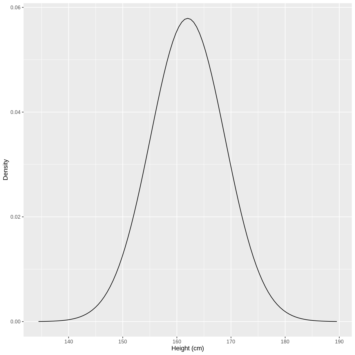
You may recognise the shape of the above distribution. It is an example of a normal distribution.
Let’s say that we sampled 1000 observations of female height through a survey. We can refer to these observations as $y_i$, with $i = 1, \dots, 1000$. The distribution of female heights has a few properties of interest, which we can estimate using our sample.
The mean
The population mean is the average of all the values that make up a distribution. In the case of female heights in the US, we will assume that the the population mean is 162 cm. Under this assumption, the average height of a US female is 162 cm.
After obtaining our sample of 1000 observations from the population, we may be interested in the sample mean. We expect our sample mean to equal the population mean, with a sufficiently large sample. The sample mean is expressed as $\bar{y}$:
[\bar{y} = \frac{1}{n} \left( \sum_{i=1}^n y_{i} \right)]
where $n = 1000$.
The variance
The variance is the average squared difference between values in the distribution and the mean of the distribution. This is a mouthful, so it is useful to look at the equation of variance.
Here we will look at the sample variance, expressed as $s_{y}^2$:
[s_{y}^2 = \frac{1}{n-1} \left( \sum_{i=1}^n (y_{i} - \bar{y})^2 \right)]
Breaking this down, we see that the sample variance is calculated using:
- $y_{i} - \bar{y}$, i.e. the difference between an observed height and the sample mean height.
- $(y_{i} - \bar{y})^2$, i.e. the squared difference between an observed height and the sample mean height.
- $\frac{1}{n-1} \sum_{i=1}^n (y_i - \bar{y})^2 $, i.e. the mean of this squared difference. Note that we divide by $n-1$ rather than $n$, which is known as a bias correction. This allows us to estimate the population variance more accurately.
Why are we interested in this value? We are mainly interested in the variance because it allows us to calculate the standard deviation, which can be interpreted on the original scale. Let’s look at this below.
The standard deviation
The standard deviation of a distribution is the square root of the variance. The standard deviation is interpreted as a measure of the difference between values in the distribution and the mean of the distribution. A higher standard deviation indicates that the spread around the mean is greater. There is no “good” or “bad” standard deviation - its purpose is to give us an idea of the spread of observations in the population.
After obtaining our sample of 1000 observations from the population, we may be interested in the sample standard deviation. We expect our sample standard deviation to equal the population standard deviation, with a sufficiently large sample. The sample standard deviation is expressed as $s_y$:
[s_y = \sqrt{s_{y}^2}]
Estimating the mean, variance and standard deviation through simulation
Another route to understanding the mean, variance and standard deviation is through simulation. This is the process of sampling data from a distribution using R. This is akin to collecting observations in the real world, where obervations come from an underlying distribution.
For example, we can sample 1000 observations from the distribution
of female heights in the US using rnorm(). We store these values in a tibble,
with the column named heights.
sample <- tibble(heights = rnorm(1000, mean = 162, sd = 6.89))
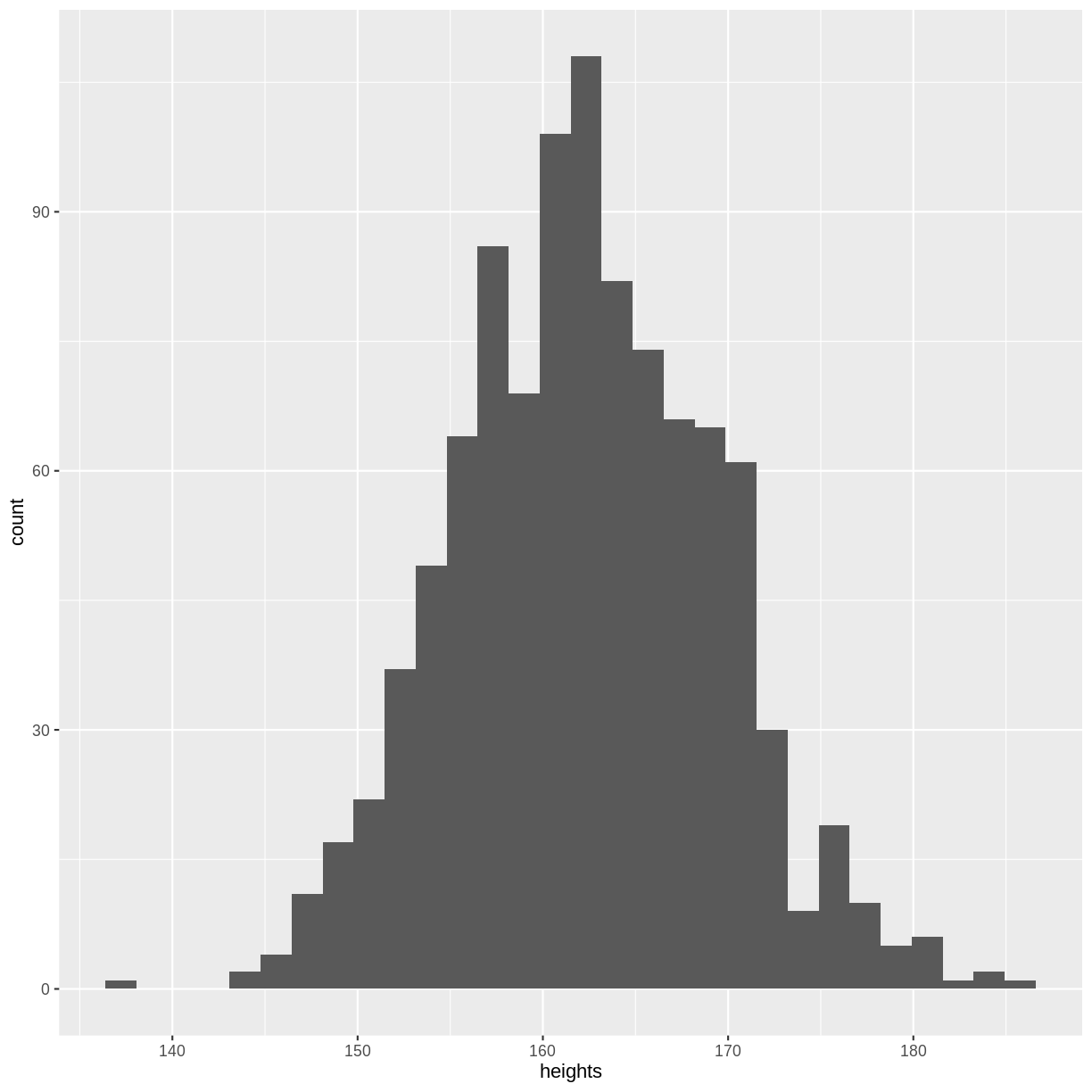
Before calculating the mean, variance and standard deviation, let’s create
a histogram of our sample. Although not a perfect representation, our histogram
looks quite similar to the distribution shown at the start of this episode. Your
plot will differ slightly from the histogram shown below, as rnorm() obtained
a random sample. If you create a new sample and run the ggplot() code again,
the histogram will differ slightly again. Every sample contains 1000 new observations
from the same distribution, akin to running an experiment where we collect 1000
observations.
ggplot(sample, aes(x = heights)) +
  geom_histogram()
We can calculate sample mean using mean(). This value lies
close to the population mean of 162 cm. Here we see that the sample mean
approximately equals the population mean with a sufficiently large sample.
meanHeight <- mean(sample$heights)
meanHeight
[1] 162.2838
We can also calculate the variance as the mean of the squared differences
between our sampled observations and the sample mean, where
sum() sums the squared differences and we divide by $n-1 = 999$:
varHeight <- (1/999) * sum( (sample$heights - meanHeight)^2 )
varHeight
[1] 49.26087
Finally, we calculate the sample standard deviation as the square root of the sample variance.
The square root is obtained using sqrt(). Recall that we calculate the standard
deviation to have a measure of spread in our distribution, in the same units
as our original data (in this case, mmHg).
sdHeight <- sqrt(varHeight)
sdHeight
[1] 7.018609
Exercise
The normal distribution of systolic blood pressure has a mean of 112 mmHg and a standard deviation of 10 mmHg. The distribution looks as follows:
A) Sample one thousand observations from this distribution. Then, create a histogram of your sample.
B) Calculate the average systolic blood pressure in your sample. Does this value correspond to the population mean?
C) Calculate the variance of your sample.
D) Calculate the standard deviation of your sample. How is the standard deviation interpreted here?Solution
Throughout this solution, your results will differ slightly from the ones shown below. This is a consequence of
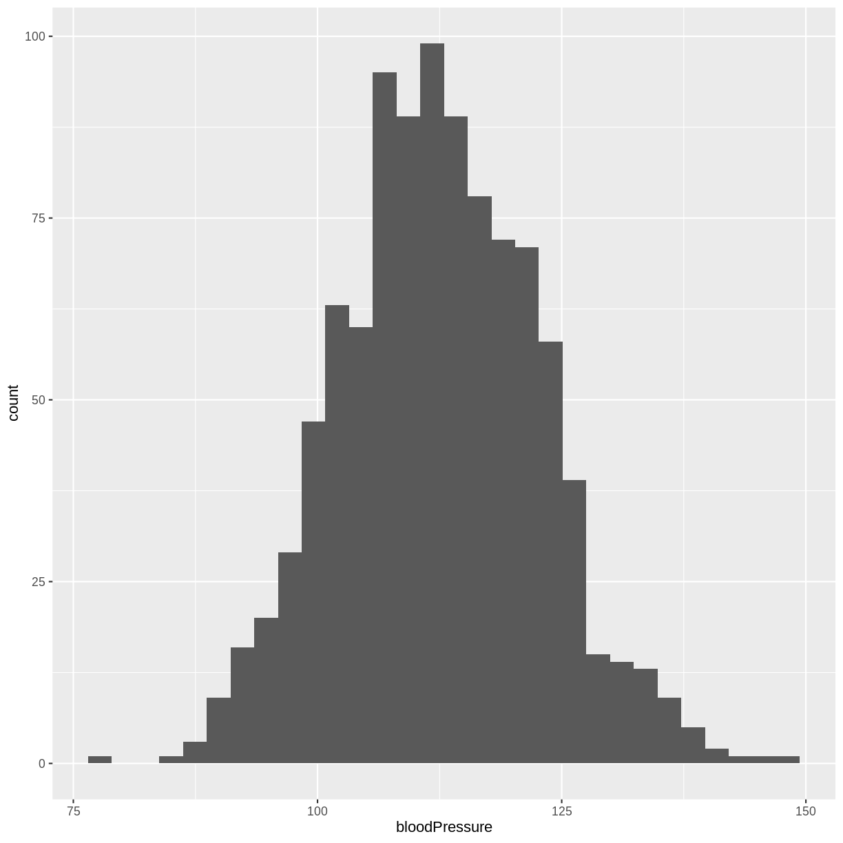
rnorm()drawing random samples. If you are completing this episode in a workshop setting, ask your neighbour to compare results! If you are working through this episode independently, try running your code again to see how the results differ.A) We obtain 1000 observations from the systolic blood pressure distribution using
rnorm(). We store these values in an object namedsample. We then create a histogram usinggeom_histogram().sample <- tibble(bloodPressure = rnorm(1000, mean = 112, sd = 10)) ggplot(sample, aes(x = bloodPressure)) + geom_histogram()
B) We can then calculate the average systolic blood pressure in our sample using
mean(). The mean of our sample lies closely to the mean of the original distribution.meanBP <- mean(sample$bloodPressure) meanBP[1] 112.4119C) The variance equals the average of the squared differences between the mean of the distribution and the observed values. This can be calculated as follows:
varBP <- (1/999) * sum( (sample$bloodPressure - meanBP)^2 )
varBP
[1] 103.768D) The standard deviation equals the square root of the variance. It is interpreted as a measure of the spread of sampled systolic blood pressure values and the mean systolic blood pressure. The square root can be calculated using
sqrt().sdBP <- sqrt(varBP) sdBP[1] 10.18666
Key Points
The mean is the average value. The population has a population mean, while we estimate a sample mean from our sample.
The sample variance is the average of the squared differences between values in our sample and the mean of our sample.
The standard deviation is the square root of the variance. It measures the spread of observations around the mean, in units of the original data.
Estimating the variation around the mean: standard errors and confidence intervals
Overview
Teaching: 20 min
Exercises: 40 minQuestions
What are the definitions of the standard error and the 95% confidence interval?
How is the 95% confidence interval interpreted in practice?
Objectives
Explore the difference between a population parameter and sample estimates by simulating data from a normal distribution.
Define the 95% confidence interval by simulating data from a normal distribution.
In the previous episode, we obtained an estimate of the mean by simulating from a normal distribution. This simulation was akin to obtaining one sample in the real world. We learned that as is the case in the real world, every sample will differ from the next sample slightly.
In this episode, we will learn how to estimate the variation in the mean estimate. This will tell us how far we can expect the population mean to lie from our sample mean. We will also visualise the variation in the estimate of the mean, when we simulate many times from the same distribution. This will allow us to understand the meaning of the 95% confidence interval.
The standard error of the mean
In the previous episode, we learned that the standard deviation is a measure of the expected difference between a value in the distribution and the mean of the distribution. In this episode we will work with a related quantity, called the standard error of the mean (referred to hereafter as the standard error). The standard error quantifies the spread of sample means around the population mean.
For example, let’s say we collected 1000 observations of female heights in the US, to estimate the mean height. The standard error of this estimate in this case is 0.22 cm.
The standard error is calculated using the standard deviation and the sample size:
[\text{se}(y) = s_{y}/\sqrt{n}.]
Therefore, for our female heights sample, the standard error was calculated as $\text{se}(y) = 6.89 / \sqrt{1000} \approx 0.22$ cm.
Notice that with greater $n$, the standard error will be smaller. This makes intuitive sense: with greater sample sizes come more precise estimates of the mean.
One of the reasons we calculate the standard error is that it allows us to calculate the 95% confidence interval, as we will do in the next section.
The 95% confidence interval
We use the standard error to calculate the 95% confidence interval. This interval equals, for large samples:
[[\bar{y} - 1.96 \times \text{se}(y); \bar{y} + 1.96 \times \text{se}(y)],]
i.e. the mean +/- 1.96 times the standard error.
The definition of the 95% confidence interval is a bit convoluted:
95% of 95% confidence intervals are expected to contain the true population mean.
Imagine we were to obtain 100 samples of female heights in the US, with each sample containing 1000 observations. For each sample, we would calculate a mean and a 95% confidence interval. By the definition of the interval, we would expect approximately 95 of the intervals to contain the true mean of 162 cm. In other words, we would expect approximately 5 of our samples to give confidence intervals that do not contain the true mean of 162 cm.
What does this mean in practice? When we calculate a 95% confidence interval, we are fairly confident that it will contain the true population mean, but we cannot know for sure.
Let’s take a look at how we can calculate the 95% confidence interval in R.
First, we sample 1000 observations of female heights and calculate the sample mean,
as in the previous episode. Then, we calculate the standard error as the standard
deviation divided by the square root of the sample size. Note the use of the
sd() function, which returns the standard deviation
(rather than the manual calculation used in the previous episode).
Finally, the 95% confidence interval is given by the mean +/- 1.96
times the standard error. Note that your CI will differ slightly from the
one shown below, as rnorm() obtains random samples.
sample <- tibble(heights = rnorm(1000, mean = 162, sd = 6.89))

meanHeight <- mean(sample$heights)

seHeight <- sd(sample$heights)/sqrt(1000)

CI <- c(meanHeight - 1.96 * seHeight, meanHeight + 1.96 * seHeight)
CI
[1] 161.7944 162.6394
The confidence interval shown above has a lower bound of 161.7898 and an upper bound of 162.6439. In this instance, we have obtained a 95% confidence interval that captures the population mean of 162. The confidence interval that you obtain may not capture the population mean of 162. It would then be part of the 5% of 95% confidence intervals that do not capture the population mean.
Exercise
A) Given the distribution of systolic blood pressure, with a population mean of 112 mmHg and a population standard deviation of 10 mmHg, obtain a random sample of 2000 observations.
B) Estimate the sample mean systolic blood pressure and provide a 95% confidence interval for this estimate. How do we interpret this interval?Solution
Throughout this solution, your results will differ slightly from the ones shown below. This is a consequence of
rnorm()drawing random samples. If you are completing this episode in a workshop setting, ask your neighbour to compare results! If you are working through this episode independently, try running your code again to see how the results differ.A)
sample <- tibble(bloodPressure = rnorm(2000, mean = 112, sd = 10))B)
meanBP <- mean(sample$bloodPressure)
seBP <- sd(sample$bloodPressure)/sqrt(2000)

CI <- c(meanBP - 1.96 * seBP, meanBP + 1.96 * seBP)
CI
[1] 111.3997 112.2691The confidence interval has lower bound 111.4 and upper bound 112.27. The interval captures the population mean of 112 and therefore belongs to the 95% of 95% CIs that do capture the population mean. If your CI does not cover 112, then your CI belongs to the 5% of 95% CIs that do not capture the population mean.
Simulating 95% confidence intervals
In the previous section we learned that 95% of 95% confidence intervals are expected to contain the population mean. Let’s see this in action, by simulating 100 data sets of 1000 female heights.
First, we create a tibble for our means and confidence intervals.
We name this tibble means and create empty columns for the sample IDs,
mean heights, standard errors, the lower bound of the confidence intervals
and the upper bound of the confidence intervals.
means <- tibble(sampleID = numeric(),
               meanHeight = numeric(),
               seHeight = numeric(),
               lower_CI = numeric(),
               upper_CI = numeric())
We simulate the Heights data using a for loop. This gives us 100 iterations,
in which samples are drawn using rnorm(). For each sample,
we add a row to our means tibble using add_row(). We include an ID for the
sample, the mean Height, the standard error and the bounds of the 95% confidence interval.
for(i in 1:100){
 sample_heights <- rnorm(1000, mean = 162, sd = 6.89)

 means <- means %>%
   add_row(sampleID = i,
           meanHeight = mean(sample_heights),
           seHeight = sd(sample_heights)/sqrt(1000),
           lower_CI = meanHeight - 1.96 * seHeight,
           upper_CI = meanHeight + 1.96 * seHeight)
}
Finally, we add a column to our means tibble that indicates whether a
confidence interval contains the true population mean of 162 cm.
means <- means %>%
 mutate(capture = ifelse((lower_CI < 162 & upper_CI > 162),
                           "Yes", "No"))
Now we are ready to plot our means and confidence intervals. The following
code plots the mean estimates along the x-axis using geom_point(), with
sample IDs along the y-axis. Confidence intervals are added to these points
using geom_errorbar(). The population mean is displayed as a dashed line
using geom_vline(). Finally, confidence intervals are coloured by whether
they capture the true population mean.
ggplot(means, aes(x = meanHeight, y = sampleID, colour = capture)) +
 geom_point() +
 geom_errorbar(aes(xmin = lower_CI, xmax = upper_CI, colour = capture)) +
 geom_vline(xintercept = 162, linetype = "dashed") +
 scale_color_manual("Population mean captured",
                    values = c("magenta", "black"))
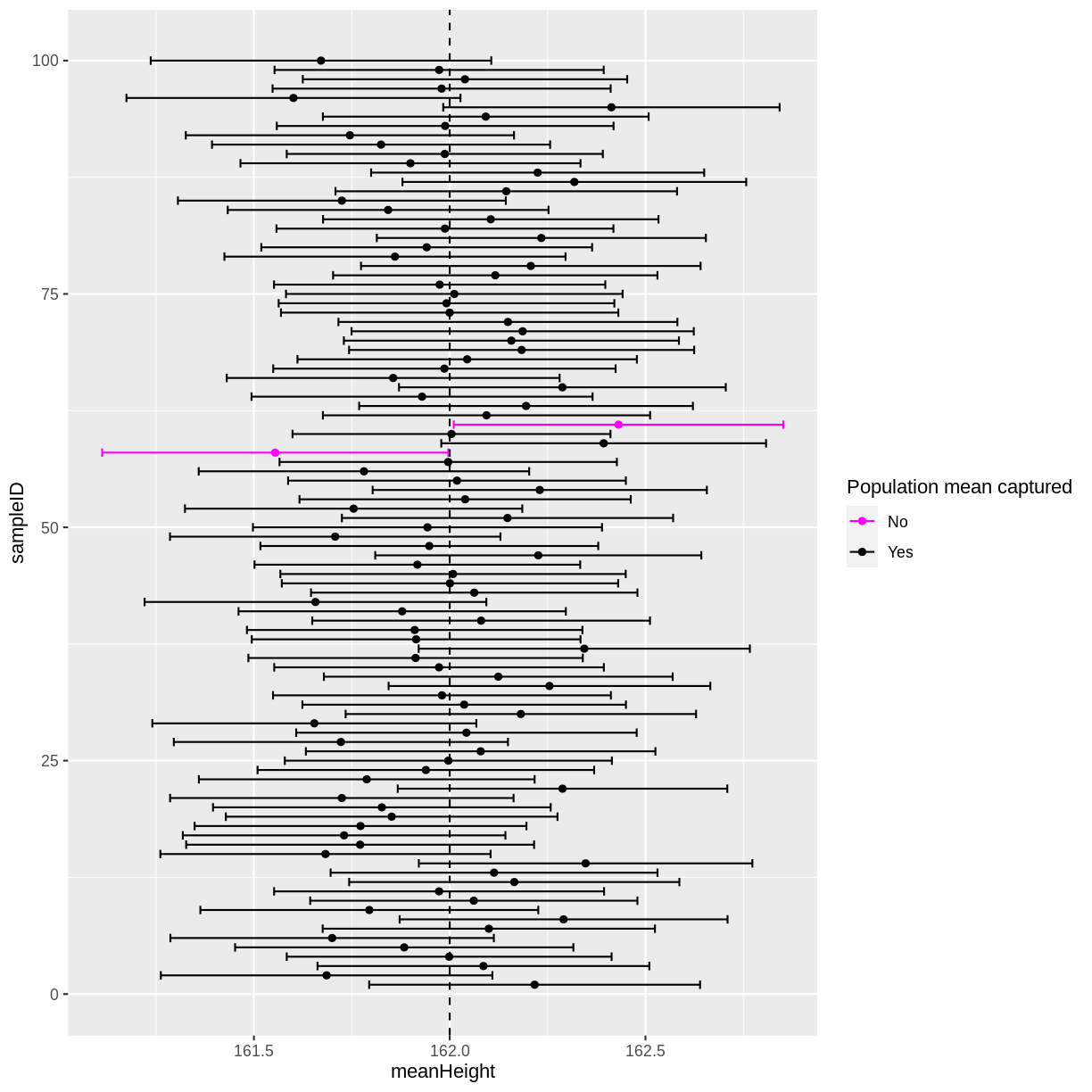
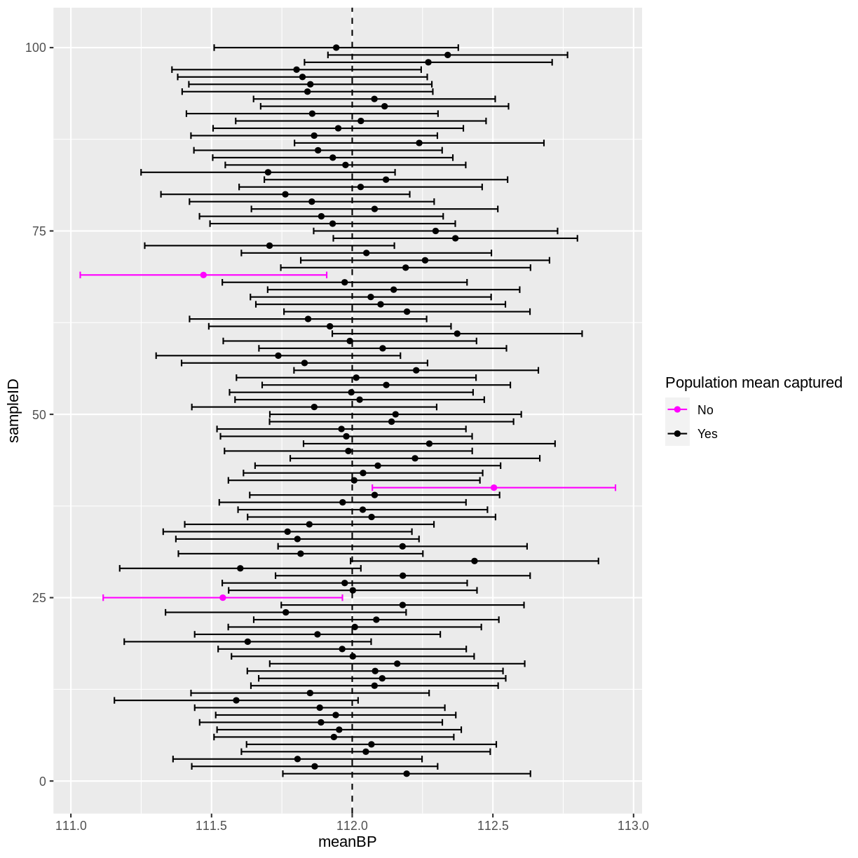
In this instance, 2 out of 100 95% confidence intervals did not capture the population mean. If you run the above code multiple times, you will discover that there is variation in the number of confidence intervals that capture the population mean. On average, 5 out of 100 95% confidence intervals will not capture the population mean.
Exercise
A) Given the distribution of systolic blood pressure, with a mean of 112 mmHg and a standard deviation of 10 mmHg, simulate 100 data sets of 2000 observations each. For each sample, store the sample ID, mean systolic blood pressure, the standard error and the 95% confidence interval in a tibble.
B) Create an extra column in the tibble, indicating for each confidence interval whether the original mean of 112 mmHg was captured.
C) Plot the mean values and their 95% confidence intervals. Add a line to show the population mean. How many of your 95% confidence intervals do not contain the true population mean of 112 mmHg?
D) Increase or decrease the number of observations sampled per data set in part A. Then, run through parts A, B and C again. What happened to the width of the confidence intervals? Did the interpretation of the confidence intervals change in any way?Solution
Throughout this solution, your results will differ slightly from the ones shown below. This is a consequence of
rnorm()drawing random samples. If you are completing this episode in a workshop setting, ask your neighbour to compare results! If you are working through this episode independently, try running your code again to see how the results differ.A)
means <- tibble(sampleID = numeric(),
                meanBP = numeric(),
                seBP = numeric(),
                lower_CI = numeric(),
                upper_CI = numeric())


for(i in 1:100){

  sample_bp <- rnorm(2000, mean = 112, sd = 10)

  means <- means %>%
    add_row(sampleID = i,
            meanBP = mean(sample_bp),
            seBP = sd(sample_bp)/sqrt(2000),
            lower_CI = meanBP - 1.96 * seBP,
            upper_CI = meanBP + 1.96 * seBP)
}
B)
means <- means %>%
  mutate(capture = ifelse((lower_CI < 112 & upper_CI > 112),
                            "Yes", "No"))
C) In this instance, three 95% confidence intervals did not contain the true population mean. Since
rnorm()draws random samples, you may have more or less 95% confidence intervals that capture the true population mean. On average, we 5 out of 100 95% confidence intervals will fail to capture the population mean.ggplot(means, aes(x = meanBP, y = sampleID, colour = capture)) + geom_point() + geom_errorbar(aes(xmin = lower_CI, xmax = upper_CI, colour = capture)) + geom_vline(xintercept = 112, linetype = "dashed") + scale_color_manual("Population mean captured", values = c("magenta", "black"))
D) Increasing the number of observations per data set decreases the width of confidence intervals. Decreasing the number of observations per data set has the opposite effect. However, the interpretation of the confidence intervals remains the same: we still have on average 5 out of 100 intervals that do not capture the true population mean.
Why is the confidence interval calculated with 1.96?
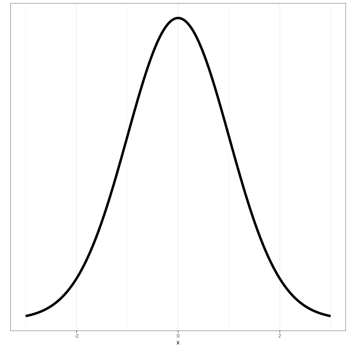
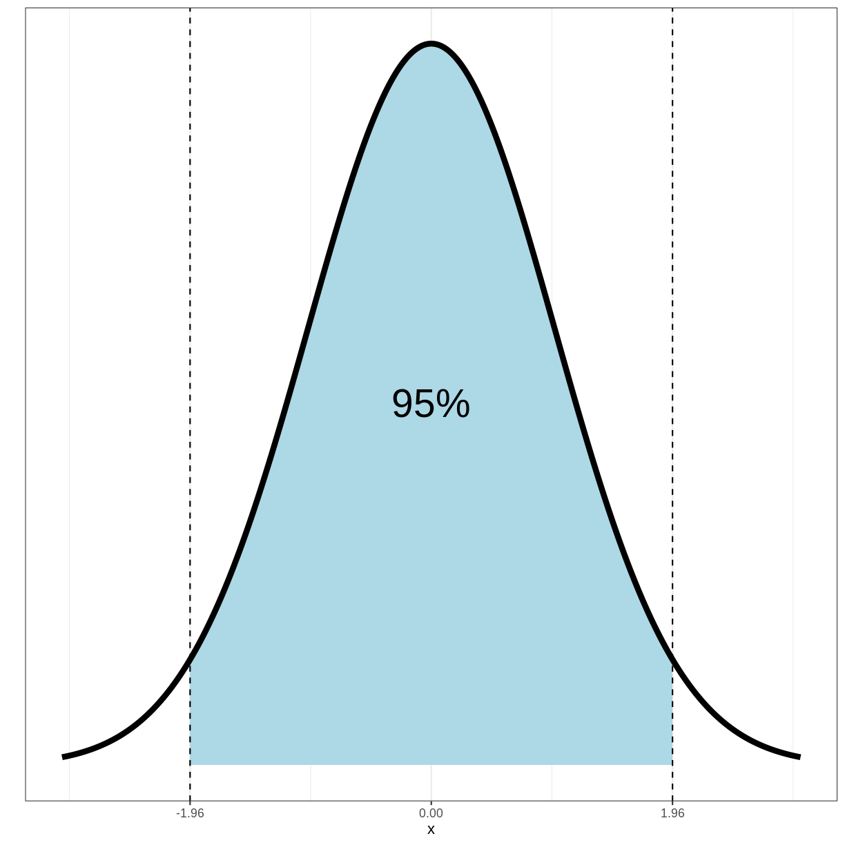
To understand where the 1.96 mulitplier comes from, we need to look at the standard normal distribution. The standard normal distribution is a normal distribution with a mean of 0 and a standard deviation of 1:
Importantly, 95% of the density of this distribution falls within the range of -1.96 and 1.96:
It can be shown that for a sample mean $\bar{X}$, coming from a normal sampling distribution, $Z$ follows a standard normal distribution:
\[Z = \frac{\bar{X}-\mu}{\sigma / n}\]Here, $\mu$ is the population mean, $\sigma$ is the population standard deviation and $n$ is the sample size.
Since 95% of the density of the standard normal distribution falls between -1.96 and 1.96, the following holds:
\[Pr(-1.96 < Z < 1.96) = 0.95\]Filling in $Z$ gives us:
\[Pr(-1.96 < \frac{\bar{X}-\mu}{\sigma / n} < 1.96) = 0.95\]Which can be derived to:
\[Pr(\bar{X} -1.96 \frac{\sigma}{n} < \mu < \bar{X} + 1.96 \frac{\sigma}{n}) = 0.95\]Since 95% of 95% confidence intervals will contain the true population mean $\mu$, the 95% confidence interval is given by $\bar{X} \pm 1.96 \times \frac{\sigma}{n}$, i.e. $\bar{X} \pm 1.96 \times se(X)$
Key Points
Sample means are expected to differ from the population mean. We quantify the spread of estimated means around the population mean using the standard error.
95% of 95% confidence intervals are expected to capture the population mean. In practice, this means we are fairly confident that a 95% confidence interval will contain the population mean, but we do not know for sure.
Visualising and quantifying linear associations
Overview
Teaching: 10 min
Exercises: 10 minQuestions
How can we visualise the linear association between two variables?
How can we quantify the size of a linear association?
Objectives
Explore whether two variables appear to be associated using a scatterplot.
Calculate the size of a linear association between two variables using Pearson’s correlation.
In this episode we will learn how to check whether two variables are linearly associated. This will allow us to use one variable to predict the mean of another variable in the next episode, when an association exists.
Visually checking for a linear association
The first way to check for a linear association is by using a scatterplot.
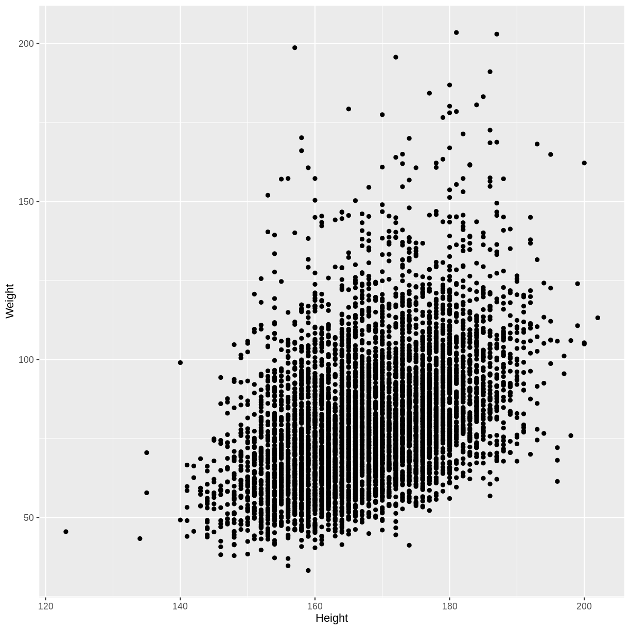
For example, below we create a scatterplot of adult Weight vs. Height.
We subset our data (dat) for adult participants using filter(), after which
we specify the x and y axes in ggplot() and make a scatterplot using
geom_point(). Note that dat is loaded into the environment by following
the instructions on the
setup page.
dat %>%
  filter(Age > 17) %>%
  ggplot(aes(x = Height, y = Weight)) +
  geom_point()
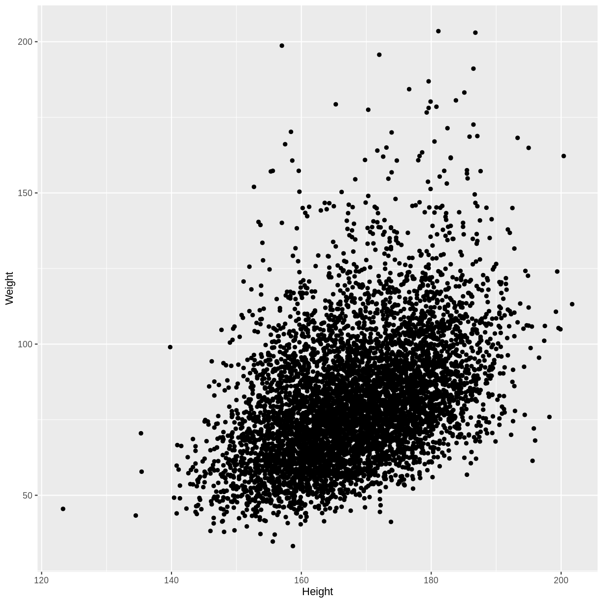
We see that on average, higher Weights are associated with higher Heights. This is an example of a positive linear association, as we see an increase along the y-axis as the values on the x-axis increase. The linear association suggests that we could use Heights to predict Weights.
In the exercise below you will explore examples of a negative linear association and an absence of a linear association.
Exercise
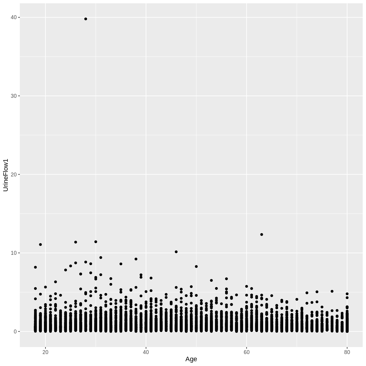
A) Create a scatterplot of urine flow (
UrineFlow1) on the y-axis and age (Age) on the x-axis for adult participants. How would you describe the association between these variables?
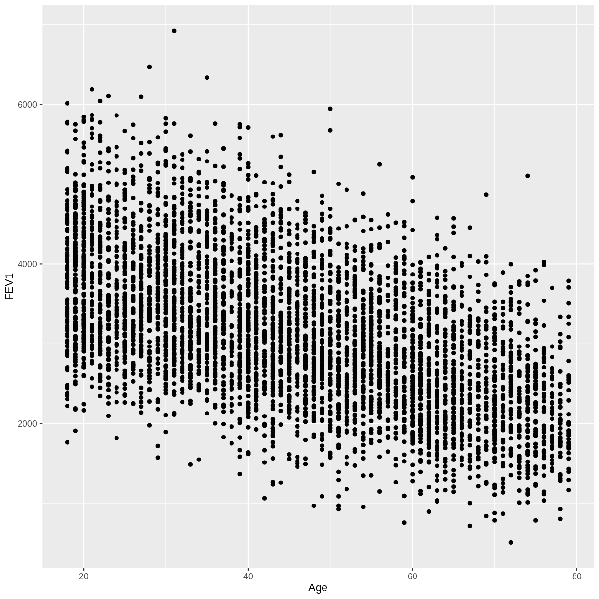
B) Create a scatterplot of FEV1 (FEV1) on the y-axis and age (Age) on the x-axis for adult participants. How would you describe the association between these variables?Solution
A) There appears to be no linear association between urine flow and age.
dat %>%
  filter(Age > 17) %>%
  ggplot(aes(x = Age, y = UrineFlow1)) +
  geom_point()
B) There appears to be a negative linear association between FEV1 and age.
dat %>%
  filter(Age > 17) %>%
  ggplot(aes(x = Age, y = FEV1)) +
  geom_point()

Quantifying the size of a linear association
We can quantify the magnitude of a linear association using Pearson’s correlation coefficient. This metric ranges from -1 to 1.
- A value of -1 indicates a perfect negative linear association.
- A value of 1 indicates a perfect positive linear association.
- A value of 0 indicates absence of a linear association.
Let’s see these in practice by calculating the correlation coefficient
for the associations that we explored above. To calculate the correlation
coefficient between Weight and Height, we again select adult participants using
filter(). Then, we calculate the correlation using the summarise() function.
The correlation is given by the cor() function, where use = "complete.obs"
ensures that participants for whom Weight or Height data is missing are ignored.
dat %>%
  filter(Age > 17) %>%
  summarise(correlation = cor(Weight, Height, use = "complete.obs"))
  correlation
1   0.4296817
The correlation coefficient of 0.43 is in line with the positive linear association that we saw above.
Exercise
A) Calculate the correlation coefficient for urine flow (
UrineFlow1) and age (Age) in adult participants. Does this agree with the scatterplot?B) Calculate the correlation coefficient for FEV1 (
FEV1) and age (Age) in adult participants. Does this agree with the scatterplot?Solution
A) The correlation coefficient near 0 is in agreement with the scatterplot.
dat %>%
  filter(Age > 17) %>%
  summarise(correlation = cor(UrineFlow1, Age, use = "complete.obs"))
correlation 1 -0.07972899B) The correlation coefficient of -0.55 is in agreement with the scatterplot.
dat %>%
  filter(Age > 17) %>%
  summarise(correlation = cor(FEV1, Age, use = "complete.obs"))
correlation 1 -0.5487635
Key Points
Scatterplots allow us to visually check the linear association between two variables.
Pearson’s correlation coefficient allows us to quantify the size of a linear association.
Predicting means using linear associations
Overview
Teaching: 15 min
Exercises: 20 minQuestions
How can the mean of a continous outcome variable be predicted with a continous explanatory variable?
Objectives
Predict the mean of one variable through its association with a continuous variable.
In this episode we will predict the mean of one variable using its linear association with another variable. In a way, this will be our first example of a model: under the assumption that the mean of one variable is associated with another variable, we will be able to predict that mean.
This episode will bring together the concepts of mean, confidence interval and association, covered in the previous episodes. Prediction through linear regression will then be formalised in the next lesson.
We will refer to the variable for which we are making predictions as the outcome or dependent variable. The variable used to make predictions will be referred to as the explanatory or predictor variable.
Mean prediction using a continuous explanatory variable
We will predict the mean of one continuous outcome variable using a continuous explanatory variable. In our example, we will try to predict mean Weight using Height of adult participants.
Let’s first explore the association between Height and Weight. To make predicting easier, we will group observations together: we will round Height to the nearest integer before plotting and performing downstream calculations.
- First, we drop NAs in Weight and Height using
drop_na(). When we later round Height and calculate the means of Weight, this will prevent R from returning errors due to NAs. - Then, we restrict our plot to data from adult participants using
filter(). Since the relationship between Height and Weight differs between children and adults, we limit our analysis to the adult data. - Next, we round Heights using
mutate(). - Finally, we create a scatterplot using
ggplot()andgeom_point().
dat %>%
  drop_na(Weight, Height) %>%
  filter(Age > 17) %>%
  mutate(Height = round(Height)) %>%
  ggplot(aes(x = Height, y = Weight)) +
  geom_point()
Now we can calculate the mean Weight for each Height. In the code below,
we first remove rows with missing
values using drop_na() from the tidyr package.
We then filter for adult participants using filter() and round Heights using
mutate(). Next, we group observations by rounded height
using group_by(). We finally calculate the mean, standard error and
confidence interval bounds using summarise().
means <- dat %>%
  drop_na(Weight, Height) %>%
  filter(Age > 17) %>%
  mutate(Height = round(Height)) %>%
  group_by(Height) %>%
  summarise(
    mean = mean(Weight),
    n = n(),
    se = sd(Weight) / sqrt(n()),
    lower_CI = mean - 1.96 * se,
    upper_CI = mean + 1.96 * se
  )
Finally, we can overlay these means and confidence intervals onto the
scatterplot. First the means are overlayed using geom_point().
Then the confidence intervals are overlayed using geom_errorbar().
dat %>%
  drop_na(Weight, Height) %>%
  filter(Age > 17) %>%
  mutate(Height = round(Height)) %>%
  ggplot(aes(x = Height, y = Weight)) +
  geom_point() +
  geom_point(data = means, aes(x = Height, y = mean), colour = "magenta", size = 2) +
  geom_errorbar(data = means, aes(x = Height, y = mean, ymin = lower_CI, ymax = upper_CI),
                colour = "magenta")
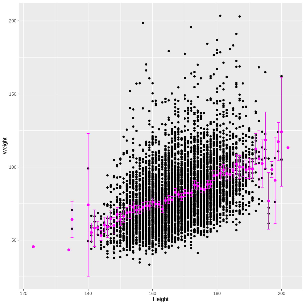
We see that as the positive correlation coefficient suggested, mean Weight indeed increases with Height. The outer confidence intervals are much wider than the central confidence intervals, because many fewer observations were used to estimate the outer means. There are also a few magenta points without a confidence interval, because those means were estimated using only a single observation.
Exercise
In this exercise you will explore the association between total FEV1 (
FEV1) and age (Age). Ensure that you drop NAs fromFEV1by includingdrop_na(FEV1)in your piped commands. Also, make sure to filter for adult participants by includingfilter(Age > 17).A) Create a scatterplot of FEV1 as a function of age.
B) Calculate the mean FEV1 by age, along with the 95% confidence interval for each of these mean estimates.
C) Overlay these mean estimates and their confidence intervals onto the scatterplot.Solution
A)
dat %>%
  drop_na(FEV1) %>%
  filter(Age > 17) %>%
  ggplot(aes(x = Age, y = FEV1)) +
  geom_point()
B)
means <- dat %>%
  drop_na(FEV1) %>%
  filter(Age > 17) %>%
  group_by(Age) %>%
  summarise(
    mean = mean(FEV1),
    n = n(),
    se = sd(FEV1) / sqrt(n()),
    lower_CI = mean - 1.96 * se,
    upper_CI = mean + 1.96 * se
  )
C)
dat %>%
  drop_na(FEV1) %>%
  filter(Age > 17) %>%
  ggplot(aes(x = Age, y = FEV1)) +
  geom_point() +
  geom_point(data = means, aes(x = Age, y = mean), colour = "magenta", size = 2) +
  geom_errorbar(data = means, aes(x = Age, y = mean, ymin = lower_CI, ymax = upper_CI),
                colour = "magenta")

Key Points
We can predict the means, and calculate confidence intervals, of a continuous outcome variable grouped by a continuous explanatory variable. On a small scale, this is an example of a model.