Predicting means using linear associations
Overview
Teaching: 15 min
Exercises: 20 minQuestions
How can the mean of a continous outcome variable be predicted with a continous explanatory variable?
Objectives
Predict the mean of one variable through its association with a continuous variable.
In this episode we will predict the mean of one variable using its linear association with another variable. In a way, this will be our first example of a model: under the assumption that the mean of one variable is associated with another variable, we will be able to predict that mean.
This episode will bring together the concepts of mean, confidence interval and association, covered in the previous episodes. Prediction through linear regression will then be formalised in the next lesson.
We will refer to the variable for which we are making predictions as the outcome or dependent variable. The variable used to make predictions will be referred to as the explanatory or predictor variable.
Mean prediction using a continuous explanatory variable
We will predict the mean of one continuous outcome variable using a continuous explanatory variable. In our example, we will try to predict mean Weight using Height of adult participants.
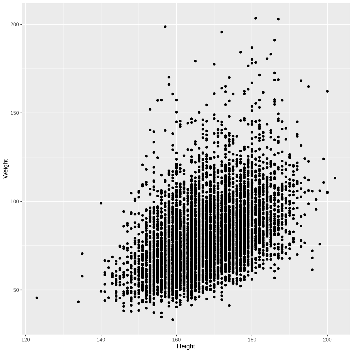
Let’s first explore the association between Height and Weight. To make predicting easier, we will group observations together: we will round Height to the nearest integer before plotting and performing downstream calculations.
- First, we drop NAs in Weight and Height using
drop_na(). When we later round Height and calculate the means of Weight, this will prevent R from returning errors due to NAs. - Then, we restrict our plot to data from adult participants using
filter(). Since the relationship between Height and Weight differs between children and adults, we limit our analysis to the adult data. - Next, we round Heights using
mutate(). - Finally, we create a scatterplot using
ggplot()andgeom_point().
dat %>%
  drop_na(Weight, Height) %>%
  filter(Age > 17) %>%
  mutate(Height = round(Height)) %>%
  ggplot(aes(x = Height, y = Weight)) +
  geom_point()
Now we can calculate the mean Weight for each Height. In the code below,
we first remove rows with missing
values using drop_na() from the tidyr package.
We then filter for adult participants using filter() and round Heights using
mutate(). Next, we group observations by rounded height
using group_by(). We finally calculate the mean, standard error and
confidence interval bounds using summarise().
means <- dat %>%
  drop_na(Weight, Height) %>%
  filter(Age > 17) %>%
  mutate(Height = round(Height)) %>%
  group_by(Height) %>%
  summarise(
    mean = mean(Weight),
    n = n(),
    se = sd(Weight) / sqrt(n()),
    lower_CI = mean - 1.96 * se,
    upper_CI = mean + 1.96 * se
  )
Finally, we can overlay these means and confidence intervals onto the
scatterplot. First the means are overlayed using geom_point().
Then the confidence intervals are overlayed using geom_errorbar().
dat %>%
  drop_na(Weight, Height) %>%
  filter(Age > 17) %>%
  mutate(Height = round(Height)) %>%
  ggplot(aes(x = Height, y = Weight)) +
  geom_point() +
  geom_point(data = means, aes(x = Height, y = mean), colour = "magenta", size = 2) +
  geom_errorbar(data = means, aes(x = Height, y = mean, ymin = lower_CI, ymax = upper_CI),
                colour = "magenta")
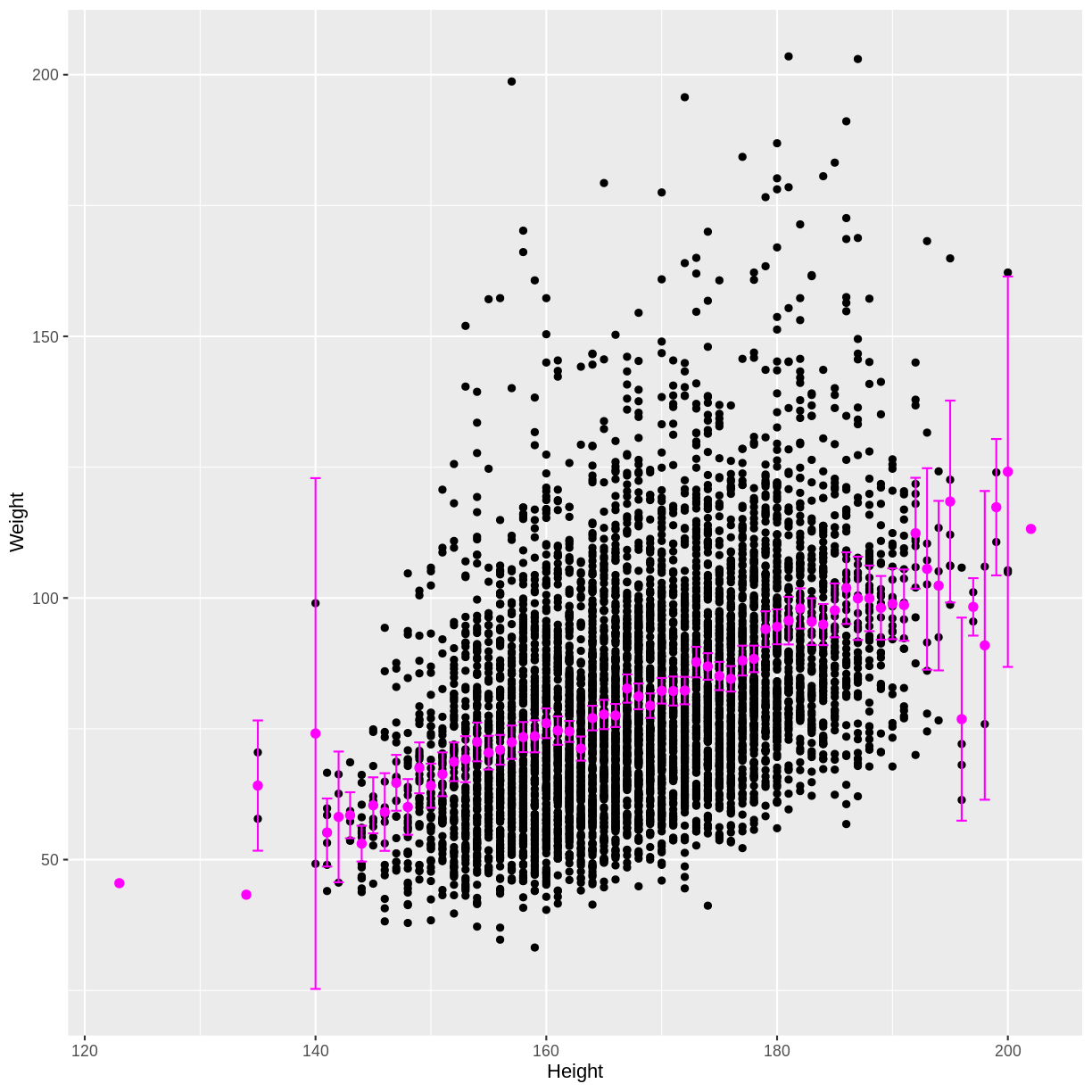
We see that as the positive correlation coefficient suggested, mean Weight indeed increases with Height. The outer confidence intervals are much wider than the central confidence intervals, because many fewer observations were used to estimate the outer means. There are also a few magenta points without a confidence interval, because those means were estimated using only a single observation.
Exercise
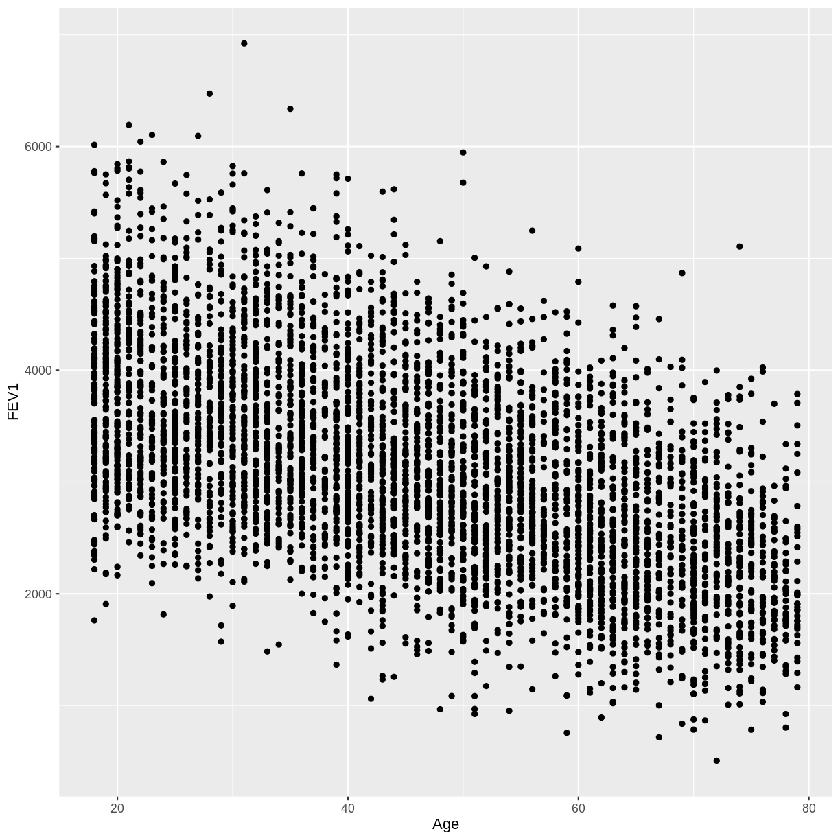
In this exercise you will explore the association between total FEV1 (
FEV1) and age (Age). Ensure that you drop NAs fromFEV1by includingdrop_na(FEV1)in your piped commands. Also, make sure to filter for adult participants by includingfilter(Age > 17).A) Create a scatterplot of FEV1 as a function of age.
B) Calculate the mean FEV1 by age, along with the 95% confidence interval for each of these mean estimates.
C) Overlay these mean estimates and their confidence intervals onto the scatterplot.Solution
A)
dat %>%
  drop_na(FEV1) %>%
  filter(Age > 17) %>%
  ggplot(aes(x = Age, y = FEV1)) +
  geom_point()
B)
means <- dat %>%
  drop_na(FEV1) %>%
  filter(Age > 17) %>%
  group_by(Age) %>%
  summarise(
    mean = mean(FEV1),
    n = n(),
    se = sd(FEV1) / sqrt(n()),
    lower_CI = mean - 1.96 * se,
    upper_CI = mean + 1.96 * se
  )
C)
dat %>%
  drop_na(FEV1) %>%
  filter(Age > 17) %>%
  ggplot(aes(x = Age, y = FEV1)) +
  geom_point() +
  geom_point(data = means, aes(x = Age, y = mean), colour = "magenta", size = 2) +
  geom_errorbar(data = means, aes(x = Age, y = mean, ymin = lower_CI, ymax = upper_CI),
                colour = "magenta")

Key Points
We can predict the means, and calculate confidence intervals, of a continuous outcome variable grouped by a continuous explanatory variable. On a small scale, this is an example of a model.