Why make interactive visualizations?
Overview
Teaching: 10 min
Exercises: 0 minQuestions
Why are visual representations of data useful when trying to see patterns?
Why do we want to make visualizations interactive?
Consider the message you want to convey or story you want to tell. Is it clearer with some interactivity?
Objectives
To understand the difference between static and interactive plots
To understand why we may want to make plots interactive
To introduce what we will be doing in this workshop lesson
Why do we like visualizations?
Visualization is often one of the first and most vital steps of exploratory data analysis. People benefit from visual representation of data to see patterns, and plotting data is also an important part of a researcher’s communication toolbox. Interactive visualizations can be used both during the initial exploratory phase and the final publication and communication phase of a research project.
Discuss: visualizations in research publications
When was the last time you saw a research paper without figures?
When reading research do you start with the figures?
How would the recent publications you have studied have made sense if you couldn’t see the figures?
Choices in analysis and presentation
Producing a figure will often depend on the story you want to tell, or the pattern you wish to highlight in your data.
Any one visualization is limited in how many attributes can (and should) be represented. For example, if you have a scatterplot and assign one attribute to x-axis, one attribute to the y-axis (maybe even one to the z-axis!), another attribute to the color, yet another attribute to the shape, and even another attribute to the size… you may be able to cram a lot of information into the plot, but the resulting visualization will probably not tell a clear story.
Any one visualization is limited in how many different attributes can be reasonably included. Modern data sets are often too dense to visualize without making a lot of these choices.
But with an interactive plot, we can include all of this information - just not at the same time. Rather than being forced to choose which few attributes to represent and communicate, you can allow the audience to choose the information they are interested in seeing, with the possibility they will choose to explore all of the possible visualizations.
The magic of interactivity is that you don’t have to limit yourself and your plots - you can visualize it all! However, you should carefully consider the options for your interactive visualizations so that they are still telling a cohesive story about the data.
Interactivity gives the audience a chance to explore the data in ways a static (non-interactive) plot does not. It can also help you and your collaborators understand your data better.
There are many options for making figures with Python
This tutorial makes use of Plotly and Streamlit, but a range of options now exist for visualizing data in the Python ecosystem.
These are summarized at PyViz.org.
Many of the tools described are developed with specific users in mind, whereas others are intentionally more basic and adaptable. Some are focused on particular issues, such as choices of color or the aggregation of data. There is a lot here to explore!
How will we build our interactive visualization app?
- Create a new and squeaky clean python environment that has only the packages we need
- Use pandas to wrangle our data into a tidy format
- Create some initial visualizations and learn how to use Plotly Express
- Create a basic streamlit app (no interactivity yet!) with one of those initial visualizations
- Go back through our code to refactor (reorganize) some hardcoded information into more flexible variables
- Add widgets! These are what allow our app to be truly interactive and allow users to adjust the displayed plots
- Deploy the app - so everyone can see what you created.
- (Optionally) Put your own creative spin on it - add some of your own widgets and visualizations to make your app unique
Key Points
Visualization is an important part of both exploratory data analysis and communicating results
Interactivity allows us to visualize more information without overcomplicating a single plot
Create a New Environment
Overview
Teaching: 20 min
Exercises: 0 minQuestions
How can I create a new conda environment?
Objectives
Create a new environment from an environment.yml file
Add this environment to Jupyter’s kernel list
This workshop utilizes some Python packages (such as Plotly) that cannot be installed in Anaconda’s base environment, because they will cause conflicts. To avoid these conflicts, we will create a new environment with only the packages we need for this workshop. These packages are:
- streamlit
- plotly
- plotly-geo
- jupyterlab
A note about anaconda
XKCD #1987: Python Environment
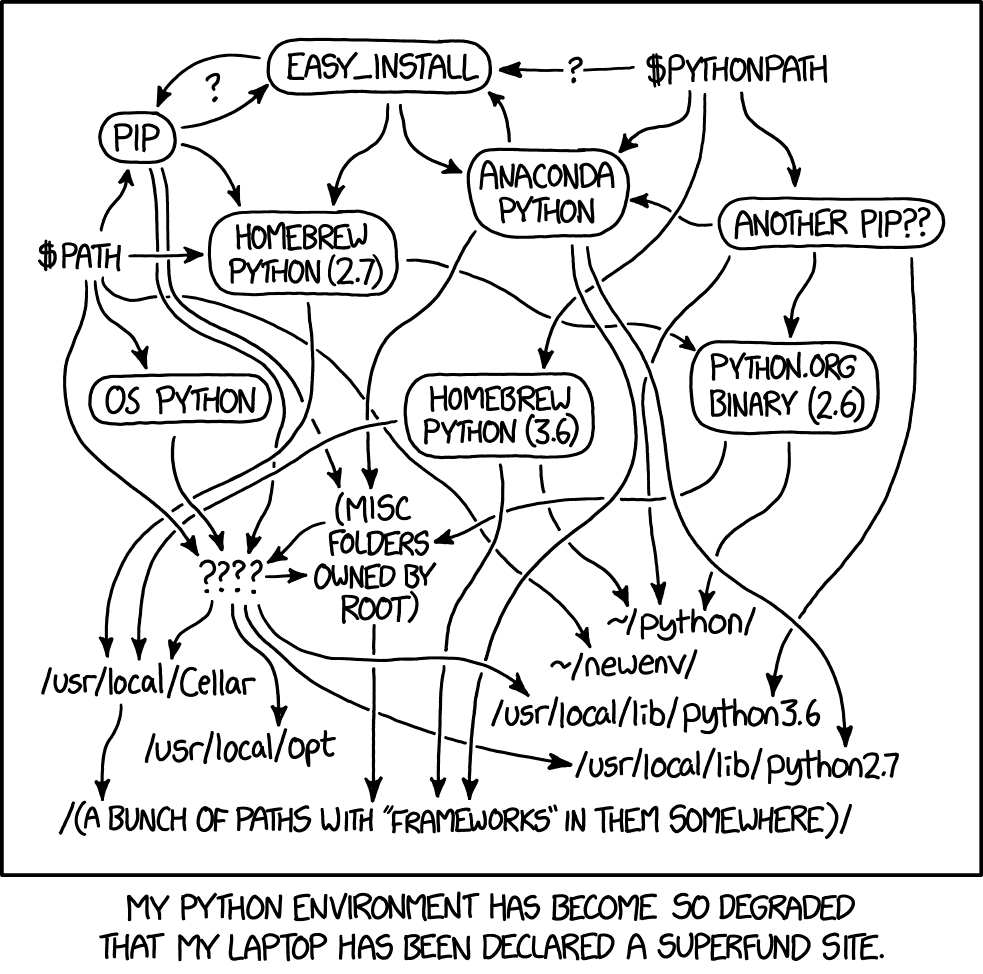
Python can live in many different places on your computer, and each source may have different packages already installed. By using an anaconda environment that we create, and by explicitly using only that environment, we can avoid conflicts… and know exactly what environment is being used to run our python code. And we avoid the mess indicated by the above comic!
Reflecting on environment mishaps
Have you ever been unable to install a package due to a conflict?
How did you solve the problem?
Create an environment from the environment.yml file
The necessary packages are specified in the environment.yml file.
Open your terminal, and navigate to the project directory. Then, take a look at the contents.
cd ~/Desktop/data_viz_workshop
ls -F
ls -F
For a refresher on bash commands, refer to the Unix Shell lesson.
lslists the contents of a directory, and the-Fflag will add a/to directories to more clearly distinguish between directories and files.
Data/ environment.yml
You should now see an environment.yml file and a Data directory.
Make sure that conda is working on your machine. You can verify this with:
conda env list
# conda environments:
#
base                  *   /opt/anaconda3

# other environments you have already created will be listed here.
# the * indicates the currently active environment
This will list all of your conda environments. You should make sure that you do not already have an environment called dataviz, or it will be overwritten. If you do already have an environment called dataviz, you can change the environment name by editing the first line in the environment.yml file.
Now, you need to create a new environment using this environment.yml file. To do this, type in the command line:
conda env create --file environment.yml
This process can take a while - about 2-3 minutes.
After the environment is created, go ahead and activate it. You can then see for yourself the packages that have been installed - both those listed in the file and all of their dependencies.
conda activate dataviz
conda list
# packages in environment at /opt/anaconda3/envs/dataviz:
#
# Name                    Version                   Build  Channel
abseil-cpp                20210324.2           he49afe7_0    conda-forge
altair                    4.1.0                      py_1    conda-forge
anyio                     3.3.0            py39h6e9494a_0    conda-forge
...
zipp                      3.5.0              pyhd8ed1ab_0    conda-forge
zlib                      1.2.11            h7795811_1010    conda-forge
zstd                      1.5.0                h582d3a0_0    conda-forge
Now we will need to tell Jupyter that this environment exists and should be made available as a kernel in Jupyter Lab.
python -m ipykernel install --user --name dataviz
Finally, we can go ahead and start Jupyter Lab
jupyter lab
Alternatives to Anaconda
Have you ever used a different solution for creating/managing virtual python environments? For example,
pipenvorvirtualenv?How does conda differ from these solutions?
Create the environment from scratch
If for some reason you are unable to create the environment from the environment.yml file, or you simply wish to do the process for yourself, you can follow these steps. These steps replace the conda env create --file environment.yml step in the instructions above.
First, create a new environment named dataviz and specify the python version.
Then, you will need to activate it and add the conda-forge channel.
Note that you can use any name for this new environment that you want, but you will need to make sure to continue to use that name for future steps.
conda create --name dataviz python=3.9
conda activate dataviz
conda config --add channels conda-forge
Next, you will need to install the top-level packages we will need for the workshop. Installing these packages will also install their dependencies.
conda install -c conda-forge streamlit
conda install -c plotly plotly=5.1.0
conda install -c plotly plotly-geo=1.0.0
conda install -c conda-forge jupyterlab
Note that this process will take a lot longer than installing from environment.yml, and you will also need to type y and press enter when prompted to complete the installation.
Learn more about using Anaconda to manage your environments
This episode only covers the bare minimum we need to get set up with using this new environment.
To learn more, please refer to the lesson Introduction to Conda for (Data) Scientists
Key Points
use
conda env create --file environment.ymlto create a new environment from a YAML filesee a list of all environments with
conda env listactivate the new environment with
conda activate <NAME>see a list of all installed packages with
conda list
Data Wrangling
Overview
Teaching: 15 min
Exercises: 5 minQuestions
What format should my data be in for Plotly Express?
Why can’t I use the data in its current format?
What is tidy data?
How can I use pandas to wrangle my data?
Objectives
Learn useful pandas functions for wrangling data into a tidy format
Data visualization libraries often expect data to be in a certain format so that the functions can correctly interpret and present the data. We will be using the Plotly Express library for visualizing data, which works best when data is in a tidy, or “long” format.
We want to visualize the data in gapminder_all.csv. However, this dataset is in a “wide” format - it has many columns, with each year + metric value in it’s own column. The unit of observation is the “country” - each country has its own single row.
Open the CSV file within Jupyter Lab
Click on the
Datafolder in the left-hand navigation pane and then double click ongapminder_all.csvto view this file within Jupyter Lab.Explore the dataset visually. What does each row represent? What does each column represent? About how many rows and columns are there?
We are going take this wide dataset and make it long, so the unit of observation will be each country + year + metric combination, rather than just the country. This process is made much simpler by a couple of functions in the pandas library.
Tidy Data
The term “tidy data” may be most popular in the R ecosystem (the “tidyverse” is a collection of R packages designed around the tidy data philosophy), but it is applicable to all tabular datasets, not matter what programming language you are using to wrangle your data.
You can ready more about the tidy data philosophy in Hadley Wickham’s 2014 paper, “Tidy Data”, available here.
Wickham later refined and revised the tidy data philosophy, and published it in the 12th chapter of his open access textbook “R for Data Science” - available here.
The revised rules are:
- Each variable must have its own column
- Each observation must have its own row
- Each value must have its own cell
It might be difficult at first to identify what makes a dataset “untidy”, and therefore what you will need to change in order to wrangle the dataset into a tidy shape.
Here are the five most common problems with untidy datasets (Identified in “Tidy Data”):
- Column headers are values, not variable names
- Multiple variables are stored in one column
- Variables are stored in both rows and columns
- Multiple types of observational units are stored in the same table
- A single observational unit is stored in multiple tables
Discuss: how is our dataset untidy?
Look again at the file
gapminder_all.csvyou opened in Jupyter Lab. Which of the 5 most common problems with untidy datasets applies to this dataset?
Getting Started
Let’s go ahead and get started by opening a Jupyter Notebook with the dataviz kernel. If you navigated to the Data folder to look at the CSV file, navigate back to the root before opening the new notebook.
We are also going to rename this new notebook to data_wrangling.ipynb.
Jupyter Notebooks are very handy because we can combine documentation (markdown cells) with our program (code cells) in a reader-friendly way. Let’s make our first cell into a markdown cell, and give this notebook a title:
# Data Wrangling
You can then add basic metadata like your name, the current date, and the purpose of this notebook.
Read in the data
We will start by importing pandas and reading in our data file. We can call the df variable to display it.
import pandas as pd
df = pd.read_csv("Data/gapminder_all.csv")
df
Melting the dataframe from wide to long
One problem with our dataset is that “column headers are values, not variable names”. The type of metric and the year are stuck in our column headers, and we want that information to be stored in rows.
The first function we are going to use to wrangle this dataset is pd.melt(). This function’s entire purpose to to make wide dataframes into long dataframes.
Check out the documentation
To learn more about
pd.melt(), you can look at the function’s documentation To see this documentation within Jupyter Lab, you can typepd.melt()in a cell and then hold down the shift + tab keys. You can also open a “Show Contextual Help” window from the Launcher.
Let’s take a look at all of the columns with:
df.columns
pd.melt() requires us to specify at least 3 arguments: the dataframe (frame), the “id” columns (id_vars) - that is, the columns that won’t be “melted” - and the “value” columns (value_vars) - the columns that will be melted.
Our “id” columns are country and continent. Our “value” columns are all of the rest. That’s a lot of columns! But no worries - we can programmatically make a list of all of these columns.
cols = list(df.columns)
cols.remove("continent")
cols.remove("country")
cols
Now, we can call pd.melt() and pass cols rather than typing out the whole list.
df_melted = pd.melt(df, id_vars=["country", "continent"], value_vars = cols)
df_melted
New dataframe variable names
When wrangling a dataframe in a Jupyter notebook, it’s a good idea to assign transformed dataframes to a new variable name. You don’t have to do this with every transformation, but do try to do this with every substantial transformation. This way, we don’t have to re-run the entire notebook when we are experimenting with transformations on a dataframe.
Just look at that beautiful, long dataframe! Take a closer look to understand exactly what pd.melt() did. The variable column has all of our former column names, and the value column has all of the values that used to belong in those columns.
Splitting a column
Now that we have melted our datset, we can address another untidy problem: “Multiple variables are stored in one column”.
Take a closer look at the variable column. This column contains two pieces of information - the metric and the year. Thankfully, these former column names have a consistent naming scheme, so we can easily split these two pieces of information into two different columns.
df_melted[["metric", "year"]] = df_melted["variable"].str.split("_", expand=True)
df_melted
Wide vs long data
Take a moment to compare this dataframe to the one we started with.
What are some advantages to having the data in this format?
Saving the final dataframe
Now that all of our columns contain the appropriate information, in a tidy/long format, it’s time to save our dataframe back to a CSV file. But first, let’s clean up our datset: we’re going to re-order our columns (and remove the now extra variable column) and sort the rows.
df_final = df_melted[["country", "continent", "year", "metric", "value"]]
df_final = df_final.sort_values(by=["continent", "country", "year", "metric"])
df_final
Finally, we will export the dataframe to a CSV file.
df_final.to_csv("Data/gapminder_tidy.csv", index=False)
We set the index to False so that the index column does not get saved to the CSV file.
Exercises
Imagining other tidy ways to wrangle
We wrangled our data into a tidy form. However, there is no single “true tidy” form for any given dataset.
What are some other ways you may wish to organize this dataset that are also tidy?
For Example
Instead of having a
metricandvaluecolumn, given thatmetriconly has 3 values, you could have a column each forgdpPercap,lifeExp, andpop.The values in each of those three columns would reflect the value of that metric for a given country in a given year. The columns in this dataset would be:
country,continent,year,gdpPercap,lifeExp, andpop.How would you wrangle the original dataset into this other tidy form using pandas?
Key Points
Import your CSV using
pd.read_csv('<FILEPATH>')Transform your dataframe from wide to long with
pd.melt()Split column values with
df['<COLUMN>'].str.split('<DELIM>')Sort rows using
df.sort_values()Export your dataframe to CSV using
df.to_csv('<FILEPATH>')
Create Visualizations
Overview
Teaching: 15 min
Exercises: 5 minQuestions
How can I create an interactive visualization using Plotly Express?
Objectives
Learn how to create and modify an interactive line plot using the px.line() function
Now that our data is in a tidy format, we can start creating some visualizations. Let’s start by creating a new notebook (make sure to select the dataviz kernel in the Launcher) and renaming it data_visualizations.ipynb.
Let’s make our first cell into a markdown cell, and give this notebook a title:
# Data Visualizations
Remember to also add some metadata and describe what this notebook does.
Import our newly tidy data
First, we need to import pandas and Plotly Express, and then read in our dataframe.
import pandas as pd
import plotly.express as px

df = pd.read_csv("Data/gapminder_tidy.csv")
df
Creating our first plot
Our first plot is going to be relatively simple. Let’s plot the GDP of New Zealand over time. First, let’s figure out what our X and Y axis will need to be.
The X axis is typically used for time, so that will be our year column.
The Y axis will be the GDP amount, which is kept in the value column.
However, this dataframe has a lot of extra information in it. We want to create a new dataframe with only the rows we need for the visualization.
That means we need to filter for rows where the country is “New Zealand” and the metric is “gdpPercap”.
We can do this with the query() function.
df.query("country=='New Zealand'")
This will select all of the rows where country is “New Zealand”. We can add our second condition by either chaining another query() function or specifying the additional condition in the same query() function.
df.query("country=='New Zealand'").query("metric=='gdpPercap'")
df.query("country=='New Zealand' & metric=='gdpPercap'")
Let’s make sure to save that filtered dataframe to a new variable.
df_gdp_nz = df.query("country=='New Zealand' & metric=='gdpPercap'")
Now we can pass this dataframe to the px.line() function. At a minimum, we need to tell the function what dataframe to use, what column should be the X axis, and what column should be the Y axis.
fig = px.line(df_gdp_nz, x = "year", y = "value")
fig.show()
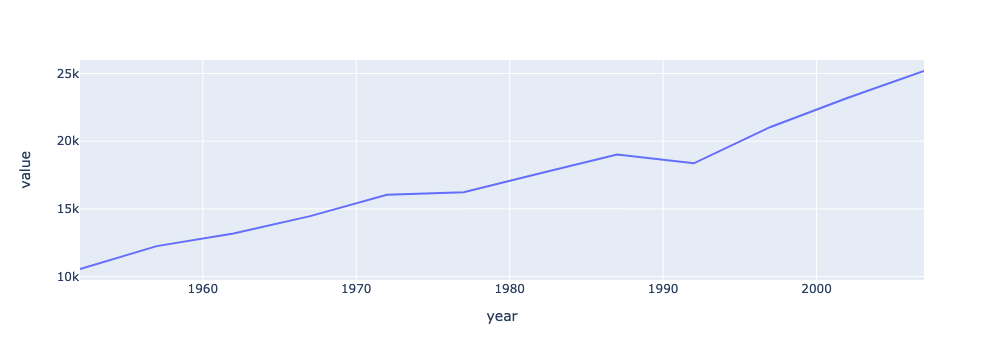
There it is! Our first line plot.
When you want to compare - adding more lines and labels
By itself, this plot of New Zealand’s GDP isn’t especially interesting. Let’s add another line, to compare it to Australia.
First, we need to define a new dataframe to select the rows we need. This time, we will specify the continent as “Oceania”.
df_gdp_o = df.query("continent=='Oceania' & metric=='gdpPercap'")
df_gdp_o
Now, we will create another figure, but this time we need to pass an additional parameter: color.
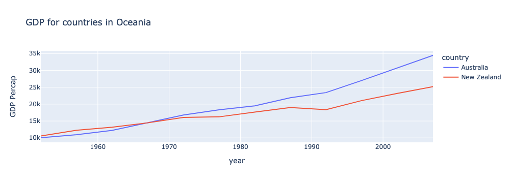
fig = px.line(df_gdp_o, x = "year", y = "value", color = "country")
fig.show()
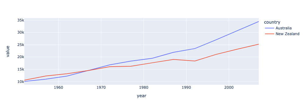
Great! This already looking better. But we should fix that y-axis label and add a title.
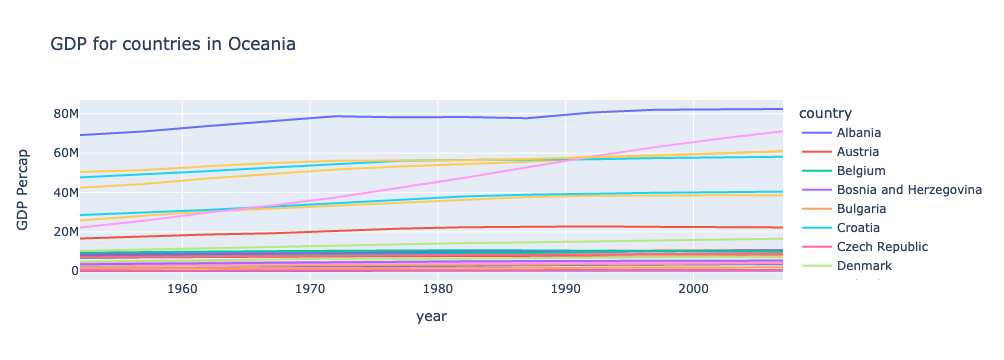
title = "GDP for countries in Oceania"
fig = px.line(df_gdp_o, x = "year", y = "value", color = "country", title = title, labels={"value": "GDP Percap"})
fig.show()
Interactivity is baked in to Plotly charts
When you have many more lines, the interactive features of Plotly become very useful. Notice how hovering over a line will tell you more information about that point. You will also see several options in the upper right corner to further interact with the plot - including saving it as a PNG file!
Exercises
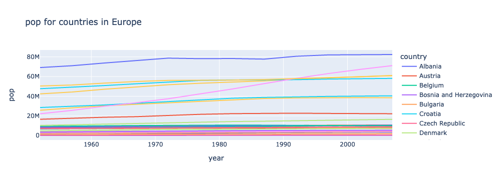
Visualize Population in Europe
Create a plot that visualizes the population of countries in Europe over time.
Solution
df_pop_eu = df.query("continent=='Europe' & metric=='pop'")
fig = px.line(df_pop_eu, x = "year", y = "value", color = "country", title = "Population in Europe", labels={"value": "Population"})
fig.show()
Visualize Average Life Expectancy in Asia
Create a plot that visualizes the average life expectancy of countries in Asia over time.
Solution
df_le_as = df.query("continent=='Asia' & metric=='lifeExp'")
fig = px.line(df_le_as, x = "year", y = "value", color = "country", title = "Life Expectancy in Asia", labels={"value": "Average Life Expectancy"})
fig.show()
Key Points
Before visualizing your dataframe, make sure it only includes the rows you want to visualize. You can use pandas’
query()function to easily accomplish thisTo make a line plot with
px.line, you need to specify the dataframe, X axis, and Y axisIf you want to have multiple lines, you also need to specify what column determines the line color
In a Jupyter Notebook, you need to call
fig.show()to display the chart
Create the Streamlit App
Overview
Teaching: 15 min
Exercises: 5 minQuestions
How do I create a Streamlit app?
How can I see a live preview of my app?
Objectives
Learn how to create a streamlit app
Learn how to add text to the app
Learn how to add plots to the app
Now that our data and visualizations are prepped, it’s finally time to create our Streamlit app.
Creating and starting the app
While you usually want to create Jupyter Notebooks in Jupyter Lab, you can also create other file types and have a terminal. We are going to use both of these capabilities.
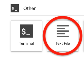
From the Launcher, click on “Text File” under “Other” (make sure you are currently in your project root directory, and not the data folder). This will open a new file.
By default, this will be a text file, but you can change this. Go ahead and save this empty file as app.py (“File” > “Save Text As…” > “app.py”). Then we can add some import statements, and save the file again.
import streamlit as st
import pandas as pd
import plotly.express as px
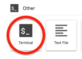
Next, go back to the Launcher and click on “Terminal” under “Other”. This will launch a terminal window within Jupyter Lab.
If you type pwd and enter, you will see that you are currently in your project root.
pwd
/Users/<you>/Desktop/data_viz_workshop
If you type ls and enter, you will see all of your files and directories.
ls
Data app.py data_visualizations.ipynb data_wrangling.ipynb environment.yml
Make sure that you see app.py. We can also see what environment we are currently in with conda env list. There should be a * next to dataviz.
conda env list
# conda environments:
#
base                     /opt/anaconda3
dataviz               *  /opt/anaconda3/envs/dataviz
If not, go ahead and type conda activate dataviz.
conda activate dataviz
Now that we know we are in the right place and have the right environment (the one with streamlit installed), we are going to start the Streamlit app.
streamlit run app.py
This will launch our app in a new tab. Right now, the app is empty. So let’s add some content!
Add a title to the app
Go back to the tab in Jupyter Lab for our app.py file. We have some import statements, but no content. Let’s start with a title:
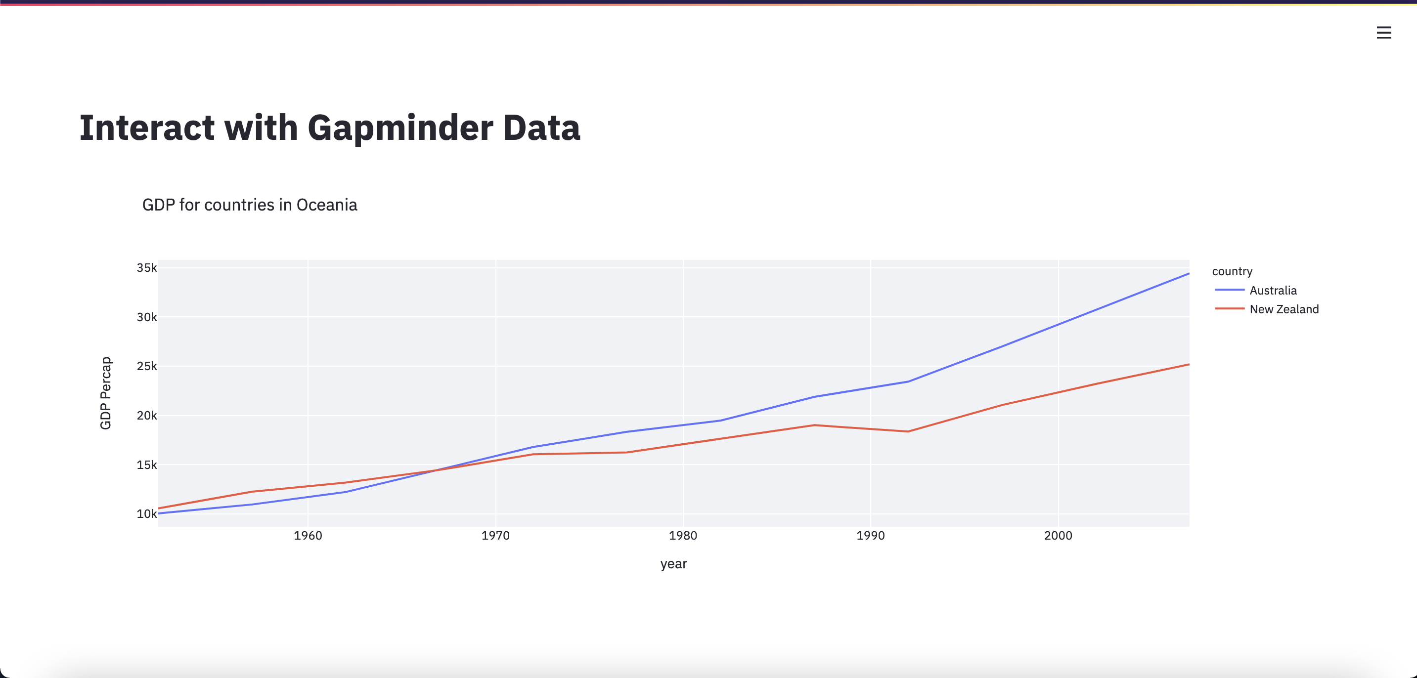
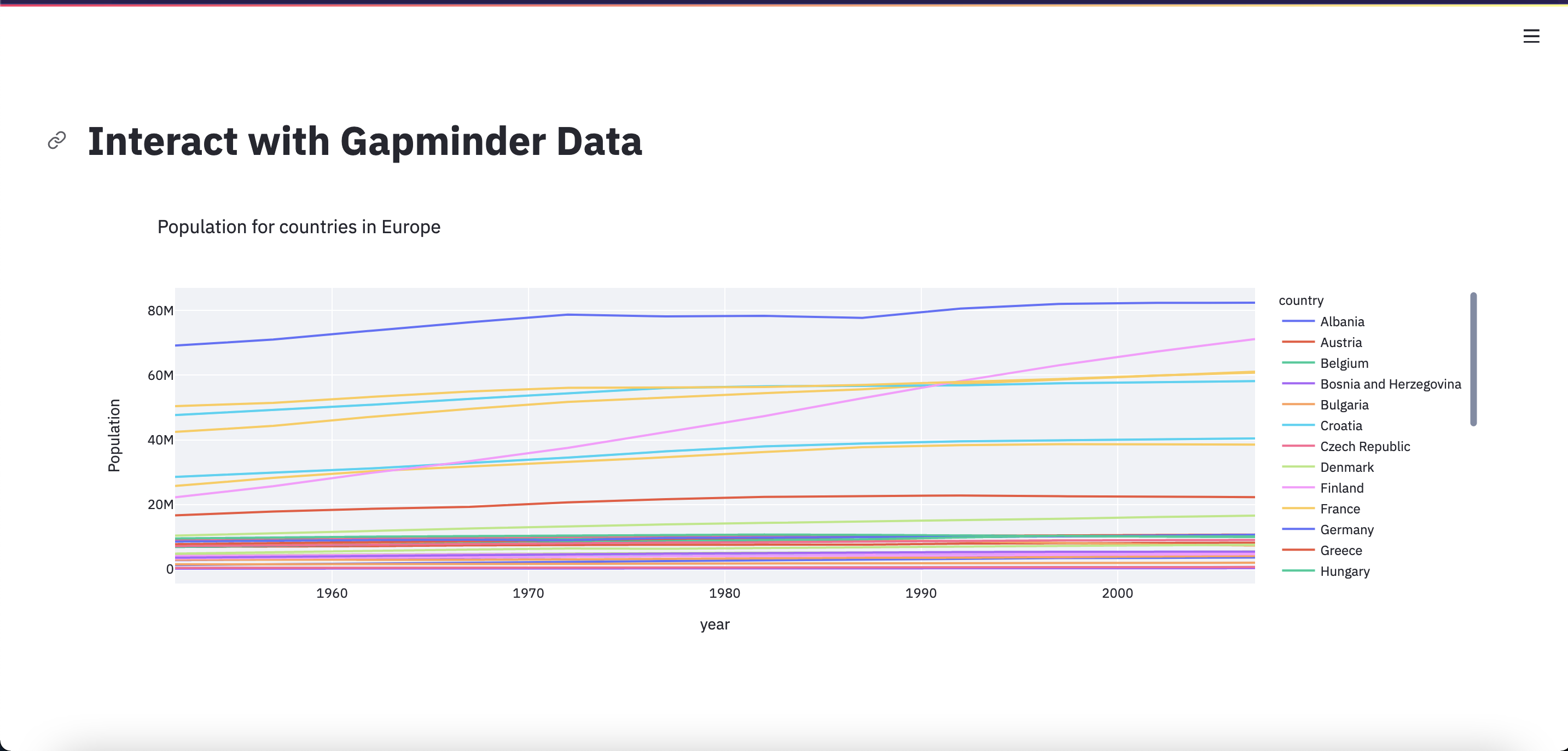
st.title("Interact with Gapminder Data")
You can make this title whatever you want. Save the file, and go back to the brower tab with our Streamlit app. Notice the prompt in the upper right corner? Go ahead and click on “Rerun”. Now we can see our title!
We can add other text to our app with st.write() and other functions.
Check out the documentation
Whenever you are working with a new library - or even one that you are familiar with! - it’s a good idea to look through the documentation. You can find Streamlit’s documentation here
Add a plot to the app
Now, let’s go ahead and add the visualization of GDP in Oceania that we created in the previous lesson. We can copy and paste the code over from our Jupyter Notebook - but leave out the fig.show(). We’re going to use a different function to display the plot in the Streamlit app: st.plotly_chart()
df = pd.read_csv("Data/gapminder_tidy.csv")
df_gdp_o = df.query("continent=='Oceania' & metric=='gdpPercap'")

title = "GDP for countries in Oceania"
fig = px.line(df_gdp_o, x = "year", y = "value", color = "country", title = title, labels={"value": "GDP Percap"})
st.plotly_chart(fig)
Save app.py, switch over to the Streamlit app, and click “Rerun”. Now we can see our Oceania GDP line chart!
Right now, this line chart is a bit squashed and small, so we’re going to change some settings so the plot will take up more space.
First, at the beginning of the app we’ll add the line: st.set_page_config(layout="wide").
Next, we’ll add an argument to our display function: st.plotly_chart(fig, use_container_width=True)
Our whole app script now looks like:
import streamlit as st
import pandas as pd
import plotly.express as px

st.set_page_config(layout="wide")
st.title("Interact with Gapminder Data")

df = pd.read_csv("Data/gapminder_tidy.csv")
df_gdp_o = df.query("continent=='Oceania' & metric=='gdpPercap'")

title = "GDP for countries in Oceania"
fig = px.line(df_gdp_o, x = "year", y = "value", color = "country", title = title, labels={"value": "GDP Percap"})
st.plotly_chart(fig, use_container_width=True)
You know the drill! Save, switch over to the Streamlit app, and click “Rerun”.
We now have a web application that can allow you to share your interactive visualizations.
Exercises
Add a description
After the plot is displayed, add some text describing the plot. Hint you may want look at the Streamlit Reference Docs to find an appropriate function.
Solution
st.plotly_chart(fig, use_container_width=True) # this line is already in the app
st.markdown("This plot shows the GDP Per Capita for countries in Oceania.")
Show me the data!
After the plot is displayed, also display the dataframe used to generate the plot.
Solution
st.dataframe(df_gdp_o) # df_gdp_o is defined in the code created in this lesson
Key Points
The entire streamlit app must be saved in a single python file, typically
app.pyTo run the app locally, enter the bash command
streamlit run app.pyAdd a title with
st.title('Title'), and other text withst.write('## Markdown can go here')Make sure your dataframes and figures are stored in variables, typically
dffor a dataframe andfigfor a figureTo display a plotly figure, use
st.plotly_chart(fig)
Refactoring Code for Flexibility (Prepping for Widgets)
Overview
Teaching: 20 min
Exercises: 5 minQuestions
How does the current code need to change in order to incorporate widgets?
What aspects of the code need to change?
What does it mean to ‘refactor’ code?
Objectives
Learn about f-Strings
Learn how to adjust hard-coded values to be variable
We now have a working Streamlit app. However, it is only displaying one plot, and we can’t currently change what that plot is showing. And we know that there is a lot more information to visualize in our dataset! So we are going to add in even more interactivity with some widgets. Widgets are an interface for users to set a variable to some value. For example, we we may want users to choose from a drop down menu widget to control which continent is displayed. However, before we can add in widgets, we need to refactor our code to allow for more user flexiblity in what is displayed. Our code needs to be refactored to use variables instead of “hard-coded” values.
For now, we will set these variables (continent and metric in the code below) to be strings. That means that after refactoring, the app will not actually look any different. However, it will make adding the widgets in much easier - because we will assign those continent and metric variables to the widget output.
The app.py file is not a great place to experiment and iterate with our code. For that, let’s go back to our data_visualizations.
ipynb Jupyter notebook.
We can add a markdown cell at the bottom of the notebook, and give this section a subtitle:
## Prep for widgets
f-Strings for variables within strings
First, let’s decide what attributes we want to be able to change in the plot. Right now, the plot is showing the GDP for countries in Oceania - that right there is two different attributes: the metric (GDP) and the continent (Oceania).
These are also the two attributes that we are filtering for using df.query():
df_gdp_o = df.query("continent=='Oceania' & metric=='gdpPercap'")
Notice that what is passed to df.query() is simply a string. Right now, the specific values of “Oceania” and “gdpPercap” are specified in the string. However, we can easily make these values variable using f-Strings.
learn more about f-Strings
f-Strings are the modern way of formatting strings in Python. You may have used the “old-school” methods of %-formatting or
str.format()to accomplish the same goal, but the syntax for f-Strings is much nicer. You can learn more about f-Strings here.
To incorporate f-Strings into our query, let’s tweak a few things. Try out this code in a cell in your Jupyter Notebook.
continent = "Oceania"
metric = "gdpPercap"

old_query = "continent=='Oceania' & metric=='gdpPercap'"
new_query = f"continent=='{continent}' & metric=='{metric}'"

print(old_query)
print(new_query)
continent=='Oceania' & metric=='gdpPercap'
continent=='Oceania' & metric=='gdpPercap'
Notice how the two strings are identical?
The new_query variable is more flexible, because we can redefine the continent and metric variables. Go ahead and try it!
continent = "Europe"
metric = "pop"

query = f"continent=='{continent}' & metric=='{metric}'"

print(query)
continent=='Europe' & metric=='pop'
It’s important to isolate these continent and metric values because we can adjust them with our widgets.
Let’s go ahead and try incorporating this into our plot (still in the Jupyter Notebook)
continent = "Europe"
metric = "pop"

query = f"continent=='{continent}' & metric=='{metric}'"
df_filtered = df.query(query)

title = "GDP for countries in Oceania"
fig = px.line(df_filtered, x = "year", y = "value", color = "country", title = title, labels={"value": "GDP Percap"})
fig.show()
Something about this plot is funky… do you notice any other places where we need to incorporate f-Strings?
The title and axis lables!
continent = "Europe"
metric = "pop"

title = f"{metric} for countries in {continent}"
labels = {"value": f"{metric}"}

print(title)
print(labels["value"])
pop for countries in Europe
pop
Let’s show that plot again, with our updated code:
continent = "Europe"
metric = "pop"

query = f"continent=='{continent}' & metric=='{metric}'"
df_filtered = df.query(query)

title = f"{metric} for countries in {continent}"
fig = px.line(df_filtered, x = "year", y = "value", color = "country", title = title, labels={"value": f"{metric}"})
fig.show()
There’s just one more thing to tweak. “gdpPercap”, “lifeExp”, and “pop” aren’t the prettiest labels. Let’s map them to more display-friendly labels with a dictionary. Then we can call on this dictionary within our f-strings:
metric_labels = {"gdpPercap": "GDP Per Capita", "lifeExp": "Average Life Expectancy", "pop": "Population"}
Now, here’s our final code:
continent = "Europe"
metric = "pop"

query = f"continent=='{continent}' & metric=='{metric}'"
df_filtered = df.query(query)

metric_labels = {"gdpPercap": "GDP Per Capita", "lifeExp": "Average Life Expectancy", "pop": "Population"}

title = f"{metric_labels[metric]} for countries in {continent}"
fig = px.line(df_filtered, x = "year", y = "value", color = "country", title = title, labels={"value": f"{metric_labels[metric]}"})
fig.show()
Getting lists of possible values
There is one last step before we can be ready to create our widgets. We need a list of all continents and all metrics, so that users can select from valid options. To do this, we will use pandas’ unique() function.
df['continent'].unique()
array(['Africa', 'Americas', 'Asia', 'Europe', 'Oceania'], dtype=object)
See how we get every possible value in the continents column exactly once? Let’s define this as a list, assign it to a variable, and do the same thing for metric.
continent_list = list(df['continent'].unique())
metric_list = list(df['metric'].unique())

print(continent_list)
print(metric_list)
['Africa', 'Americas', 'Asia', 'Europe', 'Oceania']
['gdpPercap', 'lifeExp', 'pop']
These lists will be used when defining our widgets.
Update app.py with our refactored code
Now, we are ready to define our widgets. Let’s copy this final code over to our app.py file, so that it is like this:
import streamlit as st
import pandas as pd
import plotly.express as px

st.set_page_config(layout="wide")
st.title("Interact with Gapminder Data")

df = pd.read_csv("Data/gapminder_tidy.csv")

continent_list = list(df['continent'].unique())
metric_list = list(df['metric'].unique())

continent = "Europe"
metric = "pop"

query = f"continent=='{continent}' & metric=='{metric}'"
df_filtered = df.query(query)

metric_labels = {"gdpPercap": "GDP Per Capita", "lifeExp": "Average Life Expectancy", "pop": "Population"}

title = f"{metric_labels[metric]} for countries in {continent}"
fig = px.line(df_filtered, x = "year", y = "value", color = "country", title = title, labels={"value": f"{metric_labels[metric]}"})
st.plotly_chart(fig, use_container_width=True)
Exercises
Add a (flexible) description
After the plot is displayed, add some text describing the plot.
This time, use F-strings so the description can change with the plot
Solution
st.markdown(f"This plot shows the {metric_labels[metric]} for countries in {continent}.")
Show me the data! (Maybe)
After the plot is displayed, also display the dataframe used to generate the plot.
This time, make it optional - only display the dataframe if a variable is set to True.
Solution
show_data = True
if show_data:
    st.dataframe(df_filtered)
Key Points
In order to add widgets, we need to refactor our code to make it more flexible.
f-Strings allow you to easily insert variables into a string
Add Widgets to the Streamlit App
Overview
Teaching: 15 min
Exercises: 15 minQuestions
Why do I want to have widgets in my app?
What kinds of widgets are there?
How can I use widgets to alter my plot?
Objectives
Learn how to add a Select Box widget
Learn how to modify a plot based on widget values
We are now ready to add in the actual widgets. Remember all of that work we did to refactor the code so that we substituted in the continent and metric variables instead of having hardcoded values… and then we just assigned those variables to strings so the result was the same anyways? Well, now we are going to actually change the value of continent and metric - and widgets allow the users to select the value!
Adding the Select widgets
We are going to add two widgets to our app. One widget will let us select the continent, and one widget will let us select the metric. For both, the user should select one option out of a list of strings. What comes to mind as the best type of widget?
You may have said “Dropdown box”. In Streamlit, this is called a “Select box”, and is created with st.selectbox().
Look through the documentation for widget options
Streamlit has many types of widgets available. You can see the documentation for them here
Let’s create our continent widget. Before, we had assigned continent to a string. Now we will assign it to a widget.
continent = st.selectbox(label = "Choose a continent", options = continent_list)
The st.selectbox() function requires you to define a label (what will display in the app next to the widget) and the options (a list of possible values to select from). Remember how we created a list of all possible continent values, continent_list? This is the list we pass to the options argument.
Let’s go ahead and add the metric widget as well, this time using the list of all possible metric values.
metric = st.selectbox(label = "Choose a metric", options = metric_list)
Your app should now look like this:
import streamlit as st
import pandas as pd
import plotly.express as px
st.set_page_config(layout="wide")
st.title("Interact with Gapminder Data")
df = pd.read_csv("Data/gapminder_tidy.csv")
continent_list = list(df['continent'].unique())
metric_list = list(df['metric'].unique())
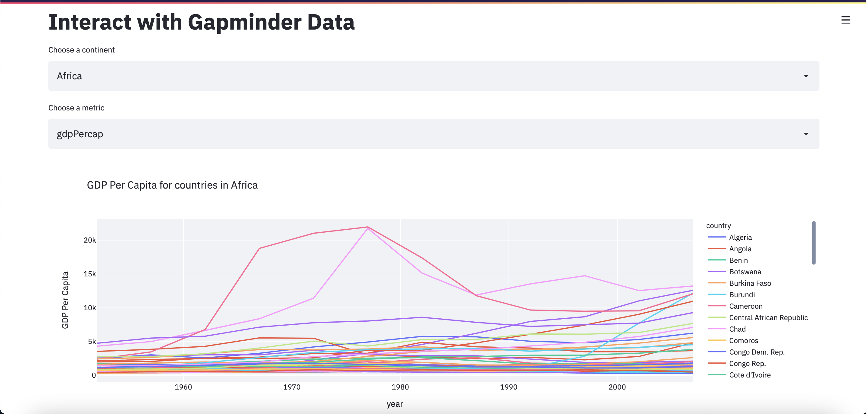
continent = st.selectbox(label = "Choose a continent", options = continent_list)
metric = st.selectbox(label = "Choose a metric", options = metric_list)
query = f"continent=='{continent}' & metric=='{metric}'"
df_filtered = df.query(query)
metric_labels = {"gdpPercap": "GDP Per Capita", "lifeExp": "Average Life Expectancy", "pop": "Population"}
title = f"{metric_labels[metric]} for countries in {continent}"
fig = px.line(df_filtered, x = "year", y = "value", color = "country", title = title, labels={"value": f"{metric_labels[metric]}"})
st.plotly_chart(fig, use_container_width=True)
Go ahead and save the app.py file, click “Rerun” in the Streamlit app, and experiment with how the widgets can affect your plot.
Move the widgets to the sidebar
Streamlit also lets us have a sidebar that can be closed and opened. This is a good place to stash our widgets. There are two ways to add something to the sidebar. One is by adding sidebar to the widget definition, like this:
continent = st.sidebar.selectbox(label = "Choose a continent", options = continent_list)
metric = st.sidebar.selectbox(label = "Choose a metric", options = metric_list)
The other way is to place the variables within a with st.sidebar: statement, like this:
with st.sidebar:
    continent = st.selectbox(label = "Choose a continent", options = continent_list)
    metric = st.selectbox(label = "Choose a metric", options = metric_list)
The second option lets us also add some other things to the sidebar, and clearly organize it, like this:
with st.sidebar:
    st.subheader("Configure the plot")
    continent = st.selectbox(label = "Choose a continent", options = continent_list)
    metric = st.selectbox(label = "Choose a metric", options = metric_list)
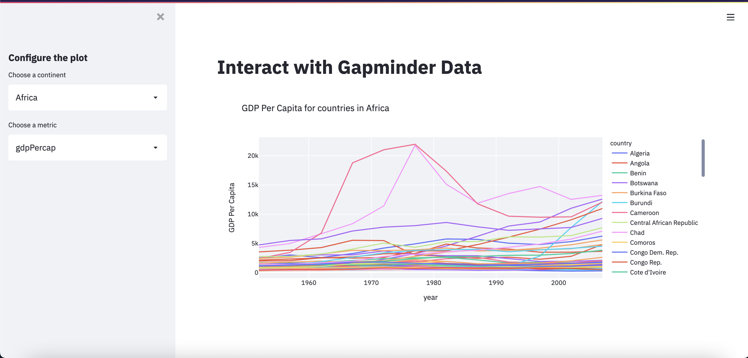
There is one last thing we should do to before we have our final app. Notice how the widget options for “Choose a metric” aren’t our nicely formatted options? We can fix this with the format_func parameter.
In order to pass a function to the format_func parameter, we first need to define a function. The function input should be the value being selected from the list. The function output should be how we want that value to be displayed. We can use a dictionary to map these “raw” values to their “pretty” equivalents.
metric_labels = {"gdpPercap": "GDP Per Capita", "lifeExp": "Average Life Expectancy", "pop": "Population"}

def format_metric(metric_raw):
    return metric_labels[metric_raw]

metric = st.selectbox(label = "Choose a metric", options = metric_list, format_func=format_metric)
The final app
Finally, we have our finished app.py file. In order to make this app easier to read and understand, we should also comment our code. Commenting our code not only helps others… but also us 2 months later when we want to pick up the project again!
import streamlit as st
import pandas as pd
import plotly.express as px

# set up the app with wide view preset and a title
st.set_page_config(layout="wide")
st.title("Interact with Gapminder Data")

# import our data as a pandas dataframe
df = pd.read_csv("Data/gapminder_tidy.csv")

# get a list of all possible continents and metrics, for the widgets
continent_list = list(df['continent'].unique())
metric_list = list(df['metric'].unique())

# map the actual data values to more readable strings
metric_labels = {"gdpPercap": "GDP Per Capita", "lifeExp": "Average Life Expectancy", "pop": "Population"}

# function to be used in widget argument format_func that maps metric values to readable labels, using dict above
def format_metric(metric_raw):
    return metric_labels[metric_raw]

# put all widgets in sidebar and have a subtitle
with st.sidebar:
    st.subheader("Configure the plot")
    # widget to choose which continent to display
    continent = st.selectbox(label = "Choose a continent", options = continent_list)
    # widget to choose which metric to display
    metric = st.selectbox(label = "Choose a metric", options = metric_list, format_func=format_metric)

# use selected values from widgets to filter dataset down to only the rows we need
query = f"continent=='{continent}' & metric=='{metric}'"
df_filtered = df.query(query)

# create the plot
title = f"{metric_labels[metric]} for countries in {continent}"
fig = px.line(df_filtered, x = "year", y = "value", color = "country", title = title, labels={"value": f"{metric_labels[metric]}"})

# display the plot
st.plotly_chart(fig, use_container_width=True)
Save, Rerun, and… Share!

Exercises
Show me the data! (If the user wants it)
After the plot is displayed, also display the dataframe used to generate the plot.
Use a widget so that the user can decide whether to display the data.
(Hint: look at the checkbox!)
Solution
with st.sidebar:
    show_data = st.checkbox(label = "Show the data used to generate this plot", value = False)

if show_data:
    st.dataframe(df_filtered)
Limit the countries displayed in the plot
Add a widget that allows users to limit the countries that will be displayed on the plot.
(Hint: look at the multiselect!)
Solution
countries_list = list(df_filtered['country'].unique())

with st.sidebar:
    countries = st.multiselect(label = "Which countries should be plotted?", options = countries_list, default = countries_list)

df_filtered = df_filtered[df_filtered.country.isin(countries)]
Limit the dates displayed in the plot
Add a widget that allows users to limit the range of years that will be displayed on the plot.
(Hint: look at the slider!)
Solution
year_min = int(df_filtered['year'].min())
year_max = int(df_filtered['year'].max())

with st.sidebar:
    years = st.slider(label = "What years should be plotted?", min_value = year_min, max_value = year_max, value = (year_min, year_max))

df_filtered = df_filtered[(df_filtered.year >= years[0]) & (df_filtered.year <= years[1])]
Improve the description
After the plot is displayed, add some text describing the plot.
This time, add more to the description based on the information specified by the newly added widgets.
Solution
st.markdown(f"This plot shows the {metric_labels[metric]} from {years[0]} to {years[1]} for the following countries in {continent}: {', '.join(countries)}")
Key Points
Add a widget to select the continent or metric from a list with
st.selectbox()There are two ways to add a widget to the sidebar:
st.sidebar.<widget>()andwith st.sidebar: st.<widget>()
Publish Your Streamlit App
Overview
Teaching: 20 min
Exercises: 30 minQuestions
How do I deploy my app so other people can see it?
How do I create a
requirements.txtfile?Objectives
Learn how to deploy a Streamlit app
Now that we have our final app, it’s time to publish (a.k.a deploy) it so that other people can see and interact with the visualizations.
Create a GitHub repo
The first step is to create a new GitHub repository that will contain the code, data, and environment files.
Refresher on creating GitHub repos
If you have not created a GitHub repository before or need a refresher, please refer to this episode on Remotes in GitHub from the Software Carpentries lesson Version Control with Git
Give your repo a descriptive name, like interact-with-gapminder-data-app. Make sure that the repo is “Public” (not Private) and check the box to initialize the repo with a README.md.
Once your repo is created, clone a copy of it to your local computer. You can use the application GitHub Desktop to more easily accomplish this. You can download GitHub Desktop here.
Now that you have a copy of your repo on your computer, you can copy over your code and data files.
Copy over the code and data files
During this workshop, we have created some Jupyter Notebooks files and an app.py file. We don’t need the Jupyter Notebooks to be a part of the app’s repo, only the app.py file.
Remember that at the start of the app.py file, we import our data with the line:
df = pd.read_csv("Data/gapminder_tidy.csv")
So, we also need to make sure to include the Data folder and the gapminder_tidy.csv file inside of it.
You can copy these files using a GUI (Finder on Macs or Explorer on PCs) or the command line, whatever you are comfortable with.
Let’s suppose that your repo is named interact-with-gapminder-data-app, and it has been cloned to the GitHub folder in your Documents. So, the location of your local repo is ~/Documents/GitHub/interact-with-gapminder-data-app. So far, we have been working from the Desktop, in a folder called data_viz_workshop. Using the command line, we can copy the relevant files with:
cp ~/Desktop/data_viz_workshop/app.py ~/Documents/GitHub/interact-with-gapminder-data-app/app.py
mkdir ~/Documents/GitHub/interact-with-gapminder-data-app/Data
cp ~/Desktop/data_viz_workshop/Data/gapminder_tidy.csv ~/Documents/GitHub/interact-with-gapminder-data-app/Data/gapminder_tidy.csv
Your interact-with-gapminder-data-app folder should now look like:
interact-with-gapminder-data-app
│   README.md
│   app.py
│
└───Data
    │   gapminder_tidy.csv
We’re almost done! But we need to do one more thing… specify an environment for the app to run in.
Add a requirements.txt file
In order for our app to run on Streamlit’s servers, we need to tell it what the environment should look like - or what packages need to be installed. While there are many standards for describing a python environment (such as the environment.yml file we used to create our conda environment at the beginning of this workshop), Streamlit tends to work best with a requirements.txt file.
The requirements.txt file is just a list of package names and version numbers, with each line looking like packagename==version.number.here. And there is no need to list out all of the packages, just the top-level ones. The dependencies will get installed for each listed package as well.
The requirements.txt file should be kept in the root of your repository. So, after creating a requirements file your repo should look like:
interact-with-gapminder-data-app
│   README.md
│   requirements.txt
│   app.py
│
└───Data
    │   gapminder_tidy.csv
For our app, we only need to specify two packages: Streamlit and Plotly. Note that you may have different version numbers. Here is an example of our requirements.txt file:
streamlit==1.1.0
plotly==5.1.0
Push the updated repo
Now that we have our code, data, and environment files added to our local copy of the repository, it’s time to push our repo to GitHub. You can use GitHub Desktop or use git from the command line to accomplish this. If you have unwanted extra files (like .DS_Store) added to the directory, make sure to add them to a .gitignore file!
Once you have added, committed, and pushed your changes (with a descriptive commit message!) go to your GitHub repo online to double check that it is up to date.
Now we are ready to deploy the app!
Sign up for Streamlit Cloud (Community Tier)
Follow the steps detailed on Streamlit’s Documentation to sign up for a free Streamlit Cloud account and connect it to your GitHub account. The documentation is located here.
You can sign up for a Streamlit Cloud account at share.streamlit.io/.
On the free Community tier, you can deploy up to 3 apps at once. If you later decide to build more Streamlit apps, you can remove this one.
Deploy your app
When you have signed in to your Streamlit account, click “New app”. Copy and paste your GitHub repo URL, for example https://github.com/username/interact-with-gapminder-data-app, specify the correct branch name (which is most likely main), and specify the filename of your app (app.py). Then click “Deploy”, and wait for the balloons!
You can read the documentation about this process for deploying an app here.
Exercises
Add your own twist
Now that you have successfully deployed the app we created together, it’s time for you to add your own twist.
You can add more visualizations, more widgets, or make use of Streamlit’s other capabilities to add to and enhance the app. Make it your own!
Share & Present Your Apps
After everyone has had time to work on adding their own twist to their Streamlit apps, take some time to share your apps with each other and present what was added to the base app.
What did you find challenging?
What feature that you added did you most like?
What is something else you would like to add in the future?
Key Points
All Streamlit apps must have a GitHub repo with the code, data, and environment files
You can deploy up to 3 apps for free with Streamlit Cloud