Add Widgets to the Streamlit App
Overview
Teaching: 15 min
Exercises: 15 minQuestions
Why do I want to have widgets in my app?
What kinds of widgets are there?
How can I use widgets to alter my plot?
Objectives
Learn how to add a Select Box widget
Learn how to modify a plot based on widget values
We are now ready to add in the actual widgets. Remember all of that work we did to refactor the code so that we substituted in the continent and metric variables instead of having hardcoded values… and then we just assigned those variables to strings so the result was the same anyways? Well, now we are going to actually change the value of continent and metric - and widgets allow the users to select the value!
Adding the Select widgets
We are going to add two widgets to our app. One widget will let us select the continent, and one widget will let us select the metric. For both, the user should select one option out of a list of strings. What comes to mind as the best type of widget?
You may have said “Dropdown box”. In Streamlit, this is called a “Select box”, and is created with st.selectbox().
Look through the documentation for widget options
Streamlit has many types of widgets available. You can see the documentation for them here
Let’s create our continent widget. Before, we had assigned continent to a string. Now we will assign it to a widget.
continent = st.selectbox(label = "Choose a continent", options = continent_list)
The st.selectbox() function requires you to define a label (what will display in the app next to the widget) and the options (a list of possible values to select from). Remember how we created a list of all possible continent values, continent_list? This is the list we pass to the options argument.
Let’s go ahead and add the metric widget as well, this time using the list of all possible metric values.
metric = st.selectbox(label = "Choose a metric", options = metric_list)
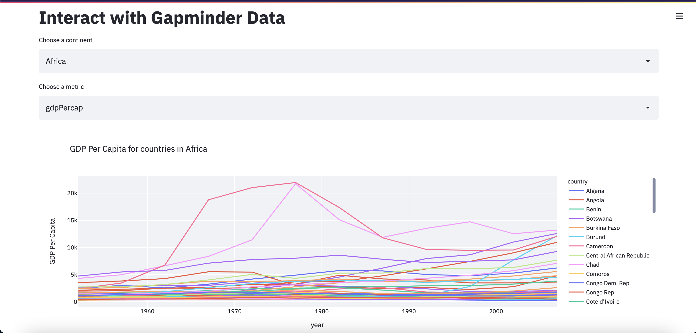
Your app should now look like this:
import streamlit as st
import pandas as pd
import plotly.express as px

st.set_page_config(layout="wide")
st.title("Interact with Gapminder Data")

df = pd.read_csv("Data/gapminder_tidy.csv")

continent_list = list(df['continent'].unique())
metric_list = list(df['metric'].unique())

continent = st.selectbox(label = "Choose a continent", options = continent_list)
metric = st.selectbox(label = "Choose a metric", options = metric_list)

query = f"continent=='{continent}' & metric=='{metric}'"
df_filtered = df.query(query)

metric_labels = {"gdpPercap": "GDP Per Capita", "lifeExp": "Average Life Expectancy", "pop": "Population"}

title = f"{metric_labels[metric]} for countries in {continent}"
fig = px.line(df_filtered, x = "year", y = "value", color = "country", title = title, labels={"value": f"{metric_labels[metric]}"})
st.plotly_chart(fig, use_container_width=True)
Go ahead and save the app.py file, click “Rerun” in the Streamlit app, and experiment with how the widgets can affect your plot.
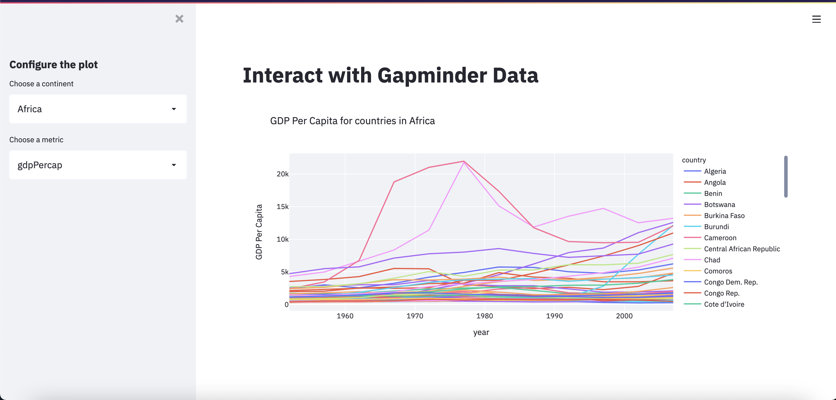
Move the widgets to the sidebar
Streamlit also lets us have a sidebar that can be closed and opened. This is a good place to stash our widgets. There are two ways to add something to the sidebar. One is by adding sidebar to the widget definition, like this:
continent = st.sidebar.selectbox(label = "Choose a continent", options = continent_list)
metric = st.sidebar.selectbox(label = "Choose a metric", options = metric_list)
The other way is to place the variables within a with st.sidebar: statement, like this:
with st.sidebar:
    continent = st.selectbox(label = "Choose a continent", options = continent_list)
    metric = st.selectbox(label = "Choose a metric", options = metric_list)
The second option lets us also add some other things to the sidebar, and clearly organize it, like this:
with st.sidebar:
    st.subheader("Configure the plot")
    continent = st.selectbox(label = "Choose a continent", options = continent_list)
    metric = st.selectbox(label = "Choose a metric", options = metric_list)
There is one last thing we should do to before we have our final app. Notice how the widget options for “Choose a metric” aren’t our nicely formatted options? We can fix this with the format_func parameter.
In order to pass a function to the format_func parameter, we first need to define a function. The function input should be the value being selected from the list. The function output should be how we want that value to be displayed. We can use a dictionary to map these “raw” values to their “pretty” equivalents.
metric_labels = {"gdpPercap": "GDP Per Capita", "lifeExp": "Average Life Expectancy", "pop": "Population"}

def format_metric(metric_raw):
    return metric_labels[metric_raw]

metric = st.selectbox(label = "Choose a metric", options = metric_list, format_func=format_metric)
The final app
Finally, we have our finished app.py file. In order to make this app easier to read and understand, we should also comment our code. Commenting our code not only helps others… but also us 2 months later when we want to pick up the project again!
import streamlit as st
import pandas as pd
import plotly.express as px

# set up the app with wide view preset and a title
st.set_page_config(layout="wide")
st.title("Interact with Gapminder Data")

# import our data as a pandas dataframe
df = pd.read_csv("Data/gapminder_tidy.csv")

# get a list of all possible continents and metrics, for the widgets
continent_list = list(df['continent'].unique())
metric_list = list(df['metric'].unique())

# map the actual data values to more readable strings
metric_labels = {"gdpPercap": "GDP Per Capita", "lifeExp": "Average Life Expectancy", "pop": "Population"}

# function to be used in widget argument format_func that maps metric values to readable labels, using dict above
def format_metric(metric_raw):
    return metric_labels[metric_raw]

# put all widgets in sidebar and have a subtitle
with st.sidebar:
    st.subheader("Configure the plot")
    # widget to choose which continent to display
    continent = st.selectbox(label = "Choose a continent", options = continent_list)
    # widget to choose which metric to display
    metric = st.selectbox(label = "Choose a metric", options = metric_list, format_func=format_metric)

# use selected values from widgets to filter dataset down to only the rows we need
query = f"continent=='{continent}' & metric=='{metric}'"
df_filtered = df.query(query)

# create the plot
title = f"{metric_labels[metric]} for countries in {continent}"
fig = px.line(df_filtered, x = "year", y = "value", color = "country", title = title, labels={"value": f"{metric_labels[metric]}"})

# display the plot
st.plotly_chart(fig, use_container_width=True)
Save, Rerun, and… Share!

Exercises
Show me the data! (If the user wants it)
After the plot is displayed, also display the dataframe used to generate the plot.
Use a widget so that the user can decide whether to display the data.
(Hint: look at the checkbox!)
Solution
with st.sidebar:
    show_data = st.checkbox(label = "Show the data used to generate this plot", value = False)

if show_data:
    st.dataframe(df_filtered)
Limit the countries displayed in the plot
Add a widget that allows users to limit the countries that will be displayed on the plot.
(Hint: look at the multiselect!)
Solution
countries_list = list(df_filtered['country'].unique())

with st.sidebar:
    countries = st.multiselect(label = "Which countries should be plotted?", options = countries_list, default = countries_list)

df_filtered = df_filtered[df_filtered.country.isin(countries)]
Limit the dates displayed in the plot
Add a widget that allows users to limit the range of years that will be displayed on the plot.
(Hint: look at the slider!)
Solution
year_min = int(df_filtered['year'].min())
year_max = int(df_filtered['year'].max())

with st.sidebar:
    years = st.slider(label = "What years should be plotted?", min_value = year_min, max_value = year_max, value = (year_min, year_max))

df_filtered = df_filtered[(df_filtered.year >= years[0]) & (df_filtered.year <= years[1])]
Improve the description
After the plot is displayed, add some text describing the plot.
This time, add more to the description based on the information specified by the newly added widgets.
Solution
st.markdown(f"This plot shows the {metric_labels[metric]} from {years[0]} to {years[1]} for the following countries in {continent}: {', '.join(countries)}")
Key Points
Add a widget to select the continent or metric from a list with
st.selectbox()There are two ways to add a widget to the sidebar:
st.sidebar.<widget>()andwith st.sidebar: st.<widget>()