Visualizing data with ggplot2
Overview
Teaching: 30 min
Exercises: 60 minQuestions
How can I make publication-grade plots with
ggplot2?What are the key concepts underlying
ggplot2plotting?What are some of the visualisations available through
ggplot2?How can I save my plot in a specific format (e.g. png)?
Objectives
Install the
ggplot2package by installing tidyverse.Learn basics of
ggplot2with several public datasets.Learn how to customize your plot efficiently (facets, geoms).
See how to use the stat functions to produce on-the-fly summary plots.
Table of Contents
- 1. Introduction
- 2. First plot with
ggplot2 - 3. Building your plots iteratively
- 4. Bar charts
- 5. Resources
1. Introduction
Why do we start with data visualization? Not only is data visualisation a big part of analysis, it’s a way to see your progress as you learn to code.
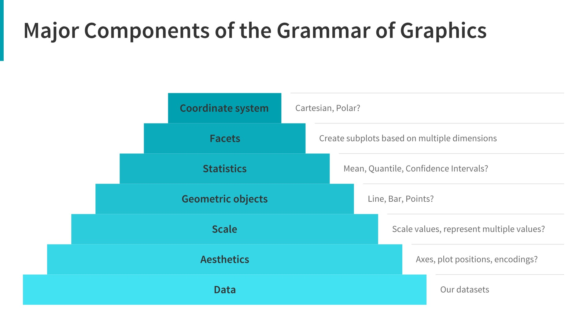
ggplot2implements the grammar of graphics, a coherent system for describing and building graphs. Withggplot2, you can do more faster by learning one system and applying it in many places. - Hadley Wickham, R for Data Science
This lesson borrows heavily from Hadley Wickham’s R for Data Science book, and an EcoDataScience lesson on Data Visualization.
1.1 Install our first package: tidyverse
Packages are bundles of functions, along with help pages and other goodies that make them easier for others to use, (ie. vignettes).
So far we’ve been using packages that are already included in base R. These can be considered out-of-the-box packages and include things such as sum and mean. You can also download and install packages created by the vast and growing R user community. The most traditional place to download packages is from CRAN, the Comprehensive R Archive Network. This is where you went to download R originally, and will go again to look for updates. You can also install packages directly from GitHub, which we’ll do tomorrow.
You don’t need to go to CRAN’s website to install packages, we can do it from within R with the command install.packages("package-name-in-quotes").
We are going to be using the package ggplot2, which is actually bundled into a huge package called tidyverse. We will install tidyverse now, and use a few functions from the packages within. Also, check out tidyverse.org/.
## from CRAN:
install.packages("tidyverse") ## do this once only to install the package on your computer.
library(tidyverse) ## do this every time you restart R and need it
When you do this, it will tell you which packages are inside of tidyverse that have also been installed. Note that there are a few name conflicts; it is alerting you that we’ll be using two functions from dplyr instead of the built-in stats package.
What’s the difference between install.packages() and library()? Why do you need both? Here’s an analogy:
install.packages()is setting up electricity for your house. Just need to do this once (let’s ignore monthly bills).library()is turning on the lights. You only turn them on when you need them, otherwise it wouldn’t be efficient. And when you quit R, it turns the lights off, but the electricity lines are still there. So when you come back, you’ll have to turn them on again withlibrary(), but you already have your electricity set up.
You can also install packages by going to the Packages tab in the bottom right pane. You can see the packages that you have installed (listed) and loaded (checkbox). You can also install packages using the install button, or check to see if any of your installed packages have updates available (update button). You can also click on the name of the package to see all the functions inside it — this is a super helpful feature that I use all the time.
1.2 Load national park datasets
Copy and paste the code chunk below and read it in to your RStudio to load the five datasets we will use in this section.
Important note
The
read_csv()function comes from thereadrpackage part of thetidyversesuite of packages. Make sure you’ve runlibrary(tidyverse)to load the datasets.
# National Parks in California
ca <- read_csv("https://raw.githubusercontent.com/carpentries-incubator/open-science-with-r/gh-pages/data/ca.csv")

# Acadia National Park
acadia <- read_csv("https://raw.githubusercontent.com/carpentries-incubator/open-science-with-r/gh-pages/data/acadia.csv")

# Southeast US National Parks
se <- read_csv("https://raw.githubusercontent.com/carpentries-incubator/open-science-with-r/gh-pages/data/se.csv")

# 2016 Visitation for all Pacific West National Parks
visit_16 <- read_csv("https://raw.githubusercontent.com/carpentries-incubator/open-science-with-r/gh-pages/data/visit_16.csv")

# All Nationally designated sites in Massachusetts
mass <- read_csv("https://raw.githubusercontent.com/carpentries-incubator/open-science-with-r/gh-pages/data/mass.csv")
2. First plot with ggplot2
ggplot2 is a plotting package that makes it simple to create complex plots from data in a data frame. It provides a more programmatic interface for specifying what variables to plot, how they are displayed, and general visual properties. Therefore, we only need minimal changes if the underlying data change or if we decide to change from a bar plot to a scatterplot. This helps in creating publication quality plots with minimal amounts of adjustments and tweaking.
ggplot likes data in the tidy (‘long’) format: i.e., a column for every dimension, and a row for every observation. Well structured data will save you lots of time when making figures with ggplot. We’ll learn more about tidy data in the next section.
ggplot graphics are built step by step by adding new elements. Adding layers in this fashion allows for extensive flexibility and customization of plots.
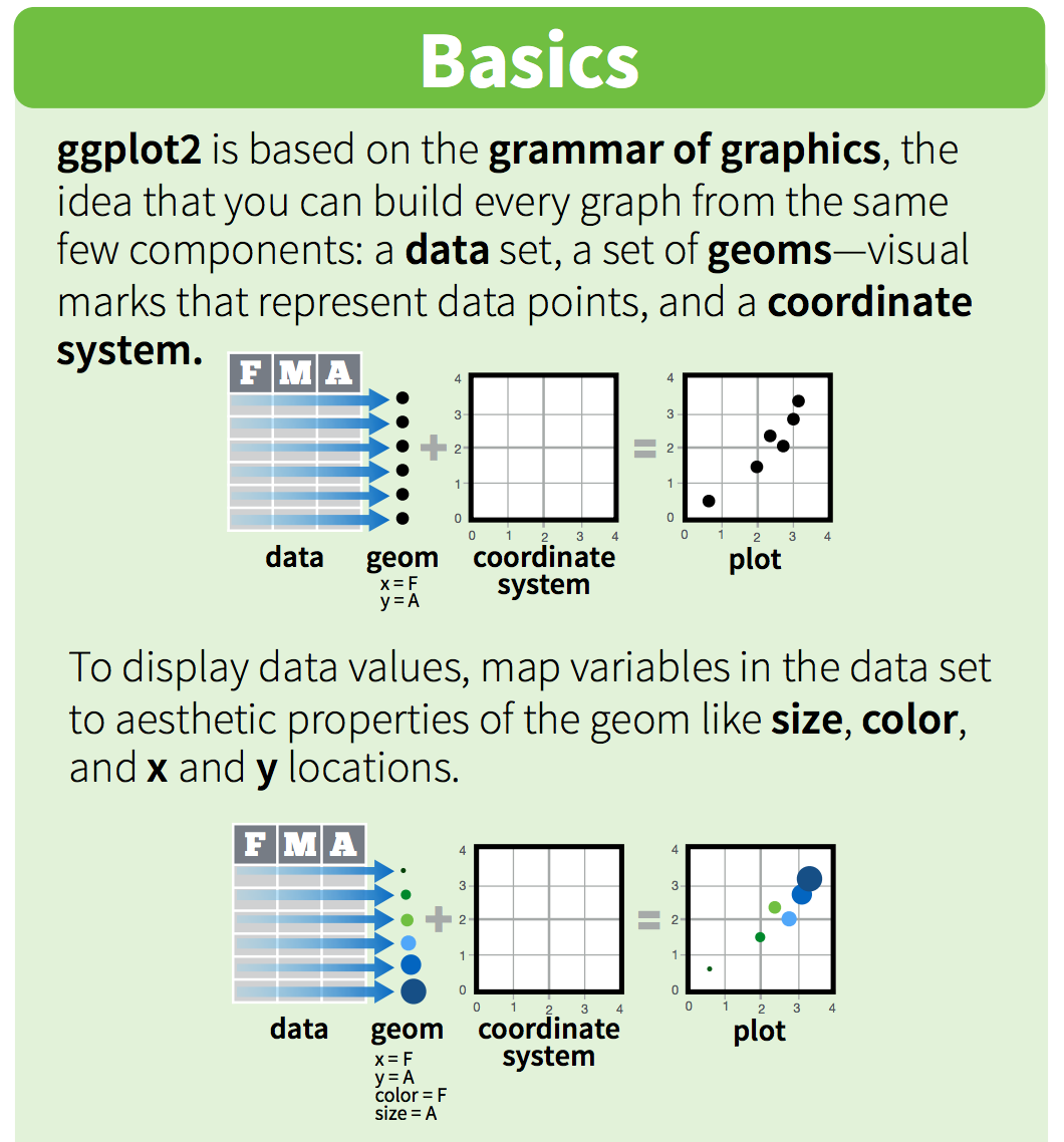
One can see it as a pyramid of layers too.
2.1 Data description
We are going to use a National Park visitation dataset (from the National Park Service at https://irma.nps.gov/Stats/SSRSReports). Read in the data using read_csv and take a look at the first few rows using head() or View().
head(ca)
This dataframe is already in a tidy format where all rows are an observation and all columns are variables. Among the variables in ca are:
-
region, US region where park is located. -
visitors, the annual visitation for eachyear
# A tibble: 789 x 7
   region state code  park_name                     type          visitors  year
   <chr>  <chr> <chr> <chr>                         <chr>            <dbl> <dbl>
 1 PW     CA    CHIS  Channel Islands National Park National Park     1200  1963
 2 PW     CA    CHIS  Channel Islands National Park National Park     1500  1964
 3 PW     CA    CHIS  Channel Islands National Park National Park     1600  1965
 4 PW     CA    CHIS  Channel Islands National Park National Park      300  1966
 5 PW     CA    CHIS  Channel Islands National Park National Park    15700  1967
 6 PW     CA    CHIS  Channel Islands National Park National Park    31000  1968
 7 PW     CA    CHIS  Channel Islands National Park National Park    33100  1969
 8 PW     CA    CHIS  Channel Islands National Park National Park    32000  1970
 9 PW     CA    CHIS  Channel Islands National Park National Park    24400  1971
10 PW     CA    CHIS  Channel Islands National Park National Park    31947  1972
# … with 779 more rows
2.2 Building a plot
To build a ggplot, we need to:
- use the
ggplot()function and bind the plot to a specific data frame using thedataargument.
# initiate the plot
ggplot(data=ca)
- add
geoms– graphical representation of the data in the plot (points, lines, bars).ggplot2offers many different geoms; we will use some common ones today, including:
*geom_point()for scatter plots, dot plots, etc.
*geom_bar()for bar charts
*geom_line()for trend lines, time-series, etc.
To add a geom to the plot use + operator. Because we have two continuous variables, let’s use geom_point() first and then assign x and y aesthetics (aes).
# add geoms
ggplot(data=ca) +
  geom_point(aes(x = year,y = visitors))
Notes:
- Anything you put in the
ggplot()function can be seen by any geom layers that you add (i.e., these are universal plot settings). This includes the x and y axis you set up inaes(). - You can also specify aesthetics for a given geom independently of the
aesthetics defined globally in the
ggplot()function. - The
+sign used to add layers must be placed at the end of each line containing a layer. If, instead, the+sign is added in the line before the other layer,ggplot2will not add the new layer and will return an error message.
3. Building your plots iteratively
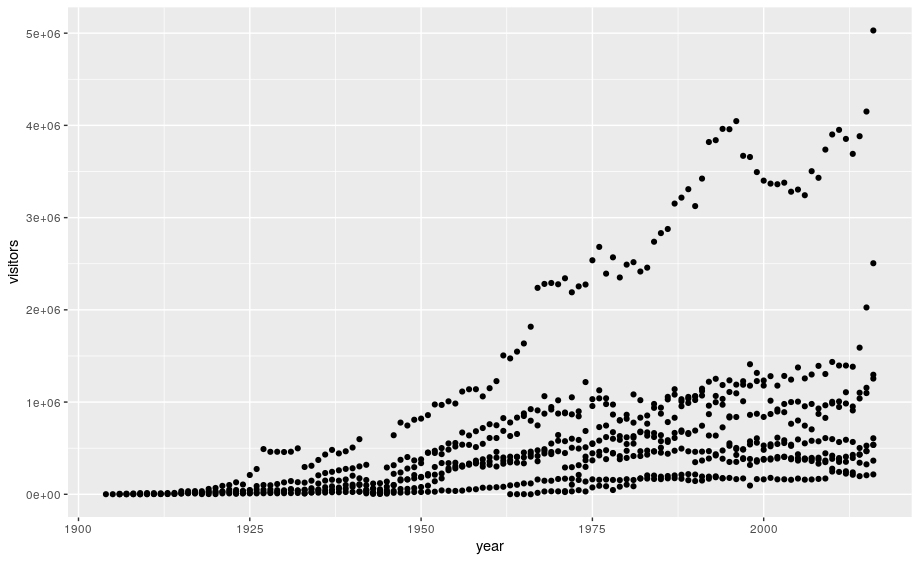
Building plots with ggplot is typically an iterative process. We start by defining the dataset we’ll use, lay the axes, and choose a geom:
ggplot(data = ca) +
    geom_point(aes(x = year, y = visitors))
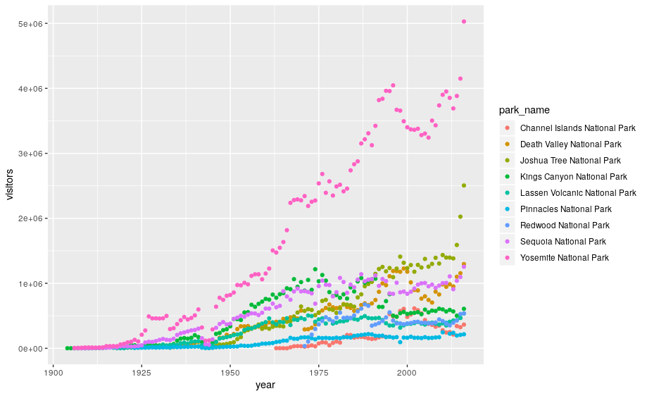
This isn’t necessarily a useful way to look at the data. We can distinguish each park by added the color argument to the aes:
ggplot(data=ca) +
  geom_point(aes(x = year, y = visitors, color = park_name))
3.1 Customizing plots
Take a look at the ggplot2 cheat sheet, and think of ways you could improve the plot.
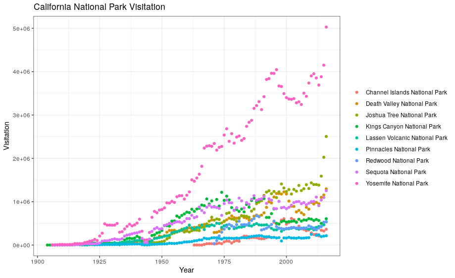
Now, let’s capitalize the x and y axis labels and add a main title to the figure. I also like to remove that standard gray background using a different theme. Many themes come built into the ggplot2 package. My preference is theme_bw() but once you start typing theme_ a list of options will pop up. The last thing I’m going to do is remove the legend title.
ggplot(data = ca) +
    geom_point(aes(x = year, y = visitors, color = park_name)) +
    labs(x = "Year",
       y = "Visitation",
       title = "California National Park Visitation") +
    theme_bw() +
    theme(legend.title=element_blank())
3.2 ggplot2 themes
In addition to theme_bw(), which changes the plot background to white, ggplot2 comes with several other themes which can be useful to quickly change the look of your visualization.
The ggthemes package provides a wide variety of options (including an Excel 2003 theme). The ggplot2 extensions website provides a list of packages that extend the capabilities of ggplot2, including additional themes.
Exercise
- Using the
sedataset, make a scatterplot showing visitation to all national parks in the Southeast region with color identifying individual parks.- Change the plot so that color indicates
state. Customize by adding your own title and theme. You can also change the text sizes and angles. Try applying a 45 degree angle to the x-axis. Use your cheatsheet!- In the following code, why isn’t the data showing up?
ggplot(data = se, aes(x = year, y = visitors))Solution
ggplot(data = se) + geom_point(aes(x = year, y = visitors, color = park_name)).- See the code below:
ggplot(data = se) +
 geom_point(aes(x = year, y = visitors, color = state)) +
labs(x = "Year", y = "Visitation", title = "Southeast States National Park Visitation") +theme_light() + theme(legend.title = element_blank(), axis.text.x = element_text(angle = 45, hjust = 1, size = 14))- The code is missing a geom to describe how the data should be plotted.
3.3 Faceting
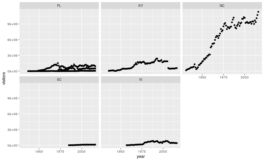
ggplot has a special technique called faceting that allows the user to split one plot into multiple plots based on data in the dataset. We will use it to make a plot of park visitation by state:
ggplot(data = se) +
    geom_point(aes(x = year, y = visitors)) +
    facet_wrap(~ state)
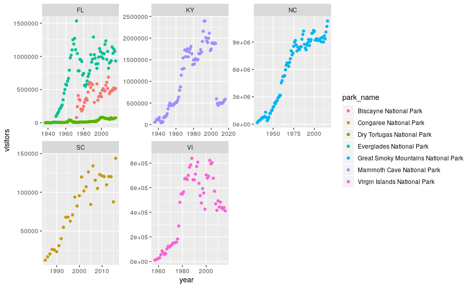
We can now make the faceted plot by splitting further by park using park_name (within a single plot):
 ggplot(data = se) +
     geom_point(aes(x = year, y = visitors, color = park_name)) +
     facet_wrap(~ state, scales = "free")
3.4 Geometric objects (geoms)
A geom is the geometrical object that a plot uses to represent data. People often describe plots by the type of geom that the plot uses. For example, bar charts use bar geoms, line charts use line geoms, boxplots use boxplot geoms, and so on.
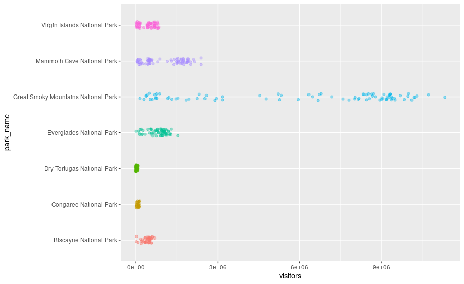
Scatterplots break the trend; they use the point geom. You can use different geoms to plot the same data. To change the geom in your plot, change the geom function that you add to ggplot(). Let’s look at a few ways of viewing the distribution of annual visitation (visitors) for each park (park_name).
# representations as points with a jitter offset
ggplot(data = se) +
  geom_jitter(aes(x = park_name, y = visitors, color = park_name),
              width = 0.1,
              alpha = 0.4) +
  coord_flip() +
  theme(legend.position = "none")
# boxplots
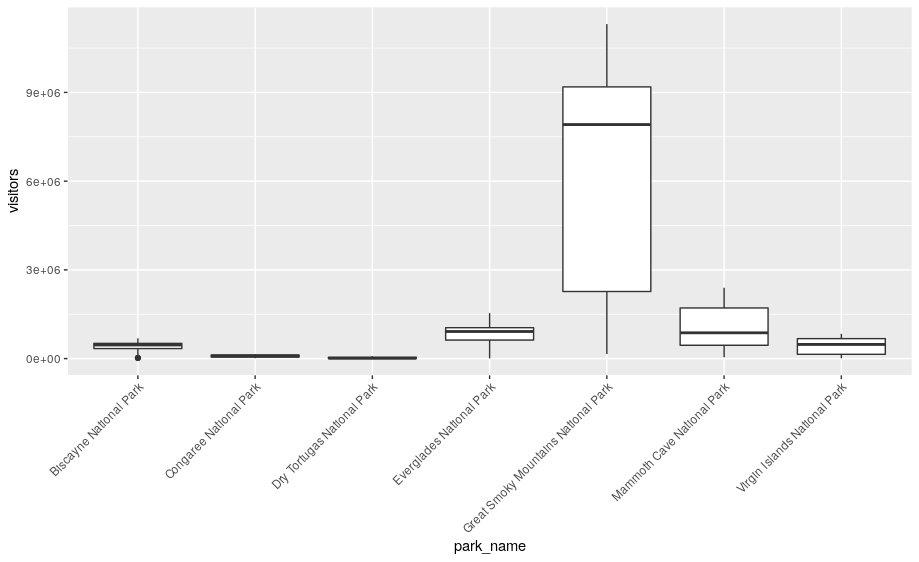
ggplot(se, aes(x = park_name, y = visitors)) +
geom_boxplot() +
theme(axis.text.x = element_text(angle = 45, hjust = 1))
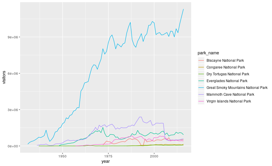
None of these are great for visualizing data over time. We can use geom_line() in the same way we used geom_point.
ggplot(se, aes(x = year, y = visitors, color = park_name)) +
   geom_line()
ggplot2 provides over 30 geoms, and extension packages provide even more (see https://exts.ggplot2.tidyverse.org/ for a sampling). The best way to get a comprehensive overview is the ggplot2 cheatsheet. To learn more about any single geom, use help: ?geom_smooth.
To display multiple geoms in the same plot, add multiple geom functions to ggplot():
geom_smooth allows you to view a smoothed mean of data. Here we look at the smooth mean of visitation over time to Acadia National Park:
ggplot(data = acadia) +
  geom_point(aes(x = year, y = visitors)) +
  geom_line(aes(x = year, y = visitors)) +
  geom_smooth(aes(x = year, y = visitors)) +
  labs(title = "Acadia National Park Visitation",
       y = "Visitation",
       x = "Year") +
  theme_bw()
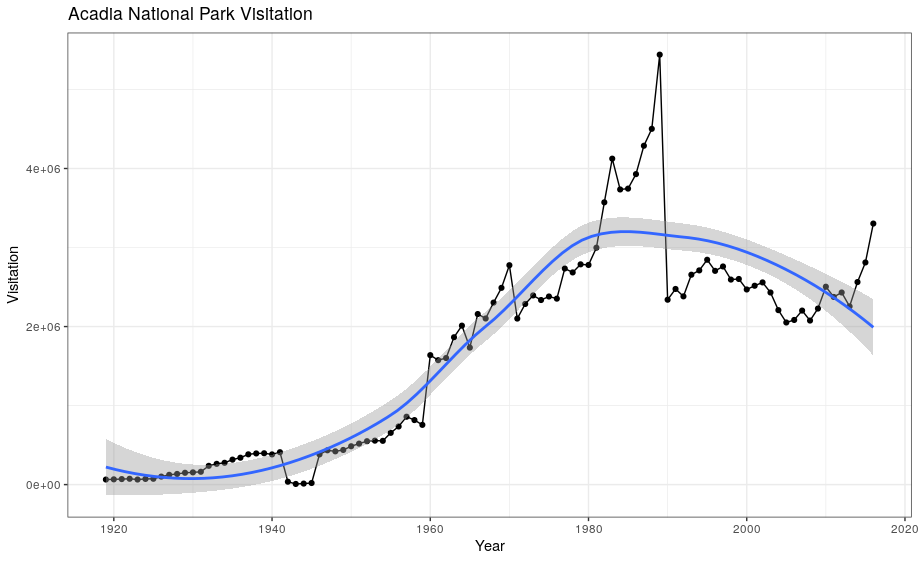
Notice that this plot contains three geoms in the same graph! Each geom is using the set of mappings in the first line. ggplot2 will treat these mappings as global mappings that apply to each geom in the graph.
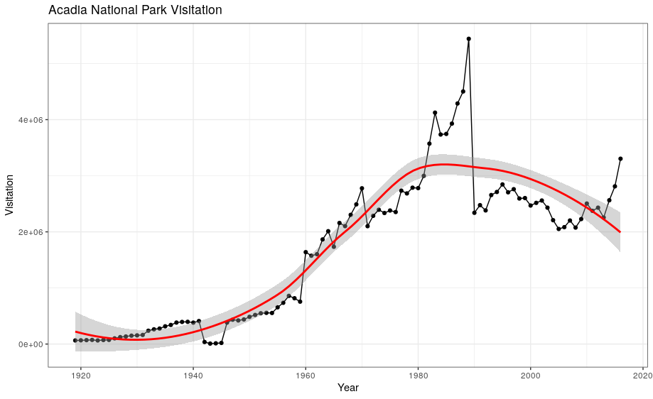
If you place mappings in a geom function, ggplot2 will treat them as local mappings for the layer. It will use these mappings to extend or overwrite the global mappings for that layer only. This makes it possible to display different aesthetics in different layers.
ggplot(data = acadia, aes(x = year, y = visitors)) +
  geom_point() +
  geom_line() +
  geom_smooth(color = "red") +
  labs(title = "Acadia National Park Visitation",
       y = "Visitation",
       x = "Year") +
  theme_bw()
Exercise
With all of this information in hand, please take another five minutes to either improve one of the plots generated in this exercise or create a beautiful graph of your own. Use the RStudio
ggplot2cheat sheet for inspiration.Here are some ideas:
- See if you can change the thickness of the lines or line type (e.g. dashed line)
- Can you find a way to change the name of the legend? What about its labels?
- Try using a different color palette: see the R Cookbook.
4. Bar charts
Next, let’s take a look at a bar chart. Bar charts seem simple, but they are interesting because they reveal something subtle about plots. Consider a basic bar chart, as drawn with geom_bar(). The following chart displays the total number of parks in each state within the Pacific West region.
ggplot(data = visit_16, aes(x = state)) +
  geom_bar()
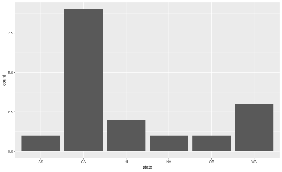
On the x-axis, the chart displays state, a variable from visit_16. On the y-axis, it displays count, but count is not a variable in visit_16! Where does count come from? Many graphs, like scatterplots, plot the raw values of your dataset. Other graphs, like bar charts, calculate new values to plot:
-
bar charts, histograms, and frequency polygons bin your data and then plot bin counts, the number of points that fall in each bin.
-
smoothers fit a model to your data and then plot predictions from the model.
-
boxplots compute a robust summary of the distribution and then display a specially formatted box.
The algorithm used to calculate new values for a graph is called a stat, short for statistical transformation.
You can learn which stat a geom uses by inspecting the default value for the stat argument. For example, ?geom_bar shows that the default value for stat is “count”, which means that geom_bar() uses stat_count(). stat_count() is documented on the same page as geom_bar(), and if you scroll down you can find a section called “Computed variables”. That describes how it computes two new variables: count and prop.
ggplot2 provides over 20 stats for you to use. Each stat is a function, so you can get help in the usual way, e.g. ?stat_bin. To see a complete list of stats, try the ggplot2 cheatsheet.
4.1 Position adjustments
There’s one more piece of magic associated with bar charts. You can colour a bar chart using either the color aesthetic, or, more usefully, fill:
ggplot(data = visit_16, aes(x = state, y = visitors, fill = park_name)) +
  geom_bar(stat = "identity")
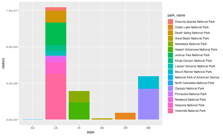
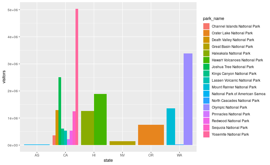
The stacking is performed automatically by the position adjustment specified by the position argument. If you don’t want a stacked bar chart, you can use "dodge".
position = "dodge"places overlapping objects directly beside one another. This makes it easier to compare individual values.
ggplot(data = visit_16, aes(x = state, y = visitors, fill = park_name)) +
  geom_bar(stat = "identity", position = "dodge")
Exercise
With all of this information in hand, please take another five minutes to either improve one of the plots generated in this exercise or create a beautiful graph of your own. Use the RStudio
ggplot2cheat sheet for inspiration. Remember to use the help documentation (e.g.?geom_bar) Here are some ideas:
- Flip the x and y axes.
- Change the color palette used
- Use
scale_x_discreteto change the x-axis tick labels to the full state names (Arizona, Colorado, etc.)- Make a bar chart using the Massachussets dataset (
mass) and find out how many parks of each type are in the state.Solution
# 1) flip the x and y axes
ggplot(data = visit_16, aes(x = state, y = visitors, fill = park_name)) +
  geom_bar(stat = "identity", position = "dodge") +
  coord_flip()
# 2) change the color palette ggplot(data = visit_16, aes(x = state, y = visitors, fill = park_name)) + geom_bar(stat = "identity", position = "dodge") + coord_flip() + scale_fill_brewer(palette = "Set3")# 3) change x-axis tick labels ggplot(data = visit_16, aes(x = state, y = visitors, fill = park_name)) + geom_bar(stat = "identity", position = "dodge") + coord_flip() + scale_fill_brewer(palette = "Set3") + scale_x_discrete(labels = mass$park_name)# 4) How many of each types of parks are in Massachusetts? ggplot(data = mass) + geom_bar(aes(x = type, fill = type)) + labs(x = "Type of park", y = "Number of parks")+ theme(axis.text.x = element_text(angle = 45, hjust = 1, size = 7))
4.2 Arranging and exporting plots
After creating your plot, you can save it to a file in your favorite format. The Export tab in the Plot pane in RStudio will save your plots at low resolution, which will not be accepted by many journals and will not scale well for posters.
Instead, use the ggsave() function, which allows you easily change the dimension and resolution of your plot by adjusting the appropriate arguments (width, height and dpi):
my_plot <- ggplot(data = mass) +
      geom_bar(aes(x = type, fill = park_name)) +
  labs(x = "",
       y = "")+
  theme(axis.text.x = element_text(angle = 45, hjust = 1, size = 7))

ggsave("name_of_file.png", my_plot, width = 15, height = 10)
Note: The parameters width and height also determine the font size in the saved plot.
4.3 bonus 1: animated graph
So as you can see, ggplot2 is a fantastic package for visualizing data. But there are some additional packages that let you make plots interactive. plotly, gganimate.
# install package if necessary and load library
# install.packages("plotly")
library(plotly)

my_plot <- ggplot(data = mass) +
      geom_bar(aes(x = type, fill = park_name)) +
  labs(x = "",
       y = "")+
  theme(axis.text.x = element_text(angle = 45, hjust = 1, size = 7))

ggplotly(my_plot)
acad_vis <- ggplot(data = acadia, aes(x = year, y = visitors)) +
  geom_point() +
  geom_line() +
  geom_smooth(color = "red") +
  labs(title = "Acadia National Park Visitation",
       y = "Visitation",
       x = "Year") +
  theme_bw()

ggplotly(acad_vis)
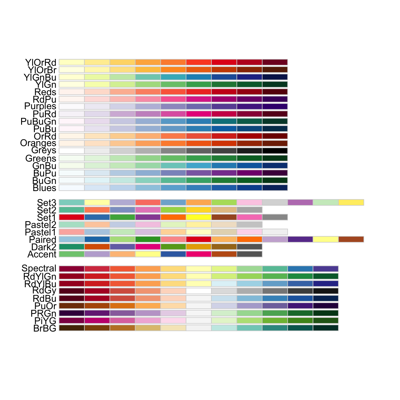
4.4 bonus 2: additional colours with scale_colour_brewer
We can use the scale_colour_brewer from the ggplot2 package to change the colour scheme of our plot.
From the help page of the function:
The brewer scales provides sequential, diverging and qualitative colour schemes from ColorBrewer. These are particularly well suited to display discrete values on a map. See http://colorbrewer2.org for more information.
ggplot(data = ca, aes(x = year, y = visitors, color = park_name)) +
  geom_point() +
  geom_line() +
  labs(title = "Acadia National Park Visitation",
       y = "Visitation",
       x = "Year") +
  theme_bw() +
  scale_colour_brewer(type = "qual", palette = "Set1")
All palettes are visible below. Always make sure that you have enough colors in the palette for the number of categories you want to display.
5. Resources
Here are some additional resources for data visualization in R:
- ggplot2-cheatsheet-2.1.pdf
- Interactive Plots and Maps - Environmental Informatics
- Graphs with ggplot2 - Cookbook for R
- ggplot2 Essentials - STHDA
- “Why I use ggplot2” - David Robinson Blog Post
- “The Grammar of Graphics explained” - Towards Data Science blog series
Key Points
ggplot2relies on the grammar of graphics, an advanced methodology to visualise data.ggplot() creates a coordinate system that you can add layers to.
You pass a mapping using
aes()to link dataset variables to visual properties.You add one or more layers (or
geoms) to theggplotcoordinate system andaesmapping.Building a minimal plot requires to supply a dataset, mapping aesthetics and geometric layers (geoms).
ggplot2offers advanced graphical visualisations to plot extra information from the dataset.