All Images
The Importance of Message
Figure 1
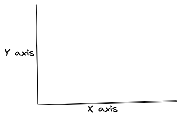
Figure 1.1: X and Y axes on a Cartesian
plane
Figure 2
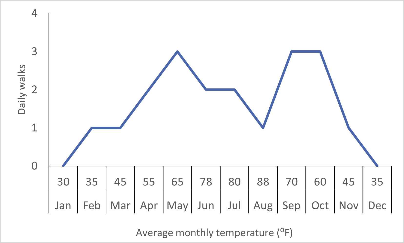
Figure 1.2: Line chart
Graphical Elements of a Chart
Figure 1

Figure 2.1
Figure 2
Figure 2.2
Figure 3
Figure 2.3
Figure 4

Figure 2.4
Figure 5

Figure 2.5
Figure 6

Figure 2.6
Figure 7

Figure 2.7
Figure 8
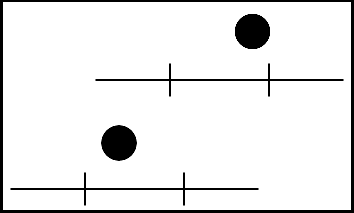
Figure 2.8
Figure 9

Figure 2.9
Figure 10
Figure 2.10
Figure 11
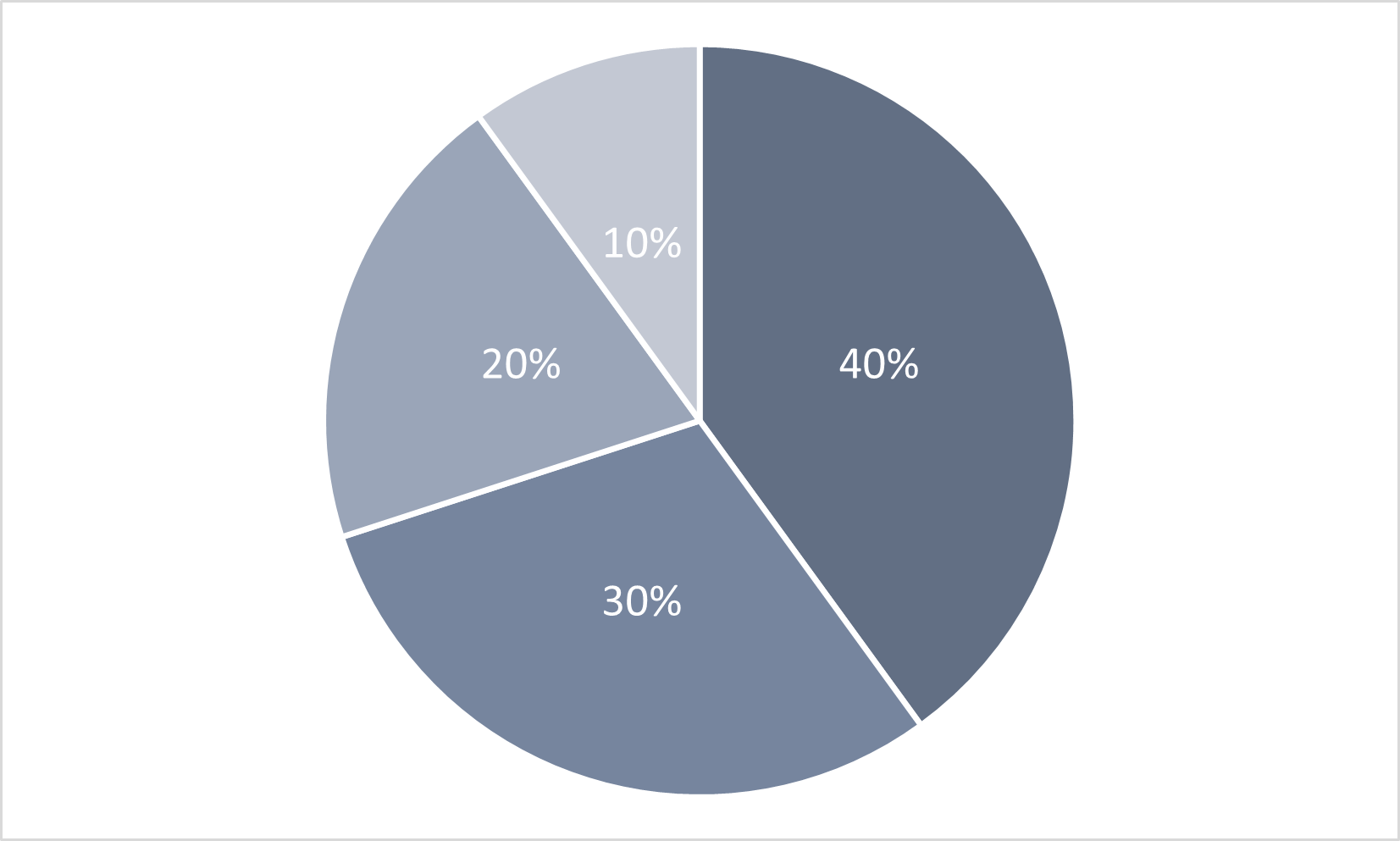
Figure 2.11: 2D Pie Chart
Figure 12
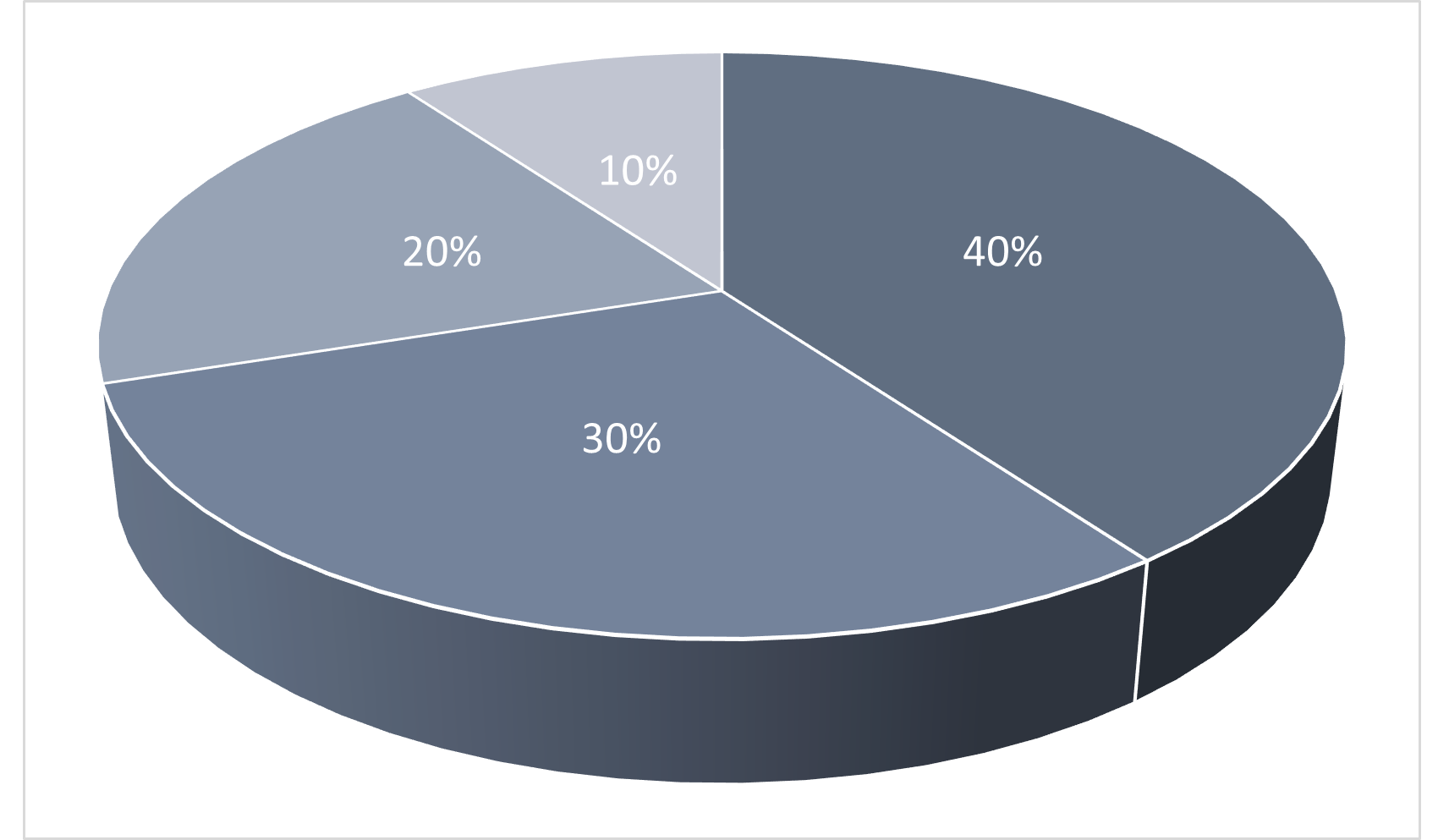
Figure 2.12: 3D Pie Chart
Figure 13
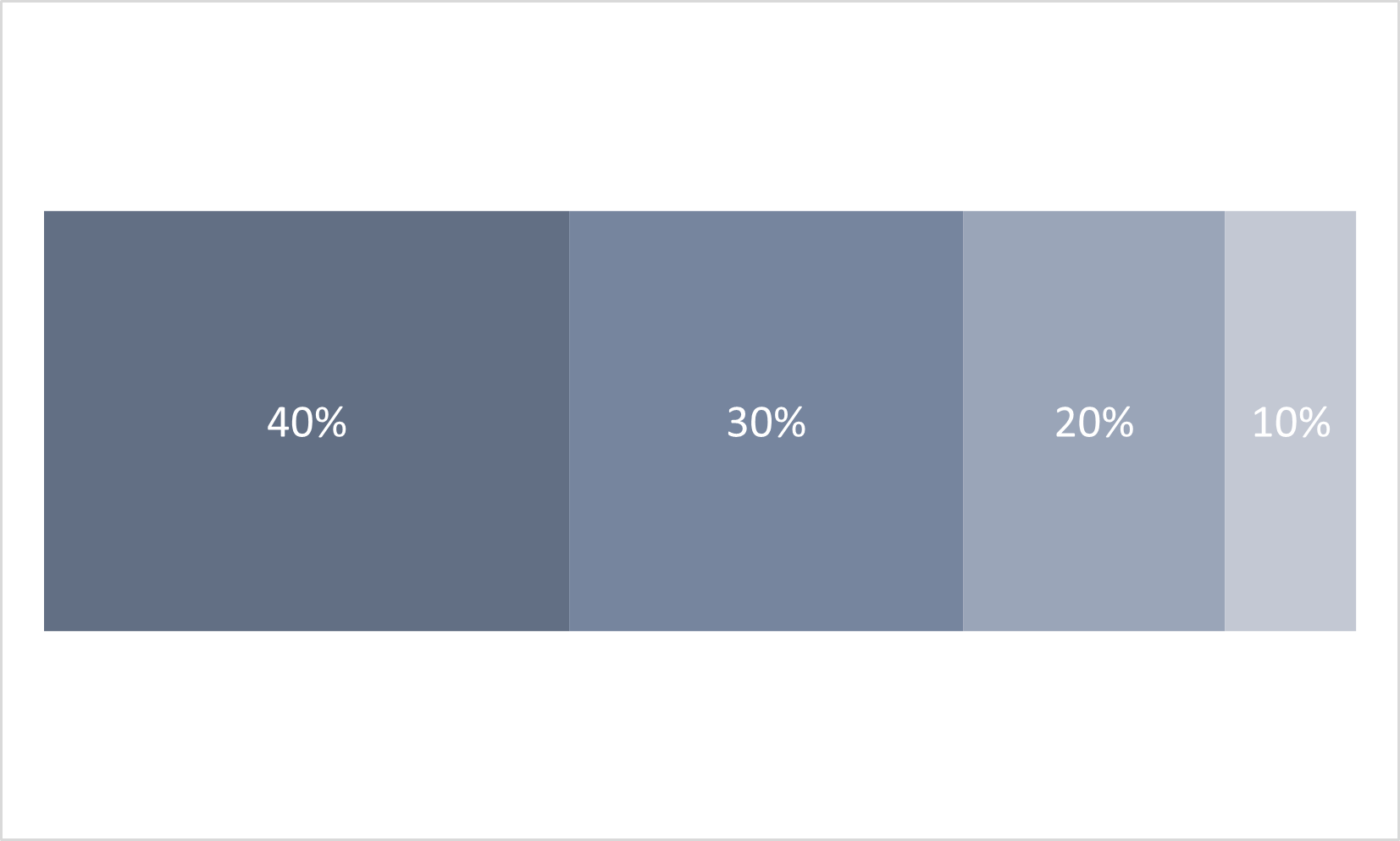
Figure 2.13: 100% Bar Chart
Figure 14
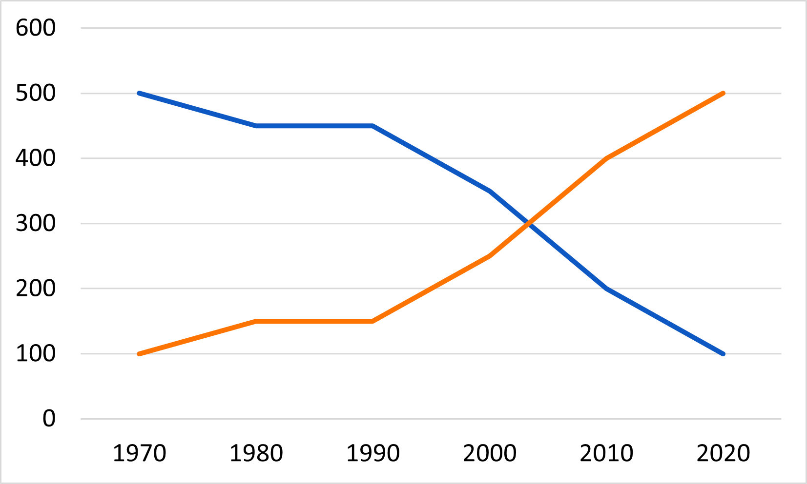
Figure 2.14: 2D Line Chart
Figure 15
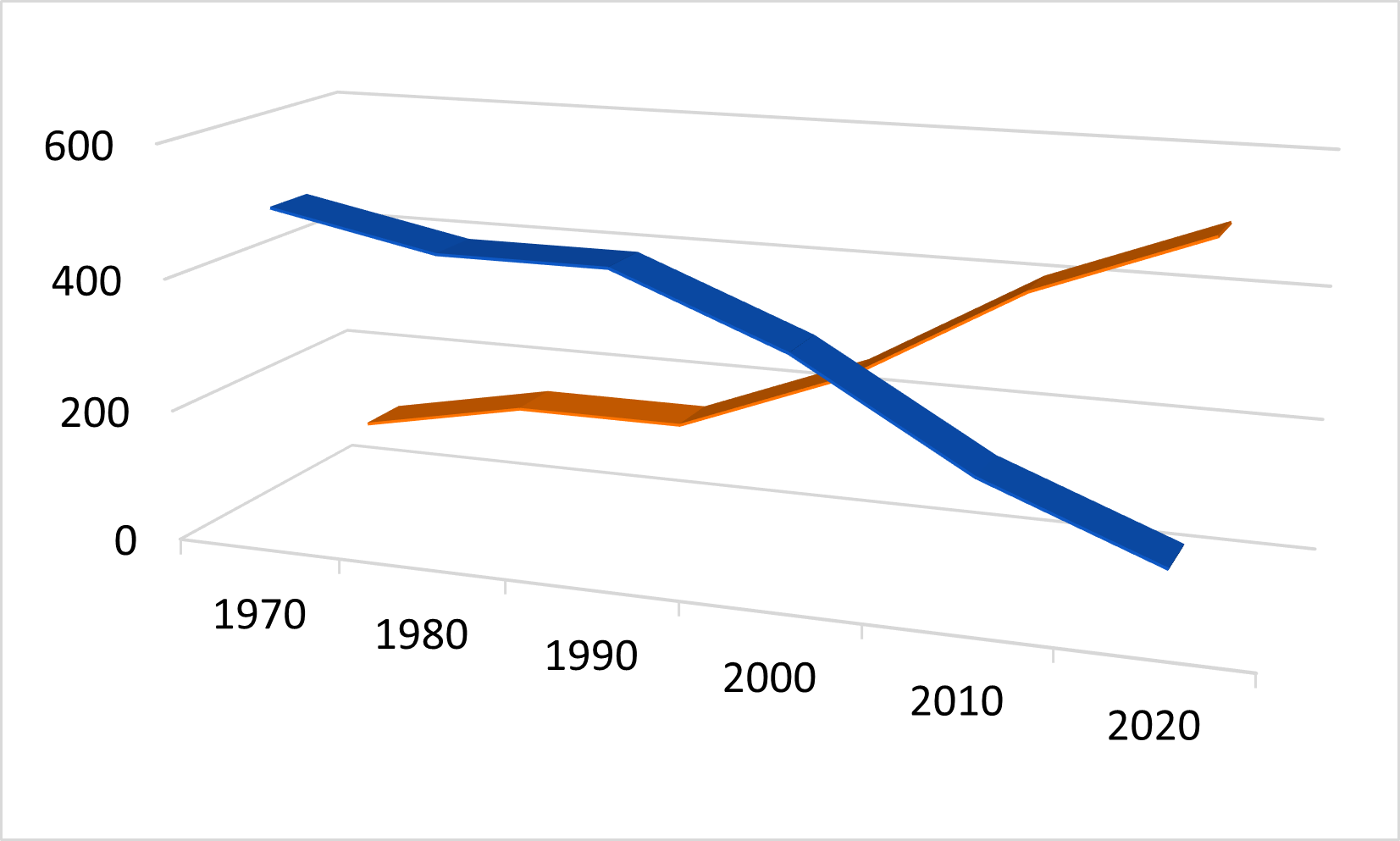
Figure 2.15: 3D Line Chart
Figure 16
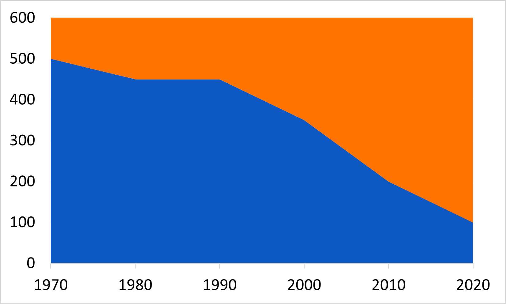
Figure 2.16: 2D Area Chart
Identify and Interpret the Message
Figure 1
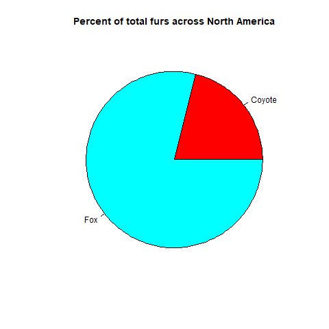 {On
average across North America throughout the collection period foxes made
up 80?% and Coyotes made up 20% of the canids}
{On
average across North America throughout the collection period foxes made
up 80?% and Coyotes made up 20% of the canids}
Figure 2
What is the message of this graph?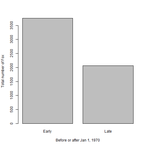 {Fox
populations before Jan 1, 1970 were greater than after 1970 {North
American fox populations averaged 3765 (units) prior to Jan. 1, 1970 and
2062 after.} Discuss message as a group
{Fox
populations before Jan 1, 1970 were greater than after 1970 {North
American fox populations averaged 3765 (units) prior to Jan. 1, 1970 and
2062 after.} Discuss message as a group
Figure 3
What is the message of this graph?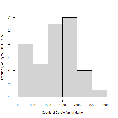 {Coyote
populations in Maine ranged from zero to 2741 throughout the collections
period and had a median of 1393 and mean of 1296 units.} Discuss message
as a group
{Coyote
populations in Maine ranged from zero to 2741 throughout the collections
period and had a median of 1393 and mean of 1296 units.} Discuss message
as a group
Figure 4
What is the message of this graph?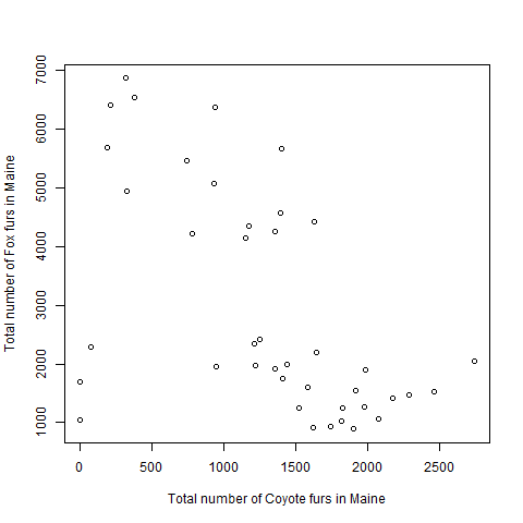 {Fox populations
tended to decrease as Coyote populations increased} Discuss message as a
group
{Fox populations
tended to decrease as Coyote populations increased} Discuss message as a
group
Figure 5
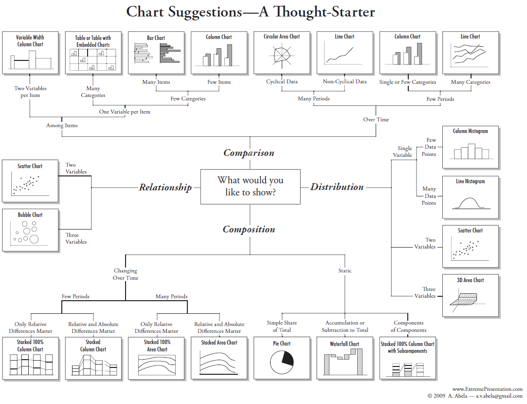
The chart chooser graphic is an informative tool
to help you consider what chart types are appropriate for your data and
message.
Communicating the Message
Figure 1

Figure 3.1
Figure 2

Figure 3.2
Figure 3

Figure 3.3
Figure 4

Figure 3.4
Figure 5

Figure 3.5
Figure 6
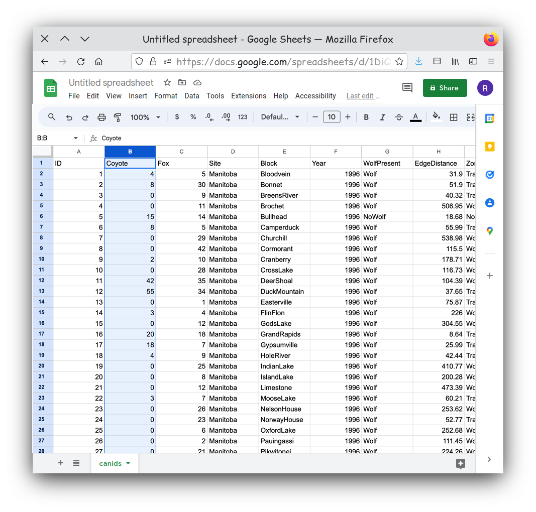
Figure 3.6
Figure 7

Figure 3.7
Figure 8

Figure 3.8
Figure 9

Figure 3.9
Figure 10

Figure 3.10
Figure 11

Figure 3.11
Figure 12
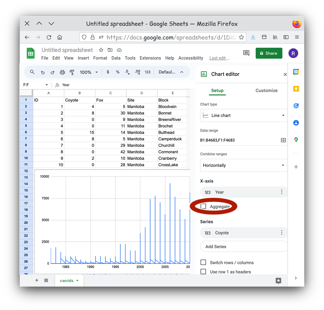
Figure 3.12
Figure 13
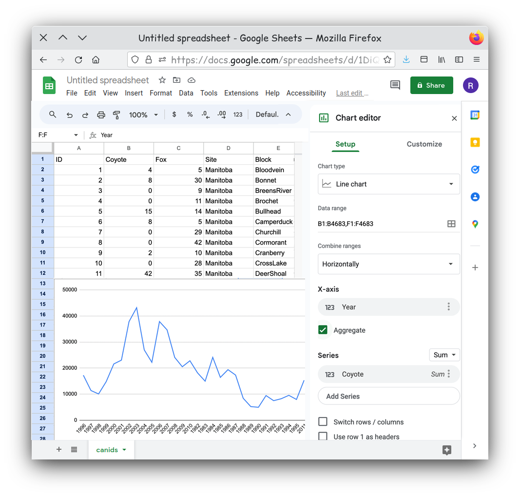
Figure 3.13
Figure 14
That looks better, but can you see another issue? Look closely. 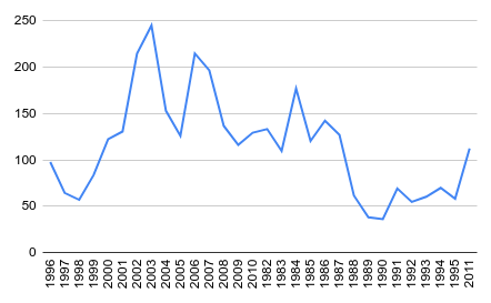
Figure 15
Figure 3.15
Figure 16
Figure 3.16
Figure 17
Figure 3.17