Communicating the Message
Last updated on 2023-12-18 | Edit this page
Overview
Questions
- What are the important aspects of a dataset you want to communicate?
- What is the best visualization type for a particular dataset?
Objectives
- Identify what message would like to communicate about a dataset.
- Identify how to best communicate the message with appropriate visuals.
- Generate graphs based on your decisions using software.
Introduction
This chapter will use the knowledge you have gained and apply it to generate graphs using software tools. What you should know:
- There are a multitude of software tools that can help generate charts for you.
- All software tools have the strengths and weaknesses. There is no best tool for all tasks or all users.
- For this lessen we will be using Google Sheets. For our purposes
this tool has some important advantages.
- The software is freely available online.
- The software works similarly regardless of the user’s operating system
- The software is interacted primarily through a graphical interface that can make it more intuitive to new users.
Importing your Data
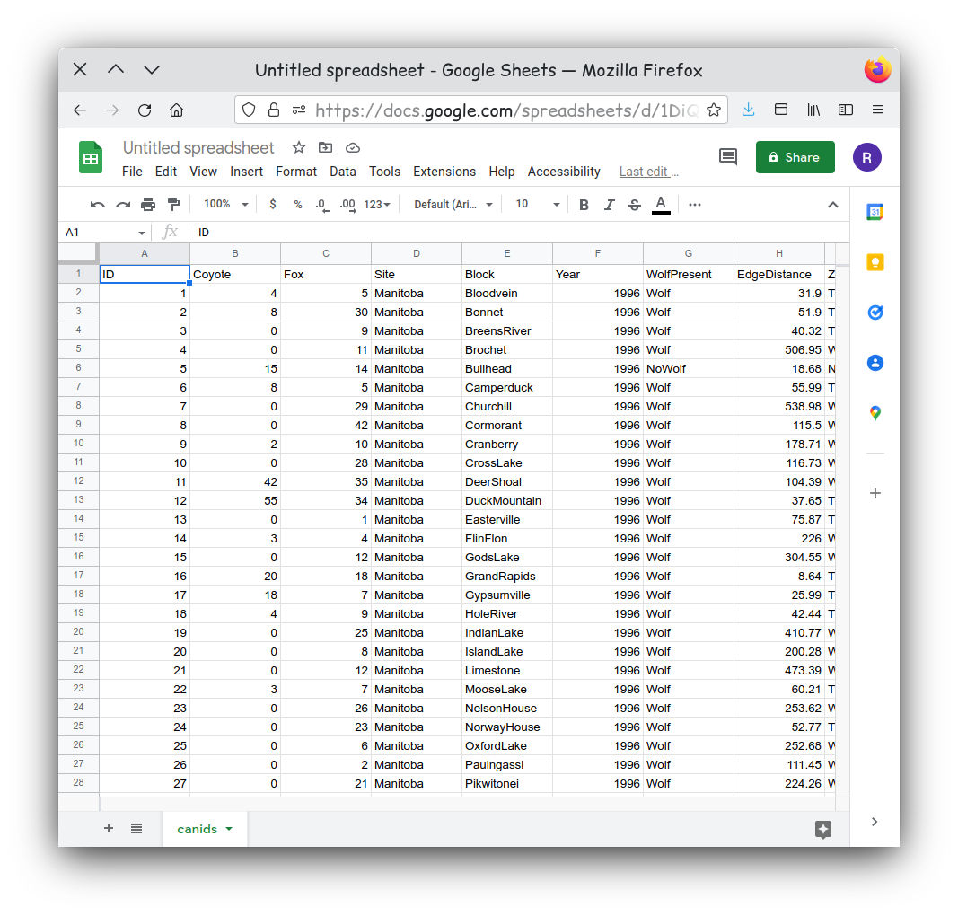
We need to import our canid data into Google Sheets. Our data is currently stored as tab separated values, otherwise known as a tsv file. This is a simple text file. Each line of the file represents a new line in a table. The values in each column of the table appear in sequence separated by a tab character. Generally tsv tables have the limitation that you can’t store any values in a table that also has a tab character. If you haven’t already, go ahead and download the canid data now.
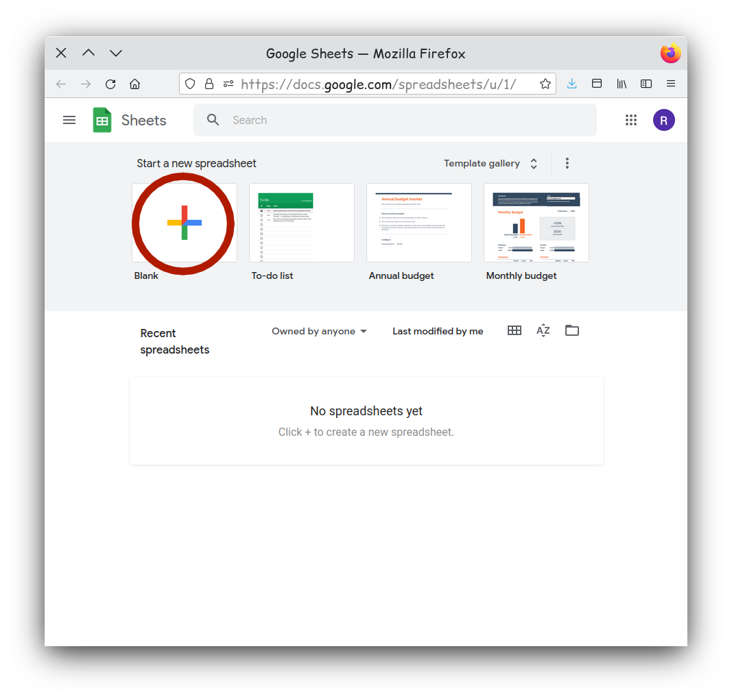
To import this into Google Sheets you first need to go to the [website] (https://docs.google.com/spreadsheets/). It will prompt you to log into a Google account. You will need to use a Google account to use Google Sheets, but if you do not have one, they are free Google Account Sign-up.
While there you will want to create a new blank spreadsheet.
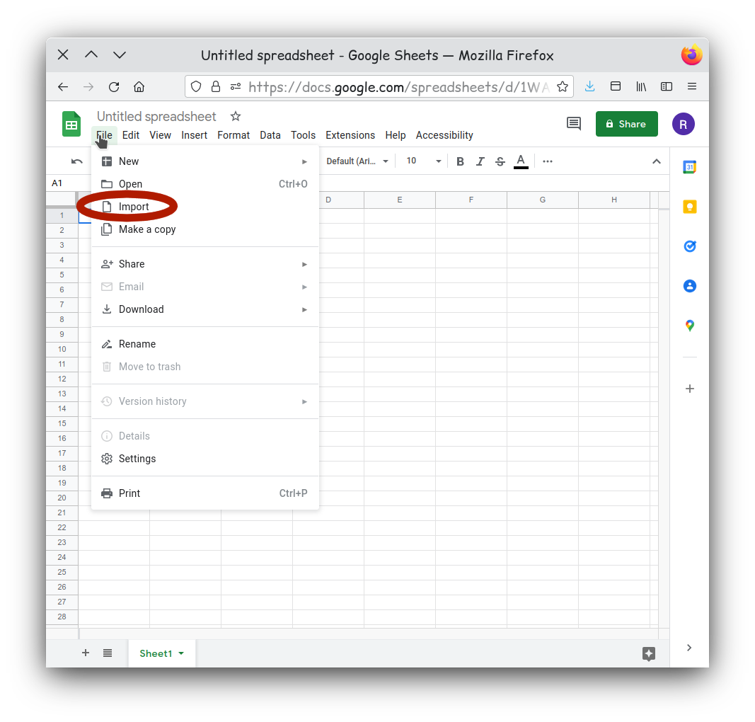
Then navigate to the File menu and select
Import.
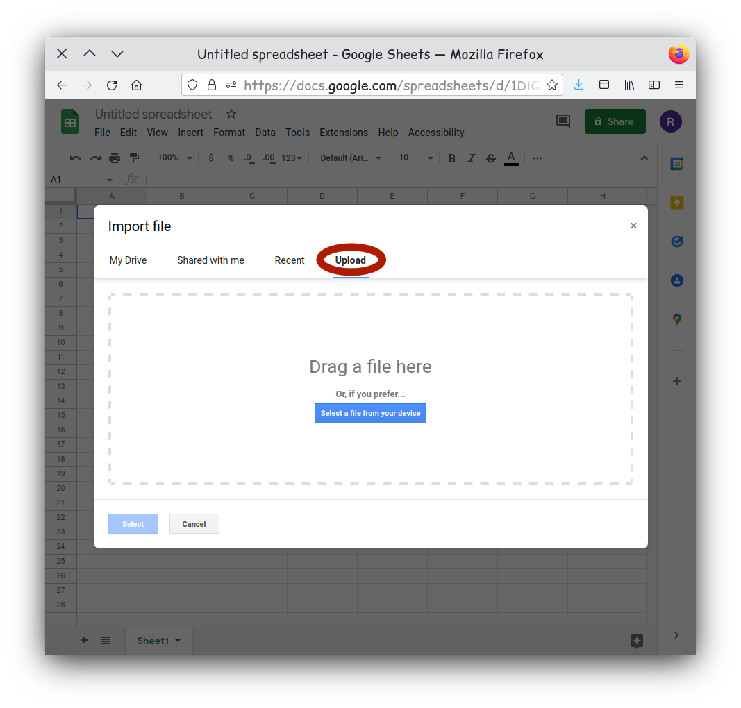
Select the Upload tab on the new window. Here you can
drag and drop you canids.tsv onto the window. You can also click
‘Browse’ if you prefer to navigate to your file.
Tab separated files are well supported on Google Sheets, and the
default import options should be fine. If your have issues you could try
setting the selector type to Tab.
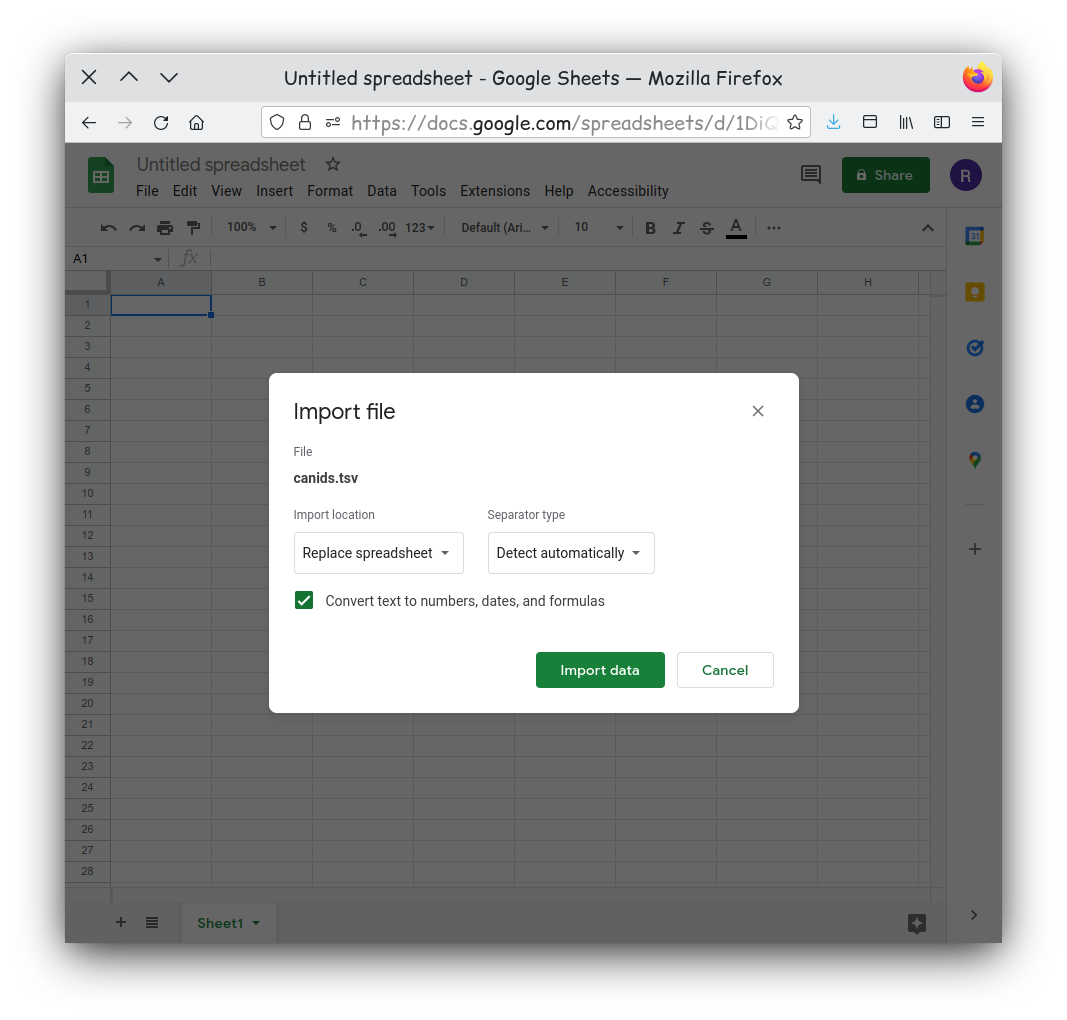
Your data should now be imported and visible in a new sheet.
Activity 1
Examine your dataset. Does it appear to be clean and tidy?
Remember clean data has no: - White spaces before or after data in each cell - Outliers, nulls, missing data, or empty cells - Formatting, such as color coding, bold, or italicized text
Also, tidy data is organized so that: - Columns are for variables - Rows are for observations - One value per cell
Lets Make a Chart
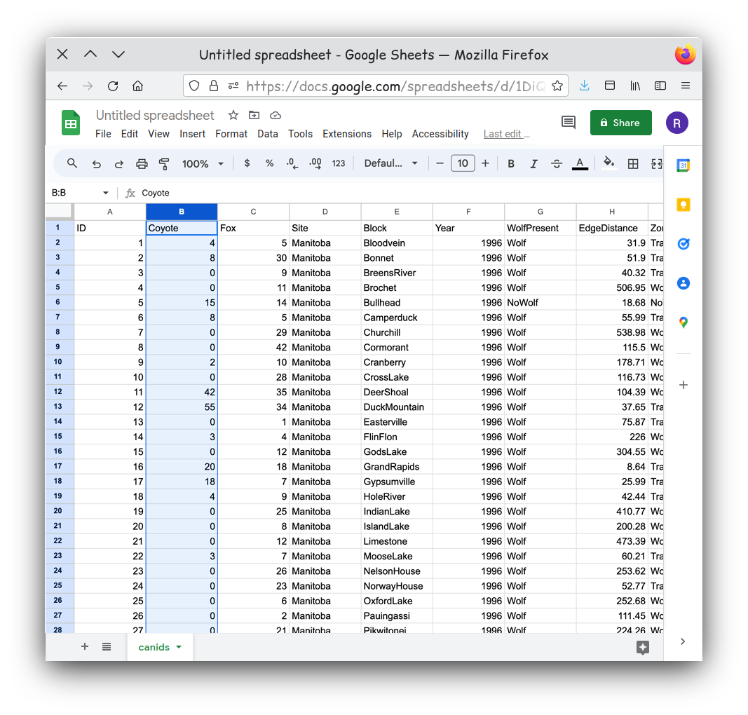
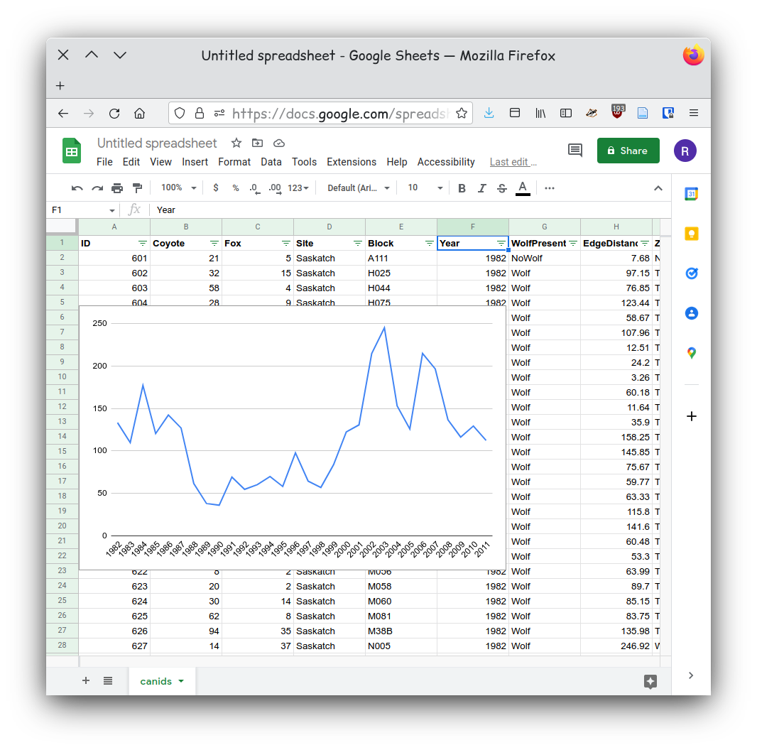
For our first chart let’s show the relationship of the counts of coyotes over time. We need to pick our first data series. This will become our y-axis data. Let’s pick the count of coyotes so we can compare the coyote counts over time. We can start by selecting Column B in the spreadsheet.
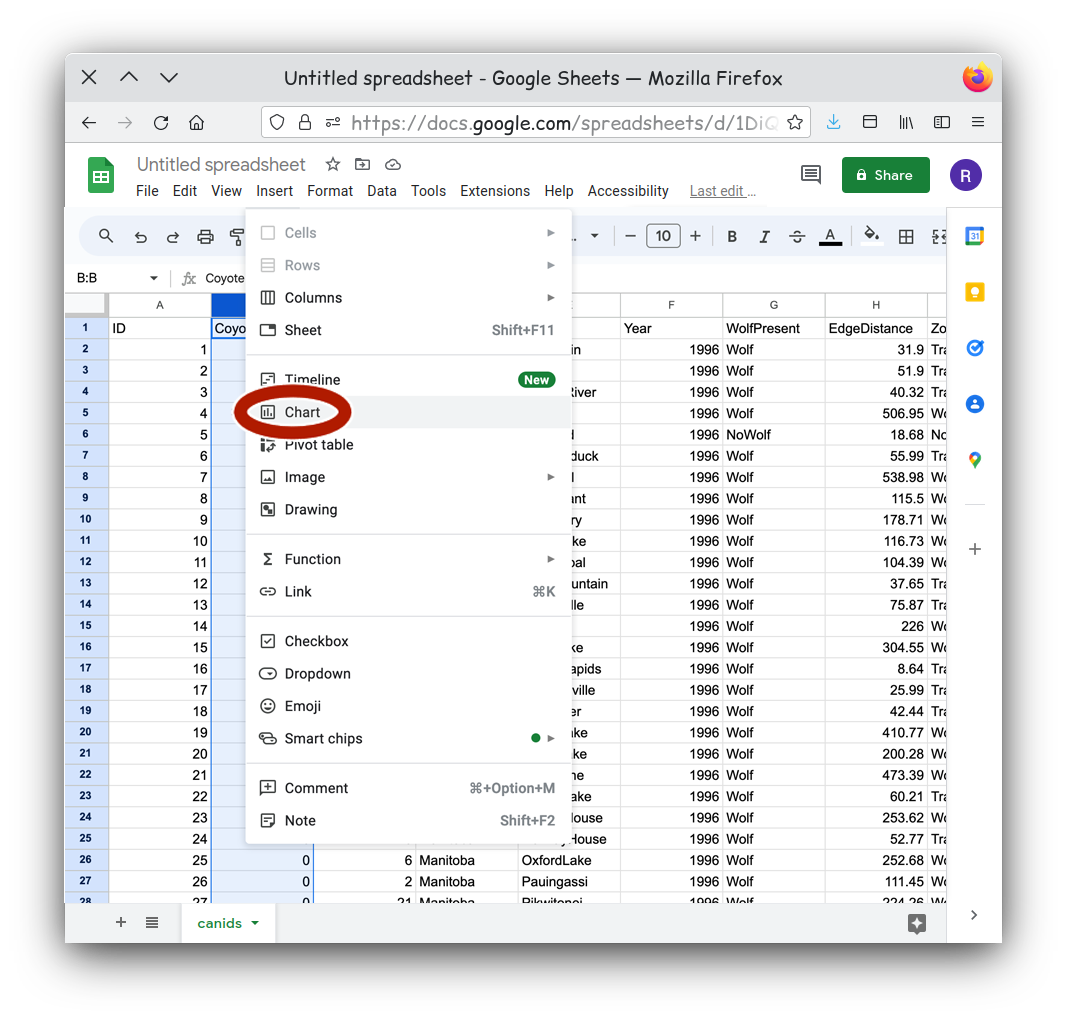
Our next step is to turn the data we selected into a chart. Using the
Insert menu, select Insert Chart.
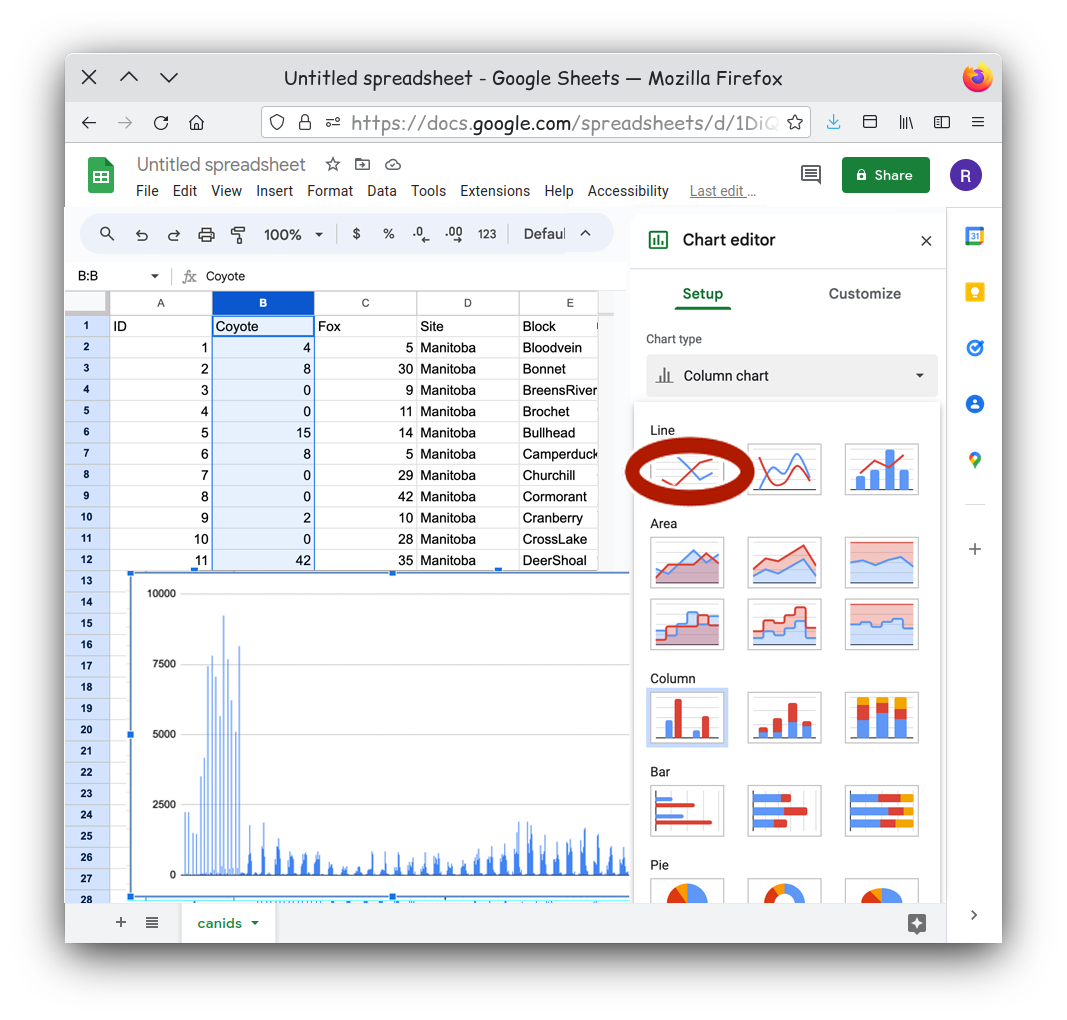
The Insert Chart command will result in a default chart
which might or might not communicate anything useful to us.
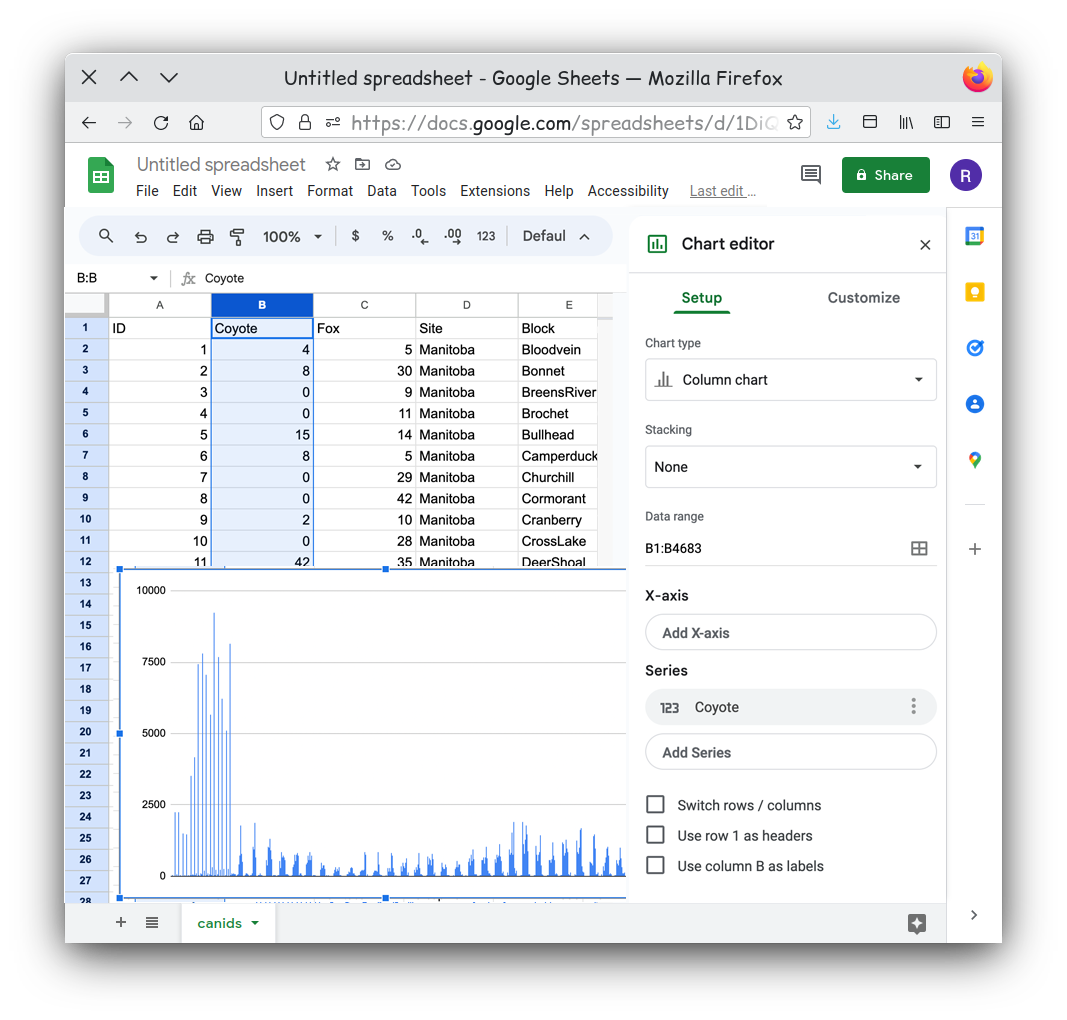
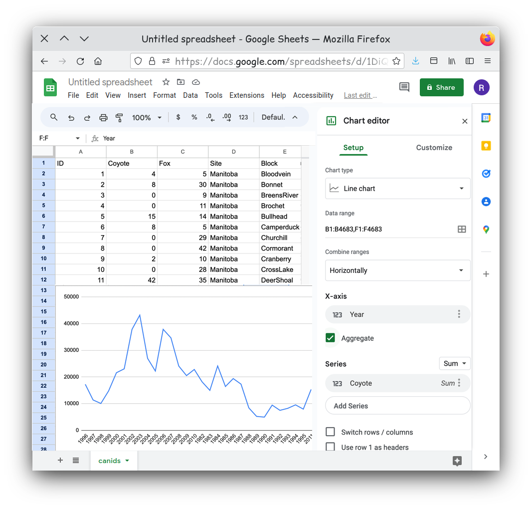
There are a few steps we need to do to get a chart that better shows our data. With the Chart Editor open, we can select the type of chart we want, such as a line graph.
We can add X-axis values. .
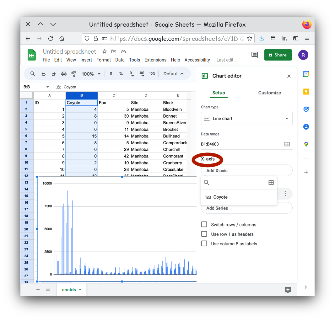
Once the Select data range menu is open, you can click the top of the column named Year in your table to set Year as our data for the X-axis.
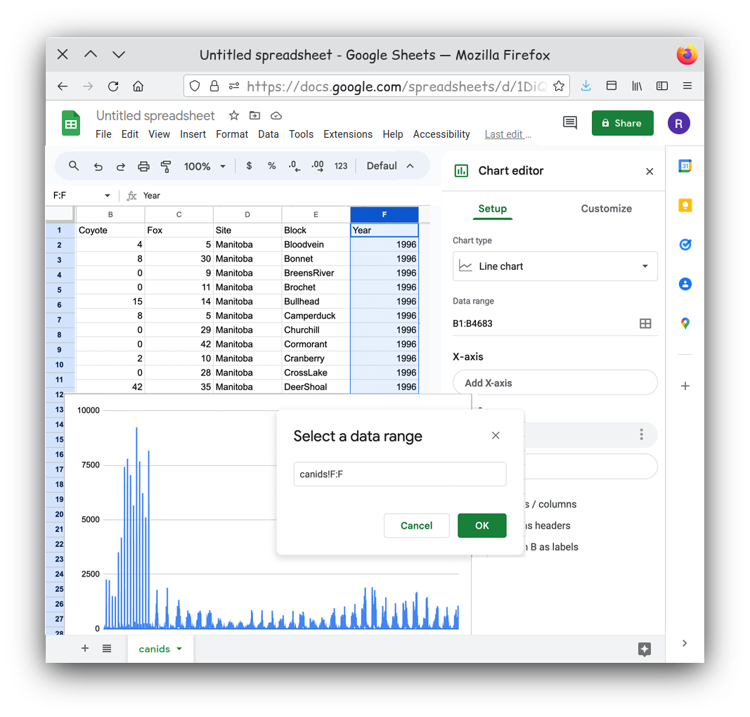
Something doesn’t look right. Our line chart seems to be jumping back and forth at each year.
If you look at the table you will notice that for every year value we
have multiple rows. By default the chart is plotting every row as an
independent point, so we have multiple points at every year. Is that
really what we want to show? It might be better to show some aggregate
value for each year. That would mean a simpler chart and a simpler
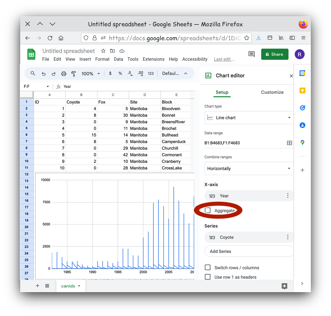
message. Click the Aggregate checkbox for the X-axis.
That looks better, but can you see another issue? Look closely. 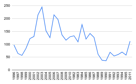
Our years are not in order! The years are plotted in the order they
appeared on our table. One simple way to solve this is to reorder our
table. There are a few different tools you can use, but creating a
filter for you table has a few advantages. First it automatically sets
your first row as headings, this means when you sort your table the
headings always stay at the top. Secondly we can order the table on the
fly by simply clicking on a heading. To set this up select the entire
table first. This can either be done using the keyboard shortcut of
ctrl-a or by clicking on the upper leftmost square in your
table This is the rectange above the row 1 label and to the
left of the column A label. Next select the
Create a Filter entry in Data menu.
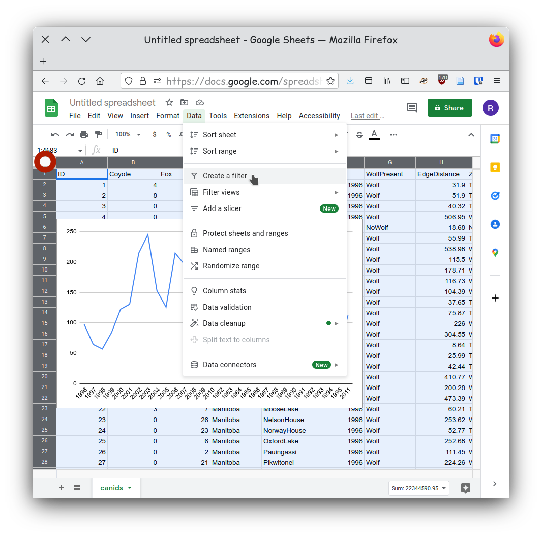
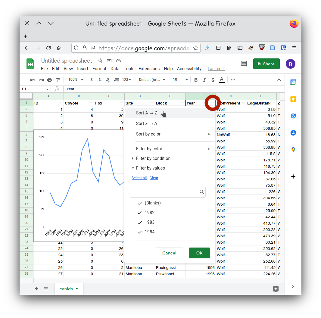
You should now see downward facing triangles on each column heading.
Click on the icons next to the year column and then select the Select
the column year. Now from the Data menu select
Sort sheet -> Sort sheet by column F (A-Z).
Now that our data is sorted our chart should show our data in chronological order.
- Identify if you are communicating a comparison, distribution, composition, relationship.
- Use the chart chooser a good chart for your particular dataset.
- Choose the tool you will be using to generate your chart
- Import your data making sure your data is “clean” and “tidy”.