All in One View
Content from The Importance of Message
Last updated on 2023-12-18 | Edit this page
Overview
Questions
- What is a chart?
- What is the purpose of a chart?
- What do we need to make a chart?
- Why is chart message so important?
Objectives
- Define what a chart is
- Explain the purpose of a chart
- Identify the components of a chart
- Explain the importance of a chart’s message
What is a chart?
A chart is a visual representation of the relationships among data elements. A visual representation allows people to see and quickly comprehend relationships among data elements by processing the information in the brain’s visual cortex1.
Purpose of a chart
The purpose of a chart is to communicate. An effective chart clearly communicates a message to the viewer. An ineffective chart confuses the viewer because it contains no message or several muddled messages.
Components of a chart
The individual pieces that we need to build a chart are:
- Data arranged in a table
- A message about the data
- Graphical elements
An imbalance in any of these components will make a chart ineffective or impossible:
- Without data, a chart has no information to communicate
- Without a message, a chart has nothing clear to say about the data
- Without graphics, a chart cannot visualize information
In this episode, we will talk about data, tables, and messages. We will address graphical elements in the next episode.
Why no software?
It may seem odd that the key components of a chart do not include software. While software is a useful tool for chart-making, it is not strictly necessary. You can create an effective chart by hand as long as you have the three essential chart components: a table of data, a message about the data, and graphical elements. Software can help you arrive at these three components more quickly, but it cannot automatically create an effective chart on its own. An effective chart communicates, and communication is a human activity.
Prepare the data
We need to prepare data before attempting to visualize it in a chart. This process is often called “cleaning.” A thorough overview of data cleaning is outside the scope of this lesson, but here are some guidelines.
Clean data is summarizable, countable, and calculable. This means that the data table contains no:
- White spaces before or after data in each cell
- Outliers, nulls, missing data, or empty cells
- Formatting, such as color coding, bold, or italicized text
For efficient data analysis and visualization, cleaned data must also be made tidy. Tidy data2 means:
- Columns are for variables
- Rows are for observations
- One value per cell
Resources for learning about cleaning data
- The Data Carpentry Ecology Data in Spreadsheets lesson offers step-by-step instructions for managing, cleaning, and tidying tabular data to prepare it for analysis
- Broman, K. W., & Woo, K. H. (2018). Data organization in spreadsheets (e3183v2). PeerJ Inc. https://doi.org/10.7287/peerj.preprints.3183v2
The role of tables
A table is necessary for making a chart, but is not a substitute for a chart. A table must be read to convey its information. Reading a data table makes it difficult to understand any patterns that might be present in the data. Consider this data table:
| Average Monthly Temperature (°F) | Daily Walks per Dog |
|---|---|
| 30 | 0 |
| 35 | 1 |
| 45 | 1 |
| 55 | 2 |
| 65 | 3 |
| 78 | 2 |
| 80 | 2 |
| 88 | 1 |
| 70 | 3 |
| 60 | 3 |
| 45 | 1 |
| 35 | 0 |
Take 1 minute to read the table and discuss it with your neighbor. How easy or difficult is it to understand the data? What patterns can you detect?
From table to chart
To create a chart from a table, data elements recorded in different
columns of the table are arranged along the x and
y axes of a Cartesian plane.
If we arrange the data points for Average Monthly Temperature along
an x axis and the data points for Daily Walks per Dog along
a y axis, we can connect the places where those data points
intersect to create this chart:
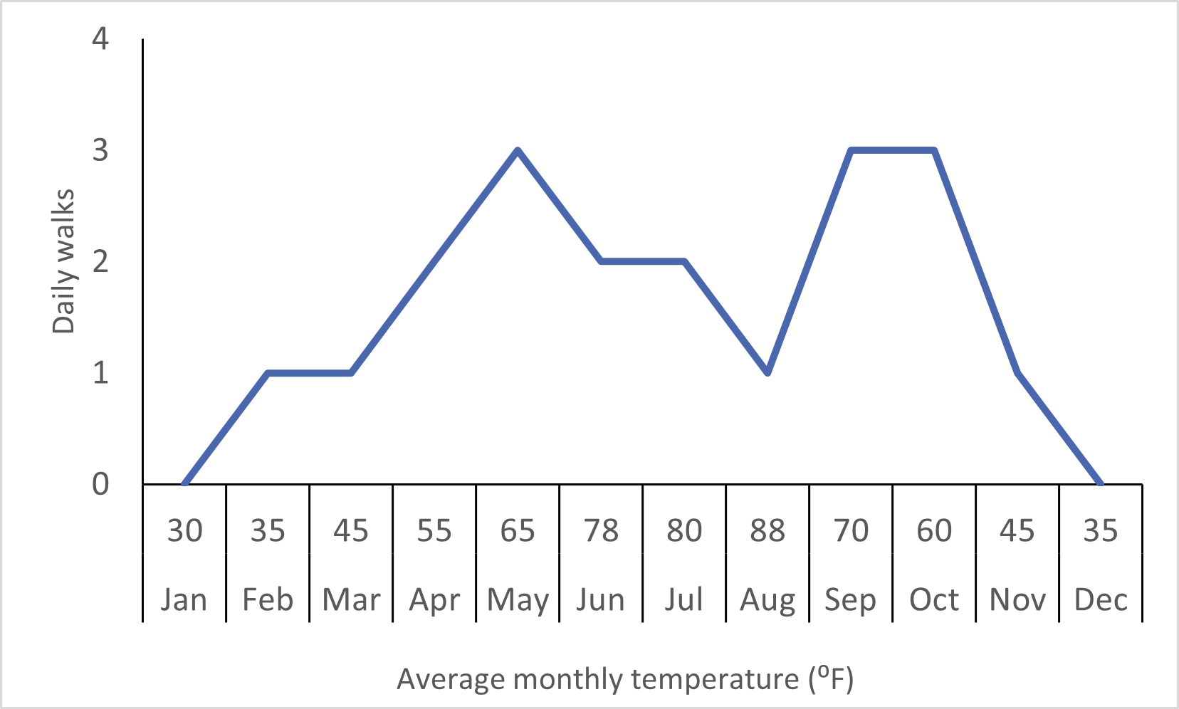
Take 1 minute to view the chart and discuss it with your neighbor. How easy or difficult is it to understand the data? What patterns can you detect?
Chart message
The relationship between the two elements that emerges when
x is plotted against y creates the message of
the chart3. This message is one sentence that
describes the relationship that the chart visualizes. This single
sentence becomes the title of your chart. If you are having trouble
stating the relationship in one sentence, you may have too many
relationships for one chart.
It takes practice to identify and articulate a message for a chart, but knowing where it comes from is a first step. You’ll practice this skill more during subsequent episodes.
Challenge: Identify a chart message
Choose the sentence that best describes the relationship depicted in the chart above:
- Dogs get fewer daily walks during seasonal temperature extremes.
- Monthly average temperature varies during the year.
- Dogs get between 0 and 4 walks daily.
The correct answer is 1. This sentence describes an interaction
between seasonal temperature and number of daily walks. These are the
two data elements plotted on the x and y axes
of this chart.
Importance of Chart Message
Clearly-imparted information - messages - about relationships within a set of data drive problem-solving and decision-making about the entities represented by the data. These solutions and decisions have real-world consequences.
In this lesson we will use a dataset about large North American canids: wolves, coyotes, and foxes4. Public policy and scientific decisions have drastically changed these populations over the past century. The presence or absence of these animals near population centers, livestock, and nature preserves stirs public debate in the present day. You will practice communicating scientific information about large North American canids in messages and charts that the public can understand.
- A chart visualizes data relationships in a format that people can see instead of read.
- The purpose of a chart is to communicate.
- Data arranged in a table and a message about the data are two of the three components of a chart.
- A chart’s message drives decision-making and problem-solving.
Bertin, J. (1981). Graphics and graphic information-processing (W. J. Berg & P. Scott, Trans.). de Gruyter.↩︎
Wickham, H. 2014. “Tidy Data.” Journal of Statistical Software 59 (10). 10.18637/jss.v059.i10 https://doi.org/10.18637/jss.v059.i10↩︎
Bertin, J. (1981). Graphics and graphic information-processing (W. J. Berg & P. Scott, Trans.). de Gruyter.↩︎
Newsome, T. M. & Ripple, W. J. (2015). Data from: A continental scale trophic cascade from wolves through coyotes to foxes, Dryad, Dataset, https://doi.org/10.5061/dryad.s0d20↩︎
Content from Graphical Elements of a Chart
Last updated on 2023-12-18 | Edit this page
Overview
Questions
- When creating a chart, what components do I have to work with?
- Which chart components are easier for people to perceive accurately?
- How can chart components support a chart’s message?
Objectives
- List the graphical elements and their visual properties that are available for chart design
- Choose chart components that are easier for people to perceive accurately
- Practice choosing better charts for some common chart use cases
Graphical elements and visual properties
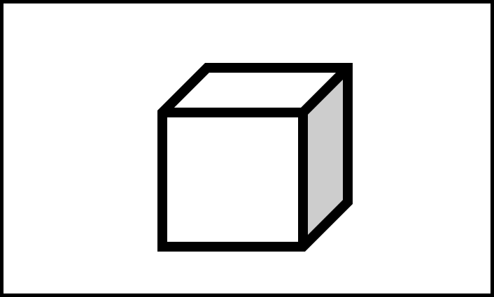
When we create a chart, we can choose many different ways to represent the message we wish to convey. But in two or three dimensions, there are only a few graphical elements we have to work with1:
- Point
- Line
- Area
- Volume
The data and data relationships we are representing in a chart have different quantities and categories. We can communicate this information through a graphical element’s visual properties2:
- Position
- Alignment on one or more scales
- Length
- Direction
- Angle
- Size (amount of Area or Volume)
- Curvature
- Shading
- Color
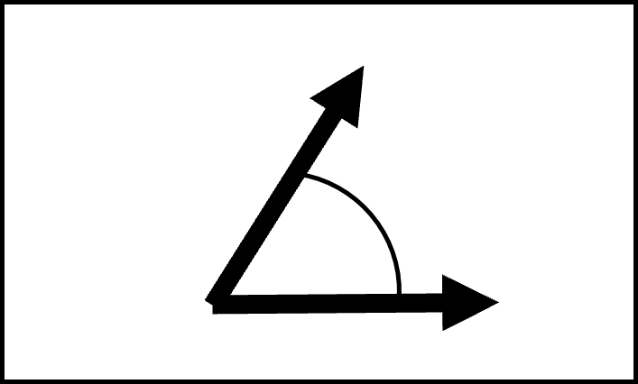
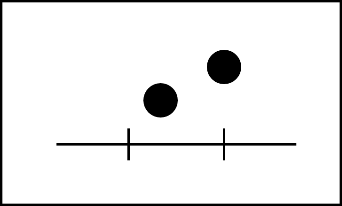
Challenge: Visual properties
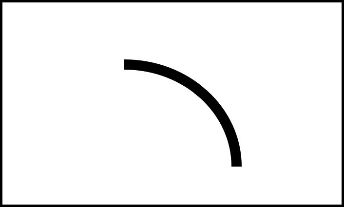
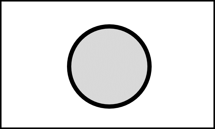
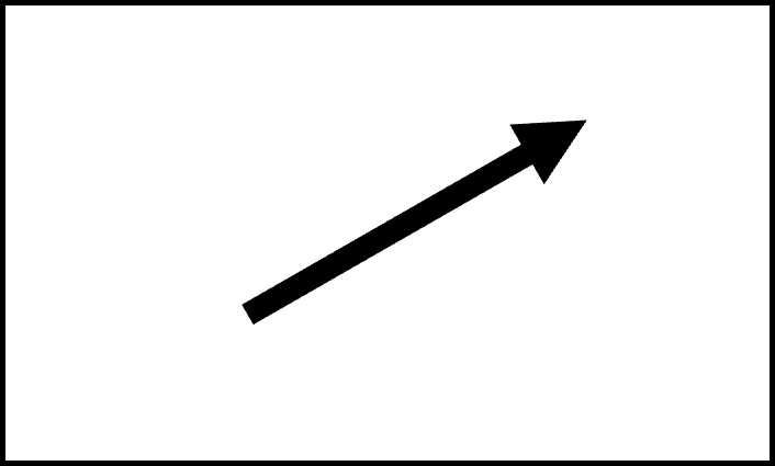
Use this list of visual properties to label the figures below3.
- Position on a common scale
- Position on non-aligned scales
- Length
- Direction
- Angle
- Size (Area)
- Size (Volume)
- Curvature
- Shading (black, white, and gray)
- Color

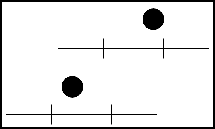
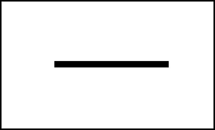
| Visual Property Number | Visual Property Picture |
|---|---|
| 10 | Figure 2.1 |
| 5 | Figure 2.2 |
| 1 | Figure 2.3 |
| 8 | Figure 2.4 |
| 9 | Figure 2.5 |
| 6 | Figure 2.6 |
| 4 | Figure 2.7 |
| 2 | Figure 2.8 |
| 3 | Figure 2.9 |
| 7 | Figure 2.10 |
Common chart types and their components
Spend three minutes with your neighbor talking about chart types you often see and which graphical elements and/or visual properties they include. Share your answers in the shared document.
Better visual representations
Depicting information visually is as much art as science, but some research-backed guidelines can help us design a chart that is easier for people to perceive accurately. These guidelines are the result of experiments conducted by two statisticians in the 1980s4. Despite their study’s limitations, the guidelines they produced remain useful and inform modern guidance about designing charts5.
These guidelines help us understand and categorize graphical elements and visual properties in terms of “better” and “worse” depictions of the underlying data:
- “Better” means easier to perceive accurately
- “Worse” means more difficult to perceive accurately
Graphical Elements
- Points are better than lines
- Lines are better than area (two-dimensional shape)
- Area (two-dimensional shape) is better than volume (three-dimensional shape)
Visual Properties
| Graphical element | Better | Worse |
|---|---|---|
| Points | Position on common scale | Position on non-aligned scales |
| Lines | Length, Direction, Angle | Curvature |
| Shapes | Area | Volume |
Shading and color are special cases
Shading and color can be both better and worse, depending on how they are used in a chart.
Some better uses:
- Differentiate categories or other non-numeric data using a graduated scale or contrasting colors
- Draw attention to areas of a chart that most clearly represent patterns or relationships in the data
Some worse uses:
- Muddle categories by using colors that are too similar
- Distract from a chart’s message by using too many colors or having no clear purpose for the chosen color or shading
We need to ask some questions when including shading or color in a chart:
- How many categories am I working with?
- Are my colors accessible?
- What assumptions are my colors making?
- How will my chart be distributed?
ColorBrewer 2.0 is an online tool for testing color schemes against various conditions. The tool targets cartography but is useful for choosing colors for any kind of data.
Support your chart’s message
Remember
The purpose of a chart is to communicate a message about patterns or relationships present in the data.
“Better” and “Worse” are comparative states. There is no one best or worst way to communicate a message about a relationship or pattern in a set of data. Instead, we can focus on designing better charts - charts that use components that are easier to perceive accurately.
Better charts can help our audience understand our message and support their decision-making with reliable information.
Worse charts - charts designed using components that are more difficult to perceive accurately - can obscure our message and misinform our audience.
Challenge: Practice choosing better charts
Based on what you just learned about how different visual properties can be better or worse at facilitating accurate perception, look at the chart use cases below. For each chart use case, put the example charts in order from better to worse.
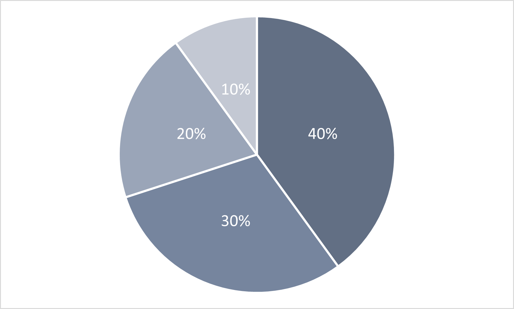
In order from better to worse, the charts are:
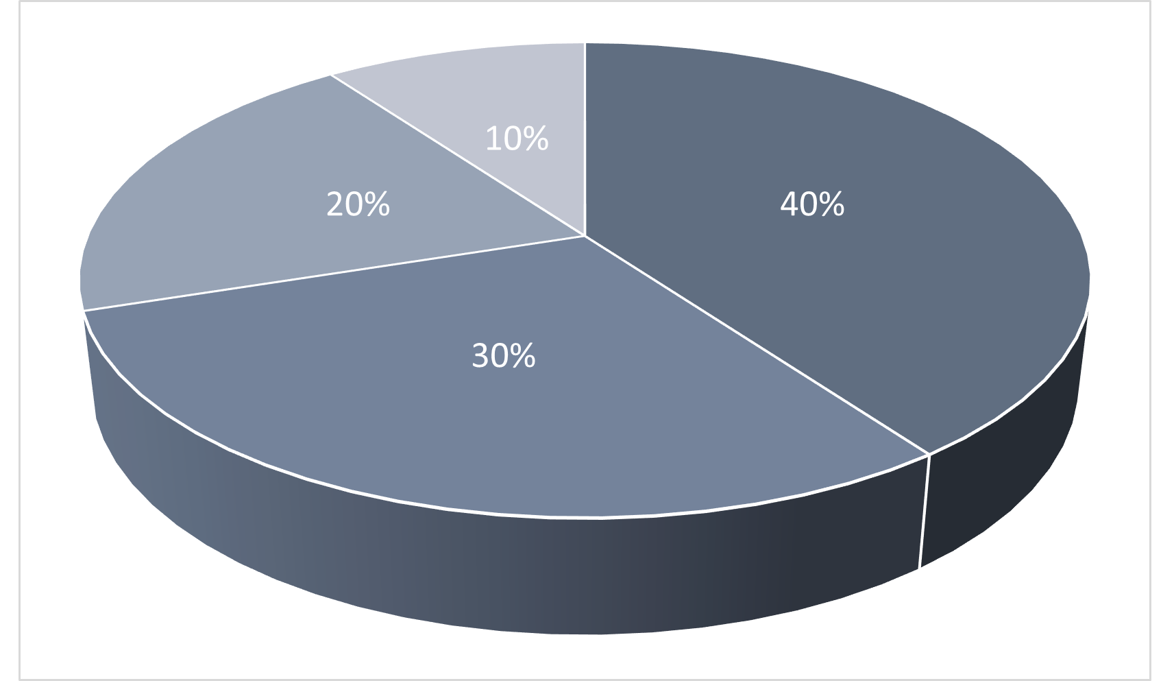
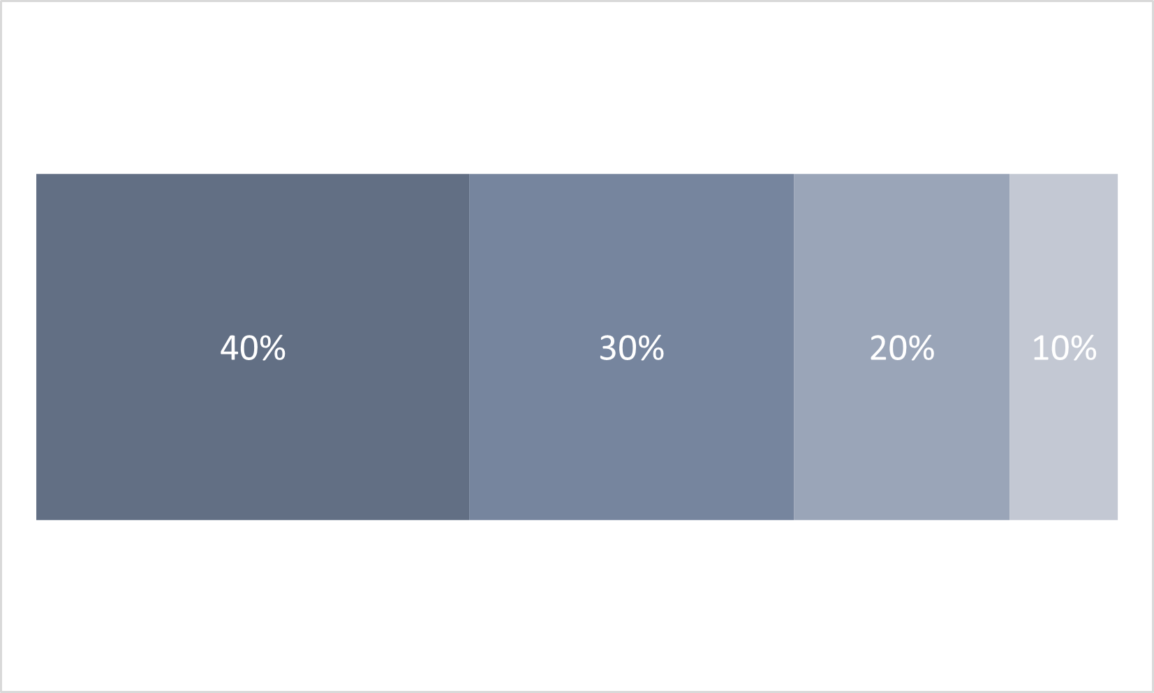
- Figure 2.13: 100% Bar Chart
- Figure 2.11: 2D Pie Chart
- Figure 2.12: 3D Pie Chart
Depending on how much experience you’ve had with charts, your perception of which chart style is easiest to understand may differ from the advice on visual properties discussed above.
Chart Use Case 2
A chart that compares two categories over a period of time.
In order from better to worse, the charts are:
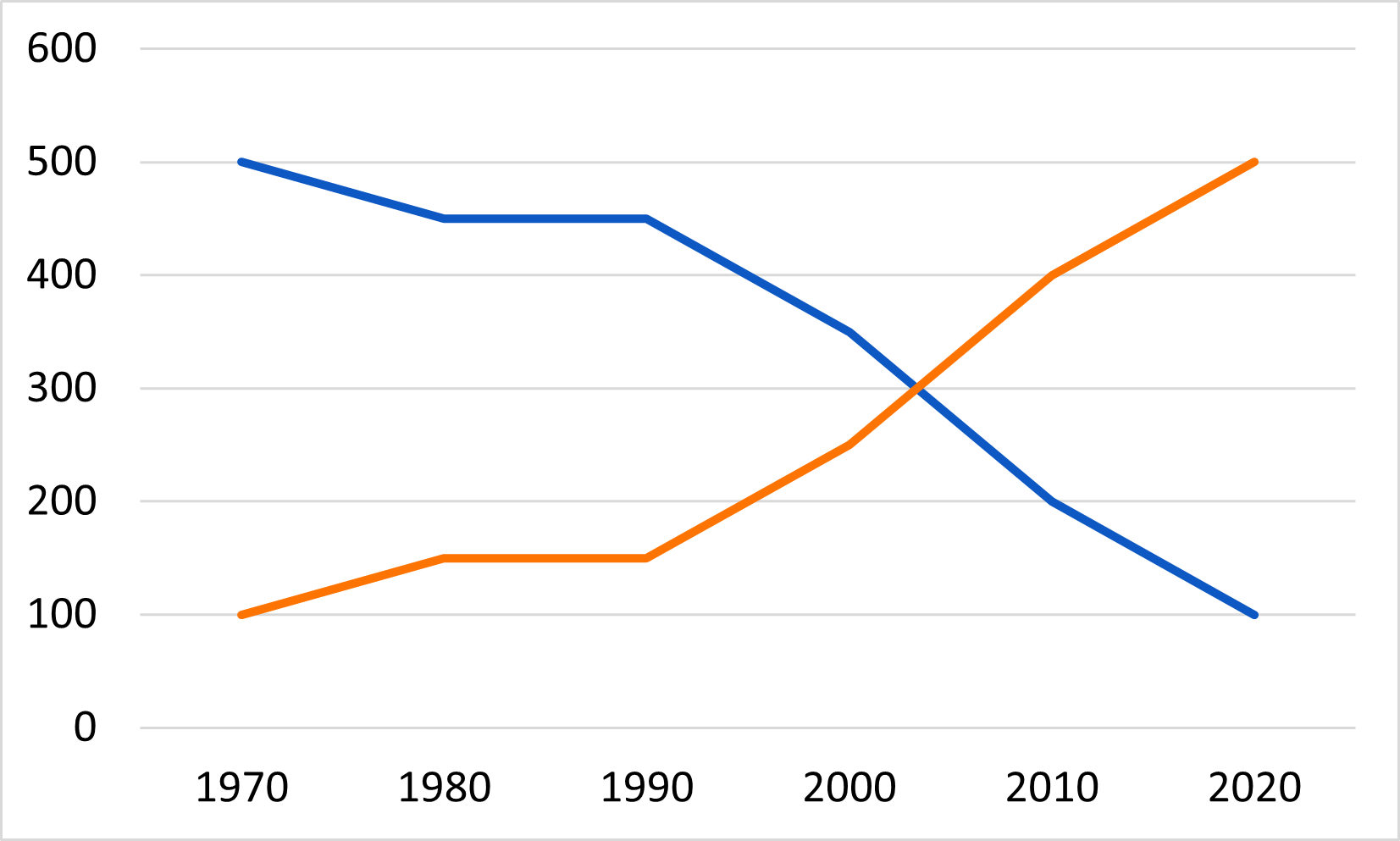
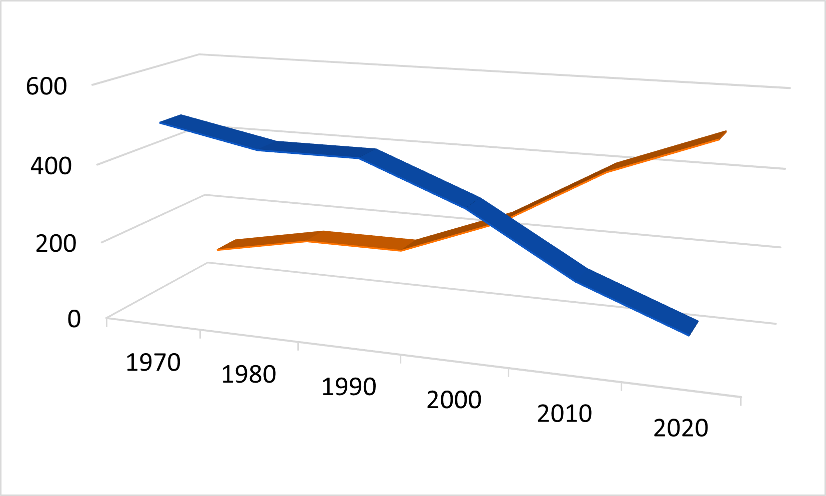
- Figure 2.14 2D Line Chart
- Figure 2.16 2D Area chart
- Figure 2.15 3D Line Chart
Depending on how much experience you’ve had with charts, your perception of which chart style is easiest to understand may differ from the advice on visual properties discussed above.
- There are four graphical elements that can represent data on a chart. The appearance of these elements can be modified with any of ten possible visual properties.
- Research suggests that many people can evaluate some of these visual representations more quickly and with more accuracy than others.
- Visual representations that are easier to perceive accurately support a chart’s message.
- Visual representations that are more difficult to perceive accurately obscure a chart’s message.
Bertin, J. (1981). Graphics and graphic information-processing (W. J. Berg & P. Scott, Trans.). de Gruyter.↩︎
Cleveland, W. S., & McGill, R. (1984). Graphical perception — Theory, experimentation, and application to the development of graphical methods. Journal of the American Statistical Association, 79(387), 531–554. https://doi.org/10.2307/2288400↩︎
Images in this challenge adapted under a CC-BY-4.0 license from Briney, K. (2017). “Data Visualization Camp Instructional Materials (2017)” University of Wisconsin Milwaukee Libraries Instructional Materials. https://dc.uwm.edu/lib_staff_files/4↩︎
Cleveland, W. S., & McGill, R. (1984). Graphical perception — Theory, experimentation, and application to the development of graphical methods. Journal of the American Statistical Association, 79(387), 531–554. https://doi.org/10.2307/2288400↩︎
Evergreen, S. D. H. (2017). Effective data visualization: The right chart for the right data. Los Angeles: SAGE.↩︎
Content from Identify and Interpret the Message
Last updated on 2023-12-20 | Edit this page
Overview
Questions
- What are four common messages usually communicated in a chart?
- What are useful charts to communicate these messages?
- How do we construct text to describe these messages?
- How does the type of data help determine the message?
Objectives
After completing this episode you will be able to:
- identify data types as discrete, continuous, or categorical
- interpret and describe the message in four common chart types
- illustrate the message of four common chart types
- use a flow diagram to choose a chart type to communicate your message
Introduction
Data Types
Charts communicate a message about data that is dependent on the type of data. Data types matter both in terms of what types of statistical analyses, and what types of visualization techniques are appropriate for the type of data you are working with.
Data scientists differ on the number of different data types, with some describing as many as 14 unique types. For this lesson we will keep the number of data types limited to three: discrete, continuous, and categorical. There can be finer divisions, or different names of data types used in a discipline, but for this lesson we will stick with these three.
Quantitative data involves numbers applied to measurable and quantifiable variables. We will consider two types of quantitative data in this lesson, discrete and continuous. Discrete data are data that consist of distinct and separate values, Often in whole numbers and used to measure discrete occurrences of a phenomenon. Examples include number of firefighters employed by a city, and number of cars sold at a dealership during a month. Continuous data can represent a range of values and can be measured by any real numbers within the range, including decimals and fractions. Used to measure phenomena that occur and change in ways measured precisely over fractions of a unit. Examples include rainfall, height, and temperature.
Categorical data do not represent quantitative information but qualitative data (i.e., information that is not a number, but a descriptive property of the system of interest, such as inclusion in a distinct category). Variables can be categorized without any inherent order or ranking, such as types of fruits (apple, orange, banana). Or the variables may be ordered with a meaningful ranking such as Olympic medals (Gold, Silver, Bronze) but the intervals between categories aren’t expected to be uniform or measurable. Categorical data is often used for labeling and classification purposes, and statistical operations such as counting and mode are appropriate.
The distinctions between discrete and continuous data can vary, depending on the level of precision of the measurements being taken. For this lesson, as a general guideline when we look at data and example visualizations, let’s define discrete data as data with measurements in whole numbers, such as counts, and continuous data as data that has measurements in decimal values. To discuss these data types and later decide what charts to make and how to make them we are going to use a long-term dataset collected on the canids of North America. The data are presented in Newsome and Ripple 2015. 1: The paper has an analysis of fur return data in multiple locations in North America to test whether the presence or absence of wolves caused a shift in coyote and red fox density across the continent. Brief summary of findings are that without wolves in an area, coyotes outnumber red foxes. In areas with wolves, red foxes outnumber coyotes. And there is a transition zone of 200 km on the edge of a wolf distribution area where the effect is weakened.
Inline instructor notes can help inform instructors of timing challenges associated with the lessons. They appear in the “Instructor View”
::::::::::::::::::::::::::::::::::::::::::::::::::::::::::::::::::::::::::::::::
Challenge 1
Choose the answer that most closely reflects your opinion. Data visualization is for ____.
- scientists
- everyone
- formal reports
- economists
b) everyone!
Challenge 2: Pair the data type names with the examples
| Data Types | Example of data |
|---|---|
| 1. discert | a. 1,2,3,…1000 |
| 2. continuous | b. 0,1 |
| 3. catagorical | c. dog, cat, turtle |
- -> b
- -> a
- -> c
Turning Data into Charts
We can think of turning data into charts as a process of transforming the data into a visual form. The visual form that we choose will be impacted by the type of data, and what kind of messages we want to be able to see, or to show others with the visualization.
Four Common Chart Types
Comparison Composition Distribution Relationships
Identify the message
What is the message of this graph? First, consider what the graph is and how the structure works. What type of graph is this and what is the structure? What aspect of the graph communicates categories, and what aspect communicates quantity? What message(s) can can take from this graph? What might the graph designer have done to make the message more clear?
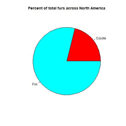 {On
average across North America throughout the collection period foxes made
up 80?% and Coyotes made up 20% of the canids}
{On
average across North America throughout the collection period foxes made
up 80?% and Coyotes made up 20% of the canids}
What is the message of this graph?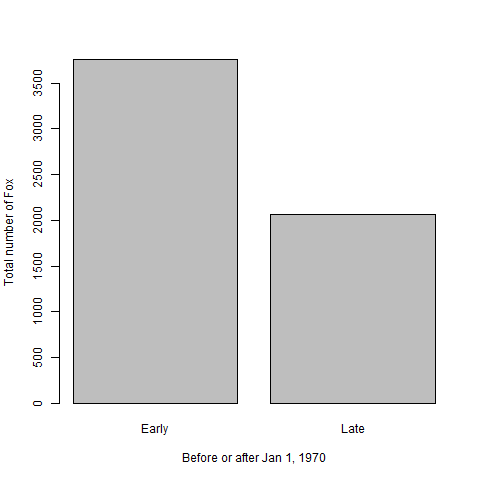 {Fox
populations before Jan 1, 1970 were greater than after 1970 {North
American fox populations averaged 3765 (units) prior to Jan. 1, 1970 and
2062 after.} Discuss message as a group
{Fox
populations before Jan 1, 1970 were greater than after 1970 {North
American fox populations averaged 3765 (units) prior to Jan. 1, 1970 and
2062 after.} Discuss message as a group
What is the message of this graph?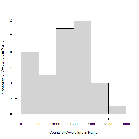 {Coyote
populations in Maine ranged from zero to 2741 throughout the collections
period and had a median of 1393 and mean of 1296 units.} Discuss message
as a group
{Coyote
populations in Maine ranged from zero to 2741 throughout the collections
period and had a median of 1393 and mean of 1296 units.} Discuss message
as a group
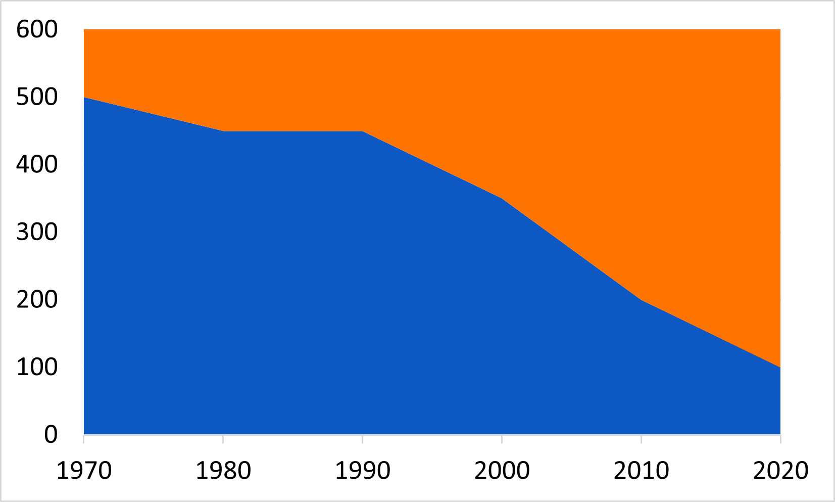
What is the message of this graph?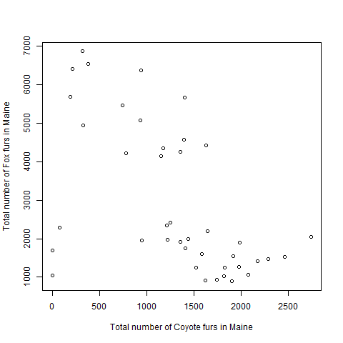 {Fox populations
tended to decrease as Coyote populations increased} Discuss message as a
group
{Fox populations
tended to decrease as Coyote populations increased} Discuss message as a
group
Describe the message
What are the basic components of each of the above’s message? Try replacing the nouns with a noun from your field of study. Does the message still make sense?
Illustrate the message
Using pencil and paper, or a drawing application of your choice, think about the data elements that would help communicate these messages, and draft one ore more charts that match the following descriptions. Data visualization works well as an iterative process. You can experiement with different chart types.
- The presence of wolves promoted fox abundance more than coyote abundance in the 1980s.
- Higher mean annual air temperature decreased the ratio of foxes to coyotes across North America.
- Overall fox abundance has a log-normal distribution.
- The proportion of all canids that are coyote increases from eastern to western locations.
Use a flow chart to choose a chart for your message
The Chart Chooser guide is an informative tool to help you consider what chart types are appropriate for your data and message.
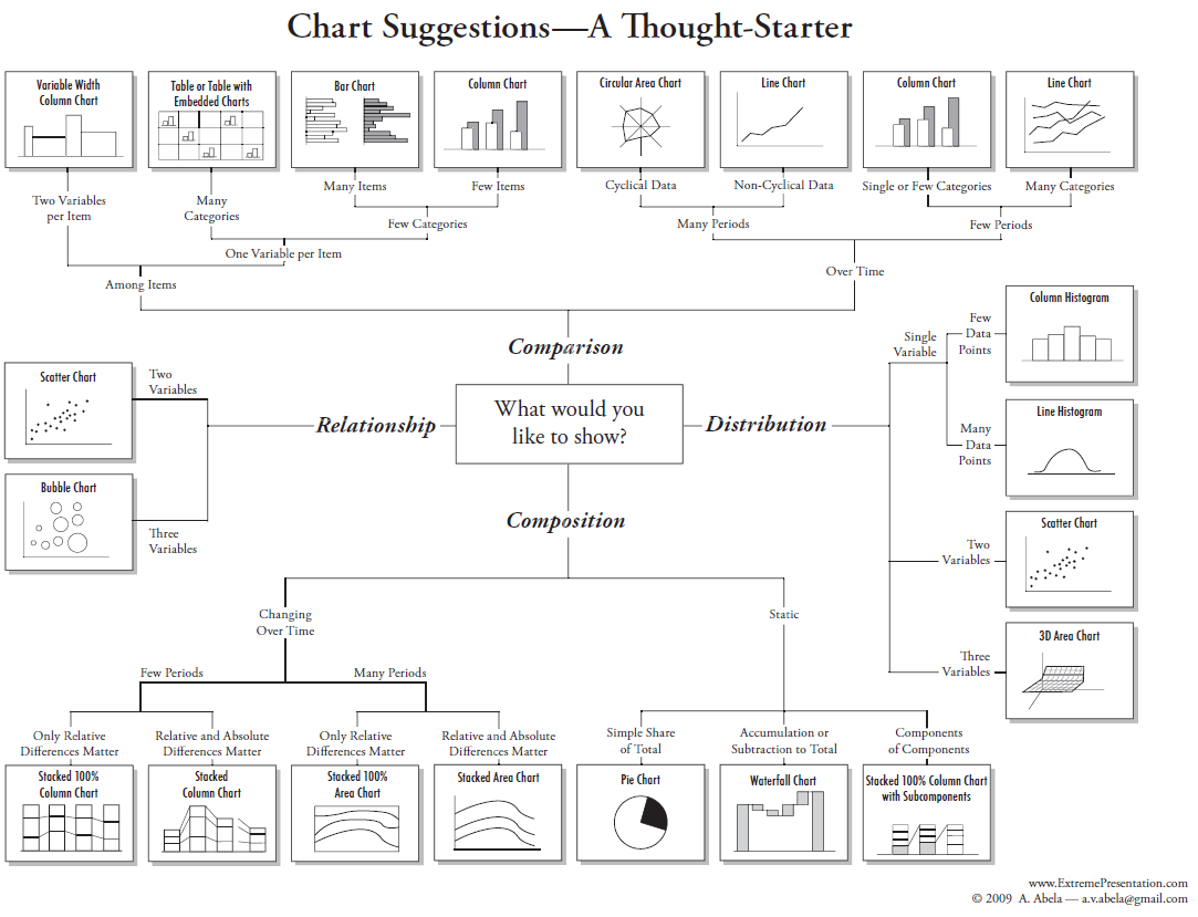
Optional Exercise
Find a chart from your field of interest. It can be from a book, on-line or even hand drawn. Using the chart chooser to decide what type of message is being conveyed in the chart. Also, what are the data types presented in the chart?
- Identifying the data type helps to narrow the choices of available charts for to convey your message.
- Charts convey messages with interchangeable nouns and verbs.
- Comparison, composition, distribution, and relationships are four very common messages in charts.
- Practice with linking chart types with data types is a valuable skill
Newsome, Thomas M., and William J. Ripple. “A continental scale trophic cascade from wolves through coyotes to foxes.” Journal of Animal Ecology 84.1 (2015): 49-59. (https://besjournals.onlinelibrary.wiley.com/doi/10.1111/1365-2656.12258) :::::::::::::::::::::::::::::::::::::::::::::::::::::::::::::::::::: instructor↩︎
Content from Communicating the Message
Last updated on 2023-12-18 | Edit this page
Overview
Questions
- What are the important aspects of a dataset you want to communicate?
- What is the best visualization type for a particular dataset?
Objectives
- Identify what message would like to communicate about a dataset.
- Identify how to best communicate the message with appropriate visuals.
- Generate graphs based on your decisions using software.
Introduction
This chapter will use the knowledge you have gained and apply it to generate graphs using software tools. What you should know:
- There are a multitude of software tools that can help generate charts for you.
- All software tools have the strengths and weaknesses. There is no best tool for all tasks or all users.
- For this lessen we will be using Google Sheets. For our purposes
this tool has some important advantages.
- The software is freely available online.
- The software works similarly regardless of the user’s operating system
- The software is interacted primarily through a graphical interface that can make it more intuitive to new users.
Importing your Data
We need to import our canid data into Google Sheets. Our data is currently stored as tab separated values, otherwise known as a tsv file. This is a simple text file. Each line of the file represents a new line in a table. The values in each column of the table appear in sequence separated by a tab character. Generally tsv tables have the limitation that you can’t store any values in a table that also has a tab character. If you haven’t already, go ahead and download the canid data now.
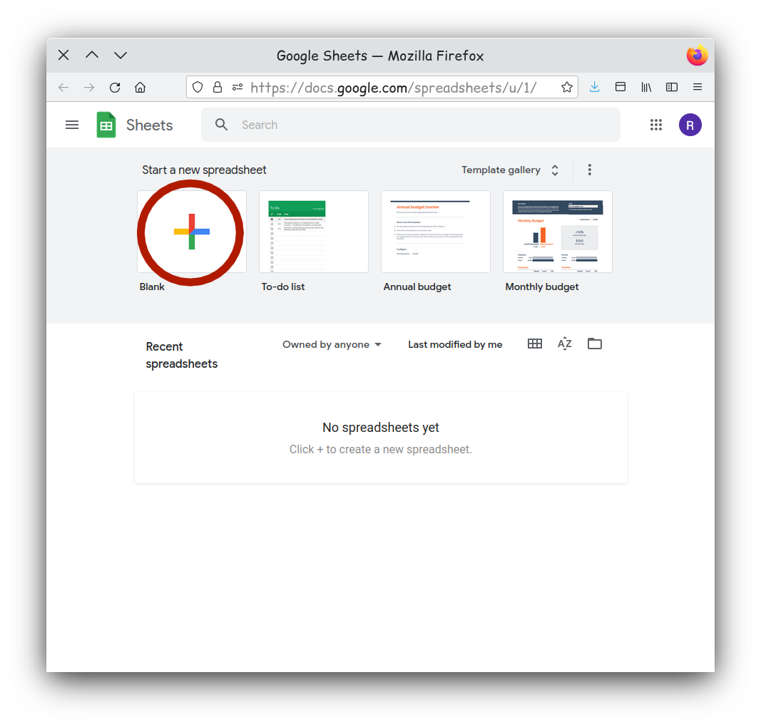
To import this into Google Sheets you first need to go to the [website] (https://docs.google.com/spreadsheets/). It will prompt you to log into a Google account. You will need to use a Google account to use Google Sheets, but if you do not have one, they are free Google Account Sign-up.
While there you will want to create a new blank spreadsheet.
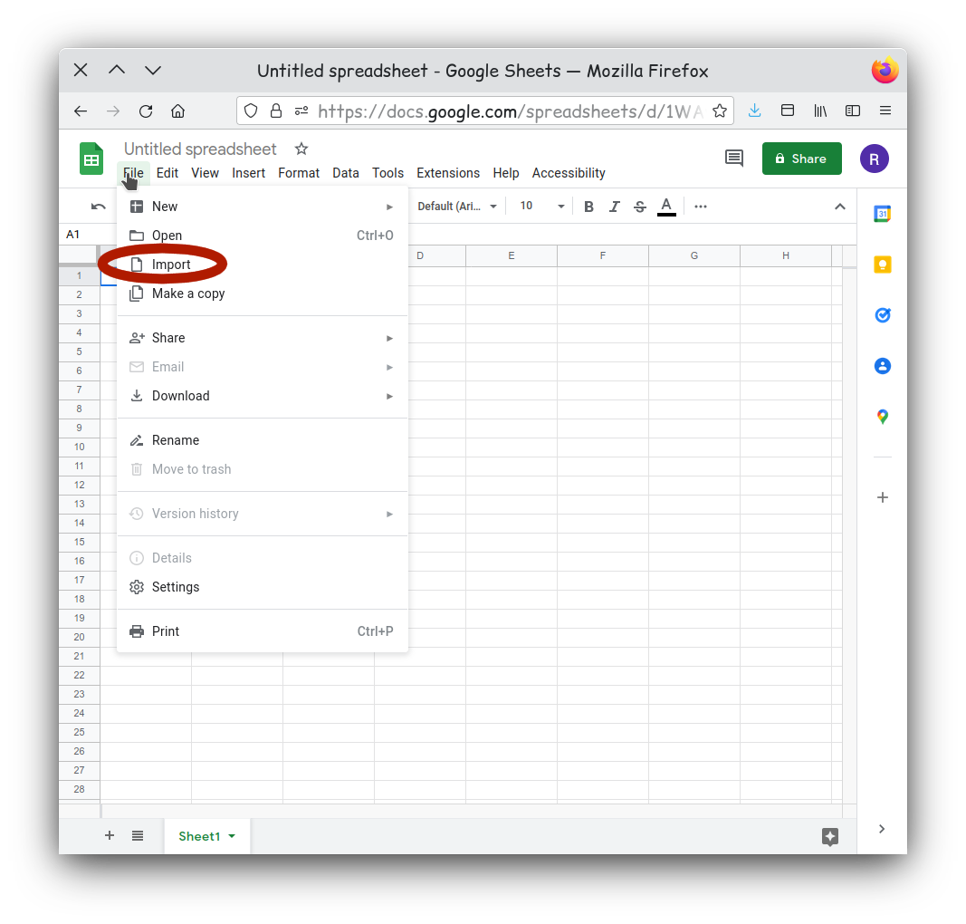
Then navigate to the File menu and select
Import.
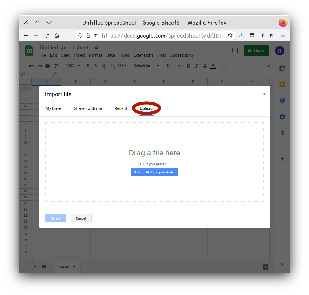
Select the Upload tab on the new window. Here you can
drag and drop you canids.tsv onto the window. You can also click
‘Browse’ if you prefer to navigate to your file.
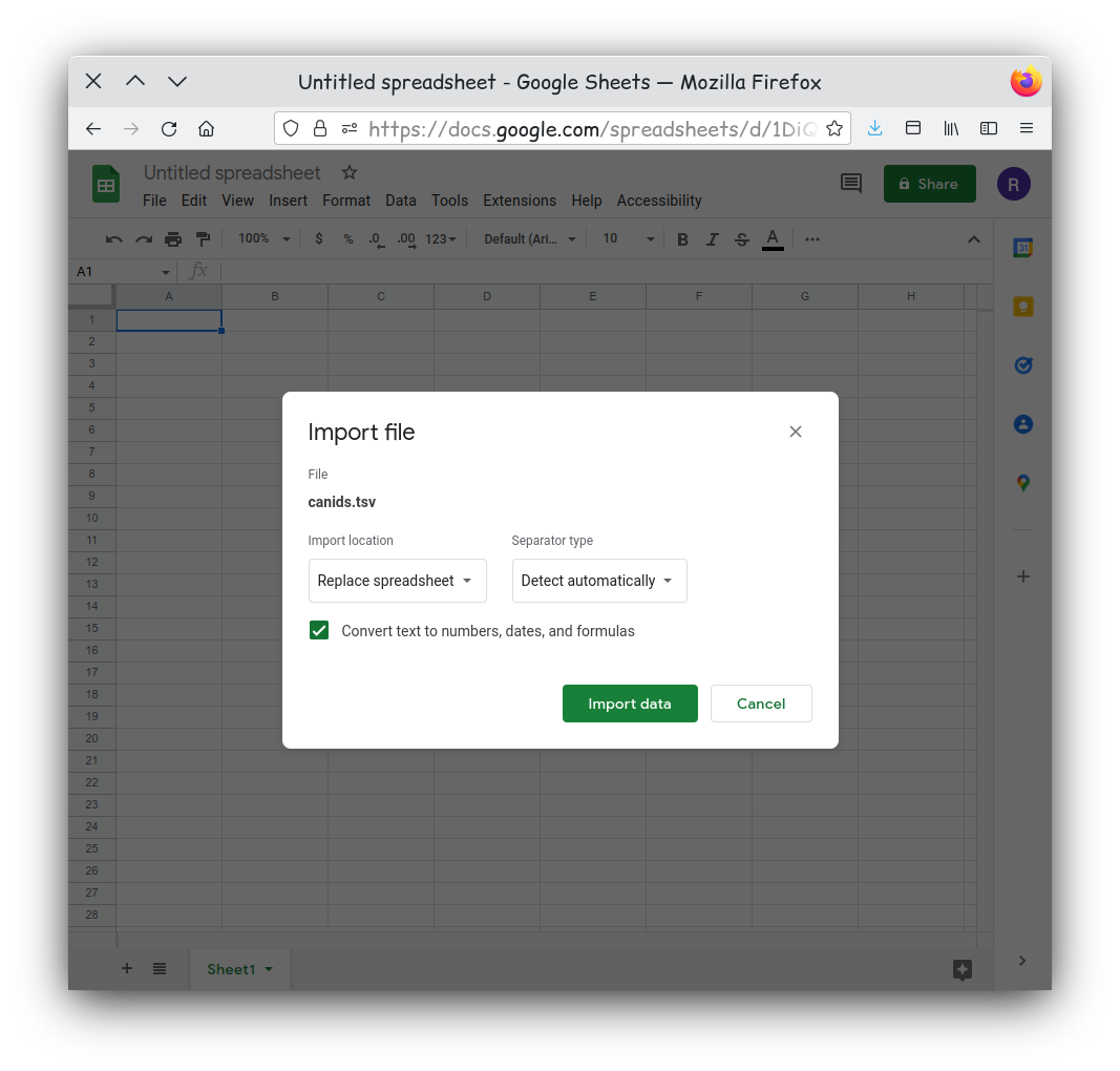
Tab separated files are well supported on Google Sheets, and the
default import options should be fine. If your have issues you could try
setting the selector type to Tab.
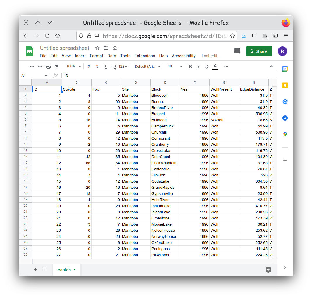
Your data should now be imported and visible in a new sheet.
Activity 1
Examine your dataset. Does it appear to be clean and tidy?
Remember clean data has no: - White spaces before or after data in each cell - Outliers, nulls, missing data, or empty cells - Formatting, such as color coding, bold, or italicized text
Also, tidy data is organized so that: - Columns are for variables - Rows are for observations - One value per cell
Lets Make a Chart
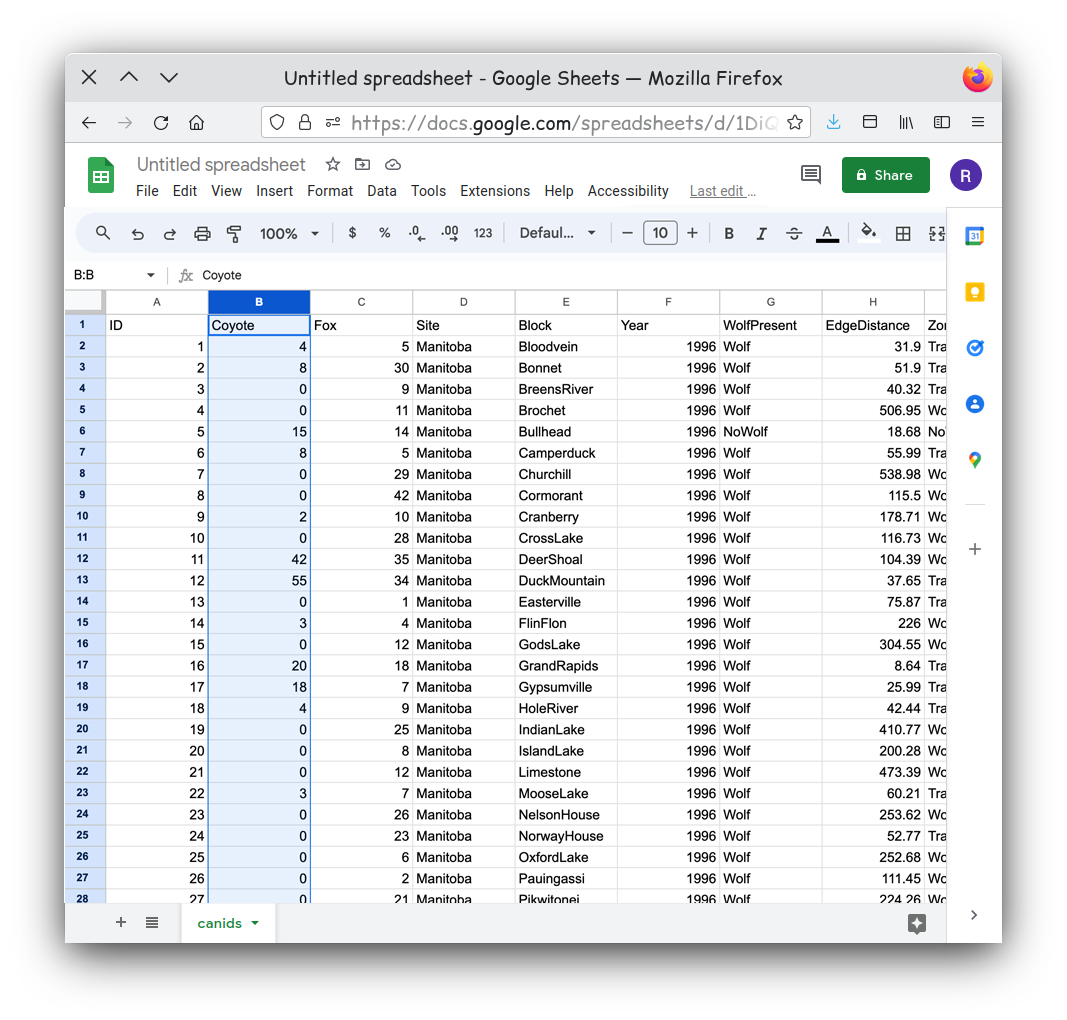
For our first chart let’s show the relationship of the counts of coyotes over time. We need to pick our first data series. This will become our y-axis data. Let’s pick the count of coyotes so we can compare the coyote counts over time. We can start by selecting Column B in the spreadsheet.
Our next step is to turn the data we selected into a chart. Using the
Insert menu, select Insert Chart.
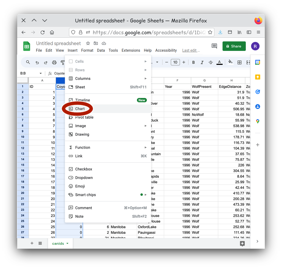
The Insert Chart command will result in a default chart
which might or might not communicate anything useful to us.
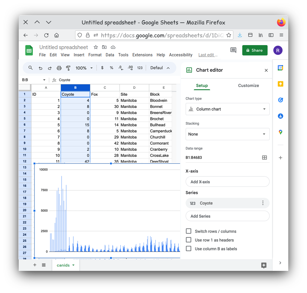
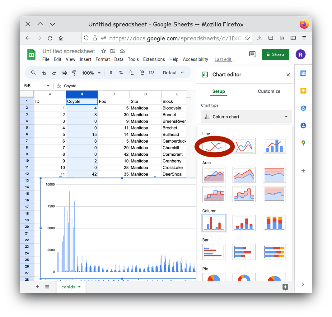
There are a few steps we need to do to get a chart that better shows our data. With the Chart Editor open, we can select the type of chart we want, such as a line graph.
We can add X-axis values. .
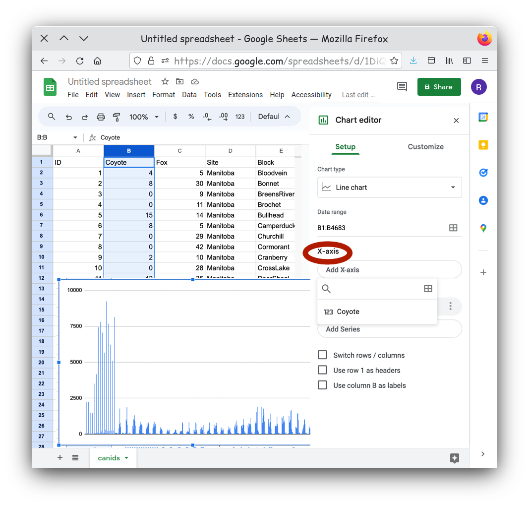
Once the Select data range menu is open, you can click the top of the column named Year in your table to set Year as our data for the X-axis.
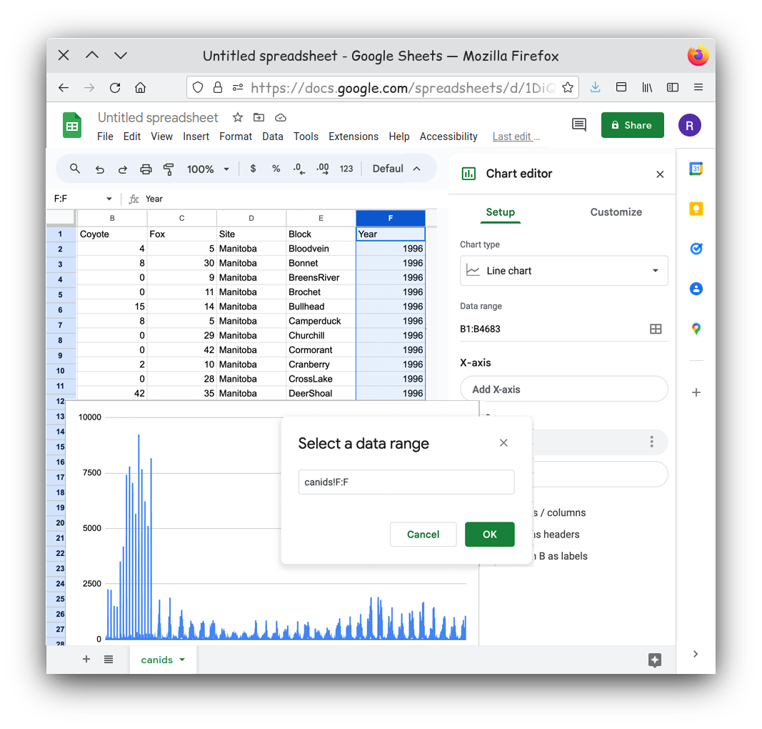
Something doesn’t look right. Our line chart seems to be jumping back and forth at each year.
If you look at the table you will notice that for every year value we
have multiple rows. By default the chart is plotting every row as an
independent point, so we have multiple points at every year. Is that
really what we want to show? It might be better to show some aggregate
value for each year. That would mean a simpler chart and a simpler
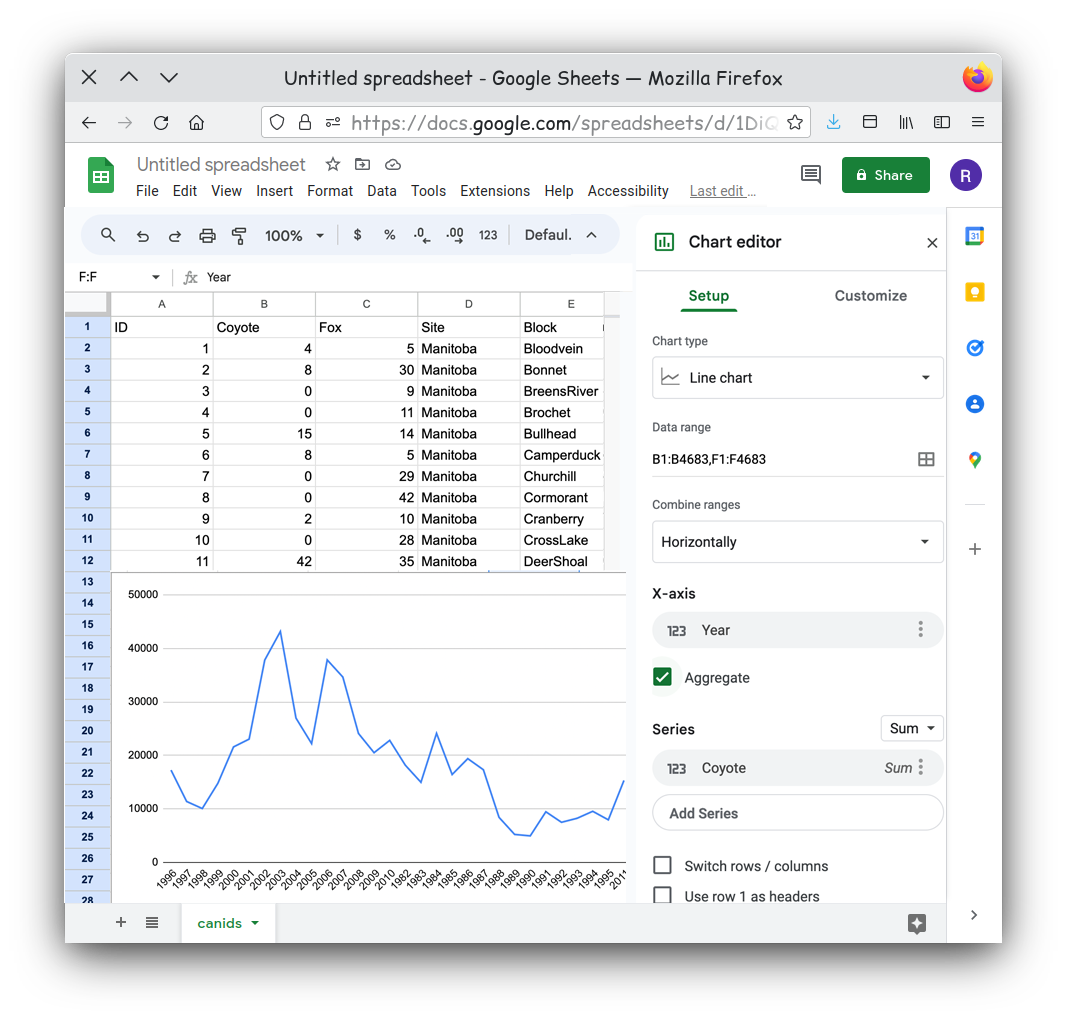
message. Click the Aggregate checkbox for the X-axis.
That looks better, but can you see another issue? Look closely. 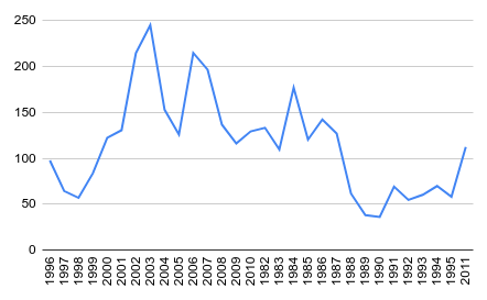
Our years are not in order! The years are plotted in the order they
appeared on our table. One simple way to solve this is to reorder our
table. There are a few different tools you can use, but creating a
filter for you table has a few advantages. First it automatically sets
your first row as headings, this means when you sort your table the
headings always stay at the top. Secondly we can order the table on the
fly by simply clicking on a heading. To set this up select the entire
table first. This can either be done using the keyboard shortcut of
ctrl-a or by clicking on the upper leftmost square in your
table This is the rectange above the row 1 label and to the
left of the column A label. Next select the
Create a Filter entry in Data menu.
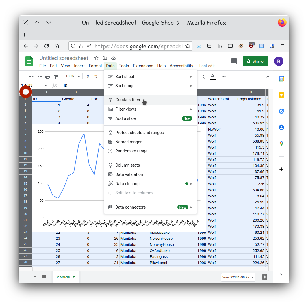
You should now see downward facing triangles on each column heading.
Click on the icons next to the year column and then select the Select
the column year. Now from the Data menu select
Sort sheet -> Sort sheet by column F (A-Z).
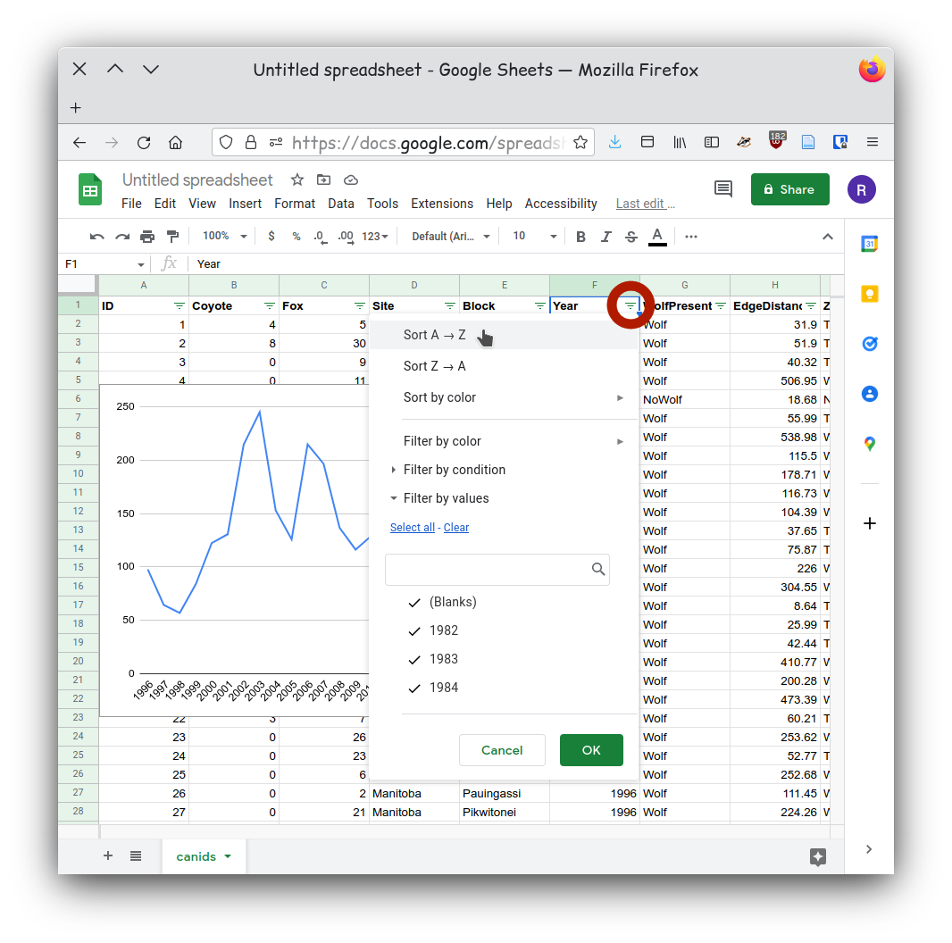
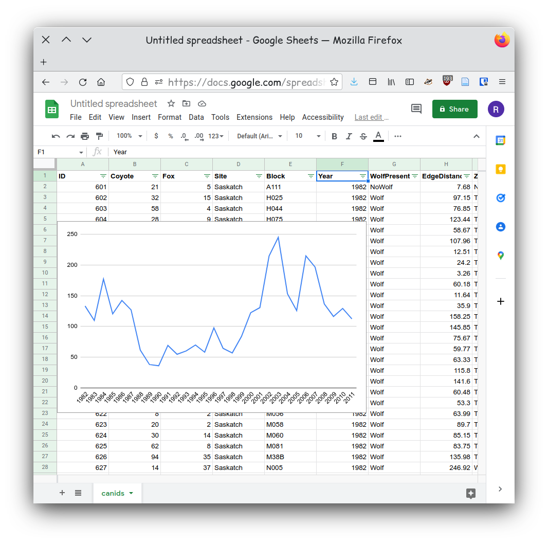
Now that our data is sorted our chart should show our data in chronological order.
- Identify if you are communicating a comparison, distribution, composition, relationship.
- Use the chart chooser a good chart for your particular dataset.
- Choose the tool you will be using to generate your chart
- Import your data making sure your data is “clean” and “tidy”.