Graphical Elements of a Chart
Last updated on 2023-12-18 | Edit this page
Overview
Questions
- When creating a chart, what components do I have to work with?
- Which chart components are easier for people to perceive accurately?
- How can chart components support a chart’s message?
Objectives
- List the graphical elements and their visual properties that are available for chart design
- Choose chart components that are easier for people to perceive accurately
- Practice choosing better charts for some common chart use cases
Graphical elements and visual properties
When we create a chart, we can choose many different ways to represent the message we wish to convey. But in two or three dimensions, there are only a few graphical elements we have to work with1:
- Point
- Line
- Area
- Volume
The data and data relationships we are representing in a chart have different quantities and categories. We can communicate this information through a graphical element’s visual properties2:
- Position
- Alignment on one or more scales
- Length
- Direction
- Angle
- Size (amount of Area or Volume)
- Curvature
- Shading
- Color
Challenge: Visual properties
Use this list of visual properties to label the figures below3.
- Position on a common scale
- Position on non-aligned scales
- Length
- Direction
- Angle
- Size (Area)
- Size (Volume)
- Curvature
- Shading (black, white, and gray)
- Color

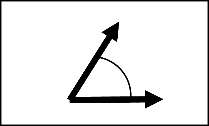
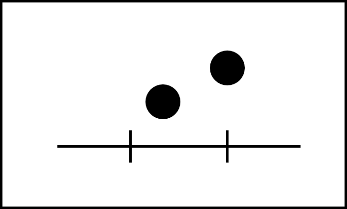
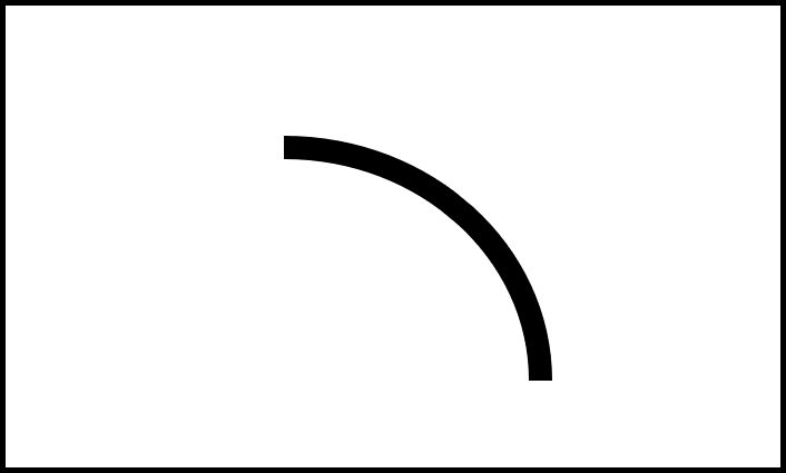
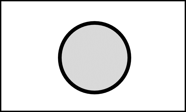
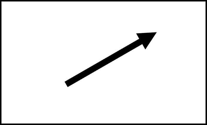
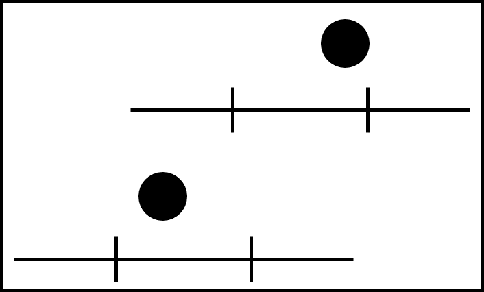
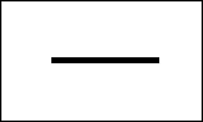
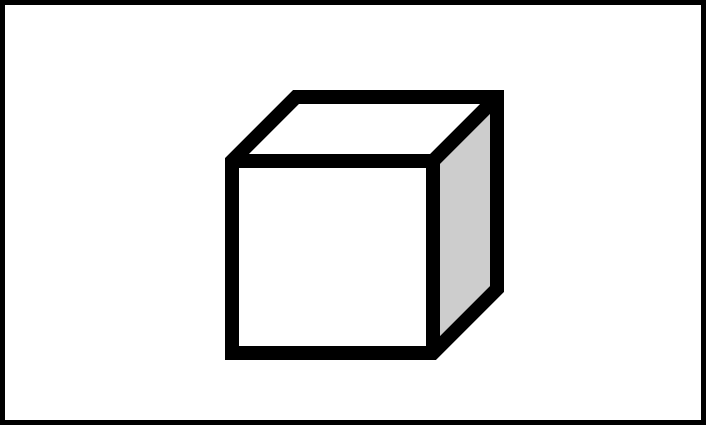
| Visual Property Number | Visual Property Picture |
|---|---|
| 10 | Figure 2.1 |
| 5 | Figure 2.2 |
| 1 | Figure 2.3 |
| 8 | Figure 2.4 |
| 9 | Figure 2.5 |
| 6 | Figure 2.6 |
| 4 | Figure 2.7 |
| 2 | Figure 2.8 |
| 3 | Figure 2.9 |
| 7 | Figure 2.10 |
Common chart types and their components
Spend three minutes with your neighbor talking about chart types you often see and which graphical elements and/or visual properties they include. Share your answers in the shared document.
Better visual representations
Depicting information visually is as much art as science, but some research-backed guidelines can help us design a chart that is easier for people to perceive accurately. These guidelines are the result of experiments conducted by two statisticians in the 1980s4. Despite their study’s limitations, the guidelines they produced remain useful and inform modern guidance about designing charts5.
These guidelines help us understand and categorize graphical elements and visual properties in terms of “better” and “worse” depictions of the underlying data:
- “Better” means easier to perceive accurately
- “Worse” means more difficult to perceive accurately
Graphical Elements
- Points are better than lines
- Lines are better than area (two-dimensional shape)
- Area (two-dimensional shape) is better than volume (three-dimensional shape)
Visual Properties
| Graphical element | Better | Worse |
|---|---|---|
| Points | Position on common scale | Position on non-aligned scales |
| Lines | Length, Direction, Angle | Curvature |
| Shapes | Area | Volume |
Shading and color are special cases
Shading and color can be both better and worse, depending on how they are used in a chart.
Some better uses:
- Differentiate categories or other non-numeric data using a graduated scale or contrasting colors
- Draw attention to areas of a chart that most clearly represent patterns or relationships in the data
Some worse uses:
- Muddle categories by using colors that are too similar
- Distract from a chart’s message by using too many colors or having no clear purpose for the chosen color or shading
We need to ask some questions when including shading or color in a chart:
- How many categories am I working with?
- Are my colors accessible?
- What assumptions are my colors making?
- How will my chart be distributed?
ColorBrewer 2.0 is an online tool for testing color schemes against various conditions. The tool targets cartography but is useful for choosing colors for any kind of data.
Support your chart’s message
Remember
The purpose of a chart is to communicate a message about patterns or relationships present in the data.
“Better” and “Worse” are comparative states. There is no one best or worst way to communicate a message about a relationship or pattern in a set of data. Instead, we can focus on designing better charts - charts that use components that are easier to perceive accurately.
Better charts can help our audience understand our message and support their decision-making with reliable information.
Worse charts - charts designed using components that are more difficult to perceive accurately - can obscure our message and misinform our audience.
Challenge: Practice choosing better charts
Based on what you just learned about how different visual properties can be better or worse at facilitating accurate perception, look at the chart use cases below. For each chart use case, put the example charts in order from better to worse.
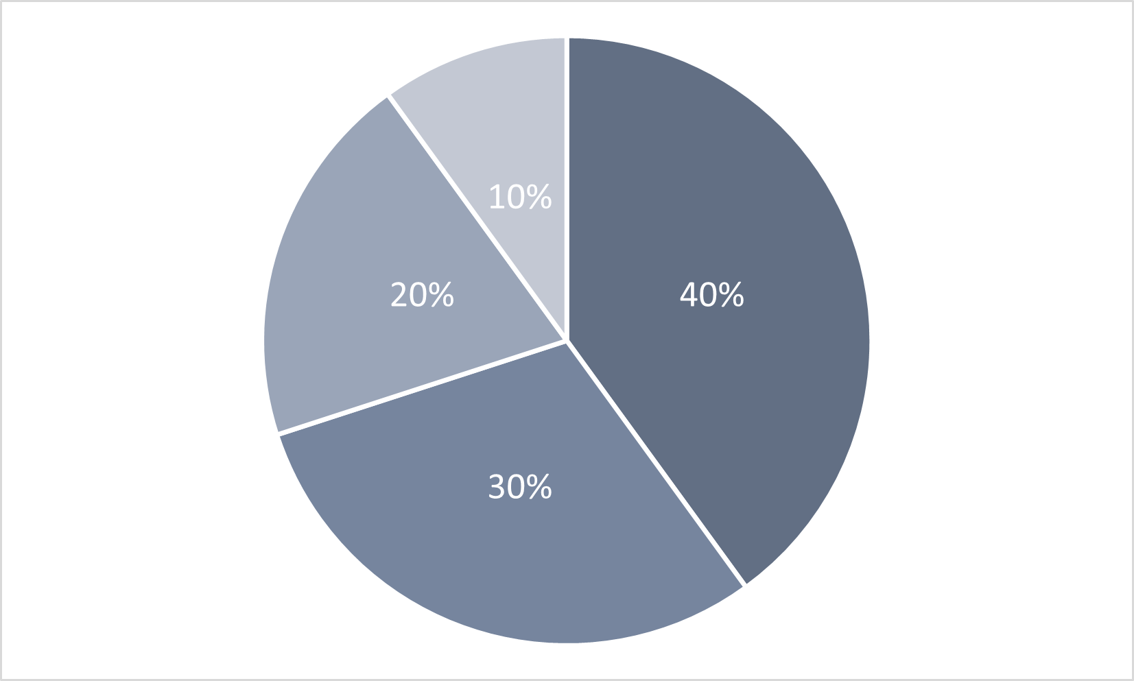
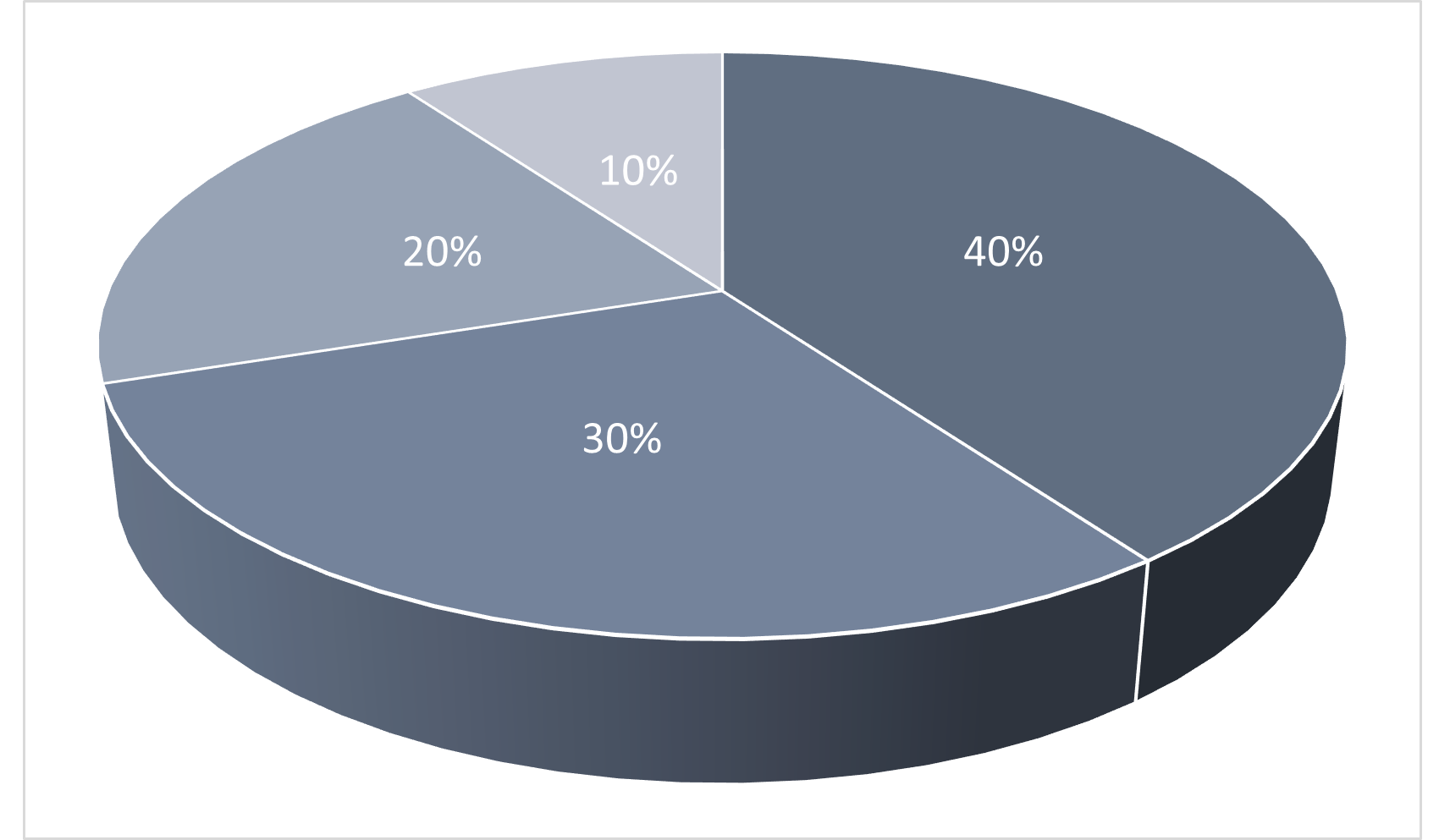
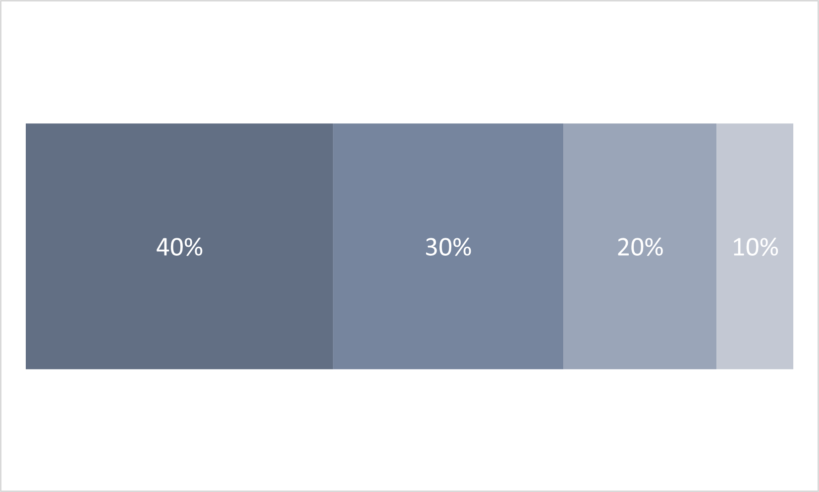
In order from better to worse, the charts are:
- Figure 2.13: 100% Bar Chart
- Figure 2.11: 2D Pie Chart
- Figure 2.12: 3D Pie Chart
Depending on how much experience you’ve had with charts, your perception of which chart style is easiest to understand may differ from the advice on visual properties discussed above.
Chart Use Case 2
A chart that compares two categories over a period of time.
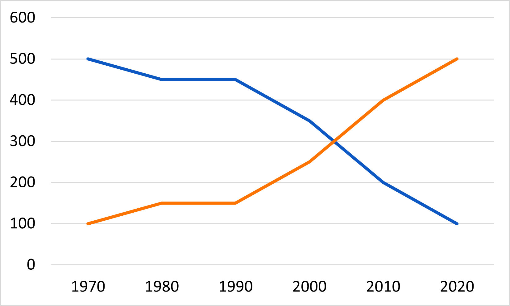
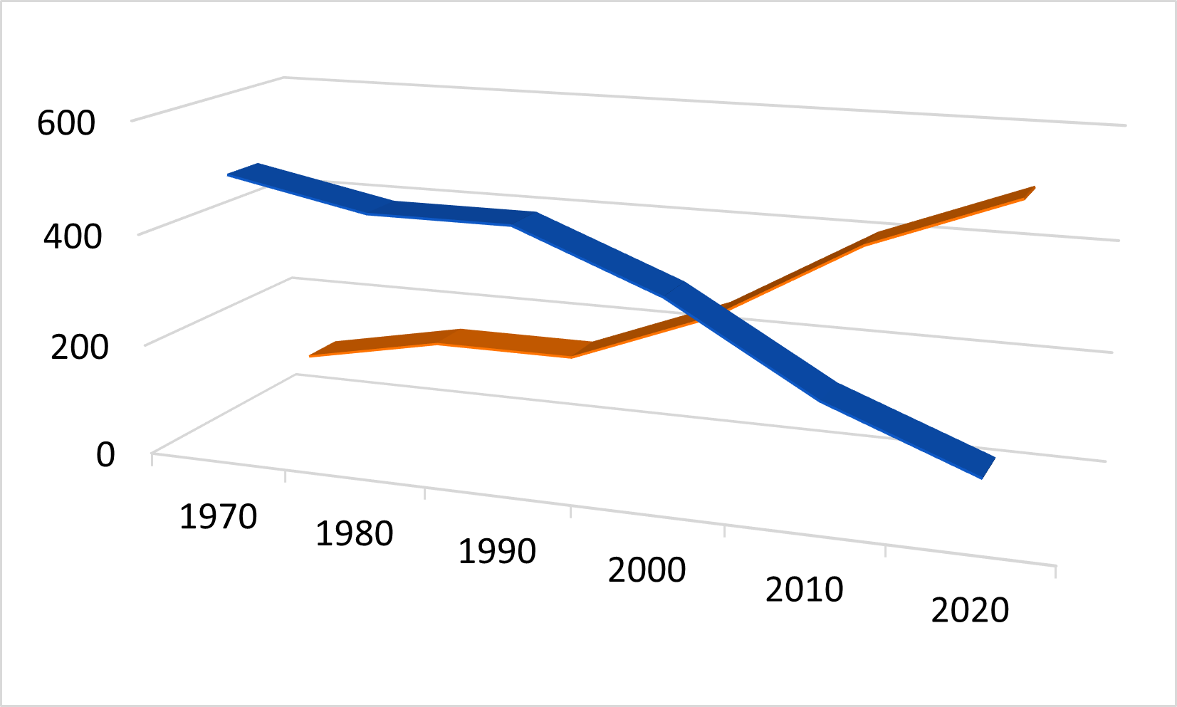
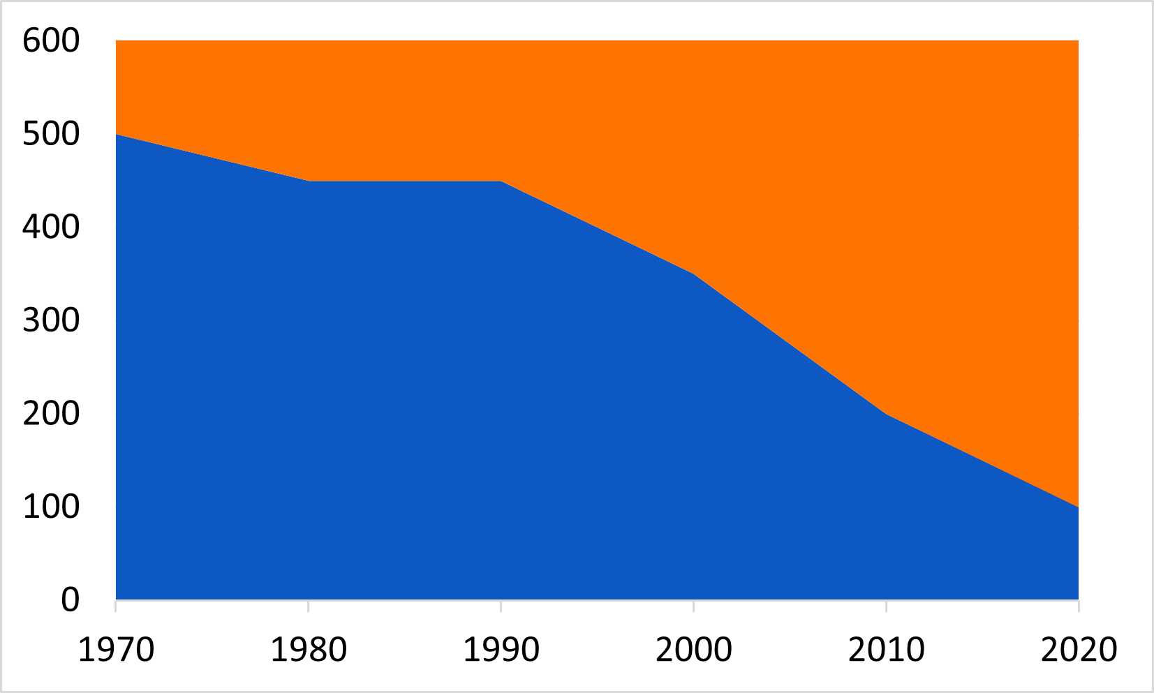
In order from better to worse, the charts are:
- Figure 2.14 2D Line Chart
- Figure 2.16 2D Area chart
- Figure 2.15 3D Line Chart
Depending on how much experience you’ve had with charts, your perception of which chart style is easiest to understand may differ from the advice on visual properties discussed above.
- There are four graphical elements that can represent data on a chart. The appearance of these elements can be modified with any of ten possible visual properties.
- Research suggests that many people can evaluate some of these visual representations more quickly and with more accuracy than others.
- Visual representations that are easier to perceive accurately support a chart’s message.
- Visual representations that are more difficult to perceive accurately obscure a chart’s message.
Bertin, J. (1981). Graphics and graphic information-processing (W. J. Berg & P. Scott, Trans.). de Gruyter.↩︎
Cleveland, W. S., & McGill, R. (1984). Graphical perception — Theory, experimentation, and application to the development of graphical methods. Journal of the American Statistical Association, 79(387), 531–554. https://doi.org/10.2307/2288400↩︎
Images in this challenge adapted under a CC-BY-4.0 license from Briney, K. (2017). “Data Visualization Camp Instructional Materials (2017)” University of Wisconsin Milwaukee Libraries Instructional Materials. https://dc.uwm.edu/lib_staff_files/4↩︎
Cleveland, W. S., & McGill, R. (1984). Graphical perception — Theory, experimentation, and application to the development of graphical methods. Journal of the American Statistical Association, 79(387), 531–554. https://doi.org/10.2307/2288400↩︎
Evergreen, S. D. H. (2017). Effective data visualization: The right chart for the right data. Los Angeles: SAGE.↩︎