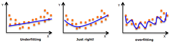
Image 1 of 1: ‘graphs of overfitting and underfitting’
Example of overfitting/underfitting
Figure 2
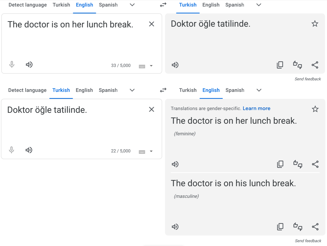
Image 1 of 1: ‘Screenshot of Google Translate output. The English sentence "The doctor is on her lunch break" is translated to Turkish, and then the Turkish output is translated back to English as either "The doctor is on his lunch break" or "The doctor is on his lunch break".’
Turkish Google Translate example (screenshot
from 1/9/2024)
Figure 3
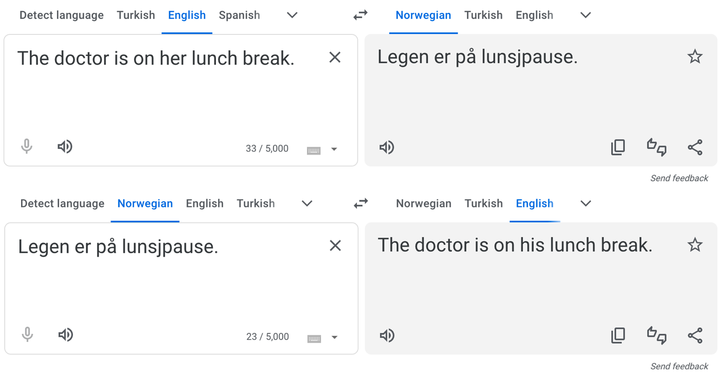
Image 1 of 1: ‘Screenshot of Google Translate output. The English sentence "The doctor is on her lunch break" is translated to Norwegian, and then the Norwegian output is translated back to English as "The doctor is on his lunch break".’
Norwegian Google Translate example (screenshot
from 1/9/2024)
Figure 4
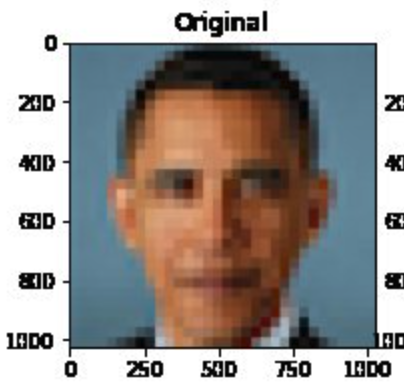
Image 1 of 1: ‘blurry image of Barack Obama’
Who is shown in this blurred picture?
Figure 5
Image 1 of 1: ‘Unblurred version of the pixelated picture of Obama. Instead of showing Obama, it shows a white man.’
While the picture is of Barack Obama, the upsampled image shows a
white face.
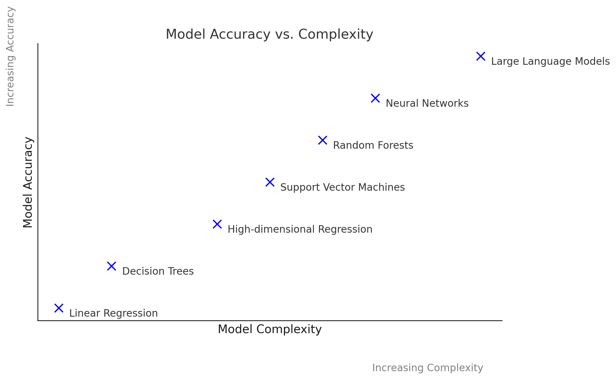
Image 1 of 1: ‘_Credits: AAAI 2021 Tutorial on Explaining Machine Learning Predictions: State of the Art, Challenges, Opportunities._’
The tradeoff between Interpretability and
Complexity
Figure 2
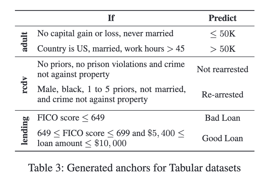
Image 1 of 1: ‘Table caption: "Generated anchors for Tabular datasets". Table shows the following rules: for the adult dataset, predict less than 50K if no capital gain or loss and never married. Predict over 50K if country is US, married, and work hours over 45. For RCDV dataset, predict not rearrested if person has no priors, no prison violations, and crime not against property. Predict re-arrested if person is male, black, has 1-5 priors, is not married, and the crime not against property. For the Lending dataset, predict bad loan if FICO score is less than 650. Predict good loan if FICO score is between 650 and 700 and loan amount is between 5400 and 10000.’
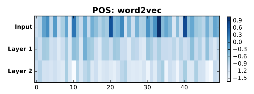
Image 1 of 1: ‘Image shows a grid with 3 rows and 50 columns. Each cell is colored on a scale of -1.5 (white) to 0.9 (dark blue). Darker colors are concentrated in the first row in seemingly-random columns.’
Example usage of visualizing attention heatmaps
for part-of-speech (POS) identification task using word2vec-encoded
vectors. Each cell is a unit in a neural network (each row is a layer
and each column is a dimension). Darker colors indicates that a unit is
more importance for predictive accuracy (table from Li et al..)
Figure 4
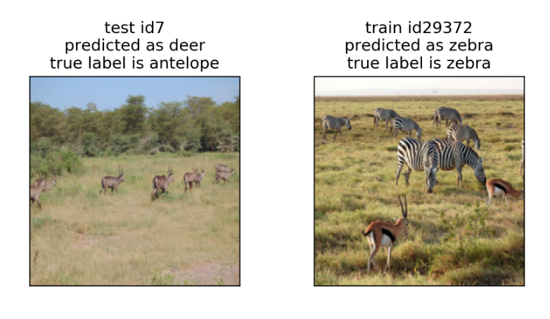
Image 1 of 1: ‘Two images. On the left, several antelope are standing in the background on a grassy field. On the right, several zebra graze in a field in the background, while there is one antelope in the foreground and other antelope in the background.’
Example usage of representer point selection.
The image on the left is a test image that is misclassified as a deer
(the true label is antelope). The image on the right is the most
influential training point. We see that this image is labeled “zebra,”
but contains both zebras and antelopes. (example adapted from Yeh et al..)
Figure 5
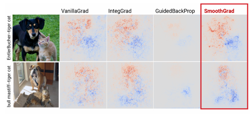
Image 1 of 1: ‘Two rows images (5 images per row). Leftmost column shows two different pictures, each containing a cat and a dog. Remaining columns show the saliency maps using different techniques (VanillaGrad, InteGrad, GuidedBackProp, and SmoothGrad). Each saliency map has red dots (indicated regions that are influential for predicting "dog") and blue dots (influential for predicting "cat"). All methods except GuidedBackProp have good overlap between the respective dots and where the animals appear in the image. SmoothGrad has the most precise mapping.’
Example saliency maps. The right 4 columns show
the result of different saliency method techniques, where red dots
indicate regions that are influential for predicting “dog” and blue dots
indicate regions that are influential for predicting “cat”. The image
creators argue that their method, SmoothGrad, is most effective at
mapping model behavior to images. (Image taken from Smilkov et al.)
Figure 6
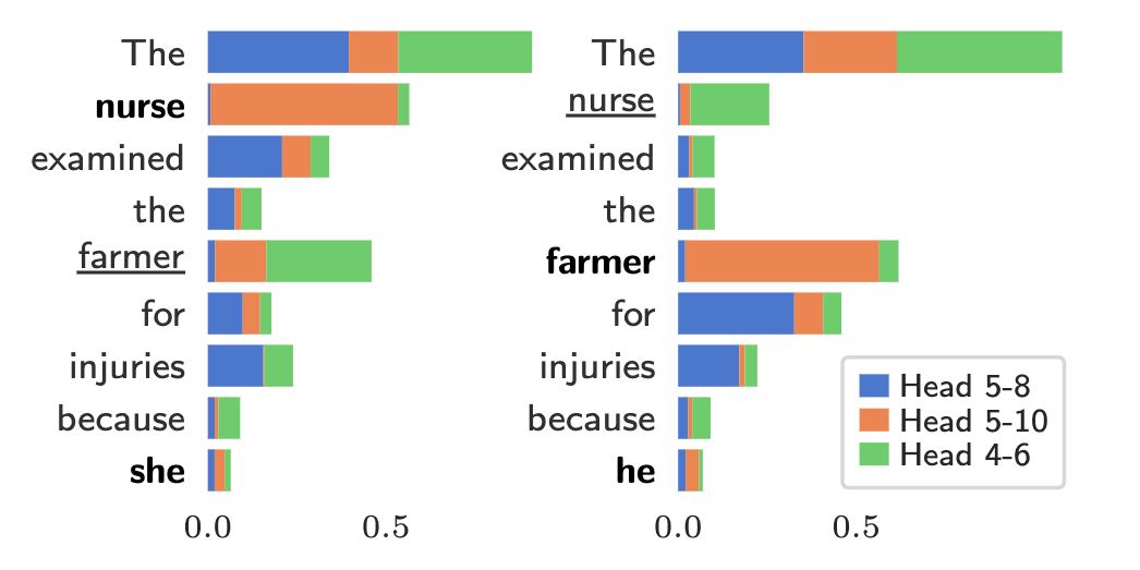
Image 1 of 1: ‘The phrase "The nurse examined the farmer for injuries because PRONOUN" is shown twice, once with PRONOUN=she and once with PRONOUN=he. Each word is annotated with the importance of three different attention heads. The distribution of which heads are important with each pronoun differs for all words, but especially for nurse and farmer.’
Example probe output. The image shows the result
from probing three attention heads. We see that gender stereotypes are
encoded into the model because the heads that are important for nurse
and farmer change depending on the final pronoun. Specifically, Head
5-10 attends to the stereotypical gender assignment while Head 4-6
attends to the anti-stereotypical gender assignment. (Image taken from
Vig
et al.)