Data Cleaning and Aggregation
Overview
Teaching: min
Exercises: minQuestions
What does it mean to “clean” data and why is it important to do so before analysis?
How can I quickly and efficiently identify problems with my data?
How can identify and remove incorrect values from my dataset?
Objectives
Confirm that data are formatted correctly
Enumerate common problems encountered with data formatting.
Visualize the distribution of recorded values
Identify and remove outliers in a dataset using R and QGIS
Correct other issues specific to how data were collected
Data cleaning and aggregation in the DIFM project
We saw in the last episode that we can make graphs of our trial data, but right now they are all points that cannot easily be combined. For example, we do not know what the yield was at a specific nitrogen or seeding point on the field. But that is important if we are going to talk about the results of the trial. We need to know what the yield was when a certain seeding and nitrogen rate combination was applied. To do this, we first clean the trial points and then create a grid over the field. Inside that grid, we aggregate the points from each data type and report the median of the points that fall into each polygon of the grid. These will form a new dataset where we can directly relate a yield value to a given seed and nitrogen treatment. In the context of trials, the polygons of the grid are typically called the units of observation.
Data Cleaning Details
After harvesting, we collect all the data needed for analysis, and in advance of running analysis, we clean and organize the data in order to remove machinery error and such. In particular, we need to clean yield data, as-planted data, as-applied data, and sometimes EC data. For public data, we simply import them into our aggregated data set without cleaning, as they have already been cleaned before being released to the public.
Here are the main concerns for yield, as-planted, and as-applied data:
- Observations where the harvester/planter/applicator is moving too slow or too fast
- Observations on the edges of the plot
- Observations that are below or above three standard deviations from the mean
Simulating yields
Because you are generating your trial design “on the fly” in this workshop you will have different nitrogen and seed application rates than for the original dataset which measured the yields from a “real” trial. In practice, whatever yield, asplanted, asapplied, and trial measurements you have stored can be used for this exercise, however for this workshop only have simulated the yields we’d expect to get out from your trial design. These are the data files with the
_newin their titles.
Step 1: Importing and transforming our shapefile datasets
The first step is to read in our boundary and abline shape files and transform them to UTM for later use. Let’s do this step-by-step, starting with reading in the boundary shapefile and projecting it:
boundary <- read_sf("data/boundary.gpkg")
What is the current coordinate reference system of this object?
st_crs(boundary)
Coordinate Reference System:
  EPSG: 4326
  proj4string: "+proj=longlat +datum=WGS84 +no_defs"
Let’s transform it to the UTM projection & check out its new coordinate reference system:
boundary_utm <- st_transform_utm(boundary)
st_crs(boundary_utm)
Coordinate Reference System:
  EPSG: 32617
  proj4string: "+proj=utm +zone=17 +datum=WGS84 +units=m +no_defs"
Now we can see that the +proj=longlat has changed to +proj=utm and gives us that we are in UTM zone #17.
In the last episode, we also imported our trial design, which we will do again here:
trial <- read_sf("data/trial_new.gpkg")
Let’s look at the coordinate reference system here as well:
st_crs(trial)
Coordinate Reference System:
  EPSG: 32617
  proj4string: "+proj=utm +zone=17 +datum=WGS84 +units=m +no_defs"
Our file is already in the UTM projection, but if we have one that is not we can convert this as well with trial_utm <- st_transform_utm(trial). For the sake of naming, we’ll rename it as trial_utm:
trial_utm <- trial
Exercise: Examine yield data and transform if necessary
Read in the yield shape file, look at its current CRS and transform it into the UTM projection. Call this new, transformed variable
yield_utm.Solution
First, load the data:
yield <- read_sf("data/yield_new.gpkg")Then take a look at the coordinate system:
st_crs(yield)Coordinate Reference System: EPSG: 32617 proj4string: "+proj=utm +zone=17 +datum=WGS84 +units=m +no_defs"This trial data is already in UTM so we don’t need to transform it! If we did, we could use
st_transform_utmagain to do this. Let’s update the name of this variable to show that its already in UTM:yield_utm <- yield
Finally, let’s transform our abline file. We read in the file:
abline = read_sf("data/abline.gpkg")
Check out its current coordinate reference system:
st_crs(abline)
Coordinate Reference System:
EPSG: 4326
proj4string: "+proj=longlat +datum=WGS84 +no_defs"
And transform it to UTM:
abline_utm = st_transform_utm(abline)
Step 2: Clean the yield data
Now that we have our shapefiles in the same UTM coordinate system reference frame, we will apply some of our knowledge of data cleaning to take out weird observations. We know we have “weird” measurements by looking at a histogram of our yield data:
hist(yield_utm$Yld_Vol_Dr)

The fact that this histogram has a large tail where we see a few measurements far beyond the majority around 250 means we know we have some weird data points.
We will take out these weird observations in two steps:
- First, we will take out observations we know will be weird because they are taken from the edges of our plot.
- Second, we will take out observations that are too far away from where the majority of the other yield measurements lie.
Let’s go through these one by one.
Step 2.1: Taking out border observations
We need to remove the yield observations that are on the border of the plots, and also at the end of the plots. The reason for this is that along the edge of a plot, the harvester is likely to collect from two plots. Therefore, the yield is an average of both plots. Additionally, plants growing at the edge of the field are likely to suffer from wind and other effects, lowering their yields.
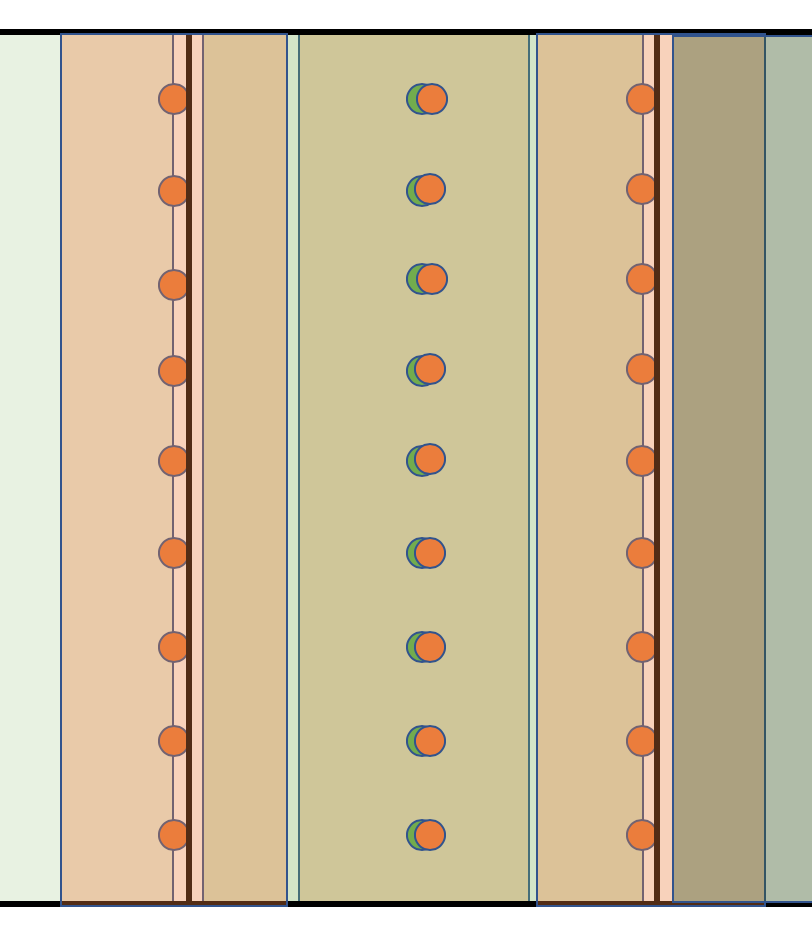
There is a function in functions.R called clean_buffer which creates a buffer around the input buffer_object and reports the points in data that are outside of the buffer. We need to decide how wide the buffer wil be using the input buffer_ft. In general this will be something around half the width of the machinery or section.
In the example below, we clean the yield data using the trial_utm to define a 15 foot buffer.
yield_clean_border <- clean_buffer(trial_utm, 15, yield_utm)
Let’s use our side-by-side plotting we did in the previous episode to compare our original and border-yield cleaned yield maps:
yield_plot_orig <- map_points(yield_utm, "Yld_Vol_Dr", "Yield, Orig")
yield_plot_border_cleaned <- map_points(yield_clean_border, "Yld_Vol_Dr", "Yield, No Borders")
yield_plot_comp <- tmap_arrange(yield_plot_orig, yield_plot_border_cleaned, ncol = 2, nrow = 1)
yield_plot_comp

Here again, we also check the distribution of cleaned yield by making a histogram.
hist(yield_clean_border$Yld_Vol_Dr)

Looking at both this histogram and the several very red dots in our de-bordered yield map, we see that there are still a lot of very high observations. So we need to proceed to step two, which will clean our observations based on how far they are from the mean of the observations.
Step 2.2: Taking out outliers far from the mean
Even if we don’t know the source of error, we can tell that some observations are incorrect just because they are far too small or too large. How can we remove these in an objective, automatic way? As before, we remove observations that are three standard deviations higher or lower than the mean. We look at histograms and maps of the data to help confirm that our cleaning makes sense.
As in lesson 4, we use the clean_sd from our functions.R:
yield_clean <- clean_sd(yield_clean_border, yield_clean_border$Yld_Vol_Dr, sd_no=3)
Here again, we check the distribution of cleaned yield after taking out the yield observations that are outside the range of three standard deviations from the mean.
hist(yield_clean$Yld_Vol_Dr)

This looks a lot more sensible! We can double check by looking at our final, cleaned yield map:
yield_plot_clean <- map_points(yield_clean, "Yld_Vol_Dr", "Yield, Cleaned")
yield_plot_clean

Discussion
What do you think could have caused these outliers (extreme values)? If you were working with yield data from your own fields, what other sources of error might you want to look for?
Exercise: Cleaning Nitrogen from asapplied
Import the
asapplied.gpkgshapefile for and clean the nitrogen application data.
- Remove observations from the buffer zone
- as well as observations more then three standard deviations from the mean.
Solution
Load the data
nitrogen <- read_sf("data/asapplied_new.gpkg")Check CRS
st_crs(nitrogen)Coordinate Reference System: EPSG: 32617 proj4string: "+proj=utm +zone=17 +datum=WGS84 +units=m +no_defs"Since it’s in already in UTM we don’t have to transform it, just rename:
nitrogen_utm <- nitrogenClean border:
nitrogen_clean_border <- clean_buffer(trial_utm, 1, nitrogen_utm)Check out our progress with a plot:
nitrogen_plot_orig <- map_points(nitrogen_utm, "Rate_Appli", "Nitrogen, Orig") nitrogen_plot_border_cleaned <- map_points(nitrogen_clean_border, "Rate_Appli", "Nitrogen, No Borders") nitrogen_plot_comp <- tmap_arrange(nitrogen_plot_orig, nitrogen_plot_border_cleaned, ncol = 2, nrow = 1) nitrogen_plot_comp
Clean by standard deviation:
nitrogen_clean <- clean_sd(nitrogen_clean_border, nitrogen_clean_border$Rate_Appli, sd_no=3)Plot our final result on a map:
nitrogen_plot_clean <- map_points(nitrogen_clean, "Rate_Appli", "Nitrogen, Cleaned") nitrogen_plot_clean
And as a histogram:
hist(nitrogen_clean$Rate_Appli)


Designing Trials: Generating Grids and Aggregating
Now that we have cleaned data we will go through the steps to aggregate this data on subplots of our shapefile of our farm. This happens in a few steps.
Step 1: Creating the grids
After we read in the trial design file, we use a function to generate the subplots for this trial. Because the code for generating the subplots is somewhat complex, we have included it as the make_grids function in functions.R.
Making Subplots
Now we will make subplots that are 24 meters wide which is the width of the original trial on this field:
width = m_to_ft(24) # convert from meters to feet
Now we use make_grids to calculate subplots for our shapefile. There are several inputs for this function:
- The boundary to make the grid over in UTM
- The abline for the field in UTM
- The direction of the grid that will be long
- The direction of the grid that will be short
- The length of grids in feet
- The width of grids plots in feet
We use the following code to make our grid.
design_grids_utm = make_grids(boundary_utm,
abline_utm, long_in = 'NS', short_in = 'EW',
length_ft = width, width_ft = width)
The grid currently does not have a CRS, but we know it is in UTM. So we assign the CRS to be the same as boundary_utm:
st_crs(design_grids_utm)
Coordinate Reference System: NA
st_crs(design_grids_utm) = st_crs(boundary_utm)
Let’s plot what these grids will look like using the basic plot() function:
plot(design_grids_utm$geom)

Now we can see that the grid is larger than our trial area. We can use st_intersection() to only keep the section of the grid that overlaps with boundary_utm,
The resulting grid is seen below:
trial_grid_utm = st_intersection(boundary_utm, design_grids_utm)
Warning: attribute variables are assumed to be spatially constant throughout all
geometries
plot(trial_grid_utm$geom)

Step 2: Aggregation on our subplots
We will now aggregate our yield data over our subplots. In this case we will take the median value within each subplot. When the data are not normally-distributed or when there are errors, the median is often more representative of the data than the mean is. Here we will interpolate and aggregate yield as an example. The other variables can be processed in the same way.
There is a function in our functions.R called deposit_on_grid() that will take the median of the points inside each grid. The function allows us to supply the grid, the data we will aggregate, and the column we want to aggregate. In this case, we will aggregate Yld_Vol_Dr.
subplots_data <- deposit_on_grid(trial_grid_utm, yield_clean, "Yld_Vol_Dr", fn = median)
And let’s finally take a look!
map_poly(subplots_data, 'Yld_Vol_Dr', "Yield (bu/ac)")

We will now clean the asplanted file:
asplanted <- read_sf("data/asplanted_new.gpkg")
st_crs(asplanted)
Coordinate Reference System:
  EPSG: 32617
  proj4string: "+proj=utm +zone=17 +datum=WGS84 +units=m +no_defs"
asplanted_utm <- asplanted # already in utm!
asplanted_clean <- clean_sd(asplanted_utm, asplanted_utm$Rt_Apd_Ct_, sd_no=3)
asplanted_clean <- clean_buffer(trial_utm, 15, asplanted_clean)

map_points(asplanted_clean, "Rt_Apd_Ct_", "Seed")

subplots_data <- deposit_on_grid(subplots_data, asplanted_clean, "Rt_Apd_Ct_", fn = median)
subplots_data <- deposit_on_grid(subplots_data, asplanted_clean, "Elevation_", fn = median)

map_poly(subplots_data, 'Rt_Apd_Ct_', "Seed")

We will now aggregate the asapplied which we already cleaned above:
subplots_data <- deposit_on_grid(subplots_data, nitrogen_clean, "Rate_Appli", fn = median)

map_poly(subplots_data, 'Rate_Appli', "Nitrogen")

Making Plots of Relationships between Variables
Relating our input (experimental) factors to our output variables lets us make key decisions about how to maximize yield subject to our field constraints.
Pc <- 3.5
Ps <- 2.5/1000
Pn <- 0.3
other_costs <- 400
s_sq <- 37000
n_sq <- 225
s_ls <- c(31000, 34000, 37000, 40000)
n_ls <- c(160, 200, 225, 250)

data <- dplyr::rename(subplots_data, s = Rt_Apd_Ct_, n = Rate_Appli, yield = Yld_Vol_Dr)

graphs <- profit_graphs(data, s_ls, n_ls, s_sq, n_sq, Pc, Ps, Pn, other_costs)
graphs[1]
[[1]]

graphs[2]
[[1]]
`geom_smooth()` using formula 'y ~ x'

graphs[3]
[[1]]

graphs[4]
[[1]]
`geom_smooth()` using formula 'y ~ x'

The other options do not need to be changed when you go to use the function on other datasets.
We can also add the trial grid onto the data and use it for looking at the accuracy of the planting application.
subplots_data <- deposit_on_grid(subplots_data, trial_utm, "SEEDRATE", fn = median)

map_poly(subplots_data, 'SEEDRATE', "Target Seed")

Joint Exercise: Costs per Grid on Subplots
Now we can revisit making maps of the cost, gross, and net profits after we have deposited them on our grid. Let’s first start by re-doing our calculation of cost on our subplots grid.
Recall our data from last time: the seed cost per acre of corn for 2019 averaged $615.49 per acre, and that fertilizers and chemicals together come to $1,091.89 per acre. For this exercise, we are going to simplify the model and omit equipment fuel and maintenance costs, irrigation water, and the like, and focus only on seed cost and “nitrogen”. We assume that the baseline seed rate is 37,000 seeds per acre (
seed_quo) (although compare this article which posits 33,000). We assume that the baseline nitrogen application rate is 172 lbs of nitrogen per acre (without specifying the source, urea or ammonia) as the 2018 baseline.We apply these base prices to our trial model to obtain a “seed rate” price of $615.49/37,000 = $0.0166 per seed and a “nitrogen rate” price of $1,091.89/172 = $6.35 per lb of nitrogen.
Using this information, produce a map like in the previous example with the cost indicated using our
subplots_datavariable. Because we have data from the trial as it was produced we can use theRt_Apd_Ct_andRate_Applicolumns of the dataframe.Solution
subplots_data$MEDIAN_COST = 0.0166*subplots_data$Rt_Apd_Ct_ + 6.35*subplots_data$Rate_Appli
map_cost = map_poly(subplots_data, 'MEDIAN_COST', 'Median Cost in US$')
map_cost
Note here that we are saying this is the median cost per subplot because we have deposited on the grids using the median function.

Solo Exercise: Gross Profit per Grid on Subplots
Now we will calculate the gross profit like in the previous lesson. If we recall: the USDA database indicates $4,407.75 as the baseline gross value of production for corn per acre in 2019. Because we have deposited the column of
Yld_Vol_Dronto our grid in thesubplots_datadataframe, we can use these yields instead of the fixed rate we used in the previous lesson.Solution
subplots_data$MEDIAN_GROSS_PROFIT = subplots_data$Yld_Vol_Dr*3.91
map_gross <-  map_poly(subplots_data, 'MEDIAN_GROSS_PROFIT', 'Median Gross Profit in US$')
map_gross
As we can see, this is a single color map and that is because we have assumed a single yield rate for each subplot. Of course, yield is something we can measure after we have designed and planted the trial subplots and we will revisit this idea in the next lesson.
Because

Solo Exercise: Net Profit per Grid on Subplots
Once again calculate the difference between the cost in each grid square and the gross profit in each grid square using the
subplots_datavariable, thus the net profit, and produce a map with the net profit per acre indicated.Solution
subplots_data$MEDIAN_NET_PROFIT = subplots_data$MEDIAN_GROSS_PROFIT - subplots_data$MEDIAN_COST
map_net <- map_poly(subplots_data, 'MEDIAN_NET_PROFIT', 'Median Net Profit in US$')
map_net

Key Points
Comparison operators such as
>,<, and==can be used to identify values that exceed or equal certain values.All the cleaning in ArcGIS/QGIS can be done by R, but we need to check the updated shapefile in ArcGIS/QGIS. Including removing observations that has greater than 2sd harvester speed, certain headlands, or being too close to the plot borders
The
filterfunction indplyrremoves rows from a data frame based on values in one or more columns.