An introduction to linear regression
Overview
Teaching: 10 min
Exercises: 10 minQuestions
What type of variables are required for simple linear regression?
What do each of the components in the equation of a simple linear regression model represent?
Objectives
Identify questions that can be addressed with a simple linear regression model.
Describe the components that are involved in simple linear regression.
Questions that can be addressed with simple linear regression
Simple linear regression is commonly used, but when is it appropriate to apply this method? Broadly speaking, simple linear regression may be suitable when the following conditions hold:
- You seek a model of the relationship between one continuous dependent variable and one continuous or categorical explanatory variable.
- Your data and simple linear regression model do not violate the assumptions of the simple linear regression model. We will cover these assumptions in the final episode of this lesson.
Exercise
A colleague has started working with the NHANES data set. They approach you for advice on the use of simple linear regression on these data. Assuming that the assumptions of the simple linear regression model hold, which of the following questions could potentially be tackled with a simple linear regression model? Think closely about the outcome and explanatory variables, between which a relationship will be modelled to answer the research question.
A) Does home ownership (whether a participant’s home is owned or rented) vary across income brackets in the general US population?
B) Is there an association between BMI and pulse rate in the general US population?
C) Do teenagers on average have a higher pulse rate than adults in the general US population?Solution
A) The outcome variable is home ownership and the explanatory variable is income bracket. Since home ownership is a categorical outcome variable, simple linear regression is not a suitable way to answer this question.
B) Since both variables are continous, simple linear regression may be a suitable way to answer this question.
C) The outcome variable is pulse rate and the explanatory variable is age group (teenager vs adult). Since the outcome variable is continuous and the explanatory variable is categorical, simple linear regression may be a suitable way to answer this question.
The simple linear regression equation
The simple linear regression model can be described by the following equation:
[E(y) = \beta_0 + \beta_1 \times x_1.]
The outcome variable is denoted by $y$ and the explanatory variable is denoted by $x_1$. Simple linear regression models the expectation of $y$, i.e. $E(y)$. This is another way of referring to the mean of $y$. The expectation of $y$ is a function of $\beta_0$ and $\beta_1 \times x_1$. The intercept is denoted by $\beta_0$ - this is the value of $E(y)$ when the explanatory variable, $x_1$, equals 0. The effect of our explanatory variable is denoted by $\beta_1$ - for every one-unit increase in $x_1$, $E(y)$ changes by $\beta_1$.
Before fitting the model, we have access to $y$ and $x_1$ values for each observation in our data. For example, we may want to model the relationship between weight and height. $y$ would represent weight and $x_1$ would represent height. After we fit the model, R will return to us values of $\beta_0$ and $\beta_1$ - these are estimated using our data.
Exercise
We are asked to study the effect of participant’s age on their BMI. We are given the following equation of a simple linear regression to use:
\(E(y) = \beta_0 + \beta_1 \times x_1\).
Match the following components of this simple linear regression model to their descriptions:
- $E(y)$
- ${\beta}_0$
- $x_1$
- ${\beta}_1$
A) Mean BMI at a particular value of age.
B) The expected BMI when the age equals 0.
C) The expected change in BMI with a one-unit increase in age.
D) A specific value of age.Solution
A) 1
B) 2
C) 4
D) 3
Key Points
Simple linear regression requires one continuous dependent variable and one continuous or categorical explanatory variable. In addition, the assumptions of the model must hold.
The components of the model describe the mean of the dependent variable as a function of the explanatory variables, the mean of the dependent variable at the 0-point of the explanatory variable and the effect of the explanatory variable on the mean of dependent variable.
Linear regression with one continuous explanatory variable
Overview
Teaching: 15 min
Exercises: 25 minQuestions
How can we assess whether simple linear regression is a suitable way to model the relationship between two continuous variables?
How can we fit a simple linear regression model with one continuous explanatory variable in R?
How can the parameters of this model be interpreted in R?
How can this model be visualised in R?
Objectives
Use the ggplot2 package to explore the relationship between two continuous variables.
Use the lm command to fit a simple linear regression with one continuous explanatory variable.
Use the jtools package to interpret the model output.
Use the jtools and ggplot2 packages to visualise the resulting model.
In this episode we will study linear regression with one continuous explanatory variable. As explained in the previous episode, the explanatory variable is required to have a linear relationship with the outcome variable. We can explore the relationship between two variables ahead of fitting a model using the ggplot2 package.
Exploring the relationship between two continuous variables
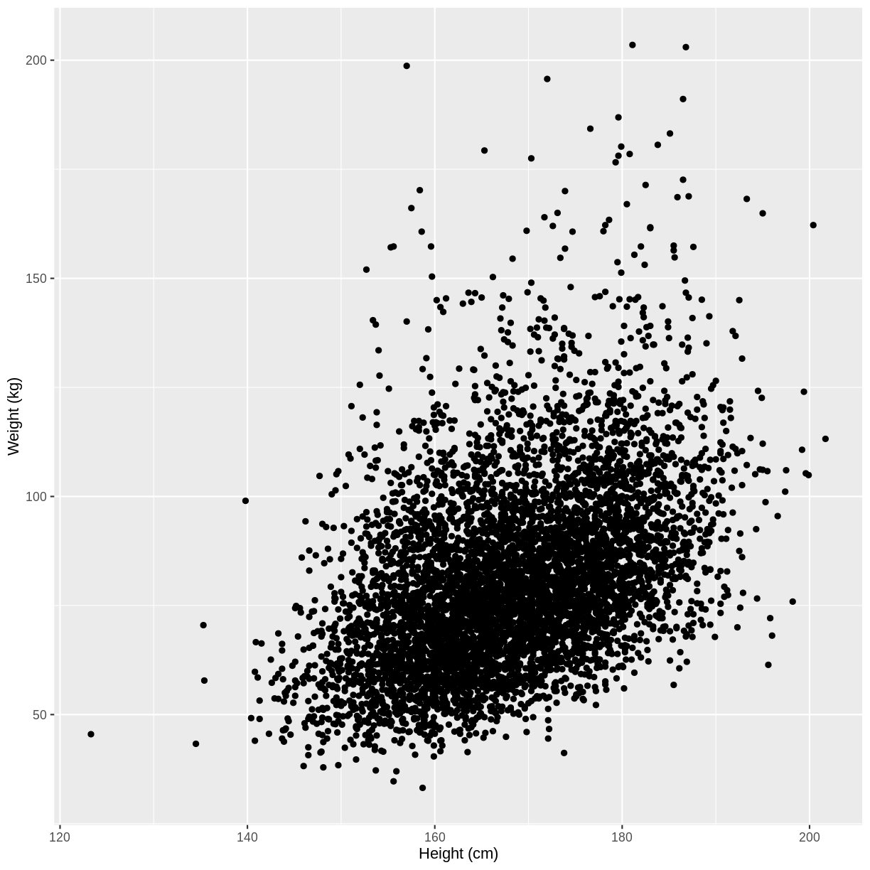
Let us take Weight and Height of adults as an example. In the code below, we select adult participants with the command filter(Age > 17). We then initiate a plotting object using ggplot(). The data is passed on to ggplot() using the pipe. We then select the variables of interest inside aes(). In the next line we create a scatterplot using geom_point(). Finally, we modify the x and y axis labels using xlab() and ylab(). Note that the warning message “Removed 320 rows containing missing values (geom_point)” means that there are participants without recorded height and/or weight data.
dat %>%
  filter(Age > 17) %>%
  ggplot(aes(x = Height, y = Weight)) +
  geom_point() +
  xlab("Height (cm)") +
  ylab("Weight (kg)")
Warning: Removed 320 rows containing missing values (geom_point).
Exercise
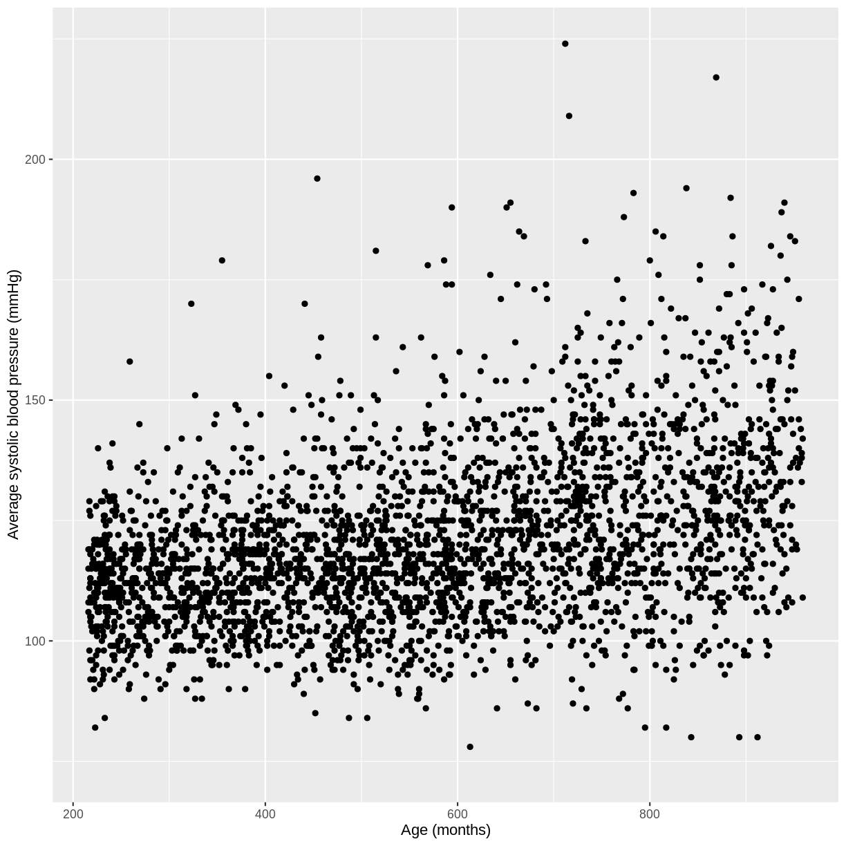
You have been asked to model the relationship between average systolic blood pressure and age in adults in the NHANES data. In order to fit a simple linear regression model, you first need to confirm that the relationship between these variables appears linear. Use the ggplot2 package to create a plot, ensuring that it includes the following elements:
- Average systolic blood pressure (
BPSysAve) on the y-axis and age (AgeMonths) on the x-axis, from the NHANES data, only including data from individuals over the age of 17.- These data are presented using a scatterplot.
- The y-axis labelled as “Average systolic blood pressure (mmHg)” and the x-axis labelled as “Age (months)”.
Solution
dat %>%
  filter(Age > 17) %>%
  ggplot(aes(x = AgeMonths, y = BPSysAve)) +
  geom_point() +
  ylab("Average systolic blood pressure (mmHg)") +
  xlab("Age (months)")
Fitting and interpreting a simple linear regression model with one continuous explanatory variable
Since there is no abnormal shape to the scatterplot (e.g. curvature or multiple clusters), we can proceed with fitting our linear regression model. First, we subset our data using filter(). We then fit the simple linear regression model with the lm() command. Within the command, the model is denoted by formula = outcome variable ~ explanatory variable.
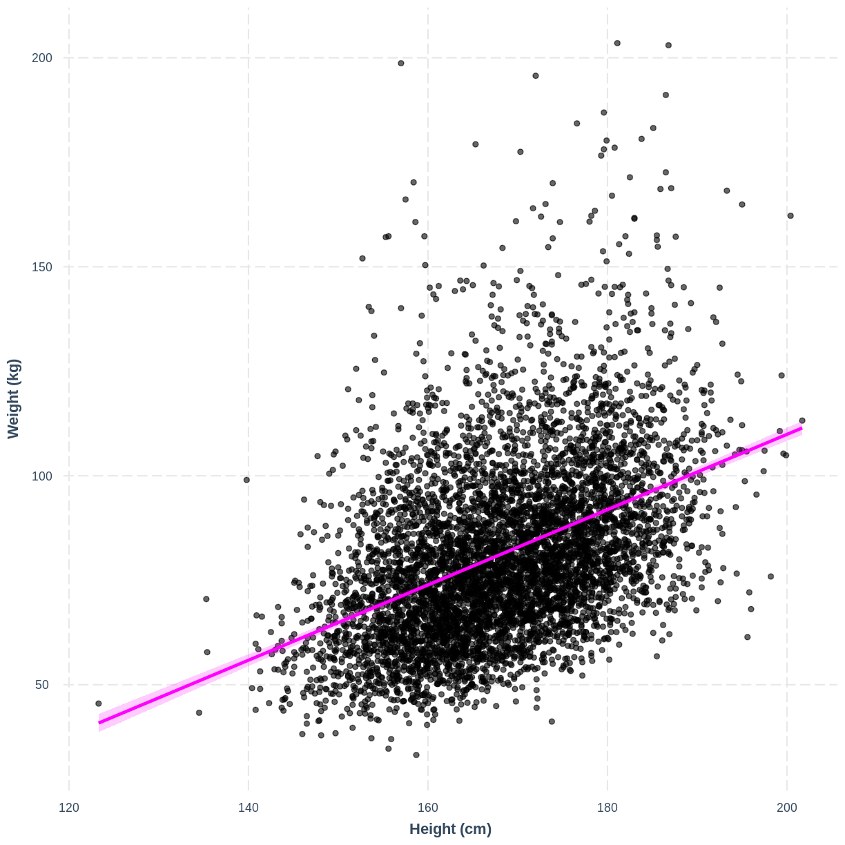
Weight_Height_lm <- dat %>%
  filter(Age > 17) %>%
  lm(formula = Weight ~ Height)
We will interpret our results using a summary table and a plot. The summary table can be obtained using the summ() function from the jtools package. We provide the function with the name of our model (Weight_Height_lm). We can also specify that we want confidence intervals for our parameter estimates using confint = TRUE. Finally, we specify that we want estimates with three digits after the decimal point with digits = 3.
We will come to interpreting the Model Fit section in a later episode. For now, take a look at the parameter estimates at the bottom of the output. We see that the intercept (i.e. $\beta_0$) is estimated at -70.194 and the effect of Height (i.e. $\beta_1$) is estimated at 0.901. The model therefore predicts an average increase in Weight of 0.901 kg for every 1 cm increase in Height.
summ(Weight_Height_lm, confint = TRUE, digits = 3)
MODEL INFO:
Observations: 6177 (320 missing obs. deleted)
Dependent Variable: Weight
Type: OLS linear regression

MODEL FIT:
F(1,6175) = 1398.215, p = 0.000
R² = 0.185
Adj. R² = 0.184

Standard errors: OLS
-----------------------------------------------------------------
                       Est.      2.5%     97.5%    t val.       p
----------------- --------- --------- --------- --------- -------
(Intercept)         -70.194   -78.152   -62.237   -17.293   0.000
Height                0.901     0.853     0.948    37.393   0.000
-----------------------------------------------------------------
We can therefore write the formula as:
[E(\text{Weight}) = -70.19 + 0.901 \times \text{Height}]
Interpretation of the 95% CI and p-value of
HeightIf prior to fitting our model we were interested in testing the hypotheses $H_0: \beta_1 = 0$ vs $H_1: \beta_1 \neq 0$, we could check the 95% CI for
Height. Recall that 95% of 95% CIs are expected to contain the true population mean. Since this 95% CI does not contain 0, we would be fairly confident in rejecting $H_0$ in favour of $H_1$. Alternatively, since the p-value is less than 0.05, we could reject $H_0$ on those grounds.Note that the
summ()output below showsp = 0.000. P values are never truly zero. The interpretation ofp = 0.000is therefore thatp < 0.001, as the p-value was rounded to three digits.Often the null hypothesis tested by
summ(), $H_0: \beta_1 = 0$, is not very interesting, as it is rare that we expect a variable to have an effect of 0. Therefore, it is usually not necessary to pay great attention to the p-value. On the other hand, the 95% CI can still be useful, as it provides an estimate of the uncertainty around our estimate for $\beta_1$. The narrower the 95% CI, the more certain we are that our estimate for $\beta_1$ is close to the population mean for $\beta_1$.
Exercise
Now that you have confirmed that the relationship between
BPSysAveandAgeMonthsdoes not appear to deviate from linearity in the NHANES data, you can proceed to fitting a simple linear regression model.
- Using the
lm()command, fit a simple linear regression of average systolic blood pressure (BPSysAve) as a function of age in months (AgeMonths) in adults. Name thislmobjectBPSysAve_AgeMonths_lm.- Using the
summfunction from thejtoolspackage, answer the following questions:A) What average systolic blood pressure does the model predict, on average, for an individual with an age of 0 months?
B) By how much is average systolic blood pressure expected to change, on average, for a one-unit increase in age?
C) Given these two values and the names of the response and explanatory variables, how can the general equation $E(y) = \beta_0 + {\beta}_1 \times x_1$ be adapted to represent your model?Solution
BPSysAve_AgeMonths_lm <- dat %>%
  filter(Age > 17) %>%
  lm(formula = BPSysAve ~ AgeMonths)

summ(BPSysAve_AgeMonths_lm, confint = TRUE, digits=3)
MODEL INFO: Observations: 3084 (3413 missing obs. deleted) Dependent Variable: BPSysAve Type: OLS linear regression MODEL FIT: F(1,3082) = 556.405, p = 0.000 R² = 0.153 Adj. R² = 0.153 Standard errors: OLS ----------------------------------------------------------------- Est. 2.5% 97.5% t val. p ----------------- --------- --------- --------- --------- ------- (Intercept) 101.812 100.166 103.458 121.276 0.000 AgeMonths 0.033 0.030 0.035 23.588 0.000 -----------------------------------------------------------------A) 101.8 mmHg.
B) Increase by 0.033 mmHg/month.
C) $E(\text{Average systolic blood pressure}) = 101.8 + 0.033 \times \text{Age in Months}$.
Visualising a simple linear regression model with one continuous explanatory variable
We can also interpret the model using a line overlayed onto the previous scatterplot. We can obtain such a plot using effect_plot() from the jtools package. We provide the name of our model, followed by a specification of the explanatory variable of interest with pred = Height. Our current model has one explanatory variable, but in later lessons we will work with multiple explanatory variables so this option will be more useful. We also include a confidence interval around our line using interval = TRUE and include the original data using plot.points = TRUE. Finally, we specify a red colour for our line using colors = "red". As before, we can edit the x and y axis labels.
effect_plot(Weight_Height_lm, pred = Height, plot.points = TRUE,
            interval = TRUE, line.colors = "magenta") +
  xlab("Height (cm)") +
  ylab("Weight (kg)")
Exercise
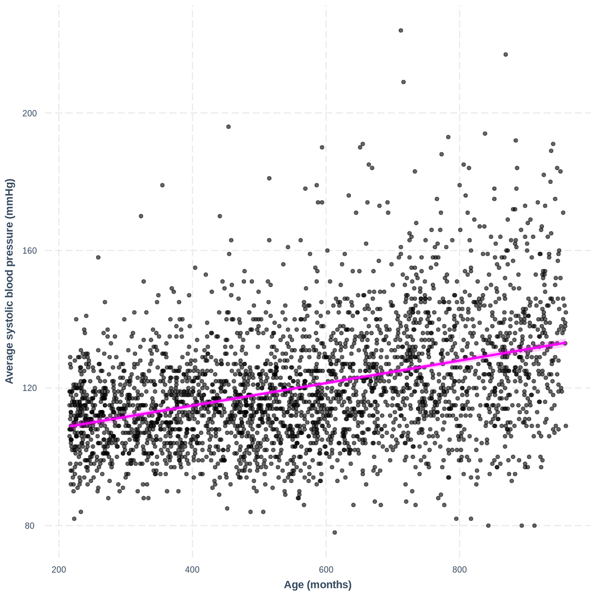
You have been asked to report on your simple linear regression model, examining systolic blood pressure and age, at the next lab meeting. To help your colleagues interpret the model, you decide to produce a figure. Make this figure using the jtools package. Ensure that the x and y axes are correctly labelled.
Solution
effect_plot(BPSysAve_AgeMonths_lm, pred = AgeMonths, plot.points = TRUE,
            interval = TRUE, line.colors = "magenta") +
  xlab("Age (months)") +
  ylab("Average systolic blood pressure (mmHg)")
Key Points
As a first check of suitability, examine the relationship between the continuous variables using a scatterplot.
Use
lm()to fit a simple linear regression model.Use
summ()to obtain parameter estimates for the model.Use
effect_plot()to visualise the model.
Linear regression with a two-level factor explanatory variable
Overview
Teaching: 15 min
Exercises: 25 minQuestions
How can we explore the relationship between one continuous variable and one categorical variable with two groups prior to fitting a simple linear regression?
How can we fit a simple linear regression model with one two-level categorical explanatory variable in R?
How does the use of the simple linear regression equation differ between the continuous and categorical explanatory variable cases?
How can the parameters of this model be interpreted in R?
How can this model be visualised in R?
Objectives
Use the ggplot2 package to explore the relationship between a continuous variable and a two-level factor variable.
Use the lm command to fit a simple linear regression with a two-level factor explanatory variable.
Distinguish between the baseline and contrast levels of the categorical variable.
Use the jtools package to interpret the model output.
Use the jtools and ggplot2 packages to visualise the resulting model.
In this episode we will study linear regression with one two-level categorical variable. We can explore the relationship between two variables ahead of fitting a model using the ggplot2 package.
Exploring the relationship between a continuous variable and a two-level categorical variable
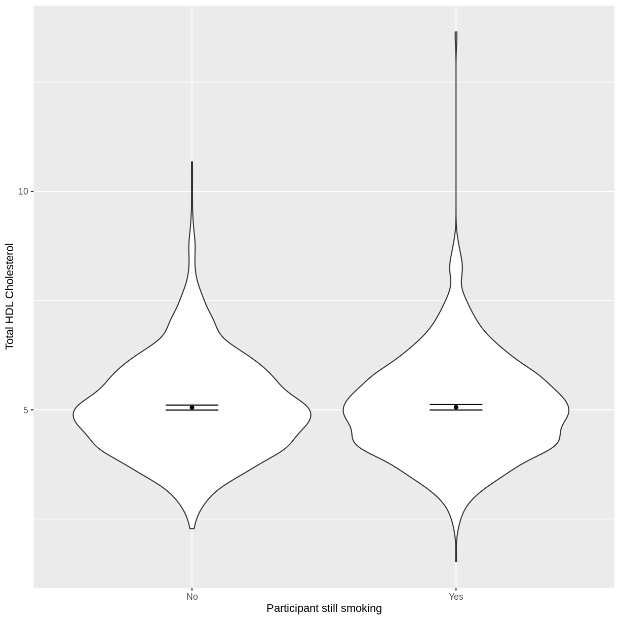
Let us take SmokeNow and TotChol as an example. SmokeNow describes whether someone who has smoked > 100 cigarettes in their life is currently smoking. TotChol describes the total HDL cholesterol in someone’s blood. In the code below, we first remove rows with missing values using drop_na() from the tidyr package. We then initiate a plotting object using ggplot. We select the variables of interest inside aes(). We then make a violin plot using geom_violin. The shapes of the objects are representative of the distributions of TotChol in the two groups. We overlay the means and their 95% confidence intervals using stat_summary(). Finally, we change the axis labels using xlab() and ylab().
dat %>%
  drop_na(c(SmokeNow, TotChol)) %>%
  ggplot(aes(x = SmokeNow, y = TotChol)) +
  geom_violin() +
  stat_summary(fun = "mean", size = 0.2) +
  stat_summary(fun.data = "mean_cl_normal", geom = "errorbar", width = 0.2) +
  xlab("Participant still smoking") +
  ylab("Total HDL Cholesterol")
Notes on the
funandfun.dataarguments instat_summary()The
funandfun.dataarguments both apply statistical operations to data but do slightly different things.funtakes data as vectors and will return single values for each these vectors. In the above example, we calculate the mean for each vector (eachSmokeNowgroup).fun.dataexpects a dataset (which may be a simple vector) and provides three values for each dataset:y,yminandymax. In our case, ymin is lower bound of the confidence interval and ymax is the upper bound of the confidence interval.
Exercise
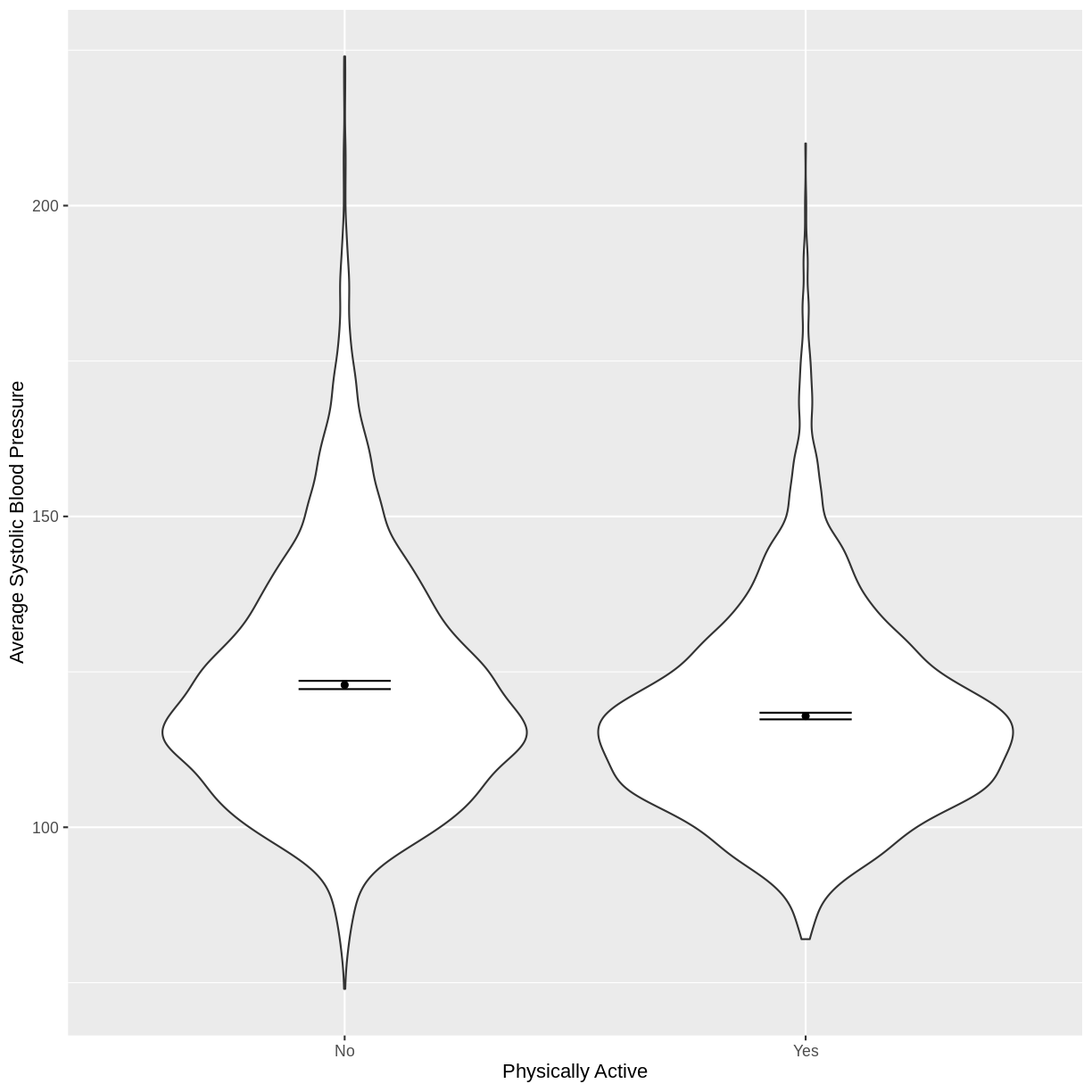
You have been asked to model the relationship between average systolic blood pressure and physical activity in the NHANES data. Use the ggplot2 package to create an exploratory plot, ensuring that it includes the following elements:
- Average systolic blood pressure (
BPSysAve) on the y-axis and physical activity (PhysActive) on the x-axis, from the NHANES data.- These data presented using a violin plot.
- The y-axis labelled as “Average Systolic Blood Pressure” and the x-axis labelled as “Physically Active”.
Solution
dat %>%
  drop_na(c(PhysActive, BPSysAve)) %>%
  ggplot(aes(x = PhysActive, y = BPSysAve)) +
  geom_violin() +
  stat_summary(fun = "mean", size = 0.2) +
  stat_summary(fun.data = "mean_cl_normal", geom = "errorbar", width = 0.2) +
  xlab("Physically Active") +
  ylab("Average Systolic Blood Pressure")
Fitting and interpreting a simple linear regression model with one two-level categorical variable
We proceed to fit a linear regression model using the lm() command, as we did in the previous episode. The model is then interpreted using summ().
Note that even though we are using the same equation of the simple linear regression model ($E(y) = \beta_0 + \beta_1 \times x_1$), our interpretation of the summ() output differs slightly from our interpretation in the previous episode. Recall that our categorical explanatory variable has two levels, "No" and "Yes". One of these is taken by the model as the baseline ("No"), the other as the contrast ("Yes"). The first level alphabetically is chosen by R as the baseline, unless specified otherwise.
The intercept in the summ() output is the estimated mean for the baseline, i.e. for participants that stopped smoking. The SmokeNowYes estimate is the estimated average difference in TotChol between participants that stopped smoking and participants that did not stop smoking. We can therefore write the equation for this model as:
\(E(\text{Total HDL cholesterol}) = 5.053 + 0.008 \times x_1\),
where $x_1 = 1$ if a participant has continued to smoke and 0 otherwise (i.e. the participant stopped smoking).
TotChol_SmokeNow_lm <- dat %>%
  lm(formula = TotChol ~ SmokeNow)

summ(TotChol_SmokeNow_lm, confint = TRUE, digits = 3)
MODEL INFO:
Observations: 2741 (7259 missing obs. deleted)
Dependent Variable: TotChol
Type: OLS linear regression

MODEL FIT:
F(1,2739) = 0.031, p = 0.861
R² = 0.000
Adj. R² = -0.000

Standard errors: OLS
------------------------------------------------------------
                     Est.     2.5%   97.5%    t val.       p
----------------- ------- -------- ------- --------- -------
(Intercept)         5.053    4.995   5.111   170.707   0.000
SmokeNowYes         0.008   -0.078   0.094     0.175   0.861
------------------------------------------------------------
Exercise
- Using the
lm()command, fit a simple linear regression of average systolic blood pressure (BPSysAve)
as a function of physical activity (PhysActive). Name thislmobjectBPSysAve_PhysActive_lm.- Using the
summ()function from thejtoolspackage, answer the following questions:A) What average systolic blood pressure does the model predict, on average, for an individual who is not physically active?
B) By how much is average systolic blood pressure expected to change, on average, for a physically active individual?
C) Given these two values and the names of the response and explanatory variables, how can the general equation $E(y) = \beta_0 + {\beta}_1 \times x_1$ be adapted to represent this model?Solution
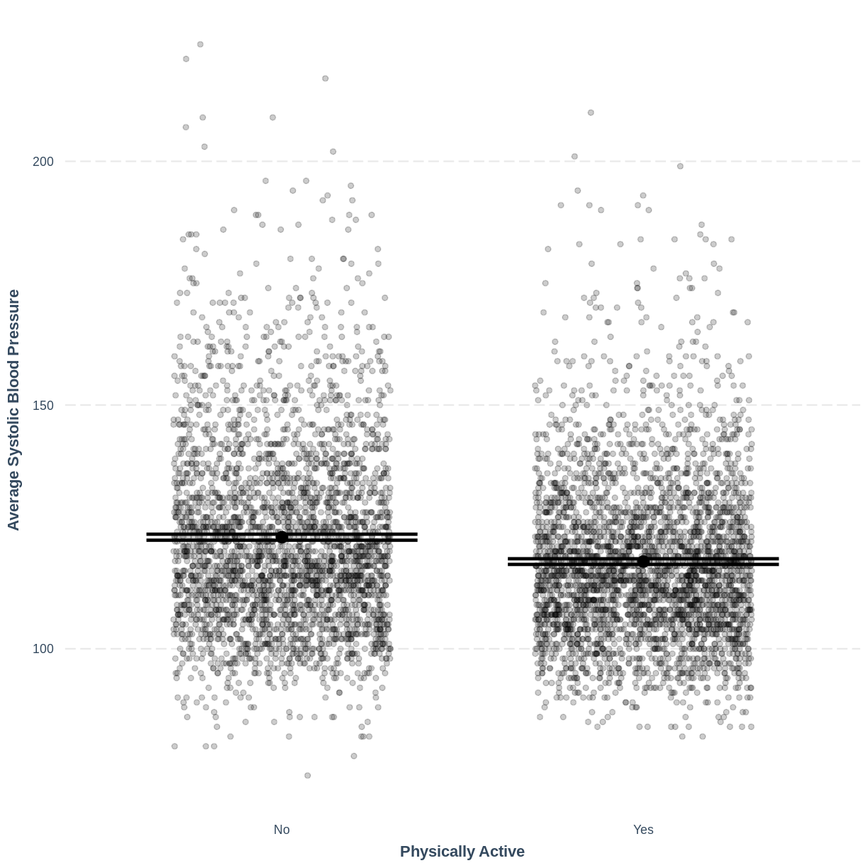
BPSysAve_PhysActive_lm <- dat %>%
  lm(formula = BPSysAve ~ PhysActive)

summ(BPSysAve_PhysActive_lm, confint = TRUE, digits = 3)
MODEL INFO: Observations: 6781 (3219 missing obs. deleted) Dependent Variable: BPSysAve Type: OLS linear regression MODEL FIT: F(1,6779) = 133.611, p = 0.000 R² = 0.019 Adj. R² = 0.019 Standard errors: OLS ------------------------------------------------------------------- Est. 2.5% 97.5% t val. p ------------------- --------- --------- --------- --------- ------- (Intercept) 122.892 122.275 123.509 390.285 0.000 PhysActiveYes -5.002 -5.851 -4.154 -11.559 0.000 -------------------------------------------------------------------A) 122.892 mmHg
B) Decrease by 5.002 mmHg
C) $E(\text{BPSysAve}) = 122.892 - 5.002 \times x_1$, where $x_1 = 0$ if an individual is not physically active and $x_1 = 1$ if an individual is physically active.
Visualising a simple linear regression model with one two-level categorical explanatory variable
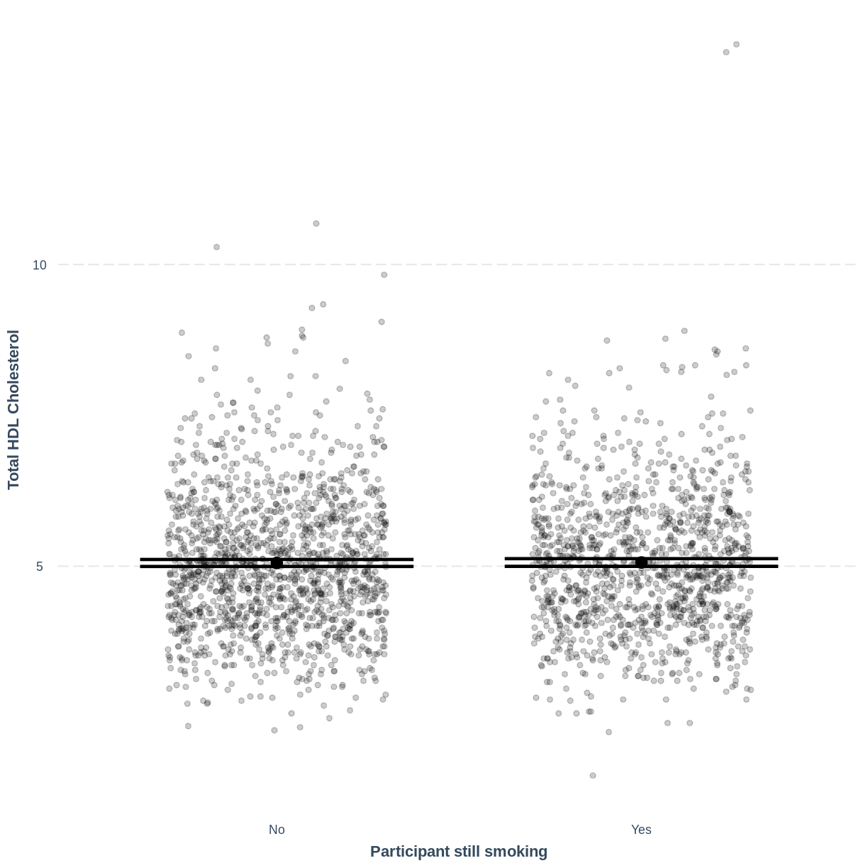
Finally, we visually inspect the parameter estimates provided by our model. Again we can use effect_plot() from the jtools package. We include jitter = c(0.3, 0) and point.alpha = 0.2 so that points are spread out HORIZONTALLY and so that multiple overlayed points create a darker colour, respectively. The resulting plot differs from the scatterplot obtained in the previous episode. Here, the plot shows the mean Total HDL Cholesterol estimates for each level of SmokeNow, with their 95% confidence intervals. This allows us to see how different the means are predicted to be and within what range we can expect the true population means to fall.
effect_plot(TotChol_SmokeNow_lm, pred = SmokeNow,
            plot.points = TRUE, jitter = c(0.3, 0), point.alpha = 0.2) +
  xlab("Participant still smoking") +
  ylab("Total HDL Cholesterol")
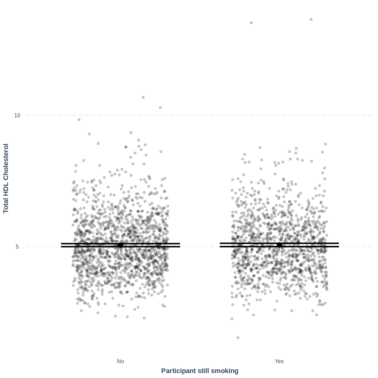
Notes on
jitterandpoint.alphaIncluding
jitter = c(0.3, 0)results in points being randomly jittered horizontally. Therefore, your plot will differ slightly from the one shown above. Re-running the code will also give a slightly different jitter. If you would want to fix thejitterto one randomisation, you could run aset.seed()command ahead ofeffect_plot.set.seed()takes one positive value, which specifies the randomisation. This can be any positive value. For example, if you run the code below, your jitter will match the one shown on this page:set.seed(20) #fix the jitter to a particular pattern effect_plot(TotChol_SmokeNow_lm, pred = SmokeNow, plot.points = TRUE, jitter = c(0.3, 0), point.alpha = 0.2) + xlab("Participant still smoking") + ylab("Total HDL Cholesterol")
Including
point.alpha = 0.2introduces opacity into the plotted points. As a result, if many points are plotted on top of each other, this area shows up with darker dots. Including opacity allows us to see where many of the points lie, which is handy with big public health data sets.
Exercise
Use the
jtoolspackage to visualise the model ofBPSysAveas a function ofPhysActive.
Ensure that the x-axis is labelled as “Physically active” and the y-axis is labelled as “Average Systolic Blood Pressure”. How does this plot relate to the output given bysumm?Solution
effect_plot(BPSysAve_PhysActive_lm, pred = PhysActive,
plot.points = TRUE, jitter = c(0.3, 0), point.alpha = 0.2) +
  xlab("Physically Active") +
  ylab("Average Systolic Blood Pressure")
This plot shows the mean estimates for
BPSysAvefor the two groups, alongside their 95% confidence intervals. The mean estimates are represented by theInterceptfor the non-physically active group and byIntercept+PhysActiveYesfor the physically active group.
Key Points
As a first exploration of the data, construct a violin plot describing the relationship between the two variables.
Use
lm()to fit a simple linear regression model.Use
summ()to obtain parameter estimates for the model.The intercept estimates the mean in the outcome variable for the baseline group. The other parameter estimates the difference in the means in the outcome variable between the baseline and contrast group.
Use
effect_plot()to visualise the estimated means per group along with their 95% CIs.
Making predictions from a simple linear regression model
Overview
Teaching: 10 min
Exercises: 10 minQuestions
How can predictions be manually obtained from a simple linear regression model?
How can R be used to obtain predictions from a simple linear regression model?
Objectives
Calculate a prediction from a simple linear regression model using parameter estimates given by the model output.
Use the predict function to generate predictions from a simple linear regression model.
One of the features of linear regression is prediction: a model presents predicted mean values for the outcome variable for any values of the explanatory variables. We have already seen this in the previous episodes through our effect_plot() outputs, which showed mean predicted responses as straight lines (episode 2) or individual points for levels of a categorical variable (episodes 3). Here, we will see how to obtain predicted values and the uncertainty surrounding them.
Calculating predictions manually
First, we can calculate a predicted value manually. From the summ() output associated with our Weight_Height_lm model from episode 2, we can write the model as $E(\text{Weight}) = \beta_0 + \beta_1 \times \text{Height} = -70.194 + 0.901 \times \text{Height}$. The output can be found again below. If we take a height of 165 cm, then our model predicts an average weight of $-70.194 + 0.901 \times 165 = 78.471$ kg.
Weight_Height_lm <- dat %>%
  filter(Age > 17) %>%
  lm(formula = Weight ~ Height)

summ(Weight_Height_lm)
MODEL INFO:
Observations: 6177 (320 missing obs. deleted)
Dependent Variable: Weight
Type: OLS linear regression

MODEL FIT:
F(1,6175) = 1398.22, p = 0.00
R² = 0.18
Adj. R² = 0.18

Standard errors: OLS
-------------------------------------------------
                      Est.   S.E.   t val.      p
----------------- -------- ------ -------- ------
(Intercept)         -70.19   4.06   -17.29   0.00
Height                0.90   0.02    37.39   0.00
-------------------------------------------------
Exercise
Given the
summoutput from ourBPSysAve_AgeMonths_lmmodel, the model can be described as$E(\text{BPSysAve}) = \beta_0 + \beta_1 \times \text{Age (months)} = 101.812 + 0.033 \times \text{Age (months)}$.
What level of average systolic blood pressure does the model predict, on average, for an individual with an age of 480 months?
Solution
$101.812 + 0.033 * 480 = 117.652 \text{mmHg}$.
Making predictions using make_predictions()
Using the make_predictions() function brings two advantages. First, when calculating multiple predictions, we are saved the effort of inserting multiple values into our model manually and doing the calculations. Secondly, make_predictions() returns 95% confidence intervals around the predictions, giving us a sense of the uncertainty around the predictions.
To use make_predictions(), we need to create a tibble with the explanatory variable values for which we wish to have mean predictions from the model. We do this using the tibble() function. Note that the column name must correspond to the name of the explanatory variable in the model, i.e. Height. In the code below, we create a tibble with the values 150, 160, 170 and 180. We then provide make_predictions() with this tibble, alongside the model from which we wish to have predictions. By default, 95% confidence intervals are returned.
We see that the model predicts an average weight of 64.88 kg for an individual with a height of 150 cm, with a 95% confidence interval of [63.9kg, 65.9kg].
Heights <- tibble(Height = c(150, 160, 170, 180))

make_predictions(Weight_Height_lm, new_data = Heights)
# A tibble: 4 × 4
  Height Weight  ymin  ymax
   <dbl>  <dbl> <dbl> <dbl>
1    150   64.9  63.9  65.9
2    160   73.9  73.3  74.5
3    170   82.9  82.4  83.4
4    180   91.9  91.2  92.6
Exercise
- Using the
make_predictions()function, obtain the expected mean average systolic blood pressure levels predicted by theBPSysAve_AgeMonths_lmmodel for individuals with an age of 300, 400, 500 and 600 months.- Obtain 95% confidence intervals for these predictions.
- How are these confidence intervals interpreted?
Solution
BPSysAve_AgeMonths_lm <- dat %>%
 filter(Age > 17) %>%
 lm(formula = BPSysAve ~ AgeMonths)

ages <- tibble(AgeMonths = c(300, 400, 500, 600))

make_predictions(BPSysAve_AgeMonths_lm, new_data = ages)
# A tibble: 4 × 4 AgeMonths BPSysAve ymin ymax <dbl> <dbl> <dbl> <dbl> 1 300 112. 111. 113. 2 400 115. 114. 116. 3 500 118. 118. 119. 4 600 121. 121. 122.Recall that 95% of 95% confidence intervals are expected to contain the population mean. Therefore, we can be fairly confident that the true population means lie somewhere between the bounds of the intervals, assuming that our model is good.
Key Points
Predictions of the mean in the outcome variable can be manually calculated using the model’s equation.
Predictions of multiple means in the outcome variable alongside 95% CIs can be obtained using the
make_predictions()function.
Assessing simple linear regression model fit and assumptions
Overview
Teaching: 40 min
Exercises: 80 minQuestions
What does it mean to assess model fit?
What does $R^2$ quantify and how is it interpreted?
What are the six assumptions of simple linear regression?
How do I check if any of these assumptions are violated?
Objectives
Explain what is meant by model fit.
Use the $R^2$ value as a measure of model fit.
Describe the assumptions of the simple linear regression model.
Assess whether the assumptions of the simple linear regression model have been violated.
In this episode we will learn what is meant by model fit, how to interpret the $R^2$ measure of model fit and how to assess whether our model meets the assumptions of simple linear regression. This episode was inspired by chapter 11 of the book Regression and Other Stories (see here for a pdf copy).
Using residuals to assess model fit
Broadly speaking, when we assess model fit we are checking whether our model fits the data sufficiently well. This process is somewhat subjective, in that the majority of our assessments are performed visually. While there are many ways to assess model fit, we will cover two main components:
- Calculation of the variance in the response variable explained by the model, $R^2$.
- Assessment of the assumptions of the simple linear regression model.
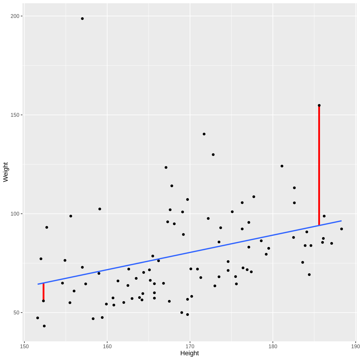
Both of these components rely on the use of residuals. Recall that our model is characterized by a line, which predicts a value for the outcome variable for each value of the explanatory variable. The difference between an observed outcome and a predicted outcome is a residual. Therefore, our model has as many residuals as the number of observations used in fitting the model.
For a visual example of residuals, see the plot below. A simple linear regression
was fit to Height and Weight data of participants with an Age of 25.
To the right side, we see a long red vertical line. This is a relatively large
residual, for an individual with a weight greater than predicted by the model.
To the left side, we see a shorter red vertical line. This is a relatively small
residual, for an individual with a weight close to that predicted by the model.
Measuring model fit using $R^2$
A commonly used summary statistic for model fit is $R^2$, which quantifies the proportion of variation in the outcome variable explained by the explanatory variable. An $R^2$ close to 1 indicates that the model accounts for most of the variation in the outcome variable. An $R^2$ close to 0 indicates that most of the variation in the outcome variable is not accounted for by the model.
What does it mean when a model accounts for most of the variation in the outcome variable? Or when it does not? Let’s look at examples of the two extremes: $R^2=1$ and $R^2=0$. In these cases, 100% and 0% of the variation in the outcome variable is accounted for by the explanatory variable, respectively.
Below is a plot of hypothetical data, with two regression lines. The blue line goes perfectly through the data points, while the red line is horizontal at the mean of the hypothetical data.
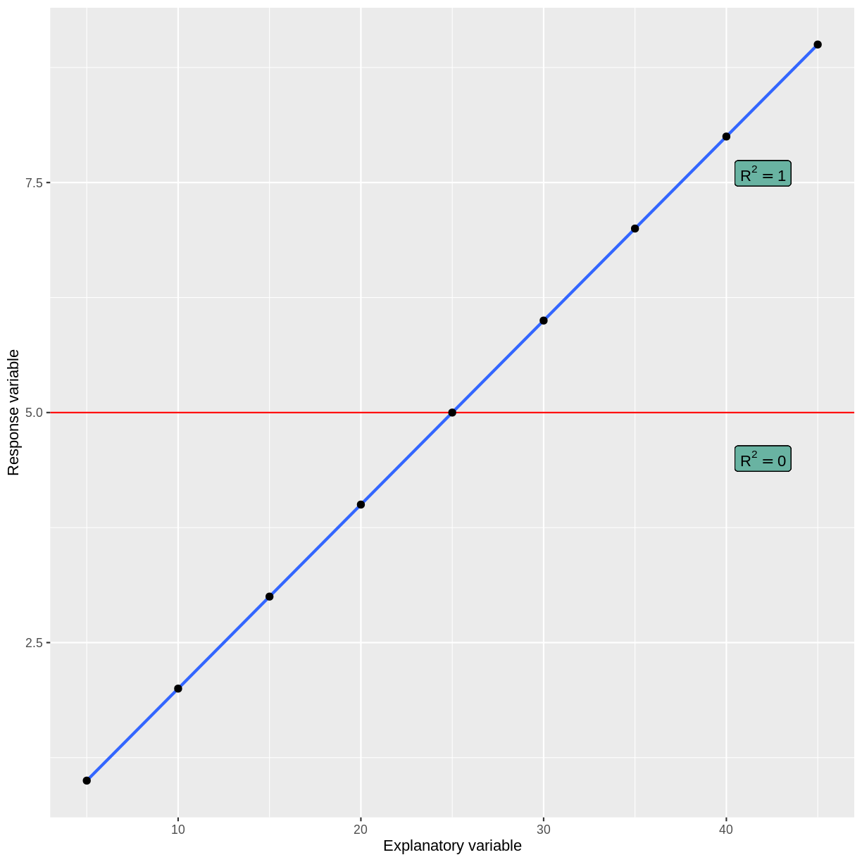
When a model accounts for all of the variation in the outcome variable, the line goes perfectly through the data points. When a model does not account for any of the variation in the outcome variable, the model predicts the mean of the outcome variable, regardless of the explanatory variable.
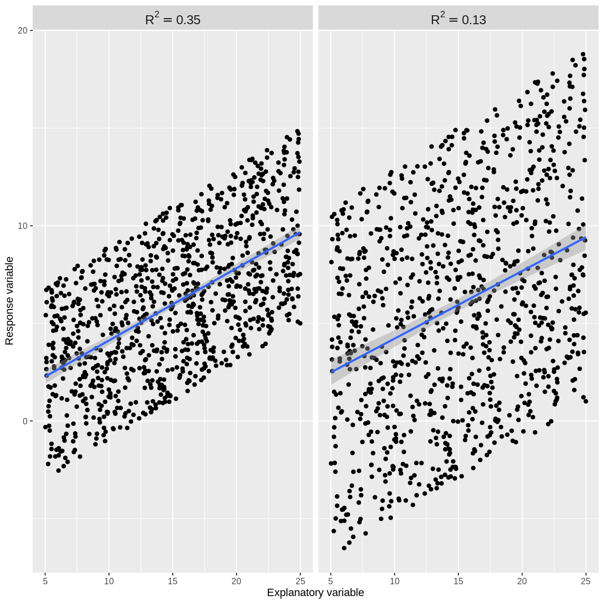
Usually our $R^2$ value will lie somewhere between these two extremes. An $R^2$ close to 1 indicates that the data does not scatter much around the model line. Therefore, our model accounts for most of the variation in the outcome variable. An $R^2$ close to 0 indicates that our model does not predict much better than the mean of the response variable. Therefore, our model does not account for much of the variation in the outcome variable. See for example plots below. The points in the left plot lie closer to the line, so the model explains more of the variation and the $R^2$ value is higher.
The cut-off for a “good” $R^2$ value varies by research question and data set. There are scenarios in which explaining 10% of the variation in an outcome variable is “good”, while there are others where we may only be satisfied with much higher $R^2$ values. The most important thing is to not blindly rely on $R^2$ as a measure of model fit. While it is a useful assessment, it needs to be interpreted in the context of the research question and the assumptions of the model used.
Exercise
- Find the R-squared value for the
summoutput of ourBPSysAve_AgeMonths_lmmodel from episode 2.- What proportion of variation in average systolic blood pressure is explained by age in our model?
- Does our model account for most of the variation in
BPSysAve?Solution
BPSysAve_AgeMonths_lm <- dat %>%
    filter(Age > 17) %>%
    lm(formula = BPSysAve ~ AgeMonths)

summ(BPSysAve_AgeMonths_lm, confint = TRUE, digits = 3)
MODEL INFO: Observations: 3084 (3413 missing obs. deleted) Dependent Variable: BPSysAve Type: OLS linear regression MODEL FIT: F(1,3082) = 556.405, p = 0.000 R² = 0.153 Adj. R² = 0.153 Standard errors: OLS ----------------------------------------------------------------- Est. 2.5% 97.5% t val. p ----------------- --------- --------- --------- --------- ------- (Intercept) 101.812 100.166 103.458 121.276 0.000 AgeMonths 0.033 0.030 0.035 23.588 0.000 -----------------------------------------------------------------Since $R^2 = 0.153$, our model accounts for approximately 15% of the variation in
BPSysAve. Our model explains 15% of the variation onBPSysAve, which a model that always predicts the mean would not.
Assessing the assumptions of simple linear regression
Simple linear regression has six assumptions. We will discuss these below and explore how to check that they are not violated through a series of challenges with applied examples.
1. Validity
The validity assumption states that the model is appropriate for the research question. This may sound obvious, but it is easy to come to unreliable conclusions because of inappropriate model choice. Validity is assessed in three ways:
A) Does the outcome variable reflect the phenomenon of interest? For example, it would not be appropriate to take our Pulse vs PhysActive model as representative of the effect of physical activity on general health.
B) Does the model include all relevant explanatory variables? For example, we might decide that our model of TotChol vs BMI requires inclusion of the SmokeNow variable. While not discussed in this lesson, inclusion of more than one explanatory variable is covered in the multiple linear regression for public health lesson.
C) Does the model generalise to our case of interest? For example, it would not be appropriate to use our Pulse vs PhysActive model, which was constructed using people of all ages, if we were specifically interested in the effect of physical activity on pulse rate in those aged 70+. A subsample of the NHANES data may allow us to answer the research question.
Exercise
You are asked to model the effect of age on general health of South-Americans. A colleague proposes that you fit a simple linear regression to the NHANES data, using
BMIas the outcome variable andAgeas the explanatory variable. Using the three points above, assess the validity of this model for the research question.Solution
A) There is more to general health than
BMIalone. In this case, we may wish to use a different outcome variable. Alternatively, we could make the research question more specific by specifying that we are studying the effect ofAgeonBMIrather than general health.
B) Since we are specifically asked to study the effect ofAgeon general health, we may conclude that no further explanatory variables are relevant to the research question. However, there may still be explanatory variables that are important to include, such as income or sex, if the effect ofAgeon general health depends on other explanatory variables. This will be covered in the next lesson.
C) Since the NHANES data was collected from individuals in the US, this data may not be suitable for a research question relating to individuals in South-America.
2. Representativeness
The representativeness assumption states that the sample is representative of the population to which we are generalising our findings. For example, if we were studying the relationship between physical activity and pulse rate in US adults using the NHANES data, we could assume that our sample is representative of our population of interest. However, if we were to use data from a survey of care homes, our data would not be representative of our population of interest: we would have an overrepresentation of older people, compared to the US adult population.
In combination with the case of interest criterium of the validity assumption, we therefore ask:
- Are the individuals on which our data was collected a subset of the population of individuals which we are interested in studying? This is a component of validity.
- Is our sample of individuals representative of the population of interest in terms of the number of individuals in relevant categories, e.g. ages? This is representativeness.
Note that when the representativeness assumption is violated, this can be solved by including the misrepresented feature as an explanatory variable in the model. For example, if the sample and the population have different age distributions, age can be included as a variable in the model. Linear regression with multiple explanatory variables is covered in the multiple linear regression lesson.
Exercise
One of your colleagues is asked to model the effect of income on dissertation grade in final year undergraduate students. They decide to survey 500 students at your university, asking them for their income and recording their grade upon completion of the thesis.
A) Would fitting a model of thesis grade as a function of income using this data violate the case of interest criterium of the validity assumption?
After completing the survey, your colleague finds that the proportion of participants identifying as female in the data is 70%. Presume it is known that at your university, 55% of final year undergraduate students identify as female.
B) Would fitting a model of thesis grade as a function of income using this data violate the representativeness assumption?
Solution
A) Since the sample appears to be a subset of the population of interest, the case of interest criterium would not be violated.
B) Since the sample is not representative of the population of interest, the representativeness assumption would be violated. Including a variable for gender may solve the violation. See the multiple linear regression lesson for details on how to include multiple variables in linear regression.
3. Linearity and additivity
This assumption states that our outcome variable has a linear, additive relationship with the explanatory variables.
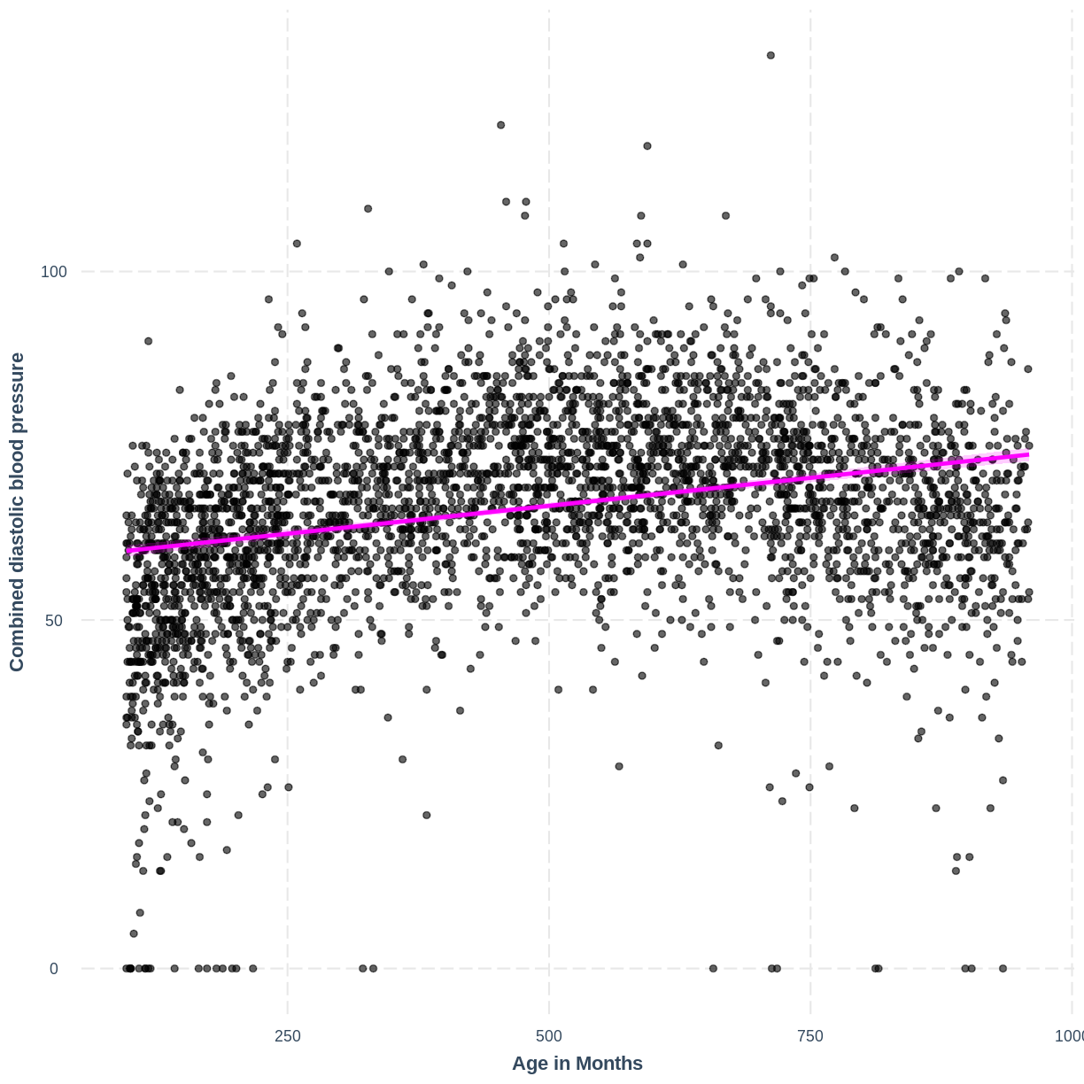
The linearity component means that our outcome variable is described by a linear function of the explanatory variable(s). On a practical level, this means that the line produced by our model should match the shape of the data. We learned to check that the relationship between our two variables is linear through the exploratory plots. For an example where the linearity assumption is violated, see the plot below. The relationship between BPDiaAve and AgeMonths is non-linear and our model fails to capture this non-linear relationship.
BPDiaAve_AgeMonths_lm <- lm(formula = BPDiaAve ~ AgeMonths, data = dat)

effect_plot(BPDiaAve_AgeMonths_lm, pred = AgeMonths,
            plot.points = TRUE, interval = TRUE,
            line.colors = "magenta") +
  ylab("Combined diastolic blood pressure") +
  xlab("Age in Months")
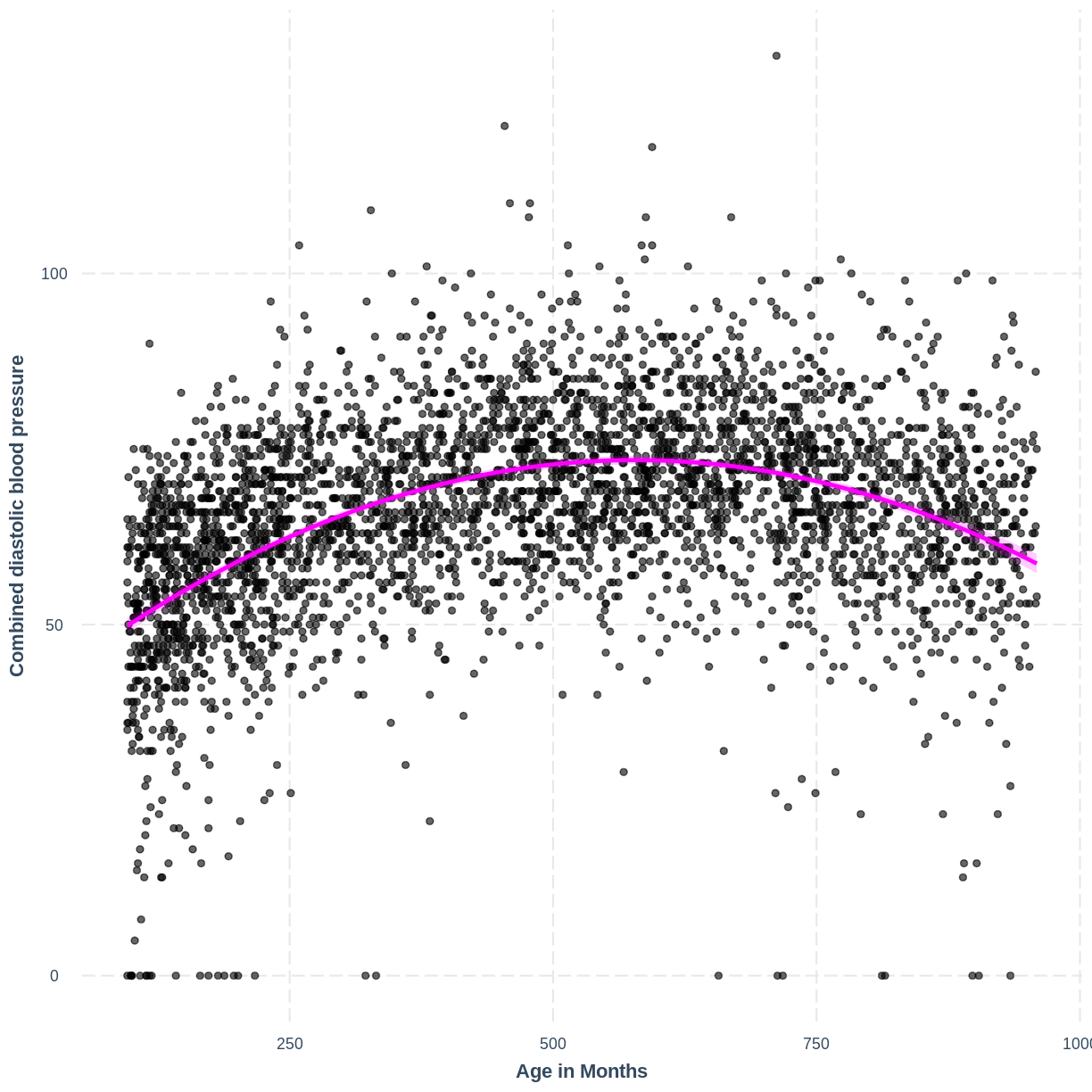
Adding a squared term to our model, designated by I(AgeMonths^2), allows our model to capture the non-linear relationship, as the following plot shows. Thus, the model with formula BPDiaAve ~ AgeMonths + I(AgeMonths^2) does not appear to violate the linearity assumption.
BPDiaAve_AgeMonthsSQ_lm <- lm(formula = BPDiaAve ~ AgeMonths + I(AgeMonths^2), data=dat)

effect_plot(BPDiaAve_AgeMonthsSQ_lm, pred = AgeMonths,
            plot.points = TRUE, interval = TRUE,
            line.colors = "magenta") +
  ylab("Combined diastolic blood pressure") +
  xlab("Age in Months")
Exercise
In the example above we saw that squaring an explanatory variable can correct for curvature seen in the outcome variable along the explanatory variable.
In the following example, we will see that taking the log transformation of the dependent variable can also sometimes be an effective solution to non-linearity.
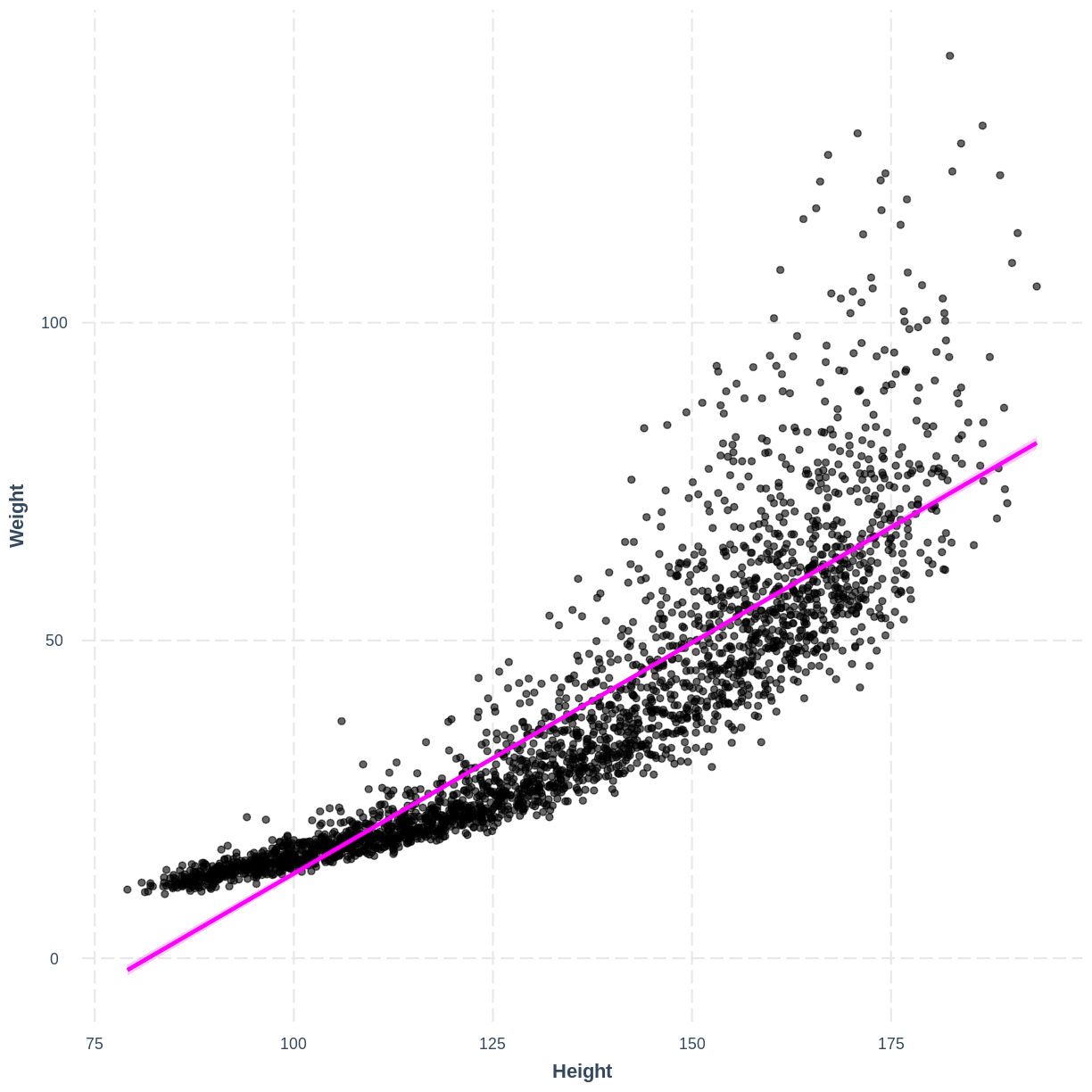
Earlier in this lesson we worked with
WeightandHeightin adults. Here, we will work with these variables in children. Firstly, fit a linear regression model of Weight (Weight) as a function of Height (Height) in children (participants below the Age (Age) of 18). Then, create an effect plot usingeffect_plot().Solution
child_Weight_Height_lm <- dat %>%
  filter(Age < 18) %>%
  lm(formula = Weight ~ Height)

effect_plot(child_Weight_Height_lm, pred = Height,
                  plot.points = TRUE, interval = TRUE,
                  line.colors = "magenta")
There is curvature in the data, which makes a straight line unsuitable.
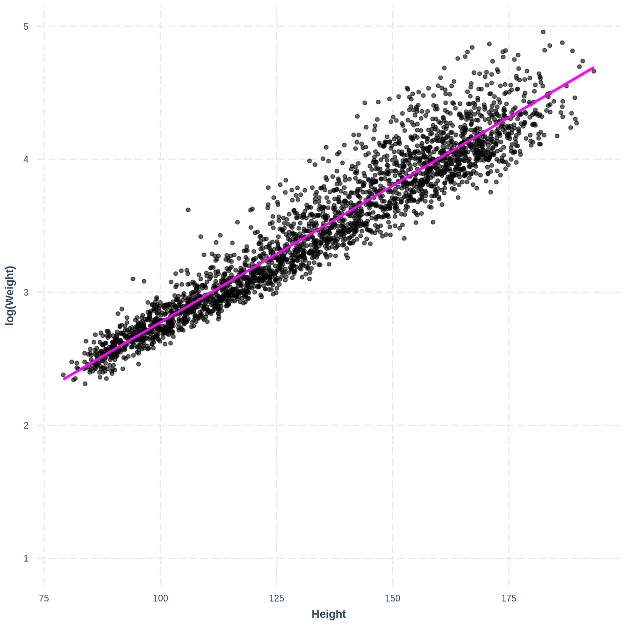
We will explore the log transformation as a potential solution. Fit a linear regression model as before, however change
Weightin thelm()command tolog(Weight). Then create aneffect_plot. Is the relationship betweenlog(Weight)andHeightdifferent from the relationship betweenWeightandHeightin children?Solution
child_logWeight_Height_lm <- dat %>%
  filter(Age < 18) %>%
  lm(formula = log(Weight) ~ Height)

effect_plot(child_logWeight_Height_lm, pred = Height,
                  plot.points = TRUE, interval = TRUE,
                  line.colors = "magenta")
The non-linear relationship has now been transformed into a more linear relationship by taking the log transformation of the response variable.
The additivity component means that the effect of any explanatory variable on the outcome variable does not depend on another explanatory variable in the model. When this assumption is violated, it can be mitigated by including an interaction term in the model. We will cover interaction terms in the multiple linear regression for public health lesson.
4. Independent errors
This assumption states that the residuals must be independent of one another. This assumption is violated when observations are not a random sample of the population, i.e. when observations are non-independent. Two common types of non-independence, and their common solutions, are:
A) Observations in our data can be grouped. For example, participants in a national health survey can be grouped by their region of residence. Therefore, observations from individuals from the same region will be non-independent. As a result, the residuals will also not be independent.
Common solution: If there are a few levels in our grouping variable (say, less than 6) then we might choose to include the grouping variable as an explanatory variable in our model. If the grouping variable has more levels, we may choose to include the variable as a random effect, a component of mixed effect models (not discussed here).
B) Our data contains repeated measurements on the same individuals. For example, we measure individual’s weights four times over the course of a year. Here our data contains four non-independent observations per individual. As a result, the residuals will also not be independent.
Common solution: This can be overcome using random effects, which are a component of mixed effects models (not discussed here).
Exercise
In which of the following scenarios would the independent errors assumption likely be violated?
A) We are modeling the effect of a fitness program on people’s fitness level. Our data consists of weekly fitness measurements on the same group of individuals.
B) We are modeling the effect of dementia prevention treatments on life expectancy, with each participant coming from one of five care homes. Our data consists of: life expectancy, whether an individual was on a dementia prevention treatment and the care home that the individual was in.
C) We are modeling the effect of income on home size in a random sample of the adult UK population.Solution
A) Since we have multiple observations per participant, our observations are not independent. We would hereby violate the independent errors assumption.
B) Our observations are non-independent because multiple individuals will have belonged to the same carehome. In this case, adding carehome to our model would allow us to overcome the violation of the independent errors assumption.
C) Since our data is a random sample, we are not violating the independent errors assumption through non-independence in our data.
5. Equal variance of errors (homoscedasticity)
This assumption states that the magnitude of variation in the residuals is not different across the expected values or any explanatory variable. In the context of this assumption, the expected values are referred to as the “fitted values” (i.e. the expected values obtained by fitting the model). Violation of this assumption can result in unreliable estimates of the standard errors of coefficients, which may impact statistical inference. Predictions from the model may become unreliable too. Transformation can sometimes be used to resolve heteroscedasticity. In other cases, weighted least squares can be used (not discussed in this lesson).
For example, we can study the relationship between the residuals and the fitted values of our Height_Weight_lm model (the adult model, fit in episode 2). We store the residuals, fitted values and explanatory variable in a tibble named residualData. The residuals are accessed using resid(), the fitted values are accessed using fitted() and the explanatory variable (Height) is accessed through the Height column of Weight_Height_lm$model.
We create a residuals vs. fitted plot named p1 and a residuals vs. explanatory variable plot named p2. In both of these plots, we add a line that approximately tracks the mean of the residuals across the fitted values and explanatory variable using geom_smooth(). The two plots are brought together into one plotting region using p1 + p2, where the + relies on the patchwork package being loaded.
Weight_Height_lm <- dat %>%
  filter(Age > 17) %>%
  lm(formula = Weight ~ Height)

residualData <- tibble(resid = resid(Weight_Height_lm),
                    fitted = fitted(Weight_Height_lm),
                    height = Weight_Height_lm$model$Height)

p1 <- ggplot(residualData, aes(x = fitted, y = resid)) +
  geom_point(alpha = 0.1) +
  geom_smooth() +
  ylab("Residual") +
  xlab("Fitted values")

p2 <- ggplot(residualData, aes(x = height, y = resid)) +
  geom_point(alpha = 0.1) +
  geom_smooth() +
  ylab("Residuals") +
  xlab("Height")

p1 + p2
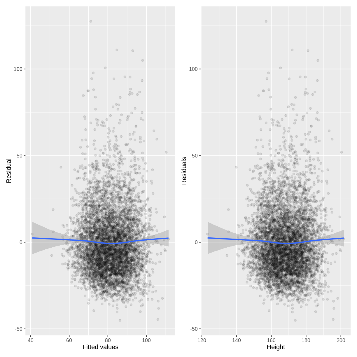
Since there is no obvious pattern in the residuals along the fitted values or the explanatory variable, there is no reason to suspect that the equal variance assumption has been violated.
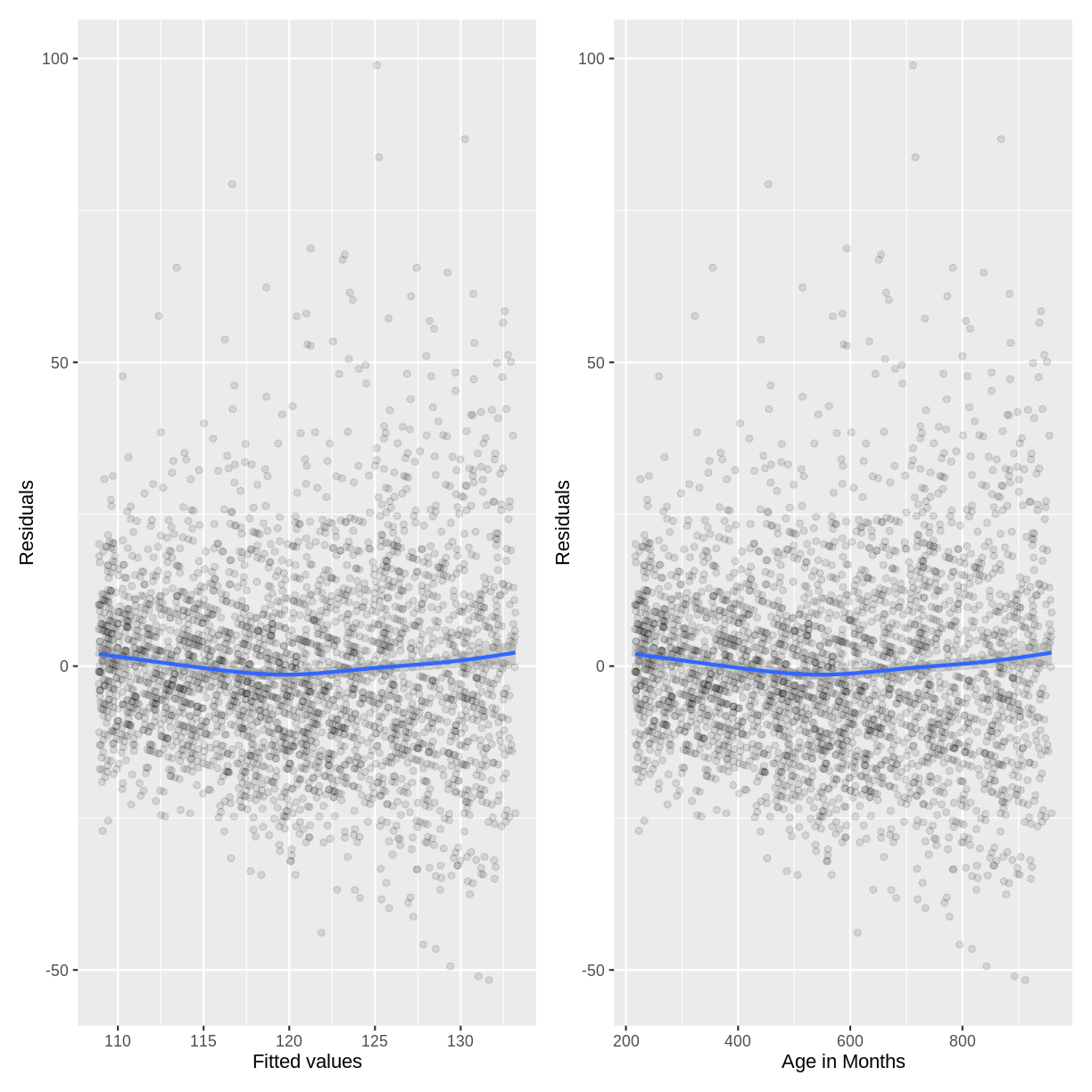
Exercise
- Create diagnistic plots to check for heteroscedasticity in our
BPSysAve_AgeMonths_lmmodel.- Do you believe the equal variance assumption has been violated?
Solution
BPSysAve_AgeMonths_lm <- dat %>%
filter(Age > 17) %>%
lm(formula = BPSysAve ~ AgeMonths)

residualData <- tibble(resid = resid(BPSysAve_AgeMonths_lm),
                    fitted = fitted(BPSysAve_AgeMonths_lm),
                    agemonths = BPSysAve_AgeMonths_lm$model$AgeMonths)

p1 <- ggplot(residualData, aes(x = fitted, y = resid)) +
  geom_point(alpha = 0.1) +
  geom_smooth() +
  ylab("Residuals") +
  xlab("Fitted values")

p2 <- ggplot(residualData, aes(x = agemonths, y = resid)) +
  geom_point(alpha = 0.1) +
  geom_smooth() +
  ylab("Residuals") +
  xlab("Age in Months")

p1 + p2
The variation in the residuals does somewhat increase with an increase in fitted values and an increase in
AgeMonths. Therefore, this model may violate the homoscedasticity assumption. Because the majority of residuals still lie in the central band, we may not worry about this violation much. However, if we wanted to resolve the increase in residuals, we may choose to add more variables to our model or to apply a Box-Cox transformation onBPSysAve.
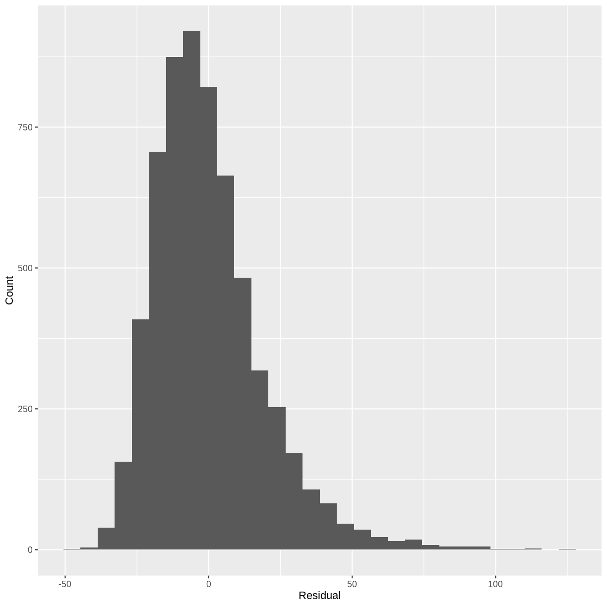
6. Normality of errors
This assumption states that the errors follow a Normal distribution. When this assumption is strongly violated, predictions of individual data points from the model are less reliable. Small deviations from normality may pose less of an issue. One way to check this assumption is to plot a histogram of the residuals and to ask whether it looks strongly non-normal (e.g. bimodal or uniform).
For example, looking at a histogram of the residuals of our Height_Weight_lm model reveals a distribution that is slightly skewed. Since this is not a strong deviation from normality, we do not have to worry about violating the assumption.
Note that if a model includes a grouping variable (e.g. a two-level categorical variable), the normality of the residuals is to be checked separately for each group. Also note that in the previous episode, we only covered prediction of the mean, not of individual data points. A deviation of the residuals from normality is usually not a concern for predictions of the mean.
residuals <- tibble(resid = resid(Weight_Height_lm))

ggplot(residuals, aes(x=resid)) +
  geom_histogram() +
  ylab("Count") +
  xlab("Residual")
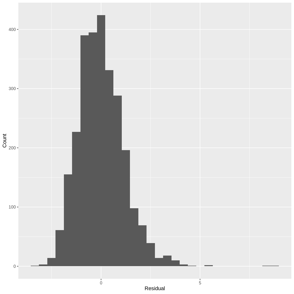
Exercise
- Construct a histogram of the residuals of the
TotChol_SmokeNow_lmmodel.- Does the distribution suggest that the normality assumption is violated?
Solution
TotChol_SmokeNow_lm <- lm(formula = TotChol ~ SmokeNow, data = dat)

residuals <- tibble(resid = resid(TotChol_SmokeNow_lm))

ggplot(residuals, aes(x=resid)) +
  geom_histogram() +
  ylab("Count") +
  xlab("Residual")
Since the distribution is only slightly skewed, we do not have to worry about violating the normality assumption.
Key Points
Assessing model fit is the process of visually checking whether the model fits the data sufficiently well.
$R^2$ quantifies the proportion of variation in the response variable explained by the explanatory variable. An $R^2$ close to 1 indicates that most variation is accounted for by the model, while an $R^2$ close to 0 indicates that the model does not perform much better than predicting the mean of the response.
The six assumptions of the simple linear regression model are validity, representativeness, linearity and additivity, independence of errors, homoscedasticity of the residuals and normality of the residuals.
We can check the assumptions of a simple linear regression model by carefully considering our research question, the data set that we are using and by visualising our model parameters.
Optional: linear regression with a multi-level factor explanatory variable
Overview
Teaching: 10 min
Exercises: 15 minQuestions
How can we explore the relationship between one continuous variable and one multi-level categorical variable prior to fitting a simple linear regression?
How can we fit a simple linear regression model with one multi-level categorical explanatory variable in R?
How can the parameters of this model be interpreted in R?
How can this model be visualised in R?
Objectives
Use the ggplot2 package to explore the relationship between a continuous variable and a factor variable with more than two levels.
Use the lm command to fit a simple linear regression with a factor explanatory variable with more than two levels.
Use the jtools package to interpret the model output.
Use the jtools and ggplot2 packages to visualise the resulting model.
In this episode we will study linear regression with one categorical variable with more than two levels. We can explore the relationship between two variables ahead of fitting a model using the ggplot2 package.
Exploring the relationship between a continuous variable and a multi-level categorical variable
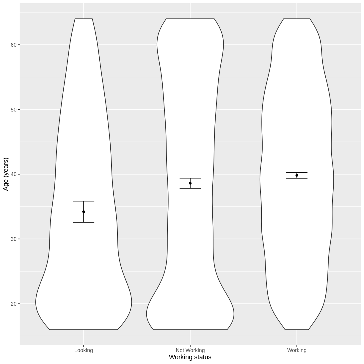
Let us take Work and Age as an example. Work describes whether someone is looking for work, not working or working. In the code below, we first subset our data for working age individuals using filter() and between(). We then initiate a plotting object using ggplot(), with the data passed on to the plot command by the pipe. We select the variables of interest inside aes(). We then create a violin plot using geom_violin. The shapes of the objects are representative of the distributions of Age in the three groups. We overlay the means and their 95% confidence intervals using stat_summary(). Finally, we change the axis labels using xlab() and ylab() and the x-axis ticks using scale_x_discrete(). This latter step ensures that the NotWorking data is labelled as Not Working, i.e. with a space.
dat %>%
  filter(between(Age, 16, 64)) %>%
  ggplot(aes(x = Work, y = Age)) +
  geom_violin() +
  stat_summary(fun = "mean", size = 0.2) +
  stat_summary(fun.data = "mean_cl_normal", geom = "errorbar", width = 0.2) +
  xlab("Working status") +
  ylab("Age (years)") +
  scale_x_discrete(labels = c('Looking','Not Working','Working'))
Exercise
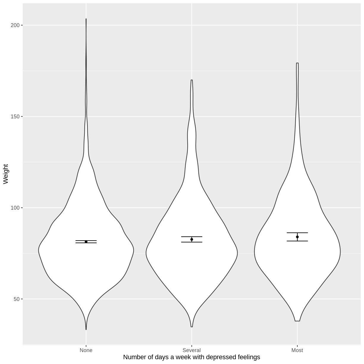
You have been asked to model the relationship between the frequency of days where individuals feel depressed and weight in the NHANES data. Use the ggplot2 package to create an exploratory plot, with NAs dropped from
Depressed, ensuring the plot includes the following elements:
- Weight (
Weight) on the y-axis and number of days with depressed feelings (Depressed) on the x-axis, from the NHANES data.- These data presented using a violin plot.
- The y-axis labelled as “Age (years)” and the x-axis labelled as “Number of days a week with depressed feelings”.
Solution
dat %>%
  drop_na(c(Depressed, Weight)) %>%
  ggplot(aes(x = Depressed, y = Weight)) +
  geom_violin() +
  stat_summary(fun = "mean", size = 0.2) +
  stat_summary(fun.data = "mean_cl_normal", geom = "errorbar", width = 0.2) +
  xlab("Number of days a week with depressed feelings") +
  ylab("Weight")
Fitting and interpreting a simple linear regression model with one multi-level categorical variable
We proceed to fit a linear regression model using the lm() command, as we did in the previous episode. The model is then interpreted using summ(). The intercept in the summ() output is the estimated mean for the baseline, i.e. for participants that are looking for work. The WorkNotWorking estimate is the estimated average difference in Age between participants that are not working and are looking for work. Similarly, the WorkWorking is the estimated average difference in Age between participants that are working and are looking for work.
Age_Work_lm <- dat %>%
  filter(between(Age, 16, 64)) %>%
  lm(formula = Age ~ Work)

summ(Age_Work_lm, confint = TRUE, digits = 3)
MODEL INFO:
Observations: 5149
Dependent Variable: Age
Type: OLS linear regression

MODEL FIT:
F(2,5146) = 21.267, p = 0.000
R² = 0.008
Adj. R² = 0.008

Standard errors: OLS
----------------------------------------------------------------
                         Est.     2.5%    97.5%   t val.       p
-------------------- -------- -------- -------- -------- -------
(Intercept)            34.208   32.519   35.897   39.702   0.000
WorkNotWorking          4.398    2.577    6.218    4.735   0.000
WorkWorking             5.620    3.859    7.380    6.258   0.000
----------------------------------------------------------------
The model can therefore be written as:
[E(Age) = 34.208 + 4.398 \times x_1 + 5.620 \times x_2,]
where $x_1 = 1$ if an individual is not working and $x_1 = 0$ otherwise. Similarly, $x_2 = 1$ if an individual is working and $x_2 = 0$ otherwise.
Exercise
- Using the
lm()command, fit a simple linear regression of Weight as a function of number of days a week feeling depressed (Depressed). Ensure that NAs are dropped fromDepressed. Name thislmobjectWeight_Depressed_lm.- Using the
summ()function from thejtoolspackage, answer the following questions:A) What average weight does the model predict, on average, for an individual who is not experiencing depressed days?
B) By how much is weight expected to change, on average, for each other level ofDepressed?
C) Given these two values and the names of the response and explanatory variables, how can the general equation $E(y) = \beta_0 + {\beta}_1 \times x_1 + {\beta}_2 \times x_2$ be adapted to represent this model?Solution
Weight_Depressed_lm <- dat %>%
  drop_na(c(Depressed)) %>%
  lm(formula = Weight ~ Depressed)

summ(Weight_Depressed_lm, confint = TRUE, digits = 3)
MODEL INFO: Observations: 5512 (61 missing obs. deleted) Dependent Variable: Weight Type: OLS linear regression MODEL FIT: F(2,5509) = 3.737, p = 0.024 R² = 0.001 Adj. R² = 0.001 Standard errors: OLS ------------------------------------------------------------------- Est. 2.5% 97.5% t val. p ---------------------- -------- -------- -------- --------- ------- (Intercept) 81.369 80.734 82.005 251.044 0.000 DepressedSeveral 1.263 -0.262 2.789 1.623 0.105 DepressedMost 2.647 0.467 4.826 2.381 0.017 -------------------------------------------------------------------A) 81.37
B) Increase by 1.26 and 2.65 for several depressed days and most depressed days, respectively.
C) $E(\text{Weight}) = 81.37 + 1.26 \times x_1 + 2.65 \times x_2$, where $x_1 = 1$ if an individual is depressed several days a week and $x_1 = 0$ otherwise. Analogously, $x_2 = 1$ if an individual is depressed most days a week and $x_2 = 0$ otherwise.
Visualising a simple linear regression model with one multi-level categorical variable
Finally, we visually inspect the parameter estimates provided by our model. Again we can use effect_plot() from the jtools package. We include jitter = c(0.3, 0) and point.alpha = 0.2 so that points are spread out horizontally and so that multiple overlayed points create a darker colour, respectively. The plot shows the mean age estimates for each level of Work, with their 95% confidence intervals. This allows us to see how different the means are predicted to be and within what range we can expect the true population means to fall.
effect_plot(Age_Work_lm, pred = Work,
            plot.points = TRUE, jitter = c(0.3, 0), point.alpha = 0.2) +
  xlab("Working status") +
  ylab("Age (years)") +
  scale_x_discrete(labels = c('Looking','Not Working','Working'))
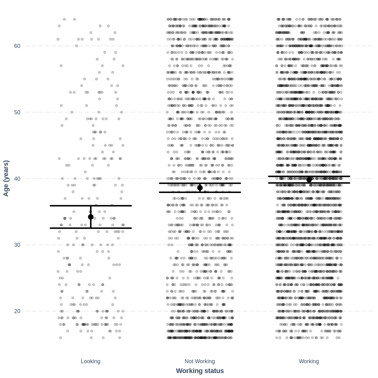
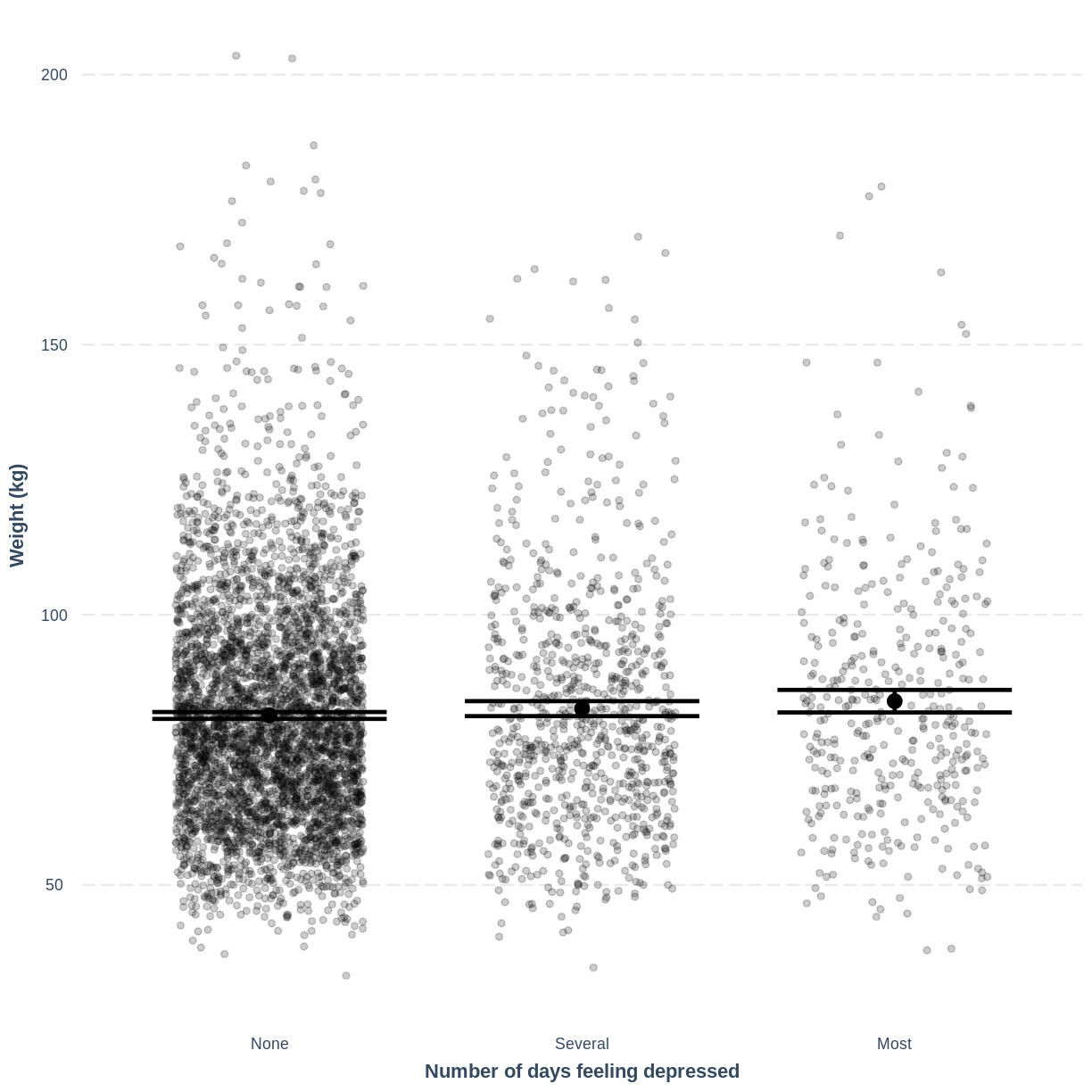
Exercise
- Use the
jtoolspackage to visualise the model ofWeightas a function ofDepressed.- Ensure that the x-axis is labelled as “Number of days feeling depressed” and the y-axis is labelled as “Weight”.
- How does this plot relate to the output given by
summ?Solution
effect_plot(Weight_Depressed_lm, pred = Depressed,
plot.points = TRUE, jitter = c(0.3, 0), point.alpha = 0.2) +
  xlab("Number of days feeling depressed") +
  ylab("Weight (kg)")
This plot shows the mean estimates for
Weightfor the three groups, alongside their 95% confidence intervals. The mean estimates are represented by theInterceptfor the non-depressed group and byIntercept+DepressedSeveralandIntercept+DepressedMostfor the other groups.
Key Points
As a first exploration of the data, construct a violin plot to describe the relationship between the two variables.
Use
lm()to fit the simple linear regression model.Use
summ()to obtain parameter estimates for the model.The intercept estimates the mean in the outcome variable for the baseline group. The other parameters estimate the differences in the means in the outcome variable between the baseline and contrast groups.
Use
effect_plot()to visualise the estimated means per group along with their 95% CIs.