Linear regression with one continuous explanatory variable
Overview
Teaching: 15 min
Exercises: 25 minQuestions
How can we assess whether simple linear regression is a suitable way to model the relationship between two continuous variables?
How can we fit a simple linear regression model with one continuous explanatory variable in R?
How can the parameters of this model be interpreted in R?
How can this model be visualised in R?
Objectives
Use the ggplot2 package to explore the relationship between two continuous variables.
Use the lm command to fit a simple linear regression with one continuous explanatory variable.
Use the jtools package to interpret the model output.
Use the jtools and ggplot2 packages to visualise the resulting model.
In this episode we will study linear regression with one continuous explanatory variable. As explained in the previous episode, the explanatory variable is required to have a linear relationship with the outcome variable. We can explore the relationship between two variables ahead of fitting a model using the ggplot2 package.
Exploring the relationship between two continuous variables
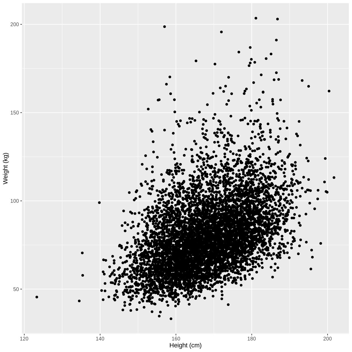
Let us take Weight and Height of adults as an example. In the code below, we select adult participants with the command filter(Age > 17). We then initiate a plotting object using ggplot(). The data is passed on to ggplot() using the pipe. We then select the variables of interest inside aes(). In the next line we create a scatterplot using geom_point(). Finally, we modify the x and y axis labels using xlab() and ylab(). Note that the warning message “Removed 320 rows containing missing values (geom_point)” means that there are participants without recorded height and/or weight data.
dat %>%
  filter(Age > 17) %>%
  ggplot(aes(x = Height, y = Weight)) +
  geom_point() +
  xlab("Height (cm)") +
  ylab("Weight (kg)")
Warning: Removed 320 rows containing missing values (geom_point).
Exercise
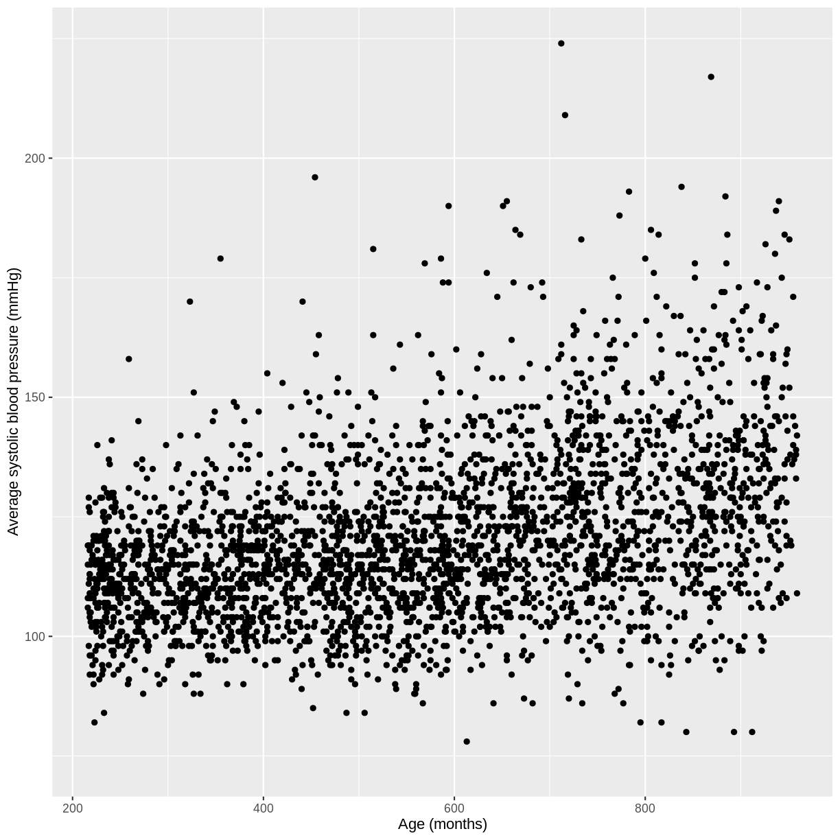
You have been asked to model the relationship between average systolic blood pressure and age in adults in the NHANES data. In order to fit a simple linear regression model, you first need to confirm that the relationship between these variables appears linear. Use the ggplot2 package to create a plot, ensuring that it includes the following elements:
- Average systolic blood pressure (
BPSysAve) on the y-axis and age (AgeMonths) on the x-axis, from the NHANES data, only including data from individuals over the age of 17.- These data are presented using a scatterplot.
- The y-axis labelled as “Average systolic blood pressure (mmHg)” and the x-axis labelled as “Age (months)”.
Solution
dat %>%
  filter(Age > 17) %>%
  ggplot(aes(x = AgeMonths, y = BPSysAve)) +
  geom_point() +
  ylab("Average systolic blood pressure (mmHg)") +
  xlab("Age (months)")
Fitting and interpreting a simple linear regression model with one continuous explanatory variable
Since there is no abnormal shape to the scatterplot (e.g. curvature or multiple clusters), we can proceed with fitting our linear regression model. First, we subset our data using filter(). We then fit the simple linear regression model with the lm() command. Within the command, the model is denoted by formula = outcome variable ~ explanatory variable.
Weight_Height_lm <- dat %>%
  filter(Age > 17) %>%
  lm(formula = Weight ~ Height)
We will interpret our results using a summary table and a plot. The summary table can be obtained using the summ() function from the jtools package. We provide the function with the name of our model (Weight_Height_lm). We can also specify that we want confidence intervals for our parameter estimates using confint = TRUE. Finally, we specify that we want estimates with three digits after the decimal point with digits = 3.
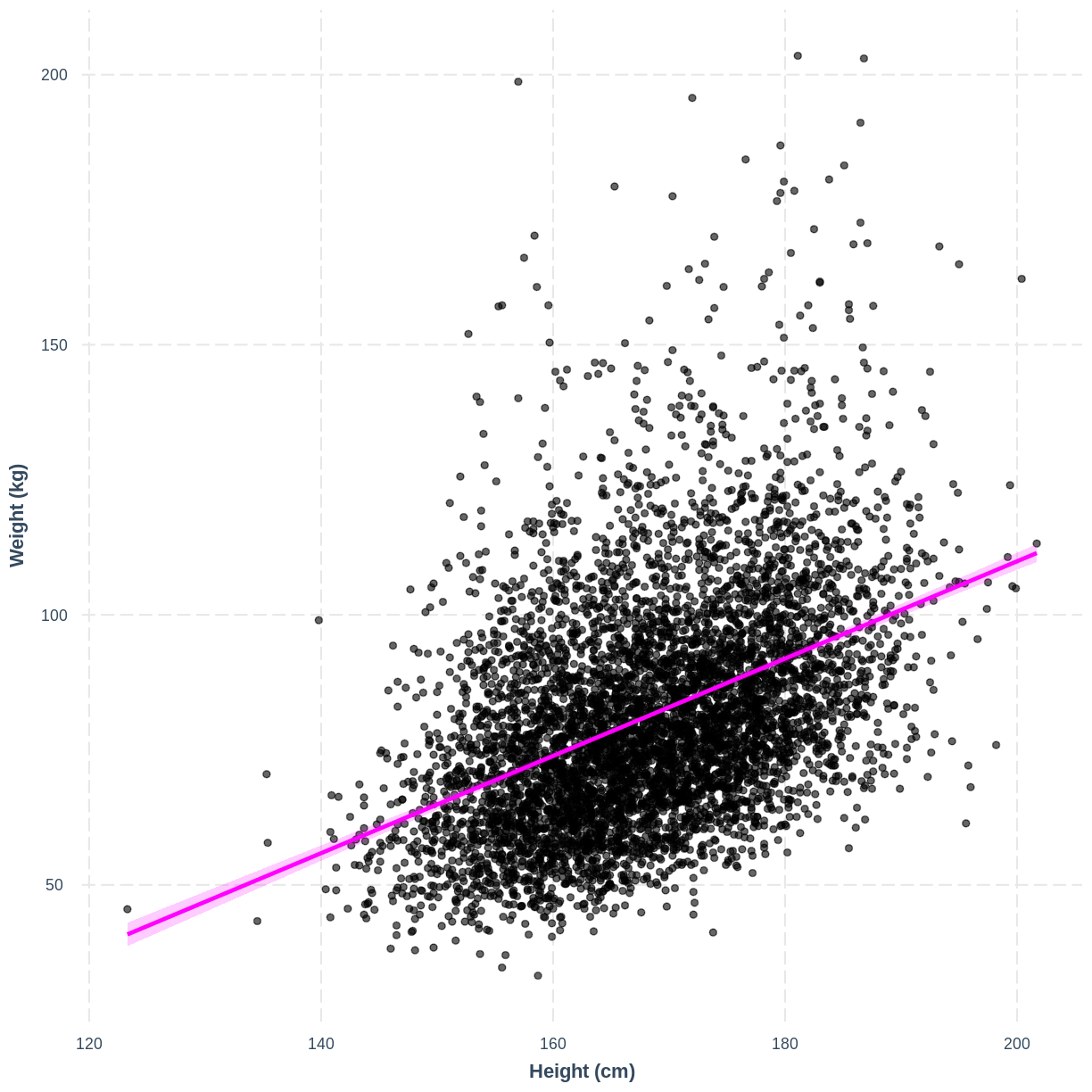
We will come to interpreting the Model Fit section in a later episode. For now, take a look at the parameter estimates at the bottom of the output. We see that the intercept (i.e. $\beta_0$) is estimated at -70.194 and the effect of Height (i.e. $\beta_1$) is estimated at 0.901. The model therefore predicts an average increase in Weight of 0.901 kg for every 1 cm increase in Height.
summ(Weight_Height_lm, confint = TRUE, digits = 3)
MODEL INFO:
Observations: 6177 (320 missing obs. deleted)
Dependent Variable: Weight
Type: OLS linear regression

MODEL FIT:
F(1,6175) = 1398.215, p = 0.000
R² = 0.185
Adj. R² = 0.184

Standard errors: OLS
-----------------------------------------------------------------
                       Est.      2.5%     97.5%    t val.       p
----------------- --------- --------- --------- --------- -------
(Intercept)         -70.194   -78.152   -62.237   -17.293   0.000
Height                0.901     0.853     0.948    37.393   0.000
-----------------------------------------------------------------
We can therefore write the formula as:
\[E(\text{Weight}) = -70.19 + 0.901 \times \text{Height}\]Interpretation of the 95% CI and p-value of
HeightIf prior to fitting our model we were interested in testing the hypotheses $H_0: \beta_1 = 0$ vs $H_1: \beta_1 \neq 0$, we could check the 95% CI for
Height. Recall that 95% of 95% CIs are expected to contain the true population mean. Since this 95% CI does not contain 0, we would be fairly confident in rejecting $H_0$ in favour of $H_1$. Alternatively, since the p-value is less than 0.05, we could reject $H_0$ on those grounds.Note that the
summ()output below showsp = 0.000. P values are never truly zero. The interpretation ofp = 0.000is therefore thatp < 0.001, as the p-value was rounded to three digits.Often the null hypothesis tested by
summ(), $H_0: \beta_1 = 0$, is not very interesting, as it is rare that we expect a variable to have an effect of 0. Therefore, it is usually not necessary to pay great attention to the p-value. On the other hand, the 95% CI can still be useful, as it provides an estimate of the uncertainty around our estimate for $\beta_1$. The narrower the 95% CI, the more certain we are that our estimate for $\beta_1$ is close to the population mean for $\beta_1$.
Exercise
Now that you have confirmed that the relationship between
BPSysAveandAgeMonthsdoes not appear to deviate from linearity in the NHANES data, you can proceed to fitting a simple linear regression model.
- Using the
lm()command, fit a simple linear regression of average systolic blood pressure (BPSysAve) as a function of age in months (AgeMonths) in adults. Name thislmobjectBPSysAve_AgeMonths_lm.- Using the
summfunction from thejtoolspackage, answer the following questions:A) What average systolic blood pressure does the model predict, on average, for an individual with an age of 0 months?
B) By how much is average systolic blood pressure expected to change, on average, for a one-unit increase in age?
C) Given these two values and the names of the response and explanatory variables, how can the general equation $E(y) = \beta_0 + {\beta}_1 \times x_1$ be adapted to represent your model?Solution
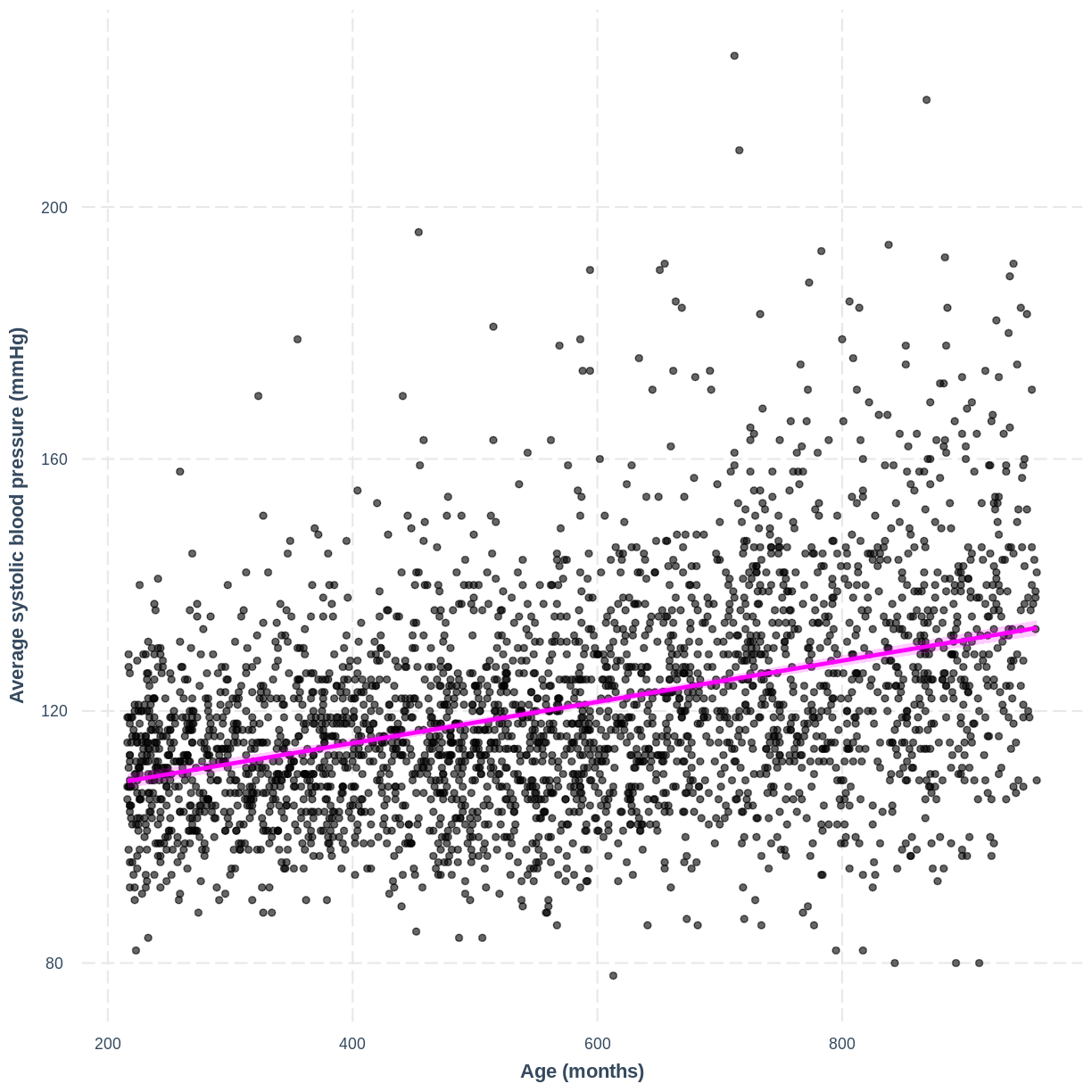
BPSysAve_AgeMonths_lm <- dat %>%
  filter(Age > 17) %>%
  lm(formula = BPSysAve ~ AgeMonths)

summ(BPSysAve_AgeMonths_lm, confint = TRUE, digits=3)
MODEL INFO: Observations: 3084 (3413 missing obs. deleted) Dependent Variable: BPSysAve Type: OLS linear regression MODEL FIT: F(1,3082) = 556.405, p = 0.000 R² = 0.153 Adj. R² = 0.153 Standard errors: OLS ----------------------------------------------------------------- Est. 2.5% 97.5% t val. p ----------------- --------- --------- --------- --------- ------- (Intercept) 101.812 100.166 103.458 121.276 0.000 AgeMonths 0.033 0.030 0.035 23.588 0.000 -----------------------------------------------------------------A) 101.8 mmHg.
B) Increase by 0.033 mmHg/month.
C) $E(\text{Average systolic blood pressure}) = 101.8 + 0.033 \times \text{Age in Months}$.
Visualising a simple linear regression model with one continuous explanatory variable
We can also interpret the model using a line overlayed onto the previous scatterplot. We can obtain such a plot using effect_plot() from the jtools package. We provide the name of our model, followed by a specification of the explanatory variable of interest with pred = Height. Our current model has one explanatory variable, but in later lessons we will work with multiple explanatory variables so this option will be more useful. We also include a confidence interval around our line using interval = TRUE and include the original data using plot.points = TRUE. Finally, we specify a red colour for our line using colors = "red". As before, we can edit the x and y axis labels.
effect_plot(Weight_Height_lm, pred = Height, plot.points = TRUE,
            interval = TRUE, line.colors = "magenta") +
  xlab("Height (cm)") +
  ylab("Weight (kg)")
Exercise
You have been asked to report on your simple linear regression model, examining systolic blood pressure and age, at the next lab meeting. To help your colleagues interpret the model, you decide to produce a figure. Make this figure using the jtools package. Ensure that the x and y axes are correctly labelled.
Solution
effect_plot(BPSysAve_AgeMonths_lm, pred = AgeMonths, plot.points = TRUE,
            interval = TRUE, line.colors = "magenta") +
  xlab("Age (months)") +
  ylab("Average systolic blood pressure (mmHg)")
Key Points
As a first check of suitability, examine the relationship between the continuous variables using a scatterplot.
Use
lm()to fit a simple linear regression model.Use
summ()to obtain parameter estimates for the model.Use
effect_plot()to visualise the model.