Optional: linear regression with a multi-level factor explanatory variable
Overview
Teaching: 10 min
Exercises: 15 minQuestions
How can we explore the relationship between one continuous variable and one multi-level categorical variable prior to fitting a simple linear regression?
How can we fit a simple linear regression model with one multi-level categorical explanatory variable in R?
How can the parameters of this model be interpreted in R?
How can this model be visualised in R?
Objectives
Use the ggplot2 package to explore the relationship between a continuous variable and a factor variable with more than two levels.
Use the lm command to fit a simple linear regression with a factor explanatory variable with more than two levels.
Use the jtools package to interpret the model output.
Use the jtools and ggplot2 packages to visualise the resulting model.
In this episode we will study linear regression with one categorical variable with more than two levels. We can explore the relationship between two variables ahead of fitting a model using the ggplot2 package.
Exploring the relationship between a continuous variable and a multi-level categorical variable
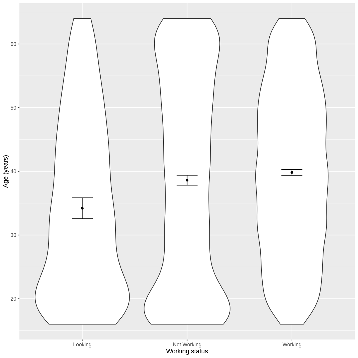
Let us take Work and Age as an example. Work describes whether someone is looking for work, not working or working. In the code below, we first subset our data for working age individuals using filter() and between(). We then initiate a plotting object using ggplot(), with the data passed on to the plot command by the pipe. We select the variables of interest inside aes(). We then create a violin plot using geom_violin. The shapes of the objects are representative of the distributions of Age in the three groups. We overlay the means and their 95% confidence intervals using stat_summary(). Finally, we change the axis labels using xlab() and ylab() and the x-axis ticks using scale_x_discrete(). This latter step ensures that the NotWorking data is labelled as Not Working, i.e. with a space.
dat %>%
  filter(between(Age, 16, 64)) %>%
  ggplot(aes(x = Work, y = Age)) +
  geom_violin() +
  stat_summary(fun = "mean", size = 0.2) +
  stat_summary(fun.data = "mean_cl_normal", geom = "errorbar", width = 0.2) +
  xlab("Working status") +
  ylab("Age (years)") +
  scale_x_discrete(labels = c('Looking','Not Working','Working'))
Exercise
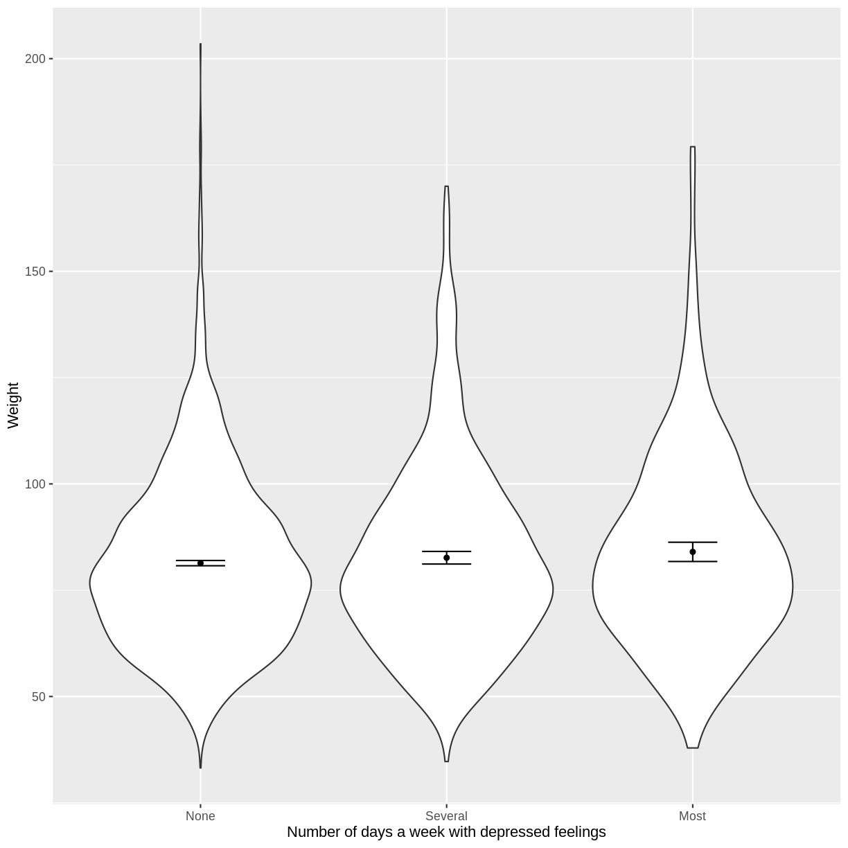
You have been asked to model the relationship between the frequency of days where individuals feel depressed and weight in the NHANES data. Use the ggplot2 package to create an exploratory plot, with NAs dropped from
Depressed, ensuring the plot includes the following elements:
- Weight (
Weight) on the y-axis and number of days with depressed feelings (Depressed) on the x-axis, from the NHANES data.- These data presented using a violin plot.
- The y-axis labelled as “Age (years)” and the x-axis labelled as “Number of days a week with depressed feelings”.
Solution
dat %>%
  drop_na(c(Depressed, Weight)) %>%
  ggplot(aes(x = Depressed, y = Weight)) +
  geom_violin() +
  stat_summary(fun = "mean", size = 0.2) +
  stat_summary(fun.data = "mean_cl_normal", geom = "errorbar", width = 0.2) +
  xlab("Number of days a week with depressed feelings") +
  ylab("Weight")
Fitting and interpreting a simple linear regression model with one multi-level categorical variable
We proceed to fit a linear regression model using the lm() command, as we did in the previous episode. The model is then interpreted using summ(). The intercept in the summ() output is the estimated mean for the baseline, i.e. for participants that are looking for work. The WorkNotWorking estimate is the estimated average difference in Age between participants that are not working and are looking for work. Similarly, the WorkWorking is the estimated average difference in Age between participants that are working and are looking for work.
Age_Work_lm <- dat %>%
  filter(between(Age, 16, 64)) %>%
  lm(formula = Age ~ Work)

summ(Age_Work_lm, confint = TRUE, digits = 3)
MODEL INFO:
Observations: 5149
Dependent Variable: Age
Type: OLS linear regression

MODEL FIT:
F(2,5146) = 21.267, p = 0.000
R² = 0.008
Adj. R² = 0.008

Standard errors: OLS
----------------------------------------------------------------
                         Est.     2.5%    97.5%   t val.       p
-------------------- -------- -------- -------- -------- -------
(Intercept)            34.208   32.519   35.897   39.702   0.000
WorkNotWorking          4.398    2.577    6.218    4.735   0.000
WorkWorking             5.620    3.859    7.380    6.258   0.000
----------------------------------------------------------------
The model can therefore be written as:
\[E(Age) = 34.208 + 4.398 \times x_1 + 5.620 \times x_2,\]where $x_1 = 1$ if an individual is not working and $x_1 = 0$ otherwise. Similarly, $x_2 = 1$ if an individual is working and $x_2 = 0$ otherwise.
Exercise
- Using the
lm()command, fit a simple linear regression of Weight as a function of number of days a week feeling depressed (Depressed). Ensure that NAs are dropped fromDepressed. Name thislmobjectWeight_Depressed_lm.- Using the
summ()function from thejtoolspackage, answer the following questions:A) What average weight does the model predict, on average, for an individual who is not experiencing depressed days?
B) By how much is weight expected to change, on average, for each other level ofDepressed?
C) Given these two values and the names of the response and explanatory variables, how can the general equation $E(y) = \beta_0 + {\beta}_1 \times x_1 + {\beta}_2 \times x_2$ be adapted to represent this model?Solution
Weight_Depressed_lm <- dat %>%
  drop_na(c(Depressed)) %>%
  lm(formula = Weight ~ Depressed)

summ(Weight_Depressed_lm, confint = TRUE, digits = 3)
MODEL INFO: Observations: 5512 (61 missing obs. deleted) Dependent Variable: Weight Type: OLS linear regression MODEL FIT: F(2,5509) = 3.737, p = 0.024 R² = 0.001 Adj. R² = 0.001 Standard errors: OLS ------------------------------------------------------------------- Est. 2.5% 97.5% t val. p ---------------------- -------- -------- -------- --------- ------- (Intercept) 81.369 80.734 82.005 251.044 0.000 DepressedSeveral 1.263 -0.262 2.789 1.623 0.105 DepressedMost 2.647 0.467 4.826 2.381 0.017 -------------------------------------------------------------------A) 81.37
B) Increase by 1.26 and 2.65 for several depressed days and most depressed days, respectively.
C) $E(\text{Weight}) = 81.37 + 1.26 \times x_1 + 2.65 \times x_2$, where $x_1 = 1$ if an individual is depressed several days a week and $x_1 = 0$ otherwise. Analogously, $x_2 = 1$ if an individual is depressed most days a week and $x_2 = 0$ otherwise.
Visualising a simple linear regression model with one multi-level categorical variable
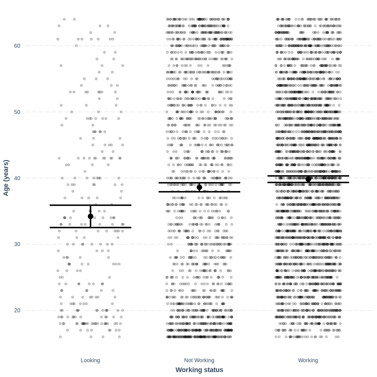
Finally, we visually inspect the parameter estimates provided by our model. Again we can use effect_plot() from the jtools package. We include jitter = c(0.3, 0) and point.alpha = 0.2 so that points are spread out horizontally and so that multiple overlayed points create a darker colour, respectively. The plot shows the mean age estimates for each level of Work, with their 95% confidence intervals. This allows us to see how different the means are predicted to be and within what range we can expect the true population means to fall.
effect_plot(Age_Work_lm, pred = Work,
            plot.points = TRUE, jitter = c(0.3, 0), point.alpha = 0.2) +
  xlab("Working status") +
  ylab("Age (years)") +
  scale_x_discrete(labels = c('Looking','Not Working','Working'))
Exercise
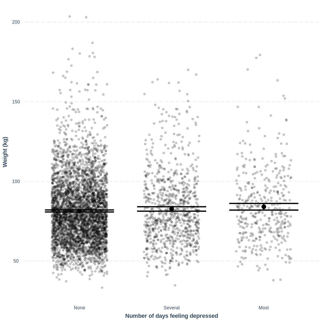
- Use the
jtoolspackage to visualise the model ofWeightas a function ofDepressed.- Ensure that the x-axis is labelled as “Number of days feeling depressed” and the y-axis is labelled as “Weight”.
- How does this plot relate to the output given by
summ?Solution
effect_plot(Weight_Depressed_lm, pred = Depressed,
plot.points = TRUE, jitter = c(0.3, 0), point.alpha = 0.2) +
  xlab("Number of days feeling depressed") +
  ylab("Weight (kg)")
This plot shows the mean estimates for
Weightfor the three groups, alongside their 95% confidence intervals. The mean estimates are represented by theInterceptfor the non-depressed group and byIntercept+DepressedSeveralandIntercept+DepressedMostfor the other groups.
Key Points
As a first exploration of the data, construct a violin plot to describe the relationship between the two variables.
Use
lm()to fit the simple linear regression model.Use
summ()to obtain parameter estimates for the model.The intercept estimates the mean in the outcome variable for the baseline group. The other parameters estimate the differences in the means in the outcome variable between the baseline and contrast groups.
Use
effect_plot()to visualise the estimated means per group along with their 95% CIs.