Linear regression with a two-level factor explanatory variable
Overview
Teaching: 15 min
Exercises: 25 minQuestions
How can we explore the relationship between one continuous variable and one categorical variable with two groups prior to fitting a simple linear regression?
How can we fit a simple linear regression model with one two-level categorical explanatory variable in R?
How does the use of the simple linear regression equation differ between the continuous and categorical explanatory variable cases?
How can the parameters of this model be interpreted in R?
How can this model be visualised in R?
Objectives
Use the ggplot2 package to explore the relationship between a continuous variable and a two-level factor variable.
Use the lm command to fit a simple linear regression with a two-level factor explanatory variable.
Distinguish between the baseline and contrast levels of the categorical variable.
Use the jtools package to interpret the model output.
Use the jtools and ggplot2 packages to visualise the resulting model.
In this episode we will study linear regression with one two-level categorical variable. We can explore the relationship between two variables ahead of fitting a model using the ggplot2 package.
Exploring the relationship between a continuous variable and a two-level categorical variable
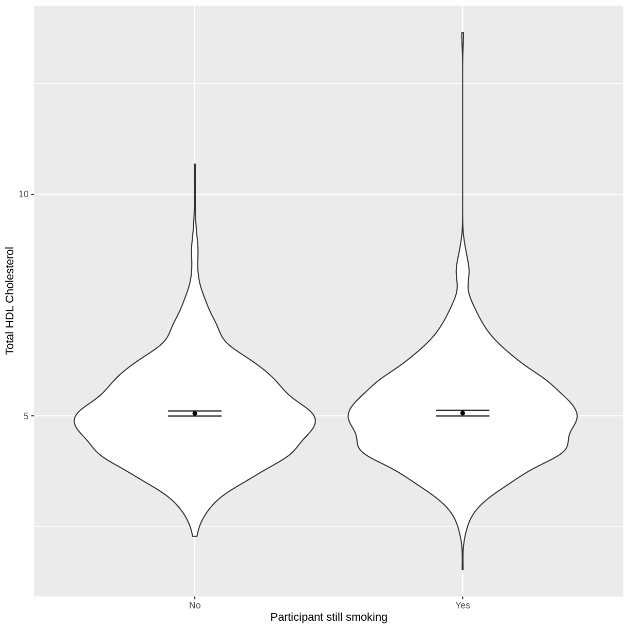
Let us take SmokeNow and TotChol as an example. SmokeNow describes whether someone who has smoked > 100 cigarettes in their life is currently smoking. TotChol describes the total HDL cholesterol in someone’s blood. In the code below, we first remove rows with missing values using drop_na() from the tidyr package. We then initiate a plotting object using ggplot. We select the variables of interest inside aes(). We then make a violin plot using geom_violin. The shapes of the objects are representative of the distributions of TotChol in the two groups. We overlay the means and their 95% confidence intervals using stat_summary(). Finally, we change the axis labels using xlab() and ylab().
dat %>%
  drop_na(c(SmokeNow, TotChol)) %>%
  ggplot(aes(x = SmokeNow, y = TotChol)) +
  geom_violin() +
  stat_summary(fun = "mean", size = 0.2) +
  stat_summary(fun.data = "mean_cl_normal", geom = "errorbar", width = 0.2) +
  xlab("Participant still smoking") +
  ylab("Total HDL Cholesterol")
Notes on the
funandfun.dataarguments instat_summary()The
funandfun.dataarguments both apply statistical operations to data but do slightly different things.funtakes data as vectors and will return single values for each these vectors. In the above example, we calculate the mean for each vector (eachSmokeNowgroup).fun.dataexpects a dataset (which may be a simple vector) and provides three values for each dataset:y,yminandymax. In our case, ymin is lower bound of the confidence interval and ymax is the upper bound of the confidence interval.
Exercise
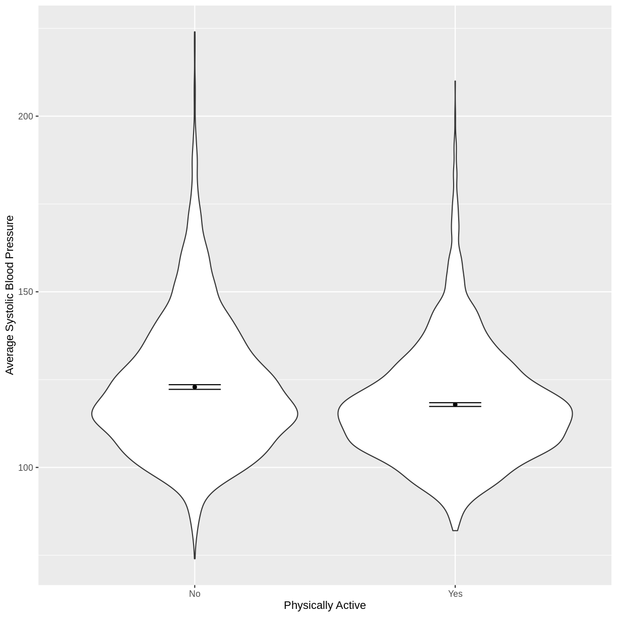
You have been asked to model the relationship between average systolic blood pressure and physical activity in the NHANES data. Use the ggplot2 package to create an exploratory plot, ensuring that it includes the following elements:
- Average systolic blood pressure (
BPSysAve) on the y-axis and physical activity (PhysActive) on the x-axis, from the NHANES data.- These data presented using a violin plot.
- The y-axis labelled as “Average Systolic Blood Pressure” and the x-axis labelled as “Physically Active”.
Solution
dat %>%
  drop_na(c(PhysActive, BPSysAve)) %>%
  ggplot(aes(x = PhysActive, y = BPSysAve)) +
  geom_violin() +
  stat_summary(fun = "mean", size = 0.2) +
  stat_summary(fun.data = "mean_cl_normal", geom = "errorbar", width = 0.2) +
  xlab("Physically Active") +
  ylab("Average Systolic Blood Pressure")
Fitting and interpreting a simple linear regression model with one two-level categorical variable
We proceed to fit a linear regression model using the lm() command, as we did in the previous episode. The model is then interpreted using summ().
Note that even though we are using the same equation of the simple linear regression model ($E(y) = \beta_0 + \beta_1 \times x_1$), our interpretation of the summ() output differs slightly from our interpretation in the previous episode. Recall that our categorical explanatory variable has two levels, "No" and "Yes". One of these is taken by the model as the baseline ("No"), the other as the contrast ("Yes"). The first level alphabetically is chosen by R as the baseline, unless specified otherwise.
The intercept in the summ() output is the estimated mean for the baseline, i.e. for participants that stopped smoking. The SmokeNowYes estimate is the estimated average difference in TotChol between participants that stopped smoking and participants that did not stop smoking. We can therefore write the equation for this model as:
\(E(\text{Total HDL cholesterol}) = 5.053 + 0.008 \times x_1\),
where $x_1 = 1$ if a participant has continued to smoke and 0 otherwise (i.e. the participant stopped smoking).
TotChol_SmokeNow_lm <- dat %>%
  lm(formula = TotChol ~ SmokeNow)

summ(TotChol_SmokeNow_lm, confint = TRUE, digits = 3)
MODEL INFO:
Observations: 2741 (7259 missing obs. deleted)
Dependent Variable: TotChol
Type: OLS linear regression

MODEL FIT:
F(1,2739) = 0.031, p = 0.861
R² = 0.000
Adj. R² = -0.000

Standard errors: OLS
------------------------------------------------------------
                     Est.     2.5%   97.5%    t val.       p
----------------- ------- -------- ------- --------- -------
(Intercept)         5.053    4.995   5.111   170.707   0.000
SmokeNowYes         0.008   -0.078   0.094     0.175   0.861
------------------------------------------------------------
Exercise
- Using the
lm()command, fit a simple linear regression of average systolic blood pressure (BPSysAve)
as a function of physical activity (PhysActive). Name thislmobjectBPSysAve_PhysActive_lm.- Using the
summ()function from thejtoolspackage, answer the following questions:A) What average systolic blood pressure does the model predict, on average, for an individual who is not physically active?
B) By how much is average systolic blood pressure expected to change, on average, for a physically active individual?
C) Given these two values and the names of the response and explanatory variables, how can the general equation $E(y) = \beta_0 + {\beta}_1 \times x_1$ be adapted to represent this model?Solution
BPSysAve_PhysActive_lm <- dat %>%
  lm(formula = BPSysAve ~ PhysActive)

summ(BPSysAve_PhysActive_lm, confint = TRUE, digits = 3)
MODEL INFO: Observations: 6781 (3219 missing obs. deleted) Dependent Variable: BPSysAve Type: OLS linear regression MODEL FIT: F(1,6779) = 133.611, p = 0.000 R² = 0.019 Adj. R² = 0.019 Standard errors: OLS ------------------------------------------------------------------- Est. 2.5% 97.5% t val. p ------------------- --------- --------- --------- --------- ------- (Intercept) 122.892 122.275 123.509 390.285 0.000 PhysActiveYes -5.002 -5.851 -4.154 -11.559 0.000 -------------------------------------------------------------------A) 122.892 mmHg
B) Decrease by 5.002 mmHg
C) $E(\text{BPSysAve}) = 122.892 - 5.002 \times x_1$, where $x_1 = 0$ if an individual is not physically active and $x_1 = 1$ if an individual is physically active.
Visualising a simple linear regression model with one two-level categorical explanatory variable
Finally, we visually inspect the parameter estimates provided by our model. Again we can use effect_plot() from the jtools package. We include jitter = c(0.3, 0) and point.alpha = 0.2 so that points are spread out HORIZONTALLY and so that multiple overlayed points create a darker colour, respectively. The resulting plot differs from the scatterplot obtained in the previous episode. Here, the plot shows the mean Total HDL Cholesterol estimates for each level of SmokeNow, with their 95% confidence intervals. This allows us to see how different the means are predicted to be and within what range we can expect the true population means to fall.
effect_plot(TotChol_SmokeNow_lm, pred = SmokeNow,
            plot.points = TRUE, jitter = c(0.3, 0), point.alpha = 0.2) +
  xlab("Participant still smoking") +
  ylab("Total HDL Cholesterol")
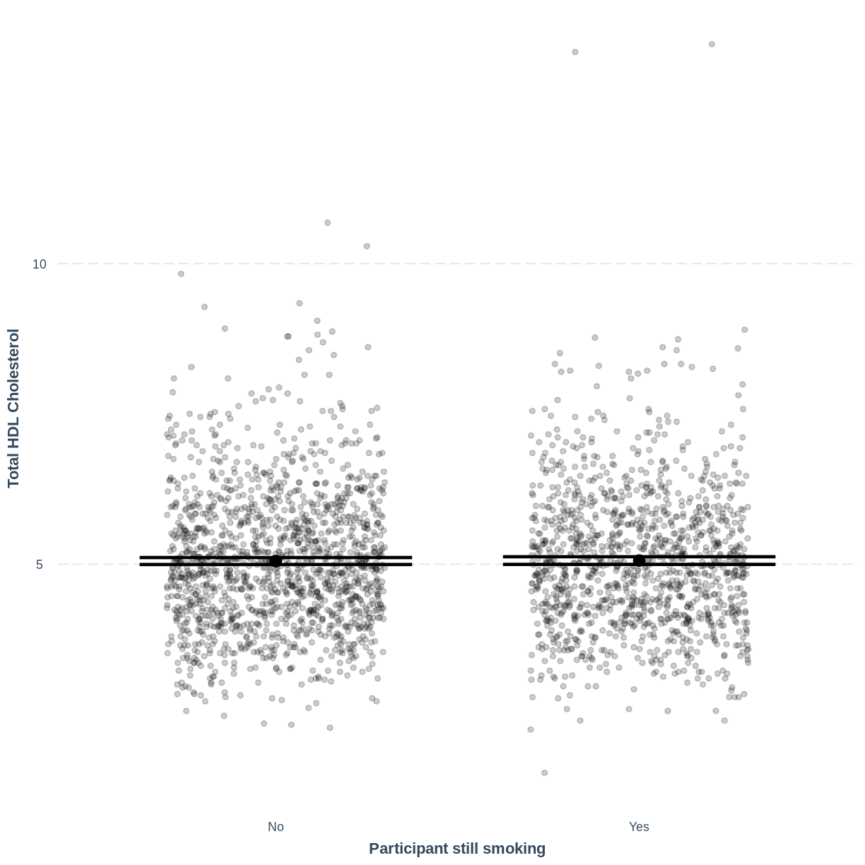
Notes on
jitterandpoint.alphaIncluding
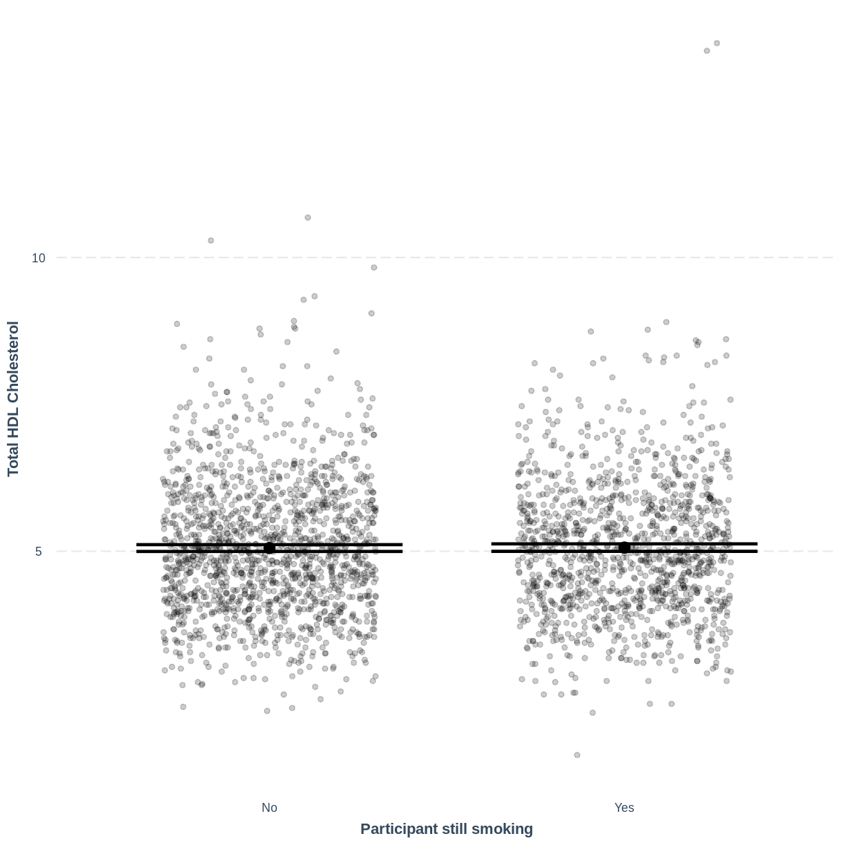
jitter = c(0.3, 0)results in points being randomly jittered horizontally. Therefore, your plot will differ slightly from the one shown above. Re-running the code will also give a slightly different jitter. If you would want to fix thejitterto one randomisation, you could run aset.seed()command ahead ofeffect_plot.set.seed()takes one positive value, which specifies the randomisation. This can be any positive value. For example, if you run the code below, your jitter will match the one shown on this page:set.seed(20) #fix the jitter to a particular pattern effect_plot(TotChol_SmokeNow_lm, pred = SmokeNow, plot.points = TRUE, jitter = c(0.3, 0), point.alpha = 0.2) + xlab("Participant still smoking") + ylab("Total HDL Cholesterol")
Including
point.alpha = 0.2introduces opacity into the plotted points. As a result, if many points are plotted on top of each other, this area shows up with darker dots. Including opacity allows us to see where many of the points lie, which is handy with big public health data sets.
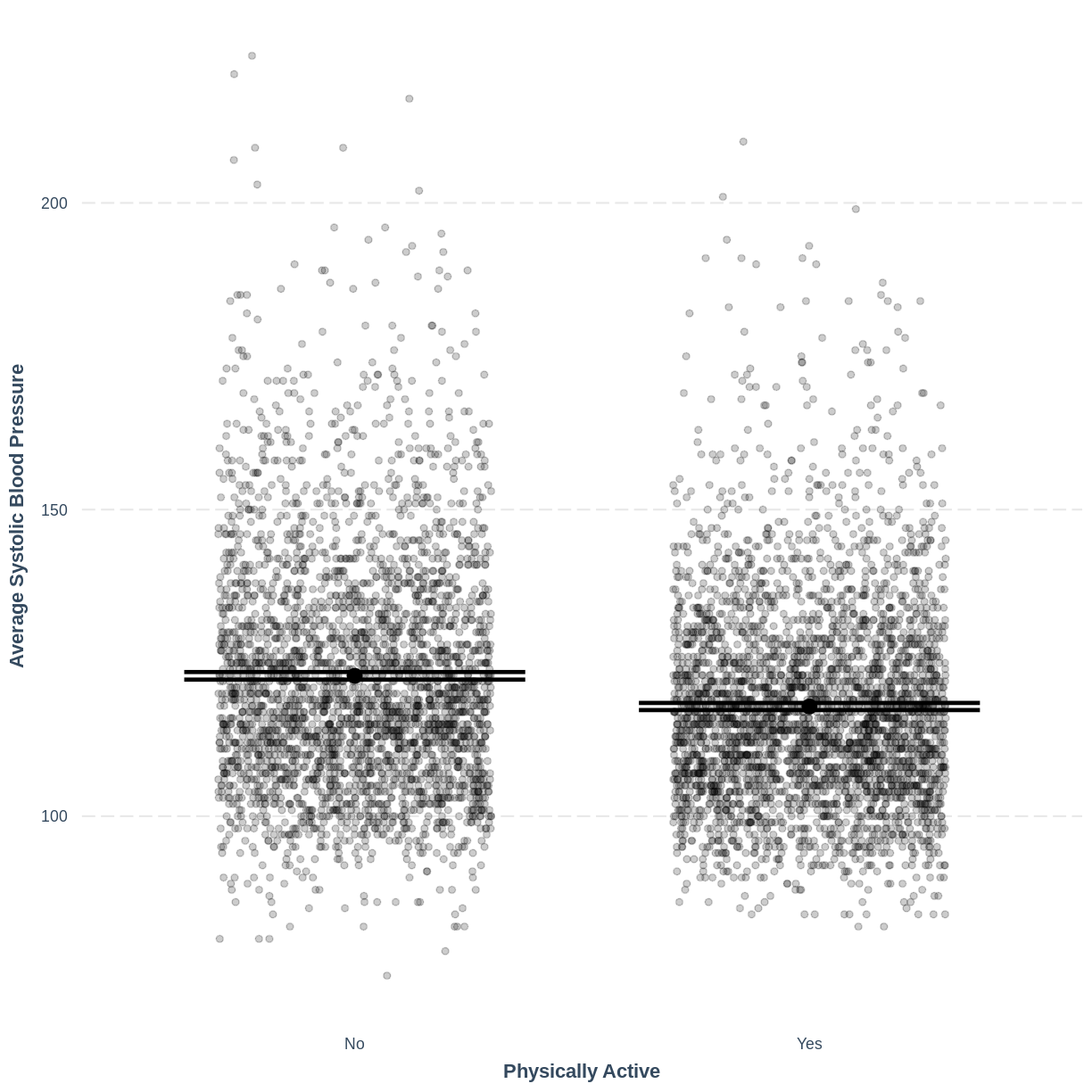
Exercise
Use the
jtoolspackage to visualise the model ofBPSysAveas a function ofPhysActive.
Ensure that the x-axis is labelled as “Physically active” and the y-axis is labelled as “Average Systolic Blood Pressure”. How does this plot relate to the output given bysumm?Solution
effect_plot(BPSysAve_PhysActive_lm, pred = PhysActive,
plot.points = TRUE, jitter = c(0.3, 0), point.alpha = 0.2) +
  xlab("Physically Active") +
  ylab("Average Systolic Blood Pressure")
This plot shows the mean estimates for
BPSysAvefor the two groups, alongside their 95% confidence intervals. The mean estimates are represented by theInterceptfor the non-physically active group and byIntercept+PhysActiveYesfor the physically active group.
Key Points
As a first exploration of the data, construct a violin plot describing the relationship between the two variables.
Use
lm()to fit a simple linear regression model.Use
summ()to obtain parameter estimates for the model.The intercept estimates the mean in the outcome variable for the baseline group. The other parameter estimates the difference in the means in the outcome variable between the baseline and contrast group.
Use
effect_plot()to visualise the estimated means per group along with their 95% CIs.