Introduction
Overview
Teaching: 20 min
Exercises: 10 minQuestions
What is machine learning?
What is the relationship between machine learning, AI, and statistics?
What is meant by supervised learning?
Objectives
Recognise what is meant by machine learning.
Have an appreciation of the difference between supervised and unsupervised learning.
Rule-based programming
We are all familiar with the idea of applying rules to data to gain insights and make decisions. For example, we learn that human body temperature is ~37 °C (~98.5 °F), and that higher or lower temperatures can be cause for concern.
As programmers we understand how to codify these rules. If we were developing software for a hospital to flag patients at risk of deterioration, we might create early-warning rules such as those below:
def has_fever(temp_c):
    if temp_c > 38:
        return True
    else:
        return False
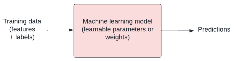
Machine learning
With machine learning, we modify this approach. Instead, we give data and insights to a framework (or “model”) that can learn the rules for itself. As the volume and complexity of data increases, so does the value of having models that can generate new rules.
In a 2018 paper entitled “Scalable and accurate deep learning with electronic health records”, Rajkomar and colleagues present their work to develop a “deep learning model” (a type of machine learning model) for predicting hospital mortality. A segment of the paper’s introduction is reproduced below:
In spite of the richness and potential of available data [in healthcare], scaling the development of predictive models is difficult because, for traditional predictive modeling techniques, each outcome to be predicted requires the creation of a custom dataset with specific variables. It is widely held that 80% of the effort in an analytic model is preprocessing, merging, customizing, and cleaning datasets not analyzing them for insights. This profoundly limits the scalability of predictive models.
Another challenge is that the number of potential predictor variables in the electronic health record (EHR) may easily number in the thousands, particularly if free-text notes from doctors, nurses, and other providers are included. Traditional modeling approaches have dealt with this complexity simply by choosing a very limited number of commonly collected variables to consider.
… Recent developments in deep learning and artificial neural networks may allow us to address many of these challenges and unlock the information in the EHR. … These systems are known for their ability to handle large volumes of relatively messy data, including errors in labels and large numbers of input variables. A key advantage is that investigators do not generally need to specify which potential predictor variables to consider and in what combinations; instead neural networks are able to learn representations of the key factors and interactions from the data itself.
Exercise
A) What is the most time consuming aspect of developing a predictive model, according to the authors?
B) How have “traditional” predictive models dealt with high numbers of predictor variables, according to the authors?Solution
A) 80% of effort in building models is in “preprocessing, merging, customizing, and cleaning”.
B) Traditional modeling approaches have dealt with complexity by choosing a very limited number of variables to consider.
These paragraphs provide an example of how machine learning can help us with tasks like prediction. They also touch on an area where machine learning projects often comes under criticism. It is easy to throw tools at a problem without sufficient thought!
Statistics, machine learning, and “AI”
There are ongoing and often polarised debates about the relationship between statistics, machine learning, and “A.I”. There are also plenty of familiar jokes and memes like this one by sandserifcomics.

Keeping out of the fight, a slightly hand-wavy, non-controversial take might be:
- Statistics: A well-established field of mathematics concerned with methods for collecting, analyzing, interpreting and presenting empirical data.
- Machine learning: A set of computational methods that learn rules from data, often with the goal of prediction. Borrows from other disciplines, notably statistics and computer science.
- Deep learning: A subfield of machine learning that focuses on more complex “artificial neural network” algorithms.
- Artificial intelligence: The goal of conferring human-like intelligence to machines. “A.I.” has become popularly used as a synonym for machine learning, so researchers working on the goal of intelligent machines have taken to using “Artificial General Intelligence” (A.G.I.) for clarity.
Supervised vs unsupervised learning
Over the course of four half-day lessons, we will explore key concepts in machine learning. In this introductory lesson we develop and evaluate a simple predictive model, touching on some of the core concepts and techniques that we come across in machine learning projects.
Our goal will be to become familiar with the kind of language used in papers such as “Scalable and accurate deep learning with electronic health records” by Rajkomar and colleagues.
Our focus will be on supervised machine learning, a category of machine learning that involves the use of labelled datasets to train models for classification and prediction. Supervised machine learning can be contrasted to unsupervised machine learning, which attempts to identify meaningful patterns within unlabelled datasets.
In later lessons, we take a deeper dive into two popular families of machine learning models - decision trees and artificial neural networks. We then explore what it means to be a responsible practitioner of machine learning.
Exercise
A) We have laboratory test data on patients admitted to a critical care unit and we are trying to identify patients with an emerging, rare disease. There are no labels to indicate which patients have the disease, but we believe that the infected patients will have very distinct characteristics. Do we look for a supervised or unsupervised machine learning approach?
B) We would like to predict whether or not patients will respond to a new drug that is under development based on several genetic markers. We have a large corpus of clinical trial data that includes both genetic markers of patients and their response the new drug. Do we use a supervised or unsupervised approach?Solution
A) The prediction targets are not labelled, so an unsupervised learning approach would be appropriate. Our hope is that we will see a unique cluster in the data that pertains to the emerging disease.
B) We have both genetic markers and known outcomes, so in this case supervised learning is appropriate.
Key Points
Machine learning borrows heavily from fields such as statistics and computer science.
In machine learning, models learn rules from data.
In supervised learning, the target in our training data is labelled.
A.I. has become a synonym for machine learning.
A.G.I. is the loftier goal of achieving human-like intelligence.
Data preparation
Overview
Teaching: 20 min
Exercises: 10 minQuestions
Why are some common steps in data preparation?
What is SQL and why is it often needed?
What do we partition data at the start of a project?
What is the purpose of setting a random state when partitioning?
Should we impute missing values before or after partitioning?
Objectives
Explore characteristics of our dataset.
Partition data into training and test sets.
Encode categorical values.
Use scaling to pre-process features.
Sourcing and accessing data
Machine learning helps us to find patterns in data, so sourcing and understanding data is key. Unsuitable or poorly managed data will lead to a poor project outcome, regardless of the modelling approach.
We will be using an open access subset of the eICU Collaborative Research Database, a publicly available dataset comprising deidentified physiological data collected from critically ill patients. For simplicity, we will be working with a pre-prepared CSV file that comprises data extracted from a demo version of the dataset.
Let’s begin by loading this data:
import pandas as pd

# load the data
cohort = pd.read_csv('./eicu_cohort.csv')
cohort.head()
Learning to extract data from sources such as databases and file systems is a key skill in machine learning. Familiarity with Python and Structured Query Language (SQL) will equip you well for these tasks. For reference, the query used to extract the dataset is outlined below. Briefly, this query:
SELECTsmultiple columnsFROMthepatient,apachepatientresult, andapacheapsvartablesWHEREcertain conditions are met.
SELECT p.gender, SAFE_CAST(p.age as int64) as age, p.admissionweight,
       a.unabridgedhosplos, a.acutephysiologyscore, a.apachescore, a.actualhospitalmortality,
       av.heartrate, av.meanbp, av.creatinine, av.temperature, av.respiratoryrate,
       av.wbc, p.admissionheight
FROM `physionet-data.eicu_crd_demo.patient` p
INNER JOIN `physionet-data.eicu_crd_demo.apachepatientresult` a
ON p.patientunitstayid = a.patientunitstayid
INNER JOIN `physionet-data.eicu_crd_demo.apacheapsvar` av
ON p.patientunitstayid = av.patientunitstayid
WHERE apacheversion LIKE 'IVa'
Knowing the data
Before moving ahead on a project, it is important to understand the data. Having someone with domain knowledge - and ideally first hand knowledge of the data collection process - helps us to design a sensible task and to use data effectively.
Summarizing data is an important first step. We will want to know aspects of the data such as: extent of missingness; data types; numbers of observations. One common step is to view summary characteristics (for example, see Table 1 of the paper by Rajkomar et al.).
Let’s generate a similar table for ourselves:
# !pip install tableone
from tableone import tableone

# rename columns
rename = {"unabridgedhosplos":"length of stay",
          "meanbp": "mean blood pressure",
          "wbc": "white cell count"}

# view summary characteristics
t1 = tableone(cohort, groupby="actualhospitalmortality", rename=rename)
t1

# Output to LaTeX
# print(t1.tabulate(tablefmt = "latex"))
|                                 |         | Missing   | Overall      | ALIVE        | EXPIRED      |
|---------------------------------|---------|-----------|--------------|--------------|--------------|
| n                               |         |           | 235          | 195          | 40           |
| gender, n (%)                   | Female  | 0         | 116 (49.4)   | 101 (51.8)   | 15 (37.5)    |
|                                 | Male    |           | 118 (50.2)   | 94 (48.2)    | 24 (60.0)    |
|                                 | Unknown |           | 1 (0.4)      |              | 1 (2.5)      |
| age, mean (SD)                  |         | 9         | 61.9 (15.5)  | 60.5 (15.8)  | 69.3 (11.5)  |
| admissionweight, mean (SD)      |         | 5         | 87.6 (28.0)  | 88.6 (28.8)  | 82.3 (23.3)  |
| length of stay, mean (SD)       |         | 0         | 9.2 (8.6)    | 9.6 (7.5)    | 6.9 (12.5)   |
| acutephysiologyscore, mean (SD) |         | 0         | 59.9 (28.1)  | 54.5 (23.1)  | 86.7 (34.7)  |
| apachescore, mean (SD)          |         | 0         | 71.2 (30.3)  | 64.6 (24.5)  | 103.5 (34.9) |
| heartrate, mean (SD)            |         | 0         | 108.7 (33.1) | 107.9 (30.6) | 112.9 (43.2) |
| mean blood pressure, mean (SD)  |         | 0         | 93.2 (47.0)  | 92.1 (45.4)  | 98.6 (54.5)  |
| creatinine, mean (SD)           |         | 0         | 1.0 (1.7)    | 0.9 (1.7)    | 1.7 (1.6)    |
| temperature, mean (SD)          |         | 0         | 35.2 (6.5)   | 36.1 (3.9)   | 31.2 (12.4)  |
| respiratoryrate, mean (SD)      |         | 0         | 30.7 (15.2)  | 29.9 (15.1)  | 34.3 (15.6)  |
| white cell count, mean (SD)     |         | 0         | 10.5 (8.4)   | 10.7 (8.2)   | 9.7 (9.7)    |
| admissionheight, mean (SD)      |         | 2         | 168.0 (12.8) | 167.7 (13.4) | 169.4 (9.1)  |
Exercise
A) What is the approximate percent mortality in the eICU cohort?
B) Which variables appear noticeably different in the “Alive” and “Expired” groups?
C) How does the in-hospital mortality differ between the eICU cohort and the ones in Rajkomar et al?Solution
A) Approximately 17% (40/235)
B) Several variables differ, including age, length of stay, acute physiology score, heart rate, etc.
A) The Rajkomar et al dataset has significantly lower in-hospital mortality (~2% vs 17%).
Encoding
It is often the case that our data includes categorical values. In our case, for example, the binary outcome we are trying to predict - in hospital mortality - is recorded as “ALIVE” and “EXPIRED”. Some models can cope with taking this text as an input, but many cannot. We can use label encoding to convert the categorical values to numerical representations.
# check current type
print(cohort.dtypes)

# convert to a categorical type
categories=['ALIVE', 'EXPIRED']
cohort['actualhospitalmortality']  = pd.Categorical(cohort['actualhospitalmortality'], categories=categories)

# add the encoded value to a new column
cohort['actualhospitalmortality_enc'] = cohort['actualhospitalmortality'].cat.codes
cohort[['actualhospitalmortality_enc','actualhospitalmortality']].head()
   actualhospitalmortality_enc actualhospitalmortality
0                            0                   ALIVE
1                            0                   ALIVE
2                            0                   ALIVE
3                            1                 EXPIRED
4                            1                 EXPIRED
We’ll encode the gender in the same way:
# convert to a categorical type
cohort['gender'] = pd.Categorical(cohort['gender'])
cohort['gender'] = cohort['gender'].cat.codes
Another popular encoding that you will come across in machine learning is “one hot encoding”. In one hot encoding, categorical variables are represented as a binary column for each category. The “one hot” refers to the fact that the category can flip between “hot” (active, 1) or inactive (0). In the example above, actualhospitalmortality would be encoded as two columns: ALIVE and EXPIRED, each containing a list of 0s and 1s.
Partitioning
Typically we will want to split our data into a training set and “held-out” test set. The training set is used for building our model and our test set is used for evaluation. A split of ~70% training, 30% test is common.

To ensure reproducibility, we should set the random state of the splitting method. This means that Python’s random number generator will produce the same “random” split in future.
from sklearn.model_selection import train_test_split

x = cohort.drop('actualhospitalmortality', axis=1)
y = cohort['actualhospitalmortality']
x_train, x_test, y_train, y_test = train_test_split(x, y, train_size = 0.7, random_state = 42)
Missing data
Certain types of models - for example some decision trees - are able to implicitly handle missing data. For our logistic regression, we will need to impute values. We will take a simple approach of replacing with the median.
With physiological data, imputing the median typically implies that the missing observation is not a cause for concern. In hospital you do not want to be the interesting patient!
To avoid data leaking between our training and test sets, we take the median from the training set only. The training median is then used to impute missing values in the held-out test set.
# impute missing values from the training set
x_train = x_train.fillna(x_train.median())
x_test = x_test.fillna(x_train.median())
It is often the case that data is not missing at random. For example, the presence of blood sugar observations may indicate suspected diabetes. To use this information, we can choose to create missing data features comprising of binary “is missing” flags.
Normalisation
Lastly, normalisation - scaling variables so that they span consistent ranges - can be important, particularly for models that rely on distance based optimisation metrics.
As with creating train and test splits, it is a common enough task that there are plenty of pre-built functions for us to choose from. We will choose the Min-Max Scaler from the sklearn package, which scales each feature between zero and one.
[x_{std} = \frac{x - x_{min}}{x_{max}-x_{min}}]
[x_{scaled} = x_{std} * (x_{max}-x_{min}) + x_{min}]
# Define the scaler
from sklearn.preprocessing import MinMaxScaler
scaler = MinMaxScaler()

# Alternative is zero mean, unit variance
# Subtract mean, divide by standard deviation
# from sklearn.preprocessing import StandardScaler

# fit the scaler on the training dataset
scaler.fit(x_train)

# scale the training set
x_train = scaler.transform(x_train)

# scale the test set
x_test = scaler.transform(x_test)
Outliers in features can have a negative impact on the normalisation process - they can essentially squash non-outliers into a small space - so they may need special treatment (for example, a RobustScaler)
Key Points
Data pre-processing is arguably the most important task in machine learning.
SQL is the tool that we use to extract data from database systems.
Data is typically partitioned into training and test sets.
Setting random states helps to promote reproducibility.
Learning
Overview
Teaching: 20 min
Exercises: 10 minQuestions
How do machines learn?
How can machine learning help us to make predictions?
Why is it important to be able to quantify the error in our models?
What is an example of a loss function?
Objectives
Understand the importance of quantifying error.
Code a linear regression model that takes inputs, weights, and bias.
Code a loss function that quantifies model error.
How do machines learn?
How do humans learn? Typically we are given examples and we learn rules through trial and error. Machines aren’t that different! In the context of machine learning, we talk about how a model “fits” to the data.
Our model has a number of tweakable parameters. We need to find the optimal values for those parameters such that our model outputs the “best” predictions for a set of input variables.
Loss functions
Finding the best model means defining “best”. We need to have some way of quantifying the difference between a “good” model (capable of making useful predictions) vs a “bad” model (not capable of making useful predictions).
Loss functions are crucial for doing this. They allow us to quantify how closely our predictions fit to the known target values. You will hear “objective function”, “error function”, and “cost function” used in a similar way.
Mean squared error is a common example of a loss function, often used for linear regression. For each prediction, we measure the distance between the known target value ($y$) and our prediction ($y_{hat}$), and then we take the square.
import pandas as pd

# Create sample labelled data
data = {'x': [1, 2, 3, 4, 5], 'y': [-0.5, 1, 2, 4, 7]}
df = pd.DataFrame(data)

# Add predictions
df['y_hat'] = [0, 2, 4, 6, 8]

# plot the data
ax = df.plot(x='x', y='y', kind='scatter', xlim=[0,6], ylim=[-1,9])

# plot approx line of best fit
ax.plot(df['x'], df['y_hat'], color='blue')

# plot error
ax.vlines(x=df['x'], ymin=df['y'], ymax=df['y_hat'], color='red', linestyle='dashed')
ax.text(x=3.1, y=3, s='Error')
ax.set_title('Prediction error')
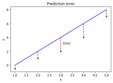
The further away from the data points our line gets, the bigger the error. Our best model is the one with the smallest error. Mathematically, we can define the mean squared error as:
[mse = \frac{1}{n}\sum_{i=1}^{n}(y_{i} - \hat{y}_{i})^{2}]
$mse$ is the Mean Squared Error. $y_{i}$ is the actual value and \(\hat{y}_{i}\) is the predicted value. $\sum_{}$ is notation to indicate that we are taking the sum of the difference. $n$ is the total number of observations, so \(\frac{1}{n}\) indicates that we are taking the mean.
We could implement this in our code as follows:
import numpy as np

def loss(y, y_hat):
    """
    Loss function (mean squared error).

    Args:
        y (numpy array): The known target values.
        y_hat (numpy array): The predicted values.

    Returns:
        numpy float: The mean squared error.
    """
    distances = y - y_hat
    squared_distances = np.square(distances)
    return np.mean(squared_distances)
Minimising the error
Our goal is to find the “best” model. We have defined best as being the model with parameters that give us the smallest mean squared error. We can write this as:
[argmin\frac{1}{n}\sum_{i=1}^{n}(y_{i} - \hat{y}_{i})^{2}]
Let’s stop and look at what this loss function means. We’ll plot the squared error for a range of values to demonstrate how loss scales as the difference between $y$ and \(\hat{y}\) increases.
import matplotlib.pyplot as plt

x = np.arange(-50, 50, 0.05)
y = np.square(x)

plt.plot(x, y)
plt.xlabel('Difference between y and y_hat')
plt.ylabel('Loss (squared error)')
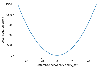
As we can see, our loss rapidly increases as predictions (\(\hat{y}\)) move away from the true values ($y$). The result is that outliers have a strong influence on our model fit.
Optimisation
In machine learning, there is typically a training step where an algorithm is used to find the optimal set of model parameters (i.e. those parameters that give the minimum possible error). This is the essence of machine learning!
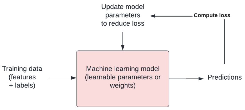
There are many approaches to optimisation. Gradient descent is a popular approach. In gradient descent we take steps in the opposite direction of the gradient of a function, seeking the lowest point (i.e. the lowest error).
Exercise
A) What does a loss function quantify?
B) What is an example of a loss function?
C) What are some other names used for loss functions?
D) What is happening when a model is trained?Solution
A) A loss function quantifies the goodness of fit of a model (i.e. how closely its predictions match the known targets).
B) One example of a loss function is mean squared error (M.S.E.).
C) Objective function, error function, and cost function.
D) When a model is trained, we are attempting to find the optimal model parameters in process known as “optimisation”.
Now that we’ve touched on how machines learn, we’ll tackle the problem of predicting the outcome of patients admitted to intensive care units in hospitals across the United States.
Key Points
Loss functions allow us to define a good model.
$y$ is a known target. $\hat{y}$ ($y hat$) is a prediction.
Mean squared error is an example of a loss function.
After defining a loss function, we search for the optimal solution in a process known as ‘training’.
Optimisation is at the heart of machine learning.
Modelling
Overview
Teaching: 20 min
Exercises: 20 minQuestions
Broadly speaking, when talking about regression and classification, how does the prediction target differ?
Would linear regression be most useful for a regression or classification task? How about logistic regression?
Objectives
Use a linear regression model for prediction.
Use a logistic regression model for prediction.
Set a decision boundary to predict an outcome from a probability.
Regression vs classification
Predicting one or more classes is typically referred to as classification. The task of predicting a continuous variable on the other hand (for example, length of hospital stay) is typically referred to as a regression.
Note that “regression models” can be used for both regression tasks and classification tasks. Don’t let this throw you off!
We will begin with a linear regression, a type of model borrowed from statistics that has all of the hallmarks of machine learning (so let’s call it a machine learning model!), which can be written as:
[\hat{y} = wX + b]
Our predictions can be denoted by $\hat{y}$ (pronounced “y hat”) and our explanatory variables (or “features”) denoted by $X$. In our case, we will use a single feature: the APACHE-IV score, a measure of severity of illness.
There are two parameters of the model that we would like to learn from the training data: $w$, weight and $b$, bias. Could we use a linear regression for our classification task? Let’s try fitting a line to our outcome data.
# import the regression model
import numpy as np
from matplotlib import pyplot as plt
from sklearn.linear_model import LinearRegression
reg = LinearRegression()

# use a single feature (apache score)
# note: remove the reshape if fitting to >1 input variable
X = cohort.apachescore.values.reshape(-1, 1)
y = cohort.actualhospitalmortality_enc.values

# fit the model to our data
reg = reg.fit(X, y)

# get the y values
buffer = 0.2*max(X)
X_fit = np.linspace(min(X) - buffer, max(X) + buffer, num=50)
y_fit = reg.predict(X_fit)

# plot
plt.scatter(X, y,  color='black', marker = 'x')
plt.plot(X_fit, y_fit, color='red', linewidth=2)
plt.show()
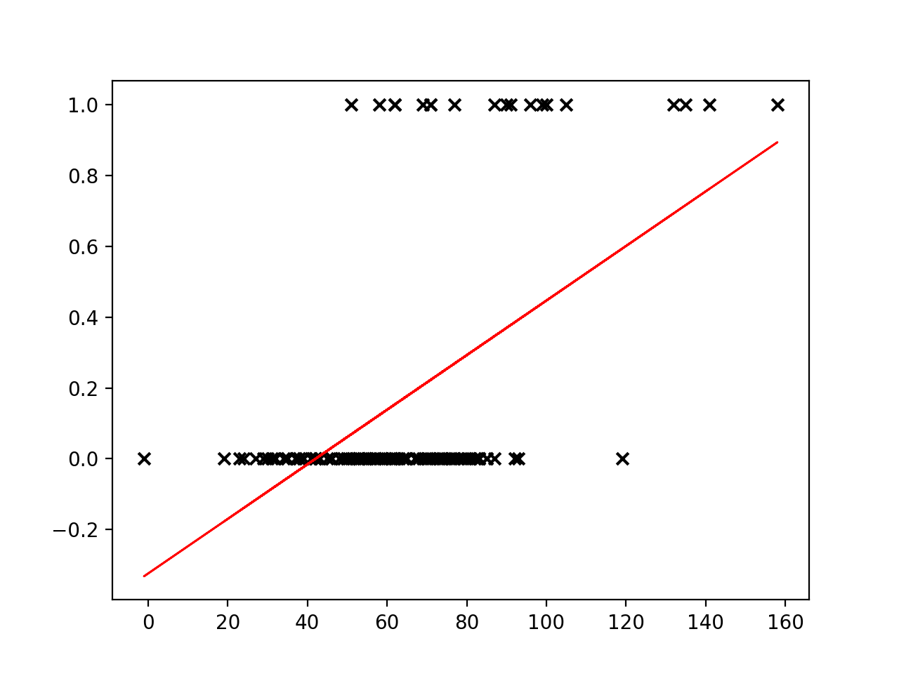
Linear regression places a line through a set of data points that minimizes the error between the line and the points. It is difficult to see how a meaningful threshold could be set to predict the binary outcome in our task. The predicted values can exceed our range of outcomes.
Sigmoid function
The sigmoid function (also known as a logistic function) comes to our rescue. This function gives an “s” shaped curve that can take a number and map it into a value between 0 and 1:
[f : \mathbb{R} \mapsto (0,1)]
The sigmoid function can be written as:
[f(x) = \frac{1}{1+e^{-x}}]
Let’s take a look at a curve generated by this function:
def sigmoid(x, k=0.1):
    """
    Sigmoid function.
    Adjust k to set slope.
    """
    s = 1 / (1 + np.exp(-x / k))
    return s

# set range of values for x
x = np.linspace(-1, 1, 50)

plt.plot(x, sigmoid(x))
plt.show()
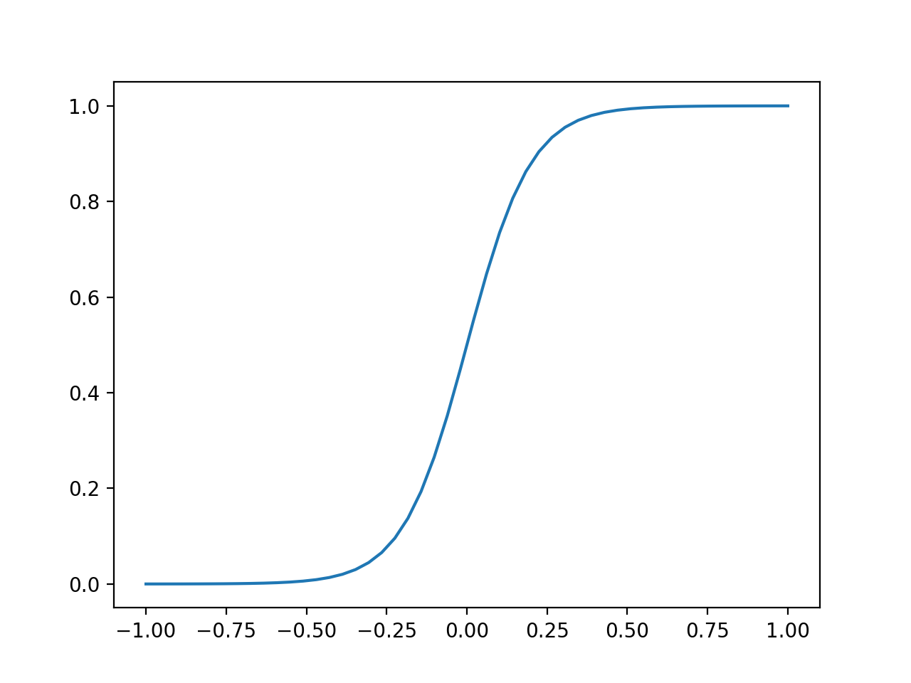
We can use this to map our linear regression to produce output values that fall between 0 and 1.
[f(x) = \frac{1}{1+e^{-({wX + b})}}]
As an added benefit, we can interpret the output value as a probability. The probability relates to the positive class (the outcome with value “1”), which in our case is in-hospital mortality (“EXPIRED”).
Logistic regression
Logistic regressions are powerful models that often outperform more sophisticated machine learning models. In machine learning studies it is typical to include performance of a logistic regression model as a baseline (as they do, for example, in Rajkomar and colleagues).
We need to find the parameters for the best-fitting logistic model given our data. As before, we do this with the help of a loss function that quantifies error. Our goal is to find the parameters of the model that minimise the error. With this model, we no longer use least squares due to the model’s non-linear properties. Instead we will use log loss.
Training (or fitting) the model
As is typically the case when using machine learning packages, we don’t need to code the loss function ourselves. The function is implemented as part of our machine learning package (in this case scikit-learn). Let’s try fitting a Logistic Regression to our data.
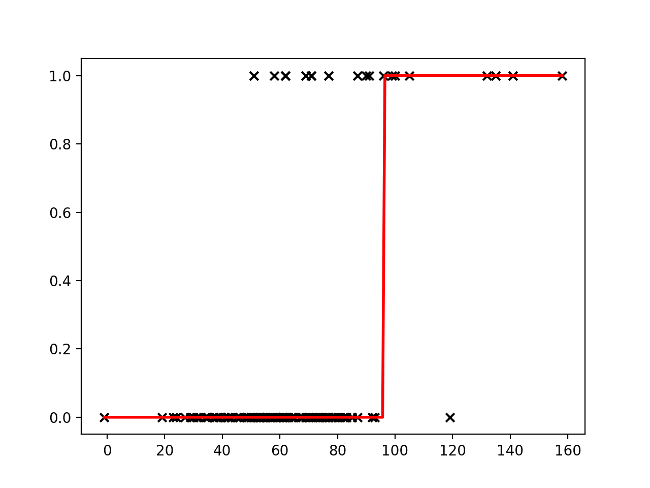
Exercise
A) Following the previous example for a linear regression, fit a logistic regression to your data and create a new plot. How do the predictions differ from before? Hint:
from sklearn.linear_model import LogisticRegression.Solution
A) You should see a plot similar to the one below:
Decision boundary
Now that our model is able to output the probability of our outcome, we can set a decision boundary for the classification task. For example, we could classify probabilities of < 0.5 as “ALIVE” and >= 0.5 as “EXPIRED”. Using this approach, we can predict outcomes for a given input.
x = [[90]]
outcome = reg.predict(x)
probs = reg.predict_proba(x)[0]
print(f'For x={x[0][0]}, we predict an outcome of "{outcome[0]}".\n'
      f'Class probabilities (0, 1): {round(probs[0],2), round(probs[1],2)}.')
For x=90, we predict an outcome of "0".
Class probabilities (0, 1): (0.77, 0.23).
Key Points
Linear regression is a popular model for regression tasks.
Logistic regression is a popular model for classification tasks.
Probabilities that can be mapped to a prediction class.
Validation
Overview
Teaching: 20 min
Exercises: 10 minQuestions
What is meant by model accuracy?
What is the purpose of a validation set?
What are two types of cross validation?
What is overfitting?
Objectives
Train a model to predict patient outcomes on a held-out test set.
Use cross validation as part of our model training process.
Accuracy
One measure of the performance of a classification model is accuracy. Accuracy is defined as the overall proportion of correct predictions. If, for example, we take 50 shots and 40 of them hit the target, then our accuracy is 0.8 (40/50).

Accuracy can therefore be defined by the formula below:
[Accuracy = \frac{Correct\ predictions}{All\ predictions}]
What is the accuracy of our model at predicting in-hospital mortality?
from sklearn.linear_model import LogisticRegression
from sklearn.model_selection import train_test_split

# convert outcome to a categorical type
categories=['ALIVE', 'EXPIRED']
cohort['actualhospitalmortality'] = pd.Categorical(cohort['actualhospitalmortality'], categories=categories)

# add the encoded value to a new column
cohort['actualhospitalmortality_enc'] = cohort['actualhospitalmortality'].cat.codes
cohort[['actualhospitalmortality_enc','actualhospitalmortality']].head()

# define features and outcome
features = ['apachescore']
outcome = ['actualhospitalmortality_enc']

# partition data into training and test sets
X = cohort[features]
y = cohort[outcome]
x_train, x_test, y_train, y_test = train_test_split(X, y, train_size = 0.7, random_state = 42)

# restructure data for input into model
# note: remove the reshape if fitting to >1 input variable
x_train = x_train.values.reshape(-1, 1)
y_train = y_train.values.ravel()
x_test = x_test.values.reshape(-1, 1)
y_test = y_test.values.ravel()

# train model
reg = LogisticRegression(random_state=0)
reg.fit(x_train, y_train)

# generate predictions
y_hat_train = reg.predict(x_train)
y_hat_test = reg.predict(x_test)

#  accuracy on training set
acc_train = np.mean(y_hat_train == y_train)
print(f'Accuracy on training set: {acc_train:.2f}')

#  accuracy on test set
acc_test = np.mean(y_hat_test == y_test)
print(f'Accuracy on test set: {acc_test:.2f}')
Accuracy on training set: 0.86
Accuracy on test set: 0.82
Not bad! There was a slight drop in performance on our test set, but that is to be expected.
Validation set
Machine learning is iterative by nature. We want to improve our model, tuning and evaluating as we go. This leads us to a problem. Using our test set to iteratively improve our model would be cheating. It is supposed to be “held out”, not used for training! So what do we do?
The answer is that we typically partition off part of our training set to use for validation. The “validation set” can be used to iteratively improve our model, allowing us to save our test set for the *final* evaluation.

Cross validation
Why stop at one validation set? With sampling, we can create many training sets and many validation sets, each slightly different. We can then average our findings over the partitions to give an estimate of the model’s predictive performance
The family of resampling methods used for this is known as “cross validation”. It turns out that one major benefit to cross validation is that it helps us to build more robust models.
If we train our model on a single set of data, the model may learn rules that are overly specific (e.g. “all patients aged 63 years survive”). These rules will not generalise well to unseen data. When this happens, we say our model is “overfitted”.
If we train on multiple, subtly-different versions of the data, we can identify rules that are likely to generalise better outside out training set, helping to avoid overfitting.
Two popular of the most popular cross-validation methods:
- K-fold cross validation
- Leave-one-out cross validation
K-fold cross validation
In K-fold cross validation, “K” indicates the number of times we split our data into training/validation sets. With 5-fold cross validation, for example, we create 5 separate training/validation sets.

With K-fold cross validation, we select our model to evaluate and then:
- Partition the training data into a training set and a validation set. An 80%, 20% split is common.
- Fit the model to the training set and make a record of the optimal parameters.
- Evaluate performance on the validation set.
- Repeat the process 5 times, then average the parameter and performance values.
When creating our training and test sets, we needed to be careful to avoid data leaks. The same applies when creating training and validation sets. We can use a pipeline object to help manage this issue.
from numpy import mean, std
from sklearn.model_selection import cross_val_score, RepeatedStratifiedKFold
from sklearn.preprocessing import MinMaxScaler
from sklearn.pipeline import Pipeline

# define dataset
X = x_train
y = y_train

# define the pipeline
steps = list()
steps.append(('scaler', MinMaxScaler()))
steps.append(('model', LogisticRegression()))
pipeline = Pipeline(steps=steps)

# define the evaluation procedure
cv = RepeatedStratifiedKFold(n_splits=5, n_repeats=3, random_state=1)

# evaluate the model using cross-validation
scores = cross_val_score(pipeline, X, y, scoring='accuracy', cv=cv, n_jobs=-1)

# report performance
print('Cross-validation accuracy, mean (std): %.2f (%.2f)' % (mean(scores)*100, std(scores)*100))
Cross-validation accuracy, mean (std): 81.53 (3.31)
Leave-one-out cross validation is the same idea, except that we have many more folds. In fact, we have one fold for each data point. Each fold we leave out one data point for validation and use all of the other points for training.
Key Points
Validation sets are used during model development, allowing models to be tested prior to testing on a held-out set.
Cross-validation is a resampling technique that creates multiple validation sets.
Cross-validation can help to avoid overfitting.
Evaluation
Overview
Teaching: 20 min
Exercises: 10 minQuestions
What kind of values go into a confusion matrix?
What do the letters AUROC stand for?
Does an AUROC of 0.5 indicate our predictions were good, bad, or average?
In the context of evaluating performance of a classifier, what is TP?
Objectives
Create a confusion matrix for a predictive model.
Use the confusion matrix to compute popular performance metrics.
Plot an AUROC curve.
Evaluating a classification task
We trained a machine learning model to predict the outcome of patients admitted to intensive care units. As there are two outcomes, we refer to this as a “binary” classification task. We are now ready to evaluate the model on our held-out test set.
from sklearn.linear_model import LogisticRegression
from sklearn.model_selection import train_test_split

# convert outcome to a categorical type
categories=['ALIVE', 'EXPIRED']
cohort['actualhospitalmortality'] = pd.Categorical(cohort['actualhospitalmortality'], categories=categories)

# add the encoded value to a new column
cohort['actualhospitalmortality_enc'] = cohort['actualhospitalmortality'].cat.codes
cohort[['actualhospitalmortality_enc','actualhospitalmortality']].head()

# define features and outcome
features = ['apachescore']
outcome = ['actualhospitalmortality_enc']

# partition data into training and test sets
X = cohort[features]
y = cohort[outcome]
x_train, x_test, y_train, y_test = train_test_split(X, y, train_size = 0.7, random_state =  42)

# restructure data for input into model
# note: remove the reshape if fitting to >1 input variable
x_train = x_train.values.reshape(-1, 1)
y_train = y_train.values.ravel()
x_test = x_test.values.reshape(-1, 1)
y_test = y_test.values.ravel()

# train model
reg = LogisticRegression(random_state=0)
reg.fit(x_train, y_train)

# generate predictions
y_hat_test = reg.predict(x_test)
y_hat_test_proba = reg.predict_proba(x_test)
Each prediction is assigned a probability of a positive class. For example, the first 10 probabilities are:
probs = y_hat_test_proba[:,1][:12]
rounded_probs = [round(x,2) for x in probs]
print(rounded_probs)
[0.09, 0.11, 0.23, 0.21, 0.23, 0.21, 0.19, 0.03, 0.2, 0.67, 0.54, 0.72]
These probabilities correspond to the following predictions, either a “0” (“ALIVE”) or a 1 (“EXPIRED”):
print(y_hat_test[:12])
[0 0 0 0 0 0 0 0 0 1 1 1]
In comparison with the known outcomes, we can put each prediction into one of the following categories:
- True positive: we predict “1” (“EXPIRED”) and the true outcome is “1”.
- True negative: we predict “0” (“ALIVE”) and the true outcome is “0”.
- False positive: we predict “1” (“EXPIRED”) and the true outcome is “0”.
- False negative: we predict “0” (“ALIVE”) and the true outcome is “1”.
print(y_test[:12])
[0 0 0 0 0 0 1 0 0 0 0 0]
Confusion matrices
It is common practice to arrange these outcome categories into a “confusion matrix”, which is a grid that records our predictions against the ground truth. For a binary outcome, confusion matrices are organised as follows:
| Negative (predicted) | Positive (predicted) | |
|---|---|---|
| Negative (actual) | TN | FP |
| Positive (actual) | FN | TP |
The sum of the cells is the total number of predictions. The diagonal from top left to bottom right indicates correct predictions. Let’s visualize the results of the model in the form of a confusion matrix:
# import the metrics class
from sklearn import metrics
confusion = metrics.confusion_matrix(y_test, y_hat_test)

class_names=cohort['actualhospitalmortality'].cat.categories
disp = metrics.ConfusionMatrixDisplay.from_estimator(
    reg, x_test, y_test, display_labels=class_names,
    cmap=plt.cm.Blues)

plt.show()
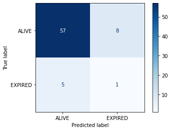
We have two columns and rows because we have a binary outcome, but you can also extend the matrix to plot multi-class classification predictions. If we had more output classes, the number of columns and rows would match the number of classes.
Accuracy
Accuracy is the overall proportion of correct predictions. Think of a dartboard. How many shots did we take? How many did we hit? Divide one by the other and that’s the accuracy.
Accuracy can be written as:
[Accuracy = \frac{TP+TN}{TP+TN+FP+FN}]
What was the accuracy of our model?
acc = metrics.accuracy_score(y_test, y_hat_test)
print(f"Accuracy (model) = {acc:.2f}")
Accuracy (model) = 0.82
Not bad at first glance. When comparing our performance to guessing “0” for every patient, however, it seems slightly less impressive!
zeros = np.zeros(len(y_test))
acc = metrics.accuracy_score(y_test, zeros)
print(f"Accuracy (zeros) = {acc:.2f}")
Accuracy (zeros) = 0.92
The problem with accuracy as a metric is that it is heavily influenced by prevalence of the positive outcome: because the proportion of 1s is relatively low, classifying everything as 0 is a safe bet.
We can see that the high accuracy is possible despite totally missing our target. To evaluate an algorithm in a way that prevalence does not cloud our assessment, we often look at sensitivity and specificity.
Sensitivity (A.K.A “Recall” and “True Positive Rate”)
Sensitivity is the ability of an algorithm to predict a positive outcome when the actual outcome is positive. In our case, of the patients who die, what proportion did we correctly predict? This can be written as:
[Sensitivity = Recall = \frac{TP}{TP+FN}]
Because a model that calls “1” for everything has perfect sensitivity, this measure is not enough on its own. Alongside sensitivity we often report on specificity.
Specificity (A.K.A “True Negative Rate”)
Specificity relates to the test’s ability to correctly classify patients who survive their stay (i.e. class “0”). Specificity is the proportion of those who survive who are predicted to survive. The formula for specificity is:
[Specificity = \frac{TN}{FP+TN}]
Receiver-Operator Characteristic
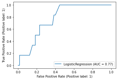
A Receiver-Operator Characteristic (ROC) curve plots 1 - specificity vs. sensitivity at varying probability thresholds. The area under this curve is known as the AUROC (or sometimes just the “Area Under the Curve”, AUC) and it is a well-used measure of discrimination that was originally developed by radar operators in the 1940s.
metrics.plot_roc_curve(reg, x_test, y_test)
An AUROC of 0.5 is no better than guessing and an AUROC of 1.0 is perfect. An AUROC of 0.9 tells us that the 90% of times our model will assign a higher risk to a randomly selected patient with an event than to a randomly selected patient without an event
Key Points
Confusion matrices are the basis for many popular performance metrics.
AUROC is the area under the receiver operating characteristic. 0.5 is bad!
TP is True Positive, meaning that our prediction hit its target.
Bootstrapping
Overview
Teaching: 20 min
Exercises: 10 minQuestions
Why do we ‘boot up’ computers?
How is bootstrapping commonly used in machine learning?
Objectives
Use bootstrapping to compute confidence intervals.
Bootstrapping
In statistics and machine learning, bootstrapping is a resampling technique that involves repeatedly drawing samples from our source data with replacement, often to estimate a population parameter. By “with replacement”, we mean that the same data point may be included in our resampled dataset multiple times.
The term originates from the impossible idea of lifting ourselves up without external help, by pulling on our own bootstraps. Side note, but apparently it’s also why we “boot” up a computer (to run software, software must first be run, so we bootstrap).
Typically our source data is only a small sample of the ground truth. Bootstrapping is loosely based on the law of large numbers, which says that with enough data the empirical distribution will be a good approximation of the true distribution.
Using bootstrapping, we can generate a distribution of estimates, rather than a single point estimate. The distribution gives us information about certainty, or the lack of it.
In Figure 2 of the Rajkomar paper, the authors note that “the error bars represent the bootstrapped 95% confidence interval” for the AUROC values. Let’s use the same approach to calculate a confidence interval when evaluating the accuracy of a model on a held-out test set. Steps:
- Draw a sample of size N from the original dataset with replacement. This is a bootstrap sample.
- Repeat step 1 S times, so that we have S bootstrap samples.
- Estimate our value on each of the bootstrap samples, so that we have S estimates
- Use the distribution of estimates for inference (for example, estimating the confidence intervals).
import matplotlib.pyplot as plt
from sklearn.linear_model import LogisticRegression
from sklearn.model_selection import train_test_split
from sklearn.utils import resample
from sklearn.metrics import accuracy_score

# convert outcome to a categorical type
categories=['ALIVE', 'EXPIRED']
cohort['actualhospitalmortality'] = pd.Categorical(cohort['actualhospitalmortality'], categories=categories)

# add the encoded value to a new column
cohort['actualhospitalmortality_enc'] = cohort['actualhospitalmortality'].cat.codes
cohort[['actualhospitalmortality_enc','actualhospitalmortality']].head()

# define features and outcome
features = ['apachescore']
outcome = ['actualhospitalmortality_enc']

# partition data into training and test sets
X = cohort[features]
y = cohort[outcome]
x_train, x_test, y_train, y_test = train_test_split(X, y, train_size = 0.7, random_state = 42)

# restructure data for input into model
# note: remove the reshape if fitting to >1 input variable
x_train = x_train.values.reshape(-1, 1)
y_train = y_train.values.ravel()
x_test = x_test.values.reshape(-1, 1)
y_test = y_test.values.ravel()

# train model
reg = LogisticRegression(random_state=0)
reg.fit(x_train, y_train)

# bootstrap predictions
accuracy = []
n_iterations = 1000
for i in range(n_iterations):
    X_bs, y_bs = resample(x_test, y_test, replace=True)
    # make predictions
    y_hat = reg.predict(X_bs)
    # evaluate model
    score = accuracy_score(y_bs, y_hat)
    accuracy.append(score)
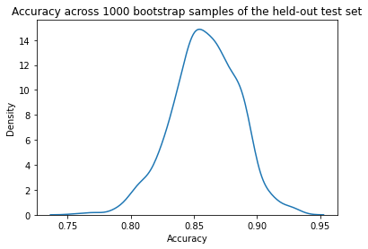
Let’s plot a distribution of accuracy values computed on the bootstrap samples.
import seaborn as sns
# plot distribution of accuracy
sns.kdeplot(accuracy)
plt.title("Accuracy across 1000 bootstrap samples of the held-out test set")
plt.xlabel("Accuracy")
plt.show()
We can now take the mean accuracy across the bootstrap samples, and compute confidence intervals. There are several different approaches to computing the confidence interval. We will use the percentile method, a simpler approach that does not require our sampling distribution to be normally distributed.
Percentile method
For a 95% confidence interval we can find the middle 95% bootstrap statistics. This is known as the percentile method. This is the preferred method because it works regardless of the shape of the sampling distribution.
Regardless of the shape of the bootstrap sampling distribution, we can use the percentile method to construct a confidence interval. Using this method, the 95% confidence interval is the range of points that cover the middle 95% of bootstrap sampling distribution.
We determine the mean of each sample, call it X̄ , and create the sampling distribution of the mean. We then take the α/2 and 1 - α/2 percentiles (e.g. the .0251000 and .9751000 = 25th and 975th bootstrapped statistic), and these are the confidence limits.
# get median
median = np.percentile(accuracy, 50)

# get 95% interval
alpha = 100-95
lower_ci = np.percentile(accuracy, alpha/2)
upper_ci = np.percentile(accuracy, 100-alpha/2)

print(f"Model accuracy is reported on the test set. 1000 bootstrapped samples "
      f"were used to calculate 95% confidence intervals.\n"
      f"Median accuracy is {median:.2f} with a 95% a confidence "
      f"interval of [{lower_ci:.2f},{upper_ci:.2f}].")
Model accuracy is reported on the test set. 1000 bootstrapped samples were used to calculate 95% confidence intervals.
Median accuracy is 0.82 with a 95% a confidence interval of [0.73,0.90].
sns.kdeplot(accuracy)
plt.title("Accuracy across 1000 bootstrap samples of the held-out test set\n"
          "showing median with 95\\% confidence intervals")
plt.xlabel("Accuracy")
plt.axvline(median,0, 14, linestyle="--", color="red")
plt.axvline(lower_ci,0, 14, linestyle="--", color="red")
plt.axvline(upper_ci,0, 14, linestyle="--", color="red")
plt.show()
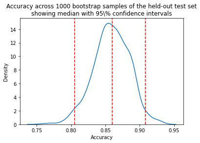
Once an interval is calculated, it may or may not contain the true value of the unknown parameter. A 95% confidence level does *not* mean that there is a 95% probability that the population parameter lies within the interval.
The confidence interval tells us about the reliability of the estimation procedure. 95% of confidence intervals computed at the 95% confidence level contain the true value of the parameter.
Key Points
Bootstrapping is a resampling technique, sometimes confused with cross-validation.
Bootstrapping allows us to generate a distribution of estimates, rather than a single point estimate.
Bootstrapping allows us to estimate uncertainty, allowing computation of confidence intervals.
Data leakage
Overview
Teaching: 20 min
Exercises: 10 minQuestions
What are common types of data leakage?
How does data leakage occur?
What are the implications of data leakage?
Objectives
Learn to recognise common causes of data leakage.
Understand how data leakage affects models.
Data leakage
Data leakage is the mistaken use of information in the model training process that in reality would not be available at prediction time. The result of data leakage is overly optimistic expectations and poor performance in out-of-sample datasets.
An extreme example of data leakage would be accidentally including a prediction target in a training dataset. In this case our model would perform very well on training data. The model would fail, however, when moved to a real-life setting where the outcome was not available at prediction time.
In most cases information leakage is much more subtle than including the outcome in the training data, and it may occur at many stages during the model training process.
Subset contamination
It is common to impute missing values, for example by replacing missing values with the mean or median. Similarly, data is often normalised by dividing through by the average or maximum.
If these steps are done using the full dataset (i.e. the training and testing data), then information about the testing data will “leak” into the training data. The result is likely to be overoptimistic performance on the test set. For this reason, imputation and normalisation should be done on subsets independently.
Another issue that can lead to data leakage is to not account for grouping within a dataset when creating train-test splits. Let’s say, for example, that we are trying to use chest x-rays to predict which patients have cardiac disease. If the same patient appears multiple times within our dataset and this patient appears in both our training and test set, this may be cause for concern.

Target leakage
Target leakage occurs when a prediction target is inadvertently used in the training process.
The following abstract is taken from a 2018 paper entitled: “Prediction of Incident Hypertension Within the Next Year: Prospective Study Using Statewide Electronic Health Records and Machine Learning”:
Background: As a high-prevalence health condition, hypertension is clinically costly, difficult to manage, and often leads to severe and life-threatening diseases such as cardiovascular disease (CVD) and stroke.
Objective: The aim of this study was to develop and validate prospectively a risk prediction model of incident essential hypertension within the following year.
Methods: Data from individual patient electronic health records (EHRs) were extracted from the Maine Health Information Exchange network. Retrospective (N=823,627, calendar year 2013) and prospective (N=680,810, calendar year 2014) cohorts were formed. A machine learning algorithm, XGBoost, was adopted in the process of feature selection and model building. It generated an ensemble of classification trees and assigned a final predictive risk score to each individual.
Results: The 1-year incident hypertension risk model attained areas under the curve (AUCs) of 0.917 and 0.870 in the retrospective and prospective cohorts, respectively. Risk scores were calculated and stratified into five risk categories, with 4526 out of 381,544 patients (1.19%) in the lowest risk category (score 0-0.05) and 21,050 out of 41,329 patients (50.93%) in the highest risk category (score 0.4-1) receiving a diagnosis of incident hypertension in the following 1 year. Type 2 diabetes, lipid disorders, CVDs, mental illness, clinical utilization indicators, and socioeconomic determinants were recognized as driving or associated features of incident essential hypertension. The very high risk population mainly comprised elderly (age>50 years) individuals with multiple chronic conditions, especially those receiving medications for mental disorders. Disparities were also found in social determinants, including some community-level factors associated with higher risk and others that were protective against hypertension.
Conclusions: With statewide EHR datasets, our study prospectively validated an accurate 1-year risk prediction model for incident essential hypertension. Our real-time predictive analytic model has been deployed in the state of Maine, providing implications in interventions for hypertension and related diseases and hopefully enhancing hypertension care.
Exercise
A) What is the prediction target?
B) What kind of algorithm is used in the study?
C) What performance metric is reported in the results?
D) How many features were included in the model? (Hint: see Appendix 3 in the paper)Solution
A) The prediction target is “hypertension within the following year.”
B) The study uses XGBoost, a tree based model.
C) The abstract reports AUC (Area under the Receiver Operating Characteristic Curve.
D) Appendix 3 includes a list of features. There are 80 in total.
In a subsequent paper, entitled Data Leakage in Health Outcomes Prediction With Machine Learning Chiavegatto, Filho et al reflect on the previous study. The abstract is copied below:
The objective of the study was to “develop and validate prospectively a risk prediction model of incident essential hypertension within the following year.” The authors follow good prediction protocols by applying a high-performing machine learning algorithm (XGBoost) and by validating the results on unseen data from the following year. The algorithm attained a very high area under the curve (AUC) value of 0.870 for incidence prediction of hypertension in the following year.
The authors follow this impressive result by commenting on some of the most important predictive variables, such as demographic features, diagnosed chronic diseases, and mental illness. The ranking of the variables that were most important for the predictive performance of hypertension is included in a multimedia appendix; however, the above-mentioned variables are not listed near the top. Of the six most important variables, five were: lisinopril, hydrochlorothiazide, enalapril maleate, amlodipine besylate, and losartan potassium. All of these are popular antihypertensive drugs.
By including the use of antihypertensive drugs as predictors for hypertension incidence in the following year, Dr Ye and colleagues’work opens the possibility that the machine learning algorithm will focus on predicting those already with hypertension but did not have this information on their medical record at baseline. … just one variable (the use of a hypertension drug) is sufficient for physicians to infer the presence of hypertension.
Exercise
A) What are lisinopril, hydrochlorothiazide, enalapril maleate, amlodipine besylate, and losartan potassium?
B) Why is it problematic that these drugs are included as features in the model?Solution
A) They are drugs that are prescribed to people with hypertension.
B) The fact that patients were taking the drugs suggests that hypertension was already known.
Key Points
Leakage occurs when training data is contaminated with information that is not available at prediction time.
Leakage leads to over-optimistic expectations of performance.