Introduction to high-dimensional data
Last updated on 2026-04-22 | Edit this page
Overview
Questions
- What are high-dimensional data and what do these data look like in the biosciences?
- What are the challenges when analysing high-dimensional data?
- What statistical methods are suitable for analysing these data?
- How can Bioconductor be used to access high-dimensional data in the biosciences?
Objectives
- Explore examples of high-dimensional data in the biosciences.
- Appreciate challenges involved in analysing high-dimensional data.
- Explore different statistical methods used for analysing high-dimensional data.
- Work with example data created from biological studies.
What are high-dimensional data?
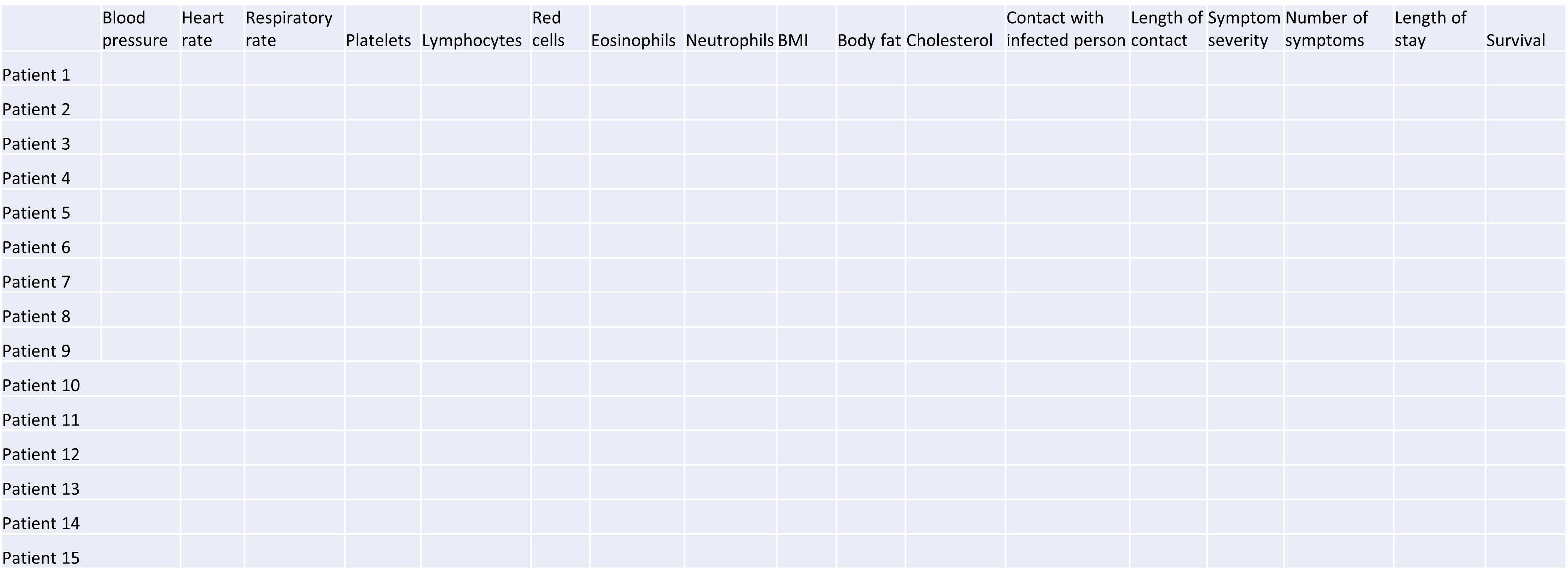
High-dimensional data are defined as data with many features (variables observed). In recent years, advances in information technology have allowed large amounts of data to be collected and stored with relative ease. As such, high-dimensional data have become more common in many scientific fields, including the biological sciences, where datasets in subjects like genomics and medical sciences often have a large numbers of features. For example, hospital data may record many variables, including symptoms, blood test results, behaviours, and general health. An example of what high-dimensional data might look like in a biomedical study is shown in the figure below.
Researchers often want to relate such features to specific patient outcomes (e.g. survival, length of time spent in hospital). However, analysing high-dimensional data can be extremely challenging since standard methods of analysis, such as individual plots of features and linear regression, are no longer appropriate when we have many features. In this lesson, we will learn alternative methods for dealing with high-dimensional data and discover how these can be applied for practical high-dimensional data analysis in the biological sciences.
Challenge 1
Descriptions of four research questions and their datasets are given below. Which of these scenarios use high-dimensional data?
- Predicting patient blood pressure using: cholesterol level in blood, age, and BMI measurements, collected from 100 patients.
- Predicting patient blood pressure using: cholesterol level in blood, age, and BMI, as well as information on 200,000 single nucleotide polymorphisms from 100 patients.
- Predicting the length of time patients spend in hospital with pneumonia infection using: measurements on age, BMI, length of time with symptoms, number of symptoms, and percentage of neutrophils in blood, using data from 200 patients.
- Predicting probability of a patient’s cancer progressing using gene expression data from 20,000 genes, as well as data associated with general patient health (age, weight, BMI, blood pressure) and cancer growth (tumour size, localised spread, blood test results).
- No. The number of features is relatively small (4 including the response variable since this is an observed variable).
- Yes, this is an example of high-dimensional data. There are 200,004 features.
- No. The number of features is relatively small (6).
- Yes. There are 20,008 features.
Now that we have an idea of what high-dimensional data look like we can think about the challenges we face in analysing them.
Why is dealing with high-dimensional data challenging?
Most classical statistical methods are set up for use on low-dimensional data (i.e. with a small number of features, \(p\)). This is because low-dimensional data were much more common in the past when data collection was more difficult and time consuming.
One challenge when analysing high-dimensional data is visualising the many variables. When exploring low-dimensional datasets, it is possible to plot the response variable against each of features to get an idea which of these are important predictors of the response. With high-dimensional data, the large number of features makes doing this difficult. In addition, in some high-dimensional datasets it can also be difficult to identify a single response variable, making standard data exploration and analysis techniques less useful.
Let’s have a look at a simple dataset with lots of features to understand some of the challenges we are facing when working with high-dimensional data. For reference, all data used throughout the lesson are described in the data page.
Challenge 2
For illustrative purposes, we start with a simple dataset that is not technically high-dimensional but contains many features. This will illustrate the general problems encountered when working with many features in a high-dimensional data set.
First, make sure you have completed the
setup instructions. Next, let’s load the prostate
dataset as follows:
R
prostate <- readRDS("data/prostate.rds")
Examine the dataset (in which each row represents a single patient) to:
- Determine how many observations (\(n\)) and features (\(p\)) are available (hint: see the
dim()function). - Examine what variables were measured (hint: see the
names()andhead()functions). - Plot the relationship between the variables (hint: see the
pairs()function). What problem(s) with high-dimensional data analysis does this illustrate?
R
dim(prostate) # print the number of rows and columns
R
names(prostate)  # examine the variable names
head(prostate)   # print the first 6 rows
R
names(prostate) # examine column names
OUTPUT
[1] "lcavol"  "lweight" "age"     "lbph"    "svi"     "lcp"     "gleason"
[8] "pgg45"   "lpsa"
R
pairs(prostate) # plot each pair of variables against each other
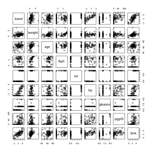
The pairs() function plots relationships between each of
the variables in the prostate dataset. This is possible for
datasets with smaller numbers of variables, but for datasets in which
\(p\) is larger it becomes difficult
(and time consuming) to visualise relationships between all variables in
the dataset. Even where visualisation is possible, fitting models to
datasets with many variables is difficult due to the potential for
overfitting and difficulties in identifying a response variable.
Note that function documentation and information on function
arguments will be useful throughout this lesson. We can access these
easily in R by running ? followed by the package name. For
example, the documentation for the dim function can be
accessed by running ?dim.
Locating data with R - the
here package
It is often desirable to access external datasets from inside R and
to write code that does this reliably on different computers. While R
has an inbulit function setwd() that can be used to denote
where external datasets are stored, this usually requires the user to
adjust the code to their specific system and folder structure. The
here package is meant to be used in R
projects. It allows users to specify the data location relative to the R
project directory. This makes R code more portable and can contribute to
improve the reproducibility of an analysis.
As well as many variables causing problems when working with high-dimensional data, having relatively few observations (\(n\)) compared to the number of features (\(p\)) causes additional challenges. To illustrate these challenges, imagine we are carrying out least squares regression on a dataset with 25 observations. Fitting a best fit line through these data produces a plot shown in the left-hand panel of the figure below.
However, imagine a situation in which the number of observations and features in a dataset are almost equal. In that situation the effective number of observations per feature is low. The result of fitting a best fit line through few observations can be seen in the right-hand panel below.
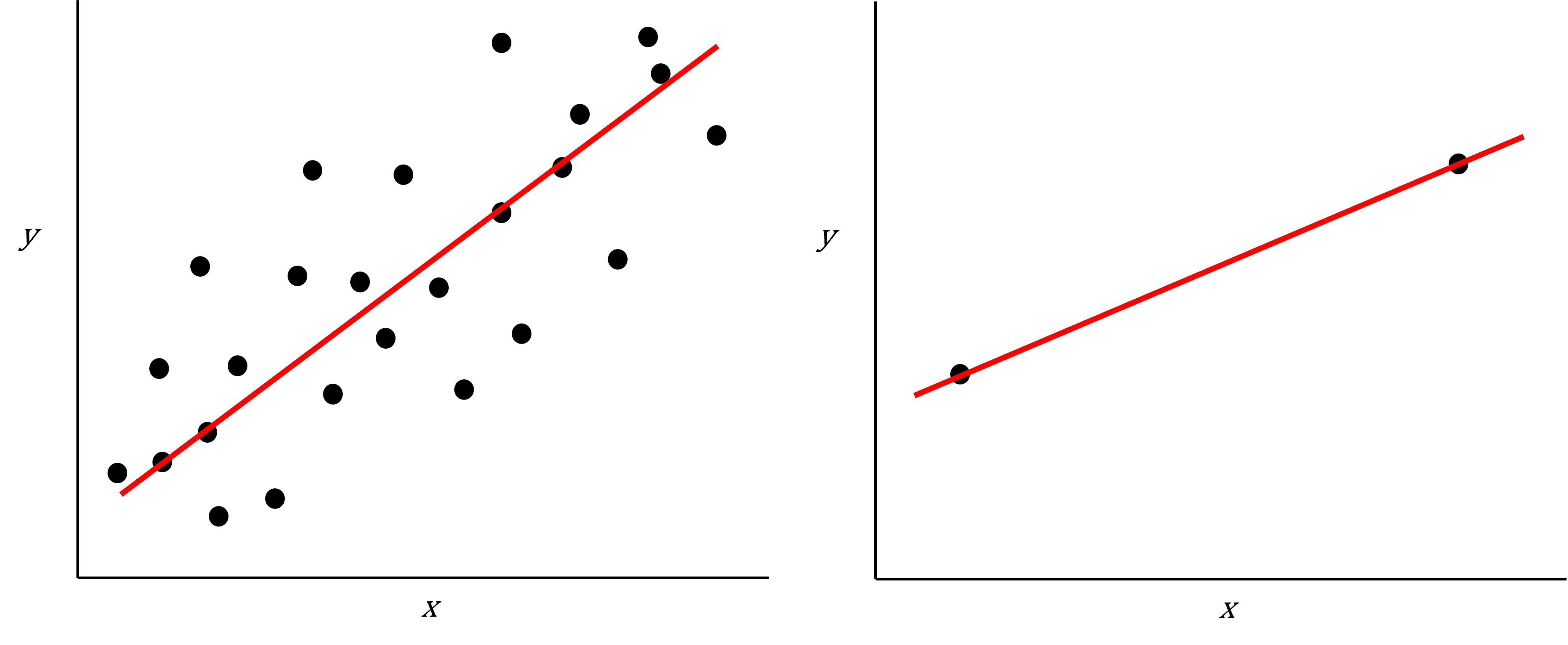
In the first situation, the least squares regression line does not fit the data perfectly and there is some error around the regression line. But, when there are only two observations the regression line will fit through the points exactly, resulting in overfitting of the data. This suggests that carrying out least squares regression on a dataset with few data points per feature would result in difficulties in applying the resulting model to further datsets. This is a common problem when using regression on high-dimensional datasets.
Another problem in carrying out regression on high-dimensional data is dealing with correlations between explanatory variables. The large numbers of features in these datasets makes high correlations between variables more likely. Let’s explore why high correlations might be an issue in a Challenge.
Challenge 3
Use the cor() function to examine correlations between
all variables in the prostate dataset. Are some pairs of
variables highly correlated using a threshold of 0.75 for the
correlation coefficients?
Use the lm() function to fit univariate regression
models to predict patient age using two variables that are highly
correlated as predictors. Which of these variables are statistically
significant predictors of age? Hint: the summary() function
can help here.
Fit a multiple linear regression model predicting patient age using both variables. What happened?
Create a correlation matrix of all variables in the
prostate dataset
R
cor(prostate)
OUTPUT
           lcavol      lweight       age         lbph         svi          lcp
lcavol  1.0000000  0.194128286 0.2249999  0.027349703  0.53884500  0.675310484
lweight 0.1941283  1.000000000 0.3075286  0.434934636  0.10877851  0.100237795
age     0.2249999  0.307528614 1.0000000  0.350185896  0.11765804  0.127667752
lbph    0.0273497  0.434934636 0.3501859  1.000000000 -0.08584324 -0.006999431
svi     0.5388450  0.108778505 0.1176580 -0.085843238  1.00000000  0.673111185
lcp     0.6753105  0.100237795 0.1276678 -0.006999431  0.67311118  1.000000000
gleason 0.4324171 -0.001275658 0.2688916  0.077820447  0.32041222  0.514830063
pgg45   0.4336522  0.050846821 0.2761124  0.078460018  0.45764762  0.631528245
lpsa    0.7344603  0.354120390 0.1695928  0.179809410  0.56621822  0.548813169
             gleason      pgg45      lpsa
lcavol   0.432417056 0.43365225 0.7344603
lweight -0.001275658 0.05084682 0.3541204
age      0.268891599 0.27611245 0.1695928
lbph     0.077820447 0.07846002 0.1798094
svi      0.320412221 0.45764762 0.5662182
lcp      0.514830063 0.63152825 0.5488132
gleason  1.000000000 0.75190451 0.3689868
pgg45    0.751904512 1.00000000 0.4223159
lpsa     0.368986803 0.42231586 1.0000000
R
round(cor(prostate), 2) # rounding helps to visualise the correlations
OUTPUT
        lcavol lweight  age  lbph   svi   lcp gleason pgg45 lpsa
lcavol    1.00    0.19 0.22  0.03  0.54  0.68    0.43  0.43 0.73
lweight   0.19    1.00 0.31  0.43  0.11  0.10    0.00  0.05 0.35
age       0.22    0.31 1.00  0.35  0.12  0.13    0.27  0.28 0.17
lbph      0.03    0.43 0.35  1.00 -0.09 -0.01    0.08  0.08 0.18
svi       0.54    0.11 0.12 -0.09  1.00  0.67    0.32  0.46 0.57
lcp       0.68    0.10 0.13 -0.01  0.67  1.00    0.51  0.63 0.55
gleason   0.43    0.00 0.27  0.08  0.32  0.51    1.00  0.75 0.37
pgg45     0.43    0.05 0.28  0.08  0.46  0.63    0.75  1.00 0.42
lpsa      0.73    0.35 0.17  0.18  0.57  0.55    0.37  0.42 1.00
As seen above, some variables are highly correlated. In particular,
the correlation between gleason and pgg45 is
equal to 0.75.
Fitting univariate regression models to predict age using gleason and pgg45 as predictors.
R
model_gleason <- lm(age ~ gleason, data = prostate)
model_pgg45 <- lm(age ~ pgg45, data = prostate)
Check which covariates have a significant efffect
R
summary(model_gleason)
OUTPUT
Call:
lm(formula = age ~ gleason, data = prostate)

Residuals:
    Min      1Q  Median      3Q     Max
-20.780  -3.552   1.448   4.220  13.448

Coefficients:
            Estimate Std. Error t value Pr(>|t|)
(Intercept)   45.146      6.918   6.525 3.29e-09 ***
gleason        2.772      1.019   2.721  0.00774 **
---
Signif. codes:  0 '***' 0.001 '**' 0.01 '*' 0.05 '.' 0.1 ' ' 1

Residual standard error: 7.209 on 95 degrees of freedom
Multiple R-squared:  0.0723,	Adjusted R-squared:  0.06254
F-statistic: 7.404 on 1 and 95 DF,  p-value: 0.007741
R
summary(model_pgg45)
OUTPUT
Call:
lm(formula = age ~ pgg45, data = prostate)

Residuals:
     Min       1Q   Median       3Q      Max
-21.0889  -3.4533   0.9111   4.4534  15.1822

Coefficients:
            Estimate Std. Error t value Pr(>|t|)
(Intercept) 62.08890    0.96758   64.17  < 2e-16 ***
pgg45        0.07289    0.02603    2.80  0.00619 **
---
Signif. codes:  0 '***' 0.001 '**' 0.01 '*' 0.05 '.' 0.1 ' ' 1

Residual standard error: 7.193 on 95 degrees of freedom
Multiple R-squared:  0.07624,	Adjusted R-squared:  0.06651
F-statistic:  7.84 on 1 and 95 DF,  p-value: 0.006189
Based on these results we conclude that both gleason and
pgg45 have a statistically significant univariate effect
(also referred to as a marginal effect) as predictors of age (5%
significance level).
Fitting a multivariate regression model using both both
gleason and pgg45 as predictors
R
model_multivar <- lm(age ~ gleason + pgg45, data = prostate)
summary(model_multivar)
OUTPUT
Call:
lm(formula = age ~ gleason + pgg45, data = prostate)

Residuals:
    Min      1Q  Median      3Q     Max
-20.927  -3.677   1.323   4.323  14.420

Coefficients:
            Estimate Std. Error t value Pr(>|t|)
(Intercept) 52.95548    9.74316   5.435  4.3e-07 ***
gleason      1.45363    1.54299   0.942    0.349
pgg45        0.04490    0.03951   1.137    0.259
---
Signif. codes:  0 '***' 0.001 '**' 0.01 '*' 0.05 '.' 0.1 ' ' 1

Residual standard error: 7.198 on 94 degrees of freedom
Multiple R-squared:  0.08488,	Adjusted R-squared:  0.06541
F-statistic: 4.359 on 2 and 94 DF,  p-value: 0.01547
Although gleason and pgg45 have
statistically significant univariate effects, this is no longer the case
when both variables are simultaneously included as covariates in a
multivariate regression model.
Including highly correlated variables such as gleason
and pgg45 simultaneously the same regression model can lead
to problems in fitting a regression model and interpreting its output.
Although each variable appears to be associated with the response
individually, the model cannot distinguish the contribution of each
variable to the model. This can also increase the risk of over-fitting
since the model may fit redundant variables to noise rather than true
relationships.
To allow the information from variables to be included in the same model despite high levels of correlation, we can use dimensionality reduction methods to collapse multiple variables into a single new variable (we will explore this dataset further in the dimensionality reduction lesson). We can also use modifications to linear regression like regularisation, which we will discuss in the lesson on high-dimensional regression.
What statistical methods are used to analyse high-dimensional data?
We have discussed so far that high-dimensional data analysis can be challenging since variables are difficult to visualise, leading to challenges identifying relationships between variables and suitable response variables; we may have relatively few observations compared to features, leading to over-fitting; and features may be highly correlated, leading to challenges interpreting models. We therefore require alternative approaches to examine whether, for example, groups of observations show similar characteristics and whether these groups may relate to other features in the data (e.g. phenotype in genetics data).
In this course, we will cover four methods that help in dealing with high-dimensional data: (1) regression with numerous outcome variables, (2) regularised regression, (3) dimensionality reduction, and (4) clustering. Here are some examples of when each of these approaches may be used:
Regression with numerous outcomes refers to situations in which there are many variables of a similar kind (expression values for many genes, methylation levels for many sites in the genome) and when one is interested in assessing whether these variables are associated with a specific covariate of interest, such as experimental condition or age. In this case, multiple univariate regression models (one per each outcome, using the covariate of interest as predictor) could be fitted independently. In the context of high-dimensional molecular data, a typical example are differential gene expression analyses. We will explore this type of analysis in the Regression with many outcomes episode.
Regularisation (also known as regularised regression or penalised regression) is typically used to fit regression models when there is a single outcome variable or interest but the number of potential predictors is large, e.g. there are more predictors than observations. Regularisation can help to prevent overfitting and may be used to identify a small subset of predictors that are associated with the outcome of interest. For example, regularised regression has been often used when building epigenetic clocks, where methylation values across several thousands of genomic sites are used to predict chronological age. We will explore this in more detail in the Regularised regression episode.
Dimensionality reduction is commonly used on high-dimensional datasets for data exploration or as a preprocessing step prior to other downstream analyses. For instance, a low-dimensional visualisation of a gene expression dataset may be used to inform quality control steps (e.g. are there any anomalous samples?). This course contains two episodes that explore dimensionality reduction techniques: Principal component analysis and Factor analysis.
Clustering methods can be used to identify potential grouping patterns within a dataset. A popular example is the identification of distinct cell types through clustering cells with similar gene expression patterns. The K-means episode will explore a specific method to perform clustering analysis.
Using Bioconductor to access high-dimensional data in the biosciences
In this workshop, we will look at statistical methods that can be used to visualise and analyse high-dimensional biological data using packages available from Bioconductor, open source software for analysing high throughput genomic data. Bioconductor contains useful packages and example datasets as shown on the website https://www.bioconductor.org/.
Bioconductor packages can be installed and used in R
using the BiocManager package. Let’s load
the limma package from Bioconductor (a
package for running linear models).
R
library("limma")
R
browseVignettes("limma")
We can explore these packages by browsing the vignettes provided in
Bioconductor. Bioconductor has various packages that can be used to load
and examine datasets in R that have been made available in
Bioconductor, usually along with an associated paper or package.
Next, we load the methylation
dataset which represents data collected using Illumina Infinium
methylation arrays which are used to examine methylation across the
human genome. These data include information collected from the assay as
well as associated metadata from individuals from whom samples were
taken.
R
library("SummarizedExperiment")
WARNING
Warning: replacing previous import 'S4Arrays::makeNindexFromArrayViewport' by
'DelayedArray::makeNindexFromArrayViewport' when loading 'SummarizedExperiment'
R
methylation <- readRDS("data/methylation.rds")
head(colData(methylation))
OUTPUT
DataFrame with 6 rows and 14 columns
                    Sample_Well Sample_Name    purity         Sex       Age
                    <character> <character> <integer> <character> <integer>
201868500150_R01C01         A07     PCA0612        94           M        39
201868500150_R03C01         C07   NKpan2510        95           M        49
201868500150_R05C01         E07      WB1148        95           M        20
201868500150_R07C01         G07       B0044        97           M        49
201868500150_R08C01         H07   NKpan1869        95           F        33
201868590193_R02C01         B03   NKpan1850        93           F        21
                    weight_kg  height_m       bmi    bmi_clas Ethnicity_wide
                    <numeric> <numeric> <numeric> <character>    <character>
201868500150_R01C01   88.4505    1.8542   25.7269  Overweight          Mixed
201868500150_R03C01   81.1930    1.6764   28.8911  Overweight  Indo-European
201868500150_R05C01   80.2858    1.7526   26.1381  Overweight  Indo-European
201868500150_R07C01   82.5538    1.7272   27.6727  Overweight  Indo-European
201868500150_R08C01   87.5433    1.7272   29.3452  Overweight  Indo-European
201868590193_R02C01   87.5433    1.6764   31.1507       Obese          Mixed
                       Ethnic_self      smoker       Array       Slide
                       <character> <character> <character>   <numeric>
201868500150_R01C01       Hispanic          No      R01C01 2.01869e+11
201868500150_R03C01      Caucasian          No      R03C01 2.01869e+11
201868500150_R05C01        Persian          No      R05C01 2.01869e+11
201868500150_R07C01      Caucasian          No      R07C01 2.01869e+11
201868500150_R08C01      Caucasian          No      R08C01 2.01869e+11
201868590193_R02C01 Finnish/Creole          No      R02C01 2.01869e+11
R
methyl_mat <- t(assay(methylation))
## calculate correlations between cells in matrix
cor_mat <- cor(methyl_mat)
R
cor_mat[1:10, 1:10] # print the top-left corner of the correlation matrix
The assay() function creates a matrix-like object where
rows represent probes for genes and columns represent samples. We
calculate correlations between features in the methylation
dataset and examine the first 100 cells of this matrix. The size of the
dataset makes it difficult to examine in full, a common challenge in
analysing high-dimensional genomics data.
Further reading and resources
- Buhlman, P. & van de Geer, S. (2011) Statistics for High-Dimensional Data. Springer, London.
- Buhlman, P., Kalisch, M. & Meier, L. (2014) High-dimensional statistics with a view toward applications in biology. Annual Review of Statistics and Its Application.
- Johnstone, I.M. & Titterington, D.M. (2009) Statistical challenges of high-dimensional data. Philosophical Transactions of the Royal Society A 367:4237-4253.
- Bioconductor ethylation array analysis vignette.
- The Introduction to Machine Learning with Python course covers additional methods that could be used to analyse high-dimensional data. See Introduction to machine learning, Tree models and Neural networks. Some related (and important!) content is also available in Responsible machine learning.
- Josh Starmer’s youtube channel.
- High-dimensional data are data in which the number of features, \(p\), are close to or larger than the number of observations, \(n\).
- These data are becoming more common in the biological sciences due to increases in data storage capabilities and computing power.
- Standard statistical methods, such as linear regression, run into difficulties when analysing high-dimensional data.
- In this workshop, we will explore statistical methods used for analysing high-dimensional data using datasets available on Bioconductor.