Data visualization
Last updated on 2026-07-14 | Edit this page
Overview
Questions
- Visualization in R
Objectives
- Produce scatter plots, boxplots, line plots, etc. using ggplot.
- Set universal plot settings.
- Describe what faceting is and apply faceting in ggplot.
- Modify the aesthetics of an existing ggplot plot (including axis labels and color).
- Build complex and customized plots from data in a data frame.
This episode is based on the Data Carpentries’s Data Analysis and Visualisation in R for Ecologists lesson.
Data Visualization
We start by loading the required packages.
ggplot2 is included in the
tidyverse package.
R
library("tidyverse")
If not still in the workspace, load the data we saved in the previous lesson.
R
rna <- read.csv("data/rnaseq.csv")
The Data
Visualization Cheat Sheet will cover the basics and more advanced
features of ggplot2 and will help, in addition to serve as
a reminder, getting an overview of the many data representations
available in the package. The following video tutorials (part 1 and part 2) by Thomas
Lin Pedersen are also very instructive.
Plotting with ggplot2
ggplot2 is a plotting package that makes it simple to
create complex plots from data in a data frame. It provides a more
programmatic interface for specifying what variables to plot, how they
are displayed, and general visual properties. The theoretical foundation
that supports the ggplot2 is the Grammar of
Graphics (@Wilkinson:2005). Using
this approach, we only need minimal changes if the underlying data
change or if we decide to change from a bar plot to a scatterplot. This
helps in creating publication quality plots with minimal amounts of
adjustments and tweaking.
There is a book about ggplot2 (@ggplot2book) that provides a good overview, but
it is outdated. The 3rd edition is in preparation and will be freely available online. The
ggplot2 webpage (https://ggplot2.tidyverse.org)
provides ample documentation.
ggplot2 functions like data in the ‘long’ format, i.e.,
a column for every dimension, and a row for every observation.
Well-structured data will save you lots of time when making figures with
ggplot2.
ggplot graphics are built step by step by adding new elements. Adding layers in this fashion allows for extensive flexibility and customization of plots.
The idea behind the Grammar of Graphics it is that you can build every graph from the same 3 components: (1) a data set, (2) a coordinate system, and (3) geoms — i.e. visual marks that represent data points 1
To build a ggplot, we will use the following basic template that can be used for different types of plots:
ggplot(data = <DATA>, mapping = aes(<MAPPINGS>)) + <GEOM_FUNCTION>()- use the
ggplot()function and bind the plot to a specific data frame using thedataargument
R
ggplot(data = rna)
- define a mapping (using the aesthetic
(
aes) function), by selecting the variables to be plotted and specifying how to present them in the graph, e.g. as x/y positions or characteristics such as size, shape, color, etc.
R
ggplot(data = rna, mapping = aes(x = expression))
-
add ‘geoms’ - geometries, or graphical representations of the data in the plot (points, lines, bars).
ggplot2offers many different geoms; we will use some common ones today, including:* `geom_point()` for scatter plots, dot plots, etc. * `geom_histogram()` for histograms * `geom_boxplot()` for, well, boxplots! * `geom_line()` for trend lines, time series, etc.
To add a geom(etry) to the plot use the + operator.
Let’s use geom_histogram() first:
R
ggplot(data = rna, mapping = aes(x = expression)) +
  geom_histogram()
OUTPUT
`stat_bin()` using `bins = 30`. Pick better value `binwidth`.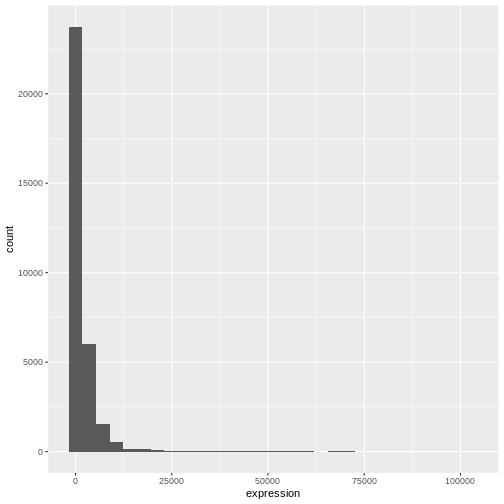
The + in the ggplot2 package is
particularly useful because it allows you to modify existing
ggplot objects. This means you can easily set up plot
templates and conveniently explore different types of plots, so the
above plot can also be generated with code like this:
R
# Assign plot to a variable
rna_plot <- ggplot(data = rna,
                   mapping = aes(x = expression))

# Draw the plot
rna_plot + geom_histogram()
Challenge
You have probably noticed an automatic message that appears when drawing the histogram:
OUTPUT
`stat_bin()` using `bins = 30`. Pick better value `binwidth`.Change the arguments bins or binwidth of
geom_histogram() to change the number or width of the
bins.
R
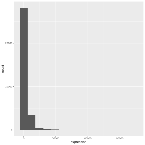
# change bins
ggplot(rna, aes(x = expression)) +
    geom_histogram(bins = 15)
R
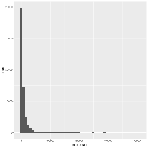
# change binwidth
ggplot(rna, aes(x = expression)) +
    geom_histogram(binwidth = 2000)
We can observe here that the data are skewed to the right. We can
apply log2 transformation to have a more symmetric distribution. Note
that we add here a small constant value (+1) to avoid
having -Inf values returned for expression values equal to
0.
R
rna <- rna |>
  mutate(expression_log = log2(expression + 1))
If we now draw the histogram of the log2-transformed expressions, the distribution is indeed closer to a normal distribution.
R
ggplot(rna, aes(x = expression_log)) + geom_histogram()
OUTPUT
`stat_bin()` using `bins = 30`. Pick better value `binwidth`.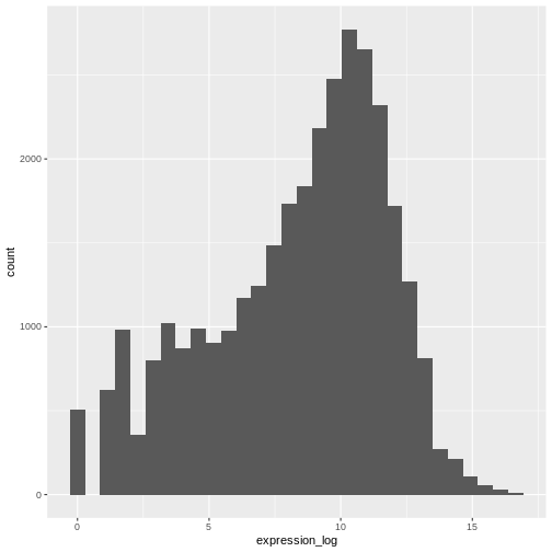
From now on we will work on the log-transformed expression values.
Challenge
Another way to visualize this transformation is to consider the scale of the observations. For example, it may be worth changing the scale of the axis to better distribute the observations in the space of the plot. Changing the scale of the axes is done similarly to adding/modifying other components (i.e., by incrementally adding commands). Try making this modification:
- Represent the un-transformed expression on the log10 scale; see
scale_x_log10(). Compare it with the previous graph. Why do you now have warning messages appearing?
R
ggplot(data = rna,mapping = aes(x = expression))+
  geom_histogram() +
  scale_x_log10()
WARNING
Warning in scale_x_log10(): log-10 transformation introduced infinite values.OUTPUT
`stat_bin()` using `bins = 30`. Pick better value `binwidth`.WARNING
Warning: Removed 507 rows containing non-finite outside the scale range
(`stat_bin()`).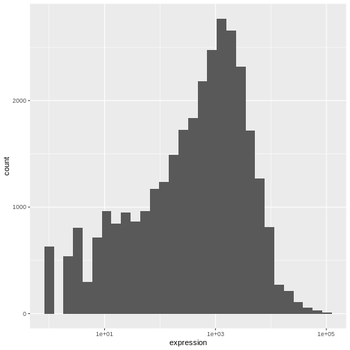
Notes
- Anything you put in the
ggplot()function can be seen by any geom layers that you add (i.e., these are global plot settings). This includes the x- and y-axis mapping you set up inaes(). - You can also specify mappings for a given geom independently of the
mappings defined globally in the
ggplot()function. - The
+sign used to add new layers must be placed at the end of the line containing the previous layer. If, instead, the+sign is added at the beginning of the line containing the new layer,ggplot2will not add the new layer and will return an error message.
R
# This is the correct syntax for adding layers
rna_plot +
  geom_histogram()

# This will not add the new layer and will return an error message
rna_plot
  + geom_histogram()
Building your plots iteratively
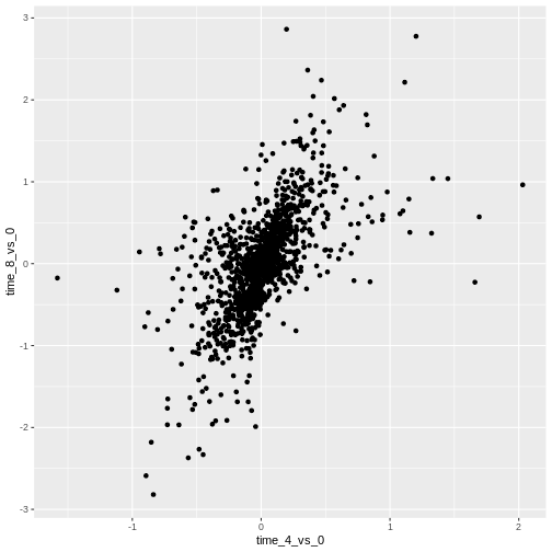
We will now draw a scatter plot with two continuous variables and the
geom_point() function. This graph will represent the log2
fold changes of expression comparing time 8 versus time 0, and time 4
versus time 0. To this end, we first need to compute the means of the
log-transformed expression values by gene and time, then the log fold
changes by subtracting the mean log expressions between time 8 and time
0 and between time 4 and time 0. Note that we also include here the gene
biotype that we will use later on to represent the genes. We will save
the fold changes in a new data frame called rna_fc.
R
rna_fc <- rna |> select(gene, time,
                         gene_biotype, expression_log) |>
  group_by(gene, time, gene_biotype) |>
  summarize(mean_exp = mean(expression_log)) |>
  pivot_wider(names_from = time,
              values_from = mean_exp) |>
  mutate(time_8_vs_0 = `8` - `0`, time_4_vs_0 = `4` - `0`)
OUTPUT
`summarise()` has regrouped the output.
ℹ Summaries were computed grouped by gene, time, and gene_biotype.
ℹ Output is grouped by gene and time.
ℹ Use `summarise(.groups = "drop_last")` to silence this message.
ℹ Use `summarise(.by = c(gene, time, gene_biotype))` for per-operation grouping
  (`?dplyr::dplyr_by`) instead.
We can then build a ggplot with the newly created dataset
rna_fc. Building plots with ggplot2 is
typically an iterative process. We start by defining the dataset we’ll
use, lay out the axes, and choose a geom:
R
ggplot(data = rna_fc, mapping = aes(x = time_4_vs_0, y = time_8_vs_0)) +
  geom_point()
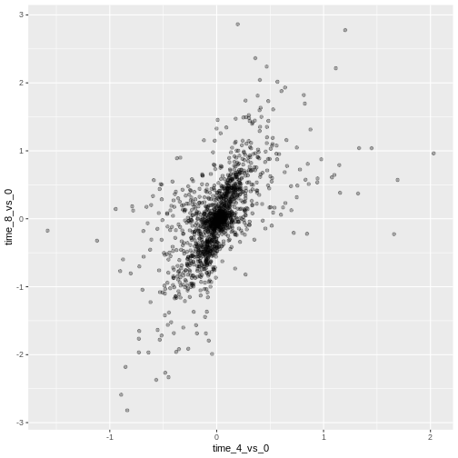
Then, we start modifying this plot to extract more information from
it. For instance, we can add transparency (alpha) to avoid
overplotting:
R
ggplot(data = rna_fc, mapping = aes(x = time_4_vs_0, y = time_8_vs_0)) +
  geom_point(alpha = 0.3)
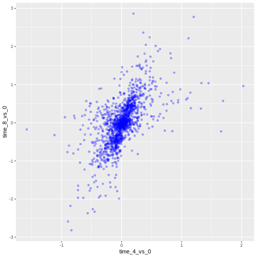
We can also add colors for all the points:
R
ggplot(data = rna_fc, mapping = aes(x = time_4_vs_0, y = time_8_vs_0)) +
  geom_point(alpha = 0.3, color = "blue")
Or to color each gene in the plot differently, you could use a vector
as an input to the argument color. ggplot2
will provide a different color corresponding to different values in the
vector. Here is an example where we color with
gene_biotype:
R
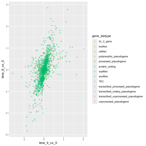
ggplot(data = rna_fc, mapping = aes(x = time_4_vs_0, y = time_8_vs_0)) +
  geom_point(alpha = 0.3, aes(color = gene_biotype))
We can also specify the colors directly inside the mapping provided
in the ggplot() function. This will be seen by any geom
layers and the mapping will be determined by the x- and y-axis set up in
aes().
R
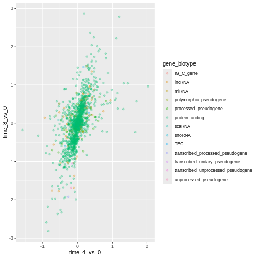
ggplot(data = rna_fc, mapping = aes(x = time_4_vs_0, y = time_8_vs_0,
                                color = gene_biotype)) +
  geom_point(alpha = 0.3)
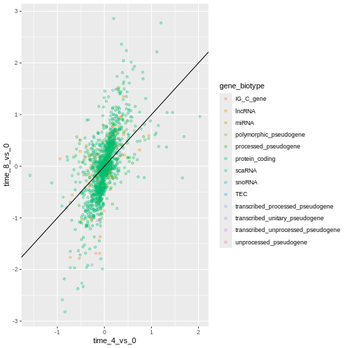
Finally, we could also add a diagonal line with the
geom_abline() function:
R
ggplot(data = rna_fc, mapping = aes(x = time_4_vs_0, y = time_8_vs_0,
                                color = gene_biotype)) +
  geom_point(alpha = 0.3) +
  geom_abline(intercept = 0)

Notice that we can change the geom layer from geom_point
to geom_jitter and colors will still be determined by
gene_biotype.
R
ggplot(data = rna_fc, mapping = aes(x = time_4_vs_0, y = time_8_vs_0,
                                color = gene_biotype)) +
  geom_jitter(alpha = 0.3) +
  geom_abline(intercept = 0)
Challenge
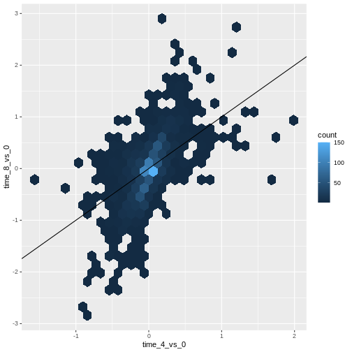
Scatter plots can be useful exploratory tools for small datasets. For
data sets with large numbers of observations, such as the
rna_fc data set, overplotting of points can be a limitation
of scatter plots. One strategy for handling such settings is to use
hexagonal binning of observations. The plot space is tessellated into
hexagons. Each hexagon is assigned a color based on the number of
observations that fall within its boundaries.
To use hexagonal binning in
ggplot2, first install the R packagehexbinfrom CRAN and load it.Then use the
geom_hex()function to produce the hexbin figure.What are the relative strengths and weaknesses of a hexagonal bin plot compared to a scatter plot? Examine the above scatter plot and compare it with the hexagonal bin plot that you created.
R
install.packages("hexbin")
R
library("hexbin")

ggplot(data = rna_fc, mapping = aes(x = time_4_vs_0, y = time_8_vs_0)) +
  geom_hex() +
  geom_abline(intercept = 0)
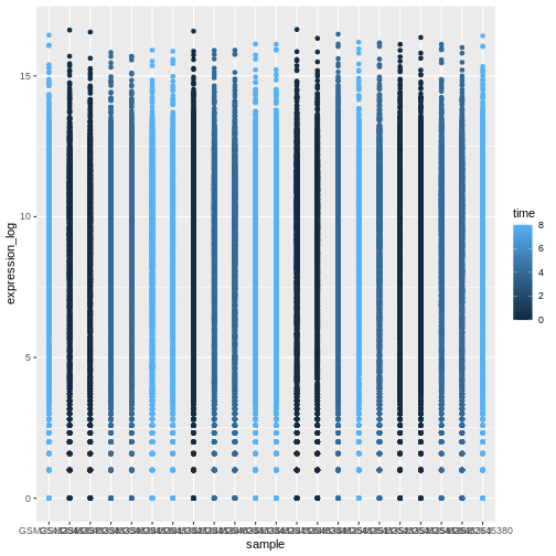
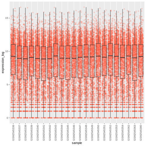
Challenge
Use what you just learned to create a scatter plot of
expression_log over sample from the
rna dataset with the time showing in different colors. Is
this a good way to show this type of data?
R
ggplot(data = rna, mapping = aes(y = expression_log, x = sample)) +
    geom_point(aes(color = time))
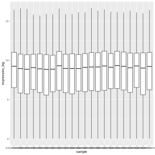
Boxplot
We can use boxplots to visualize the distribution of gene expressions within each sample:
R
ggplot(data = rna,
         mapping = aes(y = expression_log, x = sample)) +
  geom_boxplot()
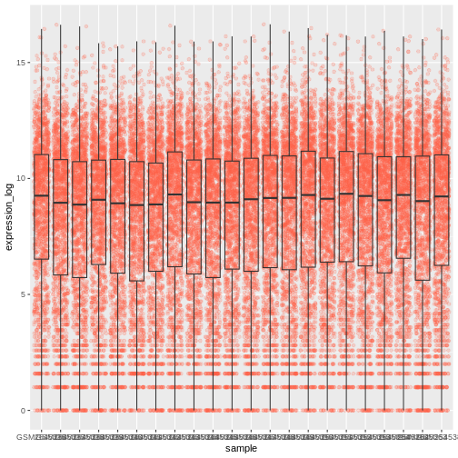
By adding points to boxplot, we can have a better idea of the number of measurements and of their distribution:
R
ggplot(data = rna,
         mapping = aes(y = expression_log, x = sample)) +
  geom_jitter(alpha = 0.2, color = "tomato") +
  geom_boxplot(alpha = 0)
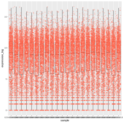
Challenge
Note how the boxplot layer is in front of the jitter layer? What do you need to change in the code to put the boxplot below the points?
We should switch the order of these two geoms:
R
ggplot(data = rna,
         mapping = aes(y = expression_log, x = sample)) +
  geom_boxplot(alpha = 0) +
  geom_jitter(alpha = 0.2, color = "tomato")
You may notice that the values on the x-axis are still not properly readable. Let’s change the orientation of the labels and adjust them vertically and horizontally so they don’t overlap. You can use a 90-degree angle, or experiment to find the appropriate angle for diagonally oriented labels:
R
ggplot(data = rna,
         mapping = aes(y = expression_log, x = sample)) +
  geom_jitter(alpha = 0.2, color = "tomato") +
  geom_boxplot(alpha = 0) +
  theme(axis.text.x = element_text(angle = 90,  hjust = 0.5, vjust = 0.5))
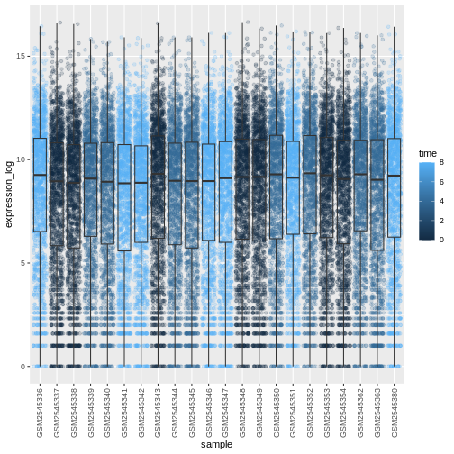
Challenge
Add color to the data points on your boxplot according to the
duration of the infection (time).
Hint: Check the class for time. Consider
changing the class of time from integer to factor directly
in the ggplot mapping. Why does this change how R makes the graph?
R
# time as integer
ggplot(data = rna,
         mapping = aes(y = expression_log,
                       x = sample)) +
  geom_jitter(alpha = 0.2, aes(color = time)) +
  geom_boxplot(alpha = 0) +
  theme(axis.text.x = element_text(angle = 90,  hjust = 0.5, vjust = 0.5))
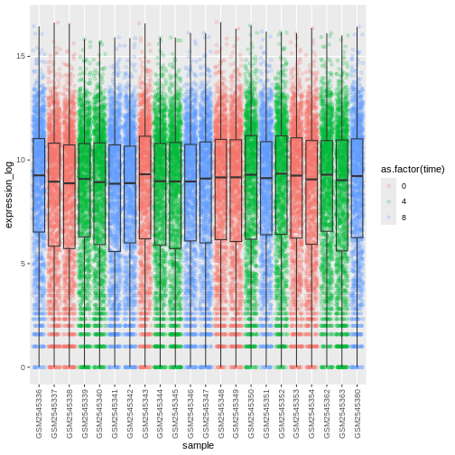
R
# time as factor
ggplot(data = rna,
         mapping = aes(y = expression_log,
                       x = sample)) +
  geom_jitter(alpha = 0.2, aes(color = as.factor(time))) +
  geom_boxplot(alpha = 0) +
  theme(axis.text.x = element_text(angle = 90,  hjust = 0.5, vjust = 0.5))
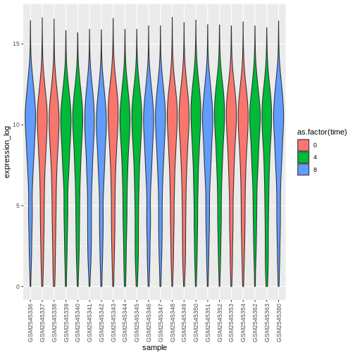
Challenge
Boxplots are useful summaries, but hide the shape of the distribution. For example, if the distribution is bimodal, we would not see it in a boxplot. An alternative to the boxplot is the violin plot, where the shape (of the density of points) is drawn.
- Replace the box plot with a violin plot; see
geom_violin(). Fill in the violins according to the time with the argumentfill.
R
ggplot(data = rna,
         mapping = aes(y = expression_log, x = sample)) +
  geom_violin(aes(fill = as.factor(time))) +
  theme(axis.text.x = element_text(angle = 90,  hjust = 0.5, vjust = 0.5))
Challenge
- Modify the violin plot to fill in the violins by
sex.
R
ggplot(data = rna,
mapping = aes(y = expression_log, x = sample)) +
geom_violin(aes(fill = sex)) +
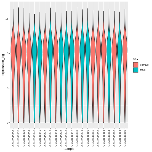
theme(axis.text.x = element_text(angle = 90, hjust = 0.5, vjust = 0.5))
Line plots
Let’s calculate the mean expression per duration of the infection for
the 10 genes having the highest log fold changes comparing time 8 versus
time 0. First, we need to select the genes and create a subset of
rna called sub_rna containing the 10 selected
genes, then we need to group the data and calculate the mean gene
expression within each group:
R
rna_fc <- rna_fc |> arrange(desc(time_8_vs_0))

genes_selected <- rna_fc$gene[1:10]

sub_rna <- rna |>
    filter(gene %in% genes_selected)

mean_exp_by_time <- sub_rna |>
  group_by(gene,time) |>
    summarize(mean_exp = mean(expression_log))
OUTPUT
`summarise()` has regrouped the output.
ℹ Summaries were computed grouped by gene and time.
ℹ Output is grouped by gene.
ℹ Use `summarise(.groups = "drop_last")` to silence this message.
ℹ Use `summarise(.by = c(gene, time))` for per-operation grouping
  (`?dplyr::dplyr_by`) instead.
R
mean_exp_by_time
OUTPUT
# A tibble: 30 × 3
# Groups:   gene [10]
   gene   time mean_exp
   <chr> <int>    <dbl>
 1 Acr       0     5.07
 2 Acr       4     5.54
 3 Acr       8     7.31
 4 Aipl1     0     3.70
 5 Aipl1     4     3.89
 6 Aipl1     8     6.56
 7 Bst1      0     3.20
 8 Bst1      4     3.77
 9 Bst1      8     5.22
10 Chil3     0     4.00
# ℹ 20 more rows
We can build the line plot with duration of the infection on the x-axis and the mean expression on the y-axis:
R
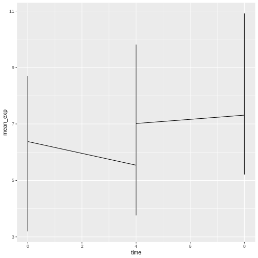
ggplot(data = mean_exp_by_time, mapping = aes(x = time, y = mean_exp)) +
  geom_line()
Unfortunately, this does not work because we plotted data for all the
genes together. We need to tell ggplot to draw a line for each gene by
modifying the aesthetic function to include
group = gene:
R
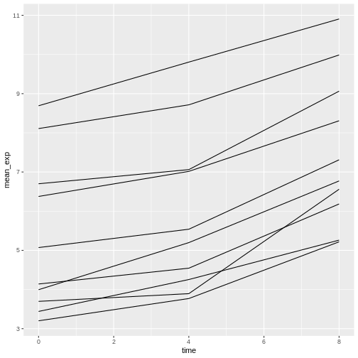
ggplot(data = mean_exp_by_time,
       mapping = aes(x = time, y = mean_exp, group = gene)) +
  geom_line()
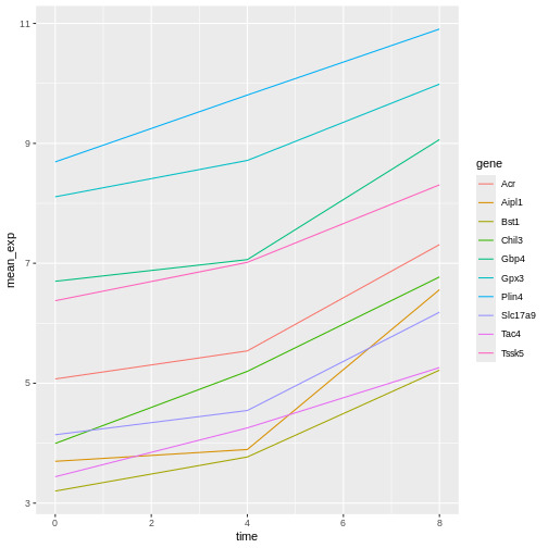
We will be able to distinguish genes in the plot if we add colors
(using color also automatically groups the data):
R
ggplot(data = mean_exp_by_time,
       mapping = aes(x = time, y = mean_exp, color = gene)) +
  geom_line()
Faceting
ggplot2 has a special technique called faceting
that allows the user to split one plot into multiple (sub) plots based
on a factor included in the dataset. These different subplots inherit
the same properties (axes limits, ticks, …) to facilitate their direct
comparison. We will use it to make a line plot across time for each
gene:
R
ggplot(data = mean_exp_by_time,
       mapping = aes(x = time, y = mean_exp)) + geom_line() +
  facet_wrap(~ gene)
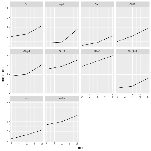
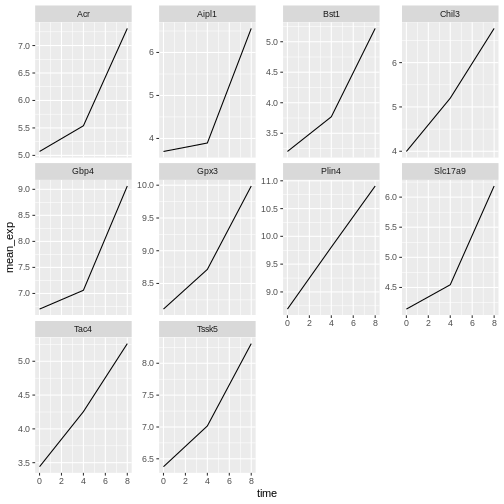
Here both x- and y-axis have the same scale for all the subplots. You
can change this default behavior by modifying scales in
order to allow a free scale for the y-axis:
R
ggplot(data = mean_exp_by_time,
       mapping = aes(x = time, y = mean_exp)) +
  geom_line() +
  facet_wrap(~ gene, scales = "free_y")
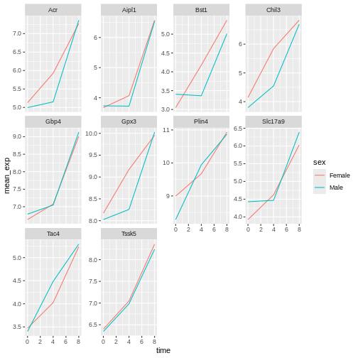
Now we would like to split the line in each plot by the sex of the
mice. To do that we need to calculate the mean expression in the data
frame grouped by gene, time, and
sex:
R
mean_exp_by_time_sex <- sub_rna |>
  group_by(gene, time, sex) |>
    summarize(mean_exp = mean(expression_log))
OUTPUT
`summarise()` has regrouped the output.
ℹ Summaries were computed grouped by gene, time, and sex.
ℹ Output is grouped by gene and time.
ℹ Use `summarise(.groups = "drop_last")` to silence this message.
ℹ Use `summarise(.by = c(gene, time, sex))` for per-operation grouping
  (`?dplyr::dplyr_by`) instead.
R
mean_exp_by_time_sex
OUTPUT
# A tibble: 60 × 4
# Groups: gene, time [30]
gene time sex mean_exp
<chr> <int> <chr> <dbl>
1 Acr 0 Female 5.13
2 Acr 0 Male 5.00
3 Acr 4 Female 5.93
4 Acr 4 Male 5.15
5 Acr 8 Female 7.27
6 Acr 8 Male 7.36
7 Aipl1 0 Female 3.67
8 Aipl1 0 Male 3.73
9 Aipl1 4 Female 4.07
10 Aipl1 4 Male 3.72
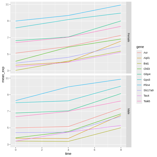
# ℹ 50 more rowsWe can now make the faceted plot by splitting further by sex using
color (within a single plot):
R
ggplot(data = mean_exp_by_time_sex,
       mapping = aes(x = time, y = mean_exp, color = sex)) +
  geom_line() +
  facet_wrap(~ gene, scales = "free_y")
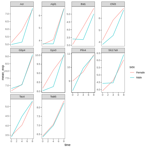
Usually plots with white background look more readable when printed.
We can set the background to white using the function
theme_bw(). Additionally, we can remove the grid:
R
ggplot(data = mean_exp_by_time_sex,
       mapping = aes(x = time, y = mean_exp, color = sex)) +
  geom_line() +
  facet_wrap(~ gene, scales = "free_y") +
  theme_bw() +
  theme(panel.grid = element_blank())
Challenge
Use what you just learned to create a plot that depicts how the average expression of each chromosome changes through the duration of infection.
R
mean_exp_by_chromosome <- rna |>
  group_by(chromosome_name, time) |>
  summarize(mean_exp = mean(expression_log))
OUTPUT
`summarise()` has regrouped the output.
ℹ Summaries were computed grouped by chromosome_name and time.
ℹ Output is grouped by chromosome_name.
ℹ Use `summarise(.groups = "drop_last")` to silence this message.
ℹ Use `summarise(.by = c(chromosome_name, time))` for per-operation grouping
  (`?dplyr::dplyr_by`) instead.
R
ggplot(data = mean_exp_by_chromosome, mapping = aes(x = time,
                                y = mean_exp)) +
  geom_line() +
  facet_wrap(~ chromosome_name, scales = "free_y")
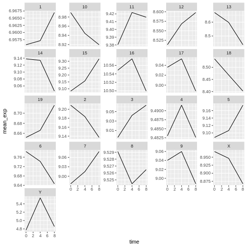
The facet_wrap geometry extracts plots into an arbitrary
number of dimensions to allow them to cleanly fit on one page. On the
other hand, the facet_grid geometry allows you to
explicitly specify how you want your plots to be arranged via formula
notation (rows ~ columns; a . can be used as a
placeholder that indicates only one row or column).
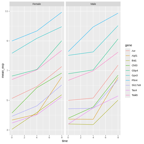
Let’s modify the previous plot to compare how the mean gene expression of males and females has changed through time:
R
# One column, facet by rows
ggplot(data = mean_exp_by_time_sex,
       mapping = aes(x = time, y = mean_exp, color = gene)) +
  geom_line() +
  facet_grid(sex ~ .)
R
# One row, facet by column
ggplot(data = mean_exp_by_time_sex,
       mapping = aes(x = time, y = mean_exp, color = gene)) +
  geom_line() +
  facet_grid(. ~ sex)
ggplot2 themes
In addition to theme_bw(), which changes the plot
background to white, ggplot2 comes with several other
themes which can be useful to quickly change the look of your
visualization. The complete list of themes is available at https://ggplot2.tidyverse.org/reference/ggtheme.html.
theme_minimal() and theme_light() are popular,
and theme_void() can be useful as a starting point to
create a new hand-crafted theme.
The ggthemes
package provides a wide variety of options (including an Excel 2003
theme). The ggplot2
extensions website provides a list of packages that extend the
capabilities of ggplot2, including additional themes.
Customisation
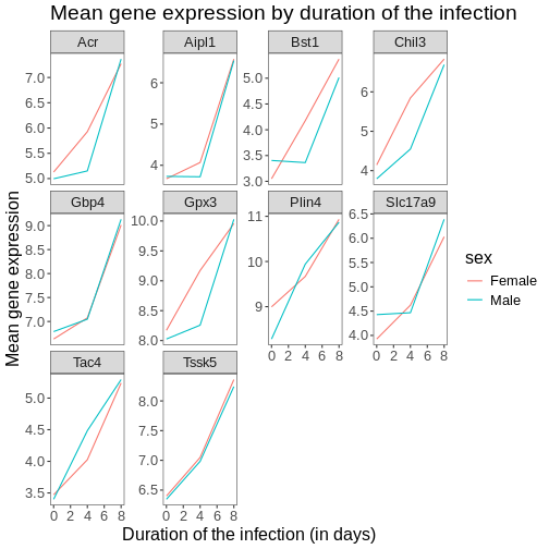
Let’s come back to the faceted plot of mean expression by time and gene, colored by sex.
Take a look at the ggplot2
cheat sheet, and think of ways you could improve the plot.
Now, we can change names of axes to something more informative than ‘time’ and ‘mean_exp’, and add a title to the figure:
R
ggplot(data = mean_exp_by_time_sex,
       mapping = aes(x = time, y = mean_exp, color = sex)) +
  geom_line() +
  facet_wrap(~ gene, scales = "free_y") +
  theme_bw() +
  theme(panel.grid = element_blank()) +
  labs(title = "Mean gene expression by duration of the infection",
       x = "Duration of the infection (in days)",
       y = "Mean gene expression")
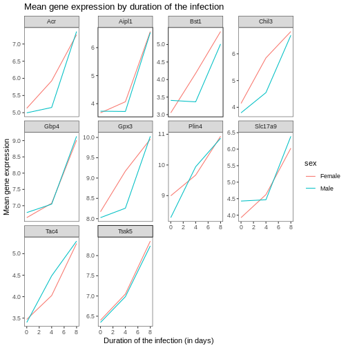
The axes have more informative names, but their readability can be improved by increasing the font size:
R
ggplot(data = mean_exp_by_time_sex,
       mapping = aes(x = time, y = mean_exp, color = sex)) +
  geom_line() +
  facet_wrap(~ gene, scales = "free_y") +
  theme_bw() +
  theme(panel.grid = element_blank()) +
  labs(title = "Mean gene expression by duration of the infection",
       x = "Duration of the infection (in days)",
       y = "Mean gene expression")  +
  theme(text = element_text(size = 16))
Note that it is also possible to change the fonts of your plots. If
you are on Windows, you may have to install the extrafont
package.
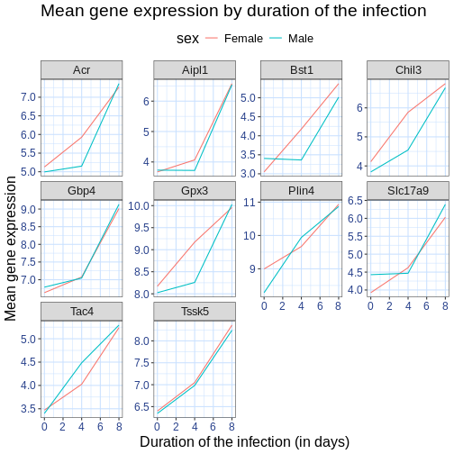
We can further customize the color of x- and y-axis text, the color
of the grid, etc. We can also for example move the legend to the top by
setting legend.position to "top".
R
ggplot(data = mean_exp_by_time_sex,
       mapping = aes(x = time, y = mean_exp, color = sex)) +
  geom_line() +
  facet_wrap(~ gene, scales = "free_y") +
  theme_bw() +
  theme(panel.grid = element_blank()) +
  labs(title = "Mean gene expression by duration of the infection",
       x = "Duration of the infection (in days)",
       y = "Mean gene expression")  +
  theme(text = element_text(size = 16),
        axis.text.x = element_text(colour = "royalblue4", size = 12),
        axis.text.y = element_text(colour = "royalblue4", size = 12),
        panel.grid = element_line(colour="lightsteelblue1"),
        legend.position = "top")
If you like the changes you created better than the default theme, you can save them as an object to be able to easily apply them to other plots you may create. Here is an example with the histogram we have previously created.
R
blue_theme <- theme(axis.text.x = element_text(colour = "royalblue4",
                                               size = 12),
                    axis.text.y = element_text(colour = "royalblue4",
                                               size = 12),
                    text = element_text(size = 16),
                    panel.grid = element_line(colour="lightsteelblue1"))

ggplot(rna, aes(x = expression_log)) +
  geom_histogram(bins = 20) +
    blue_theme()
ERROR
Error in `blue_theme()`:
! could not find function "blue_theme"
Challenge
With all of this information in hand, please take another five
minutes to either improve one of the plots generated in this exercise or
create a beautiful graph of your own. Use the RStudio ggplot2
cheat sheet for inspiration. Here are some ideas:
- See if you can change the thickness of the lines.
- Can you find a way to change the name of the legend? What about its
labels? (hint: look for a ggplot function starting with
scale_) - Try using a different color palette or manually specifying the colors for the lines (see https://www.cookbook-r.com/Graphs/Colors_(ggplot2)/).
For example, based on this plot:
R
ggplot(data = mean_exp_by_time_sex,
       mapping = aes(x = time, y = mean_exp, color = sex)) +
  geom_line() +
  facet_wrap(~ gene, scales = "free_y") +
  theme_bw() +
  theme(panel.grid = element_blank())

We can customize it the following ways:
R
# change the thickness of the lines
ggplot(data = mean_exp_by_time_sex,
       mapping = aes(x = time, y = mean_exp, color = sex)) +
  geom_line(size=1.5) +
  facet_wrap(~ gene, scales = "free_y") +
  theme_bw() +
  theme(panel.grid = element_blank())
WARNING
Warning: Using `size` aesthetic for lines was deprecated in ggplot2 3.4.0.
ℹ Please use `linewidth` instead.
This warning is displayed once per session.
Call `lifecycle::last_lifecycle_warnings()` to see where this warning was
generated.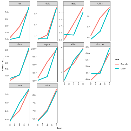
R
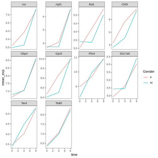
# change the name of the legend and the labels
ggplot(data = mean_exp_by_time_sex,
mapping = aes(x = time, y = mean_exp, color = sex)) +
geom_line() +
facet_wrap(~ gene, scales = "free_y") +
theme_bw() +
theme(panel.grid = element_blank()) +
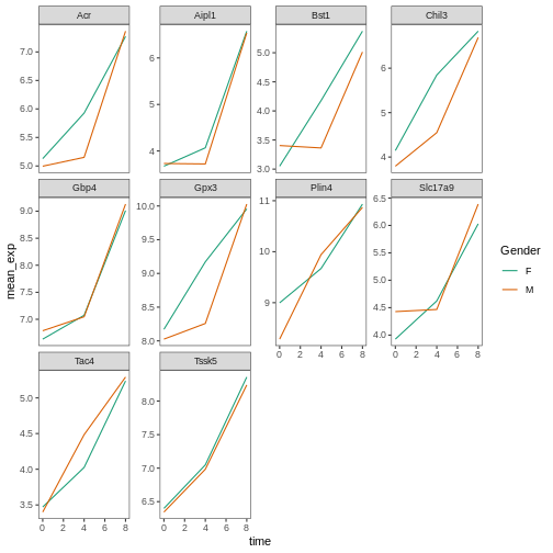
scale_color_discrete(name = "Gender", labels = c("F", "M"))
R
# using a different color palette
ggplot(data = mean_exp_by_time_sex,
       mapping = aes(x = time, y = mean_exp, color = sex)) +
  geom_line() +
  facet_wrap(~ gene, scales = "free_y") +
  theme_bw() +
  theme(panel.grid = element_blank()) +
  scale_color_brewer(name = "Gender", labels = c("F", "M"), palette = "Dark2")
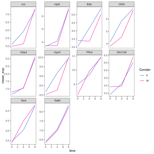
R
# manually specifying the colors
ggplot(data = mean_exp_by_time_sex,
       mapping = aes(x = time, y = mean_exp, color = sex)) +
  geom_line() +
  facet_wrap(~ gene, scales = "free_y") +
  theme_bw() +
  theme(panel.grid = element_blank()) +
  scale_color_manual(name = "Gender",  labels = c("F", "M"),
                     values = c("royalblue", "deeppink"))
Composing plots
Faceting is a great tool for splitting one plot into multiple subplots, but sometimes you may want to produce a single figure that contains multiple independent plots, i.e. plots that are based on different variables or even different data frames.
Let’s start by creating the two plots that we want to arrange next to each other:
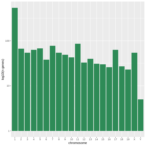
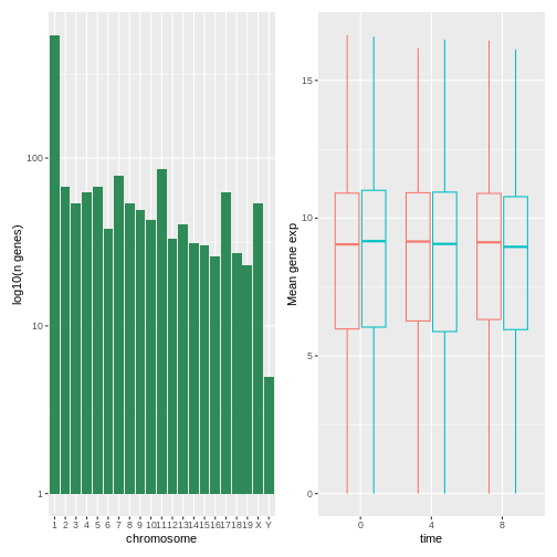
The first graph counts the number of unique genes per chromosome. We
first need to reorder the levels of chromosome_name and
filter the unique genes per chromosome. We also change the scale of the
y-axis to a log10 scale for better readability.
R
rna$chromosome_name <- factor(rna$chromosome_name,
                               levels = c(1:19,"X","Y"))

count_gene_chromosome <- rna |>
  select(chromosome_name, gene) |>
  distinct() |> ggplot() +
  geom_bar(aes(x = chromosome_name), fill = "seagreen",
           position = "dodge", stat = "count") +
  labs(y = "log10(n genes)", x = "chromosome") +
  scale_y_log10()

count_gene_chromosome
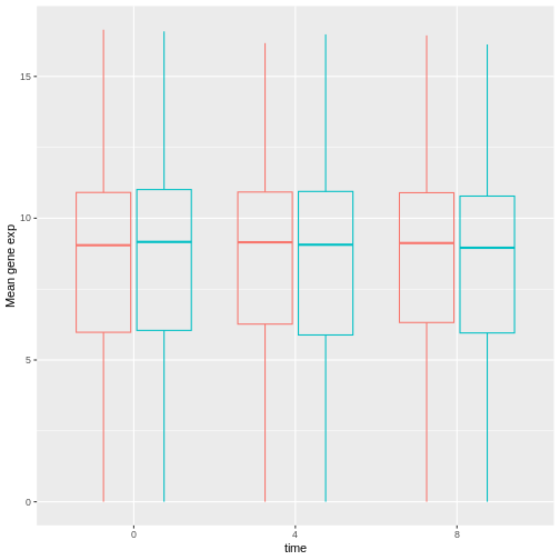
Below, we also remove the legend altogether by setting the
legend.position to "none".
R
exp_boxplot_sex <- ggplot(rna, aes(y=expression_log, x = as.factor(time),
                 color=sex)) +
   geom_boxplot(alpha = 0) +
  labs(y = "Mean gene exp",
       x = "time") + theme(legend.position = "none")

exp_boxplot_sex
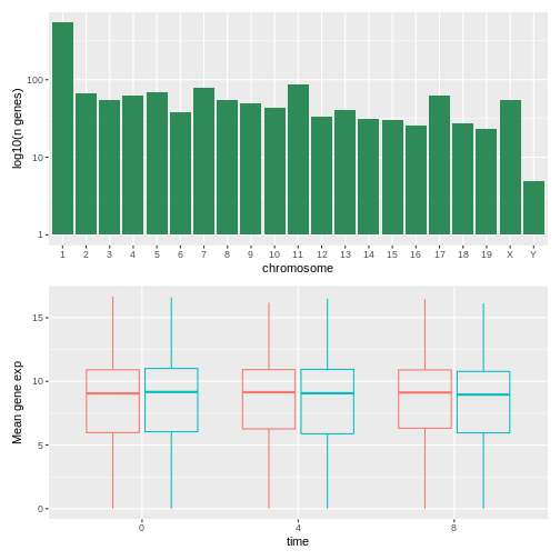
The patchwork
package provides an elegant approach to combining figures using the
+ to arrange figures (typically side by side). More
specifically the | explicitly arranges them side by side
and / stacks them on top of each other.
R
install.packages("patchwork")
R
library("patchwork")
count_gene_chromosome + exp_boxplot_sex
R
## or count_gene_chromosome | exp_boxplot_sex
R
count_gene_chromosome / exp_boxplot_sex
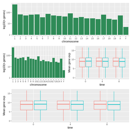
We can combine further control the layout of the final composition
with plot_layout to create more complex layouts:
R
count_gene_chromosome + exp_boxplot_sex + plot_layout(ncol = 1)

R
count_gene_chromosome +
 (count_gene_chromosome + exp_boxplot_sex) +
 exp_boxplot_sex +
 plot_layout(ncol = 1)

The last plot can also be created using the | and
/ composers:
R
count_gene_chromosome /
 (count_gene_chromosome | exp_boxplot_sex) /
 exp_boxplot_sex
Learn more about patchwork on its webpage or in this video.
Another option is the gridExtra package
that allows to combine separate ggplots into a single figure using
grid.arrange():
R
install.packages("gridExtra")
R
library("gridExtra")
grid.arrange(count_gene_chromosome, exp_boxplot_sex, ncol = 2)
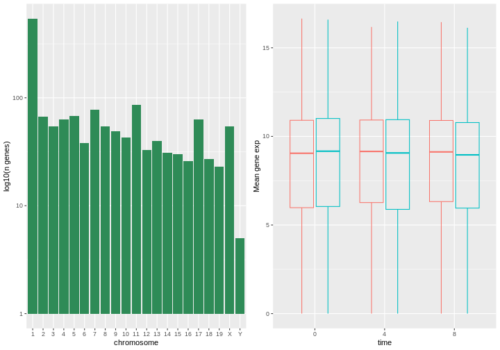
In addition to the ncol and nrow arguments,
used to make simple arrangements, there are tools for constructing
more complex layouts.
Exporting plots
After creating your plot, you can save it to a file in your favorite format. The Export tab in the Plot pane in RStudio will save your plots at low resolution, which will not be accepted by many journals and will not scale well for posters.
Instead, use the ggsave() function, which allows you
easily change the dimension and resolution of your plot by adjusting the
appropriate arguments (width, height and
dpi).
Make sure you have the fig_output/ folder in your
working directory.
R
my_plot <- ggplot(data = mean_exp_by_time_sex,
       mapping = aes(x = time, y = mean_exp, color = sex)) +
  geom_line() +
  facet_wrap(~ gene, scales = "free_y") +
  labs(title = "Mean gene expression by duration of the infection",
         x = "Duration of the infection (in days)",
         y = "Mean gene expression") +
  guides(color=guide_legend(title="Gender")) +
  theme_bw() +
  theme(axis.text.x = element_text(colour = "royalblue4", size = 12),
        axis.text.y = element_text(colour = "royalblue4", size = 12),
        text = element_text(size = 16),
        panel.grid = element_line(colour="lightsteelblue1"),
        legend.position = "top")
ggsave("fig_output/mean_exp_by_time_sex.png", my_plot, width = 15,
       height = 10)

# This also works for grid.arrange() plots
combo_plot <- grid.arrange(count_gene_chromosome, exp_boxplot_sex,
                           ncol = 2, widths = c(4, 6))
ggsave("fig_output/combo_plot_chromosome_sex.png", combo_plot,
       width = 10, dpi = 300)
Note: The parameters width and height also
determine the font size in the saved plot.
Other packages for visualisation
ggplot2 is a very powerful package that fits very nicely
in our tidy data and tidy tools pipeline. There are
other visualization packages in R that shouldn’t be ignored.
Base graphics
The default graphics system that comes with R, often called base
R graphics is simple and fast. It is based on the painter’s or
canvas model, where different output are directly overlaid on top
of each other (see figure @ref(fig:paintermodel)). This is a fundamental
difference with ggplot2 (and with lattice,
described below), that returns dedicated objects, that are rendered on
screen or in a file, and that can even be updated.
R
par(mfrow = c(1, 3))
plot(1:20, main = "First layer, produced with plot(1:20)")

plot(1:20, main = "A horizontal red line, added with abline(h = 10)")
abline(h = 10, col = "red")

plot(1:20, main = "A rectangle, added with rect(5, 5, 15, 15)")
abline(h = 10, col = "red")
rect(5, 5, 15, 15, lwd = 3)
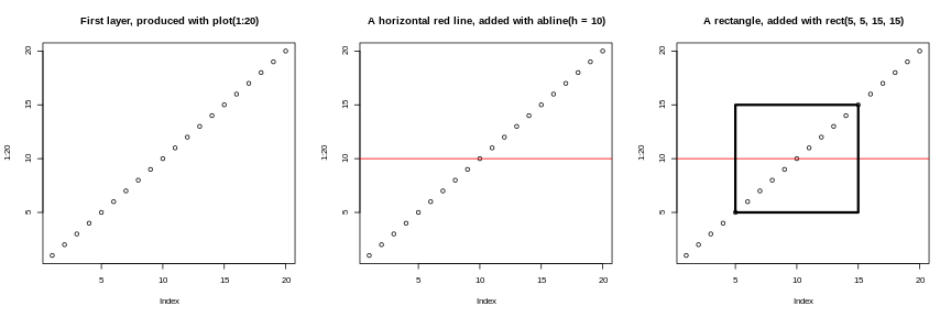
Another main difference is that base graphics’ plotting function try
to do the right thing based on their input type, i.e. they will
adapt their behaviour based on the class of their input. This is again
very different from what we have in ggplot2, that only
accepts dataframes as input, and that requires plots to be constructed
bit by bit.
R
par(mfrow = c(2, 2))
boxplot(rnorm(100),
        main = "Boxplot of rnorm(100)")
boxplot(matrix(rnorm(100), ncol = 10),
        main = "Boxplot of matrix(rnorm(100), ncol = 10)")
hist(rnorm(100))
hist(matrix(rnorm(100), ncol = 10))
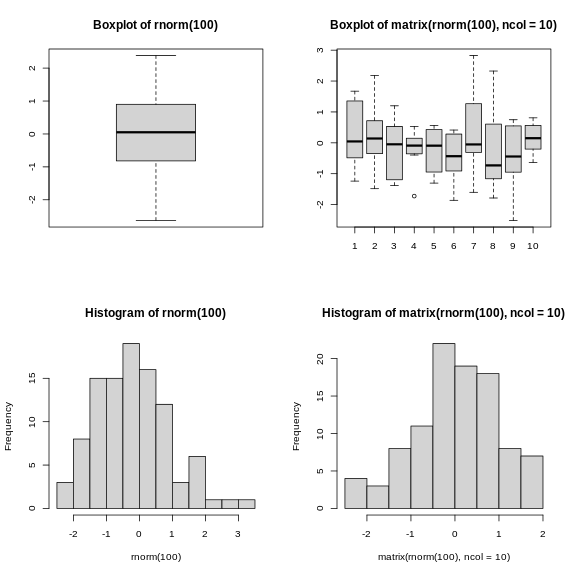
The out-of-the-box approach in base graphics can be very efficient
for simple, standard figures, that can be produced very quickly with a
single line of code and a single function such as plot, or
hist, or boxplot, … The defaults are however
not always the most appealing and tuning of figures, especially when
they become more complex (for example to produce facets), can become
lengthy and cumbersome.
The lattice package
The lattice package is similar to
ggplot2 in that is uses dataframes as input, returns
graphical objects and supports faceting. lattice however
isn’t based on the grammar of graphics and has a more convoluted
interface.
A good reference for the lattice package is @latticebook.
- Visualization in R
Source: Data Visualization Cheat Sheet.↩︎