Plotting
Overview
Teaching: 25 min
Exercises: 15 minQuestions
How can I plot histograms
How can I plot a graph with vertex and edges
Objectives
Create a graph with matplotlib
Create a graph with NetworkX
Python has several libraries that plot and visualize data. NetworkX is a library for working with graph data structures and algorithms, Plotly is a library for creating interactive and publication-quality plots, and Matplotlib is a comprehensive plotting library for creating static and interactive visualizations in Python. Each of these libraries serves different purposes and can be used for various data visualization tasks depending on the requirements and preferences of the user.
Plot with matplotlib
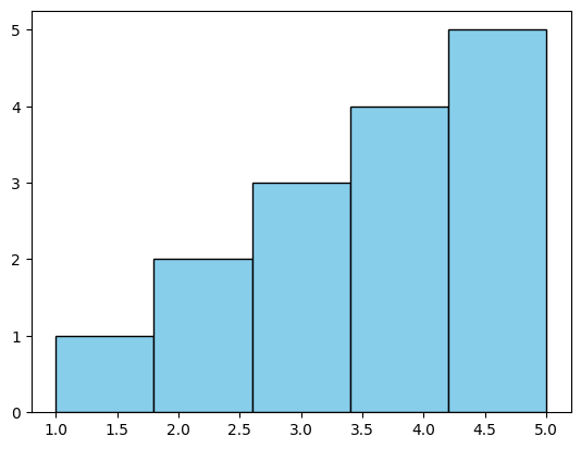
First, we import the matplotlib.pyplot module, which provides a MATLAB-like plotting interface.
import matplotlib.pyplot as plt
Now, we defined some sample data for which we wanted to create a histogram.
data = [1, 2, 2, 3, 3, 3, 4, 4, 4, 4, 5, 5, 5, 5, 5]
print(data)
[1, 2, 2, 3, 3, 3, 4, 4, 4, 4, 5, 5, 5, 5, 5]
We use the plt.hist() function to create the histogram. We pass the data as the first argument, specify the number of bins using the bins parameter, and optionally specify the color of the bars and their edges using the color and edgecolor parameters, respectively.
plt.hist(data, bins=5, color='skyblue', edgecolor='black')
(array([1., 2., 3., 4., 5.]),
 array([1. , 1.8, 2.6, 3.4, 4.2, 5. ]),
 <BarContainer object of 5 artists>)
We add labels to the x-axis and y-axis using plt.xlabel() and plt.ylabel(), and we add a title to the plot using plt.title().
plt.xlabel('Value')
plt.ylabel('Frequency')
plt.title('Histogram of Sample Data')
plt.hist(data, bins=5, color='skyblue', edgecolor='black')
(array([1., 2., 3., 4., 5.]),
 array([1. , 1.8, 2.6, 3.4, 4.2, 5. ]),
 <BarContainer object of 5 artists>)
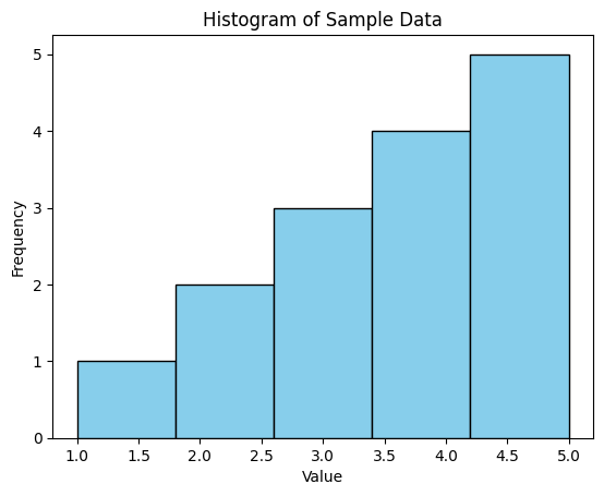
Notice that if you are not in colab or Jupyter Notebook, but in stand-alone Python you will need plt.show() to display the plot.
plt.show()
In this example, we produced a simple histogram of the sample data with five bins, with each bin representing the frequency of values falling within its range. The bars were colored sky blue with black edges for better visibility.
Exercise 1(Begginer): The nucleotide frequency of a DNA sequence
In the DNA sequence stored in the string dna_sequence, we want to graph the frequency of each nucleotide. Sort and fill in the blanks in the following code to get the frequency plot. Notice that we are using the function nucleotide_counts, which we constructed in the previous episode
Figure 5. Histogram of the nucleotide frequency on a DNA sequence.
plt.bar(__________, __________, color='skyblue')
frequencies = list(nucleotide_counts.values())
nucleotide_counts = calculate_nucleotide_frequency(_______)
dna_sequence = "ATGCTGACCTGAAGCTAAGCTAGGCT"
nucleotides = ____(nucleotide_counts.keys())
Solution
   nucleotide_counts = calculate_nucleotide_frequency(dna_sequence)
   nucleotides = list(nucleotide_counts.keys())
   frequencies = list(nucleotide_counts.values())

   plt.xlabel('Nucleotide')
   plt.ylabel('Frequency')
   plt.title('Nucleotide Frequency Histogram')
   plt.bar(nucleotides, frequencies, color='skyblue')
Creating graphs with NetworkX and Plotly
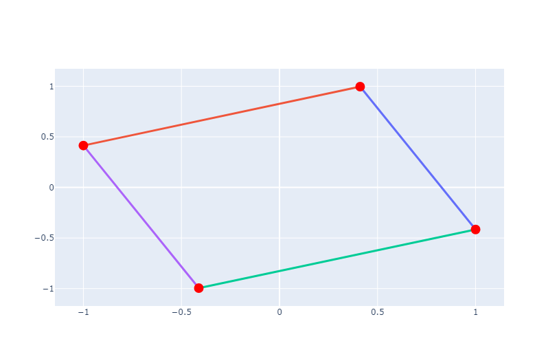
Let’s create a simple graph with NetworkX and visualize it using Plotly. In this example, we’ll create a graph with four nodes and four edges. Nodes are represented as red markers, and edges are represented as black lines.
import networkx as nx
import plotly.graph_objects as go
We create a simple undirected graph G.
# Create a simple graph
G = nx.Graph()
G.add_edges_from([(1, 2), (2, 3), (3, 4), (4, 1)])
We define positions for nodes using a spring layout algorithm (spring_layout). This assigns positions to nodes in such a way that minimizes the forces between them, resulting in a visually appealing layout.
When you call nx.spring_layout(G) without specifying any arguments, the layout is generated randomly each time the function is called. However, if you want to ensure that you get the same layout each time you generate it, you can set a seed for the random number generator.
# Define positions for nodes
# Set a seed for the random number generator
seed_value = 42  # Choose any integer value as the seed
pos = nx.spring_layout(G, seed=seed_value)
pos
{1: array([0.4112362 , 0.99648922]),
 2: array([ 1.        , -0.41570474]),
 3: array([-0.41137359, -0.99514183]),
 4: array([-0.99986261,  0.41435735])}
Try removing or changing the seed_value; what do you observe?
We create traces for edges and nodes. Each edge is represented by a line connecting the positions of its two endpoints, and each node is represented by a marker at its position.
# Create edge traces
edge_traces = []
for edge in G.edges():
    x0, y0 = pos[edge[0]]
    x1, y1 = pos[edge[1]]
    edge_trace = go.Scatter(x=[x0, x1], y=[y0, y1], mode='lines', line=dict(width=3))
    edge_traces.append(edge_trace)

edge_traces
[Scatter({
     'line': {'width': 3},
      'mode': 'lines',
      'x': [0.4112362006825586, 1.0],
      'y': [0.9964892191512681, -0.41570474278971886]
 }),
 Scatter({
     'line': {'width': 3},
     'mode': 'lines',
     'x': [0.4112362006825586, -0.9998626088117056],
     'y': [0.9964892191512681, 0.41435735265600393]
 }),
 Scatter({
     'line': {'width': 3},
     'mode': 'lines',
     'x': [1.0, -0.4113735918708533],
     'y': [-0.41570474278971886, -0.9951418290175523]
 }),
 Scatter({
     'line': {'width': 3},
     'mode': 'lines',
     'x': [-0.4113735918708533, -0.9998626088117056],
     'y': [-0.9951418290175523, 0.41435735265600393]
 })]
Productos pagados de Colab - Cancela los contratos aquí
We create a Plotly figure with the specified data and layout. We disable the legend for simplicity.
node_x = []
node_y = []
for node in G.nodes():
    x, y = pos[node]
    node_x.append(x)
    node_y.append(y)

node_trace = go.Scatter(x=node_x, y=node_y, mode='markers', marker=dict(size=14, color='rgb(255,0,0)'))

print("node_x",node_x)
print("node_y",node_y)
node_x [0.4112362006825586, 1.0, -0.4113735918708533, -0.9998626088117056]
node_y [0.9964892191512681, -0.41570474278971886, -0.9951418290175523, 0.41435735265600393]
Let’s create the Plotly figure and show it using Plotly’s show() method.
fig = go.Figure(data=edge_traces + [node_trace], layout=go.Layout(showlegend=False))
fig.show()
In the Topological Data Analysis for Pangenomics lesson, we need to graph and color triangles beside edges and nodes. Let’s do an example with NetworkX. First, we define two triangles, one with vertexes (1,2,3) and another with vertexes in nodes (4,3,2) of the above object.
triangles = [(1, 2, 3), (4, 3, 2)] # Define some triangles (example)
Now, we will use node_trace to define some characteristics of the nodes in the graph. Each node is represented by a marker (dot) with a corresponding text label displayed above it. The parameters used in its creation control various aspects of the appearance and behavior of the markers and text labels.
-
x=[] and y=[]: These parameters specify the x and y coordinates of the nodes in the scatter plot. Since we’re defining a trace for nodes, these lists are initially empty. The actual coordinates of the nodes will be added later based on the graph’s layout.
-
mode=’markers+text’: This parameter specifies the scatter plot’s mode. markers+text indicates that markers (dots representing nodes) and text labels will be displayed for each node.
-
hoverinfo=’text’: This parameter specifies what information will be displayed when hovering over a node. In this case, it’s set to ‘text’, meaning the text labels provided for each node will be displayed when hovering over the corresponding marker.
-
marker=dict(size=14): This parameter specifies the properties of the markers (nodes) in the scatter plot. Here, size=14 indicates the size of the markers.
-
text=[‘Node 1’, ‘Node 2’, ‘Node 3’]: This parameter specifies the text labels for each node.
-
textposition=’top center’: This parameter specifies the text’s position relative to the markers.
textfont=dict(size=14): This parameter specifies the font properties of the text labels. Here, size=14 indicates the font size of the text.
# Node trace
node_trace = go.Scatter(x=[], y=[], mode='markers+text', hoverinfo='text', marker=dict(size=14), text=['Node 1', 'Node 2', 'Node 3'], textposition='top center', textfont=dict(size=14))
Now that you know the for cycle, let’s iterate over all edges in the graph,
extract the positions of the nodes connected by each edge, and create a
scatter plot trace representing the edge with a line connecting the two endpoints.
These traces are stored in a list (edge_traces) to be later included in the plot.
# Edge traces
edge_traces = []
for edge in G.edges():
    x0, y0 = pos[edge[0]]
    x1, y1 = pos[edge[1]]
    edge_trace = go.Scatter(x=[x0, x1, None], y=[y0, y1, None], mode='lines', line=dict(width=3, color='rgba(0,0,0,0.5)'))
    edge_traces.append(edge_trace)
Now, we iterate over all triangles in the graph, extract the positions of the vertices of each triangle, and create scatter plot traces representing the triangles as filled polygons with lines connecting the vertices. These traces are stored in a list (triangle_traces) to be later included in the plot.
# Triangle traces
triangle_traces = []
for triangle in triangles:
    x = [pos[vertex][0] for vertex in triangle]
    y = [pos[vertex][1] for vertex in triangle]
    triangle_trace = go.Scatter(x=x + [x[0]], y=y + [y[0]], fill='toself', mode='lines+markers', line=dict(width=2), fillcolor='rgba(255,0,0,0.2)')
    triangle_traces.append(triangle_trace)
Now, we want to configure the plot layout by specifying settings for various components such as the legend, hover behavior, appearance of axes, and font properties of tick labels. These settings are organized into a layout object (layout) using the go.Layout() constructor.
# Configure the layout of the plot
layout = go.Layout(showlegend=False, hovermode='closest', xaxis=dict(showgrid=False, zeroline=False, tickfont=dict(size=16, family='Arial, sans-serif')), yaxis=dict(showgrid=False, zeroline=False, tickfont=dict(size=16, family='Arial, sans-serif')))
To create the figure, we add edges, triangles, and nodes to the data and then use the go.Figure function.
# Create the figure
fig = go.Figure(data=edge_traces + triangle_traces + [node_trace], layout=layout)
Finally, we want to adjust the size of the plot by setting its width and height based on the plot_size and dpi variables.
# Set the figure size
plot_size = 1
dpi = 600
fig.update_layout(width=plot_size * dpi, height=plot_size * dpi)
fig.show() # Show the figure
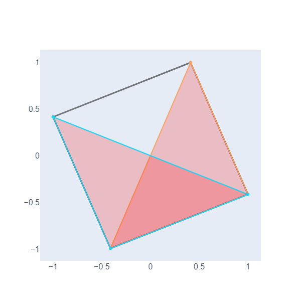
Here, we have plotted two filled triangles, we will need this ability to graph objects called simplicial complexes in the following lesson.
Exercise 2(Intermediate): Documenting a graph plot code
Look at the following function used in the Horizontal Gene transfer episode. 1) Based on what you learned about plotting triangles and edges, sort the comments that document what that part of the code is doing.
COMMENT: Triangle traces
COMMENT: Calculate node positions if not provided
COMMENT: Show the figure
COMMENT: Node trace
COMMENT: Save the figure if a filename is provided
COMMENT: Configure the layout of the plot
COMMENT: Edge traces3) What do you think the simplex tree contain?
4) what is the save_fiename doing?def visualize_simplicial_complex(simplex_tree, filtration_value, vertex_names=None, save_filename=None, plot_size=1, dpi=600, pos=None): G = nx.Graph() triangles = [] # List to store triangles (3-nodes simplices) for simplex, filt in simplex_tree.get_filtration(): if filt <= filtration_value: if len(simplex) == 2: G.add_edge(simplex[0], simplex[1]) elif len(simplex) == 1: G.add_node(simplex[0]) elif len(simplex) == 3: triangles.append(simplex) # FIRST COMMENT if pos is None: pos = nx.spring_layout(G) # SECOND COMMENT x_values, y_values = zip(*[pos[node] for node in G.nodes()]) node_labels = [vertex_names[node] if vertex_names else str(node) for node in G.nodes()] node_trace = go.Scatter(x=x_values, y=y_values, mode='markers+text', hoverinfo='text', marker=dict(size=14), text=node_labels, textposition='top center', textfont=dict(size=14)) # THIRD COMMENT edge_traces = [] for edge in G.edges(): x0, y0 = pos[edge[0]] x1, y1 = pos[edge[1]] edge_trace = go.Scatter(x=[x0, x1, None], y=[y0, y1, None], mode='lines', line=dict(width=3, color='rgba(0,0,0,0.5)')) edge_traces.append(edge_trace) # FOURTH COMMENT triangle_traces = [] for triangle in triangles: x0, y0 = pos[triangle[0]] x1, y1 = pos[triangle[1]] x2, y2 = pos[triangle[2]] triangle_trace = go.Scatter(x=[x0, x1, x2, x0, None], y=[y0, y1, y2, y0, None], fill='toself', mode='lines+markers', line=dict(width=2), fillcolor='rgba(255,0,0,0.2)') triangle_traces.append(triangle_trace) # 5Th COMMENT layout = go.Layout(showlegend=False, hovermode='closest', xaxis=dict(showgrid=False, zeroline=False, tickfont=dict(size=16, family='Arial, sans-serif')), yaxis=dict(showgrid=False, zeroline=False, tickfont=dict(size=16, family='Arial, sans-serif'))) fig = go.Figure(data=edge_traces + triangle_traces + [node_trace], layout=layout) # Set the figure size fig.update_layout(width=plot_size * dpi, height=plot_size * dpi) # 6th COMMENT if save_filename: pio.write_image(fig, save_filename, width=plot_size * dpi, height=plot_size * dpi, scale=1) # 7th COMMENT fig.show() return GSolution
1) The sorted comments are:
FIRST COMMENT: Calculate node positions if not provided
SECOND COMMENT: Node trace
THIRD COMMENT: Edge traces
FOURTH COMMENT: Triangle traces
5TH COMMENT: Configure the layout of the plot
6TH COMMENT: Save the figure if a filename is provided
7 COMMENT: Show the figure2) Object simplex_tree contains information about nodes, edges, and triangles
3) Is a parameter to save our graphs in a file
Key Points
matplotlib is a library
NetworkX is a library