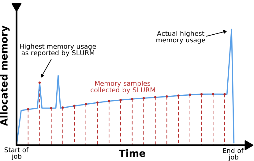
Image 1 of 1: ‘A graph plotting memory consumption of a job over time. The curve has an upwards trend with intermittent spikes. The periodic sampling of Slurm are shown as vertical lines intersecting the graph in regular intervals. While one of the memory spikes coincides with a sampling point, two others do not. One of them is near the start of the execution time and falls between two sample points. The other is at the very end of the execution time and occurs after the last sample point.’
Figure 2
Image 1 of 1: ‘Depicted is a situation of four processes running on three CPU cores, which results in each process running only 75% of the time.’
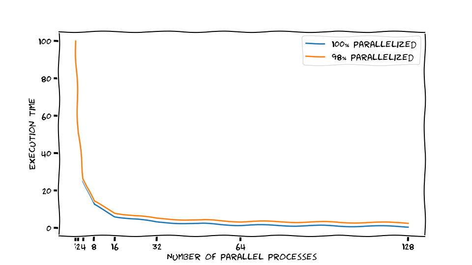
Image 1 of 1: ‘Sketched execution times for a perfectly and a 98% parallelized application. Doubling the number of parallel processors halves the execution time for the perfectly parallelized example, and a little bit less for the 98% parallelized version.’
Sketched execution times for a perfectly and a
98% parallelized application. Doubling the number of parallel processors
halves the execution time for the perfectly parallelized example, and a
little bit less for the 98% parallelized version.
Figure 2
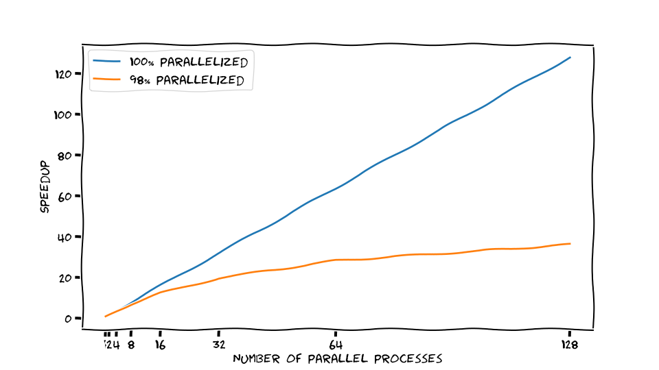
Image 1 of 1: ‘Sketched speedup for a perfectly and 98% parallelized application. Doubling the number of parallel processors makes the perfectly parallel application twice as fast. The 98% parallelized application does not speed up at the same rate.’
Sketched speedup for a perfectly and 98%
parallelized application. Doubling the number of parallel processors
makes the perfectly parallel application twice as fast. The 98%
parallelized application does not speed up at the same rate.
Figure 3
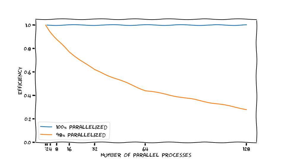
Image 1 of 1: ‘Sketched efficiency for a perfectly and 98% parallelized application. For the perfectly scaling case, each additional parallel process contributes well to solving the calculations faster. For the 98% parallelized application, adding more parallel processes has diminishing returns.’
Sketched efficiency for a perfectly and 98%
parallelized application. For the perfectly scaling case, each
additional parallel process contributes well to solving the calculations
faster. For the 98% parallelized application, adding more parallel
processes has diminishing returns.
Figure 4
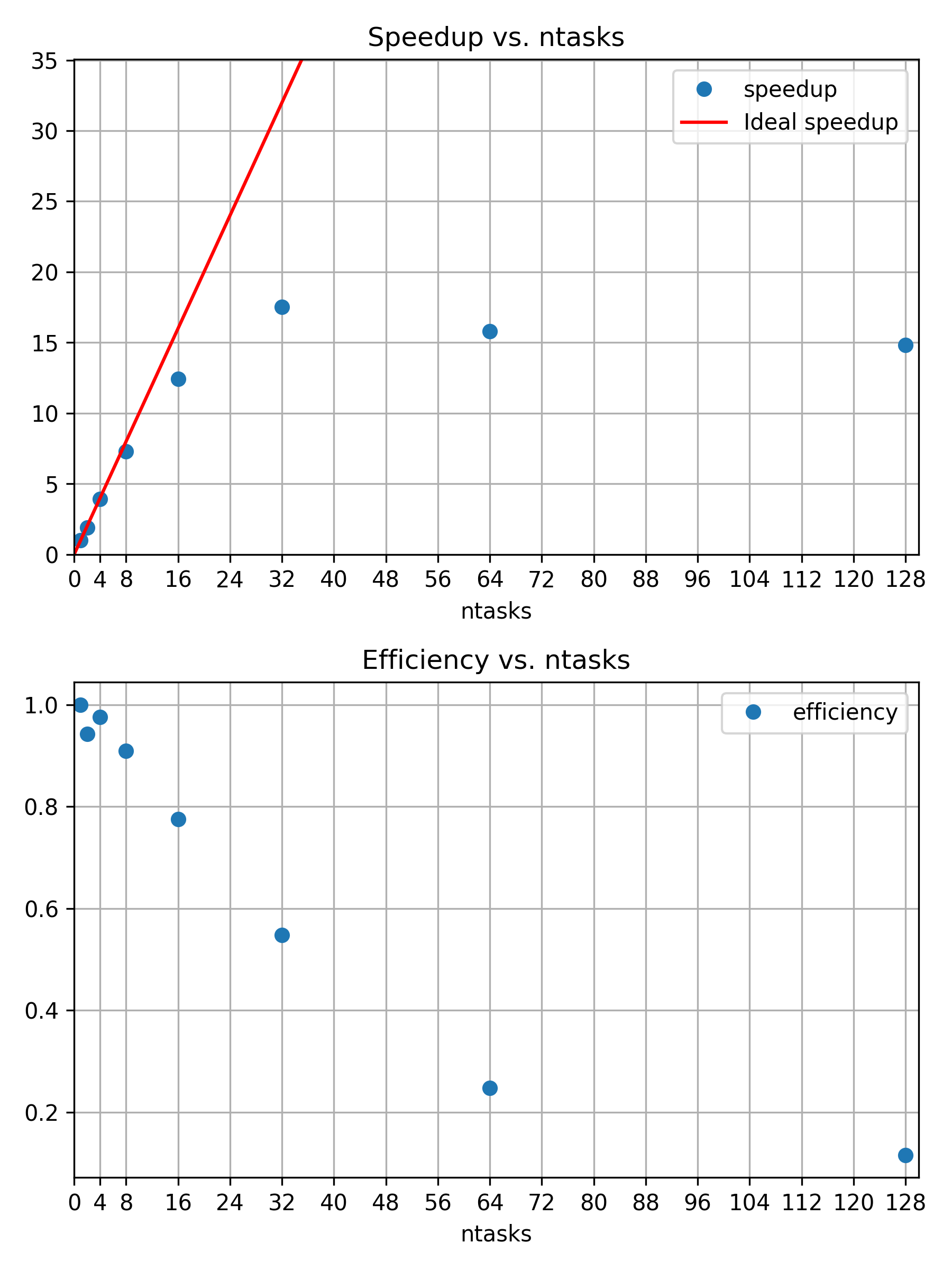
Image 1 of 1: ‘Speedup and efficiency of strong scaling example’
Speedup and efficiency of strong scaling
example
Figure 5
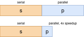
Image 1 of 1: ‘The model behind Amdahls Law: Assume an application consists of serial sections, e.g. reading from a file, and parallelizable sections, e.g. calculations in a loop. Both fractions add up to the whole program, i.e. $s + p = 1$. Here, Speedup through parallelization is inherently limited by only speeding up the parallel sections.’
The model behind Amdahls Law: Assume an
application consists of serial sections, e.g. reading from a file, and
parallelizable sections, e.g. calculations in a loop. Both fractions add
up to the whole program, i.e. \(s + p =
1\). Here, Speedup through parallelization is inherently limited
by only speeding up the parallel sections.
Figure 6
Image 1 of 1: ‘Three snowmen in 800x800 with 128 samples per pixel’
Figure 1: Three snowmen in 800x800 with 128
samples per pixel
Figure 7
Image 1 of 1: ‘Three snowmen in 800x800 with 8192 samples per pixel’
Figure 2: Three snowmen in 800x800 with 8192
samples per pixel
Figure 8
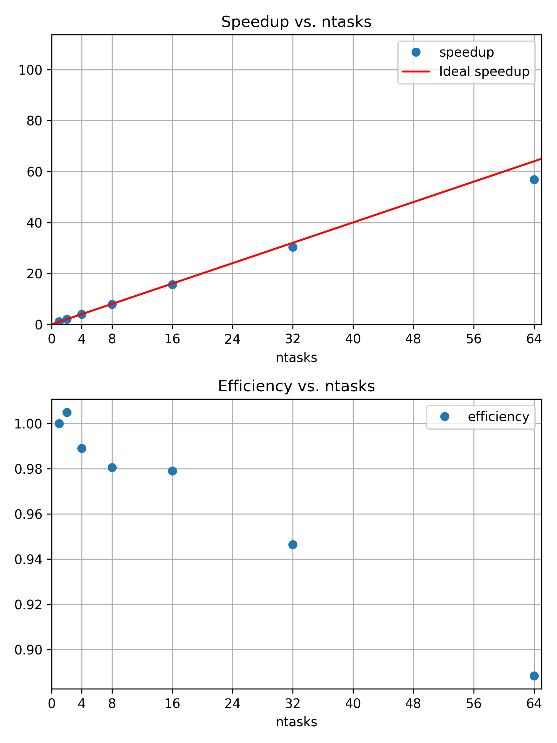
Image 1 of 1: ‘Speedup and efficiency of weak scaling example’
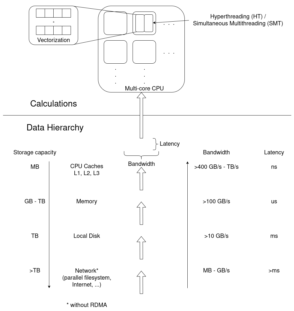
Image 1 of 1: ‘Diagram to visualize the data hierarchy of CPU architectures. Network, local disks, memory, and CPU caches have decreasing amounts of storage capacity, but increasing bandwidths and shorter latencies. Calculations occur in CPUs, possibly in multiple CPU cores, which may have multiple threads each, and even apply vectorized instructions.’
The underlying hardware frames any performance
analysis. Calculations are performed in multiple cores, potentially
multiple threads per core, and even in vectorized instructions where a
single operation is applied to multiple sets of data in a single
instruction. Data moves through the data hierarchy to CPU cores, where
each level “closer” to the CPU has a smaller storage capacity, but
larger bandwidth and smaller latencies, improving access
performance.
Figure 2
Image 1 of 1: ‘"My Jobs" tab in the ClusterCockpit web UI’
ClusterCockpits main menu. Select “My Jobs” to
see a list of the jobs associated to your account.
Figure 3
Image 1 of 1: ‘ClusterCockpit Job Info panel’
Figure 4
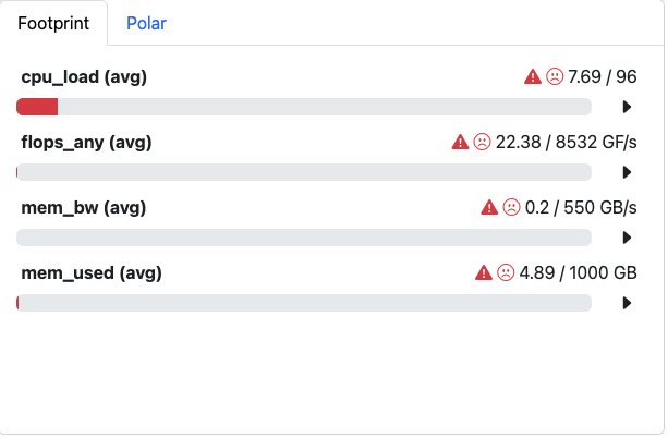
Image 1 of 1: ‘Cluster Cockpit Footprint panel summarizing central job characteristics’
Figure 5
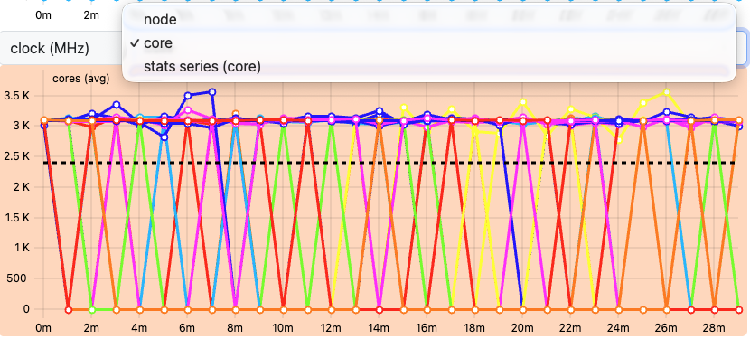
Image 1 of 1: ‘Drop down menu’
Figure 6
Image 1 of 1: ‘Select Metrics button in the ClusterCockpit job view’
Figure 7
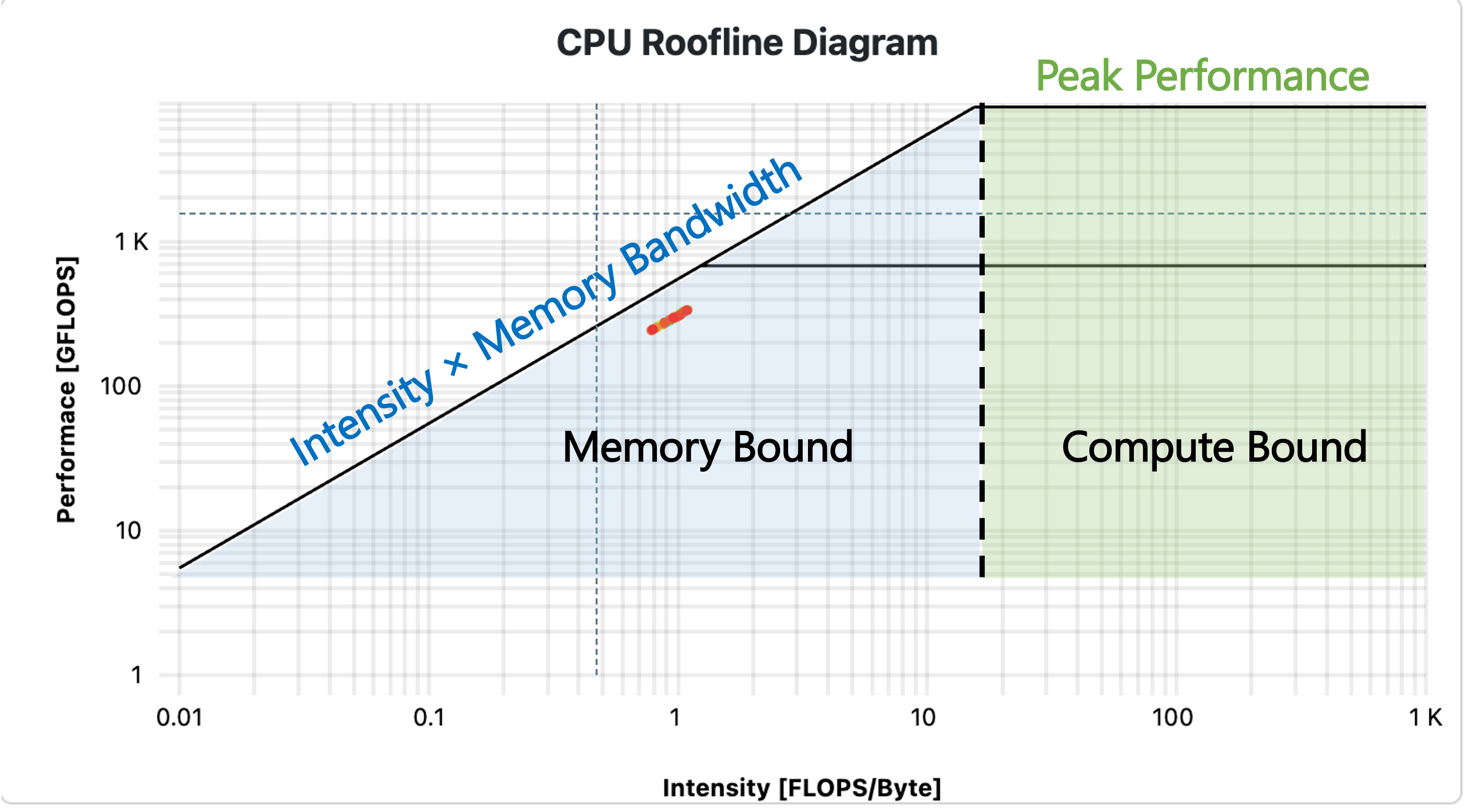
Image 1 of 1: ‘Example Roofline plot with labels’
Figure 8
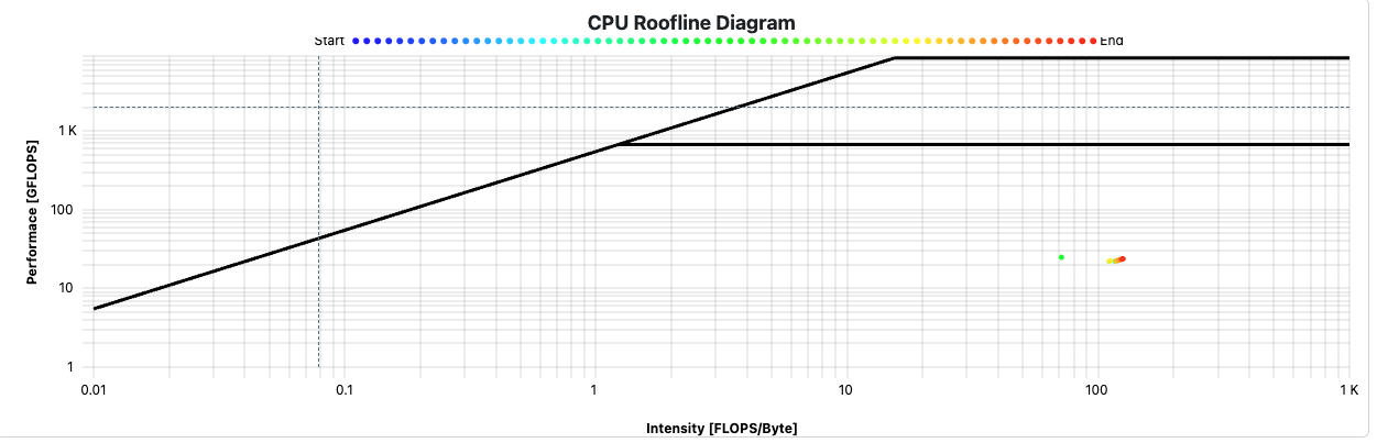
Image 1 of 1: ‘Cluster Cockpit Roofline plot of a job’
Below is the Roofline plot for our application.
Figure 9
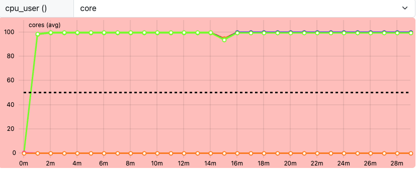
Image 1 of 1: ‘ClusterCockpit cpu_user metric’
Figure 10
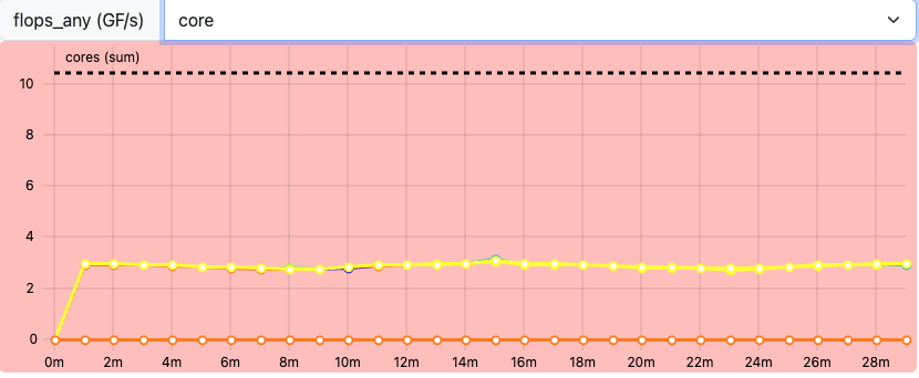
Image 1 of 1: ‘ClusterCockpit flops_any metric’
Figure 11
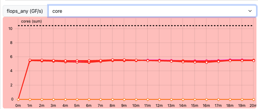
Image 1 of 1: ‘ClusterCockpit flops_any metric for job2’