All in One View
Content from Introduction
Last updated on 2026-07-16 | Edit this page
Overview
Questions
- What is gained from good experimental design?
Objectives
- Connect experimental design with data quality and meaningful findings.
Good experimental design generates information-rich data with a clear message. In both scientific research and industry, experimental design plays a critical role in obtaining reliable and meaningful results. Reliable, trustworthy science is not the result of fancy analyses or algorithms. In fact, analysis and design are intrinsically linked and dependent on one another. What you want to find out in your analysis dictates how to design the study, and that design in turn limits the kinds of analysis that you can realistically do. In other words, you would analyze as designed.

No analysis, no matter how elegant or complex, will be reliable or meaningful if based on a flawed design. Sir Ronald A. Fisher famously said:
“To consult the statistician after an experiment is finished is often merely to ask him to conduct a post mortem examination. He can perhaps say what the experiment died of.” Presidential Address to the First Indian Statistical Congress, 1938.
Experimental design aims to describe and explain variation in natural
systems by intervening to affect that variation directly. In an
experiment, the experimenter actively controls the conditions. For
example, the Salk polio vaccine trials collected data about variation in
polio incidence after injecting more than 600,000 schoolchildren with
either vaccine or placebo. In addition, more than a million additional
children were vaccinated and served as observed controls. This study
hypothesized that the vaccine would reduce the incidence of polio in
schoolchildren and the placebo-controlled trials were necessary to
demonstrate the effectiveness of the Salk vaccine. The results showed
that the vaccine was 80-90% effective in reducing polio incidence. The
intervention successfully affected variation in polio incidence
directly.
“A
calculated risk”: the Salk polio vaccine field trials of 1954 by Marcia
Meldrum
- Good experimental design generates information-rich data with a clear message.
Content from Essential Features of a Comparative Experiment
Last updated on 2026-07-16 | Edit this page
Overview
Questions
- How are comparative experiments structured?
Objectives
- Describe the common features of comparative experiments.
- Identify experimental units, treatments, response measurements, ancillary and nuisance variables
Well-designed experiments can deliver information that has a clear impact on human health. The main goals of good experimental design are to develop valid scientific conclusions and to efficiently use resources - time, money, and materials - to deliver meaningful results. These results include estimates that are precise enough to be meaningful, not fuzzy and useless. Statistical tests should have enough power to detect a real effect if it’s there. Ultimately this can protect conclusions by ruling out extraneous factors or biases, and with certainty and confidence claiming that the effect is a direct result of the treatment and not something else.
For example, to compare enzyme levels measured in processed blood samples from laboratory mice using either a kit from a vendor A or a kit from a competitor B. From 20 mice, randomly select 10 of them for sample preparation with kit A, while the blood samples of the remaining 10 mice are prepared with kit B. The average level of for kit A is 10.32 and for kit B 10.66. We might interpret the difference of -0.34 as due to differences in the two preparation kits and conclude that either they give substantially equal results or alternatively, that they systematically differ from one another.
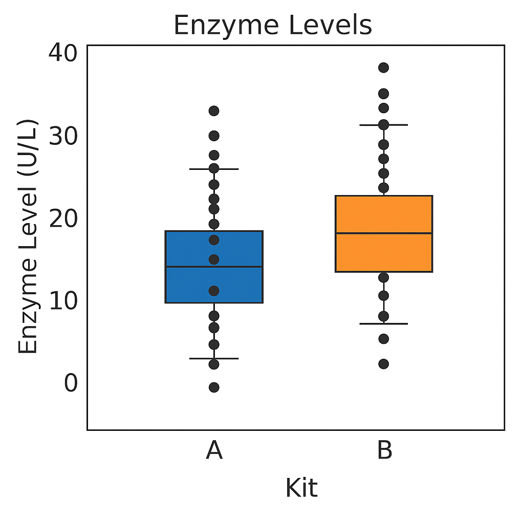
Either interpretation is only valid if the two groups of mice and their measurements are identical in all aspects except for the sample preparation kit. If we use one strain of mice for kit A and another strain for kit B, any difference might also be attributed to inherent differences between the strains. Similarly, if the measurements using kit B were conducted much later than those using kit A, any observed difference might be attributed to changes in, e.g., personnel, device calibration, or any number of other influences. None of these competing explanations for an observed difference can be excluded from the given data alone, but good experimental design allows us to render them (almost) implausible. adapted from Statistical Design and Analysis of Biological Experiments by Hans-Michael Kaltenbach
The Generation 100 study evaluated the effects of exercise on more than 1500 elderly Norwegians from Trondheim, Norway, to determine if exercise led to a longer active and healthy life. Specifically the researchers investigated the relationship between exercise intensity and health and longevity. One group performed high-intensity interval training (10 minute warm-up followed by four 4-minute intervals at ∼90% of peak heart rate) twice a week for five years. A second group performed moderate exercise twice a week (50 minutes of continuous exercise at ∼70% of peak heart rate). A third control group followed physical activity advice according to national recommendations. Clinical examinations and questionnaires were administered to all at the start and after one, three, and five years. Heart rate, blood pressure, leg and grip strength, cognitive function, and other health indicators were measured during clinical exams.

Generation 100: Does exercise make older adults live longer?
Challenge 1: Raw ingredients of a comparative experiment
Discuss the following questions with your partner, then share your answers to each question in the collaborative document.
- What is the research question in this study? If you prefer to name a hypothesis, turn the research question into a declarative statement.
- What is the treatment (treatment factor)? How many levels are there for this treatment factor?
- What are the experimental units (the entities to which treatments are applied)?
- What are the responses (the measurements used to determine treatment effects)?
- Should participants have been allowed to choose which group (high-intensity, moderate exercise, or national standard) they wanted to join? Why or why not? Should the experimenters have assigned participants to treatment groups based on their judgment of each participant’s characteristics? Why or why not?
The research question asked whether exercise, specifically high-intensity exercise, would affect healthspan and lifespan of elderly Norwegians. The treatments were high-intensity, moderate-intensity, and national standard exercise groups. The experimental units are the individuals. The responses measured were heart rate, blood pressure, strength, cognitive function and other health indicators. The main response measured was 5-year survival. If participants had been allowed to choose their preferred exercise group or if experimenters had chosen the groups based on participant characteristics, extraneous variables (e.g. state of depression or anxiety) could be introduced into the study. When participants are randomly assigned to treatment groups, these variables are spread across the groups and cancel out. Furthermore, if experimenters had used their own judgment to assign participants to groups, their own biases could have affected the results.
Conducting a Comparative Experiment
Comparative experiments apply treatments to experimental units and measure the responses, then compare the responses to those treatments with statistical analysis. If in the Generation 100 study the experimenters had only one group (e.g. high-intensity training), they might have achieved good results but would have no way of knowing if either of the other treatments would have achieved the same or even better results. To know whether high-intensity training is better than moderate or low-intensity training, it was necessary to run experiments in which some experimental units engaged in high-intensity training, others in moderate, and others still in low-intensity training. Only then can the responses to those treatments be statistically analyzed to determine treatment effects.
An experimental unit is the entity to which treatment is applied, whether this is a person, a mouse, a cell line, or a sample.
Challenge 2: Which are the experimental units?
Identify the experimental units in each experiment described below, then share your answers in the collaborative document.
- Three hundred mice are individually housed in the same room. Half of them are fed a high-fat diet and the other half are fed regular chow.
- Three hundred mice are housed five per cage in the same room. Half of them are fed a high-fat diet and the other half are fed regular chow.
- Three hundred mice are individually housed in two different rooms. Those in the first room are fed a high-fat diet and those in the other room are fed regular chow.
The individual animal is the experimental unit.
The cage receives the treatment and is the experimental unit.
The room receives the treatment and is the experimental unit.
Reducing Bias with Randomization and Blinding
Randomized studies assign experimental units to treatment groups randomly by pulling a number out of a hat or using a computer’s random number generator. The main purpose for randomization comes later during statistical analysis, where we compare the data we have with the data distribution we might have obtained by random chance. Randomization provides us a way to create the distribution of data we might have obtained and ensures that our comparisons between treatment groups are valid. Random assignment (allocation) of experimental units to treatment groups prevents the subjective bias that might be introduced by an experimenter who selects, even in good faith and with good intention, which experimental units should get which treatment. For example, if the experimenter selected which people would do high-, moderate- and low-intensity training they might unconsciously bias the groups by body size or shape. This selection bias would influence the outcome of the experiment.
Randomization also accounts for or cancels out effects of “nuisance” variables like the time or day of the experiment, the investigator or technician, equipment calibration, exposure to light or ventilation in animal rooms, or other variables that are not being studied but that do influence the responses. Randomization balances out the effects of nuisance variables between treatment groups by giving an equal probability for an experimental unit to be assigned to any treatment group.
Blinding (also known as masking) prevents the experimenter from influencing the outcome of an experiment to suit their expectations or preferred hypothesis. Ideally experimenters should not know which treatment the experimental units have received or will receive from the beginning through to the statistical analysis stage of the experiment. This might require additional personnel like technicians or other colleagues to perform some tasks, and should be planned during experimental design. If ideal circumstances can’t be arranged, it should be possible to carry out at least some of the stages blind. Blinding during allocation (assignment of experimental units to treatment groups), treatment, data collection or data analysis can reduce experimental bias.
Challenge 3: How does bias enter an experiment?
Identify ways that bias enters into each experiment described below, then share your answers in the collaborative document.
- A clinician perceives increased aggression in subjects given testosterone.
- A clinician concludes that mood of each subject has improved in the treatment group given a new antidepressant.
- A researcher unintentionally treats subjects differently based on their treatment group by providing more food to control group animals.
- A clinician gives different nonverbal cues to patients in the treatment group of a clinical trial than to the control group patients.
- The data collection was not blinded since the clinician knew which
treatment had been assigned. The clinician perceived increased
aggression in those given testosterone, yet this is subjective. This is
an example of observer bias, the tendency for observers to perceive
exactly what they expect or want to see rather than seeing things
accurately or objectively.
- This is similar to the first example of observer bias. Since the
study was not blinded, the clinician knew who received the
antidepressant and reported a positive effect. Nonblinded data
collection often reports increased treatment effects even when these
aren’t real. Inflated effect sizes are a common problem with nonblinded
studies.
- In a nonblinded study researchers might treat groups differently as
in this case. Unequal treatment of groups outside of the experimental
variable introduces confounding because extra food could influence
responses. This could create an effect assumed to be due to treatment
but in reality was based on differences in food quantity between
treatment groups.
- In a nonblinded study researchers can treat groups differently, even if subconsciously, which can influence the responses of the participants. Nonverbal cues such as head-nodding, jaw tightening, or averting gaze can bias patient responses.
- The raw ingredients of comparative experiments are experimental units, treatments and responses.
Content from Experimental Design Principles
Last updated on 2026-07-16 | Edit this page
Overview
Questions
- What are the core principles of experimental design?
Objectives
- The way in which a design applies treatments to experimental units and measures the responses will determine 1) what questions can be answered and 2) with what precision relationships can be described.
- The core principles guiding the way are 1) replication, 2) randomization and 3) blocking.
Variability is natural in the real world. A medication given to a group of patients will affect each of them differently. A specific diet given to a cage of mice will affect each mouse differently. Ideally if something is measured many times, each measurement will give exactly the same result and will represent the true value. This ideal doesn’t exist in the real world. For example, the mass of one kilogram is defined by the International Prototype Kilogram, a cylinder composed of platinum and iridium about the size of a golf ball.

Copies of this prototype kilogram (replicates) are distributed worldwide so each country hosting a replica has its own national standard kilogram. None of the replicas measure precisely the same despite careful storage and handling. The reasons for this variation in measurements are not known. A kilogram in Austria differs from a kilogram in Australia, which differs from that in Brazil, Kazakhstan, Pakistan, Switzerland or the U.S. What we assume is an absolute measure of mass shows real-world natural variability. Variability is a feature of natural systems and also a natural part of every experiment we undertake.
Replication to characterize variability
To figure out whether a difference in responses is real or inherently random, replication applies the same treatment to multiple experimental units. The variability of the responses within a set of replicates provides a measure against which we can compare differences among different treatments. This variability is known as experimental error. This does not mean that something was done wrongly! It’s a phrase describing the variability in the responses. Random variation is also known as random error or noise. It reflects imprecision, but not inaccuracy. Larger sample sizes reduce this imprecision.
In addition to random (experimental) error, also known as noise, there are two other sources of variability in experiments. Systematic error or bias, occurs when there are deviations in measurements or observations that are consistently in one particular direction, either overestimating or underestimating the true value. As an example, a scale might be calibrated so that mass measurements are consistently too high or too low. Unlike random error, systematic error is consistent in one direction, is predictable and follows a pattern. Larger sample sizes don’t correct for systematic bias; equipment or measurement calibration does. Technical replicates define this systematic bias by running the same sample through the machine or measurement protocol multiple times to characterize the variation caused by equipment or protocols.
A biological replicate measures different biological samples in parallel to estimate the variation caused by the unique biology of the samples. The sample or group of samples are derived from the same biological source, such as cells, tissues, organisms, or individuals. Biological replicates assess the variability and reproducibility of experimental results. For example, if a study examines the effect of a drug on cell growth, biological replicates would involve multiple samples from the same cell line to test the drug’s effects. This helps to ensure that any observed changes are due to the drug itself rather than variations in the biological material being used.
The greater the number of biological replicates, the greater the precision (the closeness of two or more measurements to each other). Having a large enough sample size to ensure high precision is necessary to ensure reproducible results. Note that increasing the number of technical replicates will not help to characterize biological variability! It is used to characterize systematic error, not experimental error.
Exercise 1: Which kind of error?
A study used to determine the effect of a drug on weight loss could
have the following sources of experimental error. Classify the following
sources as either biological, systematic, or random error.
1). A scale is broken and provides inconsistent readings.
2). A scale is calibrated wrongly and consistently measures mice 1 gram
heavier.
3). A mouse has an unusually high weight compared to its experimental
group (i.e., it is an outlier).
4). Strong atmospheric low pressure and accompanying storms affect
instrument readings, animal behavior, and indoor relative humidity.
1). random, because the scale is broken and provides any kind of
random reading it comes up with (inconsistent reading)
2). systematic
3). biological
4). random or systematic; you argue which and explain why
These three sources of error can be mitigated by good experimental design. Systematic and biological error can be mitigated through adequate numbers of technical and biological replicates, respectively. Random error can also be mitigated by experimental design, however, replicates are not effective. By definition random error is unpredictable or unknowable. For example, an atmospheric low pressure system or a strong storm could affect equipment measurements, animal behavior, and indoor relative humidity, which introduces random error. We could assume that all random error will balance itself out, and that all samples will be equally subject to random error. A more precise way to mitigate random error is through blocking.
Exercise 2: How many technical and biological replicates?
In each scenario described below, identify how many technical and how many biological replicates are represented. What conclusions can be drawn about experimental error in each scenario?
1). One person is weighed on a scale five times.
2). Five people are weighed on a scale one time each.
3). Five people are weighed on a scale three times each.
4). A cell line is equally divided into four samples. Two samples
receive a drug treatment, and the other two samples receive a different
treatment. The response of each sample is measured three times to
produce twelve total observations. In addition to the number of
replicates, can you identify how many experimental units there
are?
5). A cell line is equally divided into two samples. One sample receives
a drug treatment, and the other sample receives a different treatment.
Each sample is then further divided into two subsamples, each of which
is measured three times to produce twelve total observations. In
addition to the number of replicates, can you identify how many
experimental units there are?
1). One biological sample (not replicated) with five technical
replicates. The only conclusion to be drawn from the measurements would
be better characterization of systematic error in measuring. It would
help to describe variation produced by the instrument itself, the scale.
The measurements would not generalize to other people.
2). Five biological replicates with one technical measurement (not
replicated). The conclusion would be a single snapshot of the weight of
each person, which would not capture systematic error or variation in
measurement of the scale. There are five biological replicates, which
would increase precision, however, there is considerable other variation
that is unaccounted for.
3). Five biological replicates with three technical replicates each. The
three technical replicates would help to characterize systematic error,
while the five biological replicates would help to characterize
biological variability.
4). Four biological replicates with three technical replicates each. The
three technical replicates would help to characterize systematic error,
while the four biological replicates would help to characterize
biological variability. Since the treatments are applied to each of the
four samples, there are four experimental units.
5). Two biological replicates with three technical replicates each.
Since the treatments are applied to only the two original samples, there
are only two experimental units.
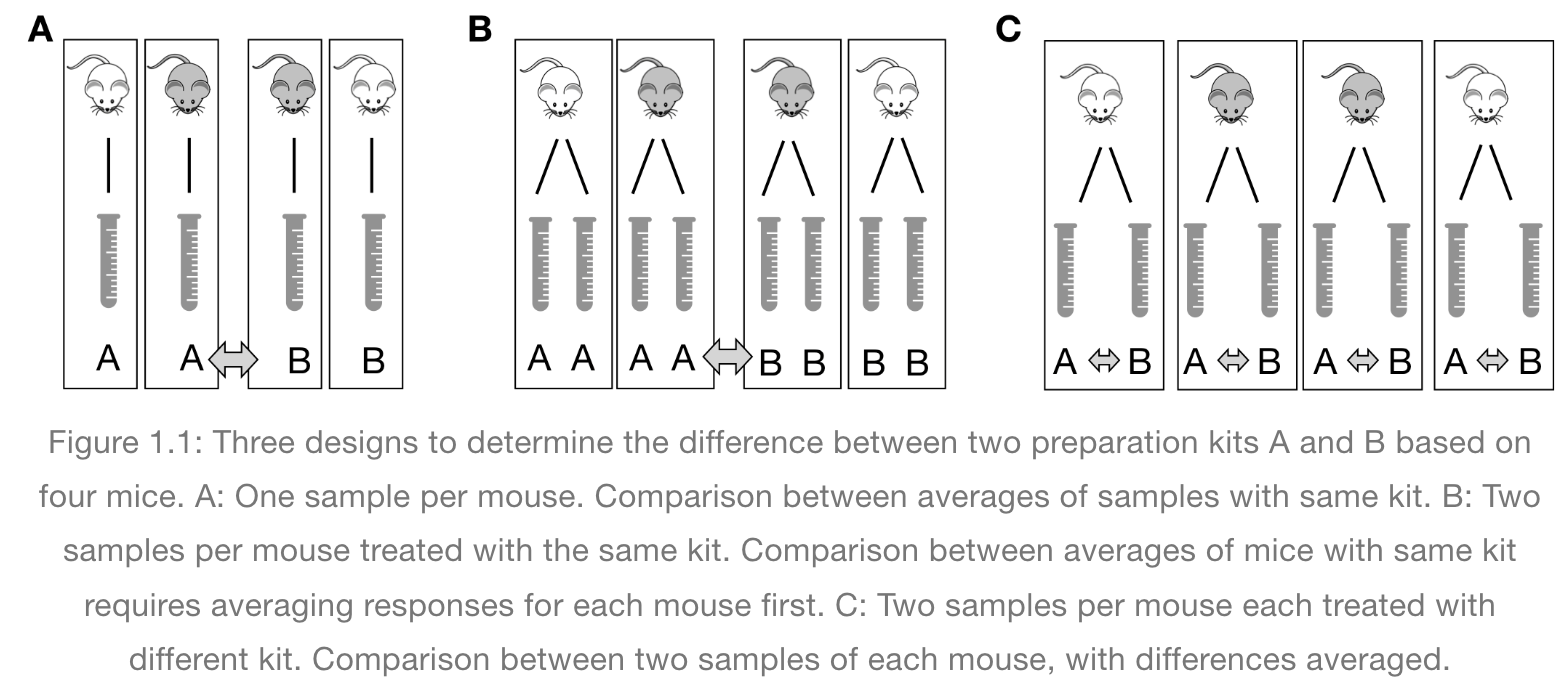
In the graphic below, four mice in each experimental design are assigned to either enzyme kit A or kit B. In the first design, one blood sample is drawn from each mouse and tested with kit A or kit B. In the second design, two blood samples are drawn from each mouse and tested with kit A or kit B. In the third design, two blood samples are drawn from each mouse and one sample is tested with kit A and the other with kit B.
How many biological replicates are in each design?
What are the experimental units in each design?
What are the advantages of design C?
 Excerpted
from Statistical Design and Analysis of Biological Experiments by
Hans-Michael Kaltenbach
Excerpted
from Statistical Design and Analysis of Biological Experiments by
Hans-Michael Kaltenbach
Pseudoreplication occurs when multiple samples are taken from the same entity. For example, if two blood sample are taken from a mouse and each sample receives treatment A, the entity to which the treatment is applied (the experimental unit) is the mouse, not the blood sample. When each of two blood samples from a mouse receives different treatments, e.g. one blood sample is assigned to kit A and the other to kit B, the blood sample is the experimental unit, the entity to which treatment is applied. The same goes for cell lines. Dividing a cell line into multiples and treating all multiples with the same treatment is still only one replicate.
Randomization
Exercise 3: The efficient technician
Your technician colleague finds a way to simplify and expedite an
experiment. The experiment applies four different wheel-running
treatments to twenty different mice over the course of five days. Four
mice are treated individually each day for two hours each with a random
selection of the four treatments. Your clever colleague decides that a
simplified protocol would work just as well and save time. Run treatment
1 five times on day 1, treatment 2 five times on day 2, and so on. Some
overtime would be required each day but the experiment would be
completed in only four days, and then they can take Friday off! Does
this adjustment make sense to you?
Can you foresee any problems with the experimental results?
Since each treatment is run on only one day, the day effectively becomes the experimental unit (explain this). Each experimental unit (day) has five samples (mice), but only one replication of each treatment. There is no valid way to compare treatments as a result. There is no way to separate the treatment effect from the day-to-day differences in environment, equipment setup, personnel, and other extraneous variables.
Why should treatments be randomly assigned to experimental units? Randomization minimizes bias and moderates experimental error (a.k.a. noise). A hat full of numbers, a random number table or a computational random number generator can be used to assign random numbers to experimental units so that any experimental unit has equal chances of being assigned to a specific treatment group.
Here is an example of randomization using a random number generator. The study asks how a high-fat diet affects blood pressure in mice. If the random number is odd, the sample is assigned to the treatment group, which receives the high-fat diet. If the random number is even, the sample is assigned to the control group (the group that doesn’t receive the treatment, in this case, regular chow).
R
# create the mouse IDs and 26 random numbers between 1 and 100
mouse_ID <- LETTERS
random_number <- sample(x = 100, size = 26)

# %% is the modulo operator, which returns the remainder from division by 2
# if the remainder is 0 (even number), regular chow diet is assigned
# if not, high fat is assigned
treatment <- ifelse(random_number %% 2 == 0, "chow", "high fat")
random_allocation <- data.frame(mouse_ID, random_number, treatment)
random_allocation
OUTPUT
   mouse_ID random_number treatment
1         A            23  high fat
2         B            16      chow
3         C            73  high fat
4         D            39  high fat
5         E            50      chow
6         F            93  high fat
7         G            14      chow
8         H            57  high fat
9         I            67  high fat
10        J            60      chow
11        K            98      chow
12        L            70      chow
13        M            26      chow
14        N            40      chow
15        O            68      chow
16        P            25  high fat
17        Q            42      chow
18        R            32      chow
19        S            35  high fat
20        T            61  high fat
21        U            69  high fat
22        V            90      chow
23        W            97  high fat
24        X            45  high fat
25        Y            94      chow
26        Z            81  high fat
This might produce unequal numbers between treatment and control groups. It isn’t necessary to have equal numbers, however, sensitivity or statistical power (the probability of detecting an effect when it truly exists) is maximized when sample numbers are equal.
R
table(random_allocation$treatment)
OUTPUT
    chow high fat
      13       13
To randomly assign samples to groups with equal numbers, you can do the following.
R
# place IDs and random numbers in data frame
equal_allocation <- data.frame(mouse_ID, random_number)

# sort by random numbers (not by sample IDs)
equal_allocation <- equal_allocation[order(random_number),]

# now assign to treatment or control groups
treatment <- sort(rep(x = c("chow", "high fat"), times = 13))
equal_allocation <- cbind(equal_allocation, treatment)
row.names(equal_allocation) <- 1:26
equal_allocation
OUTPUT
   mouse_ID random_number treatment
1         G            14      chow
2         B            16      chow
3         A            23      chow
4         P            25      chow
5         M            26      chow
6         R            32      chow
7         S            35      chow
8         D            39      chow
9         N            40      chow
10        Q            42      chow
11        X            45      chow
12        E            50      chow
13        H            57      chow
14        J            60  high fat
15        T            61  high fat
16        I            67  high fat
17        O            68  high fat
18        U            69  high fat
19        L            70  high fat
20        C            73  high fat
21        Z            81  high fat
22        V            90  high fat
23        F            93  high fat
24        Y            94  high fat
25        W            97  high fat
26        K            98  high fat
You can write out this treatment plan to a comma-separated values (csv) file, then open it in Excel and use it to record your data collection or just keep track of which samples are randomly assigned which diet.
R
write.csv(equal_allocation, file = "./data/random-assign.csv", row.names = FALSE)
Discussion
Why not assign treatment and control groups to samples in
alphabetical order?
Did we really need a random number generator to obtain randomized equal
groups?
1). Scenario: One technician processed samples A through M, and a
different technician processed samples N through Z. Might the first
technician have processed samples somewhat differently from the second
technician? If so, there would be a “technician effect” in the results
that would be difficult to separate from the treatment effect. 2).
Another scenario: Samples A through M were processed on a Monday, and
samples N through Z on a Tuesday. Might the weather or the environment
in general have been different between Monday and Tuesday? What if a big
construction project started on Tuesday, or the whole team had a
birthday gathering for one of their members, or anything else in the
environment differed between Monday and Tuesday? If so, there would be a
“day-of-the-week effect” in the results that would be difficult to
separate from the treatment effect. 3). Yet another scenario: Samples A
through M were from one strain, and samples N through Z from a different
strain. How would you be able to distinguish between the treatment
effect and the strain effect? 4). Yet another scenario: Samples with
consecutive ids were all sibling groups. For example, samples A, B and C
were all siblings, and all assigned to the same treatment.
All of these cases would have introduced an effect (from the technician,
the day of the week, the strain, or sibling relationships) that would
confound the results and lead to misinterpretation.
Controlling Natural Variation with Blocking
Experimental units can be grouped, or blocked, to increase the precision of treatment comparisons. Blocking divides an experiment into groups of experimental units to control natural variation among these units. Treatments are randomized to experimental units within each block. Each block, then, is effectively a sub-experiment.
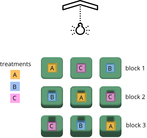
Randomization within blocks accounts for nuisance variables that could bias the results, such as day, time, cage proximity to light or ventilation, etc. In the illustration below, three treatments are randomized to the experimental units (the cages) on each shelf. Each shelf is a block that accounts for random variation introduced by a nuisance variable, proximity to the light.
Shelf height is a blocking factor that should be included in the data analysis phase of the experiment. Adding a nuisance variable as a blocking factor accounts for variability and can increase the probability of detecting a real treatment effect (statistical power). If the blocking factor doesn’t substantially impact variability, however, it reduces the information used to estimate a statistic (degrees of freedom) and diminishes statistical power. Blocking should only be used when a variable is suspected to impact the experiment.
Another way to define blocks of experimental units is to use characteristics or traits that are likely associated with the response. Sex and age, for example, can serve as blocking factors in experiments, with experimental units randomly allocated to each block based on age category and sex. Stratified randomization places experimental units into separate blocks for each age category and sex. As with nuisance variables, these blocking factors (age and sex) should be used in the subsequent data analysis.
Exercise 3: Explain blocking to the efficient technician
Your technician colleague is not only efficient but very well-organized. They will administer treatments A, B and C shown in the figure above.
- Explain to your colleague why the treatments should not be administered by shelf (e.g. the top shelf all get treatment A, the next shelf B and the lower shelf treatment C).
- Explain blocking to the technician and describe how it helps the experiment.
Exercise 4: How and when to set up blocks
For the following scenarios, describe whether you would set up blocks and if so, how you would set up the blocks.
- A large gene expression study will be run in five different batches or runs.
- An experiment will use two different models of equipment to obtain measurements.
- Samples will be processed in the morning, afternoon and evening.
- In a study in which mice were randomly assigned to treatment and control groups, the air handler in the room went off and temperature and humidity increased.
- Each batch or run would be one block. Samples would be randomly
assigned to each block, otherwise, external factors could potentially
influence each run and introduce systematic variation (batch
effects).
- Treat each equipment model as a block. Different equipment models
may have inherent differences in measurement accuracy or calibration.
Samples should be randomized across equipment models (blocks).
- Block by sample processing time (morning, afternoon, evening) and
randomize samples across time blocks.
- No blocks because the systematic or random error would impact all samples.
- Replication, randomization and blocking determine the validity and usefulness of an experiment.
Content from Statistics in Data Analysis
Last updated on 2026-07-16 | Edit this page
Overview
Questions
- How can information be extracted and communicated from experimental data?
Objectives
- Plotting reveals information in the data.
- Statistical significance testing compares experimental data obtained to probability distributions of data that might also be possible.
- A probability distribution is a mathematical function that gives the probabilities of different possible outcomes for an experiment.
A picture is worth a thousand words
To motivate this next section on statistics, we start with an example of human variability. This 1975 living histogram of women from the University of Wisconsin Madison shows variability in a natural population.

B. Joiner, Int’l Stats Review, 1975
Exercise 1: A living histogram
From the living histogram, can you estimate by eye
1). the mean and median heights of this sample of women?
2). the spread of the data? Estimate either standard deviation or
variance by eye. If you’re not sure how to do this, think about how you
would describe the spread of the data from the mean. You do not need to
calculate a statistic.
3). any outliers? Estimate by eye - don’t worry about
calculations.
4). What do you predict would happen to mean, median, spread and
outliers if an equal number of men were added to the histogram?
1). Mean and median are two measures of the center of the data. The median is the 50th% of the data with half the women above this value and the other half below. There are approximately 100 students total. Fifty of them appear to be above 5 feet 5 inches and fifty of them appear to be below 5’5”. The median is not influenced by extreme values (outliers), but the mean value is. While there are some very tall and very short people, the bulk of them appear to be centered around a mean of 5 foot 5 inches with a somewhat longer right tail to the histogram. 2). If the mean is approximately 5’5” and the distribution appears normal (bell-shaped), then we know that approximately 68% of the data lies within one standard deviation (sd) of the mean and ~95% lies within two sd’s. If there are ~100 people in the sample, 95% of them lie between 5’0” and 5’10” (2 sd’s = 5” above and 5” below the mean). One standard deviation then would be about 5”/2 = 2.5” from the mean of 5’5”. So 68% of the data (~68 people) lie within 5 feet 2.5 inches and 5 feet 7.5 inches. 3). There are some very tall and very short people but it’s not clear whether they are outliers. Outliers deviate significantly from expected values, specifically by more than 3 standard deviations in a normal distribution. Values that are greater than 3 sd’s (7.5”) above or below the mean could be considered outliers. Outliers would then be shorter than 4 feet 7.5 inches or taller than 6 feet 2.5 inches. The shortest are 4 feet 9 inches and the tallest 6’ 0 inches. There are no outliers in this sample because all heights fall within 3 sd’s. 4). Average heights for men are greater than average heights for women, so you could expect that a random sample of 100 men would increase the average height of the sample of 200 students. The mean would shift to the right of the distribution toward taller heights, as would the median.
The first step in data analysis: plot the data!
A picture is worth a thousand words, and a picture of your data could reveal important information that can guide you forward. So first, plot the data!
R
# load the tidyverse library to write more easily interpreted code
library(tidyverse)

# read in the simulated heart rate data
heart_rate <- read_csv("data/heart_rate.csv")
R
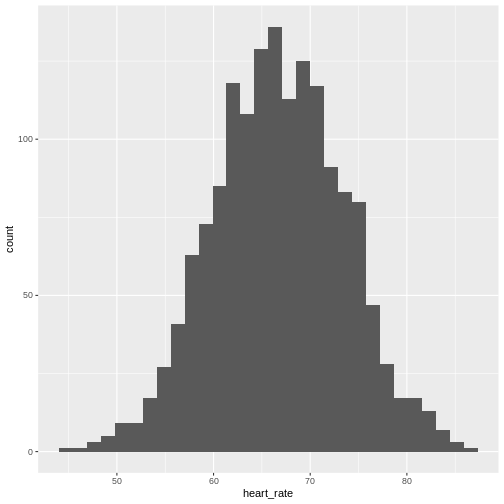
# take a random sample of 100 and create a histogram
# first set the seed for the random number generator
set.seed(42)
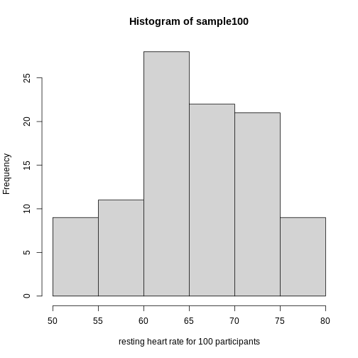
sample100 <- sample(heart_rate$heart_rate, 100)
hist(sample100, xlab = "resting heart rate for 100 participants")
Exercise 2: What does this picture tell you about resting heart rates?
Do the data appear to be normally distributed? Why does this matter? Do the left and right tails of the data seem to mirror each other or not? Are there gaps in the data? Are there large clusters of similar heart rate values in the data? Are there apparent outliers? What message do the data deliver in this histogram?
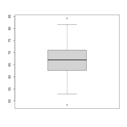
Now create a boxplot of the same sample data.
R
boxplot(sample100)
Exercise 3: What does this boxplot tell you about resting heart rates?
What does the box signify? What does horizontal black line dividing the box signify? Are there apparent outliers? How does the boxplot relate to the histogram? What message do the data deliver in this boxplot?
Plotting the data can identify unusual response measurements (outliers), reveal relationships between variables, and guide further statistical analysis. When data are not normally distributed (bell-shaped and symmetrical), many of the statistical methods typically used will not perform well. In these cases the data can be transformed to a more symmetrical bell-shaped curve.
Random variables
The Generation 100 study aims to determine whether high-intensity exercise in elderly adults affects lifespan and healthspan.
R
heart_rate %>%
  filter(exercise_group %in% c("high intensity", "control")) %>%
  ggplot(aes(exercise_group, heart_rate)) +
  geom_boxplot()
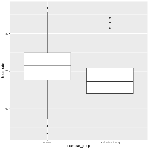
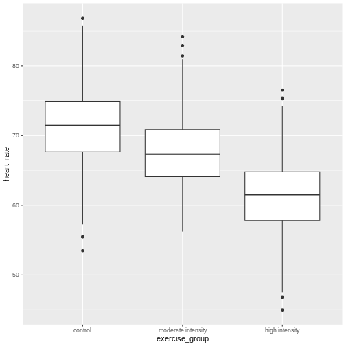
Exercise 4: Comparing two groups - control vs. high intensity exercise
- Does there appear to be a significant heart rate difference between the high and control exercise groups? How would you know?
- Do any of the data overlap between the two boxplots?
- Can you know which exercise group a person belongs to just by knowing their heart rate? For example, for a heart rate of 65 could you say with certainty that a person belongs to one group or the other?
- There appears to be a trend of lower heart rate in the control exercise group, however, we can’t say whether or not it is significant without performing statistical tests.
- There is considerable overlap between the two groups, which shows that there is considerable variability in the data.
- Someone with a heart rate of 65 could belong to any group. When considering significance of heart rate differences between the two groups we don’t look at individuals, rather, we look at averages between the two groups.
The boxplots above show a trend of higher heart rate in the control exercise group and lower heart rate in the high-intensity exercise group. There is inherent variability in heart rate in both groups however, which is to be expected. That variability appears in the box and whisker lengths of the boxplots, along with any outliers that appear as black dots outside of the whisker length. This variability in heart rate measurements also means that the boxplots overlap between the two groups, making it difficult to determine whether there is a significant difference in mean heart rate between the groups.
We can calculate the difference in means between the two groups to answer the question about exercise intensity.
R
# calculate the means of the two groups
# unlist() converts a tibble (special tidyverse table) to a vector
highHR <- heart_rate %>%
            filter(exercise_group == "high intensity") %>%
            select(heart_rate) %>%
            unlist()
controlHR <- heart_rate %>%
                filter(exercise_group == "control") %>%
                select(heart_rate) %>%
                unlist()
meanDiff <- mean(controlHR) - mean(highHR)
meanDiff
OUTPUT
[1] 2.519063The actual difference in mean heart rates between the two groups is 2.52. Another way of stating this is that the high intensity group had a mean heart rate that was 3.9 percent lower than the control group. This is the observed effect size.
So are we done now? Does this difference support the alternative hypothesis that there is a significant difference in mean heart rates? Or does it fail to reject the null hypothesis of no significant difference? Why do we need p-values and confidence intervals if we have evidence we think supports our claim? The reason is that the mean values are random variables that can take many different values. We are working with two samples of elderly Norwegians, not the entire population of elderly Norwegians. The means are estimates of the true mean heart rate of the entire population, a number that we can never know because we can’t access the entire population of elders. The sample means will vary with every sample we take from the population. To demonstrate this, let’s take a sample from each exercise group and calculate the difference in means for those samples.
R
# calculate the sample mean of 100 people in each group
high100 <- mean(sample(highHR, size = 100))
control100 <- mean(sample(controlHR, size = 100))
control100 - high100
OUTPUT
[1] 2.771769Now take another sample of 100 from each group and calculate the difference in means.
R
# calculate the sample mean of 100 people in each group
high100 <- mean(sample(highHR,
                           size = 100))
control100 <- mean(sample(controlHR,
                          size = 100))
control100 - high100
OUTPUT
[1] 2.479383Are the differences in sample means the same? We can repeat this sampling again and again, and each time arrive at a different value. The sample means are a random variable, meaning that they can take on any number of different values. Since they are random variables, the difference between the means (the observed effect size) is also a random variable.
Supposing we did have access to the entire population of elderly Norwegians. Can we determine the mean resting heart rate for the entire population, rather than just for samples of the population? Imagine that you have measured the resting heart rate of the entire population of elders 70 or older, not just the 1,567 from the Generation 100 study. In practice we would never have access to the entire population, so this is a thought exercise.
R
# read in the heart rates of the entire population of all elderly people
population <- heart_rate

# sample 100 of them and calculate the mean three times
mean(sample(population$heart_rate, size = 100))
OUTPUT
[1] 65.91388R
mean(sample(population$heart_rate, size = 100))
OUTPUT
[1] 65.02086R
mean(sample(population$heart_rate, size = 100))
OUTPUT
[1] 64.95971Notice how the mean changes each time you sample. We can continue to do this many times to learn about the distribution of this random variable. Comparing the data obtained to a probability distribution of data that might have been obtained can help to answer questions about the effects of exercise intensity on heart rate.
The null hypothesis
Now let’s return to the mean difference between treatment groups. How do we know that this difference is due to the exercise? What happens if all do the same exercise intensity? Will we see a difference as large as we saw between the two treatment groups? This is called the null hypothesis. The word null reminds us to be skeptical and to entertain the possibility that there is no difference.
Because we have access to the population, we can randomly sample 100 controls to observe as many of the differences in means when exercise intensity has no effect. We can give everyone the same exercise plan and then record the difference in means between two randomly split groups of 100 and 100.
Here is this process written in R code:
R
## 100 controls
control <- sample(population$heart_rate,
                  size = 100)

## another 100 controls that we pretend are on a high-intensity regimen
treatment <- sample(population$heart_rate,
                    size = 100)
mean(control) - mean(treatment)
OUTPUT
[1] -0.2003556Now let’s find the sample mean of 100 participants from each group 10,000 times.
R
treatment <- replicate(n = 10000,
                       mean(sample(population$heart_rate, 100)))
control <- replicate(n = 10000,
                     mean(sample(population$heart_rate, 100)))
null <- control - treatment
hist(null)
abline(v=meanDiff, col="red", lwd=2)
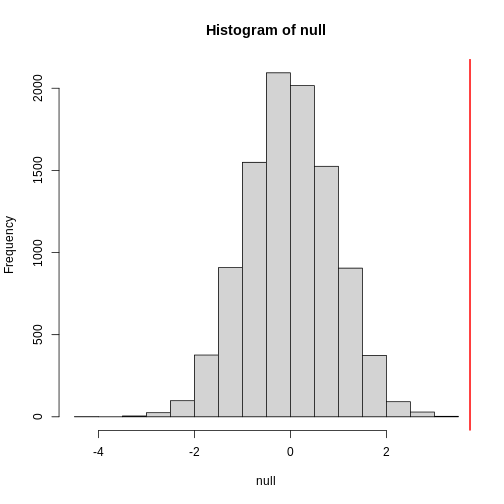
null contains the differences in means between the two
groups sampled 10,000 times each. The value of the observed difference
in means between the two groups, meanDiff, is shown as a
vertical red line. The values in null make up the
null distribution. How many of these differences are
greater than the observed difference in means between the actual
treatment and control groups?
R
mean(null >= meanDiff)
OUTPUT
[1] 0.0042Approximately 0.4% of the 10,000 simulations are greater than the observed difference in means. We can expect then that we will see a difference in means approximately 0.4% of the time even if there is no effect of exercise on heart rate. This is known as a p-value.
Exercise 5: What does a p-value mean?
What does this p-value tell us about the difference in means between the two groups? How can we interpret this value? What does it say about the significance of the difference in mean values?
The p-value tells us that a difference in means this great or greater is highly improbable assuming that the null hypothesis is true and that this difference in means was drawn from a null distribution. In other words, a p value tells us about the probability of getting the data we got if the null hypothesis is true. This is not the same as saying that the p-value represents the probability that the null hypothesis is true. We assume the null hypothesis is true when we calculate a p-value. The degree of improbability for getting a mean difference this great or greater is evidence against the null hypothesis and support for an alternative hypothesis that the sample comes from a population with a different mean. A low p-value tells us that an improbable event has occurred assuming the null is true. Another way of saying this is that a low p-value is strong evidence that the difference in means is statistically significant (so you would reject the null hypothesis). A p value provides statistical significance, but not biological significance. Subject matter expertise is required to interpret biological significance of a low p value.
P-values are often misinterpreted as the probability that, in this example, high-intensity and control exercise result in the same average heart rate. However, “high-intensity and control exercise result in the same average heart rate” is not a random variable like the number of heads or tails in 10 flips of a coin. It’s a statement that doesn’t have a probability distribution, so you can’t make probability statements about it. The p-value summarizes the comparison between our data and the data we might have obtained from a probability distribution if there were no difference in mean heart rates. Specifically, the p-value tells us how far out on the tail of that distribution the data we got falls. The smaller the p-value, the greater the disparity between the data we have and the data distribution that might have been. To understand this better, we’ll explore probability distributions next.
The alternative hypothesis
We assume that our observations are drawn from a null distribution with mean \(\mu_0\), which in this case equals zero because the null hypothesis states that there is no difference between the treatment groups. We reject the null hypothesis for values that fall within the region defined by \(\alpha\), they Type I error rate. If we have a value that falls within this region, it is possible to falsely reject the null hypothesis and to assume that there is a treatment effect when in reality none exists. False positives (Type I errors) are typically set at a low rate (0.05) in good experimental design so that specificity (1 - \(\alpha\)) remains high. Specificity describes the likelihood of true negatives, or accepting the null hypothesis when it is true and correctly assuming that no effect exists.
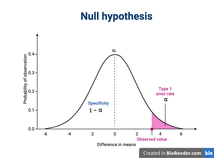
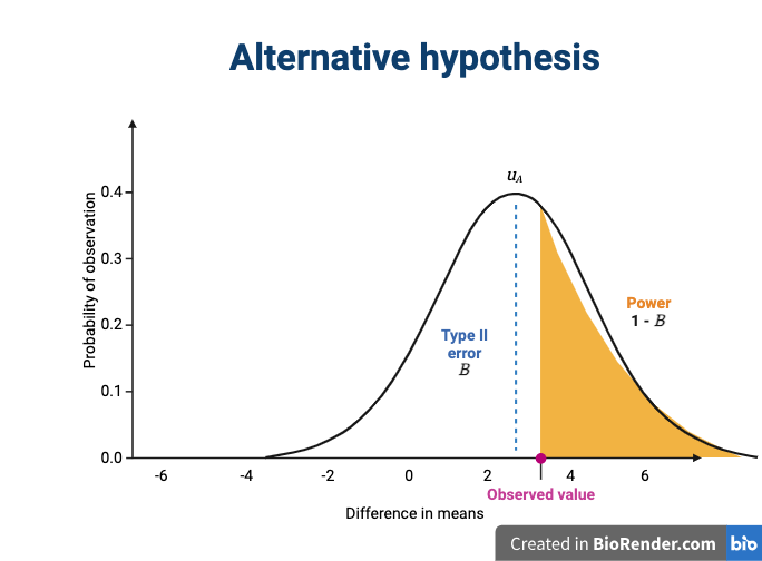
The alternative hypothesis challenges the null by stating that an effect exists and that the mean difference, \(\mu_A\), is greater than zero. The difference between \(\mu_0\) and \(\mu_A\) is known as the effect size, which is expressed in units of standard deviation: \(d = (\mu_A - \mu_0) / \sigma\).
If mathematical symbols and Greek letters are confusing, think of them as emoji language. For example,
\(\mu\) is a 🐮
\(\alpha\) is a 🐶
\(\sigma\) is a 🐛
Probability and probability distributions
Suppose you have measured the resting heart rate of the entire
population of elderly Norwegians 70 or older, not just the 1,567 from
the Generation 100 study. Imagine you need to describe all of these
numbers to someone who has no idea what resting heart rate is. Imagine
that all the measurements from the entire population are contained in
population. We could list out all of the numbers for them
to see or take a sample and show them the sample of heart rates, but
this would be inefficient and wouldn’t provide much insight into the
data. A better approach is to define and visualize a
distribution. The simplest way to think of a
distribution is as a compact description of many numbers.
Histograms show us the proportion of values within an interval. Here is a histogram showing all resting heart rates for the entire population 70 and older.
R
population %>% ggplot(mapping = aes(heart_rate)) + geom_histogram()
Showing this plot is much more informative and easier to interpret than a long table of numbers. With this histogram we can approximate the number of individuals in any given interval. For example, there are approximately 28 individuals (~1.8%) with a resting heart rate greater than 80, and another 6 individuals (~0.4%) with a resting heart rate below 50.
The histogram above approximates one that is very common in nature: the bell curve, also known as the normal distribution or Gaussian distribution.
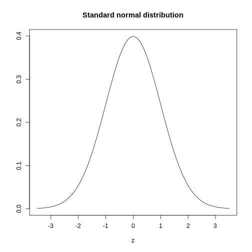
The curve shown above is an example of a probability density
function that defines a normal distribution. The y-axis is the
probability density, and the total area under the curve
sums to 1.0 on the y-axis. The x-axis denotes a variable z that
by statistical convention has a standard normal distribution. If you
draw a random value from a normal distribution, the probability that the
value falls in a particular interval, say from a to b,
is given by the area under the curve between a and b.
When the histogram of a list of numbers approximates the normal
distribution, we can use a convenient mathematical formula to
approximate the proportion of values or outcomes in any given interval.
That formula is conveniently stored in the function
pnorm.
If the normal approximation holds for our list of data values, then
the mean and variance (spread) of the data can be used. For example,
when we noticed that ~ 0.4% of the values in the null distribution were
greater than meanDiff, the mean difference between control
and high-intensity groups. We can compute the proportion of values below
a value x with pnorm(x, mu, sigma) where
mu is the mean and sigma the standard
deviation (the square root of the variance).
R
# the proportion of values BELOW the mean difference between high-intensity and
# control exercise groups
pnorm(meanDiff, mean=mean(null), sd=sd(null))
OUTPUT
[1] 0.9964357R
# the proportion of values ABOVE the mean difference between high-intensity and
# control exercise groups
1 - pnorm(meanDiff, mean=mean(null), sd=sd(null))
OUTPUT
[1] 0.003564273A useful characteristic of this approximation is that we only need to
know mu and sigma to describe the entire
distribution. From this, we can compute the proportion of values in any
interval.
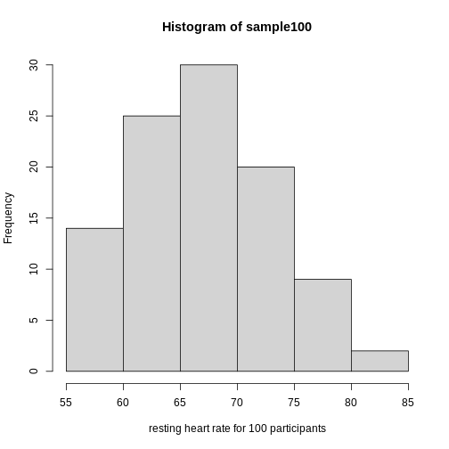
Real-world populations may be approximated by the mathematical ideal of the normal distribution. Repeat the sampling we did earlier and produce a new histogram of the sample.
R
sample100 <- sample(heart_rate$heart_rate, 100)
hist(sample100, xlab = "resting heart rate for 100 participants")
Exercise 6: Sampling from a population
- Does the sample appear to be normally distributed?
- Can you estimate the mean resting heart rate by eye?
- What is the sample mean using R (hint: use
mean())?
- Can you estimate the sample standard deviation by eye? Hint: if
normally distributed, 68% of the data will lie within one standard
deviation of the mean and 95% will lie within 2 standard
deviations.
- What is the sample standard deviation using R (hint: use
sd())?
- Estimate the number of people with a resting heart rate between 60
and 70.
- What message does the sample deliver about the population from which it was drawn?
- Yes, it appears to be normally distributed.
- The mean is probably around 65 to 66.
-
mean(sample100)= 65.6, which will vary because each sample of 100 is different and will have a different mean. - Standard deviation appears to be somewhere between 5 and 7.
-
sd(sample100)= 6.5 which will vary because each sample of 100 is different and will have a different standard deviation. - Number of people with resting heart rate between 60 and 70: 55-60
- The majority of people in this population will have a resting heart rather close to the mean of the sample population (65.6). If normally distributed, 68% of population heart rates will lie within 1 standard deviation of the mean, or approximately 59.1 to 72.1. Individuals with heart rates as low as 55 and as high as 90 can be seen. Since this sample has a normal distribution it is a good representation of the population, though we could replicate the random sampling many times to confirm.
If you have doubts about whether the sample follows a normal distribution, a quantile-quantile (QQ) plot can make interpretation easier.
R
qqnorm(sample100)
qqline(sample100)
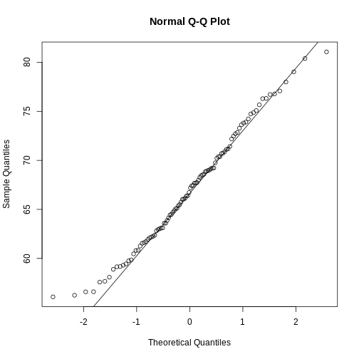
We can use qq-plots to confirm that a distribution is relatively close to normally distributed. A qq-plot compares data on the y-axis against a theoretical distribution on the x-axis. If the data points fall on the identity line (diagonal line), then the data is close to the theoretical distribution. The larger the sample, the more forgiving the result is to the weakness of this normal approximation. For small sample sizes, the t-distribution works well.
Statistical significance testing: the t-test
Significance testing can answer questions about differences between the two groups in light of inherent variability in heart rate measurements. What does it mean that a difference is statistically significant? We can eye plots like the boxplots above and see a difference, however, we need something more objective than eyeballs to claim a significant difference. A t-test will report whether the difference in mean values between the two groups is significant. The null hypothesis would state that there is no difference in mean values, while the alternative hypothesis states that there is a difference in the means of the two samples from the whole population of elders in Norway.
R
# Extract two exercise groups from the data
# Compare the means of the two groups

control_group <- population %>%
  filter(exercise_group == "control")
high_group <- population %>%
  filter(exercise_group == "high intensity")
t.test(x = control_group$heart_rate,
       y = high_group$heart_rate)
OUTPUT
	Welch Two Sample t-test

data:  control_group$heart_rate and high_group$heart_rate
t = 7.2739, df = 1042, p-value = 6.855e-13
alternative hypothesis: true difference in means is not equal to 0
95 percent confidence interval:
 1.839507 3.198619
sample estimates:
mean of x mean of y
 64.24299  61.72393
The perils of p-values
You can access the p-value alone from the t-test by saving the
results and accessing individual elements with the $
operator.
R
# save the t-test result and access the p-value alone
result <- t.test(x = control_group$heart_rate,
                 y = high_group$heart_rate)
result$p.value
OUTPUT
[1] 6.855193e-13The p-value indicates a statistically significant difference between exercise groups. It is not enough, though, to report only a p-value. The p-value says nothing about the effect size (the observed difference). If the effect size was tiny, say .01 or less, would it matter how small the p-value is? The effect is negligible, so the p-value does nothing to demonstrate practical relevance or meaning. We should question how large the effect is. The p-value can only tell us whether an effect exists.
A p-value can only tell us whether an effect exists. However, a p-value greater than .05 doesn’t mean that no effect exists. The value .05 is rather arbitrary. Does a p-value of .06 mean that there is no effect? It does not. It would not provide evidence of an effect under standard statistical protocol. Absence of evidence is not evidence of absence. There could still be an effect.
Confidence intervals
P-values report statistical significance of an effect, but what we want is scientific significance. Confidence intervals include estimates of the effect size and uncertainty associated with these estimates. When reporting results, use confidence intervals.
R
# access the confidence interval
result$conf.int
OUTPUT
[1] 1.839507 3.198619
attr(,"conf.level")
[1] 0.95
The confidence interval states that the true difference in means is between 1.84 and 3.2. We can say, with 95% confidence, that high intensity exercise could decrease mean heart rate from 1.84 to 3.2 beats per minute. Note that these are simulated data and are not the real outcomes of the Generation 100 study.
A 95% confidence interval states that 95% of random intervals will contain the true value. This is not the same as saying that there is a 95% chance that the true value falls within the interval. The graphic below helps to explain a 95% confidence interval for mean heart rates of samples of size 30 taken from the overall population.
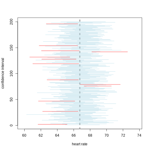
If we generate 200 confidence intervals for the sample mean heart rate, those confidence intervals will include the true population mean (vertical gray dotted line) approximately 95% of the time. You will see that about 5% of the confidence intervals (shown in red) fail to cover the true population mean.
Exercise 7: Explaining p-values and confidence intervals
For each statement, explain to a partner why you believe the statement is true or untrue.
- A p-value of .02 means that there is only a 2% chance that high-intensity and control exercise result in the same average heart rate.
- A p-value of .02 demonstrates that there is a meaningful difference in average heart rates between the two groups.
- A 95% confidence interval has a 95% chance of containing the true difference in means.
- A confidence interval should be reported along with the p-value.
Comparing standard deviations
When comparing the means of data from the two groups, we need to ask whether these data have equal variances (spreads). Previous studies and prior knowledge can help us with this assumption. If we know from previous data or from our own expertise that adjusting a treatment will affect the mean response but not its variability, then we can assume equal variances between treatment groups.
However, if we suspect that changing a treatment will affect not only mean response but also its variability, we will be as interested in comparing standard deviations (the square root of the variance) as we are in comparing means.
As a rule of thumb, if the ratio of the larger to the smaller variance is less than 4, the groups have equal variances.
R
heart_rate %>%
  group_by(exercise_group) %>%
  summarise(across(heart_rate,
                   list(variance=var, standard_deviation = sd)))
OUTPUT
# A tibble: 3 × 3
  exercise_group     heart_rate_variance heart_rate_standard_deviation
  <chr>                            <dbl>                         <dbl>
1 control                           31.4                          5.61
2 high intensity                    31.2                          5.58
3 moderate intensity                27.1                          5.20
A more formal approach uses an F test to compare variances between samples drawn from a normal population.
R
var.test(heart_rate$exercise_group == "control",
         heart_rate$exercise_group == "high intensity")
OUTPUT
	F test to compare two variances

data:  heart_rate$exercise_group == "control" and heart_rate$exercise_group == "high intensity"
F = 1, num df = 1565, denom df = 1565, p-value = 1
alternative hypothesis: true ratio of variances is not equal to 1
95 percent confidence interval:
 0.9056303 1.1042033
sample estimates:
ratio of variances
                 1
The F test reports that the variances between the groups are not the same, however, the ratio of variances is very close to 1 as indicated by the confidence interval.
Sample sizes and power curves
Statistical power analysis is an important preliminary step in experimental design. Sample size is an important component of statistical power (the power to detect an effect). To get a better sense of statistical power, let’s simulate a t-test for two groups with different means and equal variances.
R
set.seed(1)
n_sims <- 1000 # we want 1000 simulations
p_vals <- c()  # create a vector to hold the p-values

for(i in 1:n_sims){
  group1 <- rnorm(n=30, mean=1, sd=2) # simulate group 1
  group2 <- rnorm(n=30, mean=0, sd=2) # simulate group 2

  # run t-test and extract the p-value
  p_vals[i] <- t.test(group1, group2, var.equal = TRUE)$p.value
}

# check power (i.e. proportion of p-values that are smaller
# than alpha-level of .05)
mean(p_vals < .05)
OUTPUT
[1] 0.478Let’s calculate the statistical power of our experiment so far, and then determine the sample size we would need to run a similar experiment on a different population.
R
# sample size = 522 per group
# delta = the observed effect size, meanDiff
# sd = standard deviation
# significance level (Type 1 error probability or
#                     false positive rate) = 0.05
# type = two-sample t-test
# What is the power of this experiment to detect
#                     an effect of size meanDiff?
power.t.test(n = 522, delta = meanDiff, sd = sd(heart_rate$heart_rate),
             sig.level = 0.05, type = "two.sample")
OUTPUT
     Two-sample t test power calculation

              n = 522
          delta = 2.519063
             sd = 6.861167
      sig.level = 0.05
          power = 0.9999635
    alternative = two.sided

NOTE: n is number in *each* group
In biomedical studies, statistical power of 80% (0.8) is an accepted standard. If we were to repeat the experiment with a different population of elders (e.g. Icelandic elders), what is the minimum sample size we would need for each exercise group?
R
# delta = the observed effect size, meanDiff
# sd = standard deviation
# significance level (Type 1 error probability or false positive rate) = 0.05
# type = two-sample t-test
# What is the minimum sample size we would need at 80% power?
power.t.test(delta = meanDiff, sd = sd(heart_rate$heart_rate),
             sig.level = 0.05, type = "two.sample", power = 0.8)
OUTPUT
     Two-sample t test power calculation

              n = 117.4224
          delta = 2.519063
             sd = 6.861167
      sig.level = 0.05
          power = 0.8
    alternative = two.sided

NOTE: n is number in *each* group
As a rule of thumb, Lehr’s equation streamlines calculation of sample size assuming equal variances and sample sizes drawn from a normal distribution. The effect size is standardized by dividing the difference in group means by the standard deviation. Cohen’s d describes standardized effect sizes from 0.01 (very small) to 2.0 (huge).
R
# n = (16/delta squared), where delta is the standardized effect size
# delta = effect size standardized as Cohen's d
#     (difference in means)/(standard deviation)
standardizedEffectSize <- meanDiff/sd(heart_rate$heart_rate)
n <- 16/standardizedEffectSize^2
n
OUTPUT
[1] 118.6965Often budget constraints determine sample size. Lehr’s equation can be rearranged to determine the effect size that can be detected for a given sample size.
R
# difference in means = (4 * sd)/(square root of n)
# n = 100, the number that I can afford
SD <- sd(heart_rate$heart_rate)
detectableDifferenceInMeans <- (4 * SD)/sqrt(100)
detectableDifferenceInMeans
OUTPUT
[1] 2.744467Try increasing or decreasing the sample size (100) to see how the detectable difference in mean changes. Note the relationship: for very large effects, you can get away with smaller sample sizes. For small effects, you need large sample sizes.
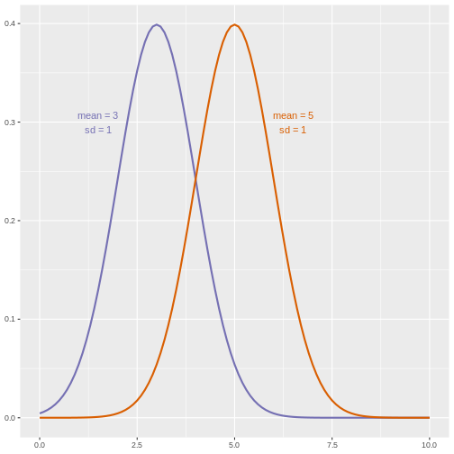
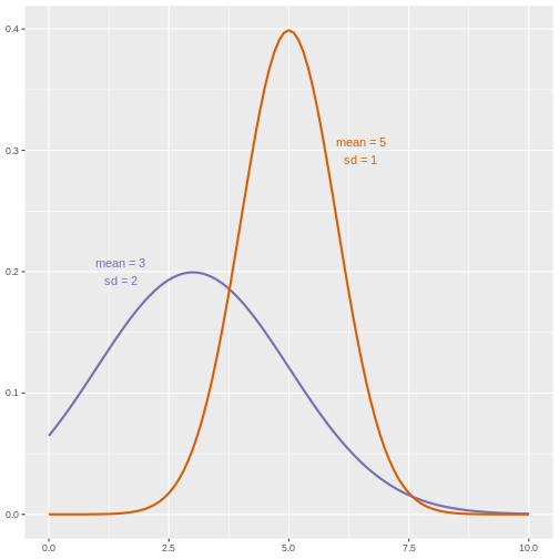
A power curve can show us statistical power based on sample size and effect size. Review the following figures to explore the relationships between effect size, sample size, and power. What is the relationship between effect size and sample size? Between sample size and power? What do you notice about effect size and power as you increase the sample size?
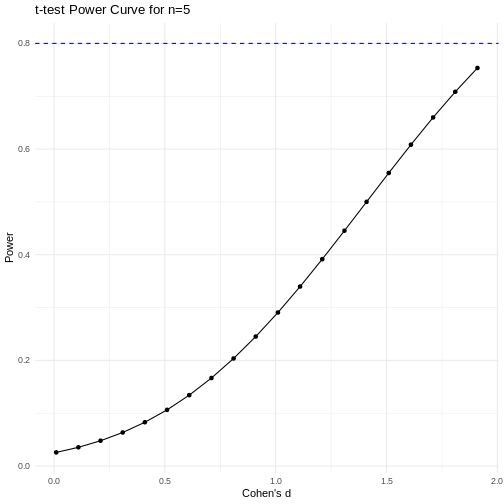
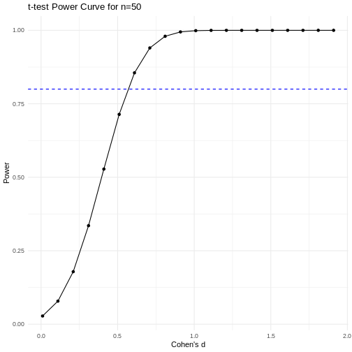
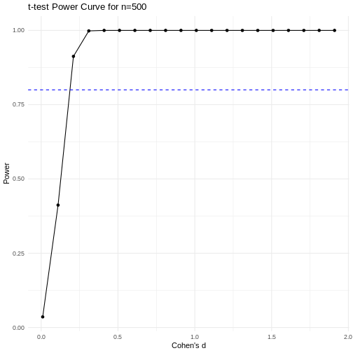 Code adapted from Power
Curve in R by Cinni Patel.
Code adapted from Power
Curve in R by Cinni Patel.
Review the following figure to explore the relationships between effect size, sample size, and power. What is the relationship between effect size and sample size? Between sample size and power?
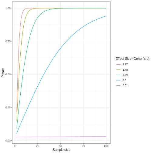 Code adapted from How
to Create Power Curves in ggplot by Levi Baguley
Code adapted from How
to Create Power Curves in ggplot by Levi Baguley
Notice that to detect a standardized effect size of 0.5 at 80% power, you would need a sample size of approximately 70. Larger effect sizes require much smaller sample sizes. Very small effects such as .01 never reach the 80% power threshold without enormous samples sizes in the hundreds of thousands.
- Plotting and significance testing describe patterns in the data and quantify effects against random variation.
Content from Completely Randomized Designs
Last updated on 2026-07-16 | Edit this page
Overview
Questions
- What is a completely randomized design (CRD)?
- What are the limitations of CRD?
Objectives
- CRD is the simplest experimental design.
- In CRD, treatments are assigned randomly to experimental units.
- CRD assumes that the experimental units are relatively homogeneous or similar.
- CRD doesn’t remove or account for systematic differences among experimental units.
A completely randomized design (CRD) is the simplest experimental design. In CRD, experimental units are randomly assigned to treatments with equal probability. Any systematic differences between experimental units (e.g. differences in measurement protocols, equipment calibration, personnel) are minimized, which minimizes confounding. CRD is simple, however it can result in larger experimental error compared to other designs if experimental units are not similar. This means that the variation among experimental units that receive the same treatment (i.e. variation within a treatment group) will be greater. In general though, CRD is a straightforward experimental design that effectively minimizes systematic errors through randomization.
A single qualitative factor
The Generation 100 study employed a single qualitative factor (exercise) at three treatment levels - high intensity, moderate intensity and a control group that followed national exercise recommendations. The experimental units were the individuals in the study who engaged in one of the treatment levels.
Challenge 1: Raw ingredients of a comparative experiment
Discuss the following questions with your partner, then share your answers to each question in the collaborative document.
- How would you randomize the 1,500+ individuals in the study to one
of the treatment levels?
- Is blinding possible in this study? If not, what are the
consequences of not blinding the participants or investigators to
treatment assignments?
- Is CRD a good design for this study? Why or why not?
- How would you randomize the 1,500+ individuals in the study to one
of the treatment levels?
You can use a random number generator like we did previously to assign all individuals to one of three treatment levels.
- Is blinding possible in this study? If not, what are the
consequences of not blinding the participants or investigators to
treatment assignments?
Blinding isn’t possible because people must know which treatment they have been assigned so that they can exercise at the appropriate level. There is a risk of response bias from participants knowing which treatment they have been assigned. The investigators don’t need to know which treatment group an individual is in, however, so they could be blinded to the treatments to prevent reporting bias from entering when following study protocols. In either case random assignment of participants to treatment levels will minimize bias.
- Is CRD a good design for this study? Why or why not?
CRD is best when experimental units are homogeneous or similar. In this study, all individuals were between the ages of 70-77 years and all lived in Trondheim, Norway. They were not all of the same sex, however, and sex will certainly affect the study outcomes and lead to greater experimental error within each treatment group. Stratification, or grouping, by sex followed by random assignment to treatments within each stratum would alleviate this problem. So, randomly assigning all women to one of the three treatment groups, then randomly assigning all men to one of the three treatment groups would be the best way to handle this situation.
In addition to stratification by sex, the Generation 100 investigators stratified by cohabitation status because this would also influence study outcomes.
IMPORTANT For the purpose of learning about analysis of variance we will treat all experimental units as is they are the same. In reality, sex and cohabitation status are important characteristics of participants and should be used in both experimental design and analysis as they were in the actual study. We simplify things here and will look at these important differences in a later episode on Randomized Complete Block Designs.
Analysis of variance (ANOVA)
Previously we tested the difference in means between two treatment groups, high intensity and control, using a two-sample t-test. We could continue using the t-test to determine whether there is a significant difference between high intensity and moderate intensity, and between moderate intensity and control groups. This would be tedious though because we would need to test each possible combination of two treatment groups separately. It is also susceptible to bias. If we were to test the difference in means between the highest and lowest heart rate groups (high vs. moderate intensity), there is more than a 5% probability that just by random chance we can obtain a p-value less than .05. Comparing the highest to the lowest mean groups biases the t-test to report a statistically significant difference when in reality there might be no difference in means.
Analysis of variance (ANOVA) addresses two sources of variation in the data: 1) the variation within each treatment group; and 2) the variation among the treatment groups. In the boxplots below, the variation within each treatment group shows in the vertical length of the each box and its whiskers. The variation among treatment groups is shown horizontally as upward or downward shift of the treatment groups relative to one another. ANOVA quantifies and compares these two sources of variation.
R
heart_rate %>%
  mutate(exercise_group = fct_reorder(exercise_group,
                                      heart_rate,
                                      .fun='mean'))  %>%
  ggplot(aes(exercise_group, heart_rate)) +
  geom_boxplot()
By eye it appears that there is a difference in mean heart rate
between exercise groups, and that increasing exercise intensity
decreases mean heart rate. We want to know if there is any statistically
significant difference between mean heart rates in the three exercise
groups. The R function anova() performs analysis of
variance (ANOVA) to answer this question. We provide
anova() with a linear model (lm()) stating
that heart_rate depends on exercise_group.
R
anova(lm(heart_rate ~ exercise_group, data = heart_rate))
OUTPUT
Analysis of Variance Table

Response: heart_rate
                 Df Sum Sq Mean Sq F value    Pr(>F)
exercise_group    2  26960 13480.1  451.04 < 2.2e-16 ***
Residuals      1563  46713    29.9
---
Signif. codes:  0 '***' 0.001 '**' 0.01 '*' 0.05 '.' 0.1 ' ' 1
The output tells us that there are two terms in the model we
provided: exercise_group plus some experimental error
(Residuals). The response is heart rate. As an equation the
linear model looks like this:
\(y = \mu + \beta*x + \epsilon\)
where \(y\) is the response (heart
rate), \(\mu\) is the overall mean,
\(x\) is the treatment (exercise
group), \(\beta\) is the effect size,
and \(\epsilon\) is experimental error,
also called Residuals. If you don’t like mathematical
equations, think of them in emoji language.
💗 = 💓 + 💥 * (🏃🚶💃) + ✨
To help interpret the rest of the ANOVA output, the following table defines each element.
| source of variation | Df | Sum Sq | Mean Sq=Sum Sq/Df | F value | prob(>F) |
|---|---|---|---|---|---|
| treatments | \(k - 1\) | \(n\sum(\bar{y_i} - \bar{y_.})^2\) | TMS | TMS/EMS | p-value |
| error | \(k(n - 1)\) | \(\sum\sum({y_{ij}} - \bar{y_i})^2\) | EMS | ||
| total | \(nk - 1\) | \(\sum\sum({y_{ij}} - \bar{y_.})^2\) |
The source of variation among treatments is
shown on the y-axis of the boxplots shown earlier. Treatments have \(k - 1\) degrees of freedom
(Df), where \(k\) is the
number of treatment levels. Since we have 3 exercise groups, the
treatments have 2 degrees of freedom. Think of degrees of freedom as the
number of values that are free to vary. Or, if you know two of the
exercise groups, the identity of the third is revealed.
The Sum of Squares (Sum Sq) for the treatment subtracts
the overall mean for all groups from the mean for each treatment group
(\(\bar{y_i} - \bar{y_.}\)), squares
the difference so that only positive numbers result, then sums (\(\sum\)) all of the squared differences
together and multiplies the result by the number of observations in each
group (\(n\) = 522). If we were to
calculate the Sum of Squares manually, it would look like this:
In the code below, groupMeans are the \(y_i\) and overallMean is the
\(y.\).
R
# these are the y_i
groupMeans <- heart_rate %>%
  group_by(exercise_group) %>%
  summarise(mean = mean(heart_rate))
groupMeans
OUTPUT
# A tibble: 3 × 2
  exercise_group      mean
  <chr>              <dbl>
1 control             64.2
2 high intensity      61.7
3 moderate intensity  71.5
R
# this is y.
overallMean <- heart_rate %>%
  summarise(mean = mean(heart_rate))
overallMean
OUTPUT
# A tibble: 1 × 1
   mean
  <dbl>
1  65.8
R
# sum the squared differences of the groups and multiply the total sum by n
((groupMeans$mean[1] - overallMean)^2 +
    (groupMeans$mean[2] - overallMean)^2 +
    (groupMeans$mean[3] - overallMean)^2) * 522
OUTPUT
      mean
1 26960.22
The source of variation within treatments is called
error (Residuals), meaning the variation among
experimental units within the same treatment group. The degrees of
freedom (Df) for error equals \(k\), the number of treatment levels, times
\(n - 1\), one less than the number of
observations in each group. For this experiment \(k = 3\) and \(n -
1 = 521\) so the degrees of freedom for the error equals 1563. If
you know 521 of the data points in an exercise group, the identity of
number 522 is revealed. Each of the 3 exercise groups has 521 degrees of
freedom, so the total degrees of freedom for error is 1563. The Sum of
Squares for error is the difference between each data point, \(y_{ij}\) and the group mean \(\bar{y_i}\). This difference is squared and
the sum of all squared differences calculated for each exercise group
\(i\).
In the boxplots below, each individual data point, \(y_{ij}\), is shown as a gray dot. The group mean, \(\bar{y_i}\), is shown as a red dot. Imagine drawing a box that has one corner on the group mean for high-intensity exercise (61.7) and another corner on a single data point nearby. The area of this box represents the difference between the group mean and the data point squared, or \((y_{ij} - \bar{y_i})^2\). Repeat this for all 522 data points in the group, then sum up (\(\sum\)) the areas of all the boxes for that group. Repeat the process with the other two groups, then add all of the group sums (\(\sum\sum\)) together.
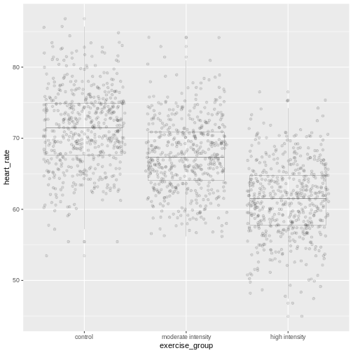
This used to be a manual process. Fortunately R does all of this labor for us. The ANOVA table tells us that the sum of all squares for all groups equals 46713.
The mean squares values (Mean Sq) divides the Sum of
Squares by the degrees of freedom. The treatment mean squares, TMS,
equals
( 26960 / 2 = 1.3480108^{4} ).
The treatment mean square is a measure of the variance among the treatment groups, which is shown horizontally in the boxplots as upward or downward shift of the treatment groups relative to one another.
The error mean square, EMS, similarly is the Sum of Squares divided by the degrees of freedom, or (46713) divided by (1563). Error mean square is an estimate of variance within the groups, which is shown in the vertical length of the each boxplot and its whiskers.
The F value, or F statistic, equals the treatment mean
square divided by the error mean square, or among-group variation
divided by within-group variation (1.3480108^{4} / 29.9 = 451.04).
F value = among-group variance / within-group
variance
These variance estimates are statistically independent of one another, such that you could move any of the three boxplots up or down and this would not affect the within-group variance. Among-group variance would change, but not within-group variance.
The final source of variation, total, doesn’t appear in
the ANOVA table. The degrees of freedom for the total is one less than
the number of observations, or (522 * 3) - 1 = 1565 for this experiment.
The Sum of Squares for the total the squared difference between each
data point and the overall mean, summed over all groups. This is as if
there were no treatment groups and all observations were grouped
together as one. You can imagine merging all three boxplots into one and
calculating the difference between each individual data point and the
overall mean, squaring the result, and adding the sum of all
squares.
Equal variances and normality
Challenge 2: Checking for equal variances and normality
A one-way ANOVA assumes that:
1. variances of the populations that the samples come from are
equal,
2. samples were drawn from a normally distributed population, and
3. observations are independent of each other and observations within
groups were obtained by random sampling.
One-way ANOVA determines whether a single factor such as exercise influences the response. Two-way ANOVA looks at how two factors influence a response, and whether the two interact with one another. We will look at two-way ANOVA later.
Discuss the following questions with your partner, then share your answers to each question in the collaborative document.
- How can you check whether variances are equal?
- How can you check whether data are normally distributed?
- How can you check whether each observation is independent of the other and groups randomly assigned?
- How can you check whether variances are equal?
A visual like a boxplot can be used to check whether variances are equal.
heart_rate %>%
  mutate(exercise_group = fct_reorder(exercise_group,
                                      heart_rate,
                                      .fun='mean',
                                      .desc = TRUE))  %>%
  ggplot(aes(exercise_group, heart_rate)) +
  geom_boxplot()
If the length of the boxes are more or less equal, then equal
variances can be assumed.
2. How can you check whether data are normally distributed?
You can visually check this assumption with histograms or Q-Q plots.
Normally distributed data will form a more or less bell-shaped
histogram.
heart_rate %>%
  ggplot(aes(heart_rate)) +
  geom_histogram()
Normally distributed data will mostly fall upon the diagonal line in a Q-Q plot.
qqnorm(heart_rate$heart_rate)
qqline(heart_rate$heart_rate)- How can you check whether each observation is independent of the other and groups randomly assigned?
More formal tests of normality and equal variance include the Bartlett test, Shapiro-Wilk test and the Kruskal-Wallis test.
The Bartlett test of homogeneity of variances tests the null hypothesis that the samples have equal variances against the alternative that they do not.
R
bartlett.test(heart_rate ~ exercise_group, data = heart_rate)
In this case the p-value is greater than the alpha level of 0.05.
This suggests that the null should not be rejected, or in other words
that samples have equal variances. One-way ANOVA is robust against
violations of the equal variances assumption as long as each group has
the same sample size. If variances are very different and sample sizes
unequal, the Kruskal-Wallis test (kruskal.test())
determines whether there is a statistically significant difference
between the medians of three or more independent groups.
The Shapiro-Wilk Normality Test tests the null hypothesis that the samples come from a normal distribution against the alternative hypothesis that samples don’t come from a normal distribution.
R
shapiro.test(heart_rate$heart_rate)
In this case the p-value of the test is less than the alpha level of 0.05, suggesting that the samples do not come from a normal distribution. With very large sample sizes statistical tests like the Shapiro-Wilk test will almost always report that your data are not normally distributed. Visuals like histograms and Q-Q plots should clarify this. However, one-way ANOVA is robust against violations of the normality assumption as long as sample sizes are quite large.
If data are not normally distributed, or if you just want to be cautious, you can:
Transform the response values in your data so that they are more normally distributed. A log transformation (
log10(x)) is one method for transforming response values to a more normal distribution.Use a non-parametric test like a Kruskal-Wallis Test that doesn’t require assumption of normality.
Confidence intervals
The boxplots show that high-intensity exercise results in lower average heart rate. Remember that these are simulated data and that the actual study measured all-cause mortality after five years of exercise.
R
heart_rate %>%
  group_by(exercise_group) %>%
  summarise(mean = mean(heart_rate))
OUTPUT
# A tibble: 3 × 2
  exercise_group      mean
  <chr>              <dbl>
1 control             64.2
2 high intensity      61.7
3 moderate intensity  71.5
To generalize these results to the entire population of Norwegian
elders, we can examine the imprecision in this estimate using a
confidence interval for mean heart rate. We could use only the
high-intensity group data to create a confidence interval, however, we
can do better by “borrowing strength” from all groups. We know that the
underlying variation in the groups is the same for all three groups, so
we can estimate the common standard deviation. ANOVA has already done
this for us by supplying error mean square (29.9) as the pooled estimate
of the variance. The standard deviation is the square root of this value
(5.47). The fact that we “borrowed strength” by including all groups is
reflected in the degrees of freedom, which is 1563 for the sample
standard deviation instead of n - 1 = 521 for the sample
variance of only one group. This makes the test more powerful because it
borrows information from all groups. We use the sample standard
deviation to calculate a 95% confidence interval for mean heart rate in
the high-intensity group.
R
confint(lm(heart_rate ~ exercise_group, data = heart_rate))
OUTPUT
                                     2.5 %    97.5 %
(Intercept)                      63.773648 64.712331
exercise_grouphigh intensity     -3.182813 -1.855314
exercise_groupmoderate intensity  6.603889  7.931388
The results provide us with the 95% confidence interval for the mean
in the control group (Intercept), meaning that 95% of
confidence intervals generated will contain the true mean value.
Confidence intervals for the high- and moderate-intensity groups are
given as values to be added to the intercept values. The 95% confidence
interval for the high-intensity group is from 60.6 to 62.9. The 95%
confidence interval for the moderate-intensity group is from 70.4 to
72.6.
Inference
Inference about the underlying difference in means between exercise groups is a statement about the difference between normal distribution means that could have resulted in the data from this experiment with 1566 Norwegian elders. Broader inference relies on how this sample of Norwegian elders relates to all Norwegian elders. If this sample of Norwegian elders were selected at random nationally, then the inference could be broadened to the larger population of Norwegian elders. Otherwise broader inference requires subject matter knowledge about how this sample relates to all Norwegian elders and to all elders worldwide.
Statistical Prediction Interval
To create a confidence interval for the group means we used a linear model that states that heart rate is dependent on exercise group.
R
lm(heart_rate ~ exercise_group, data = heart_rate)
OUTPUT
Call:
lm(formula = heart_rate ~ exercise_group, data = heart_rate)

Coefficients:
                     (Intercept)      exercise_grouphigh intensity
                          64.243                            -2.519
exercise_groupmoderate intensity
                           7.268
This effectively states that mean heart rate is 64.2 plus 7.27 for the moderate-intensity group or -2.52 for the high-intensity group. We can use this same linear model to predict mean heart rate for a new group of control participants.
R
### save the linear model as an object
model <- lm(heart_rate ~ exercise_group, data = heart_rate)
### predict heart rates for a new group of controls
predict(model,
        data.frame(exercise_group = "control"),
        interval = "prediction",
        level = 0.95)
OUTPUT
       fit      lwr      upr
1 64.24299 53.50952 74.97646
Notice that in both the confidence interval and prediction interval, the predicted value for mean heart rate in controls is the same - 64.2. However, the prediction interval is much wider than the confidence interval. The confidence interval defines a range of values likely to contain the true average heart rate for the control group. The prediction interval defines the expected range of heart rate values for a future individual participant in the control group and is broader since there can be considerably more variation in individuals. The difference between these two kinds of intervals is the question that they answer.
- What interval is likely to contain the true average heart rate for controls? OR
- What interval predicts the average heart rate of a future participant in the control group?
Notice that for both kinds of intervals we used the same linear model that states that heart rate depends on exercise group.
R
lm(heart_rate ~ exercise_group, data = heart_rate)
OUTPUT
Call:
lm(formula = heart_rate ~ exercise_group, data = heart_rate)

Coefficients:
                     (Intercept)      exercise_grouphigh intensity
                          64.243                            -2.519
exercise_groupmoderate intensity
                           7.268
We know that the study contains both sexes between the ages of 70 and
77. Completely randomized designs assume that experimental units are
relatively similar, and the designs don’t remove or account for
systematic differences. We should add sex into the linear model because
heart rate is likely influenced by sex. We can get more information
about the linear model with a summary().
R
summary(lm(heart_rate ~ exercise_group + sex, data = heart_rate))
OUTPUT
Call:
lm(formula = heart_rate ~ exercise_group + sex, data = heart_rate)

Residuals:
     Min       1Q   Median       3Q      Max
-14.1497  -3.7688  -0.0809   3.7338  19.1398

Coefficients:
                                 Estimate Std. Error t value Pr(>|t|)
(Intercept)                       64.5753     0.2753 234.530  < 2e-16 ***
exercise_grouphigh intensity      -2.5191     0.3379  -7.456 1.47e-13 ***
exercise_groupmoderate intensity   7.2676     0.3379  21.511  < 2e-16 ***
sexM                              -0.6697     0.2759  -2.428   0.0153 *
---
Signif. codes:  0 '***' 0.001 '**' 0.01 '*' 0.05 '.' 0.1 ' ' 1

Residual standard error: 5.458 on 1562 degrees of freedom
Multiple R-squared:  0.3683,	Adjusted R-squared:  0.3671
F-statistic: 303.6 on 3 and 1562 DF,  p-value: < 2.2e-16
The linear model including sex states that average heart rate for the
control group is 64.6 less 7.27 for the moderate-intensity group or
-2.52 for the high-intensity group. Males have heart rates that are
-0.67 from mean control heart rate. The p-values
(Pr(>|t|)) are near zero for all of the estimates (model
coefficients). Exercise group and sex clearly impact heart rate. What
about age?
R
summary(lm(heart_rate ~ exercise_group + age, data = heart_rate))
OUTPUT
Call:
lm(formula = heart_rate ~ exercise_group + age, data = heart_rate)

Residuals:
     Min       1Q   Median       3Q      Max
-14.6891  -3.8014  -0.1194   3.7565  19.5980

Coefficients:
                                 Estimate Std. Error t value Pr(>|t|)
(Intercept)                       84.1077    10.1807   8.261 3.03e-16 ***
exercise_grouphigh intensity      -2.5145     0.3381  -7.437 1.69e-13 ***
exercise_groupmoderate intensity   7.2653     0.3381  21.489  < 2e-16 ***
age                               -0.2730     0.1399  -1.952   0.0511 .
---
Signif. codes:  0 '***' 0.001 '**' 0.01 '*' 0.05 '.' 0.1 ' ' 1

Residual standard error: 5.462 on 1562 degrees of freedom
Multiple R-squared:  0.3675,	Adjusted R-squared:  0.3663
F-statistic: 302.5 on 3 and 1562 DF,  p-value: < 2.2e-16
We can add age into the linear model to determine whether or not it
impacts heart rate. The estimated coefficient for age is small (-0.27)
and has a high p-value (0.0511467). Age is not significant, which is not
surprising since all participants were between the ages of 70 and 77.
Notice also that the Estimate for average heart rate in the
control group (Intercept) is very high even though it is
statistically significant. This Estimate of 84.1 is far
higher than the confidence interval or prediction interval for average
heart rate of controls that we calculated earlier. The linear model that
best fits the data includes only exercise group and sex.
Sizing a Complete Random Design
The same principles apply for sample sizes and power calculations as were presented earlier. Typically a completely randomized design is analyzed to estimate precision of a treatment mean or the difference of two treatment means. Confidence intervals or power curves can be applied to sizing a future experiment. If we want to size a future experiment comparing heart rate between control and moderate-intensity exercise, what is the minimum number of people we would need per group in order to detect an effect as large as the mean heart rate difference from this experiment?
R
# delta = the observed effect size between groups
# sd = standard deviation
# significance level (Type 1 error probability or false positive rate) = 0.05
# type = two-sample t-test
# What is the minimum sample size we would need at 80% power?

controlMean <- heart_rate %>%
  filter(exercise_group == "control") %>%
  summarise(mean = mean(heart_rate))
moderateMean <- heart_rate %>%
  filter(exercise_group == "moderate intensity") %>%
  summarise(mean = mean(heart_rate))
delta <- controlMean - moderateMean
power.t.test(delta = delta[[1]], sd = sd(heart_rate$heart_rate),
             sig.level = 0.05, type = "two.sample", power = 0.8)
OUTPUT
     Two-sample t test power calculation

              n = 15.01468
          delta = 7.267638
             sd = 6.861167
      sig.level = 0.05
          power = 0.8
    alternative = two.sided

NOTE: n is number in *each* group
To obtain an effect size as large as the observed effect size between control and moderate-intensity exercise groups, you would need 15 participants per group to obtain 80% statistical power.
Challenge 3: Sizing other completely randomized designs
Would you expect to need more or fewer participants per group to
investigate the difference between:
1. control and high-intensity exercise on heart rate?
1. moderate- and high-intensity?
Recall the inverse relationship between effect size and sample size. Smaller effects require larger samples sizes, while larger effects permit small sample sizes. Check the observed effect sizes for the other two combinations of exercise groups.
highMean <- heart_rate %>%
  filter(exercise_group == "high intensity") %>%
  summarise(mean = mean(heart_rate))
delta <- controlMean - highMean
delta
The difference between high intensity and control group means is smaller, which will require a larger sample size to obtain 80% statistical power.
power.t.test(delta = delta[[1]], sd = sd(heart_rate$heart_rate),
             sig.level = 0.05, type = "two.sample", power = 0.8)
The number of participants required per group is much larger because the observed effect size between high intensity and control groups is much smaller.
- Delta is now the difference in means between moderate and high intensity means.
delta <- moderateMean - highMean
delta
The observed effect size between these two groups is large, so a smaller sample size will reach 80% statistical power.
power.t.test(delta = delta[[1]], sd = sd(heart_rate$heart_rate),
     sig.level = 0.05, type = "two.sample", power = 0.8)
A Single Quantitative Factor
So far we have been working with a single qualitative factor, exercise. Often our experiments involve quantitative factors such as drug dose. When working with quantitative factors rather than determining whether there is a significant difference in means between treatment groups, we often want to fit a curve with good precision to the data. We’ve been doing this with linear modeling already even when working with a qualitative factor. We want to design an experiment with enough replicates to estimate the slope of a line with good precision. The equation for a linear model:
\(y = \beta_0 + \beta_1*x + \epsilon\)
is often the first model we fit to the data. The slope of the line is represented by \(\beta_1\) and the experimental error, \(\epsilon\), is the distance from each data point to the line. \(\beta_0\) is the intercept or the mean value. In the following graphic, what would you say about how well the model fits the data, or how large the sum of the errors is? The linear model is shown in blue and the confidence interval shown in gray.
Linear models can be a good first approximation but not so in this case. The model fits badly. Sometimes nature throws a curve, not a line, and a different model is needed. In this case a quadratic model with a squared term fits better.
The distances from each data point to the line are much smaller. Plotting the data is the first step to discovering these kinds of relationships between treatment and response.
Design issues
The design issues for a single factor are the same whether that treatment factor is qualitative or quantitative. How should the experimental units be chosen? How many experimental units should be allocated to each factor level? What factor levels should be chosen? In the previous example involving drug dose you might choose only two levels - high and low - and connect a line. But nature can throw you a curve so choosing intermediate levels between two levels is wise. Subject matter expertise helps to choose factor levels. Other considerations are the choice of response and measurement protocols. Choice of controls is often context-specific.
- CRD is a simple design that can be used when experimental units are homogeneous.
Content from Completely Randomized Design with More than One Treatment Factor
Last updated on 2026-07-16 | Edit this page
Overview
Questions
- How is a CRD with more than one treatment factor designed and analyzed?
Objectives
- .
- .
When experiments are structured with two or more factors, these factors can be qualitative or quantitative. With two or more factors we face the same design issues. Which factors to choose? Which levels for each factor? A full factorial experiment includes all levels of all factors, which can become unwieldy when there are multiple levels for each factor. One option to manage an unwieldy design is to use only a fraction of the factor levels in a fractional factorial design. In this lesson we consider a full factorial design containing all levels of all factors.
A study aims to determine how dosage of a new antidiabetic drug and duration of daily exercise affect blood glucose levels in diabetic mice. The study has two quantitative factors with three levels each.
Drug dosage represents the amount of the antidiabetic drug administered daily. The levels for this factor are in mg per kg body weight. Control mice receive no drug. The second factor, exercise duration, represents the number of minutes the mice run on a running wheel each day. Control mice do not have a running wheel to run on. A full factorial design is used, with each combination of drug dosage and exercise duration applied to a group of mice. For example, one group receives 10 mg/kg of the drug and exercises 30 minutes per day, another group receives 10 mg/kg and exercises 60 minutes per day, and so on.
There are 3 levels for each factor, leading to 9 treatment combinations (3 drug doses × 3 exercise durations). Each combination is replicated with a group of 5 mice, making the design balanced and allowing analysis of interactions. Fasting blood glucose level (mg/dL) was measured at the start and after 4 weeks of treatment. Load the data.
R
drugExercise <- read_csv("data/drugExercise.csv")
drugExercise$DrugDose <- as_factor(drugExercise$DrugDose)
drugExercise$Exercise <- as_factor(drugExercise$Exercise)
head(drugExercise)
OUTPUT
# A tibble: 6 × 5
  DrugDose Exercise Baseline  Delta  Post
  <fct>    <fct>       <dbl>  <dbl> <dbl>
1 0        0            228.  0.449  228.
2 0        0            274. -0.977  273.
3 0        0            236.  0.190  236.
4 0        0            236.  0.731  237.
5 0        0            220  -0.493  220.
6 10       0            246. -5.04   241.
Summarize by mean change in glucose levels (Delta) and
standard deviation.
R
meansSD <- drugExercise %>%
  group_by(Exercise, DrugDose) %>%
  summarise(meanChange = round(mean(Delta), 3),
            stDev = sd(Delta))
meansSD
OUTPUT
# A tibble: 9 × 4
# Groups:   Exercise [3]
  Exercise DrugDose meanChange stDev
  <fct>    <fct>         <dbl> <dbl>
1 0        0            -0.02  0.702
2 0        10           -4.75  1.13
3 0        20           -9.99  0.824
4 30       0            -0.542 0.339
5 30       10           -2.65  1.57
6 30       20           -5.40  0.305
7 60       0            -2.79  0.652
8 60       10           -1.47  0.866
9 60       20           -0.334 0.905
The table shows that the drug alone lowered glucose in the mice in the 0 min/day exercise group. Increasing drug dose also lowered glucose in the 30 min/day exercise group. The 60 min/day exercise group showed the opposite effect. As drug dose increased, average change in glucose diminished.
Boxplots show that exercise alone appears to lower glucose in the mice that were not given the drug. The greatest glucose changes are with a drug dose of 20 mg/kg for 2 of the 3 exercise groups - 0 and 30 minutes of exercise per day. At 60 minutes of exercise a day combined with 20 mg/kg drug dose, change in glucose levels are near zero and don’t seem to have much effect.
R
ggplot(drugExercise, aes(x = DrugDose, y = Delta, fill = Exercise)) +
  geom_boxplot() +
  labs(title = "Change in Glucose by Drug and Exercise",
       y = "Δ Glucose (mg/dL)", x = "Drug Dosage (mg/kg)")
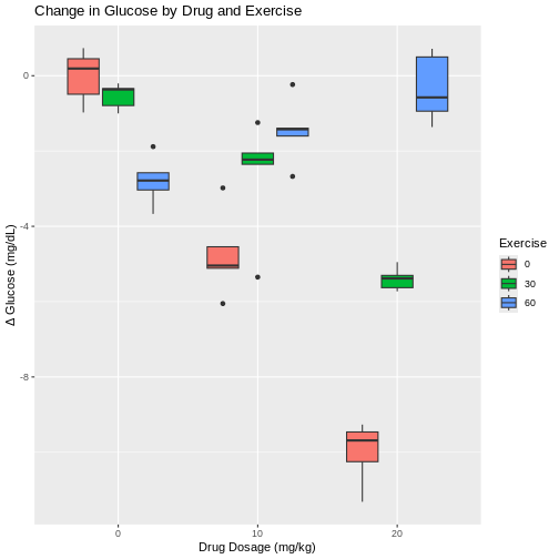
This pattern is repeated for the 10 mg/kg drug dose, where less exercise leads to greater change in glucose levels and more exercise leads to smaller changes. However, each boxplot shows outliers as dots extending above and below the boxes. This makes it difficult to determine if there really is a difference in glucose levels since there is so much overlap between the boxplots and their outliers. In fact, the spread of the data (standard deviation) at 10 mg/kg drug dose are among the largest values in the entire data set. With only 5 mice per group, it is difficult to obtain enough precision to capture the true value of mean glucose change.
Boxplots with exercise on the x-axis show similar patterns for combinations of exercise and drug dose. Greater variability for some exercise groups is apparent. The 0 min/day exercise group has the greatest within-group variability across all drug doses. The 60 min/day exercise group has the least within-group variability across all drug doses.
R
ggplot(drugExercise, aes(x = Exercise, y = Delta, fill = DrugDose)) +
  geom_boxplot() +
  labs(title = "Change in Glucose by Exercise and Drug",
       y = "Δ Glucose (mg/dL)", x = "Exercise duration (min/day)") +
  scale_fill_brewer(palette = "PuOr") # use a different color palette
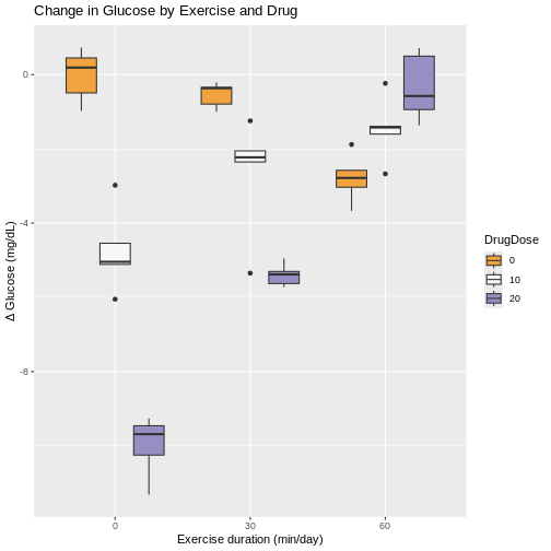
Interaction between factors
We could analyze these data as if it were simply a completely randomized design with 9 treatments (3 drug doses and 3 exercise durations). The ANOVA would have 8 degrees of freedom for treatments and the F-test would tell us whether the variation among average changes in glucose levels for the 9 treatments was real or random. However, the factorial treatment structure lets us separate out the variability in glucose level changes among drug doses averaged over exercise durations. The ANOVA table would provide a sum of squares based on 2 degrees of freedom for the difference between the 3 treatment means (\(\bar{y}_i\)) and the pooled (overall) mean (\(\bar{y}\)).
Sum of squares for 9 treatments \(= n\sum(\bar{y}_i - \bar{y})^2\).
The sum of squares would capture the variability among the 3 drug dose levels. The variation among the 3 exercise levels would be captured similarly, with 2 degrees of freedom. That leaves 8 - 4 = 4 degrees of freedom left over. What variability do these remaining 4 degrees of freedom contain? The answer is interaction - the interaction between drug doses and exercise durations.
| source of variation | Df | Sum Sq | Mean Sq=Sum Sq/Df | F value | prob(>F) |
|---|---|---|---|---|---|
| treatment 1 | \(k_1 - 1\) | Sum Sq | Mean Sq=Sum Sq/Df | F value | prob(>F) |
| treatment 2 | \(k_2 - 1\) | Sum Sq | Mean Sq=Sum Sq/Df | F value | prob(>F) |
| interaction | \((k_1 - 1) * (k_2 - 1)\) | Sum Sq | Mean Sq=Sum Sq/Df | F value | prob(>F) |
| error | \(k_1 * k_2 * (n - 1)\) | Sum Sq | Mean Sq=Sum Sq/Df | F value | prob(>F) |
We can visualize interactions for all combinations of drug dose and exercise duration with an interaction plot that shows mean change in glucose levels on the y-axis.
R
ggplot(meansSD, aes(x=DrugDose, y=meanChange, group=Exercise, color=Exercise)) +
    geom_line() +
    geom_point() +
    geom_errorbar(aes(ymin=meanChange-stDev, ymax=meanChange+stDev), width=.2,
                  position=position_dodge(0.05), alpha=.5) +
  labs(y = "Δ Glucose (mg/dL)",
       title = "Mean change in glucose by drug doseage")
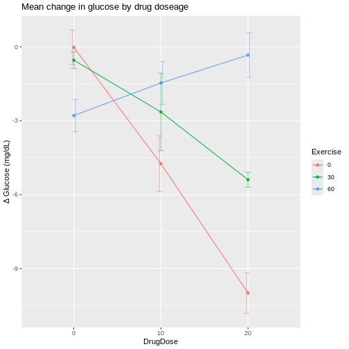
R
ggplot(meansSD, aes(x=Exercise, y=meanChange, group=DrugDose, color=DrugDose)) +
    geom_line() +
    geom_point() +
    geom_errorbar(aes(ymin=meanChange-stDev, ymax=meanChange+stDev), width=.2,
                  position=position_dodge(0.05), alpha=.5) +
  labs(y = "Δ Glucose (mg/dL)",
       title = "Mean change in glucose by exercise")
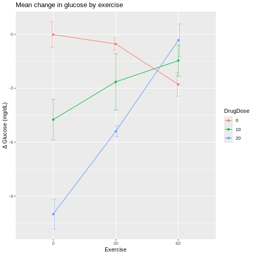
The interaction plots shows wide variation in mean glucose changes at a drug dose of 20 mg/kg, and also at 0 min/day exercise. The vertical bars extending above and below each mean value are the standard deviations for that group. Notice that the bars for the 10 mg/kg drug dose group are the longest, indicating higher variability that we also saw in the boxplots.
If we plot exercise on the x-axis, the same patterns show up differently.
R
ggplot(meansSD, aes(x=Exercise, y=meanChange, group=DrugDose, color=DrugDose)) +
    geom_line() +
    geom_point() +
    geom_errorbar(aes(ymin=meanChange-stDev, ymax=meanChange+stDev), width=.2,
                  position=position_dodge(0.05), alpha=.5) +
  labs(y = "Δ Glucose (mg/dL)",
       title = "Mean change in glucose by exercise")

At 60 min/day exercise, there is considerable overlap between the standard deviation bars in the three drug dosage groups. There is not a clear distinction indicating that the drug has an effect, although the 0 drug dosage group does appear to benefit from more exercise.
If lines were parallel we could assume no interaction between drug and exercise. Since they are not parallel we should assume interaction between exercise and drug dose. The F-test from an ANOVA will tell us whether this apparent interaction is real or random, specifically whether it is more pronounced than would be expected due to random variation.
R
# DrugDose*Exercise is the interaction
# main effects (DrugDose and Exercise separately) are included
anova(lm(Delta ~ DrugDose*Exercise,
         data = drugExercise))
OUTPUT
Analysis of Variance Table

Response: Delta
                  Df  Sum Sq Mean Sq F value    Pr(>F)
DrugDose           2 128.142  64.071  81.048 4.674e-14 ***
Exercise           2  87.515  43.757  55.352 1.041e-11 ***
DrugDose:Exercise  4 195.265  48.816  61.752 1.271e-15 ***
Residuals         36  28.459   0.791
---
Signif. codes:  0 '***' 0.001 '**' 0.01 '*' 0.05 '.' 0.1 ' ' 1
We can read the ANOVA table from the bottom up, starting with the
interaction (DrugDose:Exercise). The F value
for the interaction is 61.75 on 4 and 36 degrees of freedom for the
interaction and error (Residuals) respectively. The p-value
(Pr(>F)) is very low and as such the interaction between
exercise and drug dose is significant, backing up what we see in the
interaction plots.
If we move up a row in the table to Exercise, the F test
compares the mean changes across drug dose groups. The
F value for exercise is 55.35 on 2 and 36 degrees of
freedom for exercise and residuals respectively. The p-value is very low
and so exercise is significant. Finally, we move up to the row
containing DrugDose to find an F value of 81.05 and a very
low p-value again. Drug dose averaged over exercise is significant.
The partitioning of treatments sums of squares into main effect (average) and interaction sums of squares is a result of the crossed factorial structure (orthogonality) of the two factors. The complete combinations of these two factors provides clean partitioning between main effects and interactions. This is not to say that designs that don’t have full combinations of factors can’t be analyzed to estimate main effects and interactions. They can be analyzed with generalized linear models.
The development of efficient and informative multifactorial designs that cleanly separate main effects from interactions is one of the most important contributions of statistical experimental design.
- Completely randomized designs can be structured with two or more factors.
- Random assignment of treatments to experimental units in a single homogeneous group is the same.
- Factorial structure of the experiment requires different analyses, primarily ANOVA.
Content from Randomized Complete Block Designs
Last updated on 2026-07-16 | Edit this page
Overview
Questions
- What is randomized complete block design?
Objectives
- A randomized complete block design randomizes treatments to experimental units within the block.
- Blocking increases the precision of treatment comparisons.
Blocking of experimental units, as presented in an earlier episode on Experimental Design Principles, can be critical for successful and valuable experiments. Blocking increases precision in treatment comparisons relative to an unblocked experiment with the same experimental units. A randomized block design can be thought of as a set of separate completely randomized designs for comparing the same treatments. Each member of the set is a block, and within this block, each of the treatments is randomly assigned. We can assess treatment differences within each block and determine whether treatment differences are consistent from block to block. In other words, we can determine whether there is an interaction between block and treatment.
Design issues
The first issue to consider in this case is whether or not to block the experiment. Blocks serve to control natural variation among experimental units, and randomization within blocks accounts for “nuisance” variables or traits that are likely associated with the response. Shelf height and resulting differences in illumination is one example of a nuisance variable. Other variables like age and sex are characteristics of experimental units that can influence the treatment response. Blocking by sex and other characteristics is a best practice in experimental design.
In an earlier episode on Completely Randomized Designs, we presented the Generation 100 Study of 3 exercise treatments on men and women from 70 to 77 years of age. In the actual study, participants were stratified (blocked) by sex and cohabitation status (living with someone vs. living alone) to form 4 blocks. The three treatment levels (control, moderate- and high-intensity exercise) were randomly assigned within each block. As such, we would analyze the experiment as designed in blocks. Let’s revisit these data with blocking by sex only. Read in the data again if needed.
R
heart_rate <- read_csv("data/simulated_heart_rates.csv")
View the heart rate data separated by sex.
R
heart_rate %>% ggplot(aes(exercise_group, heart_rate)) +
  geom_boxplot() +
  facet_grid(rows = vars(sex))
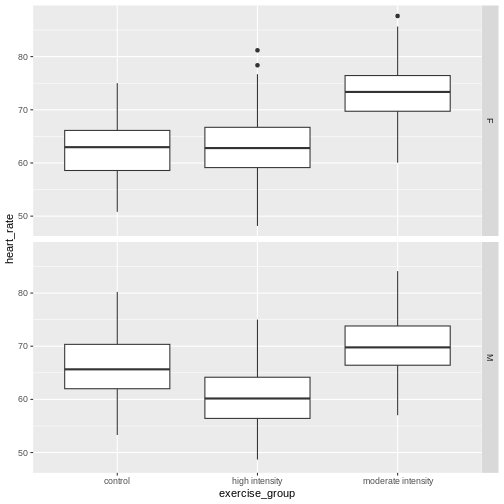
Each panel in the plot above is one block, one for females, one for males. What patterns do you see? Does there appear to be a difference in heart rates between sexes? between exercise groups? between sexes and exercise groups?
Let’s extract the means and standard deviations for exercise groups by sex.
R
g100meansSD <- heart_rate %>%
  group_by(sex, exercise_group) %>%
  summarise(mean = round(mean(heart_rate), 3),
            stDev = sd(heart_rate))
g100meansSD
OUTPUT
# A tibble: 6 × 4
# Groups:   sex [2]
  sex   exercise_group      mean stDev
  <chr> <chr>              <dbl> <dbl>
1 F     control             62.5  5.27
2 F     high intensity      63.0  5.58
3 F     moderate intensity  73.0  4.92
4 M     control             66.1  5.36
5 M     high intensity      60.4  5.30
6 M     moderate intensity  70.0  5.02
Use these summary statistics in an interaction plot to determine if there is an interaction between exercise (treatment) and sex (block).
R
ggplot(g100meansSD,
       aes(x=exercise_group, y=mean, group=sex, color=sex)) +
    geom_line() +
    geom_point() +
    geom_errorbar(aes(ymin=mean-stDev, ymax=mean+stDev),
                  width=.2,
                  position=position_dodge(0.05),
                  alpha=.5) +
  labs(y = "Heart rate",
       title = "Mean heart rate by exercise group and sex")
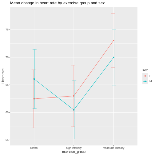
It appears that there is an interaction between exercise and sex given that the lines cross over one another. The effect of exercise is different depending on sex. The F-test from an ANOVA will tell us whether this apparent interaction is real or random, specifically whether it is more pronounced than would be expected due to random variation. The table below describes the degrees of freedom for the ANOVA where \(n\) = 261, the number of participants in each block.
| source of variation | Df | Sum Sq | Mean Sq=Sum Sq/Df | F value | prob(>F) |
|---|---|---|---|---|---|
| treatment | \(k - 1\) | ||||
| block | \(b - 1\) | ||||
| interaction | \((k - 1) * (b - 1)\) | ||||
| error | \(k * b * (n - 1)\) |
R
anova(lm(heart_rate ~ exercise_group*sex, data = heart_rate))
OUTPUT
Analysis of Variance Table

Response: heart_rate
                     Df Sum Sq Mean Sq  F value  Pr(>F)
exercise_group        2  26960 13480.1 489.6147 < 2e-16 ***
sex                   1    176   175.6   6.3779 0.01165 *
exercise_group:sex    2   3587  1793.7  65.1510 < 2e-16 ***
Residuals          1560  42950    27.5
---
Signif. codes:  0 '***' 0.001 '**' 0.01 '*' 0.05 '.' 0.1 ' ' 1
As before, we read the ANOVA table from the bottom up starting with
the interaction exercise_group:sex. Since the interaction
is significant, you should not compare sexes across exercise groups
because the exercise effects are not the same across sexes. They are
different for each sex.
The ANOVA table looks similar to the previous example involving drug dose and exercise in mice. There is an important distinction between the two ANOVA tables, however. In the drug dose and exercise ANOVA table, the interaction was between two treatments - drug dose and exercise. In this ANOVA table, the interaction is between block and treatment. The block, sex, is not a treatment. It’s a characteristic of the experimental units. In the drug dose experiment, the experimental units (mice) are homogeneous and the treatments were randomized to the experimental units once only in a completely randomized design. In this case, the experimental units are heterogeneous and a separate randomization of treatments was applied to each block of experimental units. This is a randomized block design. The purpose of the blocks is to remove a source of variation, (e.g. sex), from the comparison of treatments.
Sizing a randomized complete block experiment
A randomized complete block experiment can have greater statistical
power than a completely randomized design. The increased power is the
result of smaller residual variance within homogeneous blocks. Unless
the blocking factor is ineffective or the measurement error very large,
within-block residual variance will be small relative to between-block
variance. This smaller residual variance increases statistical
power.
If there is no interaction between block and treatment, sizing a
randomized complete block design is similar to sizing a completely
randomized design. The main difference is that the within-block variance
serves as the residual variance. In the figure below, a completely
randomized design with a single treatment factor that has \(k\) = 3 levels and \(n\) = 10 samples per treatment group will
have only 20% power when residual variance = 2 (see solid gray line).
When the experiment is organized into \(b\) = 10 blocks, power jumps drastically as
within block variance decreases. When within-block variance = 0.5, power
increases to more than 60%. Within-block variance of 0.25 reaches beyond
the 80% power threshold. In each case the total error variance sums to 2
when within-block and between-block variances are added together. For
example, within-block variance of 0.25 accompanies between-block
variance of 1.75.
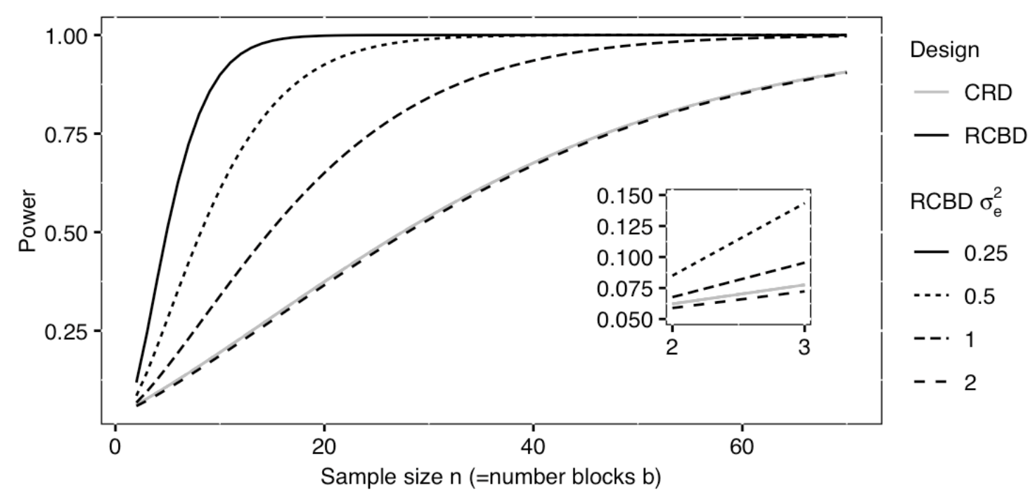 Excerpted
from Statistical Design and Analysis of Biological Experiments by
Hans-Michael Kaltenbach
Excerpted
from Statistical Design and Analysis of Biological Experiments by
Hans-Michael Kaltenbach
A power curve such as the one above can be used to size a completely randomized block design. The curve above assumes a Type 1 error rate (\(\alpha\)) of .05 and a standardized effect size (Cohen’s d) of .0625 for the treatment main effect in the completely randomized design. That standardized effect size increases for the block design as a direct result of smaller residual variation within the blocks, making the blocked design more efficient.
- Randomized blocked designs increase efficiency and statistical power.
Content from Repeated Measures Designs
Last updated on 2026-07-16 | Edit this page
Overview
Questions
- What is a repeated measures design?
Objectives
- A repeated measures design measures the response of experimental units repeatedly during the study.
Repeated measures designs, also called longitudinal designs,
investigate change in response over time in the same experimental
unit.
## Drug effect on heart rate
Among-subject vs. within-subject variability
Each subject can be its own control
crossover design for heart rate
- .