Baseline Metrics for Timeseries Forecasts
Last updated on 2023-08-14 | Edit this page
Overview
Questions
- What are some common baseline metrics for time-series forecasting?
Objectives
- Identify baseline metrics for time-series forecasting.
- Evaluate performance of forecasting methods using plots and mean absolute percentage error.
Introduction
In order to make reliable forecasts using time-series data, it is necessary to establish baseline forecasts against which to compare the results of models that will be covered in later sections of this lesson.
In many cases, we can only predict one timestamp into the future. From the standpoint of baseline metrics, there are multiple ways we can define a timestep and base predictions using
- the historical mean across the dataset
- the value of the the previous timestep
- the last known value, or
- a naive seasonal baseline based upon a pairwise comparison of a set of previous timesteps.
About the code
The code used in this lesson is based on and, in some cases, a direct application of code used in the Manning Publications title, Time series forecasting in Python, by Marco Peixeiro.
Peixeiro, Marco. Time Series Forecasting in Python. [First edition]. Manning Publications Co., 2022.
The original code from the book is made available under an Apache 2.0 license. Use and application of the code in these materials is within the license terms, although this lesson itself is licensed under a Creative Commons CC-BY 4.0 license. Any further use or adaptation of these materials should cite the source code developed by Peixeiro:
Peixeiro, Marco. Timeseries Forecasting in Python [Software code]. 2022. Accessed from https://github.com/marcopeix/TimeSeriesForecastingInPython.
Create a data subset for basline forecasting
Rather than read a previously edited dataset, for each of the episodes in this lesson we will read in data from one or more of the Los Alamos Department of Public Utilities smart meter datasets downloaded in the Setup section.
Once the dataset has been read into memory, we will create a datetime index, subset, and resample the data for use in the rest of this episode. First, we need to import libraries.
Then we read the data and create the datetime index.
OUTPUT
<class 'pandas.core.frame.DataFrame'>
RangeIndex: 105012 entries, 0 to 105011
Data columns (total 5 columns):
 #   Column         Non-Null Count   Dtype
---  ------         --------------   -----
 0   INTERVAL_TIME  105012 non-null  object
 1   METER_FID      105012 non-null  int64
 2   START_READ     105012 non-null  float64
 3   END_READ       105012 non-null  float64
 4   INTERVAL_READ  105012 non-null  float64
dtypes: float64(3), int64(1), object(1)
memory usage: 4.0+ MB
PYTHON
# Set datetime index
df.set_index(pd.to_datetime(df["INTERVAL_TIME"]), inplace=True)
df.sort_index(inplace=True)
print(df.info())
OUTPUT
<class 'pandas.core.frame.DataFrame'>
DatetimeIndex: 105012 entries, 2017-01-01 00:00:00 to 2019-12-31 23:45:00
Data columns (total 5 columns):
 #   Column         Non-Null Count   Dtype
---  ------         --------------   -----
 0   INTERVAL_TIME  105012 non-null  object
 1   METER_FID      105012 non-null  int64
 2   START_READ     105012 non-null  float64
 3   END_READ       105012 non-null  float64
 4   INTERVAL_READ  105012 non-null  float64
dtypes: float64(3), int64(1), object(1)
memory usage: 4.8+ MB
The dataset is large, with multiple types of seasonality occurring including
- daily
- seasonal
- yearly
trends. Additionally, the data represent smart meter readings taken from a single meter every fifteen minutes over the course of three years. This gives us a dataset that consists of 105,012 rows of meter readings taken at a frequency which makes baseline forecasts less effective.
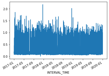
For our current purposes, we will subset the data to a period with fewer seasonal trends. Using datetime indexing we can select a subset of the data from the first six months of 2019.
We will also resample the data to a weekly frequency.
PYTHON
weekly_usage = pd.DataFrame(jan_june_2019.resample("W")["INTERVAL_READ"].sum())
print(weekly_usage.info()) # note the index range and freq
print(weekly_usage.head())
OUTPUT
<class 'pandas.core.frame.DataFrame'>
DatetimeIndex: 23 entries, 2019-03-03 to 2019-08-04
Freq: W-SUN
Data columns (total 1 columns):
 #   Column         Non-Null Count  Dtype
---  ------         --------------  -----
 0   INTERVAL_READ  23 non-null     float64
dtypes: float64(1)
memory usage: 368.0 bytes
None
               INTERVAL_READ
INTERVAL_TIME
2019-03-03           59.1300
2019-03-10          133.3134
2019-03-17          118.9374
2019-03-24          120.7536
2019-03-31           88.9320
Plotting the total weekly power consumption with a 4 week rolling mean shows that there is still an overall trend and some apparent weekly seasonal effects in the data. We will see how these different features of the data influence different baseline forecasts.
PYTHON
fig, ax = plt.subplots()

ax.plot(weekly_usage["INTERVAL_READ"], label="Weekly")
ax.plot(weekly_usage["INTERVAL_READ"].rolling(window=4).mean(), label="4 week average")

ax.set_xlabel('Date')
ax.set_ylabel('Power consumption')
ax.legend(loc=2)

fig.autofmt_xdate()
plt.tight_layout()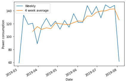
Create subsets for training and testing forecasts
Throughout this lesson, as we develop more robust forecasting models we need to train the models using a large subset of our data to derive the metrics that define each type of forecast. Models are then evaluated by comparing forecast values against actual values in a test dataset.
Using a rough estimate of four weeks in a month, we will test our baseline forecasts using various methods to predict the last four weeks of power consumption based on values in the test dataset. Then we will compare the forecast against the actual values in the test dataset.
PYTHON
train = weekly_usage[:-4].copy()
test = weekly_usage[-5:].copy()

print(train.info())
print(test.info())
OUTPUT
<class 'pandas.core.frame.DataFrame'>
DatetimeIndex: 19 entries, 2019-03-03 to 2019-07-07
Freq: W-SUN
Data columns (total 1 columns):
 #   Column         Non-Null Count  Dtype
---  ------         --------------  -----
 0   INTERVAL_READ  19 non-null     float64
dtypes: float64(1)
memory usage: 304.0 bytes
None

<class 'pandas.core.frame.DataFrame'>
DatetimeIndex: 5 entries, 2019-07-07 to 2019-08-04
Freq: W-SUN
Data columns (total 1 columns):
 #   Column         Non-Null Count  Dtype
---  ------         --------------  -----
 0   INTERVAL_READ  5 non-null      float64
dtypes: float64(1)
memory usage: 80.0 bytes
None
Forecast using the historical mean
The first baseline or naive forecast method we will use is the historical mean. Here, we calculate the mean weekly power consumption across the training dataset.
PYTHON
# get the mean of the training set
historical_mean = np.mean(train['INTERVAL_READ'])
print("Historical mean of the training data:", historical_mean)
OUTPUT
Historical mean of the training data: 120.7503157894737We then use this value as the value of the weekly forecast for all four weeks of the test dataset.
Plotting the forecast shows that the same value has been applied to each week of the test dataset.
PYTHON
fig, ax = plt.subplots()

ax.plot(train['INTERVAL_READ'], 'g-.', label='Train')
ax.plot(test['INTERVAL_READ'], 'b-', label='Test')
ax.plot(test['pred_mean'], 'r--', label='Predicted')
ax.set_xlabel('Date')
ax.set_ylabel('Weekly power consumption')
ax.legend(loc=2)

fig.autofmt_xdate()
plt.tight_layout()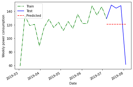
The above plot is a qualitative method of evaluating the accuracy of the historical mean for forecasting our time series. Intuitively, we can see that it is not very accurate.
Quantitatively, we can evaluate the accuracy of the forecasts based on the mean absolute percentage error. We will be using this method to evaluate all of our baseline forecasts, so we will define a function for it.
PYTHON
# Mean absolute percentage error
# measure of prediction accuracy for forecasting methods

def mape(y_true, y_pred):
    return np.mean(np.abs((y_true - y_pred)/ y_true)) * 100
Now we can calculate the mean average percentage error of the historical mean as a forecasting method.
PYTHON
mape_hist_mean = mape(test['INTERVAL_READ'], test['pred_mean'])
print("MAPE of historical mean", mape_hist_mean)
OUTPUT
MAPE of historical mean: 31.44822521573767The high mean average percentage error value suggests that, for these data, the historical mean is not an accurate forecasting method.
Forecast using the mean of the previous timestamp
One source of the error in forecasting with the historical mean can be the amount of data, which over longer timeframes can introduce seasonal trends. As an alternative to the historic mean, we can also forecast using the mean of the previous timestep. Since we are forecasting power consumption over a period of four weeks, this means we can use the mean power consumption within the last four weeks of the training dataset as our forecast.
Since our data have been resampled to a weekly frequency, we will calculate the average power consumption across the last four rows.
PYTHON
# baseline using mean of last four weeks of training set

last_month_mean = np.mean(train['INTERVAL_READ'][-4:])
print("Mean of previous timestep:", last_month_mean)
OUTPUT
Mean of previous timestep: 139.55055000000002Apply this to the test dataset. Selecting the data using the
head() command shows that the value calculated above has
been applied to each row.
OUTPUT
               INTERVAL_READ   pred_mean  pred_last_mo_mean
INTERVAL_TIME
2019-07-07          129.1278  120.750316          139.55055
2019-07-14          149.2956  120.750316          139.55055
2019-07-21          144.6612  120.750316          139.55055
2019-07-28          148.4286  120.750316          139.55055
2019-08-04           61.4640  120.750316          139.55055
PYTHON
fig, ax = plt.subplots()

ax.plot(train['INTERVAL_READ'], 'g-.', label='Train')
ax.plot(test['INTERVAL_READ'], 'b-', label='Test')
ax.plot(test['pred_last_mo_mean'], 'r--', label='Predicted')
ax.set_xlabel('Date')
ax.set_ylabel('Daily power consumption')
ax.legend(loc=2)

fig.autofmt_xdate()
plt.tight_layout()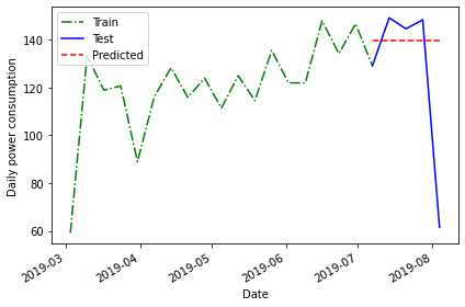
Plotting the data suggests that this forecast may be more accurate than the historical mean, but we will evaluate the forecast using the mean average percentage error as well.
PYTHON
mape_last_month_mean = mape(test['INTERVAL_READ'], test['pred_last_mo_mean'])
print("MAPE of the mean of the previous timestep forecast:", mape_last_month_mean)
OUTPUT
MAPE of the mean of the previous timestep forecast: 30.231515216486425The result is a slight improvement over the previous method, but still not very accurate.
Forecasting using the last known value
In addition the mean across the previous timestep, we can also forecast using the last recorded value in the training dataset.
PYTHON
last = train['INTERVAL_READ'].iloc[-1]
print("Last recorded value in the training dataset:", last)
OUTPUT
Last recorded value in the training dataset: 129.1278Apply this value to the training dataset.
OUTPUT
               INTERVAL_READ   pred_mean  pred_last_mo_mean  pred_last
INTERVAL_TIME
2019-07-07          129.1278  120.750316          139.55055   129.1278
2019-07-14          149.2956  120.750316          139.55055   129.1278
2019-07-21          144.6612  120.750316          139.55055   129.1278
2019-07-28          148.4286  120.750316          139.55055   129.1278
2019-08-04           61.4640  120.750316          139.55055   129.1278
Evaluate the forecast by plotting the result and calculating the mean average percentage error.
PYTHON
fig, ax = plt.subplots()

ax.plot(train['INTERVAL_READ'], 'g-.', label='Train')
ax.plot(test['INTERVAL_READ'], 'b-', label='Test')
ax.plot(test['pred_last'], 'r--', label='Predicted')
ax.set_xlabel('Date')
ax.set_ylabel('Daily power consumption')
ax.legend(loc=2)

fig.autofmt_xdate()
plt.tight_layout()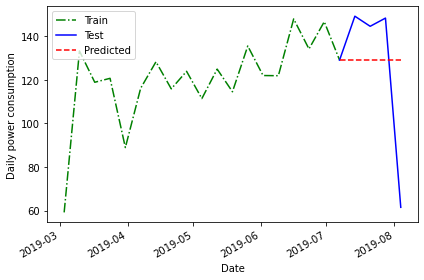
PYTHON
mape_last = mape(test['INTERVAL_READ'], test['pred_last'])
print("MAPE of the mean of the last recorded value forecast:", mape_last)
OUTPUT
MAPE of the mean of the last recorded value forecast: 29.46734391639027Here the mean average percentage error indicates another slight improvement in the forecast that may not be apparent in the plot.
Forecasting using the previous timestep
So far we have used the mean of the previous timestep - in the current case the average power consumption across the last four weeks of the training dataset - as well as the last recorded value.
A final method for baseline forecasting uses the actual values of the previous timestep. This is similar to taking the last recorded value, as above, only this time the number of known values is equal to the number of rows in the test dataset. This method accounts somewhat for the seasonal trend we see in the data.
In this case, we can a difference between this and other baseline forecasts in that we are no longer applying a single value to each row of the test dataset.
OUTPUT
               INTERVAL_READ   pred_mean  ...  pred_last  pred_last_month
INTERVAL_TIME                             ...
2019-07-07          129.1278  120.750316  ...   129.1278         121.9458
2019-07-14          149.2956  120.750316  ...   129.1278         148.0386
2019-07-21          144.6612  120.750316  ...   129.1278         134.2614
2019-07-28          148.4286  120.750316  ...   129.1278         146.7744
2019-08-04           61.4640  120.750316  ...   129.1278         129.1278

[5 rows x 5 columns]
Plotting the forecast and calculating the mean average percentage error once again demonstrate some improvement over previous forecasts.
PYTHON
fig, ax = plt.subplots()

ax.plot(train['INTERVAL_READ'], 'g-.', label='Train')
ax.plot(test['INTERVAL_READ'], 'b-', label='Test')
ax.plot(test['pred_last_month'], 'r--', label='Predicted')
ax.set_xlabel('Date')
ax.set_ylabel('Daily power consumption')
ax.legend(loc=2)

fig.autofmt_xdate()
plt.tight_layout()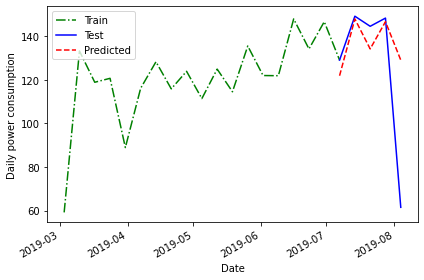
PYTHON
pe_naive_seasonal = mape(test['INTERVAL_READ'], test['pred_last_month'])
print("MAPE of forecast using previous timestep values:", mape_naive_seasonal)
OUTPUT
MAPE of forecast using previous timestep values: 24.95886287091312A mean average percentage error of 25, while an improvement in this case over other baseline forecasts, is still not very good. However, these baselines have value in themselves because they also serve as measurements we can use to evaluate other forecasting methods going forward.
Key Points
- Use test and train datasets to evaluate the performance of different models.
- Use mean average percentage error to measure a model’s performance.