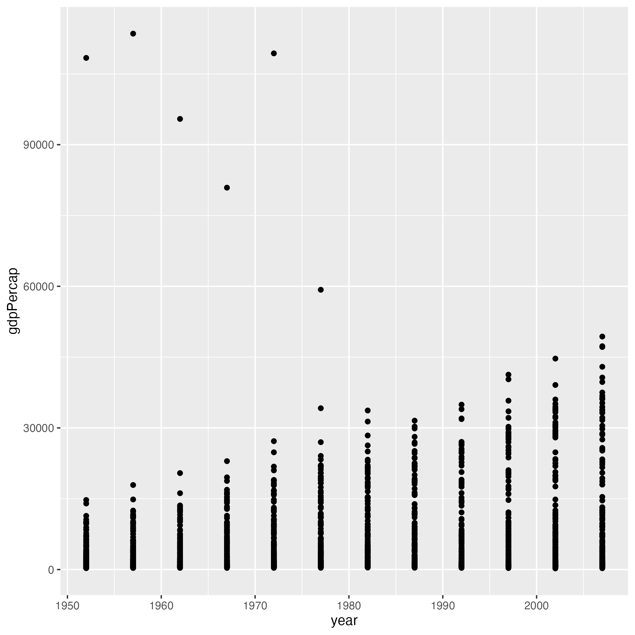
Image 1 of 1: ‘Scatter plot showing year on the x-axis and GDP per capita on the y-axis showing a general upward trend over time with several outliers.’
Scatter plot of year versus GDP per capita from
the gapminder dataset
Figure 2
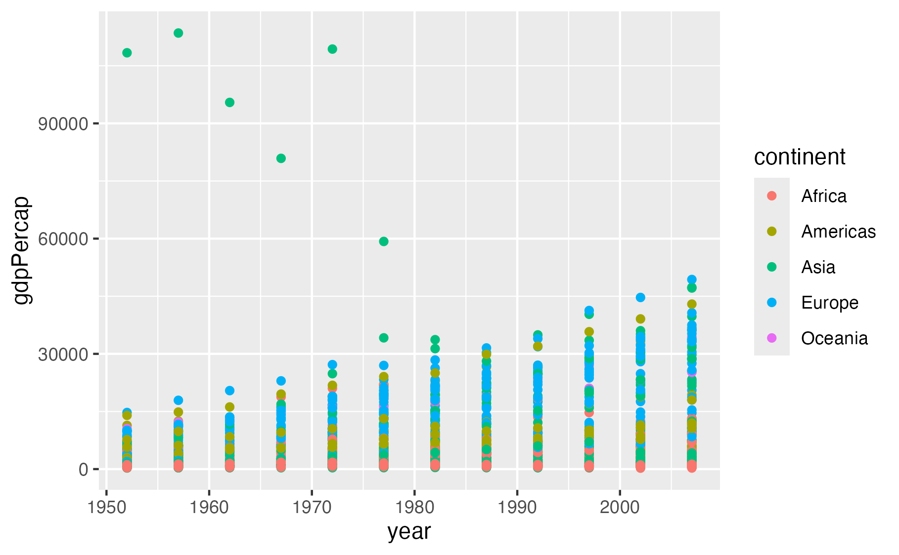
Image 1 of 1: ‘Scatter plot showing year on the x-axis and GDP per capita on the y-axis, with points colored by continent showing different colors for Africa, Americas, Asia, Europe, and Oceania.’
Scatter plot of year versus GDP per capita with
points colored by continent
Figure 3
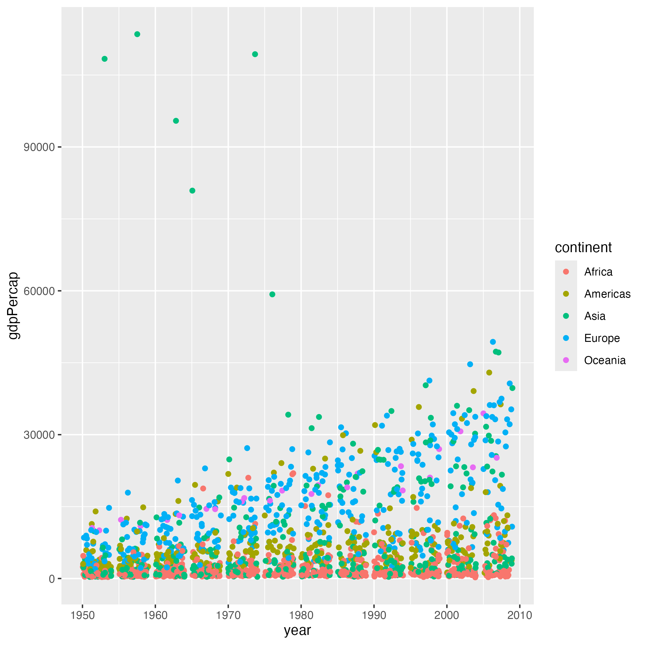
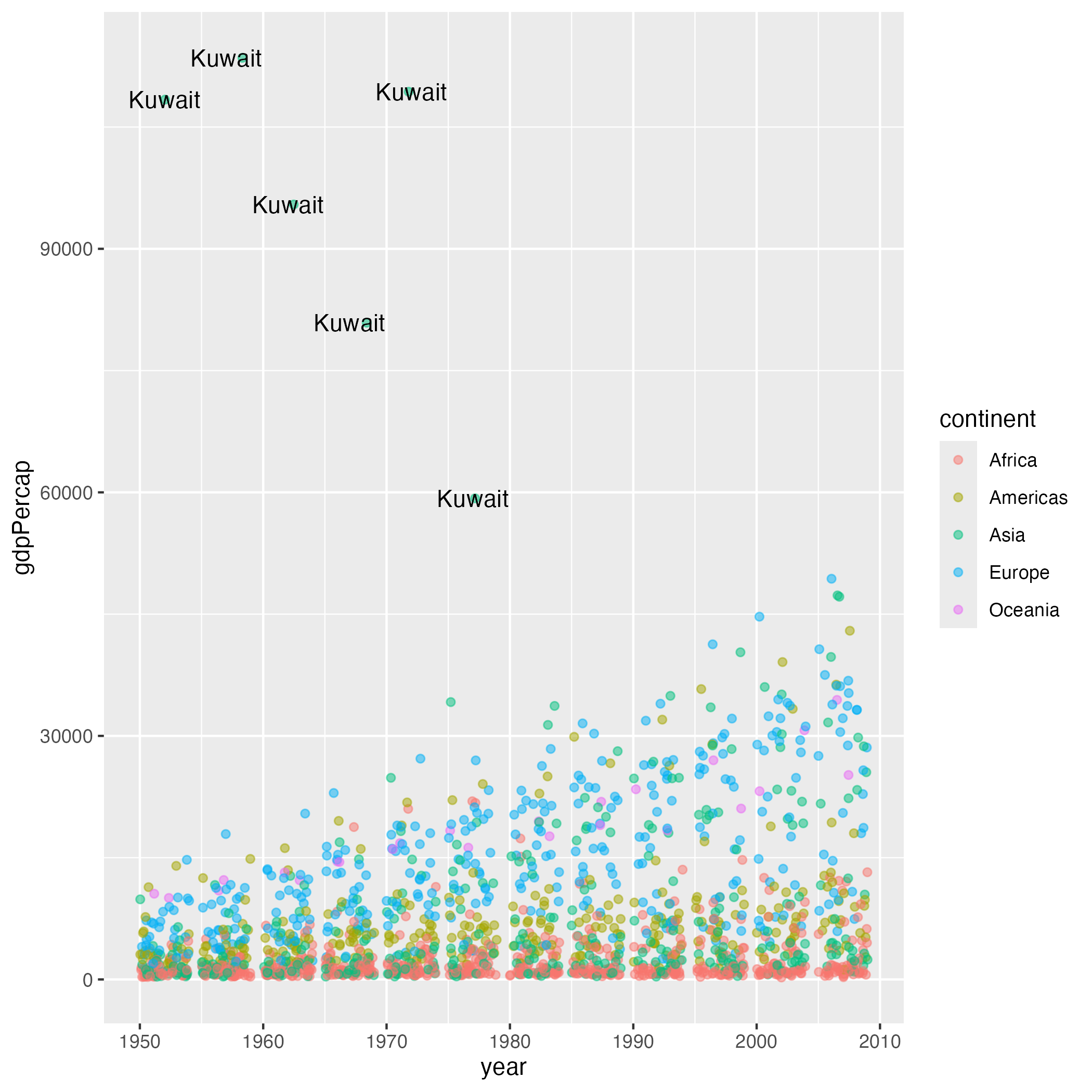
Image 1 of 1: ‘Scatter plot showing year on the x-axis and GDP per capita on the y-axis, with points jittered horizontally to reduce overlap and colored by continent.’
Scatter plot with jittered points colored by
continent
Figure 4
Image 1 of 1: ‘Scatter plot showing year on the x-axis and GDP per capita on the y-axis, with points colored by continent and high GDP outlier countries labeled with their names.’
Scatter plot with outlier countries
labeled
Figure 5
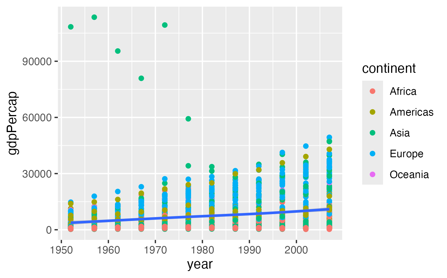
Image 1 of 1: ‘Scatter plot showing year on the x-axis and GDP per capita on the y-axis, with a trend line showing the overall upward pattern over time.’
Scatter plot with trend line
Figure 6
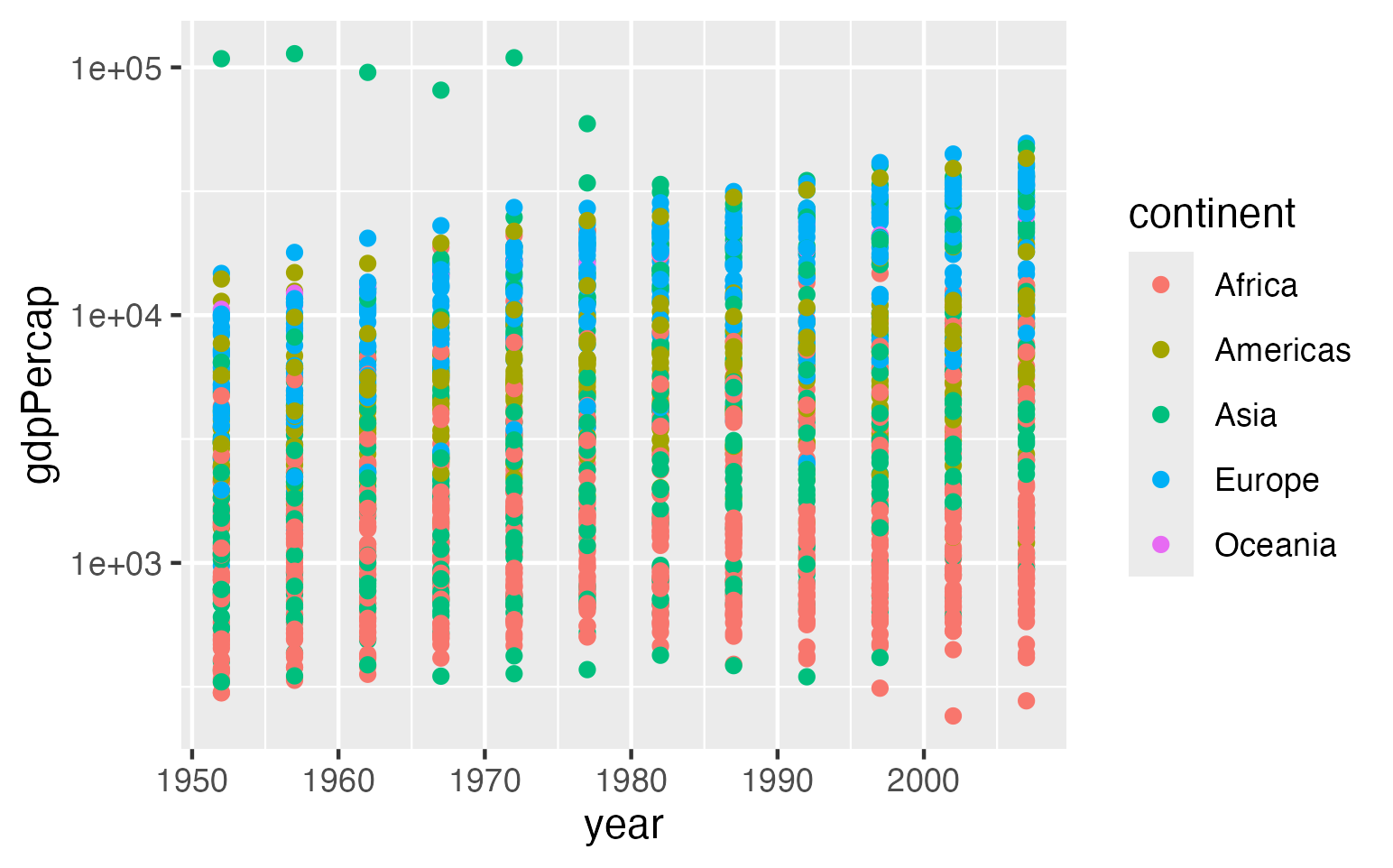
Image 1 of 1: ‘Scatter plot showing year on the x-axis and GDP per capita on the y-axis, this time on a logarithmic scale to better show the spread of values.’
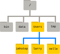
Image 1 of 1: ‘A file system made up of a root directory that contains sub-directories titled bin, data, users, and tmp, and three subdirectories under users’
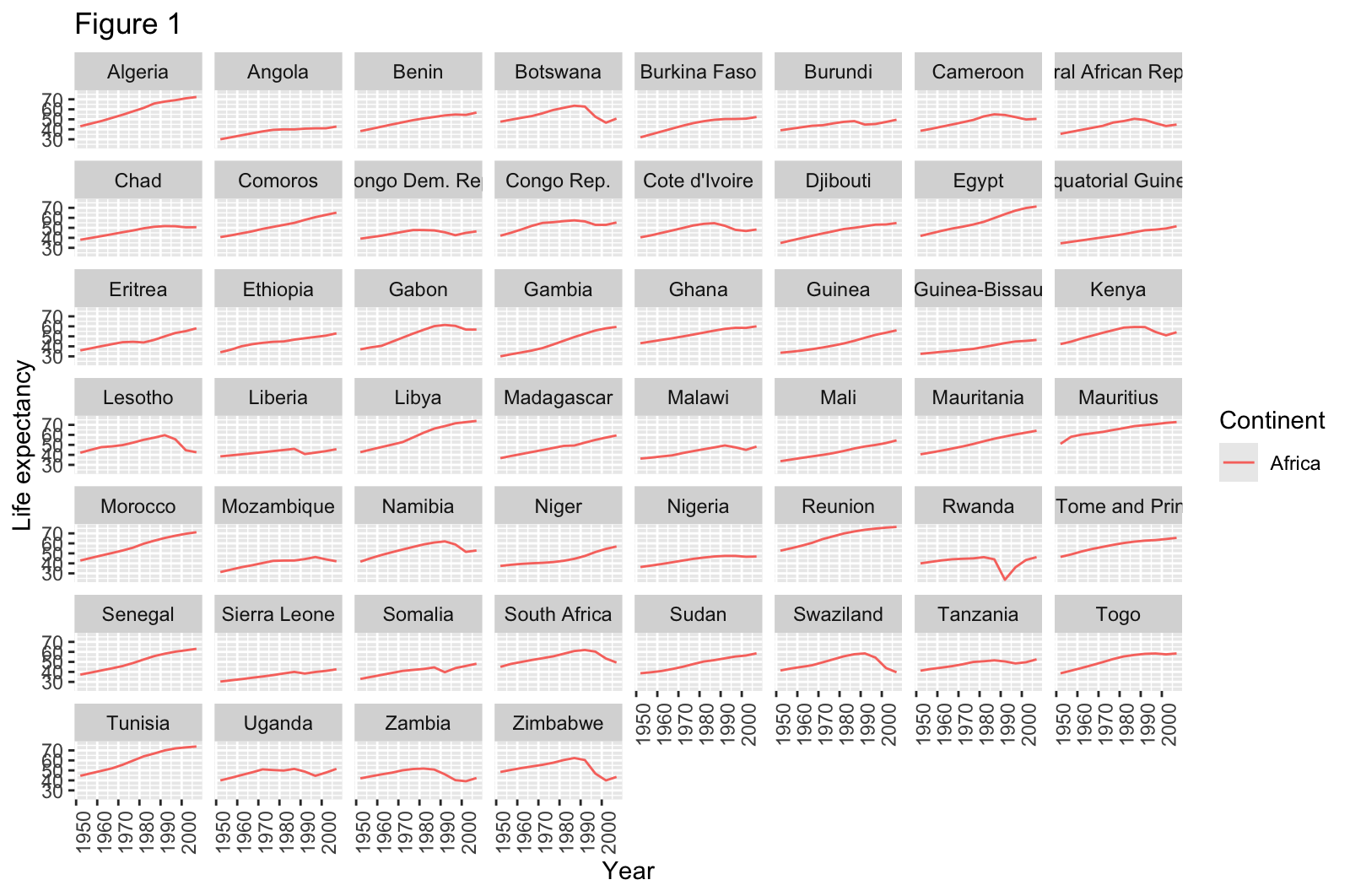
Image 1 of 1: ‘multi-panel figure of line plots, one per country, showing life expectancy between 1952 and 2007 observed in countries on Africa.’
Life expectancy over time in countries on
Africa
Figure 2
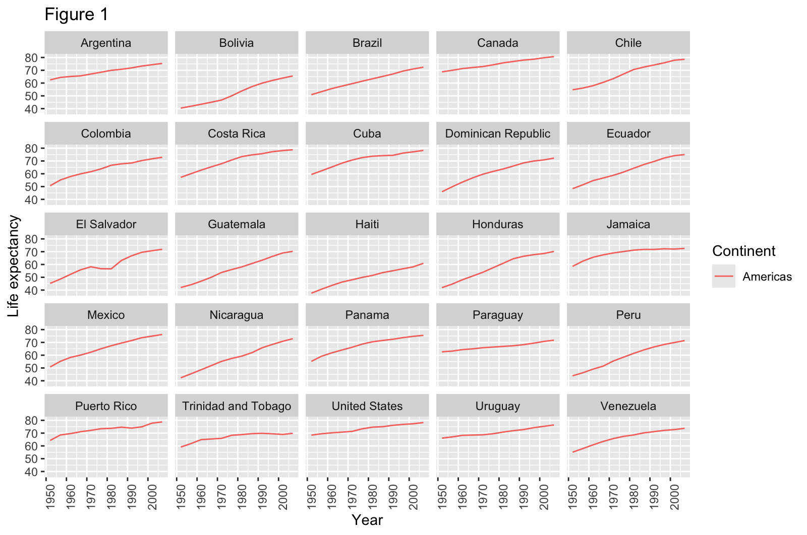
Image 1 of 1: ‘multi-panel figure of line plots, one per country, showing life expectancy between 1952 and 2007 observed in countries on the Americas.’
Life expectancy over time in countries on
the Americas