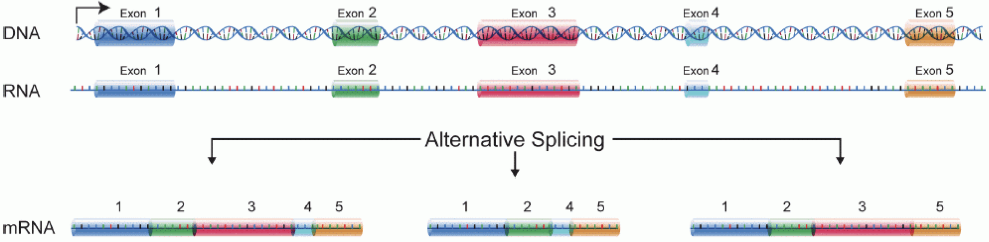
Image 1 of 1: ‘Illustration of part of the central dogma of molecular biology, where DNA is transcribed to RNA, and intronic sequences are spliced out’
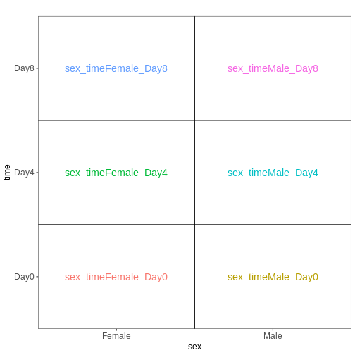
Figure 2
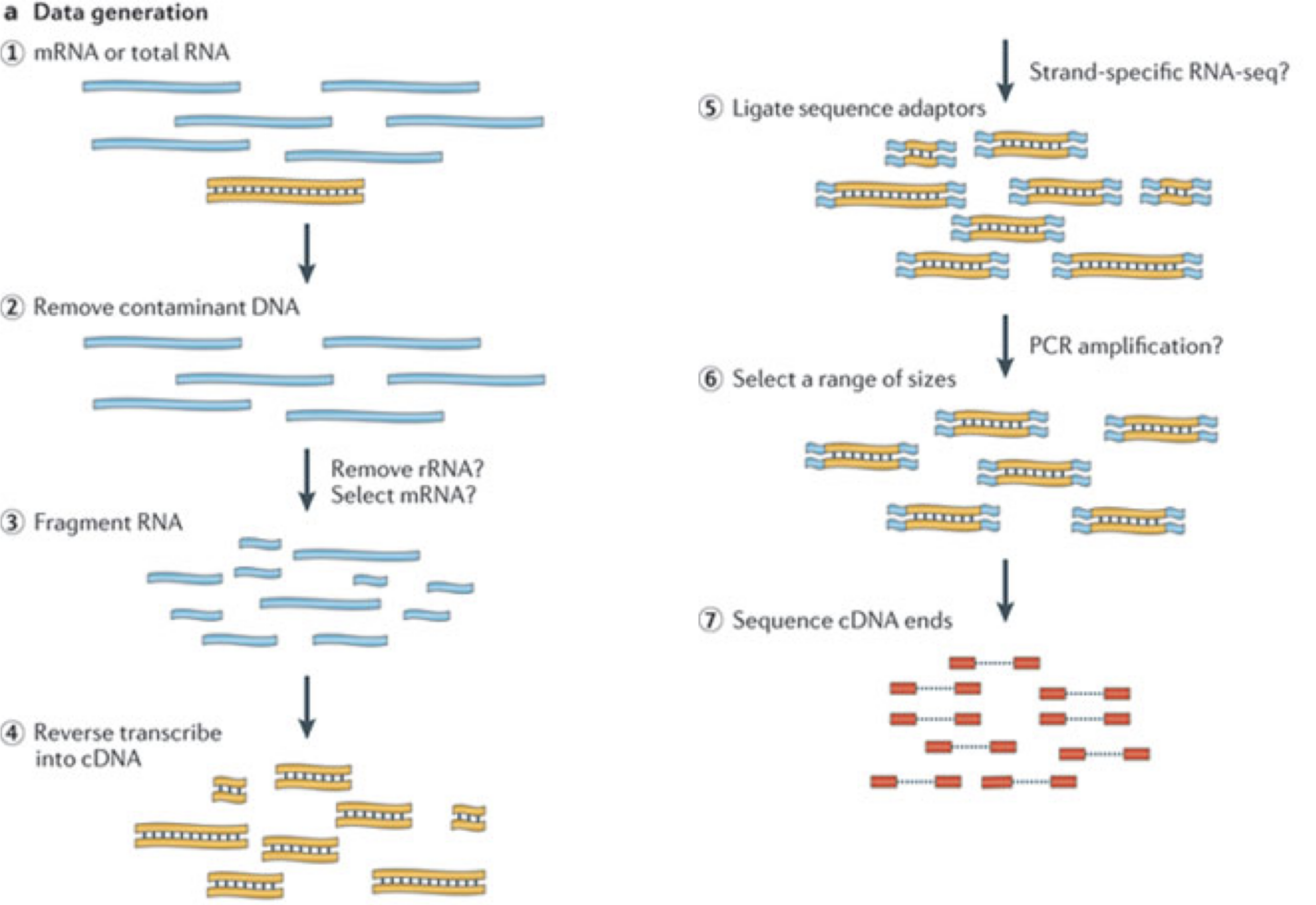
Image 1 of 1: ‘Illustration of the major experimental steps of an RNA-seq experiment’
Figure 3
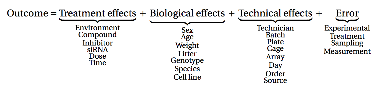
Image 1 of 1: ‘A classification of many different factors affecting measurements obtained from an experiment into treatment, biological, technical and error effects’
Figure 4
Image 1 of 1: ‘Illustration of a set of reads generated by a sequencer, and genomic and transcriptomic reference sequences’
Image 1 of 1: ‘Schematic showing the composition of a SummarizedExperiment object, with three assay matrices of equal dimension, rowData with feature annotations, colData with sample annotations, and a metadata list.’
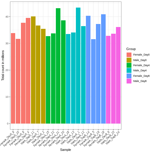
Image 1 of 1: ‘Barplot with total count on the y-axis and sample name on the x-axis, with bars colored by the group annotation. The total count varies between approximately 32 and 43 million.’
Figure 2
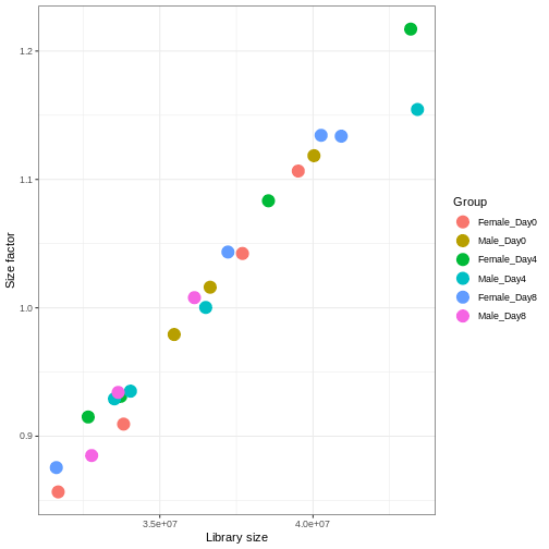
Image 1 of 1: ‘Scatterplot with library size on the x-axis and size factor on the y-axis, showing a high correlation between the two variables.’
Figure 3
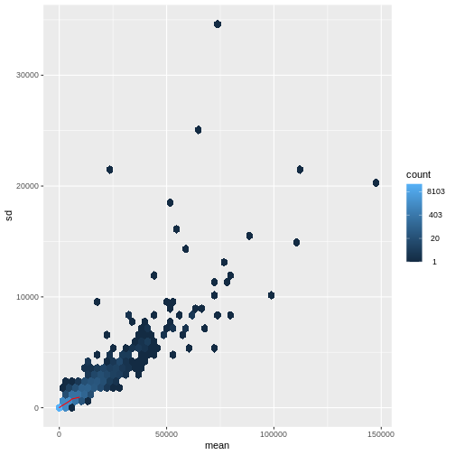
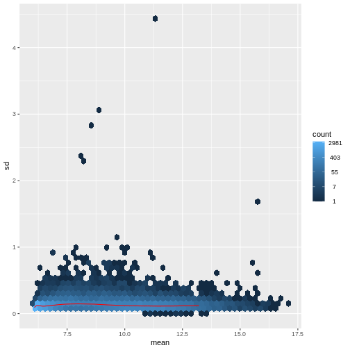
Image 1 of 1: ‘Hexagonal heatmap with the mean count on the x-axis and the standard deviation of the count on the y-axis, showing a generally increasing standard deviation with increasing mean. The density of points is highest for low count values.’
Figure 4
Image 1 of 1: ‘Hexagonal heatmap with the mean variance-stabilized values on the x-axis and the standard deviation of these on the y-axis. The trend is generally flat, with no clear association between the mean and standard deviation.’
Figure 5
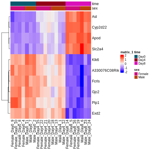
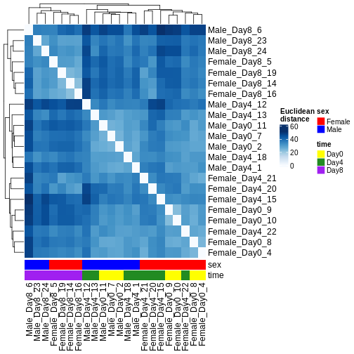
Image 1 of 1: ‘Heatmap of Euclidean distances between all pairs of samples, with hierarchical cluster dendrogram for both rows and columns. Samples from day 8 cluster separately from samples from days 0 and 4. Within days 0 and 4, the main clustering is instead by sex.’
Figure 6
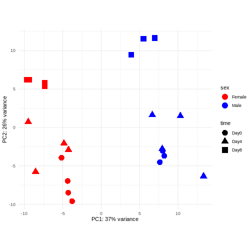
Image 1 of 1: ‘Scatterplot of samples projected onto the first two principal components, colored by sex and shaped according to the experimental day. The main separation along PC1 is between male and female samples. The main separation along PC2 is between samples from day 8 and samples from days 0 and 4.’
Figure 7
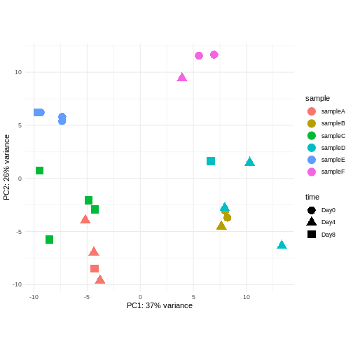
Image 1 of 1: ‘Scatterplot of samples projected onto the first two principal components, colored by a hypothetical sample ID annotation and shaped according to a hypothetical experimental day annotation. In the plot, samples with the same sample ID tend to cluster together.’
Figure 8
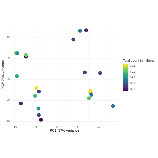
Image 1 of 1: ‘Scatterplot of samples projected onto the first two principal components of the variance-stabilized data, colored by library size. The library sizes are between approximately 32.5 and 42.5 million. There is no strong association between the library sizes and the principal components.’
Figure 9
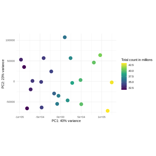
Image 1 of 1: ‘Scatterplot of samples projected onto the first two principal components of the count matrix, colored by library size. The library sizes are between approximately 32.5 and 42.5 million. The first principal component is strongly correlated with the library size.’
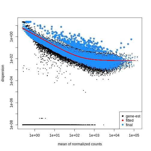
Image 1 of 1: ‘Scatterplot with the mean of normalized counts on the x-axis and the dispersion on the y-axis. The plot shows black dots corresponding to gene-wise estimates of the dispersion, a red line corresponding to the fitted trend, and blue dots corresponding to the final dispersion estimates. There is a general trend of decreasing dispersion with increasing mean normalized counts.’
Figure 2
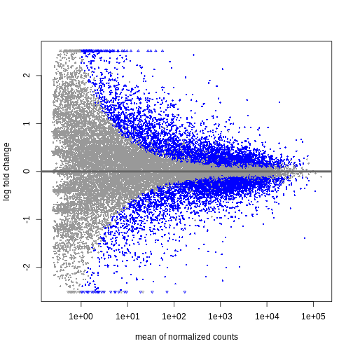
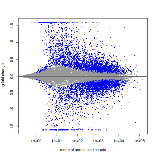
Image 1 of 1: ‘MA plot showing the mean normalized counts on the x-axis and the log fold change on the y-axis. Significantly differentially expressed genes are colored in blue. The range of log fold changes is larger for low values of the mean normalized counts.’
Figure 3
Image 1 of 1: ‘MA plot showing the mean normalized counts on the x-axis and the shrunken log fold change on the y-axis. Significantly differentially expressed genes are colored in blue. Most log fold changes for low mean normalized counts have been shrunken to be close to zero.’
Shrinkage of log fold changes is useful for visualization and ranking of
genes, but for result exploration typically the
independentFiltering argument is used to remove lowly
expressed genes.
Figure 4
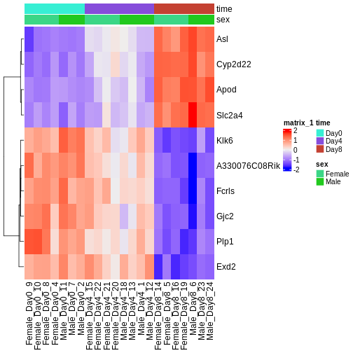
Image 1 of 1: ‘Heatmap showing the vsd-transformed expression levels for the ten most significantly differentially expressed genes over time, in all the samples.’


 Shrinkage of log fold changes is useful for visualization and ranking of
genes, but for result exploration typically the
Shrinkage of log fold changes is useful for visualization and ranking of
genes, but for result exploration typically the