Recreate a Du Bois Bar Chart
Last updated on 2026-04-28 | Edit this page
Overview
Questions
- How can I read tabular data to plot a bar graph in R?
- How can I use
ggplotto organize and format a bar graph in R? - How can I maintain a reproducible record of my data visualizations?
- How can I use color, text, and dimensions to change the aesthetics of a data visualization?
Objectives
- Create bar graph variations based on historical tabular data.
- Develop basic R code to create bar graphs.
- Use transparent, legible, and shareable record of how you created your own unique data visualizations.
- Differentiate and use the Du Bois theme in making data visuals.
This interactive exercise is inspired by the annual #DuBoisChallenge. The #DuBoisChallenge is a call to scientists, students, and community members to recreate, adapt, and share on social media the data visualzations created by W.E.B. Du Bois and his collaborators in 1900. Before doing the interactive exercise, please read this article about the Du Bois Challenge.
Black Literacy After Emancipation

Plate 47
Presentation of the historical cross-national literacy data
Du Bois’ created many data portraits to share the story of Black Americans post-emancipation. Plate 47 also known as the “Black Literacy After Emancipation” graphic at the top of this page shows mass education as one important strategy for furthering and deepening emancipation for Black Americans and others. In this workbook, you will recreate Du Bois’ visualization of Black illiteracy rates in the US compared to illiteracy rates in other countries using 1900 data.
An important context of Du Bois’s graph of Black illiteracy is that literacy was illegal for enslaved people in the U.S. until emancipation and the Confederacy’s defeat during the Civil War. Illiteracy then declined rapidly as Black Americans sought to empower themselves through education. Du Bois plotted this decline in illiteracy among Black residents in the state of Georgia in the figure below. This graph used decennial US census illiteracy rates for Georgia from 1860 to 1890 that are available here. They likely wrote “50%?” for the 1900 illiteracy rate because the Census did not publish 1900 illiteracy rates (available here) until several months after the Paris Exposition.

Plate 14
How can I input tabular data to plot a bar graph in R?
The first step for data visualization in R is to read data into an R dataframe. This is like double clicking a file to open it in other computer programs. But with R, we use code.
For this exercise, we’re going to read in data from a website. And we’re going to place the data into a dataframe named d_literacy_country.
There is no record of the exact data used by the Du Bois team for this bar graph. And the Du Bois graph curiously does not include tick marks with a labeled axis scale to show what exact values each bar represents. Why? Perhaps the Du Bois team wanted to emphasize that the bar graph was a rough comparison of illiteracy rates because of varied timing, methods, and national boundaries for measuring illiteracy rates at the time. The length of the “Negroes U.S.A” bar likely represents the national Black illiteracy rate of 57.1% reported by the 1890 US Census (see reported “Russie” (Russia) bar correspond to the national US Black illiteracy rate in the 1890 US Census (see here)). So our data derives illiteracy rates for other countries based on the length of each country’s bar relative to “Negroes U.S.A.” bar, presuming the “Negroes U.S.A.” bar represents 57.1%.
The R code to read in this data uses an <- arrow
pointed at the name of the data frame and the read.csv()
function command followed by the web address within parentheses where a
csv (comma separated values) data file is located. It looks like
this:
R
df <- read.csv("web_address_with_data.csv")
After writing this code, we can write the name of the data frame
R
df
Typing just the name of the dataframe will list all of the data in the data frame.
Challenge 1: Reading the data
The web address of the data is: https://raw.githubusercontent.com/HigherEdData/Du-Bois-STEM/refs/heads/main/data/d_literacy_country.csv
Update the code below using the web address above.
d_literacy_country <- read.csv("web_address_with_data/data_file_name.csv")

d_literacy_countryR
d_literacy_country <- read.csv("https://raw.githubusercontent.com/HigherEdData/Du-Bois-STEM/refs/heads/main/data/d_literacy_country.csv")

d_literacy_country
OUTPUT
           country illiteracy
1         Roumanie    73.3216
2           Servie    72.6727
3           Russie    72.6727
4  Negroes, U.S.A.    57.1000
5          Hongrie    55.8023
6           Italie    44.1227
7         Autriche    35.0386
8          Ireland    25.3057
9           France    12.9773
10           Suede     0.6489
Recreating a Bar Graph
After successfully reading the data above, you should be able to see that the data has two columns.
d_literacy_country
| column_name | Description |
|---|---|
| country | Name of country |
| illiteracy | illiteracy percentage |
Each column is a variable:
country is a country name for 10 countries and with Black people in the U.S. treated as a country.
illiteracy contains percent of people in each country who are illiterate.
Before creating a bar graph of the data, we need to read the library
ggplot2 and set up a couple parameters.
R
library(ggplot2)
The line of code opens the library of ggplot2.
The following code creates a simple bar graph using
ggplot2 where df represents the dataframe.
R
ggplot(df, aes(x=horizon_variable, y=vertical_variable)) +
  geom_col()
R
library(ggplot2)

d_literacy_country <- read.csv("https://raw.githubusercontent.com/HigherEdData/Du-Bois-STEM/refs/heads/main/data/d_literacy_country.csv")

ggplot(d_literacy_country, aes(
  x = country,
  y = illiteracy)) +
  geom_col()
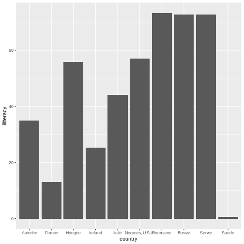
Within this expression, we set the parameters of which variable to be
placed across the horizontal (using x=variable) and
vertical axes (using y=variable). Typically, bar graphs
have categories on the horizontal axis and the values on the vertical
axis. However, there are instances where we want to create a horizontal
bar graph where categorical values are on the vertical axis and the
values are on the horizontal axis. Which bar graph did Du Bois used in
Plate 47 presented at the top of the page?
Challenge 2: Horizonal Bar graph
Below is the code to make a traditional bar graph. How can you modify the code in order to make it a horizontal bar graph?
library(ggplot2)

d_literacy_country <- read.csv("https://raw.githubusercontent.com/HigherEdData/Du-Bois-STEM/refs/heads/main/data/d_literacy_country.csv")

ggplot(d_literacy_country, aes(
  x = country,
  y = illiteracy)) +
geom_col()R
library(ggplot2)

d_literacy_country <- read.csv("https://raw.githubusercontent.com/HigherEdData/Du-Bois-STEM/refs/heads/main/data/d_literacy_country.csv")

ggplot(d_literacy_country, aes(
    x = illiteracy,
    y = country)) +
    geom_col()
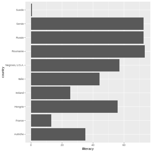
Now, our plot is starting to look more like the Du Bois original data
creation. In the code from challenge 2, the categories are on x-axis
(horizontal) and the rates/numbers are expressed on the y-axis (vertical
axis). In the challenge above, we use the ggplot function
to plot a horizontal bar graph of illiteracy rates across the
observations (countries and Black Americans).
In the challenge code above, we add a ggplot function
followed by open parentheses ( to tell R that we will plot
data from the d_literacy_country data frame with an
“aesthetic mapping” aes() specification that maps one
column of data on the x axis and another column of data on the y
axis.
After the close parentheses ) that tells ggplot we want
to plot d_literacy_country data with one variable on the x
axis, and another on the y axis, we add a + notation. When
using multi-line code with ggplot, the + tells
R we have more code to read. Specifically here, the
geom_col() function tells ggplot we want a bar
graph based on summary statistics in the dataframe.
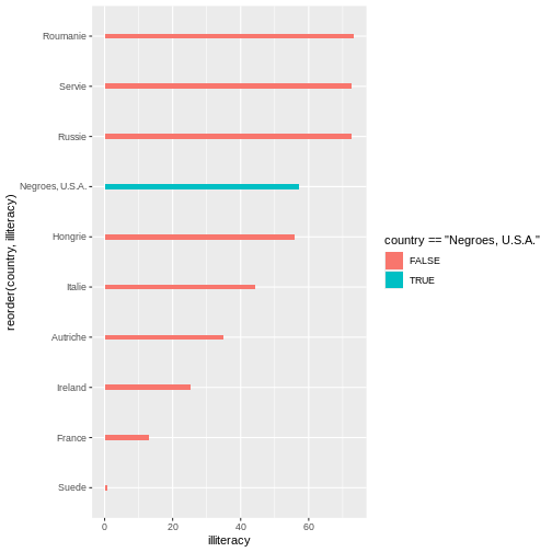
Sorting the Values & Highlighting a value
In the bar graph you created above, can you tell what order the bars for each country are sorted by?…
It is ordered in alphabetical order. When we observe Du Bois Plate 47, we see Du Bois sorts the bar by illiteracy rate from highest to lowest.
Additionally, Du Bois also graphs illiteracy rate for Black Americans in a different color to make it easier to compare to other countries.
R
ggplot(d_literacy_country, aes(
  x = illiteracy,
  y = reorder(country, illiteracy))) +
    geom_col()
Compare the code above with challenge 2, what do you notice? The code
above uses the reorder function to reorganize the country
names on the vertical axis based on illiteracy.
Next, we the fill function to highlight a specific
country: Ireland.
R
ggplot(d_literacy_country, aes(
  x = illiteracy,
  y = reorder(country, illiteracy),
  fill = country == "Ireland"
  )) +
  geom_col()
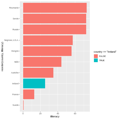
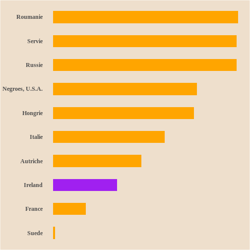
Challenge 3: Reorder and highlighting a value
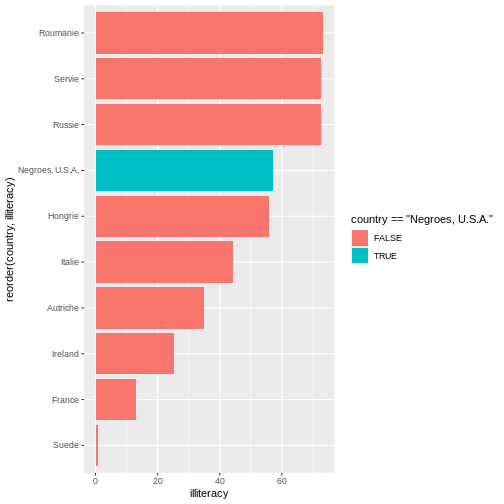
Observing Plate 47, what country or value is suppose to stand out? Update the below.
library(ggplot2)

d_literacy_country <- read.csv("https://raw.githubusercontent.com/HigherEdData/Du-Bois-STEM/refs/heads/main/data/d_literacy_country.csv")

ggplot(d_literacy_country, aes(
  x = illiteracy,
  y = reorder(country, illiteracy),
  fill = country == "Ireland"
  )) +
geom_col()R
library(ggplot2)

d_literacy_country <- read.csv("https://raw.githubusercontent.com/HigherEdData/Du-Bois-STEM/refs/heads/main/data/d_literacy_country.csv")

ggplot(d_literacy_country, aes(
  x = illiteracy,
  y = reorder(country, illiteracy),
  fill = country == "Negroes, U.S.A."
  )) +
  geom_col()
Bar width and bar colors
We can easily edit the bar width by inputting numeric values within the
Below is the code with width .1.
R
ggplot(d_literacy_country, aes(
  x = illiteracy,
  y = reorder(country, illiteracy),
  fill = country == "Negroes, U.S.A."
  )) +
  geom_col(width=.1)
 Below is the code with width 1.
R
ggplot(d_literacy_country, aes(
  x = illiteracy,
  y = reorder(country, illiteracy),
  fill = country == "Negroes, U.S.A."
  )) +
  geom_col(width=1)
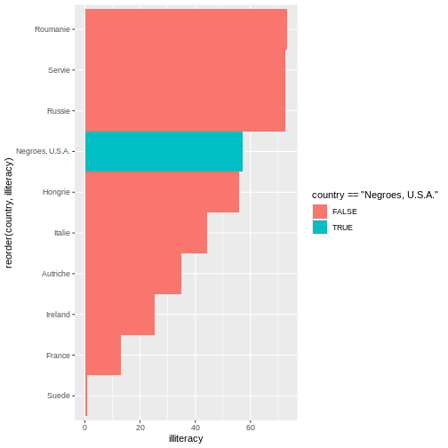
Notice the differences?
Additionally, the function scale_fill_manual() allows
users to adapt the colors of the fill based on values. Remember earlier,
the legend printed colors based on TRUE/FALSE of country == “Negroes,
U.S.A.”. We will build on that previous knowledge to adapt the code:
R
scale_fill_manual(values = c("TRUE"= "purple", "FALSE" = "orange"))
R
ggplot(d_literacy_country, aes(
  x = illiteracy,
  y = reorder(country, illiteracy),
  fill = country == "Ireland"
)) +
  geom_col(width=.5) +
  scale_fill_manual(values = c("TRUE"= "purple", "FALSE" = "orange"))
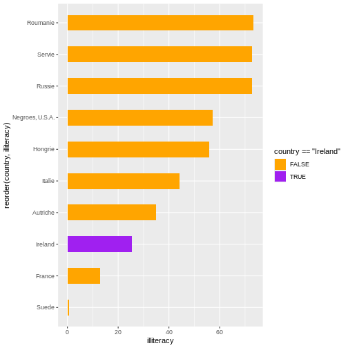
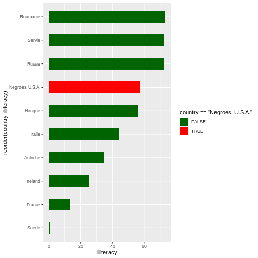
Challenge 4: Bar width and bar color
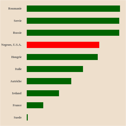
Edit the code to include an appropriate width size. Below the bar graph uses purple to high Black Americans and the other countries are orange. In the original Plate 47, red is used for Black Americans and darkgreen for the other countries? Update the code.
library(ggplot2)

d_literacy_country <- read.csv("https://raw.githubusercontent.com/HigherEdData/Du-Bois-STEM/refs/heads/main/data/d_literacy_country.csv")

ggplot(d_literacy_country, aes(
  x = illiteracy,
  y = reorder(country, illiteracy),
  fill = country == "Negroes, U.S.A."
)) +
  scale_fill_manual(values = c("TRUE"= "purple", "FALSE" = "orange"))
geom_col(width=.1)R
library(ggplot2)

d_literacy_country <- read.csv("https://raw.githubusercontent.com/HigherEdData/Du-Bois-STEM/refs/heads/main/data/d_literacy_country.csv")

ggplot(d_literacy_country, aes(
  x = illiteracy,
  y = reorder(country, illiteracy),
  fill = country == "Negroes, U.S.A."
)) +
  scale_fill_manual(values = c("TRUE"= "red", "FALSE" = "darkgreen")) +
  geom_col(width=.5)
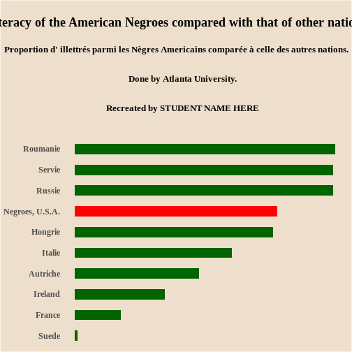
##Adding Du Bois Theme
The style of our current figure does not quite match the original Plate 47. Can you identify 1-2 style characteristics missing?…
A few features missing are: dimensions, background color, and title.
Next, we will adapt the code to match the style, specifically:
dimensions, background color, legend, and other default
ggplot elements.
R
options(repr.plot.width=22/3, repr.plot.height=28/3)

source("https://raw.githubusercontent.com/HigherEdData/Du-Bois-STEM/refs/heads/main/theme_dubois.R")
Depending on our intention or circumstance, we adapt the size of a graph. The first line of code tells R that we want the width and height of the graph to have the same ratio that Du Bois used, 22 inches wide by 28 inches tall, with each divided by 3 so that it doesn’t display too big.
The second line tells R to use a specific Du Bois style. We can add
theme_dubois() within
geom_col(width = #) + theme_dubois(). However, make sure to
include
source("https://raw.githubusercontent.com/HigherEdData/Du-Bois-STEM/refs/heads/main/theme_dubois.R")
in order to use theme_dubois()
Changing the font to
theme(text = element_text('serif'))
R
source("https://raw.githubusercontent.com/HigherEdData/Du-Bois-STEM/refs/heads/main/theme_dubois.R")

ggplot(d_literacy_country, aes(
  x = illiteracy,
  y = reorder(country, illiteracy),
  fill = country == "Ireland"
)) +
  geom_col(width=.5) +
  theme_dubois() +
  scale_fill_manual(values = c("TRUE"= "purple", "FALSE" = "orange"))+
  theme(text = element_text('serif'))
Challenge 5: Using Du Bois style
Update the code with the options and the
theme_dubois().
library(ggplot2)

d_literacy_country <- read.csv("https://raw.githubusercontent.com/HigherEdData/Du-Bois-STEM/refs/heads/main/data/d_literacy_country.csv")

ggplot(d_literacy_country, aes(
  x = illiteracy,
  y = reorder(country, illiteracy),
  fill = country == "Negroes, U.S.A."
)) +
  geom_col(width=.5) +
  scale_fill_manual(values = c("TRUE"= "red", "FALSE" = "darkgreen")) +
theme(text = element_text('FONT'))R
library(ggplot2)
options(repr.plot.width=22/3, repr.plot.height=28/3)
source("https://raw.githubusercontent.com/HigherEdData/Du-Bois-STEM/refs/heads/main/theme_dubois.R")

d_literacy_country <- read.csv("https://raw.githubusercontent.com/HigherEdData/Du-Bois-STEM/refs/heads/main/data/d_literacy_country.csv")

ggplot(d_literacy_country, aes(
  x = illiteracy,
  y = reorder(country, illiteracy),
  fill = country == "Negroes, U.S.A."
)) +
  geom_col(width=.5) +
  theme_dubois() +
  scale_fill_manual(values = c("TRUE"= "red", "FALSE" = "darkgreen"))+
  theme(text = element_text('serif'))
Titles
To add titles and subtitles to the graph, we use the
labs function in ggplot. We use the title and
subtitle specifications with labs.
The title text needs to be enclosed in quotation marks. We use the
code \n to tell R to put a “new line” break at different
places in the title based on Du Bois’ titling.
Fill in the blank with your name in the title code below to show that the graph was recreated by you?
labs(
	title="Graph title"
	subtitle="2026"
)
Challenge 6: Adding labels
Based on the Plate 47, update with your name.
library(ggplot2)
options(repr.plot.width=22/3, repr.plot.height=28/3)
source("https://raw.githubusercontent.com/HigherEdData/Du-Bois-STEM/refs/heads/main/theme_dubois.R")

d_literacy_country <- read.csv("https://raw.githubusercontent.com/HigherEdData/Du-Bois-STEM/refs/heads/main/data/d_literacy_country.csv")

ggplot(d_literacy_country, aes(
  x = illiteracy,
  y = reorder(country, illiteracy),
  fill = country == "Negroes, U.S.A."
)) +
  geom_col(width=.5) +
  theme_dubois() +
  scale_fill_manual(values = c("TRUE"= "red", "FALSE" = "darkgreen"))+
  theme(text = element_text('serif'))+
    labs(
        title = "\nIlliteracy of the American Negroes compared with that of other nations.\n",
        subtitle = "Proportion d' illettrés parmi les Nègres Americains comparée à celle des autres nations.\n\n
        Done by Atlanta University.\n\ngit ad
        Recreated by STUDENT NAME HERE\n\n"
)R
library(ggplot2)
options(repr.plot.width=22/3, repr.plot.height=28/3)
source("https://raw.githubusercontent.com/HigherEdData/Du-Bois-STEM/refs/heads/main/theme_dubois.R")

d_literacy_country <- read.csv("https://raw.githubusercontent.com/HigherEdData/Du-Bois-STEM/refs/heads/main/data/d_literacy_country.csv")

ggplot(d_literacy_country, aes(
  x = illiteracy,
  y = reorder(country, illiteracy),
  fill = country == "Negroes, U.S.A."
)) +
  geom_col(width=.5) +
  theme_dubois() +
  scale_fill_manual(values = c("TRUE"= "red", "FALSE" = "darkgreen"))+
  theme(text = element_text('serif')) +

  labs(
      title = "\nIlliteracy of the American Negroes compared with that of other nations.\n",
      subtitle = "Proportion d' illettrés parmi les Nègres Americains comparée à celle des autres nations.\n\n
      Done by Atlanta University.\n\n
      Recreated by STUDENT NAME HERE\n\n"
    )
- Learn about early Du Bois data visualization
- Use R to read tabular data
- Use
ggplot2to create graphs - Use modern features to recreate Plate 47