Adapt: Biodiversity and Redlining Bar Chart
Last updated on 2026-04-28 | Edit this page
Overview
Questions
- How can we adapt code for a previous bar chart to plot different data?
- What can go wrong when we recycle code?
- How can we refine code to fit the particular data and relationships?
Objectives
- Learn how to build off your old visualization code.
- Understand the how bar categories and statistics represented by bars shift across applications.
- Practice creative problem solving to make code fit your data and analysis.
1. Read in and check biodiversity redlining data
Now that you’ve written code to graph Du Bois’ literacy data, you can use that same code to make bar graphs of other data in the same style.
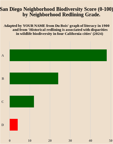
To see how this works, we will use data from an article in the Proceedings of the National Academy of Science (PNAS) here The article includes a bargraph showing lower biodiversity in neighborhoods that were redlined in the middle of the 20th century because they had large numbers of non-white residents. The home owners loan corporation (HOLC) tracked neighborhoods that would have been redlined by the Federal Housing Adminsation and local lenders, making it harder to get affordable homeloans in the neighborhood and “serving as a proxy for numerous prior and existing racialized policies at the federal, state, and local level that reinforced racial segregation, discrimination, and disinvestment” (Estian et al. 2024). The graph below uses data for the city of San Diego to show lower biodersity scores (0-100) in neighborhoods with lower A to D HOLC letter grades (indicating worse redlining treatment of neighborhoods).

To recreate the biodiversity graph in the style of Du Bois’ literacy graph, we need to first import the biodiversity data for San Diego neighborhoods from a different d_biodiversity_redlining.csv file into or df data drame.
Do do this, fill in the blank in the read.csv line of code below to use the d_biodiversity_redlining.csv file name when reading in the data from our website.
Then the line of code df to display the diversity scores by neighborhood redlining grade from the graph above.
R
df<- read.csv(
  "https://raw.github.com/HigherEdData/Du-Bois-STEM/refs/heads/main/data/_____________")

df
Hints:
Make sure that you include our d_ prefix in the filename and the dataframe name along with .csv at the end of the file name.
Answer:
The first line of code should be:
R
df<-read.csv(
  "https://raw.github.com/HigherEdData/Du-Bois-STEM/refs/heads/main/data/d_biodiversity_redlining.csv")

df
OUTPUT
  grade biodiversity
1     A           48
2     B           24
3     C           12
4     D            4
2. Edit the Du Bois Graph Code to Plot the Biodiversity and Neighborhood Redlining Grade Data
After reading in the d_biodiversity_redlining.csv data, you can edit the graph code you used for the literacy code to graph the biodiversity and redlining data. Unlike the original biodiversity bar graph in the PNAS article, your code will graph the data as a horizontal bar graph.
Fill in the blanks below to:
- Change the name of the data frame you are graphing with ggplot to the d_biodiversity_redlining data frame.
- Change the x variable you are graphing from literacy to the biodiversity variable.
- Change the y variable you are graphing to the redlining grade variable.
- Add your own name for the Adapted by line.
R
{r, fig.width=11, fig.height=14}

df<- read.csv(
  "https://raw.github.com/HigherEdData/Du-Bois-STEM/refs/heads/main/data/d_biodiversity_redlining.csv")

library(ggplot2)

options(repr.plot.width=22/2, repr.plot.height=28/2)
source("https://raw.githubusercontent.com/HigherEdData/Du-Bois-STEM/refs/heads/main/theme_dubois.R")

# above is code you learned in the Recreate episode for setting up R to plot Du Bois' literacy data

# 1. fill in the blank below to change the dataframe you are plotting
ggplot(____________, aes(
# 2. fill in the blanks below to graph the biodiversity variable
    x = _________,
# 3. fill in the blanks to graph the grade variable
    y = reorder(________, biodiversity),
    fill = grade == "D" # this changes the fill statement to graph the D grade bar in Red
)) +
    geom_col(width = .5) +
    theme_dubois() +
       theme(text = element_text('serif')) +
    scale_fill_manual(values = c("TRUE" = "red", "FALSE" = "darkgreen")) +
    labs(
        title = "\nSan Diego Neighborhood Biodiversity Score (0-100) by Neighborhood Redlining Grade.\n",
        subtitle = "Adapted by ________from Du Bois' graph of literacy in 1900 and from\n
         'Historical redlining is associated with disparities in wildlife biodiversity in four California cities' (2024)\n\n"

# 4. Fill in the blank above to show the graph is adapted by you!
    )
Hints:
The new dataframe name is d_biodiversity_redlining.
The x variable name is biodiversity.
Answer:
R
df<- read.csv(
  "https://raw.github.com/HigherEdData/Du-Bois-STEM/refs/heads/main/data/d_biodiversity_redlining.csv")

library(ggplot2)

source("https://raw.githubusercontent.com/HigherEdData/Du-Bois-STEM/refs/heads/main/theme_dubois.R")

ggplot(df, aes(
    x = biodiversity,
    y = reorder(grade, biodiversity),
    fill = grade == "D" # this changes the fill statement to graph the D grade bar in Red
)) +
    geom_col(width = .5) +
    theme_dubois() +
       theme(text = element_text('serif')) +
    scale_fill_manual(values = c("TRUE" = "red", "FALSE" = "darkgreen")) +
    labs(
        title = "\nSan Diego Neighborhood Biodiversity Score (0-100)
        by Neighborhood Redlining Grade. \n",
        subtitle = "Adapted by YOUR NAME from Du Bois' graph of literacy in 1900
        and from 'Historical redlining is associated with disparities
        in wildlife biodiversity in four California cities' (2024) \n"
    )
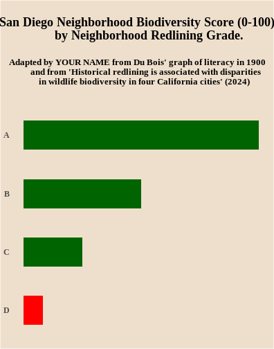
3. Improve Accessibility by Adding X Axis Grid Lines and Removing the Use of Red and Green
Some of Du Bois’ graphing choices might not make sense for graphs you want to make. For example, Du Bois doesn’t provide labels or grid lines to make it easy to understand what the range of biodiversity scores are by neighborhood redlining grade. The code cell below adds two lines of code for adding the grid lines.
In addition, red and green bars are difficult to differentiate for those with colorblindness. Try removing the line of code below that set the bar colors to red and green. This should change the bar colors back to default orange and teal ggplot colors that are colorblind accessible.
If you want to customize the chart further to add your own style twist, try a google search or chatGPT query. For a chatGPT query, you could copy and paste the code from below and ask, how could I change this R ggplot code to change the background color to beige?
R
{r, fig.width=5.5, fig.height=7}
df<- read.csv(
  "https://raw.github.com/HigherEdData/Du-Bois-STEM/refs/heads/main/data/d_biodiversity_redlining.csv")

library(ggplot2)

source("https://raw.githubusercontent.com/HigherEdData/Du-Bois-STEM/refs/heads/main/theme_dubois.R")

ggplot(df, aes(
    x = biodiversity,
    y = reorder(grade, biodiversity),
    fill = grade == "D" # this changes the fill statement to graph the D grade bar in Red
)) +
    geom_col(width = .5) +
    theme_dubois() +
       theme(text = element_text('serif')) +
    scale_fill_manual(values = c("TRUE" = "red", "FALSE" = "darkgreen")) + ## delete this line
    labs(
        title = "\nSan Diego Neighborhood Biodiversity Score (0-100)
        by Neighborhood Redlining Grade. \n",
        subtitle = "Adapted by YOUR NAME from Du Bois' graph of literacy in 1900
        and from 'Historical redlining is associated with disparities
        in wildlife biodiversity in four California cities' (2024) \n"
    ) +
  # Below is code to add grid lines with labels
  scale_x_continuous(
        breaks = seq(0, 60, by = 10),  # Set tick positions every 10 units
    ) +
    theme(
        axis.text.x = element_text(size = 12),
        panel.grid.major.x = element_line(color = "lightgray")
        )
Answer:
R
df<- read.csv(
  "https://raw.github.com/HigherEdData/Du-Bois-STEM/refs/heads/main/data/d_biodiversity_redlining.csv")

library(ggplot2)

source("https://raw.githubusercontent.com/HigherEdData/Du-Bois-STEM/refs/heads/main/theme_dubois.R")

ggplot(df, aes(
    x = biodiversity,
    y = reorder(grade, biodiversity),
    fill = grade == "D" # this changes the fill statement to graph the D grade bar in Red
)) +
    geom_col(width = .5) +
    theme_dubois() +
       theme(text = element_text('serif')) +
    scale_fill_manual(values = c("TRUE" = "red", "FALSE" = "darkgreen")) + ## delete this line
    labs(
        title = "\nSan Diego Neighborhood Biodiversity Score (0-100)
        by Neighborhood Redlining Grade. \n",
        subtitle = "Adapted by YOUR NAME from Du Bois' graph of literacy in 1900
        and from 'Historical redlining is associated with disparities
        in wildlife biodiversity in four California cities' (2024) \n"
    ) +
  # Below is code to add grid lines with labels
  scale_x_continuous(
        breaks = seq(0, 60, by = 10),  # Set tick positions every 10 units
    ) +
    theme(
        axis.text.x = element_text(size = 12),
        panel.grid.major.x = element_line(color = "lightgray")
        )