Data Visualization Now
Last updated on 2026-04-28 | Edit this page
Learning from the Innovations of W.E.B. Du Bois
This content is also available in Google Slides that can be copied and edited.
Overview
Questions
- How can data visualization and creativity help answer important scientific questions?
- Why did data visualization become predominant in the social sciences earlier than for physical and natural sciences?
- How did Du Bubois use data visualization to challenge false biological theories of racial inequality?
- How did team science help Du Bois’ team to create impactful visualizations for the 1900 Paris exposition?
Objectives
Understand how data visualization promotes scientific discovery.
Explain early innovations in data visualization by W.E.B. Du Bois and other Black and women scientists in his Lab.
Analyze the appropriate types of data visualization charts for different kinds of measurements, relationships, and scientific findings.
Engage in a creative process of data visualization in the style of W.E.B. Du Bois, by applying techniques by hand and with statistical software.
Visualizations Help Formulate New Hypotheses
If I can’t picture it, I can’t understand it. – Albert Einstein
The first thing scientists want to do is understand an issue correctly. Visualizing data with charts, in contrast to tables, helps scientists understand data because:
It is often difficult for people to view a large dataset in a table comprehensively.
People are able to identify concrete patterns and associations more easily in data visualizations.
Why Communicate Through Visualizations?
Another thing scientists need to do is to communicate their findings effectively. Visualizing data is important to scientific communication because:
Scientific discovery requires communicating our ideas and evidence to other scientists who can challenge or build on our findings.
Charts, graphs, and other visuals can clarify associations between two or more things.
For example, health researcher Florence Nightingale used data visualization early on to communicate scientific findings in ways that the public and policymakers could use to save lives.
Why the History of Data Visualization Matters Now
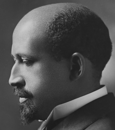
The social scientist W.E.B. Du Bois provided one of the earliest models for effectively developing data visualizations, demonstrating how science matters for the most critical material and moral issues of the day
What Motivated DuBois?
Du Bois cared about the truth. He lived during a time when biological explanations were popular among scientist to explain racial inequality.
Du Bois asked, instead, how discriminatory policies and the material consequences of slavery created unequal outcomes in wealth, literacy, and well being. Du Bois and the Atlanta University Laboratory developed new questions for the US Census and conducted scientific surveys of the population. His Lab included investigators of different racial/ethnic backgrounds and it included women, which was not the norm at that time.
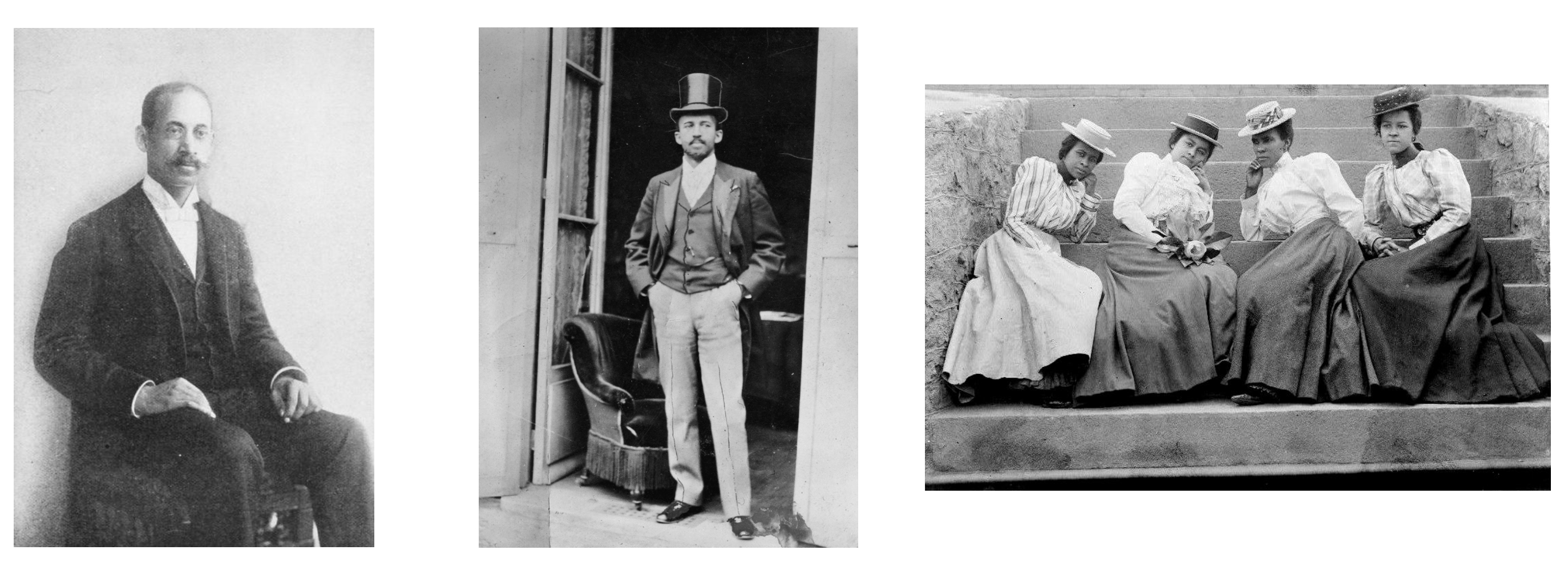
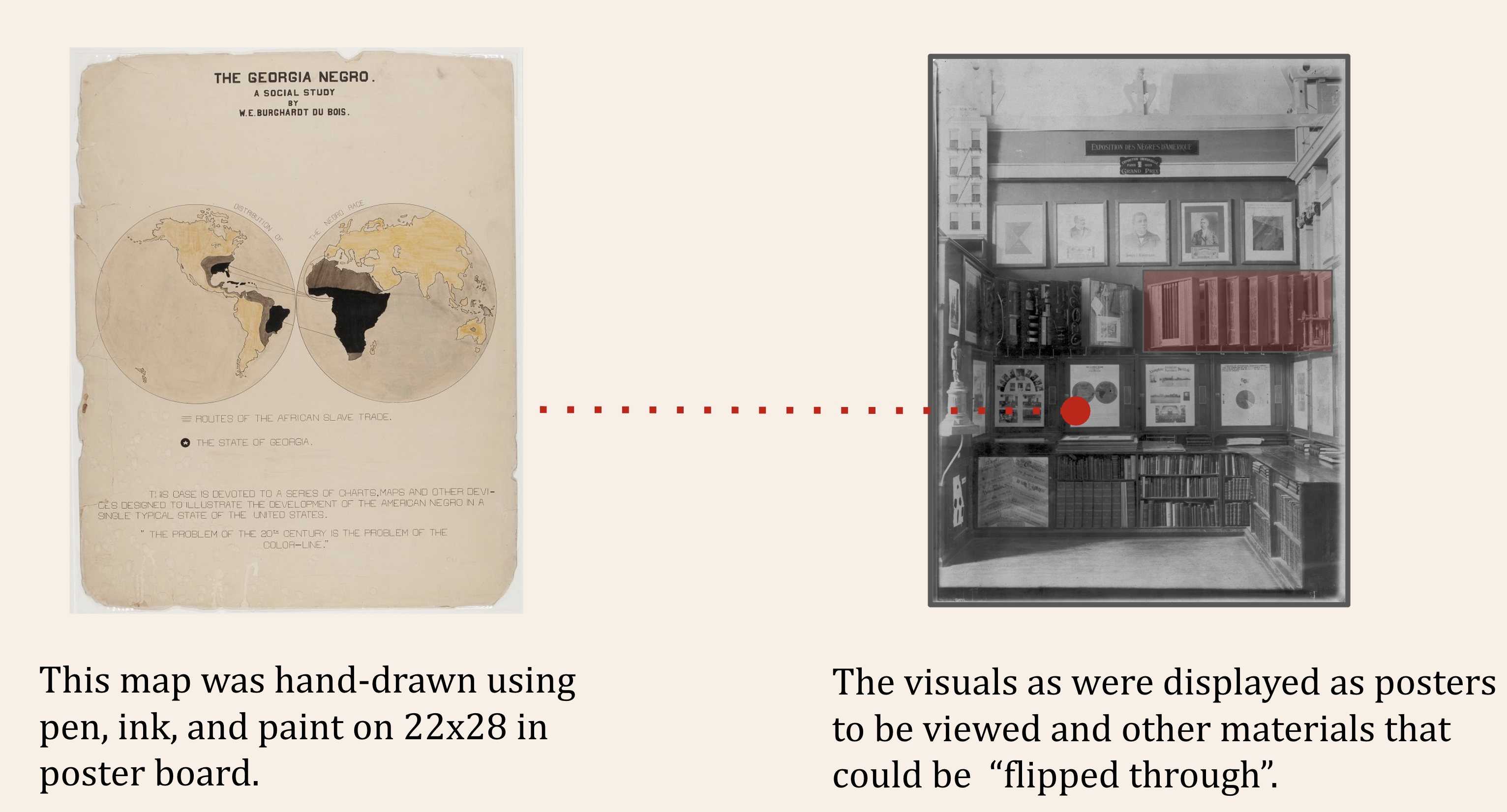
The figures show Thomas Calloway, the organizer of the “Exhibition of the American Negro”, Du Bois during the Paris Exposition in 1900, and Atlanta University Students, circa 1900.
Data Visualization as a Scientific Concern for the Du Bois Lab
The Du Bois Lab found evidence to refute theories that falsely claimed inherent biological differences between races.
The Du Bois Lab used creative visualizations to help their team work with new data, make new connections, and to ask critical questions about the objects of study
The Du Bois Lab communicated their evidence and arguments using data visualization that could be understood by wide audiences.
Communicating Science to the Public: The 1900 Paris Exposition
The 1900 World Fair in Paris provided a venue for Du Bois to challenge erroneous theories about racial difference and inequality. The exposition showcased the latest scientific discoveries and inventions to 50 million attendees from around the world.
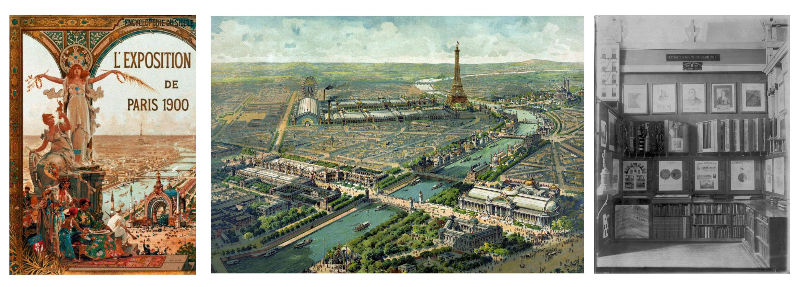
The figures show the Exposition Poster, a view of Paris, and the venue for the Exposition of the American Negro.
Motivation: What could a scientist do?
Overview
Questions
What could Du Bois do as a scientist to challenge widely believed but false theories of racial inequality?
How could Du Bois best present his ideas and evidence at the Paris Exposition with the technologies available to him?
What could you do today as a scientist to challenge theories about how a phenomenon operates that might be wrong?
In your potential career, how might you visualize data?
Objectives
Understand how data visualization promotes scientific discovery.
Explain early innovations in data visualization by W.E.B. Du Bois and other Black and women scientists in his Lab.
Analyze the appropriate types of data visualization charts for different kinds of measurements, relationships, and scientific findings.
Engage in a creative process of data visualization in the style of W.E.B. Du Bois, by applying techniques by hand and with statistical software.
Turning Data into Art
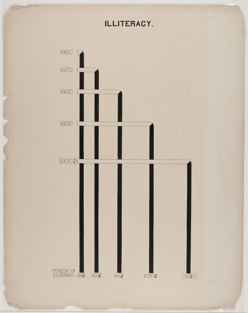
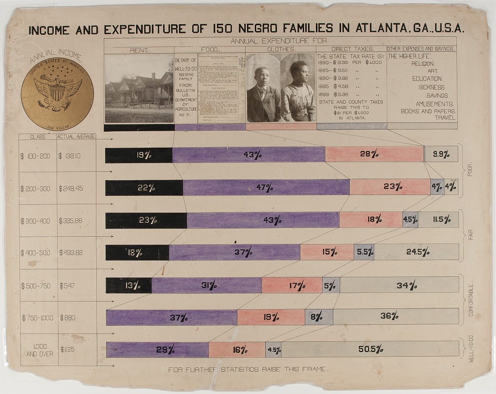
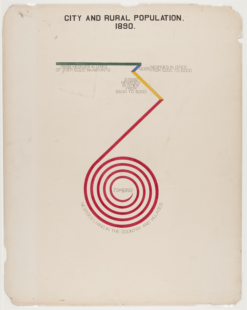
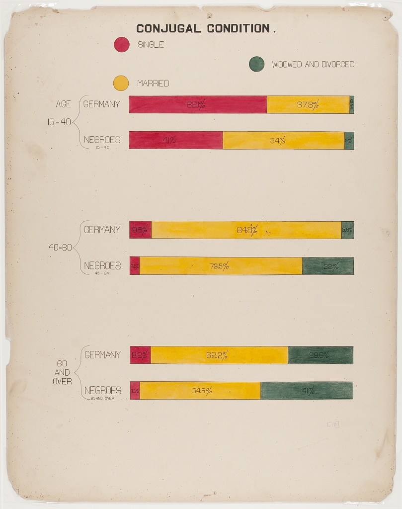
The Du Bois Lab creatively used charts to depict data about racial inequality.
This helped them show, for example, that when the US government ended bans on Black literacy in the South after Emancipation, illiteracy declined sharply.
The Lab even found that Black illiteracy had declined to lower levels than found in some parts of Europe where conditions of serfdom kept illiteracy high into the late 1800s.
Combining Different Art Forms
The Du Bois Lab used a range of charts that combined different kinds of data with visual art, including maps, photographs, and drawings, to detail change over time.
Praised and Preserved
What we remember and praise, we preserve. These charts have been praised for their ability to draw in viewers. The charts are also preserved in the Library of Congress. Fisk University also houses an archive of Du Bois data visualizations.
Recap (Overall Learning Objectives)
The central place of data visualizations in the process of scientific discovery and in communicating those discoveries. The history of the DuBois Lab exemplifies this.
It matters which type of chart or graph is used to depict a relationship, a cause, or a process. Some work better than others.
Science requires creativity for discovery. Data visualizations help communicate relevant scientific findings to audiences effectively.
Exercise 1
Why do you think Du Bois created a series of graphs and data visualizations of Black life for the exposition?
Why visualizations instead of a written report?
Du Bois used rigorous yet accessible methods to challenge subsequently discredited claims associated with scientific racism that devalued and assumed Black communities as inferior. The visualizations helped show some of the systemic barriers impeding the progress for black Americans as compared to a deficit approach that would suggest black people were somehow innately less capable. This is a paradigm shift in showing how social science can work together with other STEM fields to produce the most accurate science and impressive visualizations.
Discussion
What effect did the venue have on the design of the visuals?
Why do you think Du Bois created a series of graphs and data visualizations of Black life for the exposition?
Why visualizations instead of a written report?
What effect did the venue have on the design of the visuals?
References
(Paris Exposition of 1900 (Exposition Universelle)) [https://en.wikipedia.org/wiki/Exposition_Universelle_(1900)]
(Black America, 1895) [https://publicdomainreview.org/essay/black-america-1895]
(Plessy v. Ferguson) [https://www.britannica.com/event/Plessy-v-Ferguson-1896]
(The Philadelphia Negro) [https://www.google.com/books/edition/_/sqwJAAAAIAAJ]
(Wilmington Insurrection of 1898) [https://en.wikipedia.org/wiki/Wilmington_insurrection_of_1898]
(The Lynching of Sam Hose) [https://en.wikipedia.org/wiki/Lynching_of_Sam_Hose]