Just Enough Statistics
Overview
Teaching: 50 min
Exercises: 10 minQuestions
What is statistics?
Objectives
Be able to describe data effectively.
Use basic statistics terminology correctly.
Understand statistical power, p values and confidence intervals.
Know where to go next for help.
Lesson
The big picture
In general, we are attempting to answer a research question by collecting data from a sample of a population.
Data collection consists of measuring the values of several variables for each member of the population.
First, we gain insight into the data we have collected by inspecting it, organising it, summarising it. This is descriptive statistics.
Then, we use the data to draw conclusions about the population from which the sample is collected, and to test the reliability of those conclusions. This is inferential statistics.
Statistics != Hypothesis Testing
Often, when people think of statistics, they think “what test should I do.” Testing procedures, including null hypothesis significance testing (NHST), are a relatively small part of statistics. Scientific discovery should be much broader than simply asking “what test should I do”. The best approach is to formalise a research question before collecting data, and then approach someone (e.g. a statistician) who can help formulate a method to answer it. This might involve working with clinicians, scientist, trialists and methodologists. Whatever you do, don’t just collect data, and then look at a flow chart to find out what test you should perform. This is a terrible way to do science.
Descriptive statistics
Measure types
Variables may use the following systems of measure:
- Binary: yes/no e.g. is the patient alive or dead
- Count: naturally bound at zero e.g. daily A&E admissions
- Continuous: e.g. Age, height, weight
- Discrete
- Nominal: e.g. eye colour
- Ordinal: e.g. likert approval scale
Continuous variables can be measured with arbitrary precision. Think of age: we typically measure it to the nearest year, but in theory we could measure this in seconds, nanoseconds or even more accurately. Continuous variables contain the maximum amount of statistical information. If we discretise a continuous variable, e.g. place it into groupings like deciles, then we discard information. This should be avoided.
Discrete variables take only a fixed number of possible values. Look at the sex variable in our dataset which only takes the values “F” and “M”. There is no natural ordering here so the values are nominal. Discrete values that have a natural order (e.g. a likert scale with “bad”, “moderate”, “good”) are known as ordinal values.
Different types of data are optimally presented in different ways. For example, binary data is presented succinctly as the proportion of “yes”, while continuous data might be better presented as the average result.
Distributions
When trying to convey information about a variable, we want to explain succinctly what values the variable takes, and with what frequency this occurs. This is most commonly performed via a histogram.
Let’s think about the values sodium in our data can take, and how often it takes each one. We can visualise this with a histogram:
df %>%
  ggplot(aes(na)) +
  geom_histogram(
    binwidth = 2,
    colour = "black",
    fill = "white") +
  xlim(c(100, 180)) +
  theme_classic() +
  xlab("Sodium (mmol/L)")
## Warning: Removed 5 rows containing non-finite values (stat_bin).
## Warning: Removed 2 rows containing missing values (geom_bar).

#ggsave("./images/sodium_hist.png", width = 16, height = 9, units = "cm")
This is fairly symmetric, like a normal distribution, but the peak is a little too high, and the tails are a little too heavy.
Our dataset contains 5000 rows of observations, but imagine if it contained 1 million rows, or even more. We would start to build up a more and more detailed picture of how often different sodium occur in our data. This would be the distribution of the sodium variable. Let’s overlay a normal distribution so we can see how close it is.
df %>%
ggplot(aes(x = na)) +
  geom_histogram(aes(y =..density..),
                 breaks = seq(100, 180, by = 2),
                 colour = "black",
                 fill = "white") +
stat_function(fun = dnorm, args = list(mean = mean(df$na), sd = sd(df$na)), colour = "red") +
  xlim(c(100, 180)) +
  theme_classic()
## Warning: Removed 5 rows containing non-finite values (stat_bin).

#ggsave("./images/sodium_hist_norm.png", width = 16, height = 9, units = "cm")
As you can see, the peak is a little too high, and the tails too heavy. It is wise not to assume normality, just because the sample size is large.
Let’s explore some other variables in the data; “potassium” and “id”.
df %>%
  ggplot(aes(k)) +
  geom_histogram(
    binwidth = 0.2,
    colour = "black",
    fill = "white") +
  theme_classic()

#ggsave("./images/k_hist.png", width = 16, height = 9, units = "cm")

df %>%
  ggplot(aes(parse_number(id))) + geom_histogram(colour = "black",
    fill = "white", bins = 30) +
  theme_classic()

# ggsave("./images/id.png", width = 16, height = 9, units = "cm")
potassium could be described as right-tailed, or right-skewed. It might seem a bit irrelevant to plot a histogram for the id variable, but this is a great example of the uniform distribution (where all states of the variable are equally likely).
The normal distribution is perhaps the most well known distribution. We see this bell shaped curve throughout nature, wherever small additions and subtractions are being made. For example, in the many thousands of aggregate genetic and environmental factors that determine an individuals height.
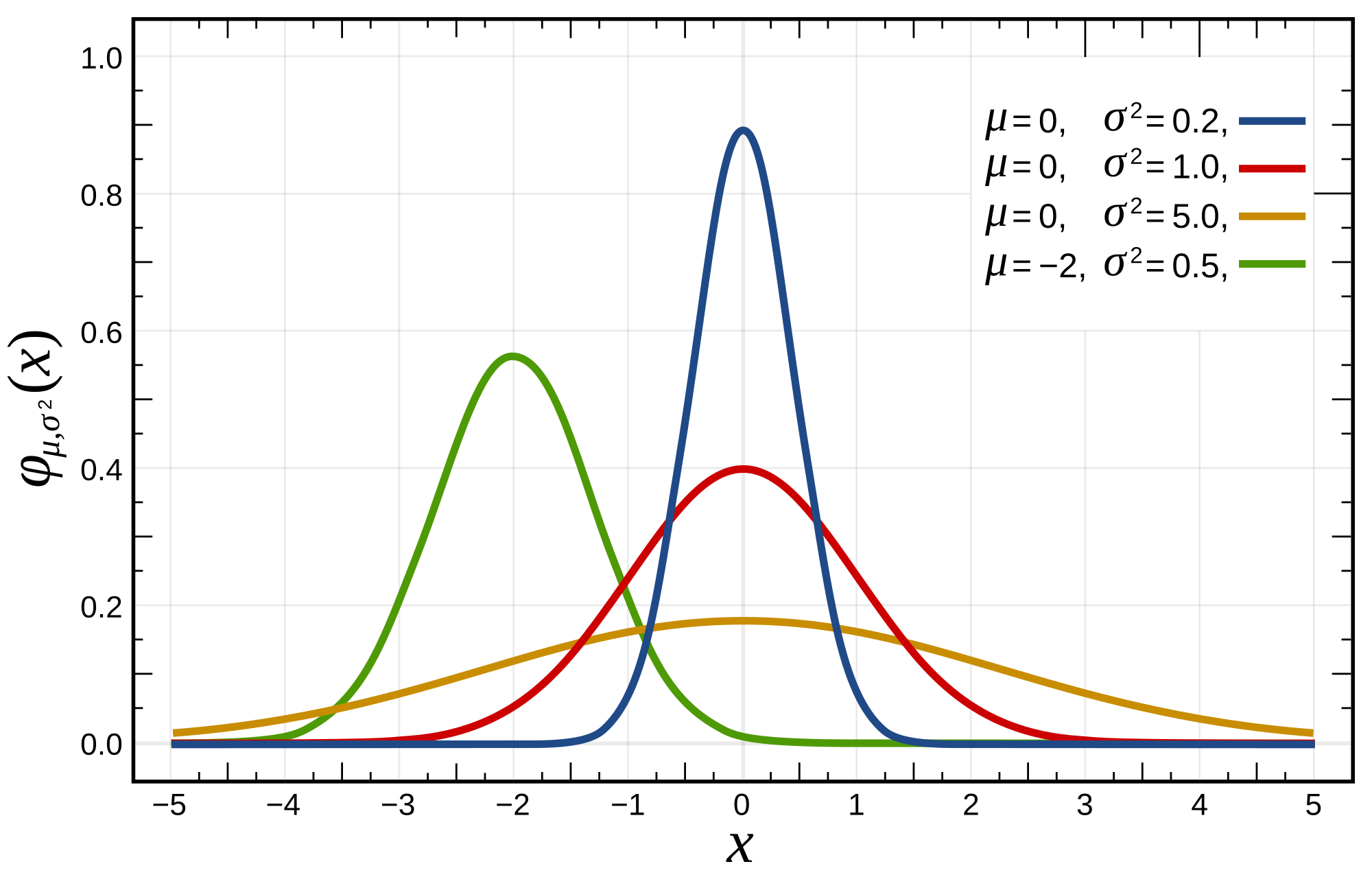
We can see how the centre-point of the bell curve shifts right and left as the mean of the distribution changes. This is why the mean is known is a measure of location. The thinness or fatness of the distribution alters as we change the standard deviation. This is why the standard deviation is a measure of spread. It is a measure of how spread out the data is around the mean.
A key question to ask yourself as you inspect the histograms for your data is, does this variable look like the normal distribution? That is, if we kept taking more-and-more observations in our experiment, would the histogram we obtain look more-and-more like a bell-curve? Normally distributed data is convenient to present and analyse, as is can be described perfectly by only two numbers: the mean and the sd.
Describing Location
The location is the measure of central tenancy of the data. It is the peak of the bell curve for example.
- Mean = sum of all data points/number of data points
- Median = middle data point, if all data were arranged in order on a line
- Mode = most common data point

For normally distributed data, all 3 measures of location align.
Exercise
Try plotting histograms, calculate the mean and median for the following data columns:
wbc,crp,platelets,hbAre the mean and median good at describing these distributions You can use the following functions:mean()andmedian()
Describing Spread
For measuring the ‘spread’ of the data:
- For normally-distributed data, use standard deviation
- for non normally-distributed data, the lower and upper quartiles are often used i.e if all data were arranged in order on a line, the values in the 25th and 75th centiles. Similarly the median was just the 50th centile
Take care not to confused the interquartile range (a single number) and the lower and upper quartiles (two numbers). Both are used to describe spread.
Descriptive Statistics in one go
You can calculate lots of useful descriptive statistics in one fell swoop using just one simple R function:
summary(df)
##      ph_abg        hco3_abg        temp_c        temp_nc
##  Min.   :6.76   Min.   : 5.2   Min.   :25.7   Min.   :23.4
##  1st Qu.:7.31   1st Qu.:20.9   1st Qu.:35.9   1st Qu.:36.1
##  Median :7.36   Median :23.3   Median :36.3   Median :36.6
##  Mean   :7.36   Mean   :23.3   Mean   :36.3   Mean   :36.4
##  3rd Qu.:7.41   3rd Qu.:25.5   3rd Qu.:36.9   3rd Qu.:37.0
##  Max.   :7.62   Max.   :65.3   Max.   :39.2   Max.   :39.7
##
##       urea        creatinine              na            k
##  Min.   : 0.60   Length:5000        Min.   : 99   Min.   :2.00
##  1st Qu.: 4.20   Class :character   1st Qu.:136   1st Qu.:4.00
##  Median : 6.10   Mode  :character   Median :139   Median :4.40
##  Mean   : 8.21                      Mean   :138   Mean   :4.46
##  3rd Qu.: 9.70                      3rd Qu.:141   3rd Qu.:4.90
##  Max.   :56.50                      Max.   :164   Max.   :7.80
##
##        hb             wbc          neutrophil      platelets
##  Min.   :  5.5   Min.   : 0.00   Min.   : 0.01   Min.   :  0
##  1st Qu.: 92.0   1st Qu.: 8.89   1st Qu.: 6.89   1st Qu.:142
##  Median :108.0   Median :11.80   Median :10.00   Median :198
##  Mean   :107.0   Mean   :12.89   Mean   :10.76   Mean   :220
##  3rd Qu.:123.0   3rd Qu.:15.50   3rd Qu.:13.60   3rd Qu.:269
##  Max.   :171.0   Max.   :59.30   Max.   :56.51   Max.   :989
##
##       crp            chemo        chronic_rrt      metastatic
##  Min.   :  0.1   Min.   :0.000   Min.   :0.000   Min.   :0.000
##  1st Qu.:  9.0   1st Qu.:0.000   1st Qu.:0.000   1st Qu.:0.000
##  Median : 46.0   Median :0.000   Median :0.000   Median :0.000
##  Mean   : 78.6   Mean   :0.407   Mean   :0.208   Mean   :0.215
##  3rd Qu.:107.0   3rd Qu.:1.000   3rd Qu.:0.000   3rd Qu.:0.000
##  Max.   :541.0   Max.   :1.000   Max.   :1.000   Max.   :1.000
##
##     radiotx          apache         medical          system
##  Min.   :0.000   Min.   : -1.0   Min.   :0.000   Min.   : 1.00
##  1st Qu.:0.000   1st Qu.: 11.0   1st Qu.:0.000   1st Qu.: 2.00
##  Median :0.000   Median : 15.0   Median :0.000   Median : 2.00
##  Mean   :0.217   Mean   : 19.5   Mean   :0.492   Mean   : 3.29
##  3rd Qu.:0.000   3rd Qu.: 20.0   3rd Qu.:1.000   3rd Qu.: 4.00
##  Max.   :1.000   Max.   :119.0   Max.   :1.000   Max.   :10.00
##
##      height         weight      elective_surgical
##  Min.   :1.45   Min.   : 50.0   Min.   :0.000
##  1st Qu.:1.60   1st Qu.: 65.0   1st Qu.:0.000
##  Median :1.70   Median : 75.0   Median :0.000
##  Mean   :1.69   Mean   : 76.6   Mean   :0.447
##  3rd Qu.:1.75   3rd Qu.: 90.0   3rd Qu.:1.000
##  Max.   :1.90   Max.   :150.0   Max.   :1.000
##
##   arrival_dttm                    discharge_dttm
##  Min.   :2014-01-01 00:35:32.00   Min.   :2014-01-02 01:06:16.00
##  1st Qu.:2015-07-02 12:22:18.25   1st Qu.:2015-07-08 04:39:20.00
##  Median :2016-12-06 16:14:27.00   Median :2016-12-11 07:06:45.50
##  Mean   :2016-11-30 19:31:11.50   Mean   :2016-12-05 04:01:23.01
##  3rd Qu.:2018-04-30 15:20:14.25   3rd Qu.:2018-05-05 04:12:20.50
##  Max.   :2019-09-24 00:13:38.00   Max.   :2019-10-07 01:43:08.00
##
##       dob             vital_status           sex
##  Min.   :1934-01-01   Length:5000        Length:5000
##  1st Qu.:1944-03-26   Class :character   Class :character
##  Median :1954-07-17   Mode  :character   Mode  :character
##  Mean   :1956-08-23
##  3rd Qu.:1968-01-02
##  Max.   :1999-09-22
##  NA's   :1
##       id             lactate_1hr     lactate_6hr    lactate_12hr
##  Length:5000        Min.   : 0.20   Min.   : 0.1   Min.   : 0.00
##  Class :character   1st Qu.: 1.10   1st Qu.: 0.8   1st Qu.: 0.50
##  Mode  :character   Median : 1.50   Median : 1.3   Median : 0.90
##                     Mean   : 2.07   Mean   : 1.8   Mean   : 1.38
##                     3rd Qu.: 2.30   3rd Qu.: 2.0   3rd Qu.: 1.60
##                     Max.   :17.90   Max.   :20.7   Max.   :21.40
##
##       los             age
##  Min.   : 0.00   Min.   :20.0
##  1st Qu.: 1.00   1st Qu.:50.0
##  Median : 3.00   Median :60.0
##  Mean   : 4.35   Mean   :60.3
##  3rd Qu.: 5.00   3rd Qu.:70.0
##  Max.   :31.00   Max.   :80.0
##                  NA's   :1
It is important to always plot your data, as these summary terms seldom fully describe your data. See the example below. The data points presented all share the same mean, standard distribution and correlation.
knitr::include_graphics("./img/anscombes_quartet.png")

Inferential Statistics
The following core concepts are central to inferential statistics, and often misunderstood:
- Power
- P values
- Confidence intervals.
If we can leave today with a strong intuition for these concepts, the rest will come easily.
All these concepts are part of the frequentist approach to statistics. In that they are hypothetical quantities that are valid in the long run, if we were to repeat an experiment infinitely many times. Usually we can only perform 1 experiment (like a randomised controlled trial), and so this point is often confused.
We will use simulation to visualise what these different quantities refer to.
Power
The power of a test (often written as a percentage) is the probability that the test will reject the test hypothesis at a pre-specified significance level. This significance level is usually (and arbitrarily) set to 0.05.
In plain English. If I were to repeat a study 1000 times, and I have 80% power at the 0.05 significance level, and a true effect exists. I would expect around 800 of the experiments to have a p value <= 0.05, and around 200 of the experiments to have a p value > 0.05
Power is a pre-study probability. It is defined, and fixed before starting an experiment. Occasionally you will see “post-hoc power” which is meaningless and to be avoided.
We can set up a simulation where we sample 8 men and 8 women from the general public. We want to know, “are the heights in these two groups different?”. Perhaps this comes from our research question: “Are men taller than women?”.
In the simulation we can fix the average population male and female height to be 1.75 m and 1.6 m respectively. Normally we can’t ever know the population quantities (thats why we are sampling). Simulation allows us to fix these before performing an experiement, so we can observe how the experiement performs.
In pain English. We have rigged an experiment, so that we take random samples of men and women, where we know than men are 15 cm taller than women.
So we have performed 1000 simulated experiments, and placed the results into a data-frame sim. Each experiement is a sample of 8 men, and 8 women, who we compare with a t-test. This asks the question: “does the average height of this sample men, equal the average height of this sample of women?”.
sim %>%
  group_by(signficant = p_value <= 0.05) %>%
  tally()
## # A tibble: 2 x 2
##   signficant     n
##   <lgl>      <int>
## 1 FALSE        166
## 2 TRUE         834
By counting the number of experiements with a p value <= 0.05, we can see the proportion that are “significant”. Thus, the power to detect a 15 cm difference in height, at the 0.05 significance, for a sample size of 8 subjects in each group is around 80%.
Even though we know that the underlying populations differ by 15 cm (we fixed that), we were unable to find this difference in 20% of cases. These 20% are “false negatives”. There is a true difference, but we did not detect it. The remaining 80% are the true positives. This is the direct interpretation of statistical power. This has happened because even though our population averages are fixed, we are still sampling randomly. And so by chance, some of these groups look very similar. Occationally, by chance, we might sample a group of taller than average women, who are of similar height to our sample of men.
Since we don’t want to be wrong often, how might we increase the power? For a given effect size (15 cm difference in our simulation), we can do so by increasing the number of people in the study.
Let’s look at how the power changes as we increase the number of people in each group from 8 to 50.
sim %>%
    group_by(subjects) %>%
    summarise(significant = sum(p_value <= 0.05)/n()) %>%
    ggplot(aes(x = subjects, y = significant)) + geom_point() +
    geom_hline(yintercept = 0.8, linetype = 2, colour = "red") +
    geom_hline(yintercept = 0.9, linetype = 2, colour = "blue") +
  theme_classic() +
  ylab("Proportion of Experiments with P <= 0.05") +
  xlab("Number of subjects in each arm")

#ggsave("./images/power1.png", width = 16, height = 9, units = "cm")
We can see that in order to find a difference of 15 cm, we have about 80% power with 8 subjects in each arm, and 90% power with 10 subjects. By the time we get to 30 subjects, we will seldom be unable to detect the difference.
What if the effect size isn’t fixed? Below is a plot that shows different possibilities if we are sticking with 8 samples from each group.
pwr <- c()
delta <- c()
for(i in seq(0.02, 0.2, by = 0.01)) {
 delta <- c(delta, i)
 pwr <- c(pwr, power.t.test(n = 8, sd = 0.1, sig.level = 0.05, delta = i)$power)
}
sim <- tibble(
  effect_size = delta,
  power = pwr
)

sim %>%
  ggplot(aes(x = effect_size, y = power)) + geom_line() +
  xlim(c(0, 0.2)) +
  ylim(c(0, 1)) +
  theme_classic() +
  xlab("Effect size (cm)") +
  ggtitle("Power curve for heights with 8 in each group")

#ggsave("./images/power_curve.png", width = 16, height = 9, units = "cm")
As you can see, statistical power is a function of both effect size, and sample size.
Traps to avoid
The power is not a direct probability in relation to an individual experiment. For example, it is not the probability that a specific experiment performed is a true positive. The probability that any specific experiment is a true positive is either 1 or 0, we just don’t know which.
Statistical significance is a messy topic. Statistical power gives us a clue as to why we might regularly find that studies on the same topic are in disagreement. Imagine two independent studies trying to investigate the same issue (for example, early antibiotics in sepsis). And they are both powered at 80%. Let’s assume for a moment, that early antibiotics are beneficial (i.e. the study would hope to have a positive finding). Then the probability that both studies will have a p value <= 0.05 will be 0.8*0.8 = 0.64. So there is only a 2/3rds chance that the studies will “agree”. The chance that one will be “positive” and the other be “negative” is 2*0.8*0.2 = 0.32. So there is actually nearly a 1/3rd chance that these studies will “differ” in their findings. Perhaps we should not be so quick to point out where studies disagree, since this is somewhat expected behaviour?
P Values
The p value is the probability of seeing data this or more extreme, given that all your assumptions are true, and that the null hypothesis is also true. The p value is another hypothetical frequency probability. It is another long running measure.
It is not the probability of a false positive. The probability that you are right or wrong about the interpretation of your findings, is either 1 or 0, we just don’t know which. If you were to repeat a null experiment an infinite number of times (remember that the p value assumes the null hypothesis to be true), then the p value converges to the proportion of false positives. Let’s use simulation again to show this.
Since the properties of the p value are most readily demonstrated under the null condition, we will modify our experiment to sample 8 men, and then 8 more men, both with average heights of 1.75 m. So we know a priori, that there is no difference between these groups.
p_values <- c()

for (i in 1:1000) {
men_a <- rnorm(8, 1.75, sd = 0.1)
men_b <- rnorm(8, 1.75, sd = 0.1)
p_values <- c(p_values, t.test(x = men_a, y = men_b, paired = FALSE, var.equal = TRUE)$p.value)
}

sim <- tibble(
    trial_number = 1:1000,
    p_value = p_values)

sim %>%
    group_by(signficant = p_value <= 0.05) %>%
    tally()
## # A tibble: 2 x 2
##   signficant     n
##   <lgl>      <int>
## 1 FALSE        947
## 2 TRUE          53
As you can see around 5% of the experiments came up “significant”. These are false positives by definition, since we have “rigged” the study so that we know there isn’t a difference. By chance, 5% of these samples were sufficiently different from one another. Perhaps one group was slightly taller than average.
The p value is simply a measure of compatibility between your data and your model (which includes all assumptions, including that the null hypothesis is true). A p value close to 0 means the data is highly incompatible with your model. Since your model includes the assumption that the null hypothesis is true, it can act as evidence against the null hypothesis. It might also mean that your study was improperly designed, or that your other assumptions were false.
Traps to avoid
A large p value does not mean no difference. A large p value just means that you couldn’t detect a difference. It simply means that the data is compatible with your model (which includes the assumption that the null hypothesis is correct)
Confidence Intervals
Confidence intervals are another long running property of experiments. They are based upon the p value, and define a range of values that are compatible with the data.
We will run our simulations again, but this time perform 100 samples, so the confidence intervals can be plotted more clearly. Let us run the first experiment, where we sample men of height 1.75 m, and women of height 1.6 m.
lower_ci <- c()
upper_ci <- c()
p_value <- c()

for (i in 1:100) {
men <- rnorm(8, 1.75, sd = 0.1)
women <- rnorm(8, 1.60, sd = 0.1)
t_test <- t.test(x = men, y = women, paired = FALSE, var.equal = TRUE)
lower_ci <- c(lower_ci, t_test$conf.int[1])
upper_ci <- c(upper_ci, t_test$conf.int[2])
p_value <- c(p_value, t_test$p.value)
}

sim <- tibble(
    trial_number = 1:100,
    p_value = p_value,
    lower_ci = lower_ci,
    upper_ci = upper_ci)

sim <- sim %>%
    mutate(significant = if_else(p_value <= 0.05, "Yes", "No"),
           contains_dmu = if_else(
             lower_ci <= 0.15 & upper_ci >= 0.15, "Yes", "No"
           ))

sim %>%
    ggplot(aes(x = trial_number)) +
    geom_linerange(aes(ymin = lower_ci, ymax = upper_ci, colour = significant)) +
    theme_classic() +
    geom_hline(yintercept = 0, linetype = 2) +
  geom_hline(yintercept = 0.15, linetype = 3) +
    xlab("Sample repeat (1 to 100)") +
  ylab("Difference in means (m)") +
  ggtitle("Sample confidence intervals for population effect size of 0.15 m") +
  scale_colour_brewer(palette = "Set1")

#ggsave("./images/ci1.png", width = 16, height = 9, units = "cm")
As you can see, around 80% of our samples, we regarded as “significant” findings in that they rejected the null hypothesis. This is statistical power in action again. But let us reformat the plot, to show us which confidence intervals contain the true effect size.
sim %>%
    ggplot(aes(x = trial_number)) +
    geom_linerange(aes(ymin = lower_ci, ymax = upper_ci, colour = contains_dmu)) +
    theme_classic() +
    geom_hline(yintercept = 0, linetype = 2) +
  geom_hline(yintercept = 0.15, linetype = 3) +
    xlab("Sample repeat (1 to 100)") +
  ylab("Difference in means (m)") +
  ggtitle("Sample confidence intervals for population effect size of 0.15 m") +
  scale_colour_brewer(palette = "Set2",
                      guide_legend(title = "contains \ntrue effect"))

#ggsave("./images/ci2.png", width = 16, height = 9, units = "cm")
Now we can see that around 5% of our samples contain the true difference of 0.15 m. Note that for each individual exeriment, the chance that the confidence interval contains the true difference is either 0 or 1, we just don’t know which. Also, The midpoint of the confidence interval is no more likely than any other. All the confidence interval shows us, is a range of values that are compatible with your sample. In the long run, there is a 95% chance that the confidence interval will contain the true value.
Wrapping Up
This has been a brief visit into descriptive and inferential statistics. The former tries to describe the data, through location, spread and distribtuions, and the latter tries to understand the data.
Key Points
Statistics is the science of learning from data