Content from Introduction
Last updated on 2026-03-24 | Edit this page
Overview
Questions
- What is statistical inference?
- Why do biomedical researchers need to learn statistics now?
Objectives
- Explain how technology has changed biomedical measurements from past to present.
Technological changes in biomedical research drive data production in greater quantity and complexity. High-throughput technologies, such as sequencing technologies, produce data whose size and complexity require sophisticated statistical skills to avoid being fooled by patterns arising by chance. In the past researchers would measure, for example, the transcription levels of a single gene of interest. Now it is possible to measure all genes at once, often 20,000 or more depending on the organism. Technological advances like these have driven a change from hypothesis to discovery-driven research. This means that statistics and data analysis in the life sciences are more important than ever.
This lesson will introduce the statistical concepts and data analysis skills needed for success in data-driven life science research. We start with one of the most important topics in statistics and in the life sciences: statistical inference. Inference is the use of probability to learn population characteristics from data. A typical example is determining if two groups (for example, cases versus controls) are different on average. Specific topics include:
- p-values
- the t-test
- confidence intervals
- association tests
- permutation tests
- and statistical power
We make use of approximations made possible by mathematical theory, such as the Central Limit Theorem, as well as techniques made possible by modern computing.
- Novel technologies produce data in great complexity and scale, requiring more sophisticated understanding of statistics.
Content from Inference
Last updated on 2026-03-24 | Edit this page
Overview
Questions
- What does inference mean?
- Why do we need p-values and confidence intervals?
- What is a random variable?
- What exactly is a distribution?
Objectives
- Describe the statistical concepts underlying p-values and confidence intervals.
- Explain random variables and null distributions using R programming.
- Compute p-values and confidence intervals using R programming.
Introduction
This section introduces the statistical concepts necessary to understand p-values and confidence intervals. These terms are ubiquitous in the life science literature. Let’s use this paper as an example.
Note that the abstract has this statement:
“Body weight was higher in mice fed the high-fat diet already after the first week, due to higher dietary intake in combination with lower metabolic efficiency.”
To support this claim they provide the following in the results section:
“Already during the first week after introduction of high-fat diet, body weight increased significantly more in the high-fat diet-fed mice (+ 1.6 ± 0.1 g) than in the normal diet-fed mice (+ 0.2 ± 0.1 g; P < 0.001).”
What does P < 0.001 mean? Why are the ± included? We will learn what this means and learn to compute these values in R. The first step is to understand random variables. To do this, we will use data from a mouse database (provided by Karen Svenson via Gary Churchill and Dan Gatti and partially funded by P50 GM070683). We will import the data into R and explain random variables and null distributions using R programming. See the Setup instructions to import the data.
Our first look at data
We are interested in determining if following a given diet makes mice
heavier after several weeks. This data was produced by ordering 24 mice
from The Jackson Lab and randomly assigning either chow or high fat (hf)
diet. After several weeks, the scientists weighed each mouse and
obtained this data (head just shows us the first 6
rows):
R
fWeights <- read.csv("./data/femaleMiceWeights.csv")
head(fWeights)
OUTPUT
  Diet Bodyweight
1 chow      21.51
2 chow      28.14
3 chow      24.04
4 chow      23.45
5 chow      23.68
6 chow      19.79
If you would like to view the entire data set with RStudio:
R
View(fWeights)
So are the hf mice heavier? Mouse 24 at 20.73 grams is one of the lightest mice, while Mouse 21 at 34.02 grams is one of the heaviest. Both are on the hf diet. Just from looking at the data, we see there is variability. Claims such as the previous (that body weight increased significantly in high-fat diet-fed mice) usually refer to the averages. So let’s look at the average of each group:
R
control <- filter(fWeights, Diet=="chow") %>%
  select(Bodyweight) %>%
  unlist
treatment <- filter(fWeights, Diet=="hf") %>%
  select(Bodyweight) %>%
  unlist
print( mean(treatment) )
OUTPUT
[1] 26.83417R
print( mean(control) )
OUTPUT
[1] 23.81333R
obsdiff <- mean(treatment) - mean(control)
print(obsdiff)
OUTPUT
[1] 3.020833So the hf diet mice are about 10% heavier. Are we done? Why do we need p-values and confidence intervals? The reason is that these averages are random variables. They can take many values.
If we repeat the experiment, we obtain 24 new mice from The Jackson Laboratory and, after randomly assigning them to each diet, we get a different mean. Every time we repeat this experiment, we get a different value. We call this type of quantity a random variable.
Random Variables
Let’s explore random variables further. Imagine that we actually have the weight of all control female mice and can upload them to R. In Statistics, we refer to this as the population. These are all the control mice available from which we sampled 24. Note that in practice we do not have access to the population. We have a special dataset that we are using here to illustrate concepts.
Now let’s sample 12 mice three times and see how the average changes.
R
population <- read.csv(file = "./data/femaleControlsPopulation.csv")

control <- sample(population$Bodyweight, 12)
mean(control)
OUTPUT
[1] 23.47667R
control <- sample(population$Bodyweight, 12)
mean(control)
OUTPUT
[1] 25.12583R
control <- sample(population$Bodyweight, 12)
mean(control)
OUTPUT
[1] 23.72333Note how the average varies. We can continue to do this repeatedly and start learning something about the distribution of this random variable.
The Null Hypothesis
Now let’s go back to our average difference of obsdiff.
As scientists we need to be skeptics. How do we know that this
obsdiff is due to the diet? What happens if we give all 24
mice the same diet? Will we see a difference this big? Statisticians
refer to this scenario as the null hypothesis. The name “null”
is used to remind us that we are acting as skeptics: we give credence to
the possibility that there is no difference.
Because we have access to the population, we can actually observe as many values as we want of the difference of the averages when the diet has no effect. We can do this by randomly sampling 24 control mice, giving them the same diet, and then recording the difference in mean between two randomly split groups of 12 and 12. Here is this process written in R code:
R
## 12 control mice
control <- sample(population$Bodyweight, 12)
## another 12 control mice that we act as if they were not
treatment <- sample(population$Bodyweight, 12)
print(mean(treatment) - mean(control))
OUTPUT
[1] -0.2391667Now let’s do it 10,000 times. We will use a “for-loop”, an operation
that lets us automate this (a simpler approach that, we will learn
later, is to use replicate).
R
n <- 10000
null <- vector("numeric", n)
for (i in 1:n) {
  control <- sample(population$Bodyweight, 12)
  treatment <- sample(population$Bodyweight, 12)
  null[i] <- mean(treatment) - mean(control)
}
The values in null form what we call the null
distribution. We will define this more formally below. By the way,
the loop above is a Monte Carlo simulation to obtain 10,000
outcomes of the random variable under the null hypothesis. Simulations
can be used to check theoretical or analytical results. For more
information about Monte Carlo simulations, visit Data Analysis
for the Life Sciences.
So what percent of the 10,000 are bigger than
obsdiff?
R
mean(null >= obsdiff)
OUTPUT
[1] 0.0123Only a small percent of the 10,000 simulations. As skeptics what do we conclude? When there is no diet effect, we see a difference as big as the one we observed only 1.5% of the time. This is what is known as a p-value, which we will define more formally later in the book.
Distributions
We have explained what we mean by null in the context of null hypothesis, but what exactly is a distribution?
The simplest way to think of a distribution is as a compact description of many numbers. For example, suppose you have measured the heights of all men in a population. Imagine you need to describe these numbers to someone that has no idea what these heights are, such as an alien that has never visited Earth. Suppose all these heights are contained in the following dataset:
R
father.son <- UsingR::father.son
x <- father.son$fheight
One approach to summarizing these numbers is to simply list them all out for the alien to see. Here are 10 randomly selected heights of 1,078:
R
round(sample(x, 10), 1)
OUTPUT
[1] 67.7 72.5 64.7 62.7 66.1 67.5 68.2 61.8 69.7 71.2Cumulative Distribution Function
Scanning through these numbers, we start to get a rough idea of what the entire list looks like, but it is certainly inefficient. We can quickly improve on this approach by defining and visualizing a distribution. To define a distribution we compute, for all possible values of a, the proportion of numbers in our list that are below a. We use the following notation:
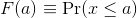
This is called the cumulative distribution function (CDF). When the CDF is derived from data, as opposed to theoretically, we also call it the empirical CDF (ECDF). The ECDF for the height data looks like this:
Histograms
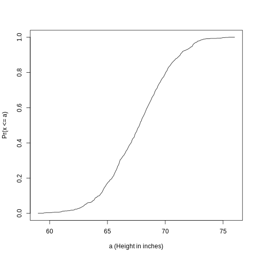
Although the empirical CDF concept is widely discussed in statistics textbooks, the plot is actually not very popular in practice. The reason is that histograms give us the same information and are easier to interpret. Histograms show us the proportion of values in intervals:
 Plotting these heights as
bars is what we call a histogram. It is a more useful plot
because we are usually more interested in intervals, such and such
percent are between 70 inches and 71 inches, etc., rather than the
percent less than a particular height. Here is a histogram of
heights:
Plotting these heights as
bars is what we call a histogram. It is a more useful plot
because we are usually more interested in intervals, such and such
percent are between 70 inches and 71 inches, etc., rather than the
percent less than a particular height. Here is a histogram of
heights:
R
hist(x, xlab="Height (in inches)", main="Adult men heights")
Showing this plot to the alien is much more informative than showing numbers. With this simple plot, we can approximate the number of individuals in any given interval. For example, there are about 70 individuals over six feet (72 inches) tall.
Probability Distribution
Summarizing lists of numbers is one powerful use of a distribution. An even more important use is describing the possible outcomes of a random variable. Unlike a fixed list of numbers, we don’t actually observe all possible outcomes of random variables, so instead of describing proportions, we describe probabilities. For instance, if we pick a random height from our list, then the probability of it falling between a and b is denoted with:
 Note that the X is
now capitalized to distinguish it as a random variable and that the
equation above defines the probability distribution of the random
variable. Knowing this distribution is incredibly useful in science. For
example, in the case above, if we know the distribution of the
difference in mean of mouse weights when the null hypothesis is true,
referred to as the null distribution, we can compute the
probability of observing a value as large as we did, referred to as a
p-value. In a previous section we ran what is called a
Monte Carlo simulation (we will provide more details on Monte
Carlo simulation in a later section) and we obtained 10,000 outcomes of
the random variable under the null hypothesis.
Note that the X is
now capitalized to distinguish it as a random variable and that the
equation above defines the probability distribution of the random
variable. Knowing this distribution is incredibly useful in science. For
example, in the case above, if we know the distribution of the
difference in mean of mouse weights when the null hypothesis is true,
referred to as the null distribution, we can compute the
probability of observing a value as large as we did, referred to as a
p-value. In a previous section we ran what is called a
Monte Carlo simulation (we will provide more details on Monte
Carlo simulation in a later section) and we obtained 10,000 outcomes of
the random variable under the null hypothesis.
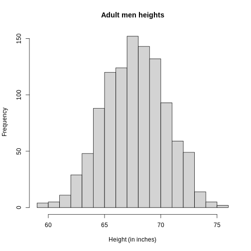
The observed values will amount to a histogram. From a histogram of
the null vector we calculated earlier, we can see that
values as large as obsdiff are relatively rare:
R
hist(null, freq=TRUE)
abline(v=obsdiff, col="red", lwd=2)
An important point to keep in mind here is that while we defined Pr(a) by counting cases, we will learn that, in some circumstances, mathematics gives us formulas for Pr(a) that save us the trouble of computing them as we did here. One example of this powerful approach uses the normal distribution approximation.
Normal Distribution
The probability distribution we see above approximates one that is very common in nature: the bell curve, also known as the normal distribution or Gaussian distribution. When the histogram of a list of numbers approximates the normal distribution, we can use a convenient mathematical formula to approximate the proportion of values or outcomes in any given interval:
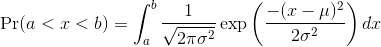
While the formula may look intimidating, don’t worry, you will never
actually have to type it out, as it is stored in a more convenient form
(as pnorm in R which sets a to -∞, and takes
b as an argument).
Here μ and σ are referred to as the mean and the standard deviation
of the population (we explain these in more detail in another section).
If this normal approximation holds for our list, then the
population mean and variance of our list can be used in the formula
above. An example of this would be when we noted above that only 1.5% of
values on the null distribution were above obsdiff. We can
compute the proportion of values below a value x with
pnorm(x, mu, sigma) without knowing all the values. The
normal approximation works very well here:
R
1 - pnorm(obsdiff, mean(null), sd(null))
OUTPUT
[1] 0.01311009Later, we will learn that there is a mathematical explanation for this. A very useful characteristic of this approximation is that one only needs to know μ and σ to describe the entire distribution. From this, we can compute the proportion of values in any interval.
Refer to the histogram of null values above. The code we just ran
represents everything to the right of the vertical red line, or 1 minus
everything to the left. Try running this code without the
1 - to understand this better.
R
pnorm(obsdiff, mean(null), sd(null))
OUTPUT
[1] 0.9868899This value represents everything to the left of the vertical red line in the null histogram above.
Summary
So computing a p-value for the difference in diet for the mice was pretty easy, right? But why are we not done? To make the calculation, we did the equivalent of buying all the mice available from The Jackson Laboratory and performing our experiment repeatedly to define the null distribution. Yet this is not something we can do in practice. Statistical Inference is the mathematical theory that permits you to approximate this with only the data from your sample, i.e. the original 24 mice. We will focus on this in the following sections.
Setting the random seed
Before we continue, we briefly explain the following important line of code:
R
set.seed(1)
Throughout this lesson, we use random number generators. This implies that many of the results presented can actually change by chance, including the correct answer to problems. One way to ensure that results do not change is by setting R’s random number generation seed. For more on the topic please read the help file:
R
?set.seed
Even better is to review an example. R has a built-in vector of
characters called LETTERS that contains upper case letters
of the Roman alphabet. We can take a sample of 5 letters with the
following code, which when repeated will give a different set of 5
letters each times.
R
LETTERS
OUTPUT
 [1] "A" "B" "C" "D" "E" "F" "G" "H" "I" "J" "K" "L" "M" "N" "O" "P" "Q" "R" "S"
[20] "T" "U" "V" "W" "X" "Y" "Z"
R
sample(LETTERS, 5)
OUTPUT
[1] "Y" "D" "G" "A" "B"R
sample(LETTERS, 5)
OUTPUT
[1] "W" "K" "N" "R" "S"R
sample(LETTERS, 5)
OUTPUT
[1] "A" "U" "Y" "J" "V"If we set a seed, we will get the same sample of letters each time.
R
set.seed(1)
sample(LETTERS, 5)
OUTPUT
[1] "Y" "D" "G" "A" "B"R
set.seed(1)
sample(LETTERS, 5)
OUTPUT
[1] "Y" "D" "G" "A" "B"R
set.seed(1)
sample(LETTERS, 5)
OUTPUT
[1] "Y" "D" "G" "A" "B"When we set a seed we ensure that we get the same results from random
number generation, which is used in sampling with
sample.
For the following exercises, we will be using the female controls
population dataset that we read into a variable called
population. Here population represents the
weights for the entire population of female mice. To remind ourselves
about this data set, run the following:
R
str(population)
OUTPUT
'data.frame':	225 obs. of  1 variable:
 $ Bodyweight: num  27 24.8 27 28.1 23.6 ...
R
head(population)
OUTPUT
  Bodyweight
1      27.03
2      24.80
3      27.02
4      28.07
5      23.55
6      22.72
R
summary(population)
OUTPUT
   Bodyweight
 Min.   :15.51
 1st Qu.:21.51
 Median :23.54
 Mean   :23.89
 3rd Qu.:26.08
Max. :36.84 Exercise 1
- What is the average of these weights?
- After setting the seed at 1, (
set.seed(1)) take a random sample of size 5.
What is the absolute value (abs()) of the difference between the average of the sample and the average of all the values? - After setting the seed at 5,
set.seed(5)take a random sample of size 5. What is the absolute value of the difference between the average of the sample and the average of all the values? - Why are the answers from 2 and 3 different?
- Because we made a coding mistake.
- Because the average of the population weights is random.
- Because the average of the samples is a random variable.
- All of the above.
mean(population$Bodyweight)set.seed(1)meanOfSample1 <- mean(sample(population$Bodyweight, 5))abs(meanOfSample1 - mean(population$Bodyweight))set.seed(5)meanOfSample2 <- mean(sample(population$Bodyweight, 5))abs(meanOfSample2 - mean(population$Bodyweight))- Because the average of the samples is a random variable.
Exercise 2
- Set the seed at 1, then using a for-loop take a random sample of 5 mice 1,000 times. Save these averages. What percent of these 1,000 averages are more than 1 gram away from the average of the population?
- We are now going to increase the number of times we redo the sample from 1,000 to 10,000. Set the seed at 1, then using a for-loop take a random sample of 5 mice 10,000 times. Save these averages. What percent of these 10,000 averages are more than 1 gram away from the average of the population?
- Note that the answers to the previous two questions barely changed.
This is expected. The way we think about the random value distributions
is as the distribution of the list of values obtained if we repeated the
experiment an infinite number of times. On a computer, we can’t perform
an infinite number of iterations so instead, for our examples, we
consider 1,000 to be large enough, thus 10,000 is as well. Now if
instead we change the sample size, then we change the random variable
and thus its distribution.
Set the seed at 1, then using a for-loop take a random sample of 50 mice 1,000 times. Save these averages. What percent of these 1,000 averages are more than 1 gram away from the average of the population?
-
set.seed(1)n <- 1000meanSampleOf5 <- vector("numeric", n)for (i in 1:n) {meanSampleOf5[i] <- mean(sample(population$Bodyweight, 5)}meanSampleOf5mean(population$Bodyweight)`
mean population weight plus one gram and minus one gram
meanPopWeight <- mean(population$Bodyweight) # mean
sdPopWeight <- sd(population$Bodyweight) # standard
deviation abline(v = meanPopWeight, col = "blue", lwd = 2)
abline(v = meanPopWeight + 1, col = "red", lwd = 2)
abline(v = meanPopWeight - 1, col = "red", lwd = 2)
proportion below mean population weight minus 1 gram
pnorm(meanPopWeight - 1, mean = meanPopWeight, sd = sdPopWeight)
proportion greater than mean population weight plus 1 gram
1 - pnorm(meanPopWeight + 1, mean = meanPopWeight, sd = sdPopWeight)
add the two together
pnorm(meanPopWeight - 1, mean = meanPopWeight, sd = sdPopWeight) +
1 - pnorm(meanPopWeight + 1, mean = meanPopWeight, sd = sdPopWeight)
2. set.seed(1)n <- 10000meanSampleOf5 <- vector("numeric", n)for (i in 1:n) {meanSampleOf5[i] <- mean(sample(population$Bodyweight, 5))}meanSampleOf5mean(population$Bodyweight)`
mean population weight plus one gram and minus one gram
meanPopWeight <- mean(population$Bodyweight) # mean
sdPopWeight <- sd(population$Bodyweight) # standard
deviation abline(v = meanPopWeight, col = "blue", lwd = 2)
abline(v = meanPopWeight + 1, col = "red", lwd = 2)
abline(v = meanPopWeight - 1, col = "red", lwd = 2)
proportion below mean population weight minus 1 gram
pnorm(meanPopWeight - 1, mean = meanPopWeight, sd = sdPopWeight)
proportion greater than mean population weight plus 1 gram
1 - pnorm(meanPopWeight + 1, mean = meanPopWeight, sd = sdPopWeight)
add the two together
pnorm(meanPopWeight - 1, mean = meanPopWeight, sd = sdPopWeight) +
1 - pnorm(meanPopWeight + 1, mean = meanPopWeight, sd = sdPopWeight)
3. set.seed(1)n <- 1000meanSampleOf50 <- vector("numeric", n)for (i in 1:n) {meanSampleOf50[i] <- mean(sample(population$Bodyweight, 50))}meanSampleOf50mean(population$Bodyweight)`
mean population weight plus one gram and minus one gram
abline(v = meanPopWeight, col = "blue", lwd = 2)
abline(v = meanPopWeight + 1, col = "red", lwd = 2)
abline(v = meanPopWeight - 1, col = "red", lwd = 2)
proportion below mean population weight minus 1 gram
pnorm(meanPopWeight - 1, mean = meanPopWeight, sd = sdPopWeight)
Exercise 3
Use a histogram to “look” at the distribution of averages we get with
a sample size of 5 and a sample size of 50. How would you say they
differ?
A) They are actually the same.
B) They both look roughly normal, but with a sample size of 50 the
spread is smaller.
C) They both look roughly normal, but with a sample size of 50 the
spread is larger.
D) The second distribution does not look normal at all.
Exercise 4
For the last set of averages, the ones obtained from a sample size of 50, what percent are between 23 and 25? Now ask the same question of a normal distribution with average 23.9 and standard deviation 0.43. The answer to the previous two were very similar. This is because we can approximate the distribution of the sample average with a normal distribution. We will learn more about the reason for this next.
- Inference uses sampling to investigate population parameters such as mean and standard deviation.
- A p-value describes the probability of obtaining a specific value.
- A distribution summarizes a set of numbers.
Content from Populations, Samples and Estimates
Last updated on 2026-03-24 | Edit this page
Overview
Questions
- What is a parameter from a population?
- What are sample estimates?
- How can we use sample estimates to make inferences about population parameters?
Objectives
- Understand the difference between parameters and statistics.
- Calculate population means and sample means.
- Calculate the difference between the means of two subgroups.
Populations, Samples and Estimates
We can never know the true mean or variance of an entire population. Why not? Because we can’t feasibly measure every member of a population. We can never know the true mean blood pressure of all mice, for example, even if all are from one strain, because we can’t afford to buy them all or even find them all. We can never know the true mean blood pressure of all people on a Western diet, for example, because we can’t possibly measure the entire population that’s on a Western diet. If we could measure all people on a Western diet, we really are interested in the difference in means between people on a Western vs. non high fat high sugar diet because we want to know what effect the diet has on people. If there is no difference in means, we can say that there is no effect of diet. If there is a difference in means, we can say that the diet has an effect. The question we are asking can be expressed as:
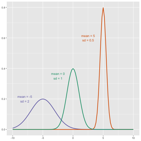
 We can even compare
more than two means. The three normal curves below help to visualize a
question comparing the means of each curve to one of the others.
We can even compare
more than two means. The three normal curves below help to visualize a
question comparing the means of each curve to one of the others.
We also want to know the variance from the mean, so that we have a sense of the spread of measurement around the mean.
In reality we use sample estimates of population parameters. The true population parameters that we are interested in are mean and standard deviation. Here we learn how taking a sample permits us to answer our questions about differences between groups. This is the essence of statistical inference.
Now that we have introduced the idea of a random variable, a null distribution, and a p-value, we are ready to describe the mathematical theory that permits us to compute p-values in practice. We will also learn about confidence intervals and power calculations.
Population parameters
A first step in statistical inference is to understand what population you are interested in. In the mouse weight example, we have two populations: female mice on control diets and female mice on high fat diets, with weight being the outcome of interest. We consider this population to be fixed, and the randomness comes from the sampling. One reason we have been using this dataset as an example is because we happen to have the weights of all the mice of this type. We download this file to our working directory and read in to R:
R
pheno <- read.csv(file = "./data/mice_pheno.csv")
We can then access the population values and determine, for example, how many we have. Here we compute the size of the control population:
R
controlPopulation <- filter(pheno, Sex == "F" & Diet == "chow") %>%
  select(Bodyweight) %>% unlist
length(controlPopulation)
OUTPUT
[1] 225We usually denote these values as x 1,…,xm. In this case, m is the number computed above. We can do the same for the high fat diet population:
R
hfPopulation <- filter(pheno, Sex == "F" & Diet == "hf") %>%
  select(Bodyweight) %>% unlist
length(hfPopulation)
OUTPUT
[1] 200and denote with y 1,…,yn.
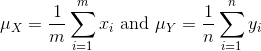
We can then define summaries of interest for these populations, such as the mean and variance.
The mean:
R
# X is the control population
sum(controlPopulation) # sum of the xsubi's
OUTPUT
[1] 5376.01R
length(controlPopulation) # this equals m
OUTPUT
[1] 225R
sum(controlPopulation)/length(controlPopulation) # this equals mu sub x
OUTPUT
[1] 23.89338R
# Y is the high fat diet population
sum(hfPopulation) # sum of the ysubi's
OUTPUT
[1] 5253.779R
sum(hfPopulation)/length(hfPopulation) # this equals mu sub y
OUTPUT
[1] 26.2689The variance:
with the standard deviation being the square root of the variance. We refer to such quantities that can be obtained from the population as population parameters. The question we started out asking can now be written mathematically: is μY - μX = 0 ?
Although in our illustration we have all the values and can check if this is true, in practice we do not. For example, in practice it would be prohibitively expensive to buy all the mice in a population. Here we learn how taking a sample permits us to answer our questions. This is the essence of statistical inference.
Sample estimates
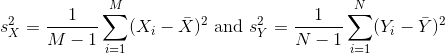
In the previous chapter, we obtained samples of 12 mice from each population. We represent data from samples with capital letters to indicate that they are random. This is common practice in statistics, although it is not always followed. So the samples are X 1,…,XM and Y 1,…,YN and, in this case, Ν=Μ=12. In contrast and as we saw above, when we list out the values of the population, which are set and not random, we use lower-case letters.
Since we want to know if μY - μX = 0, we consider the sample version: Ȳ-X̄ with:
Note that this difference of averages is also a random variable. Previously, we learned about the behavior of random variables with an exercise that involved repeatedly sampling from the original distribution. Of course, this is not an exercise that we can execute in practice. In this particular case it would involve buying 24 mice over and over again. Here we described the mathematical theory that mathematically relates X̄ to μX and Ȳ to μY, that will in turn help us understand the relationship between Ȳ-X̄ and μY - μX. Specifically, we will describe how the Central Limit Theorem permits us to use an approximation to answer this question, as well as motivate the widely used t-distribution.
Exercise
We will use the mouse phenotype data. Remove the observations that contain missing values:
pheno <- na.omit(pheno)
Use dplyr to create a vector x with the
body weight of all males on the control (chow) diet.
What is this population’s average body weight?
R
# Omit observations with missing data
pheno <- na.omit(pheno)

# Create subset of males on chow diet
x <- pheno %>%
  filter(Diet == "chow" & Sex == "M") %>%
  select(Bodyweight) %>%
  unlist

# Calculate mean weight
mean(x)
OUTPUT
[1] 30.96381Exercise (continued)
Set the seed at 1. Take a random sample X of size 25
from x. What is the sample average?
R
set.seed(1)
x_sample <- sample(x, 25)
mean(x_sample)
OUTPUT
[1] 30.5196Exercise (continued)
Use dplyr to create a vector y with the
body weight of all males on the high fat (hf) diet.
What is this population’s average?
R
# Create subset of males on high fat diet
y <- pheno %>%
  filter(Diet == "hf" & Sex == "M") %>%
  select(Bodyweight) %>%
  unlist

# Calculate the mean weight
mean(y)
OUTPUT
[1] 34.84793Exercise (continued)
Set the seed at 1. Take a random sample Y of size 25
from y. What is the sample average?
R
set.seed(1)
y_sample <- sample(y, 25)
mean(y_sample)
OUTPUT
[1] 35.8036Exercise (continued)
What is the difference in absolute value between x̄-ȳ and X̄-Ȳ?
R
# mu_x - mu_y
pop_mean_diff <- abs(mean(x) - mean(y))
# x-bar - y-bar
sample_mean_diff <- abs(mean(x_sample) - mean(y_sample))
# difference in absolute value between (mu_x - mu_y) - (x-bar - y-bar)
pop_sample_mean_diff <- abs(pop_mean_diff - sample_mean_diff)

pop_sample_mean_diff
OUTPUT
[1] 1.399884Exercise (continued)
Repeat the above for females. Make sure to set the seed to 1 before each sample call. What is the difference in absolute value between x̄-ȳ and X̄-Ȳ?
R
x_f <- pheno %>%
    filter(Diet == "chow" & Sex == "F") %>%
    select(Bodyweight) %>%
    unlist
mean(x_f)
OUTPUT
[1] 23.89338R
set.seed(1)
x_f_sample <- sample(x_f, 25)
mean(x_f_sample)
OUTPUT
[1] 24.2528R
y_f <- pheno %>%
    filter(Diet == "hf" & Sex == "F") %>%
    select(Bodyweight) %>%
    unlist
mean(y_f)
OUTPUT
[1] 26.2689R
set.seed(1)
y_f_sample <- sample(y_f, 25)
mean(y_f_sample)
OUTPUT
[1] 28.3828R
pop_mean_diff_f <- abs(mean(x_f) - mean(y_f))
sample_mean_diff_f <- abs(mean(x_f_sample) - mean(y_f_sample))
pop_sample_mean_diff_f <- abs(pop_mean_diff_f - sample_mean_diff_f)

pop_sample_mean_diff_f
OUTPUT
[1] 1.754483- Parameters are measures of populations.
- Statistics are measures of samples drawn from populations.
- Statistical inference is the process of using sample statistics to answer questions about population parameters.
Content from Central Limit Theorem and the t-distribution
Last updated on 2026-03-24 | Edit this page
Overview
Questions
- What is a parameter from a population?
Objectives
Central Limit Theorem and t-distribution
Below we will discuss the Central Limit Theorem (CLT) and the t-distribution, both of which help us make important calculations related to probabilities. Both are frequently used in science to test statistical hypotheses. To use these, we have to make different assumptions from those for the CLT and the t-distribution. However, if the assumptions are true, then we are able to calculate the exact probabilities of events through the use of mathematical formula.
Central Limit Theorem
The CLT is one of the most frequently used mathematical results in science. It tells us that when the sample size is large, the average Ȳ of a random sample follows a normal distribution centered at the population average μY and with standard deviation equal to the population standard deviation σY, divided by the square root of the sample size N. We refer to the standard deviation of the distribution of a random variable as the random variable’s standard error.
This implies that if we take many samples of size N, then the quantity:

is approximated with a normal distribution centered at 0 and with standard deviation 1.
We are interested in the difference between two sample averages. Again, applying certain mathematical principles, it can be implied that the below ratio:

is approximated by a normal distribution centered at 0 and standard deviation 1. Calculating p-values for the standard normal distribution is simple because we know the proportion of the distribution under any value. For example, only 5% of the values in the standard normal distribution are larger than 2 (in absolute value):
R
pnorm(-2) + (1 - pnorm(2))
OUTPUT
[1] 0.04550026We don’t need to buy more mice, 12 and 12 suffice.
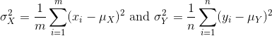
However, we can’t claim victory just yet because we don’t know the population standard deviations: σX and σY. These are unknown population parameters, but we can get around this by using the sample standard deviations, call them sX and sY. These are defined as:
Note that we are dividing by M-1 and N-1, instead of by M and N. There is a theoretical reason for doing this which we do not explain here.
So we can redefine our ratio as
if M = N or in general,

The CLT tells us that when M and N are large, this
random variable is normally distributed with mean 0 and SD 1. Thus we
can compute p-values using the function pnorm.
The t-distribution
The CLT relies on large samples, what we refer to as asymptotic results. When the CLT does not apply, there is another option that does not rely on asymptotic results. When the original population from which a random variable, say Y, is sampled is normally distributed with mean 0, then we can calculate the distribution of:

This is the ratio of two random variables so it is not necessarily normal. The fact that the denominator can be small by chance increases the probability of observing large values. William Sealy Gosset, an employee of the Guinness brewing company, deciphered the distribution of this random variable and published a paper under the pseudonym “Student”. The distribution is therefore called Student’s t-distribution. Later we will learn more about how this result is used.
Exercise 1
- If a list of numbers has a distribution that is well approximated by the normal distribution, what proportion of these numbers are within one standard deviation away from the list’s average?
- What proportion of these numbers are within two standard deviations away from the list’s average?
- What proportion of these numbers are within three standard deviations away from the list’s average?
- Define y to be the weights of males on the control diet. What
proportion of the mice are within one standard deviation away from the
average weight (remember to use
popsdfor the population sd)? - What proportion of these numbers are within two standard deviations away from the list’s average?
- What proportion of these numbers are within three standard deviations away from the list’s average?
- Note that the numbers for the normal distribution and our weights
are relatively close. Also, notice that we are indirectly comparing
quantiles of the normal distribution to quantiles of the mouse weight
distribution. We can actually compare all quantiles using a qqplot.
Which of the following best describes the qq-plot comparing mouse
weights to the normal distribution?
- The points on the qq-plot fall exactly on the identity line.
- The average of the mouse weights is not 0 and thus it can’t follow a
normal distribution.
- The mouse weights are well approximated by the normal distribution,
although the larger values (right tail) are larger than predicted by the
normal. This is consistent with the differences seen between question 3
and 6.
- These are not random variables and thus they can’t follow a normal distribution.
- Create the above qq-plot for the four populations: male/females on
each of the two diets. What is the most likely explanation for the mouse
weights being well approximated?
What is the best explanation for all these being well approximated by the normal distribution?
- The CLT tells us that sample averages are approximately
normal.
- This just happens to be how nature behaves, perhaps the result of
many biological factors averaging out.
- Everything measured in nature follows a normal distribution.
- Measurement error is normally distributed.
-
pnorm(1)-pnorm(-1)= 0.6826895 (68%) -
pnorm(2)-pnorm(-2)= 0.9544997 (95%) -
pnorm(3)-pnorm(-3)= 0.9973002 (99%) -
install.packages("rafalib")library(rafalib)pheno <- read.csv(file = "../data/mice_pheno.csv")y <- pheno %>%filter(Sex == "M" & Diet == "chow") %>%select(Bodyweight) %>%unlist()sigma <- popsd(y, na.rm = TRUE)# 4.420545mu <- mean(y, na.rm = TRUE)# 30.96381y %>%filter(Bodyweight > mu - sigma & Bodyweight < mu + sigma) %>%count()/nrow(y)# 0.6919643 (~68%)y %>%filter(Bodyweight > mu - 2*sigma & Bodyweight < mu + 2*sigma) %>%count()/nrow(y)# 0.9419643 (~95%)filter(Bodyweight > mu - 3*sigma & Bodyweight < mu + 3*sigma) %>%count()/nrow(y)# 0.9866071 (~99%)
Exercise 2
Here we are going to use the function replicate to learn
about the distribution of random variables. All the above exercises
relate to the normal distribution as an approximation of the
distribution of a fixed list of numbers or a population. We have not yet
discussed probability in these exercises. If the distribution of a list
of numbers is approximately normal, then if we pick a number at random
from this distribution, it will follow a normal distribution. However,
it is important to remember that stating that some quantity has a
distribution does not necessarily imply this quantity is random. Also,
keep in mind that this is not related to the central limit theorem. The
central limit applies to averages of random variables. Let’s explore
this concept.
We will now take a sample of size 25 from the population of males on the
chow diet. The average of this sample is our random variable. We will
use the replicate to observe 10,000 realizations of this random
variable.
- Set the seed at 1, generate these 10,000 averages.
set.seed(1)y <- filter(pheno, Sex=="M" & Diet=="chow") %>%select(Bodyweight) %>%unlistavgs <- replicate(10000, mean(sample(y,25))) - Make a histogram and qq-plot these 10,000 numbers against the normal
distribution.
mypar(1,2)hist(avgs)qqnorm(avgs)qqline(avgs)
We can see that, as predicted by the CLT, the distribution of the random variable is very well approximated by the normal distribution. - What is the average of the distribution of the sample average?
- What is the standard deviation of the distribution of sample
averages?
According to the CLT, the answer to the exercise above should be the same asmean(y). You should be able to confirm that these two numbers are very close. - Which of the following does the CLT tell us should be close to your
answer to this exercise?
-
popsd(y)
-
popsd(avgs)/sqrt(25)
-
sqrt(25) / popsd(y)
popsd(y)/sqrt(25)
Here we will use the mice phenotype data as an example. We start by creating two vectors, one for the control population and one for the high-fat diet population:
R
# pheno <- read.csv("mice_pheno.csv") #We downloaded this file in a previous section
controlPopulation <- filter(pheno, Sex == "F" & Diet == "chow") %>%
  select(Bodyweight) %>% unlist
hfPopulation <- filter(pheno, Sex == "F" & Diet == "hf") %>%
  select(Bodyweight) %>% unlist
It is important to keep in mind that what we are assuming to be normal here is the distribution of y1,y2,…,yn, not the random variable Ȳ. Although we can’t do this in practice, in this illustrative example, we get to see this distribution for both controls and high fat diet mice:
R
library(rafalib)
mypar(1,2)
hist(hfPopulation)
hist(controlPopulation)
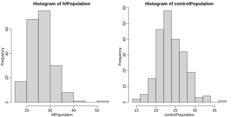
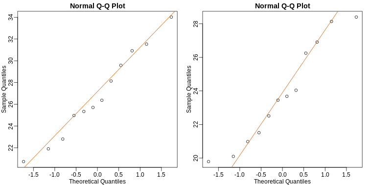
We can use qq-plots to confirm that the distributions are relatively close to being normally distributed. We will explore these plots in more depth in a later section, but the important thing to know is that it compares data (on the y-axis) against a theoretical distribution (on the x-axis). If the points fall on the identity line, then the data is close to the theoretical distribution.
R
mypar(1,2)
qqnorm(hfPopulation)
qqline(hfPopulation)
qqnorm(controlPopulation)
qqline(controlPopulation)
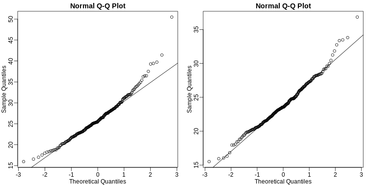
The larger the sample, the more forgiving the result is to the weakness of this approximation. In the next section, we will see that for this particular dataset the t-distribution works well even for sample sizes as small as 3.
All the above exercises relate to the normal distribution as an approximation of the distribution of a fixed list of numbers or a population. We have not yet discussed probability in these exercises. If the distribution of a list of numbers is approximately normal, then if we pick a number at random from this distribution, it will follow a normal distribution. However, it is important to remember that stating that some quantity has a distribution does not necessarily imply this quantity is random. Also, keep in mind that this is not related to the central limit theorem. The central limit applies to averages of random variables. Let’s explore this concept.
Exercise 3
We will now take a sample of size 25 from the population of males on
the chow diet. The average of this sample is our random variable. We
will use replicate to observe 10,000 realizations of this
random variable.
- Set the seed at 1.
- Generate these 10,000 averages.
- Make a histogram and qq-plot of these 10,000 numbers against the
normal distribution.
y <- filter(dat, Sex=="M" & Diet=="chow") %>%select(Bodyweight) %>%unlistavgs <- replicate(10000, mean( sample(y,25)))mypar(1,2)hist(avgs)qqnorm(avgs)qqline(avgs)
We can see that, as predicted by the CLT, the distribution of the random variable is very well approximated by the normal distribution. - What is the average of the distribution of the sample average?
- What is the standard deviation of the distribution of sample averages?
- According to the CLT, the answer to exercise 9 should be the same as
mean(y). You should be able to confirm that these two numbers are very close. Which of the following does the CLT tell us should be close to your answer to exercise 5?
-
popsd(y)
-
popsd(avgs) / sqrt(25)
-
sqrt(25) / popsd(y)
popsd(y) / sqrt(25)
- In practice we do not know
(popsd(y))which is why we can’t use the CLT directly. This is because we see a sample and not the entire distribution. We also can’t usepopsd(avgs)because to construct averages, we have to take 10,000 samples and this is never practical. We usually just get one sample. Instead we have to estimatepopsd(y). As described, what we use is the sample standard deviation.
Set the seed at 1. Using thereplicatefunction, create 10,000 samples of 25 and now, instead of the sample average, keep the standard deviation. Look at the distribution of the sample standard deviations. It is a random variable. The real population SD is about 4.5. What proportion of the sample SDs are below 3.5? - What the answer to question 7 reveals is that the denominator of the
t-test is a random variable. By decreasing the sample size, you can see
how this variability can increase. It therefore adds variability. The
smaller the sample size, the more variability is added. The normal
distribution stops providing a useful approximation. When the
distribution of the population values is approximately normal, as it is
for the weights, the t-distribution provides a better approximation. We
will see this later on. Here we will look at the difference between the
t-distribution and normal. Use the function
qtandqnormto get the quantiles ofx=seq(0.0001, 0.9999, len=300). Do this for degrees of freedom 3, 10, 30, and 100. Which of the following is true?
- The t-distribution and normal distribution are always the
same.
- The t-distribution has a higher average than the normal
distribution.
- The t-distribution has larger tails up until 30 degrees of freedom,
at which point itis practically the same as the normal
distribution.
- The variance of the t-distribution grows as the degrees of freedom grow.
- We can calculate the exact probabilities of events through using mathematical formulas.
- The Central Limit Theorem and t-distribution have different assumptions.
- Both can be used to calculate probabilities.
Content from Central Limit Theorem in practice
Last updated on 2026-03-24 | Edit this page
Overview
Questions
- How is the CLT used in practice?
Objectives
Central Limit Theorem in Practice
Let’s use our data to see how well the central limit theorem approximates sample averages from our data. We will leverage our entire population dataset to compare the results we obtain by actually sampling from the distribution to what the CLT predicts.
R
# pheno <- read.csv("mice_pheno.csv") #file was previously downloaded
head(pheno)
OUTPUT
  Sex Diet Bodyweight
1   F   hf      31.94
2   F   hf      32.48
3   F   hf      22.82
4   F   hf      19.92
5   F   hf      32.22
6   F   hf      27.50
Start by selecting only female mice since males and females have different weights. We will select three mice from each population.
R
library(dplyr)
controlPopulation <- filter(pheno, Sex == "F" & Diet == "chow") %>%
  select(Bodyweight) %>% unlist
hfPopulation <- filter(pheno, Sex == "F" & Diet == "hf") %>%
  select(Bodyweight) %>% unlist
We can compute the population parameters of interest using the mean function.
R
mu_hf <- mean(hfPopulation)
mu_control <- mean(controlPopulation)
print(mu_hf - mu_control)
OUTPUT
[1] 2.375517We can compute the population standard deviations of, say, a vector
x as well. However, we do not use the R function sd
because this function actually does not compute the population standard
deviation σx. Instead, sd assumes the
main argument is a random sample, say X, and provides an estimate
of σx, defined by sX above. As shown
in the equations above the actual final answer differs because one
divides by the sample size and the other by the sample size minus one.
We can see that with R code:
R
x <- controlPopulation
N <- length(x)
populationvar <- mean((x-mean(x))^2)
identical(var(x), populationvar)
OUTPUT
[1] FALSER
identical(var(x)*(N-1)/N, populationvar)
OUTPUT
[1] TRUESo to be mathematically correct, we do not use sd or
var. Instead, we use the popvar and
popsd function in rafalib:
R
library(rafalib)
sd_hf <- popsd(hfPopulation)
sd_control <- popsd(controlPopulation)
Remember that in practice we do not get to compute these population parameters. These are values we never see. In general, we want to estimate them from samples.
R
N <- 12
hf <- sample(hfPopulation, 12)
control <- sample(controlPopulation, 12)
As we described, the CLT tells us that for large N, each of these is approximately normal with average population mean and standard error population variance divided by N. We mentioned that a rule of thumb is that N should be 30 or more. However, that is just a rule of thumb since the preciseness of the approximation depends on the population distribution. Here we can actually check the approximation and we do that for various values of N.
Now we use sapply and replicate instead of
for loops, which makes for cleaner code (we do not have to
pre-allocate a vector, R takes care of this for us):
R
Ns <- c(3,12,25,50)
B <- 10000 #number of simulations
res <-  sapply(Ns,function(n) {
  replicate(B,mean(sample(hfPopulation,n))-mean(sample(controlPopulation,n)))
})
Now we can use qq-plots to see how well CLT approximations works for these. If in fact the normal distribution is a good approximation, the points should fall on a straight line when compared to normal quantiles. The more it deviates, the worse the approximation. In the title, we also show the average and SD of the observed distribution, which demonstrates how the SD decreases with √N as predicted.
R
mypar(2,2)
for (i in seq(along=Ns)) {
  titleavg <- signif(mean(res[,i]), 3)
  titlesd <- signif(popsd(res[,i]), 3)
  title <- paste0("N=", Ns[i]," Avg=", titleavg," SD=", titlesd)
  qqnorm(res[,i], main=title)
  qqline(res[,i], col=2)
}
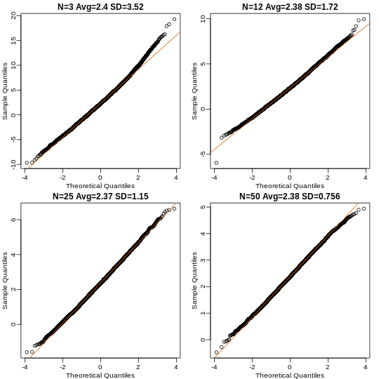
Here we see a pretty good fit even for 3. Why is this? Because the population itself is relatively close to normally distributed, the averages are close to normal as well (the sum of normals is also a normal). In practice, we actually calculate a ratio: we divide by the estimated standard deviation. Here is where the sample size starts to matter more.
R
Ns <- c(3, 12, 25, 50)
B <- 10000 #number of simulations
##function to compute a t-stat
computetstat <- function(n) {
  y <- sample(hfPopulation, n)
  x <- sample(controlPopulation, n)
  (mean(y) - mean(x))/sqrt(var(y)/n + var(x)/n)
}
res <-  sapply(Ns, function(n) {
  replicate(B, computetstat(n))
})
mypar(2,2)
for (i in seq(along=Ns)) {
  qqnorm(res[,i], main=Ns[i])
  qqline(res[,i], col=2)
}
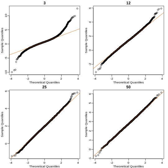
So we see that for N = 3, the CLT does not provide a usable approximation. For N = 12, there is a slight deviation at the higher values, although the approximation appears useful. For 25 and 50, the approximation is spot on.
This simulation only proves that N = 12 is large enough in this case, not in general. As mentioned above, we will not be able to perform this simulation in most situations. We only use the simulation to illustrate the concepts behind the CLT and its limitations. In future sections, we will describe the approaches we actually use in practice.
These exercises use the female mouse weights data set we have previously downloaded.
Exercise 1
The CLT is a result from probability theory. Much of probability
theory was originally inspired by gambling. This theory is still used in
practice by casinos. For example, they can estimate how many people need
to play slots for there to be a 99.9999% probability of earning enough
money to cover expenses. Let’s try a simple example related to gambling.
Suppose we are interested in the proportion of times we see a 6 when
rolling n=100 die. This is a random variable which we can simulate with
x=sample(1:6, n, replace=TRUE) and the proportion we are
interested in can be expressed as an average: mean(x==6).
Because the die rolls are independent, the CLT applies. We want to roll
n dice 10,000 times and keep these proportions. This random
variable (proportion of 6s) has mean p=1/6 and variance p ×
(1-p)/n. So according to CLT z =
(mean(x==6) - p) / sqrt(p * (1-p)/n) should be normal with
mean 0 and SD 1.
Set the seed to 1, then use replicate to perform the
simulation, and report what proportion of times z was larger than 2 in
absolute value (CLT says it should be about 0.05).
Exercise 2
For the last simulation you can make a qqplot to confirm
the normal approximation. Now, the CLT is an asympototic result, meaning
it is closer and closer to being a perfect approximation as the sample
size increases. In practice, however, we need to decide if it is
appropriate for actual sample sizes. Is 10 enough? 15? 30? In the
example used in exercise 1, the original data is binary (either 6 or
not). In this case, the success probability also affects the
appropriateness of the CLT. With very low probabilities, we need larger
sample sizes for the CLT to “kick in”. Run the simulation from exercise
1, but for different values of p and n. For which of the
following is the normal approximation best?
A) p=0.5 and n=5
B) p=0.5 and n=30
C) p=0.01 and n=30
D) p=0.01 and n=100
Exercise 3
As we have already seen, the CLT also applies to averages of
quantitative data. A major difference with binary data, for which we
know the variance is p(1 - p), is that with quantitative data we
need to estimate the population standard deviation. In several previous
exercises we have illustrated statistical concepts with the unrealistic
situation of having access to the entire population. In practice, we do
not have access to entire populations. Instead, we obtain one random
sample and need to reach conclusions analyzing that data.
pheno is an example of a typical simple dataset
representing just one sample. We have 12 measurements for each of two
populations:
X <- filter(dat, Diet=="chow") %>%select(Bodyweight) %>%unlistY <- filter(dat, Diet=="hf") %>%select(Bodyweight) %>%unlist
We think of X as a random sample from the population of all mice
in the control diet and Y as a random sample from the population
of all mice in the high fat diet.
- Define the parameter μx as the average of the control population. We estimate this parameter with the sample average X̄. What is the sample average?
- We don’t know μX, but want to use X̄ to understand
μX. Which of the following uses CLT to understand how
well X̄ approximates μX?
- X̄ follows a normal distribution with mean 0 and standard deviation
1.
-
μX follows a normal distribution with mean X̄ and
standard deviation σX/√12 where σX
is the population standard deviation.
- X̄ follows a normal distribution with mean μX and
standard deviation σX where σX is
the population standard deviation.
- X̄ follows a normal distribution with mean μX and standard deviation σX/√12 where σX is the population standard deviation.
- The result above tells us the distribution of the following random
variable:
 What does the CLT tell us is the mean
of Z (you don’t need code)?
What does the CLT tell us is the mean
of Z (you don’t need code)? - The result of 2 and 3 tell us that we know the distribution of the difference between our estimate and what we want to estimate, but don’t know. However, the equation involves the population standard deviation σX, which we don’t know. Given what we discussed, what is your estimate of σX?
- Use the CLT to approximate the probability that our estimate X̄ is off by more than 5.21 ounces from μX.
- Now we introduce the concept of a null hypothesis. We don’t know
μx nor μy. We want to quantify what
the data say about the possibility that the diet has no effect:
μx = μy. If we use CLT, then we approximate
the distribution of X̄ as normal with mean μX and
standard deviation σX and the distribution of Ȳ as
normal with mean μY and standard deviation
σY. This implies that the difference Ȳ - X̄ has mean 0.
We described that the standard deviation of this statistic (the standard
error) is
 and that we estimate the
population standard deviations σX and
σY with the sample estimates. What is the estimate of
and that we estimate the
population standard deviations σX and
σY with the sample estimates. What is the estimate of
- So now we can compute Ȳ - X̄ as well as an estimate of this standard error and construct a t-statistic. What is this t-statistic?
- If we apply the CLT, what is the distribution of this
t-statistic?
- Normal with mean 0 and standard deviation 1.
- t-distributed with 22 degrees of freedom.
- Normal with mean 0 and standard deviation

- t-distributed with 12 degrees of freedom.
- Now we are ready to compute a p-value using the CLT. What is the probability of observing a quantity as large as what we computed in 8, when the null distribution is true?
- CLT provides an approximation for cases in which the sample size is
large. In practice, we can’t check the assumption because we only get to
see 1 outcome (which you computed above). As a result, if this
approximation is off, so is our p-value. As described earlier, there is
another approach that does not require a large sample size, but rather
that the distribution of the population is approximately normal. We
don’t get to see this distribution so it is again an assumption,
although we can look at the distribution of the sample with
qqnorm(X)andqqnorm(Y). If we are willing to assume this, then it follows that the t-statistic follows t-distribution. What is the p-value under the t-distribution approximation? Hint: use thet.testfunction. - With the CLT distribution, we obtained a p-value smaller than 0.05
and with the t-distribution, one that is larger. They can’t both be
right. What best describes the difference?
- A sample size of 12 is not large enough, so we have to use the
t-distribution approximation.
- These are two different assumptions. The t-distribution accounts for
the variability introduced by the estimation of the standard error and
thus, under the null, large values are more probable under the null
distribution.
- The population data is probably not normally distributed so the
t-distribution approximation is wrong.
- Neither assumption is useful. Both are wrong.
- .
- .
- .
- .
Content from t-tests in practice
Last updated on 2026-03-24 | Edit this page
Overview
Questions
- How are t-tests used in practice?
Objectives
t-tests in Practice
Introduction
We will now demonstrate how to obtain a p-value in practice. We begin by loading experimental data and walking you through the steps used to form a t-statistic and compute a p-value. We can perform this task with just a few lines of code (go to the end of this section to see them). However, to understand the concepts, we will construct a t-statistic from “scratch”.
Read in and prepare data
We start by reading in the data. A first important step is to identify which rows are associated with treatment and control, and to compute the difference in mean.
R
fWeights <- read.csv(file = "./data/femaleMiceWeights.csv") # we read this data in earlier
control <- filter(fWeights, Diet=="chow") %>%
  select(Bodyweight) %>%
  unlist
treatment <- filter(fWeights, Diet=="hf") %>%
  select(Bodyweight) %>%
  unlist
diff <- mean(treatment) - mean(control)
print(diff)
OUTPUT
[1] 3.020833We are asked to report a p-value. What do we do? We learned that
diff, referred to as the observed effect size, is
a random variable. We also learned that under the null hypothesis, the
mean of the distribution of diff is 0. What about the
standard error? We also learned that the standard error of this random
variable is the population standard deviation divided by the square root
of the sample size:
We use the sample standard deviation as an estimate of the population
standard deviation. In R, we simply use the sd function and
the SE is:
R
sd(control)/sqrt(length(control))
OUTPUT
[1] 0.8725323This is the SE of the sample average, but we actually want the SE of
diff. We saw how statistical theory tells us that the
variance of the difference of two random variables is the sum of its
variances, so we compute the variance and take the square root:
R
se <- sqrt(
  var(treatment)/length(treatment) +
  var(control)/length(control)
  )
Statistical theory tells us that if we divide a random variable by its SE, we get a new random variable with an SE of 1.
R
tstat <- diff/se
This ratio is what we call the t-statistic. It’s the ratio of two random variables and thus a random variable. Once we know the distribution of this random variable, we can then easily compute a p-value.
As explained in the previous section, the CLT tells us that for large
sample sizes, both sample averages mean(treatment) and
mean(control) are normal. Statistical theory tells us that
the difference of two normally distributed random variables is again
normal, so CLT tells us that tstat is approximately normal
with mean 0 (the null hypothesis) and SD 1 (we divided by its SE).
So now to calculate a p-value all we need to do is ask: how often
does a normally distributed random variable exceed diff? R
has a built-in function, pnorm, to answer this specific
question. pnorm(a) returns the probability that a random
variable following the standard normal distribution falls below
a. To obtain the probability that it is larger than
a, we simply use 1-pnorm(a). We want to know
the probability of seeing something as extreme as diff:
either smaller (more negative) than -abs(diff) or larger
than abs(diff). We call these two regions “tails” and
calculate their size:
R
righttail <- 1 - pnorm(abs(tstat))
lefttail <- pnorm(-abs(tstat))
pval <- lefttail + righttail
print(pval)
OUTPUT
[1] 0.0398622In this case, the p-value is smaller than 0.05 and using the conventional cutoff of 0.05, we would call the difference statistically significant.
Now there is a problem. CLT works for large samples, but is 12 large enough? A rule of thumb for CLT is that 30 is a large enough sample size (but this is just a rule of thumb). The p-value we computed is only a valid approximation if the assumptions hold, which do not seem to be the case here. However, there is another option other than using CLT.
The t-distribution in Practice
As described earlier, statistical theory offers another useful result. If the distribution of the population is normal, then we can work out the exact distribution of the t-statistic without the need for the CLT. This is a big “if” given that, with small samples, it is hard to check if the population is normal. But for something like weight, we suspect that the population distribution is likely well approximated by normal and that we can use this approximation. Furthermore, we can look at a qq-plot for the samples. This shows that the approximation is at least close:
R
library(rafalib)
mypar(1,2)
qqnorm(treatment)
qqline(treatment, col=2)
qqnorm(control)
qqline(control, col=2)
If we use this approximation, then statistical theory tells us that
the distribution of the random variable tstat follows a
t-distribution. This is a much more complicated distribution than the
normal. The t-distribution has a location parameter like the normal and
another parameter called degrees of freedom. R has a nice
function that actually computes everything for us.
R
t.test(treatment, control)
OUTPUT
	Welch Two Sample t-test

data:  treatment and control
t = 2.0552, df = 20.236, p-value = 0.053
alternative hypothesis: true difference in means is not equal to 0
95 percent confidence interval:
 -0.04296563  6.08463229
sample estimates:
mean of x mean of y
 26.83417  23.81333
To see just the p-value, we can use the $ extractor:
R
result <- t.test(treatment,control)
result$p.value
OUTPUT
[1] 0.05299888The p-value is slightly bigger now. This is to be expected because
our CLT approximation considered the denominator of tstat
practically fixed (with large samples it practically is), while the
t-distribution approximation takes into account that the denominator
(the standard error of the difference) is a random variable. The smaller
the sample size, the more the denominator varies.
It may be confusing that one approximation gave us one p-value and another gave us another, because we expect there to be just one answer. However, this is not uncommon in data analysis. We used different assumptions, different approximations, and therefore we obtained different results.
Later, in the power calculation section, we will describe type I and type II errors. As a preview, we will point out that the test based on the CLT approximation is more likely to incorrectly reject the null hypothesis (a false positive), while the t-distribution is more likely to incorrectly accept the null hypothesis (false negative).
Running the t-test in practice
Now that we have gone over the concepts, we can show the relatively simple code that one would use to actually compute a t-test:
R
control <- filter(fWeights, Diet=="chow") %>%
  select(Bodyweight) %>%
  unlist
treatment <- filter(fWeights, Diet=="hf") %>%
  select(Bodyweight) %>%
  unlist
t.test(treatment, control)
OUTPUT
	Welch Two Sample t-test

data:  treatment and control
t = 2.0552, df = 20.236, p-value = 0.053
alternative hypothesis: true difference in means is not equal to 0
95 percent confidence interval:
 -0.04296563  6.08463229
sample estimates:
mean of x mean of y
 26.83417  23.81333
The arguments to t.test can be of type
data.frame and thus we do not need to unlist them into numeric
objects.
- .
- .
- .
- .
Content from Confidence Intervals
Last updated on 2026-03-24 | Edit this page
Overview
Questions
- What is a confidence interval?
- When is it best to use a confidence interval?
Objectives
- Define a confidence interval.
- Explain why confidence intervals offer more information than p-values alone.
- Calculate a confidence interval.
Confidence Intervals
We have described how to compute p-values which are ubiquitous in the life sciences. However, we do not recommend reporting p-values as the only statistical summary of your results. The reason is simple: statistical significance does not guarantee scientific significance. With large enough sample sizes, one might detect a statistically significance difference in weight of, say, 1 microgram. But is this an important finding? Would we say a diet results in higher weight if the increase is less than a fraction of a percent? The problem with reporting only p-values is that you will not provide a very important piece of information: the effect size. Recall that the effect size is the observed difference. Sometimes the effect size is divided by the mean of the control group and so expressed as a percent increase.
A much more attractive alternative is to report confidence intervals. A confidence interval includes information about your estimated effect size and the uncertainty associated with this estimate. Here we use the mice data to illustrate the concept behind confidence intervals.
Confidence Interval for Population Mean
Before we show how to construct a confidence interval for the difference between the two groups, we will show how to construct a confidence interval for the population mean of control female mice. Then we will return to the group difference after we’ve learned how to build confidence intervals in the simple case. We start by reading in the data and selecting the appropriate rows:
R
pheno <- read.csv("./data/mice_pheno.csv") # we read this in earlier
chowPopulation <- pheno %>%
  filter(Sex=="F" & Diet=="chow") %>%
  select(Bodyweight) %>%
  unlist
The population average μX is our parameter of interest here:
R
mu_chow <- mean(chowPopulation)
print(mu_chow)
OUTPUT
[1] 23.89338We are interested in estimating this parameter. In practice, we do not get to see the entire population so, as we did for p-values, we demonstrate how we can use samples to do this. Let’s start with a sample of size 30:
R
N <- 30
chow <- sample(chowPopulation, N)
print(mean(chow))
OUTPUT
[1] 24.03267We know this is a random variable, so the sample average will not be a perfect estimate. In fact, because in this illustrative example we know the value of the parameter, we can see that they are not exactly the same. A confidence interval is a statistical way of reporting our finding, the sample average, in a way that explicitly summarizes the variability of our random variable.
With a sample size of 30, we will use the CLT. The CLT tells us that
X̄ or mean(chow) follows a normal distribution with mean
μX or mean(chowPopulation) and standard
error approximately sX / √N or:
R
se <- sd(chow)/sqrt(N)
print(se)
OUTPUT
[1] 0.6875646Defining the Interval
A 95% confidence interval (we can use percentages other than 95%) is a random interval with a 95% probability of falling on the parameter we are estimating. Keep in mind that saying 95% of random intervals will fall on the true value (our definition above) is not the same as saying there is a 95% chance that the true value falls in our interval. To construct it, we note that the CLT tells us that √N (X̄ - μX) / sX follows a normal distribution with mean 0 and SD 1. This implies that the probability of this event:
which written in R code is:
R
pnorm(2) - pnorm(-2)
OUTPUT
[1] 0.9544997…is about 95% (to get closer use qnorm(1 - 0.05/2)
instead of 2). Now do some basic algebra to clear out everything and
leave μX alone in the middle and you get that the
following event:

has a probability of 95%.
Be aware that it is the edges of the interval X̄ ± 2sX / √N, not μX, that are random. Again, the definition of the confidence interval is that 95% of random intervals will contain the true, fixed value μX. For a specific interval that has been calculated, the probability is either 0 or 1 that it contains the fixed population mean μX.
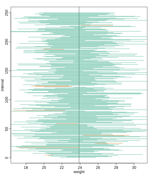
Let’s demonstrate this logic through simulation. We can construct this interval with R relatively easily:
R
Q <- qnorm(1 - 0.05/2)
interval <- c(mean(chow) - Q * se, mean(chow) + Q * se )
interval
OUTPUT
[1] 22.68506 25.38027R
interval[1] < mu_chow & interval[2] > mu_chow
OUTPUT
[1] TRUEwhich happens to cover μX or
mean(chowPopulation). However, we can take another sample
and we might not be as lucky. In fact, the theory tells us that we will
cover μX 95% of the time. Because we have access to
the population data, we can confirm this by taking several new
samples:
R
library(rafalib)
B <- 250
mypar()
plot(mean(chowPopulation) + c(-7,7), c(1,1), type="n",
     xlab="weight", ylab="interval", ylim=c(1,B))
abline(v=mean(chowPopulation))
for (i in 1:B) {
  chow <- sample(chowPopulation,N)
  se <- sd(chow)/sqrt(N)
  interval <- c(mean(chow) - Q * se, mean(chow) + Q * se)
  covered <-
    mean(chowPopulation) <= interval[2] & mean(chowPopulation) >= interval[1]
  color <- ifelse(covered,1,2)
  lines(interval, c(i,i),col=color)
}
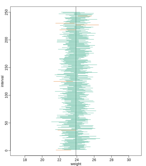
You can run this repeatedly to see what happens. You will see that in about 5% of the cases, we fail to cover μX.
Small Sample Size and the CLT
For N = 30, the CLT works very well. However, if N = 5, do these confidence intervals work as well? We used the CLT to create our intervals, and with N = 5 it may not be as useful an approximation. We can confirm this with a simulation:
R
mypar()
plot(mean(chowPopulation) + c(-7,7), c(1,1), type="n",
     xlab="weight", ylab="interval", ylim=c(1,B))
abline(v=mean(chowPopulation))
Q <- qnorm(1- 0.05/2)
N <- 5
for (i in 1:B) {
  chow <- sample(chowPopulation, N)
  se <- sd(chow)/sqrt(N)
  interval <- c(mean(chow) - Q * se, mean(chow) + Q * se)
  covered <- mean(chowPopulation) <= interval[2] & mean(chowPopulation) >= interval[1]
  color <- ifelse(covered,1,2)
  lines(interval, c(i,i),col=color)
}
Despite the intervals being larger (we are dividing by √5
instead of √30 ), we see many more intervals not covering
μX. This is because the CLT is incorrectly telling us
that the distribution of the mean(chow) is approximately
normal with standard deviation 1 when, in fact, it has a larger standard
deviation and a fatter tail (the parts of the distribution going to ±
∞). This mistake affects us in the calculation of Q,
which assumes a normal distribution and uses qnorm. The
t-distribution might be more appropriate. All we have to do is re-run
the above, but change how we calculate Q to use
qt instead of qnorm.
R
mypar()
plot(mean(chowPopulation) + c(-7,7), c(1,1), type="n",
     xlab="weight", ylab="interval", ylim=c(1,B))
abline(v=mean(chowPopulation))
##Q <- qnorm(1- 0.05/2) ##no longer normal so use:
Q <- qt(1 - 0.05/2, df=4)
N <- 5
for (i in 1:B) {
  chow <- sample(chowPopulation, N)
  se <- sd(chow)/sqrt(N)
  interval <- c(mean(chow) - Q * se, mean(chow) + Q * se )
  covered <- mean(chowPopulation) <= interval[2] & mean(chowPopulation) >= interval[1]
  color <- ifelse(covered,1,2)
  lines(interval, c(i,i),col=color)
}
Now the intervals are made bigger. This is because the t-distribution has fatter tails and therefore:
R
qt(1 - 0.05/2, df=4)
OUTPUT
[1] 2.776445is bigger than…
R
qnorm(1 - 0.05/2)
OUTPUT
[1] 1.959964…which makes the intervals larger and hence cover μX more frequently; in fact, about 95% of the time.
Connection Between Confidence Intervals and p-values
We recommend that in practice confidence intervals be reported instead of p-values. If for some reason you are required to provide p-values, or required that your results are significant at the 0.05 of 0.01 levels, confidence intervals do provide this information.
If we are talking about a t-test p-value, we are asking if differences as extreme as the one we observe, Ȳ - X̄, are likely when the difference between the population averages is actually equal to zero. So we can form a confidence interval with the observed difference. Instead of writing Ȳ - X̄ repeatedly, let’s define this difference as a new variable d ≡ Ȳ - X̄.
Suppose you use CLT and report
 with
with
as a 95% confidence interval for the difference and this interval does not include 0 (a false positive). Because the interval does not include 0, this implies that either
 or
or
 This suggests that either
 or
or
 This then implies that the
t-statistic is more extreme than 2, which in turn suggests that the
p-value must be smaller than 0.05 (approximately, for a more exact
calculation use
This then implies that the
t-statistic is more extreme than 2, which in turn suggests that the
p-value must be smaller than 0.05 (approximately, for a more exact
calculation use qnorm(.05/2) instead of 2). The same
calculation can be made if we use the t-distribution instead of CLT
(with qt(.05/2, df = 2 * N-2)). In summary, if a 95% or 99%
confidence interval does not include 0, then the p-value must be smaller
than 0.05 or 0.01 respectively.
Note that the confidence interval for the difference d is
provided by the t.test function:
R
controlIndex <- which(pheno$Diet=="chow")
treatmentIndex <- which(pheno$Diet=="hf")
control <- pheno[controlIndex, 3]
treatment <- pheno[treatmentIndex, 3]
R
t.test(treatment, control)$conf.int
OUTPUT
[1] 2.231533 3.906857
attr(,"conf.level")
[1] 0.95
In this case, the 95% confidence interval does include 0 and we observe that the p-value is larger than 0.05 as predicted. If we change this to a 90% confidence interval, then:
R
t.test(treatment, control, conf.level=0.9)$conf.int
OUTPUT
[1] 2.366479 3.771911
attr(,"conf.level")
[1] 0.9
0 is no longer in the confidence interval (which is expected because the p-value is smaller than 0.10).
- A confidence intervals is a better alternative to reporting p-values alone.
- A confidence interval estimates effect size and the uncertainty associated with this estimate.
Content from Power Calculations
Last updated on 2026-03-24 | Edit this page
Overview
Questions
- What is statistical power?
- How is power calculated?
Objectives
Power Calculations
Introduction
We have used the example of the effects of two different diets on the weight of mice. Since in this illustrative example we have access to the population, we know that in fact there is a substantial (about 10%) difference between the average weights of the two populations:
R
library(dplyr)
pheno <- read.csv("./data/mice_pheno.csv") # Previously downloaded

controlPopulation <- filter(pheno, Sex == "F" & Diet == "chow") %>%
  select(Bodyweight) %>% unlist

hfPopulation <- filter(pheno, Sex == "F" & Diet == "hf") %>%
  select(Bodyweight) %>% unlist

mu_hf <- mean(hfPopulation)
mu_control <- mean(controlPopulation)
print(mu_hf - mu_control)
OUTPUT
[1] 2.375517R
print((mu_hf - mu_control)/mu_control * 100) #percent increase
OUTPUT
[1] 9.942157We have also seen that, in some cases, when we take a sample and perform a t-test, we don’t always get a p-value smaller than 0.05. For example, here is a case where we take a sample of 5 mice and don’t achieve statistical significance at the 0.05 level:
R
set.seed(1)
N <- 5
hf <- sample(hfPopulation, N)
control <- sample(controlPopulation, N)
t.test(hf, control)$p.value
OUTPUT
[1] 0.5806661Did we make a mistake? By not rejecting the null hypothesis, are we saying the diet has no effect? The answer to this question is no. All we can say is that we did not reject the null hypothesis. But this does not necessarily imply that the null is true. The problem is that, in this particular instance, we don’t have enough power, a term we are now going to define. If you are doing scientific research, it is very likely that you will have to do a power calculation at some point. In many cases, it is an ethical obligation as it can help you avoid sacrificing mice unnecessarily or limiting the number of human subjects exposed to potential risk in a study. Here we explain what statistical power means.
Types of Error
Whenever we perform a statistical test, we are aware that we may make a mistake. This is why our p-values are not 0. Under the null, there is always a positive, perhaps very small, but still positive chance that we will reject the null when it is true. If the p-value is 0.05, it will happen 1 out of 20 times. This error is called type I error by statisticians.
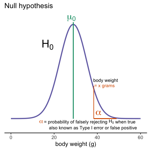
A type I error is defined as rejecting the null when we should not. This is also referred to as a false positive. So why do we then use 0.05? Shouldn’t we use 0.000001 to be really sure? The reason we don’t use infinitesimal cut-offs to avoid type I errors at all cost is that there is another error we can commit: to not reject the null when we should. This is called a type II error or a false negative.
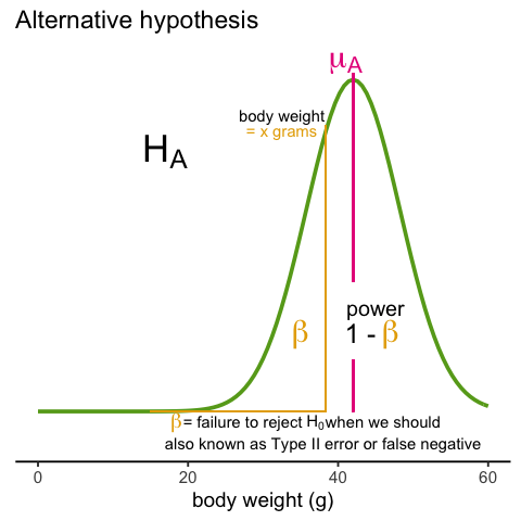
The R code analysis above shows an example of a false negative: we did not reject the null hypothesis (at the 0.05 level) and, because we happen to know and peeked at the true population means, we know there is in fact a difference. Had we used a p-value cutoff of 0.25, we would not have made this mistake. However, in general, are we comfortable with a type I error rate of 1 in 4? Usually we are not.
The 0.05 and 0.01 Cut-offs Are Arbitrary
Most journals and regulatory agencies frequently insist that results be significant at the 0.01 or 0.05 levels. Of course there is nothing special about these numbers other than the fact that some of the first papers on p-values used these values as examples. Part of the goal of this book is to give readers a good understanding of what p-values and confidence intervals are so that these choices can be judged in an informed way. Unfortunately, in science, these cut-offs are applied somewhat mindlessly, but that topic is part of a complicated debate.
Power Calculation
Power is the probability of rejecting the null when the null is false. Of course “when the null is false” is a complicated statement because it can be false in many ways.
could be anything and the power actually depends on this parameter.
It also depends on the standard error of your estimates which in turn
depends on the sample size and the population standard deviations. In
practice, we don’t know these so we usually report power for several
plausible values of Δ, σX, σY and various
sample sizes. Statistical theory gives us formulas to calculate power.
The pwr package performs these calculations for you. Here
we will illustrate the concepts behind power by coding up simulations in
R.
Suppose our sample size is:
R
N <- 12
and we will reject the null hypothesis at:
R
alpha <- 0.05
What is our power with this particular data? We will compute this probability by re-running the exercise many times and calculating the proportion of times the null hypothesis is rejected. Specifically, we will run:
R
B <- 2000
simulations. The simulation is as follows: we take a sample of size
N from both control and treatment groups, we perform a t-test
comparing these two, and report if the p-value is less than
alpha or not. We write a function that does this:
R
reject <- function(N, alpha=0.05){
   hf <- sample(hfPopulation, N)
   control <- sample(controlPopulation, N)
   pval <- t.test(hf, control)$p.value
   pval < alpha
}
Here is an example of one simulation for a sample size of 12. The
call to reject answers the question “Did we reject?”
R
reject(12)
OUTPUT
[1] TRUENow we can use the replicate function to do this
B times.
R
rejections <- replicate(B, reject(N))
Our power is just the proportion of times we correctly reject. So with N = 12 our power is only:
R
mean(rejections)
OUTPUT
[1] 0.2155This explains why the t-test was not rejecting when we knew the null was false. With a sample size of just 12, our power is about 23%. To guard against false positives at the 0.05 level, we had set the threshold at a high enough level that resulted in many type II errors.
Let’s see how power improves with N. We will use the function
sapply, which applies a function to each of the elements of
a vector. We want to repeat the above for the following sample size:
R
Ns <- seq(5, 50, 5)
So we use apply like this:
R
power <- sapply(Ns,function(N){
  rejections <- replicate(B, reject(N))
  mean(rejections)
  })
For each of the three simulations, the above code returns the proportion of times we reject. Not surprisingly power increases with N:
R
plot(Ns, power, type="b")
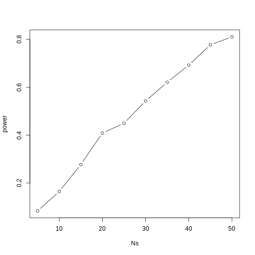
Similarly, if we change the level alpha at which we
reject, power changes. The smaller I want the chance of type I error to
be, the less power I will have. Another way of saying this is that we
trade off between the two types of error. We can see this by writing
similar code, but keeping N fixed and considering several
values of alpha:
R
N <- 30
alphas <- c(0.1, 0.05, 0.01, 0.001, 0.0001)
power <- sapply(alphas, function(alpha){
  rejections <- replicate(B, reject(N, alpha=alpha))
  mean(rejections)
})
plot(alphas, power, xlab="alpha", type="b", log="x")
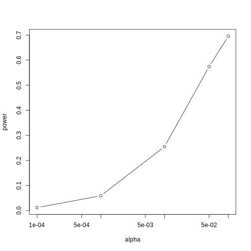
Note that the x-axis in this last plot is in the log scale.
There is no “right” power or “right” alpha level, but it is important that you understand what each means.
To see this clearly, you could create a plot with curves of power versus N. Show several curves in the same plot with color representing alpha level.
p-values Are Arbitrary under the Alternative Hypothesis
Another consequence of what we have learned about power is that p-values are somewhat arbitrary when the null hypothesis is not true and therefore the alternative hypothesis is true (the difference between the population means is not zero). When the alternative hypothesis is true, we can make a p-value as small as we want simply by increasing the sample size (supposing that we have an infinite population to sample from). We can show this property of p-values by drawing larger and larger samples from our population and calculating p-values. This works because, in our case, we know that the alternative hypothesis is true, since we have access to the populations and can calculate the difference in their means.
First write a function that returns a p-value for a given sample size N:
R
calculatePvalue <- function(N) {
   hf <- sample(hfPopulation,N)
   control <- sample(controlPopulation,N)
   t.test(hf,control)$p.value
}
We have a limit here of 200 for the high-fat diet population, but we can see the effect well before we get to 200. For each sample size, we will calculate a few p-values. We can do this by repeating each value of N a few times.
R
Ns <- seq(10,200,by=10)
Ns_rep <- rep(Ns, each=10)
Again we use sapply to run our simulations:
R
pvalues <- sapply(Ns_rep, calculatePvalue)
Now we can plot the 10 p-values we generated for each sample size:
R
plot(Ns_rep, pvalues, log="y", xlab="sample size",
     ylab="p-values")
abline(h=c(.01, .05), col="red", lwd=2)
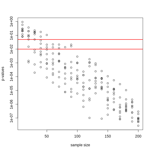
Note that the y-axis is log scale and that the p-values show a decreasing trend all the way to 10-8 as the sample size gets larger. The standard cutoffs of 0.01 and 0.05 are indicated with horizontal red lines.
It is important to remember that p-values are not more interesting as they become very very small. Once we have convinced ourselves to reject the null hypothesis at a threshold we find reasonable, having an even smaller p-value just means that we sampled more mice than was necessary. Having a larger sample size does help to increase the precision of our estimate of the difference Δ, but the fact that the p-value becomes very very small is just a natural consequence of the mathematics of the test. The p-values get smaller and smaller with increasing sample size because the numerator of the t-statistic has √N (for equal sized groups, and a similar effect occurs when M ≠ N). Therefore, if Δ is non-zero, the t-statistic will increase with N.
Therefore, a better statistic to report is the effect size with a confidence interval or some statistic which gives the reader a sense of the change in a meaningful scale. We can report the effect size as a percent by dividing the difference and the confidence interval by the control population mean:
R
N <- 12
hf <- sample(hfPopulation, N)
control <- sample(controlPopulation, N)
diff <- mean(hf) - mean(control)
diff / mean(control) * 100
OUTPUT
[1] 5.196293R
t.test(hf, control)$conf.int / mean(control) * 100
OUTPUT
[1] -7.775307 18.167892
attr(,"conf.level")
[1] 0.95
In addition, we can report a statistic called Cohen’s d, which is the difference between the groups divided by the pooled standard deviation of the two groups.
R
sd_pool <- sqrt(((N-1) * var(hf) + (N-1) * var(control))/(2 * N - 2))
diff / sd_pool
OUTPUT
[1] 0.3397886This tells us how many standard deviations of the data the mean of the high-fat diet group is from the control group. Under the alternative hypothesis, unlike the t-statistic which is guaranteed to increase, the effect size and Cohen’s d will become more precise.
Exercises
For these exercises we will load the babies dataset from babies.txt.
We will use this data to review the concepts behind the p-values and
then test confidence interval concepts.
library(downloader)url<-"https://raw.githubusercontent.com/genomicsclass/dagdata/master/inst/extdata/babies.txt"filename <- basename(url)download(url, destfile=filename)babies <- read.table("babies.txt", header=TRUE)
This is a large dataset (1,236 cases), and we will pretend that it
contains the entire population in which we are interested. We will study
the differences in birth weight between babies born to smoking and
non-smoking mothers. First, let’s split this into two birth weight
datasets: one of birth weights to non-smoking mothers and the other of
birth weights to smoking mothers.bwt.nonsmoke <- filter(babies, smoke==0) %>%select(bwt) %>%unlistbwt.smoke <- filter(babies, smoke==1) %>%select(bwt) %>%unlist
Now, we can look for the true population difference in means between
smoking and non-smoking birth weights.library(rafalib)mean(bwt.nonsmoke) - mean(bwt.smoke)popsd(bwt.nonsmoke)popsd(bwt.smoke)
The population difference of mean birth weights is about 8.9 ounces. The
standard deviations of the nonsmoking and smoking groups are about 17.4
and 18.1 ounces, respectively. As we did with the mouse weight data,
this assessment interactively reviews inference concepts using
simulations in R. We will treat the babies dataset as the full
population and draw samples from it to simulate individual experiments.
We will then ask whether somebody who only received the random samples
would be able to draw correct conclusions about the population. We are
interested in testing whether the birth weights of babies born to
non-smoking mothers are significantly different from the birth weights
of babies born to smoking mothers.
- Set the seed at 1 and obtain two samples, each of size N =
25, from non-smoking mothers (
dat.ns) and smoking mothers (dat.s). Compute the t-statistic (call ittval). - Recall that we summarize our data using a t-statistic because we
know that in situations where the null hypothesis is true (what we mean
when we say “under the null”) and the sample size is relatively large,
this t-value will have an approximate standard normal distribution.
Because we know the distribution of the t-value under the null, we can
quantitatively determine how unusual the observed t-value would be if
the null hypothesis were true. The standard procedure is to examine the
probability a t-statistic that actually does follow the null hypothesis
would have larger absolute value than the absolute value of the t-value
we just observed – this is called a two-sided test. We have computed
these by taking one minus the area under the standard normal curve
between
-abs(tval)andabs(tval). In R, we can do this by using thepnormfunction, which computes the area under a normal curve from negative infinity up to the value given as its first argument: - Because of the symmetry of the standard normal distribution, there
is a simpler way to calculate the probability that a t-value under the
null could have a larger absolute value than
tval. Choose the simplified calculation from the following:
- 1 - 2 * pnorm(abs(tval))
- 1 - 2 * pnorm(-abs(tval))
- 1 - pnorm(-abs(tval))
- 2 * pnorm(-abs(tval))
- By reporting only p-values, many scientific publications provide an
incomplete story of their findings. As we have mentioned, with very
large sample sizes, scientifically insignificant differences between two
groups can lead to small p-values. Confidence intervals are more
informative as they include the estimate itself. Our estimate of the
difference between babies of smoker and non-smokers:
mean(dat.s) - mean(dat.ns). If we use the CLT, what quantity would we add and subtract to this estimate to obtain a 99% confidence interval? - If instead of CLT, we use the t-distribution approximation, what do we add and subtract (use 2 * N - 2 degrees of freedom)?
- Why are the values from 4 and 5 so similar?
- Coincidence.
- They are both related to 99% confidence intervals.
- N and thus the degrees of freedom is large enough to make the normal
and t-distributions very similar.
- They are actually quite different, differing by more than 1 ounce.
- No matter which way you compute it, the p-value
pvalis the probability that the null hypothesis could have generated a t-statistic more extreme than what we observed:tval. If the p-value is very small, this means that observing a value more extreme thantvalwould be very rare if the null hypothesis were true, and would give strong evidence that we should reject the null hypothesis. We determine how small the p-value needs to be to reject the null by deciding how often we would be willing to mistakenly reject the null hypothesis.
The standard decision rule is the following: choose some small value α (in most disciplines the conventional choice is α 0:05) and reject the null hypothesis if the p-value is less than α. We call the significance level of the test.
It turns out that if we follow this decision rule, the probability that we will reject the null hypothesis by mistake is equal to α. (This fact is not immediately obvious and requires some probability theory to show.) We call the event of rejecting the null hypothesis, when it is in fact true, a Type I error, we call the probability of making a Type I error, the Type I error rate, and we say that rejecting the null hypothesis when the p-value is less than α, controls the Type I error rate so that it is equal to α. We will see a number of decision rules that we use in order to control the probabilities of other types of errors. Often, we will guarantee that the probability of an error is less than some level, but, in this case, we can guarantee that the probability of a Type I error is exactly equal to α.
Which of the following sentences about a Type I error is not true?
- The following is another way to describe a Type I error: you decided
to reject the null hypothesis on the basis of data that was actually
generated by the null hypothesis.
- The following is the another way to describe a Type I error: due to
random fluctuations, even though the data you observed were actually
generated by the null hypothesis, the p-value calculated from the
observed data was small, so you rejected it.
- From the original data alone, you can tell whether you have made a
Type I error.
- In scientific practice, a Type I error constitutes reporting a “significant” result when there is actually no result.
- In the simulation we have set up here, we know the null hypothesis
is false – the true value of difference in means is actually around 8.9.
Thus, we are concerned with how often the decision rule outlined in the
last section allows us to conclude that the null hypothesis is actually
false. In other words, we would like to quantify the Type II error rate
of the test, or the probability that we fail to reject the null
hypothesis when the alternative hypothesis is true.
Unlike the Type I error rate, which we can characterize by assuming that the null hypothesis of “no difference” is true, the Type II error rate cannot be computed by assuming the alternative hypothesis alone because the alternative hypothesis alone does not specify a particular value for the difference. It thus does not nail down a specific distribution for thet-value under the alternative.
For this reason, when we study the Type II error rate of a hypothesis testing procedure, we need to assume a particular effect size, or hypothetical size of the difference between population means, that we wish to target. We ask questions such as “what is the smallest difference I could reliably distinguish from 0 given my sample size N?” or, more commonly,“How big does N have to be in order to detect that the absolute value of the difference is greater than zero?” Type II error control plays a major role in designing data collection procedures before you actually see the data, so that you know the test you will run has enough sensitivity or power. Power is one minus the Type II error rate, or the probability that you will reject the null hypothesis when the alternative hypothesis is true.
There are several aspects of a hypothesis test that affect its power for a particular effect size. Intuitively, setting a lower α decreases the power of the test for a given effect size because the null hypothesis will be more difficult to reject. This means that for an experiment with fixed parameters (i.e., with a predetermined sample size, recording mechanism, etc), the power of the hypothesis test trades off with its Type I error rate, no matter what effect size you target.
We can explore the trade off of power and Type I error concretely using the babies data. Since we have the full population, we know what the true effect size is (about 8.93) and we can compute the power of the test for true difference between populations.
Set the seed at 1 and take a random sample of N = 5 measurements from each of the smoking and nonsmoking datasets. What is the p-value (use thet-testfunction)? - The p-value is larger than 0.05 so using the typical cut-off, we
would not reject. This is a type II error. Which of the following is not
a way to decrease this type of error?
- Increase our chance of a type I error.
- Take a larger sample size
- Find a population for which the null is not true.
- Use a higher level.
- Set the seed at 1, then use the
replicatefunction to repeat the code used in exercise 9 10,000 times. What proportion of the time do we reject at the 0.05 level? - Note that, not surprisingly, the power is lower than 10%. Repeat the exercise above for samples sizes of 30, 60, 90 and 120. Which of those four gives you power of about 80%?
- Repeat problem 11, but now require an α level of 0.01. Which of those four gives you power of about 80%?
set.seed(1)dat.ns <- sample(bwt.nonsmoke, size = 25)dat.s <- sample(bwt.smoke, size = 25)tval <- t.test(bwt.smoke, bwt.nonsmoke)$p.valuese <- sd(dat.ns)/sqrt(N)qnorm(1-0.01/2)*seqt(1-0.01/2, df=2*N-2)*seset.seed(1)dat.ns <- sample(bwt.nonsmoke, size = 5)dat.s <- sample(bwt.smoke, size = 5)tval <- t.test(dat.ns, bdat.s)$p.valuetval
- Power is the probability of detecting a real effect.
- Effect size with a confidence interval is a more meaningful measure than a p-value.
Content from Monte Carlo simulation
Last updated on 2026-03-24 | Edit this page
Overview
Questions
- How are Monte Carlo simulations used in practice?
Objectives
- Generate simulated data to test out hypotheses.
- Plot distributions and determine whether they approximate the CLT or t-distribution.
Monte Carlo Simulation
Computers can be used to generate pseudo-random numbers. For practical purposes these pseudo-random numbers can be used to imitate random variables from the real world. This permits us to examine properties of random variables using a computer instead of theoretical or analytical derivations. One very useful aspect of this concept is that we can create simulated data to test out ideas or competing methods, without actually having to perform laboratory experiments.
Simulations can also be used to check theoretical or analytical results. Also, many of the theoretical results we use in statistics are based on asymptotics: they hold when the sample size goes to infinity. In practice, we never have an infinite number of samples so we may want to know how well the theory works with our actual sample size. Sometimes we can answer this question analytically, but not always. Simulations are extremely useful in these cases.
As an example, let’s use a Monte Carlo simulation to compare the CLT to the t-distribution approximation for different sample sizes.
R
library(dplyr)
pheno <- read.csv("./data/mice_pheno.csv")
controlPopulation <- filter(pheno, Sex == "F" & Diet == "chow") %>%
  select(Bodyweight) %>% unlist
We will build a function that automatically generates a t-statistic
under the null hypothesis for a sample size of n.
R
ttestgenerator <- function(n) {
  # note that here we have a false "high fat" group where we actually
  # sample from the chow or control population.
  # This is because we are modeling the null.
  cases <- sample(controlPopulation, n)
  controls <- sample(controlPopulation, n)
  tstat <- (mean(cases) - mean(controls)) /
      sqrt( var(cases)/n + var(controls)/n )
  return(tstat)
  }
ttests <- replicate(1000, ttestgenerator(10))
With 1,000 Monte Carlo simulated occurrences of this random variable, we can now get a glimpse of its distribution:
R
hist(ttests)
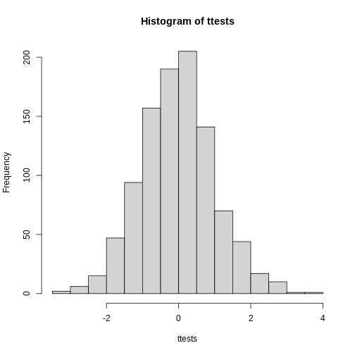
So is the distribution of this t-statistic well approximated by the normal distribution? In the next chapter, we will formally introduce quantile-quantile plots, which provide a useful visual inspection of how well one distribution approximates another. As we will explain later, if points fall on the identity line, it means the approximation is a good one.
R
qqnorm(ttests)
abline(0,1)
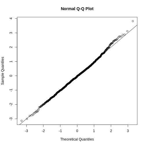
This looks like a very good approximation. For this particular population, a sample size of 10 was large enough to use the CLT approximation. How about 3?
R
ttests <- replicate(1000, ttestgenerator(3))
qqnorm(ttests)
abline(0,1)
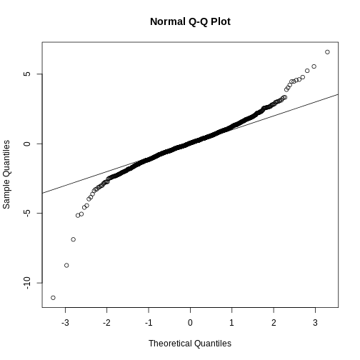
Now we see that the large quantiles, referred to by statisticians as the tails, are larger than expected (below the line on the left side of the plot and above the line on the right side of the plot). In the previous module, we explained that when the sample size is not large enough and the population values follow a normal distribution, then the t-distribution is a better approximation. Our simulation results seem to confirm this:
R
ps <- (seq(0, 999) + 0.5)/1000
qqplot(qt(ps, df = 2 * 3 - 2), ttests, xlim=c(-6,6), ylim=c(-6,6))
abline(0,1)
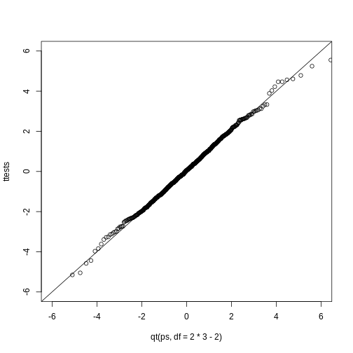
The t-distribution is a much better approximation in this case, but it is still not perfect. This is due to the fact that the original data is not that well approximated by the normal distribution.
R
qqnorm(controlPopulation)
qqline(controlPopulation)
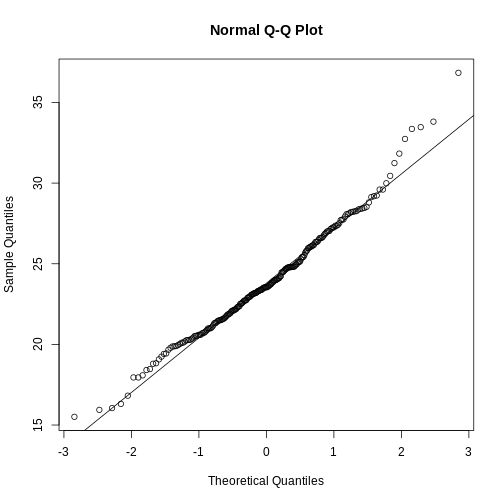
Parametric Simulations for the Observations
The technique we used to motivate random variables and the null distribution was a type of Monte Carlo simulation. We had access to population data and generated samples at random. In practice, we do not have access to the entire population. The reason for using the approach here was for educational purposes. However, when we want to use Monte Carlo simulations in practice, it is much more typical to assume a parametric distribution and generate a population from this, which is called a parametric simulation. This means that we take parameters estimated from the real data (here the mean and the standard deviation), and plug these into a model (here the normal distribution). This is actually the most common form of Monte Carlo simulation.
For the case of weights, we could use our knowledge that mice typically weigh 24 grams with a SD of about 3.5 grams, and that the distribution is approximately normal, to generate population data:
R
controls<- rnorm(5000, mean=24, sd=3.5)
After we generate the data, we can then repeat the exercise above. We
no longer have to use the sample function since we can
re-generate random normal numbers. The ttestgenerator
function therefore can be written as follows:
R
ttestgenerator <- function(n, mean=24, sd=3.5) {
  cases <- rnorm(n, mean, sd)
  controls <- rnorm(n, mean, sd)
  tstat <- (mean(cases) - mean(controls)) /
      sqrt( var(cases)/n + var(controls)/n )
  return(tstat)
  }
Exercises
We have used Monte Carlo simulation throughout this chapter to demonstrate statistical concepts; namely, sampling from the population. We mostly applied this to demonstrate the statistical properties related to inference on differences in averages. Here, we will consider examples of how Monte Carlo simulations are used in practice.
- Imagine you are William Sealy Gosset and have just mathematically derived the distribution of the t-statistic when the sample comes from a normal distribution. Unlike Gosset you have access to computers and can use them to check the results.
Let’s start by creating an outcome. Set the seed at 1, usernormto generate a random sample of size 5, X1…X5 from a standard normal distribution, then compute the t-statistic t = √5X̄/s with /s the sample standard deviation. What value do you observe?- You have just performed a Monte Carlo simulation using
rnorm, a random number generator for normally distributed data. Gosset’s mathematical calculation tells us that this random variable follows a t-distribution with N-1 degrees of freedom. Monte Carlo simulations can be used to check the theory: we generate many outcomes and compare them to the theoretical result.
Set the seed to 1, generate B= 1000 t-statistics as done in exercise 1.
What percent are larger than 2?- The answer to exercise 2 is very similar to the theoretical prediction: 1-pt(2, df=4). We can check several such quantiles using the
qqplotfunction. To obtain quantiles for the t-distribution we can generate percentiles from just above 0 to just below 1:B=100; ps = seq(1/(B+1), 1-1/(B+1), len=B) and compute the quantiles withqt(ps, df=4). Now we can useqqplotto compare these theoretical quantiles to those obtained in the Monte Carlo simulation. Use Monte Carlo simulation developed for exercise 2 to corroborate that the t-statistic t=pNX/s follows a t-distribution for several values of N.
For which sample sizes does the approximation best work?
- Larger sample sizes.
- Smaller sample sizes.
- The approximations are spot on for all sample sizes.
- None. We should use CLT instead.
- Use Monte Carlo simulation to corroborate that the t-statistic comparing two means and obtained with normally distributed (mean 0 and sd) data follows a t-distribution. In this case we will use the
t.testfunction withvar.equal=TRUE. With this argument the degrees of freedom will be df = 2 * N-2 with N the sample size. For which sample sizes does the approximation best work?
- Larger sample sizes.
- Smaller sample sizes.
- The approximations are spot on for all sample sizes.
- None. We should use CLT instead.
- Is the following statement true or false?
If instead of generating the sample withX=rnorm(15), we generate it with binary dataX = rbinom(n=15, size=1, prob=0.5)then the t-statistictstat <- sqrt(15) * mean(X)/sd(X)is approximated by a t-distribution with 14 degrees of freedom.- Is the following statement true or false?
If instead of generating the sample withX = rnorm(N)with N=500, we generate the data with binary dataX = rbinom(n=500, size=1, prob=0.5), then the t-statisticsqrt(N) * mean(X)/sd(X)is approximated by a t-distribution with 499 degrees of freedom.- We can derive approximation of the distribution of the sample average or the t-statistic theoretically. However, suppose we are interested in the distribution of a statistic for which a theoretical approximation is not immediately obvious. Consider the sample median as an example. Use a Monte Carlo to determine which of the following best approximates the median of a sample taken from normally distributed population with mean 0 and standard deviation 1.
- Just like for the average, the sample median is approximately normal with mean 0 and SD1/pN.
- The sample median is not approximately normal.
- The sample median is t-distributed for small samples and normally distributed for large ones.
- The sample median is approximately normal with mean 0 and SD larger than 1/pN.
- Random number generators can simulate imitate random variables from the real world.
- Simulated data lets us examine properties of random variables and test out ideas or competing methods computationally.
Content from Permutations
Last updated on 2026-03-24 | Edit this page
Overview
Questions
- What is a permutation test?
- When is a permutation test helpful?
Objectives
- Generate a null distribution with permutations.
- Evaluate the results of a permutation test.
Permutation Tests
Suppose we have a situation in which none of the standard mathematical statistical approximations apply. We have computed a summary statistic, such as the difference in mean, but do not have a useful approximation, such as that provided by the CLT. In practice, we do not have access to all values in the population so we can’t perform a simulation as done above. Permutation tests can be useful in these scenarios.
We are back to the scenario where we only have 10 measurements for each group.
R
fWeights <- read.csv(file = "./data/femaleMiceWeights.csv") # we read this data in earlier
control <- filter(fWeights, Diet=="chow") %>% select(Bodyweight) %>% unlist
treatment <- filter(fWeights, Diet=="hf") %>% select(Bodyweight) %>% unlist
obsdiff <- mean(treatment) - mean(control)
In previous sections, we showed parametric approaches that helped determine if the observed difference was significant. Permutation tests take advantage of the fact that if we randomly shuffle the cases and control labels, then the null is true. So we shuffle the cases and control labels and assume that the ensuing distribution approximates the null distribution. Here is how we generate a null distribution by shuffling the data 1,000 times:
R
N <- 12
avgdiff <- replicate(1000, {
    all <- sample(c(control, treatment))
    newcontrols <- all[1:N]
    newtreatments <- all[(N+1):(2*N)]
  return(mean(newtreatments) - mean(newcontrols))
})
hist(avgdiff)
abline(v=obsdiff, col="red", lwd=2)
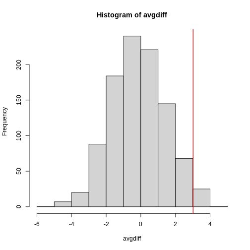
How many of the null means are bigger than the observed value? That proportion would be the p-value for the null. We add a 1 to the numerator and denominator to account for misestimation of the p-value (for more details see Phipson and Smyth, Permutation P-values should never be zero).
R
#the proportion of permutations with larger difference
(sum(abs(avgdiff) > abs(obsdiff)) + 1) / (length(avgdiff) + 1)
OUTPUT
[1] 0.05094905Now let’s repeat this experiment for a smaller dataset. We create a smaller dataset by sampling:
R
N <- 5
control <- sample(control, N)
treatment <- sample(treatment, N)
obsdiff <- mean(treatment) - mean(control)
and repeat the exercise:
R
avgdiff <- replicate(1000, {
    all <- sample(c(control,treatment))
    newcontrols <- all[1:N]
    newtreatments <- all[(N+1):(2*N)]
  return(mean(newtreatments) - mean(newcontrols))
})
hist(avgdiff)
abline(v=obsdiff, col="red", lwd=2)
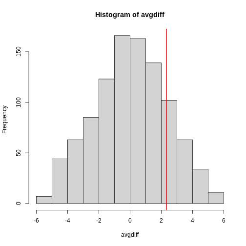
Now the observed difference is not significant using this approach. Keep in mind that there is no theoretical guarantee that the null distribution estimated from permutations approximates the actual null distribution. For example, if there is a real difference between the populations, some of the permutations will be unbalanced and will contain some samples that explain this difference. This implies that the null distribution created with permutations will have larger tails than the actual null distribution. This is why permutations result in conservative p-values. For this reason, when we have few samples, we can’t do permutations.
Note also that permutation tests still have assumptions: samples are assumed to be independent and “exchangeable”. If there is hidden structure in your data, then permutation tests can result in estimated null distributions that underestimate the size of tails because the permutations may destroy the existing structure in the original data.
Exercises We will use the following dataset to demonstrate the use of permutations:
url<-"https://raw.githubusercontent.com/genomicsclass/dagdata/master/inst/extdata/babies.txt"filename <- basename(url)download(url, destfile=filename)babies<-read.table("babies.txt", header=TRUE)bwt.nonsmoke <- filter(babies, smoke==0) %>% select(bwt) %>% unlistbwt.smoke <- filter(babies, smoke==1) %>% select(bwt) %>% unlist
- We will generate the following random variable based on a sample size of 10 and observe the following difference:
N <- 10set.seed(1)nonsmokers<-sample(bwt.nonsmoke, N)smokers<-sample(bwt.smoke, N)obs <- mean(smokers) - mean(nonsmokers)
The question is whether this observed difference is statistically significant. We do not want to rely on the assumptions needed for the normal or t-distribution approximations to hold, so instead we will use permutations. We will reshuffle the data and recompute the mean. We can create one permuted sample with the following code:dat <- c(smokers, nonsmokers)shuffle <- sample(dat)smokersstar <- shuffle[1:N]nonsmokersstar <- shuffle[(N+1):(2*N)]mean(smokersstar) - mean(nonsmokersstar)
The last value is one observation from the null distribution we will construct. Set the seed at 1, and then repeat the permutation 1,000 times to create a null distribution. What is the permutation derived p-value for our observation?- Repeat the above exercise, but instead of the differences in mean, consider the differences in median.
obs <- median(smokers) - median(nonsmokers)What is the permutation based p-value?
- Permutation randomly shuffles data so that the null is true.
- Permutation tests are useful when there is no good approximation such as that provided by the CLT.
Content from Association tests
Last updated on 2026-03-24 | Edit this page
Overview
Questions
- What is the Chi-squared test?
- What is Fisher’s exact test?
- When would these tests be used?
Objectives
- Describe and execute the Chi-squared test.
- Compute Fisher’s exact test.
Association Tests
The statistical tests we have covered up to now leave out a substantial portion of life science projects. Specifically, we are referring to data that is binary, categorical and ordinal. To give a very specific example, consider genetic data where you have two groups of genotypes (AA/Aa or aa) for cases and controls for a given disease. The statistical question is if genotype and disease are associated. As in the examples we have been studying previously, we have two populations (AA/Aa and aa) and then numeric data for each, where disease status can be coded as 0 or 1. So why can’t we perform a t-test? Note that the data is either 0 (control) or 1 (cases). It is pretty clear that this data is not normally distributed so the t-distribution approximation is certainly out of the question. We could use CLT if the sample size is large enough; otherwise, we can use association tests.
Lady Tasting Tea
One of the most famous examples of hypothesis testing was performed by R.A. Fisher. An acquaintance of Fisher’s claimed that she could tell if milk was added before or after tea was poured. Fisher gave her four pairs of cups of tea: one with milk poured first, the other after. The order was randomized. Say she picked 3 out of 4 correctly, do we believe she has a special ability? Hypothesis testing helps answer this question by quantifying what happens by chance. This example is called the “Lady Tasting Tea” experiment (and, as it turns out, Fisher’s friend was a scientist herself, Muriel Bristol).
The basic question we ask is: if the tester is actually guessing, what are the chances that she gets 3 or more correct? Just as we have done before, we can compute a probability under the null hypothesis that she is guessing 4 of each. If we assume this null hypothesis, we can think of this particular example as picking 4 balls out of an urn with 4 green (correct answer) and 4 red (incorrect answer) balls.
Under the null hypothesis that she is simply guessing, each ball has the same chance of being picked. We can then use combinatorics to figure out each probability. The probability of picking 3 is \({4 \choose 3} {4 \choose 1} / {8 \choose 4} = 16/70\). The probability of picking all 4 correct is \({4 \choose 4} {4 \choose 0}/{8 \choose 4}= 1/70\). Thus, the chance of observing a 3 or something more extreme, under the null hypothesis, is \(\approx 0.24\). This is the p-value. The procedure that produced this p-value is called Fisher’s exact test and it uses the hypergeometric distribution.
Two By Two Tables
The data from the experiment above can be summarized by a two by two table:
R
tab <- matrix(c(3,1,1,3),2,2)
rownames(tab) <- c("Poured Before","Poured After")
colnames(tab) <- c("Guessed before","Guessed after")
tab
OUTPUT
              Guessed before Guessed after
Poured Before              3             1
Poured After               1             3
The function fisher.test performs the calculations above
and can be obtained like this:
R
fisher.test(tab, alternative="greater")
OUTPUT
	Fisher's Exact Test for Count Data

data:  tab
p-value = 0.2429
alternative hypothesis: true odds ratio is greater than 1
95 percent confidence interval:
 0.3135693       Inf
sample estimates:
odds ratio
  6.408309
Chi-square Test
Genome-wide association studies (GWAS) have become ubiquitous in biology. One of the main statistical summaries used in these studies are Manhattan plots. The y-axis of a Manhattan plot typically represents the negative of log (base 10) of the p-values obtained for association tests applied at millions of single nucleotide polymorphisms (SNP). The x-axis is typically organized by chromosome (chromosome 1 to 22, X, Y, etc.). These p-values are obtained in a similar way to the test performed on the tea taster. However, in that example the number of green and red balls is experimentally fixed and the number of answers given for each category is also fixed. Another way to say this is that the sum of the rows and the sum of the columns are fixed. This defines constraints on the possible ways we can fill the two by two table and also permits us to use the hypergeometric distribution. In general, this is not the case. Nonetheless, there is another approach, the Chi-squared test, which is described below.
Imagine we have 250 individuals, where some of them have a given disease and the rest do not. We observe that 20% of the individuals that are homozygous for the minor allele (aa) have the disease compared to 10% of the rest. Would we see this again if we picked another 250 individuals?
Let’s create a dataset with these percentages:
R
disease=factor(c(rep(0,180),rep(1,20),rep(0,40),rep(1,10)),
               labels=c("control","cases"))
genotype=factor(c(rep("AA/Aa",200),rep("aa",50)),
                levels=c("AA/Aa","aa"))
dat <- data.frame(disease, genotype)
dat <- dat[sample(nrow(dat)),] #shuffle them up
head(dat)
OUTPUT
    disease genotype
249   cases       aa
68  control    AA/Aa
167 control    AA/Aa
129 control    AA/Aa
162 control    AA/Aa
215 control       aa
To create the appropriate two by two table, we will use the function
table. This function tabulates the frequency of each level
in a factor. For example:
R
table(genotype)
OUTPUT
genotype
AA/Aa    aa
  200    50
R
table(disease)
OUTPUT
disease
control   cases
    220      30
If you provide the function with two factors, it will tabulate all possible pairs and thus create the two by two table:
R
tab <- table(genotype,disease)
tab
OUTPUT
        disease
genotype control cases
   AA/Aa     180    20
   aa         40    10
Note that you can feed table \(n\) factors and it will tabulate all \(n\)-tables.
The typical statistics we use to summarize these results is the odds ratio (OR). We compute the odds of having the disease if you are an “aa”: 10/40, the odds of having the disease if you are an “AA/Aa”: 20/180, and take the ratio: \((10/40) / (20/180)\)
R
(tab[2,2]/tab[2,1]) / (tab[1,2]/tab[1,1])
OUTPUT
[1] 2.25To compute a p-value, we don’t use the OR directly. We instead assume that there is no association between genotype and disease, and then compute what we expect to see in each cell of the table (note: this use of the word “cell” refers to elements in a matrix or table and has nothing to do with biological cells). Under the null hypothesis, the group with 200 individuals and the group with 50 individuals were each randomly assigned the disease with the same probability. If this is the case, then the probability of disease is:
R
p=mean(disease == "cases")
p
OUTPUT
[1] 0.12The expected table is therefore:
R
expected <- rbind(c(1-p,p) * sum(genotype=="AA/Aa"),
                  c(1-p,p) * sum(genotype=="aa"))
dimnames(expected) <- dimnames(tab)
expected
OUTPUT
        disease
genotype control cases
   AA/Aa     176    24
   aa         44     6
The Chi-square test uses an asymptotic result (similar to the CLT) related to the sums of independent binary outcomes. Using this approximation, we can compute the probability of seeing a deviation from the expected table as big as the one we saw. The p-value for this table is:
R
chisq.test(tab)$p.value
OUTPUT
[1] 0.08857435Large Samples, Small p-values
As mentioned earlier, reporting only p-values is not an appropriate way to report the results of your experiment. Many genetic association studies seem to overemphasize p-values. They have large sample sizes and report impressively small p-values. Yet when one looks closely at the results, we realize odds ratios are quite modest: barely bigger than 1. In this case the difference of having genotype AA/Aa or aa might not change an individual’s risk for a disease in an amount which is practically significant, in that one might not change one’s behavior based on the small increase in risk.
There is not a one-to-one relationship between the odds ratio and the p-value. To demonstrate, we recalculate the p-value keeping all the proportions identical, but increasing the sample size by 10, which reduces the p-value substantially (as we saw with the t-test under the alternative hypothesis):
R
tab<-tab*10
chisq.test(tab)$p.value
OUTPUT
[1] 1.219624e-09Confidence Intervals for the Odds Ratio
Computing confidence intervals for the OR is not mathematically straightforward. Unlike other statistics, for which we can derive useful approximations of their distributions, the OR is not only a ratio, but a ratio of ratios. Therefore, there is no simple way of using, for example, the CLT.
One approach is to use the theory of generalized linear models which provides estimates of the log odds ratio, rather than the OR itself, that can be shown to be asymptotically normal. Here we provide R code without presenting the theoretical details (for further details please see a reference on generalized linear models such as Wikipedia or McCullagh and Nelder, 1989):
R
fit <- glm(disease ~ genotype, family="binomial", data=dat)
coeftab <- summary(fit)$coef
coeftab
OUTPUT
              Estimate Std. Error   z value     Pr(>|z|)
(Intercept) -2.1972246  0.2356828 -9.322803 1.133070e-20
genotypeaa   0.8109302  0.4249074  1.908487 5.632834e-02
The second row of the table shown above gives you the estimate and SE of the log odds ratio. Mathematical theory tells us that this estimate is approximately normally distributed. We can therefore form a confidence interval and then exponentiate to provide a confidence interval for the OR.
R
ci <- coeftab[2,1] + c(-2,2) * coeftab[2,2]
exp(ci)
OUTPUT
[1] 0.9618616 5.2632310The confidence includes 1, which is consistent with the p-value being bigger than 0.05. Note that the p-value shown here is based on a different approximation to the one used by the Chi-square test, which is why they differ.
Exercises We showed how to calculate a Chi-square test from a table.
Here we will show how to generate the table from data which is in the
form of a dataframe, so that you can then perform an association test to
see if two columns have an enrichment (or depletion) of shared
occurrences. Download the file
into your working directory, and then read it into R:
d = read.csv("assoctest.csv").
1. This dataframe reflects the allele status (either AA/Aa or aa) and
the case/control status for 72 individuals. Compute the Chi-square test
for the association of genotype with case/control status (using the
table function and the chisq.test function).
Examine the table to see if there appears to be an association. What is
the X-squared statistic?
2.Compute Fisher’s exact test fisher.test for the same
table. What is the p-value?
- Binary, categorical and ordinal data require different tests.
- Chi-squared and Fisher’s exact tests are useful in these cases.
Content from Exploratory Data Analysis
Last updated on 2026-03-24 | Edit this page
Overview
Questions
- How can data be visualized to reveal important relationships?
- What is exploratory data analysis?
Objectives
- Use a quantile-quantile plot to evaluate normality.
- Evaluate data distribution with a boxplot.
Exploratory Data Analysis
“The greatest value of a picture is when it forces us to notice what we never expected to see.” -John W. Tukey
Biases, systematic errors and unexpected variability are common in
data from the life sciences. Failure to discover these problems often
leads to flawed analyses and false discoveries. As an example, consider
that experiments sometimes fail and not all data processing pipelines,
such as the t.test function in R, are designed to detect
these. Yet, these pipelines still give you an answer. Furthermore, it
may be hard or impossible to notice an error was made just from the
reported results.
Graphing data is a powerful approach to detecting these problems. We refer to this as exploratory data analysis (EDA). Many important methodological contributions to existing techniques in data analysis were initiated by discoveries made via EDA. In addition, EDA can lead to interesting biological discoveries which would otherwise be missed through simply subjecting the data to a battery of hypothesis tests. Through this book, we make use of exploratory plots to motivate the analyses we choose. Here we present a general introduction to EDA using height data.
We have already introduced some EDA approaches for univariate data, namely the histograms and qq-plot. Here we describe the qq-plot in more detail and some EDA and summary statistics for paired data. We also give a demonstration of commonly used figures that we recommend against.
Quantile Quantile Plots
To corroborate that a theoretical distribution, for example the normal distribution, is in fact a good approximation, we can use quantile-quantile plots (qq-plots). Quantiles are best understood by considering the special case of percentiles. The p-th percentile of a list of a distribution is defined as the number q that is bigger than p% of numbers (so the inverse of the cumulative distribution function we defined earlier). For example, the median 50-th percentile is the median. We can compute the percentiles for our list of heights:
R
library(rafalib)
father.son <- UsingR::father.son
x <- father.son$fheight
and for the normal distribution:
R
ps <- ( seq(0,99) + 0.5 )/100
qs <- quantile(x, ps)
normalqs <- qnorm(ps, mean(x), popsd(x))
plot(normalqs, qs, xlab="Normal percentiles", ylab="Height percentiles")
abline(0,1) ##identity line
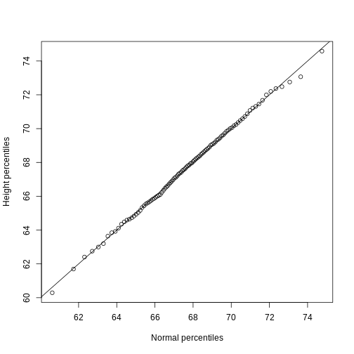
Note how close these values are. Also, note that we can see these qq-plots with less code (this plot has more points than the one we constructed manually, and so tail-behavior can be seen more clearly).
R
qqnorm(x)
qqline(x)
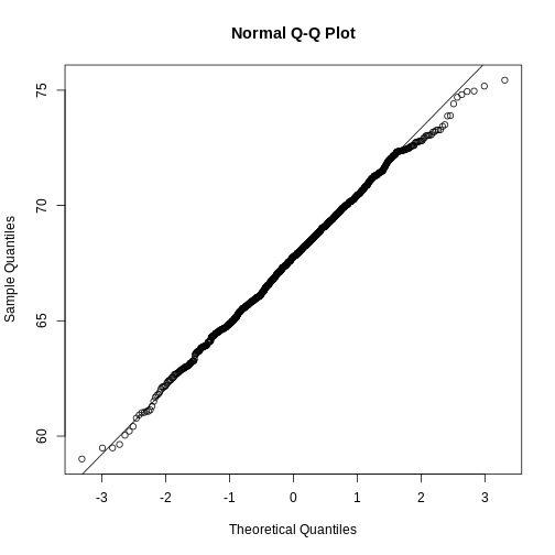
However, the qqnorm function plots against a standard
normal distribution. This is why the line has slope
popsd(x) and intercept mean(x).
In the example above, the points match the line very well. In fact, we can run Monte Carlo simulations to see plots like this for data known to be normally distributed.
R
n <-1000
x <- rnorm(n)
qqnorm(x)
qqline(x)
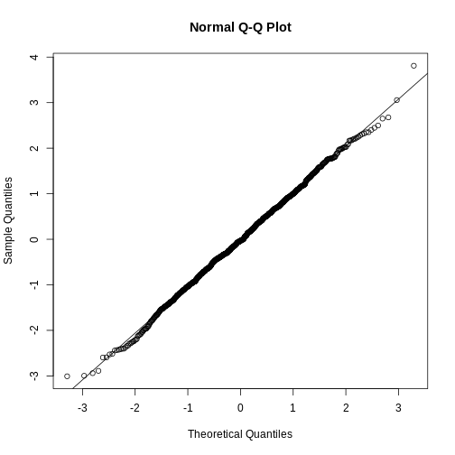
We can also get a sense for how non-normally distributed data will look in a qq-plot. Here we generate data from the t-distribution with different degrees of freedom. Notice that the smaller the degrees of freedom, the fatter the tails. We call these “fat tails” because if we plotted an empirical density or histogram, the density at the extremes would be higher than the theoretical curve. In the qq-plot, this can be seen in that the curve is lower than the identity line on the left side and higher on the right side. This means that there are more extreme values than predicted by the theoretical density plotted on the x-axis.
R
dfs <- c(3, 6, 12, 30)
mypar(2,2)
for(df in dfs){
  x <- rt(1000, df)
  qqnorm(x, xlab="t quantiles", main=paste0("d.f=",df), ylim=c(-6,6))
  qqline(x)
}
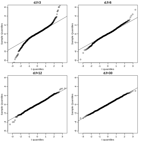
Boxplots
Data is not always normally distributed. Income is a widely cited example. In these cases, the average and standard deviation are not necessarily informative since one can’t infer the distribution from just these two numbers. The properties described above are specific to the normal. For example, the normal distribution does not seem to be a good approximation for the direct compensation for 199 United States CEOs in the year 2000.
R
exec.pay <- UsingR::exec.pay
mypar(1,2)
hist(exec.pay)
qqnorm(exec.pay)
qqline(exec.pay)
In addition to qq-plots, a practical summary of data is to compute 3 percentiles: 25th, 50th (the median) and the 75th. A boxplot shows these 3 values along with a range of the points within median ± 1.5 (75th percentile - 25th percentile). Values outside this range are shown as points and sometimes referred to as outliers.
R
boxplot(exec.pay, ylab="10,000s of dollars", ylim=c(0,400))
Here we show just one boxplot. However, one of the great benefits of boxplots is that we could easily show many distributions in one plot, by lining them up, side by side. We will see several examples of this throughout the book.
Scatterplots and Correlation
The methods described above relate to univariate variables. In the biomedical sciences, it is common to be interested in the relationship between two or more variables. A classic example is the father/son height data used by Francis Galton to understand heredity. If we were to summarize these data, we could use the two averages and two standard deviations since both distributions are well approximated by the normal distribution. This summary, however, fails to describe an important characteristic of the data.
R
father.son <- UsingR::father.son
x=father.son$fheight
y=father.son$sheight
plot(x,y, xlab="Father's height in inches",
     ylab="Son's height in inches",
     main=paste("correlation =",signif(cor(x,y),2)))
The scatter plot shows a general trend: the taller the father, the taller the son. A summary of this trend is the correlation coefficient, which in this case is 0.5. We will motivate this statistic by trying to predict the son’s height using the father’s height.
Stratification
Suppose we are asked to guess the height of randomly selected sons. The average height, 68.7 inches, is the value with the highest proportion (see histogram) and would be our prediction. But what if we are told that the father is 72 inches tall, do we still guess 68.7?
The father is taller than average. Specifically, he is 1.75 standard deviations taller than the average father. So should we predict that the son is also 1.75 standard deviations taller? It turns out that this would be an overestimate. To see this, we look at all the sons with fathers who are about 72 inches. We do this by stratifying the father heights.
R
groups <- split(y,round(x))
boxplot(groups)
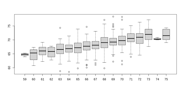
R
print(mean(y[ round(x) == 72]))
OUTPUT
[1] 70.67719Stratification followed by boxplots lets us see the distribution of each group. The average height of sons with fathers that are 72 inches tall is 70.7 inches. We also see that the medians of the strata appear to follow a straight line (remember the middle line in the boxplot shows the median, not the mean). This line is similar to the regression line, with a slope that is related to the correlation, as we will learn below.
Bivariate Normal Distribution
Correlation is a widely used summary statistic in the life sciences. However, it is often misused or misinterpreted. To properly interpret correlation we actually have to understand the bivariate normal distribution.
A pair of random variables (X,Y) is considered to be approximated by bivariate normal when the proportion of values below, for example a and b, is approximated by this expression:
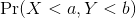

This may seem like a rather complicated equation, but the concept behind it is rather intuitive. An alternative definition is the following: fix a value x and look at all the pairs (X,Y) for which X=x. Generally, in statistics we call this exercise conditioning. We are conditioning Y on X. If a pair of random variables is approximated by a bivariate normal distribution, then the distribution of Y conditioned on X=x is approximated with a normal distribution, no matter what x we choose. Let’s see if this holds with our height data. We show 4 different strata:
R
groups <- split(y,round(x))
mypar(2,2)
for(i in c(5,8,11,14)){
  qqnorm(groups[[i]],main=paste0("X=",names(groups)[i]," strata"),
         ylim=range(y),xlim=c(-2.5,2.5))
  qqline(groups[[i]])
}
Now we come back to defining correlation. Mathematical statistics tells us that when two variables follow a bivariate normal distribution, then for any given value of x, the average of the Y in pairs for which X=x is:
Note that this is a line with slope

This is referred to as the regression line. If the SDs are the same, then the slope of the regression line is the correlation ρ. Therefore, if we standardize X and Y, the correlation is the slope of the regression line.
Another way to see this is to form a prediction Ŷ: for every SD away from the mean in x, we predict ρ SDs away for Y:
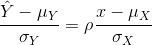
If there is perfect correlation, we predict the same number of SDs. If there is 0 correlation, then we don’t use x at all. For values between 0 and 1, the prediction is somewhere in between. For negative values, we simply predict in the opposite direction.
To confirm that the above approximations hold in this case, let’s compare the mean of each strata to the identity line and the regression line:
R
x=( x-mean(x) )/sd(x)
y=( y-mean(y) )/sd(y)
means=tapply(y, round(x*4)/4, mean)
fatherheights=as.numeric(names(means))
mypar(1,1)
plot(fatherheights, means, ylab="average of strata of son heights", ylim=range(fatherheights))
abline(0, cor(x,y))
Variance explained
The standard deviation of the conditional distribution described above is:

This is where statements like X explains ρ2 × 100% of the variation in Y: the variance of Y is σ2 and, once we condition, it goes down to (1-ρ2</sup) σ2_Y. It is important to remember that the “variance explained” statement only makes sense when the data is approximated by a bivariate normal distribution.
Exercise 1
Given the above histogram, how many people are between the ages of 35 and 45?
Exercise 2
The InsectSprays data set is included in R. The dataset
reports the counts of insects in agricultural experimental units treated
with different insecticides. Make a boxplot and determine which
insecticide appears to be most effective.
Exercise 3
Download and load this dataset into R. Use exploratory data analysis tools to determine which two columns are different from the rest.
- Which is the column that is positively skewed?
- Which is the column that is negatively skewed?
Exercise 4
Let’s consider a random sample of finishers from the New York City
Marathon in 2002. This dataset can be found in the UsingR package. Load
the library and then load the nym.2002 dataset.
library(UsingR) library(dplyr)
data(nym.2002, package="UsingR")
- Use boxplots and histograms to compare the finishing times of males and females. Which of the following best describes the difference?
- Males and females have the same distribution.
- Most males are faster than most women.
- Male and females have similar right skewed distributions with the former, 20 minutes shifted to the left.
- Both distribution are normally distributed with a difference in mean of about 30 minutes.
- Use
dplyrto create two new data frames:malesandfemales, with the data for each gender. For males, what is the Pearson correlation between age and time to finish? For females, what is the Pearson correlation between age and time to finish? - If we interpret these correlations without visualizing the data, we would conclude that the older we get, the slower we run marathons, regardless of gender. Look at scatterplots and boxplots of times stratified by age groups (20-25, 25-30, etc..). After examining the data, what is a more reasonable conclusion?
- Finish times are constant up until about our 40s, then we get slower.
- On average, finish times go up by about 7 minutes every five years.
- The optimal age to run a marathon is 20-25.
- Coding errors never happen: a five year old boy completed the 2012 NY city marathon.
- Plot data to evaluate relationships between variables.
Content from Plots to avoid
Last updated on 2026-03-24 | Edit this page
Overview
Questions
- ?
Objectives
Plots to Avoid
This section is based on a talk by Karl W. Broman titled “How to Display Data Badly,” in which he described how the default plots offered by Microsoft Excel “obscure your data and annoy your readers” (here is a link to a collection of Karl Broman’s talks). His lecture was inspired by the 1984 paper by H. Wainer: How to display data badly. American Statistician 38(2): 137–147. Dr. Wainer was the first to elucidate the principles of the bad display of data. However, according to Karl Broman, “The now widespread use of Microsoft Excel has resulted in remarkable advances in the field.” Here we show examples of “bad plots” and how to improve them in R.
General principles
The aim of good data graphics is to display data accurately and clearly. According to Karl Broman, some rules for displaying data badly are:
- Display as little information as possible.
- Obscure what you do show (with chart junk).
- Use pseudo-3D and color gratuitously.
- Make a pie chart (preferably in color and 3D).
- Use a poorly chosen scale.
- Ignore significant figures.
Pie charts
R
browsers <- c(Opera=1, Safari=9, Firefox=20, IE=26, Chrome=44)
Let’s say we want to report the results from a poll asking about browser preference (taken in August 2013). The standard way of displaying these is with a pie chart:
R
pie(browsers, main="Browser Usage (August 2013)")

Nonetheless, as stated by the help file for the pie
function:
“Pie charts are a very bad way of displaying information. The eye is good at judging linear measures and bad at judging relative areas. A bar chart or dot chart is a preferable way of displaying this type of data.”
To see this, look at the figure above and try to determine the percentages just from looking at the plot. Unless the percentages are close to 25%, 50% or 75%, this is not so easy. Simply showing the numbers is not only clear, but also saves on printing costs.
R
browsers
OUTPUT
  Opera  Safari Firefox      IE  Chrome
      1       9      20      26      44
If you do want to plot them, then a barplot is appropriate. Here we add horizontal lines at every multiple of 10 and then redraw the bars:
R
barplot(browsers,
        main="Browser Usage (August 2013)",
        ylim=c(0,55))
abline(h=1:5 * 10)
barplot(browsers, add=TRUE)

Notice that we can now pretty easily determine the percentages by following a horizontal line to the x-axis. Do avoid a 3D version since it obfuscates the plot, making it more difficult to find the percentages by eye.
 Even worse than pie charts are donut plots.

The reason is that by removing the center, we remove one of the visual cues for determining the different areas: the angles. There is no reason to ever use a donut plot to display data.
Barplots as data summaries
While barplots are useful for showing percentages, they are incorrectly used to display data from two groups being compared. Specifically, barplots are created with height equal to the group means; an antenna is added at the top to represent standard errors. This plot is simply showing two numbers per group and the plot adds nothing:
Much more informative is to summarize with a boxplot. If the number
of points is small enough, we might as well add them to the plot. When
the number of points is too large for us to see them, just showing a
boxplot is preferable. We can even set range=0 in
boxplot to avoid drawing many outliers when the data is in
the range of millions.
Let’s recreate these barplots as boxplots. First let’s download the data:
R
library(downloader)
filename <- "fig1.RData"
url <- "https://github.com/kbroman/Talk_Graphs/raw/master/R/fig1.RData"
if (!file.exists(filename)) download(url, filename)
load(filename)
Now we can simply show the points and make simple boxplots:
R
library(rafalib)
mypar()
dat <- list(Treatment=x, Control=y)
boxplot(dat,xlab="Group", ylab="Response", cex=0)
stripchart(dat, vertical=TRUE, method="jitter", pch=16, add=TRUE, col=1)
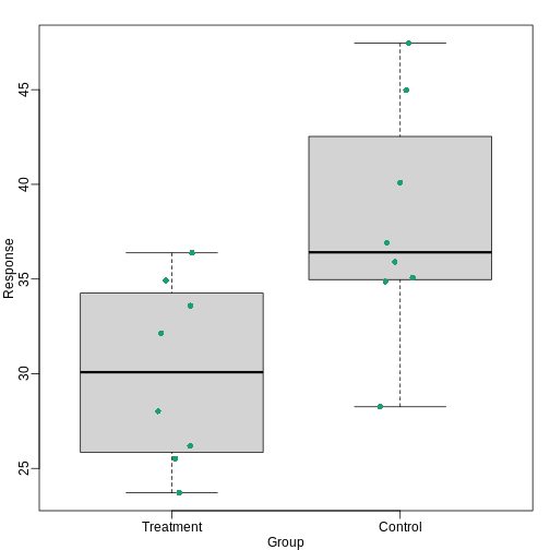
Notice how much more we see here: the center, spread, range, and the points themselves. In the barplot, we only see the mean and the SE, and the SE has more to do with sample size than with the spread of the data.
This problem is magnified when our data has outliers or very large tails. In the plot below, there appears to be very large and consistent differences between the two groups:
However, a quick look at the data demonstrates that this difference is mostly driven by just two points. A version showing the data in the log-scale is much more informative.
Start by downloading data:
R
library(downloader)
url <- "https://github.com/kbroman/Talk_Graphs/raw/master/R/fig3.RData"
filename <- "fig3.RData"
if (!file.exists(filename)) download(url, filename)
load(filename)
Now we can show data and boxplots in original scale and log-scale.
R
library(rafalib)
mypar(1,2)
dat <- list(Treatment=x,Control=y)

boxplot(dat, xlab="Group", ylab="Response", cex=0)
stripchart(dat, vertical=TRUE, method="jitter", pch=16, add=TRUE, col=1)

boxplot(dat, xlab="Group", ylab="Response", log="y", cex=0)
stripchart(dat, vertical=TRUE, method="jitter", pch=16, add=TRUE, col=1)
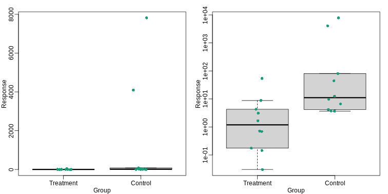
Show the scatter plot
The purpose of many statistical analyses is to determine relationships between two variables. Sample correlations are typically reported and sometimes plots are displayed to show this. However, showing just the regression line is one way to display your data badly since it hides the scatter. Surprisingly, plots such as the following are commonly seen.
Again start by loading data:
R
url <- "https://github.com/kbroman/Talk_Graphs/raw/master/R/fig4.RData"
filename <- "fig4.RData"
if (!file.exists(filename)) download(url, filename)
load(filename)
R
mypar(1,2)
plot(x, y, lwd=2, type="n")
fit <- lm(y~x)
abline(fit$coef,lwd=2)
b <- round(fit$coef,4)
text(78, 200, paste("y =", b[1], "+", b[2], "x"), adj=c(0,0.5))
rho <- round(cor(x,y),4)
text(78, 187,expression(paste(rho," = 0.8567")),adj=c(0,0.5))

plot(x,y,lwd=2)
fit <- lm(y~x)
abline(fit$coef,lwd=2)
When there are large amounts of points, the scatter can be shown by
binning in two dimensions and coloring the bins by the number of points
in the bin. An example of this is the hexbin function in
the hexbin
package.
High correlation does not imply replication
When new technologies or laboratory techniques are introduced, we are often shown scatter plots and correlations from replicated samples. High correlations are used to demonstrate that the new technique is reproducible. Correlation, however, can be very misleading. Below is a scatter plot showing data from replicated samples run on a high throughput technology. This technology outputs 12,626 simultaneous measurements.
In the plot on the left, we see the original data which shows very high correlation. Yet the data follows a distribution with very fat tails. Furthermore, 95% of the data is below the green line. The plot on the right is in the log scale:
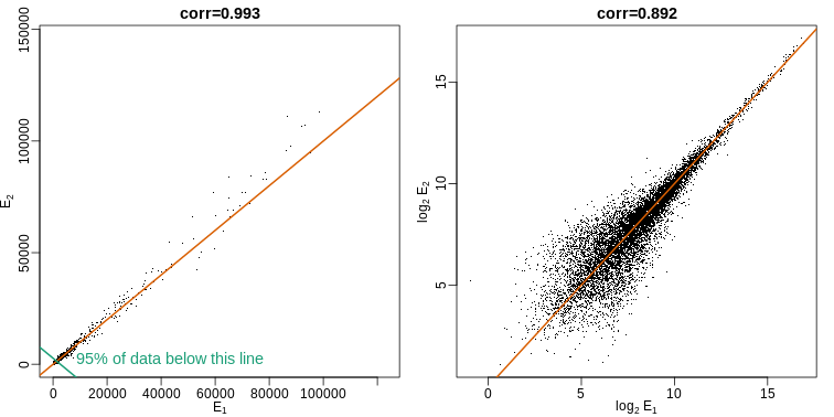
Note that we do not show the code here as it is rather complex but we explain how to make MA plots in a later chapter.
Although the correlation is reduced in the log-scale, it is very close to 1 in both cases. Does this mean these data are reproduced? To examine how well the second vector reproduces the first, we need to study the differences. We therefore should plot that instead. In this plot, we plot the difference (in the log scale) versus the average:
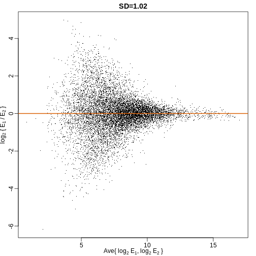
These are referred to as Bland-Altman plots, or MA plots in the genomics literature, and we will talk more about them later. “MA” stands for “minus” and “average” because in this plot, the y-axis is the difference between two samples on the log scale (the log ratio is the difference of the logs), and the x-axis is the average of the samples on the log scale. In this plot, we see that the typical difference in the log (base 2) scale between two replicated measures is about 1. This means that when measurements should be the same, we will, on average, observe 2 fold difference. We can now compare this variability to the differences we want to detect and decide if this technology is precise enough for our purposes.
Barplots for paired data
A common task in data analysis is the comparison of two groups. When the dataset is small and data are paired, such as the outcomes before and after a treatment, two-color barplots are unfortunately often used to display the results.
There are better ways of showing these data to illustrate that there is an increase after treatment. One is to simply make a scatter plot, which shows that most points are above the identity line. Another alternative is to plot the differences against the before values.
R
set.seed(12201970)
before <- runif(6, 5, 8)
after <- rnorm(6, before*1.05, 2)
li <- range(c(before, after))
ymx <- max(abs(after-before))

mypar(1,2)
plot(before, after, xlab="Before", ylab="After",
     ylim=li, xlim=li)
abline(0,1, lty=2, col=1)

plot(before, after-before, xlab="Before", ylim=c(-ymx, ymx),
     ylab="Change (After - Before)", lwd=2)
abline(h=0, lty=2, col=1)
Line plots are not a bad choice, although I find them harder to follow than the previous two. Boxplots show you the increase, but lose the paired information.
R
z <- rep(c(0,1), rep(6,2))
mypar(1,2)
plot(z, c(before, after),
     xaxt="n", ylab="Response",
     xlab="", xlim=c(-0.5, 1.5))
axis(side=1, at=c(0,1), c("Before","After"))
segments(rep(0,6), before, rep(1,6), after, col=1)

boxplot(before,after,names=c("Before","After"),ylab="Response")
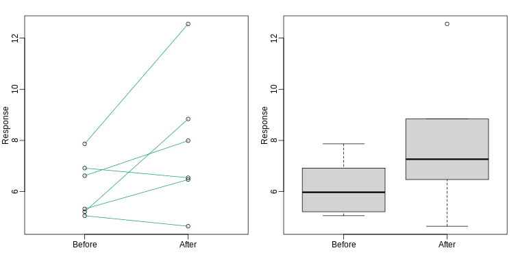
Gratuitous 3D
The figure below shows three curves. Pseudo 3D is used, but it is not clear why. Maybe to separate the three curves? Notice how difficult it is to determine the values of the curves at any given point:
This plot can be made better by simply using color to distinguish the three lines:
R
##First read data
url <- "https://github.com/kbroman/Talk_Graphs/raw/master/R/fig8dat.csv"
x <- read.csv(url)

##Now make alternative plot
plot(x[,1],x[,2],xlab="log Dose",ylab="Proportion survived",ylim=c(0,1),
     type="l",lwd=2,col=1)
lines(x[,1],x[,3],lwd=2,col=2)
lines(x[,1],x[,4],lwd=2,col=3)
legend(1,0.4,c("Drug A","Drug B","Drug C"),lwd=2, col=1:3)
Ignoring important factors
In this example, we generate data with a simulation. We are studying a dose-response relationship between two groups: treatment and control. We have three groups of measurements for both control and treatment. Comparing treatment and control using the common barplot.
Instead, we should show each curve. We can use color to distinguish treatment and control, and dashed and solid lines to distinguish the original data from the mean of the three groups.
R
plot(x, y1, ylim=c(0,1), type="n", xlab="Dose", ylab="Response")
for(i in 1:3) lines(x, y[,i], col=1, lwd=1, lty=2)
for(i in 1:3) lines(x, z[,i], col=2, lwd=1, lty=2)
lines(x, ym, col=1, lwd=2)
lines(x, zm, col=2, lwd=2)
legend("bottomleft", lwd=2, col=c(1, 2), c("Control", "Treated"))
Too many significant digits
By default, statistical software like R returns many significant digits. This does not mean we should report them. Cutting and pasting directly from R is a bad idea since you might end up showing a table, such as the one below, comparing the heights of basketball players:
R
heights <- cbind(rnorm(8,73,3),rnorm(8,73,3),rnorm(8,80,3),
                 rnorm(8,78,3),rnorm(8,78,3))
colnames(heights)<-c("SG","PG","C","PF","SF")
rownames(heights)<- paste("team",1:8)
heights
OUTPUT
             SG       PG        C       PF       SF
team 1 76.39843 76.21026 81.68291 75.32815 77.18792
team 2 74.14399 71.10380 80.29749 81.58405 73.01144
team 3 71.51120 69.02173 85.80092 80.08623 72.80317
team 4 78.71579 72.80641 81.33673 76.30461 82.93404
team 5 73.42427 73.27942 79.20283 79.71137 80.30497
team 6 72.93721 71.81364 77.35770 81.69410 80.39703
team 7 68.37715 73.01345 79.10755 71.24982 77.19851
team 8 73.77538 75.59278 82.99395 75.57702 87.68162
We are reporting precision up to 0.00001 inches. Do you know of a tape measure with that much precision? This can be easily remedied:
R
round(heights,1)
OUTPUT
         SG   PG    C   PF   SF
team 1 76.4 76.2 81.7 75.3 77.2
team 2 74.1 71.1 80.3 81.6 73.0
team 3 71.5 69.0 85.8 80.1 72.8
team 4 78.7 72.8 81.3 76.3 82.9
team 5 73.4 73.3 79.2 79.7 80.3
team 6 72.9 71.8 77.4 81.7 80.4
team 7 68.4 73.0 79.1 71.2 77.2
team 8 73.8 75.6 83.0 75.6 87.7
Displaying data well
In general, you should follow these principles:
- Be accurate and clear.
- Let the data speak.
- Show as much information as possible, taking care not to obscure the message.
- Science not sales: avoid unnecessary frills (especially gratuitous 3D).
- In tables, every digit should be meaningful. Don’t drop ending 0’s.
Some further reading:
- ER Tufte (1983) The visual display of quantitative information. Graphics Press.
- ER Tufte (1990) Envisioning information. Graphics Press.
- ER Tufte (1997) Visual explanations. Graphics Press.
- WS Cleveland (1993) Visualizing data. Hobart Press.
- WS Cleveland (1994) The elements of graphing data. CRC Press.
- A Gelman, C Pasarica, R Dodhia (2002) Let’s practice what we preach: Turning tables into graphs. The American Statistician 56:121-130.
- NB Robbins (2004) Creating more effective graphs. Wiley.
- Nature Methods columns
Misunderstanding Correlation (Advanced)
The use of correlation to summarize reproducibility has become
widespread in, for example, genomics. Despite its English language
definition, mathematically, correlation is not necessarily informative
with regards to reproducibility.
Here we briefly describe three major problems.
The most egregious related mistake is to compute correlations of data that are not approximated by bivariate normal data. As described above, averages, standard deviations and correlations are popular summary statistics for two-dimensional data because, for the bivariate normal distribution, these five parameters fully describe the distribution. However, there are many examples of data that are not well approximated by bivariate normal data. Raw gene expression data, for example, tends to have a distribution with a very fat right tail.
The standard way to quantify reproducibility between two sets of replicated measurements, say \(x_1,\dots,x_n\) and \(y_1,\dots,y_n\), is simply to compute the distance between them:
\[ \sqrt{ \sum_{i=1}^n d_i^2} \mbox{ with } d_i=x_i - y_i \]
This metric decreases as reproducibility improves and it is 0 when the reproducibility is perfect. Another advantage of this metric is that if we divide the sum by N, we can interpret the resulting quantity as the standard deviation of the \(d_1,\dots,d_N\) if we assume the \(d\) average out to 0. If the \(d\) can be considered residuals, then this quantity is equivalent to the root mean squared error (RMSE), a summary statistic that has been around for over a century. Furthermore, this quantity will have the same units as our measurements resulting in a more interpretable metric.
Another limitation of the correlation is that it does not detect cases that are not reproducible due to average changes. The distance metric does detect these differences. We can rewrite:
\[\frac{1}{n} \sum_{i=1}^n (x_i - y_i)^2 = \frac{1}{n} \sum_{i=1}^n [(x_i - \mu_x) - (y_i - \mu_y) + (\mu_x - \mu_y)]^2\]
with \(\mu_x\) and \(\mu_y\) the average of each list. Then we have:
\[\frac{1}{n} \sum_{i=1}^n (x_i - y_i)^2 = \frac{1}{n} \sum_{i=1}^n (x_i-\mu_x)^2 + \frac{1}{n} \sum_{i=1}^n (y_i - \mu_y)^2 + (\mu_x-\mu_y)^2 + \frac{1}{n}\sum_{i=1}^n (x_i-\mu_x)(y_i - \mu_y) \]
For simplicity, if we assume that the variance of both lists is 1, then this reduces to:
\[\frac{1}{n} \sum_{i=1}^n (x_i - y_i)^2 = 2 + (\mu_x-\mu_y)^2 - 2\rho\]
with \(\rho\) the correlation. So we see the direct relationship between distance and correlation. However, an important difference is that the distance contains the term \[(\mu_x-\mu_y)^2\] and, therefore, it can detect cases that are not reproducible due to large average changes.
Yet another reason correlation is not an optimal metric for reproducibility is the lack of units. To see this, we use a formula that relates the correlation of a variable with that variable, plus what is interpreted here as deviation: \(x\) and \(y=x+d\). The larger the variance of \(d\), the less \(x+d\) reproduces \(x\). Here the distance metric would depend only on the variance of \(d\) and would summarize reproducibility. However, correlation depends on the variance of \(x\) as well. If \(d\) is independent of \(x\), then
\[ \mbox{cor}(x,y) = \frac{1}{\sqrt{1+\mbox{var}(d)/\mbox{var}(x)}} \]
This suggests that correlations near 1 do not necessarily imply reproducibility. Specifically, irrespective of the variance of \(d\), we can make the correlation arbitrarily close to 1 by increasing the variance of \(x\).
When is it appropriate to use pie charts or donut charts?
•A) When you are hungry.
•B) To compare percentages.
•C) To compare values that add up to 100%.
•D) Never.
The use of pseudo-3D plots in the literature mostly adds: •A)
Pizzazz.
•B) The ability to see three dimensional data.
•C) Ability to discover.
•D) Confusion.
- Pie charts, donut charts, and 3-dimensional plots should not be used to display data.
- Box plots are a better alternative to bar plots.
- If data are small, data points can be shown in the plot.