Create the Streamlit App
Last updated on 2025-01-14 | Edit this page
Estimated time: 20 minutes
Overview
Questions
- How do I create a Streamlit app?
- How can I see a live preview of my app?
Objectives
- Learn how to create a streamlit app
- Learn how to add text to the app
- Learn how to add plots to the app
Now that our data and visualizations are prepped, it’s finally time to create our Streamlit app.
Creating and starting the app
While you usually want to create Jupyter Notebooks in Jupyter Lab, you can also create other file types and have a terminal. We are going to use both of these capabilities.
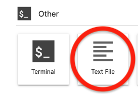
From the Launcher, click on “Text File” under “Other” (make sure you
are currently in your project root directory, and not the
data folder). This will open a new file.

By default, this will be a text file, but you can change this. Go
ahead and save this empty file as app.py (“File” > “Save
Text As…” > “app.py”). Then we can add some import statements, and
save the file again.
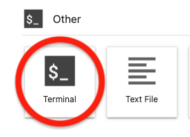
Next, go back to the Launcher and click on “Terminal” under “Other”. This will launch a terminal window within Jupyter Lab.

If you type pwd and enter, you will see that you are
currently in your project root.
OUTPUT
/Users/<you>/Desktop/data_viz_workshopIf you type ls and enter, you will see all of your files
and directories.
OUTPUT
Data app.py data_visualizations.ipynb data_wrangling.ipynb environment.ymlMake sure that you see app.py. We can also see what
environment we are currently in with conda env list. There
should be a * next to dataviz.
OUTPUT
# conda environments:
#
base /opt/anaconda3
dataviz * /opt/anaconda3/envs/datavizIf not, go ahead and type conda activate dataviz.
Now that we know we are in the right place and have the right environment (the one with streamlit installed), we are going to start the Streamlit app.
This will launch our app in a new tab. Right now, the app is empty. So let’s add some content!
Add a title to the app
Go back to the tab in Jupyter Lab for our app.py file.
We have some import statements, but no content. Let’s start with a
title:
You can make this title whatever you want. Save the file, and go back to the brower tab with our Streamlit app. Notice the prompt in the upper right corner? Go ahead and click on “Rerun”. Now we can see our title!
We can add other text to our app with st.write() and
other functions.
Check out the documentation
Whenever you are working with a new library - or even one that you are familiar with! - it’s a good idea to look through the documentation. You can find Streamlit’s documentation here
Add a plot to the app
Now, let’s go ahead and add the visualization of GDP in Oceania that
we created in the previous lesson. We can copy and paste the code over
from our Jupyter Notebook - but leave out the fig.show().
We’re going to use a different function to display the plot in the
Streamlit app: st.plotly_chart()
PYTHON
df = pd.read_csv("Data/gapminder_tidy.csv")
df_gdp_o = df.query("continent=='Oceania' & metric=='gdpPercap'")
title = "GDP for countries in Oceania"
fig = px.line(df_gdp_o, x = "year", y = "value", color = "country", title = title, labels={"value": "GDP Percap"})
st.plotly_chart(fig)Save app.py, switch over to the Streamlit app, and click
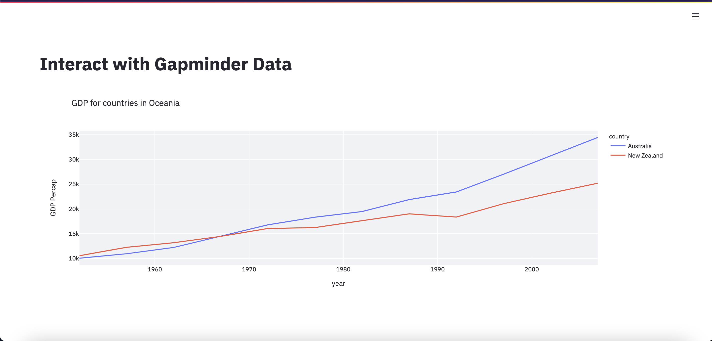
“Rerun”. Now we can see our Oceania GDP line chart!
Right now, this line chart is a bit squashed and small, so we’re
going to change some settings so the plot will take up more space.
First, at the beginning of the app we’ll add the line:
st.set_page_config(layout="wide"). Next, we’ll add an
argument to our display function:
st.plotly_chart(fig, use_container_width=True)
Our whole app script now looks like:
PYTHON
import streamlit as st
import pandas as pd
import plotly.express as px
st.set_page_config(layout="wide")
st.title("Interact with Gapminder Data")
df = pd.read_csv("Data/gapminder_tidy.csv")
df_gdp_o = df.query("continent=='Oceania' & metric=='gdpPercap'")
title = "GDP for countries in Oceania"
fig = px.line(df_gdp_o, x = "year", y = "value", color = "country", title = title, labels={"value": "GDP Percap"})
st.plotly_chart(fig, use_container_width=True)You know the drill! Save, switch over to the Streamlit app, and click “Rerun”.
We now have a web application that can allow you to share your interactive visualizations.

Exercises
Add a description
After the plot is displayed, add some text describing the plot. Hint you may want look at the Streamlit Reference Docs to find an appropriate function.
Show me the data!
After the plot is displayed, also display the dataframe used to generate the plot.
- The entire streamlit app must be saved in a single python file,
typically
app.py - To run the app locally, enter the bash command
streamlit run app.py - Add a title with
st.title('Title'), and other text withst.write('## Markdown can go here') - Make sure your dataframes and figures are stored in variables,
typically
dffor a dataframe andfigfor a figure - To display a plotly figure, use
st.plotly_chart(fig)
