Plotting with bokeh
Last updated on 2024-02-13 | Edit this page
Overview
Questions
- Can I use Python to create plots?
- How can I customize plots generated in Python?
Objectives
- Create a ggplot object
- Set universal plot settings
- Modify an existing ggplot object
- Change the aesthetics of a plot such as colour
- Edit the axis labels
- Build complex plots using a step-by-step approach
- Create scatter plots, box plots, and time series plots
- Use the
facet_wrapandfacet_gridcommands to create a collection of plots splitting the data by a factor variable - Create customized plot styles to meet their needs
Disclaimer
Python has powerful built-in plotting capabilities such as
matplotlib, but for this exercise, we will be using the bokeh package,
which facilitates the creation of highly-informative plots of structured
data.
PYTHON
import pandas as pd

authors_complete = pd.read_csv( 'eebo.csv', index_col=0)
authors_complete.index.name = 'X'
authors_complete
EEBO VID ... Page Count PlaceX …
A00002 99850634 15849 … 134 London A00005 99842408 7058 … 302 London
A00007 99844302 9101 … 386 London A00008 99848896 14017 … 14 The
Netherlands? A00011 99837000 1304 … 54 Amsterdam A00012 99853871 19269 …
99 London A00014 33143147 28259 … 1 London A00015 99837006 1310 … 16
London A00018 99850740 15965 … 26 Germany?
149 rows x 10 columns
Plotting with bokeh
We will make the same plot using the bokeh package.
bokeh is a plotting package that makes it simple to
create complex plots from data in a dataframe. It uses default settings,
which help creating publication quality plots with a minimal amount of
settings and tweaking.
bokeh graphics are built step by step by adding new elements.
To build a bokeh plot we need to:
bind the plot to a specific data frame using the
dataargumentdefine figure (
figure), by selecting the variables to be plotted and the variables to define the presentation such as plotting size, title etc.,
We also set some notebook settings with a “output_notebook()” statement to get interactive and exportable plots

We can add simple points to create a scatter plot using circle.
PYTHON
list_dates = authors_complete['Date']
list_numbers = authors_complete['Page Count']
p.circle(list_dates, list_numbers)
show(p)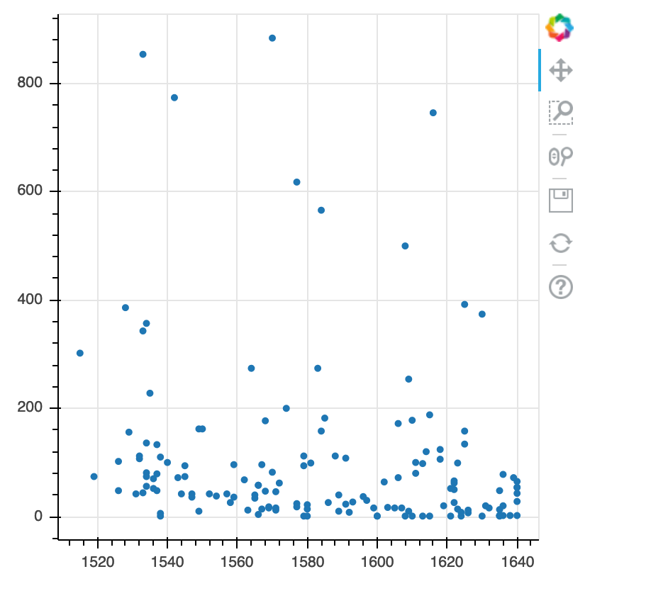
Building your plots
We can add extra arguments into circle’s argument.
For comparison, we create a new figure and then add the alpha argument to circle to change the opacity of the points.
PYTHON
p1 = figure(plot_width=400, plot_height=400)

p1.circle(list_dates, list_numbers, alpha=0.1)

show(p1)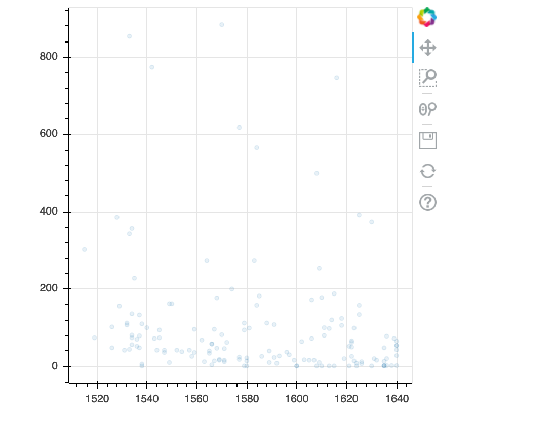
We can also add colors for all the points.
PYTHON
p2 = figure(plot_width=400, plot_height=400)

p2.circle(list_dates, list_numbers, color="blue", alpha=0.1)

show(p2)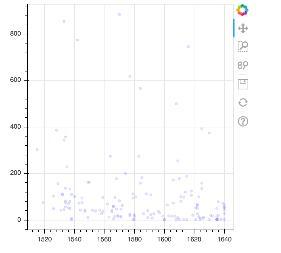
Plotting time series data
Let’s calculate number of counts per year across the dataset. To do that we need to group data first and count records within each group.
PYTHON
yearly = authors_df[['Date','Place','Page Count']].groupby(['Date', 'Place']).count().reset_index()PYTHON
p3 = figure(plot_width=800, plot_height=250)

p3.line(yearly['Date'], yearly['Page Count'], color='navy', alpha=0.5)

show(p3)
year place count0 1515 London 1 1 1519 Londini 1 2 1526 London 2 3 1528 London 1 4 1529 Malborow i.e. Antwerp 1 5 1531 London 1
[121 rows x 3 columns]
Timelapse data can be visualised as a line plot with years on x axis and counts on y axis.
p3 = figure(plot_width=800, plot_height=250)
p3.line(yearly['Date'], yearly['Page Count'], color='navy', alpha=0.5)
show(p3)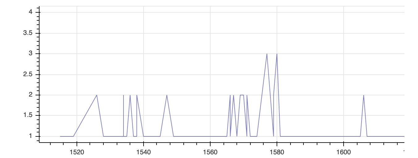
Customization
Now, let’s add a title to this figure:
PYTHON
from bokeh.models import ColumnDataSource, Range1d, LabelSet, Label

p4 = figure(title="Plot of Page Counts by Year", plot_width=400, plot_height=400)

p4.circle(list_dates, list_numbers)

p4.xaxis[0].axis_label = 'Date'
p4.yaxis[0].axis_label = 'Page Count'

show(p4)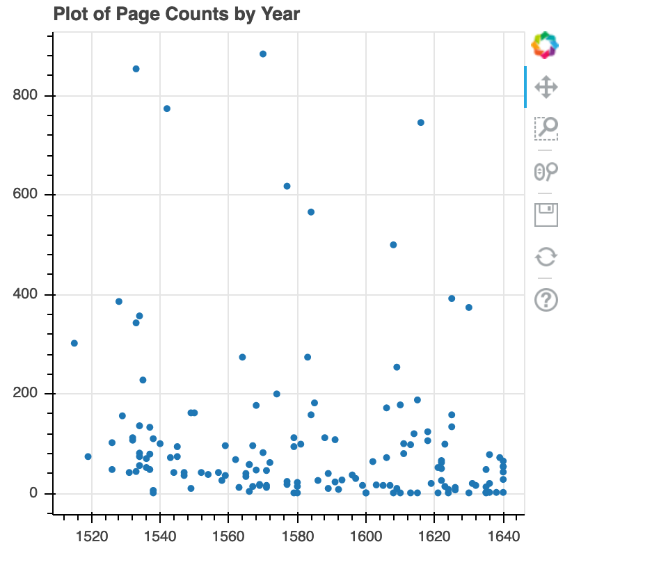
or we canadd labels to the axes and change the font size for the labels
PYTHON
p5 = figure(title="Plot of Page Counts by Year", plot_width=400, plot_height=400)

p5.circle(list_dates, list_numbers)

p5.xaxis[0].axis_label = 'Date'
p5.yaxis[0].axis_label = 'Page Count'
p5.xaxis[0].axis_label_text_font_size = "24pt"

show(p5)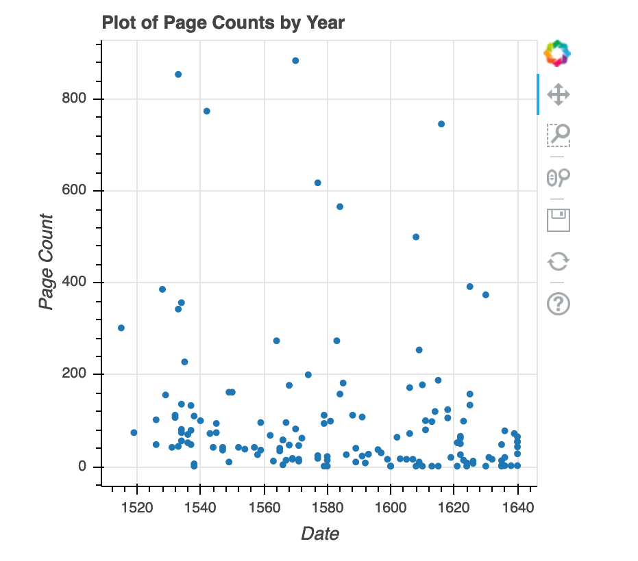
With all of this information in hand, please take another five minutes to either improve one of the plots generated in this exercise or create a beautiful graph of your own.
Here are some ideas:
- Can you find a way to change its labels?
- Use a different color palette.
After creating your plot, you can save it to a file as a png file: