Coding basics
Last updated on 2023-02-17 | Edit this page
Planning for reproducibility and provenance
Overview
Questions
- What is the role of data wrangling?
- What is literate programming?
- How to use data visualisation for insight and communication?
Objectives
- First learning objective. (FIXME)
- To make informed decisions using data.
Literate Programming
Literate programming is about comments and documentation and telling other humans what is happening in your pipeline. Depending on the scale of your computational projects, you may use one or multiple of these options:
- Inline comments when writing code (directly written in the script file)
- A README file describing what your code does
- An online documentation as a user and developer guide with step-by-step explanation
- RMarkdown or Jupyter Notebook with examples
Most of these files can be written in Markdown. Markdown is a way of writing plain text in any simple text editor that doesn’t need specific (proprietary) software to read it (no need for Microsoft Word), which can be converted to many formats including HTML, PDF or even Word documents. Many online tools including GitHub support Markdown files (.md files).
Marking up your text and code is quite simple:
-
**bold**–> bold -
_italics_–> italics - “
code snippet” –>code snippet -
[LINK](https://carpentries-incubator.github.io/managing-computational-projects/)–> LINK
You can do much more:
-
# Title(first level header) -
## Heading(second level header) -
### Subheading(third level header) -
(insert via a link)
See more in the MarkDown cheatsheet.
MarkDown files are however static, meaning that you can only read the files, but not execute code. R Markdown and Jupyter Notebook provide an interactive environment to work and share your code with documentation and examples for your project. For practice details about R Markdown, please see The Definitive Guide and for Jupyter Notebook, please see Jupyter/IPython Notebook Quick Start Guide.
These options are useful for communicating about the analysis workflow and results at any stage with other collaborators or the wider research community when developing open source code. Please note that sharing code in any format would require your collaborators to run and test your code locally. There are easier options to allow to run code in the browser using Binder, which we will discuss in the last lesson.
coding tips and tricks
Pipeline
data processing - statistical analysis plan - visualisation - stats.
Data Wrangling and Cleaning
Data wrangling involves cleaning data so it can be easily read and analysed by machines. It can also involve integration, extraction, removing missing points, and anything that makes data useable and functional. Regardless of the methods, the code involved with data cleaning steps should be carefully documented so that the steps involved can be repeated from raw data to cleaned data.
When working with data sets,
ggplot(in R) ormatplotlib/seaborn(in Python) libraries provide attractive figures that can be produced very quickly. Visualising data should not not wait for the point of publication, and can be used to explore data from the start, and also illustrate methodology. This is particularly valuable in Jupyter Notebooks. Code to produce figures should be literate, functional, reuseable in the same way as data cleaning and analysis code. That way future visualisations can be easily updated or reused.
Data wrangling
Definition
Data wrangling—also called data cleaning, data remediation, or data munging—refers to a variety of processes designed to transform raw data into more readily used formats. The exact methods differ from project to project depending on the data you’re leveraging and the goal you’re trying to achieve.
Some examples of data wrangling include:
- Merging multiple data sources into a single dataset for analysis,
- Identifying gaps in data (for example, empty cells in a spreadsheet) and either filling or deleting them,
- Deleting data that’s either unnecessary or irrelevant to the project you’re working on,
- Identifying extreme outliers in data and either explaining the discrepancies or removing them so that analysis can take place.
Data wrangling can be a manual or automated process. In scenarios where datasets are exceptionally large, automated data cleaning becomes a necessity.
Code that cleans and processes data (processing code) provides the very beginning of the data analysis pipeline: starting with raw data and resulting in processed data.

Cleaning data means it can be easily read and analysed by machines and used in analysis pipelines. It can involve changing labels, subsetting, integration, extraction, removing missing points, and anything that makes data useable and functional. Regardless of the methods, the code involved in data cleaning steps should be carefully documented so that the steps involved can be repeated from raw data to clean data. When reviewing this type of code, consider whether the steps involved are readable and in the correct order.
Data Analysis and Statistics
(Need to discuss this further, what is patronising?)
With readable, clean, processed data that you have explored using figures, the next stage of the data pipeline is analysis. There may be many variables that are related directly or indirectly to the objective. For that, we first need to study about all the variables whether it is nominal or ordinal. Preparing the data for analysis is done after understanding the data. While understanding we get to know about missing in the data, finding the independent and dependent variables, etc.
Depending on your computational project, this may involve elaborate and complex analyses, modelling, simulation, and even machine learning. However, even if this step is just running a single statistics test, keeping the code modular in clearly defined steps is key.
Here is an example of applying a Butterworth filter to some data in Python. The specifics don’t matter, you can consider this code pseudocode for any kind of analysis step.
genomeProject/analysis/01_butterworth_filter.py


import numpy as np
from scipy.signal import butter,filtfilt

# (A) Read processed data from file
df = pd.read_csv('genomeProject/data/220103_GenomicData_processed.csv')

# (B) Defining filter parameters
T = 5.0         # Sample Period
fs = 30.0       # sample rate, Hz
cutoff = 2      # desired cutoff frequency of the filter, Hz
nyq = 0.5 * fs  # Nyquist Frequency
order = 2       # quadratic
n = int(T * fs) # total number of samples

# (C) Define the Butterworth Filter Function
def butter_lowpass_filter(data, cutoff, fs, order):
    normal_cutoff = cutoff / nyq

    # Get the filter coefficients
    b, a = butter(order, normal_cutoff, btype='low', analog=False)
    filtered_data = filtfilt(b, a, data)

    return filtered_data

# (D) Apply Butterworth Filter Function to the data
filtered_data = butter_lowpass_filter(data, cutoff, fs, order)
- the processed data is read into the script. Next, (B) the fixed
parameters are set and named with comments. These fixed numbers are
saved as variables with names. In (C) the filter itself is written as a
Python Function, which means it can be called multiple times throughout
the script. Because the parameters are not written into the function
directly (so it doesn’t say
b, a = butter(2, 15,btype='low', analog=False)but instead uses variables) this code is reusable without having to paste and edit the numbers every time you apply a function.
You can also call this function in other scripts. It can make sense to produce a file with the functions inside that can be imported into different scripts in case other projects also have similar methods. This is known as a package or library. This means altering a function doesn’t mean searching across every file on every project and changing it dozens of times.
Case Study
A postdoc wrote a helpful series of functions for data analysis with neurophysiology recordings. The postdoc wrote them as reuseable, and so two PhD students copied and pasted these blocks of code into their code and used it to analyse the data for their projects.
The postdoc later discovers a better way of writing the functions. One PhD student also wants to change the method and so has to search through his files to replace the code. The other PhD student wants the old method in some files and the new method in others, and so does not change all of them. It is therefore complex to follow the differences in the methods across the projects, and this is very open to errors in typos.
Instead, the postdoc could have saved his functions in the lab’s private repo which becomes the master copy and students pull from this. With the functions saved in a library, the PhD students can import them into their scripts. Now when the postdoc changes the functions and saves them to the repo, PhD students can choose to update their version of the functions. The students should document which version they have used.
The output of the analysis code may be statistics results that are reported in a paper, and therefore the steps required to reproduce them are critically important.
Figures for Communicating Results
With the analysis complete, data visualisation is usually used to communicate results. The code used to produce figures is the next step in the data pipeline.
For publications or posters, well-constructed figures improve science communication and help improve the impact of your research. Being able to produce multipanel figures with annotations and different colour schemes is complex but one of the advantages of learning a data science language.
It is therefore worth taking the time for researchers to learn the technical skills in R, Python, or another language to produce visualisations. Producing figures in Excel is limiting and often frustrating, particularly as there are only limited options in layout and type of figure.

Exploring constraints on a wetland methane emission ensemble (WetCHARTs) using GOSAT observations, Parker et al 2020

Spatial transcriptome profiling by MERFISH reveals subcellular RNA compartmentalization and cell cycle-dependent gene expression, Xia et al 2019 https://www.pnas.org/doi/10.1073/pnas.1912459116
These figures are more than just visualising data, they’re about
communication and require adjusting the styles and formats within
ggplot or matplotlib or other libraries.
As before, any code used to produce visualisations should be reproducible and literature. Often in peer review figures need to be adjusted or altered, and having the code to do so makes the process much simpler.
It is usually cleaner to keep data visualisation code separate from analysis, just to keep a code base organised and modular.
Accessibility
- For simple figures, using shaded vs unshaded and single colour is best when considering publications may be printed in black and white
- Colours should be colourblind friendly, resources are available for this.
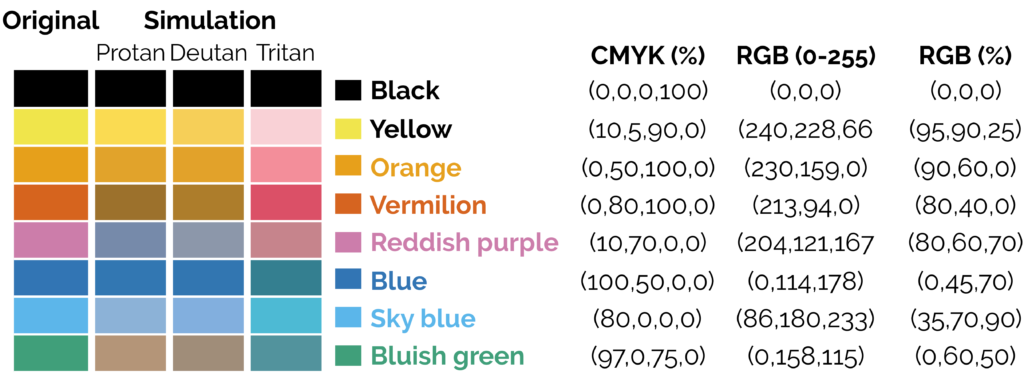
- If using a colour map, avoid the standard rainbow. Other rainbows like viridis colour maps can be downloaded. The brightness varies across the rainbow which leads to visual artefacts that do not exist:

The transition between greens to yellow and red are more prominent than the transitions between greens and blues, making stark boundaries that do not exist. A rainbow with equal brightness solves the problem.
Sisneros et al (2016) Chasing Rainbows: A Color-Theoretic Framework for Improving and Preserving Bad Colormaps. https://doi.org/10.1007/978-3-319-50835-1_36
- Keeping readability in mind with text size/font and similar considerations =======
- “First key point. Brief Answer to questions. (FIXME)”
Data exploration and insights
Let us now create two different DataFrames and perform the merging operations on it.
# import the pandas library
import pandas as pd
left = pd.DataFrame({
         'id':[1,2,3,4,5],
         'Name': ['Alnus', 'Agrostis', 'Betula', 'Vaccinium', 'Dactylis'],
         'subject_id':['sub1','sub2','sub4','sub6','sub5']})
right = pd.DataFrame(
         {'id':[1,2,3,4,5],
         'Name': ['Calune', 'Fallopia', 'Stachys', 'Stellaria', 'tiphy'],
         'subject_id':['sub2','sub4','sub3','sub6','sub5']})
print left
print right- Data Visualisation as a tool
Statistical analysis
Selection of appropriate statistical method is very important step in analysis of data. A wrong selection of the statistical method not only creates some serious problem during the interpretation of the findings but also affects the conclusion of the study. In statistics, for each specific situation, statistical methods are available to analysis and interpretation of the data. To select the appropriate statistical method, one need to know the assumption and conditions of the statistical methods, so that proper statistical method can be selected for data analysis. Other than knowledge of the statistical methods, another very important aspect is nature and type of the data collected and objective of the study because as per objective, corresponding statistical methods are selected which are suitable on given data. Incorrect statistical methods can be seen in many conditions like use of unpaired t-test on paired data or use of parametric test for the data which does not follow the normal distribution, etc., Two main statistical methods are used in data analysis: descriptive statistics, which summarizes data using indexes such as mean, median, standard deviation and another is inferential statistics, which draws conclusions from data using statistical tests such as student’s t-test, ANOVA test, etc.[
Type and distribution of data used
For the nominal, ordinal, discrete data, we use nonparametric methods while for continuous data, parametric methods as well as nonparametric methods are used. For example, in the regression analysis, when our outcome variable is categorical, logistic regression while for the continuous variable, linear regression model is used (https://www.ncbi.nlm.nih.gov/pmc/articles/PMC6206790/).
The choice of the most appropriate representative measure for continuous variable is dependent on how the values are distributed. If continuous variable follows normal distribution, mean is the representative measure while for non-normal data, median is considered as the most appropriate representative measure of the data set.
Similarly in the categorical data, proportion (percentage) while for the ranking/ordinal data, mean ranks are our representative measure. In the inferential statistics, hypothesis is constructed using these measures and further in the hypothesis testing, these measures are used to compare between/among the groups to calculate significance level.
Case Study:
A Researcher wants to compare the diastolic blood pressure (DBP) between three age groups (years) (<30, 30–50, >50). If the DBP variable is normally distributed, > mean value is the representative measure and null hypothesis stated that mean DBP values of the three age groups are statistically equal. In case of non-normal DBP variable, median value is the representative measure and null hypothesis stated that distribution of the DBP values among three age groups are statistically equal. In above example, one-way ANOVA test is used to compare the means when DBP follows normal distribution while Kruskal–Wallis H tests/median tests are used to compare > the distribution of DBP among three age groups when DBP follows non-normal distribution.
Similarly, suppose he wants to compare the mean arterial pressure (MAP) between treatment and control groups, if the MAP variable follows normal distribution, independent samples t-test while in case follow non-normal distribution, Mann–Whitney U test are used to compare the MAP between the treatment and control groups.
Other Statistical methods
- Logistic regression analysis is used to predict the categorical outcome variable using independent variable(s).
- Survival analysis is used to calculate the survival time/survival probability, comparison of the survival time between groups as well as to identify the predictors of the survival time of the subjects (Cox regression analysis).
- Receiver operating characteristics (ROC) curve is used to calculate area under curve (AUC) and cutoff values for given continuous variable with corresponding diagnostic accuracy using categorical outcome variable.
- Diagnostic accuracy of the test method is calculated as compared with another method (usually as compared with gold standard method).
- Sensitivity (proportion of the detected disease cases from the actual disease cases), specificity (proportion of the detected non-disease subjects from the actual non-disease subjects), overall accuracy (proportion of agreement between test and gold standard methods to correctly detect the disease and non-disease subjects) are the key measures used to assess the diagnostic accuracy of the test method.
- Other measures like false negative rate (1-sensitivity), false-positive rate (1-specificity), likelihood ratio positive (sensitivity/false-positive rate), likelihood ratio negative (false-negative rate/Specificity), positive predictive value (proportion of correctly detected disease cases by the test variable out of total detected disease cases by the itself), and negative predictive value (proportion of correctly detected non-disease subjects by test variable out of total non-disease subjects detected by the itself) are also used to calculate the diagnostic accuracy of the test method.
Summary of these methods can be found here https://www.ncbi.nlm.nih.gov/pmc/articles/PMC6639881/table/T3/?report=objectonly
Communicating Results
- What elements are involved
Producing figures
- Best practices
- Versions
- Publication with persistent identifier
Conclusion
- What gaps have we filled in this section
- Project management overview
Resources for taking this to next level
- https://the-turing-way.netlify.app/collaboration/new-community.html
- Data Visualisation as a tool