All in One View
Content from Introduction to Raster Data
Last updated on 2026-01-13 | Edit this page
Overview
Questions
- What format should I use to represent my data?
- What are the main data types used for representing geospatial data?
- What are the main attributes of raster data?
Objectives
- Describe the difference between raster and vector data.
- Describe the strengths and weaknesses of storing data in raster format.
- Distinguish between continuous and categorical raster data and identify types of datasets that would be stored in each format.
Introduction
This episode introduces the two primary types of data models that are used to digitally represent the Earth surface: raster and vector. After briefly introducing these data models, this episode focuses on the raster representation, describing some major features and types of raster data. This workshop will focus on how to work with both raster and vector data sets, therefore it is essential that we understand the basic structures of these types of data and the types of phenomena that they can represent.
Data Structures: Raster and Vector
The two primary data models that are used to represent the Earth surface digitally are the raster and vector. Raster data is stored as a grid of values which are rendered on a map as pixels (also known as cells) where each pixel (or cell) represents a value of the Earth surface. Examples of raster data are satellite images or aerial photographs. Data stored according to the vector data model are represented by points, lines, or polygons. Examples of vector representation are points of interest, buildings (often represented as building footprints) or roads.
Representing phenomena as vector data allows you to add attribute information to them. For instance, a polygon of a house can contain multiple attributes containing information about the address like the street name, zip code, city, and number. More explanations about vector data will be discussed in the next episode.
When working with spatial information, you will experience that many phenomena can be represented as vector data and raster data. A house, for instance, can be represented by a set of cells in a raster having all the same value or by a polygon as vector containing attribute information (figure 1). It depends on the purpose for which the data is collected and intended to be used which data model it is stored in. But as a rule of thumb, you can apply that discrete phenomena like buildings, roads, trees, signs are represented as vector data, whereas continuous phenomena like temperature, wind speed, elevation are represented as raster data. Yet, one of the things a spatial data analyst often has to do is to transform data from vector to raster or the other way around. Keep in mind that this can cause problems in the data quality.
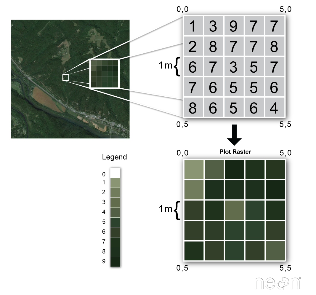
Raster Data
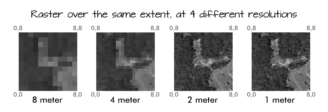
Raster data is any pixelated (or gridded) data where each pixel has a value and is associated with a specific geographic location. The value of a pixel can be continuous (e.g., elevation, temperature) or categorical (e.g., land-use type). If this sounds familiar, it is because this data structure is very common: it’s how we represent any digital image. A geospatial raster is only different from a digital photo in that it is accompanied by spatial information that connects the data to a particular location. This includes the raster’s extent and cell size, the number of rows and columns, and its Coordinate Reference System (CRS), which will be explained in episode 3 of this workshop.
Some examples of continuous rasters include:
- Precipitation maps.
- Elevation maps.
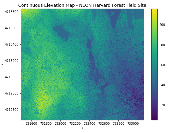
A map of elevation for Harvard Forest derived from the NEON AOP LiDAR sensor is below. Elevation is represented as a continuous numeric variable in this map. The legend shows the continuous range of values in the data from around 300 to 420 meters.
Some rasters contain categorical data where each pixel represents a discrete class such as a landcover type (e.g., “forest” or “grassland”) rather than a continuous value such as elevation or temperature. Some examples of classified maps include:
- Landcover / land-use maps.
- Elevation maps classified as low, medium, and high elevation.
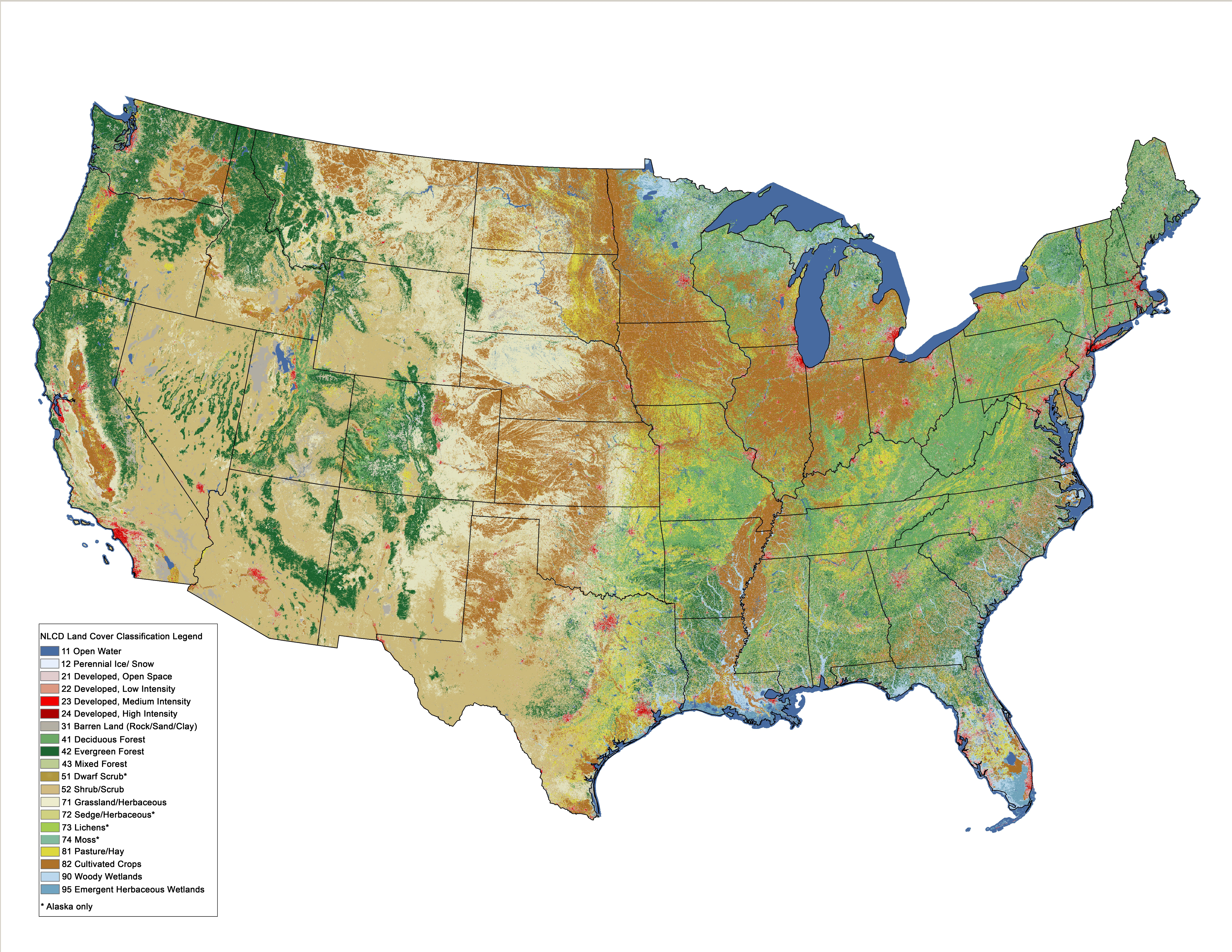
The map above shows the contiguous United States with landcover as categorical data. Each color is a different landcover category. (Source: Homer, C.G., et al., 2015, Completion of the 2011 National Land Cover Database for the conterminous United States-Representing a decade of land cover change information. Photogrammetric Engineering and Remote Sensing, v. 81, no. 5, p. 345-354)
Advantages and Disadvantages
With your neighbor, brainstorm potential advantages and disadvantages of storing data in raster format. Add your ideas to the Etherpad. The Instructor will discuss and add any points that weren’t brought up in the small group discussions.
Raster data has some important advantages:
- representation of continuous surfaces
- potentially very high levels of detail
- data is ‘unweighted’ across its extent - the geometry doesn’t implicitly highlight features
- cell-by-cell calculations can be very fast and efficient
The downsides of raster data are:
- very large file sizes as cell size gets smaller
- currently popular formats don’t embed metadata well (more on this later!)
- can be difficult to represent complex information
Important Attributes of Raster Data
Extent
The spatial extent is the geographic area that the raster data covers. The spatial extent of an object represents the geographic edge or location that is the furthest north, south, east and west. In other words, extent represents the overall geographic coverage of the spatial object.
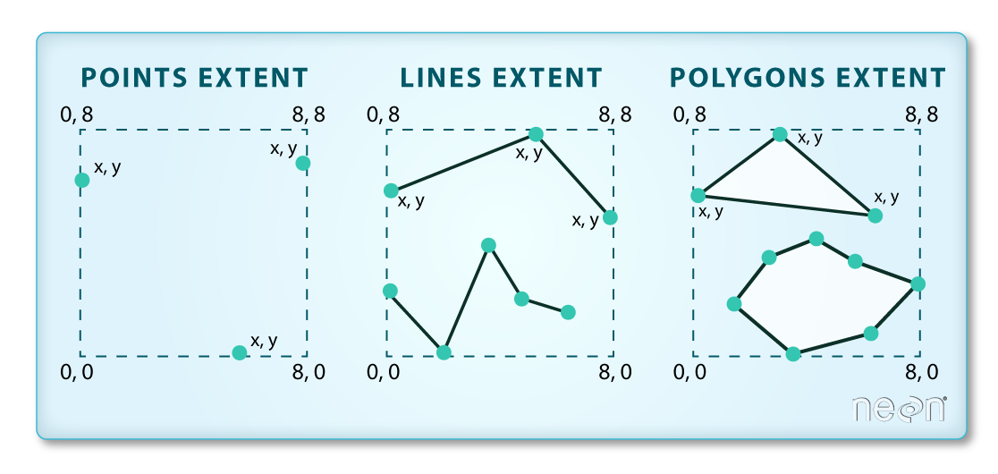
Extent Challenge
In the image above, the dashed boxes around each set of objects seems to imply that the three objects have the same extent. Is this accurate? If not, which object(s) have a different extent?
The lines and polygon objects have the same extent. The extent for the points object is smaller in the vertical direction than the other two because there are no points on the line at y = 8.
Raster Data Format for this Workshop
Raster data can come in many different formats. For this workshop, we
will use one of the most common formats for raster data, i.e. the
GeoTIFF format, which has the extension .tif. A
.tif file stores metadata or attributes about the file as
embedded tif tags. For instance, your camera might store a
tag that describes the make and model of the camera or the date the
photo was taken when it saves a .tif. A GeoTIFF is a
standard .tif image format with additional spatial
(georeferencing) information embedded in the file as tags. These tags
include the following raster metadata:
- Extent
- Resolution
- Coordinate Reference System (CRS) - we will introduce this concept in a later episode
- Values that represent missing data (
NoDataValue) - we will introduce this concept in a later episode.
We will discuss these attributes in more detail in a later episode. In that episode, we will also learn how to use Python to extract raster attributes from a GeoTIFF file.
More Resources on the .tif
format
Multi-band Raster Data
A raster can contain one or more bands. One type of multi-band raster dataset that is familiar to many of us is a color image. A basic color image often consists of three bands: red, green, and blue (RGB). Each band represents light reflected from the red, green or blue portions of the electromagnetic spectrum. The pixel brightness for each band, when composited creates the colors that we see in an image.
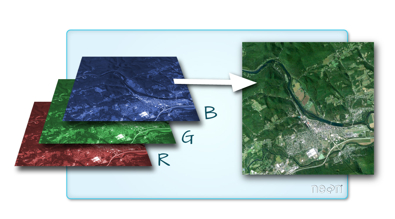
We can plot each band of a multi-band image individually.
Or we can composite all three bands together to make a color image.
In a multi-band dataset, the rasters will always have the same extent, resolution, and CRS.
Other Types of Multi-band Raster Data
Multi-band raster data might also contain: 1. Time series: the same variable, over the same area, over time. 2. Multi or hyperspectral imagery: image rasters that have 4 or more (multi-spectral) or more than 10-15 (hyperspectral) bands. We won’t be working with this type of data in this workshop, but you can check out the NEON Data Skills Imaging Spectroscopy HDF5 in R tutorial if you’re interested in working with hyperspectral data cubes.
- Raster data is pixelated data where each pixel is associated with a specific location.
- Raster data always has an extent and a resolution.
- The extent is the geographical area covered by a raster.
- The resolution is the area covered by each pixel of a raster.
Content from Introduction to Vector Data
Last updated on 2026-06-03 | Edit this page
Overview
Questions
- What are the main attributes of vector data?
Objectives
- Describe the strengths and weaknesses of storing data in vector format.
- Describe the three types of vectors and identify types of data that would be stored in each.
About Vector Data
Vector data structures represent specific features on the Earth’s surface, and assign attributes to those features. Vectors are composed of discrete geometric locations (x, y values) known as vertices that define the shape of the spatial object. The organization of the vertices determines the type of vector that we are working with: point, line or polygon.
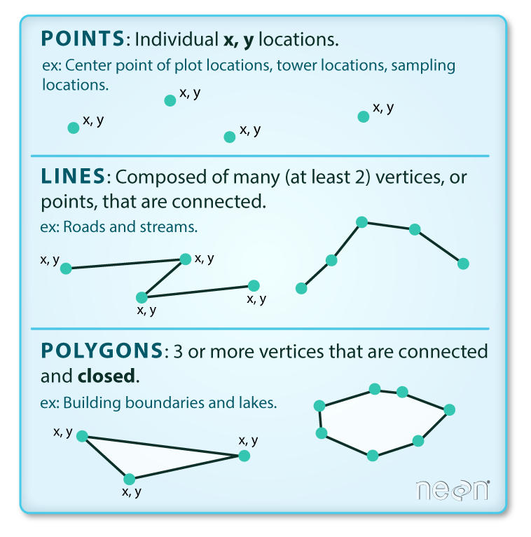
Points: Each point is defined by a single x, y coordinate. There can be many points in a vector point file. Examples of point data include: sampling locations, the location of individual trees, or the location of survey plots.
Lines: Lines are composed of many (at least 2) points that are connected. For instance, a road or a stream may be represented by a line. This line is composed of a series of segments, each “bend” in the road or stream represents a vertex that has a defined x, y location.
Polygons: A polygon consists of 3 or more vertices that are connected and closed. The outlines of survey plot boundaries, lakes, oceans, and states or countries are often represented by polygons. Note, that polygons can also contain one or multiple holes, for instance a plot boundary with a lake in it. These polygons are considered complex or donut polygons.
Data Tip
Sometimes, boundary layers such as states and countries, are stored as lines rather than polygons. However, these boundaries, when represented as a line, will not create a closed object with a defined area that can be filled.
Identify Vector Types
The plot below includes examples of two of the three types of vector objects. Use the definitions above to identify which features are represented by which vector type.
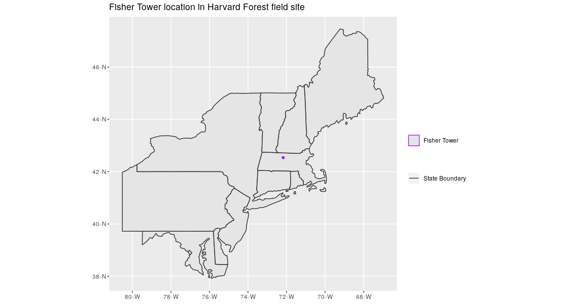
State boundaries are shown as polygons. The Fisher Tower location is represented by a purple point. There are no line features shown. Note, that at a different scale the Fischer Tower could also have been represented as a polygon. Keep in mind that the purpose for which the dataset is created and aimed to be used for determines which vector type it uses.
Vector data has some important advantages:
- The geometry itself contains information about what the dataset creator thought was important
- The geometry structures hold information in themselves - why choose point over polygon, for instance?
- Each geometry feature can carry multiple attributes instead of just one, e.g. a database of cities can have attributes for name, country, population, etc
- Data storage can, depending on the scale, be very efficient compared to rasters
- When working with network analysis, for instance to calculate the shortest route between A and B, topologically correct lines are essential. This is not possible through raster data.
The downsides of vector data include:
- Potential bias in datasets - what didn’t get recorded? Often vector data are interpreted datasets like topographical maps and have been collected by someone else, for another purpose.
- Calculations involving multiple vector layers need to do math on the geometry as well as the attributes, which potentially can be slow compared to raster calculations.
Vector datasets are in use in many industries besides geospatial fields. For instance, computer graphics are largely vector-based, although the data structures in use tend to join points using arcs and complex curves rather than straight lines. Computer-aided design (CAD) is also vector- based. The difference is that geospatial datasets are accompanied by information tying their features to real-world locations.
Vector Data Format for this Workshop
Like raster data, vector data can also come in many different formats. For this workshop, we will use the GeoPackage format. GeoPackage is developed by the Open Geospatial Consortium and is is an open, standards-based, platform-independent, portable, self-describing, compact format for transferring geospatial information (source: https://www.geopackage.org/). A GeoPackage file, with extension .gpkg, is a single file that contains the geometries of features, their attributes and information about the coordinate reference system (CRS) used.
Another vector format that you will probably come across quite often
is a Shapefile. Although we will not be using this format in this lesson
we do believe it is useful to understand how the Shapefile format works.
Shapefile is a multi-file format, with each shapefile consisting of
multiple files in the same directory, of which .shp,
.shx, and .dbf files are mandatory. Other
non-mandatory but very important files are .prj and
shp.xml files.
- The
.shpfile stores the feature geometry itself -
.shxis a positional index of the feature geometry to allow quickly searching forwards and backwards the geographic coordinates of each vertex in the vector -
.dbfcontains the tabular attributes for each shape. -
.prjfile indicates the Coordinate reference system (CRS) -
.shp.xmlcontains the Shapefile metadata.
Together, the Shapefile includes the following information:
- Extent - the spatial extent of the shapefile (i.e. geographic area that the shapefile covers). The spatial extent for a shapefile represents the combined extent for all spatial objects in the shapefile.
- Object type - whether the shapefile includes points, lines, or polygons.
- Coordinate reference system (CRS)
- Other attributes - for example, a line shapefile that contains the locations of streams, might contain the name of each stream.
Because the structure of points, lines, and polygons are different, each individual shapefile can only contain one vector type (all points, all lines or all polygons). You will not find a mixture of point, line and polygon objects in a single shapefile.
More Resources on Shapefiles
More about shapefiles can be found on Wikipedia. Shapefiles are often publicly available from government services, such as this page containing all administrative boundaries for countries in the world or topographical vector data from Open Street Maps.
Why not both?
Very few formats can contain both raster and vector data - in fact, most are even more restrictive than that. Vector datasets are usually locked to one geometry type, e.g. points only. Raster datasets can usually only encode one data type, for example you can’t have a multiband GeoTIFF where one layer is integer data and another is floating-point. There are sound reasons for this - format standards are easier to define and maintain, and so is metadata. The effects of particular data manipulations are more predictable if you are confident that all of your input data has the same characteristics.
- Vector data structures represent specific features on the Earth’s surface along with attributes of those features.
- Vector data is often interpreted data and collected for a different purpose than you would want to use it for.
- Vector objects are either points, lines, or polygons.
Content from Coordinate Reference Systems
Last updated on 2026-06-03 | Edit this page
Overview
Questions
- What is a coordinate reference system and how do I interpret one?
Objectives
- Name some common schemes for describing coordinate reference systems.
- Interpret a PROJ4 coordinate reference system description.
Coordinate Reference Systems
A data structure cannot be considered geospatial unless it is accompanied by coordinate reference system (CRS) information, in a format that geospatial applications can use to display and manipulate the data correctly. CRS information connects data to the Earth’s surface using a mathematical model.
CRS vs SRS
CRS (coordinate reference system) and SRS (spatial reference system) are synonyms and are commonly interchanged. We will use only CRS throughout this workshop.
The CRS associated with a dataset tells your mapping software where the raster is located in geographic space. It also tells the mapping software what method should be used to flatten or project the raster in geographic space.
The image below (figure 3.1) shows maps of the United States in different projections. Notice the differences in shape associated with each projection. These differences are a direct result of the calculations used to flatten the data onto a 2-dimensional map.
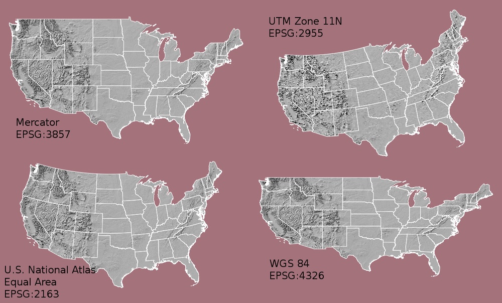
There are lots of great resources that describe coordinate reference systems and projections in greater detail. For the purposes of this workshop, what is important to understand is that data from the same location but saved in different projections will not line up. Thus, it is important when working with spatial data to identify the coordinate reference system applied to the data and retain it throughout data processing and analysis.
Components of a CRS
CRS information has three components:
Datum: A model of the shape of the earth. It has angular units (i.e. degrees) and defines the starting point (i.e. where is [0,0]?) so the angles reference a meaningful spot on the earth. Common global datums are WGS84 and NAD83. Datums can also be local - fit to a particular area of the globe, but ill-fitting outside the area of intended use. For instance local cadastre, land registry and mapping agencies require a high quality for their datasets, which can be obtained using a local system. In this lesson, we will use the WGS84 datum. The datum is often also referred to as the Geographical Coordinate System.
Projection: A mathematical transformation of the angular measurements on a round earth to a flat surface (i.e. paper or a computer screen). The units associated with a given projection are usually linear (feet, meters, etc.). In this workshop, we will see data in two different projections. Note that the projection is also often referred to as Projected Coordinate System.
Additional Parameters: Additional parameters are often necessary to create the full coordinate reference system. One common additional parameter is a definition of the center of the map. The number of required additional parameters depends on what is needed by each specific projection.
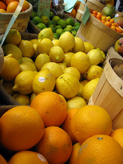
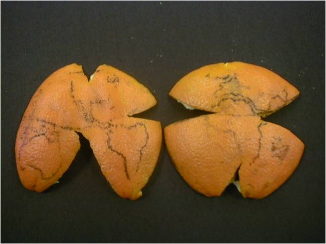
Orange Peel Analogy
A common analogy employed to teach projections is the orange peel analogy. If you imagine that the Earth is an orange, how you peel it and then flatten the peel is similar to how projections get made.
- A datum is the choice of fruit to use. Is the Earth an orange, a lemon, a lime, a grapefruit?
A projection is how you peel your orange and then flatten the peel.
- An additional parameter could include a definition of the location of the stem of the fruit. What other parameters could be included in this analogy?
Which projection should I use?
A well know projection is the Mercator projection introduced by the Flemisch cartographer Gerardus Mercator in the 16th Century. This is a so-called cylindrical projection, meaning that a virtual cylinder is placed around the globe to flatten it. This type of projections are relatively accurate near to the equator, but towards the poles blows things up (more info on cylindrical projections here. The main advantage of the Mercator projection is that it is very suitable for navigation purposes since it always shows North as up and South and as down - in the 17th century this projection was essential for sailors to navigate the oceans.
To decide if a projection is right for your data, answer these questions:
- What is the area of minimal distortion?
- What aspect of the data does it preserve?
The Department of Geo-Information Processing has a good discussion of these aspects of projections. Online tools like Projection Wizard and the Worldmapgenerator can also help you explore projections and discover what might be a good fit for your data.
Data Tip
Take the time to identify a projection that is suited for your project. You don’t have to stick to the ones that are popular.
Describing Coordinate Reference Systems
There are several common systems in use for storing and transmitting CRS information, as well as translating among different CRSs. These systems generally comply with ISO 19111. Common systems for describing CRSs include EPSG, OGC WKT, and PROJ strings.
EPSG
The EPSG system is a database of CRS information maintained by the International Association of Oil and Gas Producers. The dataset contains both CRS definitions and information on how to safely convert data from one CRS to another. Using EPSG is easy as every CRS has an integer identifier, e.g. WGS84 is EPSG:4326. The downside is that you can only use the CRSs defined by EPSG and cannot customise them (some datasets do not have EPSG codes). epsg.io is an excellent website for finding suitable projections by location or for finding information about a particular EPSG code.
Well-Known Text
The Open Geospatial Consortium WKT standard is used by a number of important geospatial apps and software libraries. WKT is a nested list of geodetic parameters. The structure of the information is defined on their website. WKT is valuable in that the CRS information is more transparent than in EPSG, but can be more difficult to read and compare than PROJ since it is meant to necessarily represent more complex CRS information. Additionally, the WKT standard is implemented inconsistently across various software platforms, and the spec itself has some known issues.
PROJ
PROJ is an open-source library for storing, representing and transforming CRS information. PROJ strings continue to be used, but the format is deprecated by the PROJ C maintainers due to inaccuracies when converting to the WKT format. The data and python libraries we will be working with in this workshop use different underlying representations of CRSs under the hood for reprojecting. CRS information can still be represented with EPSG, WKT, or PROJ strings without consequence, but it is best to only use PROJ strings as a format for viewing CRS information, not for reprojecting data.
PROJ represents CRS information as a text string of key-value pairs, which makes it easy to read and interpret.
A PROJ4 string includes the following information:
- proj: the projection of the data
- zone: the zone of the data (this is specific to the UTM projection)
- datum: the datum used
- units: the units for the coordinates of the data
- ellps: the ellipsoid (how the earth’s roundness is calculated) for the data
Note that the zone is unique to the UTM projection. Not all CRSs will have a zone.

Reading a PROJ4 String
Here is a PROJ4 string for one of the datasets we will use in this workshop:
+proj=utm +zone=18 +datum=WGS84 +units=m +no_defs +ellps=WGS84 +towgs84=0,0,0
- What projection, zone, datum, and ellipsoid are used for this data?
- What are the units of the data?
- Using the map above, what part of the United States was this data collected from?
- Projection is UTM, zone 18, datum is WGS84, ellipsoid is WGS84.
- The data is in meters.
- The data comes from the eastern US seaboard.
Format interoperability
Many existing file formats were invented by GIS software developers, often in a closed-source environment. This led to the large number of formats on offer today, and considerable problems transferring data between software environments. The Geospatial Data Abstraction Library (GDAL) is an open-source answer to this issue.
GDAL is a set of software tools that translate between almost any geospatial format in common use today (and some not so common ones). GDAL also contains tools for editing and manipulating both raster and vector files, including reprojecting data to different CRSs. GDAL can be used as a standalone command-line tool, or built in to other GIS software. Several open-source GIS programs use GDAL for all file import/export operations.
Metadata
Spatial data is useless without metadata. Essential metadata includes the CRS information, but proper spatial metadata encompasses more than that. History and provenance of a dataset (how it was made), who is in charge of maintaining it, and appropriate (and inappropriate!) use cases should also be documented in metadata. This information should accompany a spatial dataset wherever it goes. In practice this can be difficult, as many spatial data formats don’t have a built-in place to hold this kind of information. Metadata often has to be stored in a companion file, and generated and maintained manually.
More Resources on CRS
- spatialreference.org - A comprehensive online library of CRS information.
- QGIS Documentation - CRS Overview.
- Choosing the Right Map Projection.
- Video highlighting how map projections can make continents seems proportionally larger or smaller than they actually are.
- The True size An intuitive webmap that allows you to compare the actual size of countries by dragging them to another place in the webmercator projection.
- All geospatial datasets (raster and vector) are associated with a specific coordinate reference system.
- A coordinate reference system includes datum, projection, and additional parameters specific to the dataset.
- All maps are distorted because of the projection.
Content from The Geospatial Landscape
Last updated on 2026-01-13 | Edit this page
Overview
Questions
- What programs and applications are available for working with geospatial data?
Objectives
- Describe the difference between various approaches to geospatial computing, and their relative strengths and weaknesses.
- Name some commonly used GIS applications.
- Name some commonly used Python packages that can access and process spatial data.
- Describe pros and cons for working with geospatial data using a command-line versus a graphical user interface.
Standalone Software Packages
Most traditional GIS work is carried out in standalone applications that aim to provide end-to-end geospatial solutions. These applications are available under a wide range of licenses and price points. Some of the most common are listed below.
Open-source software
The Open Source Geospatial Foundation (OSGEO) supports several actively managed GIS platforms:
- QGIS is a professional GIS application that is built on top of and proud to be itself Free and Open Source Software (FOSS). QGIS is written in Python and C++, has a python console interface and allows one to develop plugins.
- GRASS GIS, commonly referred to as GRASS (Geographic Resources Analysis Support System), is a FOSS-GIS software suite used for geospatial data management and analysis, image processing, graphics and maps production, spatial modeling, and visualization. GRASS GIS is currently used in academic and commercial settings around the world, as well as by many governmental agencies and environmental consulting companies. It is a founding member of the Open Source Geospatial Foundation (OSGeo). GRASS GIS can be installed along with and made accessible within QGIS 3.
- GDAL is a multiplatform set of tools for translating between geospatial data formats. It can also handle reprojection and a variety of geoprocessing tasks. GDAL is built in to many applications both FOSS and commercial, including GRASS and QGIS.
- SAGA-GIS, or System for Automated Geoscientific Analyses, is a FOSS-GIS application developed by a small team of researchers from the Dept. of Physical Geography, Göttingen, and the Dept. of Physical Geography, Hamburg. SAGA has been designed for an easy and effective implementation of spatial algorithms, offers a comprehensive, growing set of geoscientific methods, provides an easily approachable user interface with many visualisation options, and runs under Windows and Linux operating systems. Like GRASS GIS, it can also be installed and made accessible in QGIS3.
- PostGIS is a geospatial extension to the PostGreSQL relational database and is especially suited to work with large vector datasets.
- GeoDMS is a powerful Open Source GIS software which allows for fast calculations and calculations with large datasets. Furthermore it allows for complex scenario analyses.
Commercial software
- ESRI (Environmental Systems Research Institute) is an international supplier of geographic information system (GIS) software, web GIS and geodatabase management applications. ESRI provides several licenced platforms for performing GIS, including ArcGIS, ArcGIS Online, and Portal for ArcGIS a standalone version of ArGIS Online which you host locally. ESRI welcomes development on their platforms through their DevLabs. ArcGIS software can be installed using Chef Cookbooks from Github. In addition, ESRI offers the ArcPy Python library as part of an ArcGIS Pro licence, allowing to translate operations in the ArcGIS Pro GUI to Python scripts.
- Precisely produces MapInfo Professional, formerly developed by Pitney Bowes Software, which was one of the earliest desktop GIS programs on the market.
- Hexagon Geospatial Power Portfolio includes many geospatial tools including ERDAS Imagine, powerful software for remote sensing.
- Manifold is a desktop GIS that emphasizes speed through the use of parallel and GPU processing.
Online + Cloud computing
- PANGEO is a community organization dedicated to open and reproducible data science with python. They focus on the Pangeo software ecosystem for working with big data in the geosciences.
- Google developed Google Earth Engine which combines a multi-petabyte catalog of satellite imagery and geospatial datasets with planetary-scale analysis capabilities and makes it available for scientists, researchers, and developers to detect changes, map trends, and quantify differences on the Earth’s surface. Earth Engine API runs in both Python and JavaScript.
- ArcGIS Online provides access to thousands of maps and base layers.
Private companies have released SDK platforms for large scale GIS analysis:
- Kepler.gl is Uber’s toolkit for handling large datasets (i.e. Uber’s data archive).
Publicly funded open-source platforms for large scale GIS analysis:
- PANGEO for the Earth Sciences. This community organization also supports python libraries like xarray, iris, dask, jupyter, and many other packages.
- Sepal.io by FAO Open Foris utilizing EOS satellite imagery and cloud resources for global forest monitoring.
GUI vs CLI
The earliest computer systems operated without a graphical user interface (GUI), relying only on the command-line interface (CLI). Since mapping and spatial analysis are strongly visual tasks, GIS applications benefited greatly from the emergence of GUIs and quickly came to rely heavily on them. Most modern GIS applications have very complex GUIs, with all common tools and procedures accessed via buttons and menus.
Benefits of using a GUI include:
- Tools are all laid out in front of you
- Complex commands are easy to build
- Don’t need to learn a coding language
- Cartography and visualisation is more intuitive and flexible
Downsides of using a GUI include:
- Low reproducibility - you can record your actions and replay, but this is limited to the functionalities of the software
- Batch-processing is possible, but limited to the funstionalities of the software and hard to be integrated with other workflows
- Limited ability to customise functions or write your own
- Intimidating interface for new users - so many buttons!
In scientific computing, the lack of reproducibility in point-and-click software has come to be viewed as a critical weakness. As such, scripted CLI-style workflows are becoming popular, which leads us to another approach to doing GIS — via a programming language. Therefore this is the approach we will be using throughout this workshop.
GIS in programming languages
A number of powerful geospatial processing libraries exist for general-purpose programming languages like Java and C++. However, the learning curve for these languages is steep and the effort required is excessive for users who only need a subset of their functionality.
Higher-level scripting languages like Python and R are considered
easier to learn and use. Both now have their own packages that wrap up
those geospatial processing libraries and make them easy to access and
use safely. A key example is the Java Topology Suite (JTS), which is
implemented in C++ as GEOS. GEOS is accessible in Python via the
shapely package (and geopandas, which makes
use of shapely) and in R via sf. R and Python
also have interface packages for GDAL, and for specific GIS apps.
This last point is a huge advantage for GIS-by-programming; these interface packages give you the ability to access functions unique to particular programs, but have your entire workflow recorded in a central document - a document that can be re-run at will. Below are lists of some of the key spatial packages for Python, which we will be using in the remainder of this workshop.
-
geopandasandgeocubefor working with vector data -
rasterioandrioxarrayfor working with raster data
These packages along with the matplotlib package are all
we need for spatial data visualisation. Python also has many fundamental
scientific packages that are relevant in the geospatial domain. Below is
a list of particularly fundamental packages. numpy,
scipy, and scikit-image are all excellent
options for working with rasters, as arrays.
An overview of these and other Python spatial packages can be accessed here.
As a programming language, Python can be a CLI tool. However, using Python together with an Integrated Development Environment (IDE) application allows some GUI features to become part of your workflow. IDEs allow the best of both worlds. They provide a place to visually examine data and other software objects, interact with your file system, and draw plots and maps, but your activities are still command-driven: recordable and reproducible. There are several IDEs available for Python. JupyterLab is well-developed and the most widely used option for data science in Python. VSCode and Spyder are other popular options for data science.
Traditional GIS apps are also moving back towards providing a scripting environment for users, further blurring the CLI/GUI divide. ESRI have adopted Python into their software by introducing ArcPy, and QGIS is both Python and R-friendly.
GIS File Types
There are a variety of file types that are used in GIS analysis. Depending on the program you choose to use some file types can be used while others are not readable. Below is a brief table describing some of the most common vector and raster file types.
Vector
| File Type | Extensions | Description |
|---|---|---|
| Esri Shapefile | .SHP .DBF .SHX | The most common geospatial file type. This has become the industry standard. The three required files are: SHP is the feature geometry. SHX is the shape index position. DBF is the attribute data. |
| GeoPackage | .gpkg | As an alternative to Shapefile, this open file format is gaining terrain and it consists of one file containing all necessary attribute information. |
| Geographic JavaScript Object Notation (GeoJSON) | .GEOJSON .JSON | Used for web-based mapping and uses JavaScript Object Notation to store the coordinates as text. |
| Google Keyhole Markup Language (KML) | .KML .KMZ | KML stands for Keyhole Markup Language. This GIS format is XML-based and is primarily used for Google Earth. |
| GPX or GPS Exchange Format | .gpx | XML schema designed as a common GPS data format for software applications. This format is often used for tracking activities e.g. hiking, cycling, running etc. |
| OpenStreetMap | .OSM | OSM files are the native file for OpenStreetMap which had become the largest crowdsourcing GIS data project in the world. These files are a collection of vector features from crowd-sourced contributions from the open community. |
Raster
| File Type | Extensions | Description |
|---|---|---|
| ERDAS Imagine | .IMG | ERDAS Imagine IMG files is a proprietary file format developed by Hexagon Geospatial. IMG files are commonly used for raster data to store single and multiple bands of satellite data.Each raster layer as part of an IMG file contains information about its data values. For example, this includes projection, statistics, attributes, pyramids and whether or not it’s a continuous or discrete type of raster. |
| GeoTIFF | .TIF .TIFF .OVR | The GeoTIFF has become an industry image standard file for GIS and satellite remote sensing applications. GeoTIFFs may be accompanied by other files:TFW is the world file that is required to give your raster geolocation.XML optionally accompany GeoTIFFs and are your metadata.AUX auxiliary files store projections and other information.OVR pyramid files improves performance for raster display. |
| Cloud Optimized GeoTIFF (COG) | .TIF .TIFF | Based on the GeoTIFF standard, COGs incorporate tiling and overviews to support HTTP range requests where users can query and load subsets of the image without having to transfer the entire file. |
- Many software packages exist for working with geospatial data.
- Command-line programs allow you to automate and reproduce your work.
- JupyterLab provides a user-friendly interface for working with Python.
Content from Access satellite imagery using Python
Last updated on 2026-06-03 | Edit this page
Overview
Questions
- Where can I find open-access satellite data?
- How do I search for satellite imagery with the STAC API?
- How do I fetch remote raster datasets using Python?
Objectives
- Search public STAC repositories of satellite imagery using Python.
- Inspect search result’s metadata.
- Download (a subset of) the assets available for a satellite scene.
- Open satellite imagery as raster data and save it to disk.
Introduction
A number of satellites take snapshots of the Earth’s surface from space. The images recorded by these remote sensors represent a very precious data source for any activity that involves monitoring changes on Earth. Satellite imagery is typically provided in the form of geospatial raster data, with the measurements in each grid cell (“pixel”) being associated to accurate geographic coordinate information.
In this episode we will explore how to access open satellite data using Python. In particular, we will consider the Sentinel-2 data collection that is hosted on Amazon Web Services (AWS). This dataset consists of multi-band optical images acquired by the constellation of two satellites from the Sentinel-2 mission and it is continuously updated with new images.
Search for satellite imagery
The SpatioTemporal Asset Catalog (STAC) specification
Current sensor resolutions and satellite revisit periods are such that terabytes of data products are added daily to the corresponding collections. Such datasets cannot be made accessible to users via full-catalog download. Therefore, space agencies and other data providers often offer access to their data catalogs through interactive Graphical User Interfaces (GUIs), see for instance the Copernicus Browser for the Sentinel missions. Accessing data via a GUI is a nice way to explore a catalog and get familiar with its content, but it represents a heavy and error-prone task that should be avoided if carried out systematically to retrieve data.
A service that offers programmatic access to the data enables users to reach the desired data in a more reliable, scalable and reproducible manner. An important element in the software interface exposed to the users, which is generally called the Application Programming Interface (API), is the use of standards. Standards, in fact, can significantly facilitate the reusability of tools and scripts across datasets and applications.
The SpatioTemporal Asset Catalog (STAC) specification is an emerging standard for describing geospatial data. By organizing metadata in a form that adheres to the STAC specifications, data providers make it possible for users to access data from different missions, instruments and collections using the same set of tools.
Search a STAC catalog
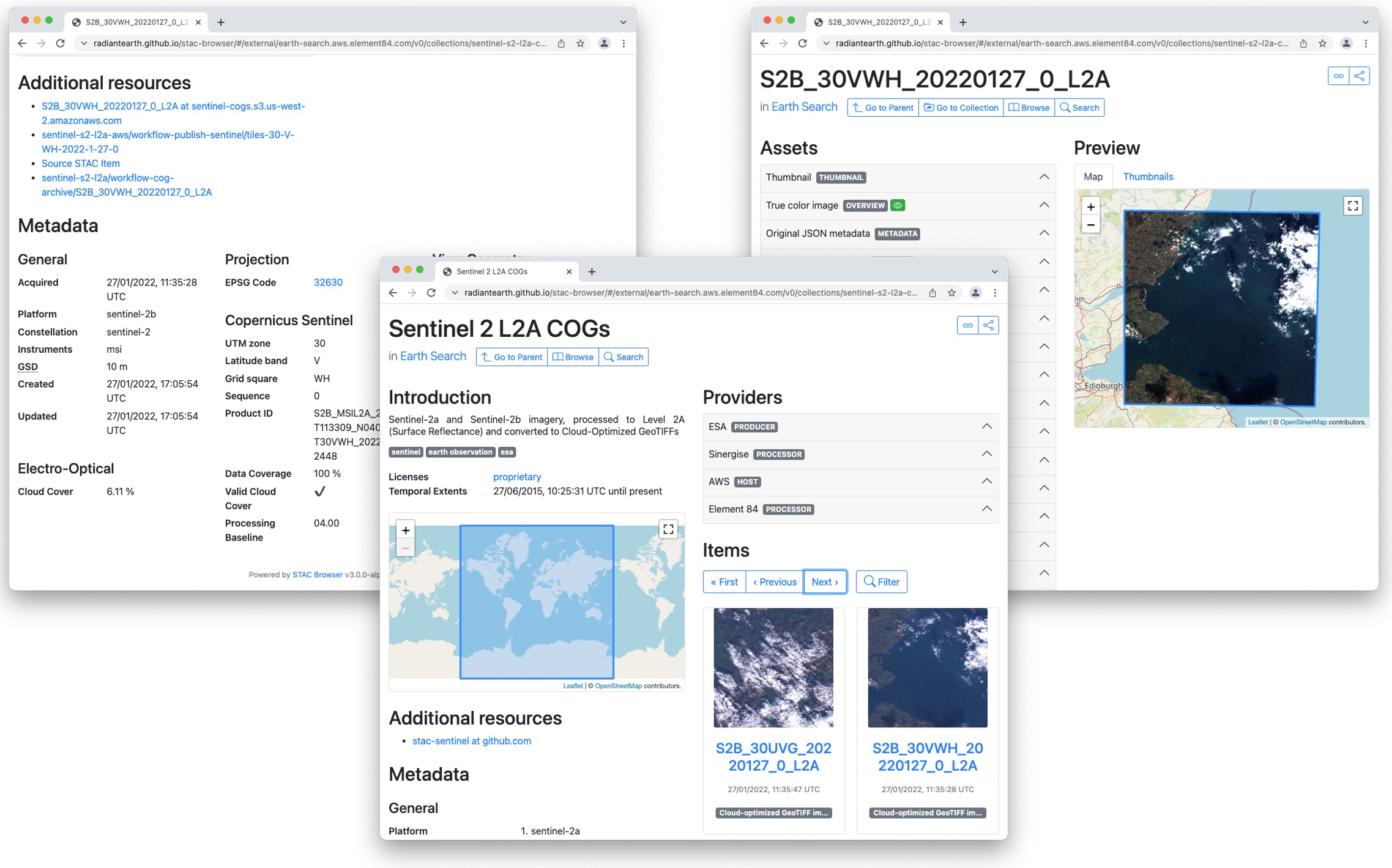
The STAC browser is a good starting point to discover available datasets, as it provides an up-to-date list of existing STAC catalogs. From the list, let’s click on the “Earth Search” catalog, i.e. the access point to search the archive of Sentinel-2 images hosted on AWS.
Exercise: Discover a STAC catalog
Let’s take a moment to explore the Earth Search STAC catalog, which is the catalog indexing the Sentinel-2 collection that is hosted on AWS. We can interactively browse this catalog using the STAC browser at this link.
- Open the link in your web browser. Which (sub-)catalogs are available?
- Open the Sentinel-2 Level 2A collection, and select one item from the list. Each item corresponds to a satellite “scene”, i.e. a portion of the footage recorded by the satellite at a given time. Have a look at the metadata fields and the list of assets. What kind of data do the assets represent?
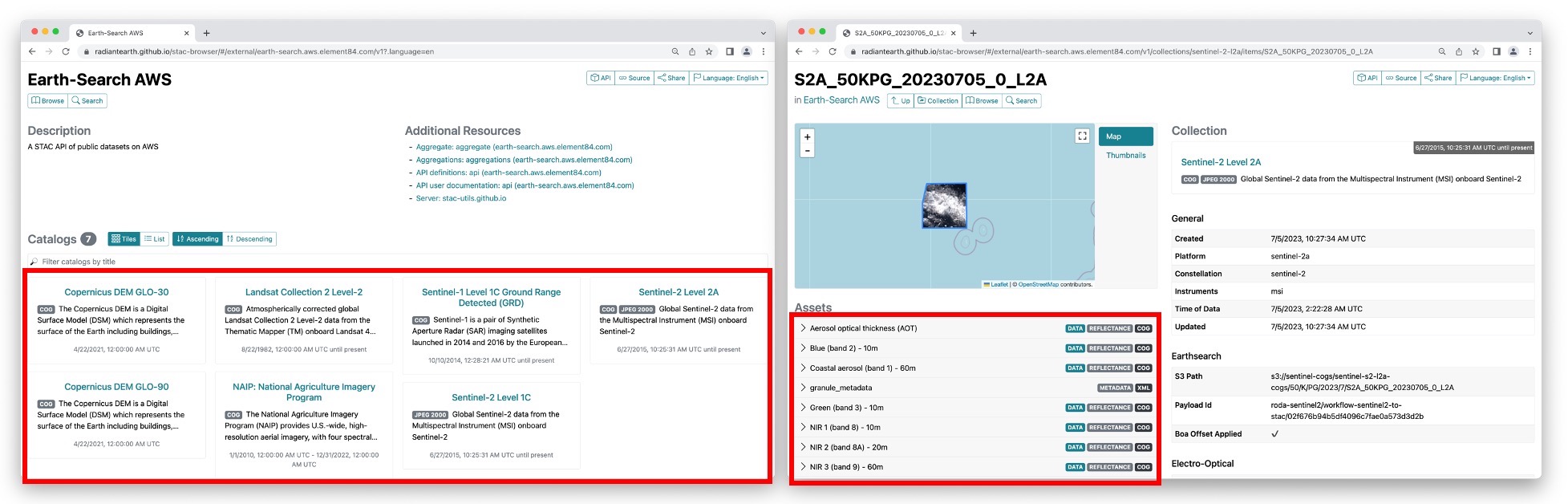
- 8 sub-catalogs are available. In the STAC nomenclature, these are actually “collections”, i.e. catalogs with additional information about the elements they list: spatial and temporal extents, license, providers, etc. Among the available collections, we have Landsat Collection 2, Level-2 and Sentinel-2 Level 2A (see left screenshot in the figure above).
- When you select the Sentinel-2 Level 2A collection, and randomly choose one of the items from the list, you should find yourself on a page similar to the right screenshot in the figure above. On the left side you will find a list of the available assets: overview images (thumbnail and true color images), metadata files and the “real” satellite images, one for each band captured by the Multispectral Instrument on board Sentinel-2.
When opening a catalog with the STAC browser, you can access the API URL by clicking on the “Source” button on the top right of the page. By using this URL, you have access to the catalog content and, if supported by the catalog, to the functionality of searching its items. For the Earth Search STAC catalog the API URL is:
You can query a STAC API endpoint from Python using the pystac_client
library. To do so we will first import Client from
pystac_client and use the method
open from the Client object:
For this episode we will focus at scenes belonging to the
sentinel-2-l2a collection. This dataset is useful for our
case and includes Sentinel-2 data products pre-processed at level 2A
(bottom-of-atmosphere reflectance).
In order to see which collections are available in the provided
api_url the get_collections
method can be used on the Client object.
To print the collections we can make a for loop doing:
OUTPUT
<CollectionClient id=cop-dem-glo-30>
<CollectionClient id=naip>
<CollectionClient id=sentinel-2-l2a>
<CollectionClient id=sentinel-2-l1c>
<CollectionClient id=cop-dem-glo-90>
<CollectionClient id=landsat-c2-l2>
<CollectionClient id=sentinel-1-grd>
<CollectionClient id=sentinel-2-c1-l2a>
As said, we want to focus to the sentinel-2-l2a
collection. To do so, we set this collection into a variable:
The data in this collection is stored in the Cloud Optimized GeoTIFF (COG) format and as JPEG2000 images. In this episode we will focus at COGs, as these offer useful functionalities for our purpose.
Cloud Optimized GeoTIFFs
Cloud Optimized GeoTIFFs (COGs) are regular GeoTIFF files with some additional features that make them ideal to be employed in the context of cloud computing and other web-based services. This format builds on the widely-employed GeoTIFF format, already introduced in Episode 1: Introduction to Raster Data. In essence, COGs are regular GeoTIFF files with a special internal structure. One of the features of COGs is that data is organized in “blocks” that can be accessed remotely via independent HTTP requests. Data users can thus access the only blocks of a GeoTIFF that are relevant for their analysis, without having to download the full file. In addition, COGs typically include multiple lower-resolution versions of the original image, called “overviews”, which can also be accessed independently. By providing this “pyramidal” structure, users that are not interested in the details provided by a high-resolution raster can directly access the lower-resolution versions of the same image, significantly saving on the downloading time. More information on the COG format can be found here.
In order to get data for a specific location you can add longitude
latitude coordinates (World Geodetic System 1984 EPSG:4326) in your
request. In order to do so we are using the shapely library
to define a geometrical point. Below we have included a point on the
island of Rhodes, which is the location of interest for our case study
(i.e. Longitude: 27.95 | Latitude 36.20).
PYTHON
from shapely.geometry import Point
point = Point(27.95, 36.20)  # Coordinates of a point on Rhodes
Note: at this stage, we are only dealing with metadata, so no image
is going to be downloaded yet. But even metadata can be quite bulky if a
large number of scenes match our search! For this reason, we limit the
search by the intersection of the point (by setting the parameter
intersects) and assign the collection (by setting the
parameter collections). More information about the possible
parameters to be set can be found in the pystac_client
documentation for the Client’s
search method.
We now set up our search of satellite images in the following way:
Now we submit the query in order to find out how many scenes match our search criteria with the parameters assigned above (please note that this output can be different as more data is added to the catalog to when this episode was created):
OUTPUT
611You will notice that more than 500 scenes match our search criteria. We are however interested in the period right before and after the wildfire of Rhodes. In the following exercise you will therefore have to add a time filter to our search criteria to narrow down our search for images of that period.
Exercise: Search satellite scenes with a time filter
Search for all the available Sentinel-2 scenes in the
sentinel-2-c1-l2a collection that have been recorded
between 1st of July 2023 and 31st of August 2023 (few weeks before and
after the time in which the wildfire took place).
Hint: You can find the input argument and the required syntax in the
documentation of client.search (which you can access from
Python or online)
How many scenes are available?
Now that we have added a time filter, we retrieve the metadata of the
search results by calling the method item_collection:
The variable items is an ItemCollection
object. More information can be found at the pystac
documentation
Now let us check the size using len:
OUTPUT
12which is consistent with the number of scenes matching our search
results as found with search.matched(). We can iterate over
the returned items and print these to show their IDs:
OUTPUT
<Item id=S2A_35SNA_20230827_0_L2A>
<Item id=S2B_35SNA_20230822_0_L2A>
<Item id=S2A_35SNA_20230817_0_L2A>
<Item id=S2B_35SNA_20230812_0_L2A>
<Item id=S2A_35SNA_20230807_0_L2A>
<Item id=S2B_35SNA_20230802_0_L2A>
<Item id=S2A_35SNA_20230728_0_L2A>
<Item id=S2B_35SNA_20230723_0_L2A>
<Item id=S2A_35SNA_20230718_0_L2A>
<Item id=S2B_35SNA_20230713_0_L2A>
<Item id=S2A_35SNA_20230708_0_L2A>
<Item id=S2B_35SNA_20230703_0_L2A>
Each of the items contains information about the scene geometry, its
acquisition time, and other metadata that can be accessed as a
dictionary from the properties attribute. To see which
information Item objects can contain you can have a look at the pystac
documentation.
Let us inspect the metadata associated with the first item of the search results. Let us first look at the collection date of the first item::
OUTPUT
2023-08-27 09:00:21.327000+00:00Let us now look at the geometry and other properties as well.
OUTPUT
{'type': 'Polygon', 'coordinates': [[[27.290401625602243, 37.04621863329741], [27.23303872472207, 36.83882218126937], [27.011145718480538, 36.05673246264742], [28.21878905911668, 36.05053734221328], [28.234426643135546, 37.04015200857309], [27.290401625602243, 37.04621863329741]]]}
{'created': '2023-08-27T18:15:43.106Z', 'platform': 'sentinel-2a', 'constellation': 'sentinel-2', 'instruments': ['msi'], 'eo:cloud_cover': 0.955362, 'proj:epsg': 32635, 'mgrs:utm_zone': 35, 'mgrs:latitude_band': 'S', 'mgrs:grid_square': 'NA', 'grid:code': 'MGRS-35SNA', 'view:sun_azimuth': 144.36354987218, 'view:sun_elevation': 59.06665363921, 's2:degraded_msi_data_percentage': 0.0126, 's2:nodata_pixel_percentage': 12.146327, 's2:saturated_defective_pixel_percentage': 0, 's2:dark_features_percentage': 0.249403, 's2:cloud_shadow_percentage': 0.237454, 's2:vegetation_percentage': 6.073786, 's2:not_vegetated_percentage': 18.026696, 's2:water_percentage': 74.259061, 's2:unclassified_percentage': 0.198216, 's2:medium_proba_clouds_percentage': 0.613614, 's2:high_proba_clouds_percentage': 0.341423, 's2:thin_cirrus_percentage': 0.000325, 's2:snow_ice_percentage': 2.3e-05, 's2:product_type': 'S2MSI2A', 's2:processing_baseline': '05.09', 's2:product_uri': 'S2A_MSIL2A_20230827T084601_N0509_R107_T35SNA_20230827T115803.SAFE', 's2:generation_time': '2023-08-27T11:58:03.000000Z', 's2:datatake_id': 'GS2A_20230827T084601_042718_N05.09', 's2:datatake_type': 'INS-NOBS', 's2:datastrip_id': 'S2A_OPER_MSI_L2A_DS_2APS_20230827T115803_S20230827T085947_N05.09', 's2:granule_id': 'S2A_OPER_MSI_L2A_TL_2APS_20230827T115803_A042718_T35SNA_N05.09', 's2:reflectance_conversion_factor': 0.978189079756816, 'datetime': '2023-08-27T09:00:21.327000Z', 's2:sequence': '0', 'earthsearch:s3_path': 's3://sentinel-cogs/sentinel-s2-l2a-cogs/35/S/NA/2023/8/S2A_35SNA_20230827_0_L2A', 'earthsearch:payload_id': 'roda-sentinel2/workflow-sentinel2-to-stac/af0287974aaa3fbb037c6a7632f72742', 'earthsearch:boa_offset_applied': True, 'processing:software': {'sentinel2-to-stac': '0.1.1'}, 'updated': '2023-08-27T18:15:43.106Z'}
You can access items from the properties dictionary as
usual in Python. For instance, for the EPSG code of the projected
coordinate system:
Exercise: Search satellite scenes using metadata filters
Let’s add a filter on the cloud cover to select the only scenes with less than 1% cloud coverage. How many scenes do now match our search?
Hint: generic metadata filters can be implemented via the
query input argument of client.search, which
requires the following syntax (see docs):
query=['<property><operator><value>'].
Once we are happy with our search, we save the search results in a file:
This creates a file in GeoJSON format, which we can reuse here and in the next episodes. Note that this file contains the metadata of the files that meet out criteria. It does not include the data itself, only their metadata.
To load the saved search results as a ItemCollection we
can use pystac.ItemCollection.from_file().
Through this, we are instructing Python to use the
from_file method of the ItemCollection class
from the pystac library to load data from the specified
GeoJSON file:
The loaded item collection (items_loaded) is equivalent
to the one returned earlier by search.item_collection()
(items). You can thus perform the same actions on it: you
can check the number of items (len(items_loaded)), you can
loop over items (for item in items_loaded: ...), and you
can access individual elements using their index
(items_loaded[0]).
Access the assets
So far we have only discussed metadata - but how can one get to the
actual images of a satellite scene (the “assets” in the STAC
nomenclature)? These can be reached via links that are made available
through the item’s attribute assets. Let’s focus on the
last item in the collection: this is the oldest in time, and it thus
corresponds to an image taken before the wildfires.
OUTPUT
dict_keys(['aot', 'blue', 'coastal', 'granule_metadata', 'green', 'nir', 'nir08', 'nir09', 'red', 'rededge1', 'rededge2', 'rededge3', 'scl', 'swir16', 'swir22', 'thumbnail', 'tileinfo_metadata', 'visual', 'wvp', 'aot-jp2', 'blue-jp2', 'coastal-jp2', 'green-jp2', 'nir-jp2', 'nir08-jp2', 'nir09-jp2', 'red-jp2', 'rededge1-jp2', 'rededge2-jp2', 'rededge3-jp2', 'scl-jp2', 'swir16-jp2', 'swir22-jp2', 'visual-jp2', 'wvp-jp2'])We can print a minimal description of the available assets:
OUTPUT
aot: Aerosol optical thickness (AOT)
blue: Blue (band 2) - 10m
coastal: Coastal aerosol (band 1) - 60m
granule_metadata: None
green: Green (band 3) - 10m
nir: NIR 1 (band 8) - 10m
nir08: NIR 2 (band 8A) - 20m
nir09: NIR 3 (band 9) - 60m
red: Red (band 4) - 10m
rededge1: Red edge 1 (band 5) - 20m
rededge2: Red edge 2 (band 6) - 20m
rededge3: Red edge 3 (band 7) - 20m
scl: Scene classification map (SCL)
swir16: SWIR 1 (band 11) - 20m
swir22: SWIR 2 (band 12) - 20m
thumbnail: Thumbnail image
tileinfo_metadata: None
visual: True color image
wvp: Water vapour (WVP)
aot-jp2: Aerosol optical thickness (AOT)
blue-jp2: Blue (band 2) - 10m
coastal-jp2: Coastal aerosol (band 1) - 60m
green-jp2: Green (band 3) - 10m
nir-jp2: NIR 1 (band 8) - 10m
nir08-jp2: NIR 2 (band 8A) - 20m
nir09-jp2: NIR 3 (band 9) - 60m
red-jp2: Red (band 4) - 10m
rededge1-jp2: Red edge 1 (band 5) - 20m
rededge2-jp2: Red edge 2 (band 6) - 20m
rededge3-jp2: Red edge 3 (band 7) - 20m
scl-jp2: Scene classification map (SCL)
swir16-jp2: SWIR 1 (band 11) - 20m
swir22-jp2: SWIR 2 (band 12) - 20m
visual-jp2: True color image
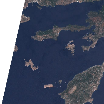
wvp-jp2: Water vapour (WVP)Among the other data files, assets include multiple raster data files (one per optical band, as acquired by the multi-spectral instrument), a thumbnail, a true-color image (“visual”), instrument metadata and scene-classification information (“SCL”). Let’s get the URL link to the thumbnail, which gives us a glimpse of the Sentinel-2 scene:
OUTPUT
https://sentinel-cogs.s3.us-west-2.amazonaws.com/sentinel-s2-l2a-cogs/35/S/NA/2023/7/S2A_35SNA_20230708_0_L2A/thumbnail.jpgThis can be used to download the corresponding file:
For comparison, we can check out the thumbnail of the most recent scene of the sequence considered (i.e. the first item in the item collection), which has been taken after the wildfires:
OUTPUT
https://sentinel-cogs.s3.us-west-2.amazonaws.com/sentinel-s2-l2a-cogs/35/S/NA/2023/8/S2A_35SNA_20230827_0_L2A/thumbnail.jpg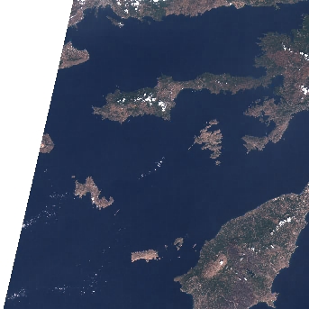
From the thumbnails alone we can already observe some dark spots on the island of Rhodes at the bottom right of the image!
In order to open the high-resolution satellite images and investigate
the scenes in more detail, we will be using the rioxarray
library. Note that this library can both work with local and remote
raster data. At this moment, we will only quickly look at the
functionality of this library. We will learn more about it in the next
episode.
Now let us focus on the red band by accessing the item
red from the assets dictionary and get the Hypertext
Reference (also known as URL) attribute using .href after
the item selection.
For now we are using rioxarray to open the raster file.
PYTHON
import rioxarray
red_href = assets["red"].href
red = rioxarray.open_rasterio(red_href)
print(red)
OUTPUT
<xarray.DataArray (band: 1, y: 10980, x: 10980)> Size: 241MB
[120560400 values with dtype=uint16]
Coordinates:
  * band         (band) int32 4B 1
  * x            (x) float64 88kB 5e+05 5e+05 5e+05 ... 6.098e+05 6.098e+05
  * y            (y) float64 88kB 4.1e+06 4.1e+06 4.1e+06 ... 3.99e+06 3.99e+06
    spatial_ref  int32 4B 0
Attributes:
    AREA_OR_POINT:       Area
    OVR_RESAMPLING_ALG:  AVERAGE
    _FillValue:          0
    scale_factor:        1.0
    add_offset:          0.0
Now we want to save the data to our local machine using the to_raster method:
That might take a while, given there are over 10000 x 10000 = a hundred million pixels in the 10-meter NIR band. But we can take a smaller subset before downloading it. Because the raster is a COG, we can download just what we need!
In order to do that, we are using rioxarray´s clip_box
with which you can set a bounding box defining the area you want.
Next, we save the subset using to_raster again.
The difference is 241 Megabytes for the full image vs less than 10 Megabytes for the subset.
Exercise: Downloading Landsat 8 Assets
In this exercise we put in practice all the skills we have learned in
this episode to retrieve images from a different mission: Landsat 8. In
particular, we browse images from the Harmonized Landsat
Sentinel-2 (HLS) project, which provides images from NASA’s Landsat
8 and ESA’s Sentinel-2 that have been made consistent with each other.
The HLS catalog is indexed in the NASA Common Metadata Repository (CMR)
and it can be accessed from the STAC API endpoint at the following URL:
https://cmr.earthdata.nasa.gov/stac/LPCLOUD.
- Using
pystac_client, search for all assets of the Landsat 8 collection (HLSL30.v2.0) from February to March 2021, intersecting the point with longitude/latitude coordinates (-73.97, 40.78) deg. - Visualize an item’s thumbnail (asset key
browse).
PYTHON
# connect to the STAC endpoint
cmr_api_url = "https://cmr.earthdata.nasa.gov/stac/LPCLOUD"
client = Client.open(cmr_api_url)

# setup search
search = client.search(
    collections=["HLSL30.v2.0"],
    intersects=Point(-73.97, 40.78),
    datetime="2021-02-01/2021-03-30",
) # nasa cmr cloud cover filtering is currently broken: https://github.com/nasa/cmr-stac/issues/239

# retrieve search results
items = search.item_collection()
print(len(items))
OUTPUT
5PYTHON
items_sorted = sorted(items, key=lambda x: x.properties["eo:cloud_cover"]) # sorting and then selecting by cloud cover
item = items_sorted[0]
print(item)
OUTPUT
<Item id=HLS.L30.T18TWL.2021039T153324.v2.0>OUTPUT
'https://data.lpdaac.earthdatacloud.nasa.gov/lp-prod-public/HLSL30.020/HLS.L30.T18TWL.2021039T153324.v2.0/HLS.L30.T18TWL.039T153324.v2.0.jpg'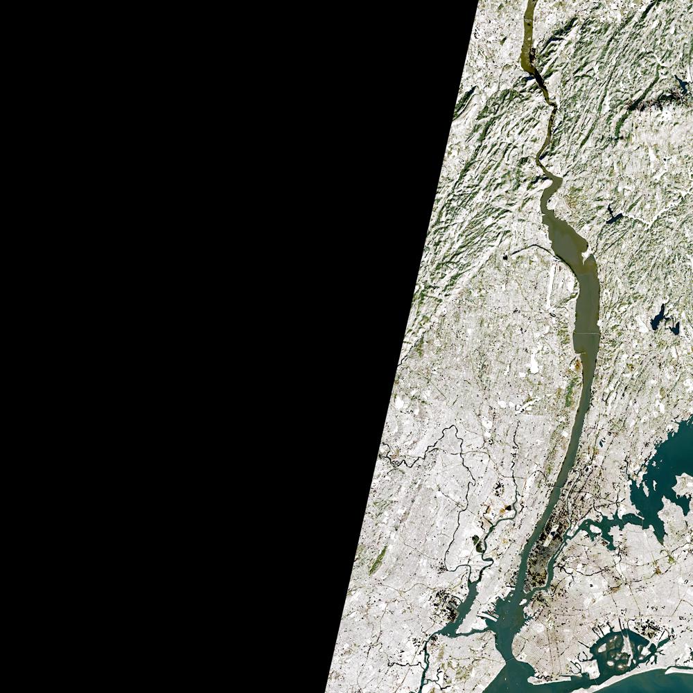
Public catalogs, protected data
Publicly accessible catalogs and STAC endpoints do not necessarily imply publicly accessible data. Data providers, in fact, may limit data access to specific infrastructures and/or require authentication. For instance, the NASA CMR STAC endpoint considered in the last exercise offers publicly accessible metadata for the HLS collection, but most of the linked assets are available only for registered users (the thumbnail is publicly accessible).
The authentication procedure for dataset with restricted access might differ depending on the data provider. For the NASA CMR, follow these steps in order to access data using Python:
- Create a NASA Earthdata login account here;
- Set up a netrc file with your credentials, e.g. by using earthaccess,
which can be executed interactively in a Jupyter session, and creates a
.netrcfile in your home directory; - Define the following environment variables in your Jupyter session:
- Accessing satellite images via the providers’ API enables a more reliable and scalable data retrieval.
- STAC catalogs can be browsed and searched using the same tools and scripts.
-
rioxarrayallows you to open and download remote raster files.
Content from Read and visualize raster data
Last updated on 2026-06-03 | Edit this page
Overview
Questions
- How is a raster represented by rioxarray?
- How do I read and plot raster data in Python?
- How can I handle missing data?
Objectives
- Describe the fundamental attributes of a raster dataset.
- Explore raster attributes and metadata using Python.
- Read rasters into Python using the
rioxarraypackage. - Visualize single/multi-band raster data.
Raster Data
In the first episode of this course we provided an introduction on what Raster datasets are and how these divert from vector data. In this episode we will dive more into raster data and focus on how to work with them. We introduce fundamental principles, python packages, metadata and raster attributes for working with this type of data. In addition, we will explore how Python handles missing and bad data values.
The Python package we will use throughout this episode to handle
raster data is rioxarray.
This package is based on the popular rasterio
(which is build upon the GDAL library) for working with raster data and
xarray
for working with multi-dimensional arrays.
rioxarray extends xarray by providing
top-level functions like the open_rasterio
function to open raster datasets. Furthermore, it adds a set of methods
to the main objects of the xarray package like the Dataset
and the DataArray.
These methods are made available via the rio accessor and
become available from xarray objects after importing
rioxarray.
Exploring rioxarray and getting
help
Since a lot of the functions, methods and attributes from
rioxarray originate from other packages (mostly
rasterio), the documentation is in some cases limited and
requires a little puzzling. It is therefore recommended to foremost
focus at the notebook´s functionality to use tab completion and go
through the various functionalities. In addition, adding a question mark
? after every function or method offers the opportunity to
see the available options.
For instance if you want to understand the options for rioxarray´s
open_rasterio function:
Introduce the data
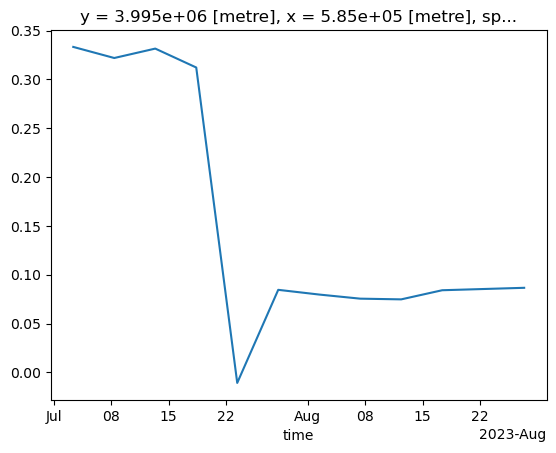
In this episode, we will use satellite images from the search that we have carried out in the episode: “Access satellite imagery using Python”. Briefly, we have searched for Sentinel-2 scenes of Rhodes from July 1st to August 31st 2023 that have less than 1% cloud coverage. The search resulted in 11 scenes. We focus here on the most recent scene (August 27th), since that would show the situation after the wildfire, and use this as an example to demonstrate raster data loading and visualization.
For your convenience, we included the scene of interest among the
datasets that you have already downloaded when following the setup instructions (the raster data files
should be in the data/sentinel2 directory). You should,
however, be able to download the same datasets “on-the-fly” using the
JSON metadata file that was created in the
previous episode (the file rhodes_sentinel-2.json).
If you choose to work with the provided data (which is advised in case you are working offline or have a slow/unstable network connection) you can skip the remaining part of the block and continue with the following section: Load a Raster and View Attributes.
If you want instead to experiment with downloading the data
on-the-fly, you need to load the file
rhodes_sentinel-2.json, which contains information on where
and how to access the target images from the remote repository:
The loaded item collection is equivalent to the one returned by
pystac_client when querying the API in the the episode: “Access satellite imagery using
Python”. You can thus perform the same actions on it, like accessing
the individual items using their index. Here we select the first item in
the collection, which is the most recent:
OUTPUT
<Item id=S2A_35SNA_20230827_0_L2A>In this episode we will consider the red band and the true color
image associated with this scene. They are labelled with the
red and visual keys, respectively, in the
asset dictionary. For each asset, we extract the URL / href
(Hypertext Reference) that point to the file, and store it in a variable
that we can use later on to access the data instead of the raster data
paths:
Load a Raster and View Attributes
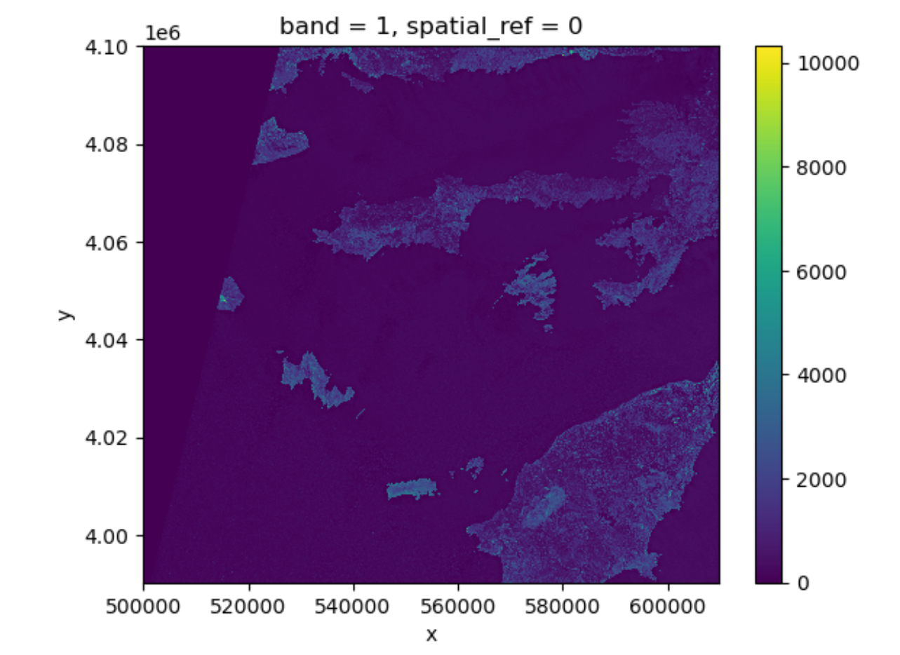
To analyse the burned areas, we are interested in the red band of the
satellite scene. In episode 9 we will
further explain why the characteristics of that band are interesting in
relation to wildfires. For now, we can load the red band using the
function rioxarray.open_rasterio():
The first call to rioxarray.open_rasterio() opens the
file and it returns a xarray.DataArray object. The object
is stored in a variable, i.e. rhodes_red. Reading in the
data with xarray instead of rioxarray also
returns a xarray.DataArray, but the output will not contain
the geospatial metadata (such as projection information). You can use
numpy functions or built-in Python math operators on a
xarray.DataArray just like a numpy array. Calling the
variable name of the DataArray also prints out all of its
metadata information.
By printing the variable we can get a quick look at the shape and attributes of the data.
OUTPUT
<xarray.DataArray (band: 1, y: 10980, x: 10980)> Size: 241MB
[120560400 values with dtype=uint16]
Coordinates:
  * band         (band) int32 4B 1
  * x            (x) float64 88kB 5e+05 5e+05 5e+05 ... 6.098e+05 6.098e+05
  * y            (y) float64 88kB 4.1e+06 4.1e+06 4.1e+06 ... 3.99e+06 3.99e+06
    spatial_ref  int32 4B 0
Attributes:
    AREA_OR_POINT:       Area
    OVR_RESAMPLING_ALG:  AVERAGE
    _FillValue:          0
    scale_factor:        1.0
    add_offset:          0.0
The output tells us that we are looking at an
xarray.DataArray, with 1 band,
10980 rows, and 10980 columns. We can also see
the number of pixel values in the DataArray, and the type
of those pixel values, which is unsigned integer (or
uint16). The DataArray also stores different
values for the coordinates of the DataArray. When using
rioxarray, the term coordinates refers to spatial
coordinates like x and y but also the
band coordinate. Each of these sequences of values has its
own data type, like float64 for the spatial coordinates and
int64 for the band coordinate.
This DataArray object also has a couple of attributes
that are accessed like .rio.crs, .rio.nodata,
and .rio.bounds() (in jupyter you can browse through these
attributes by using tab for auto completion or have a look
at the documentation here),
which contains the metadata for the file we opened. Note that many of
the metadata are accessed as attributes without (), however
since bounds() is a method (i.e. a function in an object)
it requires these parentheses this is also the case for
.rio.resolution().
PYTHON
print(rhodes_red.rio.crs)
print(rhodes_red.rio.nodata)
print(rhodes_red.rio.bounds())
print(rhodes_red.rio.width)
print(rhodes_red.rio.height)
print(rhodes_red.rio.resolution())
OUTPUT
EPSG:32635
0
(499980.0, 3990240.0, 609780.0, 4100040.0)
10980
10980
(10.0, -10.0)
The Coordinate Reference System, or rhodes_red.rio.crs,
is reported as the string EPSG:32635. The
nodata value is encoded as 0 and the bounding box corners
of our raster are represented by the output of .bounds() as
a tuple (like a list but you can’t edit it). The height and
width match what we saw when we printed the DataArray, but
by using .rio.width and .rio.height we can
access these values if we need them in calculations.
Visualize a Raster
After viewing the attributes of our raster, we can examine the raw
values of the array with .values:
OUTPUT
array([[[    0,     0,     0, ...,  8888,  9075,  8139],
        [    0,     0,     0, ..., 10444, 10358,  8669],
        [    0,     0,     0, ..., 10346, 10659,  9168],
        ...,
        [    0,     0,     0, ...,  4295,  4289,  4320],
        [    0,     0,     0, ...,  4291,  4269,  4179],
        [    0,     0,     0, ...,  3944,  3503,  3862]]], dtype=uint16)
This can give us a quick view of the values of our array, but only at
the corners. Since our raster is loaded in python as a
DataArray type, we can plot this in one line similar to a
pandas DataFrame with DataArray.plot().
Notice that rioxarray helpfully allows us to plot this
raster with spatial coordinates on the x and y axis (this is not the
default in many cases with other functions or libraries). Nice plot!
However, it probably took a while for it to load therefore it would make
sense to resample it.
Resampling the raster image
The red band image is available as a raster file with 10 m resolution, which makes it a relatively large file (few hundreds MBs). In order to keep calculations “manageable” (reasonable execution time and memory usage) we select here a lower resolution version of the image, taking advantage of the so-called “pyramidal” structure of cloud-optimized GeoTIFFs (COGs). COGs, in fact, typically include multiple lower-resolution versions of the original image, called “overviews”, in the same file. This allows us to avoid downloading high-resolution images when only quick previews are required.
Overviews are often computed using powers of 2 as down-sampling (or zoom) factors. So, typically, the first level overview (index 0) corresponds to a zoom factor of 2, the second level overview (index 1) corresponds to a zoom factor of 4, and so on. Here, we open the third level overview (index 2, zoom factor 8) and check that the resolution is about 80 m:
PYTHON
import rioxarray
rhodes_red_80 = rioxarray.open_rasterio("data/sentinel2/red.tif", overview_level=2)
print(rhodes_red_80.rio.resolution())
OUTPUT
(79.97086671522214, -79.97086671522214)Lets plot this one.
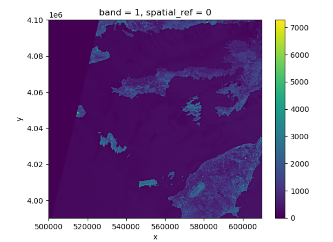
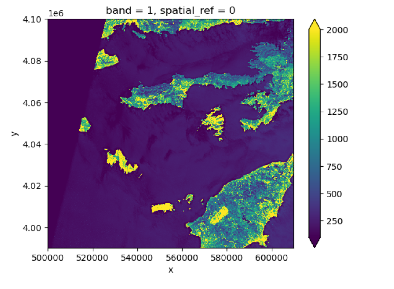
This plot shows the satellite measurement of the band
red for Rhodes before the wildfire. According to the Sentinel-2
documentation, this is a band with the central wavelength of 665nm.
It has a spatial resolution of 10m. Note that the band=1 in
the image title refers to the ordering of all the bands in the
DataArray, not the Sentinel-2 band number 04
that we saw in the pystac search results.
Tool Tip
The option robust=True always forces displaying values
between the 2nd and 98th percentile. Of course, this will not work for
every case.
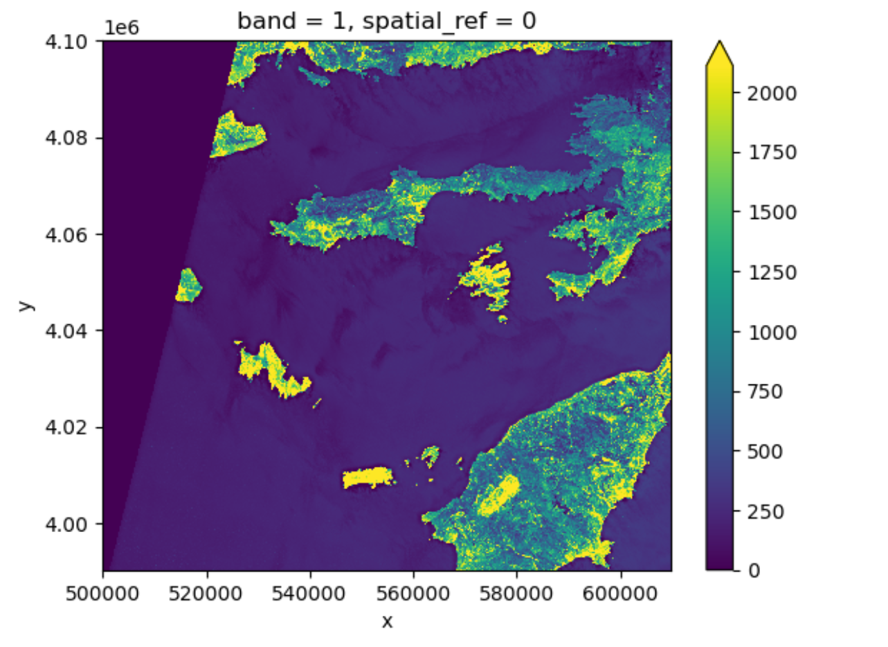
Now the color limit is set in a way fitting most of the values in the image. We have a better view of the ground pixels.
For a customized displaying range, you can also manually specifying
the keywords vmin and vmax. For example
plotting between 100 and 2000:
More options can be consulted here.
You will notice that these parameters are part of the
imshow method from the plot function. Since plot originates
from matplotlib and is so widely used, your python environment helps you
to interpret the parameters without having to specify the method. It is
a service to help you, but can be confusing when teaching it. We will
explain more about this below.
View Raster Coordinate Reference System (CRS) in Python
Another information that we’re interested in is the CRS, and it can
be accessed with .rio.crs. We introduced the concept of a
CRS in an earlier episode. Now we will see how
features of the CRS appear in our data file and what meanings they have.
We can view the CRS string associated with our DataArray’s
rio object using the crs attribute.
OUTPUT
EPSG:32635To print the EPSG code number as an int, we use the
.to_epsg() method (which originally is part of rasterio to_epsg):
OUTPUT
32635EPSG codes are great for succinctly representing a particular
coordinate reference system. But what if we want to see more details
about the CRS, like the units? For that, we can use pyproj
, a library for representing and working with coordinate reference
systems.
OUTPUT
<Projected CRS: EPSG:32635>
Name: WGS 84 / UTM zone 35N
Axis Info [cartesian]:
- E[east]: Easting (metre)
- N[north]: Northing (metre)
Area of Use:
- name: Between 24°E and 30°E, northern hemisphere between equator and 84°N, onshore and offshore. Belarus. Bulgaria. Central African Republic. Democratic Republic of the Congo (Zaire). Egypt. Estonia. Finland. Greece. Latvia. Lesotho. Libya. Lithuania. Moldova. Norway. Poland. Romania. Russian Federation. Sudan. Svalbard. Türkiye (Turkey). Uganda. Ukraine.
- bounds: (24.0, 0.0, 30.0, 84.0)
Coordinate Operation:
- name: UTM zone 35N
- method: Transverse Mercator
Datum: World Geodetic System 1984 ensemble
- Ellipsoid: WGS 84
- Prime Meridian: Greenwich
The CRS class from the pyproj library
allows us to create a CRS object with methods and
attributes for accessing specific information about a CRS, or the
detailed summary shown above.
A particularly useful attribute is area_of_use,
which shows the geographic bounds that the CRS is intended to be
used.
OUTPUT
AreaOfUse(west=24.0, south=0.0, east=30.0, north=84.0, name='Between 24°E and 30°E, northern hemisphere between equator and 84°N, onshore and offshore. Belarus. Bulgaria. Central African Republic. Democratic Republic of the Congo (Zaire). Egypt. Estonia. Finland. Greece. Latvia. Lesotho. Libya. Lithuania. Moldova. Norway. Poland. Romania. Russian Federation. Sudan. Svalbard. Türkiye (Turkey). Uganda. Ukraine.')Exercise: find the axes units of the CRS
What units are our data in? See if you can find a method to examine
this information using help(crs) or
dir(crs)
crs.axis_info tells us that the CRS for our raster has
two axis and both are in meters. We could also get this information from
the attribute rhodes_red_80.rio.crs.linear_units.
Understanding pyproj CRS Summary
Let’s break down the pieces of the pyproj CRS summary.
The string contains all of the individual CRS elements that Python or
another GIS might need, separated into distinct sections, and datum.
OUTPUT
<Projected CRS: EPSG:32635>
Name: WGS 84 / UTM zone 35N
Axis Info [cartesian]:
- E[east]: Easting (metre)
- N[north]: Northing (metre)
Area of Use:
- name: Between 24°E and 30°E, northern hemisphere between equator and 84°N, onshore and offshore. Belarus. Bulgaria. Central African Republic. Democratic Republic of the Congo (Zaire). Egypt. Estonia. Finland. Greece. Latvia. Lesotho. Libya. Lithuania. Moldova. Norway. Poland. Romania. Russian Federation. Sudan. Svalbard. Türkiye (Turkey). Uganda. Ukraine.
- bounds: (24.0, 0.0, 30.0, 84.0)
Coordinate Operation:
- name: UTM zone 35N
- method: Transverse Mercator
Datum: World Geodetic System 1984 ensemble
- Ellipsoid: WGS 84
- Prime Meridian: Greenwich- Name of the projection is UTM zone 35N (UTM has 60 zones, each 6-degrees of longitude in width). The underlying datum is WGS84.
- Axis Info: the CRS shows a Cartesian system with two axes, easting and northing, in meter units.
-
Area of Use: the projection is used for a
particular range of longitudes
24°E to 30°Ein the northern hemisphere (0.0°N to 84.0°N) - Coordinate Operation: the operation to project the coordinates (if it is projected) onto a cartesian (x, y) plane. Transverse Mercator is accurate for areas with longitudinal widths of a few degrees, hence the distinct UTM zones.
-
Datum: Details about the datum, or the reference
point for coordinates.
WGS 84andNAD 1983are common datums.NAD 1983is set to be replaced in 2022.
Note that the zone is unique to the UTM projection. Not all CRSs will have a zone. Below is a simplified view of US UTM zones.
Calculate Raster Statistics
It is useful to know the minimum or maximum values of a raster
dataset. We can compute these and other descriptive statistics with
min, max, mean, and
std.
PYTHON
print(rhodes_red_80.min())
print(rhodes_red_80.max())
print(rhodes_red_80.mean())
print(rhodes_red_80.std())
OUTPUT
<xarray.DataArray ()> Size: 2B
array(0, dtype=uint16)
Coordinates:
    spatial_ref  int32 4B 0
<xarray.DataArray ()> Size: 2B
array(7277, dtype=uint16)
Coordinates:
    spatial_ref  int32 4B 0
<xarray.DataArray ()> Size: 8B
array(404.07532588)
Coordinates:
    spatial_ref  int32 4B 0
<xarray.DataArray ()> Size: 8B
array(527.5557502)
Coordinates:
    spatial_ref  int32 4B 0
The information above includes a report of the min, max, mean, and
standard deviation values, along with the data type. If we want to see
specific quantiles, we can use xarray’s .quantile() method.
For example for the 25% and 75% quantiles:
OUTPUT
<xarray.DataArray (quantile: 2)> Size: 16B
array([165., 315.])
Coordinates:
* quantile (quantile) float64 16B 0.25 0.75Data Tip - NumPy methods
You could also get each of these values one by one using
numpy.
PYTHON
import numpy
print(numpy.percentile(rhodes_red_80, 25))
print(numpy.percentile(rhodes_red_80, 75))
OUTPUT
165.0
315.0
You may notice that rhodes_red_80.quantile and
numpy.percentile didn’t require an argument specifying the
axis or dimension along which to compute the quantile. This is because
axis=None is the default for most numpy functions, and
therefore dim=None is the default for most xarray methods.
It’s always good to check out the docs on a function to see what the
default arguments are, particularly when working with multi-dimensional
image data. To do so, we can
usehelp(rhodes_red_80.quantile) or
?rhodes_red_80.percentile if you are using jupyter notebook
or jupyter lab.
Dealing with Missing Data
So far, we have visualized a band of a Sentinel-2 scene and
calculated its statistics. However, as you can see on the image it also
contains an artificial band to the top left where data is missing. In
order to calculate meaningful statistics, we need to take missing data
into account. Raster data often has a “no data value” associated with it
and for raster datasets read in by rioxarray. This value is
referred to as nodata. This is a value assigned to pixels
where data is missing or no data were collected. There can be different
cases that cause missing data, and it’s common for other values in a
raster to represent different cases. The most common example is missing
data at the edges of rasters.
By default the shape of a raster is always rectangular. So if we have a dataset that has a shape that isn’t rectangular, like most satellite images, some pixels at the edge of the raster will have no data values. This often happens when the data were collected by a sensor which only flew over some part of a defined region and is also almost by default because of the fact that the earth is not flat and that we work with geographic and projected coordinate system.
To check the value of nodata
of this dataset you can use:
OUTPUT
0You will find out that this is 0. When we have plotted the band data, or calculated statistics, the missing value was not distinguished from other values. Missing data may cause some unexpected results.
To distinguish missing data from real data, one possible way is to
use nan(which stands for Not a Number) to represent them.
This can be done by specifying masked=True when loading the
raster. Let us reload our data and put it into a different variable with
the mask:
PYTHON
rhodes_red_mask_80 = rioxarray.open_rasterio("data/sentinel2/red.tif", masked=True, overview_level=2)Let us have a look at the data.
One can also use the where function, which is standard
python functionality, to select all the pixels which are different from
the nodata value of the raster:
Either way will change the nodata value from 0 to
nan. Now if we compute the statistics again, the missing
data will not be considered. Let´s compare them:
PYTHON
print(rhodes_red_80.min())
print(rhodes_red_mask_80.min())
print(rhodes_red_80.max())
print(rhodes_red_mask_80.max())
print(rhodes_red_80.mean())
print(rhodes_red_mask_80.mean())
print(rhodes_red_80.std())
print(rhodes_red_mask_80.std())
OUTPUT
<xarray.DataArray ()> Size: 2B
array(0, dtype=uint16)
Coordinates:
    spatial_ref  int32 4B 0
<xarray.DataArray ()> Size: 4B
array(1., dtype=float32)
Coordinates:
    spatial_ref  int32 4B 0
<xarray.DataArray ()> Size: 2B
array(7277, dtype=uint16)
Coordinates:
    spatial_ref  int32 4B 0
<xarray.DataArray ()> Size: 4B
array(7277., dtype=float32)
Coordinates:
    spatial_ref  int32 4B 0
<xarray.DataArray ()> Size: 8B
array(404.07532588)
Coordinates:
    spatial_ref  int32 4B 0
<xarray.DataArray ()> Size: 4B
array(461.78833, dtype=float32)
Coordinates:
    spatial_ref  int32 4B 0
<xarray.DataArray ()> Size: 8B
array(527.5557502)
Coordinates:
    spatial_ref  int32 4B 0
<xarray.DataArray ()> Size: 4B
array(539.82855, dtype=float32)
Coordinates:
    spatial_ref  int32 4B 0
And if we plot the image, the nodata pixels are not
shown because they are not 0 anymore:
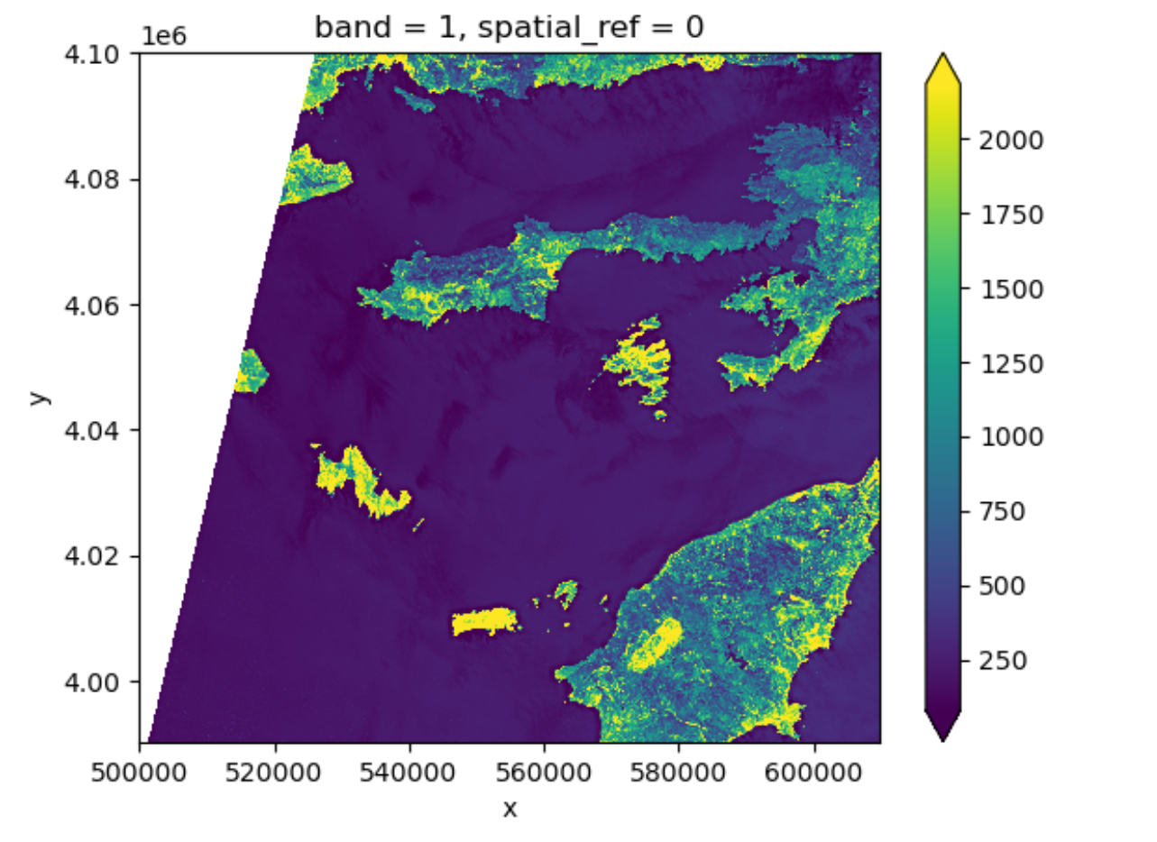
One should notice that there is a side effect of using
nan instead of 0 to represent the missing
data: the data type of the DataArray was changed from
integers to float (as can be seen when we printed the statistics). This
needs to be taken into consideration when the data type matters in your
application.
Raster Bands
So far we looked into a single band raster, i.e. the red
band of a Sentinel-2 scene. However, for certain applications it is
helpful to visualize the true-color image of the region. This is
provided as a multi-band raster – a raster dataset that contains more
than one band.
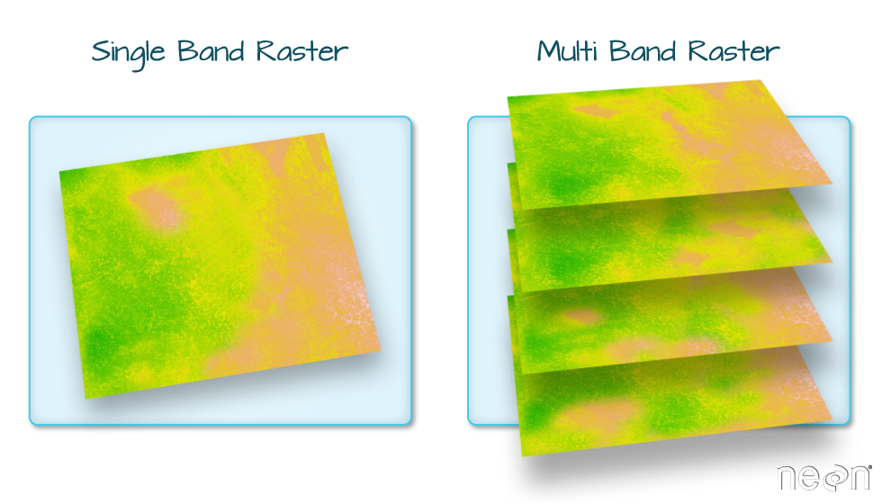
The visual asset in the Sentinel-2 scene is a multiband
asset. Similar to the red band, we can load it by:
PYTHON
rhodes_visual = rioxarray.open_rasterio('data/sentinel2/visual.tif', overview_level=2)
rhodes_visual
OUTPUT
<xarray.DataArray (band: 3, y: 1373, x: 1373)> Size: 6MB
[5655387 values with dtype=uint8]
Coordinates:
  * band         (band) int32 12B 1 2 3
  * x            (x) float64 11kB 5e+05 5.001e+05 ... 6.097e+05 6.097e+05
  * y            (y) float64 11kB 4.1e+06 4.1e+06 4.1e+06 ... 3.99e+06 3.99e+06
    spatial_ref  int32 4B 0
Attributes:
    AREA_OR_POINT:       Area
    OVR_RESAMPLING_ALG:  AVERAGE
    _FillValue:          0
    scale_factor:        1.0
    add_offset:          0.0
The band number comes first when GeoTiffs are read with the
.open_rasterio() function. As we can see in the
xarray.DataArray object, the shape is now
(band: 3, y: 1373, x: 1373), with three bands in the
band dimension. It’s always a good idea to examine the
shape of the raster array you are working with and make sure it’s what
you expect. Many functions, especially the ones that plot images, expect
a raster array to have a particular shape. One can also check the shape
using the .shape
attribute:
OUTPUT
(3, 1373, 1373)One can visualize the multi-band data with the
DataArray.plot.imshow() function:
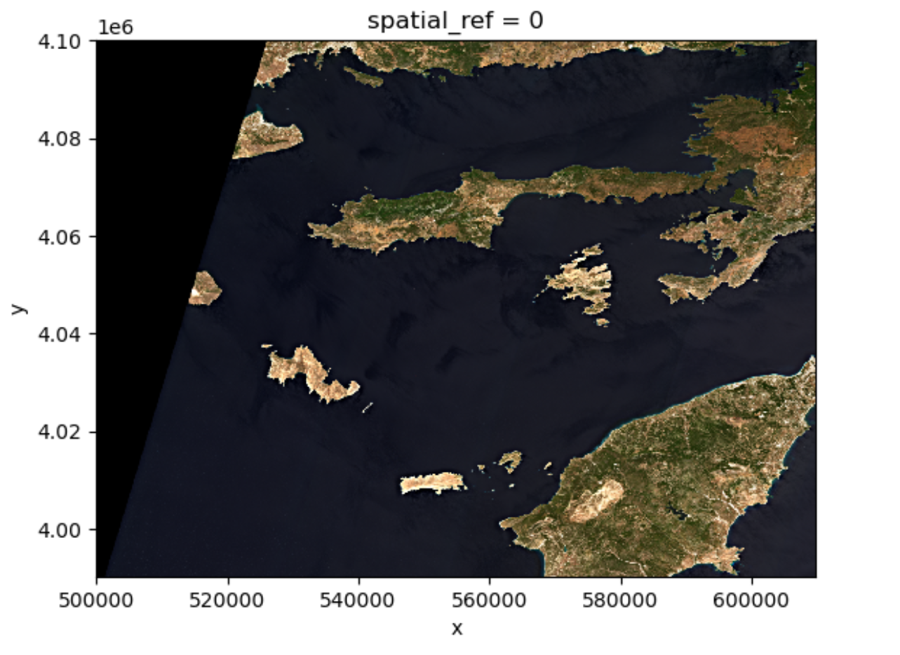
Note that the DataArray.plot.imshow() function makes
assumptions about the shape of the input DataArray, that since it has
three channels, the correct colormap for these channels is RGB. It does
not work directly on image arrays with more than 3 channels. One can
replace one of the RGB channels with another band, to make a false-color
image.
Exercise: set the plotting aspect ratio
As seen in the figure above, the true-color image is stretched. Let’s
visualize it with the right aspect ratio. You can use the documentation
of DataArray.plot.imshow().
Since we know the height/width ratio is 1:1 (check the
rio.height and rio.width attributes), we can
set the aspect ratio to be 1. For example, we can choose the size to be
5 inches, and set aspect=1. Note that according to the documentation
of DataArray.plot.imshow(), when specifying the
aspect argument, size also needs to be
provided.
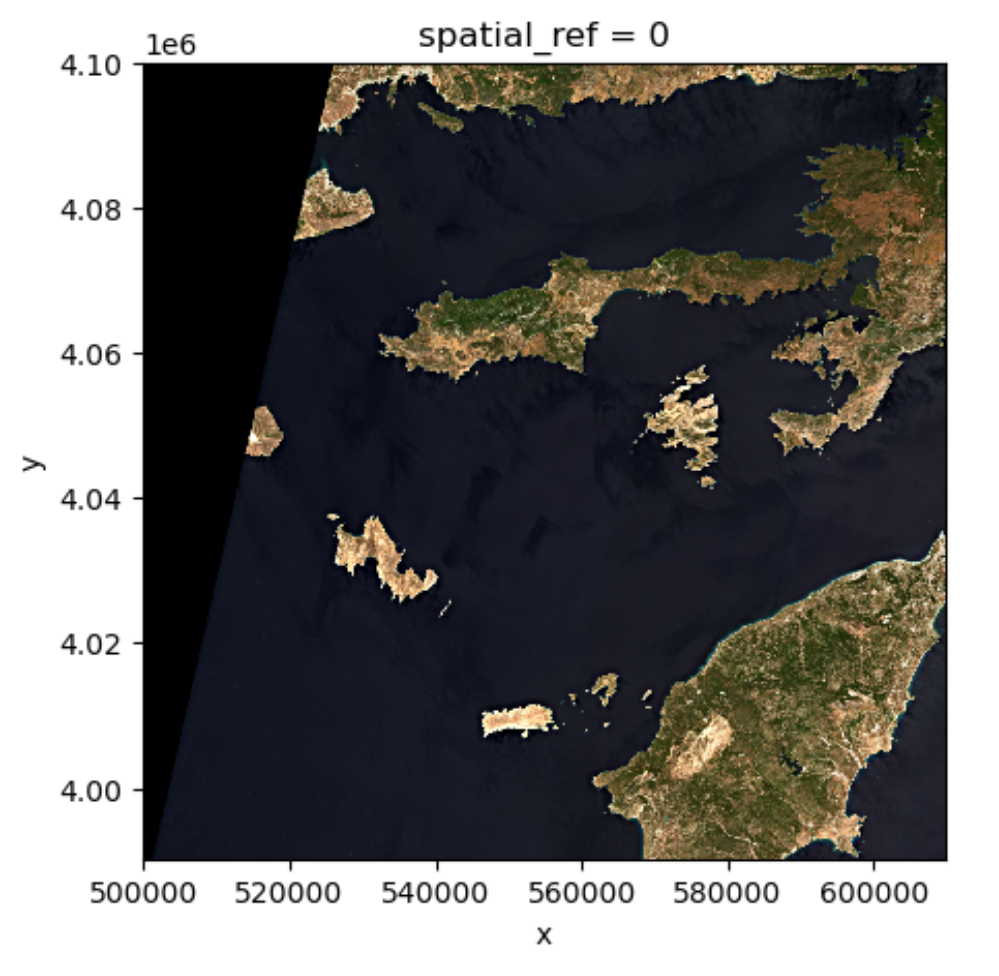
-
rioxarrayandxarrayare for working with multidimensional arrays like pandas is for working with tabular data. -
rioxarraystores CRS information as a CRS object that can be converted to an EPSG code or PROJ4 string. - Missing raster data are filled with nodata values, which should be handled with care for statistics and visualization.
Content from Vector data in Python
Last updated on 2026-06-03 | Edit this page
Overview
Questions
- How can I read, inspect, and process spatial objects, such as points, lines, and polygons?
Objectives
- Load spatial objects.
- Select the spatial objects within a bounding box.
- Perform a CRS conversion of spatial objects.
- Select features of spatial objects.
- Match objects in two datasets based on their spatial relationships.
Introduction
In the preceding episodes, we have prepared, selected and downloaded raster data from before and after the wildfire event in the summer of 2023 on the Greek island of Rhodes. To evaluate the impact of this wildfire on the vital infrastructure and built-up areas we are going to create a subset of vector data representing these assets. In this episode you will learn how to extract vector data with specific characteristics like the type of attributes or their locations. The dataset that we will generate in this episode can lateron be confronted with scorched areas which we determine by analyzing the satellite images Episode 9: Raster Calculations in Python.
We’ll be examining vector datasets that represent the valuable assets of Rhodes. As mentioned in Episode 2: Introduction to Vector Data, vector data uses points, lines, and polygons to depict specific features on the Earth’s surface. These geographic elements can have one or more attributes, like ‘name’ and ‘population’ for a city. In this episode we’ll be using two open data sources: the Database of Global Administrative Areas (GADM) dataset to generate a polygon for the island of Rhodes and and Open Street Map data for the vital infrastructure and valuable assets.
To handle the vector data in python we use the package geopandas. This
package allows us to open, manipulate, and write vector dataset through
python.
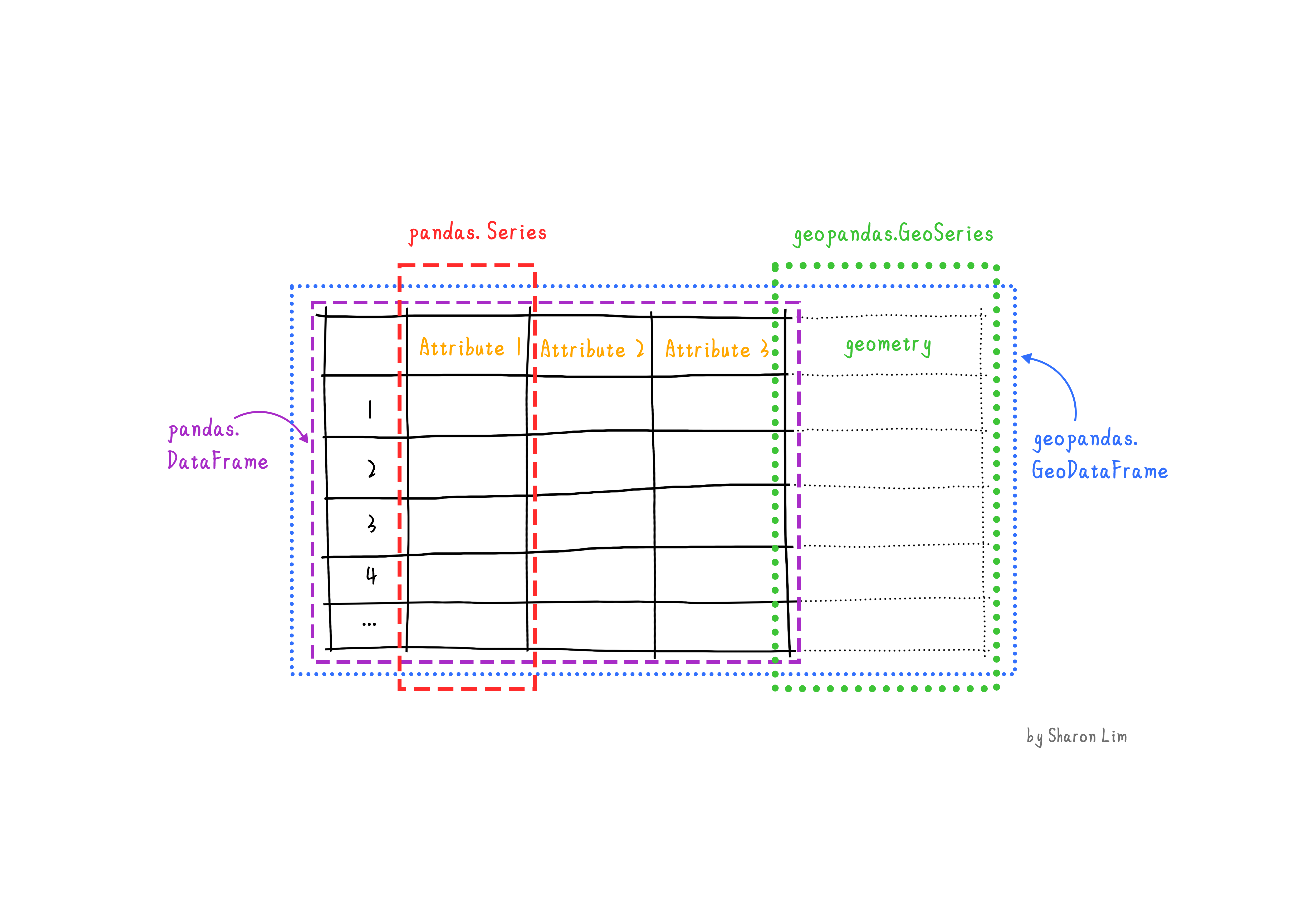
geopandas enhances the widely-used pandas
library for data analysis by extending its functionality to geospatial
applications. The primary pandas objects
(Series and DataFrame) are extended to
geopandas objects (GeoSeries and
GeoDataFrame). This extension is achieved by incorporating
geometric types, represented in Python using the shapely
library, and by offering dedicated methods for spatial operations like
union, spatial joins and
intersect. In order to understand how geopandas works, it
is good to provide a brief explanation of the relationship between
Series, a DataFrame, GeoSeries,
and a GeoDataFrame:
- A
Seriesis a one-dimensional array with an axis that can hold any data type (integers, strings, floating-point numbers, Python objects, etc.) - A
DataFrameis a two-dimensional labeled data structure with columns that can potentially hold different types of data. - A
GeoSeriesis aSeriesobject designed to store shapely geometry objects. - A
GeoDataFrameis an extendedpandas.DataFramethat includes a column with geometry objects, which is aGeoSeries.
Introduce the Vector Data
In this episode, we will use the downloaded vector data from the
data directory. Please refer to the setup page on where to download the data. Note
that we manipulated that data a little for the purposes of this
workshop. The link to the original source can be found on the setup page.
Get the administration boundary of study area
The first thing we want to do is to extract a polygon containing the
boundary of the island of Rhodes from Greece. For this we will use the
GADM dataset layer
ADM_ADM_3.gpkg for Greece. For your convenience we saved a
copy at: data/data/gadm/ADM_ADM_3.gpkg We will use the
geopandas package to load the file and use the
read_file function see.
Note that geopandas is often abbreviated as gpd.
We can print out the gdf_greecevariable:
OUTPUT
GID_3 GID_0 COUNTRY    GID_1                       NAME_1  \
0     GRC.1.1.1_1   GRC  Greece  GRC.1_1                       Aegean
1     GRC.1.1.2_1   GRC  Greece  GRC.1_1                       Aegean
2     GRC.1.1.3_1   GRC  Greece  GRC.1_1                       Aegean
..            ...   ...     ...      ...                          ...
324  GRC.8.2.24_1   GRC  Greece  GRC.8_1  Thessaly and Central Greece
325  GRC.8.2.25_1   GRC  Greece  GRC.8_1  Thessaly and Central Greece

                      NL_NAME_1      GID_2        NAME_2      NL_NAME_2  \
0                        Αιγαίο  GRC.1.1_1  North Aegean  Βόρειο Αιγαίο
1                        Αιγαίο  GRC.1.1_1  North Aegean  Βόρειο Αιγαίο
2                        Αιγαίο  GRC.1.1_1  North Aegean  Βόρειο Αιγαίο
..                          ...        ...           ...            ...
324  Θεσσαλία και Στερεά Ελλάδα  GRC.8.2_1      Thessaly       Θεσσαλία
325  Θεσσαλία και Στερεά Ελλάδα  GRC.8.2_1      Thessaly       Θεσσαλία
...
324  POLYGON ((22.81903 39.27344, 22.81884 39.27332...
325  POLYGON ((23.21375 39.36514, 23.21272 39.36469...

[326 rows x 17 columns]
The data are read into the variable fields as a
GeoDataFrame. This is an extended data format of
pandas.DataFrame, with an extra column
geometry. To explore the dataframe you can call this
variable just like a pandas dataframe by using functions
like .shape, .head and .tail
etc.
To visualize the polygons we can use the plot()
function to the GeoDataFrame we have loaded
gdf_greece:
If you want to interactively explore your data you can use the .explore
function in geopandas:
In this interactive map you can easily zoom in and out and hover over the polygons to see which attributes, stored in the rows of your GeoDataFrame, are related to each polygon.
Next, we’ll focus on isolating the administrative area of Rhodes
Island. Once you hover over the polygon of Rhodos (the relatively big
island to the east) you will find out that the label Rhodos
is stored in the NAME_3 column of gdf_greece,
where Rhodes Island is listed as Rhodos. Since our goal is
to have a boundary of Rhodes, we’ll now create a new variable that
exclusively represents Rhodes Island.
To select an item in our GeoDataFrame with a specific value is done
the same way in which this is done in a pandas DataFrame
using .loc.
And we can plot the overview by (or show it interactively using
.explore):
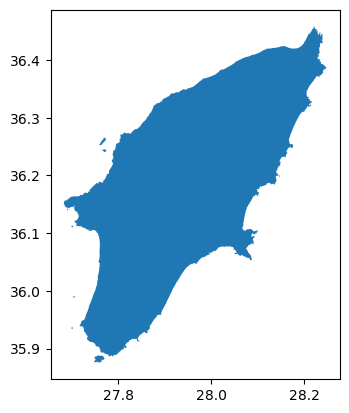
Now that we have the administrative area of Rhodes Island. We can use
the to_file() function save this file for future use.
Get the vital infrastructure and built-up areas
Road data from Open Street Map (OSM)
Now that we have the boundary of our study area, we will make use this to select the main roads in our study area. We will make the following processing steps:
- Select roads of study area
- Select key infrastructure: ‘primary’, ‘secondary’, ‘tertiary’
- Create a 100m buffer around the rounds. This buffer will be regarded as the infrastructure region. (note that this buffer is arbitrary and can be changed afterwards if you want!)
Step 1: Select roads of study area
For this workshop, in particular to not have everyone downloading too
much data, we created a subset of the Openstreetmap data we
downloaded for Greece from the Geofabrik. This
data comes in the form of a shapefile (see episode 2) from which we extracted
all the roads for Rhodes and some surrounding islands. The
data is stored in the osm folder as osm_roads.gpkg, but
contains all the roads on the island (so also hiking paths,
private roads etc.), whereas we in particular are interested in the key
infrastructure which we consider to be roads classified as primary,
secondary or tertiary roads.
Let’s load the file and plot it:
We can explore it using the same commands as above:
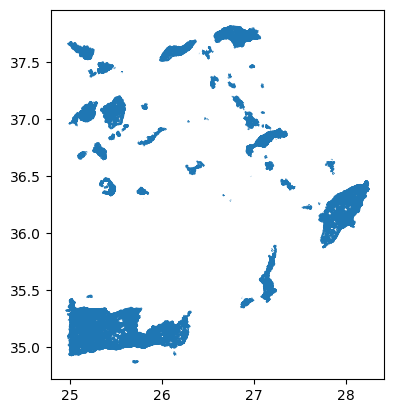
As you may have noticed, loading and plotting
osm_roads.gpkg takes a bit long. This is because the file
contains all the roads of Rhodos and some surrounding islands as well.
Since we are only interested in the roads on Rhodes Island. We will use
the mask
parameter of the read_file() function to load only the
roads on Rhodes Island.
Now let us overwrite the GeoDataframe gdf_roads using
the mask with the GeoDataFrame gdf_rhodes we created
above.
Now let us explore these roads using .explore (or
.plot):
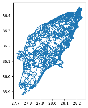
Step 2: Select key infrastructure
As you will find out while exploring the roads dataset, information
about the type of roads is stored in the fclass column. To
get an overview of the different values that are present in the column
fclass , we can use the unique()
function from pandas:
OUTPUT
array(['residential', 'service', 'unclassified', 'footway',
       'track_grade4', 'primary', 'track', 'tertiary', 'track_grade3',
       'path', 'track_grade5', 'steps', 'secondary', 'primary_link',
       'track_grade2', 'track_grade1', 'pedestrian', 'tertiary_link',
       'secondary_link', 'living_street', 'cycleway'], dtype=object)
It seems the variable gdf_roads contains all kind of
hiking paths and footpaths as well. Since we are only interested in
vital infrastructure, classified as “primary”, “secondary” and
“tertiary” roads, we need to make a subselection.
Let us first create a list with the labels we want to select.
Now we are using this list make a subselection of the key
infrastructure using pandas´ .isin
function.
We can plot the key infrastructure :
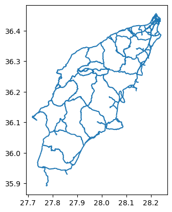
Step 3: Create a 100m buffer around the key infrastructure
Now that we selected the key infrastructure, we want to create a 100m buffer around them. This buffer will be regarded as the infrastructure region.
As you might have notice, the numbers on the x and y axis of our plots represent Lon Lat coordinates, meaning that the data is not yet projected. The current data has a geographic coordinate system with measures in degrees but not meter. Creating a buffer of 100 meters is not possible. Therefore, in order to create a 100m buffer, we first need to project our data. In our case we decided to project the data as WGS 84 / UTM zone 31N, with EPSG code 32631 (see chapter 03 for more information about the CRS and EPSG codes.
To project our data we use .to_crs. We first define a variable with the EPSG value (in our case 32631), which we then us in the to_crs function.
Now that our data is projected, we can create a buffer. For this we make use of geopandas´ .buffer function :
OUTPUT
53       POLYGON ((2779295.383 4319805.295, 2779317.029...
54       POLYGON ((2779270.962 4319974.441, 2779272.393...
55       POLYGON ((2779172.341 4319578.062, 2779165.312...
84       POLYGON ((2779615.109 4319862.058, 2779665.519...
140      POLYGON ((2781330.698 4320046.538, 2781330.749...
                               ...
19020    POLYGON ((2780193.230 4337691.133, 2780184.279...
19021    POLYGON ((2780330.823 4337772.262, 2780324.966...
19022    POLYGON ((2780179.850 4337917.135, 2780188.871...
19024    POLYGON ((2780516.550 4339028.863, 2780519.340...
19032    POLYGON ((2780272.050 4338213.937, 2780274.519...
Length: 1386, dtype: geometry
Note that the type of the key_infra_meters_buffer is a
GeoSeries and not a GeoDataFrame. This is
because the buffer() function returns a
GeoSeries object. You can check that by calling the type of
the variable.
OUTPUT
geopandas.geoseries.GeoSeriesNow that we have a buffer, we can convert it back to the geographic
coordinate system to keep the data consistent. Note that we are now
using the crs information from the key_infra, instead of
using the EPSG code directly (EPSG:4326):
OUTPUT
45       POLYGON ((27.72826 36.12409, 27.72839 36.12426...
58       POLYGON ((27.71666 36.11678, 27.71665 36.11678...
99       POLYGON ((27.75485 35.95242, 27.75493 35.95248...
100      POLYGON ((27.76737 35.95086, 27.76733 35.95086...
108      POLYGON ((27.76706 35.95199, 27.76702 35.95201...
                               ...
18876    POLYGON ((28.22855 36.41890, 28.22861 36.41899...
18877    POLYGON ((28.22819 36.41838, 28.22825 36.41845...
18878    POLYGON ((28.22865 36.41904, 28.22871 36.41912...
18879    POLYGON ((28.23026 36.41927, 28.23034 36.41921...
18880    POLYGON ((28.23020 36.41779, 28.23007 36.41745...
Length: 1369, dtype: geometry
As you can see, the buffers created in key_infra_buffer
have the Polygon geometry type.
To double check the EPSG code of key_infra:
OUTPUT
EPSG:4326Reprojecting and buffering our data is something that we are going to do multiple times during this episode. To avoid have to call the same functions multiple times it would make sense to create a function. Therefore, let us create a function in which we can add the buffer as a variable.
PYTHON
def buffer_crs(gdf, size, meter_crs=32631, target_crs=4326):
    return gdf.to_crs(meter_crs).buffer(size).to_crs(target_crs)
For example, we can use this function to create a 200m buffer around the infrastructure the key infrastructure by doing:
Get built-up regions from Open Street Map (OSM)
Now that we have a buffered dataset for the key infrastructure of
Rhodes, our next step is to create a dataset with all the built-up
areas. To do so we will use the land use data from OSM, which we
prepared for you in the file data/osm_landuse.gpkg. This
file includes the land use data for the entire Greece. We assume the
built-up regions to be the union of three types of land use:
“commercial”, “industrial”, and “residential”.
Note that for the simplicity of this course, we limit the built-up regions to these three types of land use. In reality, the built-up regions can be more complex also there is definitely more high quality (e.g. local government).
Now it will be up to you to create a dataset with valuable assets. You should be able to complete this task by yourself with the knowledge you have gained from the previous steps and links to the documentation we provided.
Exercise: Get the built-up regions
Create a builtup_buffer from the file
data/osm/osm_landuse.gpkg by the following steps:
- Load the land use data from
data/osm/osm_landuse.gpkgand mask it with the administrative boundary of Rhodes Island (gdf_rhodes). - Select the land use data for “commercial”, “industrial”, and “residential”.
- Create a 10m buffer around the land use data.
- Visualize the results.
After completing the exercise, answer the following questions:
- How many unique land use types are there in
osm_landuse.gpkg? - After selecting the three types of land use, how many entries (rows) are there in the results?
Hints:
-
data/osm_landuse.gpkgcontains the land use data for the entire Greece. Use the administrative boundary of Rhodes Island (gdf_rhodes) to select the land use data for Rhodes Island. - The land use attribute is stored in the
fclasscolumn. - Reuse
buffer_crsfunction to create the buffer.
PYTHON
# Read data with a mask of Rhodes
gdf_landuse = gpd.read_file('./data/osm/osm_landuse.gpkg', mask=gdf_rhodes)

# Find number of unique landuse types
print(len(gdf_landuse['fclass'].unique()))

# Extract built-up regions
builtup_labels = ['commercial', 'industrial', 'residential']
builtup = gdf_landuse[gdf_landuse['fclass'].isin(builtup_labels)]

# Create 10m buffer around the built-up regions
builtup_buffer = buffer_crs(builtup, 10)

# Get the number of entries
print(len(builtup_buffer))

# Visualize the buffer
builtup_buffer.plot()
OUTPUT
19
1349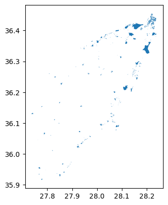
Merge the infrastructure regions and built-up regions
Now that we have the infrastructure regions and built-up regions, we
can merge them into a single region. We would like to keep track of the
type after merging, so we will add two new columns: type
and code by converting the GeoSeries to
GeoDataFrame.
First we convert the buffer around key infrastructure:
PYTHON
data = {'geometry': key_infra_buffer, 'type': 'infrastructure', 'code': 1}
gdf_infra = gpd.GeoDataFrame(data)
Then we convert the built-up buffer:
PYTHON
data = {'geometry': builtup_buffer, 'type': 'builtup', 'code': 2}
gdf_builtup = gpd.GeoDataFrame(data)
After that, we can merge the two GeoDataFrame into
one:
In gdf_assets, we can distinguish the infrastructure
regions and built-up regions by the type and
code columns. We can plot the gdf_assets to
visualize the merged regions. See the geopandas
documentation on how to do this:
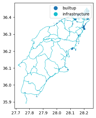
Finally, we can save the gdf_assets to a file for future
use:
- Load spatial objects into Python with
geopandas.read_file()function. - Spatial objects can be plotted directly with
GeoDataFrame’s.plot()method. - Convert CRS of spatial objects with
.to_crs(). Note that this generates aGeoSeriesobject. - Create a buffer of spatial objects with
.buffer(). - Merge spatial objects with
pd.concat().
Content from Crop raster data with rioxarray and geopandas
Last updated on 2026-06-03 | Edit this page
Overview
Questions
- How can I crop my raster data to the area of interest?
Objectives
- Align the CRS of geopatial data.
- Crop raster data with a bounding box.
- Crop raster data with a polygon.
It is quite common that the raster data you have in hand is too large to process, or not all the pixels are relevant to your area of interest (AoI). In both situations, you should consider cropping your raster data before performing data analysis.
In this episode, we will introduce how to crop raster data into the desired area. We will use one Sentinel-2 image over Rhodes Island as the example raster data, and introduce how to crop your data to different types of AoIs.
Introduce the Data
In this episode, we will work with both raster and vector data.
As raster data, we will use satellite images from the search that we have carried out in the episode: “Access satellite imagery using Python” as well as Digital Elevation Model (DEM) data from the Copernicus DEM GLO-30 dataset.
For the satellite images, we have searched for Sentinel-2 scenes of Rhodes from July 1st to August 31st 2023 that have less than 1% cloud coverage. The search resulted in 11 scenes. We focus here on the most recent scene (August 27th), since that would show the situation after the wildfire, and use this as an example to demonstrate raster data cropping.
For your convenience, we have included the scene of interest among
the datasets that you have already downloaded when following the setup instructions. You should, however, be
able to download the satellite images “on-the-fly” using the JSON
metadata file that was created in the
previous episode (the file rhodes_sentinel-2.json).
If you choose to work with the provided data (which is advised in case you are working offline or have a slow/unstable network connection) you can skip the remaining part of the block and continue with the following section: Align the CRS of the raster and the vector data.
If you want instead to experiment with downloading the data
on-the-fly, you need to load the file
rhodes_sentinel-2.json, which contains information on where
and how to access the target satellite images from the remote
repository:
You can then select the first item in the collection, which is the most recent in the sequence:
OUTPUT
<Item id=S2A_35SNA_20230827_0_L2A>In this episode we will consider the true color image associated with
this scene, which is labelled with the visual key in the
asset dictionary. We extract the URL / href (Hypertext
Reference) that point to the file, and store it in a variable that we
can use later on instead of the raster data path to access the data:
As vector data, we will use the
assets.gpkg, which was generated in an exercise from Episode 7: Vector data in
python.
Align the CRS of the raster and the vector data
Data loading
First, we will load the visual image of Sentinel-2 over Rhodes
Island, which we downloaded and stored in
data/sentinel2/visual.tif.
We can open this asset with rioxarray, and specify the
overview level, since this is a Cloud-Optimized GeoTIFF (COG) file. As
explained in episode 6 raster images can be quite big, therefore we
decided to resample the data using ´rioxarray’s´ overview parameter and
set it to overview_level=1.
PYTHON
import rioxarray
path_visual = 'data/sentinel2/visual.tif'
visual = rioxarray.open_rasterio(path_visual, overview_level=1)
visual
OUTPUT
<xarray.DataArray (band: 3, y: 2745, x: 2745)>
[22605075 values with dtype=uint8]
Coordinates:
  * band         (band) int64 1 2 3
  * x            (x) float64 5e+05 5e+05 5.001e+05 ... 6.097e+05 6.098e+05
  * y            (y) float64 4.1e+06 4.1e+06 4.1e+06 ... 3.99e+06 3.99e+06
    spatial_ref  int64 0
Attributes:
    AREA_OR_POINT:       Area
    OVR_RESAMPLING_ALG:  AVERAGE
    _FillValue:          0
    scale_factor:        1.0
    add_offset:          0.0
As we introduced in the raster data introduction episode, this will perform a “lazy” loading of the image meaning that the image will not be loaded into the memory until necessary.
Let’s also load the assets file generated in the vector data episode:
Crop the raster with a bounding box
The assets file contains the information of the vital infrastructure and built-up areas on the island Rhodes. The visual image, on the other hand, has a larger extent. Let us check this by visualizing the raster image:
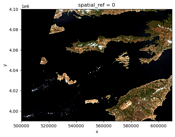
Let’s check the extent of the assets to find out its rough location
in the raster image. We can use the total_bounds
attribute from GeoSeries of geopandas to get
the bounding box:
OUTPUT
array([27.7121001 , 35.87837949, 28.24591124, 36.45725024])The bounding box is composed of the
[minx, miny, maxx, maxy] values of the raster. Comparing
these values with the raster image, we can identify that the magnitude
of the bounding box coordinates does not match the coordinates of the
raster image. This is because the two datasets have different coordinate
reference systems (CRS). This will cause problems when cropping the
raster image, therefore we first need to align the CRS-s of the two
datasets
Considering the raster image has larger data volume than the vector
data, we will reproject the vector data to the CRS of the raster data.
We can use the to_crs method:
PYTHON
# Reproject
assets = assets.to_crs(visual.rio.crs)

# Check the new bounding box
assets.total_bounds
OUTPUT
array([ 564058.0257114, 3970719.4080227, 611743.71498815, 4035358.56340039])Now the bounding box coordinates are updated. We can use the
clip_box function, through the rioaxarray
accessor, to crop the raster image to the bounding box of the vector
data. clip_box takes four positional input arguments in the
order of xmin, ymin, xmax,
ymax, which is exactly the same order in the
assets.total_bounds. Since assets.total_bounds
is an numpy.array, we can use the symbol * to
unpack it to the relevant positions in clip_box.
PYTHON
# Crop the raster with the bounding box
visual_clipbox = visual.rio.clip_box(*assets.total_bounds)

# Visualize the cropped image
visual_clipbox.plot.imshow()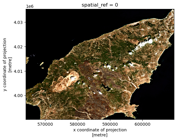
Code Tip
Cropping a raster with a bounding box is a quick way to reduce the size of the raster data. Since this operation is based on min/max coordinates, it is not as computational extensive as cropping with polygons, which requires more accurate overlay operations.
Crop the raster with a polygon
We can also crop the raster with a polygon. In this case, we will use
the raster clip function through the rio
accessor. For this we will use the geometry column of the
assets GeoDataFrame to specify the polygon:
PYTHON
# Crop the raster with the polygon
visual_clip = visual_clipbox.rio.clip(assets["geometry"])

# Visualize the cropped image
visual_clip.plot.imshow()
Exercise: Clip the red band for Rhodes
Now that you have seen how clip a raster using a polygon, we want you to do this for the red band of the satellite image. Use the shape of Rhodes from GADM and clip the red band with it. Furthermore, make sure to transform the no data values to not-a-number (NaN) values.
PYTHON
# Solution

# Step 1 - Load the datasets - Vector data

import geopandas as gpd
gdf_greece = gpd.read_file('./data/gadm/ADM_ADM_3.gpkg')
gdf_rhodes = gdf_greece[gdf_greece['NAME_3']=='Rhodos']

# Step 2 - Load the raster red band
import rioxarray
path_red = './data/sentinel2/red.tif'
red = rioxarray.open_rasterio(path_red, overview_level=1)

# Step 3 - It will not work, since it is not projected yet

gdf_rhodes = gdf_rhodes.to_crs(red.rio.crs)

# Step 4 - Clip the two

red_clip = red.rio.clip(gdf_rhodes["geometry"])

# Step 5 - assign nan values to no data

red_clip_nan = red_clip.where(red_clip!=red_clip.rio.nodata)

# Step 6 - Visualize the result

red_clip_nan.plot()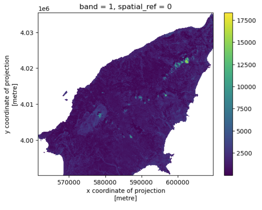
Match two rasters
Sometimes you need to match two rasters with different extents,
resolutions, or CRS. For this you can use the reproject_match
function . We will demonstrate this by matching the cropped raster
visual_clip with the Digital Elevation Model
(DEM),rhodes_dem.tif of Rhodes.
First, let’s load the DEM:
And visualize it:
From the visualization, we can see that the DEM has a different extent, resolution and CRS compared to the cropped visual image. We can also confirm this by checking the CRS of the two images:
OUTPUT
EPSG:4326
EPSG:32635
We can use the reproject_match function to match the two
rasters. One can choose to match the dem to the visual image or vice
versa. Here we will match the DEM to the visual image:
And then visualize the matched DEM:
As we can see, reproject_match does a lot of helpful
things in one line of code:
- It reprojects.
- It matches the extent.
- It matches the resolution.
Finally, we can save the matched DEM for later use. We save it as a Cloud-Optimized GeoTIFF (COG) file:
Code Tip
There is also a method in rioxarray: reproject(),
which only reprojects one raster to another projection. If you want more
control over how rasters are resampled, clipped, and/or reprojected, you
can use the reproject() method individually.
- Use
clip_boxto crop a raster with a bounding box. - Use
clipto crop a raster with a given polygon. - Use
reproject_matchto match two raster datasets.
Content from Raster Calculations in Python
Last updated on 2026-06-03 | Edit this page
Overview
Questions
- How do I perform calculations on rasters and extract pixel values for defined locations?
Objectives
- Carry out operations with two rasters using Python’s built-in math operators.
Introduction
We often want to combine values of and perform calculations on rasters to create a new output raster. This episode covers how to perform basic math operations using raster datasets. It also illustrates how to match rasters with different resolutions so that they can be used in the same calculation. As an example, we will calculate a binary classification mask to identify burned area over a satellite scene.
The classification mask requires the following of the Sentinel-2 bands (and derived indices):
- Normalized difference vegetation index (NDVI), derived from the near-infrared (NIR) and red bands:
\[ NDVI = \frac{NIR - red}{NIR + red} \]
- Normalized difference water index (NDWI), derived from the green and NIR bands:
\[ NDWI = \frac{green - NIR}{green + NIR} \]
- A custom index derived from two of the short-wave infrared (SWIR) bands (with wavelength ~1600 nm and ~2200 nm, respectively):
\[ INDEX = \frac{SWIR_{16} - SWIR_{22}}{SWIR_{16} + SWIR_{22}}\]
- The blue, NIR, and SWIR (1600 nm) bands.
In the following, we start by computing the NDVI.
Load and crop the Data
For this episode, we will use one of the Sentinel-2 scenes that we have already employed in the previous episodes.
Introduce the Data
We will use satellite images from the search that we have carried out in the episode: “Access satellite imagery using Python”. Briefly, we have searched for Sentinel-2 scenes of Rhodes from July 1st to August 31st 2023 that have less than 1% cloud coverage. The search resulted in 11 scenes. We focus here on the most recent scene (August 27th), since that would show the situation after the wildfire, and use this as an example to demonstrate raster calculations.
For your convenience, we have included the scene of interest among
the datasets that you have already downloaded when following the setup instructions. You should, however, be
able to download the satellite images “on-the-fly” using the JSON
metadata file that was created in the
previous episode (the file rhodes_sentinel-2.json).
If you choose to work with the provided data (which is advised in case you are working offline or have a slow/unstable network connection) you can skip the remaining part of the block.
If you want instead to experiment with downloading the data
on-the-fly, you need to load the file
rhodes_sentinel-2.json, which contains information on where
and how to access the target satellite images from the remote
repository:
You can then select the first item in the collection, which is the most recent in the sequence:
OUTPUT
<Item id=S2A_35SNA_20230827_0_L2A>In this episode we will consider a number of bands associated with
this scene. We extract the URL / href (Hypertext Reference)
that point to each of the raster files, and store these in variables
that we can use later on instead of the raster data paths to access the
data:
PYTHON
rhodes_red_href = item.assets["red"].href  # red band
rhodes_green_href = item.assets["green"].href  # green band
rhodes_blue_href = item.assets["blue"].href  # blue band
rhodes_nir_href = item.assets["nir"].href  # near-infrared band
rhodes_swir16_href = item.assets["swir16"].href  # short-wave infrared (1600 nm) band
rhodes_swir22_href = item.assets["swir22"].href  # short-wave infrared (2200 nm) band
rhodes_visual_href = item.assets["visual"].href  # true-color image
Let’s load the red and NIR band rasters with
open_rasterio using the argument
masked=True:
PYTHON
import rioxarray
red = rioxarray.open_rasterio("data/sentinel2/red.tif", masked=True)
nir = rioxarray.open_rasterio("data/sentinel2/nir.tif", masked=True)
Let’s restrict our analysis to the island of Rhodes - we can extract the bounding box from the vector file written in an earlier episode (note that we need to match the CRS to the one of the raster files):
PYTHON
# determine bounding box of Rhodes, in the projected CRS
import geopandas
rhodes = geopandas.read_file('rhodes.gpkg')
rhodes_reprojected = rhodes.to_crs(red.rio.crs)
bbox = rhodes_reprojected.total_bounds

# crop the rasters
red_clip = red.rio.clip_box(*bbox)
nir_clip = nir.rio.clip_box(*bbox)
We can now plot the two rasters. Using robust=True color
values are stretched between the 2nd and 98th percentiles of the data,
which results in clearer distinctions between high and low
reflectances:
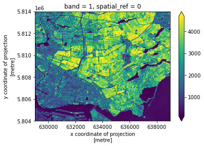
The burned area is immediately evident as a dark spot in the NIR wavelength, due to the lack of reflection from the vegetation in the scorched area.
Raster Math
We can perform raster calculations by subtracting (or adding,
multiplying, etc.) two rasters. In the geospatial world, we call this
“raster math”, and typically it refers to operations on rasters that
have the same width and height (including nodata pixels).
We can check the shapes of the two rasters in the following way:
OUTPUT
(1, 4523, 4828) (1, 4523, 4828)The shapes of the two rasters match (and, not shown, the coordinates and the CRSs match too).
Let’s now compute the NDVI as a new raster using the formula
presented above. We’ll use DataArray objects so that we can
easily plot our result and keep track of the metadata.
OUTPUT
<xarray.DataArray (band: 1, y: 1131, x: 1207)>
array([[[0., 0., 0., ..., 0., 0., 0.],
        [0., 0., 0., ..., 0., 0., 0.],
        [0., 0., 0., ..., 0., 0., 0.],
        ...,
        [0., 0., 0., ..., 0., 0., 0.],
        [0., 0., 0., ..., 0., 0., 0.],
        [0., 0., 0., ..., 0., 0., 0.]]], dtype=float32)
Coordinates:
  * band         (band) int64 1
  * x            (x) float64 5.615e+05 5.616e+05 ... 6.097e+05 6.098e+05
  * y            (y) float64 4.035e+06 4.035e+06 4.035e+06 ... 3.99e+06 3.99e+06
    spatial_ref  int64 0
We can now plot the output NDVI:
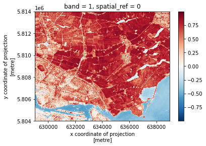
Notice that the range of values for the output NDVI is between -1 and 1. Does this make sense for the selected region?
Maps are great, but it can also be informative to plot histograms of
values to better understand the distribution. We can accomplish this
using a built-in xarray method we have already been using:
plot.hist()
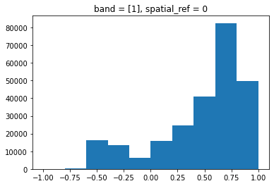
Exercise: NDWI and custom index to detect burned areas
Calculate the other two indices required to compute the burned area classification mask, specifically:
- The normalized difference water index (NDWI), derived from the green and NIR bands (file “green.tif” and “nir.tif”, respectively):
\[ NDWI = \frac{green - NIR}{green + NIR} \]
- A custom index derived from the 1600 nm and the 2200 nm short-wave infrared (SWIR) bands ( “swir16.tif” and “swir22.tif”, respectively):
\[ INDEX = \frac{SWIR_{16} - SWIR_{22}}{SWIR_{16} + SWIR_{22}}\]
What challenge do you foresee in combining the data from the two indices?
PYTHON
def get_band_and_clip(band_path, bbox):
    band = rioxarray.open_rasterio(band_path, masked=True)
    return band.rio.clip_box(*bbox)
PYTHON
data_path = 'data/sentinel2'
green_clip = get_band_and_clip(f'{data_path}/green.tif', bbox)
swir16_clip = get_band_and_clip(f'{data_path}/swir16.tif', bbox)
swir22_clip = get_band_and_clip(f'{data_path}/swir22.tif', bbox)
PYTHON
ndwi = (green_clip - nir_clip)/(green_clip + nir_clip)
index = (swir16_clip - swir22_clip)/(swir16_clip + swir22_clip)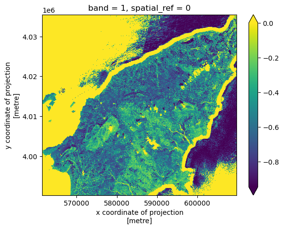
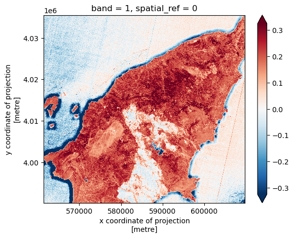
The challenge in combining the different indices is that the SWIR bands (and thus the derived custom index) have lower resolution:
OUTPUT
((10.0, -10.0), (10.0, -10.0), (20.0, -20.0))In order to combine data from the computed indices, we use the
reproject_match method, which reprojects, clips and match
the resolution of a raster using another raster as a template. We use
the ndvi raster as a template, and match index
and swir16_clip to its resolution and extent:
PYTHON
index_match = index.rio.reproject_match(ndvi)
swir16_match = swir16_clip.rio.reproject_match(ndvi)
Finally, we also load the blue band data and clip it to the area of interest:
We can now go ahead and compute the binary classification mask for burned areas. Note that we need to convert the unit of the Sentinel-2 bands from digital numbers to reflectance (this is achieved by dividing by 10,000):
PYTHON
burned = (
    (ndvi <= 0.3) &
    (ndwi <= 0.1) &
    ((index_match + nir_clip/10_000) <= 0.1) &
    ((blue_clip/10_000) <= 0.1) &
    ((swir16_match/10_000) >= 0.1)
)
The classification mask has a single element along the “band” axis, we can drop this dimension in the following way:
Let’s now fetch and visualize the true color image of Rhodes, after coloring the pixels identified as burned area in red:
PYTHON
visual = rioxarray.open_rasterio(f'{data_path}/visual.tif')
visual_clip = visual.rio.clip_box(*bbox)
PYTHON
# set red channel to max (255), green and blue channels to min (0).
visual_clip[0] = visual_clip[0].where(~burned, 255)
visual_clip[1:3] = visual_clip[1:3].where(~burned, 0)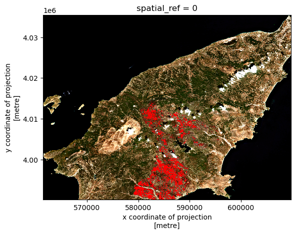
We can save the burned classification mask to disk after converting booleans to integers:
- Python’s built-in math operators are fast and simple options for raster math.
Content from Calculating Zonal Statistics on Rasters
Last updated on 2026-06-03 | Edit this page
Overview
Questions
- How to compute raster statistics on different zones delineated by vector data?
Objectives
- Extract zones from the vector dataset
- Convert vector data to raster
- Calculate raster statistics over zones
Introduction
Statistics on predefined zones of the raster data are commonly used for analysis and to better understand the data. These zones are often provided within a single vector dataset, identified by certain vector attributes. For example, in the previous episodes, we defined infrastructure regions and built-up regions on Rhodes Island as polygons. Each region can be respectively identified as a “zone”, resulting in two zones. One can evualuate the effect of the wild fire on the two zones by calculating the zonal statistics.
Data loading
We have created assets.gpkg in Episode “Vector data in
Python”, which contains the infrastructure regions and built-up regions
. We also calculated the burned index in Episode “Raster Calculations in
Python” and saved it in burned.tif. Lets load them:
Align datasets
Before we continue, let’s check if the two datasets are in the same CRS:
OUTPUT
EPSG:4326
EPSG:32635
The two datasets are in different CRS. Let’s reproject the assets to the same CRS as the burned index raster:
Rasterize the vector data
One way to define the zones, is to create a grid space with the same
extent and resolution as the burned index raster, and with the numerical
values in the grid representing the type of infrastructure, i.e., the
zones. This can be done by rasterize the vector data assets
to the grid space of burned.
Let’s first take two elements from assets, the geometry
column, and the code of the region.
OUTPUT
[[<POLYGON ((602761.27 4013139.375, 602764.522 4013072.287, 602771.476 4012998...>,
  1],
 [<POLYGON ((602779.808 4013298.838, 602772.497 4013266.01, 602768.577 4013242...>,
  1],
 [<POLYGON ((602594.855 4012962.661, 602593.423 4012983.028, 602588.485 401302...>,
  1],
  ...]
The raster image burned is a 3D image with a “band”
dimension.
OUTPUT
(1, 4523, 4828)To create the grid space, we only need the two spatial dimensions. We
can used .squeeze() to drop the band dimension:
OUTPUT
(4523, 4828)Now we can use features.rasterize from
rasterio to rasterize the vector data assets
to the grid space of burned:
PYTHON
from rasterio import features
assets_rasterized = features.rasterize(geom, out_shape=burned_squeeze.shape, transform=burned.rio.transform())
assets_rasterized
OUTPUT
array([[0, 0, 0, ..., 0, 0, 0],
       [0, 0, 0, ..., 0, 0, 0],
       [0, 0, 0, ..., 0, 0, 0],
       ...,
       [0, 0, 0, ..., 0, 0, 0],
       [0, 0, 0, ..., 0, 0, 0],
       [0, 0, 0, ..., 0, 0, 0]], dtype=uint8)
Perform zonal statistics
The rasterized zones assets_rasterized is a
numpy array. The Python package xrspatial,
which is the one we will use for zoning statistics, accepts
xarray.DataArray. We need to first convert
assets_rasterized. We can use burned_squeeze
as a template:
PYTHON
assets_rasterized_xarr = burned_squeeze.copy()
assets_rasterized_xarr.data = assets_rasterized
assets_rasterized_xarr.plot()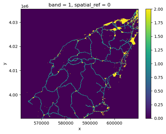
Then we can calculate the zonal statistics using the
zonal_stats function:
PYTHON
from xrspatial import zonal_stats
stats = zonal_stats(assets_rasterized_xarr, burned_squeeze)
stats
OUTPUT
   zone      mean  max  min       sum       std       var       count
0     0  0.023504  1.0  0.0  485164.0  0.151498  0.022952  20641610.0
1     1  0.010361  1.0  0.0    9634.0  0.101259  0.010253    929853.0
2     2  0.000004  1.0  0.0       1.0  0.001940  0.000004    265581.0
The results provide statistics for three zones: 1
represents infrastructure regions, 2 represents built-up
regions, and 0 represents the rest of the area.
- Zones can be extracted by attribute columns of a vector dataset
- Zones can be rasterized using
rasterio.features.rasterize - Calculate zonal statistics with
xrspatial.zonal_statsover the rasterized zones.
Content from Parallel raster computations using Dask
Last updated on 2025-05-20 | Edit this page
Overview
Questions
- How can I parallelize computations on rasters with Dask?
- How can I determine if parallelization improves calculation speed?
- What are good practices in applying parallelization to my raster calculations?
Objectives
- Profile the timing of the raster calculations.
- Open raster data as a chunked array.
- Recognize good practices in selecting proper chunk sizes.
- Setup raster calculations that take advantage of parallelization.
Introduction
Very often raster computations involve applying the same operation to different pieces of data. Think, for instance, to the “pixel”-wise sum of two raster datasets, where the same sum operation is applied to all the matching grid-cells of the two rasters. This class of tasks can benefit from chunking the input raster(s) into smaller pieces: operations on different pieces can be run in parallel using multiple computing units (e.g., multi-core CPUs), thus potentially speeding up calculations. In addition, working on chunked data can lead to smaller memory footprints, since one may bypass the need to store the full dataset in memory by processing it chunk by chunk.
In this episode, we will introduce the use of Dask in the context of
raster calculations. Dask is a Python library for parallel and
distributed computing. It provides a framework to work with different
data structures, including chunked arrays (Dask Arrays). Dask is well
integrated with (rio)xarray, which can use
Dask arrays as underlying data structures.
Dask
This episode shows how Dask can be used to parallelize operations on local CPUs. However, the same library can be configured to run tasks on large compute clusters.
More resources on Dask:
- Dask and Dask Array.
- Xarray with Dask.
It is important to realize, however, that many details determine the extent to which using Dask’s chunked arrays instead of regular Numpy arrays leads to faster calculations (and lower memory requirements). The actual operations to carry out, the size of the dataset, and parameters such as the chunks’ shape and size, all affects the performance of our computations. Depending on the specifics of the calculations, serial calculations might actually turn out to be faster! Being able to profile the computational time is thus essential, and we will see how to do that in a Jupyter environment in the next section.
Introduce the Data
We will use satellite images from the search that we have carried out in the episode: “Access satellite imagery using Python”. Briefly, we have searched for Sentinel-2 scenes of Rhodes from July 1st to August 31st 2023 that have less than 1% cloud coverage. The search resulted in 11 scenes. We focus here on the most recent scene (August 27th), since that would show the situation after the wildfire, and use this as an example to demonstrate parallel raster calculations.
For your convenience, we have included the scene of interest among
the datasets that you have already downloaded when following the setup instructions. You should, however, be
able to download the satellite images “on-the-fly” using the JSON
metadata file that was created in the
previous episode (the file rhodes_sentinel-2.json).
If you choose to work with the provided data (which is advised in case you are working offline or have a slow/unstable network connection) you can skip the remaining part of the block and continue with the following section: Dask-powered rasters.
If you want instead to experiment with downloading the data
on-the-fly, you need to load the file
rhodes_sentinel-2.json, which contains information on where
and how to access the target satellite images from the remote
repository:
You can then select the first item in the collection, which is the most recent in the sequence:
OUTPUT
<Item id=S2A_35SNA_20230827_0_L2A>In this episode we will consider the red and near infrared bands
associated with this scene. We extract the URL / href
(Hypertext Reference) that point to each of the raster files, and store
these in variables that we can use later on instead of the raster data
paths to access the data:
Dask-powered rasters
Chunked arrays
As we have mentioned, rioxarray supports the use of
Dask’s chunked arrays as underlying data structure. When opening a
raster file with open_rasterio and providing the
chunks argument, Dask arrays are employed instead of
regular Numpy arrays. chunks describes the shape of the
blocks which the data will be split in. As an example, we open the red
band raster using a chunk shape of (1, 4000, 4000) (block
size of 1 in the first dimension and of 4000
in the second and third dimensions):
PYTHON
import rioxarray
red = rioxarray.open_rasterio("data/sentinel2/red.tif", chunks=(1, 4000, 4000))
Xarray and Dask also provide a graphical representation of the raster data array and of its blocked structure.
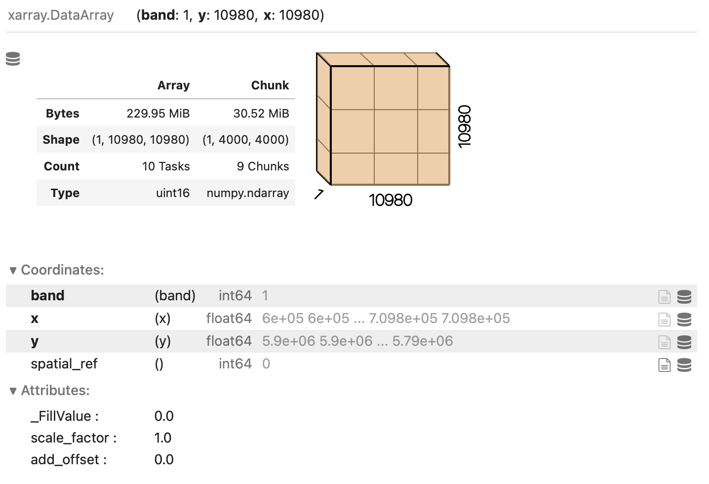
Exercise: Chunk sizes matter
We have already seen how COGs are regular GeoTIFF files with a special internal structure. Another feature of COGs is that data is organized in “blocks” that can be accessed remotely via independent HTTP requests, enabling partial file readings. This is useful if you want to access only a portion of your raster file, but it also allows for efficient parallel reading. You can check the blocksize employed in a COG file with the following code snippet:
PYTHON
import rasterio
with rasterio.open("/path/or/URL/to/file.tif") as r:
    if r.is_tiled:
        print(f"Chunk size: {r.block_shapes}")
In order to optimally access COGs it is best to align the blocksize of the file with the chunks enployed when loading the file. Which other elements do you think should be considered when choosing the chunk size? What do you think are suitable chunk sizes for the red band raster?
PYTHON
import rasterio
with rasterio.open("data/sentinel2/red.tif") as r:
    if r.is_tiled:
        print(f"Chunk size: {r.block_shapes}")
OUTPUT
Chunk size: [(1024, 1024)]Ideal chunk size values for this raster are multiples of 1024. An
element to consider is the number of resulting chunks and their size.
While the optimal chunk size strongly depends on the specific
application, chunks should in general not be too big nor too small
(i.e. too many). As a rule of thumb, chunk sizes of 100 MB typically
work well with Dask (see, e.g., this blog
post). Also, the shape might be relevant, depending on the
application! Here, we might select a chunks shape of
(1, 6144, 6144)::
which leads to chunks 72 MB large: ((1 x 6144 x 6144) x 2 bytes /
2^20 = 72 MB). Also, we can let rioxarray and Dask figure out
appropriate chunk shapes by setting chunks="auto":
which leads to (1, 8192, 8192) chunks (128 MB).
Parallel computations
Operations performed on a DataArray that has been opened
as a chunked Dask array are executed using Dask. Dask coordinates how
the operations should be executed on the individual chunks of data, and
runs these tasks in parallel as much as possible.
Let us set up an example where we calculate the NDVI for a full Sentinel-2 tile, and try to estimate the performance gain by running the calculation in parallel on a multi-core CPU.
To run the calculation serially, we open the relevant raster bands, as we have learned in the previous episodes:
PYTHON
red = rioxarray.open_rasterio('data/sentinel2/red.tif', masked=True)
nir = rioxarray.open_rasterio('data/sentinel2/nir.tif', masked=True)
We then compute the NDVI. Note the Jupyter magic %%time,
which returns the time required to run the content of a cell (note that
commands starting with %% needs to be on the first line of
the cell!):
OUTPUT
CPU times: user 4.99 s, sys: 3.44 s, total: 8.43 s
Wall time: 8.53 s
We note down the calculation’s “Wall time” (actual time to perform the task).
Now we run the same task in parallel using Dask. To do so, we open the relevant rasters as chunked arrays:
PYTHON
red_dask = rioxarray.open_rasterio('data/sentinel2/red.tif', masked=True, lock=False, chunks=(1, 6144, 6144))
nir_dask = rioxarray.open_rasterio('data/sentinel2/nir.tif', masked=True, lock=False, chunks=(1, 6144, 6144))
Setting lock=False tells rioxarray that the
individual data chunks can be loaded simultaneously from the source by
the Dask workers.
We now continue to the actual calculation: Note how the same syntax as for its serial version is employed for computing the NDVI. Don’t forget to add the Jupyter magic to record the timing!
OUTPUT
CPU times: user 7.71 ms, sys: 1.71 ms, total: 9.42 ms
Wall time: 8.61 ms
Did we just observe a 1000x speed-up when comparing to the serial calculation (~8 s vs ~8 ms)? Actually, no calculation has run yet. This is because operations performed on Dask arrays are executed “lazily”, i.e. they are not immediately run.
Dask graph
The sequence of operations to carry out is stored in a task graph, which can be visualized with:
The task graph gives Dask the complete “overview” of the calculation, thus enabling a better management of tasks and resources when dispatching calculations to be run in parallel.
Most methods of DataArray’s run operations lazily when
Dask arrays are employed. In order to trigger calculations, we can use
either .persist() or .compute(). The former
keeps data in the form of chunked Dask arrays, and it should thus be
used to run intermediate steps that will be followed by additional
calculations. The latter merges instead the chunks in a single Numpy
array, and it should be used at the very end of a sequence of
calculations. Both methods accept the same parameters. Here, we
explicitly tell Dask to parallelize the required workload over 4
threads. Let’s again time the cell execution:
OUTPUT
CPU times: user 4.18 s, sys: 2.19 s, total: 6.37 s
Wall time: 2.32 s
The timing that we have recorded makes much more sense now. When running the task on a 4-core CPU laptop, we observe a x3.6 speed-up when comparing to the analogous serial calculation (8.53 s vs 2.32 s).
Once again, we stress that one does not always obtain similar performance gains by exploiting the Dask-based parallelization. Even if the algorithm employed is well suited for parallelization, Dask introduces some overhead time to manage the tasks in the Dask graph. This overhead, which is typically of the order of few milliseconds per task, can be larger than the parallelization gain. This is the typical situation with calculations with many small chunks.
Finally, let’s have a look at how Dask can be used to save raster
files. When calling .to_raster(), we provide the as
additional argument lock=threading.Lock(). This is because
the threads which are splitting the workload must “synchronise” when
writing to the same file (they might otherwise overwrite each other’s
output).
Note that .to_raster() is among the methods that trigger
immediate calculations (one can change this behaviour by specifying
compute=False).
- The
%%timeJupyter magic command can be used to profile calculations. - Data ‘chunks’ are the unit of parallelization in raster calculations.
- (
rio)xarraycan open raster files as chunked arrays. - The chunk shape and size can significantly affect the calculation performance.
- Cloud-optimized GeoTIFFs have an internal structure that enables performant parallel read.
Content from Data cubes with ODC-STAC
Last updated on 2026-06-03 | Edit this page
Overview
Questions
- Can I mosaic tiled raster datasets when my area of interest spans multiple files?
- Can I stack raster datasets that cover the same area along the time dimension in order to explore temporal changes of some quantities?
Objectives
- ODC-STAC allows you to work with raster datasets spanning multiple files as if they were a single multi-dimensional object (a “data cube”).
Introduction
In the previous episodes we worked with satellite images with a fixed boundary on how they have been collected, however in many cases you would want to have an image that covers your area of interest which often does not align with boundaries of the collected images. If the phenomena you are interested in covers two images you could manually mosaic them, but sometimes you are interested in multiple images that overlapping.
ODC-STAC offers functionality that allows you to get a mosaic-ed image based on the a bounding box or a polygon containing the area of interest. In this lesson we show how odc-stac can be employed to re-tile and stack satellite images in what are sometimes referred to as “data cubes”.
Create a data cube with ODC-STAC
As you might have noticed in the previous episodes, the satellite images we have used until now do actually not cover the whole island of Rhodes. They miss the southern part of the island. Using ODC-STAC we can obtain an image for the whole island. We use the administrative boundary of Rhodes to define our area of interest (AoI). This way we are sure to have the whole island.
More important, using ODC-STAC you can also load multiple images (lazy) into one datacube allowing you to perform all kind of interesting analyses as will be demonstrated below.
But first we need to upload the geometry of Rhodes. To do so we use geopandas and load the geometry we previously stored in a geopackage.
Next, we search for satellite images that cover our AoI (i.e. Rhodes) in the Sentinel-2 L2A collection that is indexed in the Earth Search STAC API. Since we are interested the period right before and after the wild fire we include as dates the 1st of July until the 31st of August 2023 :
PYTHON
import pystac_client

api_url = "https://earth-search.aws.element84.com/v1"
collection_id = "sentinel-2-c1-l2a"

client = pystac_client.Client.open(api_url)
search = client.search(
    collections=[collection_id],
    datetime="2023-07-01/2023-08-31",
    bbox=bbox
)

item_collection = search.item_collection()
odc-stac
can ingest directly our search results and create a Xarray DataSet
object from the STAC metadata that are present in the
item_collection. By specifying
groupby='solar_day', odc-stac automatically groups and
merges images corresponding to the same date of acquisition.
chunks={...} sets up the resulting data cube using Dask
arrays, thus enabling lazy loading (and further operations).
use_overviews=True tells odc-stac to directly load
lower-resolution versions of the images from the overviews, if these are
available in Cloud Optimized Geotiffs (COGs). We set the resolution of
the data cube using the resolution argument, and define the
AoI using the bounding box (bbox). We decided to set the
resolution to 20 in order to limit the size of the images a bit.
PYTHON
import odc.stac
ds = odc.stac.load(
    item_collection,
    groupby='solar_day',
    chunks={'x': 2048, 'y': 2048},
    use_overviews=True,
    resolution=20,
    bbox=rhodes.total_bounds,
)
odc-stac builds a data cube representation from all the relevant
files linked in item_collection as a Xarray DataSet. Let us
have a look at it:
OUTPUT
<xarray.Dataset> Size: 7GB
Dimensions:      (y: 3255, x: 2567, time: 25)
Coordinates:
  * y            (y) float64 26kB 4.035e+06 4.035e+06 ... 3.97e+06 3.97e+06
  * x            (x) float64 21kB 5.613e+05 5.613e+05 ... 6.126e+05 6.126e+05
    spatial_ref  int32 4B 32635
  * time         (time) datetime64[ns] 200B 2023-07-01T09:10:15.805000 ... 20...
Data variables: (12/18)
    red          (time, y, x) uint16 418MB dask.array<chunksize=(1, 2048, 2048), meta=np.ndarray>
    green        (time, y, x) uint16 418MB dask.array<chunksize=(1, 2048, 2048), meta=np.ndarray>
    blue         (time, y, x) uint16 418MB dask.array<chunksize=(1, 2048, 2048), meta=np.ndarray>
    visual       (time, y, x) float32 836MB dask.array<chunksize=(1, 2048, 2048), meta=np.ndarray>
    nir          (time, y, x) uint16 418MB dask.array<chunksize=(1, 2048, 2048), meta=np.ndarray>
    swir22       (time, y, x) uint16 418MB dask.array<chunksize=(1, 2048, 2048), meta=np.ndarray>
    ...           ...
    scl          (time, y, x) uint8 209MB dask.array<chunksize=(1, 2048, 2048), meta=np.ndarray>
    aot          (time, y, x) uint16 418MB dask.array<chunksize=(1, 2048, 2048), meta=np.ndarray>
    coastal      (time, y, x) uint16 418MB dask.array<chunksize=(1, 2048, 2048), meta=np.ndarray>
    nir09        (time, y, x) uint16 418MB dask.array<chunksize=(1, 2048, 2048), meta=np.ndarray>
    cloud        (time, y, x) uint8 209MB dask.array<chunksize=(1, 2048, 2048), meta=np.ndarray>
    snow         (time, y, x) uint8 209MB dask.array<chunksize=(1, 2048, 2048), meta=np.ndarray>
Working with the data cube
Like we did in the previous episode, let us calculate the NDVI for
our study area. To do so we need to focus on the variables: the red band
(red), the near infrared band (nir) and the
scene classification map (scl). We will use the former two
to calculated the NDVI for the AoI. The latter, we use as a
classification mask provided together with Sentinel-2 L2A products.
In this mask, each pixel is classified according to a set of labels (see
Figure 2 in classification
mask documentation).
First we define the bands that we are interested in:
Next we will use the mask to drop pixels that are labeled as clouds and water. For this we use the classification map to mask out pixels recognized by the Sentinel-2 processing algorithm as cloud or water:
PYTHON
# generate mask ("True" for pixel being cloud or water)
mask = scl.isin([
    3,  # CLOUD_SHADOWS
    6,  # WATER
    8,  # CLOUD_MEDIUM_PROBABILITY
    9,  # CLOUD_HIGH_PROBABILITY
    10  # THIN_CIRRUS
])
red_masked = red.where(~mask)
nir_masked = nir.where(~mask)
Then, we calculate the NDVI:
We can visualize the calculated NDVI for the AoI at two given dates (before and after the wildfires) by selecting the date:
Another feature of having the data available in a datacube is that you can for instance questions multiple layers. If you want for instance to see how the NDVI changed over time for a specific point you can do the following. Let us first define a point in the region where we know it was affected by the wildfile. To check that it is after the fire we plot it:
PYTHON
x = 585_000
y = 3_995_000

import matplotlib.pyplot as plt
fig, ax = plt.subplots()
ndvi_after.plot(ax=ax)
ax.scatter(x, y, marker="o", c="k")
Now let us extract the NDVI values computed at that point for the full time series:
OUTPUT
<xarray.DataArray (time: 25)> Size: 100B
dask.array<getitem, shape=(25,), dtype=float32, chunksize=(1,), chunktype=numpy.ndarray>
Coordinates:
    y            float64 8B 3.995e+06
    x            float64 8B 5.85e+05
    spatial_ref  int32 4B 32635
  * time         (time) datetime64[ns] 200B 2023-07-01T09:10:15.805000 ... 20...
We now trigger computation. Note that we run this in parallel (probably not much of an effect here, but definitely helpful for larger calculations):
OUTPUT
CPU times: user 15.6 s, sys: 4.9 s, total: 20.5 s
Wall time: 1min 8s
The result is a time series representing the NDVI value computed for the selected point for all the available scenes in the time range. We drop the NaN values, and plot the final result: