All Images
What is Rapid Usability Testing?
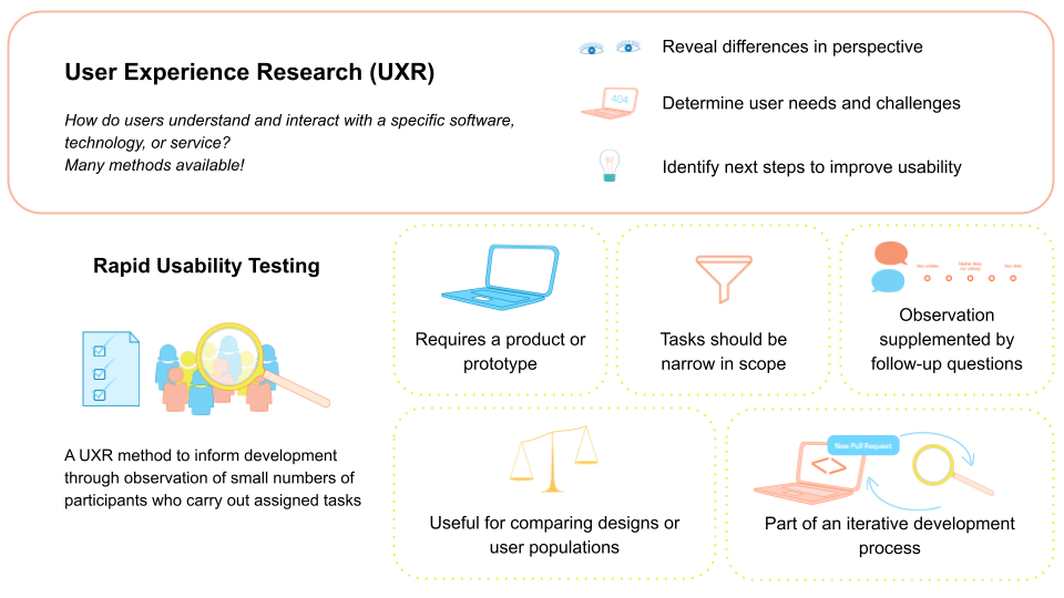
Figure 1
Image 1 of 1: ‘Infographic introducing User Experience Research (UXR) and Rapid Usability Testing. The top section, labeled 'User Experience Research (UXR),' defines UXR as studying how users understand and interact with software, technology, or services. Small icons accompany key goals: a pair of eyes for revealing differences in perspective, a laptop screen with '404' for identifying user needs and challenges, and a lightbulb for determining next steps to improve usability. The lower section, labeled 'Rapid Usability Testing,' describes it as a method that informs development by observing a small number of participants completing assigned tasks. An illustration of a checklist and a magnifying glass over a group of people represents observing users. Additional dotted panels include simple icons: a laptop for requiring a product or prototype, a funnel for keeping tasks narrow in scope, speech bubbles for observation with follow-up questions, a balance scale for comparing designs or user groups, and a laptop with circular arrows for iterative development. The graphic provides a visual overview of how rapid usability testing supports improving usability.’
Preparing a rapid usability test
Figure 1
Image 1 of 1: ‘Screenshot of an example Slack workspace, showing the #general channel open in desktop application window. The left sidebar lists Workspace, Home, DMs, Activity, Channels, and Apps. The main panel displays the top of the #general channel with a message from a user 'hcohoon' that says, 'Hey everyone! What time should we meet tomorrow?' Below the message, near the timestamp, is a visible button labeled 'Reply in thread' circled in red to emphasize it. At the top of the image, instructional text overlays the Slack workspace screenshot: a red 'X' next to the phrase 'Task: Reply to a message using a thread’ and a green check mark next to the phrase 'Task: Show how you would participate in multiple, separate conversations in one channel.’ The figure contrasts giving the user a task that repeats interface wording with one that focuses on a user goal, illustrating how task phrasing can shape what is being evaluated in a usability test.’
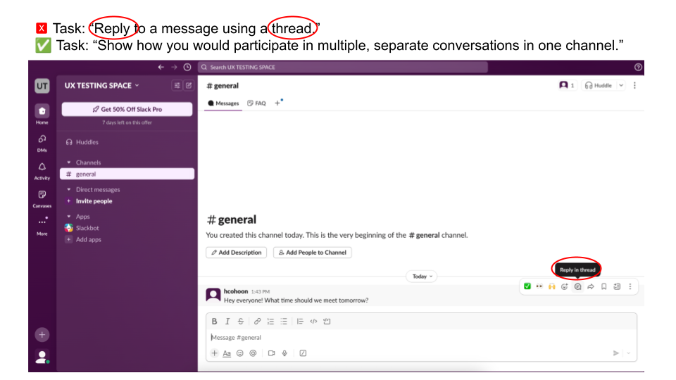
Figure 2
Image 1 of 1: ‘Graphic showing that success on a single usability task can be achieved in more than one way. On the right side is a partial Slack conversation. A user named Chung shares a link to a blog post and asks for recommendations. Below the message appears a small label reading '1 reply,' indicating a threaded response. Beneath that, another user, Sam, has posted a reply beginning with '@Chung,' suggesting a response in the main channel. On the left side of the image, large text reads, 'Success can be achieved in multiple ways,' with arrows pointing toward both the threaded reply indicator and the channel reply. The figure illustrates that when defining evaluation metrics, researchers must decide what counts as successful task completion, since participants may accomplish the goal through different interaction paths.’
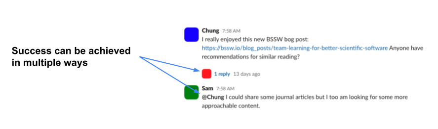
Figure 3
Image 1 of 1: ‘A screenshot of Google Forms showing two questions: 'What is your participant ID?' and, 'Indicate how much you agree with the following statement: I was frustrated when completing the task.' The first question has a line for short answer text responses. The second question has the option to respond on a 1-5 scale of strongly disagree to strongly agree.’
Recruiting and tracking participants
Figure 1
Image 1 of 1: ‘Screenshot of a Google Sheet used as a participant tracker. Column headers include Participant ID, First Name, Last Name, Email, First contacted, Followed up?, Session date, Reminded?, Session notes, Recording, and Anonymized Transcript. The first column shows anonymous IDs such as P1. Adjacent columns contain example names and email addresses. Some cells include dates, checkboxes indicating follow-up or reminder status, a “declined” entry under session date for one participant, and placeholder links for notes, recordings, and transcripts. The image illustrates how a central spreadsheet can track recruitment status, session logistics, and links to study materials while using anonymous IDs to organize participant data.’

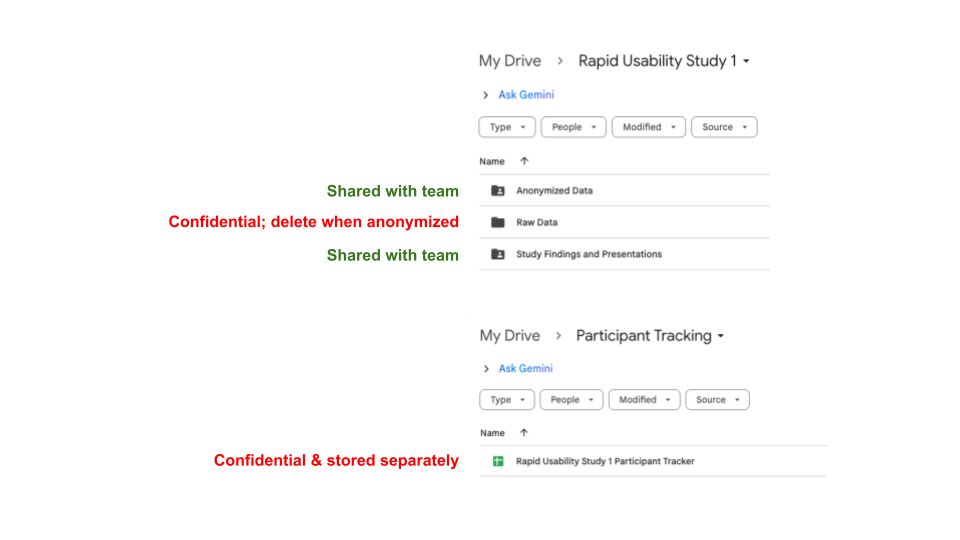
Figure 2
Image 1 of 1: ‘Screenshot of a Google Drive folder structure illustrating how to separate confidential and shared study materials. At the top, a folder titled Rapid Usability Study 1 contains three subfolders: Anonymized Data, Raw Data, and Study Findings and Presentations. Green text next to Anonymized Data and Study Findings and Presentations reads, 'Shared with team,' while red text next to Raw Data reads, 'Confidential; delete when anonymized.' Below, a separate Google Drive location titled Participant Tracking shows a file named Rapid Usability Study 1 Participant Tracker, labeled in red text as 'Confidential & stored separately.' The image demonstrates an example of keeping identifying information and raw data in restricted, private locations while sharing only anonymized materials with the broader team.’
