Data visualization with ggplot2
Last updated on 2023-05-02 | Edit this page
Overview
Questions
- How do you make plots using R?
- How do you customize and modify plots?
Objectives
- Produce scatter plots and boxplots using
ggplot2. - Represent data variables with plot components.
- Modify the scales of plot components.
- Iteratively build and modify
ggplot2plots by adding layers. - Change the appearance of existing
ggplot2plots using premade and customized themes. - Describe what faceting is and apply faceting in
ggplot2. - Save plots as image files.
Setup
We are going to be using functions from the
ggplot2 package to create visualizations
of data. Functions are predefined bits of code that automate more
complicated actions. R itself has many built-in functions, but we can
access many more by loading other packages of functions
and data into R.
If you don’t have a blank, untitled script open yet, go ahead and
open one with Shift+Cmd+N (Mac) or Shift+Ctrl+N
(Windows). Then save the file to your scripts/ folder, and
title it workshop_code.R.
Earlier, you had to install the ggplot2
package by running install.packages("ggplot2"). That
installed the package onto your computer so that R can access it. In
order to use it in our current session, we have to load
the package using the library() function.
Callout
If you do not have ggplot2 installed, you can run
install.packages("ggplot2") in the
console.
It is a good practice not to put install.packages() into
a script. This is because every time you run that whole script, the
package will be reinstalled, which is typically unnecessary. You want to
install the package to your computer once, and then load it with
library() in each script where you need to use it.
R
library(ggplot2)
Later we will learn how to read data from external files into R, but
for now we are going to use a clean and ready-to-use dataset that is
provided by the ratdat data package. To
make our dataset available, we need to load this package too.
R
library(ratdat)
The ratdat package contains data from the Portal Project, which
is a long-term dataset from Portal, Arizona, in the Chihuahuan
desert.
We will be using a dataset called complete_old, which
contains older years of survey data. Let’s try to learn a little bit
about the data. We can use a ? in front of the name of the
dataset, which will bring up the help page for the data.
R
?complete_old
Here we can read descriptions of each variable in our data.
To actually take a look at the data, we can use the
View() function to open an interactive viewer, which
behaves like a simplified version of a spreadsheet program. It’s a handy
function, but somewhat limited when trying to view large datasets.
R
View(complete_old)
If you hover over the tab for the interactive View(),
you can click the “x” that appears, which will close the tab.
We can find out more about the dataset by using the
str() function to examine the structure of
the data.
R
str(complete_old)
OUTPUT
'data.frame':	16878 obs. of  13 variables:
 $ record_id      : int  1 2 3 4 5 6 7 8 9 10 ...
 $ month          : int  7 7 7 7 7 7 7 7 7 7 ...
 $ day            : int  16 16 16 16 16 16 16 16 16 16 ...
 $ year           : int  1977 1977 1977 1977 1977 1977 1977 1977 1977 1977 ...
 $ plot_id        : int  2 3 2 7 3 1 2 1 1 6 ...
 $ species_id     : chr  "NL" "NL" "DM" "DM" ...
 $ sex            : chr  "M" "M" "F" "M" ...
 $ hindfoot_length: int  32 33 37 36 35 14 NA 37 34 20 ...
 $ weight         : int  NA NA NA NA NA NA NA NA NA NA ...
 $ genus          : chr  "Neotoma" "Neotoma" "Dipodomys" "Dipodomys" ...
 $ species        : chr  "albigula" "albigula" "merriami" "merriami" ...
 $ taxa           : chr  "Rodent" "Rodent" "Rodent" "Rodent" ...
 $ plot_type      : chr  "Control" "Long-term Krat Exclosure" "Control" "Rodent Exclosure" ...
str() will tell us how many observations/rows (obs) and
variables/columns we have, as well as some information about each of the
variables. We see the name of a variable (such as year),
followed by the kind of variable (int for integer,
chr for character), and the first 10 entries in that
variable. We will talk more about different data types and structures
later on.
Plotting with ggplot2
ggplot2 is a powerful package that
allows you to create complex plots from tabular data (data in a table
format with rows and columns). The gg in
ggplot2 stands for “grammar of graphics”,
and the package uses consistent vocabulary to create plots of widely
varying types. Therefore, we only need small changes to our code if the
underlying data changes or we decide to make a box plot instead of a
scatter plot. This approach helps you create publication-quality plots
with minimal adjusting and tweaking.
ggplot2 is part of the
tidyverse series of packages, which tend
to like data in the “long” or “tidy” format, which means each column
represents a single variable, and each row represents a single
observation. Well-structured data will save you lots of time making
figures with ggplot2. For now, we will use
data that are already in this format. We start learning R by using
ggplot2 because it relies on concepts that
we will need when we talk about data transformation in the next
lessons.
ggplot plots are built step by step by
adding new layers, which allows for extensive flexibility and
customization of plots.
To build a plot, we will use a basic template that can be used for different types of plots:
R
ggplot(data = <DATA>, mapping = aes(<MAPPINGS>)) + <GEOM_FUNCTION>()We use the ggplot() function to create a plot. In order
to tell it what data to use, we need to specify the data
argument. An argument is an input that a function
takes, and you set arguments using the = sign.
R
ggplot(data = complete_old)

We get a blank plot because we haven’t told ggplot()
which variables we want to correspond to parts of the plot. We can
specify the “mapping” of variables to plot elements, such as x/y
coordinates, size, or shape, by using the aes() function.
We’ll also add a comment, which is any line starting with a
#. It’s a good idea to use comments to organize your code
or clarify what you are doing.
R
# adding a mapping to x and y axes
ggplot(data = complete_old, mapping = aes(x = weight, y = hindfoot_length))
Now we’ve got a plot with x and y axes corresponding to variables
from complete_old. However, we haven’t specified how we
want the data to be displayed. We do this using geom_
functions, which specify the type of geometry we want, such
as points, lines, or bars. We can add a geom_point() layer
to our plot by using the + sign. We indent onto a new line
to make it easier to read, and we have to end the first
line with the + sign.
R
ggplot(data = complete_old, mapping = aes(x = weight, y = hindfoot_length)) +
  geom_point()
WARNING
Warning: Removed 3081 rows containing missing values (geom_point).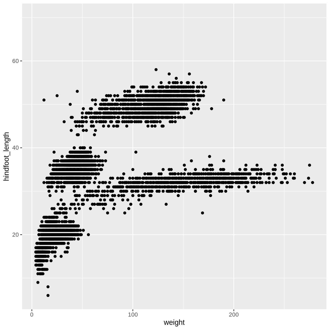
You may notice a warning that missing values were removed. If a
variable necessary to make the plot is missing from a given row of data
(in this case, hindfoot_length or weight), it
can’t be plotted. ggplot2 just uses a warning message to
let us know that some rows couldn’t be plotted.
Callout
Warning messages are one of a few ways R will communicate with you. Warnings can be thought of as a “heads up”. Nothing necessarily went wrong, but the author of that function wanted to draw your attention to something. In the above case, it’s worth knowing that some of the rows of your data were not plotted because they had missing data.
A more serious type of message is an error. Here’s an example:
R
ggplot(data = complete_old, mapping = aes(x = weight, y = hindfoot_length)) +
  geom_poit()
ERROR
Error in geom_poit(): could not find function "geom_poit"As you can see, we only get the error message, with no plot, because
something has actually gone wrong. This particular error message is
fairly common, and it happened because we misspelled point
as poit. Because there is no function named
geom_poit(), R tells us it can’t find a function with that
name.
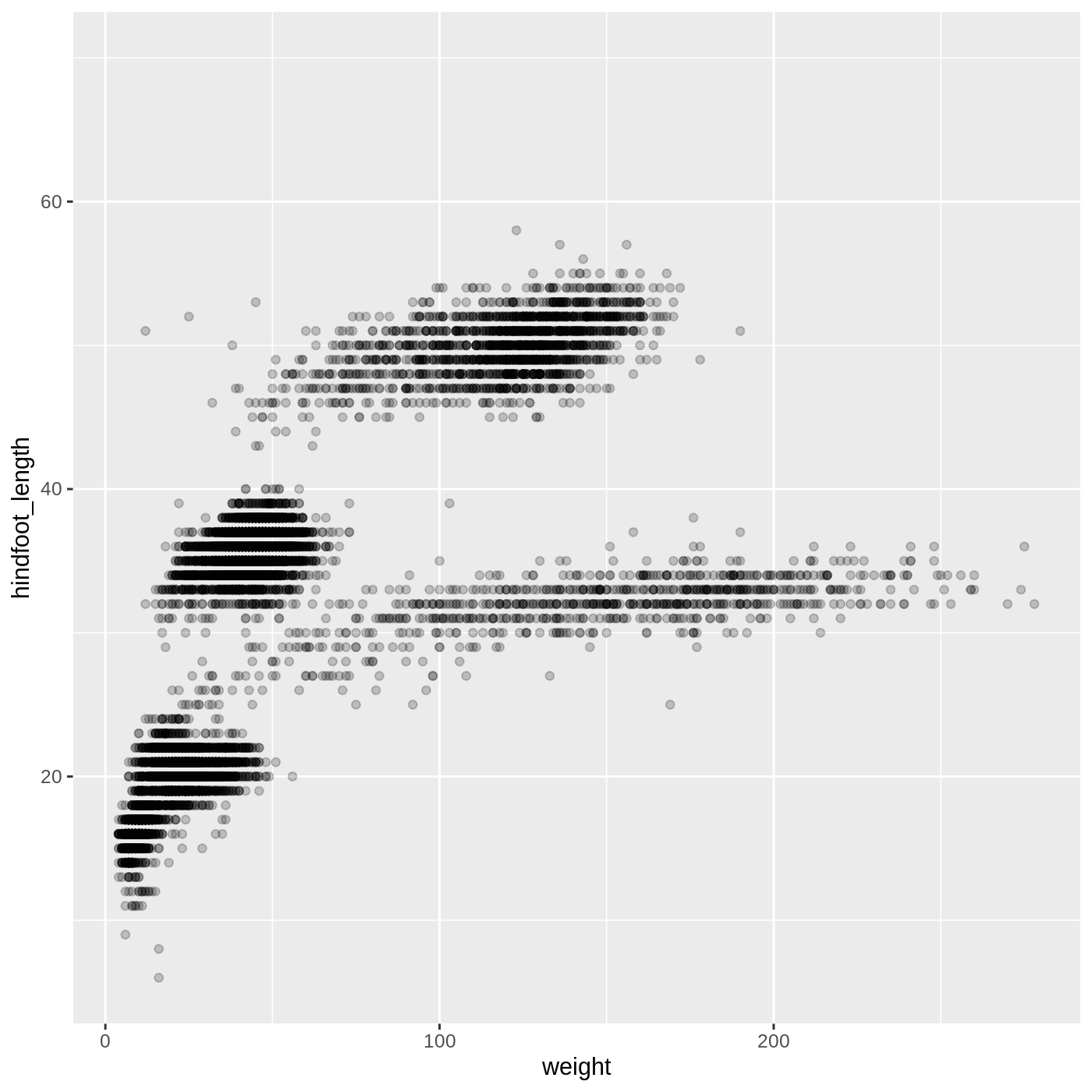
Changing aesthetics
Building ggplot plots is often an
iterative process, so we’ll continue developing the scatter plot we just
made. You may have noticed that parts of our scatter plot have many
overlapping points, making it difficult to see all the data. We can
adjust the transparency of the points using the alpha
argument, which takes a value between 0 and 1:
R
ggplot(data = complete_old, mapping = aes(x = weight, y = hindfoot_length)) +
  geom_point(alpha = 0.2)
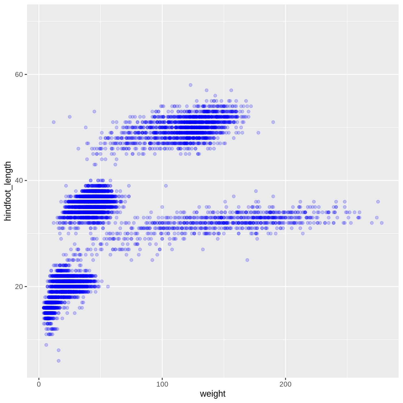
We can also change the color of the points:
R
ggplot(data = complete_old, mapping = aes(x = weight, y = hindfoot_length)) +
  geom_point(alpha = 0.2, color = "blue")
Callout
Two common issues you might run into when working in R are forgetting a closing bracket or a closing quote. Let’s take a look at what each one does.
Try running the following code:
R
ggplot(data = complete_old, mapping = aes(x = weight, y = hindfoot_length)) +
  geom_point(color = "blue", alpha = 0.2
You will see a + appear in your console. This is R
telling you that it expects more input in order to finish running the
code. It is missing a closing bracket to end the geom_point
function call. You can hit Esc in the console to reset
it.
Something similar will happen if you run the following code:
R
ggplot(data = complete_old, mapping = aes(x = weight, y = hindfoot_length)) +
  geom_point(color = "blue, alpha = 0.2)
A missing quote at the end of blue means that the rest
of the code is treated as part of the quote, which is a bit easier to
see since RStudio displays character strings in a different color.
You will get a different error message if you run the following code:
R
ggplot(data = complete_old, mapping = aes(x = weight, y = hindfoot_length)) +
  geom_point(color = "blue", alpha = 0.2))
This time we have an extra closing ), which R doesn’t
know what to do with. It tells you there is an unexpected
), but it doesn’t pinpoint exactly where. With enough time
working in R, you will get better at spotting mismatched brackets.
Adding another variable
Let’s try coloring our points according to the sampling plot type
(plot here refers to the physical area where rodents were sampled and
has nothing to do with making graphs). Since we’re now mapping a
variable (plot_type) to a component of the ggplot2 plot
(color), we need to put the argument inside
aes():
R
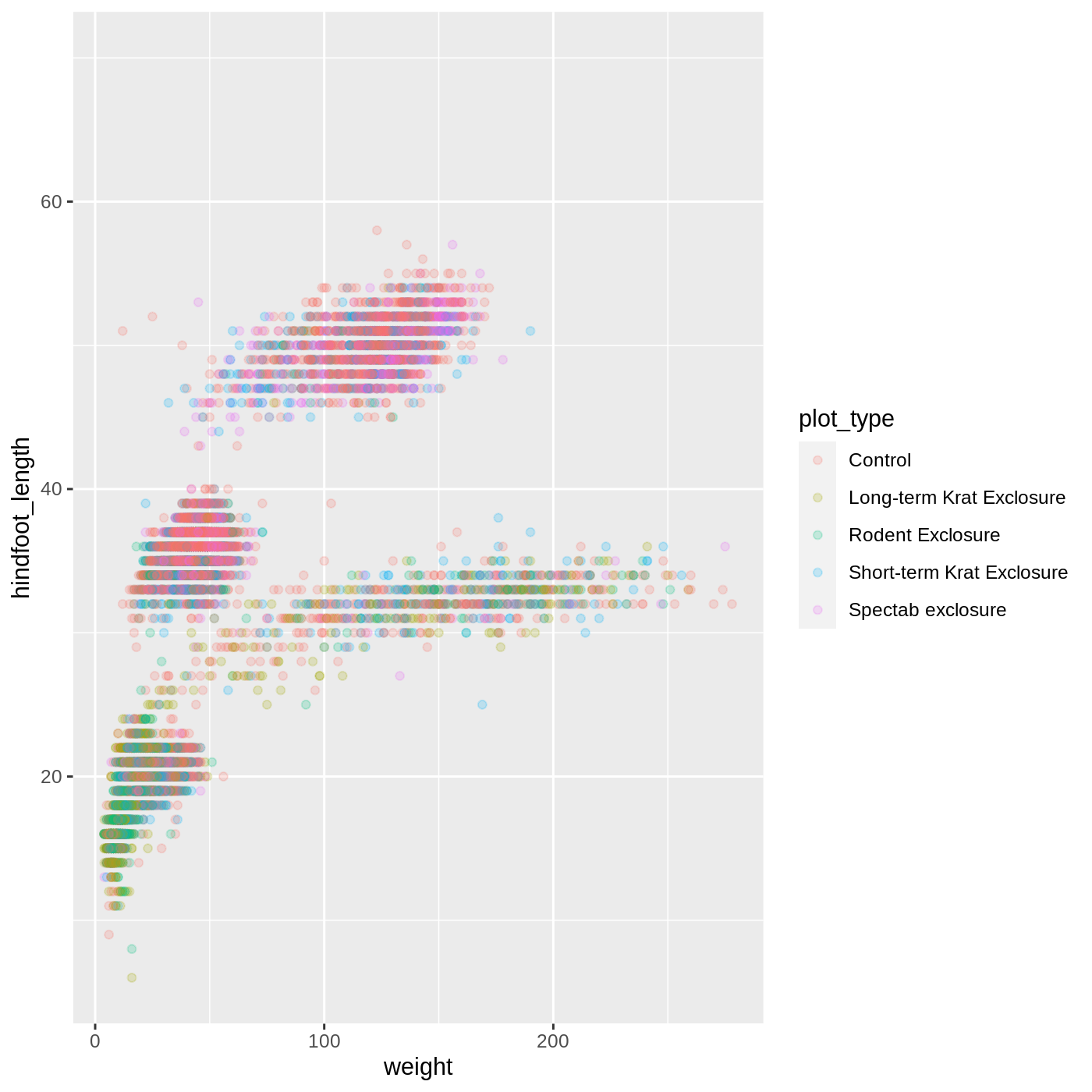
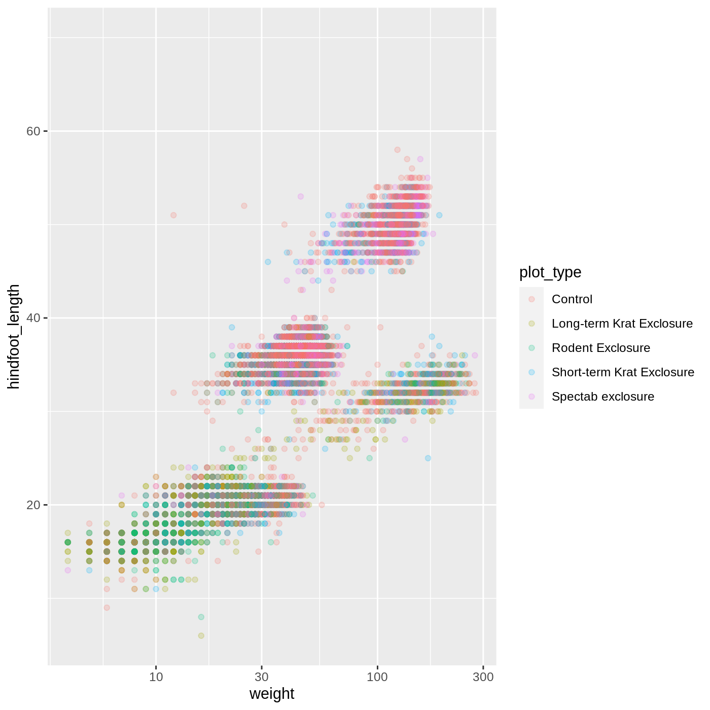
ggplot(data = complete_old, mapping = aes(x = weight, y = hindfoot_length, color = plot_type)) +
  geom_point(alpha = 0.2)
R
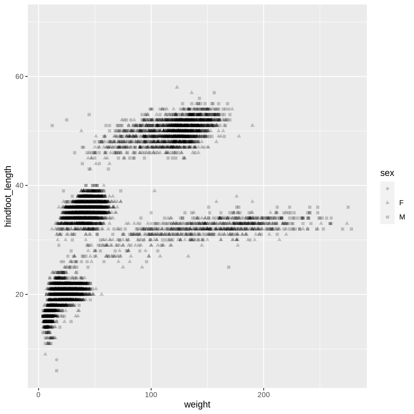
ggplot(data = complete_old,
       mapping = aes(x = weight, y = hindfoot_length, shape = sex)) +
  geom_point(alpha = 0.2)
R
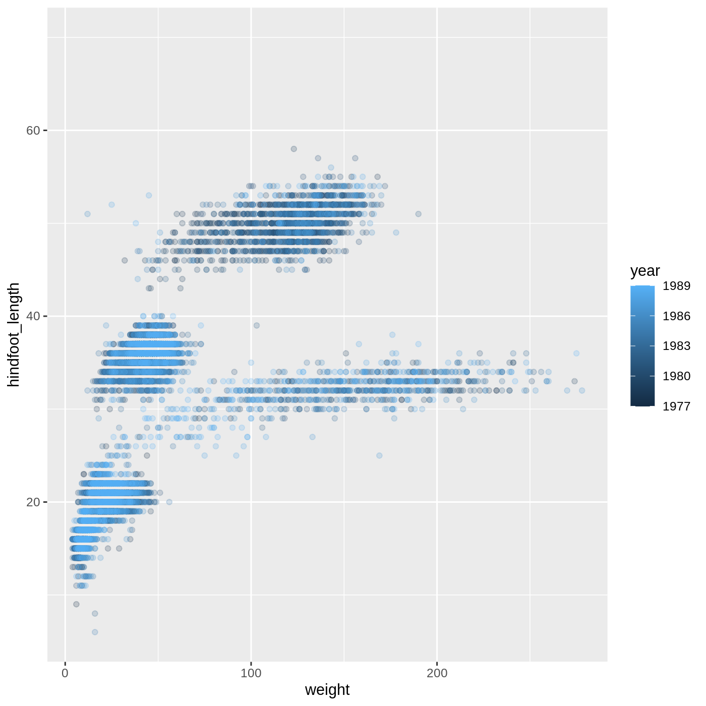
ggplot(data = complete_old,
       mapping = aes(x = weight, y = hindfoot_length, color = year)) +
  geom_point(alpha = 0.2)
- For Part 2, the color scale is different compared to using
color = plot_typebecauseplot_typeandyearare different variable types.plot_typeis a categorical variable, soggplot2defaults to use a discrete color scale, whereasyearis a numeric variable, soggplot2uses a continuous color scale.
Changing scales
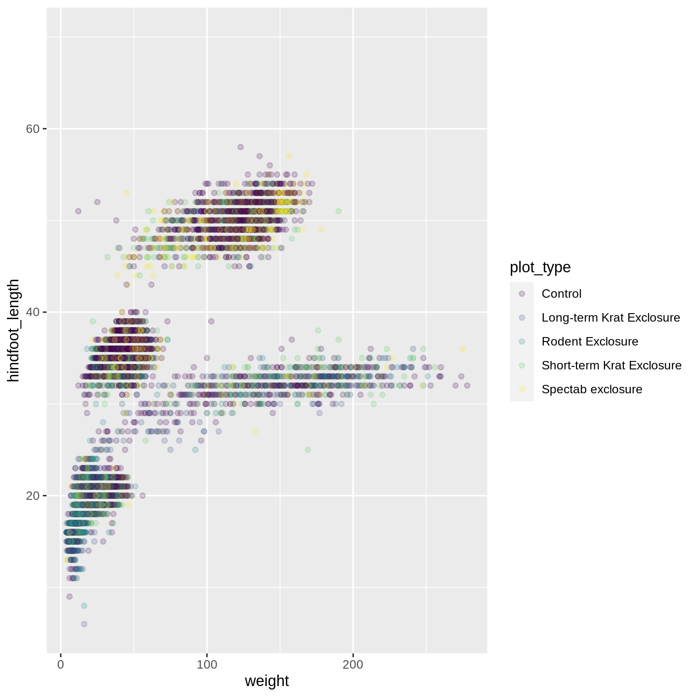
The default discrete color scale isn’t always ideal: it isn’t
friendly to viewers with colorblindness and it doesn’t translate well to
grayscale. However, ggplot2 comes with
quite a few other color scales, including the fantastic
viridis scales, which are designed to be colorblind and
grayscale friendly. We can change scales by adding scale_
functions to our plots:
R
ggplot(data = complete_old, mapping = aes(x = weight, y = hindfoot_length, color = plot_type)) +
  geom_point(alpha = 0.2) +
  scale_color_viridis_d()
Scales don’t just apply to colors- any plot component that you put
inside aes() can be modified with scale_
functions. Just as we modified the scale used to map
plot_type to color, we can modify the way that
weight is mapped to the x axis by using the
scale_x_log10() function:
R
ggplot(data = complete_old, mapping = aes(x = weight, y = hindfoot_length, color = plot_type)) +
  geom_point(alpha = 0.2) +
  scale_x_log10()
One nice thing about ggplot and the
tidyverse in general is that groups of functions that do
similar things are given similar names. Any function that modifies a
ggplot scale starts with scale_, making it
easier to search for the right function.
Boxplot
Let’s try making a different type of plot altogether. We’ll start off
with our same basic building blocks using ggplot() and
aes().
R
ggplot(data = complete_old, mapping = aes(x = plot_type, y = hindfoot_length))
This time, let’s try making a boxplot, which will have
plot_type on the x axis and hindfoot_length on
the y axis. We can do this by adding geom_boxplot() to our
ggplot():
R
ggplot(data = complete_old, mapping = aes(x = plot_type, y = hindfoot_length)) +
  geom_boxplot()
WARNING
Warning: Removed 2733 rows containing non-finite values (stat_boxplot).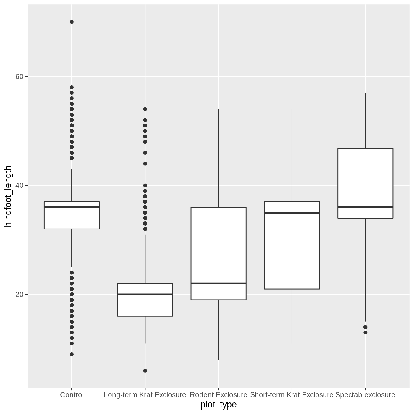
Just as we colored the points before, we can color our boxplot by
plot_type as well:
R
ggplot(data = complete_old, mapping = aes(x = plot_type, y = hindfoot_length, color = plot_type)) +
  geom_boxplot()
It looks like color has only affected the outlines of
the boxplot, not the rectangular portions. This is because the
color only impacts 1-dimensional parts of a
ggplot: points and lines. To change the color of
2-dimensional parts of a plot, we use fill:
R
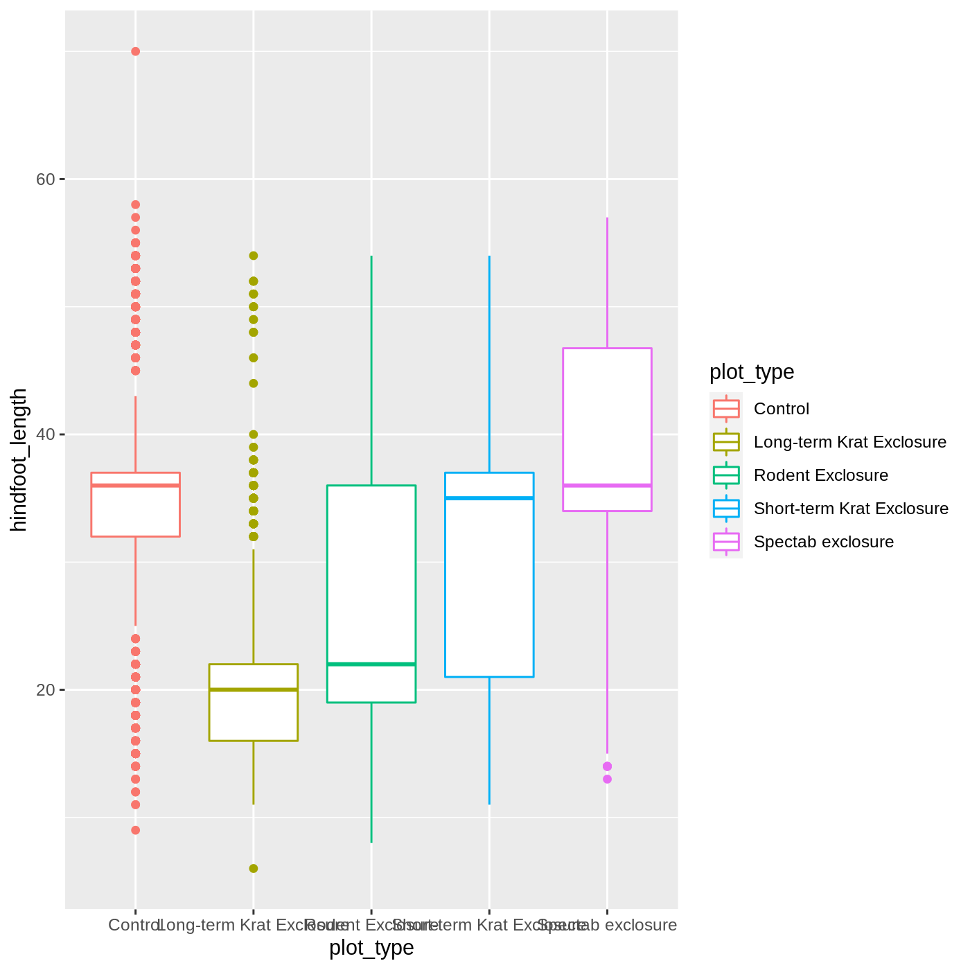
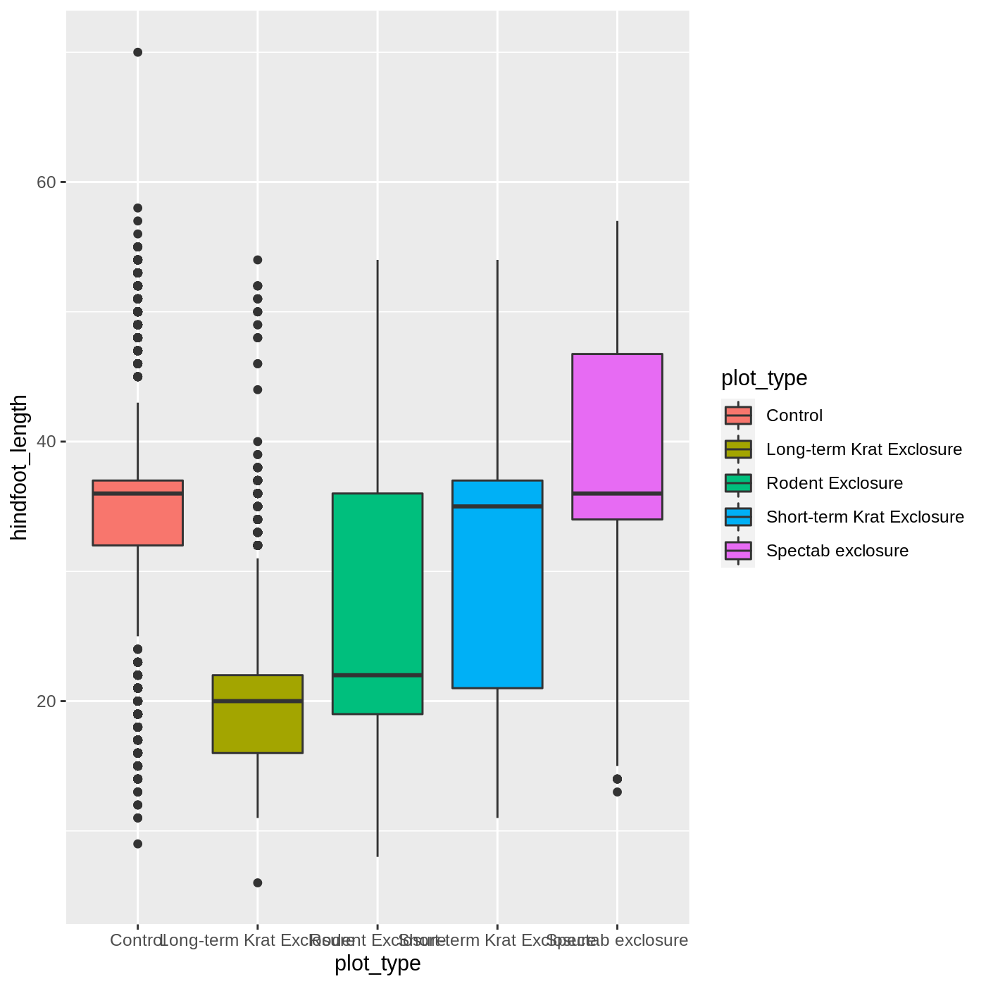
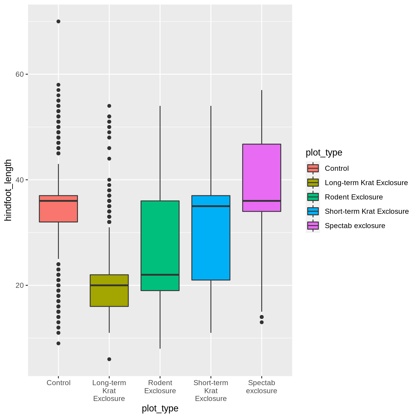
ggplot(data = complete_old, mapping = aes(x = plot_type, y = hindfoot_length, fill = plot_type)) +
  geom_boxplot()
Callout
One thing you may notice is that the axis labels are overlapping each
other, depending on how wide your plot viewer is. One way to help make
them more legible is to wrap the text. We can do that
by modifying the labels for the x axis
scale.
We use the scale_x_discrete() function because we have a
discrete axis, and we modify the labels argument. The
function label_wrap_gen() will wrap the text of the labels
to make them more legible.
R
ggplot(data = complete_old, mapping = aes(x = plot_type, y = hindfoot_length, fill = plot_type)) +
  geom_boxplot() +
  scale_x_discrete(labels = label_wrap_gen(width = 10))
Adding geoms
One of the most powerful aspects of
ggplot is the way we can add components to
a plot in successive layers. While boxplots can be very useful for
summarizing data, it is often helpful to show the raw data as well. With
ggplot, we can easily add another
geom_ to our plot to show the raw data.
Let’s add geom_point() to visualize the raw data. We
will modify the alpha argument to help with
overplotting.
R
ggplot(data = complete_old, mapping = aes(x = plot_type, y = hindfoot_length)) +
  geom_boxplot() +
  geom_point(alpha = 0.2)
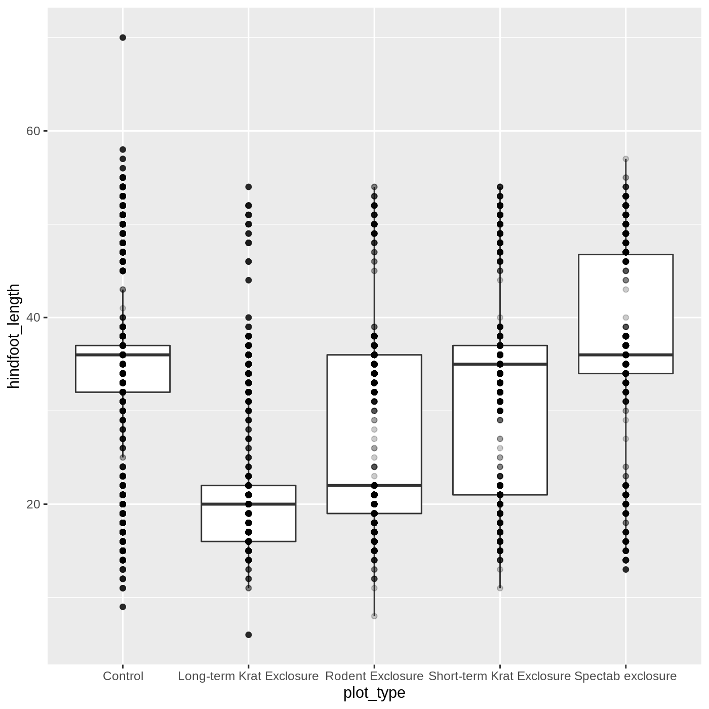
Uh oh… all our points for a given x axis category fall
exactly on a line, which isn’t very useful. We can shift to using
geom_jitter(), which will add points with a bit of random
noise added to the positions to prevent this from happening.
R
ggplot(data = complete_old, mapping = aes(x = plot_type, y = hindfoot_length)) +
  geom_boxplot() +
  geom_jitter(alpha = 0.2)
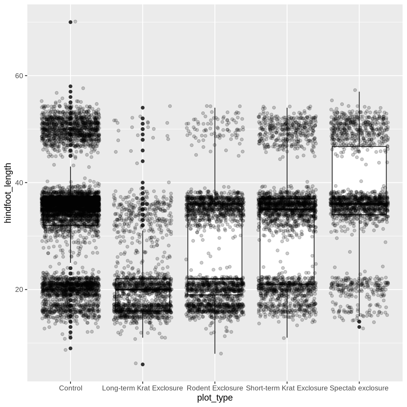
You may have noticed that some of our data points are now appearing
on our plot twice: the outliers are plotted as black points from
geom_boxplot(), but they are also plotted with
geom_jitter(). Since we don’t want to represent these data
multiple times in the same form (points), we can stop
geom_boxplot() from plotting them. We do this by setting
the outlier.shape argument to NA, which means
the outliers don’t have a shape to be plotted.
R
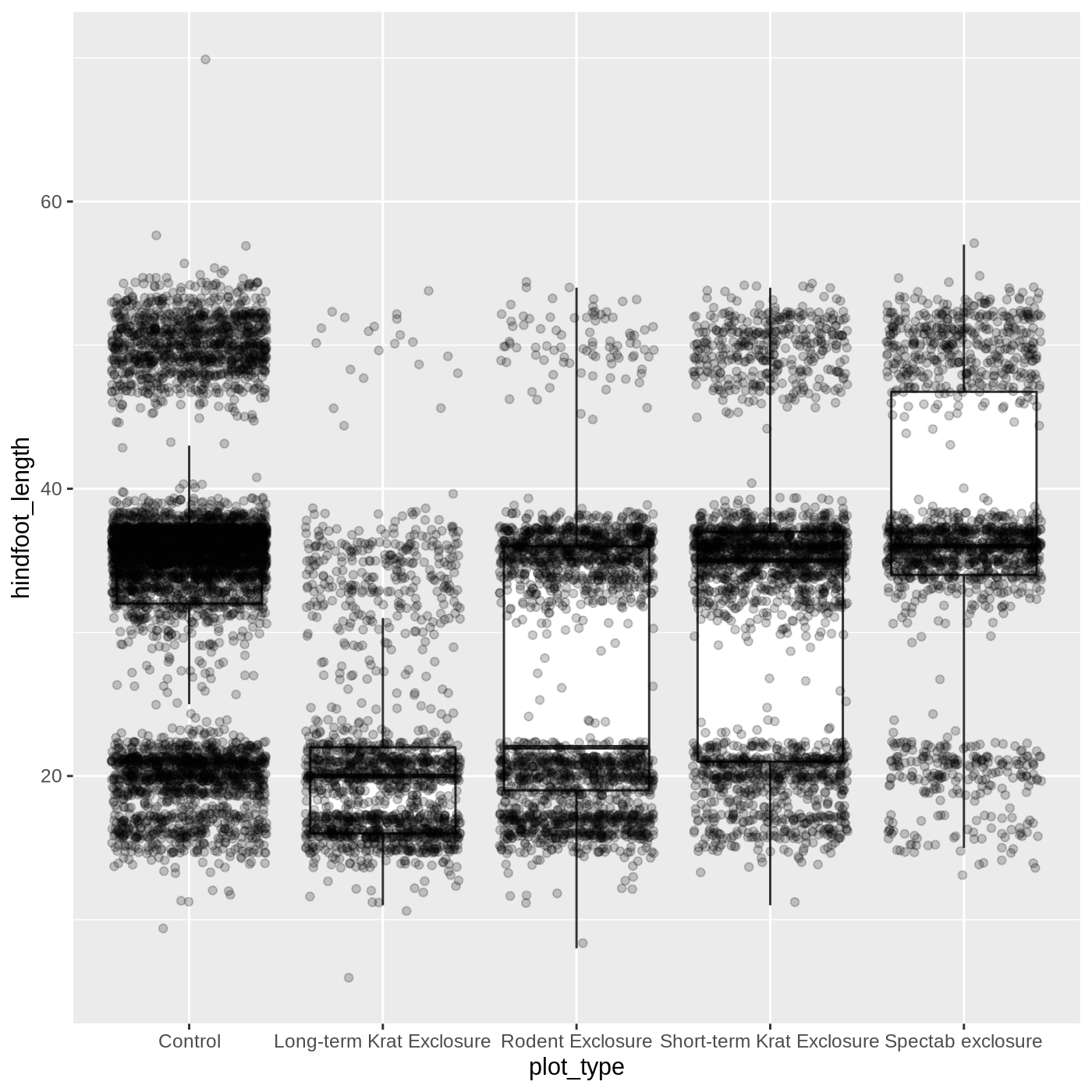
ggplot(data = complete_old, mapping = aes(x = plot_type, y = hindfoot_length)) +
  geom_boxplot(outlier.shape = NA) +
  geom_jitter(alpha = 0.2)
Just as before, we can map plot_type to
color by putting it inside aes().
R
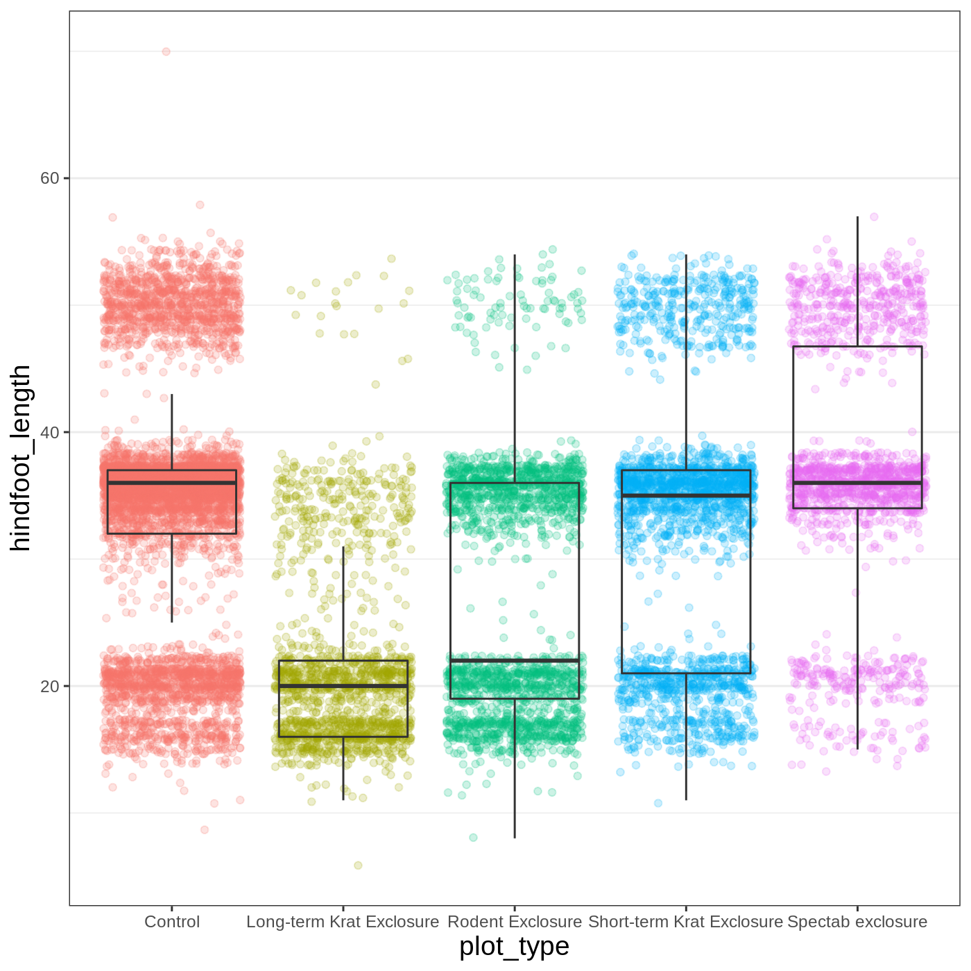
ggplot(data = complete_old, mapping = aes(x = plot_type, y = hindfoot_length, color = plot_type)) +
  geom_boxplot(outlier.shape = NA) +
  geom_jitter(alpha = 0.2)
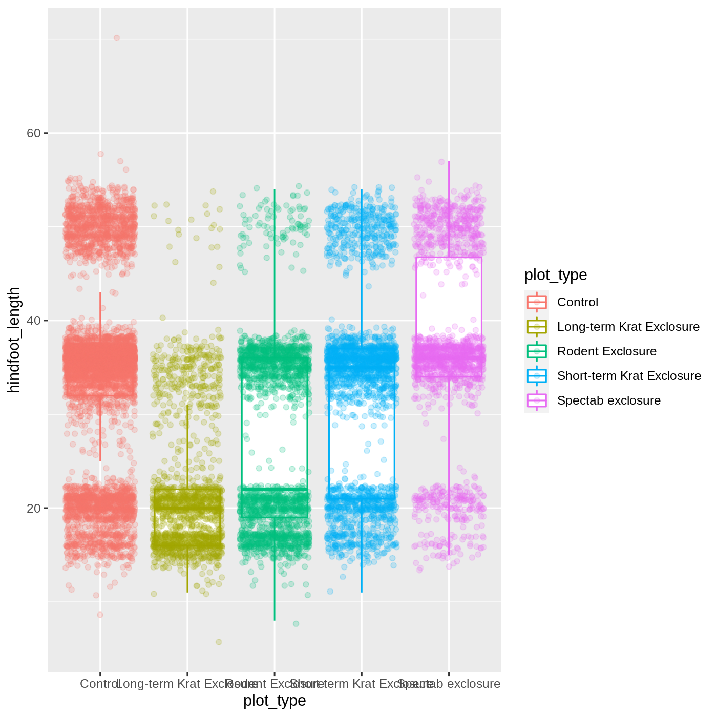
Notice that both the color of the points and the color of the boxplot
lines changed. Any time we specify an aes() mapping inside
our initial ggplot() function, that mapping will apply to
all our geoms.
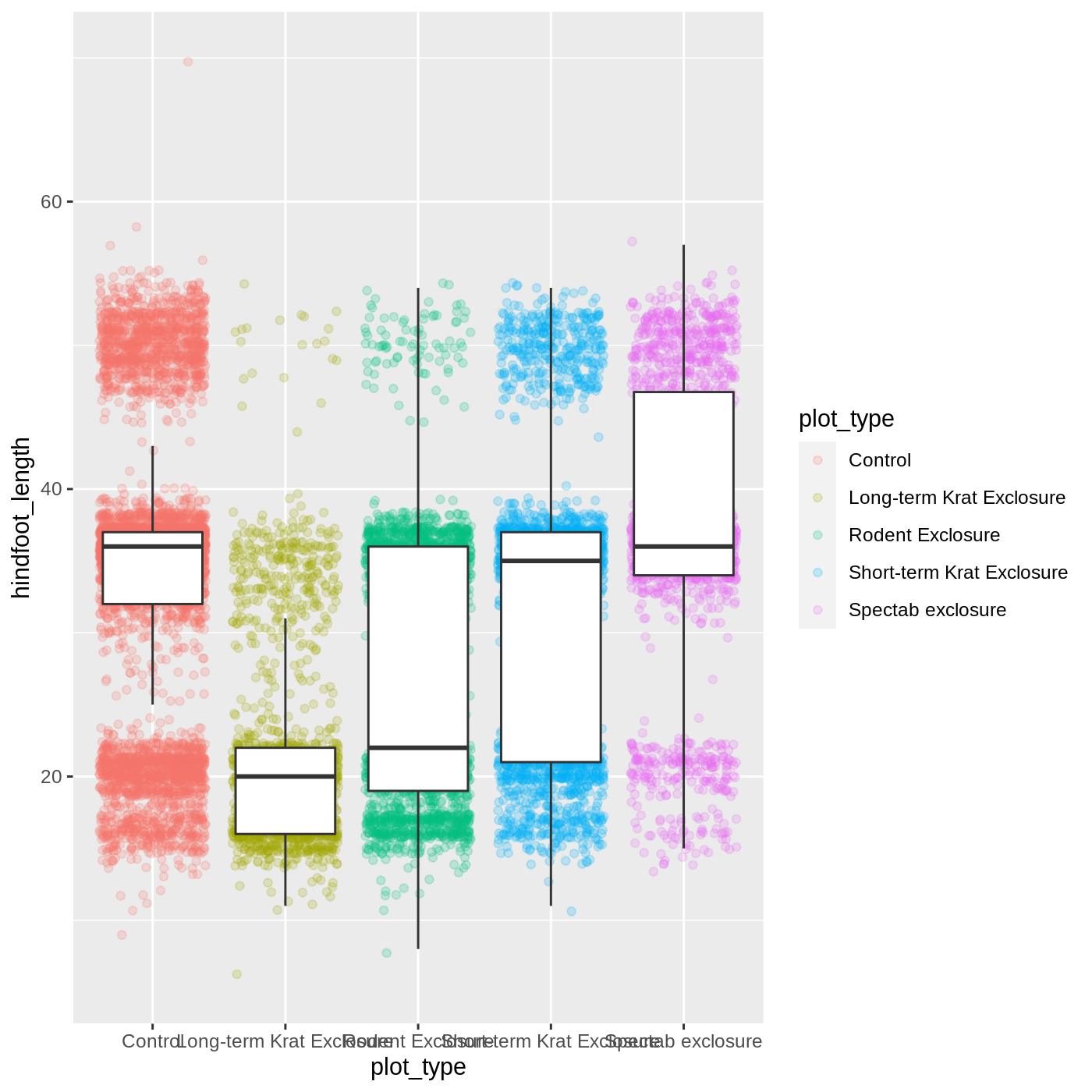
If we want to limit the mapping to a single geom, we can
put the mapping into the specific geom_ function, like
this:
R
ggplot(data = complete_old, mapping = aes(x = plot_type, y = hindfoot_length)) +
  geom_boxplot(outlier.shape = NA) +
  geom_jitter(aes(color = plot_type), alpha = 0.2)

Now our points are colored according to plot_type, but
the boxplots are all the same color. One thing you might notice is that
even with alpha = 0.2, the points obscure parts of the
boxplot. This is because the geom_point() layer comes after
the geom_boxplot() layer, which means the points are
plotted on top of the boxes. To put the boxplots on top, we switch the
order of the layers:
R
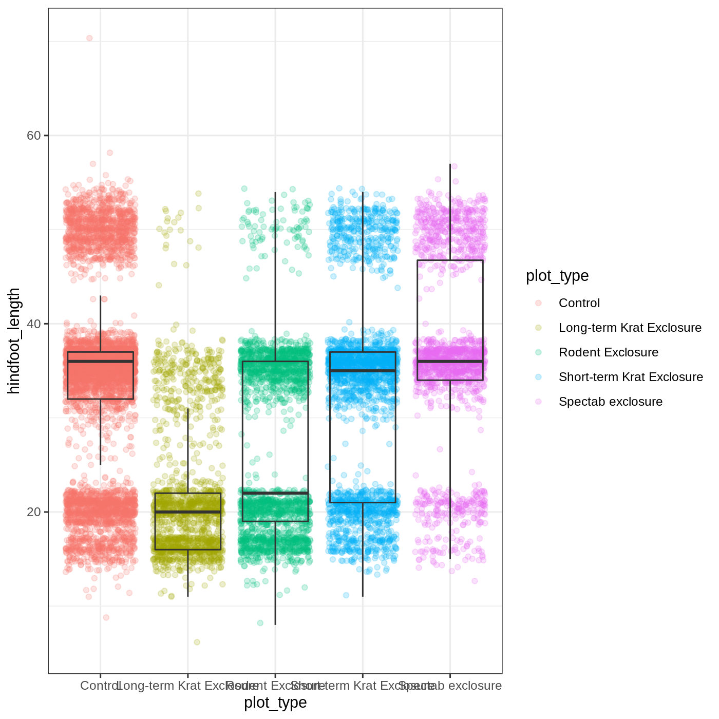
ggplot(data = complete_old, mapping = aes(x = plot_type, y = hindfoot_length)) +
  geom_jitter(aes(color = plot_type), alpha = 0.2) +
  geom_boxplot(outlier.shape = NA)
Now we have the opposite problem! The white fill of the
boxplots completely obscures some of the points. To address this
problem, we can remove the fill from the boxplots
altogether, leaving only the black lines. To do this, we set
fill to NA:
R
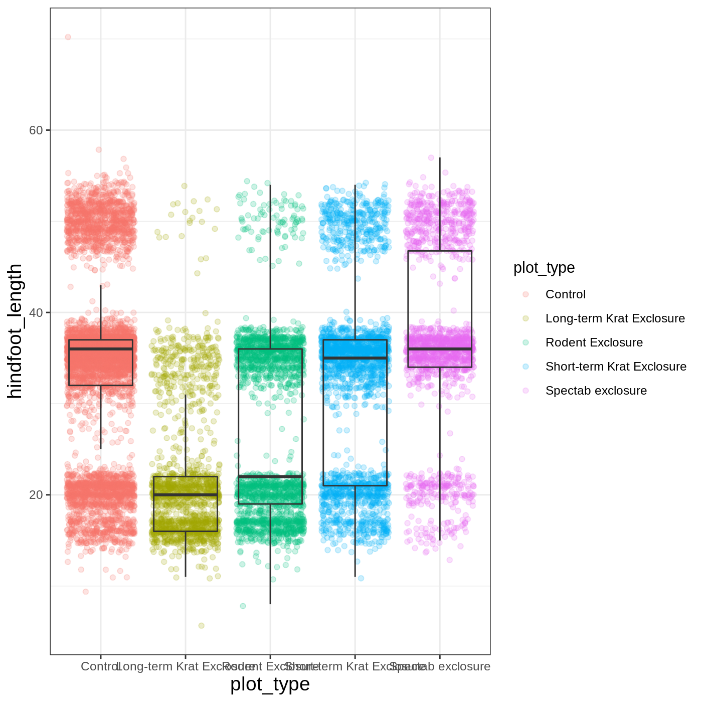
ggplot(data = complete_old, mapping = aes(x = plot_type, y = hindfoot_length)) +
  geom_jitter(aes(color = plot_type), alpha = 0.2) +
  geom_boxplot(outlier.shape = NA, fill = NA)
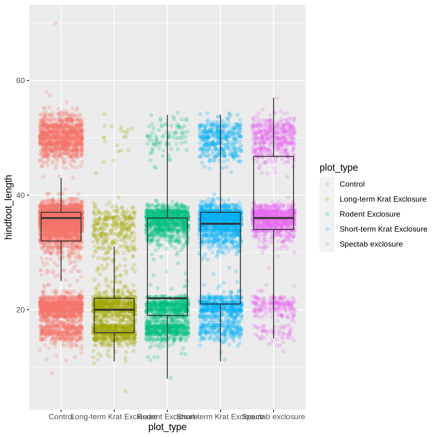
Now we can see all the raw data and our boxplots on top.
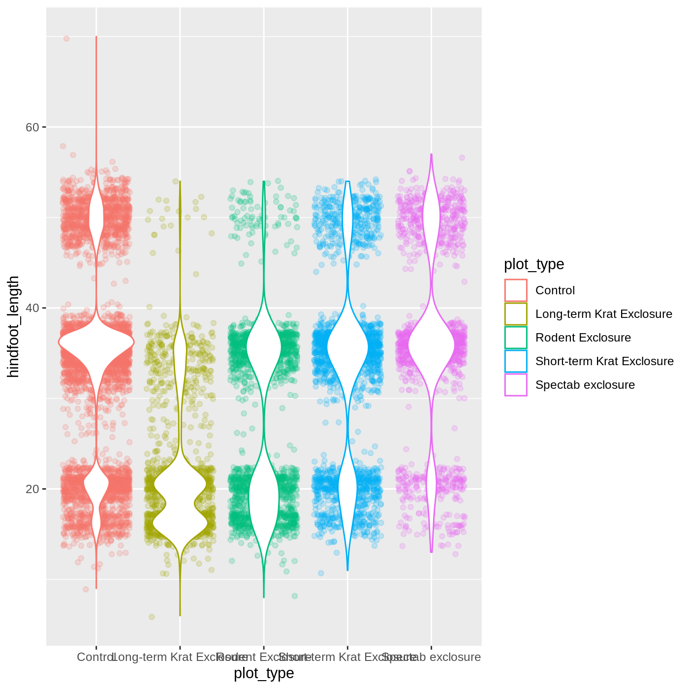
Challenge 2: Change geoms
Violin plots are similar to boxplots- try making one using
plot_type and hindfoot_length as the x and y
variables. Remember that all geom functions start with
geom_, followed by the type of geom.
This might also be a place to test your search engine skills. It is
often useful to search for
R package_name stuff you want to search. So for this
example we might search for R ggplot2 violin plot.
R
ggplot(data = complete_old,
       mapping = aes(x = plot_type,
                     y = hindfoot_length,
                     color = plot_type)) +
  geom_jitter(alpha = 0.2) +
  geom_violin(fill = "white")
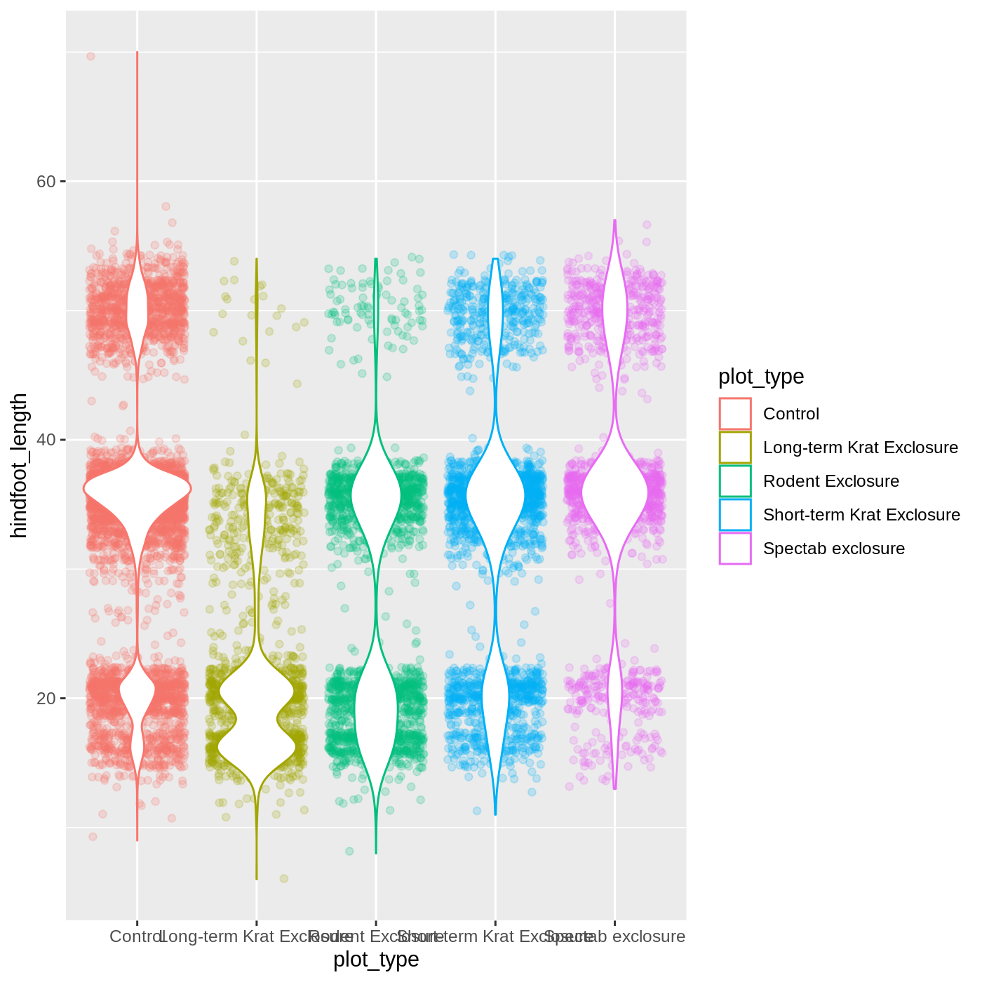
R
ggplot(data = complete_old,
       mapping = aes(x = plot_type,
                     y = hindfoot_length,
                     color = plot_type)) +
  geom_jitter(alpha = 0.2) +
  geom_violin(fill = "white")
Changing themes
So far we’ve been changing the appearance of parts of our plot
related to our data and the geom_ functions, but we can
also change many of the non-data components of our plot.
At this point, we are pretty happy with the basic layout of our plot,
so we can assign it to a plot to a named
object. We do this using the assignment
arrow <-. What we are doing here is taking the
result of the code on the right side of the arrow, and assigning it to
an object whose name is on the left side of the arrow.
We will create an object called myplot. If you run the
name of the ggplot2 object, it will show the plot, just
like if you ran the code itself.
R
myplot <- ggplot(data = complete_old, mapping = aes(x = plot_type, y = hindfoot_length)) +
  geom_jitter(aes(color = plot_type), alpha = 0.2) +
  geom_boxplot(outlier.shape = NA, fill = NA)

myplot
WARNING
Warning: Removed 2733 rows containing non-finite values (stat_boxplot).WARNING
Warning: Removed 2733 rows containing missing values (geom_point).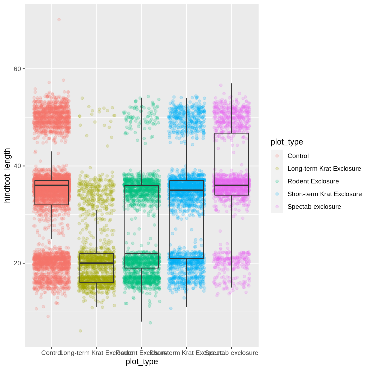
This process of assigning something to an object is
not specific to ggplot2, but rather a general feature of R.
We will be using it a lot in the rest of this lesson. We can now work
with the myplot object as if it was a block of
ggplot2 code, which means we can use + to add
new components to it.
We can change the overall appearance using theme_
functions. Let’s try a black-and-white theme by adding
theme_bw() to our plot:
R
myplot + theme_bw()
As you can see, a number of parts of the plot have changed.
theme_ functions usually control many aspects of a plot’s
appearance all at once, for the sake of convenience. To individually
change parts of a plot, we can use the theme() function,
which can take many different arguments to change things about the text,
grid lines, background color, and more. Let’s try changing the size of
the text on our axis titles. We can do this by specifying that the
axis.title should be an element_text() with
size set to 14.
R
myplot +
  theme_bw() +
  theme(axis.title = element_text(size = 14))
Another change we might want to make is to remove the vertical grid
lines. Since our x axis is categorical, those grid lines aren’t useful.
To do this, inside theme(), we will change the
panel.grid.major.x to an element_blank().
R
myplot +
  theme_bw() +
  theme(axis.title = element_text(size = 14),
        panel.grid.major.x = element_blank())
Another useful change might be to remove the color legend, since that
information is already on our x axis. For this one, we will set
legend.position to “none”.
R
myplot +
  theme_bw() +
  theme(axis.title = element_text(size = 14),
        panel.grid.major.x = element_blank(),
        legend.position = "none")
Callout
Because there are so many possible arguments to the
theme() function, it can sometimes be hard to find the
right one. Here are some tips for figuring out how to modify a plot
element:
- type out
theme(), put your cursor between the parentheses, and hit Tab to bring up a list of arguments- you can scroll through the arguments, or start typing, which will shorten the list of potential matches
- like many things in the
tidyverse, similar argument start with similar names- there are
axis,legend,panel,plot, andstriparguments
- there are
- arguments have hierarchy
-
textcontrols all text in the whole plot -
axis.titlecontrols the text for the axis titles -
axis.title.xcontrols the text for the x axis title
-
Callout
You may have noticed that we have used 3 different approaches to
getting rid of something in ggplot:
-
outlier.shape = NAto remove the outliers from our boxplot -
panel.grid.major.x = element_blank()to remove the x grid lines -
legend.position = "none"to remove our legend
Why are there so many ways to do what seems like the same thing?? This is a common frustration when working with R, or with any programming language. There are a couple reasons for it:
- Different people contribute to different packages and functions, and they may choose to do things differently.
- Code may appear to be doing the same thing, when the
details are actually quite different. The inner workings of
ggplot2are actually quite complex, since it turns out making plots is a very complicated process! Because of this, things that seem the same (removing parts of a plot), may actually be operating on very different components or stages of the final plot. - Developing packages is a highly iterative process, and sometimes
things change. However, changing too much stuff can make old code break.
Let’s say removing the legend was introduced as a feature of
ggplot2, and then a lot of time passed before someone added the feature letting you remove outliers fromgeom_boxplot(). Changing the way you remove the legend, so that it’s the same as the boxplot approach, could break all of the code written in the meantime, so developers may opt to keep the old approach in place.
Changing labels
Our plot is really shaping up now. However, we probably want to make
our axis titles nicer, and perhaps add a main title to the plot. We can
do this using the labs() function:
R
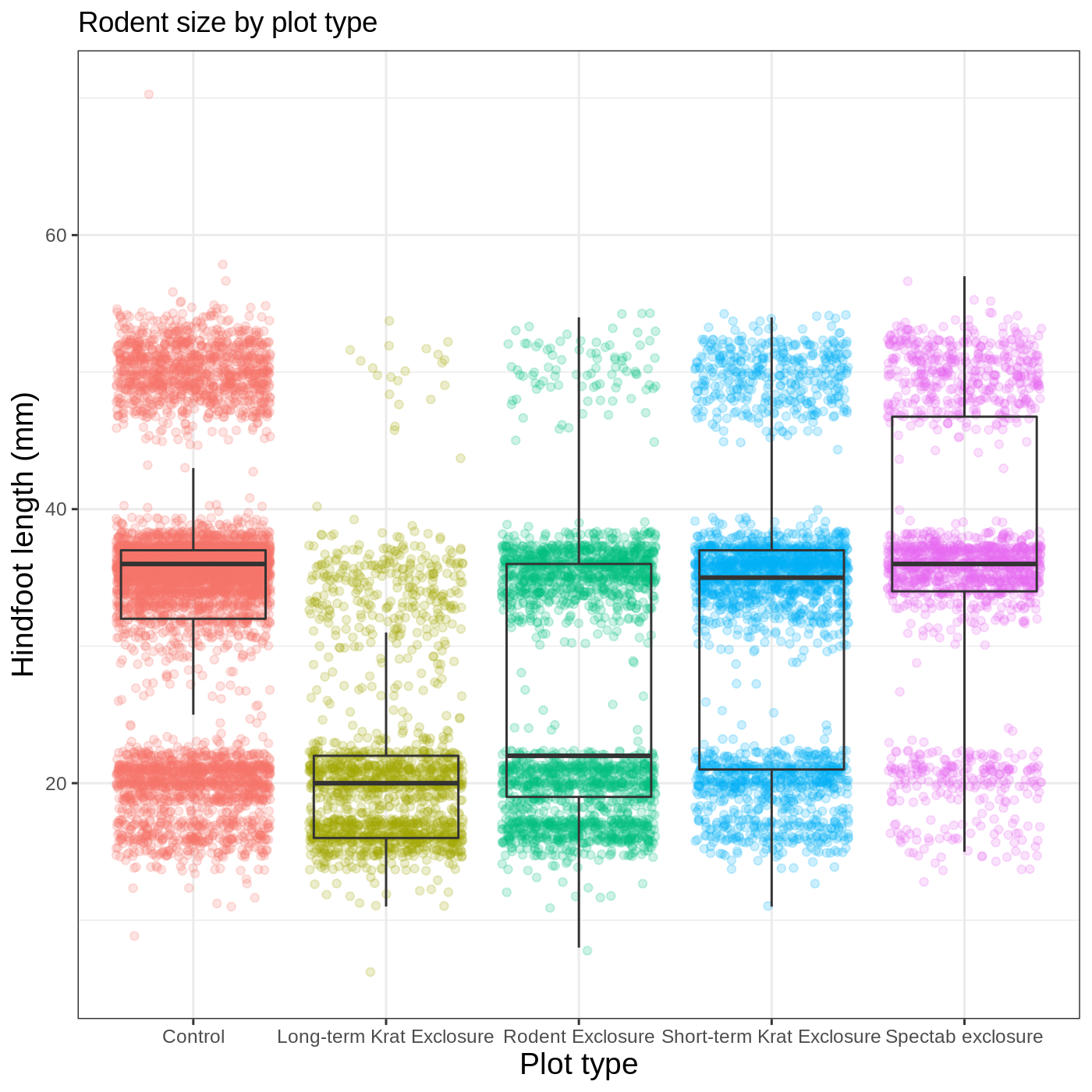
myplot +
  theme_bw() +
  theme(axis.title = element_text(size = 14),
        legend.position = "none") +
  labs(title = "Rodent size by plot type",
       x = "Plot type",
       y = "Hindfoot length (mm)")
We removed our legend from this plot, but you can also change the
titles of various legends using labs(). For example,
labs(color = "Plot type") would change the title of a color
scale legend to “Plot type”.
R
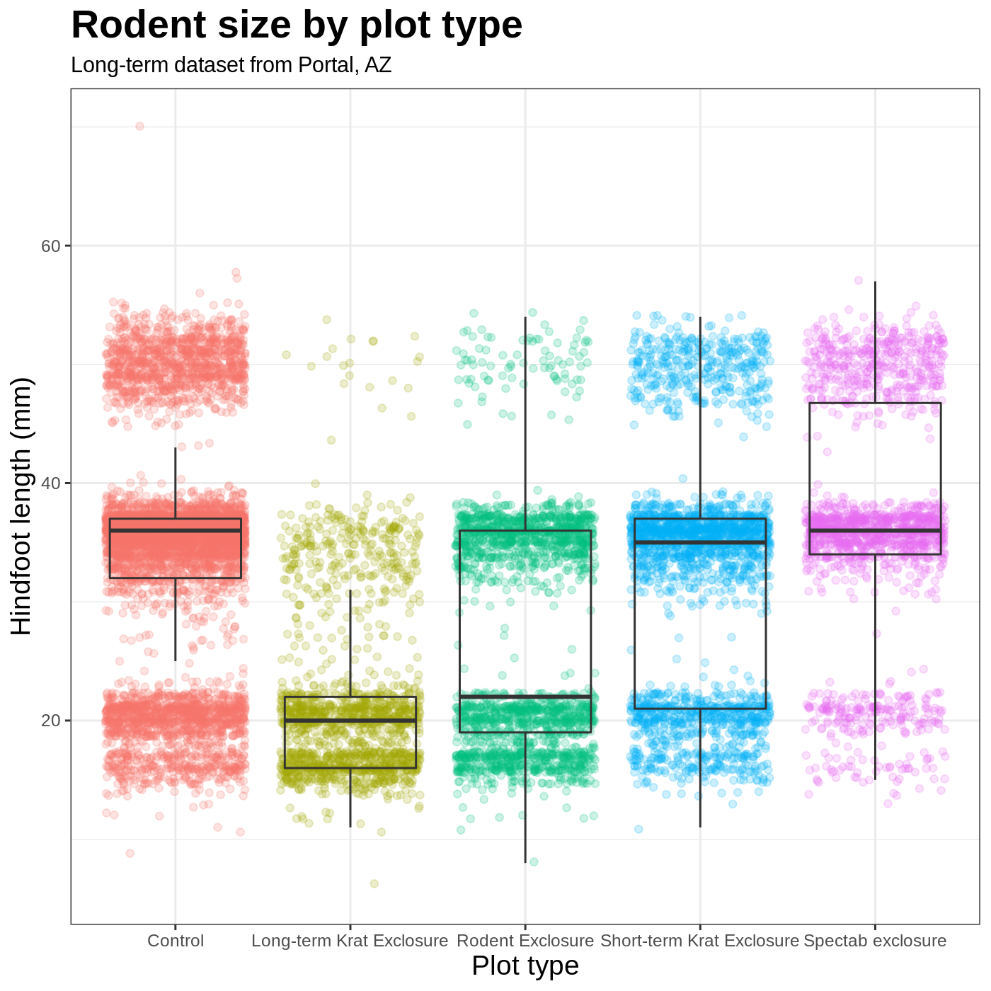
myplot +
  theme_bw() +
  theme(axis.title = element_text(size = 14), legend.position = "none",
        plot.title = element_text(face = "bold", size = 20)) +
  labs(title = "Rodent size by plot type",
       subtitle = "Long-term dataset from Portal, AZ",
       x = "Plot type",
       y = "Hindfoot length (mm)")
Faceting
One of the most powerful features of
ggplot is the ability to quickly split a
plot into multiple smaller plots based on a categorical variable, which
is called faceting.
So far we’ve mapped variables to the x axis, the y axis, and color, but trying to add a 4th variable becomes difficult. Changing the shape of a point might work, but only for very few categories, and even then, it can be hard to tell the differences between the shapes of small points.
Instead of cramming one more variable into a single plot, we will use
the facet_wrap() function to generate a series of smaller
plots, split out by sex. We also use ncol to
specify that we want them arranged in a single column:
R
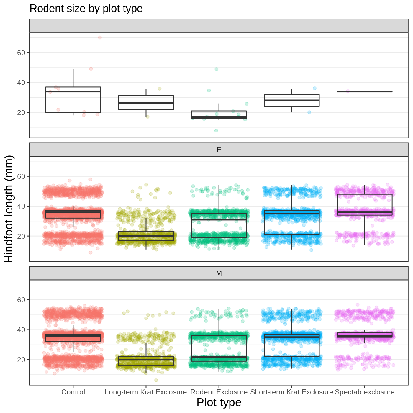
myplot +
  theme_bw() +
  theme(axis.title = element_text(size = 14),
        legend.position = "none",
        panel.grid.major.x = element_blank()) +
  labs(title = "Rodent size by plot type",
       x = "Plot type",
       y = "Hindfoot length (mm)",
       color = "Plot type") +
  facet_wrap(vars(sex), ncol = 1)
Callout
Faceting comes in handy in many scenarios. It can be useful when:
- a categorical variable has too many levels to differentiate by color (such as a dataset with 20 countries)
- your data overlap heavily, obscuring categories
- you want to show more than 3 variables at once
- you want to see each category in isolation while allowing for general comparisons between categories
Exporting plots
Once we are happy with our final plot, we can assign the whole thing
to a new object, which we can call finalplot.
R
finalplot <- myplot +
  theme_bw() +
  theme(axis.title = element_text(size = 14),
        legend.position = "none",
        panel.grid.major.x = element_blank()) +
  labs(title = "Rodent size by plot type",
       x = "Plot type",
       y = "Hindfoot length (mm)",
       color = "Plot type") +
  facet_wrap(vars(sex), ncol = 1)
After this, we can run ggsave() to save our plot. The
first argument we give is the path to the file we want to save,
including the correct file extension. This code will make an image
called rodent_size_plots.jpg in the images/
folder of our current project. We are making a .jpg, but
you can save .pdf, .tiff, and other file
formats. Next, we tell it the name of the plot object we want to save.
We can also specify things like the width and height of the plot in
inches.
R
ggsave(filename = "images/rodent_size_plots.jpg", plot = finalplot,
       height = 6, width = 8)
Challenge 4: Make your own plot
Try making your own plot! You can run str(complete_old)
or ?complete_old to explore variables you might use in your
new plot. Feel free to use variables we have already seen, or some we
haven’t explored yet.
Here are a couple ideas to get you started:
- make a histogram of one of the numeric variables
- try using a different color
scale_ - try changing the size of points or thickness of lines in a
geom
Keypoints
- the
ggplot()function initiates a plot, andgeom_functions add representations of your data - use
aes()when mapping a variable from the data to a part of the plot - use
scale_functions to modify the scales used to represent variables - use premade
theme_functions to broadly change appearance, and thetheme()function to fine-tune - start simple and build your plots iteratively